Transcripts
1. Introduction: Hi guys, My name is
Clarisse and I am a watercolor artist and
designer from Toronto, Canada. I teach watercolor mainly
through my YouTube channel. And then I also do watercolor experience events all along the greater Toronto area, and also some wineries in the Niagara wine country region. I'm also an ambassador for the esteemed
Princeton brushes, which I absolutely love. And you will find me
using quite a bit of the Princeton brushes in all my videos and
also my classes. In this class we're going
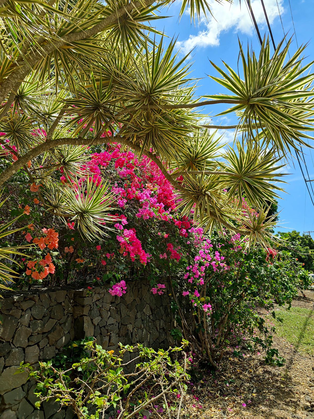
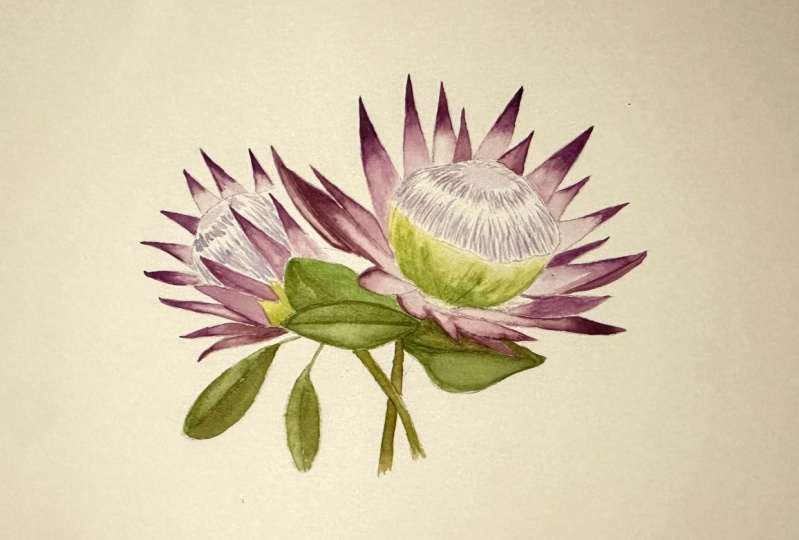
to learn how to paint that King Proteus tropical flower. And the inspiration
for this flower came from my trip
to Maui, Hawaii. We're going to learn how to mix color and blend color
to get some seamless, beautiful gradient effects
in our flower petals. We're also going to
touch a little bit on how to achieve contrast and a little bit of shadow for our petals
and within the flower. Once again, using
simple techniques like the wet on dry
technique in watercolor. This class is a
little bit different from my regular loose florals just because there is
a base drawing which I have included the link for. So feel free to download
that in the sketch. We've got two
flowers in my class. I'm going to show you how
to paint the one flower. And I would love it if
you can just go ahead and paint the second flower
all by yourself, and then post the image under the project section as I would love to see how yours turnout. If you have any
questions at all, please feel free to reach out. I will be more than
happy to help you. Let's begin
2. Supplies: Hi guys. So this is part two to my tropical watercolor
florals series. And we are going to be
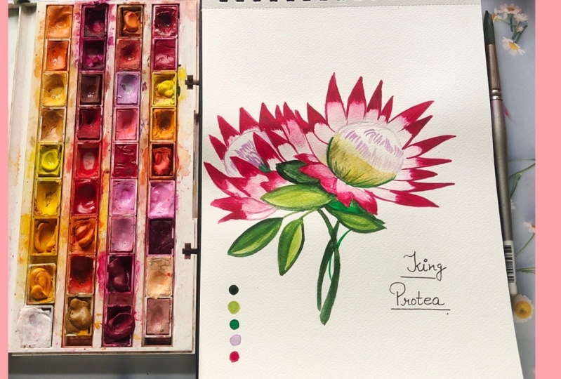
painting the king trope. Yeah, here's all the
supplies I will be using for this video and lesson. Feel free to use
similar supplies or you can find the links to all my supplies
over here listed in the info section of this class. So for colors, I'm
gonna be using my Paul Rubens fourth
generation set of watercolors. And they are tubes. And they look like this. And I'll be letting
you know what colors I'm using in a second. For paper. I'm using my Saunders
Waterford St. Cuthbert mill, hundred percent cotton paper. And this is in ten by 14, sorry, ten by 7 " in size. Then for brushes, I'm using my Princeton
watercolor brushes. We've got the Neptune
number eight, Neptune number six, velvet
touch, number four. And then for a little
bit of detail, just in case I need it, I've got the heritage in a zero. Last but not least, we've got a pencil
and an eraser. I'm also using my palette by
Lucy arts over here so that I'm able to mix some of the colors to get the pretty
colors for our flower. And I've got water on the side. And we also need a paper towel
3. Tracing/Sketching & Swatching: So we're ready to
start painting. The first thing I need you to do is you will find
the base drawing for the king Copia in
my class description. So please feel free
to download that. There's also a reference image, a link to a reference image. So if you feel that
you'd like to challenge yourself and do the
drawing by yourself. You can absolutely do that. But the base drawing
is there to help you if you just want to
focus on your painting. So feel free to download that, trace it on your sheet of paper, and then get right back into this video so we can
get to painting. I'm gonna give you a
little bit of an overview of how we're going
to tackle this. So we've got the top
portion of the flower, which is more of a, not a violet really, but we're going to
use the violet, a very muted version
of the violet to get our nice little MOV purple, which is at the top area. The bottom area of it is
more of that beautiful, bright green, yellow, green
that we're gonna be using. And we're gonna be using the
sap green and the cadmium yellow to mix and get our
beautiful color for that. And then for the petals, we've got that nice dark pink or quinacridone maroon
in our case right here. So we'll start off
with the green. And then we will get
into the pink petals. And then we'll leave
them off center for the absolute last bit. And then obviously
the green leaves at the bottom and we move on. So let's start off
with getting some of that nice bright green
mixed up in the center. We'll do a little bit
of swatching before we get right into the painting. As that always helps us determine if we need
less of a color, more of a color, and how we want to
proceed with that. So I've got some
of that sap green. I'm going to put in
some of my cadmium yellow light onto the side here. And I'm just going
to mix the two in the center over here. A little goes a long
way with watercolor, which is why I'm not putting out copious amounts of
color on my palette. I'm also going to get a little
bit off that quinacridone maroon off to the
middle over here. Again, if I always
need more color, I can come back and get
more on my palette. I'm using my number for velvet touch brush to get some mixing happening in
the center here. Beautiful, beautiful,
bright green. Just going to get a little
bit of that lemon in here to get it to
be a tad brighter. And I believe this is
the color we will do for the bottom half of our flower. And to swatch it on a little piece of paper here
just so we have a reference. Do that over here. This always helps
us not only warm up and get used to the paper
and get used to the brush. But also helps us really
figure out how the color works and looks on paper. The next thing I
wanna do is just get a little bit of lemon. Just to help myself having a visual of
what this looks like. And then I'm also going to get a little bit of that green. So I have an idea of what I am mixing to get that
first color there. You can actually start
off with swatching the lemon first and
then the sap green, and then a mixture of
the two, if you wish. I'm just doing it in
the opposite manner. There we go. Then let's get a
little bit of that. Quinacridone, maroon for
our beautiful leaves, look at that
gorgeous, rich color. This is going to look phenomenally bright and
tropical in nature. And while we're at it, let's get a little bit of that. Violet. Things like this can happen. It's completely normal. At least this time it
didn't fall on my sheet. Sometimes that happens to me. And then I have to figure out creative ways of covering that up or making it seem
like it was intentional. Those are what I call
happy accidents. So using my number four again, we're going to get a
little bit of that violet. And you can see how
dark this violet is. So I essentially need
to water it down a lot. So I'm just going to use this row at the bottom
here to swatch that. Again, very, very dark. I wanted muted way,
way, way down. So take off most of the color and dab
it on my paper towel. Like this is essentially
the color that I want. So this is a lot of color
that we have there. So again, remember I mentioned
a little goes a long way. We literally need
like a dot of this. That's how much That's how much
we probably need. Look how likenesses, that's
the light color we need. The other option you have
is you can mix it with a white if your set of
colors has a white, I do have a white. But I feel like if you
challenge yourself and just figure out how much is too much color or
how much is too much water. It really helps you get to
know the medium even better. So this is why we're going
to go with the violet and really get a tiny
amount for our center. Alright, so last but not least, I'm going to mix a little
bit of my brown umber. And we're going to
mix that in with some of the green, sap green. You can see how I have spaced
out my color on my palate, colors on my palette. So this way I'm able to
get some nice blending, but they're not running into
each other a whole lot. Here we go. Let's get some of that brown, mix it with that green. Now again, the more
brown you get, the darker the green it'll be, the less brown you get. I guess the the brighter it'll be because
when you add that brown in, it just gets a lot, lot darker. And we just want to
essentially create some nice beautiful
darks and lights for our greens in that
below the flower. And the reason we want some
nice darks in there too, is because look at the colors we have happening in the flower. It's super bright. They're eye-catching. And the last thing we
need is for the eye to be fighting between the
flower and the leaves. So you need to give your
painting a little bit of balanced by creating
some nice contrast. And this is how
we're doing this. Alright, so we have
finished swatching, and now we can get to using these paints and apply
it to our flowers. If you look at our reference
image for our flower, the base of the
flower is almost like a bunch of little
lines of green. The top portion of
it is yellower, while the bottom portion, the base of it is
a tad bit greener. So we'll start off with
getting a muted version of the mixture of green that we have and using the number four, or feel free to use the number one depending on how much brush. What's the word I'm looking
for a brush control. You have and go from there. Now I loved the number for Princeton velvet touch because it gives you a nice
fine pointed tip. And if you're able to
have enough control, you get some really nice things. So this is what we
essentially want to do. We want to start off by
lightly grazing your sheet, just going downward like this. So I'm just going
to roughly kind of mimic that shape that we have happening for the base
of the flower there. So what you'll notice is
I've gone light and then I dipped in and got
a little bit more of that green and went over it. Now, this is not 100% cartons, so it's drying up quicker. But the point is to
get your damp color and then go in with the
green and have it go over. So then you get some
nice gradient effects. You could even go back in with some of
that lemon at the top. Or maybe you want
to start off with lemon lines and then add green. And after, I leave
that up to you guys, try both ways on a sheet of paper before you actually
tackle the flower. Always helps to get a
little bit of practice in before you try things out. But essentially, this is what the base of it should look like. Keeping it simple to the point, you're getting some practice for your brush control and a little bit of color
mixing happening. Now if you want to have,
remember I said the base of the, this part should
be a lot greener, so I'm just getting a
little bit more of that green and adding
it very lightly. Not all over, just
sporadically in-between here, might even get a little
bit of that darker green, while the regular green, which is the sap green. And I'm just going
to add a tad bit of that at the bottom
before it dries up, just so I can get a
little bit of blending. This way. You've got a dark to light
situation happening as well. Okay? So that's what we're
starting off with first
4. Painting the Center Base & Petals: So here we go. Let's get a
little bit of that lemma. And remember I started
off with the green. I'm going to start
off with the lemon now that I had a chance to actually swatch and
see what it looks like. So I'm starting off
with a lemon first, and then I'll go in with
the green and add that in. So very muted version of
the lemon is on my brush. And I'm going to start off on my painting by just
kind of drawing or painting these lines in here, essentially dampening the area. The lighter the color, the easier it is for you to get more color and add it
into your painting. But if it's dark,
it's harder for you to swap out the color or, or swipe out the color. So especially if
you're a beginner, this is a good practice
to keep in mind. Water down your color because if you need
it to be darker, you can always go in
with a darker shade using your wet on wet
technique or wet on dry. So I've got a nice yellow
base happening when you get some of that green before
this yellow dries up, even if it dries up a
little bit, that's okay. We can do some overlapping. And I'm just going
to throw in some green mainly at the bottom. So I'm adding a little bit of that dark mixture of
green that we had. And I'm just putting some
of some light strokes, adding some light strokes
at the base of this. So now we've got a nice deep dark portion at
the bottom that shows shadow. Easing into some green and then easing off into some yellow. Again, giving us
beautiful depth to this little bull
area of our flower. If you have your
picture reference, you'll also notice that some of the green is seeping
at the very base. Feel free to leave
that portion out if you don't really want to add
that and it's too detailed, I kinda feel like
I'd like to do that. So I'm just going to
dampen just a little bit at the base into the petals. And then I'm just using water to dampen this
area very lightly. Remember these, these areas, if you look at the
picture for reference, these areas are
sort of white ish and then the tips of
the petals are going to be a nice bright pink. So I'm getting tad bit of
that color and I'm just going to add that in a very, very tiny muted version of it. We don't want it to
be overpowering. It must not be darker than the center that we have just painted over
here with the green. We just want to create a
light bloom happening. So that's why I
dampened it first. And then I'm going in with this light color and
just dropping it in. So it gives us a nice blue. Again, if you need
to smoothen it out, just wash off your brush, get some water on your brush, and just kind of smooth in that color upward
over on the pedal. Alright, so that is the center. We are now ready to
tackle our petals. So I've zoomed in for
this bit just so you have a better view and understanding of how we're
going to be tackling this. So these are, these little
areas, are our petals. Obviously, you know this.
What we are going to do is there's two ways
you can tackle this. You can either start off with
that nice pink by painting the top and then slowly using water like a second
brush to blend it in. This is where your other
brushes come in handy. Or you could dampen the whole area about
halfway and then drop in. The dominant amount
of pink at the top and lightly help it
downward will try both. So you have an understanding
of how both work. So the first technique
that I mentioned was using color first and
then going in with the second brush and washing
it off. So here we go. I'm getting some of that pink on the side, nice bright pink. And I'm using the, using the tip of my brush
to paint this in nicely. Obviously, how else
would we painted in? I'm painting up until
where you see I have stopped perfecting my shape. And then using this brush, the second brush, and it's just, it only has water on it. I'm going to lightly
pull this downward. And you can see how it gives
us that nice, pretty blend. Dabbing the brush
on my paper towel because I want the
blend to sort of end off in a white
dab off the pink. And then you get this nice, beautiful dark to light
effect happening, which is just gorgeous
for our petals. So that's one technique. The second technique,
like I mentioned, is dampening the area. So do that over here. Dampening the area
first with just water. About halfway or a little
more than halfway actually Because it needs to
sort of blend out. And then going in with that
color and adding it in. So we want the darkest
area to be at the tips. The first quarter of our petals. Now, this is kind
of stopping here, so I'm just going
to lightly help it along with the water brush that's called this
the water brush. And then if you feel like the
pink is seeping into much, I think it's pretty, it's nice, but if you feel like you
want to swipe it off, you can also take your brush
that has water and just lightly swipe off dab
on your paper towel. And this is you kind
of lifting color off. Again. It's a preference thing. If you feel like you need it, you can absolutely
use this move. Really, again, is something that is helpful in watercolor. And so those are the
two ways that we can paint our petals. So I'm just going to
continue doing this throughout all the
petals that I have here. And take your time
doing this because it's a very relaxing exercise to do. You can just sort
of get lost in it. And I know this isn't
quite the loose style. However, the techniques that I'm showing you here are what will really help you get
comfortable with the medium and also
help you relax into it. And then before you know it, you're using these
techniques while you're painting in the super
loose style that it, that a lot of us find so comforting and
therapeutic and fun. So this is to help you gain more confidence
in learning how things flow and how you can achieve certain effects
with watercolor. Because a lot of, a lot of watercolor paintings, I guess a lot of learning
about watercolor involves just being comfortable
and experiencing it for yourself before you, before you try other flowers or other subjects
in your painting. And once you are, once you're able to
figure these out, you can look at something that
you want to paint and then you use your brains sort
of helps you figure out, based on your experience, how you can get those results. Now one thing I'm doing over
here is I have not dampened the bottom half and
I'm just sort of doing light strokes of white, like leaving
whitespace in-between. In comparison to these, these are smooth at
the bottom and this has some nice white detail. Whitespace is your friend in
loose style of watercolor. Continuing on. And I'm
going to fluctuate, like I mentioned earlier, between the two techniques
to just really get a hold of how the color moves, how the water moves. And this, honestly this
doing this technique of alternating and getting
accustomed to it can never make, it just never gets old. Just because it's
constantly so much to learn when you're
doing watercolor. And yes, this is really
nitpicking on tiny details, so a tad bit different from the regular loose
style of watercolors. But again, like I've
been mentioning, when you do this over and over, practice really helps
with everything, including your thought process
while you're doing it. At some point, this
is going to be so natural to you that it'll, It's almost like muscle memory. Your hand will know
exactly what to do while your brain
will sort of figure out how to achieve the results
that you're trying to get. So just keep going and soon
we will have our king. Now once we've finished doing, all of the petals, will tackle the center. And then there's
an opportunity to come back and get
some darker shading happening in our petals
because sometimes some certain petals have
a little bit of like a fold or an indication
of fourfold. So that's what we're
gonna be tackling. So I'm leaving these
guys a little bit of a white center happening here. And again, if you just have a look at the reference image, you'll see exactly
why I am doing this. And by damping the area and just only using my
color on the edges, it gives me that nice little
bloom towards the center. Leaving that nice whitespace. For this one, I'm going to
get a little bit of that. Burnt sienna, burnt sienna and burnt
umber, sorry, brown umber. And I'm going to use that in this one petal here just because it's supposed to be
almost kind of at the back of the petal
that sits on top of it. So it's a little bit darker in comparison to the rest of
the petals to indicate that. So I'm just doing
just a little bit of that color and then
switching back to the bright pink so that we never lose that
as our main petal color. And then just taking my
second brush to kind of just smoothing out how
it transitions on their switching back to the
previous technique that I was doing where I was adding color first and then
going in with the water, again, switching it up to get
a good amount of practice. Then you'll realize
when you've got, when you're using that second
brush for your blending. A lot of the times these
Princeton brushes hold so much water that you
need your paper towel to do a little bit of
dabbing before you go in and add the color in the
tips of these petals, I want it to be a lot darker in comparison to the
rest of the petal. And so I'm just going in
with another layer of color. When you tack on
additional color on the tips or in an area where you've
already laid down color. It can be the same color to be a slightly different color. You're just intensifying
the opacity and also making it lift off the
sheet that much more in comparison to the rest of it. So keep that in mind. That is another thing
that sort of comes along as you progress in
your watercolor journey. And this is why we start off at the tip because we want
the tip to be the darkest. And then we use the
water to kind of smoothing things out and get a lighter sort of
blend towards the end. Then we progress on
with the rest of them. As per usual. You want to add a slightly
different variation of the pink to these, these petals that are
sort of falling forward. I would add a little
bit of the burnt brown, just a tad bit to just kinda give it a slightly
different hue. And that should
work just as fine. So for these areas, I'm going to dampen first. I know added color here
first one I want to dampen first and then go in
and drop my color. And some of these petals
are so close to each other. That again, like I mentioned, if you want to do a slightly
different variation of that pink, adding that little brown to it, maybe that would definitely help it stand out from its
neighbor or sister pedal. Then we've got this one, almost done these petals. And you can even do a
little bit of dabbing, especially in areas
where it is not as long, so you're not doing
several strokes. A little bit of dabbing
also can be helpful. Which is blooming in that area where we've dampened the water, sorry, damping the
sheet with water. You can see how these areas
have such a pretty blend into that green that we
have from the center. So now that you have
a basic understanding of how to do these petals, I'm just gonna go
ahead and complete the rest of this and
I'll be right back. So again, feel free to pause. Take your time
doing these pedals. Turn on some music, maybe
light a candle as well. Just relax into this without feeling the rush of having
to rush through things. And we will progress on to doing the center
in a short while.
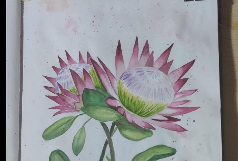
5. Painting Top Center: Alright, so we're now ready to do the center or the top part, top center portion
of the flower. This is what the end
result looks like for me after I have gone ahead
and painted all my petals. And here we go. I'm going to show
you a little bit of the mixing and how
much color I am using. I'm also keeping the
sheet that I watched on, onto the side over here
just so I can see how much or what the value looks
like once I do some mixing. So I'm taking just a tad bit
of color from the side here. And this is the
color that I get. So this might still be
a little bit too much. So I'm gonna get a
little bit more water, mix that in with
that little portion that I have activated. I think there should
be good enough. So we're going to start off much like we did
the bottom half. Tiny little lines that are going to paint this
whole area pretty much. We want to do the most
prominent bit in the front. And the background should
be a little bit more faded. So my easy technique
or what I'm thinking, the best approach for
this would be to dampen just the top portion
of our center here. So this way, when I'm
going in and adding color, It's seeping into the
water and giving us a light bloom into the area as opposed to us
just leaving it white. And I'm just going
to lightly dab some strokes in the
center here too. Alright, so here we go. So I'm just going to
start off lightly adding little strokes
at the top here. And because I'm adding this
color while it is damped, it's going to give me a soft effect in the
background there, which is what I want. I'm getting some color again. And this time I'm going to start from the bottom and I'm going to lightly sort of raise the sheet, dipping just a tiny tip
on the brush with water. I'm going back in and
adding my little strokes. Majority of this
looks to be very, very light, like
a very late move. And so I'm leaving a lot
of whitespace in-between. The darkest move
or purple on my, on this area should
be in this portion. And so I'm just going
to go back and add a couple more strokes to kinda really thick in this area up. Give us some nice,
beautiful contrast. And then towards this area
here we're gonna go very light are pretty much the
same sort of lightness. And my strokes are
gonna be a lot smaller. Because they're gonna be small little strokes that
kinda build up to almost like a
tent or a triangle. And I'm leaving a little
bit of space in-between. To show that buildup
between each layer. We are almost done this. So I'm literally only
using just the top tip of my of my brush to get color. You get a little bit of water
and then going right in and adding our little strokes. Now keep in mind
watercolor dries off late. And so as you progress
and you get this done, you'll notice it drying
and you'll notice exactly how light you're
getting things to be. And if you feel like it's
too late, don't worry. Remember I mentioned
previously it's better to start off lighter and then you can build up on it as opposed
to starting darker and then you can't really
swipe off stuff. Now some of the bottom area here has a little bit
of shadowy areas. So I'm just going to
drop in a couple of strokes here and there
to indicate shadow. And it also gives us, gives us that visual
idea that these are kind of linear little lines that are going in between. I'm just sporadically
link them here and there. These are actually the gaps. Notice I also have
whitespace in-between. Whitespace is always,
always great. I've mentioned this before. I'll mention it again. I like you can't I don t think you can hear enough about whitespaces, your friend. This is great. Leave
the whitespace. Don't paint it all in. If you paint everything in, it's just going to look
like one big blob. Hence, whitespace is
your friend always just getting a little bit of
that in the background and we are finished. That is that. So now let's tackle the leaves
6. Painting Leaves: So I can tell you right now, this portion is also
gonna be a lot of fun to do because we've got a little bit more rounded
shapes as opposed to the fine edges over here. So again, I'm gonna be using the number six and
the number four. Didn't quite, I
don't see the need to use the number eight still. But some people
might be painting this bigger and that
might be useful. And the zero still
haven't needed it as yet, although maybe for the tiny
crevices here, but we'll see. So again, we're
gonna be dampening. You have two options. You can dampen the area and
then going in with color or just painted in and then
smooth it out with water. It really depends on
what your preferences. So go with what you feel
works best for you. I'm going to show you
something a little bit. I'm going to introduce
something a little bit different where I am mixing some of that green first and
I'm watering it down. And then I'll use the
number four to get my darker shade of green
to go in and highlight, not highlight, but give it
more shadow, shadow fields. So getting this brush ready and this brush ready
with that green. Putting that to the
side and here we go. So here's one leaf. And I'm going to use the tip, press down and drag
across the whole span. This really helps us get the edges since we have a drawing that we're
following along with. And it's not
completely freestyle. And I push all the
color down to the base. Always push all the
color down to the base. So this can be, this can act as our layer where we just add water and then
go with the color. So now I'm getting
my dark shade. And while it is damp, I'm going to add
tiny little strokes, tiny little strokes. A few strokes, I should say. Just kind of outlining
the shape of the leaf and then just pulling all the
color down to the center. And that should be
good enough really, in my opinion, we're not
trying to go super realistic. But this should just
be enough to highlight certain dark and light areas
in your, in your leaf. And you want the darkest shade to happen at the center
where it meets the flower. In this way, you're adding
some depth to your painting. So we'll tackle the leaf
here at the bottom. Same technique. Feel free to add
in a little bit of that sienna if you
want to introduce more variety of greens in
your, your composition. And that is also helpful. And again, notice
how I am painting. I am really using the
tip and dragging it along the sheet to kind of give it to
get a full coverage. Little crevasses like what
I'm painting right now. If you feel it's too
challenging for you. You've got a zero or
you've got a four. Use the tinier brushes with
a nice fine pointed tip. So now this part that
I have just painted, I'm going in with my darker
shade and I'm just going to lightly using the
tip of my brush. Paint this section in
before this area dries off, especially, especially
the areas right, like outlining our petals. And this will give us like a shadow effect of the
petals over the leaves. If you don't know where
to place shadows, this is your best bet. Always under the petals that
we've painted. Best bet. And then just go in and you dab the color in these areas and immediately it'll give you
that nice shadow effect. Then just like we've
done previously, you want to smooth things out. If your area has dried up, just go in with that water brush is what I called it
and smoothing it out. And you're good. So that's
technically what we're doing. I'm gonna get a little bit
more of that darker green and add it at the
bottom here as well. So now I'm going in with this
green after it's dried up. So this would be called
a wet on dry technique. And you can leave it that way
if you like the hard edge, there's absolutely
nothing wrong with that. If you want to get a
nice smooth ER, effect, take the water brush, smoothing out the edge that
you've just laid down. And that should give you a smooth transition into the
light green just like so. So really and truly, it's a preference thing. Just want to mention one thing. Remember, in the beginning
I was talking about getting a nice darker color
just so you can offset the balance for your brighter colors
in your flower. This is what I'm talking about. You can see how most or most of the areas in my leaves
here are brighter. It's the bright green. So this is where mixing it with that color or
going over it with slightly darker version
of the umber mixed with green will be helpful if you really want your
flowers to pop. So yeah, keep that in mind
and run with what you feel works best for you and the composition and the
results that you want here. So for instance, I'm just
going to paint this one here. And I'll go in with
that darker color and I'll show you what I mean. So we're using the wet
on wet technique here. And it's the exact
same thing that we've done with the petals. The only difference is
instead of using just water, I'm using a green base and then going in
with a darker green. Now I'm mixing a little bit
more of that burnt brown, burnt umber, whatever
you're using. And I'm going in and dabbing it into this color and
allowing it to just bloom. And remember I also said, when you layer color, you get a darker result. I want that darker result. And so this is what
I'm doing to get it. I'm covering up all the areas. I'm kind of trying to
leave a little bit. The lighter green peaking out, but for majority of this leaf, I want it to be dark. And immediately you can see how this leaf stands out
from the leaf below. These are just things
to look out for as you're painting along
and doing your composition. Again, it's a preference thing
7. Layering Leaves & Stem: So two more things are left to are until we complete this. One is the stem, and the second thing is remember I was talking about
showing a little bit of folds are just doing
a little bit of extra additional layering
on top of our petals. Those are the two things. So for our stem, I would use a combination
of the green and the brown, just making it a little
bit more if in all of the green with a little bit
of more brown in it. So I'm just again
taking the color that I have previously mixed and I'm using my number
four because it's such a fabulous brush to
use for things like this. And I am painting in my stem. And I know there's a
second flower on here, but I would love to see you guys painted on your own based on what
I have shown you. And let's see how how much
muscle memory your hand has. And let's also make that
part of the project, the class project that
we have happening. A little bit of a challenge
thrown in with this class. So this is what that looks like. And now let's move on to adding some of that
brown into some of the pink and getting some little areas
highlighted over here. I have some brown here already. I need a little bit of pink
and I don't need too much, although I could use the remaining to finish
my second flower. So I'm just going
to drop in some there and then get some of
that brown mix that in. And that's like a perfect
little wine color. Love this color. And what we're doing, what I am doing, feel free to do
something different. I'm going to highlight
certain areas around these leaves are
not leaves, petals. They remind me of leaves though. And it's just going to indicate a slight curve in the petal. So for instance, this
petal right here, I'm just starting from here
and kind of going downward. And that's all I'm doing to it. So it almost looks like there's a little bit
of a fold happening there. That's what I'm
aiming for there. Then the one at the top here, where I'm going to just go in, smoothen it out a little bit, add a little bit of
a weird mix there. And so this is not a curve. So what I'm gonna
do is just take my water brush and smoothing
out the edge here. Once again, even for this part, you could absolutely start off with the water first and then
go in and drop the color. Or what I just did right
now, either works. I'm gonna go ahead and
do one more over here. This one, this time I
am dampening this area. You don't want water pooling. You can dampen a tad bit
more of the area so it doesn't quite stop abruptly. And then you're just adding
the color in the extreme, left or sorry, right, in my example here, this would be the extreme right. Then it gives you a nice
little smooth gradient effect. Going on. Perfect. You can go, if you
like the wet on dry. You can absolutely just sort of go and do exactly
what we've been doing. So highlighting in painting just the one side and adding a couple of strokes
without the blending, so without the
water brush effect. And I'm using this petal
again as an example here. This is also the
one where I left those nice little white
lines in between. And those are just really
reverse white lines because I painted it and just left
whitespace in-between really. You could leave it
that way if you like that stark effect. Really a preference. Allow your preferences
to show do not entirely copy what I'm doing because this is how you grow in your own
style of watercolor. We all have our own styles, we all have our own preferences. Embrace it. And one last one, and then we're
definitely calling it quits doing this one
at the bottom here. So I'm going to paint just the middle section
of this to kind of make it seem like this one
has a little bit of a fold. And this dark area
is within the fold. There we go. And that's it. That is all there is to it. So I hope you guys enjoyed this. Cannot wait to see
your projects. Please make sure you post them. And I'm also available
on social media. So if you wish to send me a direct message or
show me your work, if you posted it on
Instagram or Facebook. Please tag me. And again, as mentioned previously, all the items I have used
here are listed below. So feel free to check that out. That's it, guys. Thank
you so much for watching.
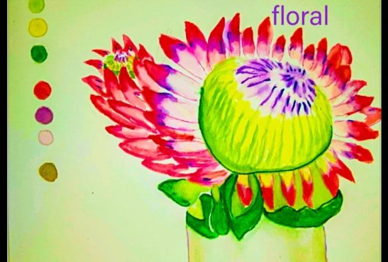
8. Protea Conclusion: So in conclusion guys, I hope you really enjoyed this lesson on
learning how to blend watercolor and mixed
watercolor to get some really startlingly
beautiful gradient effects in your florals. Please keep in mind these
are effects you can use pretty much in anything that you decide to paint
with watercolor. And they just help you grow
and build the more you do. The aspect to this lesson
was also the sketching part. If you use the base drawing, then that's great as well. But if you challenge yourself to do a little bit of a sketch, then good for you. If you enjoyed this lesson, please don't forget to hit the Follow button
and follow along as this is only part two to
my tropical floral series. There is more to come
and more fun to be had. Thank you so much
for choosing me to grow in your
watercolor journey.
 Clarice Gomes, Go with the Flow in Watercolour