Transcripts
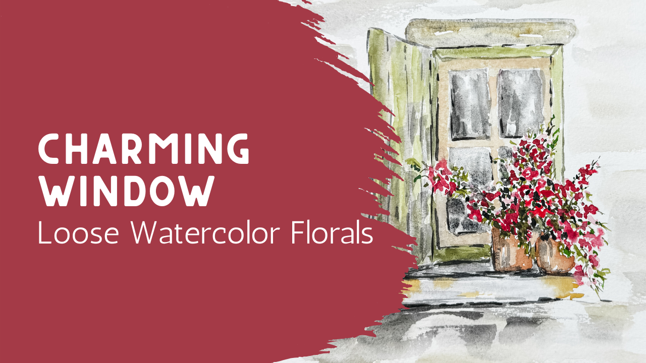
1. Welcome – Let’s Paint a Loose Windowsill: In today's class,
we're going to create a soft loose watercolor painting of a charming window and simple pots of flowers
resting along its sill. This will be a really
approachable piece and it's perfect if you're
just getting started with exploring loose watercolor
or if you're looking for something relaxing and enjoyable to paint
in one sitting. We'll focus on keeping
things light and simple. I'll show you how to suggest the structure of a window
without getting caught up in all the details and how to let your brush create soft natural
movement in the flowers. This isn't about painting
every line perfect. It's about learning how to
let the paint move a little, how to leave space where
it's needed to breathe, and how to build a
piece that feels calm and balanced
without overworking it. We'll also be working with a limited, gentle color palette. So everything stays
cohesive and soft. The flowers will be loose and expressive and the
background will stay light so that the whole piece can
feel airy and relaxed. You can absolutely make
this your own as we go. If your window looks
a little different or your flowers take
on their own shape. That's exactly what we want. Every piece will have
its own personality. And as we move
through the class, I'll guide you step by step
so that you can feel more confident and comfortable with each part before moving on. This painting is part of
a small collection of architectural pieces that will all work beautifully
on their own, but also come together as a really lovely set if you decide to take more
than one class. Let's get started and
enjoy the process. Grab your paints,
I'm ready to go.
2. Materials (Keep It Simple): Today, we're going to take our floral study and move it
into an architectural side. It's going to be so fun and you are going to
be able to do this. What I'm going to
provide for you is this window. It's
a little window. Maybe it's like a cottage
or a barn window, and it has a window sill
with a couple pots here. Everything is very straight
edges except for these pots, which are very simple. So you're going to be
able to print this out. And I want to tell you
that when you print, if you just print it
straight out of the PDF, it is going to print full size
to a full sheet of paper. That way you have options. If you want it to make this
on a great big piece of paper for a larger frame, you have that as an
option for printing. But in your printing settings, you you can shrink this
down to a smaller size. I printed this into a four
by six so that I could have some extra room to create a little bit of wall
space around it as well. So you can create this in
whatever sized piece of paper that you want to
have for your final piece. Now, I'm going to be painting
it on this cotton paper. This one is a eight
by eight size, and it is on a color block. So this paper block has glue
on all the different sides, and that's going to keep it nice and flat while it's drying. If you want to trace this, you can just trace it right onto whatever size
paper you want. You don't have to
do it on a square. You could do it on a rectangle, you can make it big, you
could make it small. You could even print it out and print it onto something very, very tiny, whatever size
you want for your frame. If you have carbon
paper like this, you put the shiny side
down onto your paper, and then you position
this on top of it, and then you can trace this as much as you want to as much
detail as you want to have. Maybe you just need
to have some of the angles corrected on here,
and that would be fine. That's all you needed to do. If you wanted to trace the whole thing, you
go ahead and do that. Maybe you don't need
to trace it at all, because if you take
a look at this, and if you have a ruler,
it's just rectangles. You can create a rectangle
here and then add out a little bit further and
add in this window sill, and you can follow along, maybe print this and follow it along so that you understand
your angles better. You can create this
shutter that's coming out here to on an angle, but it's pretty much
just straight edges. So whatever comfort level
you are at is how you're going to trace that or draw it directly onto
your piece of paper. The next thing
you're going to need is some watercolor paint, whether you have a palette with all the different tube
paints squeezed into it, or you have a can, a tin that has your
different paints in it, something like a small thing like this or a great big one. Whatever kind of
watercolor paint you have is going
to work for this. I want this to be really
accessible for you. You don't need to have
fancy or expensive supplies in order to be successful. You can just use the things
that you have on hand. You're going to need to
have water into a pitcher. I usually like to have two or even three
different containers. I have this cute one that my
kids gave me for Christmas, and then I also have just
a regular mason jar. That way, I have two
going with fresh water so that if one of my water gets
a little too muddy or dirty, I can always switch over and
start using another one. Or sometimes what I like
to do is use my back one to brush off and wash
off the bulk of the color, and then I use this front one to make sure that it's
completely clean. Of course, you're
going to want to have a couple paintbrushes. Whatever paint brushes you
have is going to work great. Again, your supplies are not actually as
important as practice. The thing that's
going to make you better is practice,
not fancy supplies. If you have the great
supplies, that's wonderful, but that's not going
to be the magic, that's not going to be what
makes your watercolor better. It actually is going to become how much practice you
have like playing piano. If you happen to have
access to a grand piano, that doesn't magically
make you a pianist. Just use the supplies you have, even if they're basic
elementary school supplies, those will also work. So I have two of my brushes
are my absolute favorites, and they're round
brushes from Princeton. They're the heritage line. I have both a size
eight and a size six. The size eight I use almost exclusively for
almost everything. I do also like to
have a size six. I prefer a larger brush, and I'm actually contemplating
getting the next size up because I think I might
actually enjoy having that. I also have just a small, this is just a simple detail
brush that I like to have. A rigor brush is often nice to have because it's a
little floppier and looser and I can get some nice
little whimsy details when I go into doing my painting of my flowers and my
vines and leaves. I do have this larger brush. This is a quill brush. It's just a synthetic quill. I like this one because I
get to add a lot of water to my paper if I'm
doing the outside edges and I want to have
some more water and a little bit more
atmospheric and general. If you have a larger brush,
that would be great. If you don't, that's also okay. You're going to be able to do it with the smaller brushes. With our painting
and our drawing, I do want to mention that we're going to be adding
flowers to this. I did provide you the details with the frame that goes
all the way around here. But most likely most of this is going to get filled
up with flowers, flowers coming out of here in a really soft
atmospheric loose style. When you are drawing
in your lines, go really light because we're probably going to be
putting flowers over the top of the center area and maybe even over
into this area, they might just be
branching out all over. So when you put your
lines down, really light. If you've put your lines down, go ahead and erase
some of them using a soft eraser to get rid of as much of your lines
so that you can see them. But that they're
not going to shine through once your
painting is done. Come back to the next lesson so we can get
started right away.
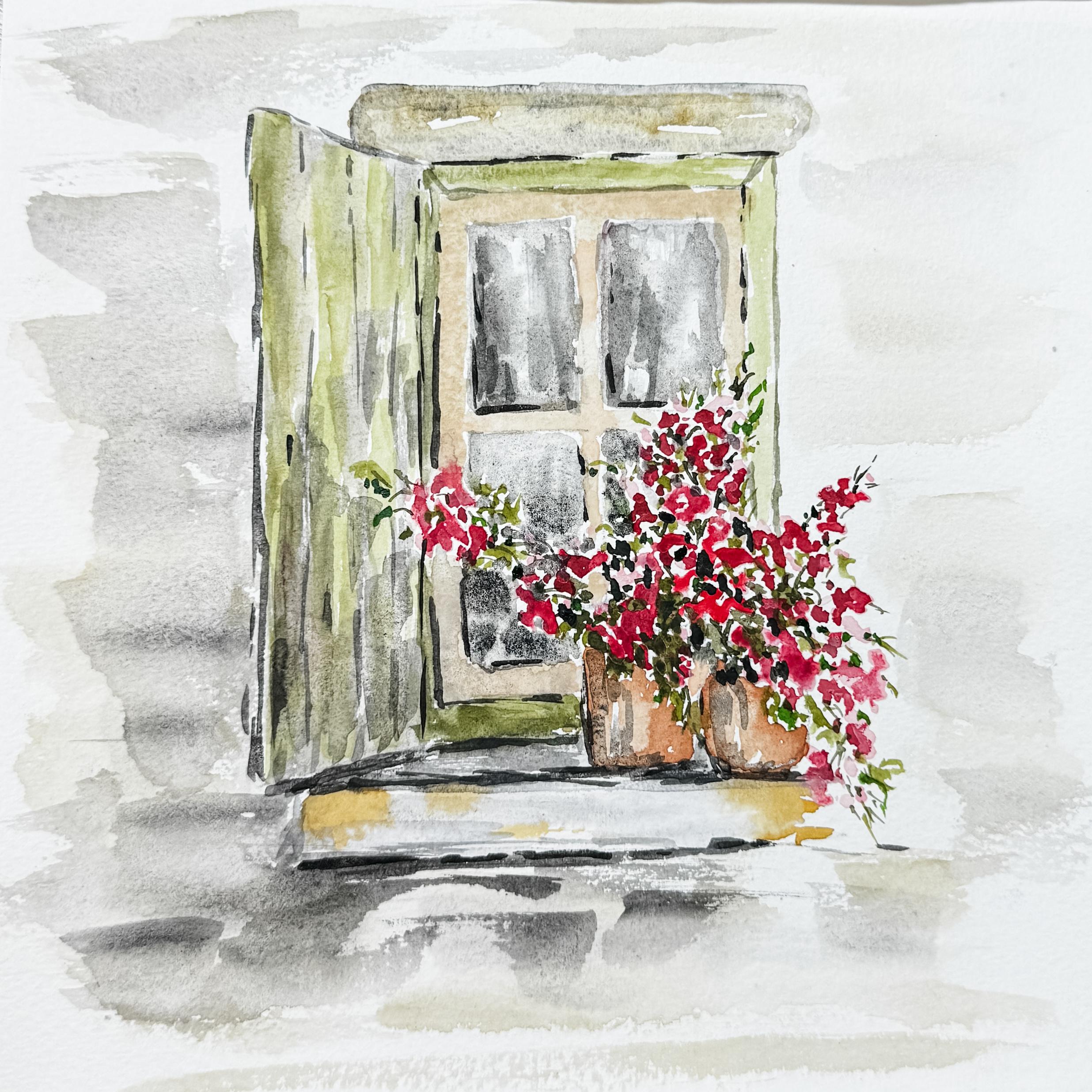
3. Mapping the Window Shape: Before I came back, I went
ahead and drew this out. I want you to see that
all I did in my lines are all wobbly I didn't try
to make this exact. I just kind of sketched it. I didn't even use a ruler. I just made some rectangles
because when I do my art, I like things to kind
of be imperfect. That's my style. I prefer things that have a little bit
more of that atmospheric, loose, abstract, casual feel. If you want yours to
be precise and exact, then get out a roller
or go ahead and trace yours so that it can
be more exact. That's fine. I just wanted to point out
that mine is wobbly and u not not precise or particular because
that's more my style. So you do yours the
way you would like to. So now that I have
that on there, I don't need that
drawing anymore. I kind of was using
that to copy. I have this eraser. It comes in a bag,
and it's filled with, like, a little eraser bits. I actually really love using this as my eraser
for my watercolor. I can just use it and lightly
rub over the whole paper. And you can see
that it's leaving off all these little crumbs. That's fine. We're just
going to brush that all off. But this way, I can just kind of loosely erase some of the darker lines that I
don't need to have on here. And then that way I
will not have them shine through in my final
project. So that's good enough. I'll brush that off. I can still see the lines, but
they're not real bold. Okay, so I think for
the first thing, we want to talk about color. I'm going to be adding in some pink flowers with some greens, but it's going to
be really soft. And not a specific flower. It's going to be more like
when you're looking at something and it's
a little blurry, a little faded out, a
little atmospheric. Yes, you're going to be able
to see that they're flowers. Maybe you don't know
exactly what kind of flowers they are,
but that's okay. We're also going to be
talking about shadows. My light my light source, I've decided is coming
from this direction. Everything on this side of the page is going
to be brighter. Crisper, whiter. Then as we move across, it's going to get darker
and more shadowy. Maybe some shadows on the
backside of these pots, maybe some shadows
underneath the window sill, maybe some shadows across
this shutter over here. So just so you know, you know, what kind of direction I'm
kind of facing my son. And so you need to decide
that on yours as well as to which direction your
son is going to be facing. Because now that we are on
the outside of a building, we definitely have
sun to contend with, and so we want to
make sure that we're considering where our sun is, where the highlights are,
and where the shadows are. Now, my outside edge is also going to have kind
of like a rustic, soft background of wall. So this is just going to we
can't see the whole building. We're just looking
at the window and the shutter and this
little window sill that has my pots on it. But the outside edge is going
to have some really soft, almost chippy paint feel where you can't
really tell exactly. Is it brick? Is it paint? Is it wood? It doesn't
really matter. It's just going to
have some softness around the outside edge. And then like I had
mentioned before, this area in the center is probably going
to have flowers in it with some vines and
some leaves and such. And so I need to be
able to cover this over with some flowers,
which is fine. So because of that, I
think what I'm going to do is actually add in my flowers as one of the first
things that I do because even those flowers might drip down over the edge of my pots. So I think I'm going
to actually add in the pink flowers first. And then around it, add in the paint
that's going to go on my window sill and the
paint that's going to go on my shutter and so that I can kind
of plan it all out. So my main colors that I've
decided on are going to be whites and creams and grays, pinks for the flowers, greens for the stems. Then I think I'm going
to do a soft sage color on this shutter and maybe even a green around the outside edge of the window sill of the
window frame itself. So that's kind of the concept of what we're going
with at this point. And you can kind of
decide for yourself what colors and direction you
want to make your window. Now, I'm going into a
rustic old style window, but maybe yours is more modern, and maybe this is a window
from outside your home. However you want to do it
is going to be perfect. Okay, so to get started, I am going to be using
my size eight brush, and I'm going to be
making up some red paint. I like my red paint, too, have a little mix of
different colors in there. I don't always like it to
be so bold and bright. So I did add a little bit of an orange color to it as well, but we're also going to
need to have a little bit of a lighter shade. And I have over here, it's almost like a white. But because my paintbrush
already had some pink on it, it's getting some little shades of pink going on in
there, which is fine. To create my pink flowers, I'm going to just make
some little dots. Little tiny dots like this. I'm starting with this
really light shade of pink because as you know, when you're painting with
flowers with watercolor, your lightest color should go on first and then
your darker color. I want to have this area really filled in densely
with some flowers. These are just little
clusters of flowers. Maybe these clusters of flowers come all the way
up into this area. Maybe they're growing up this
window sill like a trellis. And then maybe they're
coming out of this pot too. We're going to use the same
flower and maybe these are coming down and didn't
have anything to climb up, so they're climbing down this
area and wrapping around. See how we're not making
flowers, we're making dots. Maybe there's a couple that are trying to climb up the wall. We're just making some
little dots in here. Let's see. Should we bring
some all the way across? I think we might do that.
We're just going to create. This is just our first layer. So we'll be adding in
that darker pink shortly. Now, whenever I paint something
with a picture or a pot, I like to bring my
flowers over the edge. If this is my pot in real life, I would always be designing
flowers to come over the edge so that you don't necessarily see this
front edge of the pot. I'm going to also bring them
down here into the front. It's okay if I see
some of the edge, but I don't want to be seeing
all of that the whole, um, for the entire pot edge that is just going to be too much edge, and then it doesn't feel natural because usually when
you're looking at a pot, flowers don't just
grow straight up. They come over the
edge of that pot, and that's just going to make it look a little bit more natural. So now that I have the general idea of what's going on here, I've got a lot of water
and a lot of paint. If I came right in here right away and added in
my darker pink, so let's just show
you what I mean. If I just come in
here and added pink, this bright color, it's just going to bleed.
Look at that. You see how that just
bleeds right in and mixes. Now, there's nothing
wrong with that, but that's not really the
look that I'm looking for. I want to have a little
bit more definition. So I'm going to wait for
that first layer to dry just a little bit before I
come in with my darker reds. And mainly that's because
my white pink color, the really light
colored pink that I'm using was really watery. If I hadn't had so
much water in that, I could then come in here
right away with my reds, but I can't I have to wait for that to dry just a little bit. So while this is drying, I do want to talk to you about this white color that
I turned into pink. If you have some
kind of a palette like this where you have
all these different colors, it usually has some
kind of a white, and you can take a little dish, a little something
from your kitchen, a little plate, and mix this white in with one of
your other colors. Maybe you want to mix it
in with gray to soften it or mix it in with
a pink to soften it. You usually have some
kind of a white paint like that that you can use
if you have a palette. Otherwise, if you're
using two paints, sometimes you need to get quash. This one is a designer
white gouache, this one is a titanium
white opal or opaque. Then this is probably
my favorite. This is the one that I'm
going to use most frequently, which is buff titanium. This buff titanium
is so wonderful. It's just a natural
color and I love mixing it in with
my other colors and it really
softens everything. And then another one that's interesting is,
this is a gouache. This is called pale rose blush. What I'm going to be doing
because we're going to be making everything really
soft and natural, I'm going to be just squeezing
a little bit of that into this little pan
so that I have some of my softer colors ready to go
when I go to do my frames. But if you don't
have a whole bunch of different tubes
of different colors, just go ahead and
use your palette that you do have and the white that's in there and you're
going to be able to achieve that same kind of color
by just mixing it. Okay, so I have squeezed into this little dish
that I have a white, my buff titanium, and
also that rose color. It's like, it's just
called pale rose blush. And these two are
considered gouache, and this buff titanium is
actually considered watercolor. So those are the three that are inside of this little dish. And I'm going to add
some water to it to soften them up and
make them softer. But see how nice. That's just such
a nice, natural, almost like a creamy,
peachy color. That's going to come in handy. I might even mix that
in with something else. Then my white, this is gouache. And basically, gouache just
means that it's going to be watercolor that is more
opaque, not as transparent. And then of course,
my buff titanium, which I love is so creamy
and natural color. So again, I can mix
that in with pink and create such a beautiful color
or mix it in with green. So you'll be seeing use
buff titanium quite a bit. And if you're going to
be going out and buying one color from a tube, I think probably
buff titanium is the one that I would
be getting for myself. I'm going to be
putting that there. So that I can reach it. So now, this is starting
to dry and I can see that the puddles
aren't quite as high, but they're not quite ready yet. So I'm going to go ahead
and use a hair dryer. Actually, I have
a heat gun here, and I'm just going to hit it lightly because I
still want this wet. I just don't want it dripping, and this is just a
little bit too wet.
4. Painting the Soft Background: Okay, so I used that hair
dryer or the heat gun for about 20 seconds,
so not very long. I'm not trying to make it dry. I just didn't want
it as wet as it was. And so now using
this darker color, I'm just going to
come in and add it in here and there
and let it bleed. Let it blend in with the
other pink that I have there. Remembering that this
side is going to be my lightest side because of
where the sun is coming from. So yeah, I'm still going to
add in this darker color, but maybe I'll leave some of
it a little bit brighter. Whenever we're adding
in our watercolor, it's best to start with your lighter color and then
add in your darker color. So we're just going
to add in some of this darker pink red. This way, it gives us
a two tone effect, really kind of cool. Don't forget to come down in here over the edge of the pot. You can see how that
looks like flowers, but you can't really tell
what kind of flour they are. So we're just going to allow
that to start to dry now, and we're going to move on to the window sill or
the window itself. So I'm going to create
this creamy buff titanium, and I'm just going
to come around. And this inside edge, this window sill itself, I'm just going to come around and paint in that window sill. Now, because of the
way that I paint, I like things to be not precise. I like it to be a
little bit more rugged. I'm just going to come
in there and just barely don't even
touch those flowers, but I'm not going edge to
edge on the window sill, making sure that on
the window frame, making sure that every
line is perfect. I'm making it really,
really sketchy almost. Maybe even just add just
a little bit in there. I'm going to have to come
in here and add more green so I don't want to
get too carried away. But we'll add in So this
is my style of painting. You're going to have
your style of painting. If you like things a
little bit more precise, then you're going to want to
take a little bit more time and make sure that
it's just perfect. I on the other hand would
prefer things to have a little bit more of a
sketchy rustic feel, but that's just the
way I like to do it. So that's kind of the inside. I might even add in
just a little bit of this pinker color, this rose just here and there, just so that it has a
little two tone effect. It's nice to have some kind of a cloth that you can
dry off your brush. If you don't have a
cloth, use a paper towel. I prefer to have a cloth nearby that I can just throw that
into the wash at the end. So I think I like a
little bit down in here. All right. I think
I'm going to add a little bit of this white
down into this window sill. But I also need to pick up
the little bit of a gray, just a touch of gray and just drop that in there
too, kind of like a shadow. Could you even add in just a
tiny bit of brown or yellow? Just a softness,
just to kind of and then I'm going to come back to these windows because
the windows are actually going to be darker
because you're looking inside this house or barn and maybe there
are no lights on, so that's going to get dark, but I'm not ready
to add that in yet. I'm also paying attention to these flowers because I
want them to get dry. So then I can start
putting in my greens, but I'm not quite
ready to do that. Then same with these pots, I'm not ready to color those because if I started
to color those in, that would mess up these little flowers and I
don't want to do that. So I'm just letting that
dry a little bit more and finding spots where
I can do things that aren't going to mess that up. So now I have a mossy
green color here, and I think I'm just
going to kind of mix it a grab a little bit
of that buff titanium. And I'm going to add here's a a soft remember
this is a shutter. So I'm allowing my paint
brush to be kind of dry and allowing that to
just flow across my page. Now, while that's still wet, I'm going to come in
with my buff titanium and kind of add another
layer here and there. Just to fill in
some of that white. I don't need to fill
in the whole thing. I don't mind having
some white showing, but I also wanted to show
that maybe it was like chippy paint that was
coming off of the shutter. We'll be adding in
some shadows as well, so I might want to grab some of my gray that I have and just
Ooh, a little too much. It's okay. Just darkening it a little bit
with some shadows. The main thing is that
you're having fun. Yours is going to look
very different from mine. I'm going to draw a
little line down here at the bottom just to
really anchor that. And maybe this is where
the shadows are heaviest. I want you to just
be mainly having fun and seeing what happens, exploring your paints, seeing which colors work well
and best for you. Just have fun because that's really what
watercolor is all about. I never know how these things
are going to work out. Maybe I get to this
and at the end, I go, Yeah, yep, I could have done that different or I could have
done this different or maybe I don't
like that, whatever. That's fine. I don't have a problem with being a
little disappointed with my piece because you never know how this is all going to work out
until you're finished. And then maybe you just
have to paint it a second time to play around
with a little bit more. So this is kind of like an outside frame
and my window sill. But I want to darken
this area here. I have this darker
gray, almost a black. I'm just going to
create this angle. And if I lightly brush off my, my paintbrush is mostly dry. I'm just going to allow
this to kind of come in and become my shadow
because remember, my sun is coming from this side, so this area is going
to be mostly shadow. Just drying it up again. Allowing in here to be shadowy. Alright, and then I think
I'm going to put a little green maybe around this, too. Maybe on this side. And see why I didn't
care if my lines were straight or not because
I'm not filling it in. I'm not coloring it in
to make it perfect. I'm just saying, well, that's about where
that frame is. So I'm going to use that
green and add just a touch of that gray black to
make this area darker. We can kind of smooth it out. Again, my paintbrush is
now almost completely dry. I didn't dip it back into paint. I'm just using it to move that paint around and soften it. Soften the edges. Okay. And then this up here, it's almost more like the mantle that goes
above the window. And so I think I'm going
to make that kind of like a brown gray color.
Soften it again. Lots of water, a little
tiny bit of paint. It's okay to leave
some white spaces. Maybe add in just a touch
more of the darker color. I lost my front edge. See how you can't really
tell the definition between the sill and the front
edge of this window sill. So I'm going to draw a
line here and see if that helps give that definition. I can always come
back in after that's dry and work on that
a little bit more. Maybe I need a little a little
piece of hardware on here, almost like a hook or handle. Something like
that. I just very, very basic just to show
that it's a handle. My flowers are getting drier, but they're not
completely dry yet. So I could move on
to the outside, but I don't think I want to
because I think I want to add in my greens and finish off these pots and maybe
my window sills before I add my
outside edge, my wall. I'm going to use my heat gun and dry this off completely
and be right back. A
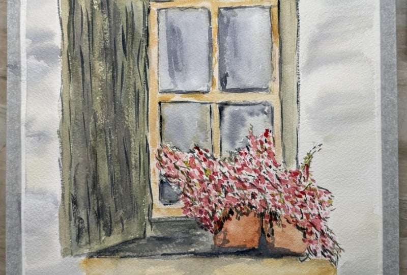
5. Adding Loose Florals: Okay, so I'm going to
pull out my rigger brush, and this one is like
a half inch rigger. I'm going to grab some of that green and maybe make
it a little bit darker so that I can make
some details in here. Now, I'm drawing again, we're not trying to create specific leaves,
specific flowers. We're just adding
in some details. But I want to be able to have some vines and things that
are coming up and out of these edges and see how you just add in some little details. So come into the
middle, little lines, little connecting lines in
between the little flowers, and maybe some are
bigger and deeper. We're just going to create
some little lines in between. That shows that these
are all connected, maybe even some
that come out just to really show that
this is a viny, branchy flower of some kind. We're going to be adding more. I'm just getting this
started just so that I can have a little clue as to
what's going on here. You how I add these that are
coming out because this is where the new buds are going to be adding
and coming from. Every single flower
does not need a vine because maybe you just can't see where
that's coming from, but just adding in enough to show some greens and that these are vinees and
flowers that are growing. We can always add in
more pink if we need to. How much that adds just
by doing that much, it's amazing how more
realistic this looks. Now, I'm filling in some of these whiter areas in
here to the center and just putting in a
little bit more dark green just to give it
a little bit of depth. I think what I'm going to do is also grab some lighter green. This just a mossy color
and just adding in right over into the centers a
little lighter green. You've taken my other classes, you know that I like to add in at least three different
color greens while I'm doing my painting because leaves and grasses and anything
that your flowers, trees, they all seem to have multiple different
shades of green, even though they're
from the same plant. And so it's good to add in
multiple different greens. Even bringing some down
here, making some bolder, putting them right on top of
or next to my bolder ones, my darker greens. It's all good. You can see, I'm not
really creating leaves, they're more just
little sketches, push that paint brush around. Now the reason I'm using my rigor brush is so
that I can't have a lot of control because I'm not trying to draw a specific leaf. I'm just pushing that paintbrush around and letting
it do its thing. A rigor brush is a
little challenging, but what it allows is for that freedom of I don't really
know what's gonna happen. Let's just see. Let's wait
and see what's gonna happen. Because it just it just
is. I just happens. You see, you don't
see specific leaves, you just see marks. Well, that's looking
kind of good. I like that. It's kind of
coming up out of the edge. Well, let's see. I'm
gonna try another green since was too dark. Let's try something else. Little brighter. Yeah.
This is a brighter green. I'm just going to add
little bits here and there. This is more like a forest
green or hunter green. I'm not going to add a
lot, but just a little bit just to show a third color. Because it's brighter, it really just a little
bit goes a long way. Those are climbing up there. Okay. Good. Fun.
Beautiful. We're gonna get to these pots
in a little bit. Um, I like my little
piece of hardware. I really like this top. I
like the way that works. It really looks like stone. I like how sketchy
and loose this is. We might have to
come back in here and add some more shadows, but we'll get around to that. So I'm going to go ahead and dry that so that I can move on to the next part. So we're going to
do these windows. What we're going to do is we're going to work on a wet on wet. I'm going to wet. This
is my size eight. I'm going to wet down this
window on the inside. I probably going to
do both of these. I just go around the flowers,
go around the edges. It doesn't have to be real
wet, just loosely wet. I'm going to grab
some of this gray. And maybe add in just
a touch of green. Not much, but I want
it to be really soft 'cause we're just looking into the
inside of this barn. And so I'm going to just
make this window darker. And I want you to
notice that I'm not filling it edge to edge, and all the way in the center, I'm allowing for a little bit of white space to be around. And the main reason
I'm doing that is it's creating almost like a, picked up a little too
much red on that one. Um, it's going to be creating
almost a reflection effect. Not too much water. Because I'm not
going edge to edge, I'm allowing some of
it to shine through, and that's going to create a reflection to allow it to
look like it's a window sill. And yeah, my flowers
are down in here. I can't get that
exact. That's okay. I'm going to rinse off my brush, dry it, and just kind of lightly go over some
of those white spots. Oh Now, I want to have some of this
be a little bit darker, just to create some
depth and shadow. I'm just going to use a
little bit more of my gray. I'm going to just add in
just a touch here and there. Also gives a nice effect for that shadow and the reflection. Drying off my paint brush again and I can just
smooth out some of it. See how it's not perfect. I even came up onto the edge of my glass of the frame
around the glass. Totally fine. Totally fine. Don't mind that at all. So now I'm going
to come in here. And now, this is
a little bit more difficult because I already
painted in this area, so I am trying to avoid
some of those flowers. But because we're not
going edge to edge, it also doesn't really matter. I'm just going to be filling
in some of that space with this brown gray color letting
that just bleed in there. Now, remembering where
my light source is, this is going to be probably my darkest area because my
lights coming over this way, and so this is going to become
one of my darkest windows. I'll come back over and
add in a little bit more. Just want to add in
some darkness in here. I can even kind of
come in between these leaves and kind
of go on top of them. It's all right. Because this is wet, it's really allowing
that to blend. You add in as much or as little
dark shadows as you want. Remember that it's going to dry
lighter than what you see. So when it's wet,
it's going to be the darker and then when it
gets dry, it gets lighter. Okay. I think I'm going to add in
making this nice and loose. I think I'm going to add in
some more shadows over here. Picking up some red, so got to be careful. If you feel like it's too dark, just add more water
onto your brush. Okay. I really want
to get to these pots. I think what I'm
going to do is use a I have this terracotta and I'm going to mix it
with some gold yellow. We're just going to add in
the general shape these pots. Again, because the way we're painting of being just really
loose and atmospheric, we don't have to have it
look exactly like a pot. It's a lot of just
letting our eye assume what it is because we have seen pots before coming out of flowers
coming out of pots, and so we're going to assume
that that's what that is without needing
a lot of detail. Now, I just brushed
off and cleaned off my paint brush and coming in with mostly just water and allowing that to
just blend again. Just pulling that color
across, softening it. You can leave in
some white spices.
6. Bringing the Piece Together: H. We're getting closer. I see there's something
going on here in the middle. So I either need to
add in more flowers in there or some more of the green or the shutter or
something because this little white spot right in there is a little distracting. So I think I'm going
to grab some of my green and put
that down in here, just as, like, a carryover
from this side over into here. And then I need to
grab some of this. Put some of that in here,
layer it up a little bit. And then I'm just
going to add in some just general darker
colors. Let that just blend. Now, I'm going to
need to make this a little darker to
create some shadow, but I want to wait
for that to dry. I might darken this area a little bit. Okay. So I think I'm going to use my larger brush and put
some of the outside edges. Now, if you wanted to
leave it like this and be done, you
absolutely could. You could make some shadows
and then just be like, This is it, this is done. But I want to add in
just a little bit of background to this. So I'm going to wet
down my paint brush, and I'm just going to just lightly brush it around
the outside edge. Now I'm certainly not trying to coat it with
water edge to edge. I'm just adding in a
little bit of water so that the paper gets
somewhat wet so that when I put down the other
paint on top of it, it blends a little bit. Okay, good enough. And now I have some paper, some color on my palette. Very little paint.
I cannot stress. This is just the littlest
amount of paint. Just allowing that to kind
of flow across the page. It's even a little dry at spots, and that's great. I love that. So I'm going to add a little
bit of the darker color. Maybe down here at the bottom. A little darker over here. Is my gray, using up what
I have on my palette. I don't want to have
too much water. Don't want to have too
much paint, a little bit. A little bit will go a long way. Makes it look like wall. I don't want to get too much over here
because this is where my lighter area is with
the sun shining on it. And this is my darker side. I think I want to get
a little closer to the wall to the shutter, just because that is
where my shadows are. I hope you're having fun. I hope you're painting along with me. If this first one
doesn't work out, go ahead and try it again. Learn from your first painting, figure out what you liked, what you didn't like,
what you would like to try differently the
next time you paint it, and just try it a second time. That's what I do. My paintings are not
perfect. That's for sure. So I just kind of
have fun doing it, and I'm hoping that
that's what you do too. Okay, so this isn't
completely dry, but dry enough. It's mostly dry. I'm going to use my size six, and I'm going to get some darker paint going so that I can add in
some more shadows. I want to make this line a
little bit more defined. So I'm going to kind of just run my almost like there's a
shadow going up behind this. This wall you see how
it's not perfect. It's just sketchy. That's what I'm going for. See how that defined it, almost made it look like
it's standing out there. I have this nice line
that's down here, and then I do want to have
just a little bit up here. This is where the
light is coming from, so I don't need to have a
lot, but just a little bit. Then maybe I'm going to
define these boards because I know that this is made
out of individual boards. I'm just going to draw in
some thin little lines. And then, again, right
along this edge. That's not perfect.
It's just an edge. We're gonna do the same
thing up here to define this green from that mantle
that goes above the window. It doesn't have to be
one continuous line. It can just be kind of dotted. I want to add something in here. I still have paint
on my paintbrush, but all I did is drip it dip it into my water and
then brushed it off, which took off the strong
part of the paint. But I still have some paint on here so that I
can pull it in, it's just a softer
amount and create that shadow on these pots. Okay. Amazing how
just a little bit of extra detail can
add so much to it. So just because I'm adding these details doesn't
mean yours needs it. You need to talk
to your painting. See what your painting needs
before you go and add it. Just because I'm doing it
doesn't mean yours does. So listen to your painting. What is your
painting asking for? What details are
important on yours? I feel like maybe that
was a little too strong, so I'm just gonna
come back in with a clean paint brush and just
kind of soften that edge. Not removing it, softening it. Okay. Add just a little bit more green to some
of these white spots. I don't mind the white spots, but maybe it just was
a little too white in there in here in the center. So I'll just add a little green. A little dark green. Adds a little depth. Okay, kind of fun. Really diff different thing from
what we're used to. So sometimes it's fun to just branch out
just a little bit. I just a small darker edge, but just using a green. Not be afraid to turn
your paper around. Be comfortable when
you're painting. Okay, I'm going to dry this
and take a look at it and come back and we'll
discuss the next steps.
7. Final Touches and Wrap Up: Congratulations. You
just finished the piece, and I hope you're
starting to feel a little bit more
comfortable letting your brush move and not worrying so much about
every little detail. This really is something
that builds over time. The more you paint this way, the more natural
it starts to feel. And you're going
to find yourself relaxing into it more
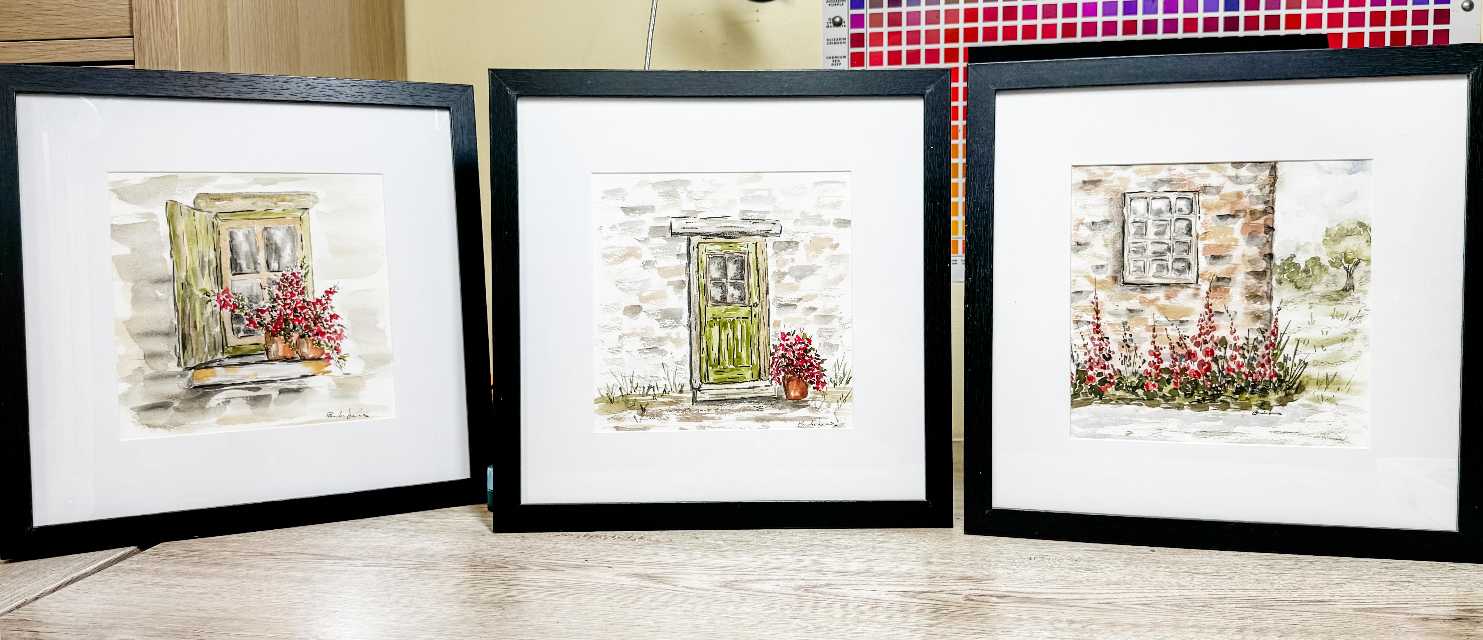
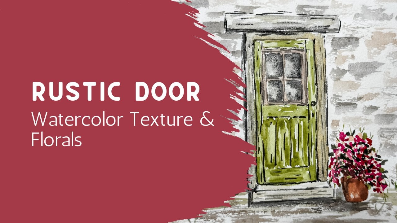
with each piece. If you enjoyed this one, a really nice next step
is the door painting. It has a similar feel, but adds just a little
bit more structure. So it's a great way
to keep building your confidence without
feeling like a big jump. If you keep going from there, you can actually create a set of three architectural
pieces that all work really beautifully
together when they're framed. Each one stands on its own, but seeing them as
a group is special. I'd love to see
what you created. So if you feel comfortable, please share your painting
in the project gallery. It doesn't need to be perfect. Every piece is part of the
process and it's always encouraging for others to see
different interpretations. If you enjoyed this class, follow me here and that'll let you know when the
next class is released. And leaving a quick review really helps other students find these lessons and feel more confident about
getting started. Today's window sill is one of those subjects that you
can keep coming back to again and again and make it feel completely
different each time, just by changing the colors, your flowers, or even how
loose you let your brush. Might want to try it again on a different day and notice
how much more relaxed it feels or how your shapes start to come together in
a little different way. That's really where
growth happens. It's just in those small
quiet repetitions. Thank you for painting
with me today. Keep it light,
keep it enjoyable, and I hope to see you
in the next class.
 Brenda Jones, Watercolor Artist & Teacher