Transcripts
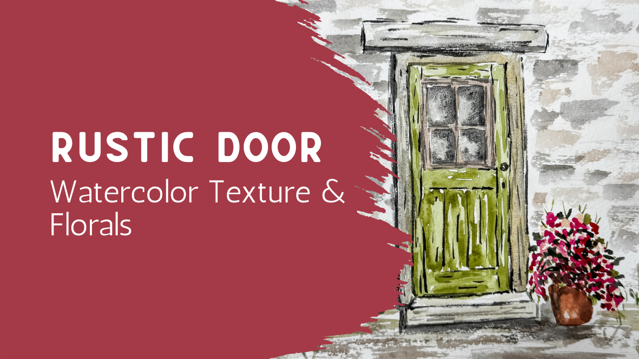
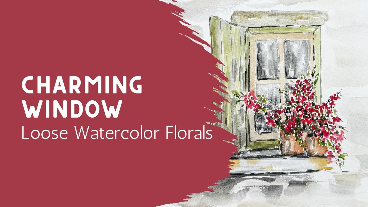
1. Welcome – Painting a Loose Watercolor Door: In this class, we're going to be painting a loose watercolor door with a soft textured wall and
a simple touch of florals. This piece is a
really nice balance between structure and softness. We'll be working with
the shape of a door and the surrounding
wall while keeping everything relaxed and
not overly detailed. I'll show you how to
suggest the lines and panels of the door without
making them feel stiff. And how to build a
gentle stone texture in the wall using loose layers and natural movement
in the paint. We'll also add a
small floral element to bring in a bit of color and warmth and to keep the overall piece feeling
light and inviting. As we go, I'll guide
you step by step, but you can always adjust
things to make it your own. Your lines don't
need to be perfect and your texture may turn
out a little different, and that's exactly what gives each painting its own character. By the end of today's class, you'll have a
finished piece that feels both structured and relaxed and something you can feel really good
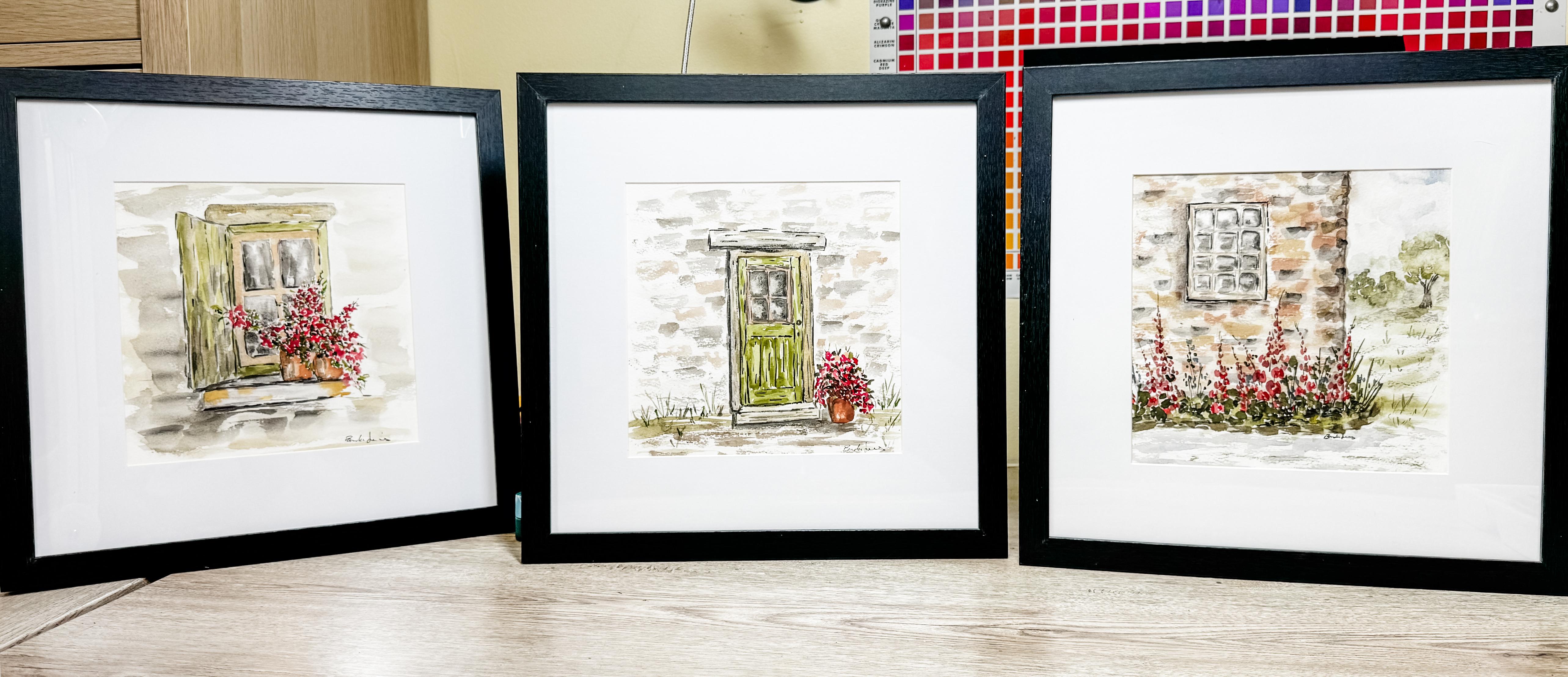
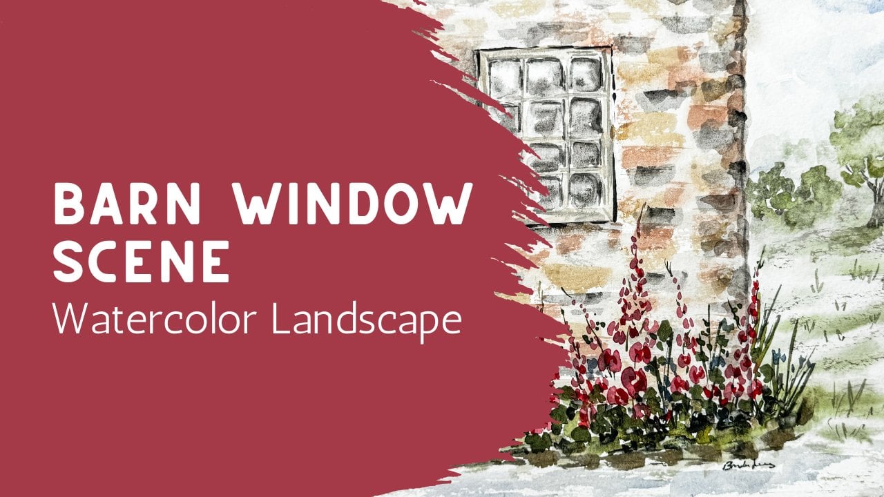
about displaying. If you enjoy this class, take a look for the
other two classes that are in the same series so that you can have a trio of architectural
watercolor paintings.
2. Materials (Simple Setup): Today, we're going to paint
an architectural piece and add in just a little bit of a flower over
here to the side. If you wanted to, you could add a trellis and add some more flowers to
one side or the other, or add baskets on both
sides with some flowers. However you want to make yours is the way that
it should be done. So I'm going to do
something similar to this, and what I've done
is I just used my carbon paper that we've
used in other classes, and I laid that down,
shiny side down. And then I laid
this on top of it, making sure that it was square and in line where I wanted it. Then I did a very
loose outline of just the door and the mantle
and just a general idea. I decided not to put in the stone work because I'm going to do that a
little bit differently. But here you can see with
the carbon copy paper, made the lines all over, I just use a simple
pencil to trace that out I wasn't really particular. I didn't try to get every
single line in here. I just did some basic outlining here just so that I
have the general sense. On my paper. So this is
my watercolor paper. This is a cold press. This is cotton. It's
an eight by eight. And when I printed out my paper, this is in your class project, you can find this document. And if you print it the way that it's been attached there, it will print full
size all the way, you know, all the
way the whole page, which might be too big for you. So if you're
painting it smaller, make sure you change the
size before you hit Print. This one is a four by six. I shrunk this down to a four
by six and printed it here. But I did give it
to you full size so that no matter
what size you need, you can print it to the size
that you want it to be. So I'm going to use this as a kind of a guide of
what I'm looking for, but I did do go ahead
and trace it on here. I have this eraser. This is like a
soft sided eraser. It has the fibers on the inside, and I'll just lightly go
across here and remove some of that excess, ink or the paint. I mean, excuse me, the carbon, just to remove some of it
so that when I go to paint, I'm not um having that show up all over my
paper when it's finished. So I like to lighten it by
erasing the paper, the carbon. So now it's nice and light, and I can go ahead
and get started. Of course, you're
going to need to have your watercolor paper, some water, your paints,
a couple brushes. Use whatever size brushes
you happen to have. I use the size eight
most of the time round, but I also have some extras
of other sizes available. And then because mine
is going to be very neutral and soft based, I am going to get out
some of my squash. I have a white titanium. I also have this squash, which is called
pale orange blush, which I might use. I'm not sure. But then I also have my
Daniel Smith buff titanium. Anytime I'm doing
architecture or something, this is going to be my go to. I pull this out quite a bit. I can mix this in with a
darker gray and soften it. I can mix it in with a
pink or blue or green, and it just is such
a beautiful thing. It actually softens it. So here you can see this is
my buff titanium, my white, and my light rose
pale rose, excuse me. So I'll be using those. I
have my spree bottle nearby, and I will wet these down
so that they're ready to go and whit down
my whole palette. If you don't have a
palette like this and what you have is
something similar to this, that's fine. This
will work as well. There is usually
a square in here that is on the whiter side and sometimes some other
colors that you can use to mix with it to create some
of these colors that I have. So just because you don't have these particular
shades, it's okay. You can just use the paints
that you already have and mix your colors so that they are similar to what you
are looking for. So I am going to be making
this into more of like an antique barn style with
maybe some bricks or, um, stonework around
the outside edge, you paint them
however you want to. You'll notice here I did not trace out all
these little stones, but if you would like
to go ahead and paint those individually, that's fine. I think I'm going to
be doing something a little bit
different with that. So that is up to you as to how
you would like to do that. Now that you have your
paints, your paper, your brushes, and some water, we are ready to get started.
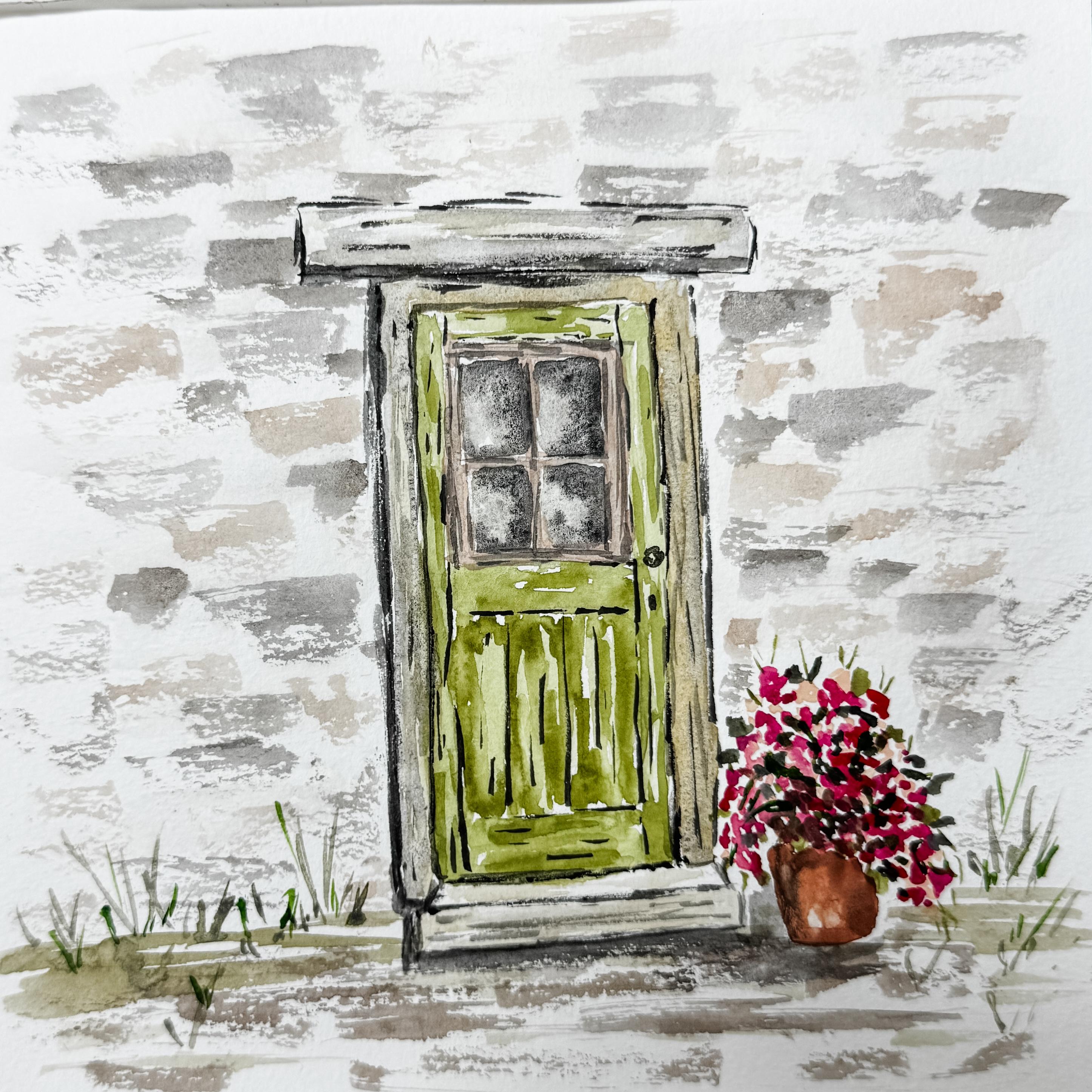
3. Sketching the Door Shape: We're ready to get started with our project here, our door. I take a look at this door, and I think I'm going to be making my door a shade of green. It'll be a very soft green, kind of have some brown
tones added into it. This mantel piece
that I have here is going to have some brown
in it and maybe some gray. I'll be using a lot of gray and brown for this
whole project, including the base and maybe
even a little bit of floor, and then I'll be putting around the edges more of
this brick stonework. I just don't think
I'm going to be painting each individual piece, but you do yours the
way you want to. And then I have a
little flower pot with some loose little
flowers up in here, which I'll also be adding. So we'll get to that as well. I think I'm going to
start with my door and my mantle and this piece, and then we'll start
adding in all the extras. So I'm going to clean
up this because I don't want my reds
mixing at this point. So I'm just going to push
that back a little bit, because I'm going to be ing
the browns and my grays, and I don't want to
mix in that red. So I'm just going
to push that back a little bit and spray
down this black. To get started, I want to
start right in with my door. As you look at the
door, you are going to have some wood frames, and so I want to make sure that my brush strokes go
along with the grain. They're going to go
up and down here, but then they're going to
go left to right for these, and I'll same with the mantle. I'll have my brush strokes
going left to right, but these I'll be
going vertically. And the centers of my windows are going
to be darker because I'm going to be saying
that I'm looking into a dark room where
I can't see in there, but I'll be adding
in some highlights so that you get a little bit of a reflection so that you see maybe that these are
glass windows in here. So let's get started. And I think I'm just going to
move these out of the way. I think what I'm
going to do is get started with using
my size eight. I want to start with that green. I do have a little bit
of green in there, and I think I'll just add
just a little bit more. It's mixing with
this buff titanium, which is really nice because that's making it nice and soft. I'm not sure what
that dried piece is. Nice and soft color
green, not too bright, not too bold because this is supposed to look like
an antique door. So I'm going to go
ahead and you can see my lines are all
wobbly and crooked. I did not use a ruler. I was not trying to make this perfect because that's my style. My style is much more relaxed
and casual and carefree. If you would like yours to
be straight and perfect, then you should get out
a ruler when you go to make these so that
they're more precise. But when I paint, mine is going to be always a little
bit more sketchy, a little bit more
loose and casual. So I'm just going to add
in just some lines here. I'm not filling it
in edge to edge. I'm just putting in
some of the lines of this vertical door here and this vertical panel
that's over on this side. I can lay this over here
next to this there we go. I think you can see
what I'm referring to. And you can see I'm just
creating this edge here. I'm going to rinse
off my paintbrush. Always have a rag
nearby where you can dry off your
paintbrush a little bit, then I'm just going
to come back in with just some clean water and
fill in some of this. It just creates a little
bit of a highlight because some of it's lighter
and some of it's darker. Then I'm going to go do
this left to right side. Here some of it's going to just have a
little bit darker edges. You can always come
back in and put in another layer if you want
to have another layer. See, this does go all
the way down so I wasn't sure when I was first painting if that goes
all the way down or not. It does. Part of it, when you're
adding in these extra layers, it makes it look a little
bit more like wood grain because you have
little definition or maybe that paint is chipping off a little bit here and there. Here I want to go this way. I rinse off my brush and
smooth it out a little bit. It's okay to leave white spaces. It actually helps quite a bit. So go ahead and leave
some white space. I'll add in another color on
top of that another layer, not another color,
but another layer. And then I want to put one here. I'm going to be also adding
in some panels here. So just really
sketchy, really loose. Um So that's going
to be the window, like the panes in there. So I think I'm going to
leave that the center area, and I'll come back to
that with another color. Let me add in some darker green. Really helps it look
like wood when you add in that little
bit more water, a little bit less water. Another layer. Okay. Soften it a little bit here and there because I cleaned
off my paintbrush, but it's wet and
my paint is wet, so now I can kind of come in
here and soften those edges. It's our general door. I'll do the frame
a different color, and I'll do the inside of the frame windows a
different color as well. Okay, but I want to wait
until that dries completely. And then we'll be
adding in some details. We'll get out some of this gray, and we can add in some date
details on top of this. This was just to get
the foundation going. So I think what I want
to do is actually take my paper towel and
clean up some of this green just so it
doesn't get over everything. Okay, so I think
what I'm going to do is come in with this gray. It's just a really soft gray. Maybe even add in just a
touch of a golden mustard, so I have a little variation, kind of like you would if you
were looking at stonework. The stone sometimes is
more gray and sometimes is more um brown, but I don't want that red, and it keeps seeping over here, so I want to
push that back. It's a little gray
color, a little brown. And then maybe even too much. This in there. As I kind of move my way across, it's going to get, you know, more into the golden colors and more into the gray colors. All right. I think I'm
going to start with this middle and do kind of like a edge to this door. This is kind of like
the door frame. And now, this is the step. So I'm just going to start it
with a really light color, and we're going to be
adding to that later. Same with up here
with this mantle. Just going to use
what's left over in my paint brush and just
add a little bit of that. I'm going to come in
with that gray that I made and add just a little
bit more here and there. Now, I don't have necessarily on this particular one that the sun is shining in one
particular direction. Maybe yours is, maybe you have an idea for the way
you want yours. But I'm just having it be the
sun is facing it directly. I don't have to worry
too much about shadows. If you ever get something that you feel like it's
just too much, you can just rinse
off your brush, dry it as best you can with your paper
towel or your cloth, and then just come back
over and just pick it up and move it away and
soften those edges. This is the fun part about watercolor is
depending on your style, you can be just really
kind of quick with it and casual and it doesn't
have to be real precise. It can just kind of be really
kind of fun and casual. I do want to have a
little front edge, so I'm going to make
a um a little line here a little little edge. To my step to define
that a little bit more. And also to define that base. I think I actually want
my smaller paint brush. I'm going to go to a
more of a detail brush, grab a little bit darker color to create that
base of that door. Okay. I am going to add in a little door knob
and a little key. And I'm going to add my edge
to my door over here in this darker gray
also along the top. It's not a perfect line. I'm just kind of
sketching it out there.
4. Building the Wall Texture: Yeah. Okay. You can see how
that's starting to form and starting to
look like a door. So I do want to wait
until this dries, this green dries a little
bit more before I go to add in the center because I want to be careful about that. But I think I'm going
to move over here and do a flower pot. That's
what I'm going to do. I'm going to use this
small detail brush, and I'm going to use some of this pink from the
the pale rose. I'm just going to be adding
in just a little bit here. They're not specific
flowers, they're more dots, dropping them over
the edge of the pot, putting some bigger spots, putting some lighter spots. Definitely drooping over
the edge of the pot because I want that edge
to be covered in flowers. Then maybe coming
up a little bit, it's coming towards the door. We're going to be adding some
darker red on top of this. If you did the
window sill class, then you know what
I'm talking about because we did the same
thing in that one. But this is just a
little different flower and I'm going to have it
come all the way down here, it's dropping all the way down. Now, because I didn't
use as much water, I can come in with
my red or my pink. I'm going to add in just a little bit into the
centers of some of those. They might be too wet
still. I have to wait. I think I'm going to wait. It's blending a
little bit too much. I have to wait for some
of that other pink, the lighter pink to finish
and I can't do the pot yet. I think now I can move back
over here and do the centers of the windows themselves. I'm going to use that gray. But I'm going to wet down. This is just the glass, the window panes themselves. Just enough. To have just a little bit of
water on here, not soaking. I don't want it
dripping in water. I want it just
enough water so that it'll flow without
being puddles of water. Anytime I see puddles,
I'm wiping them up. It's just enough water so that the paper is slightly damp. Then using some of that gray, I'm going to see how it's just slightly damp
and it's just moving it. It's just helping move that paint around just a little bit. Now, to create your reflection, you leave some spots
clear without any paint, and that's going to be
creating your reflection. We're going to be making
some spots darker. And you can always add in a second layer to
exaggerate that. So this is just the first layer. Okay? Then I can drip in dip into my darker color and add in just a little bit
of that darker paint. I'll move it around in a second. Now, I did say that I don't have a light source so that I'm just having it coming
straight on it, but I am keeping these bottom
left hand corners being my lightest spot that maybe
that's where the reflection is coming from and making
my other areas darker. Now, these again, this is just the window, the glass part. We'll be adding
the rest of it in a second after this is dry. And they don't have
to be straight edges. They can be jagged. You know, rt is really just
doesn't have to be perfect. Life is not perfect. Nature is not perfect. Art is not perfect. Just make it be fun. So I'm gonna let that go. I feel like maybe
this white spot right here in the center is
just a little too white. So my paintbrush is
clean and it's mostly dry and I'm just
going to come in here and just softly
bring it in there. It's still pretty white, but just softened
it a little bit. I'm going to come back
over here to my red. See, we're just bouncing around. I just kind of depends on the area that you
want to work on because you have to pay
attention to your paints. Yours is going to dry
differently than mine. So maybe yours was ready to go ahead and add in your
pinks right away. You should go ahead and do that. You have to pay attention to your painting and add it in
when it's ready on yours. Remember, these are just
dots that go on top. They're not a specific flower. We're not building we're not painting a draanium or something that's really,
really specific. It's just putting in a
couple of different reds, a couple of different
pinks, All right. Good enough. We'll be adding
in some green in a second. I'm not going to put
one on the other side. I just want it on the one side. May I get my detail brush back
out and add in some edges. I want to define this mantle. See how it's not a straight
edge? Doesn't matter. In fact, I'm trying not to
make it a straight edge. Trying to make it a
little bit jagged, because that's my style. You're going to make yours in your style and what
is pleasing to you. I want this to be a
little bit darker here. Just because you already
put a line there, if you want it darker, go ahead and go over
it a second time. Make it darker. Okay. And then what I want to do is add in some of the
lines, some of these. Oh, excuse me. I need
to add in some of the lines in my um door itself. So using the same
small detail brush, I'm going to add in
a little line there, and this little line
here that kind of goes all the way up. Okay. I want to add in a couple of little lines in here to
indicate that that's wood. And then there's lines in there to show that that's
a different panel. My paintbrush is just kind of dancing along the
top of the paper. I'm not pressing down.
I'm almost letting it just kind of dance
across the top. You can see I have not dipped
back into my paintbrush. I'm just using into my paint. I'm just using what the paint. That's all my paintbrush.
Very, very loose. Okay, I think this is
ready for some green. So I'm going to grab
some of this sage green. I'm going to put allow some green spikes to
come out of the tops. And maybe they're dripping
down over the edge. And then I go into the middle and I add in some
greens into the middle. Sometimes they're
bolder, sometimes they're smaller,
sometimes they're lines. Maybe I put in a
couple of leaves that are kind of, like, pushing out. I'm going to grab
some darker green. I do the same thing with
a second color green. Remember, this is not
a particular flower. We're not making
a specific kind. It's just a little pot with some greens
and flowers in it. All right. We'll get to
the pot in a minute. I'm going to dry this
off because I want to do these outlines
around the windows, but I can't do that
while it's still so wet. So I'm going to dry that off, and then we're going
to come in and do the pot and around the window. Okay, I'm going to
use my size six, and I'm going to use a little
bit of this terra cotta with a little bit of
my mustard color. Mix that up so that I
have a color for my pot, and my pot is just
very, very basic, just kind of like slanted side, flat bottom, slanted side. So I put in some color in here
that's bolder and darker, and then I'm going to clean off my paint brush a
little bit. Dry it. So now this is basically
a dry you know, I wet it. I dry off my paint on my cloth. So it's mostly dry, it's clean, and I'm just going
to bring in some of that paint that's already
there into the center. You can even leave some
white spots to show, um, a little highlight. Then if you want to add
in some darker spots, you can add in a
little darker accent. Gray little shadow. Very, very straightforward pot. Doesn't have to be fancy.
5. Adding Structure to the Door: Okay. And then I want to
do this window, so I'm going to use
some of this pink with just touch of this
terracotta and gray. We're going to put that
around this outside edge. This is the the wood part
that holds the glass in. Maybe it's been painted
white and it has a little bit of stain
coming through. We'll add another layer to that just like we
did down in here. When that starts to
dry a little bit, we'll add in a
little extra just to soften it and make
it feel connected. We're going to need
to add some ground and we're going to
need to add some wall. But I'm just waiting for that. That's not going to take long. I'm just going to pick
up some of that gray. You'll notice that
I use my palette an awful lot of just
whatever is in here. It doesn't have to be
brand new fresh paint. It can just be whatever
mixes in there. Now that that's starting
to dry a little bit, I can come in here and darken it just to make it a
little bit more antiqued. I hope you're having
fun just playing around and seeing what happens, see what you like, see what
you don't like. All right. I'm going to use that
same gray color. So I think what I'm going to do is move back over
to my size eight, mainly because I like
to use a size eight better than my smaller brush. And just kind of
mixing it up here, making it to the
color that I want. Now, this paint brush, it does have paint on it, but it's more on the dry side. It's not dripping. And
I'm going to lay it down kind of perpendicular or, like, along the edge
of the paint brush, I'm going to just
very gently touch the paint to create kind
of like a jagged edge. So let's see. It's almost dry. It's like a dry painting. I'm gonna go around that? I'm just creating a um Like a
driveway or a walkway area. I want to make this a
little bit darker around that pot. That's good. You can always come back in another time and make it a
second color if I need to. Now I want to start working on my wall because this door
is not just in space, it needs to have a wall. Now, over here on our drawing, if you wanted to trace
out or you wanted to make specific bricks
or stonework, you can go right
ahead and do that. I'm going to just wing it. I'm going to use
my grayer color, and I'm going to
make a little spot there, a little spot here, see how I'm just
making my bricks or my stonework random. It's stone, but I'm
not drawing it out. I'm making it very sketchy. Some are bigger,
some are smaller. They're all going
the same direction. Now, I space them out
so that I can come in with this terracotta color. Mix it in with my gray so
that I'm in the same family. Make sure it's not too wet, I'm going to do the same thing. But in the other spots as if this is a different
color, brick or stone. Again, some are bigger,
some are smaller. Some are next to each other. You can mix them again.
Add in some more. Maybe add more gray, maybe make it darker even. I don't know. It's up to you. This
is your painting. It doesn't have to
go edge to edge. This is just the illusion
of a stone wall. My paintbrush is almost dry. You can see that
it's almost dry. I almost have to scrub it. I think I want a little
bit more definition between my floor and my wall. I'm going to use some kind of a green because maybe there's a little green grass here. Maybe there's even
a little bit of green grass in the dirt. I need to use some
weed killer in there. Now, I think I might even draw
up some grasses this way. Not many, just a little bit. Just to give it some
vertical movement. Was that for me? Alexis stop. It doesn't have to be much, just a little bit
here and there. That's kind of fun. So I kind of want to
come back in here. I still need to do
something around this center because it's
feeling a little out of place. Just gonna kind of smear
this a little bit. This is just a wet brush. No paint on it. Just
kind of blending it. Not a lot of water,
just a little bit. My paintbrush gets too dry, I'll just dip back in. It just blends it a little bit. Those spots are already dry, so I'm just adding a
little water on top, just to soften those edges. Okay, so I want to come back
in here with my dark gray. Again, you're going
to have to do yours because maybe
yours doesn't need this. Just because I'm doing it
doesn't mean yours needs it. You need to listen
to your painting and do yours the
way you need to. You're going to have
used different colors. You're going to have
painted it differently. So just because I'm doing
this doesn't mean you should. You have to listen
to your painting. Well, I feel like mine
needs a little definition around this edge that is not standing away
from the wall enough. So I'm going to just add a little bit of shadow and
a little bit of depth. So especially on this side, make it a little bit bolder. Same with that step. Maybe even add a little
bit extra shadow on this behind it. Okay. I'm just using a different cream here just
to add in some extra color. Okay, kind of fun. Cool. What do you think? Does
it need anything? Tell how sketchy it is. Just very casual, has flowers, but you can't really tell
what kind of flowers. It's just a pot of
beautiful summer flowers with little step
going into this barn. Okay. So come back to the next
class where we wrap up this project and talk about
what's coming up next.
6. Final Details and Finishing Touches: You just finished your piece, and I hope you're
starting to feel a little bit more
comfortable working with structure while keeping
everything loose and relaxed. This one adds a little
bit more definition with a door and the
surrounding wall, but you can see
how it still comes together without needing
to control every detail. That balance between
structure and softness is something that
really develops over time. The more you paint, the easier it becomes to let
those two things work together instead of feeling like you have to
choose one or the other. You may even notice that your hand feels a little
bit more confident now, especially when it
comes to placing lines and letting the
texture form naturally. If you enjoyed this piece, there's another class
where we take this a bit further into a slightly
more open scene, adding a little
bit more space and atmosphere while still keeping
that same loose approach. If today's class was
a little challenging, you might enjoy the
Window sil class as well. It's a bit more relaxed and focuses on some of the basics, which can really be helpful
as you build your confidence. All three classes were
designed as a progression. I encourage you to
take all three. Each of these paintings
stand on their own, but they also work
really beautifully together as a set once
they're all finished. Each one is a fun way to see your progress build from
one piece to the next. I'd really love to
see what you created. So if you feel comfortable, please share your painting
in the Project Gallery. It's always so encouraging
to see how everyone's turns out and it can be really inspiring for
other students as well. You should also take
a few minutes and look through the other
projects from other students. It's a great way to
get new ideas and to see different interpretations
of the same subject. If you enjoy today's class, you can follow me here so that you get notified when
I share a new one. And leaving a quick
review really helps other students
find these classes, too. Thank you so much for
painting with me today. Keep it light,
keep it enjoyable, and I hope to see you
in another class.
 Brenda Jones, Watercolor Artist & Teacher