Transcripts
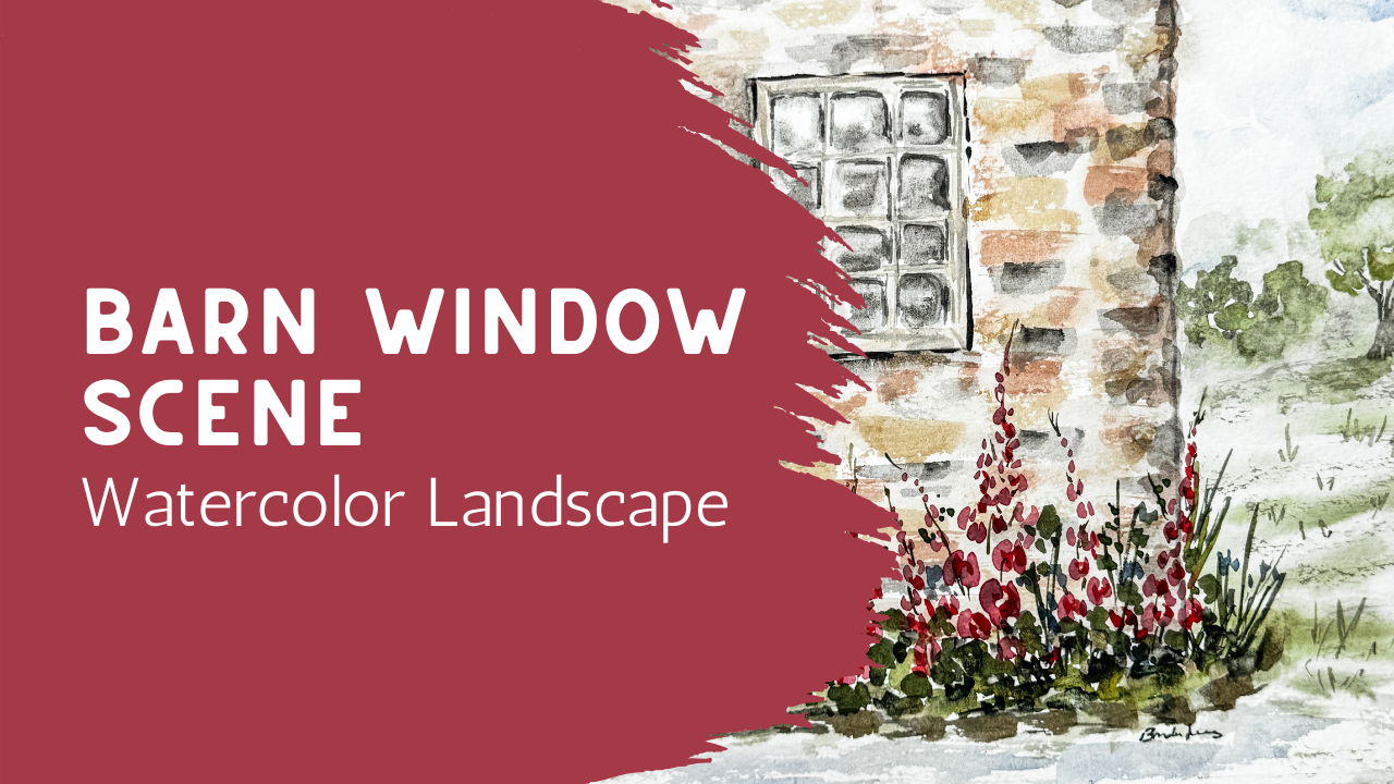
1. Welcome – Painting a Loose Barn Window Scene: In today's class,
we're going to paint a loose watercolor barn
with a simple window, soft laurels, and an open field extending off to the side. This piece brings together
both structure and atmosphere. We'll be working
with the shape of the wall and the window while also allowing space for the painting to feel
open and relaxed. I'll show you how to suggest the texture of the wall
in a loose way without getting cut up in all
the individual details and how to place the window, so it feels grounded
but still soft. We'll also add a few elements of florals to bring in the color and movement and then let that background open up
into a simple field, so the whole piece feels
light and balanced. This class is a
nice way to explore how to combine more
than one element into a composition while
still feeling like everything is approachable
and not overwhelming. As always, you can
adjust things as you go, your shapes, your spacing, and even the colors can shift, and that's exactly what gives your painting its
own personality. By the end of the
class, you'll have a finished piece that
feels both structured and airy and something that
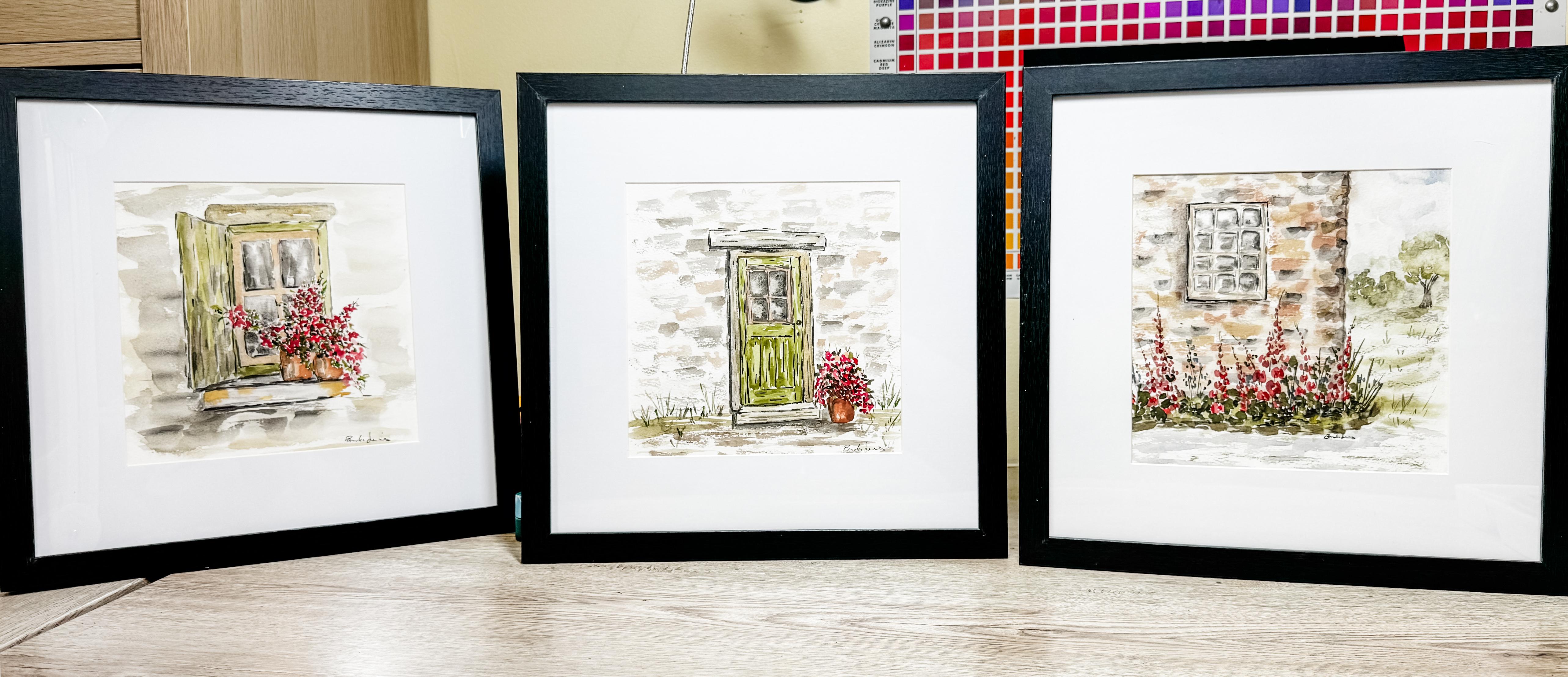
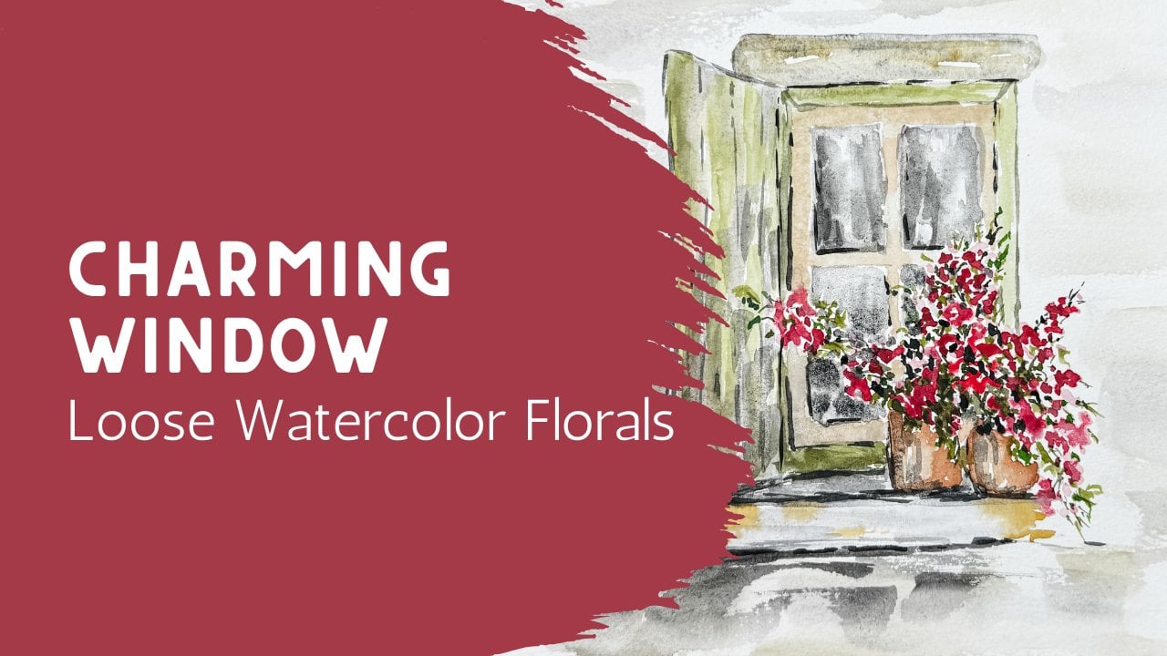
works beautifully on its own. You may also enjoy exploring the other two classes
in this collection. The three pieces make
a beautiful set.
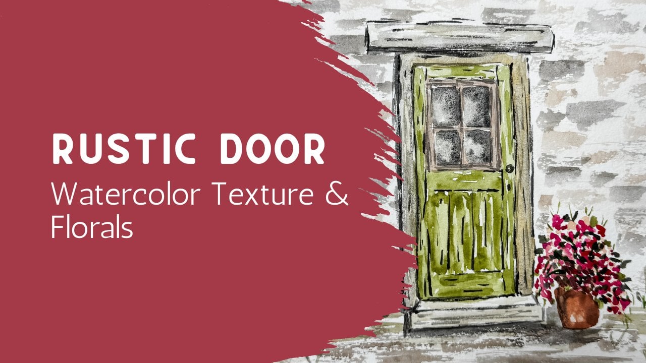
2. Materials (Keep It Simple): Okay. In today's class, we are going to be
painting more of a scene. In the last couple classes, we have been painting
more of a close up piece, but in today's it's going to be a little bit more of a scene. But it's again, very simple, very basic, very close up, and it's not a whole house,
it's not a whole barn. But today, we're going
to have some definition between having a
background back here. Our architectural piece with a window and then maybe
put in some flowers here. Now, I'm going to be
putting in some hollyhocks, maybe a couple a little
stone pathway here. Not sure if I'll
add that or not. But what I wanted
to show you is how very simple this can
be to just draw. This is available for you in the class project
that you can download. If you go to print this, it will print full size, much larger. That would be great if
you're trying to print it onto an 11 by eight
size piece of paper. But if you wanted it smaller, what I printed this one
at is a four by six. So in your settings
in your printer, you can size it and so I
scaled it down to a four by six because I want to put it onto this
eight by eight paper. Today I'm going to be
using this cotton eight by eight cold press
watercolor paint. I will have a couple of
different paint brushes. Again, I love to use my
size eight and my size six. I also have a couple extras, little bigger ones
and smaller ones depending on what I'm needing. Of course, I have my water. But the one that I want to highlight and which
we've been talking about these are my paints that
I use when I'm using architecture because I like to have things that are just a little bit on the
more subtle side. I do have a titanium white. This is a quash. This is a gouache that is
called pale Rose Blush, and then this one
is buff titanium, which is a watercolor
by Daniel Smith. This buff titanium is pretty much a must have on my palette. I always have this
one available. Then in here, you can see
this is my buff titanium and my blush and here's
a little bit of white. I don't use very much
of that and actually, I haven't really
used much at all. But I do use a little
bit of the other ones. One of the things about
this buff titanium is that you can mix it with any other color just to
mute it and soften it down. So if you wanted to
have your pinks, but you wanted to
have them softer, you could mix it
with buff titanium blue or black or
gray or the oranges, any color, you can mix that
and tone down your colors. So this, you can you
can print this out so, like I said, the size you want, and then you can use
your carbon copy and put the shiny
side down against your paper and figure
out where you want this and then trace out
as much as you want to. You know, do your lines
or your building. You're not going to be tracing out all these different
little flowers. That would be crazy.
That would be too much. You don't need to do that. I just have it here so that you could see what it is that
we're going to be painting. But you can also
just free hand this, or you can get out your ruler and draw it freehand
with a ruler. So I'm not going to be tracing this one today because
this is so simple, so basic, something that I
know you can do as well. So I am going to get out a
ruler straight edge so that I can show you how
I'm going to do this. So I'm going to just use a
pencil, just a regular pencil. And this is a mechanical pencil, but if you just had
a regular pencil, that would work too. So I want this edge of
the house of the barn. I think this is
going to be a barn to be about a third
of the way in. And it's just going
to come down. If this is the top of the paper, it's just going to come down maybe three quarters of the way. So about there, make
it kind of straight. And then I'm going to
just use my straight edge and just a light pencil and just mark it and have it
come down to about there. Now, my hollyhocks might
come up into this area, so it might come down
actually further than that, but I'm not exactly sure where my hollyhocks
are going to come in. Then this whole side is
all going to be wall, so my window is going to
be all the way over here, and then I'm going to put in a little background over there. Then this front
edge is going to be this little walkway and I don't need to draw in that because
we're going to paint that. I do want to add in this window. And so I'm going to put it
all the way over here along this edge and trying to
make it semi straight. Just make it as big
as you want to. I make it fairly large. And you can see, I'm not
trying to make this perfect. This is just, you know, kind of kind of right. You're gonna see
what I mean by that. See how I came down a little
bit too low? It's okay. Doesn't matter. I'm just
making it kind of square. So that's my outside frame. If I had I have a eraser here, I can kind of erase off that
spot there if I wanted to. And now I'm going to paint
in draw in this center line. So that's all I'm
going to use, I think, for my ruler because
now I'm going to just draw in these center areas. So I'm going to put in my frame. So it's a mired edge, so I'm just going to see how I don't even have
to have it be straight. It doesn't matter because
when we paint it, we're not trying to
make it straight. So my drawing doesn't
have to be straight. So there's my frame. And then I think
I want to put in this center line and then I'll put in the little
windows the glass. Things are going to go in there. Again, it doesn't
matter if it's straight because we're not doing
this for precision. Now, if that's going
to make you crazy, you use your ruler.
Totally fine. I understand that, you know, some people need to have
this be perfectly straight. That's fine. You go right ahead. I'm not going to do it that way. And that is all
I'm going to draw. I don't need anything
else. That's it. And then I'm going to go
ahead and just erase some of this just so that it's not so dark so that if it shows
through after painting on it. I don't want it to be too dark. But I can still see it,
and that's good enough.
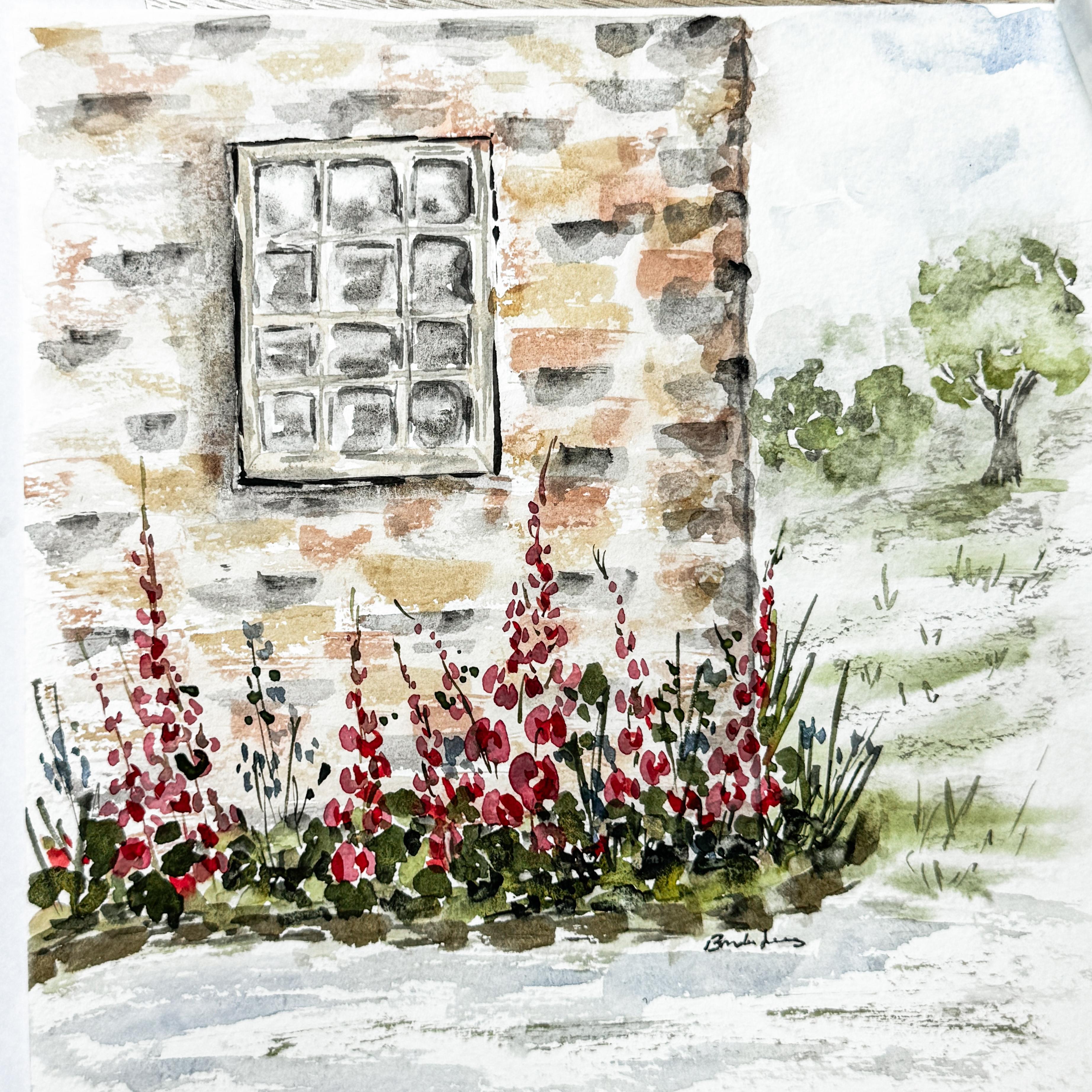
3. Placing the Wall and Window: So using my size
eight paint brush, I'm going to go ahead and
get this window done, and I'm going to be adding in
some of that buff titanium, maybe mixing it with a little
bit with that peachy color. I'm just going to
put in that frame. Again, remember, we
don't really care that it's not straight and
that it's not perfect. This is a very rustic
window, very rustic barn. So things aren't perfect,
and that's okay. We're going to come
back through and add in the details, but right now, I'm just going to be adding
in the basics for it. You can always come back in
and add in more details. It's another layer. And then the window itself, the glass part, it's
going to get very dark. Insides are going to be dark because the inside
of the barn is dark and then we're going to add some highlights
to those window, that glass so that it looks
like it has a reflection, but we can't do that
while we're working on the wood part around the outside edge,
otherwise it would bleed. So we're going to have
to wait for that to be dry before we move
on to the inside. But what I do want
to do is add in, I have a little
bit of this gray, and I want to just add in just a touch of that
here and there. To make this look like wood. Like, kind of like a wood grain. Little lines. Even
into the center. A really light touch. I'm not having to dip
back into my paint. Even add in that
little mitre corner that's a diagonal
if you want to. Okay. Really simple. We'll
add in more later, but I wanted to
get that started. I also want to add in this
edge of this building. So now I'm going to make
this as straight as I can, what I'm going to do is
I'm going to actually hold my paintbrush on there
and drag my hand down. Instead of trying to
move my paintbrush, I'm going to drag my hand down, which is going to allow
that to stay semi straight. Now, this is a size eight again. It could be smaller.
I could do smaller, but I don't need to. It's okay. It's also okay if it's
a little dragged. It doesn't matter. I'm going
to do something like that. Just so I have an edge so I
know about where I am at. So now I want to come back over here and start
working on this window again. I want this edge over
here to be a little bit darker because of where
the shadows are coming from. I'm thinking that the sun
is coming this direction, and so everything on the left hand side is
going to be a little bit darker and we'll be in shadow because the sun is
coming from the right. So I'll just add
just a little bit of darkness to some of these lines. And we'll still be
painting in that center. Okay, just to create a
little shadow. Okay. Now, what I'm going
to do is, um, do I want to paint
the flowers first or some of the brick? I think I'm going to do
some of the brick first. Using my gray I'm going to
soften it up using some water. I don't want my paintbrush
dripping wet I needs to be there's paint on it,
but it's not dripping. If I hold it upside down, I'm not in danger
of it dripping. And if I am, I have a cloth nearby that I can just
drop off some of that. I'm personally not going
to color in and paint each individual brick or stone
that makes up this wall. I am going to create
little spots like this. That indicate where
these stones are. See how some of them are longer, some of them are shorter. Dip back in, make them
sketchy, spread them around. We're going to come back
in with a second color. It's almost like dry painting because my paint brush is
almost completely dry. All right. And now
I'm going to choose another color which is
this browner color. It has a little bit of brown, it has a little bit of gold, has a little bit of that
gray mixed in with it. Again, it's wet, but
it's not dripping. And if it is, I drop it off. And then I come in
and I put again, laying my paintbrush
almost like along the edge of the paper itself so that I can add in
the second color. I'm just going to
be putting it in different spots where
the gray isn't. If it gets too dry, just drop back into your paint, and this is creating
that stonework effect. It's okay if it overlaps. Now, if you would
rather paint in each stone because that's the look you're going
for, you go right ahead. I might even add in another one. Um, maybe it's gonna have a little bit more
terracotta in it. Mix in all of this. Yours can be any color
you want it to be. Add this in or don't however you want yours to
look when it's finished. See how mine's almost
dry paint brush and so it's making it have white
spots that are spacing. Okay. What I'm going
to do is this is basically dry because I was using basically
a dry paintbrush. But now I have this paint brush that's wet, but it's clean. I'm just going to
come over it and just soften it slightly, rubbing over the whole wall. Not over the window,
just over the wall, just to soften it slightly. Bring those colors together. You're almost blurring out the paint and giving it a
little bit more background. Another way of thinking about that is that
you're adding in the grout that's in
between the stones. You're going to
avoid the window. You see how that's
creating a little bit of a softer edge in
between where the paper was So this line we're going to work on
still, but it's okay. It's good enough for
where it is for now. We'll come back to the window. That's gonna need a
little bit more detail. This line is gonna need a
little bit more detail. So I'm going to come
over here and work on this atmospheric background. I'm going to use this big
brush. This is a quill brush. This is a synthetic quill brush, and I'm just going to add just a little bit of
water to the background. I'm not trying to
make it perfect. I'm just adding a little
bit of water back there so that when I
add the other layers, it kind of blends a little bit. Using some greens, you can use whatever
color greens you want. I'm just going to add in just some softness of some
green. This is my grass. Maybe I'll put it on an angle. I can come in with
some darker colors. Put it in different spots. You maybe bring
some in the front. I'll be adding some green, some florals in there. Maybe I'm going to add in a
little bit of my some blue, that's too bright of a blue. I like that color,
but it's too bright, so I'm going to done it
down with some gray. I'm going to get some water. So it's just a little bit of
paint with lots of water. And we're going to put
some sky up in here. It's not perfect. I'm not going
to paint it edge to edge. I'm just putting in some color. If you have a paper towel, you can also dab
it and soften it. It makes some spots darker
and some spots lighter. Is going to bring it all the
way down here to the grass. Okay. I want to come over
here and work on this. Basically, I'm just softening that line that I had previously made that I didn't really like. I don't mind having it there. I just was a little too dark. I'm just softening it. Okay. We'll keep working
on that. I'm gonna come into this window and add a little bit more
definition to the edges. M. Move your paper around so
that you're comfortable. You don't need to leave
your paper one direction. I'm going to use a size six and I'm going to
fill in the windows. Just using clean water, going into just where
the window pane is, I'm just going to add a little
4. Building Soft Wall Texture: Water into each one of
these window panes. It doesn't have to
be a lot of water. A little bit of water
goes a long way. Some of these upfront have
a little bit more water, so I'm just going to pick
that up and move it around. Just go on edge to edge it's
damp and it's not complete. It's not perfect. It's just a little bit
of water in there. It's going to help when we go
to move this paint in here. I'm going to put
in this soft gray, but not through the whole thing. I'm going to leave
some areas plain where the water the paint can
seep up into those areas, and that's going to be
creating our reflection. It's okay that not
all of it's wet. We're going to move it around with paint cloth, paint brush. I'm just putting
some paint in here. Before it dries, I'm going to
come in with my paintbrush. It's kind of mostly dry and just kind of move
that around now. Doesn't have to go edge to edge. You can leave some white spots. That's going to be
your reflection. Okay. Once that dries, if you want to add a little bit more dark, you can add more of the gray
to darken it in some areas. That looks pretty cool. Okay, I want to dry
this off because I want to start putting
in my hollyhnks. Okay, I'm just
going to soften up these edges by making these
things just a little bit more organic around
the outside edge because I don't like that
line that I made there. So I'm just going to create
a couple more bricks in that area a little
bit more defined. Okay. All right. Time to start on
those hollyhocks. So we down this area,
put in that pink. Now, hollyhocks start
out bigger at the bottom and they get tinier
and tinier and tinier as they walk
as they go up. I'm going to start
with making some of these and I'm going to
be making a circle, a semicircle going
around on that side. I'm imagining that a line is coming up through the center, and I'm going to make a little
semicircle on that side, and they're bigger down
here at the bottom. Then we're going to
be getting smaller. And smaller and smaller
as we work our way up. We'll make another one. Just little sees on either side. Tiny, tiny, tiny. This is another one in here. Sometimes they branch off. Leave me another one
that goes way up high because some of
those are really tall. Little cluster of them here. I want one branching off the edge. All right. Grab my rigor, dip
into my greens. I've got this mossy green
that I have been using. This line is going to come up through and go even
up higher. Come down. We'll add in some
greenery in a minute, some leaves and such. This is just to
create that stem. It's okay if it goes right through that pink,
it's totally fine. It can even branch
off like that. You have to remember
this is a background, it's the foreground,
but it's light. We're not trying
to make a specific so that we can see each
and every single flower. I go up this way, branch them off a little
bit here and there. I go up high. All right. Maybe we'll add in
something else over here. Add some grasses. Maybe they'll have some flowers, maybe we'll add some little
blue flowers in there. Not sure yet, add in
some shorter things. Little grasses, angles
taller, shorter. Okay. Pick up my size six again. And now I want to
create the leaves. My leaves for a
hollyhock are just going to be jagged, but they're wide. Kind of like. We don't have to have something
that's perfect, but it can still look
really kind of cool. You put some up in there,
put some over there, put some facing downward. They're kind of like
a shape of a hand, if you think of it kind of
like that wide, like that. Maybe even some up in here. I don't want to have too many, but you do need to have
enough to anchor it. I'm gonna grab another
green darker green. Just to add in some depth. And then I want a lighter green. Make a little wildflower area. U. Maybe this is part
grass, I don't know. But got to fill in
that foundation. I think I want grab my little detail brush and come back in with that
blue that we made for up here. I'm going to add in some
little dots of blue. Just a different flower,
just a little wildflower, some low, some high. Very subtle. Okay. Do you want to have this
little stone pathway that kind of comes
around the edge? Let that kind of go
off into the distance. And then I want to have a
little bit of pathway here. I used the same color. I mean, it was the blue, but now it's just a path. That's one way of keeping
everything cohesive is when you are able to use the same
color in multiple spots. I'm just going to add a
little darker shadow here or base All right.
That's kind of fun. Might come back in here. Not
sure yet. Not quite done. Kind of like the way
my window is looking. I think it's gonna need a
little bit more definition. Maybe it needs this little
tree and this little bush. So we'll do that. So long here, this is the horizon line,
kind of like this.
5. Adding Florals and Movement: I'm just going to add
just a little bush. Maybe another one here. You can consider these things
kind of like abstract. They don't have to
look like a bush. It can just be a little blob. I'm going to put a
little tree again, just moving that
paintbrush around, making a little blobby spot. Add a second color green. Branching off. Not the best tree I've ever done, but that's okay. I'm just trying to get
something going on there. It's in the background.
It's not a foreground tree. This is just a background tree. Am I going to even take
while this is still wet? I can dab up some of that. Then I can put a little
little tree branch. And I'm kind of
going really sketchy because I'm not trying to
make this a foreground tree. Trying to actually
make this kind of blurt off into
the background. The lighter, the sketchier. You can take your paper towel
and dab it to soften it. I'm going to add just
a little base to it. Right. Again, this is just water, kind of like what we did over
here on the on the brick. I'm just adding more water to it to soften the
whole thing up. Make it a little
bit more blurry. Your paper towel. It's in the background. It's back there. M There we go. Well, I think my window just needs a little
bit more definition. So I'm just going to come along and outline some of
these edges of the window. Not everything needs definition, but some of it does. You need to have some
areas darker than others. Again, your painting
may not need it. You have to decide what your
painting needs because we're painting different
different colors, different amounts of paint. Yours may not need that. Mine does. Listen to your painting. What is your painting needing? I needs a little shadow. So that's lots of water, just a little bit of paint
to create this shadow. I don't like that up there,
so I'll just dab that off. Wet that and dab it. Lots of water, just a
little bit of paint. Drag it away to create a shadow. Can always wet it, dab it, move that shadow around. Okay. I feel like this is okay, but it needs just a
little bit more depth. I'm going to come in
with a little bit more red and just add in just a little bit more
depth here and there with some of the Holyhk Just
to add another dimension. Not everyone needs it, just
a little bit here and there. Okay. And then I also want to add in a
little bit more green. Basically, just to
anchor in some of that. I don't mind having some
white spots showing, but I want to anchor
some of that also. Make it a little deeper. A
little darker down in here into the centers because this
would be the luscious part. This would be the area that has the most amount of green
is at the base here. They're spreading that
around very dark green. So this is where you
just kind of refine. You add. You can't
really take much away, but you can take a
little bit away. But you can just add some
more like that blue. So I'm just going to add
just a touch more blue. I like the fact that I
have that blue gray here, and then I have the blue
gray in the flowers, and then I have the blue
gray up there in my sky. I use my little paint brush, my little detail brush and just add in little
grasses here and there. Not much, just little
bits here and there. On a V. If you go one direction,
you go the other way. Make some higher, some lower. Bigger when you get down
to the bottom here. But again, using
your paper towel, if it's too much, just dab it. Soften it. That's kind of fun. I think I'm going to dark in this area too. Just to add depth, distance. I love having a paper towel
with me because you never know if you put something down and then
you're not sure about it, you can just kind of soften it. There. That's better. I have this I hope you're having fun. Most importantly, just relax, see what happens. Have fun. If it doesn't turn
out, try it again. Because that's what
this is all about. It's just practice.
Not every art piece has to be a masterpiece. Not every single art piece
needs to go into a frame. Sometimes it's just for fun. Casual, relaxed. Learning something,
experimenting, playing. You know, I don't
think we play enough in our lives these days. Everything has to be so serious. Everything has to
be picture worthy, social media worthy, something we can post and
share and brag about. When in reality, art is
really for yourself. And if it's just for
fun, have a good time. I'm really unhappy
about this line that I made here. Wished
I hadn't done that. If you've watched through here yourself before you
went and did it, don't make that mistake. Don't make this line. I'm trying to fix it by adding
in some disguising stones. But it's kind of hard to do. I've disguised it somewhat. A little concerned
if I do too much, I'm going to make it worse. I'm just gonna pull some
of that dark color across. So it looks intentional. Okay, I'm gonna call it done. Gonna sign it. Come back to the next lesson, and we're
gonna talk about this.
6. Opening the Field and Final Touches: Just finished your barn and I hope you're starting
to feel a little bit more comfortable bringing
multiple elements together while still keeping your painting loose and relaxed. This one has a little
bit more openness to it, especially with that field
extending off to the side, that space can feel a
little uncertain at first. But learning to let areas
stay simple and not overfilled is a big part
of developing this style. If you've taken
all three classes, you've now worked
with structure, texture, and more
open composition. Those are all pieces that really start to come together
the more you practice. Painting all three pieces
in this collection, you probably see how each one builds your confidence in
a slightly different way. If this is your first class, you can always explore
the others as well and approach them in whatever order
feels comfortable to you. I'd really love to
see what you created. So if you feel comfortable, please share your painting
in the project gallery. It's always so
encouraging to see how different
everyone's turns out, and it can also be
really inspiring for all the students to see the
difference in approach. You can also take a few minutes to look through the
other projects. It's a great way to see interpretations and pick up
new ideas along the way. If you enjoy today's class, you can follow me
here so that you get notified when I
share a new class and leaving a quick
review really helps other students find
these classes as well. Thank you for painting
with me today. Keep it light,
keep it enjoyable, and I hope to see you in
another class where we explore more watercolor in
a fun and expressive way.
 Brenda Jones, Watercolor Artist & Teacher