Transcripts
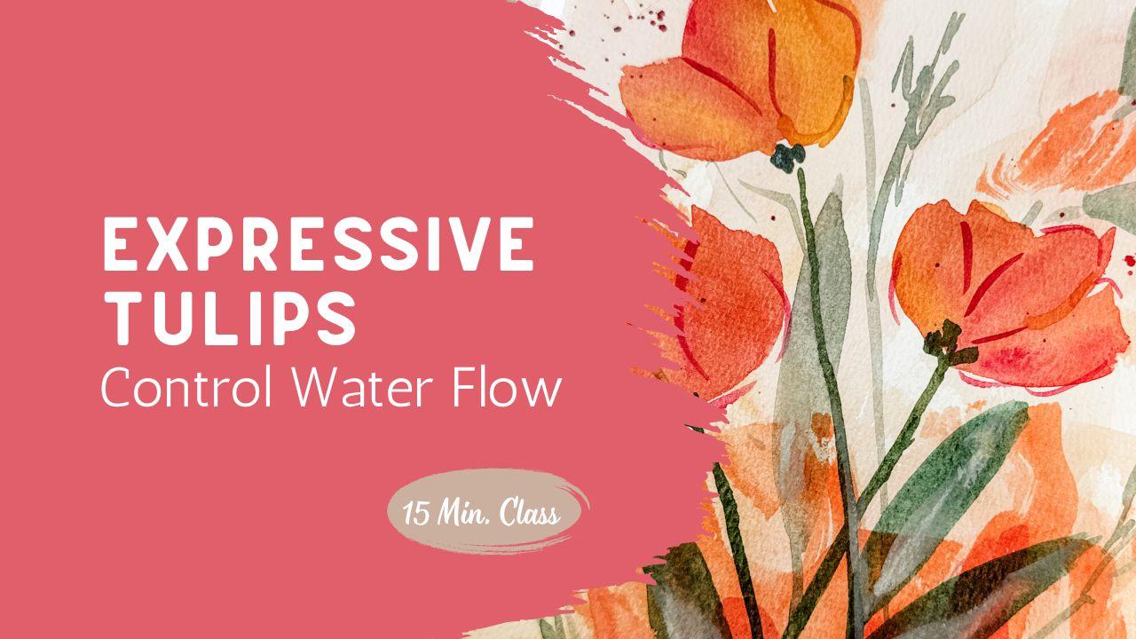
1. Painting Loose Tulips: A Relaxed Introduction: In this class, we're
going to paint a loose expressive tulip
arrangement using simple shapes, soft layers, and a relaxed
approach to composition. This is not about getting it perfect or following
exact steps. Instead, I'm going to
paint this piece all the way through while talking you through my
decisions as I go. You'll see how I
place my flowers, how I build the background, and how I decide when to
stop before overworking. You take in my earlier tulip
or watercolor classes, this is a great next step
where you can start to loosen up and trust your
brush a little more. If you're brand new, you can
absolutely follow along. Just keep it simple and focus on the overall shapes
rather than the details. As you watch, I encourage you to start thinking
about your own version. You can change the colors,
adjust the placement, or even just take the idea in a completely
different direction. This is a chance to
begin to develop your own style in a very
relaxed and approachable way. When you're ready, grab your supplies and let's
start painting together. I can't wait to see
what you've designed.
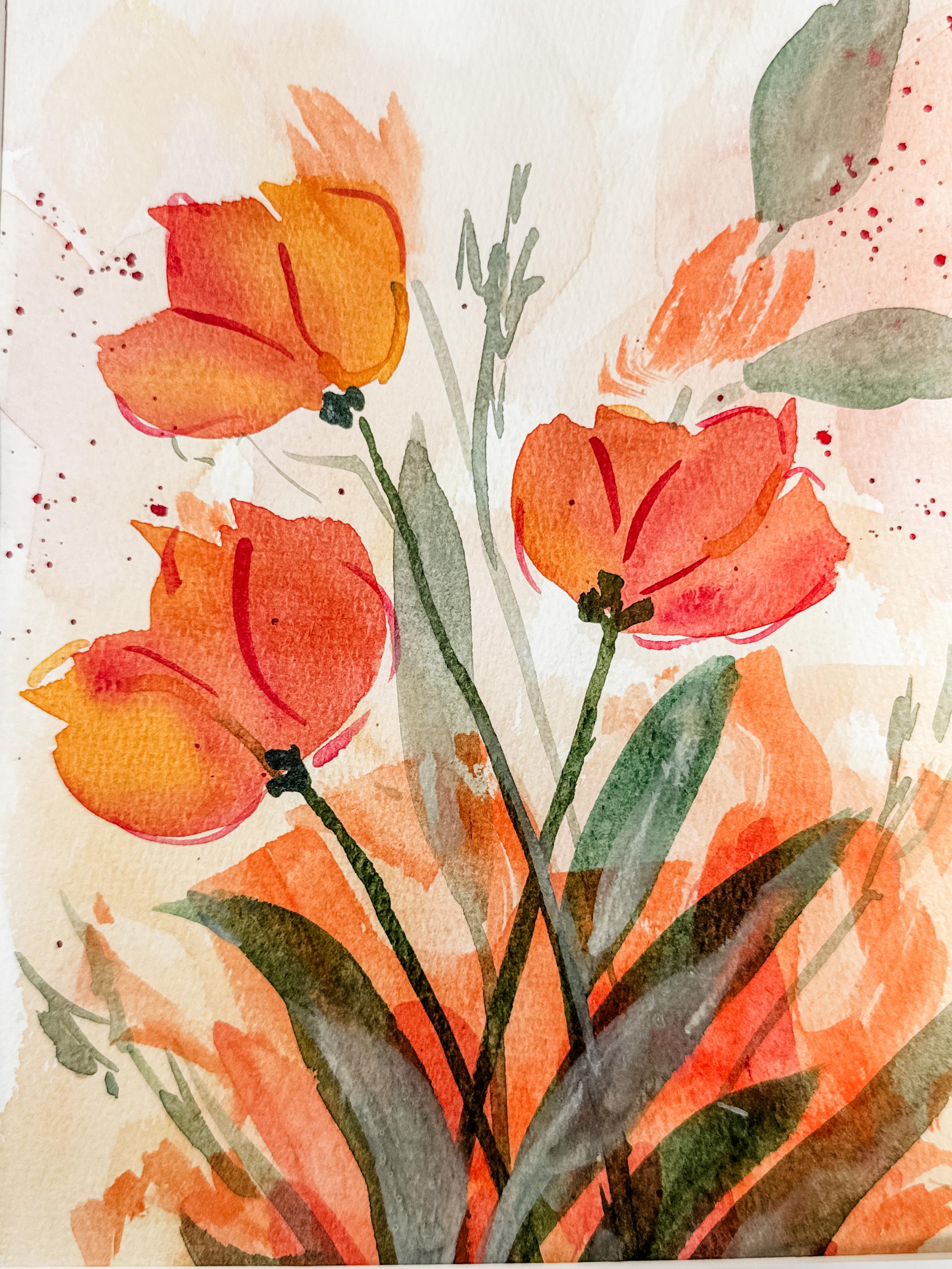
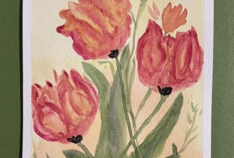
2. Expressive Tulip Painting: Full Process: This project, I'm going to use a cotton top watercolor
pad, Cold Press. Basically, what that means
is that the top layer of the paper is 100% cotton, but then the next layer
down is your standard pulp, which makes the paper
less expensive, and I kind of like that. I did tape this paper down to my desk so that
it wouldn't warp. I highly recommend that
you do that as well. I'm going to use the
largest brush I have, which is a 1 " flat brush. If you don't have that, use the largest round
brush that you own. I need you to use lots of water. Your pigment for this
background is going to be mainly water with just
a little tiny bit of paint added into it. Your paint should be
extremely transparent, almost like light tea. Now when you paint, I want you
to choose your own colors. I want you to choose
your own style. But I'm going to show
you what I did for mine. I dipped my very wet paint brush into water and then
into some watery paint. Then I used some X marks and just made Xs across
the whole page, which made it go really
blending and random. I used yellows and
oranges and brown. I even blended them up a little bit to just
add some extra depth. After it was dry, I added on a couple extra layers
and then dried it again and then went back into the center area and
put in a darker color. Using the side of my brush, using the edge of my brush, using the flat part,
making random shapes. I'm not making leaves, I'm not making an item. I'm just putting down some
paint onto the paper. You can use a paper
towel or a cloth and dab it up if you feel like you've got too much
paint going on there. Now you're going to want that to dry completely
before you move on. Either use a hair dryer or a heating tool or go get a cup of tea and
wait for it to dry. I did make some extra flowers up top using that same color. Now, I decided to add in a little bit of some
pink or some red color here just to add another depth of color.
You don't need to do this. It's just something
that I chose to do. I really want you to feel expressive and do what
it is that you want. Layer and then dry, layer and then dry. And because this week
is all about tulips, I'm going to be painting some
very casual tulips here. Basically just three strokes, a petal to the left,
a petal to the right, and then a petal
straight up the center. I did use three
different colors, a yellow, a pink, and then also a
beautiful orange. I thought that the
three colors would look really nice together
when they were blended. So one petal was one color, and sometimes I even dipped my paintbrush into two different
colors at the same time. I chose to make my three
tulips at different levels, one higher, one
lower, one medium. I also tilted my flower heads in different directions instead of having them all
straight up and down. Way I did that was
just by angling my paint brush and having the heads face
different directions. They don't have very
much definition right now, but that's okay. We're going to come back through and add a little detail later. The fact that you're using a
couple different colors for the different sections
will definitely help. It really makes it
look like a sunset. I took some time, looked
over my piece, thought, should I put a
flower down here in the bottom or shall I put one up on the top
right hand side? I wasn't sure, and so I
decided to put one down lower and figured I could always add another
one up higher later, or maybe I'll put
leaves up there. Composition is just all
about making decisions. As you're going
through it, try to imagine what would it look
like if I put a flower here? Should I have
something over there? You know, it's just
all about trying to make little decisions
along the way. You are going to be making yours and you do
not need to try to practice and make
your every brush stroke the same as mine. Just let the paint flow. Let your paint brush
glide across the page. Yours is going to be very different from mine,
and that's okay. That's the point. You are just
expressing yourself here. This is a really great
class to just let go. See what happens. Now, I mixed
up a really natural green. I put my bright green, and I actually added
in a little bit of red so that I could make
it a little bit darker, a little bit more mossy, just so that I could anchor these flowers because
they're pretty bright. When I'm looking at
flowers from the side, I definitely like to put a
little of a base to my flower. I like to make that area a little darker and
a little thicker, the part that goes right up
to the base of the flower. If you ever take time
to look at a flower, they definitely have a
little bit thicker area where the stem connects
to the flower head. Right there, you saw
that I went back over my stem and made
it a little bit darker. Because I am painting
over a darker area, I do need to make sure
that that has lots of paint there or else it
will just blend in. But maybe yours is different. Maybe you didn't make that
center area really dark. So you just do you and figure out what's going to
work best for your project. Using a much larger brush. This one is a quill brush, this one is maybe
a size five quill, which is maybe a size 12
of a standard round brush. I'm just using that same
really natural green and adding in the
wide tulip leaves. If you ever take a notice
of how tulip leaves grow, they come right out of
the base of the stem and then they come up really
nice and high and wide. That's what
I'm doing here. I'm okay with it going right on top of the other stems
that I already painted. I do want to mention that less is more when
it comes to leaves. We are so often tempted to
add in too many leaves. And when I took a look at my painting after it
was all said and done, I thought possibly I made too
many leaves for this piece. So I would probably back that down when
you're making yours. I then mix that green
that I had made with a lighter color and more water just to
dilute it a little bit, to make it a background color, make it a little softer. That way, I felt like I could
have some dimension with some bigger bolder flowers
and leaves at the bottom, and then some lighter, softer leaves coming
up from the top. Maybe those leaves are coming
from a different flower. They don't have to all
be just tulip leaves. But when I looked at it from
a composition standpoint, I felt like that upper right
hand side needed something. So I added a couple of leaves. Then I decided to use
my smaller brush. I believe this was
my six inch round, and I just used that really light green
that I had made up and added in some little wispy
flowers or maybe it's grasses. It's really just
such a background color green with gray
added and a lot of water to make it diluted so that could just be background shapes. As you can see, I'm
holding my paintbrush really high so that
I lost control. I'm just letting the paintbrush
dance across the page, letting it be wispy. I have no idea where that paintbrush is going
to go when I do it. I did decide to add in a
little bit of splatter, so I used some of that really dark red
color that I had been using and splattered
it here and there. Again, that's what
I chose to do. Maybe you like that,
maybe you don't. This is your painting, your art, you do it
the way you want to. Take time, step back from it, take a look at it, see if
it's missing anything. I decided my needed
a little creaminess. I have this almost
white opaque color and so I used that
on the leaves. Then I decided that my petals
needed a little definition. Using that same pinky red
color that I had been using, I just made it a
bolder, darker color, meaning less water, more paint, and my smaller paint brush and just outlined
here and there. Again, holding my paint brush really high so that I
didn't have control. I'm not outlining here. I'm just adding in some wispy little lines
to show some definition. Then I decided to
use a little bit of yellow just to add in more
of that sunshine color. Again, I did not outline. I just added in some depth. Removing the tape is
always the best part, getting a chance to hold it and take a look at
your masterpiece. Come back to the last
lesson when we talk about what we have achieved and
where we're heading next week.
3. Finishing Your Painting with Confidence: Now that you've
watched the process, I'd love for you to take
what you've learned here and create your own
version of this piece. Remember, this isn't about
copying exactly what I did. It's about using
the same approach and making it your own. You might choose different
colors or a different layout, or even completely
different flowers. Here's where it really starts
to become your own work. But if it makes you feel better, you go right ahead and copy
mine as much as you want to. When you're finished,
I'd love for you to upload your painting to
the project gallery. Seeing your work is one of my
favorite parts of teaching, and it also really encourages other students to see a different interpretation
of the same idea. You enjoyed this class,
I'd truly appreciate it if you left a quick review and followed me
here on Skillshare. It really helps my classes reach more students and allows you to stay updated as I continue
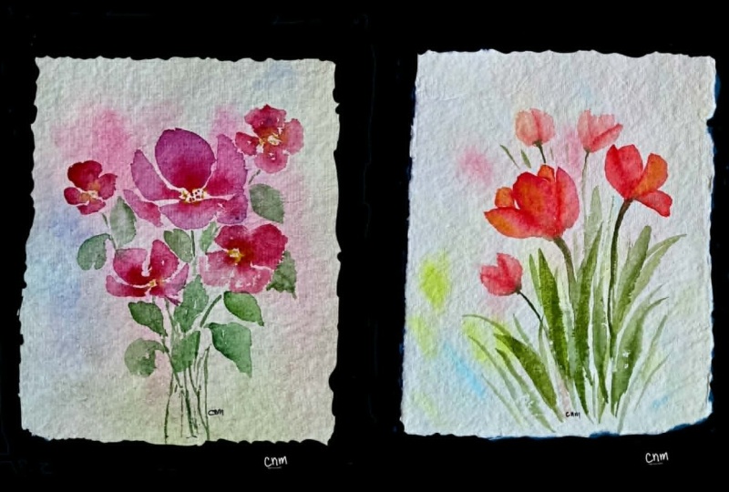
adding new classes each week. If you'd like to keep
building on those skills, I have more classes of tulips, loose flowers, and
watercolor techniques that will help you continue
growing step by step. Thank you so much
for painting with me and I'll see you
in the next class.
 Brenda Jones, Watercolor Artist & Teacher