Transcripts
1. Intro: Hello, and welcome. I'm Shari, and I'm so glad you're here to dive into the world of
watercolor with me. In this class we'll
explore a loose, relax watercolor
style, perfect for letting go and allowing
the colours to flow. Watercolors are
not always easy to control and can surprise
us in wonderful ways. That's what makes them so
special and full of life. I'll guide you
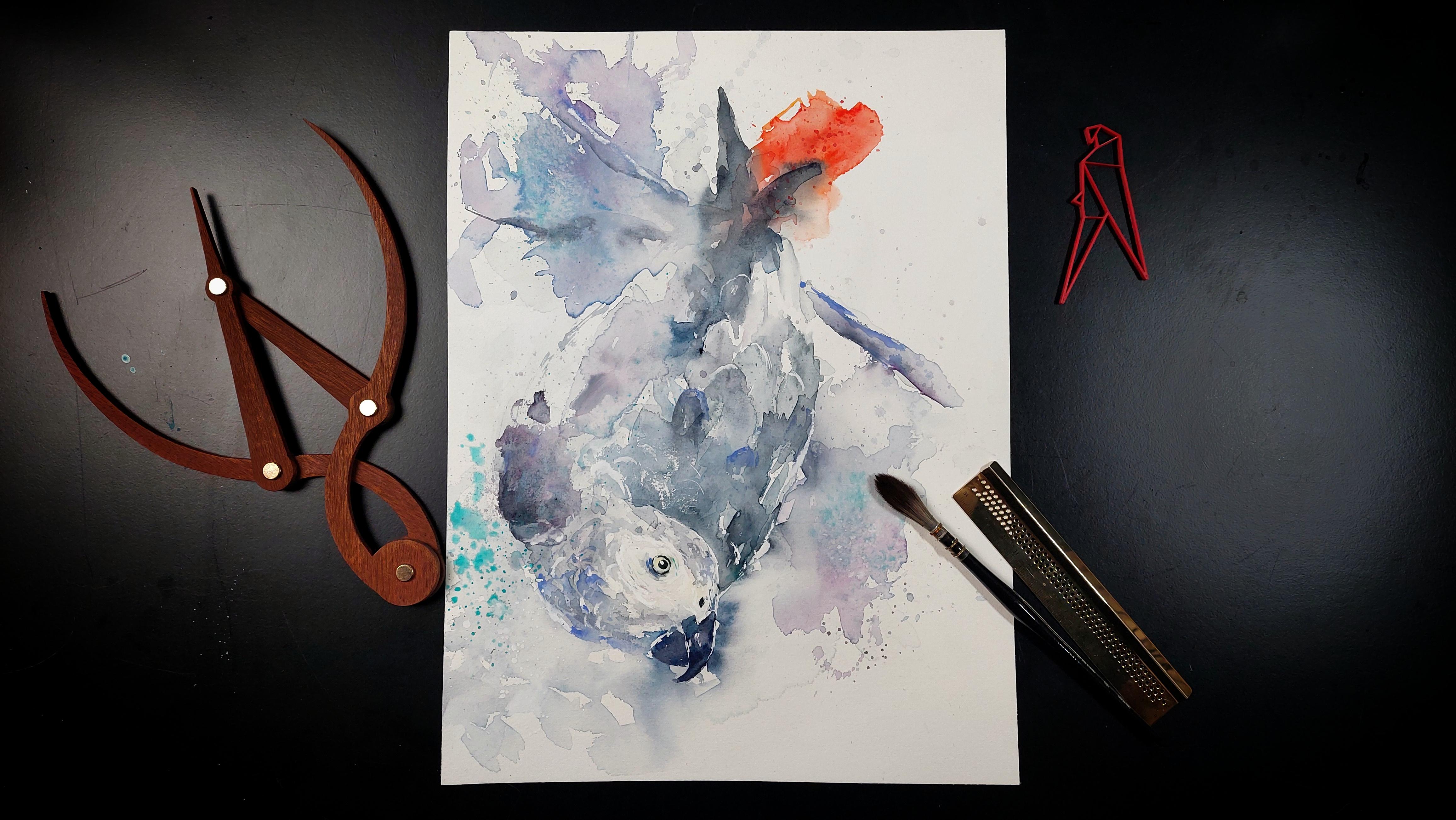
step by step as we create the painting of
a gray parrot together. Show you techniques to
work confidently with your brush and achieve
that lovely loose style. My goal is to help you
enjoy this art form. Without pressure, just you, the brush and a little
courage to try something new. And remember, even if you are like me and make a
lot of mistakes, the most important thing is
to have fun while painting. Once you're done, don't forget to share your
final piece with us. So take a deep breath, loosen up those hands, and let's get started.
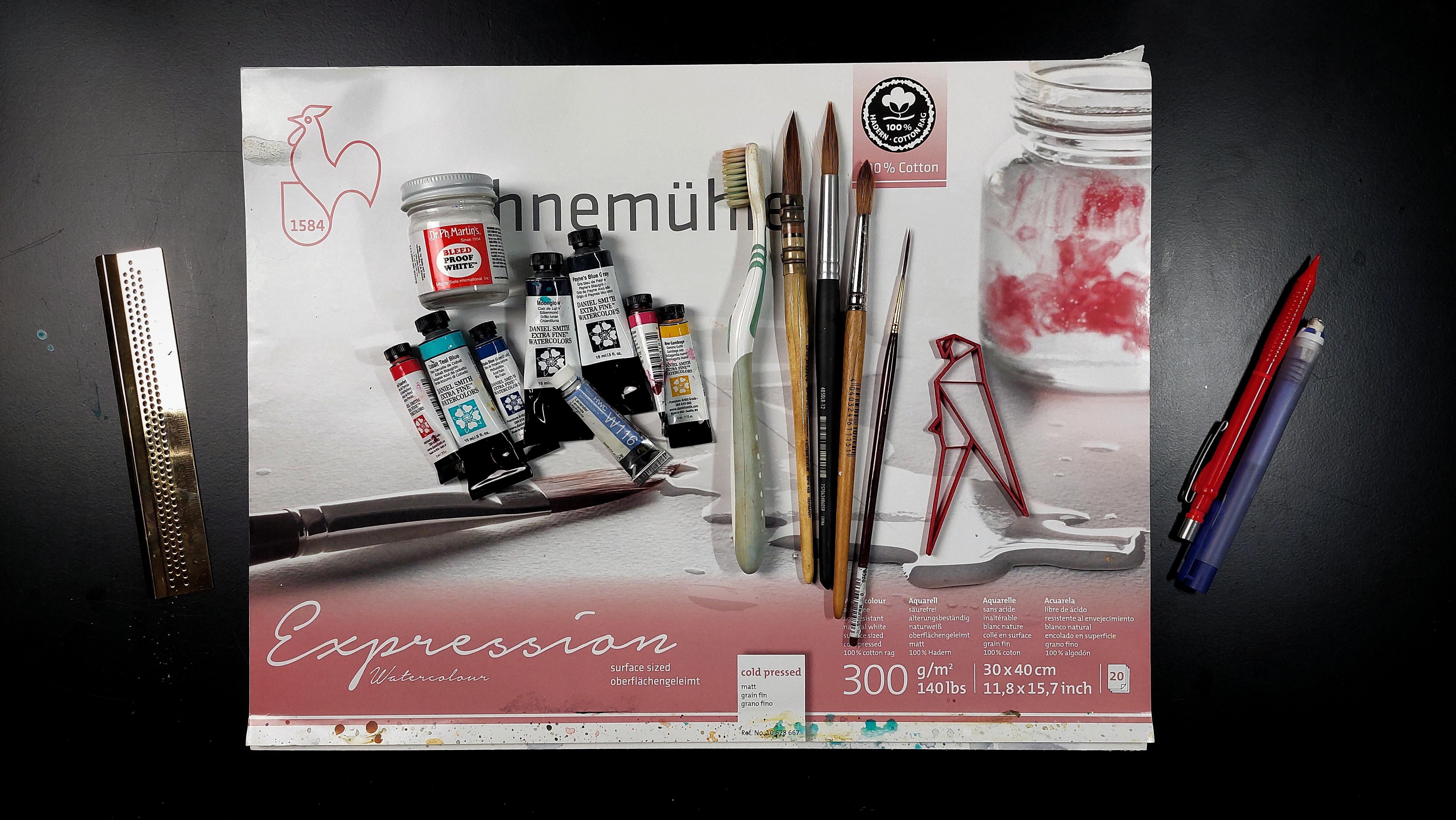
2. Materials: For the paper, I will use
my hanmul expressions, 100% cotton watercolor paper. For the brushes, I will
use my usual rigor, a round brush, a round
brush with a coarser hair, and a round brush
with the pointy tip. And, of course, my
trusty toothbrush. My paints are primarily
from Daniel Smith, and one is from Hole vein. Let's start with a
paint's blue gray. And I have the moonlow here, but you can also use
another purple color. So next, I have the palo blue green shade,
the unacrodon rose. Gamboch yellow, pyr scarlet and my axing colors cobol
teal blue and lavender. For the white, I will use the PH Martin's
bleed proof white. Of course, don't
forget your towel, your palette, and fresh water. And for those of you who
really, really, really, really don't want to sketch, I have a template for download. Then let's get started.
3. Preparation: Sketch and Colors: So we want to get to
know our subject better. So we want to find the big shapes here that
are very important. So the body, as you can see, is an oval, as is the head. Then we have some shapes for the tail feathers and
for the beak, too. We want to simplify the
shapes to make our life easier when painting
the parrot later on. Now, my paper is roughly
the same size as my watercolor paper to make it easier for me to have
the right size later on. So I just roughly sketch all the shapes that are
really important here. Everything we are learning now will make our life
easier later on. That said, we will still
make mistakes or I, that is. We want to get our
proportions down. So I take the heat as a measurement tool for
measuring the size of the body. So how tall is the body
in heads and how white? How are the relations of the important parts
to each other? How are the angles? Oh. Now that we have established
the important shapes, I will draw in the branch. Although I will tilt it more
to bring some interest in, you can, of course, keep it
straight like in the picture. The purpose behind all that is to help you with
your painting later. You will have more confidence in your decisions and you don't have to make an
underlying sketch. So you can paint more loosely. Like for every painting, I will test my colors
that I have chosen. So I have paints blue gray, moon glow, palo,
blue, green shade. Then I have the
quinacridon rose. And I test how they mix, how they react with each other. And if they look good
together, of course. For the red tail feathers, I will use a pyalRd
and some new gamboch. I want to have a bright,
slightly orangy t. I will also use the yellow with the palo blue for the eyes. With that, I know I don't need the French ultramarine
or the Elazar crimson. Oh Lord. Here I chek how dark I
can go with those colors. Lastly, a quick test
with my accent colors, lavender and cobaltear blue if they are fit for
my colour choices. And now on to the painting.
4. Part One: Figuring Out the Head: I have all my things
here that I need. My reference picture
is off to the side on the screen and my
sketch is nearby. Now let's put our
colors out and dive in. I put all my colors
on my palette, except the three accent colors. Thus, I will do the eye.
I need a rigger for that. Now, my paper for the sketch has almost the same size as
my watercolor paper, and I evaluate if I want the parrot where I have it
now or if I want to move it. I think I want to move it
more to the bottom left. Take your time figuring out
where to place your subject. Quick tip for me, print your reference
picture if you can and place it beside
your painting. I make a lot of measuring mistakes by having it on
a screen to the side. So we want to keep in mind
that the length of the body, uh, without the tail is
roughly two and a bit heads. Now we want to know
where the eye goes. The right edge of the head
is in the center of my page. That will make me
some problems later. So maybe you want to put it
a bit further to the right. And we know roughly
how large the head is, so we can guess where
to put the eye. Wet your brush and make a mark where you guess
the eye should be. If you're satisfied
with your choice, then take a bit of water
down yellow and paint a small circle and check if
the size is about right. Wow, Take your time checking your sketch and
the reference photo to be sure you have the
size roughly down. Wow. Wow, wow, Now, I take a very
tiny amount of watered down palo blue and
mix it with a bit of yellow. Watered down really good. We can always drop more
color onto it later, and don't worry too much about the form of
the eye for now. Eye is rather round. As you maybe can see, the yellow is a bit bleeding, but we don't have
to mind that and concentrate on the form
and size of the eye. Wow. If you think you have
the form roughly down, then you can let it dry. I have a very dark mix
of the paints blue gray, the palo blue, and
the quin rose. We water it down again. And now we will do the form
of the eye. And don't rush. Take your time, breathe, and check your reference photo. Try to keep the
outline very light. So now we already have
the eyelids, so to speak. I know it doesn't
look like much, but try to trust the process. Now we want to figure out
the shape of the head. Take a color and
water it down again. Our marks should all
be very, very light. So we see in our reference and sketch how the
head is tilted. Take your brush and
get the angle off of your reference and bring it
onto your painting surface. Make a mark and keep
it really light. I can take the angle of the
beak and roughly make a mark. Because the marks are so light, you can correct it at any time. Now, I make the mark for
the right edge of the head. Slowly, step by step, we will build the
shape of the head. Look at the reference,
take the angles, and make your mark slightly. All these lines are
guides for now. We can and most
likely will change them up later on. M. I look at the eye to
gauge where the beak is. When I'm unsure, I look
at the reference and take my sketch and really observe
if I have everything right. It is better to catch mistakes in the beginning when
they are easy to correct. As I looked at my
reference pictures, I saw that I made
the eye too big. So I tried to make
it a bit smaller. And because my eye was too big, my head somehow
was also too big, so we have to correct that, too. So if you find yourself making a mistake or are finding
the mistakes, don't panic. It often can be corrected. With a casa brush, I soften the lines that I made
and spread the color away. D. So I do the same again, looking where I have
to place my marks. I now also use the size of the eye to measure
the size of the head. So I measure on the
reference photo how much yes it takes
from the eye to the edge, measure and then
mark it on my paper. I primarily took my sketch because I can have it right
next to the painting. If you have printed out
the photo, use that. I sped up the
process here because I just repeat the
steps I did before. Wow, wow, wow, Wow, I measure now from the eye
to the edge of the head and now roughly know
where the weak has to go. Wow, wow. Wow, wow. So I think the measurements
are quite right now, so I can place the nostril. I tried to figure
out how to shape the bottom edge while fighting
all the lint on my paper. I decide to solve
that problem later. Now, we roughly have the head, and we want to mark the body still with
watered down paint. Keep calm, paint really lightly. I start the line at the
head a bit above the beak. We take the now hopefully
right sized head to measure out the
length of the body. So it's the head in height and then two and a bit
head sizes up. I know it looks a
bit ugly for now, but we will do
something about that. Check again if I think the
marks are placed right. So then let's get to the second part. B
5. Part Two: Let's get some Paint on!: For the next step, I
take the same mix, but a bit thicker and
paint the eyelid again. I take a bigger wet brush
and spread the paint a bit away from the eye in the direction the
marks on the head. I want to add a bit of
color to the eyeball, for I take a bit of the blue. Please keep in mind
that this color is very potent and mix it with the yellow to get
a nice pale green. I just drop the color
in the upper half of the eye so that we have
a bit of a gradient. I try to loosen
up the dark line. We will refine the eye later on. Now, I take the mix we already have here and
mix in some rose, water down, of course. I make some marks around
the eye with that colour. I want to make the white part here around the eye a
bit more interesting. You can choose whichever
color you like really. Just keep in mind that you
should keep it watered down. Keep an eye on the direction
of your brush strokes. Observe your reference to
see how to set your strokes. So looking at the reference, I tried to map out the white
area with light colors. In the next step, we
want to paint the body. On the reference photo, there is a reflected
light on the body, but we will just ignore that. So take a good amount
of paints gray. I put a bit of
Monglw in it, too. I outline the head and spread the paint in the
direction the feathers would go. As always, you can take a clean damp brush to pick up some color if
you don't like it. You're welcome to vary
your colors here. Put some thalo blue
into a mix and rose to make an interesting color palette for
the gray feathers. Don't be afraid to let
some white spots here and there to break that area
of color and loosen it up. I paint mostly the right side
here because I want to have the left side a bit
lighter and less detailed. I don't really want a hard
edge on the left side. Also, feel free to
drop in some water and colour to loosen everything
up and get some texture in. I check the head again to be
sure I get that right now. I just make some marks here to have the shape of
the head roughly. Now that I'm confident
with the head, I can start the beak now. I mix a nice amount
of rose and palo, a bit of moon glow
and paints gray, too to get a nice dark color. I trace the outline
of the beak with my paint and then spread it
inwards with the wet brush. Again, don't rush. If you don't like something, take a damp brush and take
the color of the page or take a wet brush and
spread it somewhere else, which might give you
even interesting marks. I like those water marks. I try to get some where
I just put the paint on. For some smaller marks, you can take your toothbrush and sprit some water
onto the paint. Make sure you have a
clean brush, not like me. I mix moon glow and gray into a creamy consistency
to paint the wing. I go in quite dark
because I think I will not change the
position of the wing. Keep in mind that nothing
has to be perfect. Still, I check again
to place it right. We still want to have loose
and soft brush strokes. Then I take the paint to
the neck and the hat. Really try to make soft brush marks to make
this feathered look. Don't put your brush down and
drag it across the paper. Dab it and create
some nice texture. Again, leave some
white spots and feel free to vary
the color a bit. Use your point and the side of your brush to make
different marks. Again, keep an eye
on my brush work. I don't smash it onto the paper. I make soft light strokes and dabs keeping the brush
at a lower angle. Take a clean tissue if you
want to get rid of some paint. I try not to get too dark
yet on the top of that. I want to let everything
I painted dry a bit and go on to painting
some feathers next.
6. Part Three: (Almost) All about the Feathers: Let's mix some of the dark pins. Find the middle of
the feathered body, take a reference photo for
that and also take the angle. Wow, I paint some
negative shapes of the feathers while
darkening the middle. Keep in mind that you
can vary a color. You can look at the photo for finding the right
feather shapes or try to make up your
own if there are some interesting marks
that want to be a feather. Wow, wow, Besides painting
negative shapes, you can, of course, paint
positive shapes, too. I would advise not to
paint feathers everywhere. You can also blur the
feathers at the end. B Mm. Mm hmm Here and there, you can also paint in the shaft
of the feather. Also, keep in mind in which direction the
feathers are growing. D If you want, you can drop some water for texture effects where the
paper is not yet totally dry. Just checking again if the
proportions are still correct. I gauge the direction, and when I am sure, I put the side of my brush to the paper
and make a quick stroke. When I had my shape, I can strengthen the
collar in some places. Keep it loose and abstract here. For those dark feathers, I take my paints blue gray and with a bold and
quick brush stroke, put those feathers in. I just took my
pointy round brush and quickly brought it to the paper and made a stroke downwards to make the V shape. Dipping in some more
color for some texture. And, of course,
sprinkling on some water. And here, I'm finally realizing
that my angle is off. That's why it is better to have the reference
next to your painting. You don't have to
move your arm as much and your angles
are more accurate. I try not to have a crisis
and give up at that point. I just hope for the best. Sometimes it is alright to just stop a painting
and try again. But I want to see if I
can manage to still make a nice painting despite all my mistakes
that I made today. So I take some of the
gray paint I have on my palette and
sketch in a branch. I take the tip of my brush
and make jerky lines. Then I spread the paint
with the belly of my brush to make
a sort of branch. I keep it a bit lighter
at this point because I'm not very sure
if I like that. Wow. I mix a bluish gray color. I try to get darker
step by step, at least where the head is. I make a short outline
with a dark paint, and then will drag the color in the direction
of the feathers. I don't want to drag it too much because I don't want to
destroy the feather shapes. I already did before. As you can see, the color
faded quite a bit on the beak, and we want a nice
dark color there. So go in with a thicker paint. I painted the same
as the last time. I outline and then
drag the paint in. D D I try to leave a little bit of white paper between the jars. I mix a thicker paint of
silo and rose and drop it on some of the edges to
make it really dark there. I'm not really sure which
problems I want to solve next, so I'm fiddling here and there. The nostril also gets
this thick paint. I mix the Pyl red with rose and a bit of blue to have
a darker shade of red. With that, I make a mark
on the tail feathers, not quite shaft, maybe
a shadow of some sort. I don't want to overdo it
with the details here. Now, then let's get
on to the next part. M
7. Part Four: Beak, Branch, Background and More!: I mix a thicker
paint of moon, rose, blue and gray to darken
the eyelids again. With watered down paint
mixed there on my palette, I make some light
marks around the eye to bring more texture and
interest to that area. Again, you can vary
the hues here. I take the dark and thicker
mix of paint and slowly paint the pupil in start small and paint the circle
a bit bigger step by step. I soften the edge
here a bit because I don't want to have a
continuous hard edge here. Just take a corsa brush and
scrub a bit at the edge. I am making small marks with light paint to get
a feather structure. I'm not going to paint all those little feathers
you see in the photo, but I will make some marks
here and there later on. Now, I'm starting to introduce some paint
to the background. You can choose a
different color, but I like to use the color
I already have on the paper. As I said earlier, I want to have a soft edge here, so I don't know if I let it soft like this or if I introduce some more
color later on. I make kind of half moon shapes with a point of my brush
to indicate feathers. M Now that the big shapes
are established, I will be a bit all
over the place now. Here, strengthening
the color of the beak and thinking what I can do
to make it more interesting. So I mix a thicker
mix of dark paint and paint it on the
edge of the beak. I take a wet brush and
water the paper and touch the beak with the paint in just one or two spots
so the color can spread. Taking some more color and further painting
the background. If your colour isn't
moving enough, you can just take
some water and dab it onto the paper to get
the paint spread further. Now onto the branch where
our parrot is hanging from. I take some paint onto my
brush and draw a line. Then I take a slightly
wet brush to drag it a bit up so that the
branch is formed. Again, keep your brush
stroke slight for now. In the photo, you can see different feathers in
the dark part here. So I try to capture that. I also want to darken
the middle again, making some feather shapes, too. Introduce more colour
above the head. I want to have a
high contrast there. As with the beak, I paint a creepy paint mix on
the edge of the body, and then take a wet brush, touch the paint,
and make it flow. Sprinkling in some paint
just for the fun of it. I try to figure out what
to do with the left side, as I want to keep it
fairly untouched. I skimmed the brush with a
small amount of paint on its side across the paper to
have a textut line there. I don't really like the branch, so I modify it a bit
by adding a piece. I put the top of the brush
to the paper and move it in quick strokes over the paper to make the shape more interesting. I think I'm nearing the end here because most things
are established. I darken the eyelids again
and make them a bit thicker, um, whiter on the bottom one. I blur the line down a bit, too. Don't omit the water sprinkling. And some colour, too.
Just don't overdo it. Now, let everything dry and
we get onto the last part. Two.
8. Part Five: Finishing Touches and Details: I look for opportunities to introduce some colours
to the background. Because of my mistake with
the wrong angle of the body, I try to get a better
composition by doing that. B I will switch the places where I paint off now to see where it
needs more work. I'm strengthening
the color here. Try to vary your brush strokes. And if I don't have a plan, I take my trusty toothbrush
and flick some paint on. Now onto the details. I put my teal, lavender, and white on a separate
piece of paper. They are opaque and
I don't want to mix them with the
other colours of my palette because I
don't know if I want to go in again with
them later on. Wow I pick my pointy brush for more detailed work. I drop some lavender here and there and paint some
feather shapes. The branch also gets some love. I am a bit more careful with
a tear and decide that I just want to sprit some of
it onto slightly wet paper. Going back to the lavender
and the eye and head area. Just dropping some marks
and see if I like it. If shapes got lost, you can bring them back
with a white outline, just like I did on the beak. And don't forget the
white dot on the iris. Even if you don't see
it in the reference, just put it there anyway. It makes it much more lively. I also draw the water line
with a thin white line. Take your time in observing where you can put some details with
your accent colors. Some highlights here and there, or work out some feathers more. I make some small marks with the white to indicate
small feathers here. Wow. Wow, w, w, Wow, I skim the brush a bit to create
some textures here. I could fuzz for hours here, but I think it is enough now. And I can do now one of my favorite things for the
last step spritzing on paint. I decided that the
red feathers have to be integrated
more to the body. So I quickly threw on some red paint just to show that this is a
part of the body. I think when I would cut some centimeters off
from the right side, the composition would
be much better. And there you have it a
not so gray gray parrot.
9. Outro: Thank you for
watching this class. I hope you enjoyed it, even
if I made some mistakes. If you have questions, feel free to leave them in the
discussion section. I'm excited to see your
projects and comments, and I hope you will see
us in the next class.
 Shari Wagner, Artist and lifelong learner