Transcripts
1. Intro: Hello, and welcome. I'm Shari, and I'm so glad you're here to dive into the world of
watercolor with me. In this class, we'll
explore a loose, relaxed watercolor
style, perfect for letting go a bit and
allowing the colors to flow. Watercolors are
not always easy to control and can surprise
us in wonderful ways. That's what makes them so
special and full of life. I'll guide you step
by step as we create the painting of the mouse
with cherries together, showing you techniques
to work confidently with color and achieve that
lovely loose style. My goal is to help you
enjoy this art form. Without pressure, just you, the brush and a little
courage to try something new. And remember, the
most important thing is to have fun while painting. Once you're done, don't forget to share your
final piece with us. So take a deep breath,
loosen up those hands, and let's get started.
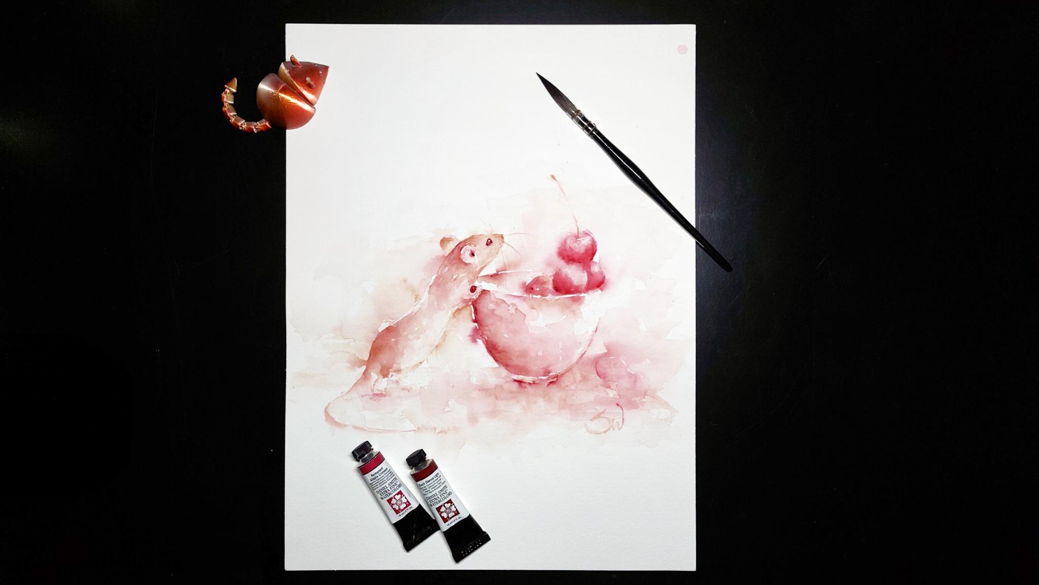
2. Materials and Preparation: I will use the Hanmlo
cotton paper again. As for brushes, I
use synthetic ones, a long round brush with a
pointy tip and that rigor. For colors, I use
Daniel Smith's colors, permanent Alizarin crimson
and burnt sienna light. But as always choose your
own colors if you want. For the white, I use the pH
martins bleedproof white. Of course, you can just use any white gouache
you have on hand. Now, I recommend getting
to know your subject. The best way is to
make a quick sketch. You don't need precious paper
or an expensive pencil. You can alter what you see in your reference photo and
integrate your own ideas. I'm thinking of how much to
include little details like the small feet or the hands and how the
tail is positioned. So I changed the direction. Observe what you see here
in your reference photo. What simple shapes do exist? What angles do you see? And how does everything
relate to each other? When you know all
that, you don't necessarily need an underlying
sketch for your painting. You start painting
with that what you observed in mind and get that loose look
in your painting. I am making a more
detailed sketch, but the most important thing is to know your general shapes, the most important shapes. Like you see in this picture. I draw a very basic shading just to know where my darker
areas should be. All that said, when
you start painting, things and are
allowed to change. So don't try to
copy your sketch. Don't forget your focal point. In this case, the
head of the mouse, there has to be the most
detail and contrast. Testing your color
is a must for me. I want to know if they
work together and if they have the right hue
for what I want to paint. Here, I test the
zarin crimson with raw sienna and
burnt sienna light. I don't want too much color
variety for my piece. I test if they mix well together and what
new colors appear. I can't see that much difference between the raw sienna and
the burn sienna light, but I decided to go
with the burn sienna. And now to the painting.
3. Important Markings: As you can see, I made some markings on my
reference photo. I made a line for the middle and a kind of rhomboid
shape for the head, and it shows how big
the body and the cup are in proportion to the
head and mouth respectively. With that information, we can start to lay down
our first layer. We start with very
diluted paint. You should barely
see it on the page. The first strokes will
just be for orientation. First, find your
middle on the paper. Again, just with
very diluted paint. Now, let's see how big
the mouse should be. Take your time in figuring
out where to place the mouse and the cup and
how big both should be. Use your hands and fingers or maybe the handle of
your brush to measure. Make sure that everything
fits nicely on your paper. Wow. The head of the mouse centers more or
less around the middle line. Find the end of the
snout and make a mark. If the color is too strong or
you want to move the mark, just take a damp, clean
brush, and wipe it away. Now, we want to establish the size of the mouse
and its position. Always refer to your
reference photo. Keep checking everything so that you can be sure to
get the right angles. Although we are working
with highly diluted color, try not to make an outline. It can restrict you later on. We just want marks that guide us later on when we start to
paint with stronger color. I have established
the size of the head, so I make my measurement
of the body. The body should be two
times the head in length. Again, make a light mark
where the body ends. I also make a mark
for the little butt. Now that we have the
size of the mouse, we can make marks for the cup. In the reference photo, the cup is the
size of the mouse, but you can make it
bigger or smaller. I'm thinking of making
it a bit smaller. The head protrudes over the cup, so the cup should
start beneath it. I mark the edge and try to paint the oval for
the rim of the cup. Keep in mind that we
want to paint cherries, so don't make the back
of the rim too obvious. I just take my
angles again before moving on to the
next step. Okay.
4. First Layer: Now, let's start with the first layer. I
start with a cup. It's the easiest for now. I check again if my marks are in the correct position so I can see where the bottom
of the cup is. I take a bit of both colors. This time, I also take
more paint on the brush. Don't start too high
here on the page. You can always move it up. So we start to paint the
negative shape of the cup now. As always, if you
don't like something, take a damp, clean brush,
and pick up the color. If it doesn't come up easy, then take a brush with rougher bristles
to scrape it away. And in case of really
stubborn stains, you can also pick
a melamine sponge. Just don't use it too much since the sponge can change the
surface of the paper. Keep in mind that you don't have to define everything
in your painting. The brain fills so much
information that we can get away with very
little marks and details. I like the size of the cup, so I keep it at that. For the mouse, I will
use more of the sienna. I just take a touch of alizarin, just keep the harmony. Start with a bit more pigment than what we had
for the markings. We want to have the option
to still move things around. I want to have a little
curve in the mouse back to get more of the feeling that she
leans on the cup. We don't have to nail
everything down yet. And if you smudge the
colour away in some places, it gets this loose feeling
that we want to accomplish. I want to define the
body a bit more, in particular, the head, which is the most
important part. When bringing pain to the paper, leave some white spots. Don't put it everywhere. Now I put the ear in. Of course, I check
with a reference. It does not have to be perfect, but it should make sense. I paint the rim of the ear. And then with the
damn clean brush, I drag the color
towards the body. I can't start on the other ear because the paper is
still wet in that part. So I move on to the head and
the snout in particular. I still look at my
reference photo, but also determine if it looks right on the page
separately from the photo. As you can see, I'm not convinced what's going
on with the head, so I drag the paint
away and spread it. Take your time
establishing the head. It is the most important
part of the painting. If you can't get
your head around, where and how to
place everything, take a step back,
let everything dry. Come again later and see
everything with a fresh eye. I decided to move
on to another area. I deepened the colour
for the ground, painting around the cup, spreading the paint
over the paper, and trying to get some textures
with the tissue paper. I skim the side of my brush over the paper to get some
more texture here and there. The cup should be symmetrical, so I look for the center. I drop a bit of water into the paint for
some more texture. Now that the paper by the
head has dried a bit, I can move on to the second ear. For that, I look where the ear is placed in the
reference photo. I outline a part of the
ear and spread the paint. For a nice mouse ear shape, you can wrap some tissue
paper around your finger and press it on the paper
and lift some of the paint. Now that we have the ear, I measure how long the snout is. I reference the angle checking every time
if it looks right. Before I paint any
further on the mouse, I have to clean my
palette to get some more of the pure sienna. I want to establish
the head a bit more, so I paint a little
bit of an outline. Don't forget to
soften the edges. Oh I have to let it dry before
going in again, so I move on to the body. To connect the tail
with the body, I have to paint the little
bit and then the tail, like I established
in the sketch. Again, don't try to make one
solid line for the tail. The belly is again
painted negative. As you can see, I put paint down and spread
it in some parts, so I don't get some harsh
lines and get the loose look. I have to move on to the cup for now to let the other parts dry. Now, we want to paint the
shadow side of the cup. If you're unsure, start
a bit on the inner side, we can always move
the edge outwards. And again, don't try to
make everything perfect. The cup is a rounded object, so move your brush
strokes accordingly. Now I'm starting to get a bit
more pigment on the brush. Keep the shadow on one side, as you see in the
photo and sketch. I paint another layer
for the ground, taking a bit of color
back with my tissue. Keep in mind that
we want most of the interest where the head is. So try to keep texture and details everywhere
else to a minimum. Let it all dry for
the next layer.
5. Second Layer: Defining the Shapes: Et's see how we place the par. If you have too much pain the
way you want to place it, you can scrub a bit away. If it's too dark, I would recommend to make some marks with
squase on top of it later on to show that there is a tiny par holding onto
the rim of the cup. I want to show the shape of the par with negative painting. Observe the reference photo
for the correct shape. And here I get a
little bit distracted. I usually jump around
a lot in paintings, but I hope you can
follow me nonetheless. You can make the
shadow quite dark. Mm. Don't forget to drag the paint away a bit. You can also drag something
of it into the pa, but do it in moderation. Keep your time in
working out the shapes. We want to place a
bit of collar on the left side and make a
negative shape for the back. Like I already did
in the first layer, I dab the paint in the
body area to have a bit of texture there and to make
it less of a uniform layer. Keep in mind that
less is often more I try to use more of the Alizarin crimson
in the darker areas. Again, if you accidentally put
too much colour on a spot, just step it away
with a dump brush or a tissue or just spread it
over your paper, maybe. M Now, to fill the gap
between the body and the cup and to bring out
the belly a bit more, we paint a negative shape here. It's an important shape, as I showed you in
the preparation part. I don't paint the whole area, but I want to have a
nice gradient here. The shadow side of the
cup should still be darker than everything
else here in that area. Keep the round
shape of the cup in mind when you do
your brush strokes. Let the color of the cup flow a bit into that
negative shape area. I want to drop a bit of the
sienna to keep the harmony. We have to darken the tiny spot there by
the hand quite a bit, but it's pretty wet now, so we leave it for later. Look at your painting.
If the light side of the cup is visible enough, if not, just put another
layer of color there. A zarin crimson is a
pretty staining color, so you have to be careful not to produce too many
harsh lines here. Observe your painting. Look
at the shapes and edges. What is nice to look at? What do you not like? The
paint is still pretty wet, so you have the chance
to change things easily. I can move to the ear as it seems the papers
dry enough there. And as a side note, you actually shouldn't touch the paper with your finger as I
did to see if it's dry. You could smell the
paint or leave grease on the paper which could
interact with the paint. We again paint the
negative shape of the ear and drag
the paint away. Painting the head a bit darker, I also took the chance to put a bit more
color on the body. See if you want the
edge of the ear sharper or if you want to soften it a bit
with a damp brush, we will put gouache as a last step there to highlight
the edge of the ear. We also want a bit of
color inside the ear. You can just take a bit from
the edge with your brush. It would best to let
it dry at this point, as the paper is pretty
wet everywhere, but I am very impatient,
so I can't stop. If you are like me, try to keep your hand and arm
away from the paper. As the colours fade
quite a bit when drying, I have to go over some
parts with more pigment. Here, I want to define
the mouse head, taking the reference to help. Again, not wanting harsh lines, I swipe the color a bit away. Look if you like the
shape of the belly. I think I like the shape
of my well fed mouse. Darken some spots with
more paint if you like. If not, let it dry and we
move on to the next layer.
6. Third Layer: with Cherries!: This layer is for darkening areas and to paint the cherries. I'm not quite satisfied
with the head shape, so I adjust it slightly. The little paw gripping the rim is an important part in my eyes, so we emphasize it
with darker paint. I also put some darker paint on the body to have darker
and lighter areas. M I observe if I want to change some things, do I begin to overwork it maybe? I just want to hint
at the little feet. Just release some
small strokes to say, Hey, here's something,
and the brain will tell, there are the feet. Now on to the cherries. Don't just draw circles. Think about how they
are located in the cup. I will paint more on
one side as to drive the story that the mouse wants to reach for one
of the cherries. First, paint one cherry and then paint some more oriented
toward the first cherry. So the other cherries
should overlap a bit. Try to keep it darker
in the shadow so that you have a gradient
in the cherry shapes. You can let some paint
flow into the cup shape, if you want, for an
extra bit of looseness. Take care not to paint
over the rim of the cup. Think about how big the cherries are in comparison to the mouse. I want to establish the
shapes first and then go in and make them darker
and more detailed. Again, you can drag the paint away to other parts
of the paper. I am mainly using lizarin
crimson for the cherries, but I drop in here and
there some sienna, too. I thought maybe some cherries
dropped to the table, so I painted very faintly
two cherry shapes. Don't go overboard with
the cherries and keep in mind that odd numbers are the most pleasing
in a painting. Light is coming from above. So I will lift some color
from the upper half of them. I want to work out
their round form. And put more color in if needed. Especially in the shadow sides. Now the cherry on top. It should be the
most detailed one. The paint of the cherries is touching the wet paper above, but that just adds
to the loose style. But if you don't like
it, just wipe it away. Now I want to let it all dry so that I can add some details.
7. Fourth Layer: Details: This layer is all about adding the last details before placing the highlights. I darken the shadow
side of the cherries, working out their round shape. I want to show the overlap
of the cherries a bit more, but that is not necessary as we try to hold back
on the details here. I paint a little oval
where the stem should be. The rim of the cup is
too soft for my liking, so I darken it. I again take the paint to
other areas of the paper. Mm. Here, I want to make the front of the
rim more visible, a touch. The cherries on the
table vanished, and I want to get them back. I put paint on the I put paint where the
shadow is and pull some paint with a damp
brush to form the cherry. I recommend to keep it light. M Of course, we cannot
forget the head. I outline the area
of the ear again, darken the head in the process. Finally, our mouse gets an eye. Observe your reference photo to determine where the eye is. Start with very little colour on the brush to still have
the option of moving it. The eye is not quite round. Again, look at your reference. After putting in
some small details, I will grip my hair dryer
to shorten the drying time. Now that the paper is dry, we can put in some more details. For the eye, I take
thick paint on my rigor and place it where I established
the eye earlier. If you can leave a white spot
in the eye as a highlight. But that is a bit difficult
as it is a very small area, and we will paint our
highlights later anyway. Oh I think about what details I need here. If I want more sharp edges, if I want the head
darker for more contrast or maybe it doesn't
even need anything. Observe your painting and think about what
would look nice. Uh The last thing I want to add is the
stem of the top cherry. I'm loading my rigor
with burnt sienna. Try ghosting your
stroke before you put the brush on the paper to get a better idea where to place it. I made a little mess here, but that is fixed quickly. I can't put the brush down, so I start to fiddle a bit. That's a sign that you should
move on to the next part. Here I lighten the upper part of the eye a bit to make
a little gradient.
8. Highlights: I put more weight on
a used piece of paper so that it does not mix
with the watercolor. And now comes the best part, placing the highlight
in the eye. Take your rigor and put
some white on the tip. Place it in the upper or
middle part of the eye. It immediately brings
life to the mouse. Be sparingly with
the highlights. Just put some here and there. What needs a little pop. As I wanted to highlight
the edge of the ear, I saw that I totally forgot to paint in the hole of the ear, so I quickly fixed that. Take some paint on your
riga and place a.in the ear and just blur it
a bit with your brush. The other ear gets also
a bit of a highlight. The cherries shouldn't
be left out. I place it there where it is most likely that it
catches the light. To change the shape of it, you can also dab it
with your finger. Again, observe your painting
and see where a highlight would make sense or where you
want to brighten an area. I thought maybe some
tiny strokes in the fur would make sense as the
hair catches the light, but do it very sparingly. M I start to feel a good sign that
it should be finished. For the whiskers, I take
the brush that makes the thinnest strokes and turn my paper for
a better angle. Again, do the ghosting strokes before putting the
brush to the paper. Just three or four
should be enough. Paint the hairs on the
other side a bit shorter. I contemplated if I want
to put white whiskers, too, but I decided against it and put some
small dots on the nose. I want to highlight
the waterline, but with a small eye like that, it is a bit difficult to do. I think now it's finished. M.
9. Outro: Thank you for watching this
class. I hope you enjoyed it. If you have questions, feel free to leave them in
the discussion section. I am excited to see your
projects and comments, and I hope we will see
us in the next class.
 Shari Wagner, Artist and lifelong learner