Transcripts
1. About the Class: Follow along with the
instructional videos to sketch the fox using
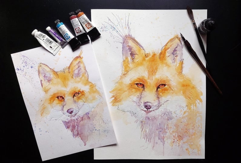
loose scribble lines, followed by the unrestricted
application of watercolor. If you like, you can join
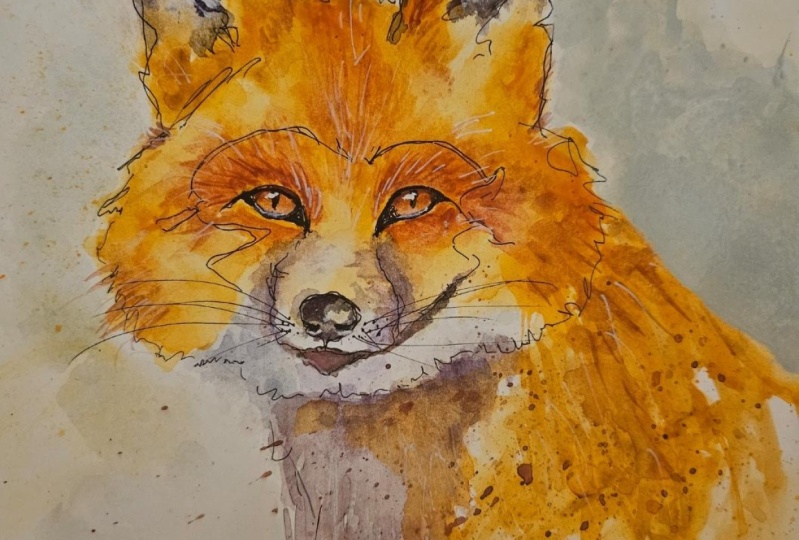
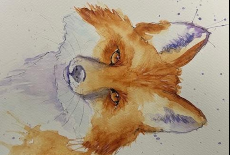
me in my practice sessions, but you are free to jump right in with the templates I offer. Experiment with Ink and learn
how to apply it freely and spontaneously in the paper to create the outline of the fox. Transition to watercolor paints and explore the playful
application of color, allowing the pains to
blend and flow naturally. Embrace a relax and
experimental mindset, letting go of perfectionism and enjoying the
process of painting. Share your progress and final artwork with
the instructor and fellow students for feedback and encouragement in the projects
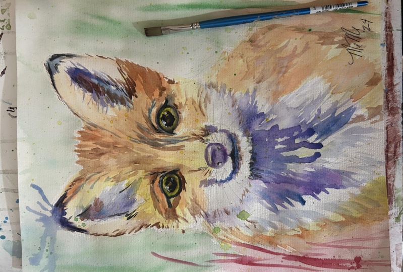
and resources section. Reflect on their experience and newfound skills celebrating their creative journey and the unique expression captured
in their fox painting.
2. Introduction: Hi there, and welcome
to my Skillshare class. I'm Shari, a self
taught artist who has been passionate about art
since my school days. Despite taking a longer
detour from art, I found my way back
to it in early 2019, and I've been diving into it with renewed vigor ever since. I primarily work
with watercolors, but I also dabble in acrylics
and oils and other media. What drew me to watercolor
in particular is its versatility and its
delightful unpredictability. There's something
magical about watching the colors blend and
flow on the paper, creating beautiful and
often unexpected results. I'm a big fan of a
loose style in art, inspired by the impressionists. For me, art is about
expression and capturing a feeling rather
than rigid realism. And that's the approach I'll be sharing with
you in my classes. This class is designed, especially for total
beginners who are eager to dip their brushes into
the world of watercolors. My goal is to make the
learning process easy, enjoyable, and most
importantly fun. So I encourage you to let loose, experiment, and embrace
the joy of painting. After finishing
your fox painting, I hope you'll not only have
gained some new skills, but also new pound confidence
in your artistic abilities. So without further ado, let's scrap our brushes and
let the creativity flow.
3. Materials: What do we need
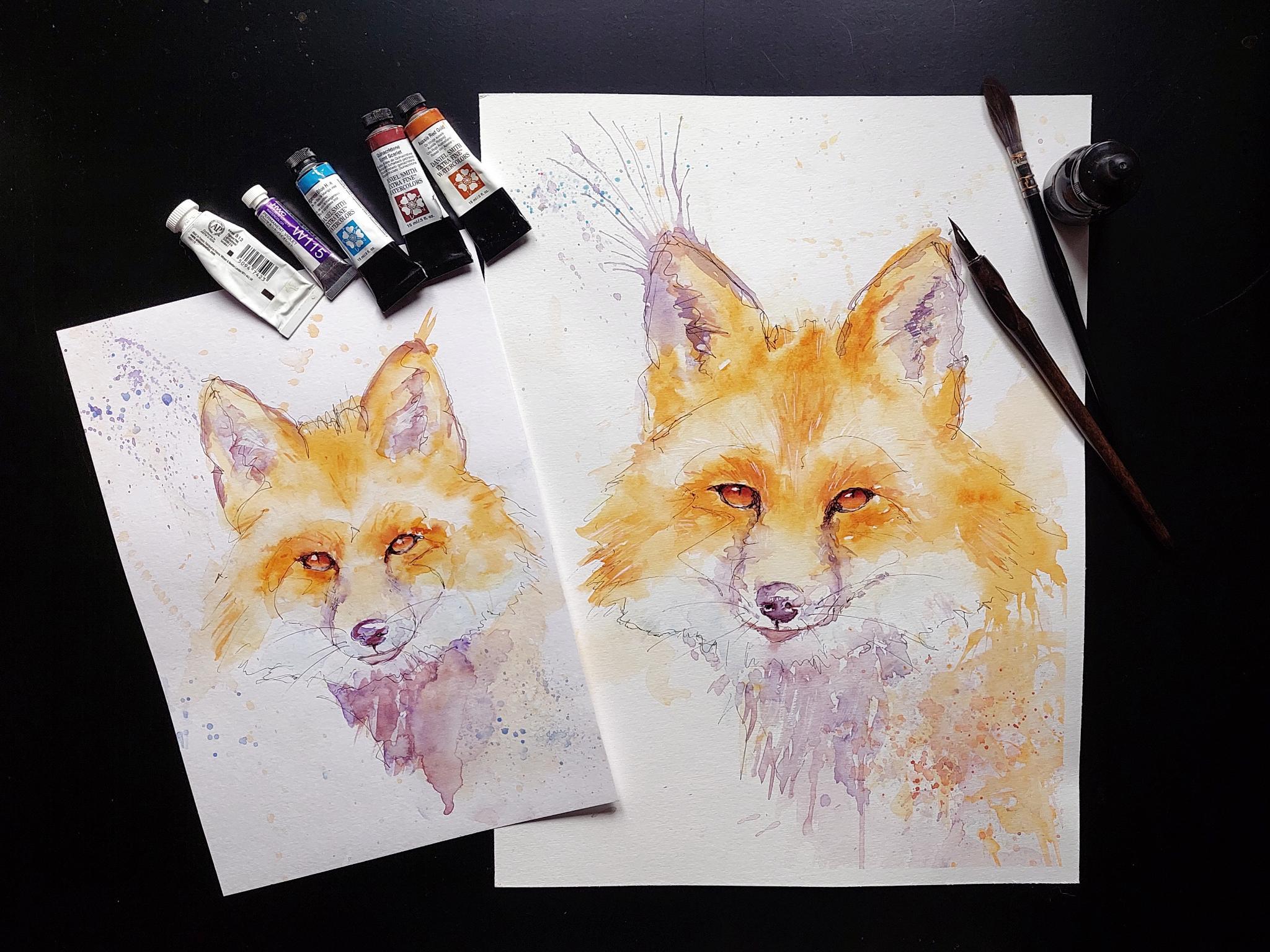
for this project. If you want to use the template, you will need to print that out. You will find it in
the resource section. Firstly, we need
watercolor paper. I use the Hanmul expressions 100 cotton paper and the
dimensions 30 by 40 centimeters. But you can use any
watercolor paper you like. The smoother the surface, the better for this project. Of course, you will
need sketching tools like a pencil and an eraser. For the inking, I
will use inking pans. But you can also use ink and ligraphy
pans or other tools. For watercolors, I will use
mainly Daniel Smith Colors, but just take what
you have on hand. So I will use the awsyRd gold, which is a nice orange color. I also have a quin
burned scarlet, a nice red brown color. The yellow is hansa
yellow light, manganese blue hue, and
permanent violet from Holbein. And a bit of white gouache
or white ink if you have. You will need some brushes. I will mainly use
these three sizes, which are all synthetic brushes. For effects all tooth brush
and straw are very helpful. Besides those, you want
to have an old towel or some tissue paper at hand
for blotting your brush. Of course, enough clean water and palette of some kind where you
can do your mixing. If you want to have clean
edges on your paper, I would recommend taping them. I personally want to
make a study first. If you would like that two, you can take another
cheaper paper for that. I use the fabriano mixed
media paper in the size. If you know what
colors you will use, then just skip the next part. But I know I am irritated
when I don't have the exact same colors as the one person that
is demonstrating. If you are like me and
want to know what colors you can substitute for,
then watch this part. If not, please skip ahead. I use the Daniel Smith
Chart, for example. Most colors should be available from other
companies as well. Do come stone to the pigments, and I'm a little
of a pigment nerd. First, we'll look at the yellow, which isn't really
that important. You can choose whatever
you have on hand or like, but maybe choose a more transparent one over
an opaque yellow. The permanent violet
from Holbein is PV 23, which should be the same as this cabazle violet
from Daniel Smith. You can also use some ultramarine violet or
something you have on hand. The Manganese blue hue is also easily interchangeable with other blues like Turan
Coval blue or all blue. It is not that important because we will use
it very lightly. The quinacridone burn
scarlet is the P R 206. It is a very nice
red brown color. You can use a boronic color
or some red go, maybe. The asi red gold is
a little bit tricky. It is more vibrant than
the swatch on the chart. You could also use some orange yellow or try to mix your own. If you have a very bright
orange like pral orange, try to tone that down with brown or even a
little bit of purple. If you want to mix a similar
color to Aussie red gold, here are the pigments. The first is the P y 83, known as dioolt yellow, the P R one oh one, which is, in this case, a transparent red oxide, and the PV 19 is
like a rinacdonRd. I don't have the yellow or
pure pr11, but for that, I have the burn Siena light, which contains that pigment. I have a Quin rose, which is a bit of
a purply PV 19. And I took the new
gamboge for the yellow. I don't think it
matters that much. I just took it for the warmth. I also tried the burn scarlet, which I will already use in the painting instead
of the sienna. That is the Osi red
gold for comparison. For the first mix, I
use the new gamboge, the burned Sienna light, and Quin whereby the yellow
took the part of the mixture. For the second, I used the Quinburn scarlet
it is a bit redder. Just experiment with the colors you have and find
a color you like. With that set,
let's get started.
4. Study Demostration (optional): If you want to skip it and just use the template, that's fine. I recommend everyone to study every subject and
reference photo to understand the structure
in form of it. Let's take our reference picture and look for basic shapes. With that, I am talking
about three simple shapes, rectangle, triangle, and circle. They help to simplify the
subject you are looking at. Of course, you do not
have to try to find a perfect rectangle or circle, but try to break it down
into very simple shapes. Try to find the bigger shapes. Don't try to put a shape
to every little thing. Try to get the angles right and the distances of important
points like the eyes to the nose is the head
as tall as it's wide, is the size of the ears
right and the angle. If you practice that with
your other paintings, you won't need templates
anymore and can be loser in your
interpretation of the subject. This chapter is a
demonstration example of how I study the subject. We will not dive into how
to study this in depth. If you would be
interested in how to study a subject
before painting, then let me know in
the discussions. If you want, you can make as many studies of your
reference photo as you like. I just did a quick
Carcer sketch. Again, trying to find the right proportions
angles and so on. And in addition to
the pencil sketch, I tried to pay attention
to the values a bit more. If you feel brave enough, try to sketch the fox directly
onto the watercolor paper. If not, grab your template
and let's start inking.
5. Testing your Tools (optional): I have here my sketch to test the tools that
I want to use. I do that to refresh the
feeling of drawing with them because it has
been some time since I last used ink and pens, and I wanted to have just
a little practice piece. So I try my Calgraphy pen, but I think I want to have thinner lines for
my final piece. So I switch here, we have the micron
pen and size three. I try to hold the pen
as loosely as I can, and also try not to
lift it too often. And because I have my
little sketch here, I can test the water colors
too that I want to use. I can test if they
look good together and if I may need some
lighter colors. I sped things up a lot
because I just wanted to show you my process before
getting to the real piece. Although as such is, of
course, a good thing. It is possible that you like me sometimes tighten up the
real piece and try to replicate the practice piece because you like it so
much because it was just practicing and trying
things out and therefore has a nice
loose style, be w
6. Inking: I prepared my watercolor paper, which is the Han Mole. I showed you taped it to a
board and then made my sketch. The board rests on
a piece of wood, so it has a slight angle. So let's start inking. I will use the micron
pen in size eight. It is a bit thick, but I could not find my
smaller number five. But if you tilt the pen enough, you can also make thinner
lines, that's great. Let's loosen up a bit. Don't over think and have fun. We just pick starting point and try to be loose as we can until we come
to the eyes and nose. The eyes are our main focus, so we should be careful there. I have my reference on a screen to the side to look at it if I'm unsure
about the line placement. Okay I will start with the ears because I want to draw the fur on the
cheeks a bit different. You can see that I made a sketch that looks more like an outline, but I don't like that. So let's begin. Ary your strokes. Make some
thinner, some thicker. Go over the same line twice. You don't have to be neat. Just play around, have some fun. Observe the fur on its head. What direction is it and
adjust your strokes so maybe. You don't need to ink
everything on your sk. You can also leave gaps. Let's see, do I like it. If that was that. Then start again or take a opaque white ink or
watercolor ground, even maybe acrylic paint
on some little spots. I think it's all
right. You don't have to be precise or anything. We have a kind of
a silhouette now. On the face, we have to be
a bit more careful here, but I'll try to be as
playful with the strokes. I want them to be a bit fine as where I keep
the pen tilted. The darkest here
are the nostrils. This line here leads to the eye, and now I have to be
a bit more careful. You can wiggle a bit around, but don't overdo it. The eye should be
the darkest spot, so we focus our attention here. Yeah, that's enough for now. Now, the other e, again, a bit more careful, but don't make it too neat. Don't just draw an outline
and fill it with ink. I always look at my
reference photo to see if I have to
adjust some things. The eyes are the important
here in the picture, so I want to get them right. If you are not sure if
you need something more or need to change
change something, just take a step back and come
back after a few minutes. If you are sure that
the ink is dry, take an eraser and
take off the graphite. If those graphite marks give your drawing something extra, then just leave them
in. Less is more. We will put
watercolor on top and can manage with fewer ink marks. You can put ink on watercolor, so if you want to add something, you can always do it later, like I had to because
I forgot something. Can you tell you what it is. Now we can get our watercolors a fresh pot of water brushes, and we will see us
in the next chapter.
7. Watercolor Part I: The First Layer of Orange: So I hope you have everything prepared
and on hand you need. Now, let's start the fun. Wet your brush and just flick it on the
page to get rid of the fear of starting and putting the color
onto the paper. Wrote the painting process, you should keep in mind where the brighter spots are to not
put too much color there. We will start with
watery yellow. We want to establish the areas
where the orange will be. Don't over think here. It
is a very light color, so you really can't do anything. So I think I just want to jump to
the orange color. Keep your brush strokes
as loose as you can. Again, keep in mind
the brighter fur. Look at the reference
photo where the darker orange fur is
and put the color. Make some edges softer
if you don't like them. And try to brush in the
direction the fur grows. If the bright fur got too dark, just take a dam clean brush
and lift some color up. A. And put more color to the darker fur. If your colors are already dark, then just let it dry. Watercolor dry lighter, so it can be that it
isn't even too dark. And we will paint another
layer on top of that. So just start as
light as you can. Because I flicked on water and had more water in the brush
as I painted with the yellow, I don't have to rush. Play around with the color, try different brush strokes, and see where it takes you. Don't forget to
play and have fun. And don't think about every
step. Does it look good? What did I do here? If you
really don't like something, take a tissue and
the paint away. Let's see, we have
the whitish fur here, and I want to take
away some color in the ears that I find two orange. So I took a wet brush, scrubbed a bit on
the place where I wanted the color to lift and it away with
the fabric piece. I want to play a bit more, so I put a lot of watery
paint on one spot. Take my straw and blow the
paint in one direction. You don't have to contain
the color in your subject, but also color the background and bring a bit of
movement with it. I think I will make
some spattering, something like that just like I did in the practice piece. For some more
texture in the fur, take your toothbrush and
get enough clean water on it that you can flip
into the orange areas. If nothing happens, then the orange paint was already
too dry or still too wet. I paint away, which ran down
into the brighter area. And if we have established
the orange areas, we let it dry for
the next slaps. I wanted to lessen the contrast
here by picking up paint. I have to keep in mind that
the focal point is the yes and we don't want to draw attention too
much to other areas. I want to begin fiddling a bit and that's a good
sign to step back. We can always come back later
and paint a layer on top, but it is difficult to save an overworked piece.
So let's stop. If you have a hair dryer, you can quickly dry it and
begin with the next steps.
8. Watercolor Part II: Purple and Blues: Now we will pick our
blues and purples, and the eyes last maybe. My fabric piece had
blue paint on it, and I d that on the paper when I was picking
up the orange, but that is not too bad because we will
get purple on there. The purple represents the
darkest spots in the fur. So I will put some on the ears. Try to keep it loose. Have a nice variety of edges. There are sharp
soft and loss edges that keep things interesting. I have to be careful here
and not fiddle too much so that the layer below is not lifted and the color gets muddy. I also don't want it
to be too dark now. I can always add another layer. I want to play around a bit, so I am adding more color now. I take a lot of watery paint and without
much thinking, blow it away. I think that's all right, but a bit of splatter
does never hurt. I will not repeat that
on the other ear. I think that would be too much. On my mixing palate, I took a tiny bit of
manganese blue with a lot of water and put that where
the whitish fur is. You can leave some white spots. Now, I take my purple
and paint the nose. In the practice piece, I did not paint the whole nose purple
and left some white. I want to do the same here. It also would be
all right to just paint the whole nose
and get the highlights with white acrylic ink later. It's okay when the purple
flows into the blue area, it can even make
something interesting. Now onto the dark
part of the muzzle. Try to follow the shape of
it with your brush strokes. I took a bit too much water. So I picked some of that up with my brush and let
it dry for a bit. If you keep those
puddles of paint, then when they dry, they can make blooms. They can be nice textures, but you do not want them
always and everywhere. Now I makes a bit of my quinburn scarlet with a purple and
make a nice warm color. I make some brush strokes trying to have a bit of a fur texture.
9. Watercolor PART III: More Purple and the Nose: I dab a bit of the Quin burn scarlet into the purple areas just to give it a bit
more color variety. Look where you can soften some edges that draw
too much attention. I am going a bit here, keeping an eye on my
reference picture. Every time I am unsure
of what to do next, I will play around a bit. Here, I will dip watery
quin burn scarlet into the neck area to make some drips or at least
try to make some drips. As you can see, I
need a lot of water. It is very stubborn today, and I don't want to use
too much water because I just wanted to have
small little riplets. It took a moment, so
I spread it up here. Here I dab a bit of purple
inside again for a variety. I think the dark area
grabs too much attention. It is too busy and
dark in this area. So I just get the fabric
and lift the color. I again soften some her edges and getting a bit
with those marks. I'm not quite
satisfied with them, but I leave them before now. The nose needs to be. Try to get some paint on the
edges of the nose and take your clean brush and get rid of the excess water and drag the paint from the edges inward. Let that sit and get a
smaller brush for the lips. The same here as with the, get the pain to the darker edges and pull the pain from there. You can soften some edges of the nose when
it is a bit drier. But because I am
impatient, I just go in. As you can see, I
come to a hlt and you maybe already know
what I will do now. So I take my tooth brush and splatter and
flick some paint on. If it is too much or
I do not like it, I splash some water on it. Remember, just not to overdo it. I think we should
paint the ice now. Get a smaller brush. Take your orange color
and paint the upper half. Clean your brush, get rid of the excess water and
pull the paint down. Take a bit of the
Quinburn scarlet and drop it in the upper half. The upper part should be darker because of the shadow
of the upper eyelid. I am so impatient
that I often make mistakes as you will
see with the eyes here. So learn from my
mistakes and better take a step back rather
than to overwork it.
10. Watercolor Part IV: Eyes and Details in the Fur: I see that it needs a bit more color and
go in way too early, and the color flows down
into the lower part. If you do not have your
paper on an angle, it can be that the
pain keeps in place. But if it runs into the
lower part, wait a bit, like the impatient me and then pick up the
color with a brush. If you go into ly like me, the Quinburn Scarlet will
just still flow down, and you have to pick
it up again and again. I now take more of the Quin
burn scarlet with a bit of a thicker consistency and paint the upper
edge of the eyes. And And here, I have to pick up
the paint again. I want to achieve a glowing
gradient in the eyes. If you feel it too much,
the effect is not as good, so that's what happened here. Now, we want to mix our
orange with a bit of the darker red brown to make
some texture in the fur. Look at the reference
picture and see where the fur
has to be darkened. I want to make it
darker around the eyes. Try to brush in the
direction the furs. Make your brush strokes and soften them with
a bit of water. I don't want to overdo
it with the texture. I don't want to overdo
it with the texture. Don't forget the
part under the yes. Make your brush strokes, where you can vary your edges, see where it needs more paint. If you don't like it, or take
a brush and pick the color. D. That
11. Watercolor Part V: More Details: Now, we come to a point where we do some minor corrections, and I see that I forgot
the tactile hairs. I paint a bit of watery purple where
the tactile hairs sit. Now, let's get a rigger or the finest brush you have
and make some details. And same as always. If you don't like it, it away. If the areas are still
too, just wait a bit. Just make some marks and play
a bit. Don't be too strict. I want to put more purple to the ars to darken
the middle part. I come to the part again where I'm unsure what to do next, and instead of
taking a step back, I want to play a bit more. So here we go with a bit more
spattering and flicking. I want to darken the e yet area. I take Quinn Burn scarlet and
a bit of purple for that. Don't do what I did and fill
even more with their eyes. I am fighting the pain
more and more here. S make the nose
darker if you want. I start fiddling with things, so it tells me that
I shod stop soon. If you are happy with
how your fos turned out, stop here and let it dry.
12. Watercolor Part VI: Details with White Gouache: Now that everything has dried, we take our gouache and
make some marks with that. Take your rigor
or Smarlst brush. We will also paint
the highlights in the eyes that will
make them pop. Because I fill it too much with the eyes and they lost
the glow I will try to take out the paint in the lower half to make
at least a gradient. I think they look okay, so I quickly get the d and try to freeze the
paint in its place. Let's get the guage
on our rigor. Again, look at the
reference photo where the highlights are. I see some on the nose. I will also paint in
some fur with the gage. If you don't like it,
then just skip that part. Although gage dries, don't
overdo it with the fur text. I will put the highlights
where I see them in the photo. I will also put some
guage on the water line.
13. Watercolor Part VII: Finishing the Painting: Of course, I have to
flick around the too. I take a bit of watery purple to paint in some fur in
the bright eye areas. If you want some parts
even darker in some areas, then just pick up
your ink and make them black or make other
texture with the ink pens. The head seems to float a bit, so I go in with a bit
of paint at the bottom. When I'm ready, I take my hair
dryer and dry everything. Now, before I forget them again, I will take a smaller
inking pen to draw the has. I test them beforehand to
be sure which one to take. Draw the lines in
the air before you commit to have a better
idea where to put them. The last step for me is to make the highlights in the e y, and then it's finished.
14. Finishing Steps: When you are finished
with your piece, be careful when
removing the tape. Take a hair dryer
and heat the tape, so it is easier to remove and less likely
to rip the paper. Pull the tape at an
angle to further lessen the chance
that the paper tears. If the fibers of the paper come up when pulling
the tape off, you can take something
like a spoon and just press them down again. If the paper happened to buckle, take your spray
bottle with water and spray the back of your
painting with a bit of water. Take a towel and
something flat and heavy, and the next stage should
be flat and stay that way. And here is now the
finished piece. I hope you enjoyed the
class and had fun. If you have questions, feel free to leave them in
the discussion section. I'm excited to see your
projects and comments. I hope we will see this
in the next class. Okay.
 Shari Wagner, Artist and lifelong learner