Transcripts
1. Welcome and Class Overview: Welcome to class, and
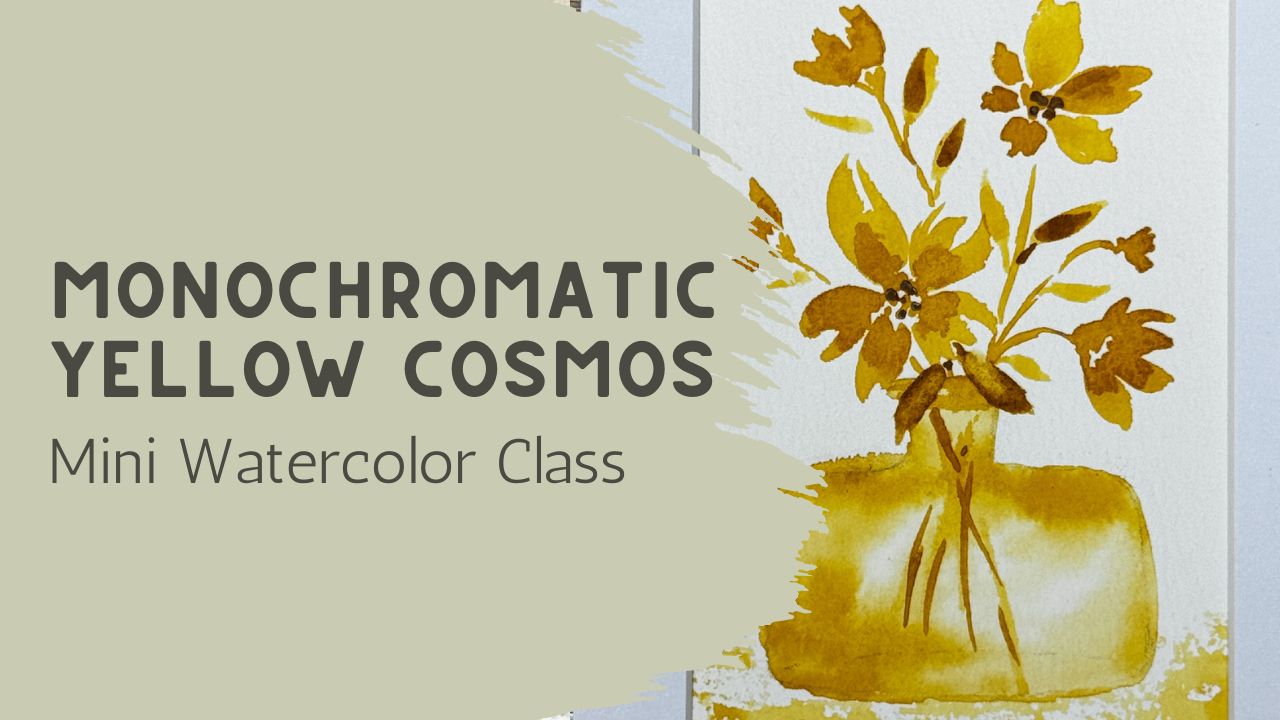
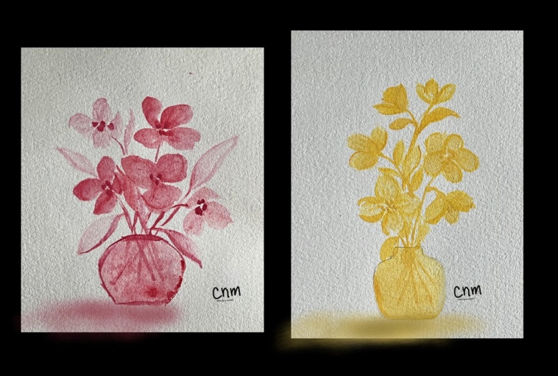
in today's lesson, we're going to paint this loose, monochromatic yellow
floral arrangement in a small glass phase
using soft layering, flowing brushstroke, and a
really relaxed approach. This class is designed
to be calming while also helping you build confidence
in watercolor in a simple, manageable way, we'll be focusing on using
different strengths of the same color to
create depth and variation without needing
a large color palette. Yellow is such an
interesting color to work with because
it can feel soft, delicate in some
areas while still creating warmth and
brightness in others. Throughout the class,
we'll be exploring how adding more water, more pigment, or just a few deeper accents can completely
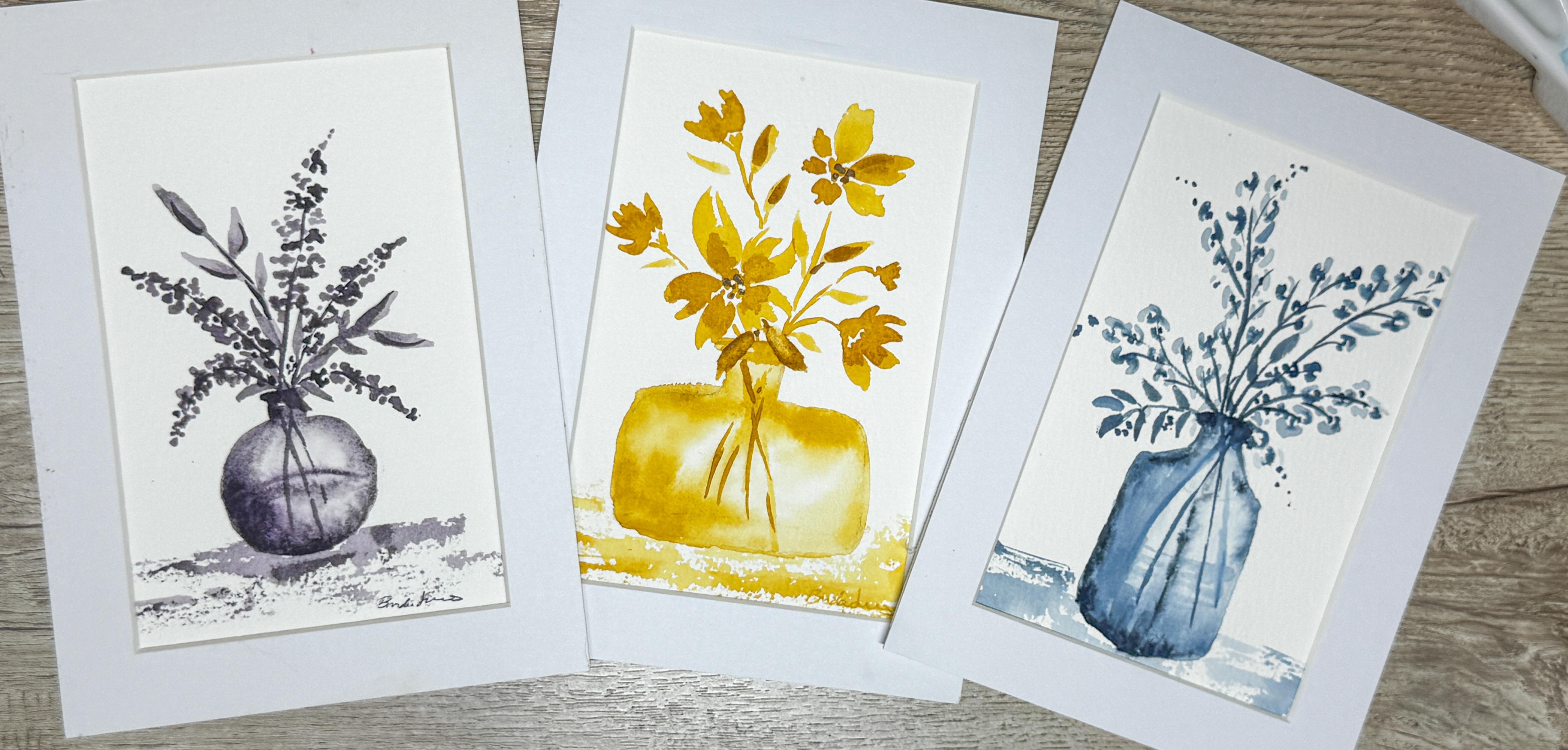
change the feeling of the painting while still staying within one color family. This piece is also part of a coordinating mini vase
collection here on Skillshare. Each class explores a
different flower style, different vase shape, and monochromatic palette
so that by the end, you'll have a beautiful set of three floral paintings that work beautifully together while still having their
own personality. As we paint, we'll try not to focus on perfection
or tiny details. The softness, movement, and the little unexpected
watercolor moments are often what makes these paintings feel alive and expressive. I'll be guiding you through
this process step by step. So gather your supplies, settle in, and
let's get painting.
2. Creating a Soft Watercolor Glass Vase: So in your class project area, you can find a PDF like this and you can
define a printout. If you print it out large, you're going to get a really
large image of this vase, which is fine if that's
the size you want. But if you want it smaller I'm going to be putting it
on this piece of paper, and so I'm going to
need it to be much, much smaller, like this
is from the other class. So I need this to
be much tinier. And so I am going
to you can go ahead and print this and scale it
and make it much smaller, or you can just free hand it. It's really just to
give you an idea. When you are drawing something like this, it's fairly easy. If you start with a light arch here at the bottom and
an oval at the top, you can pretty much connect the vase into whatever
shape you want to make it. That's what I'm
going to do here. I'm going to have
it start about here with the top and I'm just going to make this into an oval. And then I'm going to jump
down to the bottom and I'm just going to say that
I want it to be wider. So I'm going to go
from edge to edge, and this is just sketching. So we're just going to kind
of make it lightly sketched, edge to edge, kind of centered,
close enough, whatever. And then we're going to create the lid or the lip up
here at the beginning. So I'm going to come
in a little bit. So not coming out
at the very edges, we're going to come
in and then come down just a little bit,
very very light. Then we're going
to just swoop that out and swoop that
out on that side. These don't have to be exact. This is just if you do
a little bit at a time, you can really get this to be as symmetric
as it wants to be. Now that I'm down here, I'm going to start bringing this up. I can bring this side
up a little bit. Now this side, I'm going to just arch and start to come to
meet this in the middle. See how that works? I'm
just going to arch it here. And then come and met it
in the middle down here. See how it's not perfect.
And that's okay. It doesn't matter
because this is all just fun and it doesn't
really matter. So there's that, and
then I know that the base of the the glass vase
so you can see through it, so that's the other side. So here, I'll show you that. So this is kind of like this.
If you know what I mean. But it doesn't matter
because once you get the paint on it, you
can't really see that. If you go back to
our other class, this is from a different class, you can see that we
did something similar, but it was a round one and here we're making a
more of a wide one. It's close enough. Hand draw it, trace it, whatever
makes you happy. All right. I'm going to
be using my size six. This is around Princeton
Heritage, my favorite brush. Actually, the size
eight is my favorite, but the six for this one, because we're going
to be working small, and it's just going to be
a tiny little painting. This watercolor paper is
my size seven by five. This is 300 GAS, and this is 100% cotton. I like this paper.
It's on a board, so I do like working
on it this way. And because it's on a board, I'm going to be able to move
it around and twist it. So we're going to
create some little like, um, maybe cosmos. Let's call them cosmos
for this class. And they're going to be
in a monochromatic color, just like we did in the other class where
we just did purple. On this one, I'm choosing
a golden mustard. But you choose whatever
color you want. If you want your
cosmos to be pink, then choose it to be pink. It doesn't matter, make a
color that you are happy with. I'm thinking that I might just go with
something like that. This color here is really
pretty, if anything, I might just add in a
little more brightness from this other yellow, and I can just mix those
two together and create just a really pretty color that's going to there's
a little hair in there. That will be a really
nice color combination, and you can always use your
scrap pieces of paper. This is just where
I test out things. And remember that
if you start at the beginning with your
full concentration, it will be darker because
you have less water in it, and then the more water you add, the lighter and
softer that color will be like on the pink
one that you see there. When we add in a
darker one here, and then all I do is dip my paintbrush into water,
I'm not rinsing it off. I'm just dipping it. And then you add in a little
bit more water, dip it, add in more water. Look at how much
lighter it's getting, and all I'm doing is
adding more water. I'm not rinsing
off my paintbrush. I'm not dipping it
back into my paint, but you can see and watch how that really adjusted
and faded out. And then that way, you
can then come back through and on some of
these lighter areas, you can add in a more
concentrated pigment and you get that nice variation, or you can dip right into the really concentrated and
make it even darker. Okay. So that's how
we're going to do it. We're also going to remember that cosmos shape and face
different directions. Is the kind of flower that
we're going to be making. It has a base, it has a stem. It has all these
little tiny leaves that come off of it,
and it has a center. But it's all going to
be made in one color, or at least that's the
way I'm making mine. But when you do this, they
are facing different ways. So sometimes they face this way, sometimes they are down. Sometimes you see
them straight on. Sometimes you just see
the edges of them. So when you are painting them, make sure that you get
these cosmos to go different directions so that
they don't all look like this because that's going to be very boring and symmetric, and you're going it's not
going to breathe as much if all of your flowers are
just looking straight at you. We're going to want some of
them looking this direction. So we're going to talk about how to do that
when we are painting, and what we do is we make these back petals
a little longer, and then the front petal
is a little shorter. And that way it makes it look like they're heading in
a different direction. I'm going to start
with a lighter color, and so I'm going to be
adding more water to my paint over here so that I have the opportunity to make
lots of different colors, even though we're working in a monochromatic doesn't mean that we can't have variation
in our color way. So what I'm going to do is I'm going to
start with my vase, and I'm going to just wet
down this whole vase. Oh, shoot, I forgot to erase it. Okay. Well, I'll
erase where I can. Mistakes happen,
people. It's okay. Just roll with it.
Do the best you can. I'm definitely a
carefree painter. I don't like to put stress or rules on me because
when I do that, it kind of feels
like it takes away from the point of my watercolor. If everything is
stressful when you're watercoloring, I might
as well be at work. So I choose to have
watercolor be my outlet for relaxation and give myself a little bit of grace and a little freedom
to make mistakes. And most importantly,
the freedom to learn. So I encourage you
to also practice that that when you are painting
and you have a mistake, you roll with it and you
just say, it's okay. Maybe this is my practice run. Maybe I'll try it
again another day and see if I can make it
better the next time. What did I learn from
that first time around? And practice and
learn and experiment, and most importantly, have fun. So now that I have that
wet and you can see it's not soaking
wet, but it is wet. There's some shininess to it. I'm going to add in
a little dark color of this yellow around
the outside edges, and then we're
going to pull that darker color into the center. You want to cover up that
pencil line wherever it was, because it's very hard to erase pencil line after it's dry. I'm just going to be adding it. Now that paper is nice and wet. I'm just going to
add in some more. I'm going to make this
side over here darker and this side over here
lighter and less. But because it's a wet on wet, I can now rinse off my
brush using a mostly wet, I mean, mostly dry paint
brush, clean paint brush. I can just kind of pull
it in in different areas, allowing some white space
to maintain on your paper because that's going to
be your highlight or your reflection of your glass because this is a glass phase. So I'm not covering
the whole thing. Just pulling it in a little bit. Then if I want to, I can always
come back in here and add a little bit more darker
color over in the one side. Remember, it's going to
get lighter as it dries. So when watercolor is wet, it's going to show
a darker color. And as soon as it dries, it's going to be
a lighter color. So just remember that
when you are painting, that you can go a little bit darker when it's wet because
by the time it's dry, you're gonna be
like, Oh, wow, look how lighter it is now. Just adding a little bit more
on my palette over here. Just add a little
bit more water. Okay. So now what I
think I'm going to do? I'm going to leave that
alone for a minute. I'm gonna come up and choose where I want my top flour to be, and I think it's
going to be up here.
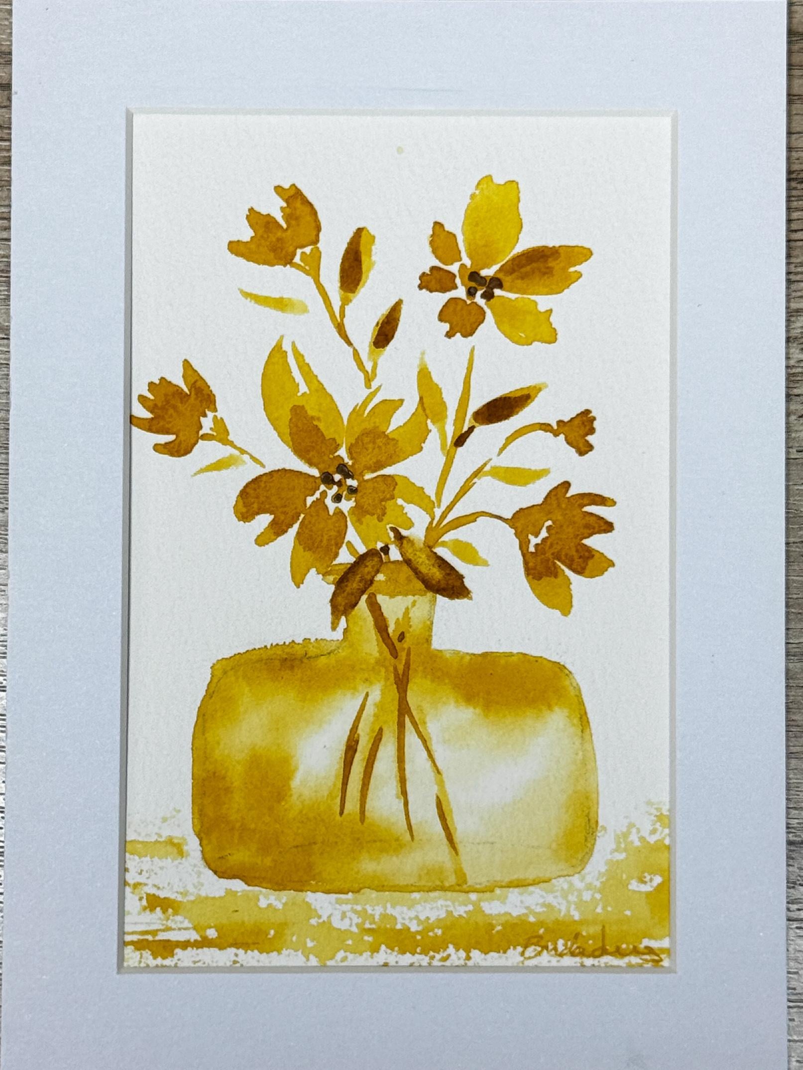
3. Painting Loose Yellow Cosmos Flowers: Um, and so I'm going to
create a little flower, and this is just going to
have some little petals. They're just going to go like
that and over on this side. They don't have to be perfect. I'm using my lighter color, so that means I'm using
more water and less paint. Then I will come
back into the middle and add in a darker color, more paint, less water
in just a minute. Now I want to show that this
is heading this direction, and so all the petals on this side are going
to be shorter. I'm just going to make little tiny petals over on this side. Draw them up a little bit. See how much shorter they are. Then that is indicating that it is heading
that direction. You can just draw them
out until it looks right. I'll just add in a
little darker color here to the center.
Here's my first one. Then I think I'm going to
put a little bud over here. For my bud, we're looking
at a bud going like this. So we're just going to
add in a little bud. You can't really see the center. It's just the bud.
So this is the face. And maybe I need another
little bud over here. And maybe I don't know. I'll see if we're going to
add in more buds over there, but maybe I want to have one of these flowers that
are facing down. And so I'm just going to have a couple facing down
like this over here. I'll be adding in some darker
bits there in a second. Um, and then maybe
I need to have a flower right here in
the center to anchor it. I like to have my biggest
flowers near the base. It really helps
strengthen and anchor the flower when the largest
flowers are near the bottom. So I'll put something there. And maybe I need to have
another little bud out here. Just another little one
coming over there somewhere. It's looking cute. Now I'm going to get
that stronger paint, which just is more water
more paint, less water. I'm going to come
into the centers of these and allow that to just kind of come in and
touch some of those spots. Same with over here,
creating that base to that flower and a little flower stem that
comes down that way, a little base to that
flower. Flower stem. Maybe a little base to this one. So I'll just make it into
like a little triangle. It's not complete.
I leave open space. I leave some white space, right in some darker. It comes down here
now. You can't see because it's going behind this bigger flower
and it's just going to come down in here
and that's fine. Same with over here. There's another little V,
it's going to come over here. It's going to come
down into that vase. And then I'm going
to add in some stems down into my water. They can cross. You don't even have to see
where they all come from or where they're going.
It's good enough. Just lifting some of that
paint that's in there. Using my rag to
wash it off onto. Add a little bit more here. Little dots to add a center. How fun that is. Because it's one color, you're using your lightest color and then you're using
your darkest color, which is just more paint, less water to create the sense of it being
multiple colors. But now I'm going to add in some little leaves and so I'm just going to add
a little tiny stem. I'm just going to press down my paintbrush and
draw it back up. Don't add too many. If
you add too many leaves, it gets really busy really fast. Just a few. It is better to add less than more when it comes to leaves. I'm going to leave this
open here in the center. I'm not going to fill
that in so that it just looks like a real flower
that's bending over. And I'm going to allow this to dry and then I'm
going to come in and see if it needs another
layer or what it needs. I think I like to cover
this lip with a flower or a petal or a leaf,
but it's too wet. I'm going to go ahead and dry this and then I'm going
to see what it needs. Okay, so I'm going
to make this just a little bit darker and just add little dots here
to the center of that flower and to the
center of this flower, just to add that
little definition. And then I want to have, like, a little maybe like a leaf
coming over the edge. I might add a little more depth to some of these other leaves. I think I want to add in these stems just
a little darker. Okay, so now I want
to add my base. I like to use this
lighter color, less water, less paint, more water, and I'm going
to put it on my paintbrush, and I'm going to hold my
paint brush on the side. So it's like this and
holding it like this. Then I'm going to brush it
along the base to kind of create a table area very, very lightly, but hardly even
touching the paper at all, letting it dance
across that paper. Coming up over the edge, letting it be kind of
sketchy. Over here. Kind of gives it just
the illusion of a table. Then I'm going to come over
where it's a little bit darker, little stronger paint, and add in just the
ever so slightest kiss it with a little darkerness darker
paint here and there. A little too dark. All I'm doing is lightening it, wetting it down, and just lifting up some of that
paint. That's all. Okay, so I'm going to dry this and then we're
going to mat.
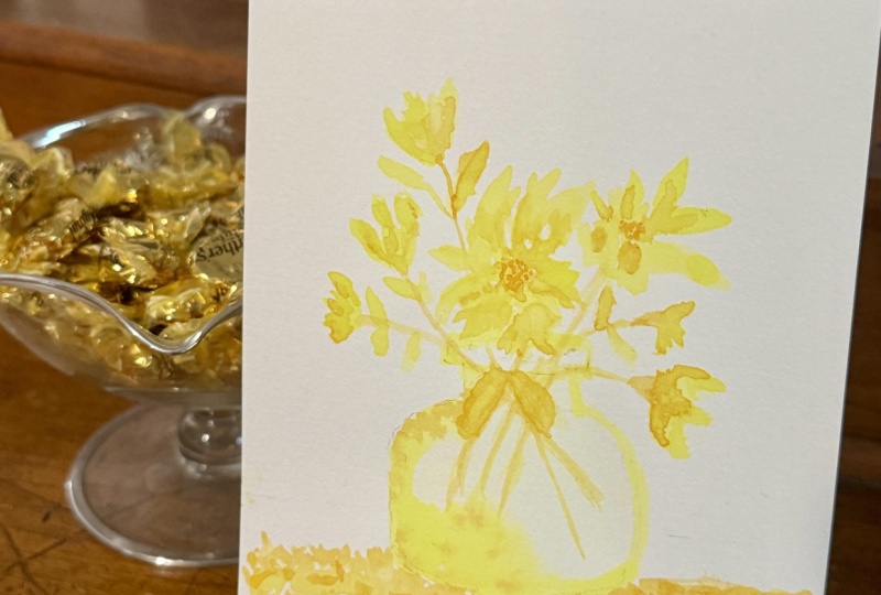
4. Final Thoughts and Next Steps: Just finished your
second piece in the coordinating mini
watercolor vase collection, and I hope this class helped
you feel a little bit more comfortable exploring
loose florals in a monochromatic palette. Yellow can sometimes feel a little bit challenging
as a color because it naturally stays softer and lighter than many other
watercolor shades. But that's also part of what makes it so beautiful
and delicate. Hopefully this class showed
you that even subtle shifts in value and water ratio
can still create depth, movement, and interest without needing strong outlines
or lots of details. One of the things I love about monochromatic
painting is that it encourages us to slow down just a little and pay
attention to water, softness, layering,
and brush movement instead of constantly
thinking about mixing colors. It can become a very
calming way to paint. Remember, loose
watercolor florals are never about making
every flower perfect. Sometimes the paintings that feel the softest and
the most natural, are the ones that we
allow the watercolor to stay slightly
unpredictable and airy. Those little blooms, soft edges, and even unexpected shapes are often what brings personality
and movement to your piece. If your painting looks
different from mine, that's completely okay
and honestly expected. Loose watercolor is very
personal and every artist naturally brings
different brush pressure, water control, and movement
into the painting. That's part of what makes these projects so enjoyable
to revisit over time. I would absolutely love to
see your finished project. Please upload your painting
into the class gallery. It was always so
inspiring to see how differently everyone
interprets the same project, and your mark may encourage other students
to keep painting. And if you enjoyed this class, I'd be so grateful for a review. Your support truly helps my
classes reach more students and allows me to create more short, approachable
watercolor lessons. Also, don't forget to follow
me here on Skillshare, so you know exactly
when the next coordinating Phase
class is released. Together, these classes will create a beautiful
little collection of monochromatic floral studies
that can be displayed as a matching set or personalized with your own favorite
color palette. Thank you so much for spending this time painting
with me today. I'm really glad
that you were here. I hope this class gave you
a little chance to relax, experiment a little and simply enjoy the
process of painting.
 Brenda Jones, Watercolor Artist & Teacher