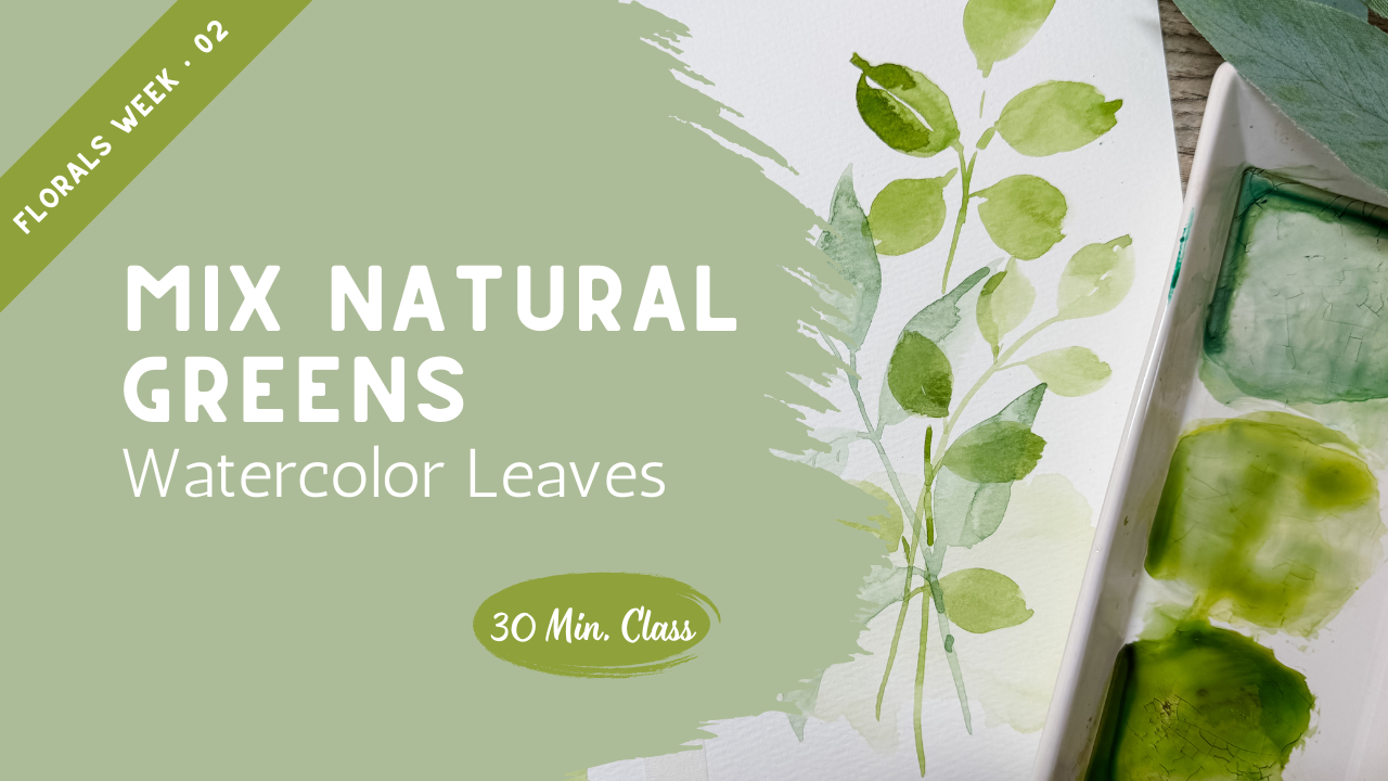
Transcripts
1. Why Tube and Palette Greens Look Artificial: You ever painted
leaves and thought, why does this leaf
green look so fake? Right out of the palette,
greens are usually too bright, too clean and too loud. When your greenery
feels artificial, your whole painting can lose that soft natural movement
that you're aiming for. In this class, I'm going
to show you how to mix your own natural
watercolor greens using simple combinations you
already have on your palette. We'll warm them up, cool them
down, mute them slightly, and give them the
depth so that they feel organic instead of plastic. Then we're going to use
those greens right away with three simple leaf
shapes so you can actually apply what
you're learning instead of just watching. By the end of the
lesson, you'll feel more confident adjusting
any green to fit your painting instead
of relying on the color straight from
the pan. Let's begin.
2. Mixing Natural Greens That Feel Organic: Greenery is such an important
part to your watercolor, and it's something that
I know that a lot of new beginner watercolor
artists really struggle with. So I really want to take this whole class to
talk about greens, how we create beautiful
natural colored greens and then also how to paint some. So we're going to
get started right away in discussing the different greens
and how to blend them. Last week we were looking
at yellow and how you can mix yellow and create darker
yellows and lighter yellows, by adding a little bit of blue, you can create some greens and by adding a
little bit of red, you can create some orange. Today is lesson is going to
be very similar to that, creating different colors
of shades of green. So maybe you don't have a big color palette like this with all the different
paints from tubes. But instead, you have something
like this where all of your paints are in a can
with little small samples. This is also perfectly normal
to use and not a problem. And so I do want to
show you this as well. So I would wet this
whole thing down with my spray bottle so that
all gets activated. And then I'm going to
show you this and how we can use these colors
or these colors to create and mix our
new green colors that look a little
bit more natural. I know you're going
to ask me what are my favorite colors in here? And I do want to show you some
of those of my favorites. I prefer to have the Daniel Smith
watercolor paints that come in the
tubes like this. These last such a
nice long time. I can squeeze them in here, create a little puddle of color, and then just refill
every once in a while every couple of months when I need to
refill a little bit. These are probably my
four favorite colors. You can see this is
called green gold. This is going to
be this one here, and it creates just
a lovely here. I'm just going to
show it to you. It creates just such a
lovely color. It's bright. It's like a spring green. It's really good to mix with. So this one here
is the Tera verte, and it is a really nice one. This one kind of is more like
maybe your hooker's green. It's a really pretty color. It's kind of almost on
the blue green side. Also a really nice
one to blend with. This cascade green
is really fun. Let me see if I can get
that one going for you. Um, this one is going to
be a granulating color, we'll put that down very
similar to this other one. We're going to let
that dry and then I'll show you how
nice that one is. Then Perlin green is
going to be one of my darker ones. We'll put that here. If you just want a really
nice natural green and not looking to
have to mix it, these would be some greens
that I might recommend. I'm going to give
you a nice close up of these so that you can see the name and you can pause it to be able to see what
each one of these are. You can see here
the granulation. Do you see that that is
there's blue in some areas, green and even a little
gold yellow color in there. I hope that comes up on
camera. Same with this one. This one is also
variegating and so you get the different depths
of color with this one. I just have a little
plain dish here, which I definitely recommend
either having a plate, something flat, some kind of
a flat dish where you can create and mix your colors if you don't have
something like this. I want to use this paper,
but in the meantime, I'm just going to use this scrap paper to show you what I mean. If I go right in here into my little palette and I put my paint brush down
here with that color on it. That's a nice olive color that they did a really
nice job with that. I'll show you that here. And then the next one over is
more like a hooker's green, really bold and almost
like a blue green ame. And then the next one see
how these other ones. This one almost looks
like a natural green, something you might
actually see in nature. But then these two
greens are pretty, but they're not
really as natural as what you might expect
to see in nature. This one's pretty,
but it's very yellow. I think you're getting
the point that these are nice colors straight
out of the can, but maybe not the colors
that you were looking for. That can sometimes get frustrating to not have
the colors that you need, but these are the color
greens that they're offering. I suspect that most of
you are going to have a color palette
that's like this. We're going to use
all of our colors out of here for today and
create our own colors. I want to create this nice color that is heading towards blue. It's like a blue green with a
little bit of yellow in it, and we're going to
create that out of here. I'm going to start with this color because it's
the closest to that, put some of that in here, and then I'm going
to pick up some of this yellow color
and mix that in. I don't know if I
have my sample, and I can swash it on there, but I feel like it still needs
a little bit more yellow. I'm going to get a
little bit more yellow, mix that in, it's heading
in the right direction, but I also think maybe
it needs a little depth. I'm going to add just a
touch of brown to it. Could have also added
just a touch of red. Feel like maybe it needs
just a touch of red. Watch how that changes it. Wow, that's really
pretty. How did we do? How close is that? Fairly close. Maybe it needs just a
touch more of a blue. See how we're just
adjusting it left and right until we find
just the right color. Wow, that's pretty nice. Look at that. Spot on. Perfect. We went from
this bright color, changed it with some yellow, added in some red, added in just a
little bit more blue, and now we're spot on. So to recreate that, I'm going to take because
I'm going to make more now. I'm going to add
in my blue green. Add in some of my yellow. Adding a touch of red head
it towards that brown. I need just a touch of blue. It's too much. Heading
it back into that blue. There we go. So now I
will put this here. And the way we did
that was by taking this one adding in some yellow. A touch of red and then adding
in a little bit more blue. When we mixed all
four colors together, we ended up with this green
that green is really, really close to what
I was going for. Even though maybe don't have all of these colors over here that I showed you
at the beginning, you can still create those
colors out of your palette. Let's do another one. This time, we're going to do this one where it's more of a yellow green. I'm going to start with this, which is more of a yellow
green to begin with, but look how much bolder and brighter and more yellow it is. That's just not quite
what we're going for. I need to add in a
little bit of blue. We're going to add in
some of this blue. We're gonna take a
look at that color. Wow. That's pretty good. Maybe it needs just
a hint of red. Let's see. Did that mess it up? Or did it make it better? Maybe it just depends on which
direction you want to go. I think I liked it
better that way. So I'm going to go
ahead and wipe that up. Try it again. So I'm gonna go with this color which
is way too bright. But we're gonna
put it down here. That yellow green, and
then a touch of this blue. Then we're back to that color. And we use this blue. We were able to make two colors. That one and this one. Now we're going to
work on a third one. Our third one is
going to be more of a true green where it's
more of a brighter green. This one's very muted yellow. This one's muted almost
towards the blue, and this one is a little
bit brighter, true green. I'm going to take this green. I always try to start my base with the one that's closest
and so that's closest, but clearly way too bright. That's too bright, doesn't
really look natural and it needs a little bit
of yellow added into it. I'm going to come in here with a little bit of
this orange yellow. Mix that in I'm also going to take just a
touch of red, mix that in. Let's see how did we do? Pretty good, but I think maybe it needs to be a little darker, maybe add a little
bit more green in. That's pretty nice.
It's pretty close. Let me just keep playing with
it until we come up with the right color. There we go. There's my third
color right there. And the way we did that,
adding this green color. The way we did that
is starting it with this brighter green which
was way too bright. Adding in just a touch of this yellow and then
a little bit of red. We mixed all three of those together and we
came up with this. We're going to be
our three colors for now and we're going to do the rest of the class
using those colors. I'm really excited to see
what yours looked like. How did you do with
mixing your greens? Were you able to get those
greens three different shades, three different
shades that look more natural than where
we started from. Remember we started here, and this one is even a
really bright yellow that we started with and just
made this beautiful green. And look how bright that is. I mean, it's just not natural. Normal greenery doesn't
look like that. But by just adding
two other colors, we were able to create it
to look like this. Okay. Now the next thing
we're going to be doing is making
leaves themselves. So I'm going to use my little
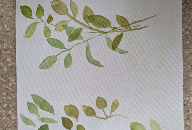
colors that I had mixed up. To make a leaf, a simple leaf, I fill up my paintbrush.
This is a size eight. I create a little this is
just a very simple leaf. I create a little
line for the stem, and then I drop my belly of my brush all the way down so
it's as flat as it can go. I drag my paintbrush along, and then I slowly lift up. And I drag it until it creates
a tip. I'll do that again. A little line, drop my belly of my brush all the way down
flat against the paper, drag it out and slowly lift up. Put a pencil down,
a little line, put the belly down,
drag and lift up. The longer you drag and
lift up or you curve, you can create all different
shapes of leaves that way. That is one style
of painting leaves. Then if I create
the next one here, it's more yellow one, more of a round shape, so I can create a little stem, and I can I put the
belly of the brush down, but I lift it up fairly quickly instead of
dragging it out, and then I can create a
second one, almost rounded. It's a little line and then push the belly
down and round it out, and then round it out
on the other side. Those would be my
rounder brush strokes for a rounder leaf. And then you could create one long stem with
several coming off of them and creating multiple rounded, similar to this. All right. Then my last one, we're like, this one is I will create
something similar to the combination
of these two with a long stem and then putting
my belly and my brush down, maybe not going out
as far, lifting up, and then just do it
again on the other side, which makes it longer and wider. Do it again, belly down, out, and then just do another
one on that side out, one, two, one, two, that would be a
different leaf here. Those are the three kinds of leaves that I might
make if I was trying to reproduce these leaves in the right colors to
match these colors. Go ahead and do this, create
your three different colors. Have them ready to go, and
then when you get back, we're going to start
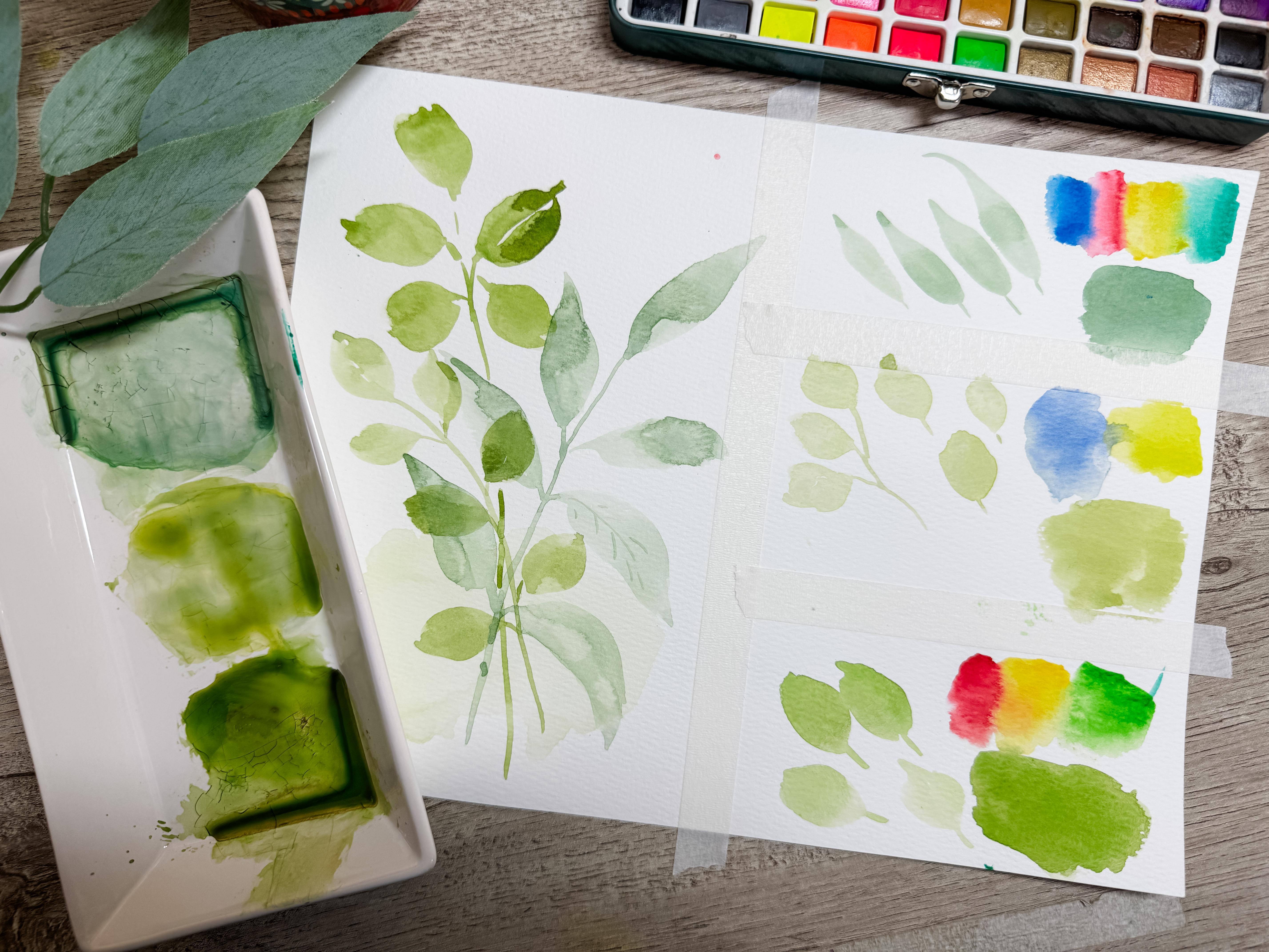
on the class project on this side of the page. What I did here is I
just broke this down. I put I have just a full
sheet of paper, an 8.5 by 11. This is watercolor paper, and then I just put a
piece of tape down here, and then I divided it here, so I had my three different
colors that I was working on. Then when you get
back, we're going to design our actual
class project there. That way we're using
one sheet of paper, and then when you upload the
photo of what you worked on, you can show a photo
of all of this where you're showing your
work for creating the colors and also creating your sample leaves and then also creating your project here.
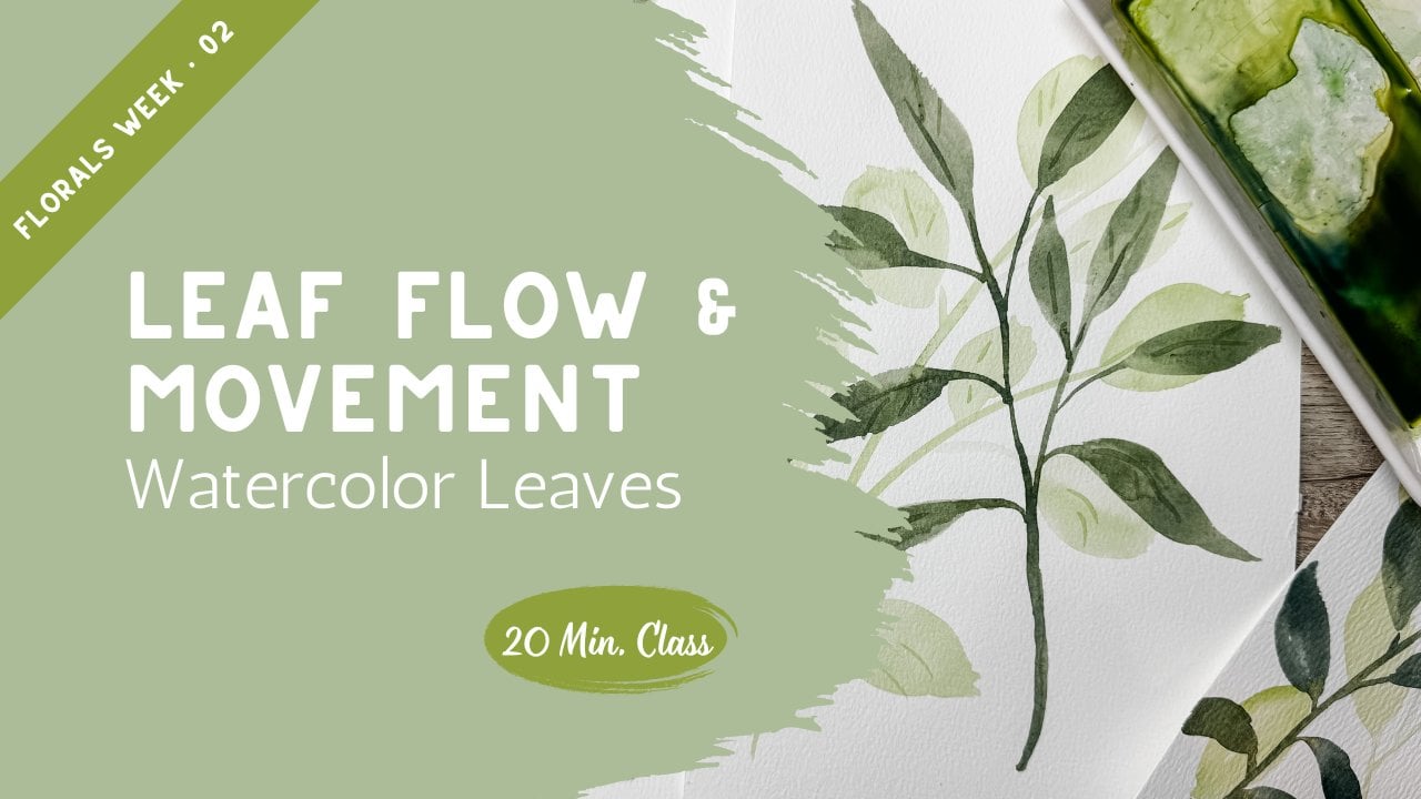
3. Three Simple Leaf Shapes with Flow: Okay, hopefully
you've had a chance to create your three
different styles of leaves and your three
different colors and creating them out of whatever
colors you happen to have. So if you don't actually
have these colors, you've been able to recreate
them similar to what we did. It's a great study
of your ability to create the color
that you actually need and that maybe
you didn't have it, but you were able to create. So now what we're going to do is I'm just going to
keep using these colors, and if I have to
mix more, I can. I know how I created it. This is my reminders my cheat code to remember
that if I need to make this, I can just come back in here
and add more of this color. And then I'm going to add
some more of that blue. I remember which ones
they are so I can just recreate that color very easily and simply
just like that, I have it next and ready to go. What I'm going to do now is
create our little project. Using this lightest color, I'm just going to create move this out of the
way so it's a room. I'm just going to create
a little wet space down in here and just add in some of this really light almost in a
fan shape, but very jagged. My base color. Add a little
bit of that color in there. As that dries, we're
going to create some really fun little
branches that are going to come up here that are going
to have our leaves on them. Maybe we're going to create
a stem that goes like that and then we'll create another one that overlaps
and goes like that. And then maybe we will tuck in a leaf that comes up into
this area right in here, something along
those lines is what I'm going for where
I can show you the three different
styles of leaves and how they overlap with the
different colors. These are just
examples so that you could see the direction
of where I'm heading. I do want to just
quickly dry this off. I have a heat gun here, I'm
going to quickly dry that. And also off camera, I went ahead and
made up the rest of this paint so that I had the three different
colors in quantity here. The first one I'm going
to do is this style leaf, something like that.
This is nice and dry. The only reason I
did this is just so I have a little
bit of a background. It's so muted, it's so light. It wouldn't be something
you'd have to do, but I like the way that looks. Now I'm going to draw my arch. I think I'm going
to start up here. I'm just going to draw
my nice little arch. Doesn't have to be perfect, but something that that's
going to be my stem. And then off of the stem, I'm going to create
this nice long leaf. Then I'm going to add
another one here. Off of that, go to
add a second leaf. Maybe I'll add a
third one over here. Maybe I'll put another
one that's angling down. Another one that's
going up here. See, I'm doing a
two stroke there. Maybe I'll put another one
that's angling down over here. Oops. Dipped into
my wrong color. Another one. That's this style. That's mostly dry. Now I'm going to
add in this a leaf. It's okay if it overlaps. I'm just going to put it
in something like that. Getting my brush full of that. I'm going to create a line that crosses
over these other ones, and then maybe we put
that rounded shape here. And then add a rounded
one off of there. You put yours in
wherever you want to. It's totally fine
for them to overlap. I can add to that, make that a little bit
darker since it's on top. It's a little rounded. I'm going to make them shape and face different directions. Okay. Now I'm going
to do that last one. I'm creating I'm
not going to add in the berries because this study
is just all about greens, but I'll add in some little
greenery up here at the top. That's the style here. Maybe I'm putting in a little
bit bigger leaf like that. You notice I didn't even
bother putting in a stem yet. I just I'm creating a little cluster because I want to create
this little cluster of leaves and then I'm going
to join them together. I'm going to jump
over it and bring it down, something like that. This one just make this a little bit bolder
so you can see it. So this is now mostly dry. This area here is just
a little bit wet still, but you can see how beautiful
and natural these look. This looks like something
that you could have literally painted out of nature. We used all these
beautiful colors, but we started with these really bright colors that
you have out of your in your canned
paint colors here. I just want you to
see the difference. I went ahead and used this bright one that was
right out of the container. And this yellow green, and then also this
really bright green. I went ahead and just used
our base colors and created this using these exact
same colors here so that you could see the
difference between this where we colored and adjusted our colors to formulate to
more of a natural color versus using paints
that are right out of the tube or right out
of the can like this. These are a great
way to get started. But if you're using the
colors straight out of here and not mixing them
with your other colors, you're really missing out
on an opportunity to make your greens more
natural in color. Now, there's nothing wrong
with painting with this color. If this bright is what you're
looking for and that's the style that you want to
paint in, then that's fine. I'm not trying to tell
you how to do art. I'm not trying to have
you change your style. I'm saying if you are
frustrated because you can't find these colors in here, it's because they're
not giving them to you. They're not giving you
these colors in here. You have to create them and
the way you create them is by coming up with your color combinations
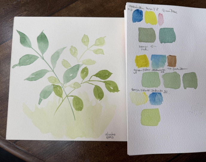
just like we did. Play around, make up some little charts like this so that you
can reference this. Put this into your little
notebook so that you remember if you're looking
for a green like this, this is how I get to it. If I'm looking for
a green like this, these are the two
colors I need to mix. If I'm looking for
a green like this, these are the three
colors that I need. This is going to
help you if you have that reference if you're trying to not paint with the colors that are big
and bold like here. You're looking for colors that are more natural like this. Then you're going
to want to learn how to mix your colors. I'm really glad you joined me. Come back to the next lesson where we pull this all together.
4. Where We Go Next in the Series: Instead of fighting a
bright artificial color, you can just adjust warmth, coolness, and intensity to match the mood of your painting. When your greens feel natural, your florals instantly feel more believable and connected. This class builds directly on the yellow study from
earlier last week. In our next lesson,
we're going to be exploring leaf flow and stem crossing so that you can bring even more movement
to your composition. Then on Friday, we'll
pull it all together in a loose wildflower cluster using these mixed greens
in a full arrangement. I would love for you to
upload your leaf study to the project gallery
showing your mixed colors, show your three leaf shapes
and even if they feel simple, that repetition
builds confidence. This class helped you, please consider following me here on Skillshare so you don't miss the rest of
the March series. If you have a moment, leaving a review really helps other
students find these classes. I'm excited to see
your natural greens and how you began to loosen
up your brush strokes. I'll see you in the next lesson.
 Brenda Jones, Watercolor Artist & Teacher