Transcripts
1. Welcome and Class Overview: Hi, everyone, and
welcome back to class. Today, we're going
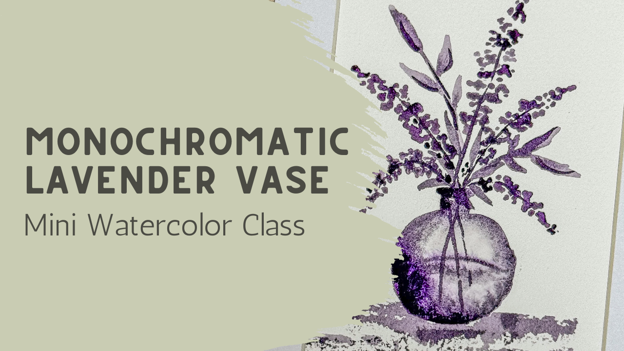
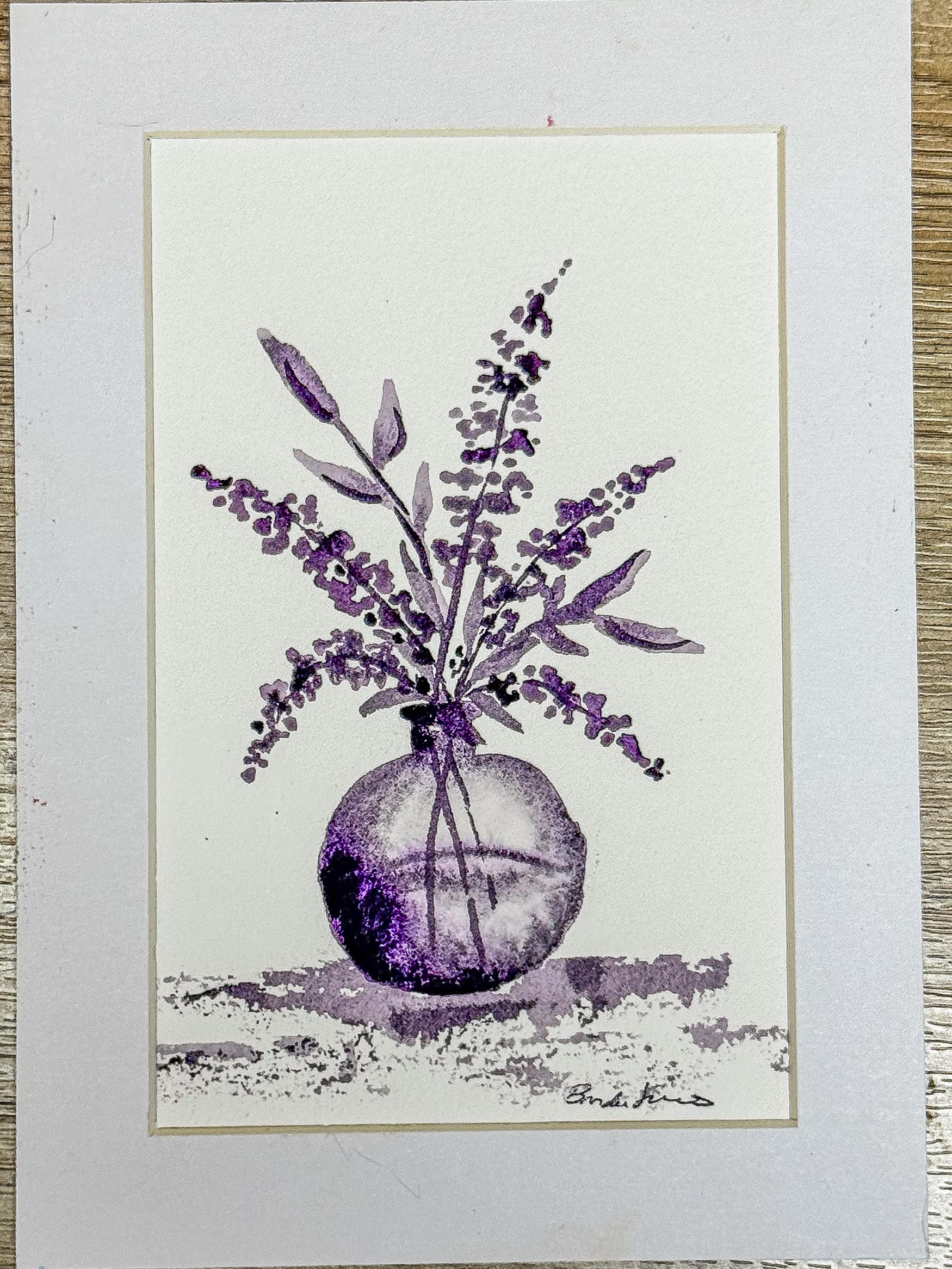
to be painting this soft monochromatic
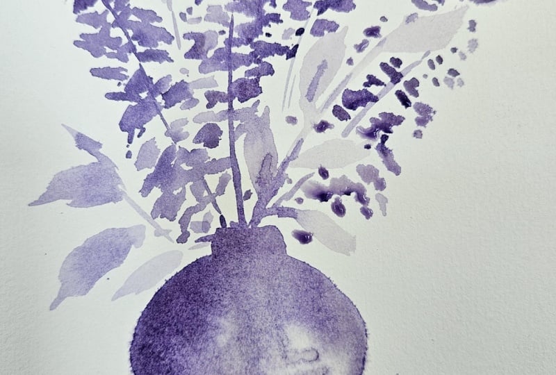
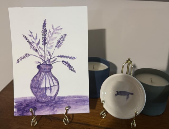
lavender arrangement in a little tiny glass phase using loose watercolor techniques
and a very relaxed approach. This class is really
about learning how much depth and
variety we can create using just one primary color and adjusting it simply with
water and pigment strength. We'll be working with a
lighter and darker values of purple to create softness, contrast, and movement without needing a complicated
color palette. One of the things I love about monochromatic painting is
that it takes away some of the pressure of constantly
choosing colors instead of allowing us to focus on
flow, brush movement, layer. And letting the watercolor
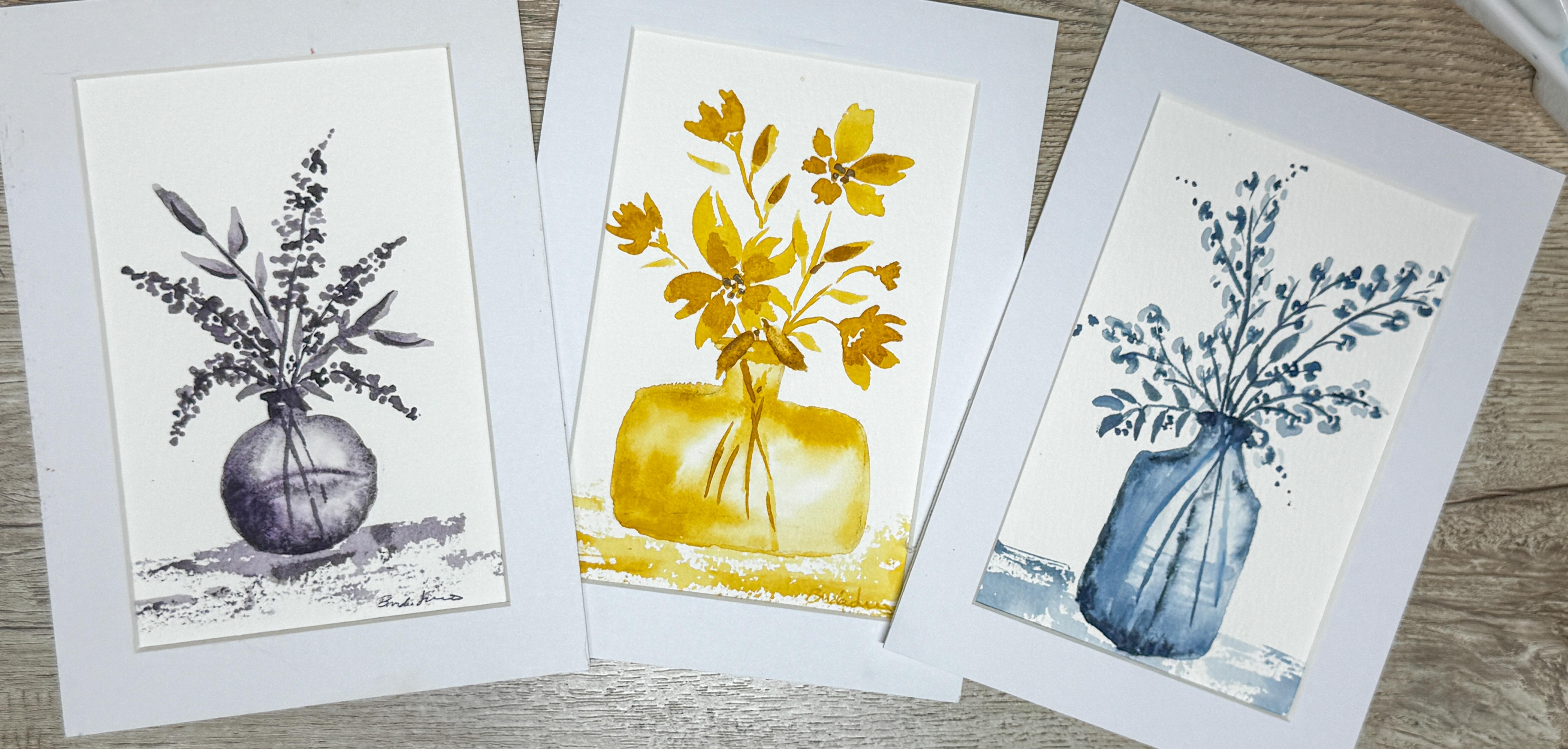
do the work for us. This first class is part of a mini coordinating
vase collection that I'm creating is a
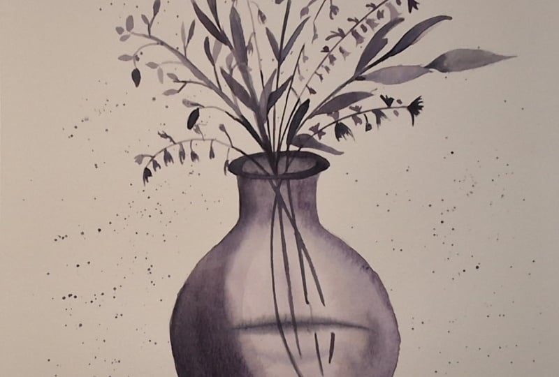
series here on Skillshare. In the upcoming classes, we'll paint additional
floral arrangements in different monochromatic
color palettes and a different vase
shape so that by the end, you have a beautiful
little collection that works together as a set. This class is designed to feel
approachable and relaxing, so don't worry about perfection. I'll walk you through the
entire process step by step. Gather your supplies, relax, and let's get started painting.
2. Creating a Soft Watercolor Glass Vase: Class project,
you're going to have three different vases on a PDF that you can
download and print. If you print it full size, the vases will be fairly large, but you could scale that down and make them as small
as you want to make them. Of course, you don't have
to add in all these lines. You can simplify this
as much as you want to. When I make our piece for today, I'm just going to use
this very small piece of watercolor paper. This is a five by seven, and I'm just going to be making my little vase down here with some little
flowers coming out of it. So I will not be tracing these or using these
exactly as they are. This was just to show you that there is
something there for you to copy out of if
you would like to. And if you'd like to trace
it, you can trace it. I'm just going to do a
little quick sketch. I want my vase to probably
be in the bottom quarter. If I say the half is about here, that means I want my vase to be all the way
down in here, very, very tiny because then I
want to have a little bit of balance area here at the bottom where I can add
a little bit of a wash, and then I will put
my little vase, and then above it is going to be where the stems
are going to be. I don't want my vase
to come up very high. I like to start my vase
with a little base. The way I know about where
my base is going to be, and then I'm going to figure out what my top is going to be. I'm looking at that
going about like that. I want to make sure
that I'm in the center. I'm going to balance it
in between here and here. It doesn't have to be level, it doesn't straight.
We're just sketching it. Just a quick little sketch. Then my top is going to just
be this light little oval. Okay. Then this is going
to, let's see, I'm going to come down
slightly, make a little lip, and then I'm going
to flare it out because this is going
to be my round one and then I'm going to flare these out and flare it out this
direction, making it round. At the closer I
get to the center, then all of a sudden you have a complete oval here
or a circle here. So I am making that
something like that. In my book, that's going
to be good enough. Where's my eraser. It's always a tricky
thing to find. I'm just going to use a little
eraser here on my back of my pencil because I can't
find my other eraser. I'm just going to do
a little quick line erasing to lighten it because after you've
put down your watercolor, it's very hard to
get pencil back up. The only time you can
really erase it is before you go and put
your watercolor on it. I know we talked about this in the last lesson
where we're going to be working in a
monochromatic color way. I'm going to go with a purple
for this first one because the first one is going
to be a lavender, a very, very soft lavender. But because we are working
in that monochromatic, just because it's one color, doesn't mean there
can't be some kind of variation between
light and dark. So you can add more water to
make your pigments lighter. So you're almost diluting the paint with more
water, less paint. And that's going to make
some lighter spots, and then you can use a more concentrated pigment or paint to make the centers where there is
going to be darker. Although we're only
going to use one color, which is going to be
this purple here, I do not need to make
it so that it's, um, lots of different
colors because I can just create multiple colors within this by how
much water I add. So we're going to just do
a little quick test here. I just have a little
sample paper, and I can show you that here. So this is a purple. It was a very, very, very dark purple, which I like. I'm not into the pastels, so you're going to
choose your purple or maybe you're going
to use blue or green. It doesn't matter
whatever color you like. So that is more of a concentrated purple
where it's nice and dark. Now, if I just dip
my paint brush, back into water and
add more water to it. I didn't rinse it off. I
just added more water. I can come over here and you
can see that it got lighter. If I do it again, just dip it into water and come over here. You can see that it's getting lighter and lighter
and lighter and all I am doing is
adding in more water. I didn't dip back into my paint, but here I have five
different colors of purple. Using just one dip of my paint
brush into my paint. Oh. Now, I have my paint
brush all dried off. My vase is going to
be a glass vase, but it's going to be
a purple glass vase. What I'm going to do is I'm going to actually wet this down. I'm going to stay
inside the lines. I'm going to just my
clean paintbrush. In fact, I'm going to use
a smaller paintbrush. This is my size six. This is a Princeton heritage, which is my favorite paintbrush. I am going to I usually
use a size eight, but for this because
it's so small, I went ahead and size
down to a size six. I'm just going to go
ahead and add water. All the way around
this whole vase that I drew and add the whole thing. I'm not looking for
puddles of water. I just want it to be
shiny and glossy. I am trying very hard not
to go outside the lines, but I'm going up to the lines so that when my paint gets on it, it will cover up the pencil
marks that are on it. I'm just going around
the outside edge. Remember that your
paint is only going to go where the paper is wet. So if you paint outside
the lines with the water, that paint will seep out outside those lines
and you may not want that. So be careful with where
you are putting that water. I'm going to dip into my paint. I'm going to use this
medium quality paint, and I want my top to be
a little bit stronger. I'm going to go ahead
and put that there. Then I think I also
want to have some of these outside
edges to be stronger. So I'm just going
to dip it in there, maybe over here as
well along the bottom. Just make it a little
rounded rounded bottom. Still flat because
it does still have to sit on the tabletop, but it can be a little rounded. Then I am going to allow one side to just get a little
darker than the other. I'm going to choose this
side considering that the light is going
to be coming in this way and shining
through this glass vase. I'm just going to make this side just a little bit darker. Now, it is going to
be a glass vase, and so we're going to show some water movement
in here as well. So I'm going to rinse
off my paintbrush, and then I'm going to just
kind of move this around. I'm going to create a line
where I think the water is. It's going to be around there, adding a little bit of water. And then I'm just going to
allow this paint to move, leaving lots of white space, especially over here
on my right hand side, because I want this to be
kind of like the highlight. So I'm just pulling
in some of it. This is a clean paintbrush. This does not have
any paint on it. It is just water, and I'm
just moving the paint that's already on my paper and
allowing that to come in. I do want to create a
little bit of a water line, but I'm going to need
to wait for that to dry a little bit before I can come back in and add in that
water line, which is fine. You know, it's all about experimenting and
seeing what we like. I do want to add in just a little bit more
color on this side. So I went right into the well and picked up
some of that heavier, darker paint just to bring in some more
darkness on that side. You have to experiment. Yours is going to be different because you have a
different amount of paint on your brush or a different amount of
water on your paper. So just because I'm doing
something doesn't mean you need to or you should go back if yours is working
out the way you want it to. Don't go and try to just, oh, Brenda changed hers, so now I should change mine as well. That's not necessary. Just do yours the way
you want to do yours. Listen to your
watercolor painting. It's really important.
Maybe yours is dryer, maybe yours is wetter. Maybe you had more paint. Maybe your color is different. So allow it to just
kind of speak to you and you do what you think
you need to do for yours. So I'm going to let
that start drying. I did add in a little bit of
a water line, which is fine. Might try it again to
just create like a Ooh. In be a little too
dark. It's okay. You know, life happens. I'm going to just dry off
my paint brush and try to pick up some of that just because it's just
a little too dark. I'm just trying to
create a little bit of an oval to show
that it's round. We're going to be
adding in some stems and such in here as well. I'm going to let that
dry just a little bit. You can see that that is still pretty wet. It's pretty shiny. So I can't really add
stems or they're just going to blow out and get too, cobwebby I need to wait for that to dry
a little bit more. Just going to mess around
with it a little bit. Okay. So now we are going to start to create
some stems coming up
3. Building Loose Lavender Flowers: Want my stems to be fairly
on the darker side, so I'm going to go ahead and
use this paint brush again. Maybe should be using a
smaller one, not sure. We're going to give it a whirl. I'm just going to
make myself a little bit more room. A
little stem there. Maybe we want to have
another one that just branches over the edge because I like to
have them sometimes branching down. I
like that look. I'm going to put
another one very just loosely up this direction. Feel free to move your paper
around, make it comfortable. You can cross your stems. Et's do something like that. One, two, three, four, five, maybe five. Sure. Seems right. Um, maybe I'll add in a couple leaves while
I'm thinking about it. Remember, our leaves are just a little stem and
then just press down with your paint brush
a little bit and then pick back up
and draw it out. So do it again down,
and then back up. Down and back up. So we're not going
to put in a lot of leaves because that can get a little too overwhelming
for your painting, but I do want to get a
couple started in here just to make sure we have
some room for some leaves. We can always add more
when we get around to it. So a clean paint brush, I'm going to use this
less paint more watery. And we're going to start
up here at the top, and I'm going to just create these little tiny clusters
right at the top. You can see I didn't even
start where the stem started. I started up higher, and then I created another
little stem cluster, another little cluster. Because this is the
really diluted paint, this is going to
dry our lightest. Then we can always add in a
darker color on top of it. That's really all lavender is is just these little clusters that just get a little
wider at the bottom. Using this really diluted
lots and lots of water. Little clusters of dots. Cluster here, a
little cluster there. Maybe it's a little
circle of clusters. And we're going to
be adding in more. Don't worry. We'll add in extra colors and dots so you don't have to have it be perfect the
first time around. This is just our first
draft. First layer. You see how it doesn't matter how high you started up above. You can start it way up here
up above that stem because you're just creating
a little cluster and then another little cluster. If you decide later, you
need to have more STEM, you can always add more Stem in. But sometimes the stems aren't necessary and just
adds more business. Decide how low you want
to put it to your phase. Simple little clusters
of this very light. Remember that your
watercolor is going to dry lighter than what you
see when it is wet. Right now it looks
like it's dark. When this dries lighter, it's going to be a lighter color once it gets dried. That's what
I'm trying to say. Before this dries completely, I do want to add in some stems, but you can see that
that's no longer shiny. It is still raised,
so it's still wet. I can still feel
wetness in there. Now I'm going to
take the opportunity to add in a couple stems. Just going to add
in because this is a class phase so we can see into I don't need to
have all the stems. I just need to say the
illusion of a couple stems. Maybe I'll only add three. You can end them at
different spots. They don't have to be complete. They don't have to
go to the bottom. You just make your vase work because sometimes when
you're looking into a vase, you can't see all the
stems, which is fine. So personally, I like to have a flower leaf coming over
the edge of my vase. I don't like to usually have the vase top completely showing. So I'm just going to add another stem or another
leaf over the top of that one just to show the illusion of another leaf covering
part of the edge of that, um, of the lip of the vase. Sorry, having a hard
time concentrating and painting at the same time. Okay, so now I'm going to
get a little bit darker. These are still wet. You can see that that water is
still wet in there, but they're starting to dry. And so before it
dries completely, I do want to add in just
a few darker drops. See how that adds in that nice look where it's not
covering the whole thing, but it adds that
great dimension. I'm going to even
go into some of the white spots where I
haven't painted anything yet and add some darker dots there and just let it bleed
into the lighter spots. And since they're still wet, they're bleeding,
and that's perfect, exactly what I wanted to do. The way I have that dimension of the lighter spots and
the darker spots. Okay, so I think what
I'm going to do is add in I think I need
something in this area, but I don't think I want
another flower head. I think I'm going to add
just like a little leaf, as if it was a stem
coming up from out there. Go on, little stem and then
maybe just a little leaf. Just to add a little
extra variation here. Maybe another one over here. Come on. Here we go. Just to add a different texture. And now I'm going back
into my darker paint, and I'm just going to drop
some in here and there, just to add some extra
color definition. While that's still wet. Okay. And then I want to add in a little bit of a base because I don't want my vase
just sitting in space. I'm going to add in
just a little bit of a wash on the bottom. So now, my paint my paintbrush
has some paint in it, and it's kind of watery. So what I'm going to
do is kind of lay my paint brush
almost on the side. I'm going to actually hold
it this direction where it's making it parallel to my paper. So that I can just
carefully hold it, see how I'm holding
it like this. I'm just going to carefully
hold it and just kind of swipe across the tip paper, which should allow me to
have almost like a sketchy, etchy feel to it because it's
not going to be perfect, which is exactly
what I'm going for. Very lightly. Not really touching the paper
intentionally at all, very lightly glazing
over that paper. Adding a little bit here
and a little bit there. I do want to bring it
up above the base. I don't want it to just be sitting down here at the bottom. I do want it to come
up a little bit, which is why you see it
coming up here and over here. So that's kind of going to
anchor all of that together. And then you just add as much or as little
as you want to. And then if you wanted
to, you could add more. If you could go back into your darker paint that was using that really
liquidy paint, and I could just touch it here
and there to add in just a little bit more but
I want to be very, very careful with
that, not too much. Because we're working
with only one color, I need to have that
definition between this base and my vase. If everything was
the same color, it would look
really, really flat. So I'm trying to make sure
that I have some definition of dark and light and dark and light throughout
the whole piece. It's one of those tricks because you're working with
just one color, how you can make it
look okay that way. I'm just going to add a little bit more color
into some of these leaves. There we go. Do you see how I move my paper around.
I like to move it. You know, which direction is more comfortable for my hand. If your paper isn't
anchored down with tape, you can move your paper all over the place,
which is really good. You want to be comfortable
when you are painting. I just have this
tiny little mat. But that's just going to make the sweetest
little picture. And then we're going
to make other ones, and you can make a
little collection of three different ones, which is gonna be a great
little collection for yourself, I'm gonna dry this off and then meet you back
in the next lesson.
4. Final Thoughts and Next Steps: We just finished
this first piece in the Mini watercolor
vase collection, and I hope that this class helped you feel a little
bit more confident exploring monochromatic
painting and allowing watercolor to
stay soft and expressive. One thing I hope that you learned and took
away from this class is that depth doesn't always come from using lots of colors, sometimes simply adjusting
the amount of water, layering a few darker values, and allowing some softness
in the painting to create a beautiful amount of movement and interest
all on its own. Remember, your piece does not lead to look
exactly like mine. Loose watercolor is very personal and often the
small differences and unexpected marks are
what makes the painting feel unique and expressive
and personally yours. I would absolutely love
to see what you created. Please upload your project
to the class gallery. Even simple studies or
imperfect pieces are wonderful to share because they encourage other students to
keep painting too. If you enjoyed this class, I'd also really appreciate
it if you left a review. Reviews truly help my class reach more students
here on Skillshare, and they also help me understand what types of classes and techniques you'd like to explore more together
in the future. Don't forget to follow me
here on Skillshare because those next two coordinated vase classes are in the collection, will be published very soon. We'll continue building
on the same relaxed, loose watercolor style while
exploring different flowers, different vase shapes, and different monochromatic
color palettes that all work beautifully
together as a set. Thanks so much for
painting with me today. I'm really glad
you are here and I hope to see you again
in the next class.
5. Outro: We just finished
this first piece in the Mini watercolor
vase collection, and I hope that this class helped you feel a little
bit more confident exploring monochromatic
painting and allowing watercolor to
stay soft and expressive. One thing I hope that you learned and took
away from this class is that depth doesn't always come from using lots of colors, sometimes simply adjusting
the amount of water, layering a few darker values, and allowing some softness
in the painting to create a beautiful amount of movement and interest
all on its own. Remember, your piece does not lead to look
exactly like mine. Loose watercolor is very personal and often the
small differences and unexpected marks are
what makes the painting feel unique and expressive
and personally yours. I would absolutely love
to see what you created. Please upload your project
to the class gallery. Even simple studies or
imperfect pieces are wonderful to share because they encourage other students to
keep painting too. If you enjoyed this class, I'd also really appreciate
it if you left a review. Reviews truly help my class reach more students
here on Skillshare, and they also help me understand what types of classes and techniques you'd like to explore more together
in the future. Don't forget to follow me
here on Skillshare because those next two coordinated vase classes are in the collection, will be published very soon. We'll continue building
on the same relaxed, loose watercolor style while
exploring different flowers, different vase shapes, and different monochromatic
color palettes that all work beautifully
together as a set. Thanks so much for
painting with me today. I'm really glad
you are here and I hope to see you again
in the next class.
 Brenda Jones, Watercolor Artist & Teacher