Transcripts
1. Intro: Hello creative friend, and
welcome back to class. I am so glad you are
joining me here today. We are at the beginning of a
brand new year is January. If you are joining
me in real time, if not, no big deal. But as I was sitting down and planning out
workshops for the year, I thought something
that might be fun for us would be to cover
birth flowers. That's exactly what
we are going to do beginning with January. I have to admit,
when I saw that, carnation was the
first flower up. Additionally, snowdrops,
which we may cover as well. Time permitting, I was
not all that excited. It's a flower that I
tend to overlook when I see it in grocery stores or
just in bouquets in general. It's never been my favorite. But I'm so glad I persisted, because when I went to the store to pick up
these in real life, which is something I
truly enjoy being able to teach with a real life
reference, I looked closer, I saw that this is truly an amazing little
flower, and in fact, they behave a lot like peonies, just on a smaller scale. I think if you are not already warmed up to
them, as I was not, initially, you are
going to be won over by this humble bloom. We're going to tackle
loose watercolor, carnations and gestural form, which simply means that we are
not going to look to paint every single detail and
stroke for stroke for petal. But sit down in a future lesson, just coming up here
in a few minutes, notice and marvel and pick out those details that
feel most special to us, that we feel most
compelled to paint, because that's where
the most joy is. It should be noted
that this class is definitely geared for
intermediate students. Some prior knowledge
and experience with watercolor is
definitely recommended. If you are finding yourself on the beginning
end of watercolor, I suggest that you
have to look at my come flowers class,
my tulips class. Both of those cover
the foundation of watercolor things as simple
as water ratios and wet. And to wet, all of these
principles that we're going to be examining and learning
on a higher level. In this class,
we're really going to look at this flower
and composition. How to cluster these
flowers together, how to paint them
in multiple colors. We're going to make
up a vintage palette. In addition to this beautiful,
bright, cheery color. We're also going to bring a
new brush into our class. I'll talk more on that
when we're in supplies, but I'm so excited to bring a new brush into
just our toolbox. Other than that, I'm just
truly looking forward to having you explore this flower on a deeper level
if you haven't already. This is what you can
expect to paint. As we move forward, we're going to look at a few different colors
of these carnations. And then at the very end,
for our class project, we're going to put
it all together in a beautiful bouquet. Although I still
wouldn't say that this is necessarily a focal flower. It becomes more focal
and lends itself as a filler flowers when the colors and the shapes
are all mixed together. I think you're going to have a lot of fun with this class. I'm so excited, I'm
ready to dive in. I hope you are too.
Let's get started.
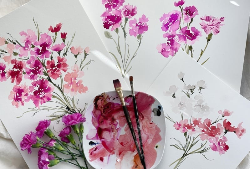
2. Class Supplies : Okay, let's dive into supplies. If you, by chance, are able to go to a grocer or Trader
Joe's or whatever it is nearby and pick up some live references,
that would be amazing. You can see I have
carnations here. There weren't a ton of
colors to choose from. There was some really
light yellow ones and some striped candy cane
looking carnations that I thought would have
been great for December, but not so much for January. And then I saw these
pink carnations, which I thought we
really special. We're going to
take a closer look at these and look at
all the details and structure when we head into
that portion of this class. But for now, if you are able to, that would be fantastic, because we're going
to go through a couple different colors. I picked these because
I do love the color. However, when it's
translated to paper, it can be a little intense,
which we will talk about. Yes, carnations. If not, then if you want to pop on
your ipad and maybe bring up just a few reference photos
just to have off to the side. I always love that
If you've taken my classes then you
know that I just love to have a source to glance
at and then come back and intuitively work
here on the page. Anyway, that's our
live study then. As far as paints, I happen to have this liquid
water color from. Let's make art. I'm
not sure if you are familiar with this company, but they hired me to create a box a couple of years ago
and I was gifted this color. And it's not a color I
would typically use. As you can see, it's highly pigmented and very
saturated and quite intense. If you take a look over in the lower left hand
corner of the screen, you'll notice that down
here is this color swatch, just pure as it is, but when held up
to the carnation, it's a perfect match there
as shadows that are making the flowers just look
slightly darker in my studio. Just because I'm actually
filming in the morning, almost afternoon,
but winter light, you guys probably
understand anyway, that color was perfect
for this class. If you happen to have
access to this color or you want to purchase just this one little vial of
liquid water color, that would be awesome,
if not a big problem. I swatched out a supplementary
color that we can both add to the palette
and then use just as our replacement for
that orchid color. We're going to use
ver Zeno violet. Then if you know me, you know that I
love vintage tones and I always tone
down the colors. I don't really gravitate towards intense bright pinks or reds unless it's Christmas
to do that, I always pop in a bit of
sepia or burnt umber. That's exactly what
we're going to do. We're going to mix
these two colors here together to make
this swash that you see, which is just a
little bit more ma, a little bit more
of a earthy pink. But we'll still get
those beautiful results. We're really going
to play with color because we're focusing
on this flower, not necessarily a bunch
of different flowers. I'm basically going to show
you carnation six ways thing. And I'm really excited because there are so many different
ways to approach it. And I feel like each
one is beautiful. And it comes down
to what you feel represents what you're attracted to and what feels most like you. I have pages of these carnations and I'm like, oh, that one's really pretty. Oh, but I really like that one. Oh, but I love how
it's light here and then a bit of dark here
with dark in the center. And then, oh, but I
love this the way that the stripes are coming
through on the outer petals. I'm going to show you all of these different
ways and let you, the artist decide, um, which one you really
gravitate towards most. And then we're going to
put a bouquet together at the end using different
colors and different styles, jumping ahead of myself a bit. Anyway, those are two colors. We're also going to be, as I mentioned, playing
with some different colors. I'd love for you to
have a lamp black, or a Janes black, or
even a Pains gray. And then I'm going to
be using quinacrodoned, some rich green, gold, undersea green for the
leaves and foliage. If you have those, that would be great if you also
have some white Gh. Throw that in there because I'm going to
show you something fun to do with white
guash as well. Okay, Other than that,
we're using Canson, 140 pound cold press. We're going to use the
more textured side. As I mentioned in previous
classes, there are two sides. To watercolor paper,
you're going to use the side that
has more texture. Then for our brush, we are going to use this really dainty, lovely, it's a Princeton, it's an eight flat. I've never used a flat. This was actually my first
time really tinkering with it. Typically, I use large flats
to paint the background, so lay the ground and
then I'll paint over it. But I've never used
it for a flower. I thought, you know
what, it's a new year. Let's try a new brush. I
have a size eight here. If you don't have this
exact same brush, please don't feel like you
have to go out and buy it. But if you have something
similar, that would be great. I also have a larger flat here, which is ironically or
strangely a size eight as well. You can see here that these are clearly not the same size. Brush sizes are very strange, but this is called a bright, it's similar to a flat, but it's not quite the same. This is an eighth and
a five eighth length. This is from the
Umbria collection and then this is from
the Kolinsky Sable. You can have a little research, take a little time
to figure out if you want to add these
brushes to your toolbox. If not a huge deal, But I would love for you to have a bright or a flat on hand, this will be the
main focal brush. But I'm going to show
you how basically to do the same thing,
a larger scale. For those of you who
like to paint big. Then of course our tried and true trusted Princeton velvet. Touch sine six round my favorite brush,
so very versatile. We could do this whole flower
with this one brush too, but we've done that
in other classes. We're shaking it up a bit. Have a palette salad
plate off to the side, some paper towels, a water cup. Just a note, I'm planning to mention it when we're
moving it in progress, but when we switch to foliage, make sure you rinse out this cup because it's going
to turn very pink, especially if you're
using the orchid.
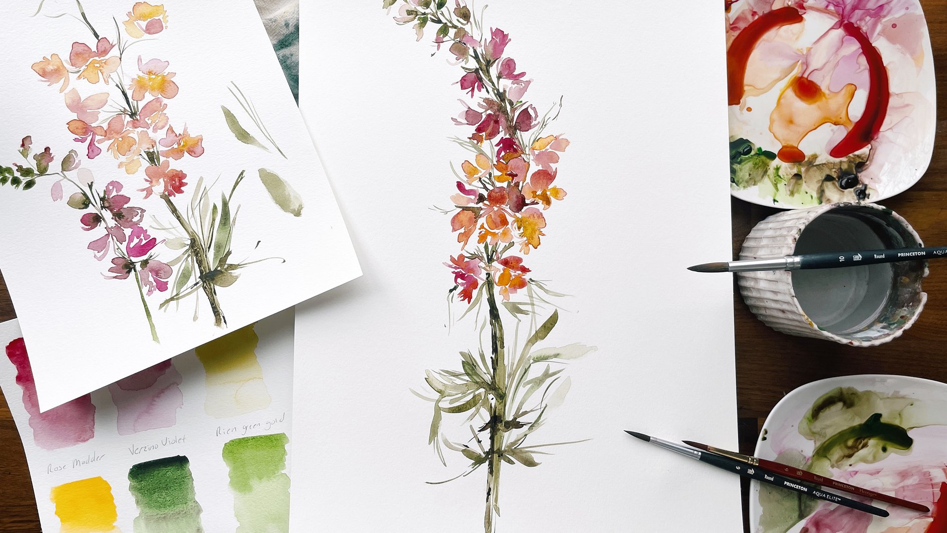
3. Talking Process and Familiarity: Okay, taking you back in
time just a bit here. This was my preliminary page
of experimental carnations. As you can see, there's
a lot going on. I wasn't really sure how I wanted to approach this flower. I tried a bunch of
different things, figured out what I loved, then tweaked things
as I went along, and then filled up some
pages along the way with more polished florals
such as those shown here. But it all starts here with
this figuring this out. I'm going to continue on with this page and do a
little bit more here, and then we're going to
fill up another page. As you can see, this is a
carnation that quickly went awry when I did not add or leave enough white
space between the petals. I'm going to talk to
you a lot about how deceivingly easy this flower appears when you see
something like this. Maybe it doesn't look
deceivingly easy to you, but to me I'm like,
oh, it's a carnation. A carnation, it's so
simple. It's sweet. It's like a daisy.
It's not a daisy, it's nothing like a daisy. It's a lot more intricate
with a whole lot of details. There is going to
be a temptation, and I usually mention
this when I'm teaching to overwork
this flower to death. Because as we are going to take a moment here to really look at all of the
stunning details, there's so many areas where
the petals are ribboning, where they're folding over. You can see the
beautiful markings where the darker is flooding
through the outer petals. The light, there's
the potential to do so beautiful things
with this flower. Just marveling and studying it. But when we try and translate nature's
intricacy to paper, often what happens is the flower just becomes quickly overwhelmed and overworked. Because we're just
trying to do too much. The idea is to look, to notice, to study. And then intuitively, once we really have a handle and feel comfortable
approaching the page, come back and paint
a going for it. That's my approach. This is not a botanical class
where we're going to just be looking at
every little ribbon and curl trying to get every
stripe within the petal. We're just going to notice and choose details that benefit
the overall flower. Just a heads up it to me anyway. A deceivingly easy
flower to paint. It took a while for me
to figure out, okay, I need to simplify this
because it's going to become too much. I just wanted to take you here. Obviously, this flower
went bad right away. But this was one of
my first flowers, and I just used the orchid
straight out of the bottle. I want to bring you behind
the scenes and say, this is what this flower looks
like using no other color, using one consistency. Our broth consistency here. If you are not familiar
with water consistencies, please definitely
go take a look at prior classes because
it's absolutely essential to have command and understanding of
consistencies for this class. This is an intermediate class. There will definitely be some prior knowledge
necessary to complete, to have success at what we're
going to do here today. This is that one color, just straight. I
loved this flower. Initially I thought
like this is the one. And then I moved on because I'm never satisfied just
leaving it as is. And I did something a little
different here where I did the dark and then I did
some lighter petals on the outside here, I really went light to
see what I could do. Then taking my brush, The thing about this brush wih is really neat, is the bristles. They have this forked edge to them when you run them
through the petals. Depending on whether they're wet or dry, we're
going to do both. Because I want to show
you, like I said, every way to, to understand
how to approach this. We'll leave some
beautiful texture behind and we'll leave some gestural
marks behind as well. That's what I did
experimenting here. The next area I went over to, I can't remember exactly what,
but I think I went here. Again, this was a
sideways looking at. I believe this one was just
looking straight down on it. Then over here, I turned
one of them sideways. Because I really wanted
to figure out all what's the best angle, because
here's the thing. I don't force myself to paint exactly what I
see if it ends up. I painting something
straight on, looking at it and
there's no stem visible. You can see it's just the
flower head, there's no stem. This is going to look like
a floating flower on paper. What I'm essentially going
to do later down the road, once I've assembled everything, is I'm going to
figure out, okay, where might a stem possibly be. If I were to imagine
this was more on its side than just coming
straight up and down. I would take my brush and I
would give some structure and give some delicacy to the stem here so that it doesn't look like a floating flower. This was an actual side flower. I would really put in some
of this base here that we see really plug
in right there, stem and then bring it down. Then over here I really went wild and I let everything dry. Because that's going to be a
really important component as we work forward to is, are we leaving things
wet and then adding in, are we letting things
completely dry? Every single decision
and choice you make is going to
affect the next step. If you look closely here, something really
beautiful happened. One of my favorites
of all the flowers. When I took this brush after
painting really light here, the media was still
wet and I took just a slightly different
water to paint. Consistency, ran the
brush through this petal here and created a
really beautiful bleed. And if you know
what I mean, those of you who work wet and to wet there is something really
magical that happens when you just time it perfect. It really doesn't happen for
me all that often, but it's, the media is not over wet
and it's not quite dry. And that color just
floods through it, leaving behind just
a beautiful streak. It looks exactly like the flower without really even trying. It's
just effortless. But I want it to be
known that that's just not the case for even
professional artists. I do have a little bit
more understanding as to what to look for
and what to strive for. But it doesn't
happen for me every time I, as you move along, extra extra grace
and patience with yourself as we explore
this flower and allow yourself to come up with different variations and different approaches
to exploring it. I don't want you to
feel like, oh well, it doesn't look exactly
like that. That's okay. Lean into that and
see if you can turn it into something
you do love. But I'm going to
show you so much. I believe I said here, I let everything dry. Then I went over with that
really intense orchid here, adding in some dark stripes. Because if you look
closely at the flower, you'll see that these
outer petals are light and then the dark
floods through here. However, if you're
not careful quickly, that flower becomes
super overworked. This is heading in
that direction. This is a whole style, this is I'm not even sure if I'm pronouncing
it correctly, but Chinois. I have a friend, Diane. She's on Instagram, if you guys are familiar
with her work, who is like a Chinois wizard, and she makes her own
silk paper and it's just her style is so beautiful and it gravitates towards that. But in terms of water color, someone might look at
that and just be like, wow, they didn't
know when to stop. But it is so subjective. I don't want to
say like, oh yeah, this was so overworked. Clearly something
wrong happened here. We can all agree
and look at and go, wow, okay, this one
missed the mark. But you take ten people, five may absolutely
adore this and think, yes, that's the way
it should look. And then the other
five are going to say the complete opposite. Keep in mind it's so subjective, it comes down to what you love and what you
feel is beautiful. Okay, that was a bit of a spiel, but I feel like I'd be
remiss in not bringing you behind the
scenes and walking you through each experiment. As I went along, I feel like so much is
missed in classes. I hear from students so often
that they take classes. And it's just the teacher
just jumps right into, okay, then we take our brush
and we do a little here. And there's just no context
for how we got there. I hope you don't feel as though I'm taking up too much
of your time here. I'm just trying to
be extra generous with my experience
and with my process. I just so much want
for you to succeed. That is all that we are going to actually
jump into painting. You probably thought
it was never coming. We were just going to talk
all day, which would be fun. But let's go ahead and actually start
painting some things. All right? I'm going to put these little
cuts off to the side here. If you haven't already, go ahead and get your palette out. We're going to mix
up some color here. I'm just for the sake of
keeping things very simple, just use this color,
which is the orchid. You can see it's
highly pigmented, it's going to come
out very intense. And then I'm going to
dilute it just a bit. Then we're just going
to experiment with brush technique and
just brush appearance, like what can we expect
basically from this brush? Then we will move forward
with the rest of how to actually assemble the
flower itself along here, I'd like for you to
just do some drills. We're not even going to
look at the carnation. I just want you to just get
familiar with this brush. If you are not already, go
ahead and dip into your paint. You want a consistency
that's right around in between broth
and cough syrup is okay. But just make sure you have
enough water on your brush, because if not, you're going
to get that dry stroke, which is super lovely. If that's in fact what
you are aiming for, let's go ahead and just start
experimenting with strokes. Now you're going to notice
when you come full belly, you're going to get
those wide strokes. But the magic really
happens when you come right on top of the brush here and you start angling
out and using the bristles. Be careful here, because the strokes can very
quickly get chunky. And the idea is to alternate with both chunkier
and heavier strokes. And then those light,
delicate aspects, which we note on the
edge here of the petals, those beautiful
forking, ruffled edges. All right, if we were to
just go full belly here, this is the stroke
we're going to get. You can see there's a little
bit of a ruffled edge here. If I were to dry it off a bit, you'd see we're really going to get that brush texture popping through depending
on how much paint to water is loaded
on your brush. Different results may vary. I feel like they always say that in like cooking
shows and I'm like, yeah, they do vary. It's so specific to exactly
what it is you're doing. A pinch of salt can
change the whole recipe. And same thing
goes for painting. Anyway, these are our
full belly strokes. If we were to keep going
along the way here, just creating like
a little arch. Really just want you getting familiar with the brush itself. Now let's go ahead and
come on the side here. Let's take our brush and really do some light,
delicate strokes here. You can chunk it up at first, but then I really want
you to take the corner, the edge of that
brush and ruffle. Even a drill of just doing this, really just grazing the paper,
the lighter, the better. Because this is going
to show you control. This is going to
show you pressure. This is going to
educate you so much just knowing the distance
between brush and paper, it's going to make
it so much easier. When it comes time to actually put all of this
theory into practice, try and make some fine lines. Then obviously you
can go much bigger. If I were to do a
little bit of both, I might start with a stroke
like this and then fine, fine, because you're trying to essentially create
something like this. Not all of these petals
are going to have that appearance as we
note and move along. We're going to pick out and choose the details we
want to highlight. But for the most part, that's what we're working with, come from all different angles. Really get comfortable with
moving your wrist around. Then I notice that when
I do strokes this way, they're not as strong, but it's something that I practice. I want to make sure that I can do it if you might
want to come this way, even though it might feel a
little bit awkward that way, you're not having to
completely turn your paper around each time I work with the angle that's
most comfortable to you, because this is most
comfortable to me. I might turn my paper around, but I also want to be
able in the moment, especially when time matters, because we're working
with wet media, be sure to just
get familiar with all different ways of
moving this brush around. I'm so excited, I can't keep myself from actually
painting a flower. I always want to
just like turn it into something. I force myself. You're just experimenting. You're just getting to know it. Don't rush ahead. Don't
rush the process. I'm not going to go too
much more into this because you can see what
it is that I'm doing. We're going to actually go into structure of the carnation
In the next video. I would love for you
to possibly take a piece of paper and
just fill it up. Doing these drills where you're just coming really
on the edge here, getting comfortable
with the pressure, and then doing some
full belly strokes and ruffling up the edges. The idea here too
is to paint small. We have a big brush off to the side that we
will likely get to. It always depends on how
much meat I give you. I tend to pack my glasses
full of information, but I'm hoping to
get to that as well. But I just want you to
try and keep in mind, okay, keep it, keep it tidy. Keep it delicate. These flowers quickly, get out of control. They just grow large
right before your eyes, especially when you
get lost in it. You can see if you're trying to actually scale a carnation. If you were to put
this in a bouquet, say with like peonies, the ponies are going to be huge. You don't want your
carnations to be so huge that they
rival the pony. You want to be able to take this delicate filler flower because it's not a focal flower. If you're familiar with the terms that I
share in my book, it's something we would
add to a bouquet. Certainly, you could assemble a bunch of carnations together and make a bouquet out of it, but it's just not that
striking immediate. Your eyes gravitate towards it. Keep that in mind
as you're working along and just do those drills. Then when you start
to feel comfortable, then maybe start
looking at a flower and taking a couple tips from your drill
session and going, okay, not an intricate flower because we're going
to do that together, we're going to look
and notice, and study. But just okay, this is how I
might put together a flower. Keep it super loose. Give yourself lots of grace
to just experiment with it and not get too hung up on
what it actually looks like. Just get comfortable with moving the brush in different ways. Angles and positions,
and pressure. It's a lot to think about. I don't want you feel stress and pressure to
make a beautiful flower. I really want you, if you can, to take at least ten, 15 minutes and just get familiar
with the brush. If it's not a brush,
you're not familiar.
4. Notice and Marvel : I feel like this video is one that could very easily
be skipped over, but I definitely
encourage you to just spend a couple
moments here with me as we take this important
step in the process, which is what I call
notice and marvel. Anytime I am painting
a new flower, I like to just give myself a little bit of time
to really look at it, whether it be in person or something like a pin
I've saved on pent. Just get quiet. It sounds a little odd, maybe a little hippy, but I just try and see this
flower for what it is, and notice its beauty
and do a little ooh, it sounds really kooky, but it helps to
make me feel more connected to what it
is that I'm painting, if that makes sense to actually
form like an attachment to the flower and not paint it from this cold
and aloof place, but really lean into beauty
of it like this is beautiful. This is something that just happens in nature all by itself. Well, with quite a bit of help, but nothing that we do. As you're looking
at this flower, I just invite you to just
notice the beautiful way that the petals coil and the sweet ruffling on
the edge of the petals. Just take a moment to figure
out what areas are your o, and maybe even make
a note or two. What do you love most about this flower?
What are you drawn to? What is most important to you in bringing out
and putting on paper? Just make a couple notes off
to the side for this one. There's these dainty,
cute little stamen coming out that I don't
see because they're tucked inside on
the other flowers. That might be
something like, oh, I could definitely lift that out and make a little
dainty aspect here. Just look at it from all angles. I really love the way
this petal is just so generous and it's
just in folding over. Anyway, it's an
important part of the process and I hope you
will just take a moment. I also love the way the color just ribbons
through the petals here is just going to be a really fun thing to
do with our water color. All right, let's put
those off to the side. As I mentioned before, the orchid color
is quite intense. I'm going to end up
calming it down. But just for the sake
of what we're doing, I'm going to use it the way that it is straight out of the tube, just to give you an idea of what to expect as
we move forward. Go ahead and take
your palette out, and then if you're
using this color, put a couple drops here. If you are not using this color, then you are simply going to mix the versinoviolet and
the burnt umber together. And I would like you to create both a cough syrup
consistency and a broth. Again, if you're not
familiar with these terms, definitely go back to
a previous class on the beginning side
of things so that this is all very clear and
understandable to you. There's so much to cover
that I'm not going to cover the basics so that
we can actually get into the meat of what
it is we're doing. Okay, put your palette
off to the side here. Go ahead and dip your
brush into the water, and then just begin to
mix it into the paint. Really saturate the bristles by rotating the brush
back and forth. Then let's go ahead and pick
up one of our carnations. And just notice together again, I'm not going to feel
like I have to pull out every detail and I'm going
to rotate things as I move. I want to come from this angle where I'm painting
it in this direction. I'm going to try and
highlight these two areas here where I see like
an infinity sign. If you see that with
me, then things are sprouting out very rounded here in the middle,
almost like a rose. To do that, I'm going to
use the side of my brush, using those delicate
strokes that we practiced in the previous video. You're just going
to see and note how I'm choosing to omit a lot of the details in order to overall benefit
the flower itself. All right? I'm going
to start right about here to give
myself some room. I'm going to begin by plugging in a little
bit of dark for here, and then I'm going to do the same thing on
the other side. Then I'm just going to
start working my way around using the
side of my brush, just noticing little
gaps in the petals. Giving myself permission
to stray a little bit. As I move things around, I'm going to blot
off a little bit. I'm going to do
one belly stroke, come up on the side
for some ribboning, then I'm going to
rinse off my brush. I want to get off some of that paint and I'm
going to complete the flower just
twisting and turning. I want to make sure that I'm
working while this is wet, so that I get that
beautiful bleed of the colors merging together. Coming up for the petal
that you see on top here. And working my way around, grabbing a little
bit more paint, then I'm going to
make sure I have some nice generous petals here. And then on the side, using
that brush to ribbon things. Going to do the
same thing up here. Again, I'm going to take a moment and just
look what I have. Because sometimes I'll tend
to work a little bit fast because I want to
make sure I capture all those details
while things are wet, make sure the bleeds
are happening, and then I rush
into the next part. I'm taking a moment because I
can now pause for a moment. I'm going to take
a little bit of that cough syrup consistency and I'm just going to plug it in right here where the
media is still wet just to create some
further bleeds. Then I'm going to
blot off again, lots of blotting off because
I'm using this one brush and not loading different
consistencies on two brushes. There's going to be a lot of
blotting off and reloading. If you want to use
two brushes, you can. That way you have a Cough
strip consistency on one brush and then a broth consistency that would help you. But you do have to pick up and put down brushes or
if you're like me, tuck them in your mouth, which I cannot do because I'm talking. All right, then
I'm going to come down and I'm going to complete this really
generous petal here. To do that, I'm going
to come out here, make sure I don't miss that opportunity to add
some really pretty ruffles. The decision I'm making
here is to not try and capture every single
one of these ruffles, but use some soft
rounding to the petal. And then letting there just be moments of ruffling
if that makes sense. You can see if we're look
straight down on it, it doesn't look exactly like it. But we have enough similarity
here to give us an idea of, okay, we're coming
at this angle, we're looking down on it, maybe a little bit to the side. As the viewer can
understand what's happening here is where I might stray a little bit and intuitively
say, you know what? This doesn't feel
complete to me, although all you can see here is that petal
and then a gap here. I like the idea of plugging in some more
petals over here, some more dainty petals. I'm going to do that just
for the sake of doing it, because I feel like it
would serve the flower. So I'm going to pick
up a little bit of that broth consistency and I'm going to be super careful to blot off so that my
brush is not soaking. This is the part my friends
that is super important. If I plug in my petals here and my bristles are stopping
or even like extra moist, it's just not going to have
the effect that I want. I really would love for
you to try and begin to get a command and control for
how much water is loaded. I mean by the degree, not just like three
different consistencies but even just the finer
consistencies in between. That only comes from practicing and just being ultra familiar with noticing your
brush and figuring out, okay, I can see that it's
on the verge of dripping, it's extra moist, or it's just a little bit
shy of getting dry. It can be hard to
note those details, but they become such a benefit
when working like this. Okay, I'm going to take
the side of my brush. I'm just going to
add a petal there. Not a huge difference.
You can see it's not on my flower
here, but I love it. I feel like it rounds off the flower and just serves
the whole flower overall. I could do the same
thing over here, but then if I make that choice, and this is where I
feel like as a teacher, I can add context if I make that choice
to come over here, now I'm expanding that flower. I'm losing the size because I'm going to
make it over large. That's what I mean
when I say try and paint small. It
can be hard to do. Painting big is easier
because you just give yourself full
range of the page. But in order to really
capture this flower, try and stay in
control of size here. So I'm not going to make
that decision over there. Even though I could
plug in some really, really dainty strokes,
I'm just going to not do it just to
keep the size here. Okay, that was a
lot and that was only just one color
and one approach. This is basic structure of a
carnation using one pigment. You can see it did some
really beautiful things. Let's just recap there. We started with that cough
consistency in the middle, then we blotted
off and we plugged in some lighter petals
along the side. Then we took a moment and a breather to load up the brush. Again, plug in some more dark right here to
create this bleed. Then we have this generous
petal here that helps to soften off the
flower as a whole. We added in some
more texture and shaping over here on the
right hand side, it's a lot, but overall you can
see that by not having a single color and shapes
that look too identical, we create something
that looks very unique and very close to what
we do find in nature. I hope that makes sense. I'm probably not
going to be that elaborate as we move forward
just for the sake of time. But I wanted to break it
down to make sure you really understand the thinking behind the decisions that are made. All right, let's plug into the next video where we're going to do this whole thing with a different flower using
a different approach.
5. Carnations With A Vintage Palette: Back in our palette.
Let's go ahead and add a little bit of the burnt
umber to the palette. I have some over here,
but I'm going to plug in a little bit right
there so you can see it. Like I mentioned
before, this color is not so much my jam. I think it looks
really beautiful. It's just so striking. And it looks so
similar to the flower. I wish you could see
exactly how close it looks. This looks so much lighter
than this on the video, but because I'm just drawn to a more vintage and
earthy palette, I just can't help myself. And I need to tone
it down a bit. We're going to take this color. You might need to
reapply your drops, or you might need
to make sure that your Zeno violet and burnt
umber are mixed thoroughly. What you're going to do
here, if you're doing Verzenoviolet and burnt umber, you're just going to
make sure that you have a really heavy mixture of both the paint I wanted a cough syrup consistency so that it's nice and
thick and unctuous. All right, let's load that in. Do we have a nice mixture here? Take your time. I'm going to add a little bit
more because it's starting to get a little
more brown than I like. I don't want to lose the pink. I just don't want
it screaming at me. That's what I feel like
when I look at that color. It's just going, hey, look at me All right. Okay, Let's do the same thing with a different flower
using the muted color. Like I said, carnation six ways, it might even be more
when I get done here, Let's go for this really sweet little dainty flower
off to the side. This is a bud that's
beginning to unfold. Let's take a moment.
I'm noticing it. I see that there is a
generous center here where it's just very dark with a little bit of
ribboning throughout. And then the petals
get gradually lighter as we extend and expand. I'm just going to notice, I'm going to marvel. And I'm going to
intuitively make strokes based on how I feel
about how the flowers going. Because a lot of that is okay. Well, that didn't turn
out the way I planned. Now what do I do and going off of what's happening on
the page. All right. So I'm going to plug in,
give myself a little bit of space here so I'm not
right up against this flower. And I'm also going to come up a little bit to give
it some height. That's something that is a super important
part of composition. You can see that all
the flowers here is the same flower
we're going to do now are at different heights. That really helps to build in the aesthetic of
the overall bouquet. Okay? All right. Just taking a
breather because I can, and maybe one more here then I'm going to
go ahead and blot off, or just wipe it on the
palette, save that paint, and then merge down to broth consistency and
begin to expand that. I'm noticing the petal up here. I'm going to start
up here first with some sweet ruffling and then work my way
down a little bit. I have to paint small here
to not come above this peak. I'm going to expand it
a little bit so that I have a little bit of
room to move around. I'm going to blot
off one more time. Now I didn't time that
bleed completely perfectly. It's still going to work
and you're going to see it's going to
just flow into here. But because I'm going slowly, I'm not going to
get that perfect effect that I got when I was talking before
about how that bleed just works exquisitely. Again, being super mindful of how much water I
have on my brush. Okay. Taking a breather, looking to see size
discrepancy here. I'm right about at the
size in real life here. And I don't want to go too
much bigger than that. Because I'm really trying to challenge myself to paint small, even though the tendency is to really be generous
with the petals here. You can see if I were to
come up on the side here, which we'll do in a moment, it's a whole different flower. But I'm really
trying to notice and study and see what's
happening in the center here. And then I'll plug a stem
in later to get more of flow and
structure, all right? I don't want to
overcrowd it too much, but I also feel like it could probably benefit from a
little ribboning down here. I'm going to add just a
tiny bit more blotting off and adding some
really fine ruffles. I don't want to crowd
this flower too much just because then I'm going to
lose that sense of flow. Then I'm also going
to come in here and just add a touch of paint to create a connection
here between that petal. All right, let's
do the same thing, but let's go on the side
now. Okay, same thing. I'm going to start with
broth this time because the cough syrup really is mostly for the
middle of the flower. Let's go ahead and plug this
one right in the middle. It's simpler, but
you also have to make clear choices
if that makes sense. There's only so many
strokes that are necessary to paint this
flower on its side. However, the choices
that you make are very important to overall
structure of the flower, in layman's term, make
your strokes count again, I'm taking liberties here, then I'm going to
leave that open. Then I would plug in the base here and then run that
stem all the way through. Super simple, but again, making your strokes count and making sure that you
have the proper amount of water is going
to be essential. Now what we could do is
take a little bit of the coughs or consistency
while things are still wet, gently run here on the bottom, then that's going to flow
right up through the base. Later on working wet into wet, you could also add the green in. Then the green is going to run from the green to the dark, to the light, which
is super pretty. I definitely encourage
further experimentation. Okay, that's a look at
using the vintage palette. You're doing the dainty flower and then the side flower here that gives you an idea of what it would look like
with a different color. Now we're going to
use the same palette, but we're going to do a few different things
with the flower itself.
6. Wet into Wet Technique: If you look at the
title of this video, it is wet into wet stripes, which is exactly what it says. We're going to create the flower and while
the media is still wet, we're going to head in with the Cough cert
consistency and add a little bit of the details working with the wet media versus letting things
completely dry. It's a completely
different effect and I think it's
going to be a fun just option and
approach for you as you feel your way
through this flower. Let's go ahead and
start as before. I'm not going to pick up
a flower this time just because we've been doing a
lot of noticing and studying. You can, if you
like, but I'm just going to intuitively
go at it now. I'm going to start right here. I'm going to do a
pretty generous flower, but I'm also going
to make sure not to enlargen it so big that I lose the
dainty nature of it. Turn the paper slightly here. I'm imagining this flower
coming on its side here. I feel like this is probably
a good place to rinse off, blot off, and pick up
a little bit of water, rinse blot, and
keep moving forward again, rinsing off here. I'm going to try and go
light on these outer petals. Too much water. So I'm going to dry off here and touch it very
lightly to this petal. This is going to be the timing that I'm going to
have to get right. I need this media wet enough to accept what
I'm going to do next. Taking a little bit of paint, picking up the
coughs consistency, and plugging it back in. You can see it's a little
bit dry over here already. Even just a few seconds. Again, it's pretty
dry over here too. We had initially, it
happened for us over here, but it already started to dry by the time I
got around to there. I'm just going to add a little bit more delicate
ruffling here and then darken this media just a little bit so that it feels like a
true connection between this base petal and the
petal extending here. But you want there to
be enough white so that you can really see the
difference in color here. Really small differences. Not something that
someone might say, oh, I see exactly what
you did here and then you changed it up when
you moved to this flower. The beauties in the details, I just want you to
decide what it is that you love and what feels like
most beautiful to you all. Just looking at this flower, I don't want to get over large, but I also feel like I can expand the a little
bit using that side of the brush and really
get some fun texture here by not overworking
the center. Because if I were to
really truly look at the center of this
flower at the center, I'm coming more from
the side angle. And then painting
this down here below. You can see there's so much
happening in the center here, but if I try and
capture all of that, it's going to end up
getting really complicated. Again, it's so important to
know what you're drawn to, point those things out as
you move forward so that you don't get lost
in the details all. Let's see, just
playing with it now, I like it the way it is, so I'm just going to
leave that there. And then let's do it again. Just doing a different flower. Okay. I'm starting with
that mixture of the umber and the orchid not
quite dark enough. I'm going to just pick up
a little bit more paint. There we go. I'm just going to take a quick
little gander at it. Okay, that's a good
spot to blot off. And I'm going to allow
these petals to touch now, because if you don't let
any of your flowers touch, then it's going to start
to look very unnatural, just because a bouquet
doesn't sit perfectly, coming on the side here. And again, going to get
generous here with this petal coming up behind here. Grab that Cough ser, consistency and plug in and adding a little bit more Cough consistency right here
just to create a connection. Then I'm looking at this
flower thinking to myself, it just needs a little bit
more of a delicate component. So I'm going to add some really light petals on this side. As things dry, you'll
notice how they shift and change looking at them. That's probably my
least favorite flower, but when it comes together, going to look really beautiful. Because we have flowers
that are going. We've talked about this, a
bouquet structure before. We want flowers that are of all sizes and scales and angles. It's extremely important when we assemble and put
it all together. Just looking at
what I have here, I'm just going to
start playing with it a little bit just
because I don't like it. Anyway, I might as well just
see what I can do with it. Pick up a little bit more paint. I like what's happening
there and there. Okay. I like it a
little bit more now. Okay. That is that wet
into wet stripe effect. That was what I
was going for when I created this
flower right here, you can see that we have some striping and then
here it was dry. Now we're going to look
at the same approach, but we're going to let the
flower completely dry and then add the stripes in so you can see what that
looks like together.
7. Dry on Wet Technique: For this approach, it is
best to go light first. You can always add in more
color because that's going to be the style that we take
with this next flower. Like I said, it has that
Chinois look to it. And you're going to
want to build up to the final result and not over saturate the flower
prior to those details. Let's make sure we're working
with broth consistency. I'm going to blot off
over here on the side, make sure that I have
a nice broth pink. I'm actually going to
add a little bit of the burnt umber to
it too. Not too. I just want to get it a
just a different color, just a slightly different
color to give you a different feel
for this flower. We're going to head into using different mixtures of colors in the next series of videos, and this will be a
precursor to that. Okay, again, I have this
really pretty pink now. It looks closer to
that than it is, it's much lighter
here on my palette. But I'm going to even lighten
it up a little bit here. All right, so again, just heading in this time, I think I'm going to plug
in a flower right here. Just noticing, coming right up here at the top then
nice generous petal because I'm not
doing wet into wet. I'm going to close the
gap here a little bit. The marks that I make, I would normally want to leave
that white space. I've been neglectful
of talking about the importance of
white space because I've been covering so
many other things. But it is absolutely essential that there is white
space between. Obviously you can see
that as I'm moving. I'm being careful not to
omit that part of the flow. I'm not really worried here about things drying
because all of the details I'm going to add are
going to happen as soon as everything's dry.
Not a big deal. I can just move at my leisure, which is nice, wet and to wet can invoke a little
bit of stress sometimes. All right, making some
minor edits here. As I move this flower along, just looking at it, noticing do I have a similar
shape? The same shape. Can something be added to
overall serve the flower? Really playing with fun
brush strokes here. Okay, that's mostly dry. However, it could probably
use a little bit more drying. I'm going to do that off
camera real quick and then I'm going to come back
and plug in those stripes. So you can see once more how much paint you load onto your brush is
going to be very important. It's not a ratio
that I can give you, because it's just
something that you can feel as you load the brush, blot it off, rinse it a
little bit, reload it. People ask a lot
about my process. There are some
things that cannot necessarily be
explained or described. Certainly learned,
but it's hard to relay that part of what
it is that happens next. Because it really comes down to feeling my
way through it. The best, the best way I
can say it is that I'm looking at my brush and I'm just noticing how much
moisture is on it. I know what I've
done on the palette, which is to run
the brush through the paint and then blot
off on my paper towel, and then reload with a mostly dry brush in order to add a little bit of
moisture back into the brush. It sounds a lot more
complicated than it is, but it's just a matter of
me feeling my way through. Okay. How much paint
is going to be on here each time you do this? And I encourage you to paint each approach that we're
looking at several times, you're going to get
slightly different results, which is the beauty of it. In fact, I was just off screen just taking
a moment to look at just our little cluster
here and just notice how beautiful everything looks
because it's not uniform. We have this intense flower, which is very pretty. And then we have these
more supplementary flowers that just a little bit more calm down but still
just equally beautiful. All of those choices
that were made lend to the overall entrant of the flowers itself
themselves. All right. Again, just plugging
in here on the side. What we're going to do here
is just add in those strokes that those markings
that we see along the flower here as they extend downward towards
the center of the flower. Now here's a tip. If you're not feeling
like you're able to master this technique
with this brush, like if it's still feeling
too clunky to you, you can very easily get them or similar results using
your round brush and plug those
stripes in that way, just taking it and
running it down. The benefit of this
brush is that you get the beautiful texture of the spacing between
the bristles. This brush naturally wants to have bristles that separate, especially the drier
the brush is if and when you can get the
right dose basically, of paint to pressure you, get a beautiful result. I encourage you to try it and there's always other options if it's not working out the
way that you like it. All right. Another
tip is sometimes I'll do a stroke on my palette just to see how
much paint I have. So I'll just run it
along and say, oh yeah, that looks to me that's
ready to be applied. You can take your palette, run the brush on the palette, or even on a scratch
piece of paper. Now, this is a smooth surface, so I have to take that
into consideration versus a watercolor paper
which has texture to it, so it's going to soak
up more moisture. All things to just keep
in mind. All right? And I'm just going to begin
to plug them in this way and then blot off and
get that texture. And again, and you're wanting to angle
everything back to center, adding in those little gestural details that make it special. You can keep playing with it and poking at it
until you feel like it's completely finished to you or you can just
leave it as is. I would suggest, again, painting at least
like four or five of these flowers
completely dry and then trying different
ratios of water and paint. You can even get the
stripes a lot lighter than this because we
painted so light. You can do this flower
and then take the brush with even less paint on it and get something that's
a little bit more subtle. This is that very
intense like it's striking. You would notice. It's not going to be that flower that your eye glances over. It's that focal, it has
the focal ness to it. For example, yesterday when I was shopping for the carnations, there had candy cane striped carnations that looked
very similar to this, with red and white, and
they were beautiful. But if you look at this pink, the stripings markings in this, you don't even notice
them until you're really looking up
close and seeing them So many different ways and approaches you can
take with the flower. And I encourage you to
try them all because they all have something
beautiful to lend. All right, we're going to
put this one off to the side and we're going to experiment with a few
different colors. I'm going to show you
how to do carnations and white and then also a really
beautiful coral color.
8. Carnations in White: If you haven't already,
you're going to want to clear some space on
your palette or use different palette completely
as we do not want to get any pink into this
color mixture. I'm going to do a little
bit of a better job here just getting the
rest of that pink off. This will give me enough
space to mix up that color. And then also rinse out your water cap if
it needs changing, which likely does after
all of that pink. Then we are going to take the same brush and make a little bit of a
water puddle here. And then dip into
your burnt umber. And swirl that around a bit, and then dip into your lamp. Black. Carbon black. I thought that's what it was. Okay, this is carbon
black that I'm using. But again, a lamp black
would work just fine. Even a pain's gray
even though it'll have a hint of blue in
it would work too. I don't want you to
feel like you have to go out and buy all
brand new supplies. Just have slightly
different results. All right. Putting a little
bit of that carbon black in. I've taught white watercolors
in a previous class. If you are curious about how I make white
watercolor ratios, you can definitely
look into that class then if you're not
already familiar, I say it with every
single class, check out my watercolor
vintage guides, especially if you love whites. There's a series called
the Enchants series where I give you 25 mixtures
for making white. It's been such an asset to
the creative community. It's my most purchased
resource of all. It gives you just the understanding and
the groundwork for creating that particular series, which is the enchanted
series for whites. And then I also go through every other color
in the spectrum. I do one on golds and yellows
and oranges and greens. And then I do blues and purples. I do pinks and reds. And it's just such
a great benefit to have that as you're working. Okay. You can see I have a really nice little
earthy gray here. Now what I'm going to do
is rinse off my brush completely and begin a new pile. And bring a little bit of
that paint into the pile. Now I have the broth version of this white and we're ready. All right, so I'm
going to pick up my flower just then head in. The main difference
you're going to note here as I begin to paint is that we're not going to have the same
bleeding effects, everything else, all the
same rules still apply. I'm noticing where
those dark pockets are. I'm just being mindful of where the petals are stretching and
arching and ruffling from, but we're not going to
have those tremendous bleeds the way we did now. This is going to be the
darkest part of the flower. Then I'm going to rinse
off one more time, add a little bit more
water so that it's an even lighter
version of this color. But it's not going
to be so light that it creates this
dramatic difference. I wanted you to see what
it would look like just being slightly more subtle. I love white water color. It is just so ethereal. But it can be a
little tricky getting the right mixture and then also just knowing
how to use it. We're going to do
this a couple times. This is going to be the example where things are a little bit darker
and drier in the middle. And then we have some petals extending where it doesn't
all blend and bleed together. And then I'm going to do one where it's just all
the same consistency. What we can do here is play with the white space a
little bit more than we can and use that to act as
light part of the flower. And we can take the brush
and run it through to create some stripes and use that white to act as
part of the petal. I'm just going to add a little
bit more ruffling here. A little bit more here. I like the way that's looking.
Let's do the same thing. I'm going to start with
that darkest color. And I'm just going to keep
working my way through. It can see it's quite a bit
darker, but I don't mind. This has more of a
gray feel to it, whereas the other one has a little bit more of a
pink, pinkish white. I cover that in
my guide as well. I'll talk about how just
changing the consistency slightly really alters
the whole effect on their own. They aren't all
that striking if I'm just looking at them and being honest is more of a delicate flower, but when added to a
cluster of the pink, it's going to end up
looking really beautiful. Which is what we're
going to do at the end. You're going to see how
these colors just completely complement and just look
so lovely together. All right, just finishing off
a few details that I see. Then what we could do
at that point too, is we can take our round brush loaded up with a little bit of that mixture if
we wanted to pull out that pretty little
white stain in there. Obviously we don't
use the white. We'd have to use the paper and then create
shadows around it. If we wanted to use white, I tend to create those details using color instead of using
the white of the paper. And you can pull out just a
little bit of a detail there, just the indication of something
happening in the middle. You can do the same
thing over here, just the indication that something was happening
here towards the middle. It's a very gestural approach, just not really looking
too closely at what's happening and overall just adding a small detail
to hint and indicate. All right, so let's do a bud, just so we round off this
little white cluster here, we'll do a couple buds. Again, your choices, count here, careful of your strokes. Just take your time just looking again at my flower, giving it a little
bit of structure by swooping out that
petal to the side there. Then let's do a really
small bud right up here. This one will
imagine coming right out of this little
enclosure here. And we're going to go
through and add stems. And just fill in the gaps that we left before we head into
the final lesson together. Let's see, Maybe I'm just taking a moment
to see what I have. Maybe one more small
one right over here. Use a little bit of a lighter
mixture just to break up what's happening. Go. All right. I love that
little white cluster. We'll head back in. All makes sense when we add some green to it, but for now, we're going to just pull this sheet over to
the side and do our last color before we add in those beautiful
green details.
9. Carnations in Coral: Okay. Off to the side here. I have combined three colors. I'm going to show you exactly
which ones those are. That is the Quinacridone red, the rich green gold, and the Verzino violet. If you don't have
the violet, you can add a touch of that orchid in there and that's going to create a really beautiful coral pink. Go ahead and mix up
two different ratios. Have your cough
syrup on one side and then your broth
on the other side, just so that you can
quickly load as needed. Then let's go ahead and again, plug in here to start
with the cough syrup. I'm just going to start to
notice where those gaps are moving a little bit quicker now as I
would while painting, just for me, I try
not to overthink it. Sometimes slowing down is necessary and sometimes
it's just fear. Okay, I like that I'm
going to add maybe one more stroke and then blot off and begin
adding those outer petals and continuing to
work my way around. I'm going to blot
off one more time, really taking advantage of all the different ratios to create a flower that has
a lot of interest to it. I don't want to lose the shape. I'm remembering to paint small and then I'm going to plug in a little
bit of color right there, just so you can see like
what's happening right there, creating the same sort
of situation here. Okay? And I have right to it. Okay. Same thing, lighter colors. I'm going to allow some
blending to happen here. I'm going to turn my
paper just a little bit as these two flowers
merge together, quickly adding a
touch of color down below the same thing
we did with the pinks. And adding a little bit
of color right in here to indicate that something dark there is happening
at the center. And continuing along and rinsing off, picking up that
broth consistency, I'm going to allow these
flowers to begin to touch. Not really using these as a
reference so much right now. Intuitively carving
out this flower, tucking it underneath
this one over here. And then just plugging a
little bit more color in here while the
media is still wet. And the same over here, adding a little bit more, picking up a tiny bit of that Verzinoviolet can see
it's going to modify it slightly so that we have some pinker petals
here which are really pretty and
running that through. Let's go ahead and do one
more using that color, The coral plus the verzenoviolet
to finish her off here. Okay, it's kind of on its
side there, rinsing off. I need a little
bit of more paint. You can see just by
adding a little bit of color to this
cluster of flowers, it begins to become so much more interesting and just
joyful to look at. I try not to do that right away because it just advances
the technique a little bit. I wanted to show you just what that coral would look like
using different consistencies. And then as you get more comfortable building
that flower, then you can add more colors into it and it
just becomes so fascinating. We're going to do
more of that. When we put the bouquet together, they'll definitely be some
booing and awe moments. All right. That's that we have covered three different
colors, more like four. And we've studied
several approaches. I feel like this is
a great foundation for us to now take what we've learned and move
it into application and building a bouquet. But obviously,
first before that, we're going to figure
out our greens, our green palette and how
to put it all together. Join me for our last segment.
10. Stems and Gestural Lines: If it's been a bit of time since you last
looked at these flowers, I invite you to do
the same thing, just so you can get reacquainted with how this all spreads out appears in real life
before you approach the page, if you want to practice this
technique off to the side rather than just
directly plugging it into your flowers,
you absolutely can. However, I'm not going to
do that only because this is more intermediate material. I've covered that
in previous classes about practicing it off to the
side and then plugging it. I feel like you're going
to be prepared for this. We're going to use a mixture of the Daniel Smith under Sea
Green and the rich green gold. That way we can blend those
two colors together to make just a pretty palette. Now what I see here, and that I'm going to
modify a little bit is that this obviously leads
straight in to these petals. That's something that
I'm not going to do. I never do that with my flowers unless I'm doing wet into wet. Because if you try and plug this in all the way
up to the petals, it's going to start looking a little disjointed and
a little bit sloppy. It depends on exactly what's happening with
the specific flower, but I just noticed as a whole, if you try and lead this, this base right up to the petal, it loses its delicacy. What I find instead is lead it up and then leave
a little bit of white space in between
the base and the petal. That'll make sense
as you see what I'm doing if it doesn't already. All right, I'm going to mix together a little bit
of my undersea green, my rich green gold to create
a really pretty color. I'll show you once I have it all mixed up on my colt here. All right, there we go. You can see this palette
is very well loved. This is my greens
and Browns palette. I love to let them all mixed
together for my classes. I like to start with
a fresh palette so that you can see
how we get there. But this is what my
palettes look like. In real life, I hardly
ever clean them unless I'm working on a commission where I need to build a
specific color palette. It's so freeing
and liberating to just let all these
colors merge together. Okay, Again, picking up the flower, noticing
and marveling, and figuring out where can I plug in these details to best serve the overall
bouquet or flower. I'm going to start
here at the top and I'm going to
use my round brush. If I haven't mentioned
that already, we're using our
round number six. I'm just going to
plug in right here. And I'm going to leave
that for just a moment and let it dry because I can see there's a little pool of water there and I don't want
to mess with that. This I'm going to leave as well because I'm going to
be plugging in a stem down here because you cannot see the base. Same thing here. I'm going to gesture that
there's something happening, leaving a little
bit of white space, going to come this way. This is where I'm really going
to come down and back up, leaving a little
bit of white space, a little bit of an angle here so that it's
not quite perfect. Same thing here, come up, and then down a little
bit of white space. Same thing here, leading it up a little bit farther
just to give some variation. Now I'm going to go ahead
and plug in the stems. I'm going to start
here at the top to lead it all the way through. Same thing here, bringing
it back to center, imagining that this is the
direction that it's going. This one next, again, just taking note. I'm going to be adding
more details here. You'll see here
in just a moment. Now what I want to do is add these special little
details here at the bottom. But I'm not going
to overwork them. I'm just going to gesture. I'm just going to indicate
that something is happening. Hope I forgot to stem here. There we go. I'm just going to indicate that something
is happening. Let's come up here.
Same thing here. Just a sweet little marking. This is where you're giving
the volume to this bouquet. You're really
allowing it to shine. Now what I feel could
be put here to really serve the overall flower is
a leaf coming out and over. I'm going to be
mindful of my hands, I take this and I'm
just going to come up. This to me, feels like
it might happen in nature where things are
colliding and overlapping. But I also have to be careful so as not to distort
the overall feeling. Feeling a little bit of a gap. Just going to come up
and fill this area in. Same thing, coming down here, again, working my way around, taking liberties here, adding in leaves,
adding in details. Being very gestural
with my strokes, using the tip of the brush. I could see over here. I'm kind of looking at this one now. I'm going to darken
up this side here. Same thing over here, just adding a little bit of
a darker element here, filling in those gaps. Then stepping back,
pausing, seeing, okay. Where does it feel like
there's anything missing? Where does things
need to be balanced? This is all feeling
very balanced to me. I love the shape of it. I love the big gap here, the way that you
would find in nature. I love how these
are all clustered together and how
different each one is. To me, this is like
the epitome of a really well balanced,
super interesting bouquet. I'm going to add a
couple bigger leaves here to the same
strokes, just going to, I got a little bit of interest and do the same thing
on the other side, balancing it out
there, you have it. Obviously, I omitted this, obviously lost its head here, so I'm not going to
add that in there. But I'm using the overall shape and flow of things
to inspire me. And then intuitively
moving along. If you're not familiar
with intuitive painting, I definitely encourage
you to look into it. Because it's so to not feel as though everything has to
be exactly as you see it. And it gives you that
permission that I feel we artists need to take liberties and just
keep moving forward. I'm going to stop
there on this one. And then let's go ahead and do the same thing for our
beautiful carnations here. You might need to
wake up your palette again by adding a little bit more of that undersea green and the rich ring gold together. We're going to do
this a little bit more in elaborate detail. When we put the
bouquet together, I'm going to let things dry a little bit and then
add a bit more color. But I just want you to
feel as though you're capable and prepared and ready to go into that final lesson. All right, let's do the
same thing one more time. To turn the paper
so you can see it. Making sure things are
dry with the white. We can go up a little bit, which is a big perk of using
white is we can collide and come on top of it
because it's not going to clash or
leave that wonky feel. Give yourself permission to come into the base
of that flower. Be mindful as you're working, Okay, so if this is your paper, you're wanting to move things around and eventually
come back to center. You don't want your bouquet
spread out this way. You don't want so
many stems going in so many different directions
that it becomes dizzying. You want to anchor your flowers? Okay. I'm always thinking, where is this deriving from? Where is that point from which
everything is extending? I'm thinking right around here. I don't want things
so middled that it looks very linear and
that it looks stiff. I want to deviate a little
bit to the right and put that arrangement together in the most natural way possible. I'm also trying to make these
look a little different. Make sure I am being
extra delicate here. Apologize for the
shaking screen. I wanted to make sure we
were focused in on that, adding a little bit of
those details right now as I work my
way down to avoid later on dipping my finger
or my palm and paint. It might help you to practice some of these fine
strokes off to the side. I've taught so many classes on this brush and how to use
it and the delicacy of it. So I'm not going to
go into that now. But it might be a benefit to
you to do that. All right. Again, just taking
a moment to pause, figuring out where is
everything coming from, where is it going, and then
filling in the volume. I'm going to turn my
paper back around and come back to center
or slightly off center. Adding in some of those stems, they don't necessarily have
to lead to anything yet. And then again, working my way. I like the bigger stems coupled
with the delicate stems, makes it feel real to me. Again, mixing up
just a little bit of the Daniel Smith
undersea green. I'm going to come
up here, head into that red a little bit
up and then down. Things are starting to look
a little linear over here. I will finish off over
there in a moment, but I'm going to continue working in this direction first, giving things flow and movement. Now remember, not everything
has to lead to something, but you want to
give at least the impression that
things are lining up and then plugging in
those sweet little details. Coming back to this side, I'm going to add some
leaves over here. Those are just those
longer strokes really bending the brush, being mindful of angles, and I'm going to fill in here so that it doesn't feel empty. But I do like this
vacuous space here. If you wanted to, you could pull these stems on top
of the flower. I don't usually recommend it because it just doesn't
end up working. But it's something
that you could do and just layer them on top. Okay. This is pretty good. I like where this is at because we're going to head
into a final bouquet cluster. I'm just going to leave
it like this for now. Now I might go in with a darker color and then embellish some of
these sides here, like I did in that
previous video. But we're going to do that when we put the bouquet together. I'll show you the mechanics of doing that as
we move forward. Okay, I'm excited. Let's head into our
workshop video.
11. Class Project Part 1: Welcome to the class project
portion of the workshop. I'm so glad you made it
this far and I am really looking forward to
putting everything that we learned
today into practice. I've turned on a little bit of classical music so we can
just relax and lean in. Because I did not show
you this while we were learning the
structure and whatnot. I'm going to use this brush, this is the size
eight bright brush in the umbra collection to
do some of the carnation. So you can see how
using this brush, which is significantly larger, produces similar results,
just bigger petals. So it could be a brush
that you enjoy using for a flower such as your
roses or peonies. If we really love this class, I may even another class using this bigger brush because I typically only use rounds
and filberts for flowers. But using this square
brush has been really fun. I'm going to show
you how to do that. And then we're also going to put a little white quash
into our painting. And just to do something
a little different than what we've already
done and create a beautiful bouquet together. Let's go ahead and begin. I'm going to mostly be
painting intuitively here and not looking too heavily at my reference
flowers over here. But I will have
them nearby off to decide if I get
stuck and feel like, okay, I need a little bit
of fresh inspiration. Other than that, I have turned
my paper portraits file just to accommodate the
bouquet nature of things. But you are welcome to keep
your landscape if you like. It would just be a little bit of a shorter stemmed bouquet. All right, let's go
ahead and head in here. I'm going to begin at the top of the page and I'm going to start
with some anchor flowers, just to hold the
paper, or excuse me, hold the bouquet
together and begin to situate the flowers
into a bouquet. I'm going to do another flower here just because I'm working a little bit faster now
so I can do a couple of the centers and not really worry so much
about things drying. Okay, I'm a block off here being mindful to paint small, especially now that I've turned
the page portrait style. We don't have quite as
much room to work with just kind of standing back for
a moment like I always do, checking to see how the shape and the
structure is coming along. I'm going to add a
little bit more. Go a little bit up here. I'm going to start with
a slightly softer metal just to kind of break
up what's going on. I don't want flowers
that are too similar. Okay, pausing here for a
moment just to give you an idea of my thoughts
behind the composition. I'm angling flowers up
here towards the top left in the attempt to create
the peak of the bouquet. So the highest portion. And then I'm going to gradually fill in the rest of the areas. Before I bring everything down into a stem or into
several stems, I'm gonna do one
more small carnation and I'm going to kind of use
this one as inspiration. Adding a bit of color
in here to the bottom. Okay, Now I'm going
to be using this size eight in the bright
and I'm going to use that coral mixture that
we mixed up earlier. I'm going to reload my brush here adding the quad red
in the rich green gold, and then adding a hit
of pink to it as well. Wow, this classical
song was very intense. I felt like I should
be painting to a time lapse, Al right, with the bigger brush, you
just have to be mindful that the full belly strokes that you make are going to be larger. But you can do this by using the sides of the
brush that will make sure that your strokes are just a little bit more slender
and not quite as chunky. I'm going to turn
my patient slightly here and I'm going to use
this flower as inspiration on a little bit like a rose, but it's going to start
to look more like a carnation here
in just a moment, I am going to do another
one right over here, just so that I can benefit from not having to
blot off the brush. So you can see I'm just using the side of the brush
rather than the full belly. But you'll see in a moment
when I blot off that, there will be more opportunities
to use that belly too. Creating some buds, trying to make those
strokes really count, especially when they're
on the side like that. And now I'm going to blot off and load the brush up with just a
little bit of water. So you can see that
stroke was full belly and I twist it
to the side here. Same thing, twisted. It's such a fun
brush to play with. I've enjoyed this
process immensely. I never thought
square brushes would be all that amenable to florals, but it creates a
whole different look and feel that has been so fun. Not quite getting the
same ruffling effect that I get from the flat brush because it is a different style, it's a bright, it's
not technically supposed to be used
for this technique. I'm not going to
let that stop me. These bristles are a lot
smoother, they stick together. They're going to be a textured, but I feel like overall, it's going to lend a lot to the bouquet because we will use the flat for our
white carnations as well. We'll bring back that ruff feel. I'm going to create
those ruffles just using the side
of the brush here. Do that here too. While
things are still wet, a little bit of paint dip in here just so I don't
miss my opportunity. Blotting off a little bit. I'm going to come down
for a nice really round petal with some ruffling. I'm going to allow these
petals to touch just to bring a little bit of a
natural flow into the bouquet, and creating a connection here. All right, I'm going
to do one more and I'm going to allow this to be a little bit of a bigger carnation just to create a little bit
of variation here we have quite a few on the side, so I'm really going to
look into the middle here. It's kind of been flattened over the last couple of
hours teaching, but I can still kind of
see what's happening. I'm going to create a
nice generous petal here and soften off a little bit so that I have just mostly water on my brush and create
some of those ruffles. And then I'm going to add in paints for wet and wet so that we can
form a connection. We have slightly
bigger carnation here, which I really
think helps to fill out the bouquet and benefits
the overall scale of things. The volume. Okay. I'm liking
where it's at so far. I'm just going to take a pause briefly and then I'll
head in with the white. But I want to make
sure everything's looking and lining up
the way that I like. I love what's
happening up here with the bleeds and these dark areas that are
happening over here. Things are starting
to look slightly uniform with the dark center. So I'm going to plug
in a few details just to break it
up a little bit, I'm going to use flipping back to my bright,
my flat brush. I'm going to plug
in some strokes just as we did in the videos. Things are not quite as dry
as I would like them to be, but it's going to
create a different result that I still love. Again, we're getting
that beautiful texture from the flat. Do the same thing up here, making sure I'm lining those stripes to lead
back towards the center. Really being delicate with
the brush a little wet and to wet here with the stripes just to create
something a little different using a little
bit of all the approaches. Now I have something
that's just feeling a little bit more
interesting to me. Everything's looking
exactly the same. I'm going to do one more
area right through here.
12. Class Project Part 2: Okay, just to break
things up a little bit, I'm going to not do exactly the same white
that we did before. I'm going to add a little bit of white guash into the painting. Now you can see I've added it here off to the side
and I'm just going to begin to wet it and
then plug it into this green gold and
quinacrdone red mixture. I have for something
that's like a light peach, I'm just going to
mix it thoroughly and I'm going to begin to
do the same technique, but this time I'm
also going to use my bright brush and have the cough sort
consistency on there. So I'm going to
load up with the, either Verzenoviolet
and the burnt umber or it's the orchid
and the burnt umber, and I'm going to pup in
a carnation right here. And then I'm going to
add my white Gh to it, or excuse me, my mixture
with the white Gh. And begin adding
those ruffle edges, bringing more interest
into the bouquet. We're bringing those
beautiful ruffles out. I'm going to do the
same thing up here, but I'm going to start
with the outer petals and I'm going to
start making that my coonans are on
the smaller side, just as we're leaning up
over here on the top left. The mixture we made
a little earlier with the red and the green gold, it makes more of a coral. This would be more on the peach. Your side of the coral again, they all are super
conducive to each other. You can use them
interchangeably. You can use them as we did here, with the dark in the middle and then the peach on the outside. It's the same technique, it's just using two
different colors. Now, the thing with bouquet structure that you
always need to be mindful of is not running up
too close to either side, the right or the left
side of the page. I'm being careful not to get too close to this left
margin over here, but giving myself ample
room so that when I head in with the greens, then I'm not going
to run into problems with things crunching or
bunching into each other. And we need to turn the page just a little bit and create a carnation that's
sort of leaning here off to the side to
fill in this vacuous space while making sure that there's some just beautiful
breathing room over here. I'm going to keep rotating my paper just to
get the best angle. I'm going to make this
carnation just slightly bigger. Again, just to fill
in some of that room, using the beautiful bristles to really embellish and highlight the ruffles on the edge
of the carnations. I turned around just
because I see what I have and head back in a bit like this one. It's verging on pony territory because it's starting
to get large. I'm just going to
finish it up here, popping in just a little bit, tiny bit of the pink, to give it an indication that something's going on
here in the center and playing again
with those ruffles. Okay, I'm liking where
everything's at. I'm going to fill in just
a slight bit over here, a little bit of
peach, just to help balance out the overall bouquet. Playing again, just
with the angles, making sure
everything's lining up, not too close to the
edge in my mind. I'm just thinking, okay, would this benefit the overall bouquet or should I stop here, fill in with leaves, and then keep moving forward? Because you can't go back, can always go forward. Think one more bud,
right over here, right? I like where we're at. I'm going to pause
here. It can always, like I said, add in later. But I really like the
shape and the flow of the flowers and now it's just a matter of putting it
all together with leaves. I'm going to use the
same mixture as before. That's the Daniel Smith undersea green along with the
rich green gold. If you need to, you might add a little bit of
it to your palette. We are, as I mentioned before, going to darken up some of those areas with some
gestural strokes. After we've laid down
the initial color. Again, our strokes not
leading completely into the base of the flower. You can in some areas, go up and over, but
as you can see here, when we have it in real life, it's tucking up and
under this flower, we don't want to lead
completely into it. Be careful of your hands because things
might still be wet. You can add details as
you go along or you can opt to fill those
in a little bit later. Just make sure you're angling things in the
proper direction. The idea is to give everything
a really nice flow, not painting too stiff, and everything in the
exact same direction.
13. Class Project Part 3: Adding volume as I go along
filling in the space. I want these carnations
to feel very full and very fluffy as they are when they are gathered
in a bouquet. Overlapping in certain
areas is okay. But just be mindful
as you're doing that, that things don't become
wonky and off centered. Adding in a little
bit of balance, Just continuing to
bring the stem down. Figuring out where things
would be leading from, and then bringing
it back to center. I'm just taking a moment
to reload my brush, making sure I'm bringing
everything back. I'm going to add in some
filler foliage here at the bottom so that all the stems aren't
lining up completely, but still looking
as though they are all meant to be
gathered together. I'm going to add some
bigger leaves here, give them some direction. Bringing them up through
the flowers is going to really help add a little bit of dimension to coming both in front of and
behind the flowers. Making sure that everything is leading back where
it's supposed to be. Now, just filling in where areas feel just a
little bit too sparse. Again, with carnations,
this can be tough to do because they
are filler flowers. To make a bouquet of carnations is just a little bit trickier, but we make our way through it, adding a little bit of extra
greenery, nothing too bulky. The carnation really
won't benefit from something where
the leaves are so thick unless there's another
flower to support it. Okay, This is where I'm going to dip into the undersea green. And I'm really going to soak up the color with
my brush so that it's darker and more concentrated
than the original color. You see I'm leaning
in right about here. It's nice and dark. And I'm just going
to start giving some areas shadows, nothing too intense. Just a couple little areas where I feel as though there
could be some dimension right here at the
base would be nice. Things are still wet, so you
may want to, after the fact, go in with your brush when
things are a little bit drier, making this feel wild, almost like a
Valentine's Day bouquet. If there was such a thing. Obviously there's such a thing. If you're anything like
me, you're going to the grocery store and it's
two weeks after Christmas. And you're wondering how is
it already Valentine's Day around here? All right. Just taking one last
moment to look and see if anything is feeling off
or just not balanced, I'm going to add a
couple more little embellishments right
over here just to lift this area of the
painting to the highest peak. I'm just overall
how wild it looks, how full it looks. I really especially love just the dimension and
the areas where it just feels as though things are very complex without being overworked
and overwhelmed. Overall, I love this carnations. Again, not my favorite flower and not something I would necessarily
put in a bouquet. But I actually am
looking forward to adding this flower to more
of my pieces in the future. I hope that you,
I hope you warmed up to it as I did if
you weren't already. Thank you so much for joining me here today and I look forward to another class in the near
future. Have a great week.
 Cara Rosalie Olsen, Floral Designer + Watercolor Instructor