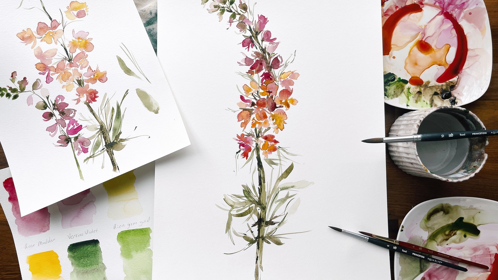
Transcripts
1. Introduction: Welcome back to Le's
creative friend. In continuing with the
birth flower series, today we're going to learn
how to paint Primrose and watercolor to celebrate
the February birthday. While researching this flower, it soon became
apparent that there were dozens of variations, some with solid colors, others boasting 3.4 hued petals, some with fine lines
sweeping through the petals, and others with
such wild patterns, it would seem they were alien. Although I love something
about each one, I have selected three for
us to explore and study, which will have you very well acquainted with this
flower by the end of the course and ready to continue exploring possibilities
should you wish to. Our early practice will begin our time
together by looking at a few reference images to stir inspiration and
take a close look at flower shape
and petal posture. You'll see in this
class that I'm really going to emphasize
keeping things simple. Our strokes and details will be thoughtful
and intentional, and we'll rely on
gestural approach to keep our hands loose. The Primrose is a dainty
flower that can become large and shapeless
without careful vigilance. We'll spend a bit of time
doing drills to build muscle memory until the movements
feel swift and natural. Next we'll explore shape, and we'll visit the
pinwheel flower to help us understand
the basic structure. And then I'll show you a
few small additions that can really add value and
interest to the flowers. We'll move on to color creation. And the biggest challenge, which is a good challenge, we'll be creating a variety
of color combinations at various ratios that
will allow us to achieve great range
within the petals. I'll talk you through this
mixing process and show you exactly what your paint puddle should look like for
ultimate success. The rest assured
that because we're using a lovely
palette of colors, the work will be beautiful
with only very little effort. Still, I will encourage you to take your skill a bit
further by taking the necessary time to create ratios that deliver
exceptional results. We're finally ready
for our class project. We're going to use
the knowledge gained from our time and
study and application. We'll take on our
biggest challenge, yet, creating my favorite
primrose of them all, the blue zebra Primrose. Most importantly, we
are going to have fun and enjoy the process of
creating something beautiful. The skill level is geared towards intermediate
students, however, beginners who have
experience using multiple brushes
at a time and have a maintained solid
understanding of proper ratios will find success. With that in mind, let's begin.
2. Supplies: Let's briefly take
a moment to discuss the supplies that we'll be
using to complete this class. Starting with our Canson
140 pound cold press paper. You can also
substitute this with any other fine R papers such as Legion or Windsor
and Newton, or Arches. Then we're going to have
a variety of brushes. I would love for you
to have duplicates just because we are going to be covering some loading or
pre loading of the brushes. It's nice to have
these extra brushes off to the sides loaded. That way when we use the
wet into wet technique, they're already ready for
us, we don't have to mix. These will be used
for pre mixing. I also have this little
brush in here that is not mandatory, it's optional. We're going to use this
as a detail brush. It's a size four cats tongue from the Princeton
heritage series. But honestly, if you have a
size two or four in a round, it will do essentially
the same thing. Please don't feel pressured or obligated to go out and buy a new brush, It is not needed. But beyond that we're
going to be using our number six rounds in the heritage series and then
I'm also going to be using a couple number six filberts from the velvet touch series. If you have duplicates,
that's fantastic. We're going to be
using a variety of paints today
because we're really going to be focusing on
colors in this class. We're going to start
with our Daniel Smith. We have Bordeaux rich green
gold and Hanse yellow, deep. Then from the binary blue brand, we have the Naples yellow carbon black fiance blue
and pyroal orange. The orange is not
necessary at all where we could always mix a red and yellow together to
get the same effect. It's a detail and not
something that is, again, just absolutely mandatory for the class. If you
don't have an orange. No stress about that, a red and yellow
will do in a pinch. Beyond that, if you are
substituting colors, I would love for you
to have a blue and pink that are clean
in so many words, meaning I want you to be
able to make a purple. That's true. Some of the blues just don't give the same effect when mixed with a
pink and vice versa. A Prussian blue
would work nicely. And ultramarine blue is great, just something that's
not already a mix. We don't want to use indigo. We want a true blue
then for your pink, if you wanted to use, let's
see, a Versino violet. We've used that
before in classes. And then we've also use
a Quinacrodone magenta. That would work lovely too. Again, there are definitely options here for substituting. I just want to make sure
I'm setting you up for success by starting
with good colors. All right, beyond
that, just have a palette and a cup of water, some paper towels, and
we're ready to begin. All right, let's head
into the next lesson.
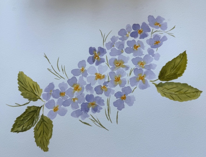
3. Discussing The Pinwheel Flower: Some of you will recognize
this book that I published a couple years ago titled Botanical Watercolor
Painting for Beginners. And I wanted to break it
out for just a moment, because the flower that we're
going to be studying today, the Primrose is essentially
a glorified pinwheel flower. The pinwheel flower is one of the simplest and easiest
flowers that I teach. It covers the basic concepts of an open face flower
and a sideways flower, using flowers that
consist of three petals, four petals, and five petals. And it can go up and up, even towards creating something
as complex as a daisy. But it sets the framework and the foundation upon which we
basically build a flower. I wanted to just bring you into this book for just a moment. I start with teaching
how to create a center, to give your eye, basically something to focus
on and to build around. That can be a really
nice tip and strategy. If you struggle to create a flower that feels
even in balance, then I walk you through all of the different
water ratios, water to paint ratios, and then show you the
difference between a controlled approach
then a gestural approach. It's very similar to
what I teach here. You will find this material in the loose floral elements
class that I teach, but I just wanted to
mention it here as well. If it continues to be something
that you struggle with, you feel like you might benefit from just
having a little bit of extra and detailed
instruction about this flower, then it might be a
great asset for you. Then we're going to be basically moving into something
that looks like this, the Plumeria, where
we're going to use multiple
gradients of colors, wet and wet, creating
clusters of the flower, using different water
ratios to create value within the bouquet
or within the painting. Anyway, it might be a resource
that you find a value. But I wanted to
just bring you in, because this essentially is what we will be doing today
with the Primrose
4. Practicing the Evening Primrose: Now before we begin painting, I would love to
take a few moments to look at a couple
reference images. We do this typically
before most classes, and I just want to briefly
emphasize that this part of the process is really about
stirring your inspiration, about getting you excited about the flower and
building a connection. I never want you to feel
as though what we see in nature is what is expected on paper because it just does
not translate the same. Even botanical painters
will tell you. They'll look at their work and
they'll see all the flaws, all the areas where they just
didn't quite hit the mark. It's one of the reasons
I stepped away from that style of painting, so that I could feel
just more free and more liberated and
enjoy the process. And I really want
you, above all, taking away education aside, I want you to enjoy the process. When we look at flowers, I really want you to note
what is most special to you. What are the details
that stand out to you? Those are the things that
are going to resonate on paper and they're really going to translate
to your audience. They'll be able to feel that
it feels special to you. Essentially what you're doing is you're building a
connection between you and your inspiration.
Let's go ahead and do that. We're looking at the
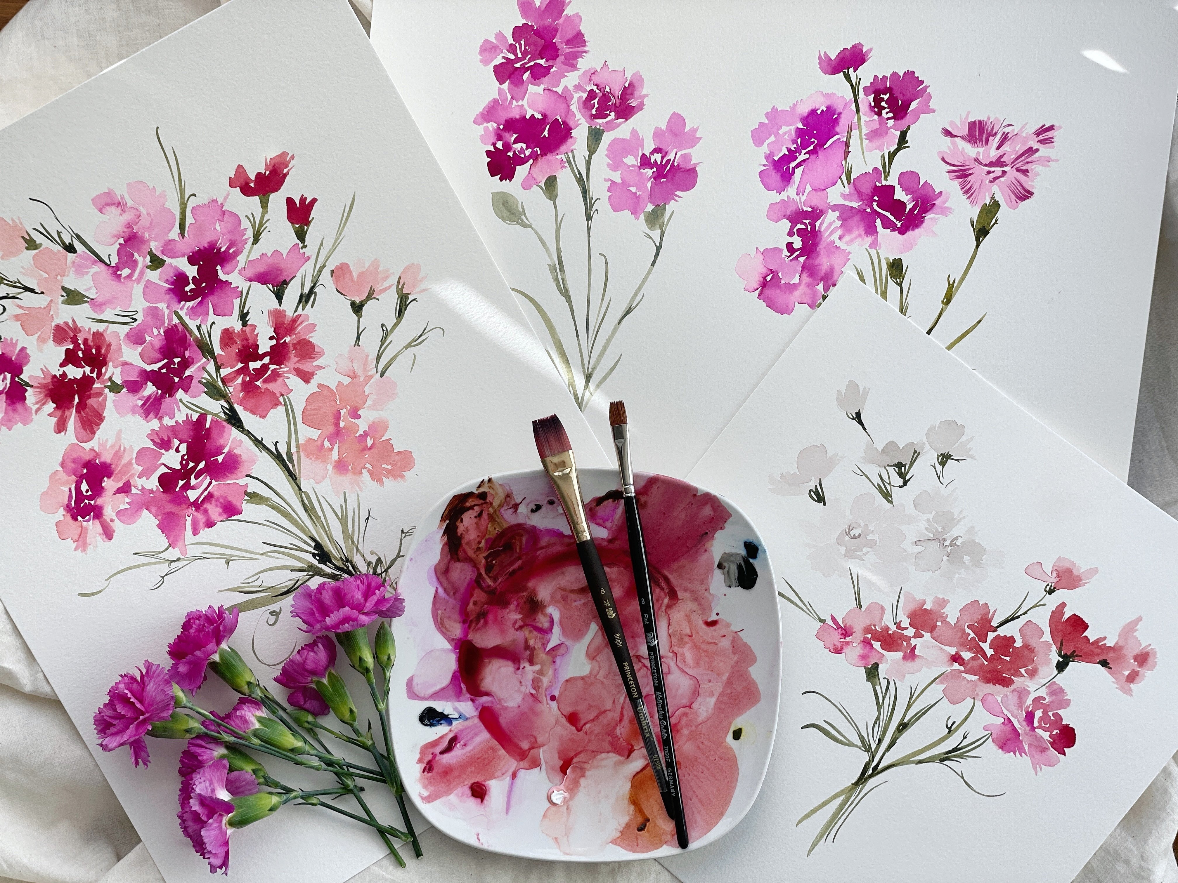
evening Primrose It's such a sweet flower
and very simple. But as you saw with
the snowdrops, even though the application
might be simple, there still is area to
go, I guess, wrong. When we try and crowd the flower with too many
details and we overwhelm it. It really starts to weigh down that flower that speaks
so simply in nature. Let's just take a look
and bring out some of the things that just feel
really special to us. I know in this flower just taking details that it is
a four petaled flower, that these petals look
like little hearts to me. We're going to take
those observations and we're going to
apply that on paper so that we can feel more
confident when we really begin to let go and
apply gestural style. But it's good to just
write down or at least think to yourself, okay, this is what that
flower looks like. I also note that they
have a cup form. They make little
almost like bowls, that will be something
fun to play with. Just noting the structure
and the shape of them. Then I really love these little lines sweeping
through the petals. That's something that I'm
going to want to lift out. And just make sure I take
time to put into this flower. I'm not going to really focus
so much on these stems. Although we can I have the
color that we'll be using. I'm going to show you as
I do with most classes, it's not just a typical
straightforward, this is how you
paint this flower. I'm never going to adopt that teaching style with you because there are so many
ways to approach it, even within my own work
that is highly stylized. I explore all the time and
I want to come up with new ways of expressing
old material. I want you to feel
as though you can do the same constantly. If you're an artist
and you're trying to create a small
business for yourself, you'll be told to
niche down and that. And that people being able to recognize your
artwork is important. Yes, those things are important. But you never want
to lose sight of the fact that you are
an artist at heart. And that exploring and
finding new ways to express yourself through what
you paint is the end goal, or the ultimate goal for
the creation process. Never feel you have to continue painting the exact same way
for the rest of your life. Your work should
continue to evolve as though you are able
to take yourself to new heights within any industry, but especially with
the artist industry. Okay, Taking away those details, that's what we're going
to apply to our paper. But if there are things
that you feel are special, please make a note of them
and put it off to the side, and you can include those
in your flowers too. As I was discussing before, we are going to take the pinwheel flower approach
with this first flower. It's going to be the
foundation upon which we build and add details and
interest to our flower. But I really want
to break it down, make it super simple and
then we can build from that. You might find
that you even like the most simplistic
approach to the flower, Sometimes simple
really is better. Let's go ahead and begin
with our Naples yellow. We're going to be using our
size six filbert brush. Go ahead and mix that paint to the proper water and paint
ratio. That's cough syrup. You may need to
reactivate the paint if it's been sitting
for any length of time and then go ahead and
create a broth puddle as well. Even if I don't end up
using both puddles, I like to have them
available just so that I can easily swoop in, load my brush, and then
head back to the paper. Okay, adding a
little bit of water. Let's begin with
a very simple and straightforward open
face, pinwheel flower. We're going to start by taking the side of the brush
to create a point. Then we're going to gradually, as we move through the stroke, bring the brush to full belly. And then we're going to do the same thing on
the other side. That's our first stroke.
Do the same thing. I don't think I
mentioned we're doing a four petal pinwheel
flower. There's our second. Do it again one more time. Okay? I intentionally kept
things very simple, almost to the point
where they are boring. Every petal looks
almost the same. Every it has the
same water ratio, is almost the exact same size. This would be a very simple and straightforward
pinwheel flower. We can tell that it
has four petals, but beyond that, there's nothing really all that
interesting about it. What would happen to make it
more interesting would be to add in some details to the center that would
really bring it to life, especially if we were
working wet into wet, we would add some
green and some yellow. Allow those colors
to blend and then things would become a
lot more interesting. But we can make things a bit more interesting
on the front end too. Let's go ahead and do the
pinwheel flower again. But this time we're going
to make minor changes. For somewhat major
differences, okay? Let's do the same
thing, same stroke, this time I'm going to make this petal just a little bit smaller. Then I'm going to
make this one come out to the side a
little bit more, not coming straight
up and down again. I'm going to go with a
smaller petal on this side. Just looking at these two
flowers next to each other. Immediately, my mind
and my eye likes this flower much better
because there's differences. There's variance with the petal. Although we use the
same water ratio, it still is more interesting
to me than this flower. Again, I just wanted
to stress that there are ways to just manipulate your strokes and make
these small changes to give yourself something more interesting
on the front end. But we're going to
also just study different postures of the flower to which will also bring a lot more interest
in value to the painting. Let's say we wanted to do
a version of this flower, but make the petals a little
bit more complicated. As we noted earlier, they have a heart shape to them. Let's go ahead and
do that this time. Let's draw a heart. The
thing to be careful of, and you'll see, is
that these petals can very quickly get big. We need to try and remember that this is somewhat of
a dainty flower. We don't want to paint too big. I'm also going to
show you how to do this with the round brush. Okay, now we have petals that have more of a heart
shape to them. We can make some
connections here if we want to just create a bridge. And then again, there would be a lot more interest happening. And we'll get to that
part where we're adding colors in the middle
to bring this to life. But we can see the
evolution here. We have a very simple flower. We have one that's a little
bit more interesting. And then we have one now
that has a varied shape. And also playing again
with the posture, not so straight up and down. These are just the steps as we get to something
a bit more interesting. All right, let's try that again. But this time what we're
going to do is we're going to create these petals, but we're going to
create a wavy edge. You want to give yourself
a little bit of room so that you can expand
on the petal. Okay, now what we're going
to do is we're going to take the edge of the
brush and we're just going to brush up against it
here to create some waves. Okay, now we have, you can tell it's getting
bigger each time we increase the detail factor, the petals just
inherently get bigger. It's something we have to watch. We can begin this process with doing much smaller petals
and that can help. But most artists inclination
is to just get bigger. And as you paint, it's something to be mindful
of as you move forward. Okay, you can see the
progression here. If we were to do that
just one more time. Starting with petals
that are a little bit smaller and then we can build upon those. We have something that's
a little bit smaller. You can see starting
with something small, but it's hard to wrap
your mind around a petal that's essentially
just a line. But the goal is to
eventually get here. That's just a simple
open face flower. Now let's move into more
posture possibilities. Let's say we want to do
this flower on its side. We would start with a line like this and a line like
this just to indicate, okay, this is the petal that's going to be
overlapping here, we saw those cup like flowers. Then we can begin to build the flower out by
adding those petals. We have something that's
pretty straightforward. We would again, add
some details in here, some wet and to wet,
but it's very simple. If we were to do this a
little bit more gesturally, we would play with something more along these lines where
it's not so controlled. Show you that one more time. This requires us to let go, to not be so slow, controlled with our movements, and just to open up and
be a little more free, a little more flicky
with our movements. Again, both approaches
are lovely, but I wanted to give
you just an idea and an example of which
approach you can explore. If you like one or the other, then there are some that are completely closed.
These would be buds. Just keeping it very simple, this would be a
downward facing bud. Then if we wanted to have more of like that bowl shape that
we were discussing earlier, we would want to create
almost like a cup. We would do a line here. And then we would take
our brush and just drag out this bottom petal. We
would make it shallow. We don't want to extend
this petal any further. We're going to lose
that bowl shape. Then we'd come in with our brush and begin to create that cup shape. Okay, that gives you just a really clear idea of all the different
possibilities, the structure, the shape, the positioning of the flower. This next lesson coming up, we're going to begin
adding those key details. Working with wet into wet, and finding those little details that make the flower
so special to us.
5. Adding Primrose Details: I just realized I neglected to mention the undersea green. I had pulled it off
to the side to gather the pigment numbers
for those of you who substitute
your paint colors. And it got left over by my
computer, so I apologize. We're going to be using
the undersea green for those details in the middle. So make sure you
have this color or something similar to be able
to put into the center. All right, I'm going to put
that on my palette here. We're also going to be
switching to our round brush. We're going to be using both, but I want you to
make sure you have a round brush available and we're going to go
ahead and load that. You don't need to
go too dark here. You can start with cough
syrup consistency, you don't need to get to
that really sticky mixture until a little bit later. Go ahead and nice
cough syrup is great. Then go ahead and set that
brush off to the side. We're going to play with a
little wet and to wet here. Still using our Naples Yellow, our six filbert brush. Can I just be really
honest with you guys because I feel like we're
just sitting in my studio. We're painting together,
we're having a session. This color Naples yellow, for whatever reason it wants to come out
is nipples yellow. Every time if you hear me
slip and start to giggle, you'll know what is happening. I promise my mind is
not anywhere other than this class and this
project and this painting, but that's what
wants to come out. Okay, let's get back
to the process. I'm mixing my paint off to the side using my Naples yellow. And let's go ahead and begin
with our pinwheel flower. Really? You can use any
of these approaches. I don't want you to
feel like one of them is better than the
other because they are not. We all feel drawn towards
certain shapes in certain ways. I'm going to do it the way that I would paint this flower, but you can make those changes and do something different. Settled yesterday
because I spent probably 3 hours just
painting this flower, not really having
any expectation, just wanting to explore
it, see what happens. Giving myself that time and permission to just do it in
a bunch of different ways, I came up with a blend of
all of them to be honest, other than like the extremely
simple version here, you'll see that
when it comes out. All right. All right, so we have a flower
that's on its side here and it's pretty wet. So I'm going to
give it a moment. I'm actually going to do
a different one or paint another one just so
that while it's drying, I have one that's ready
to go when I'm done just playing with different
shapes and possibilities here depending on the
paper that you're using. I neglected to mention
that we're using the twothier side
of this paper here. The water will absorb
at a different rate. You just need to keep in
mind what's happening. All right, So now
I'm going to plug in that undersea green and watch it into my petals. If the paper is ready, it
should look like this. It should happen somewhat
similar to this way. If you looked at the
reference image, it doesn't happen this way. The green is a lot more subtle, but I really liked the
effect of the wet on wet. I'm giving you
this option again. You can use it in
a different way. If you want to use it as
just a touch of color, you can do that more
so like I did here. And then head back in
with it really dark. And just create a
detailed center there. You have these two
different approaches. I would touch this again. You can even use your brush to sort of help it
encourage it along. Again, neither of these
are wrong or right. All right. Let's go
ahead and do that. Again, kind of mirroring
this one up here. Then we could be a little
bit more reserved here, not quite as intensely wet
into wet as we were here, but allow it to spread again, while this one's drying,
we could add even more, that's when you would get
to that sticky mixture. I'm really plugging it in right into my sticky paint here, allowing it to be at its
darkest consistency. All right, and then let's do one that's more along
the heart shaped. And I'm going to add it
to this one so that we can start to get the
feel of what it's going to look like as we
build a cluster of these. Let's start with our
little heart pedal here. Heart pedal here. Then let's do the same thing
over here, another heart. The goal really is
to use all of these, so that each flower has a moment and doesn't begin to
feel stationary and stiff. Okay, now we're going
to do the same thing, but this time we're going to
use our other round brush, so it's still another six. And we're going to
load it with the Hanza yellow deep for a
different effect. Okay, Really get that
cough syrup consistency. Rotate those bristles and then set that brush
off to the side. We're going to do
the stems that I showed you in that
reference image where they're lifting out of
the center of the flower. Okay, my flower is getting a little big here. A little bigger
than I would like, but we're going to
just work with it. We're going to go
full open faced here. This is more like
a three petaled. Again, I like to just
make slight differences. Some of them will
be four petals, some of them will be five, some of them will be three. Okay, now we can plug in a little bit of
the Hansa Yellow, Deep. Do the same thing, just
a touch of it is good. And then we can
encourage it along. I'm going to do the
same thing, and I'm going to let that
dry for a little bit because we're going
to add some darker details in a moment. I'm just going to
continue to create these, let's try one in this direction. I'm just going to be
real subtle with it. Try different ways you see, like I really leaned into
the color over here. Let's even make that
petal a little bit more golden because you might
end up loving that. Again, when we put
these in a cluster, a flower that looks like this and this next
to each other, it's going to look so great. Versus if we would just
continue to paint it like this, you would be, you feel bored. You want variation, You want subtle nuances and differences
within your painting. Exploration is key. Okay, I'm going to go ahead and paint just a couple more
so that I can really show you a couple examples of how to add details
in a beautiful way. Let's go ahead and I'm going to just do like
a but over here, keeping it very simple. Maybe another one up here using mostly are just our
snow drop structure here. We can get a little bit
more complicated with it. However, when you
do that, again, the petals get big and they can be bogged down with details. Just keep in mind maybe one more over here just
to give it some length. Okay, we have a few different ways
that we've approached this. Let's go ahead and take
our round brush dip into that Hansi yellow
and we're going to create some really
delicate stems. The way that we saw coming
out of that actually, you know what, I'm going to let that dry
for a little bit. I was just going to
plug in right away. But let's go ahead
and let that dry, and that will make sure
that we have a wet on dry. I don't want to rush
it and I don't really want to get out my
hair dryer either. Let's just pause on that. What we're going to do is
we're going to break out a bit of our carbon black. And then we're
going to mix that. Bring it down here, and
then we're going to add a touch of the Naples yellow to create
an earthy brown. It's a really interesting
color, these two together. It's a little bit green, it's a little bit yellow,
a little bit gray. But I really, I liked
the hue that it made it complimented the petal
because we're using a color that's already
within the flower. Okay. So you want to have it somewhere between
broth and cough syrup. It doesn't need to be one or the other, somewhere
in the middle. Then we're going to use our
brush to plug in some of those really lovely
sweeping lines that we saw in our reference image. Let's go ahead and do
that here pretty dry. To do that, we're going to
make sure that we're coming on top of the brush. We're really applying
light pressure here. If we get too heavy, the strokes are going to end up
starting to look chunky. I'm going to blot off just a little bit because it's
a little bit dark, although I do like
a dramatic vein. And I'm going to start rotating my paper just to get the
best angle possible. We're going to be
doing a Primrose in a little while here
that is just so unique and so striking and
this will set us up for that. All right? I really love the
veins that came out here. It's a little bit of a lighter consistency and a
little bit thinner. This one's a little
bit chunky, but again, chunky next to thin looks
really great because again, it's just bringing in
interest to the flower. Let's do the same
thing over here. I wanted to note here because
this is not so severe, this wet into wet action. The strokes are
going to be a little bit more pronounced,
which is nice. Try and keep them
light and loose. They don't need to be just
a line through your petals. Just something
playful is fantastic. You don't need to
do them through every pedal, if
you don't want to, you can leave some that are just natural there. You have that approach
where we're just doing the wet into
wet with the green and then we're putting
in that light veining, you could even go lighter
if you wanted to, for something that's
not quite so severe, then what you could
do again is plug in the undersea green, even darker in the center here. That's a possibility. Okay, let's go ahead and take that number six brush loaded
with the Honda yellow. And we're going to
add those stems into these flowers over here. These are going to be
a little bit different because they are not stems, stamen coming out of the center. The one thing you do
want to keep in mind is in what direction are
the stamen pointing? You could have stamen that are just shooting up
like a fountain. You could have some that are all pointing in the same direction. But you do want to
give your flower some positional identity. So that it feels like you
know what's happening. Just take a look and see here. I feel like the stain
would be best suited. Coming up from this direction, here's a variety of the
whole fountain effect, where they're coming out
in different directions. Then we could just
play with details. And there if we wanted to, then if we wanted to take
it one step further, we could plug in a little bit of undersea green just to add
one more layer of interest. You don't have to is just an option. Okay. So there you have it. Lots of
different ways to approach it using different
postures and structures. Let's go ahead and move
into the next lesson.
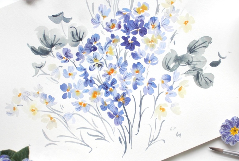
6. Painting the Violet Primrose: If you follow me on Instagram or you've known me for
any length of time, you will likely know that I have two daughters, Hazel and Violet. You may also know that the other February birth
flower is a violet. I wanted to honor her name and just in general and
create a violet. Primrose. This one actually
called Primrose blue, but it has more of a
purple tone to it. We're really going to lean into this really lovely purple and we're going to
create several washes. This is where we're really
going to get more intense into the color mixing process and play with paint to water ratios. You can see how
beautiful the effect is when there are some
deep purples in here, along the edges
right within here. And then it's coupled with these flowers that
are very pale, just a very light lavender. That's something we're
going to play with as we cluster and put
these together. We're also going to add a
little touch of blue into the edges here in there
just to intersperse, to create a different effect. I practiced this yesterday and it turned out
so beautifully. So I want to just share lots of different options as we did
with the Evening Primrose. If you like, you can go ahead and take a snapshot
of this picture. I do usually pin these to my
Pinterest Skillshare page, or I think it's labeled
Skillshare classes. It's workshops or classes,
something to that effect. But it's a public board and
you can see the flowers that we have explored and studied in past classes.
Take a look at that. I'll put a few of these
on there as well, just so that you have
them at your disposal. All right, You're going
to want to make sure you either have a different
palette or you've cleared away the palette that
you were using to create some room because we're
going to need quite a bit of room to explore these
purple mixtures. Go ahead and put your
Bordeaux and your fiance blue if you are in fact using those colors on the palette. And then you are
going to make sure your brushes are
clean and clear. You don't want to have any
of that yellow or green remaining on the bristles because it will
affect the color. All right, let's go
shift this up just a bit and start building
some of our mixtures. I love this Bordeaux. It immediately is just
such a luxurious color. Takes very little agitating
and pull out a nice amount, then let's pull it out
a little bit further. Then let's go ahead and
add a touch of blue. Create a nice purple here. If you do not love purple, you can always tone
this down with a bit of raw umber sepia or burnt
umber Van **** brown. And get something that's a
little bit more earth tone. I'm going to plug in just a
little bit more blue to it, really deep in it here. And then also expand over here. I want lots of
different mixtures. We have more of a
cough syrup mixture, broth here, then I'm going
to add a bit of blue here. I'm really going
to go blue here. Then I'm also going
to add a touch of the carbon black to it, careful because that color
will quickly dominate. But again, just toning it down, moving it away from grape juice. Again, brown works lovely too, but I have the carbon
black on our palette. Rather than adding a new color, I'm going to just
use what we have, adding a bit more blue. Take your time here. Don't feel like you have to
rush this process. Find a color that you love. I explore purples and blues. In the Color Guide series, I believe it's titled, the Midnight series, There's just so many lovely purples
and blues to explore. Make sure you find one
that you love. All right. I have a nice color here. I'm going to bring
out one more time. Then I'm going to
rinse off my brush because I want something
that's super pale. Because I want to
be able to create those really light flowers that I love, that violet color. Then I also want a mixture
that has more blue in it. So I'm going to take some blue and a bit of the purple here. And then plug in a bit of the lamp black, me
the carbon black. I have a bit more blue in it. I like having lots of
options on my palette. It's only going to benefit. We're going to gear things up
here now that we understand the structure and
posture and really play with color, potential
and possibility. Okay, I have a cough
syrup mixture of this mulberry purple here
and then a broth version. And then I have a cough syrup and a broth mixture of this, more of an egg plant purple. And then I have one that's
leaning more towards blue to add just a touch
more of the carbon black. I really love an earthy blue. We're also going to be
using the Naples yellow. Go ahead and have that
color cleared away. If there was any of the carbon black left over
from when we were mixing it. Go ahead and lift that out because we want that
to be true to color. I'm going to load my
number six brush. Just put that off to
the side for a bit. What I'm going to do is
I'm going to show you a couple different ways as always, to approach this flower. Leaving space in the middle, not leaving space in the middle. And the different effects of the bleeding so that
you can see there's just so many different
ways to do it and to find one that suits
you in your style. I always encourage you find your voice within this teaching. I never want you to feel like it's got to look exactly
like what I'm doing. Really, just have fun, enjoy this process and
lean in. All right. I'm going to get out my
number six Filbert brush. I'm going to begin with
that really pale wash. It's almost going
to be 90% water and 10% paint because what I want to happen here is for
the bleeding effect to really take shape, we're going to
start with a flower that doesn't have
an open center, meaning I'm not leaving any
white space in the center. And then we're going to plug in that naples yellow while it's still wet and
allow it to spread. Then we're going to
do the same thing, but we're going to
make sure we do have a white center and you'll
see the differences. Just one note before I begin. Make sure that you have quite a bit of that water on
your brush because what's going to happen as
you've seen when we study wet into wet technique. If the petals are
not wet enough, then when we go to add
that second color, the color doesn't move, it does spread into
the wet media. That if you are more
on the beginner side, it may take a little
bit more practice, trial and error, before you
really are able to time it and get it to achieve the
result that you want. I can already tell
that needs more water, so I'm going to add a little bit more water to it
because I really want to make sure that
the colors spread. Okay, So I'm just creating
the general shape here. And then I'm going to
close in the center. All right, Now
with my six brush, I'm going to touch the center and just allow the
colors to move a bit. Now with my other six brush, I'm going to plug into that blue and the
carbon black mixture and I'm going to
touch the edges. How pretty is that right now? By starting with
that super pale wash and making sure that
it's nice and light, that effect is all the
more grand and special, can encourage it
along if it needs it. And you can continue to have the same effect pouring in
from the tips of the flower. One of my most
favorite approaches, you can keep one petal
really nice and light, and then really play with
the dark on other petals. Now if you want
something that's a little bit more of a subtle, you can wait until
the media is dry, I'll show you, we'll
create another one. Okay, so we're just
going to give that a minute so it's not so wet and this is more like a three
petal or more on its side. And I'm going to do another one, but this time I'm going
to leave an open space. Okay. So this is a
bit more dry now. It's not going to, it
might even be too dry. This one's taking it a bit more. I will encourage that color along just by activating it
again with a bit of water. As nice of an effect,
to be honest. It looks much better when
you do it and time it well. But that would
achieve more of like the subtle and dramatic result of just having the tips of it a different color. There we go. It takes a little
trial and error. It also takes paying
attention to, I was busy over here
with this flower and then I'm not watching. It's a matter of seconds, it really, but you can
always reactivate. Like I said, it doesn't
look as good in my opinion. But if you do it gently
and slowly and take your time with it and it
doesn't feel rushed or forced, the it can turn out well. Let's just take a moment and look at these two
different flowers. This is something that I
would do in the same bouquet. I would paint one
that looks like that, just with a touch of the
white peeking through. And then I would
have a couple that look like this next
to each other. Rather than having
just that same flower repeated over and
over and over again, even in different
postures and shapes, I would want to make sure that I have other flowers that are
doing different things. We've studied the two
different approaches with the bleeding effect, using the wet into wet,
and then also not having an open center and
having that yellow just seep into the petals. Let's do that again, but
let's have an open center. This is probably to dry now, but I'll reactivate it, darkening it a little bit here, but we'll do it a
couple of times. Okay, So just making sure I'm taking my
time and rewetting the whole media and then plug in with a
little bit of the blue and then using my naples yellow, encouraging it along here, we can have that yellow
really spread into the petal. Be super playful, or we can just keep it real
close to the center here. It's up to you what you like. We can continue to add that
color and darken the edges. Get something a bit more violet. It's nice to have some petals
that look soft like that. We're going to do something
even different as we move forward and have a little bit more of that mulberry color peeking through within
the same flower. That's what the open center. What you could do
from that point on is you could add
a little bit of the Hanze yellow deep
or you could use the undersea green or
you could do both. Lots of options there. I'm going to take my little
size for cats, tongue brush, and I'm just going to
pop in a little bit of the Hanza yellow just to
show you what that would look like. Very pretty. It would look even prettier if the yellow was
spread a bit more. But again, it's a small flower, so you can only do
so much and have so many moments
within the flower. The bigger the flower, the more expressive you can get
with those details. But I really love
just the simple look of this one and even that one, we can later on when
things are dry, a little wet on dry and
just create a moment here. Then you could pop in a little bit of the undersea
green to the middle here. To the middle there.
It's entirely up to you. I like the little white
space in the middle. I think just being able to bring in light to the flower
is always a good thing. That would probably be my
choice if I had to pick one. All right, we're going
to pause here because the video is getting
a little bit long, and then we're going
to continue exploring this flower using more colors.
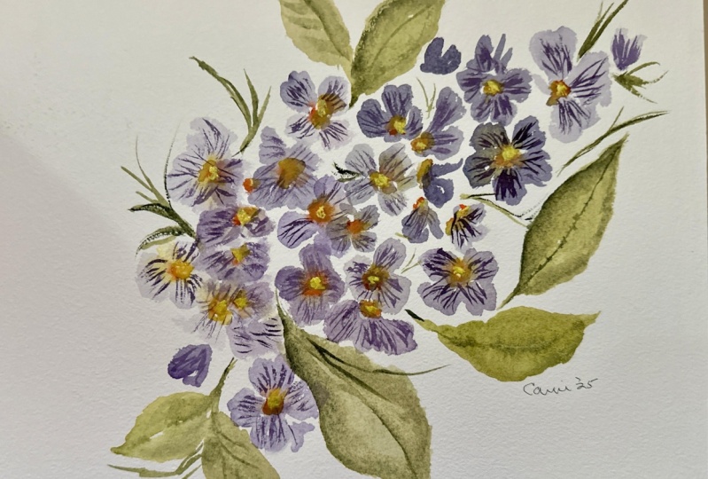
7. Clustering the Primrose: Okay, let's continue
to explore here. Again, you can do a
mixture of hearts, a mixture of gestural. And you can add
more petals here. So like this is a five petal, I'm going to quickly pop
in my Naples yellow. And then I'm going to, this
time, use my mulberry. It's a bit more pink. You can see it's really
dominating that petal. Then what I can do is plug in a little bit of that egg plant
purple on the other side. These are very
similar to pansies. I'm not sure if we're going
to be visiting the pansy yet. I don't even know if
that's a birth flower. I just taking it one
month at a time here. But they are very
similar to pansies. This is probably my
favorite look of them all, where we have multiple colors happening within
the same flower. I really love this
mulberry color with this muted purple black color, with a touch of
that naples yellow. We can add in a
bit of the honza. Again, this whole process, this is why I labeled
this class intermediate. It takes time to load the brushes to make sure that the media is going
to accept the paint. If you're struggling here, I always want to make
sure I mentioned to those who it's not coming
swiftly or easily. That's totally and
completely normal. It takes time to just find
these movements before they become super comfortable and you become confident
with each one. We're going to do drills
here where we just run through this process
again and again in order to get you to that point
where you feel that way. There we have just a
plug of the Hansa. All right, let's go
ahead and do that again. And let's just continue to play with different
color possibilities. Let's start with that. We'll show you here
just so you can see. Let's play with this color
here but make it broth. We'll work in reverse here, a little dark. I'm going to soften it just
a bit. The next stroke, I just shaping it then. Now let's go ahead and add
that egg plant purple. Again, having that brush
pre loaded really helps. You can leave it like that. You can add a touch over here, add a little bit of that
pink purple, the mulberry. You can join these petals here, that there's truly a merge. Then let's pop in that Naples. While it's still wet, you might need to
rinse off your brush. If the brush immediately turns purple,
that's very normal, just rinse off if you start
to see that color get muddy and then head in again. That combination of where a couple petals are,
the really light, faint color mixed with the concentrated color
is probably my favorite. But I really also love the look of this one where
just the edges of the petals are intense and then the center
is a lot more subtle. That perfect balance between
delicate but dramatic. All right, using my
little cats tongue to plug in a bit of that honza. And let's go ahead and
just keep exploring. I'm going to add
some clusters here, adding in hansa,
excuse me, the Naples. We can leave that as is
and continue building. I'm going to touch against
this petal so that they blend together and then I'm going
to plug in a bit of that. Bordeaux mixed with the fiance
blue, that pinky purple, and then pop in that Naples. And now let's move back towards
that really soft color. Let's use a soft Bordeau this
time, Broth consistency. And let's do one more over here. I'm gonna make this
one super light. Encourage it along a bit. And then come in with the
pinky purple over here, brushing up against the edge, then we can just
touch the edges of these using my other
Filbert brush. Encourage it a bit and bring in that Naples
to the center. This is probably a bit too
dry now, but maybe not. I'm looking at it over here
and it's still glistening. We can use our for brush to just give it a
little encouragement there and then leave those petals. Just like that, you begin to see how beautiful these flowers will start to look when
clustered together. Let's do a couple more, but
let's do that blue mixture. I'm going to pop in to my palette and I'm
going to mix up. I'll show you here a little bit of the blue and
a little bit of the pink, but really trying to
leave it towards blue with a touch of
the carbon black. All right. Going to make sure
it's at broth consistency, a little bit darker
than I would like it, so I'm going to add a
bit of water to it. Popping in that Maples, you can also alternate between having the petals completely touching where the yellow is just seeping directly
from the middle. Or if you like the look of having a bit of white in there, then you can obviously
stick to that. Okay? Now plugging into
my purple mixture, darken the edges here. Go ahead and do that
a couple more times using that same finance
blue and Bordeaux mixture. You can really use the
toe of the brush to create some crisp outlines
if you like that look, you can keep them
soft or you can drag the toe of the brush along the outside of the wet media to create something
that's a lot more crisp. Going back to my blue here, lost it here with
the purple, so I'm going to bring back some blue. And then I'm adding just a bit of the carbon black to it too. So I have a couple
different versions. I'm going to soften that off
with a little bit of water. Eventually, what you're
going to want to start doing here is adding just petals. Because the way that the
Primrose settle into each other, not every flower is going
to have this open face. I wanted to do this in
drill form with you, so that you really just get the movements down like
petal, petal, petal, petal. Adding the naples
yellow into the center, touching the outside of the petals with that
darker consistency. And just drill that home
so that when you go to create a bouquet of these
starts to feel natural. I'm going to show you that now. Just adding a few petals to
the outside to show that these flowers are nestled
underneath the other flowers. That would just be
something like that, where it's tucked under. We have a nice little
heart shape here, and then we could plug
in one over here. You could always have a little
bit of yellow spreading. But just the illusion that there are some flowers
that are happening in the undergrowth is really key to bringing dimension and just
comprehension to the piece. If you just have like a line
of open face flowers here, it's going to be
hard to understand. Okay, What's really
happening here are the growing out of a bush, is there stems that are hiding? Because these don't say, forget me not, which is
very similar in structure. They have those dainty stems to help give it that
positional identity. You can see by having a palette that's just full
of different options. Here, you can plug in
any of these colors, using them interchangeably to create something super lovely. Later on, you can add the
Hansa yellow deep if you like, or you can just do
it on some of them. I always encourage
a mixture of both. You could begin to intersperse some of the evening
Primrose into it as well, if you wanted to make a bouquet. The last thing we're
going to do in the next segment is we're going
to cover Primrose leaves. And then we're going to move
into our class project, which is the blue
zebra primrose. That is so beautiful.
I'm absolutely thrilled to take on
this flower with you.
8. Painting the Primrose Leaves: If I am being completely
honest with you, I'm not in love with
the primrose leaf. It looks a bit like
lettuce to me. It is so incredibly detailed, I don't even really
love it in nature. Which means when I go to try
and approach it on paper, it's not going to look as good as I would like it to look, just because usually nature is the inspiration is the goal. It's the most lovely
that flower can be. Then on paper and grasp that beauty and trap
it with paint and paper. Obviously, it's never a copy, but we can get close, but when I look at this leaf, I just think cabbage lettuce. But we're going to try
and approach it in a way that does feel lovely. A bit more delicate,
not quite so hardy. I'm going to show you a couple of different
possibilities, options. Again, inject a bit
of my own style, bring a bit more of the
gestural approach to the page. And be able to give
this really beautiful, dainty flower a
leaf that suits it. If you are a purist
and you want to just paint this leaf as
you see it Exactly. Please, by all means feel
comfortable to do that. But I'm going to pick and
choose some of the details and not attempt to capture every little ridge
and bump. All right? So I'm going to put
that off to the side. Let's go ahead and
create a new mixture. Again, you will need
to make sure that your brushes are rinsed. You will want to, possibly if your water cup
has grown muddy or if it's hinging on the side
of brown or purple or pink, then you might want to rinse
that out so that it doesn't mix with our greens. Then once you have done that, we can go ahead and begin to
create our green mixture. We're going to do that,
we're going to combine. I also want to
clear away some of the space on your palette. I'm going to plug in
some undersea green here and some rich green gold that's going to give us a
really pretty earthy green. Go ahead and mix
that to cough syrup, and then we will gradually
lighten it to broth. I'm going to add a
little bit more of the under sen sea
green because I can tell I'm going to run out of it shortly just looking
at this palette. It's so complimentary. You can see just these colors together are going to make
such a beautiful flower. I love when the palette
becomes the art. Okay, again, there's so
many different ways that you can mix up paint so that it hinges on one
color or the other. You can add more of
the green gold and get more of that gold color, or you can use the majority
of the undersea green. With just a touch
of the green gold, you can create a couple
different mixtures. See which one you like. And then you can always
calm things down, mute it with a bit
of the carbon black, or you could bring
in a burnt umber. Or if you don't love this green, you can always change it up. All right, then let's go ahead and bring it towards
the middle here. I'm going to be
attempting to capture just the general
shape of the leaf itself, but not exactly. I did note that there were little ridges, there was a vein, and then there were
tons of details within the leaf highlighting
each little area. Let's go ahead and break out
a practice piece of paper. Okay, using my number
six round brush. And we're going to do
this with the filbert so you can see the difference. I'm going to go ahead
and just capture the general shape using
broth consistency. We imagine this sprouting out, there's a cluster
of flowers here. And then I'm going to take the brush and I'm just going to create some ridges
along the side. I'm going to do the same thing. Sometimes they're very
pointy and they're angled up and then other times
they're just on their side. I'm going to make that just
a little bit bigger, okay? And then I'm going to let
that dry for a little bit. Let's go ahead and do
it with a Filbert brush to see what that
would look like. An epiphany is
just a brush away. I always say that I'm always
so surprised when it happens because it's sometimes a
different brush is all it took. Okay. Just dragging the side of the brush along the edges. I think essentially,
we could probably do something that's
more similar to that. Yeah, with the round brush. So let's go ahead and continue,
Try that one more time. Just creating that
compound initially, just to create the shape. Then then we have some leaves that are just
a little bit smaller, a little bit more round too. Let's go ahead and
create a little bit more of a round leaf, and then you can plug in
some of those ridges. So I'm giving these
leaves a chance to dry so that we can go
in and add the details. But let's go ahead and do a wet. And to wet using two
different mixtures. I'm going to allow those to
dry off to the side here. And let's go ahead and use this space over here
to do the same thing. I'm going to add a bit
more of the green gold to my broth mixture
because I want there to be a difference between
the two colors. This is going to be
in broth consistency with a touch more green gold. This pile is going to
be a ser consistency using a bit more of
the undersea green, you can use two round brushes. You can have your six brush
loaded with this mixture. I'm really agitating
those bristles and then set it off to the side. And then your other six brush loaded with the
broth consistency. I am going to add just
a bit more of both because I'm losing
some of it here. Let's go ahead and create
a few more leaves. If you like the filbert
better, you can use that. I'm a little bit more
comfortable with my six brush with the leaves. Okay. Now, while things are wet, let's plug in the
cough syrup mixture right along the outside, almost the same way that
we did with the primrose. And then I'm going to also take the toe of the brush
and run a vein. I went a little further
out here than I meant to. I'm going to do that one
more time, creating a vein. And then I'm also going to
begin to create some of those veins we see
coming out to the side. Okay, let's go ahead and do that again, that whole process. One stroke, two strokes, coming along the side here, creating some of
those sharp ridges. And then taking our brush loaded with the Cough
sy consistency, rolling my brush
through the mixture again, and then adding
those lines for the veins. I'm going to come
back to this leaf and plug in again nice
vein down the middle. And I'm going to wait a little
bit and allow that to dry. Okay, let's create a leaf
that's a bit more round, creating the shape here. And just giving it a bit of a ridge here. Some leaves you can really
make that pronounced, and then others you can
keep it more subtle. Then I'm going to pop in a bit more of
the undersea green because I am running through it and bring it through
the center here. Remember that the
lighter you go, the more of the dramatic result. We had one here that was medium. This one was a
little bit darker. And this one we have
is our lightest. Adding another stroke
into the center here. Still working, wet into wet. You can see it's a
lot of coming back, waiting till things are dry, and then coming back
again and again, letting the color spread, and then coming back
again and again. This I wouldn't consider
this gestural approach. This is definitely more
of a controlled process. You can do it gesturally. It just is a little bit
more of a looser feel. But I think these
leaves better suit the Primrose When we add them
to our final class project, it'll all come
together beautifully. Okay. I think our leaves over here are probably dry enough that we can head in
and add those details. Okay, I'm going to
do the same thing, picking up my six brush with the Daniel Smith
undersea Green. I'm going to plug a
vein in just like that. Then I'm going to get my filbert brush ready
and just put it off to the side adding in those veins. And then my filbert brush, I'm not putting any paint on it, so it's just moistened. I'm just going to begin to touch the outside of that
stroke that I made. I'm just noting those
details that I saw where there was areas of
light and areas of dark. And I'm blending in and I'm going to add a bit more
of that undersea green. Again, using my brush. That's just moist
blending the colors, but making sure I'm leaving some of the initial ground color, which is just that very
light, light green. This is the first approach
that we allowed to dry. That would be the wet on dry. We're allowing it to fully dry. Before we add those details, let's go ahead and
do that again, running a vein through the middle and then pulling
some veins through. They don't need to be
perfect because we're going to end up
blending them anyway. And then using your brush
that has just water on it, begin gently touching the
underside of the vein. I want to work
quickly here so that things don't dry too stiff. Then again, plugging
in those veins. While things are nice and wet, you can take this process as
far as you want to take it. You can continue to add the
cough syrup consistency, really darkening the veins, or you can leave it like that. If you wanted to
make it even darker, you could head back in just like that and add in
some darker spots. That Primrose leaf is
so detailed that you wouldn't be veering too far off the truth if you were
to continue adding. You'll just need to
time everything so that the media is wet but not so
wet that things begin to run. Or then you end up
with something that's a bit more like this,
which is great, but obviously you want to achieve what it is that
you're hoping to achieve. The other way to
do that would be to do this would be to take your Filbert brush and begin working those
veins up just like this. This would be more of
a gestural approach. It's loose, it's light, and it's just not too
overwhelming with the details. Same thing on this side, taking your Filbert brush and running those veins
through the center. You could wait till things
are a little bit more dry or while wet. Take the toe of your round and dip it in here to the center. Okay? And then coming back here, we have our beautiful
wet into wet. And the only thing I would
add here would be to add the veins and leave
the rest as is. Because the leaf is speaking for itself with all of
those beautiful colors. You may need to
even wait longer. I'm not going to get
a super crisp vein here because I can tell
that it's still wet. A, you can always take your brush if you want to just soften things
a little bit again, the underside, then it's
not such a severe vein. A couple of different
options for you there. I really love both leaves, they each have their
own little feel to it. You can continue to
take the brush while things are wet and just play
with it. See what happens. See which leaf you like best, possibly a combination
of all of them. You could, even with a leaf
like that, your brush. And do just a simple vein
and then leave it like that. Try all of these different ways where it's feeling
more bushy and you're coming back again and again adding in
that consistency. Or you can try wet and to wet completely and
then allow that to dry just a bit and then head back
in with those veins using that really dark wash
of the undersea green. And then a leaf possibly
where it's a little bit lighter and adding in a
touch while it's wet. But then coming in after waiting for it to dry a bit and
adding some lighter veins. You can see these
veins are much darker. I think it would look
a little bit too dramatic if we were to
do the same thing here. A lighter vein.
You can even play with doing more veins using
the toe of your brush. And get really vein here and just begin to fill
the leaf with lots of veins. So many options
love these leaves. They're beautiful without feeling too incredibly
overwhelmed. Okay, that concludes the
study exploration process. And we're going to be applying
everything that we have learned to create a different
version of the Primrose, the blue zebra, which
is so beautiful. You're going to
love it. All right, I'll see you in the next lesson.
9. Class Project Part 1: Amid research for this
class as I was exploring, different flower
options are so many, I could not resist
incorporating this one. It's just so beautiful. While I think that this detailed petal will always work better in nature because nature is
the true inspiration, I think that we can do
it justice on paper. I'm excited to do it.
I hope you are too. We're going to have
a lot of fun with those stripes and with
these bright colors. Primary with the
yellows and blues. Not my typical jam. If you have followed
my work for a while, I tend to lean much more towards earthy
pellets and vintage hues. But I thought this flower was too striking not to include. There's a couple different ways that we're going to explore it. Here we have these
really light petals. We're going to use some
of the theory from our violet Primrose
where we create that base color
that's very light. And then lean in to
those details and do some really beautiful veining here with those
streaks and stripes. We'll also be using
our Hanza yellow deep, which is basically that color
right there with a touch of the pyal orange coming through the center
of the flower. Again, you have the option here to leave a white space in
the middle of the flower. Or you can completely
close it in, make that naples yellow. And then extend the Hanz
yellow from that circle. Again, you have
the option there. I do tend to think that
leaving a little bit of white space just brings more interest and
value to the flower. But you, as the
artist can decide, okay, let's go ahead
and put that away. For now, we're just
looking for inspiration. No need to feel like you have to capture every single
vein and stroke. That is definitely
not our goal here, but let's go ahead
and mix up our color. We are going to use
that finance blue. Then we're going to add a touch of carbon black just to mute it slightly so it's
not so super primary blue. That's a little bit
too much, that's going to be gray, that's
what I was saying. It quickly can
dominate the flower. As you can see, I've turned
it almost completely black. Let's add back in a bit more
of the blue. There we go. And then let's bring that out and really load it down with some water to get a nice
light blue adding water. Okay, our palette is ready. Let's go ahead and set
that off to the side. We're going to begin, as we
did with previous lessons, with the pinwheel structure. And we're going to
work at the middle of the page so that we can
build out from here. Because we're going
to be building like a cluster the way that you
might see them in nature. Something that you might
want to end up doing later on is painting them in a pot or possibly like coming
out of the ground like we did with the
snowdrops where we create a base with the leaves and then the flowers are
resting on top of it. You can always pull from other class projects
and bring that theory and application into
different class projects. Okay, let's go ahead
and begin here. Rinsing off just a bit, I really want some light petals here so that those
streaks shine. Okay, so a little bit
of combination of both. Let's go ahead and continue. We're going to create
several flowers here. Oh, if you like, you can pop in a little
bit of the honza. There's not a whole lot
when we see in real life, but again, we can
take liberties here. If you want to plug
in a little bit into some of the flowers, you don't have to do
it for all of them. It could be beautiful. I'm
going to opt for both. Playing with size is also
going to be your benefit here. Do some flowers that are
just a little bit smaller, and then also flowers that are peeking out from
behind the larger flowers, leaving some white space
in between the petals too, can also help create that look. Things are going to look very, very simple and
boring initially, but that's because we are
going to be adding a lot of flare to these petals
once they are dry. Well, that wasn't
supposed to happen. Let's go ahead and turn
that into a petal. We'll turn it into a
nice little bud there. We're going to want
to begin plugging in some buds anyway. So let's go ahead and do that. It's going to feel
a little bit like there is no reward or payoff because you're just doing the same thing over
and over again. But it will pay off our
patience and persistence. We want to be mindful of the
cluster that we're creating, taking care to shape it in such a way that feels as though the flowers are
resting and nestled. Adding petals here and
there, we'll help with that. To fill in the gaps, I'm going to add just
a few more buds and petals until I have something that looks
slightly lopsided. I want to have things coming up at different angles that way. When I go to plug in the leaves, it doesn't feel like it's
just this round shape, but really giving it movement
and play and balance. I'm going to finish off
with a couple of buds and then we'll be done and ready to add in those beautiful
veining details. Okay, I'm going to pause here, I'm going to allow the media to, you can take a look
at what you have. If you want to add in a bit more yellow while things are
wet, you can do that. And then let's meet back
here when things are, like I said, completely dry.
10. Class Project Part II: I went ahead and pre mixed the color that we're going
to be using for the veins. It's a mixture of that
finance blue and carbon black at the very sticky. Beyond cough syrup consistency, it's taking it just
one step further. Eliminating a little bit more of the water instead of an 80, 20, it's more like a 9010. You also want to make
sure that you're using your most pointy round brush because you're going to want fine lines and details
for this flower. You don't want your lines to
get super chunky and having as much control as possible over that veining is really
going to be a benefit. We're also going to work from left to right just because
I am right handed. But if you find
that left to right, if you're working left handed, then you can do it that way too. This will help alleviate any smudging that
might take place. All right? Just checking that
everything is in fact dry. Okay, The trick with
the fainting here, and if you need to look at
your reference image again, I'm going to pin that to my Pentraskill share
board for you to look at. You can, but I found
that trying to mirror exactly what I saw wasn't
all that gratifying. I like just a glance
at it and then intuitively I can see what's happening here on the
paper and plug in those details as wanted. Bringing you in
just a bit closer so you can really
see what I'm doing. I just could not resist these
beautiful zebra stripes. They're just stunning. What you can do is do a few
chunky stripes and then you can do some thin on
other petals and that's really going to give
that look of interest. Another thing that we're
going to visit after this is outlining the petal. Some of you will love it and some of you will
think it's too much. I'll show you what it
looks like so that you can make that choice
based on what you like. The one thing to keep in
mind that I do suggest is continuing to give you a
sort of positional identity. If your petals are
going this way, you want your veins to
go that way as well. Varying between thick and
thin lines is going to be your friend because it's going to make each one
feel very different. You can tell like this one feels incredibly
different from this one. Not only because it's
more of an open face, but because we have a darker
petal here and darker lines in some cases, I'm kind of
doing these long oval shapes. I'm going to go ahead now
and time lapse the rest of this video because
it will continue to get long and it is
quite repetitive. I've shown you enough
in real time that you can see the
application process. You can tell that
there's a difference between some thick and
thin strokes where we're adding these ovals and then
where we're really using the toe of the brush to bring in those sweeping delicate lines. Let's go ahead and time
lapse this and then we will meet back at real time to add some of those
center details along with the leaves. Okay, bringing you back to real time to finish
off this last flower, because I want to
show you an option to outline the petals
if you like that look. I think I prefer the
un outlined petal, but let's just do
one so you can see. If we were to add some
details into here, we could then take the outside of the toe of the brush
along the outside of the petal and finish it with
some gestural outlining. It's definitely a
look and it can bring in some drama and some
interest to your flowers, But I think if it was to become repetitive upon
all of the flowers, it would begin to feel too much. That's my own personal
recommendation. You do not have
to abide by that. You can go your own way. But that was my experience
when exploring this flower. That brings us to
the conclusion of the adding the details
to the petals. We're going to head in now with a little bit
of the Hansa deep. Go ahead and mix the Hanza
deep to cough syrup. Might want to use your
other six brush because the one that you were
just using is going to be loaded with the
blue and the black. Or if you're just
using one brush, you can rinse that off. Now taking our Hanza, we're going to just
add a little bit of a darker stroke here
towards the center. We don't have to do
it on all of them, but it is the way the way that we saw it
in our reference image. We will attempt
to be inspired by that and add it here and there. Just taking the toe of
the brush along the, inside the center
of that flower. Once things are dry, we'll go ahead and add a
little bit of that. Pyal orange too, but
it's still pretty wet. Okay. I like the
mixture of yellows against the open space
where there's nothing in. I feel like it's
very well balanced and interesting without
feeling crowded. Go ahead. We can use that
same fresh and we're going to mix up
our greens again. If you still have that palette, those colors that
you were using, then you can bring
that back out. If you need to clear some
space on your palette. If you can, go ahead and
do that now, murder. Okay, so you can see I now
have my greens mixed up. I have my pile that's more at a broth consistency with a bit more of the green
gold in the ratio, so like a 60, 40 with the
green gold being the majority. And then a Cough sy,
consistency of mostly, just the undersea green, I'd say 90% undersea green and
then 10% green gold. I'm using two brushes. I have them both loaded with the different
consistencies and colors. I've decided I'm going
to do the wet into wet leaves just so that I don't have to
allow anything to dry. And I think I liked the
look of them just a bit better than when I waited
for everything to fully dry. Okay, The way to plug in
leaves to a cluster like this, where there's not a
whole lot of stems. Whereas we could add
stems if we wanted to. If we wanted to just
take this flower in a whole different direction, we absolutely could do that. However, if we're wanting
to paint it true to nature, the flowers don't grow. They would on like
a forget me not, where there's really
long dainty stems. Let's go ahead and
add some leaves where we can create
movement and play. So beginning with
that compound stroke. And now we can go ahead with our other
brush that's loaded with the cough
syrup consistency. I'm going to just encourage
the bleed just a little bit more here on. All those things will
start to settle. I am just going to
sweep out a bit of the color along the edge
using my filber brush. Just giving my leaf just a little bit more
body and movement. I'm going to wait until
things are a bit more dry to plug in that middle vein and now I'm going to add some
leaves on this sign. I'm going to do a leaf that's
just a bit more round, doesn't have quite
the same point to it, and then put my
paper back around. This is drying a little bit faster than those
leaves over there. Use my filbert brush to
encourage things along here. I'm going to sweep out a
bit of the color here too, because it's looking
a little bit too intense for my taste. I like the look,
and I think it'll look really pretty
with one leaf, but I don't want it to look. So copy and repeat. So I'm just going to
move out a little bit of the colors. Okay. That way I have one side that's just a smidgeon lighter
than the other. That's easily achieved
by taking your filbert and just sweeping
through the leaf, lifting out the color, and then wiping the excess paint
on a paper towel. I'm going to add
some playful stems. Even though it's not exactly the way that we would
find it in nature, I'm really trying to
make this whole piece feel aesthetic and because it's not coming out
of any vessel in particular, or necessarily the ground, but more of like a cluster, I feel like it needs
just a little bit of length and elegance. That's where I'm going
to take the toe of my brush and add some really
beautiful sweeping lines, really playing
with the movement. Here we have this cluster that's kind of coming up
and off to the side. And I want these lines to be going in the
opposite direction. I'm going to connect the buds and add a stem just where little petals
are floating away, connecting those petals. Nothing too detailed, adding in a little
bit of texture and depth to show where the stem
might be originating from. Not going to include,
like I said, any long stems here, because that's just
not how they're shown, but definitely putting my
own spin on this flower. Now let's go ahead and add
some veins to our leaves. Mixing that undersea green to the cough syrup I'm
going to plug in my veins. Just adding some really light,
loose, gestural strokes. I don't feel like I
need anything that's too incredibly
heavy or detailed. Because we have the flower
that's so detailed, it's coming along
so beautifully. I love the way it's all
blending and matching, and balance, and aesthetic. You can even opt to not have any veins in
some of the leaves. If you feel like it
doesn't need it, please take liberties here. I really feel like lightening
this side of the leaf was the right call because
it allows for a deeper vein. All right, so the last thing
we have to do here is to add that touch of piral
orne to the center. So let's go ahead
and do that now. I'm going to use my
little cat's tongue size four and I'm going to plug in just a little bit of detail to the center
of these flowers. Again, these colors are
typically not my jam at all, but it is spring time, at least in real time. It's spring time and I am leaning into these
playful colors. If you don't have this
cat's tongue size two or four round
would be just fine, just taking one final look. Oops, I just noticed
that I forgot to attach a butt over here,
so I'm going to do that. Pulling you out a
little bit so that you can see the entire piece. A little bit more.
There, there we go. Now you can see the whole thing. It came together so beautifully. I love the choices that I took. I hope you love the
choices that you took too. Because again, this is
your painting piece. If you don't love
it, you can try it. Again, making different
choices along the way. I really love these leaves, but it would be fun for sure to see what the other
leaves would look like, nestled up against
these flowers. Anyhow, this was such a
great flower to study. I hope you enjoyed
your time today. Thank you so much
for being here. Please please tag me in your creations on Instagram and upload your
class project here. If you care to leave a review, I would be so grateful. Have a wonderful
week, my friend.
 Cara Rosalie Olsen, Floral Designer + Watercolor Instructor