Transcripts
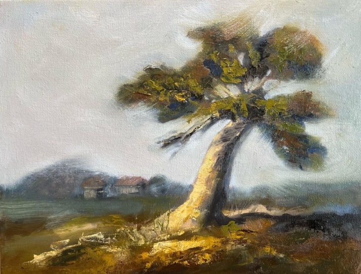
1. Welcome: Hey, I'm Claudio. And today I'm going to teach
you how to do this painting. This one is super fun because
we're going to focus on a simple composition with
just a few elements. We're going to paint
the tree, the sky, the ground, the elements in the background,
and nothing more. It's a beginner
friendly piece in the sense that we'll
get the focus on detailing and texturing
only these elements as much as we want. Also get a chance to do a ton of color variation and you'll be able to see exactly how I do it. You'll be able to see
what colors I use, how I mix them and put
them on the Canvas. Everything is in real time and I'll take you through
each step of the way. Since this is an
impressionist painting, we'll be doing a lot of texturing and moving
the paint around. It gets your palette knife
ready because we're gonna be using it extensively
in this one. For beginners that are
just starting now or have difficulty in some aspects
of their workflow. I welcome you to
watch the tips for beginners lesson
because there is lot of information in there to help you get off
on the right foot. At the end of this course, you'll have a nice
colorful painting that you'll be proud
to hang on your wall. Without further ado. Let's get started.
2. What you need for the course: Okay, So here's what you
need for the course. First, the volume of 40
by 30 centimeter Canvas, the frequency range brush, a half inch brush, a
quarter inch brush, and a detailed brush. The detailed brush is basically the smallest brush you can find. And if you can find the software
one, that's even better. You'll also need a
pallet knife for different textures
and hard edges. You can use a two-inch brush
for the underpainting stage. But if you don't have one, you can use a soft sponge
or a piece of cloth. That's just so you don't have
to deal with a tedious task of covering the whole canvas with a three-quarter inch brush. Now for the colors, you'll need titanium
white, ivory black, but any black will
do ultramarine blue, cadmium yellow or cadmium lemon. Cadmium red, yellow ocher, burnt sienna, raw umber, and some acrylic burnt sienna. If you have some lying around. Since acrylics dry fast, we're going to use this
one for the underpainting. But you can use oil burnt sienna if you don't care
about the drying time. These are the colors I use, but feel free to use
different colors if you are confident in your
mixing abilities, or if you just
really want to use the palette you are
most comfortable with. You'll also need some solvent like Germantown or white spirit. Because we're gonna
use this especially in the early stages
to send the paint. You can use linseed
oil together, different smoother
thinning effect, but only use that in the
upper layers of the painting. That's about it in terms of what you need
for this painting. Let's move on to
the beginner tips. You're welcome to
skip those if you are confident in your
painting ability. If you've seen the
beginner tips from one of my other courses,
that's about it. Let's move on.
3. Tips for beginners: Now we're going to do
an Alla prima painting, which is a direct
painting approach. Everything is
applied wet on wet. And that raises a
few problems because no layer is lifted dry well, except for the underpainting. But we'll get to that. If you're a beginner, here's some tips that will
help you along the way. First of all, be very careful
to use very thin paint. The first layers and thicker
paint on subsequent layers. This one is a big deal and
it's a really harsh mistake. They'll make the whole
creative process frustrating and seem impossible. If you put thick paint
and try to apply another layer of paint
on it, it won't stick. And you will end up with
what is called MAD. No clear, vibrant brush strokes. They're only broken
dirty colors. Second, use large brushes to get strong bold brushstrokes. There's an important one. Work your way to small details. Don't start with those. It's important to
have strong streaks of color around your painting because just one of
those bold streaks can elevate your
painting immensely. I've heard numerous people say, God, how I love this part here. And they point to just
one clear brushstroke that really moves them. That's what we're
trying to achieve. Number three, wipe your brush
in-between brushstrokes. Always do that if
you're changing colors, every time you put the
paint brush on the canvas, It's picking up new bank and he's mixing with
the original paint. In some cases it's a good thing, but most of the time
it's just getting your original color dirty and you lose impacting
your brushstrokes. Number four, don't
neglect the values. In every painting. You have to put values first. You have to know where
light and dark values are and how light
and dark they are. If you get that right, You've won more than half the bowel. This way you will still get a good painting
using random colors. If you just stick
to your values, five, don't leave your
colors to saturate. This is a really common
one in beginner painters. Everything seems
oversaturated to the point that it
looks like a cartoon. Look at the reference
and analyze which colors are the purest
and which ones are UDL. If you know how to
use the digital editing software like Photoshop, you can start picking
general colors from the reference image and set them aside to
better understand how saturated your
colors should be. Also desaturating all the colors is bad and will
kill your painting. So be mindful of that last
step to the saturated color. Use its complimentary colors. The complimentary colors, the opposite color on
the color wheel. You'll see me
adding, for example, cadmium red or burnt sienna to agreeing mixture
just to desaturate it. That's because green is opposite of red on
the color wheel. Also complimentary colors have a very pleasant feeling
place next to each other. That's why a lot
of great artists create paintings using shades of just two complimentary colors and add extra undertones
to those two. Bright orange sunset with cool dark blue shadows would be a perfect example
of that combination. These are, in my opinion, the six main tips for beginners. If you get these right, you'll have great control
over everything you paint. Of course, as with most
anything, this takes time, so don't get discouraged
if you don't do as well as you hoped
your first time. To recap, focus on
thin to figure paint. As you layer the painting. Use large brushes as
often as you can. Wipe your brush
in-between brushstrokes. Don't neglect the values, don't neglect the
color saturation and the saturated colors using their
complimentary colors. That's about it. Moving on to the underpainting.
4. What is an underpainting: What is an underpainting? An underpainting is the
first layer is set on the canvas and it's usually done within earth color or gray. It's purpose is to give
your art more depth and dimension by showing through the thinner layers of your pain. It creates contrasts with the
other colors in your valid. And it may even give a
certain glow to your objects. That way it'll help your
painting feel more unified. There are a few ways of
doing underpinnings, but we'll focus on what is called a tonal grounds
underpainting. This means will be coding the whole canvas
and just one tone. I've chosen burnt
sienna for this, and I'll be using the
acrylic paint for the code. I suggest you do the same
because this way it will be dry by the time we finished
mixing domain colors. And we can start
painting right away. Now let's start putting
some paint on the canvas.
5. Doing the underpainting: Okay, let's start doing the underpaying. For
Danner painting. I like to coat the whole
canvas in burnt sienna. So I got my acrylic burnt
sienna right there. Some water. Gonna start. I'm
going to coat it all. Just going to use a
bit of water to speed this up process. Okay? I guess that's it. Now we're going
to have all these beautiful earthy burnt
sienna undertones showing throughout
the whole painting. So I'm gonna let this dry. See you for the
free value study.
6. What is a three value study: The three values study. This is a basic sketch
mapping out where the three main values are
going to sit in our painting. These values are dark,
middle, and light. The study will help us define the composition and see if
we need something added or even taken out from the reference photo to make
it clear and more balanced. This is a crucial part of the creative process
when we must escape, even on the simplest
of trainings. If your composition is an interesting or doesn't
feel well balanced, it could very well be that the three main values are not well distributed
for maximum impact. So how do we find these
values in a photo? Well, if we're looking
at this photo, it may be pretty hard to get a sense of the values
at first glance. What am I going to do is squint our eyes until all
the dark parts blend into each other and we can't distinguish
any detail in them. Now we can clearly see
that our darks are made of the tree trunks and the foreground and the
shadows on the grass. The lighter value is
here on the right side, the light streaks on the road and these branches to the left. Finally, domain
value is everything in the background plus the
shadowy parts of the road. If I were to do symbol three
values, study this photo. It will look
something like this. As you can see. Simplifying the composition
like this makes it a lot less
overwhelming and we have no problem understanding
how to block in this painting everything
that makes a lot more sense. And we can think
about how to get the most of the composition
by changing it up. Remember, nature does not
owe us a great composition. So we have to make
adjustments here and there. That's how you do a
three values study.
7. Doing the three value study: Okay, The three values study
should be a simple one. Right off the bat. If we look at the photo and if we
squint our eyes, we can clearly see that the darkest areas of the
photo or the canopy, the branches and the
shadow on the tree trunk. The middle ground
would be the ground. A few lighter areas
in the tree canopy. Our lightest value
will be this guy. So let's start
sketching this out. I got my black marker. I'm going to make a rectangle. This is gonna be the feigning. I'm going to place the
tree right around here. Because maybe we'll do
something in the back there. Maybe some other trees, smaller trees, the background. We're also going to show a
lot more of the ground area. I'm going to draw some lines that would
represent a tree canopy. Something like that.
This part here, free important,
kind of like that. Maybe have this one
connected with this one. We might change the
slope a bit later. Draw some of these branches like that. I'm going to make
the street trunk a bit curved,
something like that. I'm also going to throw
in shadow on the ground. Would be our darkest value. For the middle value. I'm going to take my gray marker and start sketching it in. We're going to have the ground. I think I'll keep the tree trunk lighter than the middle value. What we'll see, I'm
going to throw in some of this value here. Here. Something like that. It's
going to have some trees, some bushes in the distance. This would be a good
composition. Should look cool. Especially this area here. If we're keeping this slider. That's it for the
three values study. Let's get the
mixing some colors.
8. Mixing the colors: All right, Let's start
mixing some colors. I'm going to use my
palette knife for this. I'm going to take a good
gander at the image. Let's make this sky color. I'm going to take
a lot of white. Just touch ultramarine blue. See what comes up. That looks good for start. Next, stop. Darker areas. For the darker areas. I'll use some ultramarine blue, some burnt sienna,
kind of like that. Maybe some more blue. Actually, you know what? I forgot to put the
cadmium red on the ballot. Yeah, because I feel like we
could use some cadmium red. This mixture. That's better. Too cold. The color
was too cool. We warmed it up a bit. This is good. This is perfect for now. Now, I think we're going to
start mixing the greens. I'm going to take some
of this yellow ocher. I'll do my greens here. Put some on this. Cadmium lemon, get in some ultramarine blue and some raw umber. Starting to get
that desaturated. Green number should
do the trick. Something like that. Maybe some yellow, maybe some more yellow, some more blue. Kind of like that. That's a good color. Let
me just some burnt sienna. Just a bit. We're going for something really desaturated because
they're going to have some highlights. We're going to saturate those. We got the sky done, we've got the leaves
and the grass. We should do the branches, the lighter branches and the lighter part
of the tree stem. I'm just going to take
some of this yellow ocher. Put it right here. Take some of this
cadmium, yellow, lemon. Again, you can use
cadmium yellow. Yellow is a bit warmer. We definitely need
to desaturate this. First of all, no, I'm going to use raw umber. I'm going to desaturated blue. Because raw umber with
make it too dark. Too much wasn't too much. We started to get type of green. I'm going to use some cadmium
red to the saturated morph. Starting to look really warm. That's too much. That's good. I'm going to bring
a bit of white. That's too much spare to have
too little, then too much. Actually, I don't
know about that. May force you to
make more color. Let's bring a lot of white. Perfect. That's perfect. More red, yellow. Kind of looks right? Desaturated. Blue. Bring in some more white. That's good. Yeah,
that's a good color. Perfect. I think some red
might do the trick. Should I put burnt sienna? Put some red? I'm looking at the
reference photo. I see big color difference between leaves, the tree trunk. I'll leave it at that. We'll leave it
like that for now. Maybe some burnt sienna. Change it up as we go along. Great. So these are the base colors we're going to be using
in this painting.
9. Sketching on the canvas: Okay, Let's start sketching. I'm going to use this color. I could see it better. I'm using the detailed brush. And actually I think
I'm going to finish it. I also put here some bank there, some turpentine and
some linseed oil. Just thinning this
out a bit. The tree. I'm going to have
a section here. Section here. Something like this. That's kind of how it looks. Small section here. I'm not sure if we're
going to stick with this. This is how I normally do it. I pretty much sculpted
the tree to have a better understanding of where the shadows and highlights are. Going to have this
one in the back here. Kind of like that. Like I said, going to
have this one curved. Tree trunk will be
curved like that. Got this huge branch there. Will start putting
other branches later. Probably have some
more branches. As we go along. I'll just bring this
down a bit more. We'll have some more branches
shooting from the side. Maybe we can extend this a bit. Yeah. That was a good
move for the ground. I think this would
be a good ratio. Should I do a third
of the canvas? Kind of straight? I don't like the fact
that this section here, this area here is touching. So I'll probably
bring this branch up. We'll see we'll have
other stuff around here. That's it for the sketch.
10. Blocking in - thin layers: Okay, Now for the
blocking and process, we're going to use
really thin paint. And I'm going to
start with the sky. I'm using the
three-quarter inch brush. Again, super thin. Because we're gonna be
adding over that later. Doesn't have to be perfect. I'm going to do this
chi holes here later. Just being around a tree. Yeah, kind of like that. This is just to get a sense. We could get a sense of how our colors match
with each other. Going to see how they combine. That's it for a sky.
Wiping my brush. I'm moving on to dark areas. Again, sin paint. I'm going to make
this thicker though. Not too thick because
we're going to, because we're gonna be adding
this color over this layer. So we don't want this
to be too thick. Also think thinning it with turpentine makes it dry a lot faster. Kind of like that. I'm going to try adding
some more branches around here just to get a sense
of what's happening. Now for the ground area. This is too saturated. I'm going to bring
in some some red. That's a lot better. Still do saturated though. That's better. Okay. Let's try this again. That's better. I'll be the shadow. Let's do the lighter
part of the tree trunk. We're going to start
adding detail later. Maybe throw in some
color around here too. We can make much what's
happening here. Right now. I think it's a good start. Let's see what we're
gonna do around here. This layer of the
sky is too thick. Gonna take some of it out. Kind of like that. We're going to blend the sky
with the ground too, so there's no need to worry
about that too much. Okay. We've got the composition in stand to put in
some thicker paint.
11. Blocking in - thick layers: When we're putting
in thicker paint, we're going to start working in some color variation
here and there. Let's start with the sky. My brush was kind of dirty, but start from here. That's good. I'm just using this dirtier color next to the ground because it's basically almost the same color. I want to make it more blue. I go upwards. I'm going to use
a bit more blue. Since the light is
coming from this side, we will have a darker sky. This n. That's good. Kind of like that.
Gets gradually lighter to the bottom of the vein where the
horizon meets the ground. Yeah, that's good. Bring
in some more blue. Let me thin it up a bit. That's good. Now, going to be using
this lighter color here. I think I'm going to
warm it up a bit. What do we get here? This section of this guy? Think that's too much. We're going to work on
the gradient more later. Let's do that. Now. Why not really
darken this corner here? This up a bit more because
we're closer to the ground. They're putting out some street so blue Around here. Getting some texture. Good. Yeah, that looks better.
Let me fill this up. Bring that blue. Closer around. Some orange. See where this takes us. Interesting. Doesn't quite match, but even if I cover it
up, it'll still show. And that's a good thing. Actually liked this pink here. I think I'm going to
keep it. I'll just move it around a bit. Let me just bring a bit
of blue around here. That looks good. Move these around throughout
the whole process of creating the painting. Okay, cool. Now, we're gonna do, Let's take care of
this ground area here. We're gonna take
our main color and make it cooler and lighter
around the horizon. Let's take some of this blue. Gonna put it here. This white. Let's see where that takes us. I think that's good.
I think that's pretty good. I like that. Yeah, That's good. I always start making like a gradient. Actually, I should have
made a lot more of this. Doesn't matter. I'm trying to make it still make it thin. Because although this
is the general color, gonna be pretty light, not
going to look like this. I don't like this one. Here. Was too dark to light it up. A bit more blue. Darken it up. Go to the
bottom of the frame. We're still need some
separation between these trees here. The ground area. I think that's enough
on the ground for now. Just going to take
care of this sky around here because it bugs me. Just throwing make it a bit tighter. That's good. Now I'll start making
a tree canopy. Think I'll start by adding
more shadow, shadows, making them working
them in better. Each time I lay a brushstroke, I wipe off my brush. That's a good thing to do. I'm going to add some more blue, get some cooler
areas around here. Even more. Right here. Let me get some of this. Burnt sienna. Looks pretty good. I think I'll do this
part here. Darker. This is gonna be the
darkest area of the tree. I'll do the same here, right where it meets the ground. I'm going to make more
of this color here. I think I'm going to
bring in some pure black, some more blue Somewhere. Going to be pretty thick. I'm going to create some
kind of some branches here. And actually let me put
some pure black and they're going to look good. One more done. Next up, we're gonna be working
on the tree canopy.
12. First details of the tree: Okay, I'm gonna take
the palette knife. We're going to start
putting this color here into the tree. Let's see where that takes us. To take a lot more. Just throw it around. This color is too dark. I'm going to place this and I'll put another layer over it. That's going to
be a lot lighter. I'm using the above knife to get some different textures around. Yeah, that's good. Go here. Go here.
Maybe throw in. Here. You've got to wipe your palette knife to, because you might
end up getting paint on it from the under layers. Right now it kind of
looks horrible because of the acrylic burnt sienna. That's showing. It's
a bit too much. We'll fill that in. Let's take the
quarter-inch brush and start putting in some sky
holes and filling those gaps. Started already starting
to look better. We give more detail
to the canopy. Already starting to shake it up. Pretty good. Maybe thin it up a bit. Yeah, that's good. To look like a tree now. I have to use some
thicker paint here. Unloading the brush with color. I'm placing it,
then I'm wiping it off because it gets a journey
from the layers beneath. Don't forget to do that. I'm going to do some more
shaping of the tree. Get in some clear
brushstrokes around. I'm placing the color
and wiping the brush. I'm going to merge
these two here. Starting to look good. I'm going to bring
in some burnt sienna to this side here. This side here. Make
some warmer tones. Them around. Paint is a bit too thick, so I'm just going to place
it with a palette knife. Okay, good. Now, as an any painting
you will ever do, you will have to
rebuild the darks. We're gonna be doing that now.
13. Rebuilding darks in the tree: I'm going to use my
half-inch brush. Just color dark, pure black, some burnt sienna. More blue. More blue. I think that's okay. Let's think about it. Let's work on this one. Just placing it like it's showing through
the lighter areas. We're going to come here
later and blend them in. Yeah, that looks pretty good. Some of these branches
won't be super dark. Some of them will be lighter. Make it look like an umbrella
or something like that. We're getting there. That's
gotten a lot more dimension. Now, again, I'm just shaping. I'm looking at this
shape, for example. And I'm thinking, where are the shadowy parts and where
are the lighter parts? So evidently the sun is
coming from this side. So this is lighter
and underneath it and to the side would
be the darkest areas. That's exactly what
I'm going to do. Around the whole tree. Kind of like that. That's
good, That looks good. You know what? I think
I'm gonna put in some pure ultramarine blue
and see what happens. That's not half bad. It's actually pretty nice. I don't have to put it
everywhere, of course. Maybe on this side. I think I'm gonna make
this side cooler. Just mixing it with
the under layers. That was a good move. Kind of like that.
Looks pretty good. I'm going to work those
sky holes better. Yeah. Kind of like that. There's a lot of
underpainting showing. It's too much. It's great
to have it too much. That's a lot better. Gonna be adding a
lot more smaller. As we go, as we detail the tree. So I'm thinking this is gonna be the focal point
of the whole painting. I'm going to treat
this as best I can. Sell. Got some stuff
to work around here. Would be a very good time to start blending in some edges. I'm going to take my
three-quarter inch brush. I'm just going to take
some of this sky color. I'm going to do
something like this. Although this seems like
destroying the painting. It's actually given
a lot of moon. It helps you focus on the
main area of the tree. I know it seems
counterproductive, but trust me, the end. This is what it's going
to make the pain shine. Bringing in some more blue. The upper side of the tree. That's good. It already looks
better. In my opinion. Soft edge isn't hard edges are the backbone of impressionism. Actually. Any style of painting. Just detailing a bit more. Make some more of the sky color. I'm using the three-quarter
inch brush to get really bold brushstrokes in. That's not good to be. Detailing too much. Especially these areas. Basically trying to texture the painting in a way that we understand that
this is a branch. These are leaves. But
that's kind of it. If we choose to detail
something more, we should do it
around this area. I hit this part here. Just going to take
it out completely. I think it's thin enough. Now we can use the
white color too. Cover it up. I'm going to rebuild it next. Don't worry. Just I didn't
like how it looked. Just going to use the
palette knife for that. Next step will be working on the highlights of the branches.
14. Tree highlights and branches: Okay, We're gonna
need a lighter, greener color for
the highlights. I'm just going to take
some of this yellow here. Bit of blue. Just a bit. Actually, I should make
a lot more than this. I'm gonna use the palette knife because we're going to apply
it with the palette knife. And that means we're going
to need a lot of color. That is a good color. We're still not there. Basically, it's yellow
ocher with some ultramarine blue and
some cadmium lemon. Light it up a bit more. I think that's good. That might be two
lights, but we'll see. I'm going to make some
nice contrast around here. I'm gonna make some
branches like this to create contrast between
this shadowy part over there. Let's see what happens. Something like that.
Looks pretty good. I'm going to make it go through the shadowy part. Yeah, that looks good. I'm going to add it
around the whole tree. Again, keeping in mind
the shape of the tree. I'm not going to put
it everywhere though. Just around this area. Maybe a bit to the sides. Kind of like that. Just place small dot around here. These small dots really
captured the attention. This one is not good. Going to try to take it out. Doesn't look bad at all. I'm going to do
something like this. I'm going to use
the palette knife. Again. I'm placing color
and I'm wiping it off. Pleasing color. And
I'm wiping it off. I'm going to place
some pure black right here. That's cool. Right around that area. Maybe here. Behind the tree trunk. Kinda looks good. It gives it some dimension. I'm going to take care
of this branch here. I'm going to do it with
the palette knife. And I'm going to simulate like this part is in the shadow. Then it shines
through the light. Let's see what's going to
happen. Let's do that. Too much. I'm going to place
slight turn color here. Yeah, that's good. That looks pretty good. I'm
going to place it here too. Yeah, that looks good. Let me get some of this
here on the red. Took some of it out. I can place this
one. Cover this up. Good. Looks pretty good. Maybe throw some of these, some of these leaves here. Yeah, that's good. Be cool if we will have a branch
sticking out from here. Super light. Just going to
transform this one. I'm going to make a new one. And it's going to go right
under this one. Let's see. That's going to
show really well. I think it just needs
another one right here. Maybe splash a few more. Really thin. You got
to get this right on the edge. Like that. They can eat some shadow right around here. That's pretty
tricky. Cover it up. Yeah, kinda like that. Looks good. Maybe one here. Kind of like that. I think I need more
dark branches. Now. I'll have to put
in some more sky holes. Let me using the
quarter-inch brush, bringing in some blue trying to get some
really clear ones. Especially in this area. Yeah. That's better. Still not done though. I like that. Color variation that gives still see a lot of burnt sienna. I really want to
get rid of that. We're getting there. That's good. I'm
not concerned at all about getting
the sky journey. It should have colors from
all around the painting. It's really starting
to come together. Just start applying the
half-inch brush some more color. Because right now
everywhere we look, we are having these
really jagged edges. Going to use the brush to
soften them all. Wore. Plus, we need this texture. I'm applying and
wiping my brush. I'm going to bring in
some more burnt sienna. I feel like we really need some warm earth tones around. Yeah. That's good. Maybe even here. Yeah, that looks pretty good. Since it's darker than our
lightest color for the tree. On placing it between
the lightest side under the market side. Somewhere. These dark values here. Let me get some yellow here. Let's see what does
again, color variation. I think I'll do this
here. Make a groove. That's good. About putting some more blue
around in the tree. Just pure blue on this
side, which is cooler. Looks pretty good.
That was a good move. Especially where the
leaves hit the sky. I think that's enough to add some more black
around some areas. I wanted to look deeper. Here, for example. How about I put some of
this blue right here? Yeah, that was good. Not entirely, but it was I think I'll use the brush to move
the paint around a bit. Feel like it's too perfect. Maybe make some
bolder brushstrokes around some of the areas. It's all about experimenting. Just have to try and add
things to see what looks best. Lesson be a good place to
have nice blue shadow. A couple of black. Maybe add some shadows to these branches.
Kind of like that. Maybe add some more around here. I think that's enough for now. Let's move on to
the ground area.
15. Painting the ground: Now, as I said, the bottom of the
painting should be darker and as it goes upwards
to the horizon, it should get
lighter and cooler. Let us do that. We need a lot of color variation
in the Grand Area. So we got to think about that. I think I'm gonna make this part here right near
the tree lighter. So let's do that. I'm going to use actually, I'm going to use some warm brush, wasn't dirty. Going to use this color here for the darkest areas
of the painting. Lighter. The ground. So it should be lighter. Kind of like that.
Actually. I think I'm going to darken it
up around here. Maybe use some burnt sienna. Too much color. Going to take it out. Like this. Start applying thicker paint. Use some of this dark blue. I think I'll have
a strong contrast between the shadow
and the ground. Something like that. And maybe
even lighten it up a bit. Let's lighten this up even more. But bring in some, someone this raw umber to green. I'm going to use some red, desaturated, more red. That's a good color. Going to make some really bold
brushstrokes around here. I can actually
make that lighter. And I'm going to lighten
that up with some white. Going to bring in some
blue and some white, some yellow ocher, some warm blue, burnt sienna. That's good. We've got some nice color
variations around here. Interesting gradient.
The shadow. Using ultramarine and
burnt sienna again. Maybe a touch of raw umber, some black because
it's kind of a light. Let's see what that yields. That's good. That's
actually pretty good. Let's throw in some of
this light color around. The light hits objects and
bounces around in the scene. It's pretty natural that we get stuff like this happening. It'll plus its size. The painting together. Now one thing that
I like to do in the ground area is put
some burnt sienna. Let's see. Just
pure burnt sienna. I just loved the
way that looks in every scene. Kind of like that. Yeah. I'm not sure if I'm going to leave
it exactly like that, but it just works really
well with the green around, since green and red are
complimentary colors. Let me just bring
some of this. Blue. Maybe darken this up on the horizon. We got a lot more
information there now, a lot more interesting. We needed a bit of
contrast between the ground area and the sky. That really works in our favor. Just putting in some lights actually might be
slightly greener. Going to shape them off
more as we go along. That's a nice gradient. Let me get some blue. Like more saturated blue. The ground. Kind of like that. I'm going to do some
more of this color. Ultramarine blue,
some raw amber, white, some yellow ocher. We kind of broke the
horizon around here. Kinda lost it there. Wave fixed it. Okay, Cool. Just playing around
with the colors. Maybe takes the palette
knife and just place it around because it gives
a different texture. Now, you end up with some interesting things. I like this. The way this
darker area contrasts. The ground continues right here. That's interesting. Just play around. It's super fun. Doesn't have to look
the same for you. Let's get some of
this raw umber. Just throw it around. That's cool. It looks pretty
cool. Maybe couple it with a bit of raw sienna,
burnt sienna, sorry. Breeding good. Some of this blue. Just small streaks of it. From time to time.
The other ones good. I like that one. That's good. I'm gonna take the brush
and just move it around a bit to get different textures. Just move it around
as you please. Just make sure not
to break everything. Leave some of the
brushstrokes alone. Tiny bit of smudge here too. Yeah, that's good. And give it different
directions. Each time you place, the color. Looks pretty good. Next up, we'll be working
on the tree trunk.
16. Detailing the tree trunk and painting the houses: Okay, this is a crucial part of the painting, the tree trunk. So we've got to pay extra
attention to the values on it and how it meets with
the sky and the ground. I'm going to use a
slightly smaller brush. The half-inch brush. I think I'm gonna light, light up this part here. Going to use some white here. Maybe get some yellow in
to make it more orangey. Let's see. Actually some yellow
ocher. Kind of like that. Let's see. That's good. I'm going to give
us some detail. That's good. Let me fill it in right up to the sky. I'm going to make the sky a
lot lighter on this side. The contrast would be
more will be clear. I also don't want to
have such a sharp edge. I do, but in some places
more than others. For example, I could
break it off right here. Keep it really sharp
right there. Only there. No good. Light it up a little bit more. Paint is quite thick there. It's harder to add. Now. Let's don't work. You want to, I'm going to do here where it's
shadow meets the light. I'm gonna make a really
saturated orange. Let's see, that works out. I'm going to do here. More on warmer side. Let's see what happens. Yeah, That's good. That's good. That's really good. I think I'm going to
light up this side here. Because the light is reflecting off the objects and is hitting the
tree from this side. We would need a
cooler light there. Like this. Just a touch of
white. This should work. Liner. Yeah, that looks good. That's good. Maybe it's a bit too much. Bring it down a bit. At least in some places. Yeah, that looks nice.
It looks really nice. Gonna have a really
light streak, right? They're really light
one. Just one. Place it here and make some higher contrast with
this guy right here. Yeah, that's good. Work on this part. Get some strong blue in there. What I'm gonna do now is
not in the original photo, but I'm gonna simulate something like shadows of branches here. Let's do that. Let's
think about it. That's good. That's a good move. More paint. Some more blue. Good. Just going to
smooth it out a bit. That's nice. I want to make it contrast. What's the shadows right here? That's better. You know what, I think I'll use
the detail brush for this. That's better. Now again, with a
half inch brush, that was good. I liked this branch here. So I'm just going to
work around it again. Really thick paint around. Doesn't look too bad. Lot better than
what was the four. I'm going to take
my palette knife and put a shadow
right underneath it. This lighter color here. That's good. Actually, I
think I'll throw around this stuff through
the ground too. Get a sense that these might be some sticks or really helps with the detailing. Yeah. I think we can take care of the shadow here and add
some blue in it too. So it ties in with
this whole area. Right near the exterior of it. Just one street there
and maybe just one here. That's it. No more. Just smooth out some edges. Some of this dark color here. That's it. That's enough for it. What I wanted to do was
make a house right here. It's gonna be tricky, but I think it's gonna be fun. I think it'll bring a
lot to the composition. Probably use some of
this color for the roof. Of course, I'm going to
add some blue to it. White. Was just a simple house. Nothing too fancy. Something like this. Looks good. Need some blue, actually some purple,
lighter purple. Not that light dough. Do saturated. So I'm gonna bring
in some yellow. Tone it down. Would be the shadow kind of blends in. So maybe. Lot darker. Some ultramarine blue and
some burnt sienna. Some red. More blue. I think
that would be it. Yeah. That's a lot better. I'll put it right underneath
the roof side of the roof. Kind of like that. I think I'm going to use this color
for the side of the house. More white, some more blue because it's
in the distance. So let's go to have
a bit of blue in it. Yeah, that works. Actually
works pretty well. Just fix the roof here. Maybe throw in another
one around here. That isn't a bad idea. Like that. Dark color here. I'm just giving the
appearance that it's another house for
strokes of color. That's the idea. And actually, how about I make
another one right here? That's perfect. These ones should be
well, this detailed. We don't want to avert the eyes from the
focal point of the painting. I think we need to soften
up some of these edges. This guy here.
17. More detail on the ground: We should get some
more bushes in there. Something like that.
Like this house to be darker, just a tad. Make some shadows around. I think I'm gonna make a fence, something that
resembles a fence. Going to use the
sky color for that. The detailed brush. I'm just going to place some
really strong white marks. Yeah, that's good. I'm actually going to make some
shadows for these. Yeah. Very subtle. Since we're detailing
this part here so much. I think trees in the background
should be detailed to, at least in this section. The least get some
hard edges right there. Kind of like that. Just too hard here. Soften it up. This one, I think we're going to
break off completely. These ones to decide
should do the same. Make them even more blue. Make it look like bloom effect. Yeah, kinda like that.
That looks pretty good. I'm just putting in smaller
streaks of color Here. Let's bring in some more
of this burnt sienna. That's good, That's good. Get in some of these details. Working, especially in
this part of the painting. Just want to get some really nice information
around. Be cool. If I would have
the spark lighter. Because the light hits the ground and it
reflects into the tree. But greenery, Let's see. Still gonna be pretty blue. Just a touch of yellow ocher. I think that's okay. Edge here is too strong. I'll just break it off a bit. Yeah, that's nice. That's nice. I want
this stronger. I think we're in
the final touches. At least for the ground area. Putting in different
streaks of color. Don't be afraid to experiment. For example, put this one, see what you get. You might get something nice. For example, I like it there. Yeah, that's good. Gonna get some Ross,
some burnt sienna. Just place it here. That's good. Thinking some contrast
in this area here. But we would also need some contrasting here
because it's kind of flat. I'm going to take some
of this green to dark, lighten it up a bit. Put some Lewin, some more blue. I think we're good to go. That's good. That's kind of the secret to it. Just play around
with your colors. As long as you stay in
the same value range, only have small streaks
of really light colors. Small streaks of
really dark ones. I'm going to take
the palette knife. I'm going to do some of those straight lines from
earlier because we lost them. Do them and this light color. I'm going to do some of them. Actually, I'm going to
do some of them here. Yeah. That was a good move. Some of this color here. That's good. This is how we
detail the ground. Just flip like really
strong streak right here. One here. Yeah, that's nice. Place. This one here. Actually looks good. Getting that sharp
edge right there. It looks pretty
good. Leaving that they're small one right here. I'm going to soften
up the edges. Again. This time only on the sides of the
painting of the ground. This one. This shouldn't really, the spark shine may have
overdone it though. I'll just place just want to streaks of color in there.
I think that's enough. Okay, good. Next thing we're gonna do is put on the
final touches on leaves. And I think we're done.
18. Final touches: I'm gonna take my
quarter inch brush. We're going to bring in some
more highlights in there. Something with a lot of yellow, something like that. Bring in some raw umber, Something like that. Let's see where that takes us. Yeah, that's good. Even lighter work. I'm just going to
take some white. Let's do much. Good. That looks pretty good. This did wonders for the values. Maybe get some
contrasts with this. Dark spot. Looks good. That's a lot better than before. Even lighter. I'm going to place
it right here. Something like that. Have a strong one right here. As you can see, I'm just
working around this area. I'm really trying to
make this one shine. That's two lights going to
bring in some raw amber. I should do this with
my palette knife. Really careful, careful
where I'm placing these. That's nice. Even a bit lighter, warmer. Although I think
it's a bit too much. Just going to soften them all. Maybe replace some of them
with the palette knife. I think those are enough. Please, on the
inside other colors with a palette knife now, get some different textures. Yeah, that's good. Really strong. Sky Hall right there. And bring in some blue. Got to build some new
sky holds though. This is good. This is good. This looks a lot better. Yes. Moving some paint around, give the impression
of more detail. Something like that. That works. Let me get some of this blue there with
the palette knife. Get some really
strong directions. Yeah, that looks good. Basically
just picking right now. Paintings pretty much done. Kind of intruded on that
one, their worries. Yeah, that's good. My three-quarter inch brush got to make sure it's clean. I'm gonna do this.
Some more of this. In my opinion. Looks a lot better. I mean, it just amplifies the
mood of the whole painting. One of my favorite
things in the process. Yeah, that's good. I like it. Be careful how much you
do this. Don't overdo it. You might break some of these interesting
contrasting parts. I put some more
blue around here. Some more dark here under these leaves. Good to go. I think
this looks pretty good. I didn't do this. Really soften these
ones. These ones. Exaggerate. The effect. Really feels like the
sun, the light spilling. Think it's a good effect. I'll just step back and
see if it looks okay. That's pretty cool. Looks tight, wealth
tied together. I make this change though. We kind of lost that edge there. Let me separate from the house. That's good. I feel like this could be a lighter white. Got to get some
white right here on the edge. That's perfect. That's exactly what
I was looking for. Get some more red than there. That's good. That's
a lot better. Got this nice gradient. Like from the bottom to the top, from the side to the other. That's cool. I think I want
to get some contrast here. I'm just going to use color. Yellow, white. Just do this. Yeah. That's cool. Perfect. All right. Well, I think we're done. Hope you have fun. I'll
see you next time.
19. Thank you: Okay, so we're done. Thanks for taking the course and hope you had a lot of fun. I hope you learned a few things and got a great
result in the end. If you're up for it posted
here or on social media, because I really loved to
see how it turned out. You can also find me on
the address is below. If you want to follow me
and see what I'm up to. That's it. See you next time. Cheers.
 Claudiu T