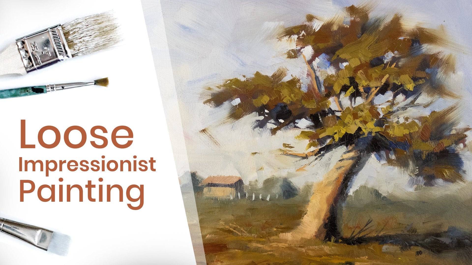
Transcripts
1. Welcome: Hey, I'm Claudia, and today, and then teach you how to
paint this little piece. These cherries or a
perfect subject to bank, if you're a beginner trying
to learn some new skills. Or if you're an intermediate
painter who just wants to exercise his brushwork
and value structure. Painting these small pieces
of great way of gaining new experience and
helps you get ready for those huge and
more complex words. There are no elements
in the background. So we'll get to focus
almost all our attention on the cherries will
give them a cool shine, which is pretty easy to do, but delivers great
impact in his shirt. Lift your pain to another level. As always, if you're a beginner, I recommend watching the
tips and tricks lesson. And if you keep those in mind, I'm sure you're going
to do just great. Okay. That's enough
talk. Let's get started.
2. What You Need for the Course: Okay, So here's what you
need for the course. First of all, you'll need a
20 by 20 centimeter Canvas. A three-quarter inch brush, a half-inch brush, a
quarter-inch brush, and a detail brush. The smaller the better. Also have some paper towels on hand because you'll need to keep wiping the paint off the brushes throughout
the whole thing. You can also use a
palette knife for easier color mixing and even experiment with it to
get some interesting effects. In terms of colors, you'll
need the following. Titanium white, ivory
black, ultramarine blue, burnt sienna, cadmium red, cadmium lemon, and some acrylic burnt sienna
for younger pain. This one is optional, but since acrylics dry in a
matter of minutes, it'll be a good idea to use this for younger painting
instead of oils. You also need some
mediums and solvents. So we'll be using linseed oil as a medium and turpentine
as a solvent. White Spirit is also
k as a solvent. So use either one. And that's about it. Keep in mind that you don't
necessarily need to use these exact items as long as
you get a similar result. And of course, no one
says that you can paint the cherries blue
or green or whatever. Just have fun. Well, that being said, let's move on to
the beginner tips.
3. Tips for Beginners: We're going to do an
allo premium painting, which is a direct
painting approach. Everything is
applied wet on wet. And that raises a few problems because no layer is left to dry. Well, except for the underpinning,
but we'll get to that. Okay? If you're a beginner, here are some tips that will
help you along the way. First of all, be
very careful to use very thin paint on the first layers and thicker
paint on subsequent layers. This one is a big deal and it's a really harsh
mistake that will make the whole creative process frustrating and seem impossible. If you put thick paint
and try to apply another layer of paint
on it, it won't stick. And you will end up with
what is called MAD. No clear, vibrant brush strokes. They're only broken
dirty colors. Second, use large brushes to get strong bold brushstrokes. There's an important one. Work your way to small details. Don't start with those. It's important to
have strong streaks of color around your painting because just one of
those bold streaks can elevate your
painting immensely. I've heard numerous people say, God, how I love this part here. And they point to just
one clear brushstroke that really moves them. That's what we're
trying to achieve. Number three, wipe your brush
in-between brushstrokes. Always do that if
you're changing colors, every time you put the
paint brush on the canvas, It's picking up new bank and is mixing with
the original paint. In some cases it's a good thing, but most of the time
is just getting your original color dirty and you lose, impacting
your brushstrokes. Number four, don't neglect the
values. In every painting. You have to put values first. You have to know where
your light and dark values are and how light
and dark they are. If you get that right, You've won more than half the bell. This way you will still get a good painting
using random colors. If you just stick
to your values, five, don't leave your
colors to saturate it. This is a really common
one in beginner painters. Everything seems
oversaturated to the point that it
looks like a cartoon. Look at the reference
and analyze which colors are the
purest and which ones are. Though. If you know how to
use the digital editing software like Photoshop, you can start picking
general colors from the reference image and set them aside to
better understand how saturated your
colors should be. Also, the saturating
all the colors is bad and will
kill your painting. So be mindful of that last
step to the saturated color. Use its complimentary color. The complimentary colors, the opposite color on
the color wheel. You'll see me
adding, for example, cadmium red or burnt sienna to a green mixture
just to desaturate it. That's because green is opposite of red on
the color wheel. Also complimentary colors have a very pleasant feel when
placed next to each other. That's why a lot
of great artists create paintings using shades of just two complimentary colors and add extra
undertones to those, to a bright orange sunset with cool dark blue shadows would be a perfect example
of that combination. Okay, these are, in my opinion, the six main tips for beginners. If you get these right, you'll have great control
over everything you paint. Of course, as with most
anything, this takes time, so don't get discouraged
if you don't do as well as you hoped
your first time. So to recap, focused on
thin to figure paint. As you layer the painting. Use large brushes as
often as you can. Wipe your brush
in-between brushstrokes. Don't neglect the values, don't neglect the
color saturation and the saturated colors using their
complimentary colors. That's about it. Moving down to the underpinning.
4. The Underpainting: Alright, so we're starting
off with the underpinning. Now as you know, we're doing the underpinning for
a lot of reasons. One of them is to
have this earth tone showing through the upper
layers of our painting. It kinda creates an
extra layer of mood. There are a lot of ways
to do the underpainting. But for this one,
we're going to cover the whole canvas and
burnt sienna completely. So I'm just going
to take some water, dip it into my burnt sienna, start applying it with
a two-inch brush. Shouldn't take too long. Since I'm using the
two-inch brush. A little more water. Don't forget to cover the sides. Just a bit more water. And that's it. Now, all we have to do
is wait for it to dry. And while we're waiting, will be mixing the
main base colors. So let's do that now.
5. Mixing the Main Colors: Okay, So let's start
mixing the colors. I'm going to use my
palette knife to do that. He can use your
brush if you want, but it's a lot less messy
with the palette knife. Now the first thing I'm gonna do is create the main red for the cherries and take
some cadmium red. Put it right here. I think I'm going
to take some burnt sienna to darken it up. I think I'm going to
use some cadmium lemon, some more burnt sienna, even more burnt sienna, some more. And I think we should
darken it up even more. Let's get some blue. Yeah, I think that's
a good color. We're gonna have some
bright red spots throughout the painting, but this should be good
as the main color. Actually, even earth here. Yeah, kinda like that. Spread it out a bit. So I can add various
tense around the edges here so we can get
some color variation in. Okay, I'm wiping off
the palette knife. Now for the background, I wouldn't make it white
like in the reference photo. I'll make it something like a light beach with
some tens of green. And maybe it will gradually
get cooler to the top. But let's create the page. So take a lot of white. And I'll add a bit
of burnt sienna. I'll add a bit of yellow. A bit of burnt sienna again. I think that's okay.
Kinda like that. Yeah. Maybe a bit of red to green. I was too much. Let's bring in some yellow. More yellow. Just a bill. Some burnt sienna, some more burnt
sienna and some more. That's looking pretty good. Now it's starting to
look a lot warmer. Yeah. That's pretty good. Maybe make a side of it lighter. Right here. Yeah, that's perfect. That's
exactly what we needed. Cool. I'm wiping off the
palette knife. And I think this is
all we need for now. We'll make up other
colors as we go. So let's start sketching
on the canvas.
6. The Sketch: Okay, So let's start sketching. I think I'll use the
background color. So I'll make one here, one here like that. So it'd be the first one. The second one,
something like that. The third one here in the back. And doesn't have to be perfect. Okay? And for the
stems, same thing. Think of it. I'm going
to make one right here. The second one right here. And the third one here. Yeah. I think that's
a good composition. And I think the background should start separating
right around here. I'm not going to make
a clear separation. I think we'll see how it looks. But it will gradually get
darker and cooler as we go up. So yeah, I think this is okay. Let's start adding the
first layers of paint.
7. Painting the Background: Okay, We're going to start off by filling in
the background. I got my linseed
oil, my turpentine. And I'm going to
thin out some of this background color
using turpentine. Let's see what we get. That's good. I'll leave out these areas here
for the shadows. Kinda like that. Maybe I'll add some color variation. Let's read here. Some more white. Make it a bit thicker. And I think that's okay. Let's start. What's
the upper background? Just a bit of blue. I'm going to use some
turpentine, defend that out. And make some really
strong brushstrokes. Using both the colors.
To combine them. Maybe add some blue, some more turpentine, some
blue and this mixture here. And it's gotten quite cold. So I'm gonna use it mainly on this side because we got the light
coming in from the right. And evidently that
side would be warmer. Okay. I just put it in paint. However we feel we can have
some cool spots in here too. Fill out the sides. Maybe get some someone
this red mixture. The background too. That's too much. No problem. We're going to use a tissue
and take some of it now. Just a second. Can I show dab this in the
turpentine? Use it here. No problem. I'm wiping my brush. And adding the color again, some more turpentine. And looks even better. Okay. Lighten that up a bit. Cool. I'll use a lighter
and thicker layer. For the foreground. What's some whites? I think we're okay for now. Just got to fill in
this section here to work on that later. I think we're okay for now. We've got some good color
variation in the background. Maybe how some of this dark color here to see. Maybe some pink,
some more white. A stronger white here. Wouldn't be cool. Yeah,
that looks pretty good. Next up, we're going to start
working on the cherries.
8. Painting the Cherries: All right, For the cherries, I'm going to use a
half-inch brush. I'm looking at the
reference photo and we got some pretty nice
darks around here. Something like that. It's not too visible now, but it will be. And a bit around here. Something around
here to around here. We're gonna do the same
thing to the other one. Kinda like this. I've left a hole here
for the highlight. Something like this. Grid. This one in
the back. Like this. I think we're okay
with this color. Now we're going to create
the darker sections. We're going to use some
ultramarine blue and burnt sienna, some cadmium red. We'll add some some ivory black. Some more red. I think we're okay. Kinda like that.
Yeah, That's good. Okay. Darker section of our painting would be
right between them. So let's do this right here. Okay, Looks good.
Kinda like that. Song goes further below. Swan around here. Kind of like that. Maybe to the sides
here, but two. Okay. Here. Because of the
reflection of its shadow. And I think we can
put just a bit here. I'm wiping off my brush so I can do the blending. Yeah. That's good. That's good. Here too. Now we need a lighter
color for this area here. And here. I'm going to use this ground color and
add it to the side. Not too much. Maybe a bit of blue. I'll start adding it. Just a bit of linseed oil. I think it needs to be lighter. Yeah. Something like that. Rounded sides here. Maybe some more blue. Yeah, that's a good color. That's better. Okay. Here to this part, here. Maybe here to just creating
the reflections by looking at the reference
photo and see where they might go. Okay. Maybe take some of this color here. Some here. Because the surface
here is reflecting. I think that's too much. It's going to cover it up.
This line here is to clear. So I'm just going to break it with a strong streak of red. Yeah. Some darker here. Kind of like that. Okay. I think
that's pretty good. I think I'm going
to use someone with this pure cadmium red
right here. Actually. Yeah. I'm here too. And the same for
the third one. Right here. I'm going to add a brighter spot here with this color here. And bring in some
titanium white. More titanium white. I'm just going to
place it right around here and here, and here. Okay? This is not the
actual highlight. The actual highlight will
be white, completely white. And let's place to the
right now. Let's see. The first one. Second one. Okay? And the third
one right here. Alright. Let me just accentuate this bar here and just blend it in. Use. This color here, like this. Here's this color here. To do the same
thing on this end. And the same thing here. There's too much there. So I'm just going
to bring some of this color and drag this up. Okay. I think that's okay. This is too bright. Yeah, that's good. I'm gonna make a
lighter color of this one and create the shadows. Something like that.
I'll just place it here. Yeah, that's a good color. Like that. Make sure
you get soft edges and hard edges in the shadows. And everywhere you look. Actually, let me just wipe the brush and work these shadows a bit. Just redo this one. Quickly. Cool. That's good. That's,
it looks pretty good. Just work around here a bit. Maybe. Make it darker around here. Yeah. Kind of like that. I want to cut off this one right there. Something like that. Cool. Doesn't look bad at all. Yeah. Some white. I'm reshaping the composition. I think we're okay for now. Next up, we're going
to do the stems.
9. Painting the Stems and Adding More Detail: Okay, So I've replenished
some of my colors and let's start working on
the color for the stem. Will try to go dark with
this one and just have some brighter
highlights. Let's see. I'm going to use ultramarine
blue, some burnt sienna. And I'm gonna put
some cadmium red. And I think that's okay. That's already a pretty
good earthy green. And let's see how it looks. I'm using my quarter inch
brush and I'm painting this way because I like
to see some broken edges. Not just move the
lines like this one. For example. You gotta have them both to
keep the painting alive. And I'm putting in some
pretty thick layers. Okay. This one has
to be thicker. Yeah. That's good. Okay. Something like that. What will work on
them more later? I'm wiping my brush and I'm going to reshape them by recreating
the background color. So I'm going to take some white. Actually, I'm going to use
the palette knife for that. Because it's a lot of mixing. A bit of blue, a bit of burnt sienna. Burnt sienna. And we're kind of there. Maybe make it darker this time. Let's see what we got. Yeah, that's a good color. Good. I'm using the half-inch brush and I'm starting to
place the color. Actually I'm going to use
some linseed oil on this one. Let's see. Yeah, that's better. I'm going to send them out of it because there are too thick. Something like that.
Yeah, that's better. Okay. Good. I think I should have done this
with the detail brush. So I wouldn't have to redo them. But it's okay. Cool. Now I'm gonna make the highlights
for the stems. So I'm going to use
this color here. And I'm just going to
add just a bit of lemon. See what that does. That's good. That's good. Let me give the detailed brush That's apply it. Yeah. Like that. But I'm going to have some
strong highlights too, with pure cadmium
lemon right here. Yeah. That's good. Here too. Super thick here. Yeah. I think that's okay. It's a bit too much. So I'm just going to
take out some of it. And now we'll work on the detail here
where the stem meets the Cherry will need
some light pink. Some of this color
here. Let's see. This should be at this place here to here too. Yeah, that's good. I'm just following along where I see highlights in
the reference photo. So let's look at it and see where we need some
of these lighter spots. For example, here. And here maybe here. I'll take my quarter
inch brush and add some color here because
it looks a bit dirty. And then I'll blend their son just wiping it. And then I'm
blending the colors. Get some of this
purple around here. Yeah, that looks good. Some more here. But at more, we're pretty okay. I just want to fix
these edges there. Like that. Here too. This is an important one. And maybe, maybe make
some of them smoother. Like blending it with
the actual background. Here, for example. Here. Yeah, that's good.
That looks better. They felt too textured. So this should help. Maybe make it darker where
the stem meets the cherry. Yeah, that's good.
Okay. Here too. Work on the shadows, darker here to bring that up a bit. And maybe make some really, really dark spots
around here and here. Like ivory black, pure, Something like that. Yeah, That was good. And make just a spot
of light in-between. Like this. Maybe not so clear. Okay. I'm just working the edges. Getting some edge of variation to maybe I'll put some
pure titanium white here. Yeah, that looks good.
I should have some of this color in the background to just a bit to make it feel like
it's bouncing around. I'll use the
three-quarter inch brush. Her dad. Yep. We're back to the
three-quarter inch brush. Okay. I'm going to step
back to look at it to see if it needs
something else. And I think you need some
separation in this area here. So let's do just that.
10. Final Touches: I'm going to make
a different color. I'm going to use this
white. A lot of it. Place it here in just
a bit of burnt sienna. And I'm going to use this as
the main foreground color. I'm going to place
it right here. Really thick strokes. Yeah, This looks good. This looks a lot better. Cool. Maybe. Work the edges a bit. Right here. The mouth. And I think I wanna go for something like
a vignette effect. So especially in this part here. So I'm going to darken
up this corner. Making just some suggestions of darker colors around. Yeah, I want to go even
darker with the background. So let's do that. I'm going to use blue
and burnt sienna. I'm gonna use a lot of white. And that wouldn't
be a good color. Yep. That looks good. We just got to blend
them in a bit. Okay. Now we've got a better separation here. Thanks a lot for them
around this area. How we blend them anymore. Bring in some lighter
values here to starting to have a
lot more texture. Yeah. Okay. That's pretty good. Maybe get some lighter
values around here to make it feel like the
light is really shining. Let me get some
suggestions of this color. Let's paint color in
the background too. Maybe some cadmium lemon, actually, something like that. Someone in this burnt sienna. Let me get some really
strong ones around here. Just play with them a bit. See what looks best. And let me take a step back and see if
it needs something else. Maybe working these
shadows a bit more. I'm gonna take my quarter
inch brush like this, blend them in, get some
harder edges in there. Okay. That looks good. Here too. Yeah, I think that looks better. Maybe. Just blend them. On this side. Yeah. That looks pretty good. Just reshape this one. You know what? I'm
going to take? My detail brush. I'm going to play
some pure white right here in these highlights. Because they sent, they
seem to be kind of pink to put like a lot of it because the
paint is super thick there. I'll put this one again. Yeah. That's good. Let me get some of this purple
right next to it. I think there are two identical. So I'm just going
to play some colors around them to
reshape them a bit. Yeah, that's better. I think we're done.
I hope you had fun and I'll see you next time.
11. Thank You: Okay, So it's done.
Thanks for watching. Hope you had fun learning new things and got
a great result in, yeah, I'd love to see how
your work turned out. Suppose to here or on social
media. And let me know. If you want to see on a
month to from time to time, you can find me on
the addresses below. And that's it. See you
next time. Cheers.
 Claudiu T