Transcripts
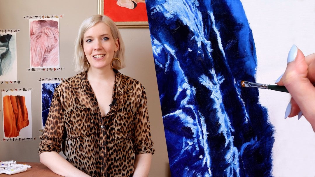
1. Welcome to Fearless Oil Painting!: Hi. Welcome to fearless oil painting. My name is Amy Plant. I'll be your teacher and your guide. I'm a multi passionate, creative, and I've been painting with oil since I was eight years old. I've been building my skills and intuition ever since, painting for commissions and for fun. If you've always been intrigued by oil painting, but we're too intimated to get started, this is the class for you. We'll be taking a less academic approach to painting by building your creative intuition. We will work on an oil painting from start to finish and in the process, learn how to paint with minimal materials, how to mix color intuitively, and how to create atmosphere through mark-making. Whether you are a complete newbie or a more experienced artist who wants to try a new medium, this class is accessible to you. The oil painting process is meditative and allows you greater flexibility with what you're creating. Since oil paints take longer to dry, you can take your time with blending and color mixing easily achieving effects that are a lot harder in other mediums. Oil paints will give your work life, depth, and magic. Another bonus: people will often pay more for an oil painting than they would for acrylic or watercolor paintings. Oil paint is my favorite medium to work with and you can fall in love with it too. Let's get started.
2. Project: An Oil Painting: Class project. In this lesson, we'll be creating an oil painting from start to finish. This course is best suited for anyone who is new to oil paint or has had trouble working with it in the past, no matter your skill level as an artist. The techniques we will be focusing on are color mixing and using edges to create atmosphere. These two aspects are, in my opinion, the most rewarding thing about working in oils and will give your paintings that little something extra that you can't achieve and other mediums. In addition, you'll also get to experiment with blending color on the canvas and pick up tips for painting in a realistic style. Whatever your artistic skill level, you should pick a subject that is very familiar to you. For example, if you've drawn or painted landscapes before, pick a landscape for this project. If you're more comfortable with still lives, set up a still life for your subject. Don't make it harder on yourself by picking a challenging subject and tackling a new medium, set yourself up for success. For this lesson, I'll be showing you how to paint from a photo because it is accessible for artists at any skill level. Although you lose some nuances and color when working from a photo rather than real life, a photograph does the work of flattening your composition for you and making it easy to replicate. A lot of our teachers will discourage this, but there is no shame in it. Remember, we're setting ourselves up for success by focusing on the challenge of working with a new medium rather than struggling with the drawing aspect as well. You can either print your photo or pull it up on a laptop or tablet. I actually prefer to have my reference on a screen because I can control the brightness. One last thing, I strongly discourage you from portraiture for this project unless you are experienced in the subject. Because it is easy to get bogged down and trying to make the painting look like the person, rather than concentrating on color and mark making. All right, we've picked our subject and now let's get acquainted with oil paint.
3. Understanding Oil Paint: Understanding oil paint. Most people are introduced to painting through water-based paints, such as acrylics or watercolors. The main thing you need to know about oil paints is that they don't mix with water, unless you specifically buy water-soluble oil paints. But we're going to be using traditional oil paints for this project. In this lesson, we'll be working wet-into-wet or alla prima. This simply means you work everything while the paint is still wet, rather than letting the paint dry and creating layers. I rarely thin my paints, that's just my style. But if you're interested in that, you'll use an oil medium instead of water. I'll go over oil mediums later on in the lesson. Now, if you've ever taken an intro to painting class, you've likely been faced with a daunting required materials list. You have to buy a dozen or more expensive oil paints to make color charts, and by the end of the course, you realize you won't use most of them ever again. But this is in academia, this is a happy place where we only buy the paints we need. I paint nearly every single one of my paintings, no matter the subject, with five paint colors: red, yellow, blue, white, and brown. Of course, the pigments you choose are very important. Pigments can be either natural or synthetic and refer to the chemical makeup of a specific color. When choosing your pigment, what you want to pay attention to is temperature. Temperature simply refers to how warm, think tangerine and sunsets, or cold, think blueberries and lilacs, our color is. You'll get a much different green by mixing a warm yellow with a warm blue than you will by mixing a cool yellow with a cool blue. Believe it or not, even the warm colors of red and yellow can have cool undertones. If you aren't yet comfortable classifying colors as warm or cool yet, here are a list of primary paint colors and where they fall on the spectrum. I've also created a PDF with this information that you can download and use when you shop for your paint. The pigments I typically use are cadmium red, cadmium yellow or lemon yellow, ultramarine, raw umber, and titanium white. Cadmium red is a warm shade, extremely pigmented, and really livens up a painting. If I'm going to be mixing skin tones, I'll go with a warm yellow, like cadmium yellow, to blend with the red nicely. If I'm going to be mixing a lot of greens, I'll go with a colder yellow, like lemon. For blue, I almost always use ultramarine. It's beautiful, it never lets me down. It's the Paul Newman of paint. It also happens to make my favorite black when paired with raw umber, which is really the only reason I included raw umber in my list, because I usually prefer to make my own brown with red, yellow, and blue. If you don't have much black in your painting, you really don't need raw umber. Titanium white is a great all-purpose white with the most opaque white you can get. That also means that it will dull the vibrancy of your color quite a bit, but there are ways we can counteract that. If you are concerned about that, there are other whites, such as transparent white and zinc white that are much less opaque. A bonus pigment you may want to add is burnt sienna, which delivers the most beautiful reddish brown hue that makes skin tone sing and brings landscapes to life. Now, you don't have to choose the same pigments as me. Take a good look at your reference photo and start naming the colors you will need to mix. Look at the different temperatures. Are they mostly warm or cool? If you have a unique color such as neon, you won't be able to mix that by hand and have it match perfectly. You will have to buy that color straight out of the bottle to achieve it. Whichever pigments you choose, you want to have at a minimum, red, yellow, blue, and white. When you go to buy your paints, you'll notice some colors are labeled "Hue." Many paints, especially oil paints, are mixed with heavy metals to achieve their brilliant shades. Hue simply means that the color was developed synthetically to match these original colors. If you specifically want to avoid heavy metals, look for paints labeled cadmium-free or buy paints made from plant-based pigments. One last thing you'll notice is the designation, artists grade and student grade. Artist grade paints are better quality and have more pigment in them, but they're also more expensive. If you're on a budget, student grade is just fine. To recap, oil paint differs from acrylics and watercolors in that it is slow drying and isn't water-soluble. Pay attention to pigments and temperature when you buy your paints, as they will affect how well you can mix the colors you need. You can mix many colors by only buying the primary colors, red, blue, and yellow, as well as white. Don't forget to download the PDF cheat sheet to help you shop for paint. Up next, a quick guide to brushes and canvas.
4. Quick Guide: Brushes & Canvas: A quick guide to brushes and canvas. There are so many types of brushes out there, so I'm just going to give you the quick low down on the ones I have success with. With oil painting, you'll typically want a brush with firmer bristles, as you will be blending right on the canvas. I prefer synthetic bristles as opposed to natural hair bristles, as they tend to be more durable. Luckily, art stores and websites will label the brushes they sell with the type of medium they work best with. The shape and size of brush you choose, will determine how your brushstrokes look on the canvas. You'll want to choose brush shapes that will produce soft edges, crisp, flat edges, and fine lines. I recommend you buy at least one brush for each category or a variety pack so you can experiment. For your canvas, a pre-stretched prime canvas is all you need. The size is up to you, but make sure the ratio matches the ratio of your reference photo. I don't recommend canvas boards as they tend to warp. Other things you will need are a brush cleaner, palette, palette knife, an old rag and optionally an oil medium. I don't use solvents such as turpentine because there are highly combustible and need to be disposed of with care. This brush soap by the masters, cleans oil paint from your brushes and your hands with the addition of water. Make sure to clean your brushes when you're done painting for the day. For a palette I prefer something with a lead so the paint will stay wet for a decent amount of time. You can get wax paper pads to fit in these palettes and just peel off the top layer when you need a clean surface to mix. If you like painting in thin layers or glazes, you can get an oil mediums such as linseed or Walmart to thin your paints with. With oil mediums a, little goes a long way, so use sparingly. Let's finish up your materials list. For brushes, you'll want a small segment of brushes with firmer bristles and a variety of shapes to experiment with. Buy a pre-stretched prime canvas with the same ratio dimensions as your reference photo, and complete your toolkit with a palette knife, palette, brush, soap, and an old rag to wipe your brushes and knife as you work. Up next, prepping your canvas and your mind.
5. Prepping Your Canvas & Mind: Prepping your canvas and mind. Now it's time to prep your canvas and your mind for painting. I recommend sketching out your subject on your canvas with a cheap, non waxy colored pencil. Graphite pencils easily show through paint and can be very frustrating to try and hide. Pick a colored pencil that matches the colors in your subject. You can also use a grid to draw with greater accuracy. I won't go into detail about drawing from a grid, but there are plenty of great tutorials on this. Now take a good look at your subject. First, look at all the different colors, which colors are dull, which are vibrant? What type of light is there, indoor, daylight, or both? Are there any unexpected colors? Try and forget what the objects in the scene are supposed to look like. Pretend you're an alien seeing them for the first time, we're only going to paint what we see. Now, look at the edges around different objects, are they crisp, blurry? How does each object or aspect of the scene relate to the others? Let go of trying to get it right the first time. I do most of my problem-solving right on the canvas, which is really the best part of oil painting. Up next, mixing color intuitively.
6. Mixing Color Intuitively: Mixing color intuitively. Mixing color is my favorite part of painting, in part, because I get to use my intuition and logic rather than relying on color or value charts. You can build the skill with practice and eventually it will become second nature to you. So you don't ruin your brushes, do most of your paint mixing on your palette with your palette knife. We'll do more nuanced color changes with our brushes right on the canvas later. When I'm trying to match a specific color and paint, I name it in my head. What I mean by that is that I quickly assess what the color is, what artists call the hue, the value, how light or dark the color is, and how saturated it is, whether it is vibrant or dull. That may sound like a lot, but you already do a version of this when you pick out a pair of shoes to match your outfit or decide if your chicken is done cooking. If you can tell the difference between pastel pink and fire engine red, you already have color intuition. When you are calibrating your paint color, you only need to learn a few rules to become a mixing master. Number 1, complimentary colors will dull each other. Number 2, warm and cool colors can dull each other. Number 3, the three primary colors make brown. Number 4, colors that fall next to each other in the spectrum will change the hue without dulling. Number 5, white will lighten your color, while a combination of primary colors, or simply ultramarine can darken your color. Let's mix a few of the main colors you see in your reference image. The best thing about oil paint is it takes a lot longer to dry than acrylics so you can mix all your colors in advance if you want to. If you are completely new to color mixing, start experimenting with small amounts of paint. Use your intuition to judge which combinations of pigments will get the color you want. Take a bit of paint on your palette knife and hold it near the color you are trying to match. Is it too bright, too dull, too dark? Naming or describing the differences will help you define the problem and then solve it. I usually mix two or three of the main colors in my image to get started. I highly recommend finding a mid tone color that is not the lightest or darkest color, but somewhere in the middle to mix first. If you get that right, you can use it to compare with every other light and dark in your painting and mix the rest of your colors more accurately. In the next video, I'll demonstrate my process for mixing colors.
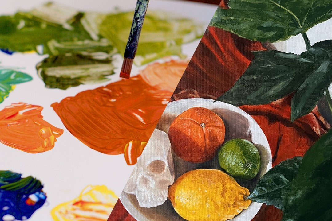
7. Building Your Palette: Building your palette. Now, I'm going to walk you through a bit of my process for building my palette based on the reference photo that you've seen me use. As we discussed, I'm going to pick out a few mid-tones or maybe even one or two to start with, and then I can base the rest of my lights and darks around that mid-tone and it will help me achieve more accurate colors. I'm using the colors that I told you about that are my favorites, cadmium red, lemon yellow, ultramarine, raw umber, and titanium white. I'm going to start with the pumpkin color because it's taking up quite a lot of the image and I think it'll help ground the rest of my colors. It's a pink color. Naturally, I'm going to start with red and white. But as you'll see, mixing red and white together won't give me the exact color. I'm going to start fine-tuning from there. What I'm really trying to achieve with this first initial mix is getting the right value. Is it not necessarily the right cue? It's not going to match the color perfectly, but is it the right lightness or darkness that will match the pumpkin? As you see in the reference photo, there are a lot of shadows and differences, and new ones around the pumpkin. It may sound confusing, but I'm going to try to get the mid-tone of the pumpkin itself. Something that's not the lightest part of it or the darkest part of it, but somewhere that I can build the rest of the colors off of. I can see that this pink isn't quite the right color. It's a little bit too bright or too warm, so I'm going to add a little blue and cool it down a bit. As you can see, I take the tiniest amount of blue, like when I'm mixing my colors, I use very tiny amounts at a time because this oil paint is so strong. Especially I'm using artist-grade paints, which have a lot of pigment in them, and if you use too much, you have to pull it back and add a lot more paint so it's easier to go little by little. You can see what that blue did. It dulled it down quite a bit and it's pretty cool, but it's still technically pink, which is what I want. Pretty happy with that pink. I'm going to leave it as it is and once I put up my Canvas, I can add some yellow and bring out the orangey tones you see in the pumpkin. Or I can add some more red and blue for purple undertones and get some of the shadows. Now I'm going to mix the blue of the fabric that's on the table. Again, I'm starting with just the basics, mixing white into the pure blue pigment to see what I have and then I'll adjust the coolness or the warmness from there. In its pure form, this blue is a little bit too cool and this is actually a pretty tricky color in terms of the fabric because it's almost warm and cool at the same time. But I'm going to add a little bit of yellow because I want to warm it up a bit. Now I'm going to add some red because actually, there are some purpley undertones that I want to bring out in, and the fact that I am adding yellow and red will actually dull the color too because that makes orange, which is complimentary to blue. You have to keep that in mind as you add different primary colors, like how the two that you added might interact with each other in addition to how they react to your base color that you're mixing. If it all sounds too sciencey, you can play around with the colors and start seeing what you got. This is how you build your color intuition just by trying things out, seeing what happens, and then you'll remember for next time. You'll see me add a little bit more blue because I realized it's getting too dull and need more of the blue that makes it a little darker. Then I have to add more of the white. It's all going back and forth, fine-tuning, adding little by little and you may decide," I've made a mistake, I made it too warm." You can always bring it back by adding your original color. I'm pretty happy with that. I will need to work on it a bit right on the Canvas to make the highlights a little bit more and more in the shadows, a little bit cooler, but this is a fine base to start with. Now, I could leave it there because those are two major parts of my painting and they're both mid-tones, but I do want to mix the green because it is in the same value level as those other things. I really like mixing at least three colors to start by painting with, because it sets me off on the right track. Right now the green that I've made is actually too vibrant and I need to delve it a little bit. I'm going to add a tiny bit of red and when you're adding red to a green to dell it down, you really don't need very much, especially if you're using a cadmium red, which is a very strong red pigment. You really need to just use a tiny bit of it at a time. You can see here I actually added too much red even though that wasn't very much. I'm going to go back, add a little bit more blue, maybe add a little bit more yellow to bring the pure pigment back to what it was and that's the great thing about well-paint is so forgiving. If you go a little bit too far, you can go right back. Now I've got the hue right, but now it's too dark, so I'm going to add a little white and line it out. Normally, I would stop here and start painting at this point, but because I want to show you my mixing process, I'm going to show you how I would mix some of the shadows or highlights of the pumpkin as I'm working. I've already applied the base mid-tone pink to the pumpkin. This is how I would start mixing shadows as I go. The main thing you need to realize is that once you have paint on your Canvas, anything you want to add to that, say a shadow, you'll have to make that darker on your palette than what you are actually trying to achieve on the Canvas because once it mixes with that mid-tone, it's going to be lighter. Right now I'm mixing a shadow and I'm going to make it at least a few shades darker than what I am actually trying to achieve because I know once it touches that lighter mid-tone color on the Canvas, it's going to lighten up a fair amount. Just keep that in mind as you're mixing. It does take a little practice to guess the right color. I've been doing this for some time now so I can usually get it right in the first time, but that's okay if you put on your Canvas and you realize, "that's not dark enough". You can always remix and then put some more on. Or if it's too dark, you can add a little bit of white and lighten it up. It's really easy to fine-tune. You can see from the photo that this shadow is a little bit complicated, which is partly why I chose it. But you can see that there are some cool tones in the shadows, but there's also some warmness as the pumpkin gets a little bit more orange here in the corner. I'm trying to find something that is going to blend with a warm color and get the right shade, but also blend with the cool color and stay cool. It's basically a purple mix. But I'm trying to get a temperature that's somewhere in the middle. This color will also be good not only for the darks that I'm looking for, but it will also blend with the mid-tone ticket, the colors that are between the mid-tone and the darks as you go further up the pumpkin. Now since I'm here, I'm also going to mix the warmer shadows that you see. I'm going to start with that dark purple that I made because that's a great base for this. All I need to do is warm it up a bit and lighten it up a tiny bit. To lighten it, I'm not going to add pure white. I'm going to add a little bit of the pink that I mixed for the mid-tone and then I'm going to add a little bit of pure red and pure yellow to get that nice orange genus coming through. What I'm probably going to find once I start mixing as that might be a little bit too dull. What I might do once I'm not right on the Canvas is mix a pure orange made from the red and the yellow right into what's already on the Canvas. One last thing I'm going to show you is mixing a little of the shadows for the fabric. As I said before, it's a tricky fabric. It somehow oscillates between cool and warm just in the one blue color. I probably will need to fine-tune this once it's on the Canvas, but I know that I need a little bit of a purpleness. I'm going to start with a purpley red color. Just mixing that really warm red with the cool blue is going to create a dull warm purple and that's totally fine. I may need to add some more blue to cool it down. When you're working with dark colors, it's a good idea to add some white to see what you're working with. If I'm mixing a black, I'll do that quite a bit. Even though with a black, you obviously want the pure raw umber with the pure ultramarine to get the darkest color. But you can't really see if it's too blue or too brown. I'll add a white to that and that will show me based on the color gray that it turns if I've created a pure black or if I created basically a very dark blue or a very dark brown. That's a great little trick is to add a little bit of white and see where you're at. Even though that'll make your color too light, you can see what you're working with. Right now you're seeing me go back and forth with the red and the blue trying to decide is this quite the right temperature I'm looking for? Right now I'm working with a fairly cool purple and it's pretty dull and that's what I'm looking for. I'm fairly happy with that. It's still a little bit too saturated, so I'm adding the tiniest touch of yellow to dull it down even more. Then when you're working on a shadow, it's great if you can add in the mid-tone as you're mixing it because then it will blend with the mid-tone really nicely when you have some of that color in there. Again, I'm not happy with it, so I'm adding a little bit of blue. That's pretty close to not the darkest shadows, but almost dark shadows that you see with the folds of the fabric. I'm pretty happy with that. Once you add the darkest color, you will be able to gauge if it's the right hue. Now to show you guys, I'm mixing that with the mid-tone blue and that gives you a sense of how they'll blend together on the Canvas. Let's recap what we've learned. The most important thing about mixing colors is to work incrementally. As you're fine-tuning your color, add pigments little by little, that way it's easy to pull a color back if you've taken it in the wrong direction. Define your color as you're mixing to figure out how to adjust it. You heard me say things like, "this color is too bright. I need to dull it down with a complementary color" and that's really what's going on in my head as I mix. Refer back to the color rules on your cheat sheet. If color theory is new to you, or if you're feeling brave, just experiment and try to use your intuition to adjust your colors. When you're mixing a shadow color that you're going to be blending into your mid-tone on the Canvas, mix it a few shades darker than the actual color you want, because it will lighten up once it blends with the mid-tone. You can test out the shadow color by blending it with your mid-tone color on your palette. If you're mixing a dark color and can't tell if you've got the right hue, add white to see where you're at. Next up, applying the paint.
8. Applying the Paint: Applying the paint. You've sketched out your image, you've mixed a few colors, now let's get to painting. A lot of our teachers will tell you there is a right and wrong way to paint a scene. It's all nonsense. You should paint whichever way works best for you. I like to play that mid-tone color first, wherever it may be in the scene so I can base the rest of my colors off of it. In general, it is usually easier to paint the background first and work your way to the foreground of the scene. But again, do whatever works best for you. Just remember that if you want to create layers, you'll have to wait for the paint to dry. For my painting, I'm applying the pumpkin color you watched me mix earlier. As I cover the canvas, I'm taking into account the varying hues, values, and saturations of the object and adjusting on the fly. Sometimes this involves mixing more colors on the palette and sometimes I'll work in a pure pigment with my dirty brush right on the canvas, which is what I did with blue for this cool tone shadow. I'm not going to add all the fine details of the pumpkin yet. I just want to get the values close to where they need to be and cover up the white of the canvas. Next, I'm applying my other mid-tone color, the blue fabric. Again, I won't add every single detail, I just want to lay the baseline color down. When you add more elements to your painting, you'll need to start paying attention to your edges where different objects or planes meet and switch up your brushes accordingly. My subject has mostly soft edges, so I'm sticking with my filbert brush for now. Now that I've covered a big section of my canvas, I'm going to return to the pumpkin and start adding details with a finer brush. I want to reiterate that this is just how I work and you're more than welcome to work section by section rather than object by object. When I'm switching between colors that I don't want to blend together, I'll either switch to a clean brush or wipe the brush on my rag to get most of the paint off. This is why it helps to have a variety of brushes at your disposal. Next, I want to eliminate the rest of the white canvas, so I'm filling in the other objects in the scene. Finally, I've come to the focal point of my painting, the candle. I've switch to a finer detail brush since my edges need to be crisp for the most part. Reflective surfaces such as this brass candle holder are very tricky to paint. So if you have any in your subject, just take it slow and paint what you see, not what you think it should look like. Although I know that brass is metallic, what I actually see is a pale tan color with spots of bright yellow and blue gray tarnish. Painting in a realistic style is simply a game of compare and contrast. I'm constantly referring to my subject to see if what I've painted looks like what I see in the photo. If it doesn't, I name the differences such as this color is too dull or that line isn't straight enough and then I correct it on the canvas. Naming the problem will help you figure out how to solve it. Now let's recap what you've learned. Apply your mid-tone color first to help you paint the rest of your values more accurately. Try working from the background to the foreground if you don't know where to start. Take advantage of blending right on the canvas and adjust your colors a little at a time. Switch out your brush styles to create different types of edges. Next, we'll get into more detail about edges in building atmosphere.
9. Building Atmosphere: Building atmosphere. Building atmosphere into your painting, is an important skill that will really add a lot of magic, and it's easier than you think. Atmosphere refers to the depth of field and planes of focus, either created by edges, color, or a combination of the two. Your reference photo likely has some planes are objects that are sharp and some that are blurry. Typically, as an image recedes into the background, it will get more out of focus and lose color saturation. Oil paint lends itself well to creating atmosphere because you can easily blend right on the Canvas, softening edges or keeping them sharp. You can build atmosphere into your painting easily, a couple of different ways. The first way is by using different brushes. For areas of your painting that you want to sharpen and focus, use a brush with a flat or chisel tip, or a liner brush for detail work. For areas that you want to be soft or blurry, use brushes with rounded tops for easy blending. Feel free to exaggerate the atmosphere, that's what being an artist is all about. Another way to easily build atmosphere is through color. This is especially true if you're painting a landscape. Use bluer and less saturated colors in your background, to really push it back in your painting. Use warmer and more vibrant colors as you move towards the foreground of your painting, to bring objects and planes forward. Keep in mind that you are free to build the atmosphere as you wish and think outside the box. Use these techniques to emphasize certain parts of your painting and de-emphasize others. If you want the focus to be on the middle ground, soften the edges of your foreground and background, to draw the eye to the center. In my reference image, the lens of the camera focused on the candle and blurred the immediate foreground, as well as the background. This type of atmosphere gives your painting a dreamy quality and is a fun effect to try. To recap, atmosphere defines the depth of field of your painting and can be used to emphasize or de-emphasize certain areas of your painting. Build atmosphere easily by switching your brushes to achieve different edges and using different levels of saturation in your colors. Feel free to experiment with different planes of your painting to create an atmosphere that achieves the mood you want. Next up, solutions to common problems.
10. Problem Solving: Problem-solving. You may run into a few problems or obstacles as you work. So Here are a few common ones and how I would solve them. Problem; I added white to lighten a color and now it's too pastel. Solution; little by little, add more of the original pigments you started with to brighten it up. If you've already applied it to your canvas, blend a tiny bit of the pure pigment right into the color. Problem; my edges are too soft or I over blended. Solution; this is pretty common with oil paint and working alla prima. To correct your.
11. Conclusion: Congratulations, you've finished your first oil painting. I hope you had fun exploring this new medium. Over the course of this lesson, we discussed the qualities of oil paint, how to get started painting with minimal materials, how to mix your own colors and build your creative intuition, how to create atmospheric effects, and how to problem-solve on the canvas. Oil paintings often require multiple sessions to complete, so don't feel the need to rush to finish. In fact, often the unfinished oil paintings are the ones that feel complete. What matters more is your process, what techniques you explore, and what you discover along the way. I encourage you to upload photos of your painting and your reference photo to the project gallery along different stages of your journey. Take a look at what other students have done and pick out moments that grab your attention. These moments are the magic that make for a great oil painting. Remember what Bob Ross said, "We don't make mistakes, we have happy accidents." Thank you so much for taking fearless oil painting. Keep in touch and happy painting.
 Amy Plante, Multi-Passionate Creative