Transcripts
1. Welcome & Class Overview: Welcome to class.
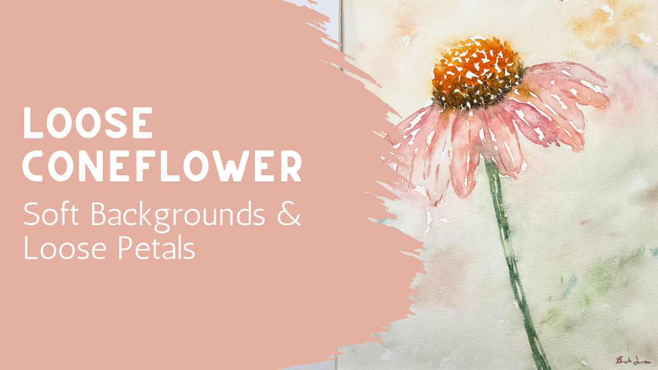
In this lesson, we're going to be painting a
soft atmospheric coneflower using loose
watercolor techniques and a gentle layered background. If you've ever looked at watercolor paintings
that feel light, airy and almost dreamy, but wondered how to create that effect without
losing the flower itself, that's exactly what we're going to be exploring
together today. The good news is that this
project is very approachable. Even though the finished piece looks delicate and expressive, we're going to take it
one step at a time. I've included a
simple outline for anyone who would like a
little help with placement, so you can spend less
time worrying about drawing and more time enjoying
the painting process. Throughout the class, we're going to be focusing on things, keeping it loose
while still creating a little flower that feels
recognizable and beautiful. We'll talk about soft edges, lost and found shapes, layering gentle
color and creating an atmospheric
background that supports the flower without
overwhelming it. One of my favorite things about this project is that it leaves
room for interpretation. Your flower does not need
to look exactly like mine. In fact, some of the most beautiful
watercolor paintings happen when we
allow a little bit of unpredictability and let the paint move in ways we
didn't originally plan. As always, I encourage you to pause a lesson
whenever you need to, work at your own pace, and enjoy the process. Watercolor has a wonderful way of teaching us patience
and flexibility. This project is the perfect
opportunity to practice both. By the end of the class, you'll have a
finished atmospheric loose coneflower painting that would look lovely, matted, framed, and displayed
as part of a collection. Gather your supplies and
let's start painting.
2. Supplies and Color Palette: Today's class, we're
going to paint a really loose coneflower. We have these growing and
they are just so beautiful. They're great in the summer. They have such
beautiful colors of an orange center here and then a light pink with some
darker pink shades in and then a nice
beautiful stem. We're going to be painting that with an atmospheric background. We're even going to let
some of these petals just blend into that background almost to let it disappear so that you just have a
feeling of a flower there. I'm going to be using
my cotton paper. This paper size is 12 by eight, and my size that I want for my final piece is
an eight by ten. I went ahead and used my ruler and I just
measured out what 10 " was. Since this is just
over 8 " wide, I'm just going to go ahead
and use my whole width. I did not add tape on the sides, but I did mark it with a little line so I knew
where my 10 " was. And then I did put
some artist's tape along the top and the bottom so that I can paint within it and keep this
centered where I want. So I hope you can see. What I actually went ahead and did is I used my carbon paper, shiny on one side,
darker, and then dull. I put the shiny side down, and then this you can find
in the class project. It's a downloadable piece, and I have it scaled so
that it's bigger than this. And then when you print it, all you have to do is decide what size you want
this to be printed at. I decided, even though
I'm going to be painting it on an
eight by ten piece, I wanted it smaller. And so I had it print
in a five by seven. So you can adjust it. I made sure to make this big enough for you so that
you have options. But you can shrink this down. You can make it really,
really tiny if you wanted to. But I did end up printing
it at an eight I mean, a five by seven. I put the shiny side down,
I laid this on here. And then I want you
to notice that I intentionally set
it off to the side. I didn't want it
perfectly centered. I didn't want it
straight up and down. I wanted it on an angle so that the stems was going off
to the left hand side, I also wanted it shifted to the left hand
side of my paper. Then I just went
ahead with my pencil and I outlined it and I did
a really loose outline. I didn't put in all
these little lines. I just put in an oval, and then same with these things, I just did it really, really
light, very, very gentle. I did not press down hard. So what you want to make
sure that you have is a really light marking on here
from your carbon copy paper. You don't want this to
be too dark because the problem is that even when you've put a watercolor on top, these lines will
shine through and it's very hard to get them
up after you have painted. So I have drawn this
on with a very, very light hand and I will actually come
back through with my eraser and erase
it a little bit more so that you might
not be able to see it, but I will be able to
see it in front of me. When you have done your tracing, if you decide to trace it, if you want to
just free hand it, that's also perfectly
fine. That's up to you. I'm just providing this
for you if it has helpful. But you want to erase
it so much that only you sitting in front of
it will be able to see it. I have that ready to go
and I have it traced. I'm going to set this aside.
I don't need this anymore. And now we are going to
go ahead and paint this, but we are going to paint it in such a beautiful loose style with lots of water and just
a little bit of paint. I'm going to do some
erasing and get that ready. But I want to show
you just a few of my tools that I'm
ready to go with. I have a couple of
different brushes. I have a size six
and I also have a size eight brush
that I'll be using. I probably will also use my rigor brush that I really
like. It's nice and long. Then I have a couple
of these squirrel hair brushes that I may use. I might end up using them. Just keep a bunch of little brushes around
just in case I need them. But if you don't have that
many brushes and all you have is a round brush,
that's perfectly fine. Here it is. Here's
my eight inch brush. These brushes are the heritage Princeton Heritage
round brushes, and they're my favorites
size six and size eight. Those would probably be
my two if you're looking for really good brushes,
high quality brushes. They do cost more, but they've lasted me for years, and I really like those. Um, and then I have, of course, my watercolor, so I'll slide
that over into the view. And of course, I have
two different bottles of jars of water, clean water, ready
to go so that I can get started with that. I'm going to cleave up
my desk a little bit, spray down my watercolor, so it's activated and join
you in the next lesson.
3. Painting the Coneflower: Okay, I am ready to go, and I hope that you have all your supplies ready, as well. I have erased most of this design so that I can be
the only one who sees it. You might be able to see
some of it in the camera. Not sure, but I've really tried hard to get most of that going. So we're going to
be using a lot of water and just a
little bit of paint. And I'm going to start
with the center. We're going to paint the center and then the petals
and then the stem. And then we're going to add a really loose
atmospheric background. I really want to be working quickly because I don't
actually want my flour to dry completely before we start adding in the background
because I want to be able to have some of the
paint that's in my stem and in my petals
and in the center to actually bleed out into the background just to give it that really beautiful
atmospheric feel. So because of that, I
actually want to get some of my flower colors ready to go so that I'm not wasting time creating the color
that I'm looking for. I'm going to get some
of my pink going. I got that, of course, I'm going to be
adding in some of my buff titanium
that I really like. Um, if you've taken any
of my classes before, I've talked about this before. This is by Daniel
Smith, Buff Titanium. It's in this well right here, and I do like to add that. It creates a really
nice soft color. If you don't have that,
you could add white. You could just go with
the pinks that you have. Whatever you have
will work fine. Then I also want to add
in just a little bit of a orangy color because I might
need some of that as well. I might even mix that
in with my pinks. And I'm going to put a little
bit of that buff titanium. It just softens it, makes it maybe a little
bit more vintagy, just a little softer. I'm definitely going to need like a true orange
for that center. This center is going to be an orange with some yellow hints at the top for a reflection and then a brown or base here. I'll want that. I've got some brown going on in there
and that's going to be fine. I'll be able to dip
into that brown. My greens are fairly easy. They're right in here,
so I'm not going to worry about those too much. Add a little bit of buff
titanium to that orange. Why I need that. Okay, so I think that's pretty
much ready to go. If you don't have a
palette like that, and what you have is a tin that has all
your paints in here, what I recommend that you do is wet all of
this down first. You could use a spray
bottle like I did. You could just dip your paintbrush into
water and drip it in, that'll take longer,
but you can do that. But I would activate
all of this paint, then I would probably
have some kind of a plate next to me where I can mix my colors
just like you saw me mixing. Using a tin like this with all your colors in it is going
to work for you as well. You don't need to have
a palette like mine. All right, we're going to get started with this centerpiece. And the way I'm going to do that is I'm going
to remember that my sunshine is going to
be coming this direction. I want the lightest. That's going to be
the most water, the lightest color,
the brightest color, maybe I could add in some
yellow if I wanted to. I'm just going to be putting
some little dots in here around that top center
of that flower. Just something along that line. And then I'm going to rinse off my brush and
come back over and grab a little bit
darker of that orange, and just let that settle into those same little dots
and just make another row. Little dots, little squiggles, maybe even coming up into it and touching some of those
dots just to blend it. I know that my arch is here, so I'm just going to keep
on bringing that down. You can see how much water is in this, painting that I've made. This is not a dry painting.
This is very wet. I want it to be very wet
because I want lots of time. I'm going to be painting
as quickly as I can, but I also want to have lots of time so I'm not feeling rushed. I have lots and lots of water. This is fairly liquidy. I'm just going to
just add that center. Do you see how I left lots of white space? I
didn't fill it in. I left lots of white space. Now I'm going to come in
with a little bit of brown, maybe just a little too much, maybe mix it in with my gray my um my orange color there
just to make it a softer. I'm going to just add in just a little bit down here
at the very base, the spot right between the
petals and that top section. We're going to just let that
merge and blend together. Can even move it
around a little bit if you wanted to. All right. Now we're going to start
in on those petals. I'm picking up some of my pink. I'm going to try
not to touch that, but if I do touch it,
it's going to be okay. I'm going to be making
some little stripy lines, almost outline that
first little petal. Then I'm just going to add just a little bit of water to it. I didn't rinse it
off completely. I'm not dabbing it
off on my towel. I'm just adding a
little bit of water, which is going to allow it
to be a little bit more liquid and a little
bit more diluted. I'm just going to leave
some white spaces in there. I'm not going to fill
the whole thing. I'm going to come over. I'm going to do
another petal here. And this one's going to
be a little bit lighter. Again, I'm not filling
the whole thing in. I'm just leaving
some white spaces. Do you see how I
touched in just ever so slightly into that brown and
that's bleeding down in. I'm totally okay with
that. I like that. I'm good with it,
bleeding down in there. We're going to get an
opportunity to work with that. Here I'm going to
do another one, following that line, leaving
lots of white space. I'm jumping over
some of the petals. I'm not doing them right
next to each other, so I'm choosing every
other petal to go into getting a little bit more
water and just putting in. This is going to be a softer one because I have more
water and less paint. My do another one over here because I can always
dip back into my darker paint and bring
in more color. See that? See how I had it really, really faint and then I
brought in more color. I'm just going to add
in a little bit more. This is my last one over here, leaving lots and
lots of white space. Now, I also want to use some of this more orangy pink
that I had mixed up. So I'm going to come back over here and just add
in some of that. It's okay if they
touch and they blend. That's the beauty of watercolor. We're going to let that happen. They're just ever
so slight touching, leaving lots of
little white spaces. Those little white spaces
are your highlights. They're going to be
what's going to bring a lot of interest
to your flower. Look how beautiful this is. Also gives you dimension between
one flower and the next. I do want to come up in here and touch some of
these so that they can start blending down in if
they want to, which is fine. I actually liked. That's looking really
cool. I love that. If I'm feeling like
anything's getting too dry, I can always just
come in and just add just a little droplet of water because I don't want
that to dry too quickly, but I am moving quickly here. I am going to then use a
little bit of my green. Get going on this stem. Again, I'm going to
do it so that I have little stripes which allows for those little lines
to come through. I'm going to come
all the way down and touch that tape down at the bottom so that it goes the whole distance,
all the way down. I almost feels like it's
coming off the page. Leaving little white spots being okay if I touch
into those petals. That's all right. You see how I leave all those
little white spots. That's very, very intentional. Okay, really love that.
That's looking great. I'm going to come in with
a second green though, because I want to add
in just a tiny bit of depth with a second green. I'm just going to add
that in right on top. Okay, now, I want you to take
notice of something here. My green touched into my pinks. And so my paintbrush
is rinsed and it's dry because I drip I kind of like
dabbed it off on my rag. So I'm just going
to come over here and just smooth that out. I'm okay with that
it touched in, but I don't want
it getting crazy. So I'm just going to
kind lift up some of that pink and let that I mean, some of the green
in the pink and let that just kind of
blend out a little bit. I can even come back
in with more pink or orange and just add another
layer right up on top. We don't get upset about
those things happening, we roll with them. All right. Now what I am going to do is get some nice clean water and I'm just going to sprinkle some water around
the outside edge. This is just clean water. We're going to be adding in a beautiful outline
around this flower, but we're going to be
okay if it blends out. This is still very wet. I want to show that to you
don't you see how wet this is. So see how wet this flour is because I've
been working very quickly. You can still see
it being shiny. It's just really important
that you work quickly in here. Hopefully, you don't have
heat on or a fan going, which is going to
help you a lot. Now I'm going to be adding
in some more colors.
4. Creating an Atmospheric Background: Just going to use the same
colors that I used in here on my outline for my background. Just a little bit of some
orange, swishing it around. Now, we put that water out here, which is going to
allow that to just blend and get really
atmospheric and loose. I'm going to come
in near the petals, but not touch them
intentionally. But if I do touch them and it blends a little
bit, totally good. Look at that, see how I touched the edge and it just
bleeds out a little bit. I'm moving it from the orange to the pink to the
lighter color, moving it around,
grabbing some more water. This is where watercolor
just really shines. Makes this so beautiful. Go ahead and let that touch into those stems and the petals
every once in a while, grab some yellow,
get some more water. Don't be afraid of using water. Now, I don't want
it to be puddling. I don't need a whole bunch
of puddles on my paper, but I sure don't mind if there's a significant
amount of water. Now, I'm also
leaving white space, and I want you to
make sure that you're seeing that I'm not
filling this in edge to edge and
making sure that every single spot on
my paper is filled in. There's definitely some
still white spots around. Maybe I'm going to grab some
green drop in some green. Maybe that's to indicate
there's a field back in there. Not sure. Just
having fun with it. And if you feel like you get too much or you don't
like something, you can always grab a cloth, like a paper towel or
something and dab it off. If you feel like you've got
a puddle going on somewhere, you can always just pick
it up with a cloth. So this is really pretty. I even want a little bit of brown. Maybe I'll just add just
a touch touch brown. Just have fun.
Explore. Experiment. I'm using this great big brush. This is a size six from meten. I like these. These
are my quill brushes. They really are fun to use
for something like this. It allows you to get a lot of water and paint
moving in a quick way. I'm even touching
right into the stem. Do you see how that
bled right out? I like that. I think
that's kind of cool. I'm going to come back in
here and touch some of these petals and let them
bleed out a little bit. Even up into the center. I like that center to
bleed out a little bit. Let that get a
little atmospheric. You see how this side is just
almost like disappearing. But that's because
the sunlight is shining down here and
allowing this spot to just kind of blend out
where this side is a little bit stronger
and a little bit darker. It's got the little darker
lines of the brown going on. But over here, I have
more highlights, more brighter colors.
Really pretty. Love this. So I think
what I'm going to do is I'm going to grab
a little bit of color because I want to add just a little sparkle
of, um, splatter. I'm going to grab some pink and I'm just going to
splatter some pink on here. Maybe even get a little bit of this yellowy color.
Don't need a lot. And then once you've
done that splatter, if it's landed anywhere
that you don't care for or you feel
like it's just too much, you can always come
in with a clean brush and just kind of
like mute them down. You can kind of rub
them out a little bit. Juste like, Well, maybe that was too many, maybe I
didn't like it there. You can manipulate it
and move them around. It's all good. I like them. Okay. Um, let's see. What else do we
want? Maybe. I want a different color green. Maybe I want this green. Let me just add just a little bit more
green down in here. What does it touch too much. I'll just pick up some of
it with my paper towel. Remember this is
going to dry lighter. Watercolor is always its darkest when it's at its wettest. So if we let this
dry a little bit, it's actually going to get
not as bright, not as dark. I also want to add,
sometimes I like to add just a little bit of
an unexpected color. So far, it's all been the exact same colors on the background as what
is on the inside. But I also I'm going
to just grab this really pretty blue and just add this little see
how it's like a squiggle. Just a little squiggle there, and maybe just a
little squiggle here. Maybe just one more
we're on this side. I can rinse that off. I can come in with my brush, and I can just even mute out just one side of
it with my water. Just soften the one side, let the other side
be a firm edge. See how I did that?
I'm just working. I'm just wetting the lower side, letting the upper side stay
exactly the way it was. Softens it a little bit, gives it just a little
bit of a dimension. Well, what's going
on back there? What else is happening
in the background? I don't want to do
the same thing. I could do that
with some yellow. I don't want to get overboard. You have to be
careful not to put in too many random colors or it starts to look just
a little cartoony. But if you want to
add in just a hint, just to make the
allusion that there's something else going
on in the background. You can add in just
another layer now. This is still really wet.
You know how wet that is? Now, the flour itself
is starting to get dry, but everything else
is really wet. Background. I've come up and bumped into these edges so that they kind of
blend out as well. This is all just experimenting. So if you play around with it
and you like what you did, but you didn't like
something else, you can always
just repaint this. Just didn't take you that long. So go ahead and repaint
it. Try it again. I'm going to kind of leave
it kind of muted like this. Might even just soften this
stem just a little bit. I feel like maybe it's a little harsh compared to the
rest of the background. So I'm just coming in
and softening the edges. And by meaning
that, my paintbrush is it just has water on it. Maybe I've dried it
off a little bit, and then I'm coming in
and kind of scrub in the edges just to
allow them to bleed out into the background,
softening those edges. Not necessarily the whole thing, but just in spots. Alright. Me. Add another layer
of some pink up in here. Like it needs a
little bit more of my uh my buff titanium added to the pink
just to soften it. I'm just really being careful to only add it
where it's already wet. Otherwise, you get
pretty harsh lines and I'm not looking
for harsh lines. I also want to make sure I'm
leaving these white spots, so I'm being really careful
not to add too much. I feel like that's pretty good. So what I'll probably
do is walk away from it and come
back at it and say, now, what else does it need? Is it missing something? You know, am I happy
with the way it looks? So, what do you think?
What does yours look like? Really fun. Really beautiful. So soft and romantic
and beautiful. And I think that could go
anywhere in your home. You're going to frame this. It's just gonna be beautiful. I'm gonna dry this off and then show it to you
in the next lesson. And I think we're gonna see what it looks like
with a mat around it. So I'll see you in
the next lesson.
5. Soft Edges, Details & Final Touches: It is mostly dry and
I have this mat. I like to just to have these
laying around that I can add on so that I can really imagine what it's going to look like when I have it framed. I love this. I think that is so cool. Because I have some
flexibility left and right, I can decide where to put it, and I'm going to
think I'm going to be positioning it like that. But what I did
decide now that I've had a chance to walk
away from it a little bit is that some of
these petals need just a little bit
more definition between one petal and the next. So we're going to
do another lesson in creating some of
that definition. And I also decided that I wanted this area to just be
a little bit darker, so I'm going to add
another layer of some depth in this
lower section. So I'm going to set my mata side here and go ahead
and add in another, um, another layer
to this. Join me. Now, if your piece looks great
and you don't need this, then please don't be adding anything just because
I am adding something. You do need to listen
to your own piece, and maybe yours doesn't need it. I'm going to be using my smaller paintbrush.
This is my size six. All I'm going to do is just make a little tiny outline,
very, very fine. And not even a straight
line or a definite line, some little almost dotted lines, dotted edges that creates just that illusion of some
definition between some of these petals to help give it see how I'm just I put a line here and then I skipped and then
I added another line. It's something along
those lines where you're just adding in a little
bit more definition, maybe even something
down the center. Here's a good example where
this is just all blending in. You can't really tell where one starts and where one ends. I'm just going to put
a little line there. It's not even a solid line, just a little bit of a line, just to add in a little bit
more definition. That's it. That's all I'm going to do
for that. I'll let that dry. Then I'm going to
come in and add just a little bit more depth. What I'm looking
for is to create um Got lots of paint on here. Just to create a little bit
more depth in definition between the base of my flower
and the head of the flower. And so I'm just putting in a little bit more
color in there. You've been letting some of
it come down onto the petals. And that's going to allow that. I can even draw it
up a little bit. Some little lines, not much, just a little lines here. My paintbrush is clean, so I'm just moving the paint
that's already on my paper. Just moving it
around a little bit. It's all about experimenting. Give it a try, see
what you like. You can always practice on another piece of
paper if you want to. I'm just going to add in a
little bit more water to dilute what's already there
so it's not so harsh. Just bringing it up in there, incorporates that lower section that's darker in with
the lighter section, creates just a little bit of a soft organic movement there. Even again, this
paintbrush is just water. Just softening
this backside too, bringing it down into my
pink just ever so slightly. Again, just water. Just allows it to soften. See how that works. I'm not
filling in all the white. I'm just added a
little bit of depth. It creates that three
D effect going on. Can you even make
it just a little bit darker here in the center. Just allow this spot here. To get just a little bit darker. They're just little dots, little little tiny little lines. It's creating shadow,
it's creating depth, water, softening it up. You don't want any
harsh lines in here. This is so loose and atmospheric
that you certainly don't want any harsh poka
dots or harsh lines. You want everything to be soft. I don't mind it coming up this darker color
coming up into some of the petals because it also helps if some of the petals are
just a little bit more, just a little darker. Also just add in a little more
color pink if you want to. Remembering that
this pink is going to dry lighter once it dries. But it is nice to have just a little extra color,
another little layer. Called glazing when you just add just a little bit
more right up on top. You can always soften it
with some more water. Blends it out a little bit. Okay. Nice. It's looking good. I feel like that really
helped this piece. I don't think I really
need much more. I'm not going to do anything
with the background. I'm not going to do anything
else with the stem. Kind of like the fact
that the stem is there, but it's also kind of muted and kind of soft
into the background. Um, you let me know
in the comments, you can start a discussion if you think that I should
have done it differently, or you want to see it
done in a different way, or you wished I had
done something. Just let me know in
the comments. I'd love to have a discussion
with you about it. All right. I will
see you back in the next lesson where
we wrap this all up.
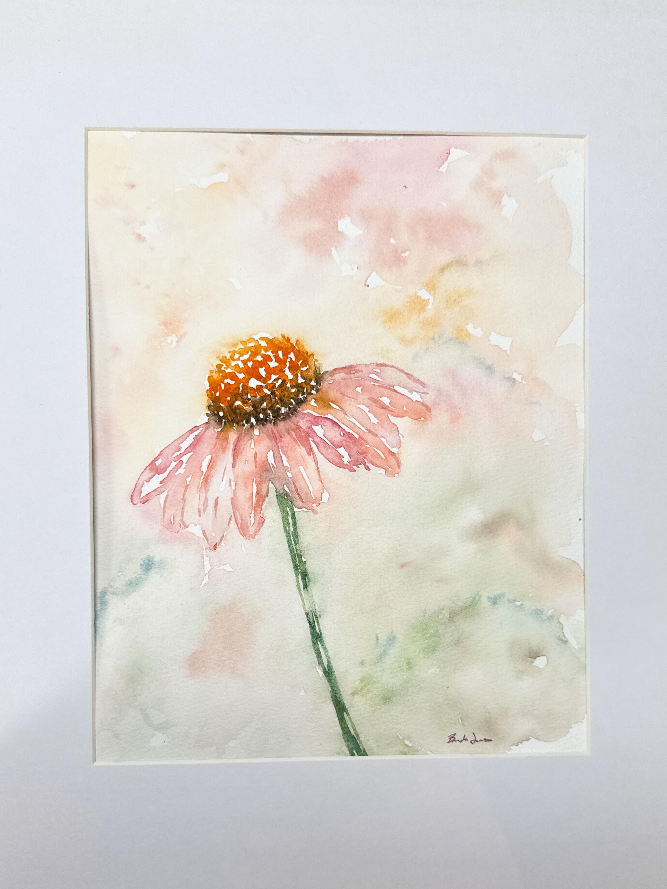
6. Final Thoughts & Project Reminder: Congratulations on finishing your atmospheric
coneflower painting. I hope as you look at
your finished piece, you're able to appreciate
not only the flower itself, but also all the small decisions
you made along the way. Watercolor can be
unpredictable and every painting becomes a unique
combination of planning, observing, and
allowing the paint to do what it does naturally. One of the things that
I love most about this project is
that it shows how a single flower can make a strong statement without needing a complicated
composition. Sometimes a simple subject, plenty of breathing room and a few soft atmospheric effects are all we need to create
something beautiful. As you continue painting, I encourage you to
pay attention to what parts of this project
you enjoyed the most. Maybe you loved creating
the soft background washes. Maybe you enjoyed
painting the petals. Maybe you found yourself becoming more
comfortable leaving white space or allowing
edges to stay soft. Those little
preferences are often the beginning of developing
your own personal style. Your painting didn't
turn out exactly as you imagined, that's
completely normal. Watercolor has a way of
teaching us something new every time we
sit down to paint. Sometimes our favorite pieces
are the ones that fell uncertain along the way
while we were creating them. I would love for you to upload your project into
the class gallery, whether you're thrilled
with the results or still experimenting
and learning, sharing your work helps build confidence and encourages
other students as well. One of my favorite parts
about teaching is seeing the unique choices each student makes with the same project. You decide to paint
additional versions, try changing the color palette, softening different
edges, or allowing more of the flour to dissolve
into the background. Some changes can create surprisingly different
results and help you discover new approaches
that feel natural for you. Thank you so much for spending
time painting with me. If you enjoyed the class, following my profile
is a great way to stay updated so that when new
watercolor classes are released, you're first to if you found this class
helpful and exceeds expectations review
is always deeply appreciated and
helps other students also discover the class. You just finished your piece and I hope you're starting
to feel a little bit more comfortable letting the paint move and
do its own thing. This really is something
that builds over time. The more you paint, the more
natural it starts to feel. If you'd like to
keep practicing, I have more classes
that build on the same concept with
different flowers, techniques, and ways to
approach your brush. Until next time, happy painting.
 Brenda Jones, Watercolor Artist & Teacher