Transcripts
1. Hello & Welcome Back: It is no secret
that people use art as a means to deal
with stress, trauma, unhappiness, anxiety, or just to find greater purpose and
meaning to their lives. Hello everyone. Welcome back to another
Skillshare class with me. I'm on my sheet the
five-year and at this and enact educate
piece in India. If you do not In
know much about me, you can follow me on
Instagram under the handle, creating from the heart and
find all my works out there. And clearly my words
with watercolor, wash, acrylics, or making off some
beautiful vintage frames. I have been practicing God
on a daily basis in studios. And believe me, when I see this, it's the best time of my day when I sit
with applying people, without anybody about the
outcome and just letting the colors do its own
magic. Various forms. A five bedroom one can
use as an outpatient. That includes olivine,
doodling, scribbling, finger painting, or
sculpting or clean remotely. This ten-day artery PE class, we are going to be
exploring a few of these techniques which include playing along with
loose watercolors, forming some color
theories, doodling, scribbling, and creating some
loose watercolor patterns. Through the ten days, we will be walking on ten
different watercolor patterns, walking in very low styles. But believe me, you will
be much more at peace and relaxed because this class
is not outcome-based. Rather, it is based on letting yourself explore
freely on the paper. This class is more focused on relaxation and hence
the class projects are very simple and small for anyone to join us after their
busy day at work. I hope this class will give you immense happiness everyday
for the coming ten B's and help you be relaxed and let them calmness
deflect onto you. So without further ado, join me into this
class and let's build better versions of ourselves together today and every day.
2. Overview of the Class: Before finalizing all the
class projects for this class, I made sure to select
the best ones out of all the practice patterns that I have created on my
rough sketch book, the class is made in such a way that even if you are
an absolute big no, you can easily follow along. Because before each
class project, we will be having an overview for that class
project wherein we will be discussing all the
techniques and methods that will be used for creating that class project. They say for this class
project where we will be using in the base colors for
the second class project, the pattern that
we will be using, how you can keep the grid of color compositions that you
can use it and so forth. Same day, moving the head for
each of the class project, I will be teaching you the technique before
the class project, giving you all the alternative
options that you can select on the color selections that you can go ahead with. Even if you are an
absolute big node, you can join us freely and enjoy this art therapy session. Because this class is
not at all result-based. Rather it is based on being C and letting yourself be three onto the paper and playing along with the loose consistency
of watercolors. Let's move ahead to the next
lesson and begin painting.
3. Materials Required: Before beginning with
the first painting, let me quickly guide you through the material list that I will
be using for this class. I will be using in this rough
sketch book to teach you all the patterns and color compositions
that you can use it. For the final painting
I will be using in these E6 size people, these are soft, not much
of the textured paper. Hence, best for
loose watercolors, you would be needing
the jar of clean water, one round brush and one flat brush for a
few of the patterns. Apart from that, you would be needing watercolors
since we've been replaying along
with the loose and the flowing consistency
of watercolors, you would need a basic
set of watercolors and even obesity 12 sheets set is much more than enough
for this class. You will be needing a mixing palette for
mixing the paints in the liquidy consistency
as we will be playing along with the floating
consistency of watercolors. These are the limited supplies that you need for this class and you can grab them quickly and
join me in the next lesson.
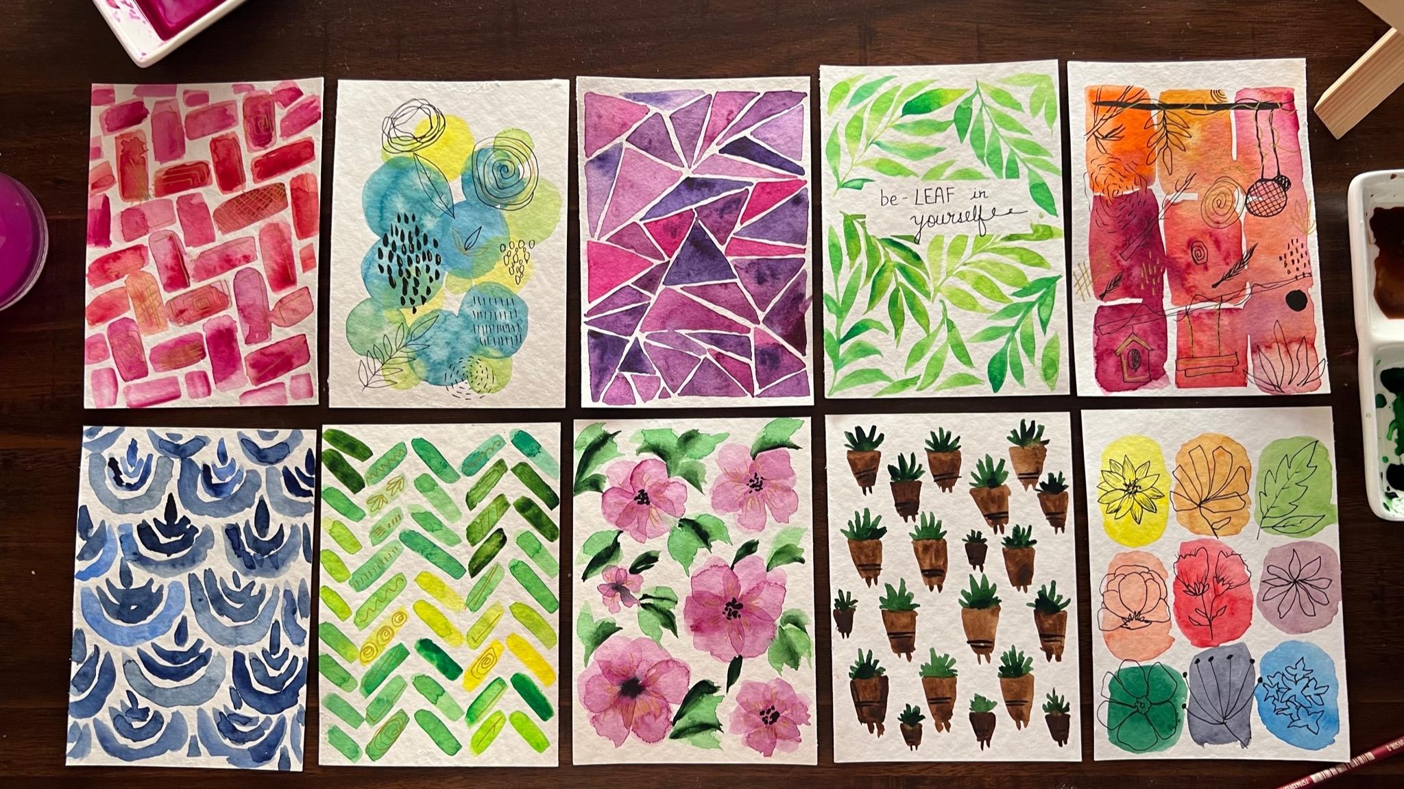
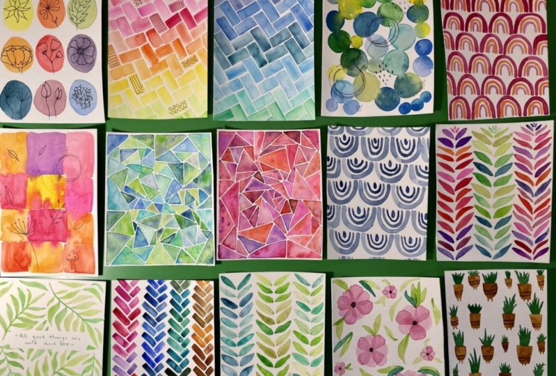
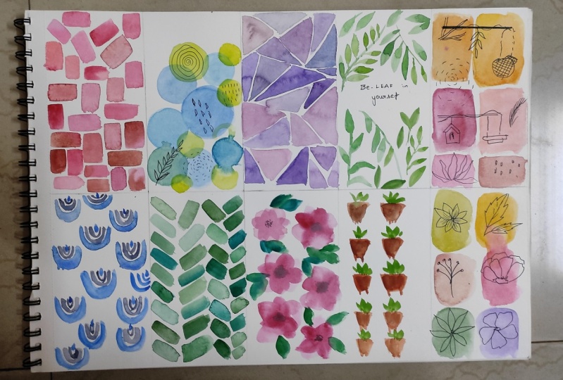
4. Day 1 - Playing with Primary Colors - Technique: Welcome to day one of this
ten d mindful pattern class. Today we are going to paint in simple color patches and then adding simple flower dude linked onto these color patches. Now the uniqueness of these classes we're just
going to be using in the three basic
primary colors for creating those nine different
colors for the patches. So the three colors
that we will be working with is going to be
a shade of yellow, red, and blue color. Now since we have two
mixing the colors, I'm going to pick up all of these three colors
freshly from the tube. So since we have going
to mixing the colors, I'm going to remove these
colors from the tube. So I'm using the shade
of lemon yellow, permanent shape, and
sitting in blue, you can go ahead with
any yellow, red, and blue that is
in your palate and pick up all the three colors
separately on your palate. Now the reason of picking up
the lemon yellow is so as to get a lemon green kind of appellate route you are
when mixed in with blue. I want a very good
bright green palette. That is the reason I picked
up the lemon yellow fallow. Instead of a bright
yellow color, I have picked up the bright
permanent red color, this element, blue colors. So we will get in
all the mixes right? Now next, let's begin to
understand how we are going to mix in these colors to get in those nine color composition. So first let's
begin swatching in all the three
primary colors that we have picked up for
this class project. The first one being the
lemon yellow color. As I told you, I
picked up this lemon yellow to get this
bright green color out. Next, let's watch it. This beautiful
permanent red color. All these three colors
that I'm using for this class project from the
brand Magellan mission. You can use any colors. Believe me, even a
student good color is perfect for this class
because we are just going to play along with the colors in a flowing consistency and
creating beautiful patterns. The last color out your is the setting in blue color
that I've used in. Now I'm just going to
quickly begin mixing in these trees applause and show you how we are
going to use it. I wouldn't be mixing the
colors out on my palette. Rather, I will be showing you out your how we are
going to mix it. In what proportion? You get nine different
color values. The three primary
colors that we have, that is the yellow, red, and blue are going
to be pleased. And diagonally, as you can see, the yellow being
at the top space, the red being in the center
and the blue being in the last line corner out
you're like this diagnosis. Then we will mix the yellow
and red to get an orange, yellow and blue to get a green. When we are mixing the
colors for the first line, the first line color
is going to be more on the second line colors and the third line colors
are going to be less. The second line, the red
color is going to be more and the other color
mixing is going to be less. Let me explain it to
your out on paper. First being the base colors, that's the yellow, red, and blue, please, diagonally. Now in the first line, the yellow color is
going to be more and red is going to
be less out your, again, your yellow
is going to be more and blue is
going to be less. When we mix in the Palo is
the proportion of yellow will be more when mixing the
colors for the first-place. Same V out your red
is going to be more, yellow is going to be less, and red is going to be more out. Your blue is going to be less. And in the third line, the blue proportions
will be more. So again, as I told you, it's very simple as using in the base colors
that we are going to paint the first exercise. The reason of
preparing the colors on our own is so
as to understand walking in with a
limited color palette yet able to create such beautiful column mixes by just reading in the
proportion of the colors. So that's the entire
motive behind this post-class project to learn and play along with
limited resources. Then lastly, we will
be in simple black pen for doodling in some floral and leaves onto these patterns. I have these three different
nip sizes, 0.10.30.5. You can go ahead with a simple black pen available
on your desk as well. Let's begin painting in a
class project and begin mixing in the colors for painting
in the final class project. I will see you guys into
the next lesson and begin painting the findings
class project for the one.
5. Day 1 - Playing with Primary Colors - Class Project: Let's begin painting in
the day one class project, I have this A6 sized paper
which I'm just going to tape down on the back
of one of my journeys. You can tape it down on a table cardboard or anywhere where you
find it comfortable. The reason for taping
it down in that low people does not
move while painting, or it may create different blobs as well as it will
help from paper, from buckling up by painting
because we are playing along with the loose
consistency of watercolor. So I have all the base
layer three colors, That's the three base primary
colors out on my palette. Now we are going to begin
painting one-by-one, the nine blocks, and mixing
the colors as well, one by 1. First I'm beginning with this lemon yellow
color directly. And using this color in a
good liquid consistency, I'm going to paint the
first batch out here. According to my class project, we have followed in
yellow at the top, red in the center, and blue at the bottom space. But you are free to
change the color line. You can take the red at the
top or blue at the top, yellow in the center, or at the bottom, it's completely your choice. Also, if you want, you can mixing the colors and much more different
proportion and please these patches
quite separately. Apart from this, I would
recommend you mixing the colors rather than
directly picking up the color if it's
available in your palette. Because this can help you
understand how using in two or three simple
colors you can create so many color
possibilities. The same. Just even with
limited resources, our means in our daily life, we can still happily live
with those limited resources. Now I'm going to mix in the
yellow and the red color. I'm picking up more
of the yellow color, unless off the red color, I'm going to create an, a bright orange color. Using this bright orange color. I'm going to place
this block out too, or just about the red color. Again, you can see
I'm playing along with a very liquid
consistency of the paint. In-between, you will see somewhere little extra
water which went dry. It will give you a
very different effect. And what we have with unnormal
watercolor consistencies. Now next we are going to mix in the yellow and
the blue color. The yellow color is going to be more since I'm on
the first night. And I'm just going to
add a little danger of the blue color to get a good bright yellowish
kind of a green loop. I've got this
bright green color, as you can see. Believe me, all of these colors are
readily on my palette, but mixing them forming
your own colors. And you know, being
able to create with limited resources is a
different level happiness. Now for the next slide, I'm going to increase
the proportion of the red color in my color mixes and create vibrant colors by altering the
other two colors. First, I'm going to make sense that my permanent
hair color with a little pinch off
the yellow color and create a bright
orange color. So the top color, if you, It's more on the yellow side, looking like a permanent
yellow orange here. And this shape is going to
be more on the red side. It's going to be like a 1
million kind of fur color. In the camera. You may feel
that the red and this yellow, orange or yellow red mix
is almost the same colors. But believe me, Andrea, they are quite
different colors than what they are looking
in the camera. Now next I'm going to mix
in more of red analytics, touch of blue and create a
red violet kind of a tone. This exercise will
actually even help you. If you are just having
into LBC colors, you can mix your own colors. So you can see this red violet
color is majorly dead in all the professional
pallets or in those 36 sets are 48 colors set. So if you are walking with
a twelv colors that you can also create your color by
just altering the proportion. And that's the entire
thing about watercolors. Now in the last slide, Let's begin mixing
in more of blue and less of the two colors. Mixing in this city, in Hindu and the
lemon yellow color. You can see the Defense out here by just reading
in the proportions. That is the reason I mix them on the same part of the palette. I've got a beautiful emerald
green kind of a color. You can see how simply you can even create
your emerald green. And when you will be the yellow and the blue colors as Ben say, you're using in the
lemon yellow color, but see if you use
a different tone of yellow and a
different tone of blue, you will further get more different tone variations
of the green color. And you can build
in ten to 20 of the different shades of green just by these two base colors. Now next I have mixed
it more of blue, unless after red color. And I've got a good Violet
kind of vocal it out here. And I'm going to
swatch this color onto the center space in the
bottom line, which is blank. Now, we are ready with an I in swatches
coming to the placement of these
swatches and the shapes you can see I have created
in very rough shapes. The gaps in-between
are also not equal. The shapes are also not of the same size or of
the same placement. If you'll see the bottom
most green shape, it's quite small as
compared to the other ones. So that is what I want
you to understand, that you just have
to let yourself free this paint simple nine
blocks onto your paper. Now let's wait for
this to dry and begin adding in
the doodling part. Now, all of my nine
patches are completely dried and I'm going to begin adding in the simple doodling. So I'm going to use a 0.3 pen. You can use a 0.5 normal, regular pen that is
available at your desk. Now make sure your colors
are completely dried otherwise the black ink
will begin to spread it. Now you will see wherever
there was extra water in the paint on the red
color or the blue color, you have a different
drying pattern out there, which adds to the beauty of these loose watercolor
patterns that we are painting. Now onto all of these
I'm going to add in very random flower
and leaf to link. Now on the yellow color, I'm going to add
simple sunflower. Again, your flowers can be
quite different than mine. You can go ahead with different shapes of
flowers if you do not want to add in the same
flowers that I'm adding in. Or you can add in all different kind of leaves
onto all the nine patches. If you want, you can add nine
different flowers as well. Or if you want, you can even create
your own name onto these patches instead of adding in these
flower dude links. As I told you in the beginning, this class is not an
outcome-based plus you do not have to worry
about the final result. It can be completely
different than what my result looks like or any
other results will look like. You can go ahead with
your own doodling Patton, or what is running in your mind. Say if you want to add in simple elements from
your kitchen onto this, you can add in different
fruits, vegetable dude links. If you want, you can add indifferent stage
study material, dude links or your art
supply dude links. You can even go ahead and
add different shapes of clouds or create
different trees as well. As I gave you so many options, it's completely onto you. What do you want to go ahead
with on these tiny patches? Go ahead with the dueling that relaxes your mind and give you that piece while doodling all of those onto these patches. Now on the green color out here, I'm going to add in
simple leaf details. Now to the sunflower, you can see I gave a little detail view by
adding in little pen details, giving in those fine lines on the petals and creating the
center but space as well. Again, as I repeat, you can go ahead with very
different placements. You need not follow the exact
same placement as mine. It's all about just giving
him these 15 minutes of the DA creating in
these simple patterns. And believe me, they
look quite pretty on the wall and perfect for your abstract walls
that you wish to play it with these
lovely watercolor patterns. Now out your, I'm
going to create. Is popping from
behind of this so as to give this flower
a little side view. From behind you can see those small patterns
that I'm adding in, which are actually behind
of these front petals. You can see how simple
doodling with a pen and the flowers look so beautiful with just
simple patterns as well. Now on this red one, I'm just going to add in
some simple puppy details. So again, you can
add in a rose or any other flower that
you wish to add it. I would highly recommend
you to do this lesson by listening some wall for the soothing music
that comes your mind. Because that will help
you in further relaxing your mind and
building that NOPs, letting yourself
completely free, creating in these
beautiful patterns where you do not have to
worry about the outcome. If you notice my patterns
as well to some of the flowers I given a
little line details as Ben, some of them, I leave them free completely just with
those simple outlines. Again, it depends on
do you how do you tell you wish to go ahead
with your doodling part? I'm sure many of you
may be great artist, but believe me
sometimes paintings, such simple things given
a different level of joy. The time when I was
curating all of these Class Projects
and practicing myself, that was the most of
these fulltime that I hadn't because it was so
much free and relaxing, I didn't have to worry
about the outcome. And every outcome seemed
more beautiful to me despite being just a
small practice session. Again, I would repeat, go in very freely, let your mind free
and just create simple patterns using
in your basic supplies. And let yourself free through these ten days while creating
each of these patterns. Now on this last
blue patch out your, I'm going to add in a bunch
of smaller flowers out, you're closer
together, some of them from behind of this
bigger flower. So again, you can just go
ahead, change a flower. I didn't a very
small, simple flower. That's completely your choice. Believe me, even if
you are a big nose, I'm sure you could
have painted this along with us very easily. And you didn't even have to body about the outcome
because as I told you, your outcome would be very
different than what mine is. And your outcome
would be way more prettier than what mine
outcome looks like. Every outcome is beautiful in its own way and has its
own story to tell it. Let's remove the
masking tape and see this final
painting for day one. It's such a simple,
easy pattern, but such a relaxing
and calming one. I hope you painted this
class reject creating in your own colors using in the
tree-based primary colors, instead of using the colors
directly from your palette. I hope you do build
out your hat onto dispatches and created whatever
was running in your mind. I hope you guys enjoyed the day. One of this ten-day mindful,
loose watercolor patterns. I will see you guys tomorrow into the day to class project. Thank you so much for joining
me into this simple farm, easy class of creating mindful, loose watercolor patterns and letting yourself lose unfree.
6. Day 2 - Colors of Love - Technique: Hello everyone. Welcome
back to day two of this ten days of ART therapy with loose
watercolor patterns. Today we are going
to go ahead with this rather lose
deputy this pattern. This time, we are going to be using a flat brush for
creating in this pattern. So I have this half
inch flat brush. You can go ahead with any
medium-size for size six brush. Let's begin understanding
the movement and creation of this appetitive pattern to
get that, if, you know, different look to
the same rectangle that we keep painting is going to be showing you the different color combinations that you can use in Aspen. In the rough sketch
that I have tried, you can see I've gone ahead
with different shades of pink and a little
touch of orange. For this one out,
you're going to use the orange and the
blue of my palette. So first beginning
with the audience. Now for the false true, you have to begin in diagonally. From the top line
of this to you. Another rectangle
moving downwards. You can see now the next one will go from
the bottom area or edge. First, you will add the diagonal
stroke again from your, from the bottom edge you can see again from the top it will
be from the top edge, then moving diagonally
towards the right side, again from the bottom space. So all the bottom ones that is from left to right will
be from the bottom of the central rectangle
and the top ones will be from the top space of the diagnosis that
you are adding in. Now we'll begin adding
in the second line. For the second line, I haven't shifted
to another color, so I've been shifted to
this violet color mix out. You're on my palette now. Audience and violet,
as you know, are two complimentary
colors out there which do not go well with
each other when blended, but when used in
patterns like these, they make a good
color combination. The final class project, we are going to go ahead
with the combination of pink colors you can
use in Scarlett, Carmine, windrows of vermilion, or any other family
of pink and red. And, you know, given a mix and match of the
color combinations. Now I have built in the
second line you are as well. So you can see how I
built in the second line. To let you lose, what you have to do
is just simply keep adding in simple
rectangle boxes Chris, close to each other
pitting in this pattern. Do not worry if you're
unable to understand the logic of this pattern or the movement of these plates. If you practice two
to three times, you will easily be able
to understand from where you have to begin the second
block for the pattern. So now you can see the movement crisscross when it is
added from left to right. The next one that is from top to bottom begins from the
top of the diagram. When you are adding
from left to right, again, for the next block, it will begin from the
bottom space of the top-to-bottom diagnosed
that you are adding in. This is how you are
just going to build in your base Leo
crisscross pattern. Now after this you can add
in little doodling walk, very simple, basic dueling using in the golden silver a pen. For this class
project I'm going to be using in my golden pen. Now, do not worry
if you do not have a golden pen in
case by any chance, if you have metallic
watercolors, you can use that using a fine tip brush and
add in the details. Or you can also use a black
pen if you do not have all metallic watercolor
or a golden pen. In these blocks,
we're going to add in very simple dawdling,
just some spirals. I'm standing straight line, some different shaped as
some different angles. Very simple doodling into this and some rectangles, borders. Very simple as I told you. In these, if you want, you can go ahead with the color combination
of the primary colors. You can begin with the
yellow strokes at the top, moving downward, shifting
to the mix of the yellow, red, then do simple red color, then to red and blue mix and
then the blue column mix. So that is again another
color combination that you can use it. For my final class project I'm going to be using
in the differentiates of red and pink on my palette as I have done in the
practice exercise, your, let me show you my palette and all the red
and the pinks available. So you can see the second
line that is filled in with the different tones of red
and the pink colors out here. I'm going to use it. The other two audiences as well. These five to six colors, I'm just going to mix
and blend them very loosely with each
other and given different color combination,
big, timeless, one-by-one. Let me give you
one more practice. Look with the colors that
I'm going to be using. I'm going to use these shade of orange God mine quin rose
when the lag or carmine ruby, vermilion Scarlett, Whichever is available
in your palette, it can go by any name in your palette and
you can use that. So first you can
see I began with the shade almost equal
to the red color. Now since this paper is a little draft green paper
on which I'm showing you. It becomes a little
difficult to spread the colors if it's not
perfectly in the liquid state. Now, next out you are
in the second line. I shifted to the orange
color and just beginning to add the strokes
crisscross as we learned. Now, perfect the
monotony out your, I'm simply just adding in little Red Touch as Ben
along with the orange color. This is how you can add Dr.
Finn color combination. Now we are going to
be playing along with the very loose consistency
of watercolors. So you will have
different patches once all of these dry on
our actual paper. Plus you will have
the darker and the lighter tones visible
on one paper itself. Now in-between, if you
feel any spaces is extra, you can add some
simple ten lines and fill up the spaces as well. Do not worry again,
I will repeat. You need not follow the exact same layout
for the pattern. You can mess up at places and still go ahead
and freely and keep adding in the book
squeeze close to each other and form the
pattern. You are. If you notice in the chord
line I messed up the pattern. Still, I am continuing
with the pattern and still it is giving
it a decent enough loop. So that is the entire
motive of not stopping, not worrying about the outcome, just letting yourself free and flow along with the fellows, just painting along easily. So now you already, you can see the different color
combinations that we use to be going to be using in the seminar color combination for our final class project. Let's begin painting in our final class project in
the next lesson for D2. I hope you guys will
enjoy this class as well. And let you send three
and let the fellows flow and create those beautiful
patches on their own.
7. Day 2 - Colors of Love - Class Project: Let's begin with our
class project for dy dt. So as I told you, I'm going to be
using in the shades of orange and the red colors. I will first quickly tape down my paper after them
moving in the colors. So I'm removing the
colors on my palette so that it's easier
for me to dilute them with water a lot and play along with the loose
consistency of the colors. So the first color
that I've picked up is the orange color and
added a lot of photo. The next color I'm picking up the shade of
carmine out here. And after that, I will pick up one more color and I will
play with these three colors. And if need be, I will
pick the other colors as well to the Carmine
color as well. You can see are added in
a lot of water out here. Now I'm picking up a
bright red colors. I'm picking up the ruby
color from my palate. You can go ahead with
the permanent red color, red color, or whichever bright red is available
in your palette. Or again, if you're going ahead with a different
color combination, then that's absolutely
your choice. I'm picking up the fourth color, That's the windows color
and do this as well. You can see I'm
adding in a lot of water to play along with the loose consistency
of the colors. Now last year I'm
picking up a little of this Queenie color, which is A2. And so it's kind
of a rose color, a dark pink rose color that
is there to this also, I'm going to add in
water and keep it in a good liquidy consistency so that you can see I'm ready with all the feeds that
I will be using it. And to all of them, you can see I've added
a lot of water so as to keep them in the loose,
liquidy flowing consistency. Now I will quickly take down
my paper at the top and the bottom side
so that the paper doesn't move while
adding in the patent. Otherwise, if the paper
will keep moving, it will be very
difficult to control the movement of the brush because it's the paper
moving here and there. Now, picking up the flat brush, I'm using the half-inch
size flat brush. I'm going to begin with
this color combinations. Now when I begin painting, you will see when
I add the color, there will be some
watery consistency of colors in some
of the patches, which will dry very unevenly giving
indifferent blobs as well, which will look more beautiful. Even if you see at the top space in the practice exercise paper, there are some different
patches because of these blobs of watercolors
that is there. And that adds to the
beauty of these patterns. That is why it is loose patterns that we
are playing along with. I'm beginning with the sheet
of carmine now till now, you can go ahead it
randomly, any colors, troops, or any color combination that you
are following along. So I will not keep repeating the shades of the
polos I'm going to be using in these five colors
only vary randomly. I will be picking up
these colors one-by-one. I'm just playing along
very loose leaf. Now. I add places. I'm picking up the darker
tones of the color and add the bottom space
while it is still wet or at any space
in the block, you can add a little
darker patches if you wish to give him
this color combination. I will be playing along with the DACA consistencies
as well like this, giving in some darker
tones very randomly. This pattern will help you mindfully keep pleasing
these blocks in such a way that at the end you have that zigzag pattern
coming into life. So it is again, please playing along loosely placing
in these blocks, just creating in our
beautiful design out of simple rectangle boxes. Now in-between you can see I've shifted to
the orange color, giving the color grade to
the pink and the red tones. Now again in-between while
the blocks are still wet, I pick up the darker
tones and just using the tip I drop little
darker tone patches. And believe me, these
patches dry very unevenly but give a very
beautiful view to your painting. Do not worry if you
are on the left side, you'll see that it's
still space which I will be filling up with
the blocks as well. Now at any point, if these blocks get connected
as bare, do not. It's perfectly okay. Let the colors bleed into
each other and create that connecting
patch look as well in-between it's perfectly
okay for the pattern as well. Now coming to this left edge, you're going to begin, begin filling in
the spaces and make sure that they go well
with this exact pattern. Now chair, now coming to the color combinations
of this class project, as I told you in the
practice exercise, you can even use
the primary colors. Move from red to yellow, yellow to red and
then two, blue. Your we're using in the
shades of pink and oriented. You can even use
the shades of green and orange or green and yellow. You can even add in this pattern
using the shades of blue and violet in that you can pick up all the
different blues, different violates,
play along with the color consensus and
create this pattern. Or you can even go ahead or
without tool or, you know, conflicting colors like orange and violet as we saw in
the practice exercise. Or you can even create
this pattern of blue and the red color combination that will give a
pretty view again. The color combination again, is completely your choice and you have the entire freedom in choosing the color
combination that suits and goals with
your mind, state. B3, to choose the
color combination that you feel will be the
best for this pattern. Now again, you are, you
will see I'm adding the darker patches very
roughly and randomly. Other reason why I selected the red color
more is because, you know, red and gold and make a pretty color combination. And somehow it depicts
a lot of love to me. That is the reason iPad of going ahead with the color
combination of all, you're not red, pink, and golden for this one. As I told you in the beginning, this class is more
about reflecting what is running in your
mind onto the paper. Again, you know your color
combination may vary depending on the moon or the
state that you bought into. If you notice in the
second last line, I messed up the
pattern and Latin, but still I managed
to add the blocks and keep the pattern
going and fill the space. So that is the beauty of these loose patterns that you
have to let yourself three, let the colors flow, create its own magic and
create its own beauty. Believe me, these
small pieces of people with these loose
patterns are great for framing and putting onto your abstract walls or for
using them as God patterns, or even creating prints
with these onto clot or, you know, very abstract designs
for different surfaces. Now ready roughly, I'm adding
in some darker patches. You can even add
the darker patches once your first layer
is dried completely. So that will again give you another different
patchy kind of a loop. So if you notice, I added
a few of the patches of the darker color at the top species after the
patches were dried it, that gives it another
different view to it. So again, it's all about
letting yourself three and slow with these strokes
comely and loosely. That is it I'm adding
in and filling the entire page with these blocks of the
love colors out here. Now we'll wait for this to dry completely and then
I will be using in the golden pen for adding in some doodling
details onto this. Now if you have gone ahead with a different
color combination, you can even use a silver
pen or a black pen, or an empty color of pen, whichever color you wish to or any other California
pain for that matter. Let's wait for
this to dry first. Now my pattern is
completely dried and I will begin adding
in little doodling. Now before beginning,
can you see the beauty of the dry patches? How differently every patch
has dried and every pad has a different story with different color combination,
defend unfinished edges. That's the beauty about the
loose watercolor patterns. Now I am using the
golden color pen and just very randomly adding
very simple doodling. I also realized while painting in these deputy
additive patterns, it helps in building
the muscle memory and makes your brain
walk a little more. Or because it has to, you know, of fixed into that
pattern and meet the pattern goal enough
if that helps in building and just helping you or given little
more focus as well. Now, I tried adding little detail with the
silver color pen as well, but they didn't turn out that I preferred going ahead
with the golden pen. Only. You can see I'm going ahead with very
random dude link somewhere, some spider block, some ways
I'm Chris class patterns. Some will just some
loose crisscross lines closer together somewhere. If you don't lines towards with each other and somebody
just different angles of the L or creating
in the blocks. So again, with the
dude link path, you have the entire freedom. You can go ahead with whatever
dude link you wish to. Also, I would like to mention
it's not compulsory to go ahead with doodling onto each of the blocks
you can leave off. The blocks are very
randomly empty, or you can add the link
to each of the blocks. That's again completely
your choice. I have left a few of the
blocks empty as well. Now I know the golden column may not be visible to you for now, but I will give
you a closer view. At the end, you will be able to see all the golden
details that we have added onto these beautiful
red and pink patches. Now let's remove
the masking tape. We are ready with our class
project for D2 as well. Another simple loose pattern to just build a muscle
memory and to, you know, go in the
flow with the pattern. Now, you can see with
the closer view, the golden lines
that are visible, believe instill the
camera doesn't do justice to the golden line that is
visible to the naked eye. But I hope you guys
enjoyed painting this beautiful
simple pattern with me using in the simple
rectangle sheep. Have you ever caught that
even a small shape and create such a beautiful pattern with the different color combinations
that you can use it. I hope you enjoyed
this pattern today. I will see you guys into the
D3 tomorrow where we will be painting loose
watercolor circles and going ahead with some
simple doodling again. So see you guys tomorrow.
8. Day 3 - Colors of Nature - Technique: Hello everyone. Welcome back to day three
of this ten days of octets. Today we are going to
be playing alone with some circular patterns
and then adding in simple doodling
using in the black pen. Let me die deal with the
technique that we are going to be using in today for creating
in a similar pattern. This time I'm going
to be using in the color combination
of yellow and blue, which will automatically
be forming in the green colors in between. So I have my rough sketch
pad ready out here, and I have the
yellow and the green and the blue colors
already on my palette. Now I'm going to
show you by using in a little bit
of green as well. And without using
an a green also, you can simply just
mixing the blue and the yellow together while
adding in the surface, which will automatically formed the green tones in the circus. First, I'll begin with
the yellow color. Now in this pattern has
barely are going to play along with the liquidy
consistency of watercolors. You just have to begin adding new symbol so it goes
closer to each other. Wet on wet as well. Some of them you can
add in wet on dry. Now this circle is
better as you can see. And around this I'm
going to begin adding in the another circle using
in the blue color, wet on wet as well. So automatically when the blue and the yellow will
react together, it will form green
color in-between and cause this
Persians as built. Now, you will see that I'm
adding in another circle, just about the yellow circle. Little of it is crossing
the yellow circle and desktop it is below the yellow
circle, as you can see. Now, the blue as you see, seeps into the yellow because
the yellow is still wet. So that is what we are going
to be playing today with. That is letting the colors flow and bleed into each
other loose leaf. Now, do this, we can even create little texture using
in water droplets. So you can simply use in
water or color droplets and drop while these spaces are still wet and create rooms. In the final class project we will be creating in
the blooms as well, using in the water
droplets as I told you. Now, you are, you
can see I've used in a little bit of green to
create this third token. In these, if you do not
want to use a green, you can simply just keep using indifferent tones
of blue as well. So now you can see
I've picked up or turquoise blue kind of Ocala. First one was an ultramarine
blue kind of a color, the second was a green patch. Accordingly, You can even keep playing with
different tones of blue or just using
simple one blue color. If you're playing
along with one blue and one yellow, most sleep rest. It depends while painting
how mood goes in. Now also the other technique that we are going to
be using in this year, you can see I've added a
few circles separately. Now, while this dries
in, after that, we will add some
circles on top of this. So that way you will get in little LEO tokens having
in some transparent to look as well and can be seen perfectly overlaid
onto each other. Now, then let me show
you the blooming. So I've just picked up a brush with little bit of
water on the tip. And using the tip, I'm just going to drop the water while the
circles are still wet and you can see the
balloons that these create it. But the only technique and important thing to remember
is you need to drop this water droplets
while you are so-called or the paint
layer is still wet, only then you would get
this blooming effect. And automatically you
will get a lot of texture onto these circles
that we're adding in. Also, you can create
some lighter patches at places by lifting
up the colors as well. So this is how we are going
to be playing along with different sizes of circles
closer to each other, onto each other
some after drying. Then I didn't very simple
doodling onto this. Now when it comes to
layering of the circle. So these bottom two
circles have died in. I'm going to pick up
another color of blue, which is different from
the base layer color. And I will add a
circle on top of this. So in such case,
you will see that the colors do not
bleed into each other. Rather, you have
transparent circle or the transparent layering
method out you're wearing the basis circle is
also visible clearly. And even the top layer
software becomes visible. And you can add in the
circles at different places. Now in this technique, I have used in only one
circle with the yellow color. You can definitely add in more circles with
a yellow color. So now we are going to
use in three techniques. That is one of Wherein be let the colors bleed
into each other. One day we will be adding
in certain solvents after letting the
business circles dry in. And told me we'll be using in the water droplets for
creating blooms and textures. After all, that drives
in we will be using in these technical pens and adding
in very simple doodling. Again, it's going to be
very simple doodling. That is it for this
class project. I will see you guys in the next lesson where
we are in creating in this free circle pattern using in the nature
of color palette. That is the sheets of see, the brass and the
lovely sunset color. So let's begin painting
in today's class project. I will see you guys
in the next lesson and paint the class
project along together.
9. Day 3 - Colors of Nature - Class Project: Let's begin with our
class project for D3. Now, I have my
paper taped down at the top and bottom sides so
that the paper doesn't move. Now I'm going to be using in the colors out from
the palette out here. Now you can use in
any shade of yellow and any shade of blue
as per your choice. But just make sure
to use these colors in a very liquidy
fluid consistency. The reason for that beam, it will be in the liquidy
fluid consistency. And when you play
along with them wet on wet or for creating
in the blooms that will give you effect and also help you in
creating texture. First one I have added in a circle with the
yellow color out here. I've added a good enough
big size yellow circle. Now I'm just going to
add in few more of the yellow circles while my brush has the yellow
color picked up. I've just added one more circle out with the yellow
color out here. Now I'm going to shift
into the blue color. I'm just using the blue color that's already on my palette and mixing in a little bit of the turquoise blue
along with it. You can go ahead with
any shade of blue. You are free to use
your own color palette, whichever you feel is perfect
for this class project. Now again, you can
see wherever I seen that there
is less of water, I'm dipping my
brush in water and just letting the colors
flow with water. Now, make sure we're
about one more thing into any of these circles. If you wish to add
in the blooms, you need to add while
the circle is still wet. I haven't added any blooms on the yellow circle
as you can see. But if you wish to RD, you are free to add in the blooms in the
yellow circles as well. But for that you need to add the blooming effect while the
yellow color is still wet. Now ready randomly, you
can see I'm feeding in the circus with this
color of blue first. Now at the bottom your UC, the yellow color
circle has tried in. Hence the colors
are not bleeding, March into each other out. You're now into
these blue circles. I'm going to begin
creating in the bloom. So for that I'm going
to use the water now. Just dip my brush in
water and using the, if I'm just dropping in
some water droplets, you can see how beautifully
the blooms get created. By mistake me, I dropped the water bloom on the
yellow color and I quickly dab it so that the turquoise blue color
does not settle in. Now, can you all see under
dispersion happening because of the water droplets
drop down these wet paints. This will further creating beautiful textures
on your paper. Now next I have picked up
the bright blue color, and I'm just going
to begin adding in a few circles with this
bright blue color. Now, my blue-collar
so-called status with the dope boys
do are still wet. And I'm going in because I want these circles to bleed
into each other. Make sure repeating
it again along with the fluid inconsistency
of the beans and let the colors flow
easily into each other. Now again, you're
as value need not follow the same color
palette as mine. I am following in the
colors of knee-jerk, that's the sunset grass. And see, you can simply go ahead with any other
color combination. Say if you wish to go ahead and just with
different colors of blue or this imbalance
of pink order, if you distribute
to go ahead with the orange and yellow color, or if you wish to go
ahead with the shades of brown color combination in this pattern looks
very beautiful. Another tip that you can
create this pattern on a bookmark size
paper, indeed done. Or you can use that bookmark as a bookmark if you
are a book level. So it looks perfect as an abstract pattern for
your bookmarks as well. These patterns can be created on different
sizes of people, can be used for
different purposes. Now again, I've shifted into
the turquoise blue color and I'm beginning to add-in for
the transparent so for loop. So all the base neon, yellow and previously autopoiesis blue circles
were completely dried. Now you can see these circles are employee or visible and have the perfect sharp
edges and not look blended or bleeding into
the previous layers. Now if you notice, I can see a lot of
blue happening in, so I'm just going
to pick up a little more of the yellow
and begin adding it. I'm not using the
green color directly, but you can see wherever the blue is overlaying
the yellow, even if it is dried, it's automatically
forming in a green color. That is the reason I'm not using the green
color separately. But if you are someone
who wants to add enough, use circles with the
green color separately. Again, as I told you, you are free to use your own creativity and
your own color palette. This class exercise is
absolute fun painting and loose circles wherever you want of different sizes
using different colors. Plus you do not have to worry about the colors
bleeding into each other because that's the beauty
of this class project that the bleed streaming
into each other. I'm just adding smallest circles with the yellow palette
as you can see, but since they are
mixing in with the blue, they are forming a
beautiful green shade, a lightly in kind
of a sheet which is complementing the blue and
the yellow both perfectly. Also one thing that you can even add in Bloom's
to these also calls that you're adding
in now you are completely free again,
I repeat whichever. So can you wish to add in
mode of the blooms effect? You can just dip
your brush in water and drop water using
the tip of your brush. Now I'm just going to
drop a little model of the blooms effect
very randomly onto these vesicles that
have added recently on this, this time, I'm going
to go ahead with very simple nature
kind of doodling. So I'm going to go in
with simple spiders, leaves, simple circular patches. Because since the background is all the circular motions
and the circular patterns, I'm going to keep little
of the doodling part also in the circular
aspect as far as possible. Adding a little bit
of leaf effect, you're in debt to break the
monotony of the pattern. Let's wait for this to dry completely and then begin
adding in the doodling part, make sure you are blooms
also dry completely otherwise the ink will begin
to spread off the pen. Let's wait for it to dry. Is completely dried out here. And now I'm going to begin
adding in the dude link. But before doing
that for a minute, let's adopt the beauty of
these blooms that are created. Alright, so let's begin now. I'm first using in the 0.3 pen, and I'm just going to begin adding in very simple doodling, as I told you, we
are going to go ahead with simple doodling
this time as well. So first I will just begin with a simple round spiral out. You're in the previous class
project, if you remember, we added the spider in the rectangle shape
because we were playing with the
rectangle pattern. This time since we are playing along with the circle pattern, you will notice
might do links also in little circular ships. Some simple lines out here
onto the socket. Do not worry. Your pattern can even go on
to the white part, that is, you're doodling part and be onto the whitespaces of
the paper as well. That will build the
pattern more beautifully. Now I'm going to use this thick black brush pen and begin adding in
some darker spots, creating in a circle. Using simple lines, suggest
using in the tip I'm going to drop simple sidelines our tour and create them into
a circular pattern. Now if you do not have
such a thick pen, you can simply use in your normal sketch
pen or a brush pen, or use your normal
pen and gifts such, you know, vault circles out
there, giving them the dots. Or you can even use in your round brush and the black color and
give this detailing. Now, I've shifted to a 0.1 pen and just going
to add in a few of the leaf pattern in-between
as I told you to break the monotony of
the circular pattern. You can also go ahead but
different dawdling that runs in your mind and feel free to add whatever pattern
you wish to. These patterns make
beautiful covers for your thank-you cards, for your greeting cards, or since it's east. So you can even use these
as Easter thoughts and send it to your friends and families along with
your Easter gifts. So all of these
patterns are pretty beautiful and you can use
them for different purposes. Like I told you, kind of cue cards, postcards, bookmarks, or simple cover
for gift trappers as well. Now just some random doodling. You can see simple or the brick pattern
that I'm adding in now at the top
space out your, I'm just going to
add a little model using in this 0.3 pen. So you will notice
I'm just adding in very random circle
crisscross to each other, making them look like a nested
circle out there together. That is it. We are ready with our class project
for D3 as well. Let's remove the masking tape
and CFI in the painting, I will just add a
little detail with the golden color before
removing the masking tape. If you want to, these darker
patches in the center, you can give them
little golden lines, giving in the golden effect. Again, this is an
optional thing. I hope you guys enjoyed
painting this beautiful, easy circular pattern
and let yourself three, adding in the DDL is completely your choice
and how you wish to add in and make it look more beautiful and let yourself free. These ten days are all about
letting yourself free, letting the colors flow
into each other freely. You're painting for D3. I'm absolutely in love with how the texture is created using the blues and the unevenness of the texture on
different Circus. Thank you so much for
joining me into this class. I will see you
guys tomorrow into the D4 class project and paint along another beautiful
yet easy pattern. See you guys tomorrow into
the default class project. Thank you so much once
again for joining me.
10. Day 4 - Playing with Greens - Technique: Hello everyone, Welcome
back to the fourth. Today we are going
to be painting another simple
repetitive pattern. This is similar to the D2
strokes that we had added, but on D2L, if you remember, we had added it in a
crisscross pattern, creating a pattern along
with the repetitive strokes. This time as well, we are going to be using
in the repetitive strokes, but creating a very different
paradigm looking pattern. Let's begin with
the technique and the color sheets that we will be using for this class project. For this class project, I'm going to be showing you two different strokes
that you can use. One is going to be
the simple rectangles took and the other stroke
will be the leaves too. We will be doing the class
project for this class when both the patterns and creating two different
class project. Let's begin with the
basic strokes first. This time for the class project, I'm going to use these shades of green that are on my palette. Now you can go ahead
with what they were shades of green out
onto your palette. Light green, dark green,
medium tone greens. Or you can even add a little yellow to create
different tones of green and blue and
brands to darken the tones of green if you do not have many greens
in your palette. For the first pattern, I'm going to use this 1
fourth inch flat brush. Now if you do not have this
1 fourth and flat brush, you can use any smallest
size flat brush. I'm false beginning with
this May green color. This is basically a light
green color. As you can see. You can pick up the
light green color, yellow, green color. They compare different names in different sets
with a flat brush. I'm just adding in very simple rectangle strokes
crisscross to each other. It basically you
just have to create simple parallel strokes and
create an entire parity line. Let me show you the
strokes that we were using for the second
class project was when we started the stroke from a little
about the ending point. But for this class project, you can see we are beginning the next stroke that
is on the right side, just closer to the
left side stroke. That is exactly a replica
of the left side stroke. So basically, you
can imagine it as a imaginary line in-between and adding leaves on both
sides of this branch. That is how this
pattern is curated. Now in this pattern, you can either use this stroke
using an a flat brush or the second method is
using a round brush and adding leaves instead
of simple rectangles. Let me add some leaves as
well and show you now again, we are going to play along
with different tones and values of green in the
final class project. For the leaf pattern as well, we're going to go ahead
with the same thing. Tick off out of
the leaves will be bought coming together
in the center point. Or you can add in the thinner parts of the
leaf coming in together. In the class project we will be using in both the T naught and the takeoff coming together in one line and then
the other lane. This is how the
fourth pattern is curated using in the
shades of green, using one flat brush
and one round brush. Now this size of
paper that we're using is A6 sized paper. So in that paper
we will try to fit in approximately 2.5 branches. If you are using some
bigger size paper, you can fit in
approximately TreeSet of the branches that is
left and right board. Alright, so that is about how the pattern
will be curated. Now going again to the
color sheets I'm using in the green color you can use in any different color
combinations. Or you can even use the shades
off just the yellow reds, or you can use in blue
and greens bought. So again, the color
combination that color choices is completely
your choice as you need not worry at all about how the colors will be
mixing with each other or how they
will be looking in. That is it about the techniques and the color combinations? Let's begin painting
the class project in the next lesson. And we will be painting the class project in
both the patterns.
11. Day 4 - Playing with Greens - Class Project: Let's begin with
our class project. Finally, I'm first going to
begin with the leaf pattern. I have my round brush and my people is steep down already. Along with that, I also have the green color
out on my palette. That's the light green color
that I'm using enforce. First I'm going to
create pattern using in the leaf shape
onto this as bent, we're going to be adding in simple doodling effect
onto one of the buttons. We will be adding doodling
effect with the golden color. And on one path we will be
adding it with the black pen. Now you can see
adding in the leaves on both the sides
with one angle is a little difficult job
and you can already see or meet shifting into
different tones as well. What I will do is I am
going to quickly add in all the right side
leaves first because that is easier for
me in this angle. And then I will tend to
make the butt and add all the left side
leaves so that it becomes easier with
the pointed tip. Certain, right, nice. You see the pointed tip goes at the top. So I have to tell them my hand, which becomes a little difficult and the strokes do
not go properly. As you can see, I'm going to
tell the board like this, that is why I
always recommend to tape down your paper
on moveable surfaces. And then now you see
the angle sets in perfect and the strokes going
easily, smoothly as well. Alright, so I'm going to add the left side strokes first quickly since I have
my paper density. Now you can see I am shifting alternatively between different
shades of green color. I'm also mixing in
different greens together and adding them
in one leaf as well. So again, I would
repeat going ahead with the pallet choice of your own wish or
depending on your palate, it's completely your choice. You can add leaves with
all different colors as well and make it a multi-color
pattern along with it. Again, adding in these
repetitive patterns with simple leaf effect, you will see a beautiful
pattern coming into or life. Now these patterns can
again be used for making in cushion covers,
bedsheets, coatings. And these patterns make pretty beautiful abstract look into your living spaces as well. These patterns can
be used for surface designing if you practice a lot into pattern
designing again. Now these are very loose
and very basic patterns that we're creating
with practice. You can even given more depth. Again, I've tilted my paper
and now I'm beginning to add all of the leaves
on the right side. Now you can see
both the left and the right side needs meet at
the center point together, there is a small
white gap in between, but they are exactly at
the same meeting point. So that is the logic about
this pattern that they should be at 1 out together. Now when we begin adding in the second row of these leaves, I will be going ahead with a little different stroke and I will show you the difference now that will again
automatically added to a little difference and
beauty of a pattern. Now if you notice me, when I am laying my brush
on my color palette, I'm shifting in-between all the five to six
green pants that are on my palette and not picking up just one single V plus a few. Notice I'm not cleaning my
brush after every green. I'm letting the previous
lean as Belle-V there. Alright, so we are done
with the false, true. Now let's begin with
the second row. It will be for the second row, I'm going to keep the
pointed side up and take the thicker side of the leaf
towards the center point. Same way for the
right side as well. I'm going to keep the
pointed side up and take the thicker side
at the bottom space. Now seen, what I'll
do is I'm going to force this time adding
all of the left side leaves so that it's easier
because the pointed tip isn't that angle and my
hands moving perfectly. And then I will tilt my paper and add all the
right side leaves. Now if you'll see just by
making a small difference, the pattern begins to look more detail and gets a
little different variety, then the simple, basic leaf
that you could have added in. Now if you are someone who
wants to add in the leaves, same as you added
in the first row. You can even go ahead with that. There is no rule
that you need to go ahead with the same
lethally out as mine. You can simply change the
leaf payout in Venice, the photo coming days, we're going to have
one more class project with the leaf pattern, wherein we will be
painting branches of leaf in very loose manner, adding in a different
code as well. Do it. Again the order, if you notice I'm shifting an alternating between
grids and randomly cleaning my brush
wherever I feel that I do not want the previous
colors to be dead. Now as I told you, if you want, you can even use a little
yellows in your leaves because some of the leaves
are even yellowing color. Actually, leaves are
not only gain in color, leaves are in almost every
color that you can find. In autumn, they are in the
shades of yellow, red, orange. During springtime they are
in the shades of green. And when they are atoning
to be dried completely, they are in shades
of brown as well. So that is the
reason you are free to use in your own
color palette. Now for the third row here, I'm first going to
go ahead with the false TO kind of
leaves that we added in that is the genocide
in so far I didn't mean all the leaves of
the left side as tilt my paper again
so that again, it's easier for me to add
in these leaves quickly. I'm just adding in the leaves
quickly as you can see, I'm keeping the thicker side inside and the thinner
side out, sorry, the thicker side outside and the inside of the leaf and say, I'm going to quickly add in
the leaves now like this, keeping the pinpointed
side of the leaf inside. Now again, depending on the pattern that
you are following, you can change this. Adding simple ones. It leaves using an a round brush is a different
therapy in itself. Believe me, if you have been
following me on Instagram, you would know that I love painting leaves with gouache and watercolor and creating
very simple patterns just using in the leaf shape, using in the one stoke
method that is just using one simple round
brush for adding in leaves in different
sizes and shifts. It's an absolute fun exercise and also relaxes your
mind completely. You just have to loosely
and freely keep adding in the leaves and let the petals blue on their own one-by-one. Now you can see I'm using in some darker tones
as well in-between, you can even add different
color patches in between. That is, once your leaf is
wet with a lighter tone, you can just pick up
some darker color and drop it in the
lighter tones. Just in the last class project as we use the water
blooming technique, you can use the color
blooming technique. The layout is ready, that is, all the leaves are added now until this dries and I'm
going to quickly take down another paper
and begin adding in the pattern with the flat brush that we learned in the
technique section. And then once both
dry completely, we will begin adding in
very simple details into these leaves using in the
black and the golden pen. This was the pattern
one in the leaf style. Now I'm quickly going to
tape down another paper on the top and the bottom
side of this sketch book out. You are at the backside and even begin adding in the
same color pattern using a flat brush creating in the pattern in the flat
style with the leaves. You can see we were able to
add three complete rules, that is six lines of leaves, but with a rectangle pattern, we will be able to
mostly be able to add in only 2.5 of the rows. Let's see if you can
fit in three rows. It's perfectly good if you go, if you can only fit in 2.5
rows, that's also fine. You can even add more
rows by adjusting the size of the pattern
that you are adding in. If began with the light
green color first again. And I'm going to seem weird, keeps shifting between
different color tones. Now the bottom side line, you can see for both the lines
are closer to each other. The difference in
this pattern will be that in the
center there will be little extra spaces as compared to when we were
adding in the leaves style. Now in-between this time
I'm using in some yellow colored as bell to give him little dry defects in-between. Again, shifting between
the colors is completely your choice and absolutely how
you wish to go ahead with. I'm just going to take a
pencil and roughly mark of very light lines
so that I stay on the line on the right side
because I feel I may go lift it out of proportion while adding it on
the right side. Now again, doing
this is my choice. You need not do this. A compulsorily, even if a few of the patterns out of different
sizes, it's perfectly okay. It will only add to the
beauty of the pattern. Remember every time for
every class project, the reason why
we're doing this is to let yourself three
and flowing freely. You do not have to worry
about the perfect outcome. Rather, you have to
enjoy the process. Let yourself three, let
the colors flow and let the brushes dance onto the tune that's running
into your mind. Now as I've moved
towards the bottom side, you can see I'm
adding in more of the darker green boxes out your, again, it's your
choice you want. You can begin with the
darker tones at the top and reach down with the
lighter tones or just use one simple color again, completely your choice,
but I would still recommend you to play with
different color options. Do not stick to one
single color palette. Bc, let the colors
flow, you know, even that will help
you in understanding how and which color
compliments each other. So that even further in if you are painting into
landscapes or something, these color combinations
can help you judge more which color
looks good together, alright, now beginning with
the second batch out your, again this time there will be no difference like in the leaf we had the pointed tip and
the thick end at one side. But in this pattern
on both the ends we have the same
kind of ending only, so it will not make
any difference as it made in the leaf pattern. So I will quickly add
in the second row. And I guess for the third row, I will be able to add in only
one side of the pattern. That's perfectly okay. Let's be clear eyed
in the second side and then shift into
the third side. If you see I messed
up a little bit. You're in this truck and the proportions have gone out of the line for
the second line. That is the reason I had restricted myself
for the first line. But again, as I told you, I'm not worried, I
still like my outcome. I'm quite happy with it. If I wanted, I could have discarded this
paper and re-shoot this entire thing and created the perfect
outlook class project. But if you notice in each
of the class projects, no matter how the
outcome is looking, I'm letting the real outcome be there because I wanted
to let you know, it's the process that's important rather
than the outcome. It's important to let yourself
enjoy while creating, rather than restricting
yourself to a specific outcome, to a specific expectation. Let the colors flow, let it be expressive. Let your mind be
free while creating, and then see the happiness
that it brings to you. We are ready with the base for the second pattern as well. Now, they'll both
of these rising. Then we will begin adding in the little doodling effect
on both of these patterns. So this pattern
arteriole is completely dried on the box
pattern I'm going to use in the golden
pen and just going to begin giving in
little golden doodling. Since again, I'm going ahead with the
rectangle shaped boxes. I'm going to add in the
doodling in very simple way. Somewhere. I'm just
going to give them little wins and somewhere
I'm just going to give in our simple lines
closer to each other somewhere just the angular
shape of the El Gallo. And somewhere just simple
spiral into these boxes itself. It's not necessarily to add the pattern to all of the boxes. It's completely your choice. I know the golden
column will not be visible to you right
now on the screen, but I will give
you a closer loop. But this is again helpful
when it is not visible. This will help you add in your own doodling that you
wish to go ahead with. I have added in simple dueling, such as a simple
spiral is simple, crispers lines, simple or curvy lines and
simple coves as well. Simple spiral, simple lines, simple hatching, creating
increase plus boxes. So I am going ahead by
adding in the pattern onto the right side of
the pattern for this one, again, it's your choice how
you wish to go ahead with. And I would love to see your creativity flowing
onto the paper, coming to the doodling part. I'm almost done with
adding in the details out. You're on the
second row as well. So it takes a little
time to think what pattern would I
like to add in more? Take your time,
add your patterns as best thinking what
runs in your mind. Now before giving
you the final look, I will move to the
last one out here. And to this one I'm
going to add in simple we in effect
using in the black pen. I'm going to use the 0.3 pen. You can use in any pen
that is available. And I'm just going to add simple veins to these yeasts
since they are leaves, I'm going over it with
simple window link itself and not much to
it to some of the weeds. I'm going to add in the smaller veins to the
leaves and some of the wins. I'm just going to leave
them simple like this. In this second line.
Now, I'm adding in the veins from the top
side, as you can see. Now if you want
in this side also you can add the veins
from the center site. Again. If you want, you can go ahead with a
very different dueling has when union not follow the
same window modeling as mine. You can simply given outlines to each of the
leaves very roughly randomly as an oak creating the outline which is not
exactly running on the sheet. So creating an outline
which is a little outside the shape on one side and little inside
the shape on one side. The different suggestions that I can just give you
for going ahead with your creativity and letting your pattern of bloom
out more beautifully. Now as you've did, do a father fine tip pen and do some of
the veins as I told you, I'm just going to add in some smaller veins
also picking up. So you can see I'm randomly running on one or
two of the leaves, randomly leaving a
few in-between us. Bell, It's very random thing
that we're adding in your we're almost ready with
both our patterns for the form you can see
one simple shade of color and how
we could create in such beautiful looking patterns
into different styles. Both of them have
their own appeal and own our relaxation
by painting. And your is the final class
project for D4 painting. What different
styles? You can see, just different shape and so much of difference it
makes to the pattern. Again, your resume review
for the final class project. Let me give you a closer view of the colon work that I have done. If you can see, I've
left the left side empty and I've just added on
the alternate dried sites. And for the leaves I've
added wins on each of them, and then smaller veins
in some of them. This was a day for playing
with the green color, letting the color of flow, and just creating
a simple pattern, relaxing and adding
in some doodling. I hope you guys are enjoying this class and enjoyed
painting two patterns today. I will see you guys into the
D5 class project tomorrow. Thank you so much once again
for each one of you for joining me into this class and painting along with me each day.
12. Day 5 - The Triangle Pattern - Technique: Hello everyone.
Welcome back to day five of the 10-day
art therapy class. Today we are going to be painting in this
triangular pattern, wherein we'll be
painting triangles of different sizes and
in different angles, just filling in the spaces and
leaving simple white lines in-between the triangles to mark the distinction
for the triangles. Now this trial project, I did it with the color
combination of green and blue. But the finance class
reject I will be painting in with the color combination
of pink and purple. Also this time I will
be playing along with the dispersions using
the color drops. So in the third of
the class project, if you remember, we used
water to create blooms. This time we will be using in the colors to create the blooms. This class project is
quite an easy one. I will get the colors ready
on my palette first and then show you how we will begin
adding in the triangles. So far, adding the triangular
you can use in two methods. The first method would be first creating a layer of water using the brush and the water only so fast you can
mark out the triangle, adding water onto the entire triangle
shape that you added. And then add the
colors to this and let the colors
disposed on their own. So I've added a little photo. Now I've picked up a little of the red color and I've been just begin dropping in the red color using the tip of my brush. You can see because of the
basically or red color, this color automatically
spread and gives it a different color
tones because of this and even spreading
that happens. Now at one side I'm going
to add in little orange out here and show you how you
can mix into colors as well. If you are using this
technique of adding in a layer of water previously and then beginning to
add in the colors. This is how we can add the
triangle in the first style, you can see the
colors blend into each other because
it's the water layer. Now the next method is
going to be directly adding in the triangle without
adding in the layer of photo. That is how I'm going to be adding into the
final class project. I won't be adding in a
layer of water for each of the triangles
because of two reasons. One, it becomes a tedious task. Secondly, since It's
a very small space and a very small shift that
we have to keep adding in. You don't need the paper to
stay wet for a longer time. Plus we have playing along with the loose consistency
of watercolors. So it's better to let the
colors flow directly rather than having in the role of
water out into the pattern. Now you can see you can
add in the triangles. Do they cleave without
a layer of photo? Now, you have to, if adding triangles in
different angles, filling in the
whitespaces and of different lens and
different thickness. So you can see I'm going
ahead and adding in the triangle's very roughly
in-between your, I added a smaller triangle to show you how you can
adjust the space that becomes available after adding in some smaller
ones in-between. So again, from these two
smaller ones out here, I'm going to pop out
for the smaller one. And then on the right side, I will take $1.1 moving
towards the right side. This is how you're going
to play along with different triangular
sheets of different sizes. Now in this, you can go ahead with different
color combinations. Again, I will be
going ahead the color combination of pink
and violet this time, you can see I added
the darker tones while the triangles are still wet,
creating some dispersions. Alright, so I'm going to
be playing along with the second method and not the first method out you
are, as you can see, because the second
method will create more loose pattern
plus it will help in getting the color
dispersions much better rather than adding in a
layer of water out here, I will be adding darker colors associated on the pink color. I will give them blooms, but the violet color and on the violet color we can get
rooms with the pink color. This is how we are going to be painting in today's
class project. Now let me give you a
look of the colors that I will be using for the
final class project. From my palette, I will be using in all the shades of pink. And the purpose the
second drew out to or has the shades
of pink and violet. So it's the Carmine color
when they lack violet color. This is the ultramarine violet, which is a light violet color which I won't be using in March. And then I can use
in the karma in Colorado Windows color
on the basic family and basic colors of paint
that you can use in and violet tones and mixing
all of these together, we will even create different color tones and
different color combinations. Let's begin painting the
final class project.
13. Day 5 - The Triangle Pattern - Class Project: Now let's begin painting
in our class project. I'm going to begin
picking up the colors directly from my
palette I showed you in the last lesson the colors that I will be
using from my palette, I will pick the colors
from my palette and transferred it onto these
smaller palette out to her on the left
side so that I can create a liquidy
consistency of the color. Now again, I will
not be specifying the exact sheets that
I'm using in because I want you guys to go ahead
with whichever colors Independent your
palette creating in your own color tones. One, I have a light pink tone. Second one, a medium pink or red violet tone that
you can use in. And the third prune that
I will be picking on my palette will be
the violet color. Now in-between, I will just keep mixing these three colors
together on and off, creating in for the combinations and different tonal values. I have all the three colors
out on my palette to each of the three colors I'm going
to add in a lot of a photo. In the second color, I mixed in a little
blue to get it into a red violet
tone because it was more on the pink side and I wanted a little total variation. Now first I will begin in
with the lighter pink tone. Now in this, you can
even use in tones of brighter para,
Carmine, Scarlett, the Queen Rose, Colorado,
Quinlan, black color, the red violet tones differentiates
of the violet color. And if you are going ahead with any different combination, then you can choose the color of that palette that you
are going ahead with. Now I've just begin adding in the triangles in
very random shape. Now again, the layout of
your triangles can be completely different than
the layout of my triangles. And that will be perfectly
okay because it's absolutely not compulsory to follow the same sheep as mine. And plus the paper sizing
would be different, that would make a difference. Only on the left side
I'm trying to maintain that is on all the four corners that I haven't
tried to maintain. That straight line
looks so that when you remove the masking tape
on all the four edges, you'll have that
little street loop. So in case if you're one
for this class project, you can even tape down your
paper on all the four edges. So after removing the deep, you will get that finished look. Now you can see I'm
beginning to add in some droplets of
the darker tones of the color on
the lighter tones. So you need to add
these droplets while the base layer is still wet only then it will
dispose and create a blue. And given those rough, uneven patches that
we need while playing along with the loose
consistency of watercolors. It anywhere if you feel that the colors are not
spreading easily, you can just use a
damp brush again and try to blend and bleed
them into each other. The BCR I added with the light pink you
can see and on one of the edges I gave in the darker tone using
in the violet color. Now your app began with the red violet color
that I formed by mixing in the Windows color with a little bit of the blue
and the violet color. Now you can see I'm
going ahead with very random triangle
angles status. I'm just adding them
very randomly in different shapes and
different thickness. Plus I'm using in the
different color combinations by creating them from the
three colors on my palette. You can even add
some darker paint on the edges and given
some bloom effect. But remember all of that
has to be done wet on wet. This repetitive
triangular pattern will help you in understanding
how you can use the same shape and just
alter the angle or the thickness or the
height and fill in the gaps with the same
sheep at the end. You can see how I'm going to hit with different sizes
of the triangle still in-between each of the
triangles leaving in that white line for letting in each of the triangles
stand out separately. This will help you
understand that no matter how huge the Cloud is, even though you may
be small or big, you will always stand out differently with
your own qualities. So never try to match the crowd. Always try to make your own
space in-between the crowd. That is what this pattern
has helped me understand. You can notice by the
end of the pattern, each triangle will be off, differentiate different lengths, different angle,
different placement. A different color combination, but because of those
white lines in between, each triangle will be
visible separately. That is how you need to distinguish yourself
from the crowd, no matter how well the crowd is or how
high are the crowd is, then you, you will
always stand out separately because of your
own unique qualities. On the right side, if you see the white gap is quite thin, so I'm quickly
adjusting the white gap on the left most edge as well. Because I want all the four
corners of the paper to be almost equally
whitespaces left in. My left side was still wet too. I just adjusted it quickly. Now quickly going to begin
adding in the patterns again. You can see I'm quickly altering between the three colors
that is on my palette. I'm not following
any specific color or pattern to go ahead with. I'm just going with
my own intuition and letting the colors flow. You can even go
ahead creating in the pattern moving from the
lighter tone at the top, then moving to a darker tone, then the father darker tool. That's completely your choice, but I wish to keep it a
mix and match this time. I'm going to head with a mixture of all colors in-between. I will even keep adding the lighter tones
switch to darker. And again, the lighter tones. I'm completely enjoying
painting in this pattern. And I'm going ahead very slowly building in one
triangle at a time, trying to make different
color combinations possible. Because it's quite fun and relaxing to paint
these triangles. You can even who ahead with different color combinations of the primary color as we went for the first-class projects are
beginning with the yellow, then shifting into a
lighter orange tone, then a darker orange
then shifting into red are creating in the column mixes using
the primary colors. Or you can even go ahead, it differentiates the
blue for this one. But in the coming class project we are going to be painting one fact in very loose and
the lovely indigo pattern. So I didn't want it to go ahead with the blue color
for this one. Somehow this color
combination of the pinks and purples attracts me a lot. I just felt like
going ahead with this color pattern for
this class project. Plus this is one of my most favorite class
project because of the, you know, confidence
or because of the message that
this conveys to me. If you remember in the
beginning of the class, I told you this class
is not outcome-based. This class is not
about perfection. This class is all about setting yourself free and
letting the colors flow, creating without
any expectations. Do not compare your
class project result, even with my class project, how it is turned out with, because your comparison
should only be with yourself. What you were yesterday
and what you are today. You, yourself is your
biggest competition. No one is your competition, except for yourself yesterday
and yourself today. Try on walking, making
yourself better, rather than making yourself better compared to someone else. If you try to compare
yourself with someone and in
competition with that, you try to make yourself better. Remember you are restricting
yourself because to you, the better is only tell where that person has reached
and not beyond that. But if you were in
competition with yourself, you are not
restricting yourself. You are rather challenging
yourself to be better every day with yourself than
what you were yesterday, setting your own limits and
your own boundaries high. So always compare
your progress with yourself and never
with anyone is. That's what this triangle
pattern again conveys to me. If you see every triangle has a different color
combination going ahead and differentiate
different movement, different size, different
lens. Same way. In this world, we are all different people with
different qualities, different appearances,
defend all backgrounds. But at the end, again, it's you who has to stand out separately and create
that space for yourself. I'm absolutely loving how
this pattern is turning out. And you can see
with every stroke how beautifully this
pattern is developing. I'm very consciously adding in these triangles so that I do not miss onto the
white gaps in between. Because I want each
of the triangle to have its own
identities standout, you can see in-between playing along with the colors by using in the darker tones
on the edges to create some highlights spaces. Also at the top, if you notice, I used the colors with a lot of water plating in that lighter
effect in the center. If you notice the colors
are a little more vibrant, standing out more different
than the top space. Now in the same way, I'm going to keep adding in the further triangles at the bottom half of
the page as well. Now onto this triangle, I'm going to add
in some balloons using in the same violet color. No matter the color is same, but when this triangle will dry, you will see the effect of these blooms standing
out separately. You can even create some blooms using ingest water droplets, just as we did in the
third class project. So the techniques
are unknown to you. It's about how you apply them into your class project
and your creativity. As I said, you're free for using in your own color palette. You are even free
to go ahead with your creativity for making each of the triangles
stand out separately. For instance, you can add in some dawdling after these giant. Or you can even all you
know, as I told you, create balloons using in water or different
color combinations. You can even make some of the triangles
overlapping each other using in the
transparent method that we use a little in the
third class project. But the reason of not using in that method your risk
because In these, in one of the class projects, we are going to be painting a beautiful floral pattern using in the transmitting
petal techniques, wherein we will create one petal at a time
and then lead with the second petal and create
beautiful flower or padding. They have almost reached
three fourths of the paper. And I'm going in very
slowly as you can see, I'm trying not to rush
because I do not want to go out of proportion or lose
my white edges this time. This is one of my
favorite patterns, as I told you and walking on, this is giving me
immense happiness. Hence, I'm taking my own time creating in this pattern slowly. I would recommend us bell. A smaller A6 size paper
would hardly take 15 to 20 minutes for
creating in this pattern. Going slowly, do not drag. Try adding in different
distinctions. Do not go ahead with
simple, plain one color. Try to play with colors. The colors of your choice create some difference
into the painting. And also let the
colors flow freely. Do not worry about the outcome. Again. Just let the colors do its magic and the sheep bring
the magic to your painting. In-between, you can
notice I'm using quite smaller
triangles to fill in the gaps so that I do not have much whitespaces in-between
the triangles lift up. Because in-between the
triangles I just want very small spaces to
be lifting visible. So make sure you also use
in some smaller triangle, some triangles in
different angles as to fill in the white gaps. If you feel the white
dots are going in long. Under these triangles,
you can see I've created color
dispersions by using the lighter pink at
the top and then adding in the violet
color at the bottom. The two to three, while it dark triangles that have added almost in the
center spaces are standing out so separately
and creating a difference to the pattern plus the
light patches on the top are creating a
different look to this pattern. So again, I will
tell you as bell play with different color
tones of the same color. You can see I have used
an only the three colors, but still almost each of the triangle has a
different color tone to it. Five to six different
color tones bombed in just using the three colors. Plus playing along with
the loose consistency. That is, if you play with
the loose watercolor flow, that is adding in more of water, it will further create
different looks, different dispersions,
different blooms. So please, and let the
colors do the magic. I have almost reached
the end of the paper and will almost be done with this class project
in a minute or two. Now, I absolutely
loved painting this, and I hope you guys
enjoyed painting this one. Remember again,
the competition is only with yourself and
no one else around. It's only you and you, and that will help
you grow rather than comparing it
with anyone else. Just one last two
triangles out here, and we will be ready
with a patent for d5. As Ben, I'm just adding in some darker tins onto whichever
tangles are still red, creating in some darker
dispersions and balloons. You can see I'm adding in
quite smaller triangles, filling in the spaces that I do not have much white
gaps in-between. And I'm so happy with how
this pattern has turned out. It's, let me be so free. Plus this was the
most relaxing pattern that I have painted so far, and I absolutely
loved the outcome. Now you can create thank-you
cards with these as well. In-between you can lay down
masking tape so that you have whitespaces and you can write in your
messages out there. So we will be doing once at similar project in the coming
day with the leaf pattern. But for now, this is
a pattern for d5. You can see the dispersions of the violet color that I added at the last minute onto
those wet triangles. I hope you guys enjoyed painting this d5 class project with me. And I hope you will consider only yourself as the
competition from now on. I will see you guys into the
D6 class project tomorrow. Thank you so much once
again to each one of you for joining
me into this class. See you guys tomorrow into
the next class project.
14. Day 6 - Be-LEAF in Yourself - Technique: Hello everyone. Welcome back to the ten day our therapy class. We are on day six today. And today we will be painting very simple leaf pattern
using in the green colors. Again. Your, if you see I have painted the leaves
without leaving any gaps. But for the final class project, we will be leaving a
little space in-between. The colors of green that I
will be using are all out. You're on my palette. You can go ahead with whichever green sheets are
available in your palette, or you can form your own greens by mixing
in yellow and blues. I'm going to be
using this one round brush itself for adding
in all the leaves. This is a size eight round
brush with a pointed tip. Let me guide you through
the technique of adding the leaves
using a round brush. For painting these leaves, we are going to be
using the colors in a very liquidy consistency. So I'm going to first pick up this light pink color
and pick it up on my palette and mixing
a little water to it so that it's in a
liquid employee consistency. Then using the round brush
we will begin adding in the leaves branches now
to these leaves as Ben, when they are where
you can add the blooms using in water or the
darker green color. Plus you can even
create two tone and leaves using in the
round brush itself. First, let's understand
the simple stroke. I will begin with a
very thin branch. Suggest using the
tip of the brush. I will first given the
branch in whichever angle, shape, and size I want it to go. Then for adding in the leaves, I will begin with a thin stem, press the belly of the brush
and lift it up once I'm satisfied with the length of the leaf and give
it a pointed tip. This is called as
one stroke leaf. Now on the same brush
I just picked up a little darker green without cleaning in
the lighter green. And you can see
the difference in the color in-between the
first and the second leaf, the lighter tone defense. Now I will pick up one more tone.com and begin with
the same angle leaf. So I begin with a thin stem, press the belly of the brush until I'm satisfied with
the length of the leaf. And then pick up the brush. Once I'm satisfied
with the length. Same way, I'm just going to add leaves on the other
side as well. Now just by adjusting the
pressure of the brush, you can add the leaves in different sizes using in
one brush size itself. So you can see now with the
size eight brush itself, I'm adding in some
smaller leaves. Let me give you a closer view. Alright, so this all depends
on how much pressure you apply onto the value of the brush and how
long you collect. If you want smaller leaves, you add in less pressure
and pull it lightly. Now, while these
leaves us still wet, you can just pick up some
darker green colors given some vein details as
well in the center, or given some blooms
with the darker color, that's completely until
you have you want to video leaves in-between. As I told you in the
final class project, we will be adding in
court as well for that, we will be using masking tape and keeping the space clean. Now for adding in
the photo leaves, I'm picking up the
VDD and Jean follow. Now if you do not have the viridian green color,
It's absolutely okay. You can go ahead
with whichever color is available in your palette on. You can go ahead with
emerald green as well, or any other greens or whichever available
in your palette, you can set your own color tone. If you do not want to
go ahead with greens, you can go ahead with
blues or browns as well. It's completely your choice. Now, I'm going to show
you how you can do color leaf using in
one stroke itself. False lifted the
light green color. Then on the tip I lifted
the viridian green color. And you can see that when
I begin the brushstroke, I have more of viridian green, and then it turns to the
lighter green color, which is at the
bottom of the brush. Depending on which
color you want that to, which space you need
to pick up the colors like I needed the lighter
green color at the end. First time picking up
the lighter green color. And then I picked up the viridian green color
to just add it to the tip. Now in other way,
you can first add a leaf using in the
lighter green color. Then pick up the viridian
green color and just started at the bottom as well to create the two
tone and leaves. So there are two different ways, how you can add them. It's completely onto your
practice and your wish, how you wish to
add these leaves? I've just tilted my paper because it becomes easier for me to add the leaves
on the other side so as to get the perfect angle. Otherwise the brush doesn't
move and freely for me. Say it again onto you. If you are able to add it
from one angle itself, you can add all the sides from one angle or simply
flip down your paper on a movable surface so
that easily you can tilt your paper and get the
perfect angle and strokes. So we have a branch
of leaf ready. In the same way we are going to be adding in lots of branches on the paper of view of the leaves will be overlapping
each other as well. And we will be creating that
beautiful leaf pattern, letting ourselves free and
let the watercolors flow. Depending on the color that you are planning to go ahead with. You can get all the
color shades ready. Now if you are going ahead
with the green color and if you do not have the
lighter and the darker tones, you can use yellow color
to create lighter tones. And you can use blue and rounds to create the darker tones. This is about the technique
for this class project. In the next lesson,
let's begin painting in a final class
project together.
15. Day 6 - Be-LEAF in Yourself - Class Project: Let's begin with a final
class project for D6. I have my paper taped down and now we're using
in the masking tape, I will create a space in-between for writing
in a cold plated on. You can use in any masking
tape that suits your paper. Now, almost a little about the center I'm going to be
creating in this space. You can create this
piece depending on the place that you want
to write the code. It can be at the
bottom of the paper, at the top of the paper, at the center of the paper, it's absolutely your choice. Now, I am leaving
an uneven space, as you can see. The edges, as you can
see, are very uneven. Cut them properly
because they want the leaves to be there in
this uneven shape out there. Now when we will be
adding half of the leaves moving onto these
masking tape spaces, we will have half of
the leaf effect and the bottom layer would
stay white itself. And then we will try the good ones are leaves
are completely dry. So let's begin adding in the leaves using
the round brush. I'm going to quickly begin
creating the colors in a good liquidy consistency
on my palette so that it's easier to add them in
the flowing consistency. First, I'm picking up
the light green color. This is the midline color
from the white knight set. You can go ahead with the
light theme color, yellow, green color by whatever name
it is in your color palette. Again, for this class, I'm not specifying any
color combinations on any specific color shader color pigment that I'm using it. Because this is a very
fun and relaxing class without worrying about
the color tones, you are free to go ahead with
any color combination if you do not want to go ahead with the green
color combination, just beginning to add in. Before that makes
sure you get it in the right light consistency. Now I have shifted to a
size six brush instead of a size eight brush
wheezing being this paper is quite a smaller one
and I want to add in more smaller details so
as to add more details. Now beginning with
the thin stem, I'm just going to begin adding
in the leaves one-by-one. So you can see how
using the belly of the brush you can add
these ones stroke leaf. And then if you feel that the leaf is incompletely
thick enough, you can add for the little
details at the bottom or the top side depending
on the shape of the leaf that you desire. Now I didn't little of the darker green touch
just at the bottom. Now for the next leaf, I just picked up a little darker green on my brush itself, mixed it with the
light green color. Now I'm going to go ahead with a mixed color combination
of the leaves. I'm not going to add them
with one single color. Some of them I will be adding with the color combination
of two leaves, some just light color tones. Some of the leaves
I will even be adding by adding in
the darker tones, wet on wet, we're adding in the blues and
dissolves the leaves. I may just add in
simple windy days at the center with
the darker colors. Now I've completely
added onto the one side. Now I will quickly
begin adding in the leaves on the other
side of this branch. If you are not comfortable
by adding it to, if you can tilt your paper
and feel free to adjust your hand angles with
two to the best and makes him comfortably
add these leaves freely. If you want, you can first
practice these leaves on it, a sheet of paper. That is the one-stop
leaf method. It will help you are
adding these leaves much more easily in the
final class project. Now in this little
space out here, I'm just going to add in
one or two more leaves out loosely trying to show they're popping out from
the edges out here. If you'll notice by now, I have only been
using in two colors and with two colors
only I have created in so many different
shades of leaves by using the different
techniques that we discussed. Now I have picked up the next green color and using in this darker
green for now, I will begin adding in
furthermore leaves. This is how using ingest
even two colors of green, you can create so
many different tones by altering the proportion of both the greens that
you mix and also altering the water
content in your color. Now the next branch
I'm going to add, you're on the right side, moving downwards towards
the right side it says, and begin adding
in the leaves in the same way as we added
for the first ranch. But just a color
combinations are going to be farther different because I've picked up a third color now. And I'm going to keep mixing
in these three colors vary randomly and creating in different color
patterns for the leaf. Now you can see as we reach near to the
center area masking, the color does not get laid down at the bottom right people, those leaves will be visible. In half, and then we will remove that masking
paper I begin, the leaves will
look very beautiful though have the demeanor
beautiful pattern. In this way, you can create a whitespace what any of the
previous patterns as well. If you wish to
write any quotes or messages in the whitespaces, these meet as beautiful
time cue cards as well. Or useful reading God's along
with your presence as well. Using the masking tape, you can just create whitespace for writing
in your message. And in the rest of the spaces, you can add the packages that we have been learning so far. Now for glyph logo
near of leaves, I'm picking a photo,
darker green, mixing it with the
greens on my palette. I'm going to head with
query random mixed. I am repeating this again
because I do not want you peptide will get the
same color combination. You'll notice that I have been randomly
mixing all the pins that's out on my palette without worrying about what
color is being formed, I'm just letting the
greens do its magic. You can see all the
different genes that are coming out it on my paper by vary randomly mixing in the
greens on my palette. For this smallest
pieces on the paper, you can see I've been
adding loose leaves just as I did at the top
right and the left side has been now adding
in this next tranche of leaf at the bottom
space moving downwards. And you can see how
beautifully again, near to the masking tape, we have got those
half leaf patterns. Now to this branch is leaves
while they're still wet, I'm going to add in
some darker depth. So I'm going to pick up
the darker green color and just using the tip, I'm going to drop in
some darker green onto one side of the leaves. You can see just using
the tip of the brush and dropping in the darker
green onto 1 eighth. And because the
leaf is thin bed, you can see the
colors flowing in so easily and blending
into each other. Creating again, a
different kind of leaves in the same
class protect itself. Now beginning
another branch OTO, moving towards the right side. If you notice, I've added the movement of
the leaves also in defended action so as to not make the pattern
look more notorious, it's very important to 3D the layout of the branches
of the leaves as well. That they make a pretty
pattern at the end of it all. If you've NPV adding them
in this one direction, you will have in very uneven
spaces left in between, which will not give
a good look to your pattern. Move freely. Or it's not compulsory
to move and add in the same direction
as I have added it. But just try to 3D the direction of the
branches of the leaves that you are adding in and in-between the
smallest In this MOOC, in this died in the filler
leaves as I have been adding. Now beginning with
another blank, just nice for this branch, you will notice the color will be a little on the darker side. If you'll notice my
color patterns also, I started with a very
lighter green branch, that is the first topless grant. For the second branch, I shifted to a
darker green tone. For the third branch that is at the bottom left side
or just near to the masking tape if you see the color tones but a little
on the darker side again, compared to the
false two strokes. Then again for the fourth one, I should still do
the lighter tone. And now again, I've shifted
to the darker tone. In this phase, you'll see all the leaves branches
look different and standard differently because
of the little colored is since that the leaves
caddy along with them. Now to fill this space
on the next side, I'm going to add a hospital
and kind of a loop. So half of the needs out you
all will not be visible, and half of the leaves on the right side will
be visible clearly. The left side, you can see I'm just adding in half of the leaf, so half of the leaf
is out of the site. Now I'm just next to fill in little space at the
bottom center space, as you can see there, I'm just going to add in some
loose leaves out together from one leaf itself. And this is going to pop up three to four of the
leaves trying to show a small branch out
you're popping around. Alright, so we are almost
done with the layout. We're left to just
add in the code. Now the code, again
B of your choice, it need not be the same as mine. But I would recommend
you to, you know, I'll do this class project
by adding in a court so that you get a difference in all of your class projects as well. And plus you will understand how the masking tape
can help you in, you know, creating the
whitespaces as well as breaking the
patterns in between. So the breaking leaf
pattern that will come into live as soon as we
remove the masking tape. When he carefully
I'm going to remove the masking tape as
my leaves around the masking tape or completely
jiving, going very slowly. Or you can wait for your entire paper to dry
first and then remove the masking tape very carefully as you need to go in
very slowly with this, but also do not
lay your hand onto the bottom leaves
which are still wet while removing
the masking tape. You can see the
whitespace that is created with the help
of the masking tape. Now I will pick this
removes the top and the bottom
masking papers Bell, and wait for all of
the leaves to dry completely and then begin adding in the code
in the center space. Otherwise, I will lay my
hand onto the wet fleece. Now my leaves are
completely dried and I will begin
adding in a court, I'm going to add the code
beliefs in your cells. But for the spelling of beliefs, it is going to be B and the leaf word instead
of believe in yourself, I would always recommend you only and only
believe in yourself, believe in your instinct, and believe in your heart book. Again, do not compare
yourself with anyone else. The only competition is you. You are says today and
tomorrow and yesterday. Just compare yourself with
your progress from yesterday. And just believe in yourself. Nobody is going to believe in you except for you yourself. Make sure you give yourself
the last statute dissolve. And always says now is more important than
any form of love. At the end, after I had
a little extra space, I wanted votes to go ahead till the end because
at the top line I had started it from the
left end and at the bottom I wanted it
to go to the right end. So I've just added
that little connecting to the F or later out there. Alright, so your class
project for these six, believe in your cells and everything will be
easy and what it, I hope you guys enjoyed painting this beautiful pattern
with me today. I will see you guys tomorrow
into the D7 class project. Thank you so much once again
to each one of you for joining me into this class
and painting along with me. I hope you are enjoying these 15 to 20 minutes
of your d creating these loose patterns
freely without worrying about the outcome and
comparing it with anyone else. Thank you once again.
16. Day 7 - Nature Elements - Technique: Hello everyone,
Welcome back to D7. Today we are going
to be painting another beautiful loose
pattern blocks. Onto that. We will be doing simple
dude link of nature. Elements such as tweaks, leaves, Bird's Nest, swing for the
defendant nature elements. Let's begin understanding
how we are going to be painting this beautiful
class project for today. If you notice deliberately
between the blocks, I have tried to
make them mix and blend into each other
and let the colors flow. And in some of the blocks I have made sure to leave gaps as well. The beauty of these
pattern is to deliberately let the colors
flow into each other, creating in those
mixed color patches. And also letting
the colors flow, bleed into each
other and dry in, in a very rough angle. There are again, two ways
how you can do that. First one is adding in a
layer of water and then adding the colors onto this and let the colors this
post on their own. So I've added in a
layer of water for now. I'm going to be
playing along with the reds and orange this time. I have first picked up the orange color and you
can see it onto the water. I'm just letting the
orange color bid in different color
tones Somewhere. I've added little
darker tone somewhere, just let it lighter tones. Now just underneath this, I'm going to add in
the second block. Now you can see
when I'm adding in the second block
on the right side, if you see I have deliberately made the false block meet with the second law and making the colors bleed
into each other. So I added a layer of water in such a way that it connected
with the first block. Now if it does not
happen smoothly, you can even connected
with the colors like this. For the second block, I went in for the tone
of the red color. Now for this also, you can go ahead with your
own color combinations, but I will be going along with the different sheets
off a yellow, orange and the pink
and the red tones. I will be using more towards
the audience and that excite and less towards the
yellow and the pink side. All right, Now I'm
going to begin adding in the third block
in the same way. But for the code block, I will be going ahead with
the different techniques. I'll show you the second
technique that you can use it. I have created a watercolor in a very liquidy
consistency and I'm directly adding in the block with this liquidy watercolor, as you can see. Now onto this block, I'm just adding some
darker details again, using the tip of the
brush as you can see. Now, I can begin adding
in the second row. So for the second lock as well, I'm going to go ahead
directly with the color. When I begin adding in
the second glove, again, this time I'm connecting
it on the right side. And you can see the colors
bleeding into each other. Now you can see the block is almost connected
to the first law, and that's perfectly okay. It's onto you which blocks you want to give
him the connections. And with blocks you want to leave them
political separate. It's not compulsory to
connect all of the blocks. Not compulsory to leave
each of the blocks alone. Now on to the second block, I'm adding a little of the
blooming effect using in the water technique that is just using the
tip of my brush. You can see I'm dropping some water droplets to
create the balloons. These are the two ways how
you can create the blocks. One by adding in a
layer of water second, directly going ahead with the color in liquidy
consistency. Now in both the
methods after this, we will be adding in
doodling using in the black pen and the metal with the golden pen if needed. If you do not have
the golden penny, you can simply in the black pen. As I told you this time, we will be doodling
nature elements. You can go ahead and do them. Any other nature
elements that comes into your mind giving
into the layer I'm going to be meeting in
most of the needs two elements as I've done in
the sample class project. I'll see you guys into
the next lesson where we begin painting the
final class project.
17. Day 7 - Nature Elements - Class Project: Let's begin painting a
class project for D7. As I told you, I will be going
ahead with the shades of orange and I have
my color palette. And I will be detected using the colors from my
palette and mix them in a liquidy consistency out you're onto my
ceramic palette. First, I'm beginning with this shade of audience
from my palette. You can go ahead with the shade of blue, vermilion, orange, scarlet, or yellow orange, which usually is available
in your palette. And if you are changing
the color combination, again, that is
absolutely your choice. But I would recommend
to go ahead with some light color tones
only do not go with darker tones of blue
and violet because the pattern will not stand
out on those darker colors. So I'm going ahead with
the lighter tones. That is the orange and
the red color palette, I've added in the false block, you can see very
randomly have added in the decoy effects as
well onto the edges. Now I'll begin with
the second Look. I'm not taking much time for adding in this Vizio
for the pattern. We will be adding doodling
after everything drives in. Very mindfully just
create the pattern and let the colors
bleed and flow into each other at very
random points. And also if you notice the
shapes that I'm adding are not exactly rectangle
or clean shape. I'm trying to keep them
also it rough and row. That is again, the
beauty of this pattern. Now I'm making the
dark Academy in color flow into both the orange and the red colored tones. And this last block, I'm going to add it with this
darker tone itself and make it also bleed a little
into the top block says, now for the next
column out here, I'm going ahead with the
second technique that we learned that it's adding
in a layer of water. Now In C, very randomly, I've connected the first and the second block
of the first row. It says, use again
just little water. I made that little
orange color bleeding. Now I'm using the
yellow orange tone out your and that is a little
different than the false stone. And add the water, I'm adding in the dark orange tone that's
already on my palette. You can also notice that my blocks are all
of different sizes, not of the same size itself. So that is again, the loose
beauty of this pattern, that every block is different yet so
beautiful altogether. Again, by this is still wet. You can see I'm creating in some bloom patterns using
in the darker color tones, just dropping it using
the tip of the brush. If you want the profit
blooms of the colors, it's very important to add the blooms while the
pattern is still wet. So that is one thing that you need to keep in mind if you will try adding the blooms once your pattern or the block
has dried analytic, it will not give you
the effect rather, let me just give you one
single color patch instead of creating the balloon and
the color bleeding effect. Now in-between you can
see I add a little color and then just use water
to lighten the tones, create lighter tones, and
create that watery effect. And the loose watercolor
effect now vary randomly or Madelyn connection in-between the blocks again. Now undo this block. I'm adding a little of the orange effect
at the top space. You can see how beautifully
the color bleeds and floors. When there is extra water on the rightmost edge
in-between the two blocks, you can see the color flowing
is looking so beautiful. And when this will dry, it will further create
a beautiful effect. We are under the last
block out your and at the top I've given in the darker color tone
and at the bottom, again, a little of
the orange tint. Now I have purposely connected the last
two blocks with each other and created that flow
of colors between each other. You can see just
three to four colors that I've been using. But overall, the pattern
looks so colorful, such a different VIII
wanted to gather. And believe me, when
you see the colors floating into each other
on your own paper, it's a different feeling
of satisfaction. Plus It's a very
satisfying process to see the colors bleed and how
they blend into each other, creating these
beautiful textures. The color tools, we add
id with the base layer. Now we need to
wait for it to dry completely and only then
we can add in the nucleus. So let's wait for this
to dry completely and then begin adding
the dueling on this. My BATNA is dried
completely and you can see the beautiful
textures of the blues. Now let us begin adding in the dueling using in the
three different pens. First, I'm going to be using my black brush pen and
add some thicker strokes. That is some deep branch
at the topmost base. And from then that I'm
going to add a little of the smaller branches
hanging out and little details of
the nature elements. If you do not have this, take brush pen or
different sizes of pen, you can simply using
one single black pen. Or if you do not even
have a black pen, you can simply using your watercolors and
create using in the brush. Now I'm just going
to add in a little just so cool elements
using in the teacup. And now I will shift to the smallest size bend and begin adding in the smaller
elements to this. Make sure that your
paper is completely dry, otherwise the blank ink will begin to bleed and we'll spray. So it's very important
for everything in the background to
be dyed completely. Now from the tweak that we
have added at the top space, I'm just adding in
some random balls hanging out some string again. Now I've added in one branch and from that I'm going to
pop out a few of the leaves. You can see me going with
very random googling, anything interrelated to lead to that comes to your
mind that you wish to add in roughly two added at
the bottom I taught again, I'm adding in one big branch
from which I will be handing the boats nest as Ben and some other few
elements has been. First, I'm adding in
a swing out here. Alright, so again, these are very last nature elements
that you can think of. Just imagine a small puff, oddest model of gotten
in your surrounding. And think of the
things that come to your mind that
you wish to add it. At the bottom most
part out you're just adding a very
simple bird feeder. So you can see very
simple googling, very rough, very plain. And it without any perfect
measurements or anything, just playing along loosely out, you're disputing some
random spider B3 to add your own creativity to the elements that
you wish to add in. You can even add in some defend or T elements to
each of the block. Or you can add in
different kinds of leaves, different shapes of these
to each of the elements. You can even go ahead and add in a few of the boards as well. You can add in a mixed match
up certain flowers again. But since for the
first-class project, we already have done an outflow of background
in a similar way. I did not want to go ahead
with the flag of Athena. Now the difference in
the first-class project, in this class project is in
the first-class project. We had gone ahead with
very simple colors using the primary colors and very simple blocks
which were not blending and bleeding
into each other. But in this class
project we have made the boxes deliberately
bleed into each other, flow into each other, let the fellows create its own color or form
those different pictures. Very roughly, I'm adding
in a few feathers as well. That comes into my mind. Now. I am giving in another
born from behind of this big ball that we have added in the basic elements
that I've used in, in some balls hanging
from the branches, some leaves, feathers, the
board miss the spring. Now I will shift
to a teacup and, and just begin adding in some thicker outline to these
details that I've added in. Make sure that you use a
little smooth green paper. Because when you add
details using enough pen, it becomes difficult if
the paper has a texture, your pen or moves in
a crooked manner. And that becomes difficult for adding in the patterns easily. Now I'm just going to add some simple doodling and
some simple elements. Urine, there are tiara I'm adding in one mode
tweet which is in divine wisdom been
branch that we have added in and
do this as well. I'm just going to add in
little leaf or a branch DPs. In this last block here, I'm going to add in few of the cactus leaf popping
up from the bottom space. Very simple details that we're
adding in as you can see, and it's fun to
play along loosely. And when you paint on these
beautiful patterns that are created by just letting
the colors to its magic. It's more fun and relaxing. Just ten to 15 minutes. But such beautiful
patterns and believe me, they are absolutely frame
body and the energy that the pass into the
surrounding that you put them will be
completely different. Now I'm going to be using in the golden pen and just
adding in little details. Now the golden details may not be visible to you on the screen. But believe me, when I'm seeing the class project
life incentives me, it's clearly visible
to me and it added, and it adds its own blink and magic to the entire pattern. Just eating some
crisscross patches. You can take the pattern or the dueling outside of
the blocks as well. Elite me OPN completely perfect. You don't have to stick your
dawdling just to the blocks. You can even match the dueling
in-between the two blocks, as you can see at the top space, I've not restricted my dawdling specifically do just one block. I've tried to mix
and match them out. That is, if not, let's
remove the masking tape and see our final painting
with a little closer view. I hope you enjoyed painting this beautiful loose pattern today and adding in
the nature elements and feeling connected with the
nature of making your mind run and search for all the nato elements
that you can add in. This was again, a
pretty fun exercise just to let your mind free and connected
with the nature again and letting
the colors flow. That is the reason I used
in very light colors. I'm just adding little more
doodling in the center block because they founded a
little empty. So that is it. We are ready with the
class project for D7. Three more days
away from closing this ten-day art therapy
Challenge class. I hope you guys enjoyed
painting this with me today. I will see you guys tomorrow
into another class project. Thank you so much once again to each one of you for taking out the specialist 15 minutes and joining me into
this class every day.
18. Day 8 - Indigo Pattern - Technique: Hello everyone. Welcome back to the ETE. We adjust three days
of interim closing this Tandy, our therapy class. Today we are going to be
painting this beautiful, easy indigo pattern,
just using one color. So I tried to mix in the
greens and the blue, but I somehow love just playing along with the indigo
color or pattern. Now today, we will be going ahead with one single
color for this class project. If you want, you can surely go ahead with different
color combinations. That's absolutely your choice. I'll show you how
we'll be adding in this design to create this
beautiful indigo pattern. As the name goes,
the indigo pattern, the Canada we will be using
is the indigo color itself. But we are going to be
using the indigo color in a very liquidy,
watery consistency. So I will just begin picking up a little of the
indigo carried out. You are on my palette
and add water to it to create it and get it into the liquidy flowing consistency. Now, do not worry if you do
not have the indigo color, you can go ahead with any
other tone of blue mixing a little bit of Payne's
gray to occlusion blue if you want to
form an indigo color, or you can even use the
pollution load directly, or for that matter,
any other color, not specifically blue that
you can go ahead with. Now for painting this pattern, we're going to begin
in bit of very simple or bigger size. You, this, you will not be
it completely or taller. You, it's going to be rather
abroad you, as you can see, you can call it an
inverted see actually, this is the biggest
one in the pattern. Now inside this
we will be adding two to three of the
smaller inverted sees. Just going to begin adding
in more of the seas. But before that I
will just add in another bigger you
of the same size. Now when we move
to the next line, we will begin from the center
of the first and move till the center of the second and other similar inverted c out. You're all like to do the
center of the next one. This is how you are going
to create the pattern. Now, on the left side you can
see little space to mean. So there you would just add in the half remaining pattern. Seem beyond the rightmost side, there will be little
space to meaning we will add the remaining
pattern out there. Now inside we will be adding in the smaller inverted
sees, as I told you. For that, you can
add in three or two depending on your space
that stays there. If I didn't want mix of both, even you can go ahead
with a mix of both. Now as I keep going photo, you can see the thickness
of the C reduces as well. And at the top, that is the last edge I given a little
droplet kind of a shift. Now in this also, I'm randomly going
to be dropping in some darker color
patches onto the wet or Cs that we are adding in. Alright, so while
your background off the light color
is still wet, you can just simply add in little darker patches to create bloom and given little textures. Now in this second
nine-year-old, you can see how we are
adding the smallest sees inside it and the droplet goes exactly in between
the two patterns. And the third, that is
the second line pattern exactly loops between
the first two pattern. This is how you will be
adding this pattern on repetitive mode depending
on the size of your paper. Now the final class
project that we are painting is on the
smallest size paper, that's an E6 size paper. I will be going ahead with little smaller sizes of
the EU and a little lesson thickness so that I
can at least have two to three rows added in easily to make the
pattern standard. If you want, you can paint this class exercise on a
bigger size paper as better, not go ahead with
the smaller one. This is the entire technique
that's adding the sea in an inverted manner and creating in the line one after the other, giving him the details. So this is how we will be adding in the final
class project. As I told you, I will be
adding with the smallest size. So the paper size
that we're using for the final class project is
this small size is six paper. I will be adding in such
a way that I can at least 2.5 of these, if not completely three, because three would be
too much to fit in. I will try and fit in 2.5. Later. I will go ahead
with smallest sizes. You can go along with the sizes depending on
the size of your paper. That is about the technique
for this class project, we will begin painting the final class project
in the next lesson.
19. Day 8 - Indigo Pattern - Class Project: Let's begin painting our
class project for the eighth. Now, I'm quickly going to pick up a little more of
the indigo color before we begin and get it into a good liquidy
consistency there, make sure to add in
a lot of water to play along with the fluid
consistency of the paint. It would not get that feel of the loose watercolor
techniques out. You're, now if you
want to add in more textures and more
difference to your painting, you can even add
water blooms or to some of those inverted sees
that we will be adding. You can even connect
one or two C's to each other and let the colors bleed into each other naturally. Now you may think that the same color bleeding
into the same color, what difference will it make? But believe me, when
the bleeding happens or even through one color
into the same color, it creates a very
different texture and a very different
effect onto your painting. And it adds to the beauty
of these Lewis patents. Now ready randomly, I will just begin adding in
these inverted sees. And while this is still wet, I will keep adding in some
darker textures as well. As you can see I'm for studying
in the bigger sees out here so that I know how
many seeds can be added in. So as I told you, approximately 2.5 that I
will be able to add it. Alright. I'm just adding
in the half out here. Now, I will begin adding
in the smaller ones, or maybe I will first add in the bigger ones in
the second line as well. Then move ahead for the width, the smaller ones needed on. You can notice very
randomly to some of them, I'm adding in the
darker texture. Now in the second line. This, the first
scene looks a little widespread as compared to the
other sees that I've added. And that's perfectly okay. It's not a dollar problem. If you want, you can
add the seam of fat in, in our different
inverted format. Suggest as we are adding
these C in a new format, you can add this C
completely inverted and into a mountain shape out there and keep adding in the
smaller details. Or you can simply paint
the entire pattern like this and just
turn it upside down. Now in-between, I
added two strokes with the cobalt blue color
because I wanted to give a little defend
blue strokes to it. It's completely onto you
again as you wish to add it. Now if you'll notice,
because in the second row, my OC had gone a
little extra white, blue in the card rule, my OS, the second half of pattern that I added is a little small as compared
to the first row. Again, that is perfectly okay. Let your pattern we descend
in each of the line. Let it be of different
sizes and still it will look very beautiful
at the end altogether. I'm gonna adding in the bigger
strokes for each of them. Now I'm picking up little
more of the cobalt blue as I begin to add in the
details at the top space. Now, make sure if you have also added in only the
bigger ones first, either wait for all of
the bigger ones to dry completely before laying
your hand onto the pattern. Because now you can see I'm facing it and
finding it a little difficult because I
cannot lay my hand on the paper as the bottom
strokes are still wet. So I need to if my
hand a little bit in the air and keep adding it
and using the brush strokes. This makes it a little difficult as you do not have
support to your hand. So either you can
wait for it to dry completely and then
begin adding in further. Now after adding these
with cobalt blue, I'm just adding in
little darker tones, as you can see. In-between our TR, you can see I've taken the
indigo color in a good dark form and with
just one indigo color also, if you'll notice, I have
so many different sheets because I'm using the color
in different consistency, that is by altering
the content of water. Now as I told you
in some of them, you can just add in one additional stroke inside and then just add the droplet. So you can see in the second
row, I have done that, that I added just one stroke and added the droplet directly. And the third picture
that I told you, you can meet two of those C's are connected to each other
points in the third row, you can see I have, I'm connected in the first
12 of the C's together, creating in a defendant
shot altogether again. This is the most easiest
of all the pattern, very quick enough to
paint, but very beautiful. And believe me, these
are if painted in a multi-color or rainbow color TO make good covers
for your sketch. If you look below ours
on pushing covers for your sofa and your white rooms, these colorful patterns would
surely stand out separately and make beautiful
abstract coverings for your home furnishings. Now I'm just going to
fill in the rest of the spaces out here at
the top and the bottom. So at the bottom, at this pace They should
be droplets coming in. So I added the droplets and at the top space it should be the half c that
should be there in. So I'm just adding those and filling up the spaces quickly. That is it. We are
ready with the pattern. Let's remove the
masking tape and CFR and then painting with
a little closer view, you can see those little
dark strokes in-between vary randomly create so much more
depth into the painting. This pattern was absolute fun and just an easy one to flow freely and let the colors do
its magic though one color, but you can see so many
different shades of indigo just with
one color itself. Now, I'm just adding in
some more darker depth at random places where
that is still wet to give them
little texture detail. And some where I'm adding
where it is giant as well, so as to give you a
little more texture and write different effects. I hope you guys enjoyed painting this beautiful indigo
pattern with me today. You can see how beautifully the colors are moving
steely and loosely. And even when connected
to each other, the still creates so much
beauty into the painting. I will see you guys into the dynein class
project tomorrow. We are just two days away from closing this trendy at class. I hope you guys are enjoying painting these patterns freely without worrying
about the results and just letting the
colors do its magic. So you guys into the next
class project tomorrow. Thank you so much
once again to each one of you for joining
me into this class.
20. Day 9 - Transparent Flowers - Technique: Hello everyone. Welcome back to day nine off the attendee art therapy class. We are going to be
painting this beautiful, transparent petal, loose floral today as
our class project. So I will teach you the
techniques for creating these beautiful transparent
petal flowers one-by-one, step-by-step. So let's begin
understanding how we will be creating these
beautiful pattern for painting the flower we
are going to be using in any shade of pink I am using in the Carmine
colored out your, you can go ahead and use
any colors college Carmine, wind, rose, rose matter, whichever color you
wish to go ahead with, or any shade of orange, blue, whichever shade
comes to your mind, and whichever is your favorite, maybe we have to use the color in a very
liquidy consistency. You can see I have added in so much water and
very less of pigment. Now we will begin creating
the petals one-by-one, using this transparent
watercolor, we're going to create
one petal at a time. You will see in a
petal in a very, very rough shape out
you're in the same way. I will add one more petal, but leaving a lot of space
in-between these two petals. In-between the gap we will
be adding in the credit once these petals
dry in and so forth, I will be adding in
the code petal out. Now, it's until you, if you want to create a sixth petal flower or
five petaled flower, I will add one more flower out. I will begin with
the first petal. Now in this flower,
the second pattern, I will add it closely
to the first pattern itself in such kind whenever
you want to create just say, a five petaled flower. You can add though. You know, one to two of the flowers closer to
each other as bed, sorry, the petals
closer to each other. In this I'm creating
more than 56 petals, so I've added four petals
closer to each other, as you can see. Now, we will wait for
the first layer of these petals to dry completely, and then we will begin adding in the second layer off
the transparent petals. So let's wait for this
to dry completely. You can see I've given
each of the petals of very rough and random shape
at the top edge as well, and distinguished each petal
from each other as well. So let's wait for this
to dry completely. And then we will begin adding in the further details into
this and learn how to create the transparent
pattern look the same baby or even going to be
adding in the leaves after all our flowers dry in. My first layer of petals
are completely dried. Now, I will be using the exact
same color that we use for the false player in adding
in the next layer of petals. Now the next layer
of petals will be in-between two pages. So I will begin roughly with
the center of one petal and move this petal roughly near to the center of
the second petal. Now it may not exactly
be the center space. It's just immediately onto
the edge that you take it. Now in this one, you can add little
darker strokes as well, but make sure not to duck, otherwise you will lose the transparent look
of the flowers. So I'm just going to dilute this darker tone that I've added because it's too dark for the transparent pedal to
be visible to you early. Now in the same way, between the next two
adjacent petals, I'm going to begin
adding in the second ill so as to create that
transparent petal loop. Now the third petal out
here you can see I'm not overlapping the other two
petals much for this one. So that is again, all
radiation that you can use it. Now in this pattern, it's not necessary to
add in the petals or in-between all of the petals that you added in
the first layer. Like in this flower, I'm going to add in petals
very randomly in-between only few of the petals and not all the sheaf of
the flower can be, be according to your
placement of the petals. It can be a 6-bit, its level of five petal, full petal, seven pectins. As per your wish and ask for your paper that you're
using in the size, the size of the flower
that you want to add in. This is how we will be creating
the entire pattern for this pattern that we will be doing as the final
class project. This is the method for creating in the
transparent petal look, we will be going ahead
with the first player, then moving and weeping
credit to die completely. Moving on to the second layer, once the first layer of
petals are completely driving farther leaves as well, we're going to do
the same thing. But for the leaves, it won't be waiting for the second
layer to dry in. We will be beginning to
add him directly so that little green naturally
flows into the pink. So far adding the leaves, I'm just going to
use my round brush, begin with a pointed tip. Press the belly of the brush
until the lens that I'm satisfied with and
then just lift it up again for the
leaves as well. In the center, you can play with the loose consistency of watercolor and adding
the darker strokes. And you can even add in overlapping leaves with the darker color
while you're false, we elif is still wet. This is on about the
techniques that you need to know for painting this
class project for D9. Let's begin painting
the final class project in the next lesson.
21. Day 9 - Transparent Flowers - Class Project: Let's begin painting a
class project for D9. This is the second last project
of this Tandy challenge. So I've got the
same carmine color mixed with a little
darker pink tone as well. And I'm adding in
a lot of water to get it into its
transparent consistency. You can see very less
pigment and much more of water to get those
transparent pattern. Now I will first be creating the first layer of
patterns for each of the flowers and spread them
randomly onto my paper, then wait for it
to dry completely and begin creating in
the further details. I have the color ready. You can see so much of the
water that I've added in. Now, I will begin adding it onto the paper,
creating the pattern. Leaving in spaces in-between, it will begin creating in the
first layer of the petals. So you can see on the final class project
I'm going ahead with a little smallest size flower because the paper is
of a smaller size. And I don't want to
fill the entire space, but just one to two
of the flowers. I want to add around at
least four to five of them. That is the reason
I'm going ahead with the smallest size pattern. Now I've done adding in the first three petals
for the false flowers. Now, very randomly, I'm going to place the flowers are leaving spaces in-between where we will be adding in
the leaves later on. One thing I forgot to
discuss with you in the technique section is that adding in the center but space, when we add in the
second layer of petals, we will be adding
in the buds as bed. Now you can see for the second
flower that I've added in the three petals are not
equidistant from each other. Of them are closer to each other and one of
them is far off. Now, I'm just going to add
in little darker depth in the first layer as well
in the center space majorly. So it's onto you if
you want to add in the darker depth or you want
to keep it light itself. In this second
flower when you see the two petals that are
adjacent to each other. So the rest of the petals will majorly be at the top spaces. And these two petals
will not have an overlapping of petal and
that's completely okay, adding in a different dimension to the flowers that
we are adding in. Now I'm adding in the
fourth flower out, you're at the bottom space. Now in-between in
the center space, I will add in a very
small flower to fill in that extra huge
gap that is there, because we won't be adding many leaves to fill
that entire space. I've been adding the detail
of the flower there as Ben, I will just create a
small flavored out your first layer of the petals. Now last year I will be adding one more flag route,
the bottom space, again, that will be a
little smaller one as compared to the other
flowers that we added in. So you can see you can even use smallest size flowers to fill
in the spaces in-between. It need not be that
each of the flower has to be of the same size
and the same rate. Alright, so we are ready with the first layer of the petals. Now we need to wait for these
to dry completely and then we will add in the
second layer of petals and the other details. My false field of petals are
completely dried and you can see how beautifully the
color has disposed, giving in those dark
patterns in the petals it self giving it to
the petals as bell. Now in the same way as we discussed in the
technique class, I'm going to begin adding in some rough petals in-between these petals that I've added in, in-between at places I will even be adding little
darker depth on the edges and using water I will be blending it
into the center space. Make sure to not add too much dark of the
petal or effect. Otherwise the base near
pebbles will not be visible and you will lose the transparent
effect of the petals. So it's very important to understand that you
only has to add in little darker highlights on the edges or to the
petals if you want to distinguish them or adding in little shadow effect
to the petals, do not. It is completely
in a dark colored. Otherwise the
transparency looked at we are trying to play
along in this class, predict will be lost and very difficult to then get
to the obese neopentyl. Look. The petals to the top two flowers. Now seeing the, I'm
going to quickly keep adding into the
rest of the flowers. At the top rights level, you can see I added only
two petals at the top side. I did not add the petal in-between those two edges in
petals of the phospholipid. So that way we created in
a five petaled flower. Now again, as in the technique
section as we discussed, you can create the flowers with seven petals, eight petals, or paint much more
smaller petals and keep adding in
more depth to it. It's absolutely your choice
and no compulsion to just follow the number of petals that I have
added in your. Now you can see
in-between the endomysium adding in some darker
depths as well. Now before you are
patterns dry completely, you have to add in little
buddy effect as well. So my petals are
still wet hands. I'm going ahead and painting
the second layer of petals onto all of
the flowers first, and then I will shift to
adding in the bank details. This class project is one of my most favorite class
project because of the transparency of the petals that we are playing along with. I absolutely loved how the flowers are looking
different from each other. So many color variations, even by just using one
color enough lava, if you notice there are
so many color variations your despite we using
in just one color, given it's the magic
of the color and the water content that's creating in this beauty
into the pattern. I'm done adding in
the petals out. Now while this is still wet, I will pick up the
green color and begin adding in the leaf effect. I will use the green color from this palette or maybe or
Sapien sort of a color. You can use one light, one dark green tone. So I will quickly remove the green color onto
another palette out. You're so that it does not
mix in with the pink color, the green color also, we will be playing along in the very liquidy and
watery consistency. So I will be taking less of
pigment and more of water. Now, you can see I'm dropping so much water as compared to the pigment
that I picked up. It says we played
with the petals in the loose transport
inconsistency, same way with the leaves also, we will be going ahead
with the transparent blue. Now, I'm going to begin adding the leaves closer to the petals. Do not worry if little of the green color floats
into your pink color. That's perfectly okay
creating in the blends. That's exactly what we want. That is the reason
we're not waiting for the pink layer of the
petals to dry completely. And we are adding in
these leaves directly. Now in-between on some of
the leaves, if you want, you can keep adding in some darker depths
while it is still wet, or you can add in some
leaves as well later on. The technique to adding these
leaves is quite simple. You just have to begin with appointed stroke and
then press the belly of your brush and lift
it up once you are satisfied with the
height, believe me, using one size brush, you can begin adding the
leaf in different sizes, like using this
brush of size eight, I can add in leaves in n
number of video sizes by just altering the pressure
on the brush that I apply while pressing
the belly of the brush. Now wherever in if necessary, you can see I'm adding the
leaves very randomly in a bunch of two or three maybe depending on the
size of your paper, you can even keep altering that. I'm done adding in the leaves. You can see I've
added the leaves on the edges as well to fill
in the white spaces. Now I have picked up a
dark green color and I will begin adding in the
next layer of the leaves. Now I'm not going to
wait for my first nude of leaves to dry
in your as-built. I'm just going to pick up the darker color and begin
adding in the leaves on top of them in such a way that the leaves will even
have a soft edge, still having the darker
tones coming in between. You do not have to
wait for the leaves as well to dry in
the first layer, to add the leaves off
the second layer, like the blending of the
darker and the lighter tones create its own magic and
BOD into the painting. Very randomly. You can see I've added in the darker
depth and it's giving in another touch of
color to the entire painting. Those darker strokes
are creating so much focus creating in that beautiful look
into the painting. Now very randomly at
certain places I will just died a few of the darker
leaves wherever I feel, I need to add a few more of it. Now lastly, let's begin
adding in the Bot Details. So I'm going to add the barbs
using in the brown color. I'm just going to pick up
the brown color or you can pick up the paints gray
color or a sepia color, whichever color you wish to. Just using the tip
of my pointed brush, I will begin adding in the Bot details in
the center space. You can see how beautifully the bud is popping
out. If you want. You could have added this while your petals,
we're still way. So my bottom layer flowers
are still little way. So you can see the
paints gray color will spread a little
when you add on it. So you can go ahead
with the blend of both, but you just need
to be careful that if the petal is true, when do you need to stop? Otherwise, the Payne's
gray color will spread in such a way and cover
onto the entire petals, which is exactly not
what we want it. Now lastly, I'm just going to shift to a smallest size brush. If you want, you can just add little details to
your paintings. So rather than shifting
to a smaller size brush, I'll rather shift
to my golden pen, and I will just add little
details in the center of the flowers using in
the golden color. Now again, the golden
column will not be visible to you on the
screen completely. But when I'll give
you a closer look, you will be able
to see the detail. Do not worry if you do not have this golden pen,
it's perfectly okay. You can simply add
in the details using our smallest size brush, one tone darker pink color, then the base new color that
you have used and begin adding the little center detailed closer to the
bud of the flower. I'm done adding this detail
onto all of those Legos are not added the detail into
each bedded of the flower, rather some of them I have
left it blank vary randomly. That is, if we are ready with the class project
for D9 as well, we adjust one day to close
this ten day challenge. Alright, so let's
remove the tape and see your final painting with
a little closer view. You always a closer
look at the painting. I hope you could see the golden touches
that we have given. This was the second
last class project of this ten day challenge. I hope you guys enjoyed
painting this with me today. I will see you guys into the
last class project tomorrow. Thank you so much once again for joining me into the class.
22. Day 10 - Planters - Technique: Hello everyone,
Welcome back to day ten of the attendees at class. Today we are going to be
painting this beautiful, small, cute little planters. I will guide you through the basic technique that
we're using to paint these. We will be using it or shade of brown and maybe a little
darker shade of brown or Payne's gray or black
if you do not have a darker brown color to
add in the darker shadows. And then we will be using in green color for
painting the leaves. The leaves look so
pretty out here, but they're painted using very
single, simple technique. You can use in a combination of different greens or a single green depending
on your choice. So let me quickly show
you the technique that we will be using for
today's class project. For the pots. As I told you, I will be using
differentiates us brown. I'm not going to specify the shades that you need
to use and you can go ahead and use any shade of brown that is available
in your palette. It can be burnt sienna, bond bar raw sienna, or it can even be or
CPR or Van **** brown, depending whichever
palette you are using it. You just need to make
a very small part and then add in too little
stands at the bottom. Now you can notice my
courtship is very rough. I'm not giving it a
much detail look or, or giving it a
perfectly edge loop. I'm just going to hit
with very simple shapes. Now I'm just showing
you the other sheets of the planters
that you can use. If you do not want to use the
simple, basic shape, your, you can use the bowl-shaped as well and then
add in too little. Stands at the bottom. That the kind of the plant
or shape that you can use is the simple
rectangle planters. So add the topics you'll
see the planter is a little wider at the top and
goes narrow at the bottom. The second one is a bowl shape, and this one is a
simple rectangle G, which is of the same
of bread throughout. And then at the bottom
to this as when you can add into simple stands. You can even add
the planters like this in a perfect square shape. Or you can even go ahead
with a U-shaped planter. So they are differentiates of planters that you
can completely use and change the shape of the planters in your
final class project, it's not compulsory
to use any of these specific planters
that I have shared in your, you can go ahead and
have your own shape of planters and form
your own plans. You can even use a hexagon
like this and then add in the cool little stands at the bottom to show
it as a plan TO. These are a few of
the shapes that you can use in which
I've discussed, there can be still
many more shapes, as I told you, a U-shape or you can even go ahead with a
complete circle shape. It's completely your choice. Onto this. Now, I will show you how we are going to be adding
in the leaves. The leaves I'm going
to be using in my smallest sides, round brush. This is my size two round brush. You can see a plan
doesn't quite mini. Make sure you go ahead with a very small sized round brush, maybe a size one or size two. I have picked up two green color and I'm just going to begin adding in five to six as the leaves closer
to each other out, you're popping out
from the planter. You will see the leaves
are quite simple. Now since this paper is
a little grass green, it becomes a little difficult
to add the leaves out here. I've just picked up more color
so that it becomes easier. Now while adding the leaves, you need not wait for the
planters to dry completely. If a little green
color seeps into the plant does as well,
It's completely okay. You can see I'm adding
the leaves very simply, nothing much in detail or nothing deeper
technique to use it. I just begin with a pointed tip and then press the
belly of the brush, adding the leaf and lift it up. Also in case if you want
you, as I told you, you can use darker brown
sheets or the same brown and a little darker
consistency and added little darker debts
into the vases at places while the
wash is still wet. Bindu a bottom
planter is still wet. You can just use the
tip of your brush and drop in some darker tones
to create Docker depths. Same people, the needs as well. You can use in
darker tones and add more depth as well
into the leaves. So this is the basic
technique that we are going to be
using for this class. I will be going ahead
with the simple planted out your and
maybe a few in-between. I may add simple
rectangle planters to break the monotony, but that all depends while
painting the final pattern. So this is how we
will be painting a pattern for the last
day of this class. Let's begin a class project
in the next lesson.
23. Day 10 - Planters - Class Project & Thank You: Let's begin with our
final class project. I have my paper, Dave, done at the top and bottom
so that it does not move in-between the planters I will be using in the
burnt umber color out. You can go ahead with any shade of brown as I
discussed with you, it need not be the exact
same shade as mine. You can use whichever
color you want. And for DACA, Deb says
when you can form your own darker brown to begin
giving into Docker depth. Now I will begin painting
the planters first, and then I will begin adding
in the leaves altogether. Now the placement
of the planters can also be very random. It may not be exactly
same as mine. You can follow a completely
different pattern. What I am going to be doing is I'm going to add the planters in a line in between leaving gaps and in-between those
gaps in the second line, just underneath
that, I'm going to add in the second
row of the planters. Now the shape of the
planters, as I told you, will not be the same
for every plan TO. Plus I'm going ahead with
very rough edged shape. I will not be giving it an
exact or finished edge, a sheep, rather giving
it a very loose shift. In the second line,
as I told you, the planter will be
at a lower height. That is how I'm adding it to. The third planted
again will be in line with the first plant
that's in the first place. You can see how I'm
adding the planters one after the other one
is in the first nine, the second one is
in the second line. Now fourth one plant
that you can see, I've added a little
bigger planters compared to the
first three ones. As I told you, I will be
breaking the monotony and not be taking it to adjust in a
simple line, as it should be. Just adding the pandas very
randomly at the places you can see on the edges I'm adding in some Geico
depths as well. And do every plant
as I told you, I'm giving it that
little stem stand detail at the bottom spaces. Now quickly in the same way, I'm going to keep adding in the planters in the
rest of the space. Now the third row planters
will be just in line with the foster plant does as
you can see right now, elliptical placement
difference may occur at it seems
like you can see my second plan TO is elliptical imbalance,
but that's okay. We didn't manage it.
It's about letting the patterns B3 and
flowing in freely. So you do not have
to worry much about the placements as
best as I told you. Plus your placements can
be completely different. You can go with a single
line plant or detain or add planters in
one row altogether. And then leaving the
prevalence-based moving to the next
slide as well. It's completely your choice
how you wish to go ahead with the placement and creating your own pattern using
one seem element. That's the plant goes. Since my paper size
is an A6 size, I have been able to add around or five lines off the
plant does as you can see in the rest of the top and
bottom empty spaces as bell Ivan still be adding
in a few more planters. Bye for now, just going to
add in these many planters and begin adding in the details with the
green color first. And then understand the
remaining empty spaces and begin adding in
further details. Now shifting to my
size two round brush, I will begin adding in the
leaf details as I told you. For that I'm using in the
green color from this Padlet, It's from the brand
White Nights. I'm going to use this color in different color
consistency so as to get different tones and
values to the leaves as well. For the planters as well, you can see I have used in
one single brown color, but I have different color
consistency is because of the water content that I have tried to read while
adding in the plant. Does Plus in certain plant does
you can see on the edges I've added some droplets of the color using the
tip of the brush, because of which you have the darker brown depths as bell. Now with this odd round brush, you can see I'm just beginning
to add in the leaves out your very simply just using
the tip of the brush, adding in very simple bunch of five to six leaves on
top of the planters. As I told you, you do not
have to body if I lift it off the green color seeps into
the brown color planters, it will make it look
more beautiful. So you do not have to wait for your planters to dry completely. But any which ways I'm
sure by the time that you would have reached the
last line of your planters, your first kind
of the plant does may have been dried completely. Also makes sure about one
thing that if you are watering their planters are
where you would not rest your hand onto
those planters. The y's the colors
we begin to lift. And if you lay your
hand anywhere else than the colors will get laid
down there as well. This is the last
class project of this dandy art
therapy class with loose and EPA data
watercolor patterns. I hope you enjoyed this class. If you'll notice
this pattern and try to take a giveaway
from this button. It clearly sees that everybody has a different
growth journey. Everybody bloom's differently. Yet everybody's
journey is beautiful. The growth and the
bloom is beautiful. Never see yourself in
comparison with anyone else. Rather, always see
your own journey, your own growth, and
your own blooms. Now if you notice on the left
edges and the right edges, there are little
extra whitespaces, which I'm going to quickly
fill in with some planters on the edge and then add in the green details
to them as well. So you can add in
small planters as well to fill in these
spaces as you can see, I'm going to add
in a few bunch of small planters in
the center as well, the alignment where
it had gone wrong. So I've been just
fill this space as well in some small planters. So this is how you can
use a mix and match of different sizes
of planters to fill in the spaces that are left after adding in the base
layer of the planters. Now to this, I'm adding in
the green effect as well. You can see these two planters, I have used the
same brown color, but they are in such
a dark consistency as compared to the
other planters. It's because just of
the water content in the brown color that
makes it different. Now lastly, using in
some Payne's gray color, I'm just going to give him little detail to these planters. I'm just going to add in two straight lines
at the bottom of the plant is giving him little
design to these planters. Alright, so simply
you can just add in or any other design
that you want to give into the planters
to make them look a little decorative
and more creative. Now, again, for this as well, if you are brown
colors are little wet, it's completely okay when
it will flow a little. Because we are playing
with the loose consistency of watercolors plus human. Notice my lines are not exactly, uh, from edge to edge. I'm adding it very
roughly to make it look like a lose and
repetitive pattern. I'm almost done adding in these lines to all of the
planters, as you can see, also have added three
mini planters at the bottom most paid
area of the paper as well because there was
a lot of space out there. When I will remove
the masking tape, I will give you a closer view of the small plant,
those as well. That is it. We are ready
with our pattern for date. Then let's remove
the masking tape and see our final painting. I hope all of you enjoyed this trendy of loose
watercolor patterns. I'm ready, replayed along
with the watercolor without worrying
about the results and playing in with the
watercolors without any intention of getting
a perfect outcome, rather enjoying the process. If you enjoyed this class, makes sure to drop a review
and also would love to see your class project into the project section
of this class. Thank you so much once again to each one
of you for joining me into this class and painting along with me for ten days. I will see you guys into my
next Skillshare class soon. Thank you so much once again, to each one of you
for joining me.
 Umashree Taparia, Artist, Art Instructor, Entrepreneur