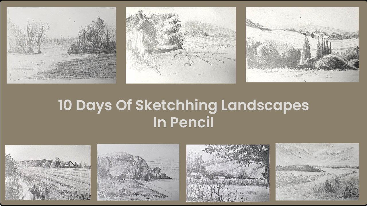
Transcripts
1. Introduction: Hello, join me on a
seven days sketching challenge to build confidence and create a sketching routine. Learn the techniques to
loosen up your sketches, sharpen your
observational skills, and embrace those
imperfect lines to create visually pleasing
and interesting sketches. Hello. I am Susan Abraham. I am an artist, urban sketcher, and an art tutor. I tutor both adults and children in weekly classes
in my local area. This class is inspired by the children in my art group who embrace the art of observation to draw
in their own style. We will be discussing the
techniques that we use during these classes to create
simple loose sketches. We will be discussing
the techniques that we use during these classes that has helped the children to
embrace those imperfect lines to create unique sketches
in their own style. Sketching is a great activity to relax and to be creative. It helps to sharpen your
observational skills, build problem solving abilities, and boost your confidence
for anybody who is looking to improve
their artistic skills. As a hobby, it is a
great way to relieve stress and to express
yourself using the most simple materials and easily accessible materials
such as pens and pencils. One of the reasons why I
prefer calling it sketching is because the term makes it feel more informal,
fun, and relaxing. This class, we're
going to practice drawing quickly and loosely, and we're not looking to do very accurate and
detailed drawing. I believe that this will allow
us to enjoy the process, as well as help us to express ourselves through these
beautiful imperfect lines.
2. Your project: For the project, we're going to sketch a variety of subjects. These are the
subjects that most of us come across in
our daily lives, starting from the very
simple fruit and veg, your household items or
your drawing materials, urban sketches, birds,
bugs, et cetera. We will be looking
at how to draw from life using real objects, as well as look at a
few reference pictures. The reference pictures are provided in the projects
and resources section. Reference pictures
that I have used mostly from sites
such as unsplash.com, where you are able to download royalty free images to
create sketches or artworks. Can use the reference pictures
that I have provided here, or you can use these websites to find your own reference
pictures if you prefer. You can also use your own items from around the house that
you're more familiar with. Techniques that we're
going to be looking at are how to hold your pen for sketching blind
contour sketching, continuous line drawing, simplifying into simple
shapes and lines. We'll also be looking at negative spaces and the
angle of the lines, the weight of the lines, and finally, adding
value to your sketches. There are at least
two examples to work from these seven techniques. You may choose to do all
of them or you can just stick to one of them that
you prefer personally. 20 minutes a day is all we need to create beautifully imperfect, wobbly and visually
interesting sketches. These techniques are
just a guideline to kick start your
sketching journey. As you continue to practice, you will realize which sketching technique
works best for you. You do not need to
include all of them into every sketch that you do. As time goes by, you would realize what works
best for you and you may choose one or two
techniques that works best for you and
your personal style. It would be wonderful to
see some of your sketches. Please make sure to upload your sketches in
the projects and resources section where you will be able to see
some of my sketches, as well as the sketches
from fellow students. Stay on to find out more about the materials that we'll
be using for this class.
3. Materials Required: We're going to
keep our materials very simple for this class. All we need is a
sketchbook or a bunch of paper and some pens. The paper can be as simple as a printout paper
or a copy paper, or you can even have a very simple basic
sketchbook with 160 to 190 GSM weight of paper, which is not very thick. Here I have a sketchbook
with paper that is 160 GSM. With pens, you have a variety
of pens in the market, and you can use any pen that
you feel comfortable with. You can use a very
basic ballpoint pen, or you can use these
microtip pens. This is by UIBO and
it's a waterproof pen. You get them in blue
as well as black ink. You can use any color
ink that you prefer. You can also get these doodling
pens or sketching pens, and they come in
different sizes. And you can get them in
different tip sizes. I have 0.1 and 0.2 here. They are not very different, but they are really good
with very fine lines. You can also get tips that
are slightly broader as well. Another example is
a simple sharpie or any sort of a marker pen
that you prefer working in. They have slightly thicker nibs, and that is completely fine if you want to keep your
sketches very bold. If you are a fountain
pen enthusiast like me, you can use a fountain
pen as well for drawing. This is my favorite
way of sketching. And throughout this class, you will see me using
these fountain pens. The ink doesn't have
to be waterproof. However, if you would like to use some paint
over it later on, you can keep it as
a waterproof ink. For this class, we will
only be using the pens, so it's not necessary to
have waterproof pens. You are also welcome to use pencils if you like to keep
them even more simple. However, I do suggest that you do not use an eraser because an eraser would give us a tendency to erase
more than sketch, and we would never learn to embrace those wobbly lines
that we have naturally.
4. Day1: How To Hold Your Pen: The first and most important
technique that I would like to stress on is how we hold a pen
when we're sketching. We normally hold our pen in a pincer grip or a tripod
hold like this when we write And most of the time when we're
drawing smaller details, this hold is really great. However, for sketching
the initial lines and those free and loose lines, it is always a good idea to move your fingers
away from the nib, hold it somewhere in the middle. Or you can even hold
it right at the back. This is always a
personal choice. I would just say that it is always better to
move away from the nib, but you can decide
where you want to hold either here or
right at the back. So let's try both
ways and see you can decide which is more
comfortable for you. It is going to be a little bit outside our comfort
zone to begin with, as we're not used to
holding the pens like this. But let's hold it right
at the back of the pen. You can even start by
dangling it down 90 degrees and see if you want to just make some marks and
see how that works. You might find this really
uncomfortable to begin with, as we're not used to
holding our hens like this. Just draw anything
at this stage. You can even do a few
lines of scribbles, just to try out the hold. You can also notice that my wrist is not
resting on the paper. That would be
extremely difficult to work with at some point. However, if you're not resting
your wrist on the paper, lifting it up, letting
the pen dangle a bit, so you are almost out
of control of the pin. Continue making
these simple lines. We can create some large shapes and lines with this
type of a hold. And sometimes I always feel that this is very
useful when it comes to the first few lines that I have to put down when I sketch
just about anything. Now, let's move our fingers a little bit to the
middle of the pen, but at the same time, not
too close to the nib. We're just going to hold it
somewhere in the middle. You can hold it loosely. You can hold it
in a tripod hold. It's totally up to you, but let's try the loose hold. This is more freeing
and it helps us to be more self
expressive, as well. Let's continue to make
these marks on paper. It can be anything
at this stage. It doesn't have to
resemble anything. You can see that
because my wrist is not resting on the paper, my lines are more free. I'm able to move my
pen across the page. Whereas if I was resting
my hand on the paper, my movement is a bit restricted. It And now let's move our
hold right nearer to the nib. You can rest your wrist at
this stage on the paper. You can see the
type of lines that we're creating are
more controlled. They are also much
smaller compared to these large shapes that
we have created here. This hold is really great for the fineer details and
the smaller details that we need to include
in our sketches. Why not take a few minutes to practice the different marks
that you can make on paper. It can be anything starting from simple scribbles to lines, both horizontal and vertical. You can have a few wavy lines. You can have some squiggly
lines, some swally lines. Think of all the different marks that you can make on this paper. And at this stage, you
can even practice holding the pen further away from the nib somewhere in the middle, as well as nearer to the nib and observe how you feel
with each hold.
5. Day 2: Blind Sketching: Today we're going to
look at the technique called blind contour
drawing or sketching. This is a fun technique
where we're going to observe the objects in front of us
without looking at the paper. This is a great way to learn how to observe your subjects
more intensely, looking for the
shapes and lines to complete drawing of what you see and to avoid drawing the preconceived notion
of how it should look. I'm going to start
by sketching some of the art materials
that I use regularly. It doesn't have to
be art materials. You can find other
household items to sketch at this stage. So first, I'm going to start by sketching one of
my palette knife. I really like the
shape of this knife, and it looks simple enough
for a blind contour drawing. So I'm going to
start with this one. For blind contour drawing, I am not going to
look at my paper, but only at my object. So for this, I am going to keep my object right
in front of me. All you need to do is keep concentrating on the object
and not on your book. To start off with, we can look at where we're going
to start on the paper. And then after that, we're
not going to look at all, absolutely no peeking, completely concentrating
on the object alone. I'm going to start
with this corner. Once I know where
I'm going to start, I'm going to not look
at my book at all. So I'm going to start following
the contour or the line. And I'm going to
take it really slow. Sometimes it's really
difficult to go slow, but I'm going to
try my best anyway. And I think I have
made a drawing. I'm going to have a look now. I can see I've got
a basic shape. Obviously, these lines are a lot more further away
than it should be. But that's the fun of blind contour sketching or drawing because you
cannot see your paper, and you're only
trusting your hand to follow what your
eye is seeing. So although it's not perfect, I quite like the outcome as it is very raw and very quick. It's got character to it, and most importantly,
it's not perfect. I'm going to try again so we can sketch multiple times
using the same object. So I'm going to
try one more time. This time, again, I'm not going to look at what
I'm going to do. Let me start at the opposite side this
time, just for fun sake. And I'm going to start by following the
contour along this way, finishing all that
and coming back here. Again, not looking at my book, looking only at the object. I can see how my hand is moving. However, I'm not
looking directly at it. I'm trying to add a few more
details in there this time. So that has come out a lot more better than
the first trial. So that was my first trial. That was my second trial. I think I'm beginning to
like this action a lot more. I started feeling rather
uncomfortable first, but now I can feel that
it's a lot more fun. So this time, I'm
going to change the the position of the object just to
try it one last time, and I'm going to keep it
like this right next to me. Again, I'm going to start
from the top over here, follow the contour or the
outline of this object, and finish it back there. Again, not looking
at my book at all. I can even hold my
hand like this, so I'm not really looking. Right. So that was my third result. Again, it is a lot
different because I've changed the position
of the object, and when I'm looking at it at a different angle,
this is my first go, and it's still very raw, not perfect, exactly
what I was expecting. I'm trying to lower
my expectation of how perfect my drawings
or my sketches should be. So that was my third attempt with by looking at it
from a different angle. Let's try another object. I think I'm going to try one of these small tubes of watercolors
that I have with me. So I'm going to put it down right next to the
drawing on my paper. Again, starting I can either start from here or I
can start from there. I think I feel more comfortable starting from this corner. Again, not looking at
my drawing at all. You can either hold your hand in the middle if you feel
that you're going to look, or you can even put a little card or a
book in the middle, so you won't look
at your drawing. So if you would
like a bit more of a challenge, you can, like, hold your hand up here and to make sure that
you're not looking at your drawing but looking
just focusing just on this. Or you can even
put a notebook or a card so you can absolutely
not see what you're doing. So I'm going to place
my pen down on my book, starting with the
top right corner. I'm going to work my way
around the basic shape of this paint tube
going really slow. I might overlap with the shapes. At this stage, I am just
following my contours. Okay, so that was my first
attempt. Not bad at all. I quite like the very raw rough looking
paint tube over here. Let me try that one more time, bringing that down here, starting with the top
right corner there. I want to work my way around all those details
and come back up here. But the first time
I think I started my way around, I went over here. I finished I did this bit, and I came back over here, and then I went again to finish
this. That is also fine. It doesn't you don't have
to follow the contour. In sequence, you can always finish them in shapes
and come back as well. So let's try that
again. Attempt two. So I'm going to look where I'm
going to start in my book, and then I'm not going to
look at my drawing at all. I'm looking completely
at the paint tube now. Harder than I thought, but I'm completely out of my
comfort zone at this stage, but really I am enjoying
what's happening to my brain, what's happening to my hand, completely trusting
the process here. I can see some of the details
of the paint tube here. I can see all these lines that I wanted to give
all the details. It's worked out
outside the box here. So all these details
have worked out a little bit lower than
where it should be ideally. But for a blind contour drawing, I really am happy
with this outcome. So I can now start to
change the angle of this object and see if I can
draw it in any other angle, I quite like the way I'm
looking at it right now where I'm able to see the front of it. I can see this area. I can see a little bit
of this area as well. I'm going to try and
see if I can draw this. I'm going to attempt it a
couple more times before I finish for today because
I enjoy the process. It's really therapeutic and it has helped me to sharpen
my observational skills. I quite like the way
my hand is moving and the way that I'm able to
observe an object more closely. I'd like to encourage you
to find an object to do a blind contour sketch on and let me know
how it went for you.
6. Day 3: Semi-blind Sketching: We're going to look at semiblind sketching using a
continuous line. It's very similar to what we
have been doing yesterday. It's very similar to
what we have been doing yesterday with a
blind contour drawing. We still used a continuous
line to sketch yesterday. We're going to continue
using this continuous line, but we are going to do
a semi blind sketching. Or in simple words, we are going to look at our object as well
as our sketchbook, and we keep moving our
eyes from the object to the sketchbook to
get this drawing done. Compared to this, yesterday, we did not look at the
sketchbook at all. So today, we have a
little bit more freedom to briefly look at
what we're sketching. You can also use a reference
picture if you are not too comfortable working from
an object in real life. So we're going to continue
using similar objects as this exercise is very similar to what
we did yesterday. I'm going to start with
the palette knife again. So this time, I
don't have to cover with my hand or with
a book or anything. I can just go straight away
with sketching this out. Again, as I said, we're going to start
using a continuous line, which means once we
put our pen down, we're not going to lift it
off unless we're finished. So I'm going to start
with this corner again. And then I will see if I can work my way
around each shape. That's one way of
going about it, or another way is to just follow the contour all along and come back and finish
off at this point. It doesn't matter
which way you choose as long as we are
observing the object. So I'm going to
start from the top. I can see that the
handle goes up slightly. It curves there. If you feel like
you need to make multiple lines to make
sure of what you're doing, you are free to do that, as well, like how
I'm doing here. I am doing multiple lines to finish off one side of
this palette knife. I think I'm going
to go make my way back here to finish
off the knife bit. Again, if you feel you're sure, you can always go back
on the same line. So that's quite slanting. I do feel that I can make it
a bit more bulgy like that. I am left with this
unfinished line over there, which I'm completely fine with. So again, let's finish
off the other bit. The handle of the palette knife. I would also like to add a few more details like
the shape of this handle. I can see a bit of a shadow, or this side is more
prominent to me. And it looks darker
than the top. So I would like to, like, add a few lines here to
show that it's darker. Not necessary to do this. But if you do like shading or rendering,
you could try this. But at this stage, you don't really
need to do this. And then I'm going to do
that suckle over there, that little hole over there. And then there's something
written over here. Again, all in a continuous
line, and I'm done. I did make a few mistakes. I can see a few lines over here that are
quite unfinished. But if not for that,
it looks okay. But then again, we're
not looking for a perfect drawing
or perfect sketch. We are working in
a continuous line, which means we may
have to overlap in certain areas like
how I've done here. Let's try that again. This time, I'm going
to change the angle. I'm going to keep it like this. So again, I'm going to
start with that shape. Again, as I said, I
can always retrace my lines to come back
to where I need to be I did make a huge mistake
of starting a tube, and now I'm not able to fit it in my sketchbook, which
is completely fine. I'm just going to
finish that over there and then come
back over here, finish it off here, which is completely fine. This is our sketchbook, and it is okay for
us to make mistakes. Sometimes we may not
calculate it well and we might have a drawing that
is going outside our page, which is, again, okay. I could probably do another
one like this over here. This time, I'm going to
see if I can fit it in. So because I want to fit it in, I'm going to start from
the bottom over here. Okay, so I've successfully
fitted that in there. I'm going to go back and finish the rest of
this palette knife. Again, I don't mind it overlapping
with my first drawing. A few wobbly lines, which adds on to the
character of this knife. And I can always go back and forth to create some
texture over here. Let's do the circle. And there something
is written over here. I can also add some finer details of
how this handle is made. That is attempt three
of this palette knife. I quite like the way that they are overlapping with
my older drawings. It just makes my sketchbook looks a little bit
more interesting. I feel it just
makes my sketchbook looks a bit more interesting. And this is one place where I don't really need
to worry about the composition or
has it gone wrong or right because it's not It's
my personal sketchbook, and this is the place
where I have the freedom to explore and experiment
with different things. So if I like, I can also overlap
like how I've done here. I can also add other
things to it and create a new a whole new page or completely with continuous
line drawing here. That is also an idea. So I'm going to start off
by doing continuous line semiblind sketching for
this tube of paint, starting off with that circle. I'd like to get the
texture of that cap. It looks quite interesting. Okay, and then I'm going to go for the body of that paint tube. I also like to add the
details of the paint tube. Again, always making sure that
I'm not lifting my pen off the paper until I finish
this drawing and I'm done. Now, I'm going to fill this page with different angles
of the same object. I'm going to turn it around, maybe hold it in different ways, and still do the semi
blind contour sketching using a continuous line, I'm going to fill
this page just by sketching different angles
of this paint tube. If you're looking at
different objects in your household or if you're
using a reference picture, the techniques are
going to be the same. We're going to move our
eyes back and forth from the reference
picture to our drawing, and we're going to capture
the essence of the object. We're looking at using continuous line and using a
semi blind contour sketching. I would love to
know how you got on with this semi Blind
contour sketching. Please feel free to
upload your process and your work in the projects and resources section for
everybody to see. So this is my semi blind sketching using
a continuous line. I use just two simple
objects from my table today. I encourage you to use one of your favorite objects
around the household. It could even be it could be anything
from your household. If you would like to
work from a photograph, you can always use one
of my reference pictures as well to try out this
continuous line drawing. Although I started
off feeling very uncomfortable with
using a continuous line to finish this drawing, I felt that as I progressed, I enjoyed this continuous line that just just moved
around my paper, creating a hand movement in response to
what I was seeing. It is such a great exercise to sharpen your
observational skills.
7. Day 4: Sketching Using Simple Shapes (Sketch 1): We're going to observe and
sketch using simple shapes, or in other words,
you can call it simplifying into simpler shapes. Now, with the last few
days of sketching, we are a lot more confident
observing and looking at the contour or the outline of any object
that we are sketching with. Today we're going to see how we can break it down
into simpler shapes. This is just another
way of sketching or another technique that
can be used ching. Again, you can use an object that is right in front of
you to do this sketch. You can also use the
reference picture that I have provided in the projects
and resources section. I am using still life
with three fruits today. Because I'm a left hander, I prefer working from the
right side of the picture. But if you are right hander, then you can always
start working from the left side of the picture and to work
your way towards the right. I'm going to start by
marking out the pair, the pair from where I'm seeing, I can simplify it into a rough triangular
shape with a curved bottom. I'm going to use
really soft lines, and this is where I can hold my pen a little bit
further away from the nib to make this
loose and soft lines to begin any drawing. I am using very
simple quick lines. They're quite broken
in certain areas. That's the shape
of the pair that I'm going to try
and get the shape of the pair with simple lines, few dotted lines, scribbly lines if you feel
that's better for you. That's the top of the pair marking out the top of the pair. There is a slight
curve for that pair. And most interesting for me
is the angle of the stem. I really want to get
the angle of the stem. It's angling to the left. Slightly curved like that. Again, it doesn't
have to be perfect. You can see how I've done a
more shallow angle over here. I wanted to curve it a bit more, so I got to the
second time round. That's completely fine.
I've got the stem now. Maybe do a few scrogbles at the edge to get some
character for the stem. I've got the shape of the pair. There is another pair sitting
in front of this spare. I'm going to start
where the bottom is because I can see that I need to give space
for this spare to sit. There's another pair in front. Bit more chubby, nice
and curved on this side. Could probably make
it a bit more bigger. I think this one's too short. I'm going to redo
that line again. I'm left with two lines. That's completely okay. So I'm going to get to
the bottom of that pair. Curves and rounds there. Again, I'm very interested
in the angle of that stem. It curves away from me. Then finally, I've
got this apple that is sitting
behind this pair, it's got a considerable distance between this pair as well. I have decided to
start from here. Starting with a
very rough circle, just to mark out where the
apple begins and apple ends. I think it's somewhere
over there. Mark that out. Now I can go in and get the shape of the
apple a bit more accurate. Again, broken scribbly
lines are completely fine. I can see is rounded here, whereas as it comes
to the bottom, it narrows a bit like that. Now for the stem of the apple, I think it starts
somewhere over here. I can see there's a
line for the top of the apple and the
stem is straight. To bring interest, I want to make it a little
slanting as well. Now let's add some details to this pair in the foreground. I can see if I look
at the contour, the outline of that pair, it's not really
completely curved. It has a slight dip over here, comes back out like that. That's a little bit
of detail over there. I can see a few lines that I
need to add for this pair. I think I need to fix the
shape of this pair over here. It curves down slightly before
it comes to a triangle. Fix that shape now. When I know that is
the line that I need, I can make it a bit
more darker if I need. I know there are lots of lines that weren't the right lines, but that's completely fine
to leave it like that. It's part of sketching and
it's part of our process. So I'm going to let that stay, which is why it's
good idea to use a pen because if
it was a pencil, we would immediately
reach for the eraser and we would be rubbing away every line that we
thought wasn't right. That's when it begins to feel a bit frustrating
because you would soon realize that you end up rubbing more than
you're sketching, which is why it is a good
idea to stick to a pen. Embrace those imperfect lines, the wrong lines are
there to remind us that it is a journey and
it's a beautiful journey. So let's finish
off the next pair. I'd like this line to be a
bit more fluid, more curved. Now I think I'm more
confident because I've got all these lines that I
had marked out initially. You can see how rough and
imperfect these lines are. I think I'm completely
okay with that. We nearly done, I'm just going to add the table behind as well. That's where the table
is, where the apple is. I'm going to bring that, make sure that line is
continued here as well, giving it a sense of space, we're done with the sketch of the three fruits
using simple shapes. The result is far from perfect. As you can see, there's so many lines that had
gone wrong initially. But that is completely fine. This is a sketchbook. It's a sketching practice, a sketching journey where we are learning to feel more
confident with sketching. We're not looking for perfect, accurate still life drawings
and each of your drawings are going to look really different compared
to what I have done. That is because of those characteristic
unique lines that your hand can make.
8. Day 4: Sketch 2: Let's do one more example. This time, we're
going to look at a slightly more
interesting subject. It is an urban scene of
the facade of a building. From the reference picture, we're only going to sketch
the building in the middle. That is the white building
with the roof above it. Let's see how we can simplify
them into simpler shapes. I'm going to start with the largest shape
that I can see here. That is the body of
the building itself. I'm going to create
a long rectangle. Again, it doesn't have to
be a perfect rectangle. I'm going to distort it anyway. That is going to give my sketch a little bit more
interesting outcome. That is the body of the
house or the building. Then we've got the roof. I can see the top is slightly
slanting. That's the roof. Well, I think I'm going
to make it a bit more longer and that lines
completely fine. Now I'm going to put
the chimney down. The side facing us, I can see there's a rectangle. There's the other side that
I can't really see much, but that's all I can see. Then the chimney is on top. I'm just going to make
another shape over there. There is a window here that sits within
the height of the roof. I'm going to make a
rectangular shape here. Now let's move on to
the main building. I have a doorway here. That's a door, but
in front of that, I've got some foliage. Simple squiggles for foliage. I'm going to do a
larger planter over here compared to what I
can see in the picture. Now, that's the door. Another rectangular shape, maybe just a few
lines to show steps. I can do the window here, the large window
beside the doorway. Again, simple shapes for now. There's another
tiny window here. I'll start with the
rectangular shape, but the top, I can
see it's an arch, it's curved on top. Again, simple shapes, lots
of mistakes going on here, but I'm still pushing
myself to finish this. We just need to
trust the process. Now inside this window, I've got the glass panes. I'm not sure how to go about it, but I'm just going
to divide them into six different sections like
how I can see in the picture. Again, soft lines. You can hold the pen away from the nib if you like,
if that works for you. Let's add some
details to the door. I can see the sections on
the door that are darker. I'm just going to
make those shapes first and then maybe I can
just darken that area out. Can see the detail of a
letter hole or letter box. Maybe color that in, maybe
darken the steps a bit more. I could maybe color in
these sections if I want to enhance that darkness,
what I can see there. So I have gone in and created little boxes within those six sections I had made. Keeping it really rough, loose. I'm not really worried if
it's gone wrong or not. Okay. Let's give a
few darker shapes within this window as well. I'm going to get rid of
that bench over there. Instead, I'm going to put a
little planter over here. I can see a planter in front. I've just extended it, made it longer, maybe
add some foliage. Now let's finish
off the top bit. There is a dark shape over here, which I'm going to
place there now. Again, I can color
that in if I like. Now, let's put that window in. Another rectangular
shape doesn't have to be perfect rectangle. You can see minus a
bit wobbly anyway. I think within that I'm going to add two windows like that. Then again, I can divide them I'd like to darken
that shape now. Now that I know
this is going to be the edge of the roof,
darken that shape. I can maybe give a
few lines there. There's a pipe going on
underneath that roof, I can see. So there are these few
short lines to depict that. There's a pipe that
comes down here as well. I'm just going to give more
importance to that pipe, maybe add one on my
own because it looks so much fun to just add something
that looks like a pipe, a darker shape on this
side of the building. Okay. Now let's go on
to that attic window. I'm going to add a few shapes here for the detail
of the window. Now I'm going to add some more details for
the foliage here. Just a few more scribbles
to show foliage, I can make it come out of that building as well just to
create more interest there. To add more texture, I can maybe add some texture
of the roof as well. Add a few dashes to create
texture of the roof. And make the lines
a bit more short, a bit more characteristic, you can add the squiggly lines to create the texture
of the roof as well. I think we're done
with the sketch of this house using simple shapes. So just to recap on
what we did so far, we started off with
the simple shape of the house and the roof, and then we started putting in little simple shapes for
the windows and the doors, a few squiggly lines
for the foliage. You can chip and change
some details if you prefer. I've also given more importance
to the pipe that goes by the side of the
building because I just felt that looked
really characteristic. And as well as the chimney, I do like the shape of
the chimney as well. And we're done with the sketch. Why don't you give this a go and let me know how
it went for you. Please feel free to ask me any questions through
the discussions, and I'm more than
happy to help you.
9. Day 5: Negative Space & Angle Of The Lines (Sketch 1 - Pigeon): Today, we're going
to discuss about negative space and the
angle of the lines. What is a negative space? It's simply the space
around our subject. So let me show you an example. Let's take this
picture, for example. My area of interest or
what I would like to sketch from here is the tree, the red post box. I'd like this
triangular shape of island and I'd like
the post as well. The negative space
is the space that is around the subject that I
am interested to sketch in. In here, the
negative space would be this little window that is created with all the
objects around it that I want to sketch and the
space that is within that, this is a negative space. All that is also
a negative space, so is all these areas
and these areas. Let's take a single
object, for example, this pigeon here, the negative space is all the space that is
around the pigeon. That's all that space. Also this space here
and this space here. The angle of the
lines, for example, this angle of the line defines
the neck of the pigeon. This angle of the line defines the way the pigeon
has turned its neck. Angle of the lines just helps
us to define the subject, and it's very important
to depict the shape and its position in relation
to its surroundings. Here for this pigeon, the
angle of these lines are very important to depict the way the pigeon has turned its head. The angle of this line
is very important to show the angle of the tail and how it is
placed in its body. The angle of this line, compared to the
angle of this line, it's very important to show how the pigeon has
positioned its feet. We're going to start working on these two pictures to help
us understand this better. Let's start with this
pigeon, for example. Before I start drawing, I'd like to show you the main negative spaces that we're going to concentrate and these negative spaces
and the angle of these outside lines
are going to help us to place the feet in
the right position. Okay. So just to
make you understand, I am going to do a
little line drawing. I'm going to go around this line that I really
want to capture. So if you do have an iPad or a tablet where you can
draw over the picture, then that is also fine. You don't have to take
a printout of it. Let's start by drawing a line just at the outside
of the pigeon's leg. It angles like this. Don't worry about the details
of the feathers just yet. We just need to get the
line and then it goes in and then it slants
slightly like this, comes back down here, and that is the angle
I'm looking for. So let's see if I can draw this shape first to start with. I'm going to copy that shape or more or less similar shape. I'm starting off with this side where there is a slight hook
like shape for that line. It comes in, slants
up, slants slightly. There is straight
line over there. I slants away, comes down and I need to make
sure where it finishes. That line finishes a little
bit below this line. I'm thinking
somewhere over there. My main aim is to curve and
bring it all the way up here. Got that shape. I think
it'll be fairly easy for me to do the feet
of the pigeon now because I've got one
side of this feet. I just need to fill
in the other side. Let's say that's the feet. It widens here. I think I've got the
shape of the feet now. And then I can see this shape, this angle of this line. I'm going to try and copy
that angle of the line. It's not going to be accurate. Again, we're not looking
for an accurate drawing. We're just trying to get
the angle right just to see if we can get the
position of the feet right. I'm going to put that
claw over there. I think I can safely say that
I can finish off this area. I'd like to draw this
triangle so that will help me get the position of this bit here, this claw. That's the angle of the
line I'm looking for. I have one side and I'm
going to go down and make that little inverted
V shape over there. Hopefully, I've got the
shape of that claw. Again, let's look at the shape
between these two claws. That's slightly narrower,
slightly curvy at the top, triangle shape or the V shape. I've got one side of it, slightly narrow, curved
and brought it down here. That's the next one. Let's do the other side. I could finish it off. That's the other
one. Then finally, we've got this wider triangle or a wider inverted V shape
over there happening. I do feel that it's a bit too close because of
the line that I did, but hey, that's okay. We are still working with
our pen, mistakes do happen. We're just going
to work around it. I'm going to try and create that wider angle over there and that would mean that I make
this a bit more sharper. At that angle. Just to make you understand, I'm going to color that
bit of the claw in to show that this is what I've got with that wider
angle over there. We've got the shape of 1 ft. Let's do the
same for this one. We take it really slow, looking at each
angle of the line. Let me finish that claw first. Again, looking at
this triangle there. Let's do that triangle. Then we've got this
claw over here. But let's look at that shape. It's another triangle,
slightly curved at the top, not a triangle, sorry, an inverted V, slightly
curved at the top. Let me get that slightly
curved at the top, curved, and then it goes
away from us like that. That has hopefully given
me the shape of this claw. Now let's do the last one. I've done that line and
I can see it curves. It curves. Let me finish the
edge of that claw. Again, not too accurate, getting the shape and the
essence of that claw. I do feel that my feet
here is a bit narrow. I'm just going to try and redo that line again. There you go. Then I've got this shape
that widens up till here. I've got that shape,
I think it will be fairly easy for
me to just look at the angle of this line
to get the tail end. We've got till here from here, it angles away like that and then angles
down to get the tail. I'm going to do the same
angles away much longer, and then I get the tail. I think I can safely finish
that shape of the tail now. It's a bit like a triangle and the other end is going
away from us over here. But then again, we
can always look at this angle to get it accurately. I've got this and then it
curves away like that. So concentrating only on
the contour at this stage. You've got that. Then on top, let me keep looking at the outside
angle of these lines. It curves back in
like a triangle, curves back in like a triangle, and then it goes up
the hill, curves. Let's go up the hill. It curves curves down, and then there's a huge
curve to the head. It curves down. It's a huge curve to the head. I think my pigeon's
head is going to touch right up till here. I'm going to finish
off the pigeon's head, it curves away like that. I'm going to go up and
curve away like that. I think I'm nearly
getting there. Now let's look at Now let's
look at this shape over here. This line comes all the way
here, the beak is over there. I'm just not going to
put the beak just yet. I'm going to see if I can
start with this line. That's a slight curve, inside curve, and then it
comes back out like that. Almost like an inverted S shape, so curves in and
then comes back out. After that wing, then that
line just joins with the feet. After that wing, I'm going to let that line
just join the feet. Now I think I'm going to go in and put the
detail of the beak. Again, looking for
simple shapes here we can also use the techniques that we used the last few days, continuous line, simple shapes. We keep using these techniques again along with the negative
spaces and the lines. I do personally feel that a mixture of all the techniques
has always helped me. That's the shape of the beak, starting of the beak. There's a little bulge, the white bulgy area, and then the beak tapers off Let me position
the eyes now. There's a slight
line over there. That's the position of the eyes. There's a lot of space on top. There's very little
space from this line, and that's how I am trying
to position the eyes. Just looking at the space between this line and that line. I feel it's angling
towards the bottom line. It's not a circle. So I'm trying to squint
my eyes at this stage to get the shape of that eye. It is not circle. I can see it's a bit
more angular over here. It's a lot more
darker over here. Once I put those
lines and shapes, I feel that I can get
the shape of the eye. Maybe add a few lines for
texture of the feathers. I can add. I can separate the
body and the wing at this stage. I think
that's the wing. I do feel that I need to make this wing a bit more longer,
so I'm going to do that. Just make that darker and
that wrong line is gone. Now let me add all
the other details that I want to add
for this pigeon. Again, some texture over here. This is just a line. I'd like to bring in some
texture of the feathers here. Because we're using pen, there's no way that we can
rub out the wrong lines, which is completely fine. Remember, we're sketching,
we are looking for those imperfect lines to bring
character to our sketches. I'm just going to go over these lines to create
texture of the feather. I can see that there's
more feathers over here, adding those lines for texture that line
underneath is almost gone. I'm not even looking at it now because I'm adding
more texture on top. And I feel I'm a lot more
happier with this than trying to rub off a wrong line because when
I rub off the wrong line, there's nothing to guide me for the next line
that I want to place. So there's a little line over here with
feathers sticking out. I'm going to add a
few feathers here. That's the end of the feathers, even here, going to mark
the end of the feathers. From there, there's some
texture on the feet. Can add a few lines
to show texture. You can even add those shadows, if you like. Color that in. I think there was a
shadow just over here. We are yet to do the
shadow of the bird, which we would do in a minute. I'm going to add some texture
to this feet as well. Again, when I add
those textures, that wrong line is gone now. I'm going to add a bit of
shadow that I can see here, maybe color that in, give me
a strong shadow that way. I think there's a bit of
shadow over here as well. Let's go back to the
body of the bird. I'd like to add the next wing, which is over here,
that one there. I can see there's a
feather sticking out. I'm just going to give
that texture over there. There's another white
feather, again, texture. This bit, I can see that line that
is curved away from us, going to add that
line for the tail, a few lines at the back
again to show texture. I could go on and add a few
more texture of the feathers if I like completely optional, or you can just leave it as
a line drawing if you like. I just want to add
some texture here, some lines to show texture, but we will talk more about showing dark and
light and texture in the last section of this
class where we will be learning more about adding
values to your sketches. Finally, before I
finish off this pigeon, I would like to add this large shadow of
the bird on the ground. So again, looking at the
angle of the line here again. It starts here, goes up
and comes back down, finishes off near this claw. The other side of that shadow starts at the edge of
that claw over there. Then it is a funny shape
that's going on over here. But let's not look at
the shape for now. Let's look at just the shape. It widens and it
stops just there. I'm going to mark that
down where it stops, just putting markers there. I'm just going to follow this outline and
join it over here. There's a little dip over
here, comes back up, widens giving me that a shape. That shadow is
continued over here. I'm going to mark where
the shadow ends and I can see it ends with the tail. Briefly looking at
this shape for now, it's easier to get the
angle of the line that way. That's the tail end. I can see the back
go in like that. There's another tail
sticking out over there. From there, it widens. I'm going to do that
wide line and then it curves and then curves back
to finish near that cloth. I've got that shape
of the shadow, I could color that in
or maybe at this stage, just draw a few lines to
show that it's the shadow. I we can always
come back to it to add more visually
placing shadow later on when we are working with the last section of this class where we learn
more about adding values. But for now, we're going to
leave the sketch as it is. We've got all the
angles of the lines. It was a complicated shape to get and when it's a
complicated shape, the best thing to
look out for is the angle of these lines
and the negative spaces, that is the space outside of our subject that
always helps us to get the angle of the lines right and eventually
the drawing right. I hope you enjoyed this. We will try one more example. That's the example that
I showed earlier on.
10. Day 5: Sketch 2 - Urban Scene: In this session, we're
going to continue looking at negative spaces and
the angle of the lines. We're going to be
drawing this bin sketch, looking at the
reference picture, and the reference picture is given in the projects
and resources section. We're going to start the same
way as we did the pigeon, and we're going to look
for simple shapes. We're looking for the
angle of the lines and the shapes of the negative
spaces around it. Quite a complicated
picture over here. But we are not going to add any of those details
in the background. We are only concentrating
on these items here. Let's have a look at how
we can tackle this shape. I do feel that it's easier than the pigeon because these are
more geometric shapes here. First up, we're going to try and get this shape within all the subjects that
we need to draw. That is this line here there's a slight bulge of the post box
there, straight line down, and then across that
line comes down again, goes up the post and then
finishes off with the branch. I think we could safely start with something like a rectangle, but the top is a
bit curved down. Let me see if I can do a
small curved down top. That's the top where
the branch is. There's a slight bulge of
the post box over here. Straight line down. Goes across and then
it angles down. It goes across, it angles down, and then it goes up the post. Straight line up,
you could include the boards at this stage
or just to keep it simple. Let's go up the post and then just finish
off with that branch. That's the inside negative
space that we're working with. You can note that
I've actually not included this box over here. Could include it
later on as well. I was just trying to get the lines to be more
simpler at this stage. Once you've got that shape, let's go in and add the details
of the main tree trunk. I know the tree trunk
is maybe this thick. Now I'm looking at
the outside angle that line there and it goes
away because of that branch. It goes away because
of that branch and then just going to add
some foliage over there. Now, I need to add the
telephone box over here, a little bulgy rounded top. I've got the edge here. It goes up and comes
back down like that. Just going to add that
little rectangular shape. I looking to finish
off the other side. Again, just drawing
that rectangular shape that says library, and then finishing
off the other side. I haven't quite decided where I want to stop these lines at the bottom because we've got another shape going
on in the foreground. In the foreground, it's
this triangular shape. This triangular
shape that's there, it goes all the way
across like that. Now, let's finish
off the foreground, that's this large piece of land. From here, I'm going
to look at this line that goes in to create that
triangle with this line. From there, it curves
and goes in like that. I can draw the foreground that's the height of that
triangular piece of island. Let's finish off the post, so we know where
we need to finish off the triangular
piece of land as well. So the post comes down. It stops over there, which means I need to extend
my lines to get to the post. Let's finish off the
post a thin long post. You can use very
soft light lines if you feel you can even again, remembering to hold
the pen further away. If you think this is
giving too much control, we can always hold
it away as well. Aster post, which means the
triangular piece of flan, that line is going
to continue all the way up here and then
curve and join here. Let me do the same for
my drawing, continue. Curve and joins here. I think it's easy for me to
finish off that shape now. Let's do the inside
of that shape now. Just to show the inside
of the shape over there, maybe I could show the inside of the shape
over here as well. I'd like to start adding
some details at this stage. So my concentration
is mainly on here, the telephone box,
maybe some details in the foreground as well. So it's easy to just add the
foliage inside this island. I'm going to add some squiggly
lines to show foliage. That also helps me cover
up that line over there. It doesn't have to look exactly the same way as in the picture, you can add your own
type of foliage, give it more character. Just add some squiggly lines to add more foliage in there. Once that is done, let me add some more details
on the telephone box. So this glass door over here. I'd like to go a bit soft just to get the
shape of that door, the rectangular shape, again, wobbly lines always welcome. I'm going to add these individual shapes
over here as well. It doesn't always have
to look the same. You can change it if
you think you want to as long as you get that
simple shape over there, simple rectangular
shapes to show the door. The same goes for this side. Again, simple rectangular shape to start with and within that, you can have smaller rectangles to show the detail of the door. You can also add a bit
of darker shadows, just a little bit of
coloring in there with your pen if you
feel like you want to add those darker areas
within the glass of the door. I'm going to move on. I'd
like to add this board. Over here, there's a blue arrow. There's a board over here. Just going to add that
rectangular piece of board. The rectangular piece of
board is at an angle. Again, if you would like
to look at the angle, you can hold a ruler or just draw a line and see what
angle that bottom line is. It's angling up and that's
what I have done here. The top also angles up and then two straight
lines to finish up the sides. This board, for example, you can see that it's sitting
at an angle to this board. I can see there's this narrow triangle
happening over here. I could do the same here, a narrow triangle so I get the
angle of the board on top. Two straight lines.
It's a wider board compared to that
blue arrow board. Then there is a circular board
on top. I'm just looking. It's really difficult
to get the angle of this circle if we're not
familiar with the perspective, but we could still do it without
knowing the perspective. That again is when we can look at the angle
of these lines. I can see there's a
little angle there. It curves up slightly from there and the same
way this as well. If I compare this
angle to this angle, this is much wider
compared to this one, and that's what I'm
going to do here. I'm going to make a wider angle, which means it curves widely up compared to this one which is a smaller
angle over here. Once I've got that shape, I'm going to try and finish off without having to think of
perspective at this stage. I think that's more
than enough for now. Once I have all that details, I can now go in and do a few more branches of the tree so I can see another triangular
shape over there. Let's continue with that trunk. Triangular shape. I get that branch. I can add some foliage here. There's another
shape over here that looks a lot like the
capital letter D. So let's get that capital
letter D over here. I'd like this
branch to be thick, so I'm going to make
my D over there. That gives me a curved
branch over here, I can continue with
that branch as well. Maybe give another branch in
between or do some foliage. That's not really important. You can just add your own
branches if you like, or maybe just add
some foliage to show. There's a lot of foliage there, depict the foliage there. I could give another branch. Again, I can see another
triangular shape over here and then finish off with some foliage So you could give some texture of the stones that make
up this island. Just giving some texture. Just a few lines again
to show texture. I think there's grass
growing on the outside, so just showing a
few lines for that. I could put in the shadow if I want I'll color that in
just to represent shadow. Keeping it very loose, rough, exactly what we need
for this class today, trying our best to keep all
our lines loose, rough. That helps us to enjoy
our sketch more. There's a shadow of
that post over there. I think I can finish
this now like this. It's your turn to try out these techniques
of negative space and the angle of the lines. I know these reference pictures were not entirely easy subjects. If you do feel that you
need to do something else, you have another
reference picture that you may want to use, then feel free to use that. I would love to see
what you produce. Make sure to upload your process in the projects and resources
for everybody to see.
11. Day 6: Weight & Quality Of Line: We're going to talk about weight and quality of the lines. I hope you have been enjoying sketching for the
past four days and today is going to be something very similar to what
we have been doing so far, but we're just going to give
importance to one technique. Today, using a light or a heavy
line to do your drawings. For this, we're
going to start off with rather simple shapes. We're not going to complicate our sketches today
because I think yesterday we did two
fairly difficult sketches. We're going to keep it
quite simple for today. But if you do want a challenge, I do have reference pictures in the projects and
resources section. From the reference picture
that we're looking at, I have two half avocados. Top, one at the top
is carved at the top. So I'm going to make that
curve to start off with. Again, soft lines if we want to start with really soft
lines is completely fine. Then it narrows
down to the bottom. At the bottom, it
has double curves, which I'm going to
bring that in now. Fairly got the shape
of the avocado. I still need to fix
the top a little bit. There is the space for the seed of the avocado or
the stern of the avocado, which is circular in shape. That's the simple basic
shape of an avocado. Now, how can we bring character to this
drawing that we've done? We can simply add darker lines everywhere to get
a nice drawing. But how can we make our lines a little bit more
characteristic? One of the ways is to
think of the light and the dark and try adding
lighter and heavier lines. A light line is what we
have used right now. So really soft
touch on the paper, you get a light line. If you press down, you
do get a heavier line. Having a light and a heavier
line close to each other, you can see the difference
in the quality of that line. We're going to use something
similar for this avocado. I do feel that
this side is a bit darker with the dark skin
showing on this side, I am going to make this
side a bit darker. Also add some scribbles to show the texture of
the skin as well. So it's a bit of a scribbly
line at this stage. I'd like to add a darker line on this side because I can see there's a shadow
going on over here. We're not adding
the shadows today. We're just adding the line
to show the darker side. Then here, of course, it looks a lot lighter. I'm going to leave it like that. But as I come here, I can see shadow. I am going to darken this side and perhaps add some
shadow as well. I've got an avocado with heavy as well as light
lines at the same time, we can use either a light
or a heavier line to depict or give emphasis
to our sketches. Let's do the next half. The top has a double curve. I'm going to make that now. I'm going to get the
shape of the avocado. You can see how I'm
using light lines. I'm holding the pen
away from the nib, allows me more freedom. I'm going to draw the seed
circular in shape over there. There's a lot of
shadow on this side, making that line
heavy over there, finishing off the shadow can add a few darker lines to
show the shadow over here. I can see dark areas here, so I'm going to make that
line a bit more heavy. Add some texture of the skin
of the avocado on this side. Again, it's all scribbles
to show the dark lines. There's some shadow
on this side as well. Going to add a heavy
line over there as well, and we've got the sketch of an avocado using heavy
and light lines. Let's try one more example
this time it's going to be a still life with a white vase and some foliage with
red berries in it. The reason why I chose this is because I
can see the light shining on from the left side and there's a fair amount
of dark and light in there. I'm going to draw a small vase over here looking at
the reference picture. The top of the vas, I can't see the inside of
the vase or anything. I'm just going to do a
fairly straight line for the top of the vase. Come down and it widens. You can use the technique of
using the angle of the line, the negative space or
the simple shapes. All these techniques
can work hand in hand with any technique that
you want to use personally. I have a lot of
wrong lines in here. That's completely fine. It's part of the process. There's some drapery
that goes on over here. I'm just going to make
that line over there. There's drapery here as well. Fairly dark over here, so I can safely put in
that dark line over there. But looking at the
vase in itself, I can see there's
shadow on this side, which means my lines are going to be heavier
on this side. So pressing down to
create my heavy line. Now let's look at the
branches of the foliage. There's one foliage over here, main branch over here, quite light lines on left side. Compared to that, the right
side has darker lines. This immediately gives a sense of roundness to those stems. There's a little bit
of a bulge there for that stem and then
we've got branches. There's one there, there's
another one there. You can also create character to your lines
by adding dark and light or heavy and lighter lines at the
same time in one line. So you can press down to create heavy lines and then lighten your touch to create
really soft lines. Or you can start with
a really soft line, maybe even dotted and
then press down to create this darker line and you get really characteristic
lines that way. That's what I have done
here for the branches. I'd like to add the next branch over here, which carves away. I'm not worried about the
position of the branch, but if you feel like you want to get the position
of the branch, we can always work with
the negative space or the angle of the lines
like how we did yesterday. That's another branch, fairly
dark on the right side, fairly light on the left side where the light is
hitting that branch. And from there, I've got branches going in two
directions there. There's another one,
a curved one here. It's darker over here
for that curved line, but lighter as it comes out. I'm just going to do
the same to show light. Let me add some details
of those berries to that. I'm going to add some darker
berries on this side. I'd like to lighten my lines as they come
to the left side. This gives a sense of light hitting on those
berries from this side. The berries that are here
are completely in darkness, I think I can just
add some berries. Again, those berries
are not perfect round. I'm just adding character by creating these small
squiggly lines. There's a bunch of
berries on this branch. Again, darker on the right side, lighter as I come to the left. Lightening my pen marks
as I come to the left. The same goes for the other
set of berries that are here, darker berries on the right, and they are becoming
lighter as they're coming to the left because of
the light falling on them. There's one last branch here, just going to add it
anyway, just for character. Let's recap what
we've done here. We've used heavy and
light lines to show lightness and darkness in our sketch and also to
bring some character. The vase here especially, you can see how the lines
are a lot lighter and almost broken on this side
where the light is hitting. If you look at the
reference picture, you can see there's a lot
of shadow on this side, so I've added darker
lines to represent that. The same goes for the avocado. I have added darker shapes here and darker lines
here to show the shadow, and the lighter areas
are left really light, like you can see here, almost thin lines over here. You can draw anything
in this style. You can try anything or any
subjects that you like. If you want in this style, this is a great way to bring
character to your sketches.
12. Day 7: Rendering Techniques (Sketch 1 - Fruit Still Life): Welcome to day seven of
sketching and this is the last technique in this class where I will show you how to
add value to your sketches. Today we're going to
look at how to add values to our sketches
or in simple terms, how to add darkness and
lightness to our sketches. So far we've been looking
mostly at drawing characteristic lines
and shapes on paper. We have also looked
at how to sharpen our observational skills and bring characteristic
lines into our sketches. In this session,
we're going to see how we can add more
depth to our sketches. Today we're going
to look at how we can create these
with just a pen. We're going to practice some of the techniques here starting off with the simple way of shading using a pen
would be hatching. We have already used that in our sketches in
the previous days. This is called hatching, where we place shot lines
close to each other. To create dark and light. We can vary the way we
place these lines together. For example, if they are
further apart and lighter, it gives a sense of
lightness for that area compared to having darker, heavier lines that are placed slightly
closer to each other. You can get them to become even more closer
as you go along. And you can immediately
see a sense of darkness and lightness in this rendering
that I have done here. You can see how it's
gone from light to dark and that is hatching. We've also got something
called cross hatching, where we can place these rendering lines
or hatching lines. One set of hatching
lines would be in one direction and the other
set of lines would be in opposite direction in a way that they cross
each other's parts and that's called
cross hatching. For cross hatching, we can still have the lighten the dark. Again, placed lighter further
apart from each other. It would look lighter. And you can increase the
pressure on these lines, bring them closer to each other, and you can still do the
cross hatching technique to make it even more darker. These two techniques are quite popular when it comes
to shading with a pen. Other techniques that we
can use are stippling. Stippling is simply using dots
to create dark and light. When the dots are
farther away from each other, they look lighter. If you place the dots
closer to each other, you can already see that it's becoming a bit more
dense, bit more darker. I personally also
enjoy doing stippling, but a bit more lazy
in a way to create the soft squiggly
yet stippling lines. I'd like to call this
a lazy stippling because instead of taking
the pen away from the paper, I'm just letting it roll
along the paper like that. To create something what I personally like calling
lazy stippling. I feel that this is a great
technique to create texture, especially in foliage
and rough surfaces. I do feel that
lazy stippling has always helped to create
beautiful textures. I also like doing
squiggles or scribbles. This is a great way to
express yourself as well. At times when you
want to feel more free and bring more
energy to your drawing, I do feel that scribbling does really help and you
can create the intensity that you want with scribbling
by cross scribbling or adding more darker lines as you scribble to create the
dark and light you need. Again, these goes really
well with foliage. It could go anywhere depending
on how you use them. These are some of the main ways of rendering or
shading with a pen. Apart from this,
you can also create hatching lines in the
angle of an object. For example, if
you're doing a fruit, for example, and you want to show the
roundness of our fruit, it is always better to curve
your rendering lines or hatching lines to show the
curveness of that round fruit. Or for example, if you're doing a tall building and you want to show the height
of that building, I feel that hatching or rendering shading
them long is always better than shading them horizontally because that will emphasise the length
of that building. We're going to look at a
couple of examples where we can use all these
rendering techniques or shading techniques. You don't need to
use all of this. These are just guidelines so you can use anything that you feel is best for your shading technique in each
drawing that you're doing. Our first example is
of a bowl of fruit. You can find the
reference picture in the projects and
resources section. I particularly like this because there's a stark light that
falls from the left side. We're going to start
by drawing this out. So we're going to use all
the techniques that we learned so far to
draw this out and then we're going to use our rendering techniques
or shading techniques to create the dark and the light and create depth
into this drawing. I'm going to start
with the shape of the bowl right in front of me. You don't really need to do
a big drawing at this stage. You can keep it small. And it's easier to
tackle a small drawing. I'm going to draw
the top of the bowl, a slight curve using
very soft line and also multiple lines because it is completely fine when it
comes to drawing with a pen. I can see the
bottom of the bowl, which is quite dark over here, curving down like that. The same way, I'm going to add the other
side of the bowl. As I can see here,
it's really light. There's a lot of light
falling on that side. At the same time,
there's a lot of darkness on the right side. I can confidently go on and
add some darker lines here. Now for the fruits in here, I'm starting off
with the fruits that is right in front of
me and then I'm going to place every other fruit
in relation to that fruit. The fruit that is
right in front of me is angled to the right. A nice carved fruit over here. I can see another fruit behind and a corner of
another fruit over here, and then another
fruit behind it. Now I'm going to
move to this side. There's another fruit, I can only see one third
of that fruit over here and the same goes
for the next fruit. Keeping my lines
really light because I can see there's a lot of
light falling on that side. I'm almost bringing it down to dotted lines at this stage. There is another fruit that is positioned right
behind this fruit. It's always good to look
where those lines begin. That's a larger fruit over here. I think I need to move my
line a bit more inside. And again, I would like to use dotted lines at
this stage just to keep my lines really soft, nice rounded fruit over here. I can see the top of that bowl just curving
away at this stage. I'm going to add
that over there. Then there's one last fruit that starts at this corner where these two fruits are
meeting just over there, and it finishes off somewhere over there
behind this fruit. Nice curved fruit over here. There was a nice gap between
this fruit and this fruit. Mine has gone a bit narrow, but that's not a cause for
concern at this stage. I've got the positions
of the fruits. I'm going to start adding the
dark and the light areas. I do feel that this root is
a bit smaller in my drawing. I could always make it bigger. I like the way I like to compare the shapes
and the sizes just to make sure that my drawings are okay and I haven't messed
up any sizes of the fruit. But besides also, then again, we're doing fruits
and it doesn't matter if one of them
was slightly smaller. Let me mark down the shadows, very light shadows
on this fruit. That's the top of the
fruit over there. It's a slight bit of a bulge
over there for that fruit. Quite light on this side. I'm not going to work
a lot on this side, but I could add some light hatching or curved hatching just to keep up with the
shape of the fruit. To get the shape of the shadow, I also like to squint my eyes
so I get the darker shape and it's easy for me
to just mark them out and start hatching. I like to use very soft
lines to begin with, and then I can darken it
in stages if I need to. There's a bit more
shadow over here, I'm going to make
my lines darker. Now let's move on
to the next fruit. This fruit in front, squinting my eyes to mark out the shape of the
shadow over there, and then I'm going to start
adding hatching lines. I'm going to repeat this process for each and every fruit, marking out the shadows. I like to use hatching. You can use, squiggling, lazy stippling, anything
that works for you. It's always a good idea to
start really soft and light, and then you can always
increase the pressure of your lines to add
darker lines later on. The fruit in the
foreground is almost in the shadow except for
that little bit at the top. I'm going to mark that out, start with some rendering. Again, I'm trying to
curve my shading lines or hatching lines here to show
the curveness of that fruit. I'm going to darken that, I'd like to use some cross
hatching technique here. You don't need to
use cross hatching. Again, as I said, you
can stick to stippling, scribbling, anything that you personally like
for your drawing. I'm going to try
and darken that. It's completely in the shadows. I've gone into scribbling now. I like to use a mixture of rendering
techniques sometimes. Now for the next
fruit here, this one, there's a nice amount of
light falling in this area. Everything else has
a bit of a shadow. I'll start with the shadow, and then I can darken the
darkest areas later on. Going to add the
detail of that fruit, the center part of
that fruit over there. Add some extra shading
here for darker areas. I can now begin to add the darkest areas on the fruit by adding an
extra layer of shading. I'd like to add some darker
areas on this fruit as well. I'd like to do cross satching. I quite like cross hatching. That is just my personal choice. You don't need to do that. This shadow here is
quite dark as well, so I'm going to use
darker lines to create the darker shadows and the
same goes for the next fruit. I feel that there's a
little bit of darkness. I need to bring more
roundness to this fruit, maybe add some
details here as well. Now I'm going to move on to
the shadow on the bolls. There's a dark shadow
on this bowl here. I'm going to mark that out. There's a bit of a
lightness on the rim of the bowl and I do feel that sometimes marking them out makes
a huge difference. Then once I've got that, I'm going to start
adding hatching. You can also do lazy scribbling, lazy stippling, anything
that works for you. I think this is an
area where you can use your freedom to express yourself with the
rendering techniques. I'm going to add
some darker shadows on the table as well, giving that sense of
darkness over there. To bring out the
lightness in the fruit, I can also add a little bit of darker areas around the ball. For example, that's where
the table finishes and I'd like to add darkness
in the negative space. When I do add that darkness
in the negative space, the lightness of that ball
comes out immediately. I'm going to do the same thing for the outside of the fruit, not everywhere, but maybe
just a little bit just to bring out the lightness
of those fruits. I think I'm done with
rendering this fruit bowl. I mainly used hatching
and crosshatching, a little bit of scribbling in the outside just to bring in
some energy to this sketch. But other than
that, I have mainly stuck to hatching
and crosshatching. I could use a mixture of other techniques as well to bring in the
texture of the fruit. I'm going to add
some stippling just to create texture on that fruit, but not overly stippling. H.
13. Day 7: Sketch 2 - Bell Pepper: Next we're going to look at the reference picture of
the half of bell pepper. I'm going to start by
getting the shape of the bell pepper using very
light lines to begin with. So it just gives me
more freedom to move around and go over these
lines if it's necessary. That's the curve of the stem. That's the other side. I've got the shape
of the bell pepper. I'm going to add
some more details. I can see the back of the
bellpepper over there. I'm going to work on the
inside of the bellpepper now, starting off with this big white shape where the seeds are. That line continues for the inside shape of
the pepper as well. I'm going to add
slightly darker line because it's quite
dark on the inside. I'm going to add some details of the grains or the
seeds of the bell pepper. You don't have to keep
it really accurate. You can add more seeds if
you do like that texture. I personally prefer adding
or exaggerating the seeds. I like these little details in my pen sketches for some reason. That's the inside
of the bell pepper. A I'm going to mark out those areas
where it's quite dark. I'm going to start
with shading now. I'm going to start
with the darkest part here because that's what
I can see them most. I am using hatching
to start with. I do like changing and mixing my rendering lines
or shading lines. Soon enough, I'm going to go into a bit of
scribbling as well, it becomes a bit
of cross hatching, a mixture of cross hatching and scribbling to get the
inside dark area. All these different
layers always brings out the darkness
and the lightness. I'm going to continue
with a bit more hatching in the
other areas as well. I can see that it's quite
dark here over here, whereas it becomes a bit
lighter as it comes out here, I'm going to go really light
on my lines as it comes out. There's a bit of
lightness here as well. Quite dark here. Mixture of scribbling. Again, there's a bit of
darkness around the seeds. All that darkness will
make the seeds stand out. Let's move on to the
next section over here. Quite dark to begin with. Start I'm going to start
with some hatching again. Going to keep hatching as
a base for my dark areas, and then I can also combine it with a bit of
scribbling as well. That's my usual way of rendering darkening with cross
hatching and scribbling. I can see that the
shadows become considerably lighter as
it comes to this side. Lightening my hatching lines
as I come to this side. I'm going to move on to the other areas of
this bell pepper, adding lines for texture
as well as I go along. It's a bit of a darker
shadow over here, adding some hatching
lines in some areas, but everywhere else seems
to be slightly lighter. I'm just going to
add some details of these lines to bring up the character of the
bell pepper now. Again, if I squint my eyes, I can always see the
darkest areas and I can add those lines to depict
the darker areas. Then some lines and textures
on this white area, the center part of
the pepper as well. I'm going to render the outside of that bell pepper
where I can see a bit of a shadow there and that helps this part of the
pepper to stand out as well. So now I'm done with the sketch of the bell pepper as well. Where I have used all of
the techniques that I have been learning so far and I've used the dark
and the light lines, the heavy and the light lines. I've used simple shapes. I've used some negative space. I've marked out the shapes
using negative spaces and angle of the lines as well
in both these sketches. You can use these techniques
to draw just about anything. You can always go back
and finish up some of the sketches that we have
just done a line drawing on. For example, I'd like to add a little bit more texture
to this pigeon over here, especially to enhance
the darker shadow areas. Here, I would like to
just show you how to add value to the
shadow of the pigeon. I know I just finished off
with a quick hatching before. And I'm going to
do a crosshatching here trying to make
that shadow look a bit more darker and also I'm
using cross hatching in a way that I want to also emphasize
the angle of that shadow. I know the angle of
the shadow is a bit flat compared to the
pigeon who is standing up. I'm going to see if I
can add some lines, some directional lines to show
the angle of that shadow. I just feel that adding these flat lines or horizontal
lines is just going to give me the impression of the shadow lying
flat on the ground.
14. Final Thoughts: Hope you're enjoying using
these sketching techniques. Most of us love sketching
things that we see on a daily basis and
the things that we can associate with
on a daily basis. And most of the time
we are curious to know how some artists
create beautiful, intriguing sketches
of their daily lives. And when you look closely, you always realize that they are not accurately
proportionate, but they have a sense
of imperfection, a sense of charm with the beautiful wobbly lines and those imperfect lines
that they have embraced. I personally feel that those sketches look very
lively and expressive. And this is exactly what I
wanted to show in this class. I strongly believe training our eyes to look at objects and observe them intensely is very helpful when it comes
to observational sketching, and it becomes an
important factor to begin our journey in sketching just about anything that
we see around us. The techniques that
we have discussed in this class are just a
few techniques that helps us to observe and translate those that
we observe onto paper. There are many other
techniques out there, and each and every one of us have different
ways of sketching. I would not say that these are the only techniques
that are necessary. There are many other techniques
that you can explore, but I hope that these
techniques that we have explored in this
class is going to help you to observe more and
gain confidence in embracing those imperfect lines and start sketching just about anything
that you see around you. Look forward to seeing your sketches in the projects
and sources section. You are free to upload
your finished work, as well as your process
and your journey. It could be an unfinished work. It could be something
that you're not happy with, whatever it may be, it is so lovely to see your journey and what you
felt about this class. Feel free to open up
any discussions if you feel like having a chat
with me about sketching. I am more than happy
to help you with that. Happy sketching, everyone. Bye
 Suzanne Abraham, Artist