Transcripts
1. Introduction: I love to sketch all the time. I always have a sketchbook
with me when I go outside, and I make sure to sketch at least a tiny sketch if I have the
opportunity to do so. This did not come
about very easily, as I was doubtful
if what I saw in front of me would make a
simple and effective sketch. On days when I cannot sketch, I would take a photograph and bring it back to my
studio to work from it. But most of the time when
I come back to my studio, I do not feel that
these photographs are sketch worthy and I feel
so uninspired by it. And now I have a gallery full of photographs that does
not feel sketch worthy. Have you found yourself in a situation like this?
Hello, I'm Suzanne. I'm an artist and an art tutor. During this class, I
would like to share my experiences on how to use your photographs to
sketch and how to keep them simple and
effective as a composition. I have to remind you that I am not a professional photographer. Most of my photographs are
only a reference picture. They are far from being perfect. Most of the time, the
lighting is not right, the composition is not right. I would have unwanted
elements in there. But I'm going to use my
creative freedom to make sketches that looks more exciting than the
photographs that I've taken. I would like to inspire
you to try this out.
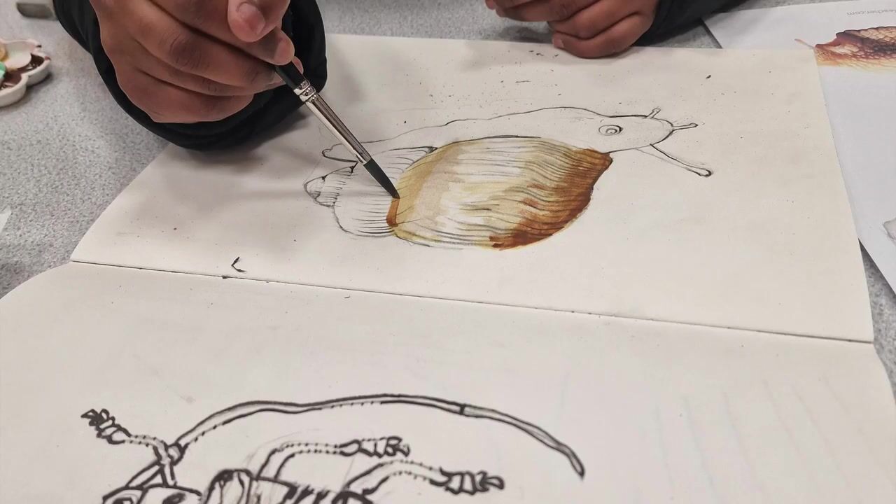
2. Materials: The materials can be
kept quite simple. I'm using an A five
sketchbook and a fountain pen for this project. You can also use a
pencil if you prefer, but I would suggest
staying away from erasers. This is mainly because
we are looking at doing quick informal sketches and
they do not need perfection. These could be
preliminary sketches, quick sketches in
your sketchbook. It could be idea sketches
where you would like to add many more things onto
the initial drawing. It can have overlapping lines, wobbly lines, and it is
far from perfection. These sketches are
meant to be raw, full of mistakes,
overlapping lines. It could have some writings, maybe some information
for yourself. It could be part of your
daily journal as well, and hence I would like to keep these sketches as
informal as possible, embracing all the imperfect lines that we are going to do. And it is also optional
for you to have a water brush and maybe just
one tube of watercolors. This is mainly for us to
do a tonal value study, which I will explain
about later. You can also swap the
watercolors with an art graph, crayon or an art graph
that comes in a tin. You can also use
liquid charcoal, ink, whatever that works
for you for a quick wash.
3. A Sketch Is Not A Copy Of Your Photo: A sketch is not an exact replica of the photograph you've taken. When you're doing a sketch, it's very important to
remember that we're not making an exact replica or a copy of
the photograph we've taken. We have the creative
freedom to add, eliminate, and change the scenes according to how we feel. So a sketch is
essentially a response to what you're seeing in
your own unique way. So let's remember that
our wobbly lines and imperfect shapes are going
to make our sketch unique. You may want to use
more than one reference for a sketch that you're doing. You can bring two
scenes together. You can eliminate details, add in details, anything
that works for you. It is not important
that you keep the exact number of windows
on a building, for example. Or you do not need to lay the bricks of a building
exactly the same way. You can make your
own wobbly lines, characteristic lines that can create character
to your sketches. In the end, these
are not going to be formal studies of buildings
or scenes that you have done. These are not recordings
of what you have seen. These are merely just a response to how you feel
about that scene. So how do we make our
sketches interesting? Let's learn a little bit
about composition and how to create them using the photographs
that you have taken.
4. Keep Compositions Simple: So how to build an
interesting composition. The key factor is to
keep it rather simple. When we look at a scene, we may feel that there's a lot to look at and we do not
know what to focus on. If you find an
interesting scene, let's focus on just one
element in that scene, which we can make as a
focal point, for example. If you find an
interesting scene, look for an object to focus on. It could be a house, an electric post,
or a tree stump. So let's say if we have a quick bushy
landscape over here, I would like this
electric pose to be one of my main focus. Next, we need to determine whether the composition is going to be a landscape or a portrait. This photograph was
taken in a portrait mod, and I like to keep my sketch
also in a portrait mode. I took this photo because I like the height of the church, the tall steeple, the
details on the facade, and the people at the
corner of the street. This being my focus, I feel a landscape
sketch will not allow me for the
details on the facade, because it'll be a
wider angle sketch. Let's take another example. This photo here is perfect
in a landscape orientation. I like the wider angle, giving the landscape more depth. The focus here is the house, but set in the
faraway landscape, it becomes part of
the scene and will look more beautiful in a
landscape orientation. If you're in doubt, always take the photo in both landscape
and portrait orientation. You can make up your mind on which is better to
sketch later on. A few trial and error
will soon help you understand the best orientation
for your landscape. In the next few videos, I'm going to show you a few tips on how I choose a
scene to sketch. As you go through this class, remember that there is no
wrong way of doing it. So feel free to use the methods that you
think is right for you. And in the end, it's all
about feeling comfortable, sketching a scene, and
practicing different techniques.
5. Do Not Divide Page Into Equal Sections: This photo is a pretty
straightforward photo. The path is off center,
as you can see, the sky area is larger
as compared to the land. So it's quite
asymmetrical that way, where there are no equal sized portions in
this landscape. And this is something I have found creates more interest
to your landscape. That is to keep your horizon line a little bit of the middle. It could be higher up. And the center of the page, or it could be lower down
than the center of the page. This is especially effective when it comes to
sketching landscapes. You can also notice these things in an urban setting as well. If it's right down
the middle like that, we are dividing this section and this section into
two equal parts. It would be more
interesting if we are able to place that line a
little bit of the middle. Like that, or it can be
a little bit further up, which means the land is
more and the sky is less, depending on what you want
to show in your sketch. This way, you can
create a little bit of interest and excitement
in your landscape. It depends on what you want
to show in your landscape. For example, if you want
to focus on the clouds, it's always better to have
more sky than the land. Whereas if you want to show
more details on the land, then it is a good idea to keep the land more and not
focus on the sky as much.
6. Keep Focal Points Off Centre: One of the first and
most important thing that I look for
is a focal point, as I explained before, and my focal point is
usually off center. So I make sure that
I almost never place my focus right down in
the middle of the page. Let's look at this
particular landscape. The photograph here itself shows that I am not a
professional photographer, and this photo just acts
as my reference picture where I can create a
landscape sketch of my own. My focus on the scene is just the path on the left and the house
in the background. However, in the photograph, I can see that the house
is too much towards the right hand side and the path is too much towards
the left hand side. And I am going to try and
find a way to bring these two slightly towards the center but not right in the middle. So for this, I'm going to create a few thumbnail
sketches to start with. So using my pen, I'm going to start by drawing a few rectangles
in landscape orientation. Let's start with four. In each of these, I'm
going to play around with the placement of the
house and the path. For the first one,
I am going to place it right in the middle
because that being my focus, let me say if I kept
right in the middle, it could look like
that's the main focus, and then I'll have the path
as well going like that. So this is a thumbnail
sketch, as you can see, it's probably very rough, just a few lines. It's informative for you. It doesn't have to look anything like the
reference picture at all. So that's my first version. In the second one, I
would like to place the house towards the
right hand corner, but not too much to the right, but something off
center like that. So again, I'm not worried about too much details at this stage. And then I'd like the path to sort of go away
from us like that. And then I have the
hedge over here. This is more or less similar to the picture we're looking at. And then we have another one where I'm going to place
it a little bit on top. Let's say the house is
somewhere over there. And then maybe have the path come straight from the house. And then finally, I'm going to place the path a
little bit lower down, and then again, off center. The path is in the same location with the shrub on
the left hand side. So by looking at this, I have a feeling I'm
definitely not going with the first option
because I do not like the fact that the house
is right in the middle. This one I quite like because it's more towards
the right hand side. There's a path that goes away from us, but at the same time, I do not like the fact
that the horizon line is dividing the paper
into two equal parts. So looking at this one, the line that separates
the land and the sky is not separating the page
into two equal parts. Instead, we have more of the
sky and less of the land. Everything else is the same. This one, we've got everything
on to the right hand side, and this area looks
rather plain. I think I would prefer
this composition, mainly because it's off center and the
horizon line is not dividing the page into exact halves and the landscape remains more or less the same. So with that in mind, I'm going to make this
slightly bigger. Again, these are
rough sketches in pen and it needn't be
anything perfect. Again, I'm going to be
very careful not to divide the land and the
sky into equal parts. Instead, I'm going to bring
the horizon line a little bit to about one
third of the page. I'm going to place the
shrubs first and the house. There's a hill that
goes behind the house. I'm just going to add, like, a very light line for
that just to suggest the hill and the big
shrub on this side. And the path that sort of winds away from us
to the left side. I can also give a little bit of lines to show that this is the field and I'm
done with the sketch. That was a quick sketch just
to suggest the composition. We looked at keeping
our focal point of center and we also look at how the horizon line does not divide the page
into two equal parts.
7. Explore Lines, Shapes & Texture: Next step is to create interesting shapes,
lines and textures. Anything you draw
can be simplified into simple shapes,
lines and textures. I feel that that's
the best way to understand a scene
and simplify it. The main shapes or the
simplest shapes that we can think of
would be a circle, a square, and a triangle. These shapes, they
are quite regular. They are very simple,
and it doesn't have any sort of
excitement to it, compared to, like, a
little bubble shape or a wobbly shape like that
instead of a circle. It could even be oval. It could have maybe one big circle and a small
circle attached to it. Instead of a square, I can have a rectangle, either this way or long way. I can even have one edge to be a little bit slanting
like a trapezium, for example, these shapes I feel are more exciting than a square, and that goes the
same for a triangle. It is always better to have a distorted triangle where all
three sides are not equal. And that sort of
creates more interest. So let's take this
picture, for example. This reference picture has this beautiful
cherry blossom tree, which if we were
to start drawing, we could just box it inside
a very rough circle. Let's put that in
there, like that. And that's our cherry
blossom tree, for example. This shape, I feel it's okay, but it could be more exciting. So for example, instead
of just a circle, boxing it in a circle, I am going to create a little bit of a distorted
shape, for example. So I'll start with a
circle and then maybe add another extra layer to it just
to create one big circle, smaller circle, for example. And I feel this shape can be a lot more exciting
compared to this one. So if we were to draw this
from this reference picture, we have the freedom to tweak it and make it more exciting. So it's good to play around with different shapes that you
can do for the trees, for example, and the foliage. Let's look at another example. Here in this reference picture, we have a roofed building
and some foliage. So when we start drawing, it's always good to think
of the box the house is in. It's always better not to
have a squarish shape. So let's start with the corner. As the top, as the bottom. If I was to make it like a cube shape, I
would stop there. Let's put the roof on top. And that's the house we have. Now let's look at a
slightly longer shape. I'm going to make the building
a little bit more longer. Now let's put the roof. And then we have the
foliage over here. Now, this shape seems to be far better because
it's slightly longer. Now, the important thing is
in the reference picture, there's also another
building to the side of it. It's like a little
extra fitting, which actually creates
more interest rather than having this house on its own
or this building on its own. So I'm going to put this little
extra fitting over there. And then I'm going to create
a bit of foliage over here. That is a lot better. It carries interest. You can actually see that
little extra fitting. It makes the drawing look more intriguing compared to
just a boxed house. You can also distort the house should we try making
the house a bit taller. I'm going to make
it a rectangle, and I'm going to enhance
the height of the roof, make it maybe about that tall. The top of the roof,
instead of having a straight line that is
parallel to these two lines, I'm going to create a
slanting line like that. And I have made the
roof a lot longer, which means that line
also gets covered up. I can make this a
bit curved up like that if I want,
creating more interest. So it's all about the
angle of the lines. So the regular box has disappeared when we have added
this characteristic roof. And then I'm going
to give a little bit of foliage over here. That's not a focus really, so I'm just going to add a
few lines to show foliage. I'm definitely going to
add that little extra fitting by the side
of this building. And now let's add the
details of this building. I'm going to create
quite longish door. It doesn't matter if that
door looks a bit distorted. Actually, that
longish door creates more interest to this sketch rather than having a
more wider study door. So again, we're playing
around with our lines, the simple shapes that
we're creating over here. I don't really mind all the overlapping lines because they're actually
adding character, showing so much of
energy to your sketch, and it's actually giving
you more confidence to explore the different
types of lines and shapes. Let's also add that little
path that comes that way, and we are done
with this sketch. So let's compare that one to our previous sketches over here where they were a little
bit more regular looking, whereas with the third version, I actually made a few
tweaks to the lines, the angle of the lines, and I made a few
tweaks to the shapes, gave more energy to the lines, and I can see that this could be a lot more interesting compared to the first
couple of versions. And all these quick
lines for the foliage, all that rendering has
actually created a texture to define the texture of different
elements in this sketch. We can actually go on and add a little bit
more texture here. For example, maybe I'm going to suggest a few of the roof tiles, but not a lot. I don't want it to
be too uniform, so I'm going to add
just only a few lines. With that, I've given a texture of the roof tiles as well. A lot of these energetic lines gives interest to the foliage. And we're done with this sketch.
8. Creating A Dominant Shape In Your Sketch: We're going to look
at how to vary sizes of elements in
a landscape or in a scene and create dominance
using varying sizes. So this example here, I have a tree and the foliage right in the
front on the left hand side, which is a dark shape compared
to the sunlit background. And that dark shape
which is dominating this picture actually creates more light in the background, drawing our eyes to
the sunlit background. So it's not an easy thing for
us to do in just a sketch, but we're going to
do a quick sketch. It could be an idea sketch
that can be developed into a painting or a
drawing much later. So I'm going to start
with blocking off that big shape
here with foliage. The big shape of the tree is actually again
sitting off center. So keeping it off center
is very important. So we're going to
sketch that tree out. So let's start with
sketching the main branches, creating the shape and
that balance of the tree. Once we have the
main tree trunk, I'm going to add in
a few more branches. I'm also going to
add a little bit of darker shape to the
left hand side. So at this stage, because
this is just a sketch for us, it's all about blocking in
the dark shape over here. This is not going to be
a final sketch anyway, and we're just
practicing sketching. So I've blocked off that
area just to give me an idea that's the dominating
shape I have here. Again, as I said, it's
sitting off center, the landscape in the background, and the landscape in the
background is much lighter, subtle and soft compared to
this big dominating shape. I'm just going to render
this a little bit just to emphasize the
light in that area. So once I make these
areas a bit darker, this area becomes
much more lighter. That's just a quick
sketch just to show how dominating shape can define
a landscape as well. And you can use this in
urban scenes as well.
9. Add Tonal Value To Your Sketches: This video, we're
going to look at playing around with
the tonal values. Tonal values are the dark
and the light of a shape, and it's very important
when it comes to depicting the form of that shape or the depth of a
scene, et cetera. The trunk of this tree
is a good example here, and you can get a sense of depth because of the
tones on the trunk. You can see the darks and the lights clearly
on this tree trunk. This value of dark to
light gives the form of the trunk its roundness
and make it really pop. Let's start the sketch of this tree and start
adding some values. For adding the values, we can use watercolor. Or ink or art graph, anything that works for you. You can still use the
pen to create values. But if you want it to be a little bit more
smoother finish and a different outlook, you can always use
watercolor media or ink. I'm going to do a quick
thumbnail sketch just to get the idea of the placement of the tree in the first place. In this sketch, we're also
going to look back at all the techniques that I explained in the
previous videos. So I'm going to make sure that
I place the tree trunk off center if it's right down
in the middle like that. It's not really going
to be very exciting. So let's do a thumbnail sketch to determine where
we want to place it. Another one, I'd like to keep it a little bit
more off center, which means I'm going to change the orientation of
the tree, as well. I'm going to make
it a little bit more dramatically slanting here. So I'll start from this corner here and then finish
off just over here. So it's a bit more
slanting that way. It's a little bit more
off center as well. Now, let's do a slightly
larger version. We can start with pen as usual. Let me start off with this
side of the tree trunk. A bit more slanting here. I'm going to use a bit
of dotted lines and very loose lines to give the
shape of the tree trunk. This branch, I'm going
to keep it over here. And there's another branch
that sits about here. And then after that, the tree is sort of quite
dark in this area. There's a lot of
foliage creepers growing on that tree trunk, which gives it more character, especially in the darker areas. And there's a bit of light
that falls on this side. I'm going to keep
the lines here, the texture here really light. Here I'm using the
texture as well. I'm using different shapes. If you think that it was really difficult to get the
shape of the tree, we can always think of
them in negative spaces. I like to look at this
little V shape over here. Then there's another
triangular shape on this side. Then there is another
slightly V shape over here, and this is what gives me the branches in the
right position. So now we've
positioned everything. I'm going to go in and
add some more details, making the branches a little
bit more characteristic. So I'm going to change the orientation of the
branches here slightly. I can't really see beyond that. That's where my drawing stops, which is absolutely fine. There's another branch
in the background, just going to suggest that. There's a lot of branches
over here as well. Maybe just a little bit
of suggestion is good. Let's move on to this side. Going to finish off
this branch over here. Again, you can see that it's
not exactly the same way. There is no hard and fast rule that it needs to be
kept exactly the same. I'm going to add a bit of uneven shapes on this
side as well just to show the foliage,
the dark shadows. And then I know there's a lot
of darkness on this side. I'm going to suggest that
with the pen right now. I can even start rendering
shading using my pen, but I wanted to try using some ink or art
graph for this purpose, and see how that works. A loose watery medium
also helps me to suggest more branches in the background with a
lightness in value. So I'm going to use
art graph for this. This is water soluble. I can just use a water brush
to create the tonal values. If you don't have art graph, you can always use just one
neutral color of watercolor, or you can even use ink
if that works for you. The watercolor doesn't
need to be in tubes. It can also be in little cakes. So because we're
using a water brush, I don't really need
another water jar, but if you don't
have a water brush, you can always use a
regular brush as well. If that's the case, you would need a jar of water as well. Now, I'm going to start by blocking in the darkest
shadows on the tree. It's always a good idea
to squint my eyes, especially just to mark out the large shadow
shapes and also to know where to stop leaving the
highlighted areas as well. I don't really want
to overwork as well, which is why I am going to
squint my eyes every now and then just to look at the bigger shapes and then
a bit lighter on this side, leaving it almost white
on the other side, I would add a few
details of texture. But not really necessary. Again, I'm going to do the same for this branch over here. It's darker on the top. This branch is
more or less dark. I'm going to leave it that way. There's another branch
that stems from here, which is even more darker. So it's all about just determining what is
dark, what is light. And now for the other
branches in the background, I started suggesting
them with pen. The reason why I wanted
to use a water media is because then I can show lighter branches
in the background, and it kind of gives you a sense that it is
in the background. It is not what is
right in front of us. When it's pushed
to the background, the scene also automatically
gets a bit of depth as well. So it's good to play around with the darks and the
lights in a sketch. And if you're sketching for the first time or if you're
fairly new to sketching, I would highly recommend using just one color instead
of lots of colors. I think I'm done with
the tree sketch as such. I can maybe add a few branches. I can continue adding as
many branches I like, or I can just give some
texture in the background, and it could be anything. Our eyes reads it as
different things. It doesn't have to be branches. It can just be something
in the background. I'm going to give
a little bit of texture here because I feel that this area
looks rather plain. In the reference
picture, there's a wall, but I don't think I am particularly interested
in giving a wall here, but instead, I would like
to give a little bit of texture and some color just
to finish off this sketch. So if that's the case, I can maybe add some
extra branches over here flowing down from
here, filling that area. I just feel that looks
better as a design. Because my focus
was only the tree, I am going to stick
to just the tree. I can just finish off
with some extra texture. So it looks complete
as a sketch. I might give a little bit
of shading to this side of the tree because it's lighter and the
paper is also white, and that's not very good to show the brightness
of the tree trunk. So I'm just going to
shade this area slightly. Very light wash over here, just to shade that area. Then maybe give some texture, branch like texture,
foliage like texture, anything that works for you. That way, when this
side is a bit darker, I can actually see the whiteness or the lightness of the
branch on this side. This is one way of
giving contrast to your background as well.
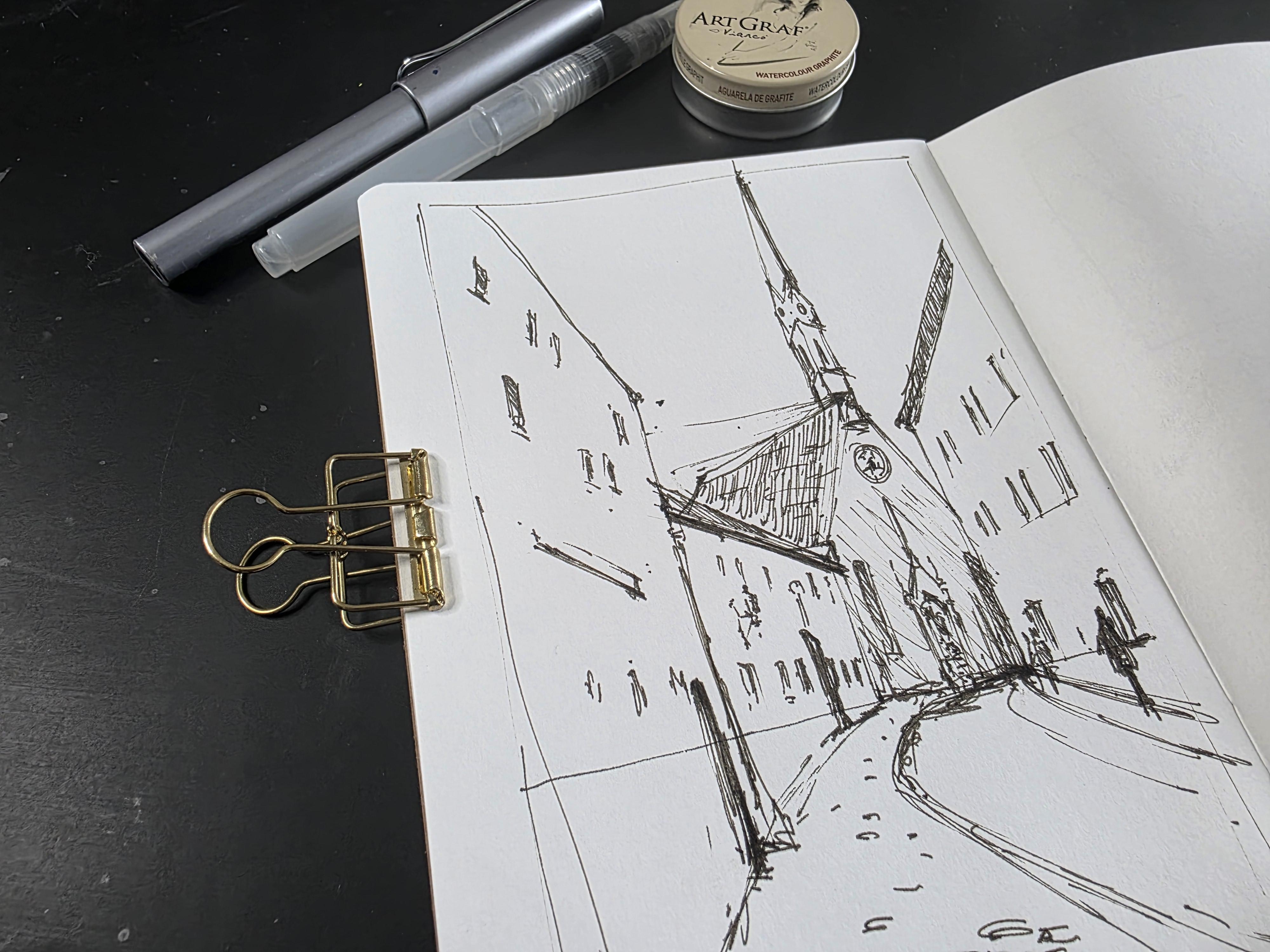
10. Project 1: Urban Scene: We're going to move
on to sketch from three different
reference pictures and using all these techniques
that we learned so far. The first picture I have
here is of an urban sketch. We can use similar techniques as to what we have learned so far, and it works beautifully
well in a landscape, as well as in an urban scene. So I like the orientation
of this photograph. It is a portrait mode. And it goes really well
with the tall buildings. The portrait mode could define the height and the grandeur
of these buildings as well. The road curves and disappears just along the corner of the
building on the right. So I'm going to use the line where the
base of the buildings are, and I'm going to keep it
in the bottom half of the page so that the majority of the area would be where the sky is and all
the buildings are, and this area here would
consist of the curved road. You can also see that in
the reference picture, the road curves away
just about here. Which is a bit off
center as well. I'm going to start with
the building on the right. I'm not too much worried
about perfection here. We're going to do a
quick informal sketch, more like an idea sketch, which you can develop later on. And the road sort of
curves along this way. And then I have all these
buildings on this side, which looks a little bit more complicated than this
simple building over here. To tackle that, I am going to determine where the rose
color building starts. The buildings are
also curving in line with this road over here. Now, now that I have the
base of the building, I am going to determine the height of the first
building over here, which is much shorter compared to the building
that's closer to us. So the first building, the roof stop somewhere halfway through
this building here. Just about there. So I'm going to make a
vertical line there, and then you can clearly see the slanting
line on the top there. And that's the start
of the next building. And if I look at the height
of the next building, it's a little bit taller
than this building here. So if I look at
the corner there, it is slightly higher
than the corner of this building. So
just about there. Just so much. And then that's the
top of the building. So we've got the shape
of the building, the height difference, and now I'm going to
place the church. The height of the church, the steeple goes
right up till here. But right till
where the roof is, I think the height of the church is somewhere about there. So I'm going to first
place the roof. And I just feel the roof is a little bit slanting
down like that. So that's the wrong
line, which is fine. I don't need to worry too
much about it at the moment. So it's slanting down like this. And then I have this
beautiful structure of the steeple
sitting over here. So I'm going to go
in simple shape so I can see a little rectangular
shape over here. You can make you can
make the steeple a bit longer if that's what you like to create more
height to the building. It doesn't have to be straight. Don't worry if it
goes a bit slanting. It just adds to the
charm of our sketch. So that's the roof, that's where this building ends. And you can see there's a
lot of overlapping lines, lot of wrong lines over here, which I'm not too worried
about because this is just a quick sketch
in our sketchbook. It doesn't have to be perfect. And the detail on
the church itself, it's too far off and
it's not really a focus, so I'm just going to do
away with a few scribbles just to suggest that there's something
going on over there. I'm going to add a
few more details to this building over here. I think there's a
roof over there, just going to suggest the roof. Maybe I can render
it with my pen. I'm not looking into the
details of any of the roofs, but I think I'm just
going to add a few lines just to create more
interest to this sketch. Now, let's add another set of windows and all the
details over here now. And here, especially, I'm going
to remember that it's not necessary that I need to include all the windows
or exactly the same way. Even a little scribble
or a squiggle can create the impression
of windows over here. I think there are
a few more windows at the top over here. There's a suggestion
of a light bulb. Again, quick scribbles. Then on this building,
let's add a few windows. It doesn't have to be
exactly the same way. It can look quite different if going to put another
door over here. I know it's very different to the door that
I see over there, which is completely fine. And I'm going to add a few
details on this building. So maybe just a few windows. Again, few scribbles. So I'm going to add the
base of this building, maybe add an extra
footpath over here. And let's add a suggestion of some people,
again, simple shapes. And I'm going to add a
bit of texture here to show the roof of that building. We're nearly done
with this sketch. All I need to do is maybe
add a little bit of shadow, loose quick lines. You can even do
this in pencil or art graph or watercolors
if that works for you. Or you can just keep it rather
simple as a pen sketch. I'm also going to
add a little bit of details of cobbled stones
here on the left hand side. Now let's look at the
sketch that we have done. We've created the focus of where the road
is disappearing. We've got two buildings, just created a beautiful
corner over there. And then we've got
all these buildings that are quite simple, and we don't need
a lot of work done on that because that's
not really our focus. Our focus is mainly
in this area, and I've done enough
details on there. And at the same time,
I would also like to draw the viewers attention
to a little bit of details, maybe suggestion of
cobblestones over here. Maybe I can take the viewers eyes right up to the
steeple over here. So I can maybe just
to draw attention, I can add details of windows. And that's all the details
I need for this sketch.
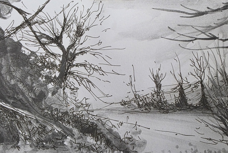
11. Project 2: Dominant Tree Landscape: Our next project, we are going
to sketch this landscape. While we sketch, I'm
going to explain and go over all the techniques that we have been
discussing so far. You can already see that the horizon line
or the line that separates the sky and the land is a little bit to the
bottom of the landscape. Somewhere about there, and it sits in the bottom
half of the landscape, and it doesn't separate the
page into two equal parts. Rather, you have more of the sky area and a
little bit of the land. And now we're going to
simplify our drawing into simple shapes,
but at the same time, trying not to stick to the regular shapes like the circles, triangles,
and squares. So the landscape
in the background, the trees the row of
trees and the bushes in the background are a
triangle, if you can see, but at the same time, it is
a longer triangle instead of a regular triangle with equal sides that itself is
an interest over there. And this sort of triangle gives you a sense
of perspective, a sense of depth
in this landscape. The same way, the path in the foreground that
disappears behind the bush creates a triangle
on the foreground, as well. Now, I'm going to move on to the large shape in
the foreground, which is the
dominating large shape that creates a lot of
interest in this landscape. Listen. I'm going to create lots of squiggly and uneven lines to create the sense of foliage. I don't want to
make it a straight triangle over here, but instead, I'm going to break that maybe create another layer
of foliage over here. Just breaking the monotonous
shape over there. And then there's a
branch that sticks out. You can suggest that as well. I can also decide what I do need and what I do not
need in this landscape. I definitely do not need a
lot of details over here. That's not our main focus, but I definitely need
the tree over here, and I would like the orientation of the
tree to be a bit slanting, just like how you can see
in the reference picture. It's slanting slightly
into the landscape, and that's exactly what
I'm trying to get here. I can use my artistic freedom, make it a little
bit more slanting. So that's the main trunk. So if you think that finding the main tree trunk and simplifying the
shape is difficult, the best way to do this
is to squint your rice, you get to see the main dark
shapes of the tree trunk. And once you've had
all the large shapes and the dark shapes
of the tree trunk, we can then move on and add
some finer details as well. So what catches my attention are these beautiful branches. So I'd like to create the
impression as much as possible, but at the same time, I do not need to look at
each and every branch. That will be quite stressful. I'm going to create
an impression, which means it won't
be exactly the same, but it would have a look and feel of the tree that you can see in
the reference picture. I'm going to add that
dark branch over here. I also like a few branches
that sticks out that way. It all starts with
a simple line, and then it's up to you if you want to make it thicker,
more characteristic. And I quite like the
fact that we are using pen right now because there's lots of scribbly
lines over here, and pen is just a great tool to create all these scribbly lines. Now I'm going to go
ahead and add a bit of scribbles for the
foliage as well. Keeping my scribbles
quite loose, creating these large
shapes as well. I'd also like to add
some value here, which is the darks
and the lights. Especially if you look at
the reference picture, you can see there
are two sets of bushes here and
there's a gap here, which is quite darker over here. I'm going to add a little bit of scribbles in between
the two bushes, just creating the
dark and the light. Quite dark over here,
but at the same time, I am not too worried
about getting each and every leaf or getting the branches
exactly the same way, but I could give the
impression of a branch over here and I can just
leave it as it is. And now moving on to some
details in the background. There's a bit of bush over here, which I'd like to add some
very loose lines like that. I'm going to keep
my pen quite loose. You can see where
I'm holding the pen higher up and I'm not
holding near the nib. This allows me to create
very loose, rough lines. In the background, we've got this area full of
trees and foliage. I'll just maybe suggest
a few trees Again, quiet loose, very soft. No dark lines here
at this stage. It's really difficult to create that sort of effect with a pen, which is why I like to vary
the way I hold the pen. So if I want a more definite, strong line, I would hold
it closer to the nib. If I would like a little
bit of loose lines, very rough outcome, then I prefer holding it further
away from the nib. I'm going to create
a few rough shapes that suggests bushes, maybe some trees
in the background. As I'm coming towards this area, I'd like to lighten
my pen lines, be even more suggestive. I'm going to do a quick
wash using my art graph. This is water soluble graphite. And I've got a brush pen, which I have filled
with some water. So the reason why I'm only
sticking to one color is that I can see the darks and the lights better
with just one color. I'm going to start by filling in the darkest areas with a
medium wash, not too dark. If you think your
wash is too dark, you can go ahead and add
a few drops of water. And then as I am working, I'm going to make a
variation between dark and light, as
you can see here. Then again, the darker
area between the bushes, I'm going to make it slightly
more darker in this area. This corner is quite dark. I'm going to go with very
rough brush strokes, and then I'm going to use more water to lighten
this area for now. I'd like a lighter wash
for the background here compared to the wash
that's going on here, so it's going to
be rather light. So you can take out
almost all of the pigment from your brush and do a quick, watery wash. And that
disappears behind the big bush. This gives the landscape a sense of dark
and light already. I'm going to add a little bit of shadows just where the
trees and the bushes are. And again, it's going to be a lighter wash on the
foreground, as well. So I've already created a sense of darkness and a
sense of lightness. I'm going to maybe
add a few lines Now I'm going to bring in a little bit of
shadow for the sky, mainly because I
want to emphasize a little bit of lightness
over in this area. I am going to do a quick
light wash for the sky. So the whole idea is that I want to emphasize
the light in this area. I am going to add a little bit of darker
texture over here, and that immediately
lightens this area again. I can also add some
branches like you can see, I'm going to add some
branches over here that frames this scene and
at the same time, creates a little bit of
variation of darks and lights. There's a bit of
darkness over here, you can actually see that it is framing the scene,
framing the sunlight, and that's exactly the reason why I took this
photograph initially, exactly the reason why I was drawn to
painting this scene, mainly because of
the sunlight and this huge tree that
was so dramatic. So just to recap on this scene, I have concentrated more on dominating this
shape over here. I have eliminated a lot of
details that was unnecessary, I thought, made sure to emphasize the lightness of
the sunlight over here. Although I haven't
because this is a sketch, I haven't really put
in the sun over here, which means I will
have to add in a lot more darker
shades over here, which I thought for a
sketch was unnecessary. I've also eliminated a lot of the details in the
background because I wanted to give
more emphasize to this shape over here and
the light just behind it. So I actually wanted to create the contrast between the dark
and light in this sketch. So that's our second
project done.
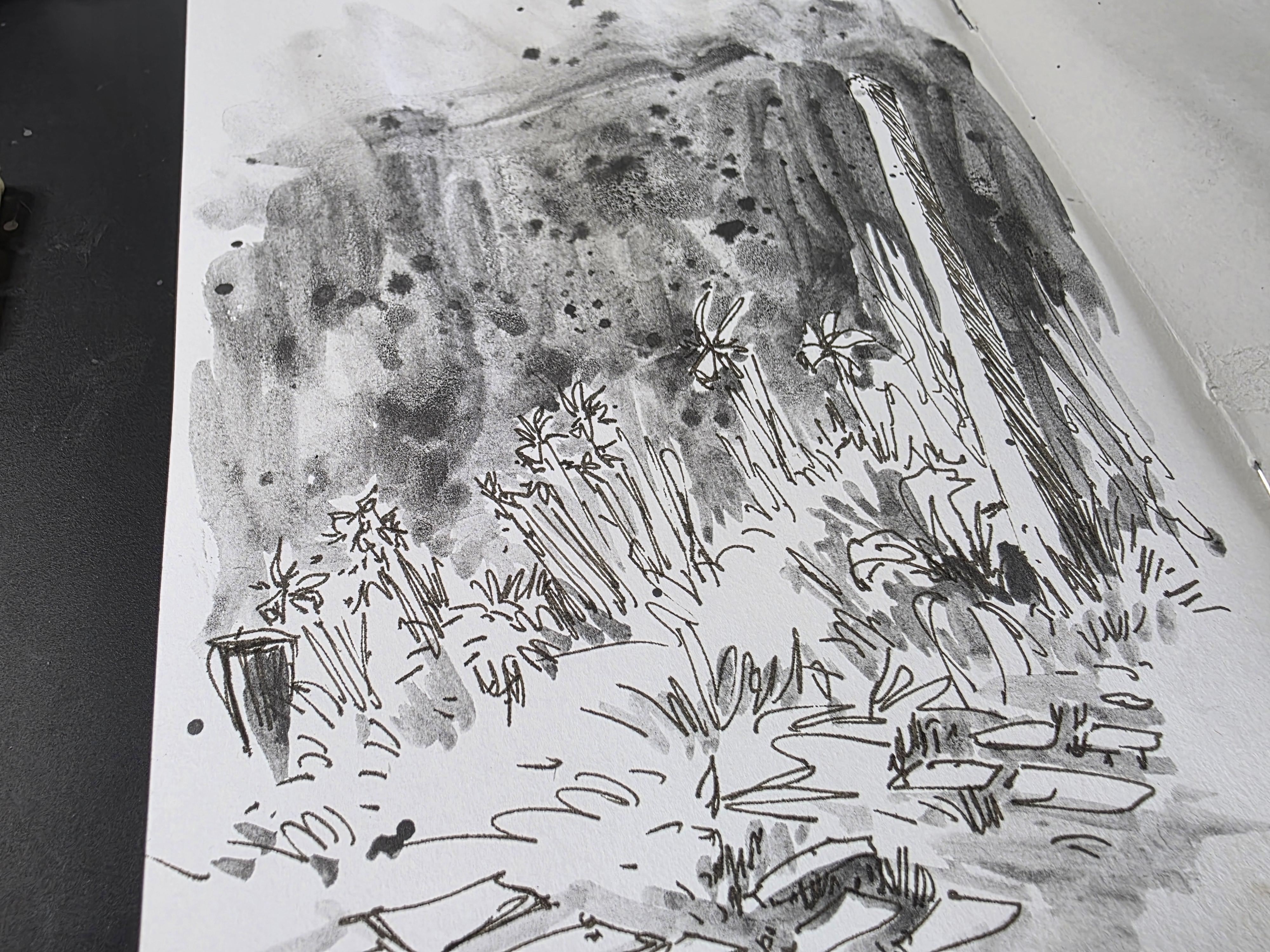
12. Project 3: Daffodils: Last project is quite simple. We're looking at some daffodils. So I am going to start
with deciding what I would like to include and what I would like
to eliminate here. The picture is
portrait orientation, and it's got a lot of things that I don't think I
need to include at all. There's a huge hedge in
the background that gives the bright yellow flowers
its charm and beauty. This can look really
good in color. But we are just going to
stick to one color today. So in this sketch, I'm only going to include the post and the daffodils and a bit of foliage
in the foreground. I'll also suggest a little
bit of cobblestones just to give the whole
thing a garden feel. The background hedge, I'm
not too worried about, as it's not my focus. The bricks in the foreground, they look very neatly laid, but for our artwork, I don't think it needs
to be laid neatly. So let's start and see
where it takes us. Going to start by adding
a stump to begin with. I like to make the stump
a little exciting, so I'm going to use
very loose lines. And at the same time, I do not want the stump
to be too straight. I'd like it to be a little
bit characteristic. So it is fine. If it's longer, it's fine if it has lots of
different lines over it. There's repetition of lines.
That's absolutely fine. You can have broken lines
if that works for you. I'd like to add some
rendering here just to show that this side
has a bit of shadow, which you can see in the
reference picture as well. Quick rendering, quick shading. The bottom of that post has
a lot of foliage there, so I'm going to add a few
lines to suggest foliage. Dots and lines, mixture of the both would create
a lot of character. I'd like to add some broad
leaves here as well. And I want to vary the type
of leaves there are here. And now I'm going to move on and begin to add some details of the foliage you can see that bush that I just added is not in the reference picture. There is, I can see a
suggestion of lavender, where the daffodils
are, but I've kind of made that shape
a little bit larger, just tweaking it
for my own liking. And then from there, I've
got the daffodols over here. Then again, I am not going to zoom into the
picture or anything, but I'm just going to create
flowers that look a bit like daffodols just creating
the impression of daffodils. And that's more than
enough for my sketch. So just little star
shaped petals, just creating the impression of a cluster of
daffodils over here. You can see how
suggestive the lines are. I am not really going to add too many details or create a botanical
study of the daffodils. I am sketching merely because I like how pretty that scene is with just groups of daffodils that post and the
dark background. So the dark background
which is a hedge, which I decided I wasn't
going to add here, but at the same time, I like the darkness in the background, which is the reason why
these daffodils are bright. So what I'm going to do is I might do a quick wash
in the background, creating that darkness, and
we'll see how that goes. Adding another layer
of leaves over here, another layer of foliage, varying the size of
the leaves as well. And I am going to add
a few cobbled stones. It doesn't have to
be regular shapes. It can be quite irregular. It can be big, small. It can be a mixture of both you can lay them
loosely as opposed to the neat brick laid here
in the reference picture. Change them according to how
you would like them to look. I'll give a suggestion of some plants here
in the background. And that's it. So
for the background, the dark hedge that is actually creating a
lightness in the foreground, I am going to suggest a bit of darkness using art graph again. So this is a bit like
negative painting. The color is there, so it creates a lightness
in the foreground. So I am just painting
the color there, but at the same time, not really worried whether it's
looking like a hedge. So I'm going to
go around shapes. Let's add some more water here. Just make sure that
I'm going only in the negative space
around the daffodils. You can see how I am just
suggesting a few lines in between the bushes in
between the foliage. That way, I am not overworking
with too much dark colour. You can see how rough and
suggestive my dark shape is, which is completely fine. As I said, we are not going to create any sort of
texture or anything. We're just creating a dark
shape in the background, so it suggests the lightness
in the foreground, and that's the only reason
why we have done this wash, and thereby I have eliminated the hedge
in the background, which isn't our focus. And I don't want to make it
like a neat line or anything. I'm going to keep
it quite loose, quite textured like that. I can even suggest some texture by spattering
into this area. Let me also give a little
bit of shading in this area. So that's just like
little suggestions of foliage in between the
lines that we have drawn. Mainly near the
cobblestone area, I would like to suggest
a bit of darkness, and that sort of brings out the lightness of
the cobblestones. And as you can see, we are finishing it quite
rough over here. And with this, we are done
with the sketch of daffodils. It just has art graph, and it suggests the
shapes of the daffodils. I just wanted to show you
why we chose this scene, why I thought this
scene was sketchworthy. It was mainly because
of the dark hedge in the background that made
the daffodils stand out. And through this sketch, I have actually created
the lightness in the foreground just by adding darkness in the background
after my sketch.
13. Final thoughts: Hello. I hope you have enjoyed creating these little
sketches and I hope that the little tips that I have shared in this
class has been helpful. I hope that you were able
to try out at least some of these little tips that we
worked on in this class. I would like to remind
you that while it is a great way to click photos
as reference pictures, our photographs may not be exactly the same way as
we wanted it to look, mainly because we are not
professional photographers. But as artists, I would
like you to encourage using your creative freedom to make sketches that looks visually pleasing from the
photographs that we took. Your sketch needn't be a replica of the
photograph that you took. So if you do not have
the right lighting or if you have elements that you don't
like to include in your sketch, that's
absolutely fine. You have the freedom
to eliminate and include things that you feel
is right for your sketch. You're sketching a landscape
or an urban scene, no matter what the scene is, I would like to remind you
that we do not need to have the same number of trees or the same number of
flowers, for example. We do not need to have bricks laid out
exactly the same way, or we don't need the same number of
windows on a building. We have the freedom to change elements in our sketch
that fits our composition. We are aiming to create a
visually pleasing composition. So we have all the freedom to tweak the photographs that
we have in front of us. So to sum up, our sketches are a response to the scenes
that we're looking at, whether it's a photograph or
you are there physically. Let's use our
creative freedom to create sketches that
are visually pleasing, interesting, and exciting. Happy sketching, everyone.
 Suzanne Abraham, Artist