Transcripts
1. Introduction: Perspective. Most
of us would not dare to sketch if
we hear this word. But what if I told you that
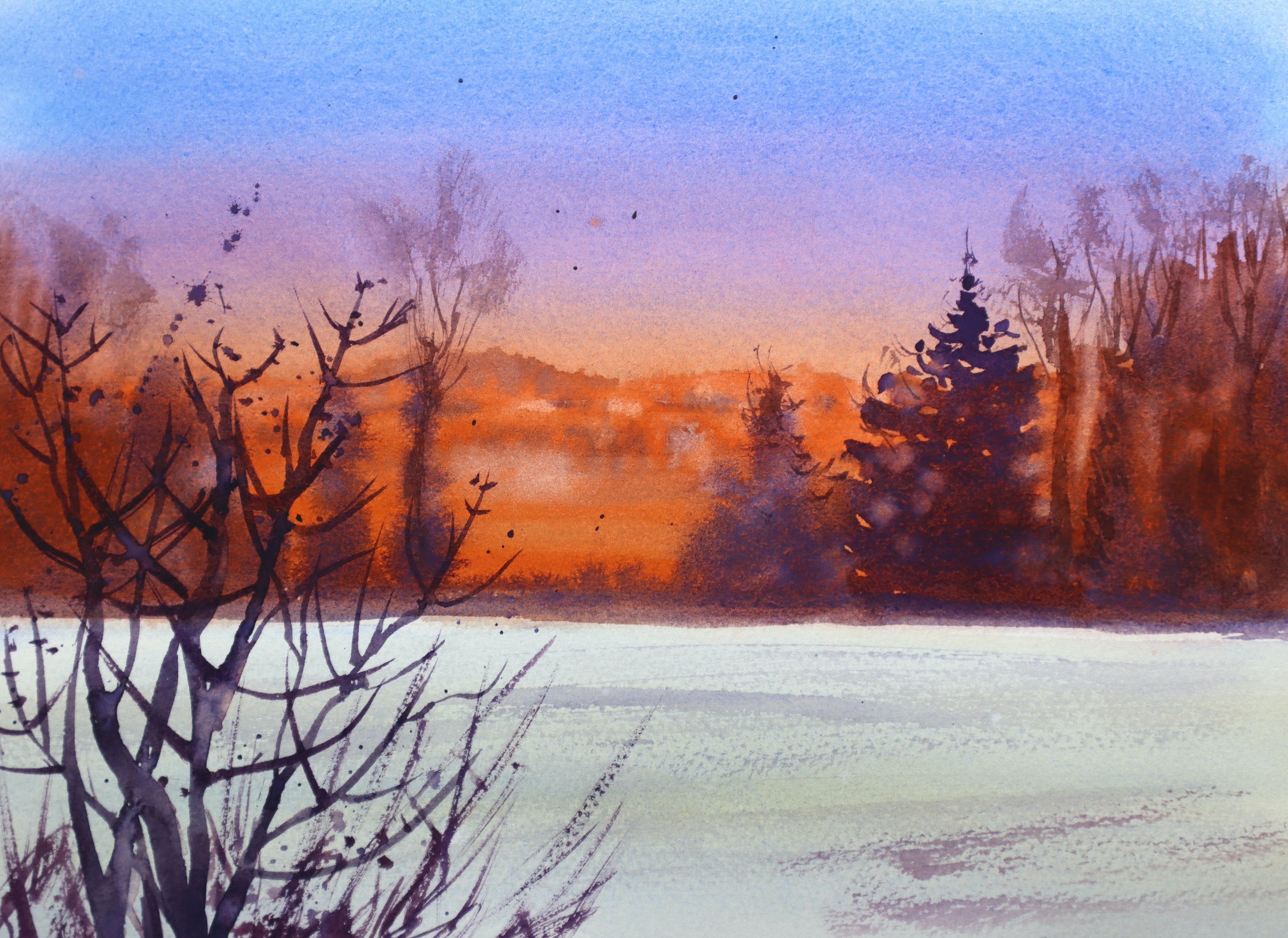
you do not need to know perspective to sketch beautiful
scenes like this or this? Hello. I am Suzanne. I'm an artist and
urban sketching. And today, I'm here
to show you how to sketch without the
knowledge of perspective. In this class, we are going
to use negative space, angle of the lines, and simple shapes to
create urban sketching. I've always enjoyed looking at urban scenes with
complicated buildings, valleys, cluster of
buildings down the valley. And last month when
I visited Portugal, I fell in love with the
landscape immediately. However, sketching the
hilly landscape with a cluster of buildings was posing to be
quite challenging, especially because I was
trying to sketch on site. What helped me the most was
to look for simple shapes, compare the angle of each
line that I'm drawing and draw the lines in comparison to the other
objects around me, looking for the negative
spaces or the spaces created between each buildings. During this class, we will practice looking for
negative spaces. We will start with simpler
objects and then move on to applying the same technique
in urban scenes as well. In addition, we
will also look at the lines that make up
the negative space. The angle of those
lines matter very much, as well as using
simple shapes to add details to the urban scenes
that you're going to do. For the project, we will work on two scenes
from Portugal. Both are very similar
because they go downhill. You can see a little bit
of the valley ahead, and we are going to work with the details that
are right in front, as well as the details that
are far ahead as well. You can do just a pen sketch
and finish off your project, or if you'd like a pop of color, you can join me to add some
watercolors towards the end. You can also use other materials to add
color if you prefer that. You do not need to stick to watercolor as this
is just optional. You are also welcome to just choose one of the
scenes to work with, and you do not need to do both the scenes to
complete the project.
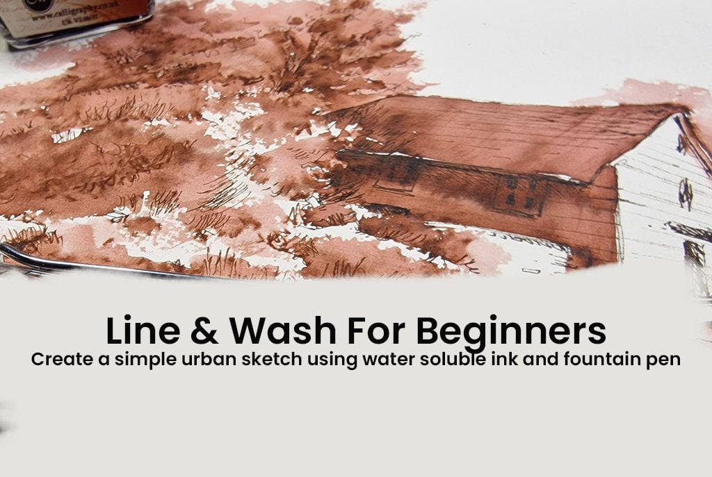
2. Materials Required: Keep the materials quite simple. All you need is some paper or a sketchbook and
a waterproof pen. The reason why we're using waterproof pen is so that
you have the freedom to do a quick watercolor wash over your sketch once
you're done with it. So here I have a
normal sketchbook, about 60 GSM thickness
for the paper. It's not very thick,
but at the same time, it's slightly thicker than
a four sheets of paper, and I think this is a
great way to start. You can also use any
mixed media paper or watercolor sheets
if you have some. For pen, I'm using a fountain pen with
waterproof ink in it. You don't need to use exactly
the same type of pens. You can use any of waterproof
pen that you may have. Finally, if you would like
to add some watercolors, you can have a selection of
watercolor cakes or tubes, anything that you're
comfortable to work with, and a medium sized round brush or even a flat brush
if that works for you. The size that I have
here is size eight. You do not need to have the
exact size of the brush. You can go up to even a size 12, depending on the size of the
paper that you are using.
3. Understanding Negative Spaces: Have you ever noticed
the space between a tea cup and its
handle or the gaps between the branches
of a tree or the space between buildings
in an urban scene? The spaces that I
just described are the spaces that are
outside our main subject. If you're drawing a tea cup, the teacup is our main subject. The space outside it
is the negative space. We are always used to looking at just the positive space that we always forget about
the space outside it. But in fact, these spaces
are what gives our objects, its form and their
exact position. Let's have a look at
these reference pictures. If you have a printout, you can use a marker pen, a pencil or a pen to just
mark out the negative space. It's just to understand what negative spaces are and
how to look for them. You can also mark them out digitally like how I have done. This is just to get an idea
of the negative space, the angle of the
lines that create these spaces and the simple
shapes that they make. Oh, if you'd like to have a
go at sketching it yourself, you're always welcome
to try it out. I have included a video where
I'm sketching this out, and you can maybe just follow the video and try
it out yourself. There's no hard and fast
rule on how to sketch here it's just about training your eyes to
look for the spaces, the angle of the lines, and the simple shapes they make. I will also explain
these techniques in detail when we start
with our project. In this reference picture, I am looking at the
shapes that I have marked out in yellow markers
in the reference picture. So I'm concentrating mainly
on the angle of the lines between the bottom
of the tea cup and the ground on
which it's sitting, as well as that mirrored D shape within the
handle of the tea cup. Now, let's look at the shape that these
branches are creating. It looks somewhat
like a diamond shape. And in order to draw
that diamond shape, I need to look at the angle of the lines that is
surrounding that shape. And eventually, I get the shape of the branches just by looking
at this negative shape. I can also do the same with
the rest of the branches. Some of them have very
difficult perspective here, and it can be easily
achieved just by looking at the space that
these branches are creating.
4. Project 1: Sketching The Negative Space: So far, we have
looked at examples like teacups and
branches of a tree. Let's try to put that
into an urban sketch. How can we use the
negative space, the angle of the lines, and the simple shapes to create a very interesting
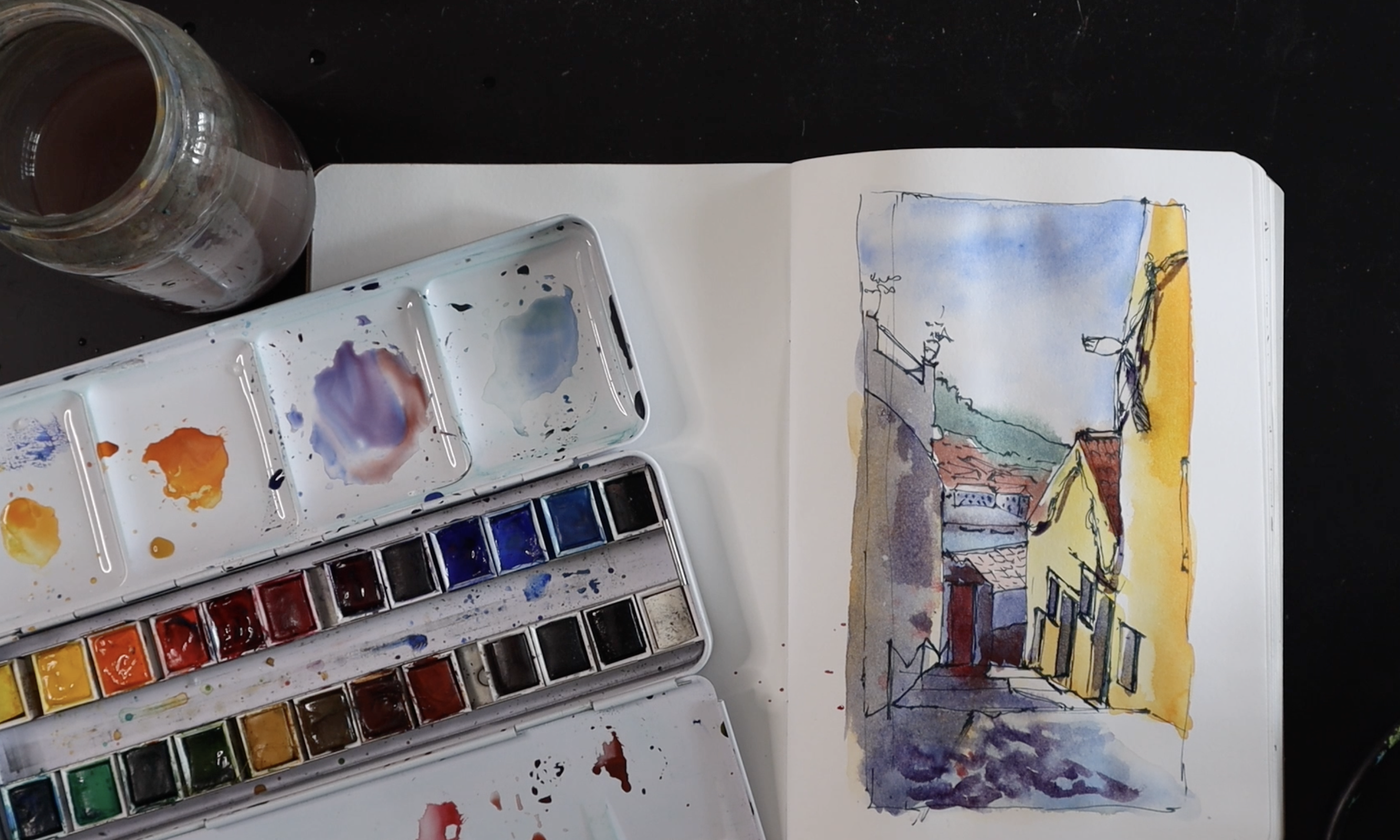
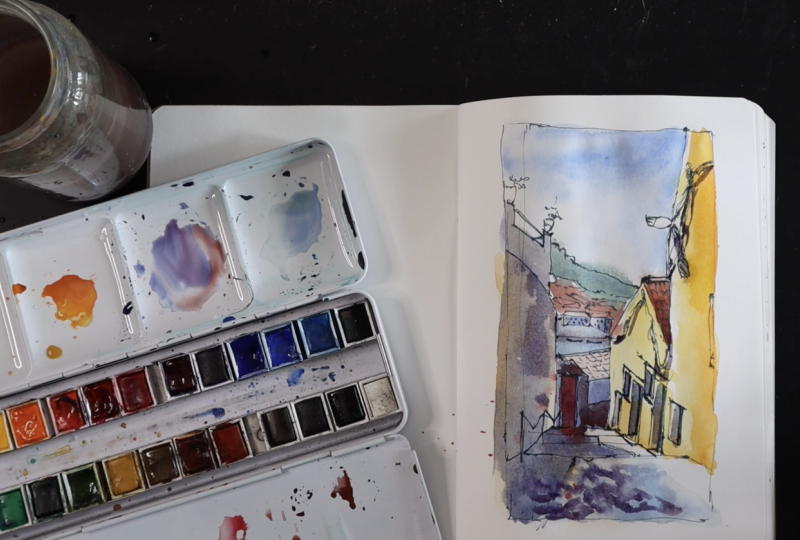
urban sketching? So the reference picture I
have here is from Portugal, and I took this photograph
while I was there last month. I particularly like this scene because it's going downhill. It's one of the most
interesting things I found in the urban
scenes in Portugal. I quite like the hilly
areas, the downhill. I also love the fact that it's a beautiful
little alleyway, and the bright yellow building
just stood out for me. We're going to try and sketch
this by using simple lines, shapes, and negative spaces. So first up, I'm going to
draw a very quick frame. So I know where to
place my lines. Yeah. It doesn't have to stick
exactly within the frame. It can go outside the frame. This is just for our guidance. And if I look at
the tall building, the yellow building
right in the foreground, it starts somewhere about there, right in the right hand corner. It doesn't come straight down. I feel it's at an angle
because it's narrower there, it's wider about here,
maybe about there. So I'm going to make a line
just about there like that. And then it goes a
little bit down and then we have the top
of the next building, the roof of the next building, which is a line horizontal. I know it looks
confusing right now, but let's concentrate on the outside lines of those
two buildings for now. So we start at the top, slightly slantingtll here, and then we've got the top
roof of the next building. And then from there, I can see that it slants sharply
down like that. And then I feel it's like a vertical line straight
down like that. That's it. Now for that horizontal
line over there, I just feel that line goes a little bit into that
building like this. And from there, we've
got a wall on the left, which is slightly
curved at the top. But the vertical line, if I compare the line's height
compared to this height, it goes slightly taller
compared to this line. And then from there,
it curves slightly. Slanting up like that. Now, you see what I mean by saying it could go
outside your frame. That's absolutely fine.
We're not stopping there. We're going to go ahead and do the building that's
just beyond that wall. So it's basically
a vertical line, but with a little
bump over here. Go straight up again, creating the negative space
between these two buildings. This is the negative
space we are looking at. Let's finish this off. That's like a little
pillar over there. Then a slanting line, and then we finish
off with a pillar. So in reality, my frame should be this wide,
but that's okay. So don't worry if
you make mistakes. We can always work around it. We don't really need
accurate lines. We need interesting lines. We need the lines that
we may have gone wrong. I think that just adds to the character of
your sketch as well.
5. Project 1: Adding Smaller Details: Now that we've got
this negative space, we're going to begin
to work with it first. So if I look here, I've got a building
that is down below. I can see the roof
of that building, and it connects this building
to this building here. It's slightly slanting as well. So if I compare the
top of that roof to the last step over here, this line is slightly slanting. And then beyond that,
I've got the river, which I think it's
a line connecting the corner of that roof to here. And then beyond that, we've got this whole area, the
whole cityscape. I'm just going to add
the outline of it. Far ahead, I can see the line connecting from the top of that roof
just about there. I'm going to use a very
uneven line to create the texture of buildings and foliage and there's some
buildings in this corner, so I'm just going to use some
geometric lines over there. We've got the outlines. Let's go into some more detail. Let's finish off this roof. That's the top of the roof. That is the bottom of the roof. That starts somewhere over
there, stops over there. There's a vertical line down. And that line, in turn, it slants up, finishes
off in an uneven line. So I've created another
building in front. I can see, there's a
different color over there, so I'm thinking that's part
of the building, as well. Let's put the rectangular
door over here. So just a rectangular
shape there for now. Well, so that we don't get too confused with the many
lines that we have here. Let's add some
texture to this roof. Now, beyond that, in the river, I can see some boats. I'm just going to give detail
of those boats over there. I can probably give some
detail of the buildings, but then again,
it's too far off. So I'm just going to add some
geometric shapes over here. Just looking at it
as simple buildings. Let's add some dots
and lines for windows, doors, whatever it could be. Then beyond that, there's a
lot more of those tiny roofs. We can't really add
each and every detail, but I'm just going to add some geometric shapes
over here that resembles rooftops of buildings. Then maybe finish
off with some lines. Now we're finished
with the landscape that we can see through
the negative space that is created by these
buildings in this alleyway. Now, let's add some details
to these buildings itself. So what stands out for me
are the electric lines, the electric wires
on this building. And that's a great
opportunity for me to add some rough lines to create the texture of electric
lines on a building. Now, there is a street
lamp, I suppose. And then this building, there the electric wires again, comes vertically down over here. And then I'm going to
create the roof now, the little detail here. Can you see the roof creates
a little triangle over here. And now let's continue
with the electric wires. It curves, it goes
up over there. And I'm using very rough lines. Just a great way of using rough lines to give
character to this building. There's a line that
goes vertically down. This shows the end of this
large building over here. I need to know where it stops. So I'm going to compare
where it stops compared to the line of this building here. And I can see that this
finishes off higher up. Compared to this
building over here, so I'm just going to finish
that somewhere over there. So it finishes over there. This finishes over here, that's going to be the
space for the steps. So from there, there
is a line that goes almost at an
angle like that, and that gives us
the first step. That's right in front of us, another step over there. Again, another line over there. We're going to give the windows and the doors over here as well. I've got a door and a window
attached together first, and that starts just below
where the electric wires are. The top of the door and
the window is at an angle, and I'm going to
create that angle. It's at an angle compared
to the electric wires. I don't think it needed to be
that long, but that's okay. We'll work with it later. To stop there for
the little window. And the door on this side. So let's create a
box for this window. So if I look at the bottom
line of that window, it is almost parallel to
the top of the window. This line comes
further down here. Now, let's look at the top of the top beam of that
door and of that window. And now let's draw the
inside of that door. So there's another
beam on the side, that's another beam, and
it stops just about there. The bottom of that beam, the line is at an angle
compared to this line, and that's how you create depth for the
inside of the door. Let's color the
inside of that door. And we're going to do the
same thing for the window. So that's the inside
of the side beam, and it creates an angle over there showing the
depth of that window. Now we've got a
door and a window. Now, just below that, maybe
halfway through that window, there's another line that is the top of the next
set of door and window. And if you look at that,
it's parallel to this line. So let's do the same thing for this door and
Window, as well. Further down at the
bottom over there, we've got another
little window as well. So I'm just only going
to suggest it with a little rectangular shape
and a line inside it, because we are seeing
it from far off. That's the only detail we
need to give for that window. Now, there's also another window on this big building over here, which is sitting a little bit lower than this
door over here. So that line again, is going to be parallel
to this line and these lines parallel line. I'm going to give some detail. It's a very simple
window over here. No beams to be seen. Just the depth of that
window is more than enough. There's also a suggestion of another window on the side here. I'm not going to do a
lot of details for this. I just need to suggest that
there's something over there. It just gives more character
to it. That's all. I'm going to look
at the bottom line of this wall over here. It starts here, and this
line is in such a way that the space between the top
line and the bottom line is larger over here
compared to this. So I'm going to place
that line in such a way that it widens the gap between the top and
the bottom line. I'm going to avoid that little
structure on the side over there because I don't want
to make it too complicated. Now for that railing,
suggestion of railing, I'll do maybe three posts, and now we need to connect it. The connecting shapes are more like it's creating an
M shape like that. So we're nearly done
with the sketch. I'm going to add
some finer details, maybe a couple of planters
at the top of this building. The railing of this
building, which again, is parallel to this line. There's another line, the
railing on the other side. It creates a little
triangular shape over here. And that way you get the perspective of that
railing correctly, as well. We just need to mark
out the shadows. The shadows are important because the way they are showing on the steps that are going down tells a lot about
the perspective, as well. And the shadow widens as it
comes over here like that. I'm going to give details
of these roofs over here. I'll just mark out the shadow of the street lamp, as well. I'll just shade it. So the wires could have gone behind
the street lamp, but I actually did a small mistake by doing
the wires over here, which is okay because it doesn't affect the
perspective of the scene. So I think those minute changes could be a unique
character to your sketch.
6. Project 1: Watercolour Wash (optional): As this is a quick wash, you only need a
little bit of water. I'm going to wet the
colors that I'll need. I'm going to go for
a bright yellow, like cadmium yellow, maybe also throw in
some orange there. I would need some red for that door at the
far end over there. You can change the
colors if you like. As I said, we're
just giving a color. You can personalize the colors that you're using, as well. It doesn't have to be
the same colors as you see in the
reference picture. And most importantly,
I'm going to have a little bit of ultramarine
blue just to show shadows. I could mix that with
some red, as well. So let's begin by doing a
quick wash for the sky. I'm just going to use
ultramarine blue here because Portugal was so warm. And I just feel ultramarine blue for the sky is probably
the best thing. It just shows how
warm that place is. So it doesn't have to
be perfect perfect. It just create a quick
splash of color. It can even seep into
other colors if you like. And then we've got we've got this beautiful hilly
area in far away. I'm going to use
ultramarine blue, maybe mixing a little
bit of green into it. So I get this bluish green. Let the colors seep
into each other. I think it's okay. It just adds to the beauty
of the whole thing. Maybe add some brown
or venetian red for terracotta over here. We've already marked
them out with pens, so you just need to give
some colour to suggest. I think that's it. And now for the bright yellow
of this building over here, I'm going to let it come onto the doors and
the windows as well. I just feel that
yellow is too bright. I'm just going to throw in some orange and some
yellow, mix them roughly. Just creates a beautiful
orangish warm tone. I'll also leave some
unpainted areas just to give some
light reflections. Give some warmer tones to
the bottom of that building. Now I'm going to
give some color for the terracotta, the roof. You don't really need to know the techniques
of watercolor here because this is
just adding some color, a splash of color to our sketch, and you don't really need to go with the rules
of watercolor here. For the wall on the left, I can see it's another type
of yellow like a pale yellow. So you can use a
pale yellow ochre or something to create
that color over there. And a somewhat similar color here at the bottom on
the steps as well. So I'm just going to add some color and add
some water to sort of make it very loose, very soft. Make the colors very
light at this stage, because I'd like to add a
little bit of ultramarine blue into this as well
to create the sort of dark patterns on the ground. I'm not going too much into this area here because
I'd like to show some light in that area
where the light is falling, where the sunlight is falling. And now for some deeper shadows, I'm going to use
ultramarine blue, just a tiny bit of red. You can use crimson
red or permanent red, anything that works
for you to give you a very beautiful shadow color. So we've already marked
out the shadows, which means I can just go
ahead and paint that area. There's also a bit of
shadow on the side here. It's not entirely bright. So I'm going to add some
more water and maybe get that color to sort of seep
into this area as well, especially on this side. I'm going to use the
same shadow color to give a quick shadow for these walls of the buildings below because I can see there's a lot of shadow
going on over there. And I'm going to start with
giving a quick shadow color, maybe a few shadows on
these buildings as well. Let's give the terra
cotta roof some color, but that is a very light color because there's a lot of
sunlight falling on it, which means I'm going
to add a lot of water to create a very
light color over there. So for the river, it is a
nice blue color over here, but it's a different
blue compared to the blue of the sky. I feel it's more greenish blue, so I might give the same sort of color compared to this far
away landscape over here, but a little bit more
blue compared to this. You can see my sketchbook is not really great
for too much water, but that's okay if you
are learning and you don't want to spend a lot of time trying to source
out the right materials, you can just create in
a normal sketchbook, it'll be okay to
hand a little bit of water because we're just doing a one layer
quick wash. Now, as this is drying, I'm going to go ahead and add the beautiful
bright red door. I'm using a azarine
crimson red for that. So because I've already added a little bit of ultramarine
in the background, and this bright red sits on top, when this bright red is sitting on top of
that ultramarine, it still creates a
muted tone over there. Maybe you can have a little bit of a spatter over
there if you like. And now let's finish off
that building over there, which is like deep brown. So I'm going to mix ultramarine blue into the
brown that I'm using. The brown that I'm using
it's not really a brown. It's called Venetian red, and it's that deep
terracotta color, which is the color that I have used for the tops of the roots. But this one I have added a little bit of ultramarine blue giving me this
really dark color. The stones or the
tiles in the alleyway. I like the pattern of that. I'm going to try
and create that. The same shadow color, which is ultramarine
blue and red, you can use that
same shadow color, maybe add some texture. Maybe just some dots and
dashes to create texture. It can be really watery, can be really lightwh? It's just creating the texture of the stonework
in the foreground. Okay, now to finish off
the doors and the windows, I'm just going to use
the same mixture, ultramarine blue
and crimson red. I'll just paint the inside of these just giving it a
quick sense of shadow. Maybe add a sense of shadow here to the corner
of that roof as well. Maybe add some texture
on this wall here. Go to add a little bit of depth for that river over there. The shadows of the light. The light as well as
maybe just adding some shadows for
the electric wires, some quick lines is
more than enough. So with a quick wash of the
scene that we have done, this stage is optional, or you can even use
another medium. You can even use ink, maybe just some charcoal, anything that works for
you if you want to give some depth to the scene.
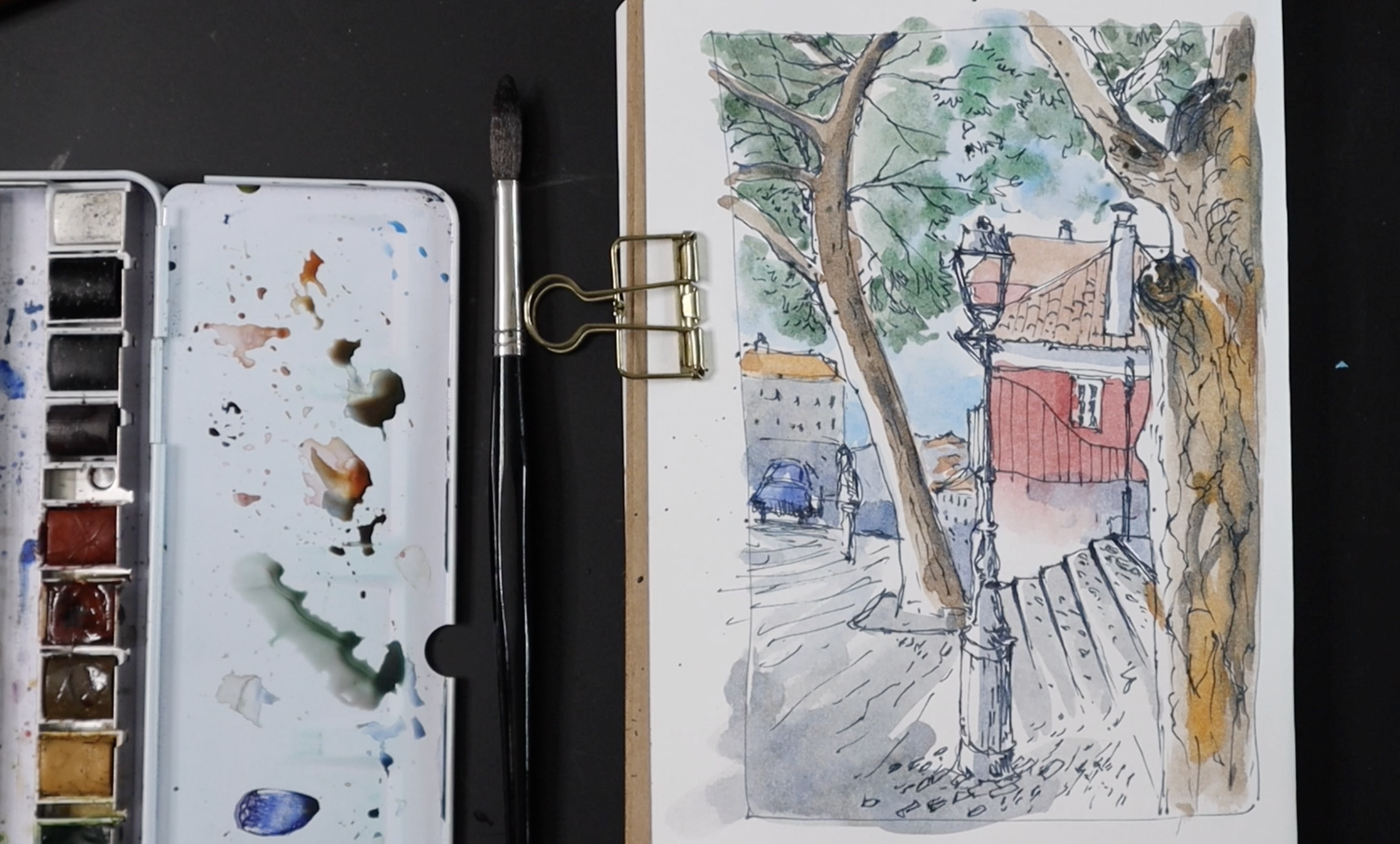
7. Project 2: Sketch The Scene: Next reference picture
is also from Portugal. I quite like this scene
because this again, is downhill, but we're not
concentrating mostly on that. We're concentrating
on the negative space created by two trees. So let's create a
frame for this again. First, we're going to do the outline or the
negative space created by the two trees. So starting off with the
tree on the right hand side, the tree closer to us, it creates a little
V shape at the top. And then we've got
this main branch that goes from the top. It comes all the way down. As it comes down,
it widens a bit. And then let's do the
rest of the tree. There's a bump here
area for the tree where I think a branch has
been cut off over there. And then let's come down. The tree gets a bit broader over here about halfway through. And then let's bring
it all the way down. Nice vertical line. And now let's look at
the tree just beyond it, creating this beautiful
curvy shape over here. The curved line starts
somewhere over there. Gently curves and finishes off. Now, I need to be careful
where it finishes off. It finishes off maybe
around this level, one third of the frame
that we created. That's the sort of
curve it creates. On the other side of that tree, we've got a few more branches that characterizes the tree. So now that we've got
the negative space here, let's finish off this tree. So it's not as broad as a tree in the foreground because it's further
away from us. It looks smaller. There's a branch over here. There are so many other
branches along the way. You can again look at
the negative space, it creates with each branches if you would like to
add all those branches. But I would suggest that not
to add all the branches, maybe stick to just
a few main ones. I curves up, there are a few
more branches over here. Maybe I'll just add
a few over here. Suggestion of
branches over there. Okay. Now let's see what's happening within the two trees. You can start by marking the street lamp because
that's in the foreground. I'm going to start by marking the height
of the street lamp. I think it's
somewhere over there. I will do a very rough
shape for the street lamp. It doesn't have to be
the exact same shape. It doesn't have to be
the exact same angle. It can just look
like a street lamp. It doesn't have to
be the same one. And from there, it's got a straight line with a few
bumpy bits along the way. And I think it
finishes off right at the bottom over here
with a little space. So now I know where to stop, I'm going to carry on and add the straight line and adding a few bumpy
bits along the way. It doesn't have to be the same. We just create character
for the street lamb. Okay, so I've got one
side of that street lamp. Going to finish it
off by the other. Again, at this stage, it's always good to look
at the outside line, the line that the contour of that street lamp rather
than the shape itself. Once you've got one side of it, it's always easy to
get the other side. So I've done the street lamp. I can just add a few more lines. Maybe some texture,
shading that in if I like, creating a bit of texture. I can definitely see that
this side is a bit darker, so I'm just going to
add some texture here. Okay, now, beyond
the street lamp, we've got this slanting, but just a bit of a
zigzag slanting line. Well, if you think
it's really difficult to capture the zigzag
slanting line, you can just go for a
normal slanting line. And that's the top
of the stairs. This line, the top
of the stairs, it's at an angle to the
tree in the foreground, and there's a line
that goes straight, and together, these three lines create a little
triangle over there, and that's how it's really
easy to get the shapes. Now, let's do the steps. The lines are parallel
to the top of that step, but as it comes nearer to us, it slightly widens,
creating a sense of depth, creating the perspective
that we need. I think I'll stop over there. The next step, I would
stop over there. Okay. Now for the building, the building itself, this
side of the building is exactly in line
with the street light. So which means I would stop this building right over there, where the
street light is. The little rectangular
shape of the building, it is somewhere over there. And then we've got
the white bit between the white section between
the red one and the roof. The roof is jutting out a bit just beyond
that street lamp. And then we've got the
slanting line of the roof. It stops somewhere over there, just giving a little
gap for the chimney, which sits right where that little bulgy
area of the tree is. I'm going to put a little
rectangle over there, maybe add some structure on
top to show some details. Now let's add the window. It doesn't have to be exactly
the same type of window. You can just have a big
rectangle shape with a few rectangles or
squares inside it. There's also a railing, which is what's actually
giving it the character, giving the building
its character. And that railing
sort of finishes off just beyond where
the street lamp is. I think I can see a little
bit of that building just finishing off
beyond the street light. There's also another
roof beyond that. The straight one
finishes off just behind the street lamp with a little
tiny chimney over there. There's also another
street lamp. I'm just going to suggest it very tiny because
it's far away. It doesn't need a
lot of details. All that is needed is a few lines to suggest
the street light. I think we are done
with the sketch. I'm just going to
finish this side. I'll just suggest a few lines, a few lines for
the cobblestones, and I'll add details of
the cobblestones there. And beyond that, I can
see rooftops far below. There's a building. I can see the roof of
that building as well, maybe add some windows,
suggestion of windows. There's also another
building just over here. I'll just suggest that
very light lines. I can maybe add some suggestion of people as
well. Doesn't have to be. But if you think it's a
bit too much for you, you can always stop just
with the buildings. There's also some cars. I'm just going to see if I can
add them as simple shapes. So I'm not great with
drawing cars either, so I'm just going to give just copy the shapes that I see
and see if that would work. Keep it really simple, almost cartoon like, doesn't have to look
exactly like the cars. We don't need to recognize
what sort of cars they are. As long as it's a suggestion
of cars, I think we're okay. Maybe suggest some windows
on this building, as well. You can also give a
chimney if you like. You can make your own make up your own buildings
if you like. These lines, you can see that these lines they go at an angle, and that is what gives
depth to this scene. And with this, we are done
with the main sketch. Now we can go ahead and add some more details and finish
this off with watercolor.
8. Project 2: Adding Finer Details: Let's add some of finer details. Mainly the branches
over here of this tree. I'd like to add a
few more branches. Again, it doesn't have to
look exactly the same. You can eliminate details that you think is not best
for your sketch. Each and every one of us sketches are going
to be different. And depending on what
you have drawn so far, you can decide on how much more details
you would like to add. And as we go along, we will also add a few lines, a few shapes for
texture of the foliage. So for the texture
of the foliage, I'm adding a few dots, dashes, trying to keep to the texture of the leaves or the foliage
of this tree over here. I've elevated a
branch that's behind this main tree because I just feel that there's not enough
space for me to work on it. And I'd like to keep
this like this. And looking at this now, I feel that this corner looks a bit odd because the shape of my tree and the shape of the roof is a little bit different compared to
the reference picture, which means that
there's this gap here, which I feel makes the roof
look like it's incomplete. So I'm going to carry on and finish off that roof
over there like that. Now, looking at
the finer details of this top of the roof here, there's a little bit of an
angular line over here just beyond the street lamp that completes the roof on
this side of the house. And now I'm going to add
just a few details of the roof on this roof as well. I'm going to go over
this straight line with a few curvy lines just to
show texture off the roof. I can carry on with
those curvy lines and add some texture
on the roof. And finally, I'd like to add a few details of texture on the tree in
the foreground, as well. I quite like the texture
on the tree trunk. They create a lot of
character for this tree. So they look more like uneven lines that kind
of join in some areas. Like that. So I'm trying to create the
impression of the pattern, I can see on the tree because I feel that gives
that tree, its character. It looks very different
from that tree in the background because we
don't have a lot of texture. There is texture on that tree, but because it's
far away for us, we're not going to add as many texture as we
can see on this tree. A for this tree here, I'm going to go a bit more
easy with the texture, maybe just a few uneven lines, and that should be more
than enough for that tree. I'm going to make this section of the steps
a little bit darker, making it look
like it's three D, giving it more depth. And I'd also like to give a little bit of
texture on the steps, giving it the impression
of cobblestones, maybe just a few
lines, few dashes. But not too much, though. I don't want to make
it look so heavy, so I'm going to go a bit easy
on the texture I give here. I'd also like to add some texture here as it
goes down like that. And the angle of these lines are definitely different to
these lines over here. And they both meet
in this section. I'm going to go with a bit more detail near the
bottom of the street lamp. Now, we're done with
the sketch from here, you can choose to keep
this as a pen sketch, or you can choose to
give it some color. Using watercolor or any medium that you personally prefer. As there is too much details, I might just give, like, a quick color wash, but maybe not stick to
the exact same colors. I will see how it goes. I would probably give, like, two colors and not make it
too colorful because already, there's a lot going
on in this sketch, and giving it too much color would take away the
beauty of these lines.
9. Project 2: Adding Colour(optional): So as I'm using a sketchbook where the paper
is not too heavy, I am not going to go
into too much details. We're going to do a quick wash. We'll start with the building. I'm going to go really
easy with the colors, not worrying too much about if it's going outside
the lines because we would like it to
go outside the lines, creating that character
to this building. I'd like this ridge
to sort of wash down. From there, so I am going to
use some water over here. Just bring that color down. We can see the same color
just behind the street lamp, where the rest of
the building is. Now, for the rooftops, it's not so much red, so I'm just going to go with Indian red or Venetian
red, whatever you have. I feel it needs a little
bit more orange to that. So I'm just going
to mix some orange. So these are my
personal observations. If you don't like your
rooftops to be that color, you can always change it to something that you
personally prefer. Different areas, different
parts of the world will have rooftops
in different colors, and you can bring
in a little bit of your personal touch into these sketches by choosing
your own colors if you like. So giving it a little bit more orange on that rooftop
that's far away. Perhaps perhaps a suggestion of the same color here in
the faraway roof as well. Now, for the trees and the
tree in the foreground, I'm going to do a mixture
of brown, bun Siena. Mixture of brown
or reddish brown and some ultramarine blue. So the reddish brown that I am using here is burnt sienna. And with a little bit
of ultramarine blue, I can vary the amount
of ultramarine blue to give different color
variations on my sketch. So I'm going first for a nice
deep brown for the trees. So as I said before, it's going to be a quick wash. Water it down a
bit more and give a very light wash to the
tree in the foreground. I'd like to add a little
bit more colour to that. So I'm going to go
back into a bit of burnt sienna and then
drop in some color. I can also drop in some orange, making it a bit more
vibrant over there. As I go along, I'm going to dip into some ultramarine blue. You can note that I did
not wash my brush here. I'd like the two colors to
blend into each other and I do not want to introduce
more water into this mixture, which is why I'm playing around. I'm going back and forth with the ultramarine blue
and burnt sienna. We can always wash our
palettes later on. But if we begin to introduce
water into this mixture, you may end up getting a really muddy wash
on your sketchbook. I just feel there's a need of more darker color over here, perhaps a bit of darker color
on top of these branches. So here, again, I
haven't washed my brush. I've just dipped into a
bit of ultramarine blue. I also have a little bit of
brown leftover on my brush, so I guess they are both
mixing together on paper. And this, I feel is a very
fun way of using watercolors to not worry too much about how much water you're adding
or what you're mixing. You can perhaps
refrain from washing your brush all the time and dip in and out of the
colors that you like. And that way, you
can get them to mix on paper without much effort. Now, I'm going to
go really slow from here and think really
carefully of what I would like to do
with the rest of the scene because I don't
want to add a lot of details. And at the same time, I'd
like some colors just to make it just not to make it too bright because right now I can see a lot of
white of the paper. So I am going to mix a
lot of ultramarine blue, maybe a tiny bit of Bnciena, you end up with this
nice bluish gray, and I'm going to use that as a neutral wash for the
rest of my sketch. And I'm also going
to leave a lot of highlights like
how you can see here. I'm going to make
it slightly more darker towards the
bottom of the page, keeping it lighter further away. That sort of gives
us a sense of depth. Now for the car, not washing the brush and going straight
into some ultramarine blue, maybe I'll just give
it some shadow. Again, I'm just going to do a quick wash around the
faraway scenes over here. If your tree is still wet, you might want to wait a few minutes before
you add this wash. So the bottom of those
buildings become darker, slightly more darker
compared to the top. Just a way of
showing tonal value, showing a bit of shadow. I'm going to show a bit of
shadow over here as well. Let that color bleed into
this mixture over here. I'm going to put a
bit of shadow here, maybe a bit of shadow
on that chimney, bit of shadow on
the street lamp. And finally, a
quick wash of blue. I'm going to use Well, I'm going to use cobalt blue for a quick wash
in the background. That's just bright
blue for the sky. You can still leave a few white areas that would represent
eventually would show clouds and into that wet mixture, I'm going to add a
little bit of green. Maybe just drop in some green. If you think the green feels too bright and you
want to mute it down, just add a drop of red into it, and you would have a
uted green to work with. Maybe give a few spatters
to finish off the foliage, and we're done with the
watercolour wash on our sketch.
10. Finishing Touches: Let's have a look at what we
have done for our project. We did two up in sketches using the concept
of negative space, angle of the lines
and simple shapes. The first sketch was of this bright yellow building
that's going downhill. We also had a set of steps. We could see a scene
far away, as well. We sketched this just by
using the simple shapes, the angle of the lines, the position of the lines, and the negative space as well. The next one was a similar
scene with two trees creating the space for our
focus, which is this house. I hope these projects were
simple enough for you. And it was optional to add a
little bit of watercolors, or you're welcome to use any medium to give some
color to your sketches. And now that we've finished these and they're
completely dried, I'm going to look back at it and see if there's
anything more to add by looking at this
sketch specially, I just feel that the street lamp is getting a bit lost
between all the colors, and I feel that it needs some pop of color to
make it stand out. In a reference picture, the street lamp is black, so I am going to use some black You can even use some
black ink to finish this off, maybe like a huge
marker pen or something to make it look quite
bold and standing out. So I'm going to use
a bit of black, or you can even use
Paine's gray as well to give a little bit of color
to this street lamp. A So for the wider part of that street lamb, you can see that I've only
given the color to one side. The reason being, I want to keep the other side
a bit more brighter. So for this, I'm going
to wash my brush, take out excess water and
just run my medium wet brush, not extremely wet brush. Just a little bit of water on the brush is more than
enough just to soften the sides of this
black line over here, and it kind of makes it
stand out a little bit more. I can also use that color for the cobblestones at the
bottom of that street lamp, just making that area
look more interesting. But I would stop there
as I do not want the color to take over
the rest of my sketch. I would like the other
color to stay as it is and just make sure that the street lamp stands
out a little bit more. Let's have a look at
our first sketch. I'm just going to analyze it and see if there's any more
work I need to do. I just realized that
I haven't colored in the planters over here. Although not necessary, I
just feel like a quick pop of color would just bring
the whole thing together. And I'd like to use a little
bit of the terracotta red. It's Indian red or Venetian red, anything that works for you. And I'd like to give a pop of green just at the top
for foliage as well. Quite like the shadows, but that's when I noticed
that the electric wires, which were black, I'm going
to give it a little bit of that same color we used for the street lamp in
the other sketch. Just maybe a quick pop of color. Again, you can use
just a marker pin, some bold color here, that's all that is needed. If you haven't used colors
at all and you still want to make your drawings
bold in a few areas, you can still use a marker
pin or a darker black ink, go over some of the areas to
emphasize some of the lines.
11. Final Thoughts: I hope you enjoyed both
these urban sketching. They are both very
similar scenes because they show a scene
that goes downhill, and it is very interesting
to see the landscape far away through the negative
spaces that we created. In the first sketch, the negative space was
between the buildings, and we were looking through it to see the faraway landscape. In the second one, there
were two trees that were interestingly creating a space between them for our focus, which was the house
and a little bit and showing a little bit of the
faraway landscape, as well. These two scenes
are slightly more challenging compared to
a normal street scene, as it is really difficult to get the perspective of a
landscape that goes downhill. However, I believe that
we were able to pull it off with just
a few tricks and techniques of using
the angle of the lines in simple shapes and looking
out for the negative spaces. I hope you enjoyed this session. I would love to see
some of your projects. Feel free to upload some of your projects in the project
and resources section. It doesn't have to be
a completed project. It can just be the
beginning of a sketch. It can be just a pen
or a pencil sketch. And you can even have some
pop of color if you prefer. No matter what stage you are at, I would love to see how
you're getting along. Feel free to ask
me any questions, and you can use the
discussion section for that, and I'll be more than happy
to clarify it for you. Happy sketching, everyone. Bye.
 Suzanne Abraham, Artist