Transcripts
1. Introduction: There's hardly any time
for me to be creative. I feel like my life is
on a roller coaster that I wonder if I can just slow down to observe
what's around me. Do you feel this way, too? Creativity helps
us to slow down, and I personally
enjoy being slow to observe people and
nature around me, to just wonder and be intrigued by the little changes
that happens around me. And this is when
I usually go for a walk or reach out
for my sketchbook. And sometimes it's a joy
to combine them both. Hello, I'm Suzanne. I'm an artist and art tutor. This class is
inspired by my walks and the sketches I
produced during that time. During this class, I
will introduce you to different techniques of
sketching using just a pencil. I would also like
to introduce you to the sketches of the great
master Vincent Van Gogh. I am highly inspired
by his sketches, and it is just a joy to see the different types of lines he used to create
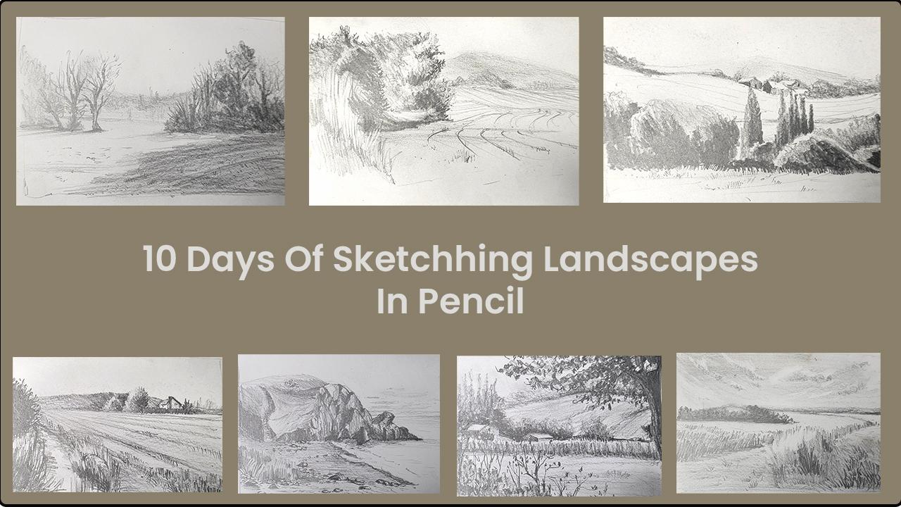
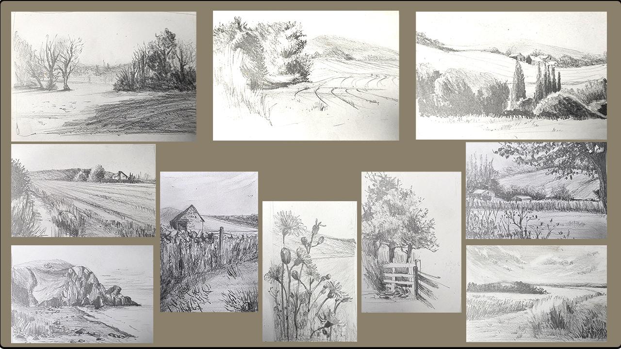
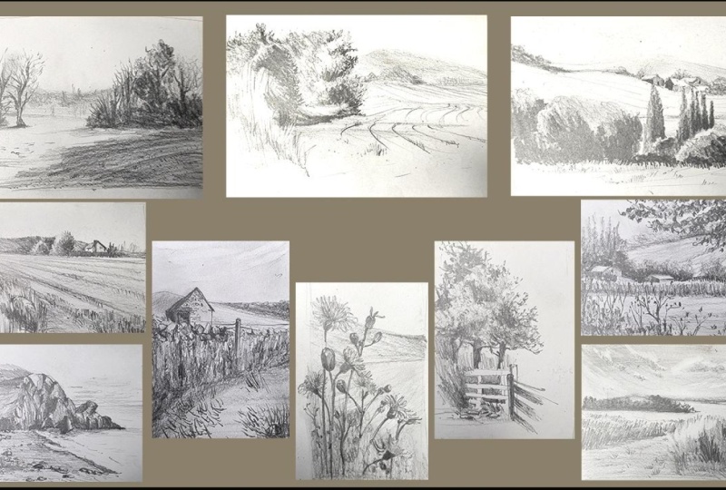
marks on paper. Then we will embark on a ten day landscape
sketching challenge where we will practice lots of
techniques that will help you to sketch with
confidence in future. At the end of this course, I hope to encourage you to start using a sketchbook
just for your personal joy. These pencil sketches are also a great way to get
back into sketching. If you've had a break and
is not sure where to start. If you're an
experienced artist or a painter who loves using color, these exercises of just
using a pencil to create value sketches can be an essential part of
planning your painting. No matter what stage you're at, I hope that this
sketching challenge helps you find your
way into creativity. This course is for
absolute beginners, as well as anybody who would like to start
keeping a sketchbook. The landscape references
that I provide in this class are quite simple with
easy to tackle shapes, and I hope that this will
help you to relax and enjoy markmaking without being too overwhelmed by
complicated scenes.
2. What Will You Learn: I believe that
landscape sketching is a great way to observe
the world around us. It is a great way to enjoy
connecting deeper with nature, and it has been quite therapeutic in my
personal life, as well. Sketching is also a way to record scenes or
make marks on paper. Or it can also be a
way to let out pent up energy and frustrations
of a busy day. A quiet walk with my dog is something that I
enjoy on a daily basis. Also enjoy carrying
a little sketchbook and a pencil with me. This has given me
the opportunity to sketch wherever I am. I also enjoy
clicking photographs of the scenes that I would
like to come home and sketch. And sometimes I like to just
curl up on my sofa or just stay in my studio to quietly sketch before I
finish off the day. This class, I would like
to encourage you to start sketching in
your comfort areas. It doesn't have to be outside or doesn't have to
be on a large scale. It can be quite small scale
just for your personal joy. And to make that happen, I'd like to show you some
techniques that you can practice and maybe carry along and sketch
in future as well. During this course, we will be sketching ten
different landscapes, one for each day, if you please. And while sketching,
I'd like to demonstrate some fundamental techniques
such as how to hold a pencil or composing a drawing and leaving
out and emphasizing some of the elements in your
drawing using light and shadow and creating an illusion of depth in your sketches. For the project, you may complete just one of
these landscapes. Or you can even come up
with your own landscapes. Something that you might be
inspired by your own work. Please feel free to share at
least one of your sketches, inspired by this course.
3. Suggested Materials: Let's look at the materials
that we need for this class. We are going to keep
it very simple. These are all the materials that you need and nothing more. All you need is a fob pencil. An eraser, a sharpener
or a knife to sharpen your pencil and a sketch
sketchbook can be of any size. You can keep it as
small as a six, if you like to carry it around, or if you want to practice techniques and you
want to keep it slightly larger and
A five is perfect. Here I'm using an
A five sketchbook, which I've already
started to fill in with a few sketches from my walk. I'd also like to show
you how you can sharpen your pencil if you're
using a knife or a blade. I'd like to sharpen my
pencils quite long like this. This is because I can
hold the pencil in different ways when
I have a longer nib. When I sharpen with
a pencil sharpener, it usually gives me
a very short nib and sometimes that restricts me from holding the pencil
in different ways. Let's have a look at how I
like to sharpen my pencil. Like you can see here, I'd like to sharpen
it with a knife, making the nib nice and long. H. Once I get a considerable amount
of length for the nib, I would then just simply go on and sharpen the
end a little bit. I'm aware that this is quite
fragile at this stage, especially if you're using
a four B or a six B. It's really easy
for them to snap. I'm going to be really
gentle shaving off a little bit of the
lead from that pencil, making a nice fine
point like that.
4. Benefits Of Using Sketching Pencils: I the pencil that I'm using
here is a four V pencil. You can either use
four B or six B pencil or even an eight B
could work really well. Good thing about these type of pencils that you can
create a light as well as a dark line with the same
pencil without having to keep changing your pencil for the darkness
and the lightness. If you hold the pencil really
softly and move it across the paper in a very soft manner without applying much pressure, you are able to get a
very light shading. Or a very light line like this, you can apply a little
bit more pressure to get darker lines, which is not possible
with an HB pencil. You can also vary darkness and the lightness in one line just by controlling
the pressure. You can start off
really dark by giving a lot of pressure on your
pencil, as you go along, you can lighten the
pressure gently lifting off the pencil to get a very
light line as you go along. You can do the same
with shading as well. Let's say we start
off really light. And then slowly,
I'm going to build pressure until I get
a really dark shade. You can do the same, you can go the other
way around as well, so you can start with
really dark and then let's lighten it out by slowly
releasing the pressure, making my pencil hold really light and airy to
get this variation. You can also overlap to create
even more darker areas, which is one thing I like about shading
pencils that you can layer it and create
darker areas if needed. Let's do some cross hatching. Let's do a cross hatching, which is much lighter as well. I can still apply pressure
over it and create a few areas with
darker shades as well. Feel free to explore the strength of darkness
and the lightness of your pencil and practice
moving from dark to light. Or from light to gently
building up the darkness, whichever way works for you. The four B pencil is that
it's four times black or six B says it's six times black and HB is a
hard and a black. There's not enough blackness as you would see in a four B.
5. Inspired By Vincent Van Gogh: I'd like to show you examples of the drawings of the
artist Vincent Van Gogh. I am absolutely inspired
by his drawings. Most of these are using
pen and ink on graphite. Although we are
only using pencil, I thought it's a good idea to just look at the different types of lines that he has used
in his landscape sketches. You can see how intricately
worked sketches these are and the way
he has used lines in different angles to
create the texture or the impression of
foliage on the trees, grass, the little
dots and dashes that combine to create the impression of the landscape
that we see here. I also like the way he has used hatching
or cross hatching. He has also used very thick or very heavy and
lighter lines as well, and this has created a sense of depth in his sketches as well. Although we are only using
just a pencil for our project, it is a great idea if we can be inspired and use some of these lines in our
sketches as well. We're going to practice
some of these lines. You can use one of these
reference pictures as your guidance to copy some of the lines from the
great master's work. So just to copy and practice a few lines from Van
Gogh's sketches, I am going to start off
with some heavy lines that eventually transform
into lighter ones. I'm going to start with
short heavy lines like these that Van Gogh has
used in his sketches. I can even change the angle of these lines to create movement. It could be something
like grass or a meadow where the
wind is blowing and he wanted to show
movement of the grass. He has used the lines
in different angles. Let's try that as well. A few shorter lines as well, just to create
texture of the grass. This is something
we would be using a lot in our sketches as well. I'm also going to incorporate
some lighter lines. I have been using heavy
lines all this while, going to move into
some lighter lines. Then I can space the lines a little bit
further apart just to show a sense of depth
in this meadow here. Then as it comes to the
foreground or nearer to me, I can even use heavier lines to make really dark
shapes and lines. Let's try drawing a tree that
we can see in his sketch. But just to get the shape of the tree, I'm going to use
really light lines to create the shape
of the tree around that trunk and then I am going to use a few
heavy light lines again. I can even include a little bit of shading here
just to show depth. I'd like to have
some darker areas in the foliage over here. I'm going to start
shading a little bit with my pencil for that, I am using the pencil like this, holding the nib flat
onto the paper. I also like to use
my fingers to smudge my pencil lines a little bit just to create a soft outcome. Now I'd like to place a few
more lines on top of this. Although I'm highly inspired
by Van Gogh sketches, I don't want it to look exactly
like Van Gogh sketches. I just want to use these
sketches as my inspiration and maybe incorporate some of his techniques into
my sketches as well. Let's also try the rocks that you can see in
this sketch here. Just creating the shape
of the rock over there, and then I can add in a few lines or even shading
to create the dark and light. So this is how Van Gogh
used his slins and I've tried to combine my style and be inspired by
some of his lines. I really enjoyed looking at his sketches and copying a
little bit of his sketch. I quite like the way Van
Gogh used to say lines. I'd also like to
use a little bit of shading as well to
create my sketches. In this class, I'd like to show you how I am going to combine these lines as well as some shading techniques to
create sketches of landscapes.
6. Practice Markmaking: So now let's look at some markmaking with my
newly sharpened pencil. As I was saying, with
a nib this long, I would be able to hold my pencil in different
ways to create texture. One of my favorite ways to hold the pencil is what I
call the grab and hold. I grab the pencil like this, put a pointer finger
near the nib like that, and I just like to hold
the pencil quite flat. This just gives me really
flat or thicker lines, which is really great for shading or creating
heavy texture. Especially if you're using
a four B or a six B pencil, you should be able to get
really dark or light lines. Let's try creating some
variation in lines. I'm going to create really
heavy or dark lines like that. Then I can reduce my pressure and create lighter
texture as well. That's one way of
holding my pencil. Another way is to
hold it normally, but a little bit farther
away from the nib. When we write, we normally
hold it quite close to the nib so that we can gain control over
what we are writing. Whereas with drawing, we don't really need
as much control, so we have the freedom to hold it a little
bit away from the nib. And this kind of helps
us to create big shapes. It also helps us to move our arm instead of
just the wrist. I always like to have my
wrist not resting the paper, and that gives me more freedom, more space to move around, to create large
shapes when needed. Let's practice drawing some
really big long lines, vertical lines,
and then we can go on and try horizontal lines. Where our wrist is not
resting on the paper, it is lifted off and our
whole arm is moving, giving us lots of freedom to make really bold pencil lines. You can also try light
as well as heavy lines. Heavy lines by pressing
a little bit harder on the paper and light
lines is when you just gently move your pencil
across to paper like that. Now, if this is quite
therapeutic for you, I would encourage you to continue creating different
types of lines if you like. It doesn't have to mean
anything at this stage. It's just playing around
with lines at this stage.
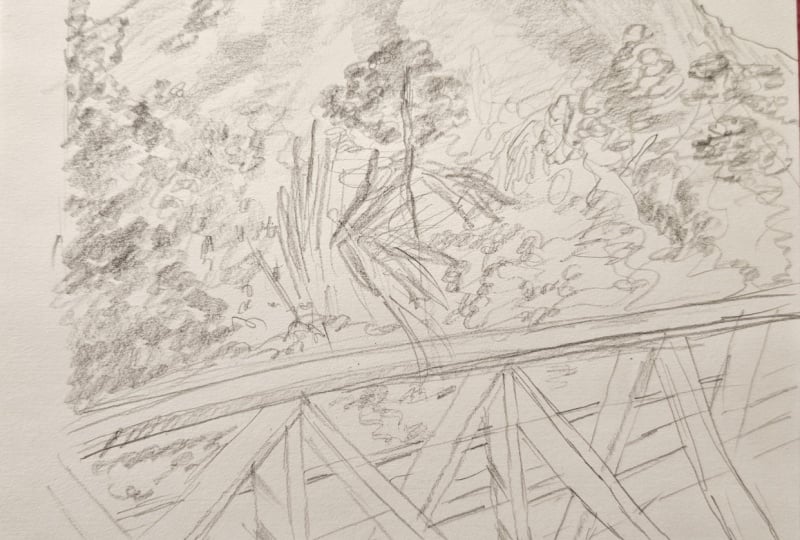
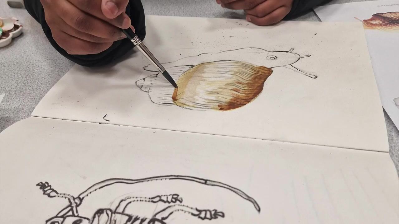
7. Project 1: Let's sketch our
first landscape. This is a very simple landscape
and here we're only going to look at shapes and
how to place them. In this landscape that
we're looking at, I can see there's
a cluster of trees and bushes on the
left hand side, I'm just going to mark
them out over here. I'd also like to
frame our landscape. Just put a rough outline around so we know where
to place the elements. Again, I'm just
going to mark out the cluster of trees and
bushes on the right hand side. On the same line, we've got a few trees. This is a winter
scene as you can see, which means trees don't
have any foliage. I'm just going to use very short lines and
very light lines to create the lines
for the branches. Because the landscape that
we're looking at has a lot of silhouettes or darker shades rather than any
shadows or details, it is easier to
tackle these than trying to create more detailed
texture of the trees. The other tree just
right next to that tree. Just going to add
a few branches, again, light lines
at this stage. This also gives me the
opportunity to erase if I think it's not the right kind of
lines that I was looking for. Whereas if you had made a
drawing quite dark initially, then it's not as easy
to erase as well. Okay, so I got the
structure of the tree. I'll come back to it with a
few more details later on. There's another tree over here. It's more bushy, so
I'm just going to use my pencil this way to create
a very light fuzzy texture. I think I'm not going to
add the fourth tree because I like to keep an odd number of trees
rather than an even number. I just feel that is more
exciting to look at. I'm just going to
finish off with a few scruples to create the
illusion of shrubs nearby. So you can see how it's slightly different from the reference
picture we're looking at. I'd like to change
it a little bit depending on how I'd like
my end result to be. And I've chosen to keep only three trees instead of the four trees I can
see in the picture, very hazy landscape
in the background. It's quite foggy. The top of that
landscape is very hazy compared to what
is nearer the ground. So I'm going to create
a very light shading. And I also like to
smudge it a little bit, so it's not standing
out so much. And I'll finish off with a much lighter shading
nearer the ground. I'm now going to
finish off the cluster of trees and shrubs that
is in the foreground. I can see here that it's much darker compared to
the background. I'm just going to
create darker lines, pressing harder into my
sketchbook with the pencil. I like to build my
darkness step by step. Instead of going completely
dark in the first go, I'd like to build a
few scribbles just to create texture of
the foliage there. Then once I'm done with that, I can add on some more darker
areas as and when needed. I quite like the process of
extensive scribbling like this because it's quite therapeutic for some
people and for others, it really helps to concentrate. No matter what group you are in, I hope you enjoy scribbling and creating this beautiful
texture for the landscape. Now, I'm just going to add
in some few darker details. Maybe suggestion of tree trunks, branches, I can keep going. I think I need to make
these areas quite darker because they're
completely in the shadow. I'll leave a few areas
that are a bit lighter, so it's not completely
a dark shape. It's about creating
that variation of dark and light in this area. Now, for some finer
details of some shrubs, because it's winter,
there's fewer foliage. I would need to add a few more extra lines just to show the texture of
the winter foliage. If this photograph was taken
during the summertime, this would look very different. Let me darken these
trees as well now. So just adding some
extra branches. And for the smaller or
the finer branches, I can create a very
fuzzy texture as well. It doesn't have to be
individual branches. I'm going to create
a rough texture of the branches over here. You can either hold
the pencil the normal way or you
can even grab and hold like this with the flat end of the pencil
touching the paper. I personally like
the texture that it creates when I hold
the pencil like this. But if you're uncomfortable, you can always hold
it the normal way. Adding a few fuzzy lines, just quick lines for
the finer branches, a few fuzzy lines for the shrub that's
underneath that tree, and finally, the last
tree, the smaller one. Then I'm going to
finish off with a little bit of a texture
of shrub over here. I can even smudge it so
it's not standing out. I also like to add some finer
texture in the background, maybe just a suggestion of a
few trees in the background, like how we can see in
the reference picture. Be it's so foggy, I can't really see
what's happening in the background, which is fine. I'm going to leave it like that. Just creating a
sense of depth with maybe just a very soft line. At the same time, I don't
want to make it too dark over here because
if I make it dark, then it would look as if
it's in the foreground. So anything to the background, we're going to leave it lighter. Anything in the foreground
would be a little bit more darker or in some cases
more details as well. Now let's come to
the foreground here. Just going to depict some
shadows so you can see there's light shining
through those shrubs. So I'm going to
leave those areas. Without any shading. Just looking at the
orientation of those shadows, it's angling this way. I'm going to move my pencil
lines this way as well. Then I'm going to
start shading a bit more darker on the
right hand corner. I'm just going to slightly turn the page like this so I
get the angle correctly. Long swishy lines to
finish off the shadow. I also like to give
a little bit of texture for the foreground. Maybe add just a few
lines, dots and dashes, just to create texture of the grass or the open
ground in front of us. Let's add the shadows
of those trees as well. Right in the foreground, I can even add these
really short lines just to create texture of
the grass in the foreground. A This just remembering what we saw in Vango sketches where he used
the short lines to create texture of the grass in his sketches I quite
like that idea. Now, if you look at this sketch, we have eliminated the sun in the background and the
shadow in the sky as well, mainly because I thought
it's a good idea to concentrate on how to create
texture of the foliage.
8. Project 2: Next landscape is something very similar to what we did
for the first one. In this landscape, we're
going to look at mainly the shadows on the shrubs
and how they are placed. In the photograph, I quite like the way how the shrubs are
to the left hand side, where you can make
that the focus. Then have a little bit of the landscape in the
background as well. We're going to see
how we can show that these shrubs are in the
foreground and how we can make the rest of the landscape in the background without
giving too much details. I'll start off by adding the line at the far end
or at the background. Start by putting
in that line that divides the landscape in the foreground and the
one in the background, that's at the far
end over there. From there, this is
where the shrub is. It's always good to lightly mark where the shrub or each object
in your landscape goes. That's where the shrub is. Once I know where they
are approximately, then I can begin to add in a little bit more details to bring out the
shape of the shrub. I'm not really going to worry
too much about the sky, which looks rather plain
in the reference picture. I'm just going to
concentrate on the shrub. I think I would like my shrub
to be at least this tall. I've marked it with just a few lines just to suggest where
the shrub is going, and I'm going to add a few squiggly lines to bring
out the shape of the shrub. All right. Now that's the shrub behind. The next shrub, which is a little bit darker on this side, is the one that is in front. I'm going to use
slightly darker lines compared to these lines
that I've used before. Let me finish that off. Now, if I squint my eyes
in the reference picture, I can see how this area is nice and dark and I'm just going
to mark that out now. It makes a huge
difference if I can mark out the darkest shadows,
the deepest shadows. And it's always a good idea to squint your rice so that you
don't see a lot of details. At this stage, we're
only concentrating on the shadows and the highlights. Now, I'm trying to
compare the two shrubs. This one's definitely
lighter because there's a lot of light
falling on the shrub, and this one's
slightly darker color, especially with the color
of the leaves as well. This is more yellow if
we were to use color, but because we're only
using um, pencil, we need to think in
terms of light and dark to create that sense of
depth in the sketch. I feel that this
shrub is a little bit more slightly more darker
than the shrub behind it. You can even use your
fingers to smudge. So you get a very
soft outcome as well. And again, within this shrub, I can see slightly darker areas. If I squint my eyes,
I can see that. That is definitely darker. So I'm just going to add
a bit more darker areas. You can see how I'm holding
the pencil like this. It's a bit like using
a brush where you are not entirely in control
of what you're doing. So the really dark area just
going to press down and create that really dark area
at the bottom of the shrub, I sort of follows along over
here as well, those shadows. I'm just going to try
and create a little bit of roundness or depth into
those shrubs over there now. There's a bit of shadow here as well on the other shrub
that is behind this one. So in this sketch, I feel that it has helped me greatly because I've looked
for the darker shadows first, Mark them out, and
then I'm going to look for the less
darker shadows. So that's the darkest area. Just outside that area, I can see an area where it's a little bit lighter
but not as bright. So I'm going to create that tonal variation from
really dark to slightly lighter and then finish off with just a few extra lines
for texture like that. Let's do the same sort of technique in these
areas as well. So that's really
dark area over here. And I've got this area
that is not so dark. That's the mid tone area, and then we are moving
outside that area where it's a lot more lighter
and you can see my pencil lines are a bit
more lighter at this stage. Almost like little
squiggles in some areas, leaving that white as well. I can see because there's bright yellow leaves
on this side, and then there's a little bit of greenish color on this side. I feel when it comes
to gray scale, if you think that in gray scale, I feel that the green is slightly darker than
the yellow area. If I've left that as almost white with
little scribbles in it, I can create a
slightly darker tone for the green area over here, and that way I can
get that variation in the shrub over here. Just to finish off just a few more variations
of light and dark. It's always good to stop and
look back at what you've done and then you can make a decision of where you
want it to be darker. Sometimes if you're looking into your reference
picture too much, you get lost in looking
for the dark and light. This stage where I've
marked out everything, I'd like to start looking
at my reference picture. Now look completely at
my sketch and think, how else can I make these two
shrubs look more rounded? It might be just a few
tweaks here and there that could make a huge difference to making the shrub
look more rounded. Okay. I think that
looks okay for now. I'm going to add a few
details in the foreground, this tall grass that is sitting
at an angle to the shrub. I think it's sitting
at this an angle. The shrub is like this and the grass grows in this
angle and I'm just going to try and
add some long lines to create the texture of
the grass that I see. It's a much lighter color compared to the shrub
in the background. I'm just going to add only
a few lines at this stage. At the bottom, I'm going to add slightly darker just to show the green color and then finish that off with some rough lines to show
the texture of the grass. Just to depict the ground, I'd like to use these
horizontal lines. I can even smudge it because
I quite like the gray scale. Creates a nice atmosphere
to the whole sketch. Now let's add some details
in the background. We've got this little hill a little green hill
full of foliage. There's a nice red shrub
right in front over there. Again, that's not
really a focus, so I'm only going to create those shapes and then maybe do a very hazy shading just
to create the mood. I don't want that
hill to stand out. I'd like it to just get
absorbed into the background. But at the same time,
I might add slightly more darker shading for the
shrub in the foreground. It's also just a good way
to bring in some variation. This photo was taken
right after the harvest, and you can see that there's nothing else
growing there right now, but you can still see the rows of crops that used to be
there by these lines. I'm just going to make
those lines very faintly. Again, not our focus. I'm not really bothered about adding too many
dark lines at this stage. I've got this very
faint lines that runs from that hill all the way to the middle
ground over here. And in line with
the perspective, as the lines come near
to here, it widens, whereas they are
going to be quite narrow right near
where the hill is, and this gives you the
perspective you need for this landscape or the depth you need
for this landscape. There's a little
raised area over here. You can see by the lines
that are going on from the bush to this line over here. You can see how the lines are
sort of widening as well. Just creating some. It doesn't have to look
exactly like how you see in your picture as long as you can create
that sense of depth, a little bit of perspective, where the lines are
narrower further away from us and it widens
as it comes out. I just want to
create a little bit more of the beautiful lines. It just makes a huge
difference just to have lines. It creates a lot of depth. You can see just by adding three levels or three
sections of lines, it has created a lot of
depth for my sketch here, some texture of grass
here if I need. Again, this is not
really necessary, but if you want to
add more details, you can just break these
long lines by adding a few smaller lines to create the texture or
the impression of grass. If we look at our
reference picture, you can see how the
front shrub is a little bit lighter compared
to what's in the background. I like to use an eraser. If you can look for a
corner of that eraser, maybe make a few lines it's going to
highlight those areas. It works really
well where there is a darker area and you want to add some highlighted
areas over there. I'm going to use the edge of my rubber and pull out or rub
out a few lines like that, and it breaks that dark shape, giving me details of some
grass in the foreground. I also like to bring in a little bit of highlights
in these areas as well. I'm just going to lift
out using my eraser. This is why it's necessary
to have an eraser. Holding my pencil in a
more conventional way, I'm going to add a few
details of those shrubs, just a few squiggles to create finer details
of the shrub. I
9. Project 3: Our next sketch, we are
going to look at how we can add or eliminate a few
details in the background. We're going to think
about what we can keep or what we can
modify for our sketch. This photograph, again, is
very similar to what we have been referring to for
the past two sketches. I'm going to start off
by looking at what I can include from this sketch. I quite like the depth, the things in the background
that defines this landscape. I'd also like to emphasize
a little bit more on the shadows of the
trees in the foreground. I'll start off with a very
rough outline just to suggest where I would
like my landscape. This kind of gives me an idea of where to place elements
within the landscape. The foreground, which
is the dry grass, I'm going to keep it
quite low over here. And then we've got
a row of trees. We can only see the
top of the trees here and they look more like
shrubs at this stage. I'm going to add the
first row first, so that's the two large
shrubs or the trees. Then we've got
some taller trees, maybe poplar or something
in the background. On this side, the
trees are a lot more bigger and they are
in a continuous line. It looks like a row of
shrubs at this stage. I'm just going to create
a very rough shape just to show how long they go. And then I can break it into
different areas later on. Let me just place some taller trees or maybe just the shape of those
taller trees at this stage. You can see how light
my pencil marks are. Then from there on, there's I think there's a few shrubs or trees in the background
over here as well. That's two layers of
foliage over here, and then from there on, we have the background. I'd like to bring this
line of the valley quite low and it disappears
behind these trees. And then I've got the
next level of landscape where I can add a little bit
of a hilly area over there. I've got some shrubs or trees in the far in the
background over there. Then there are some
buildings in this area. Which I'm going to
add, but I'm not going to add all of
these buildings. I'll probably add just a few. I'll leave that space to add
the buildings a bit later. I'll finish off this maybe
another hill over here. Again, it doesn't have to
look exactly the same way, so I'm just going to create what looks best for my sketch. I think I've created
that sort of depth with these hills in the background, and now I'm going to start
adding some more details, just making those shapes
a little bit more darker, making more sense to this landscape that
I've sketched now. So I'll first start with
adding a few buildings. Not as many as I see in
the reference picture, but maybe just a few to suggest some
buildings over there. So whatever fits my valley, that's what I'm going to do. That's a little barn or
something over there. Maybe I can add some similar looking
buildings over here as well. I can maybe add the rooftop and offer
another one over here. And it sort of hides
behind those trees. And then maybe one last one
at a higher level over here. I think that looks okay for now, and I think I'm going to stop
with just those buildings. I'm not going to add each and everything that
I see over there. Let's add a few more details.
Maybe I'll just make. We don't need a
lot of details for elements that are far
out in the background, so I'm just going to try
and add some shadows just to show a little bit of
depth in what we're doing. Maybe add a little maybe I'll just add a little
line to suggest door. That's the roof. The roof is going to stay white, but everything else
I can probably a darker shape to show the
side of that building, which is hiding
behind that valley. I can maybe show some shadow on this side of the building,
this barn as well. Quite dark. It's all in
the shadow, I guess, and then I'm going to add some shading to building the side of this
building as well. I'll leave the roof white again. Now what's in the background? Probably add some shadow again, maybe a window or something just to suggest that
it's a building. Again, I'm going to leave
the rooftop white for now. I'll see if I need to add
anything more later on. Just suggestion of shrubs
in the background. Adding the shrubs just
near the roof also helps me to keep those roofs
quite highlighted. Then these trees over here, again, I'm going to
keep it quite light. I'll just darken the bottom
areas of these shrubs, creating a variation
with that now. This is all the shading
that would need. I don't really need to add any more details to those
shrubs because it's in the background
and we don't need a lot of details for
what's in the background. The hill in the
background, again, quite light shading or even left to almost
no shading at all. It's just a suggestion
of landscape far away. I'll now begin to
add some shading or some value to the
trees in the foreground. It's all about getting the
dark and light in this sketch. That's the shrub
in the background. Darkening the inside
of that shape slightly more than the outside
to create more depth. Even with the taller trees, I'm going to add these
very hazy shading, holding the pencil quite flat. I don't really need to add
in lots of details that way. Maybe right at the bottom, I'll darken a bit more, but the top skin stay lighter. And now for these tops of
the trees in the foreground, you can see a dark
shadow on these trees. Mainly on the right side, I'll start with
those darker shadows and then I'll lighten
the surrounding areas, but at the same time
leaving a little bit of untouched areas like these
to create highlights. I'll follow the same principle
for the next tree as well. I and almost leaving a layer of untouched area here just to create
those highlights. Let's do the same for
the next shrub as well. And this contrast of dark and light is what creates
depth in these shrubs. Now for the row of
trees over here, I'll just mark out where I
want the darker areas to be slightly marking out with
a much lighter pencil line. So I'm not overworking
in these areas. All that area is pretty dark, so I'm going to start off
with really heavy shading. And then as I come to the
outside of these shapes, I will lighten my pencil
lines a bit more. So darker in this area and then slowly lightening
my pencil lines as I go outside to this area. And let me just continue that for the row of trees over here. And for some details
in the foreground, you can see how I've
created this sort of edgy shading over here. That helps me to create the highlights of the
grass in the foreground, as well, the dry grass
in the foreground. So I'm just going to be very careful to add a few
more of these lines to create the texture or the impression of the
grass in the foreground. And then just to
show a little bit of texture or little bits of
movement in the foreground, I'm just going to add a few
lines just to show depth. I can even add a few
lines like these to show the impression of
the grass in the foreground. When nearly done,
I just want to add because this area
looks too dark bright, I'm going to tone
it down slightly. I'm just going to add some
shading in the background. Maybe add a few lines
here on this field. Adding adding a detail of some foliage over here
just to break that long line. I know it's not there in
our reference picture, but I've kind of added
on a few of my elements. I've eliminated a whole area of foliage in this
corner over here. I've eliminated a
house over here, and I haven't done the
foliage exactly the same way. I haven't done the lines
of the hills the same way. But I've created my own
little landscape sketch inspired by the reference
picture that we used.
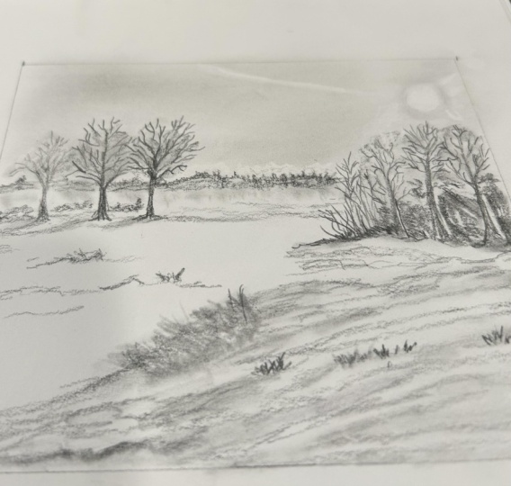
10. Project 4: Welcome to another day
of landscape sketching. Yesterday, we were looking at shading and creating
depth in a landscape. Using very heavy shading, we eliminated and added on details just to
fit our landscape. Today we're going to look at something similar
and we're going to combine all the things that
we have learned so far. We are going to add a little bit of depth into the
next landscape. We're going to add
a bit of shading and we're going to
decide what we want to keep and what we want to eliminate in our next
landscape sketch. One of the reasons why I like this landscape is because
it's rather simple. I can see those
beautiful lines that go across the field and that
gives a sense of depth. It's a great thing to
sketch, to be honest. I also like the little house that I can see in
the background. Which I'd like to
bring into the picture and make it one of the
focus of the landscape. Here we are also going to
think about how we can create a landscape sketch
that is visually pleasing. I will start off
by marking where the field ends and where
the background begins. When I divide this landscape into the foreground
and the background, I don't want to make
two equal halves. Instead, I'd like to distort
that a little bit and maybe make foreground a little bit larger
than the background, which means I am
going to compromise on the space where the sky is. I'm not really concentrating
too much on the sky. I think I'll keep the sky
pretty small over here. I'd like all the details of the landscape in the
foreground here. Also, I've got that little house which is on the
right hand corner. In the reference picture, it is to the far right hand corner. I would like to bring
it a little bit inside, maybe just about here. I'm going to place
that house over here. One of the features of this
house that I particularly like is this tall chimney that creates character
to this house. Maybe two windows over here, another one over here. I lightly shade the roof, but not too much. I'll maybe give some color to this side of
the house as well, but I'll leave this side white just to show light
falling from this side. I'm going to bring that line a little bit down
over here so I have enough space for the shrubs and the greenery
around the house. That's a little shrub or a green shrub, which
is pretty dark. I'm going to create that
darkness here already. So because we're just
using the pencil. We are looking at each shape in terms of lightness
and darkness. Because we're not using any other color but
just one color. This is a great
exercise if you like to practice the lightness and
the darkness in a scene, and it can be easily applied
to a colored sketch as well. You can see how
scribbly my lines are. Very little details here
because it's far off. Although I cannot see
a lot of shadows in this reference picture because it was taken on a moody day, I still like to bring in a little bit of
lightness and darkness or value into this sketch and
especially to this shrub. So I've shaded it quite
dark on the right side, just like how I've
done with the house, and I'm lightening my
shading towards the left. There is another shrub nearby. Just to bring in some interest, I'm going to make it a bit smaller than this
big shrub over here, so I'll make this
shrub nice and big. Again, the same technique
of dark and light, bringing in some interest
into the shrub as well. I can maybe add some random lines just to suggest that
there's something else in that corner there, but that's not really my focus, so I'm not going to worry
too much about it just yet. There's a hilly area
in the background, and I can see a road that goes up that hilly area in
the reference picture. All those details are not
really necessary in my sketch, so I'm going to eliminate
those details for now. I'll just lightly shade that
hill in the background. When I shade that hill
in the background, I'd like that to be slightly
darker near the roof. The roof stands out
as a lighter shape. Just bringing in
contrast in this sketch, making things stand out
because we're working with just one color and
we really need to think about how we can
make things stand out. Then again over here, the shrub on this
side is lighter, which means the hill in the background is going
to be slightly darker. Just creating that contrast. The same way I'm going to do
that for the shrub as well. The hill in the background so
far has been a bit darker. But it's soft lines. I'm not adding any
stark lines over there because if I add any stark lines into
the background, my ice is going to
automatically look at that. Instead, I am creating these soft lines,
very fuzzy lines. You can even hold your
pencil like this, if you like, to create
the soft lines. Then as I come to the left side, I'm going to lighten
that hill as well. I'm going to start working
on the background, which is the huge field. With these beautiful lines, there's a path on the left side, which I'd like to add as well. So I think the path over here, it vanishes off somewhere there, but it winds its way to
the foreground like that. The next line is going to
start at this point again, and as this line winds down, I'm going to make this
whole shape wider, creating a sense of depth. In the foreground, I'm
immediately going to just break that line with some
lines for tall grass. There is a tire over here or you can even make it
into a rock if you like. Because I walk this path, I know that it's a tire, and I think this is just
their way of marking their boundary separating
the field from the path. I'm just going to just
quickly sketch that tire. There's grass growing
all around it, so I just need the impression, just a quick sketch
of that tire. I so here I'm going to add lines in different direction
just creating the impression of grass. Just creating some darkness in between that grass
as I go along. Very quick, rough
sketch at this stage. So I'll leave that
there for now, and I'll finish off the
rest of the field before I decide how much of lightness and darkness I need in
the foreground. There is an other shrub
on this side over here. Shrub is definitely darker than the hill in the background, so I'm going to
make it quite dark. I'm going to create
really dark shapes, dark scribbles to create the silhouette of the tree or the shrub that
is on this side. I'm also going to add some finer details using the short scribbles to
bring some character. So you can see the path is
covered by that shrub now, which is absolutely fine. That's what's happening in the
reference picture as well. I'm just going to add some lines just to
define that path. Maybe some grass along the
side of the path as well. This could look
quite different from the reference picture once
it's done, but that's fine. As long as we are just keeping that as a reference picture, we're not going to create exactly the same drawing as we see in the
reference picture. Just creating some
horizontal lines over here just to define
that path over here. I feel that it's a lot
darker on this side, whereas it goes a bit
lighter over there. I want to create a layer of graphite that starts quite
dark in the foreground, but as it moves away from the foreground,
it lightens out. And then finishes off
almost nothing like this. I can also use my
fingers to smudge that, create even more softer
outcome over there. And I'm going to add a
few lines in the fields, as you can see in the
reference picture. This is just to
bring in some depth and add some character
into that field. And if you look at the
reference picture, you can see that all
these lines join or meet at a point just
beyond that shrub. And the lines, when
they come closer to us, are wider, as you can see how
I've marked in the sketch. And this sort of creates
an illusion of depth, the sense of far and near. Then as I'm working on these, I can also add a little bit of details maybe make these
lines a bit darker, but yet keeping it quite soft, adding some short lines to depict grass in
the foreground. Sometimes it's good to change the angle of the grass as well, so you get more
natural looking grass. Grass that surrounds
the tire looks much lighter compared to the
field in the background. I'm going to use an eraser
to lift out some lines. Then as I'm doing
that, if I go in and darken the
areas beyond that, keeping that lighter,
it's going to create an illusion of light
grass in the foreground. It's all about bringing in that contrast between
the dark and light. And I'm nearly done with the sketch, and all that is left
to do is to add in a few lines to create a
focus around the house, just like the roof of the house, maybe just a few lines
to define the shrubs. I'd like to use
my eraser to lift out some highlights
on those two shrubs, just making it stand
out a bit more. And I think we are done
with the sketch now.
11. Project 5 Part 1: Hello, welcome to a
new day of sketching. I hope you have been enjoying sketching landscapes so far. We have been looking at simple landscapes with fairly
muted color all this while, and now I have brought to you a landscape with a lot
more brighter colors, and we're going to see if we can still work out the darkness
and the lightness. There's also a dark shadow on the fields in the
foreground as well, and it is a lot more
interesting to shade. I quite like the contrast between the light
and the dark here, like the contrast between the
yellow and the green here. I'm going to go for a line which sits slightly
above the middle. That's going to be the sky, that's going to be the
foreground with the fields. At the top left
of the landscape. I can see there's
a little bit of hilly area or just an
area with lots of trees. Because we don't
know what that is. I'm just going to
follow the shape. It's a very shallow hilly shape it doesn't have to look
exactly the same way. You might want to make it much taller if that works for you. I think there's a
lighter hilly area just about there as well. There is a structure over here. I'm not sure what that is, but I quite like to convert that into an electric
post or something. Where the horizon line is, there's a little bit of a landscape right at
the back over there. Then the yellow field and the green field
are separated by a footpath in the middle. You can see that line
that follows along, starting from that background, the horizon line, it curves. It comes all the
way to the right, it curves a little bit, and then it finishes
off in the foreground. It's always good to
look at what shape this line and the outside
of the picture creates. That way you can get
the part accurately. It comes all the way to the
foreground here and we've got a large area of uncut
grass in this area. Another line that comes
out on the other side over here and finishes off on the
left hand side over here. And that way, we know that
this is the green field, plus the yellow field. But obviously, we're
not using color. So we're going to figure out
which is the lighter area, which is the darker area. I'll start off with
the background, which is the easier areas. In the background, you've
got this hazy landscape, the hazy hilly area.
Going to do that first. While I'm doing that, I'm just going to
look at how dark it is compared to the
fields and the foreground. I feel that it's
definitely darker than the fields in the
foreground in this area. I'm just going to
shade that first. I just feel the bottom of
that is a lot more darker. I'll just scribble a
few details in Now, I can see that there's a dark shadows
somewhere about here. It follows all that grass. It falls on this grassy area and it continues to this
side of the field as well. I'm just going to mark that out. I know that's the dark area, that's the light area. I can even shade it lightly. A Let me add some grass for details. At this stage, we
can just suggest it. We'll come back for
details much later. Very light pencil lines to
create the lines of the grass, the tall grass over there. I definitely know.
If I squint my eyes, I can see this area is lighter, whereas this side is darker, definitely that shadow
falling on there. I just continue with a
few more lines over here. You can still see that
it's not as dark. I haven't applied a lot
of pressure on the paper, so it's just layering of another set of scribbles over
the first layer of shading. I think at this stage, this is more than enough. I'll just come back to it later. Once I've marked that out, I'm going to work on the lighter area of
the field as well as this area where there
are lots of trees. I can definitely see that
this area is pretty dark. I'll start off with
shading the dark areas. I can add another darker layer
if it's not dark enough, much later, but for now, I'm just going to add the shape. Applying fairly a good amount of pressure but not too
harsh at this stage. I'm creating dark
shapes over here. And this little hilly
area is much lighter, as you can see in the
reference picture, so I'm going to leave
that lighter for now. Anything else around
it is much lighter. I don't think I need to create a lot of
shadows over there. I can just gently rub with my fingers just
smudging that area, but I like to keep that area
quite light at this stage. Now let's add some details. Just emphasizing a
little bit of that path over here or the separation
between the two fields. And towards that
curve of that path, I'm going to add a little
bit more deeper shading, maybe just some details
of grass, as well. The grass also follows
the line of perspective, making it a little
bit more taller as it comes to the foreground. I'm going to repeat
the process again on the left side with
the green field. The blades of grass
are more prominent. I can also see that they
are angling away from us, and I'm just going to create those lines just by
adding slanting lines, making it more characteristic. And this is something
that we have observed a lot in
Van Gogh's sketches. Another way of showing depth in that green field is to
create shorter lines for the grass that goes
further away from us that moves further towards
that little hilly area. So I'm going to create
shorter lines nearer to the hilly area and also place them
slightly further apart, or maybe just add a few squiggles or just
a few dots and dashes. Maybe add a few scribbles
to show a little bit of texture of the
shrubs over here. I can show a little bit of texture in the
grass in this area, the wheat fields here as well. The texture is more
coarse because you can see that the wheat
field has been harvested. Especially in the foreground, you can see how the grass is more stubby, more
thicker looking. Going to add some darker areas. There's a mixture
of dry as well as green grass in this
stall uncut area. I can represent that by adding some darker grass and leaving a little bit with
lighter areas as well. Obviously, pretty light
over here in this area. I am going to use my eraser to create that illusion of
darkness and lightness here. I'll place all the darker
areas here for now. And then using the eraser, I'm just going to lift out or erase out a little
bit of light areas. Just a few lines over here to
represent the wheat fields. I can maybe add a little bit
of texture in the foreground here to show the path that
is falling in front of us. Maybe some horizontal lines
in line with the path. Maybe a few straws of grass
sticking out here and there.
12. Project 5 Part 2: Still have this
expanse of the sky, which we haven't done much. We haven't done the sky in
any of our landscape so far. I was thinking maybe we could
give the sky a try now. Again, we are looking
at a bright sky with clouds in it and we know that the clouds are much lighter
compared to the blue sky. I'm starting off with a very
hazy shading for the sky. I like to create it as fuzzy as possible without
much pencil lines. I'm trying to smudge it as I go along the clouds are
placed in a curvy angle, just showing the depth
of that sky as well. I'm trying to
create pencil lines that shows the depth
of the sky as well. Then once I have that light
shading going on there, I can always add clouds by
lifting out using my eraser. The clouds also have shadows. I'm just going to go in and add some shadows to
the clouds as well. This is a step that is
optional if you want to just keep the clouds just
like how you can see, right now, it is fine. But if you want to
add a little bit of shadow to those clouds, that's also a great idea to
make it look more realistic. So clouds are definitely more darker than the bright blue
sky in the background. It is good to add a few fuzzy shapes for
the clouds anyway, along with lifting
out with the Emaser. I don't want to
overwork it too much. I'm going to stop there for now. Just like that, our
landscape is completed.
13. Project 6 Part 1: Welcome to day six of our
landscape sketching challenge. We're going to move on
and do another landscape. This landscape is a good example for details in the foreground. As you can see in
this landscape, we've got a tree and it's foliage that's
framing the landscape. On the right side,
we've also got a few wildflowers in
the foreground as well, and we're going to see if we can add such details
to this landscape. As always, we're going to start
with a quick rough frame, so we know where to place
each and every element. Once I have that, I'm
going to start marking all the things like
how we have been doing in the past
few landscapes. You can start at
any stage really. Some people might like
to start with framing. By using the tree in
the foreground and then begin to add the
elements in the background. Another way to start is to
start with the elements, the bigger shapes and the
elements in the background and then finish off by
framing with the tree. I'm going to start by
the larger shapes or just demarcating the different
sections of the landscape, mainly starting off with the line that separates the lavender field
in the background. And it's the same line where the buildings are
situated as well. I think I'm going to place it. This is about the halfway
mark of this whole frame. I'd like to place it a
little bit lower than that. Mainly because I'd like
to add a little bit of that emphasis on
the lavender fields or the hill in the background. That's where the field in
the foreground begins. This section is
further divided into a green stretch as well as a
brownish stretch of wheat. I'm going to make that
division here right now. Sorting out the
bigger shapes first before we add any details. In the background, I can see
that hill full of foliage. It's slanting or the
valley comes to the left. That again is divided into a stretch of foliage
right in the background, and then we've got a stretch
of lavender fields in the foreground or in the
front of that background. Just roughly marking
those shapes in so the lavender fields, I'm going to maybe
divide it with a little bit of foliage
here in the middle. Maybe another set of green
foliage here as well. Because again, we're
not using color, it is all down to the different
shapes and the shadows, the contrast between
the light and dark, that's going to create
this variation for us. I've marked out the
bigger shapes here. Now at this stage, I like
to mark out the tree. I think I can cover up
that much of that area, and then the foliage is filling the areas
starting with here. I'm just going to maybe give a very light pencil mark just to show where the foliage goes. I can work into it later on. I'll just mark the tree
down just for now, I know that's where
the tree goes. There's a bit of foliage
that I can see over here. And further down here, I can see there's a
bit of foliage that is in front of the
lavender field that continues and it gets
taller as it comes to the left hand side with
tall poplar trees on the left. Now, just underneath
the poplar trees, I've got a barn, let's mark that barn out. There's another shrub
here in front of that, which just adds on to having lesser details
for that building. And then further up here, I've got another building, which I feel it's too
far off for my liking. I'd like to bring
this building or the barn nearer to this one here. I'm going to place it
somewhere about here, much lower at height as well. So I'm going to make sure
that it's smaller or shorter compared to the
first building I did. And now the foliage behind that, if you look really closely, you can see it starts off
really dark over here, making the buildings stand
out as well because it's like a moody climate and you can't really see where
the shadows are going. I'm just going to look
really carefully. And if I do look
really carefully, I feel that it's a lot more darker on this side of
this building over here. So I'm just going to
shade that in for now. The roof is definitely lighter, but there is a sense of shadow on this side of the building. It's not altogether bright, I'm going to shade it lightly and maybe I'll leave
the roof bright, white, or untouched for now. Following the same set of
rules for this barn as well, this side or the left side
is going to be darker. The edges so it is going to be a little
bit edgy like that, it gives the impression of foliage in the
foreground as well. This side is going to
be shaded, but again, just slightly less shaded
compared to this side. I'll leave the roof like that, maybe just a few lines. I'll leave the roof that darker shadows in
the background, especially for this foliage. So just giving the impression of foliage with quick shading. Once we've got that really
dark shape near the buildings, I can then loosen
out and lighten out the shapes of the
foliage in the background, start really dark
nearer to the ground, and then I can lighten
the pencil lines, make it lighter as I go outside. With the port plt trees, again, I'd like to have these
rough long lines. I start really soft, not too harsh lines
at this stage. Then I can decide if I want to add more or not much later. I can build the depth slowly, I think I'll do another layer of shading for the
trees over here. At the same time,
I'd like to keep the top a little bit
loose and light. I feel that the barn here has
been shaded a bit too dark, so I'll just use my
eraser gently dab on it, and I'm slowly lifting off a little bit of pencil
shading from that born, making it a bit lighter,
as you can see. Now moving on, I'm going
to finish off a little bit of shading for the foliage
that is here as well. Starting off light, a little bit darker nearer to the ground, more dense foliage
nearer to the ground. As it goes higher up,
the foliage lightens. There's more light falling
on the foliage as well, which is why we have made the
foliage lighter on the top. Do the same for this one. There's dense foliage in the background over there
in the reference picture, the foliage in the front
is a lot more lighter, so I'll keep it light. I will make the edges
of these quite toothy, it resembles the
impression that it creates with all the crops
that's growing in front for the green stretch
of crops in this field here, again, if we look
really carefully, you can see it's a lot more
darker at the bottom and it lightens out as it goes nearer or it goes
farther away from us. I'll start with a very
rough line over here, maybe start shading a
bit darker over here, but not too dark. And then from there,
I am just going to add a few lines like that, still holding my
pencil flat down like that because then I
get these soft lines. I'm going to pull my pencil
in an upward motion to create an impression of the crops that are
growing in that area. I'm also going to
leave a little bit of highlights or unshaded area, creating a contrast between the barn and the
field in front of it. It But just adding these lines here
and there just to suggest the texture
that we can see there. Now, let's move on to the
field in the foreground. It's nice and brown, and compared to the green that
is in the background, I feel, again, this area
is a lot more lighter. So I'm going to start off
with a very rough shading. I'd like to keep it
a little bit light in contrast to the
shading over here. The only texture I
need to add here are just a few lines to show some texture of the
grass in the foreground. And with this, we are done with the foreground and the middle
ground of this sketch. Now we are going to move on to doing the background
where the lavender fields are and the main details of the trees and the
shrubs in front.
14. Project 6 Part 2: We've done all of
this in quite dark and we've emphasized
on the elements here, I am going to keep the background a little
bit on a lighter side. I'm going to start
shading but quite light. Then I'll see how
it goes and then decide if I want to make
a few areas of it darker. But just to keep in line with the angle or the
orientation of the valley, I'm just going to add lines
that are in this direction. I'd like to use lines
in different direction, just like how we saw in the
sketches of Vincent Van Gogh. Where he has used lines in
different directions to create a sense of movement,
a sense of depth. Just the orientation of
different elements can also be achieved just by
using directional lines. Let's put some foliage in
the background as well. For the foliage, I'd
like to keep a bit of a scribbly sketchy
outcome over here. I'll start with the
scruby sketchy shading and then I can decide where
I want to make it darker. Obviously, we don't want to make this whole area darker,
but at the same time, we'd like to show that little bit of depth in the foliage in the
background as well. So once I've put that down, I can now go in with adding a little bit more
darker areas in some areas of this foliage
in the background, but not too stark. We don't want to take away
the attention from this area. At this stage, I'd like to
switch between my pencil holds from a more conventional
way to holding it flat. You might have a different
way of holding your pencil. That's absolutely fine, but
it's just a few techniques, few tips that I can give in case you wanted
to see how you can vary the way you hold pencils to create different
textures on paper. Just emphasizing a few areas of that lavender field there, not too much, just to
create some variation. I think there's a little
bit of foliage in here. Maybe just a rough
line would do. Do the same for another set of foliage in the middle
of the field over here. It's going to make the foliage
a bit larger over here. I think we've done waters
in the background, Waters in the middle ground. Now what's left for us is to finally add the
finer details. That's the main focus
on the right side, which is the tree,
and then we've also got some foliage in the
foreground over here. We're going to create
an impression of it, let's start working on the tree first and then
we'll come over and finish off the foliage and the wildflowers
in the foreground. With the tree trunk itself, I can see it's quite nice and dark to the side of the frame. It slightly lightens out,
but at the same time, it's definitely more defining compared to what's
in the background. So I am going to draw a slightly darker line just to demarcate it from what's
happening in the background, maybe give a bit of
texture as well. And then I'm going to start
adding a few leaves or leaf like structure just
to begin to show foliage. Definitely darker on this side, so I'm just going to make that
area really nice and dark. Maybe just add a leaf or
two as I go along as well. And very rough shape for
the texture of foliage, the texture of leaves over here. I fill that in here, leaving little specks
of unshaded areas. Then as I come to this area, I can now decide where I
want this branch to flow. I'd probably leave one here. Again, starting off with
really rough shading, just really rough scribbling. Again, I'm using the flat side
of the nib at this stage. I'll just create the shape first and then I can
come back and add some finer details with the
pointy end of the pencil. Another set of leaves over
here and from there on, I can see how it feathers out, just giving the
texture of the tree. Let me try and extend some of the foliage right down to here. Now I'm going to start using
my pointy end of the pencil, adding few defined shapes
of the leaves as well. The shape of the tree is really just for framing the picture, so it really doesn't matter
if it's quite sketchy and for the foliage
in the foreground, I'd still like to see what's in the middle ground,
the barn and everything. I'm just going to reduce the amount of foliage
I see over here. I'll put a layer
of shading here. And then I can start to decide how much of
detail I want in each. I can even give texture of foliage with short lines
like this over here. You don't really need to look closely into the reference
picture for this because all these little lines can be made depending on what
your personal choice is. It doesn't have to
look exactly like the foliage in the
reference picture. Then I'm going to
add a few lines just for the foliage that
you can see here as well. Because these areas here
are quite dark for us, I don't think it's
a good idea to make these lines go taller. Because if I make it taller, they're going to
come over here and I don't think you can really
see what's happening. Because of that, I
have decided to make these lines of the
foliage quite short. A difference from what we see in the reference picture
because I'd like to show some details of the wildflowers that you can see
in the foreground, adding a little bit of dots just to create the
impression, the texture. And I might just use the edge of my eraser to bring back
some light over here, it resonates with the foliage that are in the
foreground as well. Just finish off
with a few more of these foliage here,
very rough lines. We're done with this sketch now. I hope you enjoyed
sketching this. This was a little
bit more detailed, a little bit more
challenging compared to the more simpler landscapes we were doing in
the past five days.
15. Project 7: Next sketch is again, focusing on details
in a landscape. We're going to try and do
a little bit of flowers with very hazy landscape
in the background. Photograph that I've taken
here, taken from my phone, it is in a portrait mode, and we're going to
keep our sketch in a portrait mode as well. It doesn't have to be as long
as the reference picture. You can make changes to how
long you want it to be. I'm going to start by
marking out the flowers. We can see there's a
cluster of flowers here. As a way of marking out the orientation and the
way the flowers are, I'm just going to mark
them out in larger shapes. So there's a cluster
of flowers over here, and that sort of
extends slanting like that sideways
grows taller over here. There's a low flower
at the top over there. There's one right
down the bottom. I might eliminate the
one even below that. I can maybe add another
low flower over here. So let me start by adding
the shapes of the flowers. There are more fuzzy tiny
long petals, dandelines. So I'm going to try and get
the basic shape first with a few lines to
represent the petals. We're going to use
very simple shapes and very light pencil
marks at this stage. I'm just going to lightly
shade that flower, make it look more three D likes. I'm just going to
squint my eyes, look for a little
bit of a shadow in that shape and shade that shape. Then I'm going to add a few petals to make it
look more like dandelions. That little cluster is
more than enough for it to create an impression
of dandelions. Let's do something quite
similar to the flower below it. Shade the brownish area, and then beyond that, I'm going to draw a few petals just creating the impression
of dandelion flowers. As you can see, I'm keeping
it quiet light at this stage. I can always come back and add some darker shadows later on. Going to finish off that flower, the really dark green shape
at the bottom of that flower. It may look quite odd at this stage because we don't have anything
in the background. But as we begin
to fill what's in the background or give a nice
shade to the background, these will begin to
make more sense. There's another bud over here. I'm just going to add
another bud here, maybe connected to that
dandeline as well. This is quite a different
picture compared to all the reference pictures we have been looking at so far. It may look more challenging. I hope I can give you some
tips on how to keep it simple. A I'm going to move on and add the same
petal like shapes or maybe just a fuzzy shady area here because these flowers
are not really my focus. I can just get away with just
shading a similar shape, scribbling in a similar
shape like this. Here and there pulling
out a few petals. Here again, it's the contrast
that we are looking at. So if there's a lighter flower, then we finish off with a
darker stem, a darker bud. After a point, you can create your own flowers
in a similar way. It doesn't have to look exactly like the flowers that
we see here at all. There is another flower which
is more defined over here. I'm going to create the shape, create the shape of the
stem and the bud as well. Just adding layers of petals, just like how you can see on a dandelin the whole idea is, again, to create the
dark and the light. I'm just going to
create a darker area just below that flower. There's another stem and
going above that flower, there are a few buds at the top. I think that is a nice
thing to try and tackle because it gives out more details of that plant
than any other flower. There's another huge bud with just a few
petals on the top. Looks quite interesting
as an object to sketch. I'm definitely going to
include that into my sketch. Moving on, I'd like to add that lone flower at the top now, and I'd like to start with doing a simple rounder shape and then slowly adding
some petals in it. Again, using very
soft pencil lines. I'd like to add different
layers of these petals. So add a cluster in the middle, and then for the ones outside, I can pull out looser
ones like that. If you think the petals
look rather thin, if you think the flour looks rather thin with fewer petals, you can always finish
it off with a bit of light shading to make
it look more thicker. And then I'm going to
finish off the stem, the bottom of that petal. I quite like the overall
placement of the dandelins. What I'm going to do is create a shading just to represent the foliage
in the background, and then I can decide how much more details
I want to add. We don't really need to copy exactly the same things
going on in the background. You can just shade to
create a larger shape. It's always good to break
it down to larger shape, and then I can create
a little bit of texture of the foliage in
the background as well. There's a lot of
buds at the bottom. I'm just going to create
the impression by creating a little bit of
circular shapes over here, but not too much of details. I just need to create
the impression just to make it look more full. I said I would be adding
the other flower over here, it goes a little bit
outside my frame, which is completely fine. Y. Just a few lines
for the background, again, just
representing foliage. I can see a cluster
of flowers here, but I'm just going to add just a random shape just to make the foliage
look more full. As for the background, the landscape in the background, which in the reference picture you can see it's quite hazy. You can't really see what's
happening over there. I'm just going to create
a little hilly area in the background just showing that there's some
background there. And then maybe shade
that slightly. It's just again to
create the impression. Okay. If you think you've shaded over the flowers while you're shading
the background, you can always bring back some light by using
the eraser to lift out some lines and we can redefine those petals as well. We are done with this sketch.
16. Project 8: Next two sketches focuses
on details again, and one of them will focus on the details of stone fences
in a stone building. As always, it's really good to start off with a
rather sharp pencil. The main focus is on the hut, the stone fence, which
is in the foreground. Is at an angle because the right side is
further away from us. I'm going to make that
line slanting just to show that and it also gives a sense
of depth when I do that. The stone fence, again, you can see there's
a height difference between the store
fence that is over here and over here again showing
the depth of this scene. Once I mark that out, I can start drawing the barn
or the stone structure. I quite like to represent
the details of the barn, mainly the beam, the doorway, the unevenness of
the stone structure, the little ventilation
holes that you can see on the stone structure. I'm going to shade the inside of the doorway and the roof, which looks like it's slightly darker compared to
the stone building. And also the side of
that stone building is a little bit darker
than the front. And now I'm going to add a
few details of the fence. It's a stone fence. As well as that, it's also
got these concrete posts as well with what I'm guessing
is a wire as the fence. I'm going to slowly add in the details of
the stone fence. So the texture of the stones are quite edgy, very angular. I don't need to give
a lot of details for the stone structure
further away from me, whereas in this area, I'm going to start adding
a few detailed stones, just concentrating on few of the shapes that
I can see there. I can see it's quite edgy. Some of them are
quite boxy as well. More angular shapes, which
we have not tried so far, add another one here. Once I place the shapes in, the next stage is all about
adding the darkest shadows, the deepest areas of
the stone structure. I've just added those
and you can see how the stones here are more defined compared to a very suggestive
texture here as well, which is a way that we can show depth and perspective
in the foreground. We've got foliage, which we are quite used to drawing
during the past few days. I'm just going to suggest
that here through shading. And let's add some more darker
shades for the foliage. Again, because it's
not our focus, I'm just going to suggest a
few darker areas here first, and then I can decide
whether I want to add any more details later on. Some of this foliage are covering the stone
structure as well, so then we can decide on what to shade because there's
no point shading the stone structure first
and then going on to adding the foliage if the
foliage is going to cover most of that
stone structure. For the grass in the foreground, I'll start off with a
little bit of shading and then I can add lines and directional suggestive lines to create the texture of the
grass in the foreground. You can see it's quite
darker on this side. I'm just going to add a
bit of shadow over here, bit darker over there, nearer to the foliage. It's just about getting the bigger shapes,
the shadow areas. Now I'm going to start placing some suggestive lines for
the grass in the foreground. There's an odd bit of
stones here and there, so I can maybe
suggest that as well. I'm going to add some
directional lines just to show grass
in the foreground. And the good thing about
landscape sketching is that each and every element depends
on the elements around it, and you decide how much of
details you want to show, depending on what's around it and what you want
to make the focus. So I have done a
few textured lines for the foliage in
the foreground. Before I do anymore, I'd like to add some
texture of the stones. So the ones nearer to the
foliage are more darker, leaving a little
bit of highlight on the top of those stones, so it looks more like more
rounded and three D like. And where the stones
are finishing, starting off with another stone, I'm going to make
those gaps really dark and creating the
texture that way. I think this is my main focus. I've got a few stones here
that I'd like to emphasize on. As you can see, I've only
just suggested a few shapes here and it already begins
to look like a stone fence, just a few areas where I'd
like the foliage to be. I'm going to emphasize those. Go to give a very hazy
shading for the stones here and then maybe suggest
a few darker lines, darker shapes as well. You can see it is much lighter, more suggestive in this area compared to the more
detailed stonework here. Moving on to the stone building. I'll begin the shading first. Again, it's an overcast weather. I just like to suggest a bit of shading over here,
but not too bright. Then I can add these few short lines just to show the texture of
the stonework over here. But then again, it's not really necessary to show
each and every brick Then in the background,
we've got a little hill, going to finish that off, and then a little
bit of foliage as well or the landscape
in the background. W just foliage, I'm going to maybe do a bit of shading
just to suggest that.
17. Project 9: Next sketch also focuses
on some texture. This time we're
looking at trees. In this sketch, I'd like
to keep it quite simple, just looking at the
trees and the fence in the foreground and we can
just finish off with that. The two trees that are
placed over here are more of a rough triangular
shape over here. I like to break that triangle up by adding a little bit
of foliage here as well. So with light pencil marks, I'm going to represent
the shape of the tree. Let's have two trees over here. It's two main trees over here. Then maybe a suggestion of another tree in the
background as well. There's fence that is right
in front of these trees. Mm hmm. Mm hmm. Just suggest a fence
and I'd like to suggest the greenery in
the background as well. So the foliage, I'm
going to start shading. There's another set of
fence sideways here, so I'm just going to
suggest that as well. Just to emphasize
the fence over here, I'm just going to
shade the gap in between that fence stands out. Then let's concentrate
on the tree now. Starting off with very
rough scribbly lines, holding the pencil
flat just to create the shape and the
texture of the tree. I'm going to go in
for loose scribbles. It can be really wild
with the lines over here, make it flow in all directions, just creating the wild texture of the trees that
you can see here. Instead of having the shading
in one single direction, you can just vary the direction, making a rough scribble. Now, let's add some
depth to this tree. I'd like it to be a
little bit more darker in this area where I can suggest a little bit more
depth in the foliage. A little bit of darker
area here at the top. I Now I'm going to add the shadow
of the tree trunk. It's quite dark. I'm going to start with the darker
shape of the tree trunk. If you have noticed
I have changed how this tree trunk is
slightly slanting compared to this one instead of
having two parallel lines of distorted those parallel
lines of the tree trunk. It's just a way to bring in some interest
into this sketch. I can also add a few branches that are sticking out like that. The tree in the background, I'm going to go in with a lighter shading so it
doesn't take a lot of focus. I think I'd like it to be a
little bit more brighter, it's quite hazy, not really taking away the
focus from the foreground. Let's add some finer
details of the tree here, mainly the edges
with finer twigs, finer details of the leaves, mainly creating the
texture of the trees. I emphasizing the details, focusing on the details
of this darker area here, creating texture of the foliage. I quite like the loose lines and the texture
that this tree has. Suggest a few branches here
in the background as well. Okay. Just going to add
a little bit more of that darker texture here, just beneath the tree over here. And finally, I'd like to add a few angular shapes at the bottom of that fence
to suggest stones. And I'm done with the sketch. O
18. Project 10 Part 1: Last and final landscape
sketching is based on this reference
picture of a seascape. I chose this
particularly because we haven't tried a landscape
such as this before, and I would like to show
you how we can tackle the rocky hills and
the rocky beach here. As always, I'm
going to start mark between the sky and the land, and that's far beyond in the background here
where the sea is. Although this line
is about halfway separating the sky
from the land, I am going to go with it
for now because that is going to be broken up
by this rocky cliff, which is slightly at a lower
level from the horizon line. I'm going to roughly draw a few lines to represent
rocks of the cliff. This side of the cliff is quite rocky compared to
the grassy area on the other side of the cliff. And I think I quite like
to include the suggestion of the flight of stairs
that is going up over here. Now, let's draw the line that separates the beach
from the water. Then I've got an area of long grass in this
area in the foreground, going to mark that out as well. I'm going to use long lines to represent grass
at this stage. Now I can begin to add some larger shapes
of the rocks here. First, I started
with a silhouette, something like a silhouette. Now I'm going to see if I can bring in some details
of the rocks now. Quite angular lines
here to start with, and then I like to squint my eyes just to mark out
the dark and light here. Quite dark over here, so I'm just going
to make that dark line dark shading over here, make it look more
like a silhouette, like how I can see here. So I can start with the
darkest shading and then I can tone down the stark whites with a
much lighter shading. And then I can decide what I
want to leave as highlights. But at the moment, I think
there's not a lot of highlights going
on on these rocks. There's a lot of texture going on here on the rocky cliff. But I'm going to try and get
only the big marks here, the big shapes here
at this stage. I think there's a bit of a
shadow here right at the top. Just going to mark that out. Coming slightly down, there's another shape that's
lying slightly parallel to this shape over
here. That is quite dark. There is a darker bit
of rock over here, and then go to try and
make it stand out a bit. And then we've got this slightly shaded
area here as well. The rest of the area here, I can see the bottom is slightly darker
compared to the top. I'll start with a
shaded bottom area of this cliff and then I can finish off with lighter
shading further up. As I was saying, it doesn't
have to be exactly the same. I can create a cliff that
looks a little bit different, only just gathering inspiration from the reference
picture we're looking at. It's all about just
giving some texture over here. Let's go further up. I'm going to give a little
bit of a shadow over here, a bit of an edge over there. I'm gonna shade a
little bit over here at the bottom
of this cliff again. I'm going to add a few more of those darker shapes and lines just to get the impression
of the texture of the clef. There's a little bit of light shining at the
top of that cliff. I'm just going to leave
that bright for now. I'm going to add a bit of
a shadow on this side. And this area looks a lot more smoother compared to
the cliff over here. I'll see if I can keep it
a little bit more smooth. And There's a little bit of a rough area in
between that green space, and I'm just going to add some texture over there
just by shading that area. The top of that hill
looks much lighter. So I'm going to add a
very light shading. There's a little bit of a rocky texture going on over here, so I am just going to add
a few squiggly lines, maybe some uneven shapes to
suggest rocks in this area. And I'm just going to
shade a little bit of a darker area where
those rocks are. And now moving on to that
flight of steps over there, I start by shading the top where I can see it's a
little bit more darker. And as I come to the
bottom of the cliff, I'm going to use a light shading on one side
of those steps, and then I'm going to add some lines to suggest
stairs in that area. The area beyond those
stairs are quite dark compared to
this area over here. I'll just block that
light out over here, finishing off the
cliff just over there, adding some directional lines to show a little bit of
detail over here as well. I'd also like to
add some texture for the rocks and the pebbles
that are here on the beach. I'd like to use some
horizontal lines just below the
cliff on the left, and this sort of gives
a sense of space, showing the grass
in the foreground. Then there's a little
bit of land beyond that. And there's a cliff
in the background. And I feel that these directional
lines more horizontal, compared to any of
these lines here, they can sort of draw our attention to
this piece of land. Going to add a few more of
those huge rocks or pebbles. Just to vary the size and
maybe add a larger one here. Add a few larger
ones here as well. I think it's really impossible to add all of these pebbles. I'm just going to concentrate
on the main ones. The ones that I feel is
necessary for my sketch. You can pick and choose what's best for your sketch
at this stage. I will show a little
bit more pebbles or texture of the pebbles
in this corner here.
19. Project 10 Part 2: There is a bit of water here, a small stream
flowing into the sea. I'm going to keep
it quite light. I can represent that by just adding some reflection
like lines over here. I'm going to add a few more of those soft lines to
represent stream. Let me just move that all
the way towards the sea. I will give a few
pebbles along the way, but not a lot, so it's not making this area
look too heavy. Probably add a cluster
of shapes over here. The water flowing here is a lot more brighter because of
the light reflections. Whereas the one to us this
area is a lot more darker. So again, if I squint my eyes, I can see that there's
a fair amount of reflection of this particular
rock here, which I can add. Maybe I can add a little bit
of reflection for this rock. Do the same for a few
rocks over there. Now I'd like to lightly
shade the land area. Once I've done all the details, I think I can shade the area
that looks more like land. And then maybe add a few
highlights for the waves in this area and then add a little bit of
reflection in the water here. To add on, I will give
a few lines to show the texture of the tiny waves that are around in this area. Then emphasize the
waves as well. I think all that area
is quite bright. Maybe I can add a little bit of a shadow just over here as well. And just to show the waves
or the lines of the water, I can just add a few lines here, showing the direction
of the waves, the water moving
towards the shore, again, quite suggestive
at this stage. And now to add a few
more of this texture over here, on the land. It's all about just adding
that rocky texture on the land and you can choose how much of it
you want to represent. You can choose which area you
want those pebbles to be. It's all about just bringing that contrast between
the sea and the land. The huge contrast of lines on the rocky area of the cliff, as well as the grassy
area of the cliff. I think that contrast creates a beautiful
balance in this landscape. Now, I'm just going
to go ahead and add a few more lines just to shade
this tuft of grass here. As the second layer of
lines that I'm adding just to show depth
in this grassy area. Then finally, I'd also like to add a little bit of shadowy
area for the clouds. The clouds look really
thick and dark. At this stage, there's a lot of shadow going on in
the clouds there. Maybe I'll just suggest a few
darker areas of the clouds. And just some finishing touches to the rocky area of the cliff, I can just add a
few more details of lines or cracks
on these rocks. Just a few lines makes a huge difference to the
texture of these rocks. With this, we are
done with the sketch.
20. Recap & Final Thoughts: As we're nearing the
end of this class, I'd like to remind
you to have lots of fun while scribbling
through these sketches. Most of these sketches are just merely examples
for you to be inspired to try out sketching
for your personal joy. You may have noticed that I
have only used one pencil, 14b pencil during the whole of this course to
create the texture, the lightness, darkness, and
depth in these sketches. Some of the things that
we could look at is the creation of high contrasts in these landscape sketches. For example, this one here, we created a contrasting
dark silhouette of the tree compared to
the lighter background in the landscape and also adding a few darker areas to where you want your
viewers eyes to be. It's also about creating directional lines
that show movement, especially in the fields
in this landscape here. The depth of this landscape
is shown again by the perspective created
by the clouds over here, the path that goes along
in this landscape. Another thing that we have learned and
that you can use in your sketches in future is to decide what you want
for your landscape. You can either add or eliminate elements that you think is
best for your landscape. You can move the elements
around to please yourself, to make sure that it
looks visually pleasing, just like these landscapes
here where we looked at how to choose on what buildings we need
here in the background. Or just by merely moving this house from
the right corner, a little bit towards the center, so it comes more into focus. We can also look at
these landscapes where we have represented shadows and shrubs and trees just
by scribbling and just building in layers by different layers of
scribbling. Shading. You can also think
of the way you hold the pencil in
different ways, starting with a normal
conventional hold to holding it flat down so you get really nice dark shapes. I also like to encourage you to go back and look
at the works of Vincent Van Gogh and how we created some sketches
inspired by his lines. His work is quite different in terms of using different
types of directional lines. However, in the landscape
sketches that we have done, we have used a combination of these directional lines
as well as shading and all this were done just by the use of one
single pencil and an eraser. I hope you enjoyed this course. Please feel free to
share your work. It doesn't have to be
the landscape sketches that we have done in class. It could be anything
that you were inspired to do in your
sketchbook for project. It would be wonderful
to see at least one of these sketches or you can sketch any landscape
that has inspired you. Thank you for joining
me in this course. I hope to see some
of your projects. Happy sketching. Bye.
 Suzanne Abraham, Artist