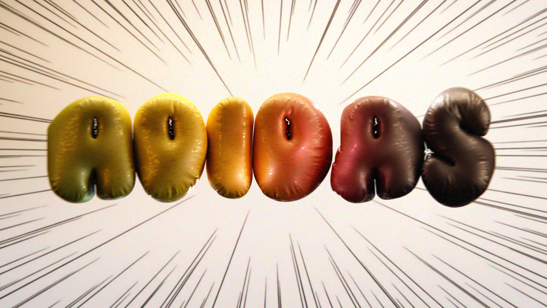
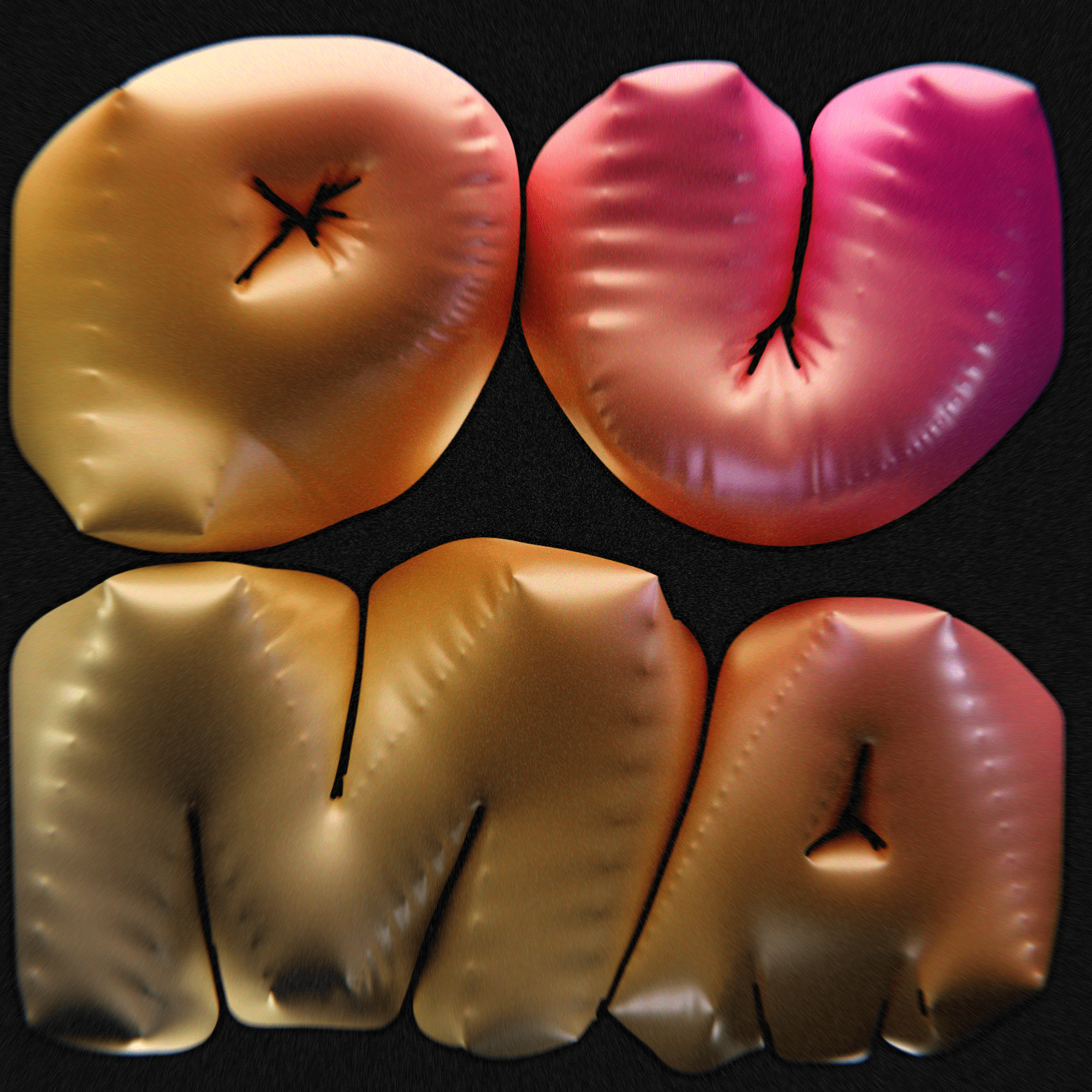
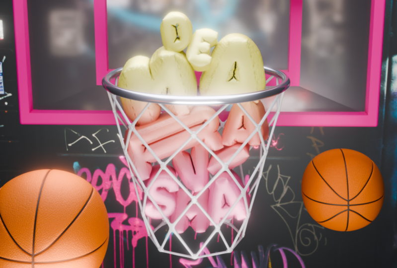
Transcripts
1. About that class: Welcome to Logo Design
with 3D Typography. This class, we will dive into
the fascinating world of 3D typography only have to
create dynamic 3D logo. This course will give
essential skills to turn your creative ideas
into real designs, opening doors to new
artistic opportunities. In this class, you'll get
hands-on experience using powerful tools and Blender
can make beautiful 3D logo. You'll explore
practical technique for making different and
interesting outcome, using colors and materials
to make your design better. Becoming rated
lighting and putting things together
for cool visuals. And of course, final touches
for high-quality render. Why You have to take this class. A logo is more than just a name. It something people connect
with them emotionally. Whether you want to do
more freelance work later and 3D design or get
better at what you do. This class gives you
the tools to make her own 3D logo ideas come
to life in less than 40 min, you'll learn a thing
that can help you in your own creative journey
and for whom who This Class, of course, everyone can join. But for beginners,
I have just say it can be challenging
but not impossible. No need to worry
because Blender is here to help NOT confuse you, will have FUN learning
new things together. I hope you're ready to bring
your 3D logo design to life. Join me on this class today
and let's get started.
2. 1. Logo Technique: Hello everyone and welcome. In this lesson, I'm
going to show you the main technique that
you can use to create different logo and just
you can found in future is going to be simple and I
hope you're eager to start. So emphasise or QP Edit Mode, then choose the feasible, this one below the X and delete faces grade back to
the object mode. Then they go to the modifier tip 1 s and then add modifier, solidify modifier seven an input and bring the
thickness value -0.15, just to make this one that
we did with more thicker. Then we go and
apply our modifier. Now, just to make it
clear that he's going to be the frame for our texts. And actually let's go there, double-click and let's
call this one frame. Our next step is, of course to add the
text, shift a text, then to edit this one, you press Tab and how we can see we have edit mode here also. So actually the text. And they decided to
choose Puma worth, which is also very popular
support brand. Go back there. Let me adjust this one, G X, G agaric. And here we have an icon of the letter where we have
to do some adjustments. So the first thing first,
we're going to choose a font. You have three options. You have fonts from
the photon Blender. You can download the zip file Under this course
where I bring a few of my fonts that you can easily use or you can go
to their website. They, for example,
the 1001 fonts, choose wherever you
want, download. Then you're going to have
this type of file just opened press Install and you're
going to have them Blender After Effects
and wherever, wherever. So it's very simple,
actually took around one time, 1 min. I'm back, I'm going
to choose one of the fonts that how
I say you can find that a zip file
before and this is going to be bold, italic. Second one, like
that. Yes, I like it. Our next step, I
would like to bring a little bit less space
than between them. We have the paragraph
spacing and line space. You're going to be 0.6. And the character spacing
gonna be 1.1 S for scale G X Megiddo with more
smaller, something like that. Create a little
X1, 100 and birth. And how we can see
our text is flit. We need to make this one a
little bit more thicker, so we'll go to the
geometry, extrude 0.3. And now the next thing that we have to do is to convert
this one into the image, which is very simple or
right-click convert Shemesh, how we can see now
we have topology, but also you can see that
this topology is dirty. So let's solve this one. Here we go to the Modifier Tab and then add modifiers
second column. And here we have
the 3D mesh where your fire than the voxel
one direct towards 01, like that, or actually is
gonna be one more 0.9. So yes, I think I
would be this one. If you want, you can
draw a little bit more. I don't want to make
it very detailed, but also to keep it to keep
it close to the original one. So 009, I'm going to
be more than enough. And then let's apply our image. Now let's take a look. Our topology is very clean in comparison to what
we had before. Before. We're going
to move forward. Let's save our file
just in some case, choosing whatever
folder you want. And let's call this one Puma, logo and save Blender file. One very important
moment that we actually do right now is to scale. So choose both of them
and scale until you have a little bit of space in between of your cube
and the default lights. So I'm going to
keep it like that, goes a little bit
more in the center. Seminars. And other important
thing also is choose your frame control a scale, Control a, and apply scale. Let's play around
with a litters, go to the edit mode and
press for it doesn't matter. You can vertices,
edges or faces, for example, Bresson the face, and then having caramels, not somewhere outside but on your latter point and
your letter, press L. And that's how you emphasize
the entirely letter. And then go to the GX. Just a line, this one
under your own tastes. So as far as scale, I'm going to the later, I've showed you those are M, el. Make this one, I'll
do it more bigger. Very important
moments to emphasize, either keep a small
distance in between of them and in between of
the border choose so don't have moments like that. Everything should your container with a bit of space in-between? Let's go here. Bit
more bigger like that. Why did I want to rotate? Ok. control is back. And now it's time for
our physics part. On the frame one,
we go on this icon below which of the
physical properties and turn on the collision. And actually that's all
you can forget about that Then we go into the
pool. Malware will have a little bit more
settings stored on cloth. And don't worry about
everything here, we just have to
touch a few of them. The first one is gonna
be the quality steps, which means we're going to
increase their quality. Then go down to the filed
weight, open this one, and turn the gravity
towards zero, which means when we're
going to inflate, we don't need our
Puma to fly around. We want to give this
one in one place. Then we have collisions. Check in on the self collision, which means it will
avoid the moments where we're going to intersect
in between of each other. They're going to
interrupt. Each letter, going to interrupt
like an object apart. For this one, you just
have to check in on the self collision tomorrow
settings pressure. This is the main
thing that we're going to inflate our promo word. So we're gonna keep
this one on for custom value to three. And that'll catch the last one. So move yourself on the
frame zero, right there. And here, simulation
starts simulation and on. I suppose 88 is
more than enough. You can keep something like ten. Actually, let's
go to their name, which will be more than enough. Control S is very
important because Blender could crush
the big process, can take a little bit of
time, but there'll be, it will be much
easier to work in your PC will say, will tell you. Thank you. So after we do want with
all of our settings, we apply our scale. We don't have any modifiers. Now we can go again to
the physical properties. Having your puma emphasized. Go here and press
on the bag button. It took me for around 2 min. And now just having
that will just scroll and emphasize
which one we like more. It's cool. I think I'm going to
keep my own on a 654. Definitely not 456 or Puma. I like the B letter from them. From the frame for, but in the rest I like
everything from the frame five. Probably I'm gonna keep an
eye frame file because I like this one a little bit
more than everyone else. When did you choose
which one do like more control as of course. And then again, we have
to throw this one into, into the mesh, which means
right-click convert to match. Our topology is very
good, actually. Great. Now we don't
need anymore our frame. Let's just hide this one. And this is what we have. Two more things that
we can add to keep this more clean and equality
much higher for the thing. First is right-click
Shade Smooth. And another one is control two, which means subdivision
surface modifier. We're going to be it
will make this one, it will be the more detailed and a little bit more smooth. So how it was before, how it is right now, having our subdivision
surface modifier on, turn on. And that is X 90, which men are turned
on 90-degree. This is what we have a
very cool for my work. In the next lesson,
I'm going to show you how to create materials, lighting, can chimera,
and the render. I will say it's very easy. I hope it was easy
for you to follow. And it gives if you
have any question, just open the discussion here
under the Skillshare page. Thank you so much and I'll
see you in the next one.
3. 2. Dope Materials: I hope you're satisfied with
the previous lesson and it's time for one of my favorite
bar to bring the materials. And in the next one we're going to set the
Allies and the camera, but material is going
a bit first one, so we can pull my word. What are we gonna do next is
go to the render settings, render engine switch,
and the cycles. Let's go right there. In
their, in their mood. And how we can see we have
this one small light, actually don't need it anymore. I can delete. One of my favorite technique that they use probably most other time is shift a mesh and then bring
the plane S for scale. Make this one a little bit
more bigger. Move it up. But I haven't thought
what if we're going to make our promo work a
little bit more smaller. So wait a second. We go to their
right-click Set Origin, origin to geometry. And now we're going to
move into the center so that it's gonna be a little
bit more comfortable now. Okay? Vector for plane, which gonna be playing underlying light. And let's move this one
in the collection apart, which is M, new collection. Lights. Go through the material window, which is this circle right here. Bring the new, let's
call this one else. So also playing light here
in this survey is switch, the principle-based deer
shoot, the emission. No. You can see clear that the
results, as for scale, maybe there's quite a
bit more smaller cheese that God's own. And I think it's more
than enough for us. And then go to this.
I will like to make this world though
is a bit more darker. So I go here to the world
properties and then bringing the color a little bit more
toward the black one. Great. Now let's bring the
materials for our promo Word. Press, then go here, mu. And let's call this one Logo
underlying one. Why one? Because it can create
different materials and it blew much easier for you logo on one or
with Chula with 3D logo for it like that. Go there. When you're going
to have a two arrows, you press right-click vertical, split, and drag this
one on the left. Great Z, render it, which means we're going to
switch and the render mode. Here we're going to switch
to the shader editor. You can take a look one
time just to understand, but actually it's going to
be very easy to shift a. We're gonna go with
a gradient texture. Then we're going to
press Control T, which will add mapping
contextual coordinate. And in case if you've
done a habit core to the Edit Preferences, Add-ons and search for Node Wrangler and have a
check in right there. Great. One more time Control
T to turn this one on. Then we have another thing
which is color ramp. We, where we're going
to adjust our colors. So right here to connect gradient to the effect and
color to the base color. And now you can see
our first changes. To choose the colors. I'll recommend you
to go to the Google or wherever browser to use. And doesn't matter actually, you can search for the
website color hand that's got here. I found a column of
the reservoir and I think there's a lot of
options of the color palette, which we'll easier your work. But I think that the retro
one is where I want you to stop and I want you play
around with a blue one. So I think this one I like, let me show you the
more I like this one. I think I'm going to
stop on this juice or that or that I liked
this one more. Four colors. Okay, let's go, we go here. Let's go to the list
one and Control V. Then we can plus,
plus twitch remorse. And here we're going
to choose these blue and bring that one here. One more. Last one. Another thing,
instead of linear, I'll let you choose
the B-spline, which is going to create more smooth transition
in-between of colors. So for example, this
hardwoods before, this is how it is right now. But of course you
can play around constant is we're going
to create this strict. I like the B-spline and
now it's time for me just to adjust my colors or what if I'm going to keep
this one and the linear, too much cardinal,
much easy. Display. Great. But honestly, I'm not sure that I like
this color palette. Probably I would like
something more toward yellow. So the point here is used to play around choose
your own colors. And then we're
going to come back when I do get time
to move forward. Okay, This one is pretty nice. I'm gonna say this one, which means she 3D
just More move above. And I want you to
try this one also. Another thing that
you can do is choose Swedish them out and
the gradient texture, I think diagonal is what
I use most of their time. But again, Let's play
around quadratic. No easing, no spherical. It's very cool how
you understand work from much better always fear. No. And radial. I think we have to adjust here, but it's too much know that they are going to lose
one of my favorite one. Here you can play
with the settings, for example, the
location. Latif. I'm going to drag this
one a little bit more. I don't want too much with
the red allergies to small. Think right there. And problem when I drag the yellow one at
a bit more here. So I switch the color
a little more towards pink and are more satisfied
with my final results. This is the part of the 3D. You just have to play
around and as you have FUN. So then what about rotation? What about scale? I don't
think there's been a bit more. I think I'm going to keep
everything like that. But we can make this one
that we did the more interesting than the way how
it is at the moment trade. Now we're going to add
a glossy material, Shift a and search for
glossy be SDF has been, first of all, show you what does this node,
this texture does. Great. And I would stay image
should combine both of them. So it shifts a mix shader
and bring them right here. These gloves you're going
to be in this one below. And BSD if it's gonna
be on this one above. Now in case if you don't
know how they think work, my interpretation
is that vector show which node is going to dominate. For example, if I'm going to
drag this one on the right, that means the glossy. I'm going to dominate. If I'm going to drag this
one on the left. We're going to see on
the principle is DF. So that's why we have to
keep them in balance. I think something like
0.3 gonna be good. So now we can see the shiny
parts or Ireland or water. If I'm going to give this 1.5, I think it'll be too much, I think zero for your
gonna be more than enough. Another thing, Jamaica, this one that we did, more saturated, is we'll go here where the
scene properties and go down. You can think here
the color management. And here on the look, you can bring, for example,
the high contrast. You see the difference.
Now, what about medium, high contrast or another thing, you can switch from the
fuel mixture, the standard. It's going to bring a
little bit more saturation. But I'm not sure that I want I'm not sure I think I want to keep this
one and the filmic one. High contrast, very
high contrast, no medium, high contrast
or high contrast. I'm going to keep this
one on the high contrast. I like it personally, I like it white about
with exposure or we can keep this one
and 0.1 or even 0.3, which is too much to point you. Great. The last thing we can play around with the
roughness or foreign glossy. We can make this one very shiny, which looked like candy. Or we can make this
one lack of shyness. So I think 0.45 gonna be
good or what about 0.55? Let me check one more time. 45. Okay. And when I give you this one, I'm
pointing four to five. And let me check with
this color palettes. So looking at, for example, hold control the right-click
and cut this node. And then you can bring this one just to see which
one I like more. So they have similar colors. This one look like more and
more head birthday party. So I'm going to
keep this one out. It's a bit here. It's cool, but I think instead of yellow, I can bring it a green
one or sending me to be enough green and
yellow right there. But however, unlike
the previous, anyone for our final
render to keep this one, I'm going to cut them, bring this back. Yes. That's how we created
our materials. I hope you enjoyed this lesson
in the next one, we'll, we'll make this one even more interesting because
I'm going to bring, we're going to bring
more sources of light, the Camera one, but this
is our materials for now. Thank you so much
for your attention. Nicu, in the next lesson
4. 3. Lights, Outline and Camera: Lesson number three, where we're going to adjust our lights and bringing the camera and prepare the scene for the final render. So probably I'm going to
keep the show window. So I'm gonna go
here, 3D view port. And then I'm going to press
one and an input here, I'm going to switch the Z solid. And now let's bring it. Actually there's nothing
card and I just use the point lights to move them
under here, here and here. So let's have fun. Emphasize the lights
collection and then Shift a, go the first one, light, light and point grid. And actually would like
you to begin to give you this one here on layer. Let's adjust this one
summer here in the middle. And one very useful
advice that you can use in case if you don't understand the
array of influence, what you can do is
go here to the icon, switch the color, for
example, toward very red. Now you can, first of all, let me turn off
this setting, okay, and now we can clearly
see the area of influence of the light because their color one
is very emphasized. Problem, I'm going
to keep this one. First of all, it Manchester, them adjust their location. I'm going to bring
this one there. I'm going to decrease
two or three. I just want a small
outline here and there. And I think even to be more than enough or not, three was good. And let me come back to the previous color
of, for example, something like in-between
of yellow and white, gray. The first one is done. And next we're just
going to duplicate, which is shift the x. And I want you to keep this
one here in-between of M and a because it's
too dark there. And another thing, e Greek, I'm going to move this one
a little bit in front so that actually agaric,
let me go there. And let me choose, for example, the blue one or something toward this color palette of
pink, violet and blue. So somewhere here. But I don't like this
reflection Greek. And I'm going to move
this one a little bit more insight or a little
bit more outside. What about that? So let
me check without width. Okay, it's done, but I'm
gonna keep this one on two. And we can move forward one to light under somewhere here. So I think another
shift a light and point G and go down create that may increase just to see their area of
influence were hungry. And then I'm going
go to the red one. Okay. I G X grade three. Why didn't want to move this one a little bit more
insight or whatever, I'm going to move this one
a little bit more outside. It has been shown a
lot of influence, but I think this one is pretty good if you're going
to keep this one and the low value and colors, I want something like Bash, which is this one. And let it go with
five or actually 15. Play around 25. What do you think is too
much here on this side? So problem when I keep
this one more like that, just you have a small outline. Actually a little
bit later we're going to add the outlines, the black outlines,
but it's gonna be after we're going to
set all of our lights. This one is good and I'm
going to keep this one on for or actually on nine. And then this one a little
bit more on the right. Like that. Nice Shift D to duplicate, bring this one right there. This one, I'm going to
move more in front. So just to bring more light
because I'd mentioned show you is too dark here in
this zone, in this zone. So I don't want that. I want you to keep the lights. So that way I'm going to give you this one on for the color, we're gonna miss
something again. More towards light
blue like that. I'm going to keep this
one on hate or on three. Good. Just a little bit of light
gonna be more than enough. Then I'm gonna keep
one more right here. How we can see ISA,
there's nothing card. Just play around satellites
and just have fun. Do to, to, to usually people bring it the
time-lapse here. I just want like a real time to make you see everything
that they do in cases, especially if I'm going
to do some adjustments. I want you to know
about this adjustments. So g x g is it. I'm going to put some low-fi in the background to make it a little bit more
pleasant for you to hear. And I like to take a
look, take a look. I'm going to hide is very dark. But if I'm going to turn on, we have the lights reflection
here on this side. On this side, which
is which looked very interesting considering the reflection of
horror promo word. I like it. I like it so much. So the next one we go to the 11, what I'm going to bring
something like green. Now I'm just experimenting. Know, something towards blue, toward, toward, Great. And what if, just to check, what if this is the G agaric? I'm going to move this one here. Like this one wasn't
a perfect spot. Great. What else? I think it's not enough
for a meal light here. And I think I want one
more on this side. And then I could say I have so many things that I wanted to
tell you about it, but everything at
the right time. One light here when I hear
and then the secret thing. So copy x. Then move this one inside
under the a later. Somewhere here. I'm going to take this one. I'm going to turn this
one into the area. I'm going to -90. 90 to turn this one here and
then go with a G agaric. Now, keep this small thing. It showed the area
of the main light. So that's why keep it. Don't look at the entire thing. Just take a look at this one and then this one
and this distance. I'm going to adjust under that. I'm going to keep this
one somewhere here. And I'm going to keep
this one on two. Now. I have small outlines. I think I'm going to keep
this one a little bit more on the right side or
more in the middle site. Like here. A little bit more behind and just a small
light right here. Okay. One more thing
here on this side, which I think I'm going
to copy this one, g x. Let's see if this wheel. Take a look. Again.
It's emphasized. Do see that our bubble,
bubble, I'm sorry, our Belen effect had this
type of things here. So when you have a
light on this side, they are very emphasized which create a more complex work. And then which I
personally like. I think I'm going to
increase the power towards 15 or I'm showing I'm
gonna decrease or attend. And I'm going to color
to something more of the yellow this time
just to even more war. Like that. Great. I say one
very cool technique. Actually not a technique
just to think how we can see every light have
their own temperature, independency with the power. And we have a main
light right here that I would like to adjust
back to the shader editor. And here we're going
to bring shifts, a black budget, and connect, connect the color
toward the color. And now you can see that we
switched the temperature. And you're going to see this
image under the zip file, in the zip file and
reading scores. I'm going to keep this
one in between now for thousands and thousands. But you can set your
own value, for example, for I'm gonna keep in-between of something in the middle of in-between of hot color
and called color. If I'm going to keep this
one on for thousands, is chewing yellow,
but five to white. So that's why 400750. And that were the small secret. Okay, great. We've
finished with our lights. But how I said before, we're going to
create the outline. I'm going to make the world
believe the more darker. And let me show you a
very simple technique. So emphasize your promo word. We can go right there. Control S to save, of course, and Shift a and bring
the grease pencil. And the last one, object
line art is very messy. But we can call this one style. But however, let's
solve this one. So first of all, m new collection line art
to give this one here. And just hold this
one is very easy. We just should choose
set the camera, which we actually have
the camera in this scene. And what you can do
is the combination of where my screen case, sorry. So we're going to press Control Alt and
zero on the numpad. Excuse me. Now we can see
that how you can easily, you can easily say
the camera from angle that you see at
the moment right now. Ups, for example,
Control Alt zero. And that's how you
set from that angle. So it's going to save you
a little bit of time. Actually, this angle
is pretty cool, but probably I'm
going to give you this one in the middle. So control, I'm one of the numbered and then Control
Alt and 01 more thing. This is the perspective
type of view. But what I'm, what I
would like is to bring the orthographic
go to the camera. Here on the camera icon. Switch the type from perspective
to the orthographic. And then how we can
keep the same outlook. For example, it will be like
wondered am pet or zero, which means you go
inside of the camera. Then let's set our resolution
where we go right there. And a switch, for example, 2000s on 2000s and
back to the camera. Let's move this one toward ten. She make it to zoom in or out. Three, which means
you zoom in too much. Five. Okay, so this is what
we have at the moment, is right now probably one or
thing that they want you to do that line art to make it
a little bit more thicker. We go to the strokes and here
it has a thickness scale. I'm going to keep
this one on 1.3. And the outline, now we have this type of
comic book style, but I think 1.3 is too thick. 1.1, I'm going to be
more than enough. And the curve
resolution towards 64. And voila, very quick, very easy with Zorn in probably less than 40 min
into something like that. I hope you like it. I hope you enjoyed
and I hope you found this information
useful for you. In the next lesson,
we're going to render our promo work. See you there.
5. 4. Render: This lesson where we
went render actually you're going to be very easy
for the first thing first, we should make sure that everything is hide from
the final viewport, sorry, from the final render, which means turn
off that Camera. Here is good. Here is a good. We just have to turn the frame
that we can before. Great. Then next thing is to
increase the quality. We're in the render. I have the chicken
on the denoise, everything on the default. Then samples for
thousands is too much. Let me tell you that 256 is more than enough
for a decent, for a decent quality. But I personally would like
to keep this one on 1024, which we'll talk a little bit more time and hotel
they don't bit, which took more time. But the final quality, you're going to
be more pleasant. But again, 25063, hungry, it's can be more than enough. So it's your own,
your own choice. Then they color management and when I keep
everything leg of it. And actually that
all probably the background I'm going to
make whatever I'm going to make it go to the more brighter, know, I'm going to keep this one I did more darker like that. So we check everything. And these are my simple render settings control S to save. And let's bring this one. Or wait a second, wait a second. Why didn't want to
know type contracts but medium, high contrast, high-contrast to the
render, render image. And I'm going to see after
my render will be done, somewhere, render is done. Of course, we can image
Save As choose a folder. One, bringing their color,
their, For example, your 16 and save as image. That is our final render. If you have a desire to bring
this one into Photoshop to add with a grain of
color correction. No problem. My main purpose was to show
you how in Blender easily and actually in less than 1 h to
achieve this type of thing. And just you have a good time. Thank you so much and I'm looking forward to see
why You haven't done
6. Congratulation: We finished congratulation. I want you to ask you should
not be shy and she upload your final result here in the project section under this Skillshare class
on Skillshare page. And you share your work
with the entire community. Or if you want to do your
own work, your own brand, your own logo,
using the technique that will be learned
here. No problem. And looking forward
and I'm eager to see what you've done. Also on my page, you can fall in some other courses
that can be very useful and push you
toward new levels. Thank you so much
for your attention and I wish you the best
 Sasha Luvr, Work in third dimension