Transcripts
1. What to Expect: Welcome to a skillshare
course that delve deep in the art of three D,
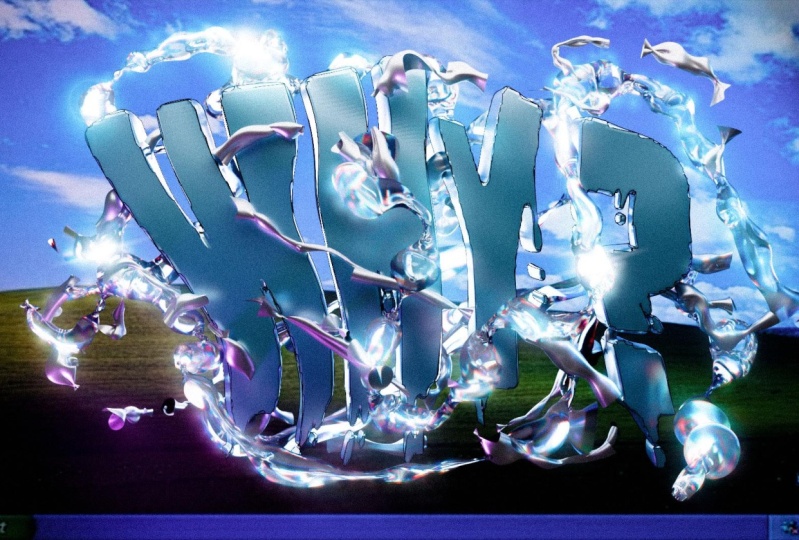
typography and design. In today's digital landscape or words dominate screen and page. The importance of
typography cannot be understated from websites
to advertisements. Typography, the
visual language that communicates tone,
mood, and meaning. If you are eager to start, but don't know where
this course is, your gateway to mastering this crucial aspect
of graphic design. And under 40 minutes we'll
learn three D typography and bring your text to life with
dynamic forms and styles. Learn how to apply
captivating materials and lighting technique to elevate your design to new dimensions. Discover the art of creating
chromatic distortion, material that add a unique
touch to your creations. Explore essential
blender modifiers that will refine and
enhance your design. In other words,
you'll learn how to make things look cool
and match their meaning. Throughout this
class, we'll dive into the essential
tools needed to complete our final
project that you can easily upload in project
gallery section. In addition, the knowledge
you gain here will help you apply them effortlessly in
the future personal projects, while keeping you
aware of your actions. I hope you are ready to elevate your design skills and leave your mark in the
world of typography. Join us and let's discover this creative
journey together.
2. 1. Typography in Blender: Hello everyone and welcome. Under this class you can find a zip file with a materials, phones and image background
that you have to download. Then in the folder you going to found this Windows
background image. Just drag and drop
in our blender. Great. Then press on your image, you call it the algae
to move this one in the center out there
to make it flat. Then we go with the
90 for a scale. Make this one a little
bit more bigger Greek and go behind with our image. Let's delete our light and
shift left. Click on our cube. Delete, Great one
in an Mp problem. I'm going to do this
one a little bit more. Bigger. Good job control. Save our file, choose
wherever folder do you want. Let's call this one from
text and save blender file. Great, let's set our
camera from the start, which is going to make our wow a little bit more comfortable. There is a hot key
that's going to be very useful and save
you a lot of time. You press control at zero P. How you can easily set your camera from wherever
point do you choose? How you can see,
there is nothing. I'm going to the one P, control out zero P. Now I want to adjust our
image under our camera. I'm going with the a little bit more bigger and then I'm
going with the X like that, which will stretch and make
it a little bit wider, but there is no problem. I'm going up a little
bit more wider. Okay, I'm good with this one. Great. Then we go with
the shift at text a x 90. Go to the edit mode,
which is step. Or you can switch right here and then just backspace
delete this one. Our question is going to be why. Or you can press how or whatever word
actually do you want. There is no trouble with that. Then I press Enter. Oops, I press step to get out from the
edit mode for scale, but I don't like
that our scale is from that point. We go
with the right click. Set a region,
region to geometry. And then as for scale, now you can see the difference. Let's go with the create. Go to the icon of, of our text settings. Let's first of all extrude
were the geometry. Let me go right
here and I'm going to keep this one on 03. Great. Then it's time for the most interesting
part which is to choose the fund open right here. How I say under this class, going to be a few funds that
you can easily download. I'm going right there and here we are, the
materials funds. And I'm going to choose the
first one because I like it. Mostly you can see you don't have even to scoop
or to bring this one in. The illustration. This
one is more than enough. Let me go to the camera zero and p. Let's
adjust this one. I think this one is good. Okay, one more thing, one more thing that you can play around in case if
you want you go to the paragraph spacing
and here you can increase or decrease
the distancing between of our letters. But honestly, I'm going
to add probably one more additional three for
me, it's enough. Now we have to turn our text into the mesh, which
is very simple. When you adjust all
of the settings, we have to increase the
resolution, which is this. We go to the 12, and
here we go to the 24. Now we can turn this one
into the mesh which is right click, convert to mesh. If you go to the edit mode, you can see our word is a real mesh with
the real topology. But also you can see that
our topology is very dirty. We can easily solve this one. Get out from the edit mode, we go in the modifier
window modifier, second column, here you
have the Rems modifier. Then in the Vauxhall, I'm going to keep this one
on the 007, press Enter. The quality is more
than pleasant for me. I'm here. If you choose
another settings, no problem. Remember that the more
zero you have here, the more heavy it will be. Probably, You know what, I'm
going to keep this one on 08, like that, great. And I'm going here and
apply our modifier. Now if you're going to come
back to the edit mode, you can see we have clean
topology which will simplify the process of adding materials and less artifacts. Great control to save. Before we're going to
finish our lesson, I'm going to make
one more thing in order to achieve much better, much interesting, final shape. Back to the edit mode and here we have the
proportional editing, which is you have
to turn this one on or you can press
on the keyboard. Now I deactivated. Now. Activated. Take
a look one time. You can choose wherever. Right now in the vertex mode, you can choose wherever
vertices like that. And then I'm going with
the how you can see we have this sphere around which show the
area of influence. If I'm going to move on
with my mouse wheel, I'm going to choose less
area, less topology. If I'm going to make it bigger, now I can work more. This is what I actually need. I want to make it bigger, and I want to move this
one a little bit higher. Then I'm going to the W, I go Hoops X. I'm going to move this
one inside like that. Here you have, you're
allowed to be creative, you are allowed to do
wherever you want. I just show what I do. You can repeat or you can
adjust under your own desires. Let me choose this one behind. Also, let me go
with the question. I'm going to decrease the space
or I'm going to increase, actually I'm going to choose the vertices behind
to keep it like that. To keep it like
that, let me check. Let me go with this one
a little bit higher. I think it's enough for me now. I like that curve, I
like that shape out of the edit mode and this
is what we have, great. It's so wavy and how I say, usually people, they go to the Dop illustration,
play around there. But I think this one can allow you to have
not less results, but saving a little
bit of time control. Save for scale. Actually, for a scale go down. Great. This is what we have
at the moment right now. Let's rename our text. We go here double click and
call one Y and that all. Thank you so much. We finished
with our first lesson. How you can see there
is nothing card. And it's usually, it's way more easier than to look
at the first glance. In the next lesson, I'm going
to show you how to create the kinda interesting
and weird curves around. Then material sun lighting, and our final render. So thank you so much for your attention and let's
jump in our next lesson.
3. 2. Dope Curves Around: So that's number two,
where I want you to show the main technique
and not only a few additional tips that
will elevate your work. And to say it more properly, I'm going to show you how
we can create this type of weird curves around that, definitely going to
be a great decoration for your three D typography. So let's dive in one important thing to say
is it will be useful to watch one time to understand
because it's very easy and then you can play around with your own creativity. We go to the shift and I'm
going to choose curve, where it is, this one easier, Go with the x, 90. As for scale, Greek
for the rotation. Now I'm going here in the curve settings
and I'm going to in, first of all increase the
resolution toward 24. And then I need the depth in order to make it more bigger. I think 09 is more
than enough for me 12. And how you can see, we have a gap here, so we
can easily solve this one. Just press on the field
caps, that's all. Then I'll go back to
my camera, the trick. The steps are very easy. First of all, we have to
make some random shapes. Then we're going to turn
this one into the mesh. And then we're going to apply some modifiers in order
to get our final shape. Step number one, we
go to the edit mode. And then for example,
choose this vertices, shift each duplicate and
move it somewhere here. And then we press to extrude, I think it's too thick
so I'm going to keep this one on zero, F like that. Now I'm good press to
extrude and just bring some random shapes
around for example. Like that you can for the
rotation and keep it here. For example, I'm going
under the hash letter, Good shift D and you can
bring it somewhere up. Again, it's on your own
creativity, just play around. You can bring this one in between of the letters.
There is no problem. Then for example, I'm
going to keep that, I'm going to keep here
under the question or under the Greek shift, each duplicate, duplicate,
and extrude that. Then I'm going right there. I want something, the
question letter here, here to play around intersect like this. I think I need a few more above. It will be more
than enough for me. Here, here, here a rotation. I want to rotate this one too. I have to keep this
one like that. Probably I'm going to decrease. I'm going to make it smaller. Now, I think I'm
good with the shape. One more thing, I'm
going to increase the depth toward 06 quanta. When you finish with
your own shape, there is a step
number two which is right click convert to mesh. We can see the topology
is pretty clean so we don't have to
apply the Rem modifier. Let's move this one to
another collection. Let's go with the M collection. Let's bring this one curves. Okay, then step number three, which let's call this one. The main magic happen, we go here in the
modifier properties. Let me make this one a
little bit more bigger, add modifier in the third one. In the third column, we
have displaced modifier. It's weird, I don't worry. Let's decree this one toward
0.3 Then the main thing, the displaced modifier work
with the texture setting. How you can see we have
texture properties right here and we have the
same icon right here. What I have to do is
to press on the N, which means we created
texture for our mesh. Then let's call this one
curve under line on E. Okay, the next step we go
to the texture properties. And here in the type we switch, we have a lot of settings. What my recommendation is to choose what is the
most pleasant for you. I'm going to choose the magic. This is one of the main
technique that will allow you to achieve
this kind of shapes. Of course, we have your
materials and lighting. We don't have the
moment right now, but we're going to add this
one in the next lesson. At the moment, right now,
we have to play around with our settings in order to
make the shape better. One important thing that we
have to do is control two. Subdivision surface modifier. And you can see clearly the
difference between our shape before and our shape when we
add subdivision modifier. I will not recommend to
apply because it will be very heavy and there is
no necessity in that one. The shape is good
then we back here. I don't force you to
choose the same magic. Let's go, for example,
to the clouds. It's pretty nice also, we can go to the marble
I like marble problem. I'm going to keep on the marble
one because we have here a little bit more
settings than with the magic one pattern. Sharp, sharper, I'm going to keep on
the soft on the scene. Let me check the I like
the 31 type soft, soft. And then we're going to
increase the size toward 35. Then actually I'm just
playing here with this size. I think 35, 37 will be
good for me personally. But you know what, We can make one more thing in order to keep this one a
little bit more better. It's back to the
displaced modifier. Here you can play around
with the strength. You can clearly see
the strength show the way how hard the texture going to influence
on your final mesh. That's why I want to keep it low to let me choose. I'm going to keep this
10,200.20 great control, safe. That's how you can play around
and make your own shapes. But I don't want to finish
our lesson right here. I want to show you
one more thing in order to make this one a
little bit more better. I'm good with that one. Take a look, let's call this
one double click shape, underline on E and then
shift to duplicate. Left click rig 180, move it up. Then we go to the solo mode, which is the slash
and ped. Take a look. What we have to do is we go to the edit mode al to get
the transparent mood. Or you can be sure that or to
check if this one is blue. If this one is blue, that means that you are
in the transparent mode. For example, choose vertices. We could just go randomly
and delete some of them I'm going to delete. Now when we finish,
we deal randomly, it looks weird.
You are like what? That I'm going to
show you back from the edit mode a show. We have additional
things right here, right there. For example. We can apply two
different materials to make one more lighter,
one more darker. What we can make more is go
to the displayed modifier. And it's very important to duplicate the texture
because at the moment, right now, they
share one texture. If you'd like to change
the texture here, these changes will be
appliable for this mesh also. That's why we have to duplicate. Let's call this one curve two. Now we can be sure that we'll influence
only on this mesh. What I want to do is to choose, for example, the magic one. I'm going to increase the depth, I'm going to make it smaller. I'm going to move this one a little bit in front with the or, probably not like that. Create. Then I'm going
here in the display, I'm going to keep this one lower or I'm going to keep
this one higher. Create my last step. I'm going here from the magic, I chose clouds and
now I like the clouds more that how I say. Usually people think
that it's very hard. But it looks hard just because you sometimes don't know
how to achieve that. It's actually way more easier than it can look at
the first glance. The shape at the moment
right now is pretty weird, But we're going to jump
in our next lesson where we're going to
apply our materials. And you'll find that the amount
of thing that you can do and how it's going to elevate your creativity is
going to be amazing. Thank you so much
for your attention. I hope you enjoy these lessons and let's jump
into our next one.
4. 3. Lights + Materials: Hello and welcome back.
Lesson number three, where we're going
to create lights and health of the materials. Why hell? Because
the chromatic one is very interesting and I
want to have a lesson apart. Shift a, excuse me, shift a mesh plane. Then as for a scale, and then we go by
the, move it up. This is one of my
favorite technique to add some lights where we go we call hearing the
materials properties. We press new, let's call this
one plane underline light. Then we go to the surface
and change this one. Let me actually show
you the difference in case if we do this
one for the first time. So keep it like that. We
go to the render mood, which is the last one here
in the render engine. Switch to the cycles. Then let's switch
one more thing. At the color management, I want to bring the high
contrast and then back to the material property and switch from the principal
DF to the emission. Now you can see the difference, probably going to
increase this one toward 1.5 Then we go
through the Petri. I'm going to turn this one
and back to the front view. Let me go to the camera. Okay, great. It looked
pretty interesting. The first one, double click, plain lights, and then we
go to the M new collection. And let's call this
one Lights Create. We can add one more
here. One more here. We're going to do
this one. But first, let's go with the
material for our y word. Go here when you have
two arrows, right click, vertical split and direct
this one on the left side. Then we go here and Bread
the shader editor here. Back to the render
Mood Dig this one on the right side and let's bring the material for our Y word. Let's call this one Y. You're going to be very simple. Actually, I'm going to show you. First of all, take a look, this dig, this one on the right. Then shift A and search for
glossy SDF and mix shader. Bring the mixed shader
in between of them, SDF to this one below. What we have to do is let me
drop this one on the right. I want to choose the pink color, this type of aesthetic pink. But what we will save you
a little bit of time. You can go to the Google
and, for example, search for some
thetic pink colors, or wherever you can
choose the blue one, the green one, it doesn't
matter, it's your own choice. I'm going to choose
this one, the third, which mean that one
I like it and then I go here and X and control V, I'm going to make
it a little bit more intense which means a
little bit more saturation. Great. Then I go
to the metallic, I'm going to increase
the metallic part toward 0.7 and then the
roughness I want to decrease toward 0.25 There
is one more thing that we have to play around here in case if we don't know
how this mix shader work. You can see we have this factor that if you're going
to drag on the right, that means that a
glossy material going to dominate
over this node. If I'm going to drag
this one on the left, that means we're going
to see the principal BS, DF going to dominate
completely over glossy. That's why you have to
keep this one in balance. I think 0.45 and
here the roughness, I'm going to decrease towards 02 or actually 35 like that. I'm going to decrease the
intensity at the moment. Right now I have
something like that. I have a good reflection. I have a reflection here. Reflection there. But I'm not
very sure that I like it. Probably 0.5 Yeah, the metallic part was the moment that I
didn't like too much, so I'm going to keep
this one on 0.5 Great. You have these options, you can play around, but for
me, it's more than enough. Let's jump into our materials
for the wear shapes, which was the second one. Let's rename this
one the second. What we can do is shift left, click on the Y word control
L and link materials. Now back to press on our curve, go here and duplicate
our material. Let's call this one curve. Underline to what you can do right there is just
to switch the color. Probably I'm going to keep
this one on the dark one, something like gray, light gray. And then I'm going to
increase the metallic part on 0.8 I'm going to bring here 0.65 I'm going to decrease here toward 0.250 Good. One thing I want now, it's time to bring
some light here here. I think we're going to
have three or them. Let's check it out.
We go the first one, shift a light. Aha. Let me go and go over the Erik and turn
this one toward the Y word. Let me check, okay, Erik, a little bit in front
toward our word. Let's go with the power. Let me first of all check 250. There is one trick
that I usually use, and this is like my advice. Go to the color and
choose the very high red, which will show you
very clear where the area of influence of our light. I don't
like it really. I want to cover this part also. What I can do with the Z, now I have more
area of influence, now I can increase the
power, for example, 555. And I'm going to come
back to something like if you what we can do, how we can see our
windows background contain two main colors,
the green and the blue. Let's go with one here, that's going to be the blue one. And this one below going
to be the green one. To fulfill our background image, I'm going to keep
this one like that. I'm going to decrease the
power toward 275, probably. I'm going to keep
this one a little bit more inside for a small outline. Great, let's copy. We go with the shift,
then left click, we go with the algae
to move this one in the center out to make it flat air on the side and
a erik on our word. Let me move this one a little
bit more in front, Grit. Let's use this time a little bit more toward the blue one. What I want to do is to
increase the power 350. That is exactly what I needed. I think I want to increase the power of this
one above to two. What? I want some color, want some light behind them. We go, for example with
this one shift, left click. Alex 90, no X -90
then just 300 and Pd. And move this one behind. Look, if this one is annoying, what you can do is to
turn all this thing. Now you can see
clearly our light. We have to move all of them in our collection in order to
make it more easy to work. Shift left quick and switch
to the light collection. Then this one. The
third one, I suppose. Yes, this are I'm going
to make it bigger. As for a scale a
little bit more, I'm going to decrease
toward 180, probably. I'm going to keep
this one towards pink to fulfill our Y word. I, I'm not very satisfied
with the Y word. I think I need more intense, less of the glossy
part like that. Now I'm much better. We can
go to the color management. What if you want
to keep this one on the medium high contrast? Make it so sharp from
the point of the colors, And let me hide this one. It's pretty nice. We have
the outlines here and there. The green one, the blue light, and one above and one behind. We can add one more, I suppose right here, to emphasize the W word. Let's go, we go here, choose this one shift
and keep it right here. But I'm going to decrease
the color toward eight just for a small thing. And I'm going to keep
this one more toward let me check which one
I like. More yellow? No, I think something in
between green and blue. And I'm going to decrease
again toward 45. And that's what we
have at the moment. Right now, there is
one more thing is the outline that I
personally am a big fan of, the grease pencil outline. Press on your word
control S save. We go with the shift, a
pencil and object line art. Now we have this dope black
outline around our word. One thing that I'm
going to do is go here, go to the settings of your line, of your outline, where
we were in the strokes. Let me decrease the
thickness toward 0.6 and increase the curve
resolution toward 64. Probably I expect a little L, I'm going to increase
toward 0.9 Okay, I think I'm very close to
found 11676, great height. And that's what we have
at the moment right now. You know, there is one thing
that I'd like to make, and I hope you like this idea also back here in our
simple viewpoint. Then choose the Y
word only the Y word. Add modifier. Let's try to
add the displaced modifier. I don't know how
it will look like, so just our experiment in
order to achieve something better strength toward
0.1 express texture, let's call this one y. Then we go to the texture
properties image. And the clouds, one
going to fit very good. The size probably
going to have 0.35, I increase towards 06. What if I'm going
to keep this one on 0506 was very good here. Instead of soft heart. Too much. Soft is great
here in the blender. What I'm going to try
Voronoi F two Voronoi. F one original Perlin. Okay, this is just a small
change but if you're going to, for example, hide this one, this is how it was before and this is how it is right now. No big difference. But the summation of the
small differences is what creates a gap in between
okay work and good work. So let me back to the Viewport. Render the render mood
to check one more time. Now the result is more
pleasant for my eyes. Okay, great, thank you so much. I hope you enjoy that lesson. The next one I'm going to
show you how we can create the chromatic material for the rest of our curve and then we're going to
render our work.
5. 4. Dope Chromatic Material: Hello everyone.
Lesson number four, which is probably going to
be the most valuable one, because I'm going
to show you how to create this type of
chromatic material. Let's start, we go to the curve. We're going to choose the
first one which is this white. Yes, and then direct
this one on the left. My recommendation is take a look one time,
understand the movement, and then it's going to
be very easy for you to apply for your
future projects. I press and I'm going to
call this one Roma material. Great. Then I'm going to
delete the principal BDF. What I'm going to
shift at refraction. Sdf shift shift D.
Then you go here, press at shader shift D.
And let's go right there. What we have to do
right now is connect this one to this one. This one to this, oops moment, allow connect,
connect, and connect. Then we have to turn the colors toward
red, green, and blue. We go here to the RGB and
drag this one on the left, which is green and blue, which we have only the red one. Then we go here and air and
blue for the green one. Then we go here for the red
and green for the blue one. You start, you can
see some shapes in the momentan some
form of the material. Then we go to the roughness and we're going to
increase toward 0,202.02 IO have to be here, 40 here, 1.5 Like with the difference of 50 in between of each one, we can start to see some type of chromatic
distortion here and there, but we didn't finish. Let's go forward because it
is in the final material. Drag this one on the right here. Bring three more
which is going to be mixed shader for the first one. Then we go to the glass BDF for the second one and light
path for the first one. First of all, let's connect
our glass SDF to the shader, and you can see a very
good difference in between of what it was before and
what it is right now. Let me hide our
collection Y line art. Let me also to hide this shape, you can see the distortion of
the light around our shape. You can clearly
see this red blue. I mean, it's very p, especially if you want
to make some cover for artists, this is
going to be useful. No matter 2d3d, it's
going to be very useful. Let's decrease the
lighting of our world. Let's make it a little
bit more darker. Let's enjoy what we
have at the moment. Right now, it's pretty nice. I really like this gamma of
the colors here and there. It's not like one or two
with the manifold colors, but we can make it even a
little bit more better. How I'm going to show you, where is our lights here? Light path, you have to connect transmission depth
toward the factor. Now this is how it was before and this is how it is right now. It's more clean,
it's more sharpen in comparison to what we have
till the moment right now, like always, how we can
see, there is nothing hard. One thing that you have to do, let's call this one,
like your homework is just to play around. We can increase the
roughness here, for example, toward 0.3 which is going
to make it less shiny. And then we can
decrease the IO toward 0.3 There is a lot of things that you can
do here and there. For example, to change
the roughness here, to change the IO here. There is a lot of
things, probably. I'm going to show you one more
thing that you can mix in order to make it less transparent
and a little bit more. Let's call this one colorful. Let's duplicate our
mix Shader Shift D, bring this one here, and then we go to
the principal SDF. Let's connect this one
and this one right there. Let's choose the color. Something like very
esthetic, Let's say blue. I'm going to drag
the factor more toward this web of nodes. And this one, if I'm going
to drag on the right, we're going to see on the blue one from our principal SDF. What we can do actually before we're going to go
forward is to increase the metallic 0.7 roughness, 0.1 or 0.34 It's look cool
even at the moment right now, but I'm going to keep
this factor toward 01. Now you can see
we have this, um, our shape is fulfilled a little
bit with this blue color. Let me show you,
for example, if I'm going to drag the red one, it's not only transparent, is the mix of transparent
and some specific color. I'm going to keep
this one in the blue. I'm going to keep this 1.6
this is how it was before, and this is how it is right now, you can clearly see
the difference. Probably I'm going to
keep this one even on 0.4 because I want to keep it close to
the transparent one. Let's open everything that we have before this line. I don't know, green pencil. Probably some of you
have this thing too. And I don't want
to cut this from the final edit because this
is the common problem. Sometimes green pencil just
turn everything into black. I don't understand why you have probably to
delete and then to add. Again, this is blender. Or let me open this shape. Let me open this one. Let's go to our final render. That's what we have
at the moment. Right now, I think I'd like to make it a
little bit more brighter, like the entire scene. What we can do is
coach the world. Let's increase a
little bit the light that we done with our final lesson where we
create lights materials. One more thing that we have
at the moment right now is just to render
our final project. Thank you so much, I hope
to the moment right now. This lesson, this course, was very useful for you and you found a lot of
useful information, a lot of useful
instruments that will allow you to create
different things and interesting projects. But at the moment right
now we do with this one, and let's jump into the
next one we're going to.
6. 5. Let's Render: But we have the thing
that we have to solve that when we're
going to render, we will not see our image
because it's an empty. Let's solve this
one pretty quick. Let me hide this
one, the shape one. Shift a plane and then
we go to the x 90. Go to the simple
viewport and just scale this one and adjust under the size of our reference image. Then we go through the pad, Move this one behind
Greg like that. Keep it a little bit in
front one in an pat. Then you go to the
Material Properties. Press, let's call this one BG, which mean background here. Shift a image texture, connect the color
to the base color. And go to the open
and search for our material window
that you can find the zip file under
this course window. And let's go to the
render settings. Now we have our background, let's open everything else. I really don't understand the
thing with this line art. Then you go to the curves
and let's check it out. Now when we check that
everything is on, we can go to the render part
with the render settings. First of all, be
sure that you don't have anything here hided. So you have to have the
eye and the camera both or turned on or turned off.
Everything is good. Then we go to the
render settings here and the render the samples in case if you know the more
samples you have, the more quality your
work will be at the end. But I don't have 4,000 too much. I'm going to keep this one on. Seven hungers, which trust me, more than enough for a
decent quality check. In on the noise, I have the default settings
which more than enough. And then we go to the
color management. I can increase the
exposure toward zero, even four I suppose or no. I'm going to keep this one
on 03, medium high contrast. What about high contrast? I like it a little bit
more control to save. Actually that is that I
do for my final render. We can drag this one on
the right one more time, check everything
and if you're good, go to the render
and render image. See after my render
going to be done. So my render is done. This is what we have
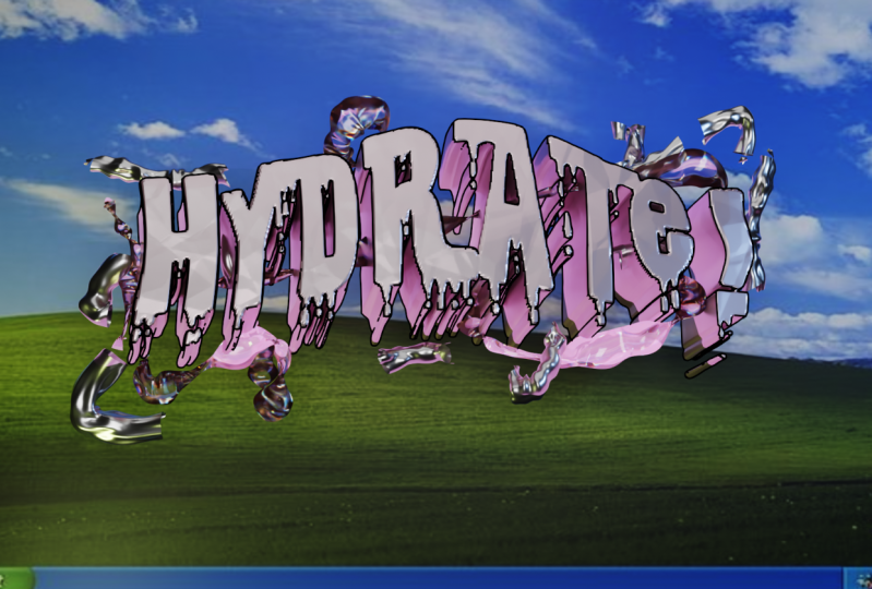
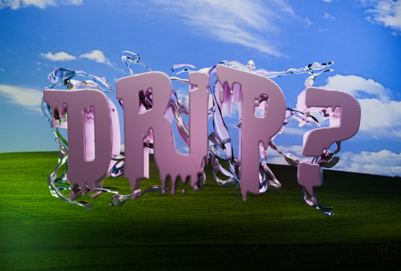
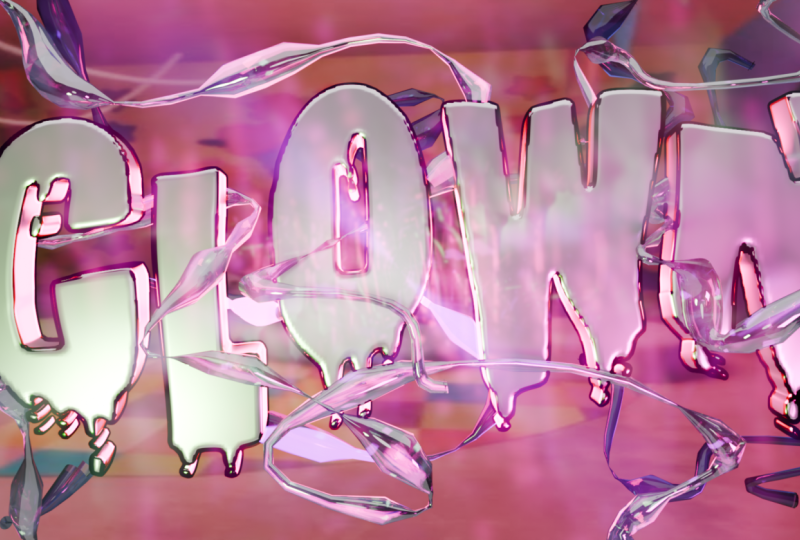
at the moment right now and probably that all. Thank you so much
for your attention. I really hope you
enjoy this class and I really hope that
you get more than enough information in order to achieve what you
want At the end. Now you can bring this image in the Photoshop or wherever, it's usually Photoshop to bring some noise, some LGB distortion. But in the rest, I show
you everything that I wanted and I hope this
class was useful for you. Thank you so much and have
a nice day. Don't forget. Of course, to save your
file image, save something. Let's call this one
y, color depth 16. Now that all. Goodbye.
7. Congratulation: Thank you so much for your
presence on that class. How I say before, the
tools discovered here can be effortlessly used
in your future projects. You just have to trust yourself and enjoy the workflow in case, if you have any
questions, feel free to bring them here under
the discussion section. Also, I'm looking forward to see your final
render that you can easily plot here under the
course in the project section. And the rest, enjoy the
process and have a nice day.
 Sasha Luvr, Work in third dimension