Transcripts
1. About that class: Are you looking
forward to level up your renders to
dive in the world of motion graphics and you turn your hobby into your main craft. Then this class is
for you in next 2 h, I'll take you through the
process teaching you how chisel blender modeling tools to
create abstract shapes, covered it with
aesthetic Materials, cool and very useful
techniques that will elevate your creativity
and of course, compositing after you're
done with your render, belong that will apply all new information on
branches where it into this course will
accomplish that work that you can probably
add in your portfolio. Showcase on social media. And if you're a
complete beginner, this class could be changeable
but not impossible. I will have special
lesson for people who never touched
3D software before. But remember that Blender work for you and not versus you. We're here just you have a good time learning
new skills together. So if you're ready
to join the ranks of elite 3D artists
out there and set yourself apart from the crowd than dive in our
Skillshare class today, your journey to
becoming a master 3D Motion Graphics starts here
2. Introduction for newbies: Hello everyone. This is Specialists
and for people hope and Blender
for the first time. If he has some experience, you can skip it and
go to the next one. But for everyone else, welcome. You're gonna be
uncomfortable for the first day is probably
the first two weeks. But the more far
you go, the more comfortable it
will be for you to navigate through Blender and I'm here to help you with it. Before we start, I
want you to say that completely everything that I press you can see
in the left corner. So in case if you
have any question, just take a look right there. Okay. Hey, if you're
ready, let's start. This is the image that you have when he opened the Blender. If you want, you move yourself
around the three-year-old, just hold the mouse wheel. And that how you can easily
move yourself around. But there's a few hotkeys. They're gonna make this process, even though it's a
bit more faster. One on an empath
for the front view, 300 empath for the side view, and seven to take a
look above. Okay. If you want to keep this view, but to move yourself,
for example, up or on the right-hand, the left hold Shift
and mouse wheel. And that how you
can move yourself, like if it will be Judy layer, enter the 3d one. Great. Let's go forward. Emphasize you're a cube. There are three main function that you're going to
use most of the time, no matter you are beginner,
intermediate or advanced. This is S for scale rotation and to move
if you want, for example, to cancel your action, just press on the
right-click and your object, I'm going to come back
to the previous bullets, to the previous position
or rotation or scale. Because we work in a
three-dimensional world, that mean that we
have three x's. The red one is X, green one is a Greek, and the blue one is it. Let's try to combine what we learned to the
moments right now. Let me, for example, to move our coupla to
do this one together. On the x-axis, I press G, and that's how I can move
only on the red one. Or for example, I can press G agaric and now I move
home on the green one. And of course G is it. And voila, another example, let me, for example,
many example words. X 19, which look like we did nothing but let
me for example, X 45, which mean we turn our cube
on 45-degree on the x-axis, which means on the red one. Or for example, air is at -177. So we took her cube minus one Hungary 77 degree on the
one which is the blue one. Let me show you another thing. Let's say that you
move forward G Greek. You make a little
bit of rotation, but you don't like it anyone to return to the previous one. So very simple. You press a to the default
position and rotation. So you press Algae, GMO it in the center and out. Okay? Same thing, for example, S, S, and we are here. Okay? We live in debt. Let's move forward. And the moments right now,
we are in the object mode. There are a few of them, but the most important and what you're going to
use most of the time, it's gonna be edit
mode and object mode. So let's switch
to the edit mode. Every object have
three main aspects. This is vertices,
which are these dots. This is edges which are these
lines and phases which are these polygons wondering one of the keyboard to emphasize
vertices do on the keyboard. These are hotkeys, for
example, for the edge. And three on the keyboard
to emphasize faces, Let's go to the face mode, For which is three
on the keyboard. And let's emphasize,
for example, this one. And I'm going to tell you about another very important
function which is extrude. So I press E X and that how I can extrude any
apart from our object. Or let's say, for
example, I press E, how we can see that X is appear in this breast
one more time set. And that will allow you to, with more freedom to
move your object around. But if you want to move your
object on specific X's, your breath, for
example, a Greek. And that how you move it
on the, on the Greek, if you're, if you
want to and the eggs, Let's go with the X. And if you want to zed, zed one, I know it can be a little bit complicated when you do
this for the first time. But how I say, the
more far you go, the more comfortable it will be, controls, it controls it. And we are back, back to the object mode. And let me tell you about another important thing that you're going to
use pretty often. So let's say that you had any reference here in some image that
you're going to use, a reference you personally
or image algae, Altair 90 as far scale G agaric, moving behind one at an
empire for the front view. Let's make it a bit smaller. So you want to achieve something
similar with your cube, but you can see what
is behind your cube. So it's anytime comfortable
all of the time to preamble, to move yourself and to come
back and again to look. So there is a transparent mode, which are these two squares, you just press on them. And that's how you can
have, for example, your cube work with him
with the same time. Because it's transparent. You can see your
reference behind, which is, again, sometimes
very comfortable. The hotkey is outset Array. And of course, let me tell you
about the display. So right now we are in the viewport display,
but when you, when you want to
render interests, see how your image
will look like. A. You go to the last one, which is this icon
Viewport Shading, you press on that. And because we don't
have any lighting, we don't have any texture. It looked very simple. But let me, for example, we can do this one
together if you want. We can create a background. So shift a plane
than S for scale. Go to the edit mode,
which is the hotkey tab, like that edge mode, which they chew on the keyboard. Choose this one which
is like behind. For the extrude and move it up. Then come back to the
object mode with that G, moving a little bit
lower, like that. And back for example here. So now there is nothing special but we just which is needed. If you want to add
some materials, we're going to have a
lesson apart for that. But this is that
icon right here. You press under new. For example, we have
here a base color. You can choose wherever
color do you want. And that how you can bring
some colors to your objects. But let's say that you
want to remove this grid. And because you will not have this one and
the final render, so you can turn off this icon. And that is, and then you can come back and then
again turn off, turn on a very
easy nothing card. Great list thing that I'll want to tell you
about is your camera, for example, how to bring
herself into the camera, how to control your camera. So to bring yourself
into the camera is a zero underneath that, how it gets in, gets out and get
in, and get out. But let's say, for
example, that you want to sit there chimera from, I don't know, let's
say that view. So the easiest way is the
hotkey of control out and zero and then how you can easily set your camera
from the new angle. It Nicole for example,
somewhere here, control outer is zero and voila. And if you want to have a little bit more control
over your camera, for example, you
bring herself in. And for the side menu, you will not have
so many options because there are
a few Evans items. But you definitely going to have this one if you present that. And then check in on
the camera to view. And how we can see our border of our camera at
the moment right now is red, which allow us,
which is zoom in or Chisholm out because even
going to have a chick off. Now my point of view for
this same, if I'm going to, for example, use my mouse wheel to move myself around the world. I will get myself
out of the camera. But if I want to choose
another angle, bank in camera, check-in, play around to the point of view
when you like it. Chekov and an impala. So of course there
are more thing that we have truly are anabolic. Because Blender, more
you know about Blender, the more you know that,
you know nothing. I hope it does
make sense because the amount of functions and combinations these
software provide you is just beyond
my comprehension. But my goal for that lesson
was just to introduce you, to show you some
basic functions and basic thing that you're
going to use pretty often. In the rest. How I see we can go forward, you can swipe this course. I encourage you
this software will work for you and not versus you. Do your best and you definitely will achieve
some great results. Thank you so much for
your attention and I'll see you in
the next lessons.
3. 1. Advices for better result: So I guess you want to
jump into the bruxism, but there are a few advices, a different ligand to contribute too much comfortable workflow. And the very thing first is pinterest is your
friend. With that. I don't mean to still
work from here, but you definitely have
a lot of references that you can use for
your own inspiration. It's enough just to
write something like abstract 3d Shapes and
you'll have dozen of them. Let's say that you
choose what you like, but it's kinda uncomfortable. Always choose switch
them like that. So we have an amazing software
which name is poor ref, where, which is completely free. But at the same time you hear some money in your pocket and you'll later thing that
developers, it will be amazing. You download it
for Antoine 2 min and I actually bring
my references here. You open this software, open your references images, and just do like that. And that's how you can bring all of your references
in one place, which will save
you a lot of time. And again, it's gonna be way more comfortable
for your workflow. And my advice number three
is, of course, colors, colors, combination,
which Pro the gray, the main dynamic of your render. A website like color.adobe.com
is a very useful tool. Or another way you
just can't go to the Google and write a
steady color palette. And you will have a lot of websites that will
help you to find, to find their right combination
of their colors and at the same time will allow you to stay on that creative path. So these are my
three main advices that definitely will help you
that if you're a good Now, we can jump into our practice
4. 1. Lights and 3d Shapes: So lesson number one, where we're going to create
if your objects else, we're going to create a
background and lighting. But before we start, I
want you to say that completely everything that I press you can see
in the left corner. So when you have in case
if you have any question, just take a look right here. Let's start. Choose your lighting going cube and deal with them we
need on the camera. Let's start with our background, shift a mesh and playing S
for scale and make it bigger. Then we go to the edit
mode than Edge Mode. Choose this one E, and extrude it up. Choose this edge. Cones are the combination
of control B for bevel. Drag your mouse, move
your mouse wheel forward a few times to add
a few more edge loops. Left-click, and enough,
back to the Object Mode. Right-click, Shade Smooth. So this is how it was before, this is how it is right now. Good. Let's save our
file in case if Blender, we'd like to surprise
us with a crush. So Control S, choose
whatever folder do you want? Let's call this
one abstract ART. Save Blender file. Great. I'd like to add a source
of light at that lesson, we're going to have a less
than apart when you're going to create
way more detailed. But for what? For the moment right now,
it's enough on the one, shift a mesh and
LN S for scale G, and move it up above
our background. So let's go right here. And we're going to move to
their render viewport shading. We don't see anything. So first thing first, let's switch our render
properties from EV to the cycles. Than Thing number two, we can go here on the
material window, create new. This is my favorite technique. Let's call this one Blaine
underlying light. Here. Instead of worry, this surface instead of principle,
which is the F, we're going to choose emission voila coins from S to save. I'm going to increase
this one towards one point for something
like that is good. Let's go to our background as ICS and make it a little
bit more a bigger. Then back to our
viewport shading. Let's add our first object. But I think it's gonna be more comfortable to keep
them in one collection. So we go right here, right-click new
collection, double-click, and let's name this one objects. Great. Then please take a look. We're going to create,
we're going to play around with settings and
then you're going to repeat. So I go to the shift a mesh and tourists and Don click on
anything the most important, don't press the left Gleick. You can go forward, you can go with the mouse wheel. Why? Because we have a
setting right here. If you're going to
press left Gleick, at least one time, wherever, somewhere, you're
going to disappear. So that's why it's important
to not have a left-click. I'm gonna go with
where my background, just move it a little bit lower. And then one more time, shift a mesh and Taurus. And what I want to do is play around here
with a major radius. I want to make him a little
bit more thick like that. Also, if you want, you can increase the number of segments, make it more detailed. For example, 64, and then just play around
with major radios. It's not important to keep
the same settings like me. Just do what I'm going to
be pleasant for your eye. I think 1.311 or K major
radios like this one. I'm going to keep
on fighting five. Now, if you are done left
Greek than regard to Arcturus, right-click, Shade,
Smooth. Great. But you can see, you can clearly see that
it is in a very smooth. So onetime control Chu to add the subdivision
surface modifier. So this is a subdivision
surface modifier. You, in case if you're
completely beginner, these how it was
before control to the hotkey and now
it's way more smooth. I like to use my honor
render for reference. And if you want to, you can find the files under this curve
that you can easily download. So we go to our folder, choose the image, and just drag somewhere
in the empty space. Then you'll go to the Blender, algae out air, air X 90, which mean we turn our image
are 90-degree on the x-axis, which is this red one. S for scale. Okay? One on an input. Great. I just need time to,
time to take a look to see how it was before
Control S to save. So we have one object above. This one is health of our torus. Let's go right here. Shift a mesh and I ecosphere. Then G is, move it up
somewhere on the right, right-click, Shade Smooth and onetime control Chuy for
the subdivision surface. And how you can see
then angle here. Isn't this this trait. So it was something like that. I'm going to my torus, I'm gonna make it
a little bit more, a bigger error, agaric, a little bit torn like that? A little bit like that. Let's go with our bare
ground and move it a little bit lower rate. I think this one can be behind of oratorios
somewhere here. Good. The question is how
to set the camera without the easiest way. How we can set the camera from that angle is the combination of control alt and
zero under water. Or for example from
here, Control Alt zero. So this is the fastest way that's going to save you
a little bit of time. Probably. I'm going to use this angle which
is pretty similar to my initial render
Control, Alt zero. Ok, and it gave to you. We want to play around
with your camera. And for the side menu, you go to the view and
checking camera to view of. Now we can see the frame is red, which allow you to
move your camera. So I'm going to move
a little bit here. We talk a bit like that. Are actually below. Yeah, I'm good with
this one below. And when you're
done, Let's go here. Let's take a look. This is what we have in
the moments right now, which is very simple, but at least we
have a common idea. We're going to have a
common idea of where we are and what we
should to add more. So the second thing that
they want to add is this health of our
torus is very simple. Go right here, Shift
D to duplicate this one and then move it up. Let's work in the solo mode, which is slash on
the numpad Altair to make it flip seven
unemployed to look above, go to the edit mode. I'll choose a transparent mode. You can see these squares. They should to be blue, which means you are in
a transparent mode. Seven above. Choose, for example. Let's go with a face mode, which is a three on
the keyboard and choose health of it like that. And delete it, which
is X and delete faces. Then choose this one X, delete, this one X Delete, Control S vector,
the object mode, and back out of the solo mode, which is less remembered. I'll set, which means
this one should, should be agree to be
in the normal mode. A lot of mod, words back to the camera. And let's play around air. Eggs, make it like that. G, X. I think. Again, it's not important to
keep it completely like me. Something similar
going to be good. But you can, it's
a creative course where you are completely
free to do your own things. So just go a little bit down, a little bit on the right. Let me check my render. Okay. I think a little bit behind, I think a little bit towards us, like that air in Greek. So I just play around at
the moment right now. Okay, Let me check
from this side. And G agaric, I'm going to move this one that
was a bit in front. G is a bit up and probably S for scale to make this one
a little bit more bigger. G, excel, little
bit more up-close. And she told me town
background. Okay. What do we have a few
holes right here, actually two holes and I
would like to close them. They're easy. We go click on your,
on your health. Then we go to the edit
mode to, for the age mode, hold Alt and left-click on this one to choose the
entire loop and press F. Then you can press E for
the extrude to make it. So this is how it was before? Yes. This is how it is right now. So it's more it's more
smooth in my opinion. Let's repeat the same actions right here to, for
the edge mode, choose this loop F to
close Jamaica, like that. Come back to our camera view. I'm gonna go with my bare
ground G X on the right. Okay, I shouldn't make it a little bit more
bigger right here, but I will not
complain about that at this stage of our process. But why do we can do is to
rename our plane in BCCI, which is background for me. And this plane gonna be
playing under lying light. Let's go and take a
look what we have. Good. But from the start, I like to switch
one more settings. So we go, we go here in
the render properties, go down the list. One is color management. On the default, is
filmic on the cycles, but I like the standard. And then from the known, I moved to the high contrast. So this is how it was before, and this is how it is right now. You have you have here
also the exposure. I didn't know how to
pronounce this one correct. And we can make this one a
little bit more brighter. Something like 0.5
is good for me. I usually don't play
too much with gamma, so I probably we'll add
additional value like 1.1 Control S to save. So, ladies and gentlemen, as we finished with our first lesson, if
you're a beginner, I know that probably the
worst too much for you, but it was a disclaimer from the start, but they
didn't know the day. You can do that. I didn't use some
advanced technique. Also, stay on the basic leg
as far scale air for a date, something to do it and
something to close. Two more things to
say is first of all, turn off your grid. That will give you more close look of what your
final renders look like. And the thing, number
two, you will, you probably saw that UPS in our reference that
this shapes look a little bit different
from what we see the moments right
now, don't worry. In the next lesson, I'm going to show you
the main technique. One of the main technique
that we will allow you to create a big variety
of interesting shapes. So we don't read the first one. Thank you so much
for your attention if you like it, if
you don't like, leave me a review, but for now, let jump in the
lesson number two
5. 2. Dope technique nr.1 - Displace: So lesson number two, where I'm going to show you one of the main technique that we'll took your creativity
to another level. But if you're a beginner or not, please take a look one time and then you're going to repeat, because in that
case you're going to impregnate new knowledge much better and much deeper. Let's start. Let's start with, for
example, with our tourists, go to the Modifier Tab, and here in the third column you have a Displace modifier. Move it above of
our subdivision. Our total is big, but don't carry about that. Important thing to say, either Displace modifier alone, don't do anything special, but it works in
combination with texture. How we can see this
icon and this icon are similar because these
are the texture properties. So we go here and we
have a button new, which mean we created
a new texture. Now to set this texture, we should to jump into
our texture window. In our texture window. First of all, let's
give it a name. Here's where you can
create it a name. Let's call this one
abstract, underlying one. Our Donald jump from big
one, too skinny one. So there's a lot of settings. Again, don't care about them. There's one important at
the moment showing now is type in, go here, open. And now let's take a
look to a few of them. Clouds, magic,
marble, most grave. Suchi Voronoi, noise. I'm going to want to stay on the marble because I like it. Let's make a quick conclusion. If you see this one
for the first time. So you'll go to the modifiers, misplaced modifier,
create new Dexter, and then choose the
type of texture. I hope it's clear to
the moment right now. We'll stop to the marble. Here we have a few settings
that allow us to play around. For example, I'm
going to go from soft to sharp or just sharper. Then we can choose sin. So or three. This is your texture display. So everything that
you do right now, you can see how it
influenced on your texture, which means how we're going to influence on your final shape. I'm going to keep it
probably on three. And then type software heart. I'm going to keep it on soft, size, size, depth,
and turbulence there. Nabla Iona, I want to slit on using most of the time, size, size of the texture so
you can make it more bigger or you can
make it more lower, which will add you a few
more additional details. Probably, I personally will
keep it somewhere on 0.45. Then we go to the depth. I don't use them
elsewhere too much so to, we can keep it down to
and then turbulence. It's also very important thing. I'm going to keep
it on six because I think or five or four.
I like the full-on. Now, when we created
our texture, we can come back to
our Displace modifier. And here we have a useful, a useful setting
which is strength, which mean if I'm going
to drag on the left, we're going to achieve, for example, if you're going
to keep the value in zero, we're going to have
our initial shape. And if I'm going
to move forward, you're going to show how much
the texture gonna influence on your final shape. So the more you
draw on the right, the more influenced
the mortgage direct towards zero, less influence. I suppose I want to
keep it on point for quantile S to save. I said before this technique
is amazing. Why is amazing? Because this FPU settings can give you a big
variety of things. For example, for a marble, we can jump to the noise. For example, from noise we
can jump to the clouds, back to the marble. And now, if you're a beginner
and let me show you, it isn't the final
goal of our course. But I want you to show you
how you can animate it. In case if you will want to do some Motion Graphic or Motion Design
interested technique. So we have our
turbulence, yes, yes. I press E to add a keyframe. So how we can see we have
what it is color yellow, yellow, yellow point right here. Don't repeat it. Just something additional that I want you to share for you. Then let's go, for
example, towards frame 14. Then I increase the turbulence
two doesn't matter, for example, this one. And now I insert another
keyframe E and take a look. Let me, for example, move
this one right here. Let me, for example,
do like that. And voila Simple tool that allow you
to do a lot of things. For example, we can do
the same thing with our size shoe is are
they came frame. And then for example, let's increase this one. Train service one, silver black. And you can do the same things with all of these objects.
What do you can do? What you can do L.
So for example, we can go to the object
properties of our doughnut. This is the same thing like as I like location,
rotation and scale. For example, again, EGN, insert the gain frame
I'm going create here. I'm going to make our rotation. Doesn't matter like that. A pardon? You can search right here. You have location,
you have scale, you also can increase, for example, they
Displace modifier. Let me do this one. If
I start, let me finish. For example, right here. I inserted, I'm
going right here and increase this one to
something like that. I'm going to the
zero temperature you see from the camera. And voila. All of it. I don't in a few
minutes Control Z. How I said before, this isn't
the purpose of our course. But I hope, especially
if you're a beginner, it's some kind of
motivation I can call it. I mean, because these tools are very simple to do
and to understand, but they will allow
you to create a lot, a lot, a lot of things. So Control S to save. And let's make a
quick conclusion of everything that we did. And the best way to
understand it is practice. So let's choose, for example, our ecosphere where we together, where we together can
repeat the same steps. So we go to the modifiers window and choose the Displace one. Move it above of our
subdivision Paris mu, and go to the texture. Let's call this one
abstract underlying two. Then from type, I'm going to choose marble again
because I like it. Now. One important thing that
they didn't say before, but the way how your final
shape gonna look like, it also depends of how
subdivided is your object. Let me make it more clear. If, for example,
I'm going to apply this subdivision
surface modifier, you can see that our shape
is completely different. My recommendation is don't rush to apply or subdivision
surface modifiers because first of all, it's going to make
your file more heavy, your render more longer. And the second one, it doesn't mean that it will be way more beautiful than with lower,
for example, subdivision. For this icon sphere, I'm going to apply this
one because I like it. For example, corn throw to you. And now how you can
see this is the shape. But again, don't rush, play around and time-to-time
go back with a control Z. So actually the
dumpster modifier. And now let's play
with our settings. We go to this soft
for example, at you, they're sharp or a
sharper from s2. So or three. I like the 3y1 soft heart. No, I'll like to keep it soft. And now let's play
with our size. I think this 11.5. Now too much, 1.25 is
something that I like. Then you're going to play with
the turbulence due to two. What about I think this one, okay, I'm going to
keep it on 3-point to control S to save. I hope you were the
moments right now. It's very clear
what I explained. And because my gurus don't
contain any time-lapse, Let's do this one together one
more time with our object, with our health done it. But and other advice, there's gonna be very
useful in case if you understand all of that and
you're kinda lazy or like, I don't want you to
be the same types, the same steps all the time. I want to save my time. Let me show you one quick thing. So choose for example,
your semi Donald. Then shift left quick
on your food on. And so this one should be orange and this
one should you be more like yellow, Control L. And you can copy modifiers. And that how now this doughnut, the semidefinite,
share completely the same modifiers
than this one. I personally completely good. Promptly I'm going to increase the turbulence or decrease. I'm gonna keep it on 060. Unemployed. We should to move our camera a little bit more. Rbac. So N for the assignment
EU, check in. Mouse wheel. One more flag bits. Okay, I'm good. Let's go to our
viewport shading. Let me remove this grid. And this is what we have
at the moment right now. So I hope that I was able to
explain everything clear. You know what, you know what, because I'm really
looking forward to make it very
simple for everyone, especially for beginners who, who do this one for
the first time. Let me repeat the steps. You add modifier you
find for display, display alone. Don't
doing that thing. Special Displace work good
in combination with texture. So after you add a display, press on the New button
and add your texture, then we should to play around with settings with our
texts or you go here, don't care about all of it. Choose the type. When you choose the
type that you like. For example, a cloud or
a marble on Musgrave. This setting is going to appear. Don't allow you to these
settings to scare you. They work for you
and not versus Hue. They allow you to be creative. So just drag on the right, directly on the left, drag on the right,
drag on the left. And that's all
control S to save. And how you can create a big
amount of different shapes. For example, even when
I choose not marble but noise, this is what we have. But I'm completely
good with marble. Coins from S to save. Thank you so much
for your attention. I hope I shared
more than enough, and I hope you found
it this lesson useful. Let's jump into our next one where I'm going to show
you another technique. How you can create these type of how you can create the gaps in between
of your polygons. So, yes, thank you. And let's move to the next one.
6. 4. Dope technique nr.2 - Wireframe: So lesson number three
where we're going to create another objects
with another technique. I hope you're satisfied with the previous one
where we play with our Displace and it's time
to learn something new. So let's go to order for us. We have here and
other health Donald, this one is a
duplicate of this one. This is the plane and this is circle with array modifiers. Let's start with this one. Go here, let's rename
this one health. And this one just empty. Let's move our empty
to this collection. And I'm going to choose your
health Donald Shift D to duplicate this one on the red Xs and move
this one right here. Then we go with the air is
at 180 to turn it like that. Three on an input G agaric, no, this one behind them
is zero and then empowered to move yourself
into the camera and to see, to see that G, E, X. Now, again, it's time just to stay creative and to
do wherever you want. Just place this one like that. S for scale G, X. Our background. Should you
be a little bit more a bigger GE, Greek like that. G is down. Ok. K. What about that? What about that? G? Okay. I think I like
it if you like, if you like it, your
final position. Now, let me show you
the second technique, which is very simple. We go to the Modifier Tab and we're going to
add another one, which is Wireframe that
I'll actually this is, Let's go right here. And without and with unfortunately I broke a
little bit my laptop so my air takes is off
and because of that, my laptop is pretty slow. But you can see clearly
the difference. My recommendation,
what you can do actually to achieve different
results is for example, to move your Wireframe
at both of subdivision. That I'm gonna give you
this type of outlook. If you're going to move
it above, Displace. It's kinda come si, comes
up or leg or under. Again, like in my
previous lesson, I give you an advice that your final shape when
I look different, if for example, you will
apply your subdivision. Let me do this one on for
experimental purpose, you don't need to repeat. So for example, let me apply. And now one more
time. One more time. Oh, we lagging, lagging. So that's why it's very important you don't
play too much. We subdivision because I was very close to crush
my Blender file. So this is the difference. I don't like this result, so, but just taking
consideration that your final outlook
can look different. Independency, how subdivided
ease your object. So control Z, control
Z, control Z. I personally, we're
going to keep subdivision a buffer
and Wireframe. But for our next work, for our next object, we can switch this one. So I hope it make clear. Let me, for example,
to show you on Donald. This technique could
just add Wireframe. Wireframe, wireframe. And sometimes you can achieve just an outstanding
results with this one. So Displace modifier to change to give this type
of distortion towards your object and
Wireframe in case if you want to make it a little
bit more interesting. But again, it's going
to influence on your final render and
how long it will take. So I'm gonna keep my
Wireframe one here. And let's add
another object which is simple plain Shift F, shift a, mesh blend S
for scale to, to, to G. G somewhere above S is zero. Like that. Okay, Remember what
I showed you before. So shift, Let's
click for example, in our doughnut
or not on Donald. But let's go into ecosphere
Control L copy modifiers. Unfortunately, it look like. Here we should to
add a little bit of subdivision surface
modifier note for you, but for you, my friend, you go to our plane, apply. And now one more time control to right-click Shade Smooth. And that how it looked before. And how it look. Right now Does it make sense? I hope yes. But you probably noticed that if you share the
same modifiers with, for example, with our,
with our ecosphere. And let's say that I'm
gonna go to my texture and our lake to make
the size bigger. This one gonna be
influenced at L. So why? Because they share
the same texture. So very easy way how we can
solve this one, just go here. Go to whereas belong to
your name of real texture. And here we have this
thing which is duplicate. So you just duplicate it. And that's how you create it. Now they share two
different texture. So this one I
ecosphere abstract to, and this one abstract three, which is just the name. Let's go for example,
two clouds. Noise. Now I'm gonna go to the marble. Marble and G. G is, I'm going to
move it more behind, like a little bit
more on the right. Oops, I'm going to move the
background or you didn't below S for scale. And I think I'm good
with this position. So what I said before, the same thing we're
gonna do right now. You go to the modifier, we go to the Wireframe. That is the shape look
pretty interesting. L, so I'm going to
remove the grid. But what if I'm going
to move it above? To solve this one, we should try apply our
subdivision surface modifier and one more time
controlled shoe. So now it look a
little bit more. Because we have more phases, we have more polygons that why we have this
type of display. But honestly, honestly, I was good with this type
of squarish, yes. And probably I'm gonna
keep it like that. I shared the important tools. If you want to achieve
something else, put on pause this lesson
and do whatever you want. I encourage you to stay creative and to do
whatever you want. My, my main purpose
is just to help you to lead you through all
of these instruments. So G is it air know, like like like their time and good to go to the Displace a little
bit, a little bit. 1.3 GCD em go down. What different free but sin, so NAD83 was a good
heart, no soft, sharper. And what about turbulence? I'm good with 3.2. Okay, why do we have more open or we have one more I
ecosphere right here. So just take this
one duplicate ECS. And then we go with a agaric
a little bit in front. And you know what we can do, we can open another window. So go here when we
have two arrows, right-click vertical split, and drag this one on the left. Now, we can keep this
one for the camera view. And here we can set our
ecosphere G. Is it up? Let me duplicate our texture. So go here on this icon. Let's call this
one abstract for. Now, let me choose
something else. Oba, I like this scene. I like soft. Soft. No, I like sharper. What if not marble
but Musgrave, wild, definitely the most
great but noise. Why not? Why not? Unfortunately, noise don't
have a lot of settings. So it's really depend. Here. We can play only
with our displays. For example, I'm
going to keep it like that. What are you? I'm going to apply our
subdivision surface modifier. And now I'm going to decrease. Not really. I like
how it was before. I'm going to move this
one a little bit more up, a little bit more here. What if I'm going to move
this one a little bit more in front G, X. No, on the previous
distance, it was good. I think like that.
I think like that. Okay. I think our cameras should be because we have
an empty space right here. I don't like this
empty space, but L, So I'm gonna move my
camera view right here, shift and hold Shift and
mouse wheel to drag that. And I'm going somewhere. Oh, I like that one. K N. Let me go with my shape right
here, shape right here. And you eager to go down
front G gigs error set. And let me take a look
at the render view-port. This is what we have at
the moment right now. Cool. I forgot, I forgot that we have a sphere with hair right here
in the middle of the donut. So to give this lesson's
easy and simple, I probably gonna
finish this one. In the next lesson. We're going to create this one. And after that lesson we're
going to create this theory. Nmr also will show
you how we can add a hair particle System. So the conclusion
of that lesson is Wireframe modifier that can create these gaps in-between
of your polygons. Thank you so much
for your attention and see you in the next one.
7. 5. Array technique: Lesson number five, where are we going to
create this thing? I think this lesson
I'm going to be under 5 min because again,
it's very easy. I hope you're very comfortable
with our workflow. Two arrows, right-click
join area on the right. Good. I actually practiced before this lesson and I didn't
enjoy how it was, so I decided to edit this one. So how you can see my pivot
point is on the side. It's usually here in the middle. So in case if you
want to come back is Shift S course or to
the world region. But the reason why I move this one on the
right is because I want to add the torus and here
is overlay of everything. So shift right-click and move this pivot
point on the right. Shift, a mesh torus. Now, I actually played
with our settings. So I did the minor radius
to the word the 0.2, which mean I wanted a thin. Yes, as skinny Donald, if you like that, then left-click, right-click,
Shade Smooth. And then we should chew, move this one behind
all of our objects. So let's coach her camera. Or a day, this one
on the agaric, which is green one. And Okay, now, what
are we gonna do? The same things. Choose,
choose your, This one, This McDonald's than Shift
left-click for example, in our beginner that
control L copy modifiers. Then we go to, then choose. Be sure that you emphasized only this circle
which is a backup. All of them like small donor, Let's call this
one small Donald. Go to the texture and
duplicate this one. Let's call this one
abstract. Small. Good. Let's go to the solo mode, which is slash unemployed. And where are my screenshots? I'm sorry, it's not
me is the add-on. So one thing that
they want to do is add modifier, array modifier. Then we need these donor to go on these diagonal
and not on this one. So that's why Factor X we're
going to keep on zero. But vector Z, we're going
to keep on 1.3 grade than, than inquiries the account? No. This is too much. I think a
gonna be more than enough. Then they'll go to the texture. And instead of
marble, let me check. Instead of marble, we're
going to go to the clouds. He is eventually the solo mode. And now let's play around. Grayscale, soft or hard. I think the hard one
I like more and size. I'm going to keep this size than the
original, whatever I want. Mom proved Berlin. Yes. So close having other
settings like noise basis, which again, hello you to do
a lot of different things. What if we're annoying? I liked the Voronoi of one, or voronoi or improved Berlin. I think Voronoi F1. What about soft? No, What about heart? He is and I went to increase the size towards
something like 06. Okay, out of the solo mode. And that how we
created this shape, I'm going to make it
a little bit bigger. And then what if don't repeat and let me
just take a look. But if I'm going to apply the subdivision
surface modifier, no, I want to keep it
on the previous one. We can work with their displays, for example, 0.5
or actually 0.45. And that's how we created pretty quick in five-minutes
and other objects. The main goal of this course is not this final render.
Forget about that. It's not so important. The main thing is look how from simple shapes like Donald I, ecosphere, a blank,
a few modifiers. We can achieve these
type of Shapes. And this is the
most amazing part. With simple technique, we can create a very advanced results. So I hope this is the main goal. This is what I hope you will leer at the end of this
course in the next one, how I say this lesson, we're
gonna be pretty quick. So in the next one
we're going to grade these this sphere. And else I'm gonna
show you how we can add this hair particles. But for now, goodbye
and have a nice day.
8. 6. Particle System - Groom: So another lesson
where we're going to create not as simple sphere, but this fear with hair
material around. Let's start. First of all is bring
are people going back to our Donald Shift, Shift S course or to the world
or region, shift a mesh. And either remember
it's use fear. Yes, right-click Shade
Smooth S for scale xi, X on the right. Let's set this one here. And they think I
want to move this, the midterm front, like this, or like Okay, I'm
gonna do this one. We actually, how you can see
it is a little bit sharp, so controlled Chuy for the subdivision surface modifier and let jump in our
particle System. So this is this icon under
the modifier properties. Me go here and breast on the Plus button,
nothing has changed. We should just switch
from emitter to the hair. The next thing, go down here, open the children and choose
the list1 interpolated. And one very important advice, the amount of hair
that you see at the moment right now
will be different. The that that you will render. Why is because the
display amount should be the same
render amount. How we can see, we see right now we have the value of ten. But when the render
is very often hungry. So if you want to know how your final render
will look like, keep them on the same value. So one hungry. Then we go up hair
length, for example, 0.2, I think is good. Let's go to the next one because this is kinda very boring. Yes, we want to achieve
something else. We go to the kink and here you have no other
different types. Let me show you,
for example, Carl, radial wave over to
the braid and spiral. I personally prefer this one, or probably the,
the wave one is, I like you don't even more. You can see how it, you can see the shape of the
hair is kinda different. Also, I think are I ecosphere
can be a little bit up and a little bit behind
of our like that. Okay, Now I'm good.
I'm back here. And there is nothing
more to do than, for example, to play
with these settings. We can play with amplitude, but don't go too far,
something like 04. And in the rest I wanted
to say, don't use them. I go to the roughness. And here these settings are a little bit
more interesting. So for example, the uniform, you can clearly see
the difference. So that's why I'm going
to keep it like on 00.04. Something like that. Random
is also interesting. Like for example, physical, we'd look on the value of
one, but it's too much. So 02 is pretty good. And then endpoint is 01. Size. Identity,
this is too much. So what about shape? Shape on the one is good. Uniform. Do I like with, with more? No, I always go to this one. Therefore, random
probability will increase the random toward 0.25. And actually that I know, you probably expected that this lesson I'm going
to be very much, I'm going to explain, but this is actually the main things. So you go to the hair, you add a here, for example, the hair length, we can make it a little
bit more a bigger. No, I was good at 0.2. You choose not amateur but hair. Then you go to Open children
and choose interpolated. Then be sure that
display amount and render amount share
the same value. After that, you go to
the king to choose the type of hair that you look
that you will like to see. And then just play with
the roughness settings. And with these settings, how we can see there is
nothing card. I like. Let me go to the solo mode. So I like that shape. And I'm completely
good. Not this is very important thing that
usually beginner thing, that advanced stuff took
always a lot of time, but now sometimes in a few
minutes you can achieve something very beautiful and
very pleasant for your eye. And not only problem, I'm going to make this one S for scale a little bit more smaller. I'm going to increase this one. And let me go here. Let me remove the grid and let's take a look on what we have. Those. Britain is two thing that I don't like is of course
9. 7. Set the Lights: I would like to say
there'll be or close to finish our course, but actually we have, we finished with one health and I was time for the
second of health. In that lesson, we're
going to create lighting. Actually, there's
nothing complicated, I suppose under 10 min. So first of all, the
true, this one S for scale negativity,
but the more a bigger. Then let's move in another
collection, M, new collection, Lights K. So I think
we'll add our reference. We don't need it anymore, so harsh to hide it. I would like to have a
one lighting right here. One writing a one light
on this diagonal, and one light on these
diagonal and one main light. So let's go with another window. Two arrows, right-click
vertical and let go like that. Zero and unemployed. Were there moments right now? For the moments
right now, shift a. Where is it? Light point? And let's bring this point
G agaric somewhere here, G is it somewhere here? Let's go in our render. Shading, that light above
is kind of too much for me. So I think 0.2 is enough. And I think I can move this
one a little bit more up. Then choose this one that
stay under our objects. And let's bring another color, something for
example, like array. So now you can see a little bit of a little bit of outline. But I think we should can query this one towards 45. Great. What about G X? If you hear some weird noise, know that this is my laptop. It is like too much for him. So that's why but probably
you not hear anything. Who knows? I hope no. So what about something
like blue, green? No. I think I will keep
more towards the red. And I think I'll
keep more towards 3051 source of light we have, Let's go with the second one, which is Shift a light
and it's gonna be a real. Then we go the G X on the right background a
little bit behind like that. Taking this one, G
agaric right here, a Greek 90 degree. And then we go with
the air toward them. We should to increase our
light towards, let's, let's try one one-thousandth
of K is too much. First of all, let's
choose our color, something like bright blue. And then let's go to hundreds. Now we can see a little
bit of our line on this. So without let me hide this one. The difference is pretty clear. So and we've, we've either
got a little bit more. I can think that not
square but disc. And then let's try 250 and a little bit
more towards this one. And they told me both. Great. One more source of light, I'll like right here. So Shift a light area, G X right here. G agaric in front. Air, agaric -90. Great. And then air toward that. The color this time
should to be more. Let's remove this grid. I think something more towards the green
would be interesting. And let's go with one hungry at, it's definitely not
bad. I really like it. I think all of our lights, they're going here, so let's move them M to the
light collection. One more to the
light collection. Let me make this one a
little bit more towards red. And 40, I increased disease in case I increase the light that stay
under these objects. And let me go to this one that stay on the left, the green one. Which one is the green one? I think this one,
yes, to hungry. No. Too hungry will be good. And let's go something
toward more like a yellow. Great Britain, interesting
at the moment right now. But I think this one
deserve to be a little bit more toward
blew up like that. And I think we can add one
more under this shape, but very, very easy. So I am going to choose this, this blame shift D, a Greek EBIT, EBITDA in front. G is a little bit up
towards our object. Let's go. G is under this. Okay? And then enter
zip, a Greek goods. And let's switch the
color, for example, towards something
in-between of red and pink. Or what about white? About or read? So like I said,
**** out of time. Therefore, you don't need
to repeat the same steps. Just do what you like. I can't understand
10. 8. Aesthetic Materials - Part 1: Lesson number eight, probably where we're going
to create our materials. But before I want to
duplicate this slide is the underside Shift D. And
then we'll go with the Greek. And we go with Jesus. That will be down UPS, ice ages at Logix. The reason is because
I didn't want this additional was very, very dark and I want you to make them a little
bit more soft. So one more thing
is that we go here 150 and something towards this. Okay. Now I am good or not. Or G? Yes. Great. Right-click
or actually no, just drag this one on the
right but don't close it. And we go on the third
one, viewport shading, where we'll be able
to see our materials. And how I said before, my recommendation is
take a look one time and then repeat the lesson and
productivity with me together. So directly this
one on the left. Let's start with our torus, with our main
donor, the big one. And we go here. This icon change to
the shader editor. And let's create
our first material, which is this
sphere. Right here. We press mu, let's call
this one doughnut. Let me drag this one that
we don't get on the right. The right. Okay, Take a look and then we're going to
repeat, first of all, drag this one here a little bit later
you'll understand why Shift a and search
for gradient Dexter. And then we go with the Shift a and search for color ramp, then color, color
to the base color. And then we go with
the color toward FAQ. So now you start
to see something. And this is the advice number three that I gave you
the first less than the where use the
instruments of colors. Whether we should you
use a color combination? I suppose I'll like to keeps think first of
all, complimentary. Yes, I like that one. And I will say more. I like these colors. So I want you to
choose this one, this one, and this one. Let's start with FFF. So we should to add
one more right here. And let's start for example. These is going to be like that. This second one, I'm going
to and be like that. And the third one is this one. Great. Now just direc on the
right, drag on the left. If you want to have this
gradient more smooth, choose a set of linear B-spline. And another thing
here, gradient, you can play around and
choose different settings. For example, diagonal or diagonal is good
spherical quadrics. For now, I like the diagonal, learn and I'm going
to move this one a little bit more toward this one. And like that, what if
I'm gonna make this one a little bit more towards green juiced Hawaii
Toby, like that. Good. We can take a look
how it looks at the render. So the color is pretty soft. But let's add a few more
additional details. So come back here, take a look, shift a noise, noise texture, not white noise, and then
go to the color ramp. Or no, shift a color ramp. Go here and we're gonna set
this one to the roughness, so color to the roughness
and color to the effect. Now, let me drag this
one a bit on the right, every bit on like that. Then the scale we can make,
for example, like 65. And now you can see for example, if you're going to go here. So we added additional
think on our material, it's not only the color. Now we have some shapes around. One thing that You Shu
to do is because we plug our color ramp towards the
roughness that mean that we can make our object more
shiny or less shiny. So for example, if I'm going to drag this one more
towards the black, towards one you can
see it's very shiny, but even want to drag
this one on the left, is actually these
things even disappear. So that's why I would
like to keep it. Not really, but just a
little bit like that. Details we can keep
on 12 roughness, ellipsoid sandbars
and the thing, but I'm going to keep
it like 0.6 distortion. I'll give the value on zero. And probably 55
going to be good. So now let's take a
look. What we have. How I see might be see unfortunately is a
little bit slow, but I like our final shape
and we did unfinished. We have one more thing to
do that definitely will. Will set another level
for your final material. Shifts a search for glossy, and then shift a mix shader, bring it right here. So principle-based,
the abstract should be both and glossy should
to be right here. They're all furnace. So indicates if you
don't understand how the mix shader
work, take a look. We connected them
both right here. And if I'm going to drag
this one on the right, that means that Glossy Material going to dominate
over principle-based. But if I'm going to drag
this one on the left, that means that principle be SDF material is going to be more emphasized that the glossy. So that's why it's important to keep them both in balance. I think something like 03 going to be good
and the roughness more toward 0.7 or
actually 0.4, 0.55. It's good. Let me take a look at
the gradient. Great. One more thing that we
can add is metallic. So even going to move
this one toward one, you can clearly, clearly
see the difference. And this look
pretty interesting, but I like to give it more
on that aesthetic colors. So that's why I suppose point to be more than enough for me. Don't try to exaggerate with
all of these materials. Keep them very simple. Great. We've finished with our
material and that's actually the main
thing that we're going to keep for all of them. So back right here to this step. Now, you can repeat, do the same steps. If you want a screen. I hope that you
can put on pause, take a look one more time and
let's go to the next one. Very simple, the same
technique database before. Goal for example,
to your ecosphere. Shift left-click on your Donald
Control L link materials. Then you go to the ecosphere and duplicate this
one right here. Let's call this one I ecosphere. And let's switch our
callers on something else. For example, let
me go right here and choose something
more toward where it is. Something more towards blue. I like this one.
So I'm going to, I'm going with this, with this. And with this. Great. Then I can go right here, make it more shiny
or less shiny. I think with this one, I'll keep it like that. Great. And what about scale? I think what about 25
or what about two? No2 is too much. 25 was good. And let's shake a
lot with glossy. More or less. I think I want less shiny, so I'm gonna keep it on 08. Okay, we've finished with
our second material. Let's go with chores,
semi Donald, shift, left-click on our ecosphere
Control L link materials than we'd go right here. Duplicate, and let's call
this one health doughnut. Go to the color palette
and search for something. I'll leg this time, Violet. Like that one. Great. So I'm going here. This one will be here. This one will be here. And the green one. Let's go with you right there. Great program going to drag this one a little bit
more on the left. Because green deserve
more attention. And what about not diagonal, but for example, another one, linear, spherical,
quadrics, fair? Radial. Ah, west, good. Okay, Let's take a look what we have at the moment trade now. I like it, it's color palette. I would like probably
to make it more shiny, our health Donald. So that's why I come back. And let's play with these
settings of the color ramp. So more like that. And I would like
to have the scale of our noise texture
a little bit bigger, like 45 watts about what
if less, what about 12? No, I think 66. Let me take a look. It's too much. Ten is enough. And not so shiny. Something like that. Great. I honestly
like this work, even though it's a bit more than what they did before the course. Let's go forward. Let's choose, for example, our, this one with our
hair particle System. I don't think or
actually, you know what? Okay. Let's duplicate this one. Link Materials. Yes. Then duplicate. Let's call this one Groom. But I didn't think that we need nice texture because
it will not, our hair particle System will not reflect this
one how this objects. So that way control, right-click and cut this one, we need only our gradient. And I'll actually
have another one, something more toward yellow. Whereas all real and what
if split complimentary, monochromatic triad,
an alloc, analogous. Good. Let me keep it here. I like these color. So let me like that. I like the green one that
I can choose for the left. And I'll like
something like blue. Or these blue is pretty nice. We actually have one
blue right here, but let's keep another one. B-spline. Little bit more there. Yep. Let's see. I'll think
I'll add more yellow. But unfortunately
we can see enough. We can duplicate
actually this yellow. We can go here, color picker, choose this one
and go like that. That's cool. That's cool. Let's go to another objects. I hope. How you can see there's nothing hard sometimes it's
just a question of a few tools that you should
to shoot you know about. In the rest, you can put
this video on pause, or we can do this one with me. And let's go to
our next objects.
11. 8. Aesthetic Materials - Part 2: Through this one with me. And let's go to
our next objects, which will be probably, Let's go with our plane. So in case if you
want, You know what? Because it's very important for your muscle memory and not only to Brock do the things
for a few more times, Let's create our material
again from the start that will strengthen your
memory of that material. So new object, let's
call this one plane. And again, where you are, here you are, you
go with a gradient. We go with what? With colorRamp, right here. Color to the color, color to the effector. Then let's choose our colors. For example, another black one. I want something, something very bright
for all like on this or actually not more
I aesthetic like that one. Yes. So let's go with this red. Let's go with this blue. And I think I like what
you do outlet I do. Then linear, linear, diagonal, spherical quadrics for the, the initial one was pretty good. Let me move this one a
little bit on the left, and let's go with
our noise texture. We go to the noise texture. We go right here, which I don't think
that will need. Because these small things, you can see them on
objects like doughnut. But you can see
them on this one. So we don't need nice
texture for that one. And I don't like the blue. I would like to
keep it more toward white because of their
combination with that colors. And we can make
it more metallic. So more. What if I'm gonna
keep the value on one? Yes. Great, We have 123 more objects. Let's go to this one. Why not? Here you are. Shift
left-click on our doughnut or on
our semi-definite. So Control L link materials, go to the materials
copy and oleic here to have something in-between
of white and blue. Wanted to split complimentary. Or I like that. I like the three,
these three colors. So I'm gonna keep it. You, alright? Hoops. Because we are in the to not have the same
mistake like me. After you copy the materials, click one more time
on your object because before they
are both emphasized. So go right here on
our, on our object. Duplicate this one. Why? They're interesting. Let me go one more time. Control L link Materials. I honestly have this
thing for the first time. So very interesting. Wherever. Let's
bring our colors. So that one here we're
going to keep on white and white,
which means brighter. And here we're going
to keep on that one. Great. I want to make
them very visible. So 55. Good. Like that. Great. And I think again, Let's play with
this one spherical, nice quadric spherical easing. I think I found what I
personally like. Or no. You didn't look in that way. You expected we'll linear,
quadratic diagonal. So I think I'm good with
today are going to learn. And it's kinda dark right here. I thought we have a, we
should to bring one more. What if, what a vector, the 3D view port, in case if you have
the same thing, can even don't like it. G, E, Greek. Let's go a little bit more
insight like that. And then electrical with this one a little
bit on the right. And the winner is the slight U, G, G, E, Greek. And moving more
toward our object Zip up. So of course your workflow
can be very perfect. And sometimes you have things like that you should
choose solve. But this is a part of our process and there is
nothing wrong with it. We love what we do. Yes, I hope you'll like it. I make it a little bit more bigger or actually a
little bit more smaller. The question is,
what if, what if, instead of noise, I'm going
to come back to Marble? Alright, here is
too much for my PC. I can go like that. I didn't make this one over
will be the more smaller. And let me play right
now with my colors. Marble seen. So three seen. Heart is blended voronoi
and other Voronoi. If1, I remember it. I like it for an, a crackle too much. But Voronoi F3 is
pretty. We're on an F1. And then I'm going to
play with the size here. And then I'm going to play
with the turbulence too much. But something like that can
be good somewhere here. Okay. And then I come back
to the Displace, why they didn't want to do. While one was good. What if I'm going to apply the subdivision surface
modifier control to now I'm going to
decrease to 0208. I'm going to be up
to the texture. I'm going to make it
bigger or make it smaller. Turbulence, less turbulence,
more durable, soft. I like it before when it was with lower amount
of subdivision. Okay. Now, let's take a look. Now what islam orbiter
with this one, we have two more objects. I would like to keep
them more metallic. And let's go to this one. Shift left-click on our doughnut Control L, link Materials. Back to the shader editor. And let me go here. Make all of the disappear. I've been watching the colors. And what I want is make sure
he is duplicate Wireframe. Let's call this one leg of it. Then. I would want to keep this one more metallic
completely on one. I say on one. And I think that glossy
can be more toward 0.2. We don't need noise right here, because we will not
see a big difference. Let's play around
with our colors. What about something
like an ocean color, which is this one. So I'll choose you, my friend. And I'm going to choose you. I think it'll be good. And in-between them gonna be this one more darker,
like right here. And instead of B-spline, I'm going to choose,
is it linear? Linear. And now it's time.
Make it like that. Grid. Let's add for our last
object, which is you, I'm going to go to the ecosphere Control L link materials, then go here, Materials
duplicate array. And I like the blue one. I think I'll like the three
at the monochromatic hip. And let me go. Where are you are?
Here? Let's make sure that these three colors, so I'm going to choose you. And then the next one, I'm going to be that. And for small diversity, I'll keep this one white. White, where you are up. And now it's time to
play around that. Great. And now one more
thing that we should to do is to emphasize our noise. So I'm going to
keep it like that. What about 55? What about 100? Is in this too much? No. But more toward here, more towards all like
that and more toward no. Yes, no. Or to avoid glossy. Why didn't want to do
like a 03 too much? Is 0607 gonna be good? And now let's take a look at what we have at the
moment right now. So I'm gonna close that. We can go to your render
properties and high contrast. What about the very
high contrast? And what about exposure to
keep it on 07 or even 08? I think the brightness
of this world can then be a bit more higher like that. And I don't like your color of this
Wireframe on this side. So that why you are
wherever you are. Why didn't want to remove you? And I'm gonna make
you white also. Thank that. Let me check. Yes, it's a little
bit very slow, but it is what it is. We have a lot of light
on the right side. So this is how it looked
at the moment right? Now, this lesson
probably was more, more than 20 min. And how we can see
there is nothing hard. I explain everything
at the start and I'm very sure that the
order and a great job. One thing that I
don't like is it is very bright on
the second health, which we will solve right now. I think the problem
is that one which should to be not
120 and L. So you, we should to be a little bit
on the side length that. Now let me take a look. Also the exposure. You're gonna be like four is 04 is more than
enough for us. And this one, let me
come back to one. Hungry at K. Now let me
take a look one more time. Thank you so much. We are very close to
finish our course. In the next lesson, we're
going to create our render, and then I'm going to
show you how it can create compositing in Blender. I enjoyed all of them
that we did here. I am looking forward for your
own works and like always, I hope I explained everything clear and
simple for everyone. Thank you so much and
I'll see you very soon.
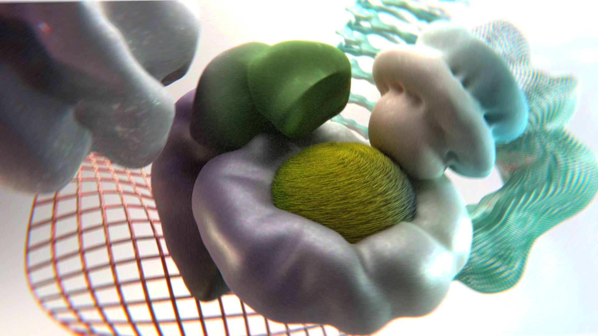
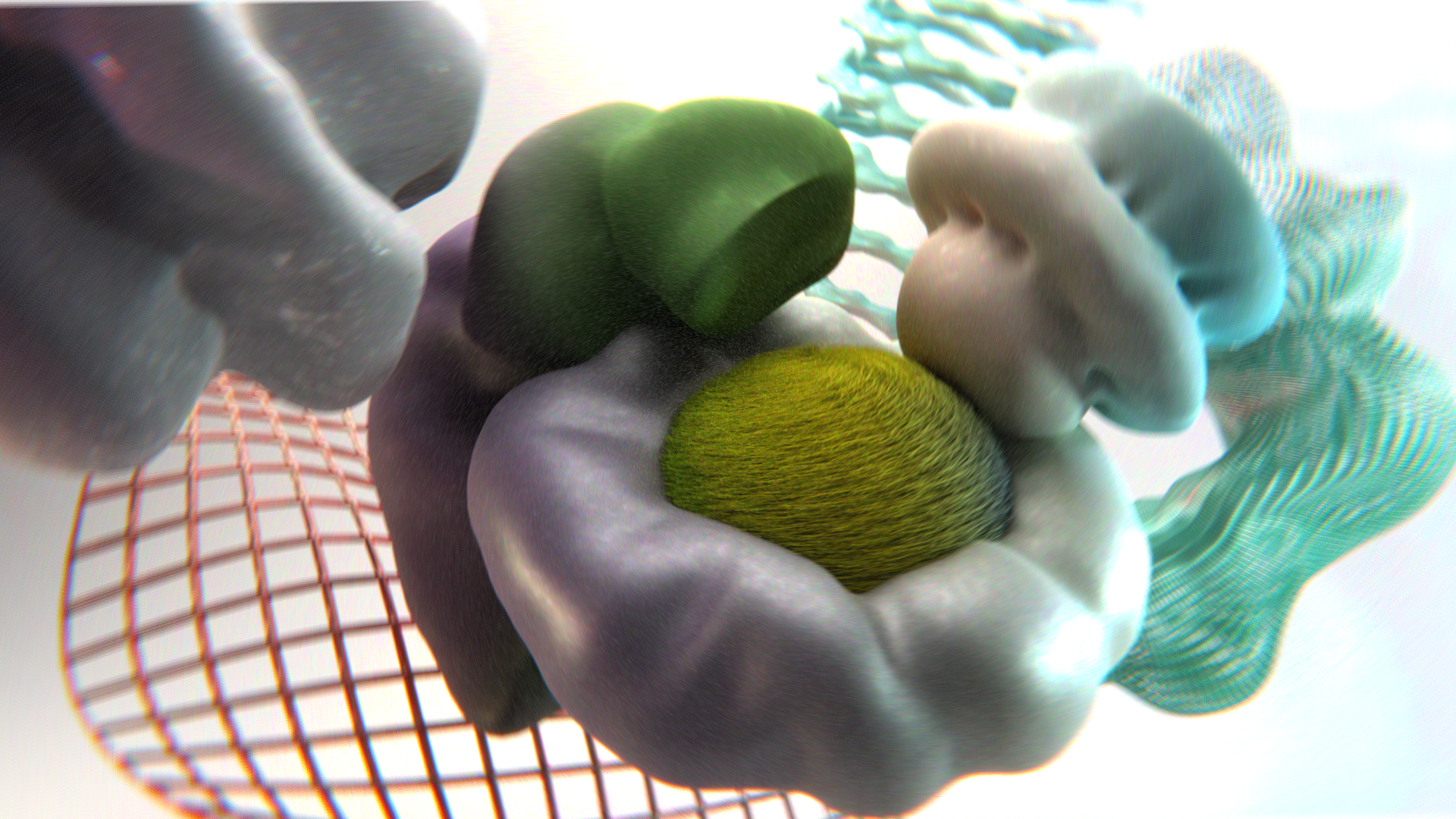
12. 9. Let's Render: Two more or less thans,
and this is one of them. Where are we going to render? And then I'm going to
show you how we can make your final render even more and better with compositing
in Blender. I hope you're still here and I hope you're eager to do that. Actually this lesson we're
gonna be under 5 min. So I like everything. I liked the colors. I probably want to make it a little bit
more brighter. Yes. I know I played a lot, but I do this one for myself and there's
nothing wrong with it. We also can the exposure
to make it bigger. I don't think so. Zero.
Oops, one is good. Okay, come back a
few important things because my render
settings are pretty easy. So first of all,
You Should you be sure that everything
that they have in your scene gonna be displayed
in your final render. How to understand that? You probably will notice that usually every object in
case if you're a beginner, this information
is useful for you. You have an I and
you haven't chimera. Let's, for example,
hide our doughnut. It's disappear from our scene, but it will be in
our final render. Why? Because chimera
respond about final render and this
one respond about what you see and note see
in your viewport display. So let Y be sure that our reference should to
be high done in the rest, everything is good, okay, I want to make this one
a little bit bigger and just a little bit in
front and a little bit ISAF. Okay. There is another thing. I'm going to render this one on. Okay, these settings are good. So we go to the
render properties and on the render assembles, the more samples you have, the motor better quality
you're going to receive. But it will took way, way, way more time. So I personally in case if
you don't trust your PC again or you aren't like me and you broke something
like your outtakes. You can go I think more
smaller, which we'll, doesn't mean that the
quality will be poor, not so better but good. For example, 1,000, 1,000 is
Trustman pretty decent one. And actually that is you
can check one more time. Color management,
very high contrast. I have everything they needed. So how I say this
is very simple. This is my settings,
nothing too special. And then we go to the
render and Render Image. My recommendation,
my recommendation, let me, okay, let
me delete this one. Let me start this one. In case. If you don't trust your PC, again, you can, for example, have max samples, not 1000s, but for example 50,
which is very small. But you make a
quick test Render, makes sure that everything is endpoint and if you like it, then you can increase
the quality. So one thing that I noticed, I want to keep my view, the camera a little
bit more on like that. Good Control S to save
and now I increase. Everything is important. And let's put this
one on render. See you? I didn't think that soon. So my render is done. It took me 11 min. So first of all,
we reimburse them. Think is you go to the image, Save As, and choose
whatever folder you want. For example, I'm gonna
go here course video. I'm going to call
this one render underlying one color
depth 16 savers image. This is the most
important thing. So at the next lesson in the
final one will be going, I create a little bit of
compositing in Blender, which trust me, we'll bring her render on
much better level. Thank you. And I'll see you very
13. 10. Compositing in Blender: Congratulation if
you make it so far, I hope you're doing a lot, but we have one more or
less than the world. We definitely going to increase
the amount of knowledge. And these are the
compositing in Blender. So back here, save your render. I hope you saved your render and then switch to the compositor. First of all, You Should
you have a check in or they use notes and usually they
appear auto-magically, but not in my case for some
reasons it's so complex loci. You press Shift a and is here
to here for the composite. And then one more thing is
shift a search for image and open sewage for your render and connect
image to the image. But unfortunately
we can see all of our changes which will be
actually very comfortable. So for that one, shift
a and search for the Luvr like that and
connect image here. And then check-in like
turn on the backdrop. And that's how you
can see your image. Unfortunately, you can see that the brightness is pretty different from what
we have right now. You can play here with a color, but trust me, this is the
best offer we can have. But wherever, don't worry,
we're going to have, we're going to achieve
a great result. And then one thing that
I would like to do with the moments right now is to
control the right-click. You can this one,
we don't need it. I actually can even delete it. At the moment, we
need only the viewer. We'll add the compositor when, when we like to render. So let's start shift a search for a lens distortion, or actually either this
one for the first time. To make it more clear, take a look and
then we're going to repeat and connect them here. There less distortion
is a thing. Let me show you a 0505. Let's create this type of LGB abbreviation
around of our object. But we should to keep
our value a little bit more lower, for example, 02. And here let's say zero for something like
that will be enough, like not too much naturalists
or actually, nope. 015 and here 0335. Okay, the next one is gonna be, we're going to sharpen a little bit dollar
image, shift a filter. And here we have filtered. So move them here and
instead of software and search for books sharpen. But how can you see
the value is too much, so keep it around
0.1 or even 0.05. I honestly not sure that I
like it and you know what? Let me delete it. We're going to have this
somewhere here in some cases, but at the moment is right now, I'm not really looking for the sharpen,
it's pretty clear. So our next one will be glare ethic that
is kinda similar. If you work in After Effects in Photoshop, there is a glow. So shift a filter and
search for a glare, put in-between of lens
distortion and our image. Here, we should just switch streaks to simple
star medium high, Take a look iterations for
and check out the rotate 45. There is no big change
their moments right now. But if I want to
keep this one on 0.8 and this one on 0.6. Now we can see a big difference. Let me show you, for example, just play around with a value to understand the way how it works. So you can see this
type of glow effect. It's kinda even this
table for retro style, but I think is too dark. Which, and the purpose,
or for example, another effect which is
again kind of retro one. So what about 01? What about zero for at
the moment right now, I just play around till our choose something that I
personally would like. I think 0608. Yes. It is a good faith
faith a in the thing that we will bring a
big difference in between before and
after. Okay, we're good. Let's go to the next one, which is blur, I suppose, is gonna be directional
bluer. Yes. Let me do this book sharpened because I
personally will not use it. So shift a here, search for bluer where you are
here you are the last one. We don't need all
of these settings. We just need this been
for example, on two. Now you can see the difference. This one is too much, we can keep it like a 02. The reason, the reason
why I always bring high-value is just to see how this or that node influence. I'm like, okay, it creates some bluer around
the flower image. So now I can choose,
for example, one And just as small, bluer around the
flower at our corners. I think iterations
I can keep on two. And then I think that
the Zoom can be, let me try one just
to see too much. But 01, we can have zero
to something like that. I think something like
01 is gonna be perfect. So not too much neutralized, so it'd be the blue around. Great thing here. 0.09. No, one was good. One was good. Okay, let's play around
with our colors. Shift a and brightness
and contrast, and put it right here. So just a little bit
play with a value. But again, we can just check. So one is like that. I think although here to keep 06 and the contrast on the
one Control S to save. Why do we have there? What we have there? So this one, I'll show
you a little bit later. We have or the noise texture, this one is going to be great. So I do know, I'm sure most of you will love this green layer
over your image. Very simple. We
go to our texture where it was before, create new. And here instead of
type, search for noise, Let's call this one green
underlying texture. Then we go to the shift a
here, search for texture, bring it right here, and search for our
grain texture. Then we should to
mix both of them, shift a mix and
bring it right here. So now we have lens
distortion right here and color to the image to mix, search for, darken where
you are here below. And the one thing that we
shoot you do is 4.0 to, to decrease the value. So now we have a small
grain layer over our image. What if I'm going to keep
this 1.0 for a little bit, too much, too hungry is called, of course, you can play
around with other to choose sending out
color born too much, white about at the
classical one. Kinda nice. Let me try with 005. You know what? I like it. I'm gonna keep it on 009. I'm going to keep
it on 065. Yes. I think this scale,
I can make it like 1.5 for 1.5 and 1.5. I make it a little
bit more smaller. Or actually 045. I don't want to emphasize
too much these green, so like that is
more than enough. Great. Let me drag this one
a little bit on the left. I hope it's clear to
the moment right now. So I tried to explain
and we should to bring a little bit of color
balance and saturation. So let's start with our, I think other rebellions
gonna be good. So we go here, color, where you are, color balance, again
without any big change. So let's play with our
color balance. Again. Let's drag this
one, for example, up just to see too much. So let me bring this one
a little bit higher. A little bit lower. Know, probably you're gonna be juiced that we
will get higher. I see a little bit. Then we can go toward the gamma. What about that? What about that? I'm going to use delve
a little bit lower. I don't need the big change. And then the last one, I'm going to be a little
bit more interesting. So let me move up, let me move down. I'm going to take, so now here's where
you can play around. If we can go, for
example, you know what, let me make it a little bit less darker but below the center. So something like that gears. And now let me go to the glare. And let me try, for example, to keep this 1.05 just for
the interests too much. But what about 08 right
here? Interesting. Is it going to be true darker, but I personally like it. 03. It's cool, but now
it's too much. 09. I want to give them
brightness of our image. So that's why I'm
gonna keep this 1104 05. Okay, I'm good
with this one. And the last thing is
probably saturation. Who has iteration? I don't know how to
pronounce this word. So I see where we go to this iteration
every time it more, it too much, 1.1,
we're gonna be enough. Here. We can bring coin 45, too much, a little
bit more like 49. Great. And the value also can be 1.1. And that's all. So let me make a quick conclusion
in case if this one for the first time and you're
like What was that? So image node to
bring your image, then you connect this
one with the viewer. And now for the render Shift a, go to the composite. Whoops, pardon, composite. Bring it here. Connected this node,
composite one. You need for the render viewer, you need to see your
changes right here. Okay, It's clear. It's clear. Then let me go again. Less distortion is for this LGB abbreviation,
route glare. If this type of glow effect, these one color balance
and saturation, I think most of you know, is just something
that again apply, play around with your colors. Then we have brightness, which is nothing car to
just increase or decrease a little bit of the
brightness of our image. We have directional bluer, which is this thing
around bluer. And you don't need
to be, I don't know, adenomas Graphic Design there or somewhere else to
know what is blue. So directional one is what
I personally pupils eschew. You can play around
with other blues. I personally like this one. And then we mixed all of
it with grain texture. One more time. You
go to your texture, you create a new one and
search here for type noise. Then you add a node, texture node and connected. It is in the heart to just
play around a few more times. And now it's time for
us to render this one. We just go to the
render and don't worry, this time you're going to
be just a few seconds. Render Image and voila image, save us my Blender crush. Okay, So let me into this
render one more time, Render, Render Image gray. Then they go to the Save
As and save this image. I already said all
the radius, save it. And to finish these
compositing setting, I want you to show
you one more thing, how to create them black
and white version, they're gonna look
outstanding two. So we go here in between
our lens and saturation, shift a and search for G, delayed in their code
and bring it in between. Then the mode not step with the last one that
further weight. And there instead
of smooth series for sharp the second one, you think there is
no big difference. But take a look if
you're going to, for example, in Greece, I didn't know 14 is the
difference is clear, 22, 33. So you actually can play around. It creates some type
of bluer retro style. I like to keep it
for around 12 or probably something like to exaggerate a little
bit like 18 years. And if you want, for
example, to save this lens distortion L, So you just emphasize your lens distortion Shift
D and bring in between all of them in-between of this one, delayed
and saturation. And now you can, for example, increase the settings will, let's say in a 35 but 45. And we have this blue, this red, I think is a little
bit too much, so I'll keep it like 45. And then I'm going to
keep this one like ten. Great. That is whatever we
want to keep it on 22. Now, before I like it more. What about for 18 is good. One more time.
Render, Render Image way the second image, Save As, Let's call this one
black and white version, color zip 16,
service image. Good. In case if something is
wrong with your render, I didn't know what
could be the reasons, but let's say you can
miss something if you do this one for the first
time, two important things. Be sure that use notes, you have a check in and
be sure that here where the image is connected,
you plug them. The list node to
the composite one. That's all. Thank you so much. We've
finished with our less lesson. And if you wanted to hear a little bit of
congratulation for me, well, you can move
to the next one, but if you're not, I will say
right now congratulation. I hope you'll learn a lot, and I hope you enjoyed
the entire process. Thank you.
14. Congratulation: I'm to say goodbye
to each other, but before that, I want
you to say big thank you. First of all, that you
always not going to see you spend your
time with me here. Leave me review.
I'll like to hear your opinion and it also don't be shy to
share your project. I encourage everyone to stay creative and to
share the military. You have something to ask. Asked me, I'm always
looking forward to answer and to be the part of
the supportive community. I hope you'll learn a
lot and of course I hope that I was able to explain
everything simple, especially if you're a beginner. Well, it will definitely increase your knowledge
and your skills. And if you're looking
for introduce something like chubby characters
or Chilean animation, I have other courses
complete the beginner friendly that you can access. So now for sure, goodbye
 Sasha Luvr, Work in third dimension