Transcripts
1. Introduction: Hi friends, I'm so excited to
share this class with you. In this course, you
will learn how to take a beautiful photo of
your handmade product. It's crucial to take
professional photos of your product and tell a
story through your photos. This will help your customer visualize using your
product in their homes. If this is your first time
taking classes with me, hi I'm Prachi Singh. I'm owner of Prachi'
Bohemian Art. I started my business
in 2020 and within few months I got featured
in a local magazine. I also get selected in a lot of reputable art shows and this was all possible because
of my photography. As handmade business
owner myself, I know how difficult
it can be to compose a beautiful photo, and make your product look as beautiful as it is in person. That is why I started
teaching photography. I focus on styling, choosing the correct
props and background, and composing beautiful photo. In this course, we will
learn how to choose props, background, and how to tell
a story through your photos. We will do this by looking at various examples and taking photos of different
handmade products, like handmade bag, handmade made, and a tumbler. The skills you will learn in this class will help you take amazing photos of your
own handmade products. This course will help you systemize your
photographic process. It will give you an idea about things you need to do
before taking photos, and it will make your
photographic process much more enjoyable. I hope you enjoy this class, let's get started [MUSIC].
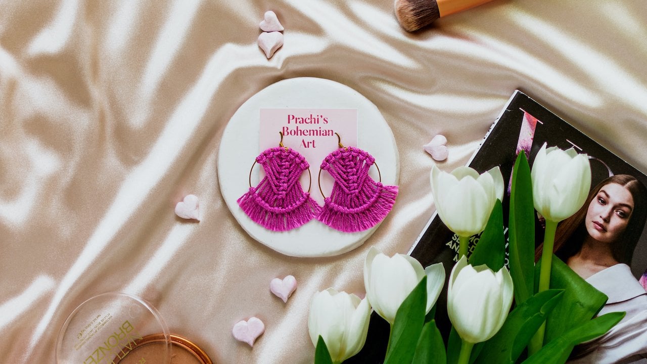
2. Project: [MUSIC] Before we start, I wanted to let you
know that this course is a continuation
of my first course, Instagram photography for a
product-based business owner. In previous course I go to various concepts
like branding, prop, and background selection,
how the camera works, how to compose a
beautiful photo, and how to edit them. I mostly focused on
concepts that are relevant to handmade
photography. Please make sure to check
out my first course. If you watch my first course you know before taking photos, I find inspiration, make
an inspiration board, and go on from there. For this class project, you will make an inspiration
board filled with amazing photos of products
similar to yours. For example, if
you said jewelry, you can have an
inspiration board filled with pretty
jewelry photos. I explained how to search inspiration in third
lesson of the last course, so please make sure to
refer to that lesson. Next, you will figure out props and background
by looking at your inspiration board and also from your knowledge of
your customer's lifestyle. At the end, you will take a styled photo of your product. Once you finish
the class project, please make sure to post
it in the project gallery. Once you're done taking photos, you will know how to
present your product in a style environment and you
will get a feedback from me. You can also add your
work in progress or a screenshot of your
inspiration board in the project gallery. In the next lesson, we will
take photo of a handmade bag. see you in the next lesson.
3. Photography of a Handmade Bag: [MUSIC] Welcome. In this lesson, we will take photo of this
handmade crochet bag. If you've watched
my previous course, you know before taking photos
of your handmade product, you need to understand your
customers and your brand. You need to make an
inspiration board on Pinterest or Instagram, and you need to figure
out what props and background you can use based
on your inspiration board. I have saved some
photographic inspiration for my background in my
Pinterest board. As you can see from
my Pinterest board, I really like to do
style photography of bags, especially this pin. I think studio style photography once you know how to
compose your photo, you will get faster
in taking photos. Studio style photography is
also very easy to reproduce. From my inspiration board, you can see I really like the
monochromatic background. That's why I will use a
simple cloth as a background. Keep in mind that the background should not clash
with your product. At first, I was going to use this white simple
cloth as background, but because my bag
is made of cotton, the white cotton cloth will
clash with my cotton bag. That is why instead
of using cotton, I am going to use a certain cloth and it won't clash
with the background, because these are
different fabric. Another thing to notice from my pins is that I
really like how the bags are elevated and
they are standing out. They are placed on
a box or a table. This separates the bag from the rest of the
surrounding and it lets the viewer know that this bag
is important in this photo. From this knowledge,
we are going to decide our props and we are going to use this simple
box to elevate our bag. Don't worry, I'm going to cover this box with a certain cloth. I'm going to use these
flowers as a prop too, and I'm going to put
these flowers in my bag while taking photo. This flower would add
some colors in our photo. One thing to note is if your idle customers like
certain kind of flowers, maybe dried flowers,
pampas grass or hydrangea, make sure to use those flowers, because you are
trying to promote the work to your
ideal customers. Since my brand is
a made up brand, I will assume that my customers like
this kind of flowers. Now that we have decided on
our props and background, let's start making
our composition. As you can see, I am using my old window space
to take my photos. The light falls on this
side of the setup, so when I take photo, I'm not blocking the light. First, I will put the white
cloth on the walls of this corner to make it very
bright and reflective. Then I will put the box beneath everything to make a stadium. Then I will paste this statin cloth that
we are really low. Before we take photos, few things to keep in mind. Try to take the photo
in the daytime, because the light coming in will be white and
not yellow or blue. If you take photo
in early morning or late evening you might get
real yellow or blue light, this will affect the
color of your product. Cloudy days can be really
good to take photos, because you get soft, diffuse light from the sky. Now that we are done with
setting up, let's take photo. Remember to change
the composition and try different angles. I love to put this
bag at an angle because it adds
depth to the photo, and in this case, it shows the knots of
the bag perfectly. If the bag is placed flat, it doesn't really look good and it's not really
satisfying to look at, as compared to the
bag with an angle. To be honest, I like
both of the photos. But I just feel like
the right photo looks slightly better
than the left one, because when you
include an angle, it is more satisfying
to look at and plus it has a bit more depth and it gives a
three-dimensional feel to your photo or to your object. That's why I like putting objects at an angle
while taking photo. Throughout my
photography session, I keep my ISO at 100, F-stop is around 1.8-2, and I change my shutter speed
to get a well-lit photo. Please refer to Chapter 6
and 7 of my previous course to understand how camera works and how to use the
camera setting. Make sure to move
around while taking photos and take photos
at different angles, so that you will have
more options to choose from and you will have high chances of
getting a good photo. These are some of the
photos from today shoot. As you can see, I like flowers on the
other side and I do like bag at a diagonal angle
instead of just straight. I really like this
photo where you can see the handle is open and you can see flowers
and they're like there's a movement
involved in this photo, but I'm pretty happy with
all of these photos. Well, I like this
photo the most, because there is good
amount of space between the bag and the corner
edges of the photo. You can see the stadium or
the box it is been placed on, and there is good amount of negative space on
the top of the bag. There is basically
breathing room around the bag and you can see
the entire atmosphere, instead of the bag
just cropped in. I like this photo because it's not completely
at the center. It's lying on the 1/3 or
the 2/3 of the photo. The bag is really
relaxing to look at and it has good amount
of breathing space, and that is why I think
this is my best photo. After a few lessons, we will see how to
edit these photos. In next lesson, we will
take photo of a scrap. See you in next class. [MUSIC]
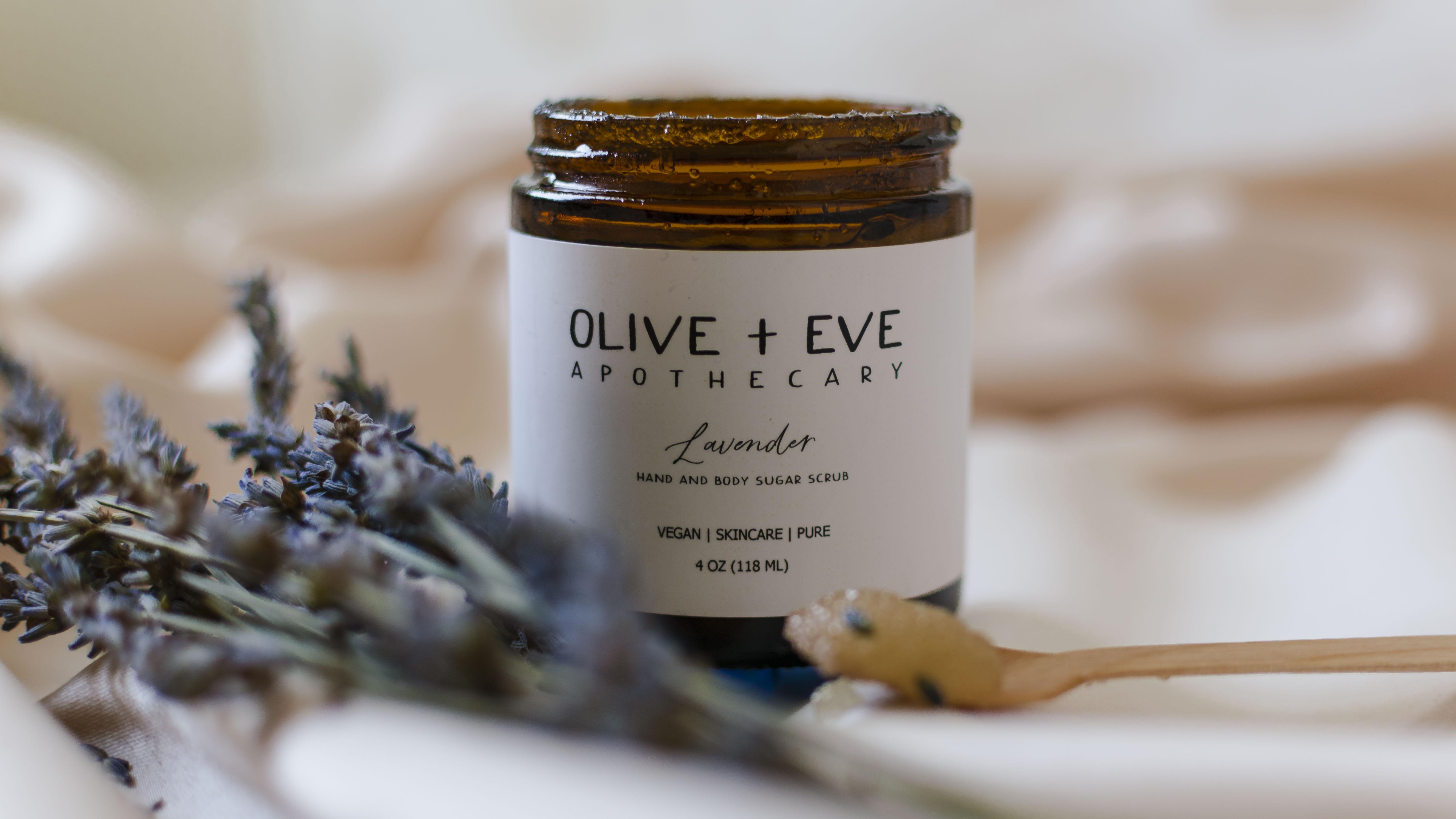
4. Photography of a Handmade Scrub: [MUSIC] Hi, welcome
to this lesson. Today we are going to take photo of this scrub by Olive and Eve. The scrub is really good and it is made by
my friend Heidi. This is her Instagram and if
I had to guess her brand, I would say that it is
inspired by nature. She and her customer probably like clean, simple aesthetic. After looking at her Instagram, I made an inspiration
board for this brand. Most of the photos in
this board have clean soft aesthetics with
simple elements and props. You can see some
similarities in the photos. In this spin the
photographer used a mini stadium to
elevate the product. This way, the product
also stands out. In this pin, the photographer use fruits and herbs as props. These are probably
ingredients of dilution. This is unique way to show
what the product is made of. Checkout this pin. The photographer is using silky smooth satin
as a background, and it probably shows
that your skin is going to be silky smooth if
you use this body polish. These are the takeaways
from my Pinterest board. First, we can
elevate our separate our scrub using a stadium. Second, we can use main
ingredient as a prop. Third, we can tell a story
that your skin will be silky smooth when
you use our scrub. This is what I'm going to use
as prop, lavender flowers. Since this scrub is
a lavender scrub, it makes sense to
use lavender as the main prop plus it also adds natural element
to our photo. I will use this wavy train
to showcase my product. This would elevate
the product a bit and add interesting
shape to our photo. I will use this set in cloth to add a soft look to our photo. Class, I will use this
huge backdrop as a wall. I made this backdrop
using a wood. I basically painted the wood and I watched a course about it. I will add the link to the course in the
resource section. Now that we've figured out
our props and background, let's start taking photos. First, I will place this
backdrop near this wall. You can use a cheap
brackets and clamps if you want to place the
backdrop on a table. Next I will put a blanket and my satin cloth on the floor. I will add waves to it. This will give the photo
a soft, luxurious feel. I will paste my tray. I will take the lavender and place it on the
side of the tray. I like to place lavender on top of each other to hide
the green stalk. I will place my
script on the tray. I cannot put the script flat
since this is a baby tray, I will use a lighter to
balance the scrub on the tray. When you are composing a photo, you need to do some trial and error to figure out
what looks good. Let's take some photos. I also like to move the
product to a different angle. These are some of the photos. Heidi added as scoop
with the package so we will show how the scrub
looks like using this cooper. We will take some scrub
and put it on the top. Let's take some
photos [MUSIC] Now, let's put this scoop on the
side and use it as a prop. This composition looks
like a triangle plus odd number of
elements in the photo is very satisfying to look at. These are some of the photos
that I clicked [MUSIC]. I really like the photos
that we clicked today. In two next lesson, we will start
editing our photos, and in next lesson we are going to take photos
of a tumbler. See you in next class [MUSIC].
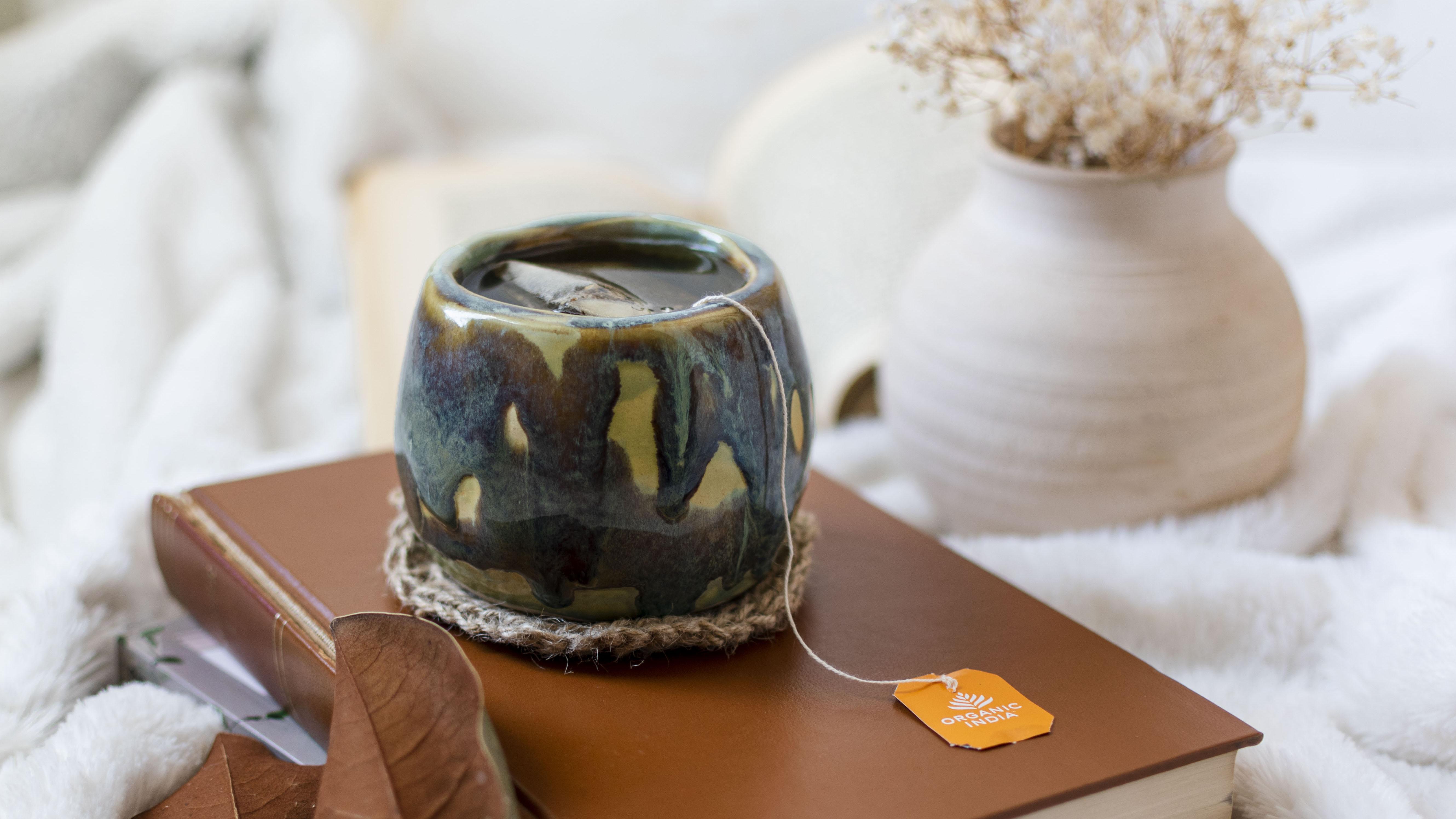
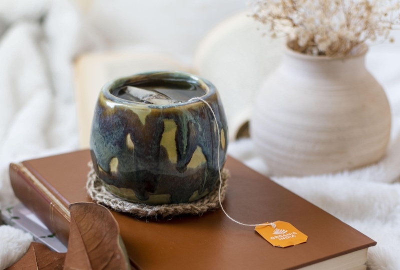
5. Photography of a Handmade Tumbler: [MUSIC] Welcome to this lesson. Today we will take photo
of this handmade tumbler. For this tumbler, I imagine my ideal customer is a reader, a tea drinker, and she
loves autumn and fall. I saved some photos on my Instagram for this
photoshoot and some of the images the photographer
used a coaster to elevate and separate the mug. This way, your eyes
falls on the mug. They have also elevated mugs
using books or a sweater. The use of books as
props help the viewer imagine drinking from the
mug while reading a book. I love to use the
flowers as props. I think this gives the
photo a very cozy vibe. These are the takeaways
from my saved images. I know my customer reads books, so it makes sense to
use books as props. I can use multiple book
and create a layer. One thing to note is that
cover of the book matters. If the cover has a lot
of texture or images, it might clash with our
product, that is mug. That's why it's better to use a book with a mono-color cover. I'm going to add some
natural elements to our photo by using
magnolia leaves. The backside of the
leaf matches with our book cover so it will
make the photo look cohesive. Some people use the
leaves as bookmark, so this will help us
to add in our story. I might use these flowers and flower pot in the background
just to create a vibe. Like in some of the Instagram
photos we looked at, I want to use a
coaster to show that our tumbler is the main
object because I did not have a wooden
coaster laying around, I just made this crochet
duet coaster and the color of the coaster will
match with rest of the props that we're using, so it will make our photo
look a bit more cohesive. For background, we will use our fake wall that
I showcased in last video and this cozy blanket to just add coziness
in our photo. Now that we have our props and background figured out,
let's start styling. First, I will put my background, then I will place my cozy
blanket on the floor. Next, I will place my
books on my blanket. I usually put books at an
angle to create depth. I will put my flowers
in the corner, I will put the magnolia leaves
at the edge of the book, I will place my
coaster on my books, then I will put my mug with
tea in it on the coaster. I also added a book in the background to
create an atmosphere. Now, we're ready to
take some photos. These are some of the photos. These are some of
the close-up shots. Next lesson, we are going
to edit all of our photos. See you in next class [MUSIC].
6. Editing in Camera Raw: Are you guys excited
to edit some photos? Before we start, I hope you guys watched
my first course, especially the ninth
lesson of this course. In this lesson I go
through a lot of depth on how to edit photos and
what all the setting mean. Please make sure to watch the ninth lesson of this course. If you watch the course
you know that I use Camera Raw to edit
all of my photos. I will select all the
photos and open them up. All of my photos
shows up like this. Sorry to be a broken record, but I hope you guys watched the ninth lesson of
the first course because I go into great depth explaining
all the concepts, like profile correction,
chromatic aberration. In this lesson I will
show you guys how I edit my photos and the reason
behind each of my action. First we will read our photos. I did not like how the flower are on this side of the bag. I like the flower better on
the other side of the scarf, the opposite side of the scarf. Plus I like the background
better in this photo. I will give it a five-star. I don't like how the bag
is placed in this photo, so I will give it three-star. Now I will rate everything. In these photos what I am looking at is if there is enough space
around our project, we are going to crop our photo. You want to make
sure that we include most of the elements and
detail in the frame. After rating we are
going to filter our rating and edit the
photos that we like the most. Now we will click
the Filter button, Star Rating, and
then five stars. These are the photos
that we like. I'm going to edit a few footage to show you guys my process. First I will crop the image. I will use 4 is to 5
ratio for this photo. I think Instagram allows
photos with a 4 is to 5 ratio. First I will make
sure that there is enough space at the
edges of the photo. It's also good if your elements
are on the four points. In this case the three
points in our photo. This will ensure that
your eyes falls on those elements and that you
have a good composition. First we will do profile correction and
remove chromatic aberration. It will remove distortion and
fringing from our photos. Now we will do some
basic correction. If you are taking photos
during the daytime, you won't have a weird
white balance issue. But if you take photos in
early morning or late evening, your photo will be either
too blue or too yellow. If your white balance
is messed up you can drag this slider to fix it. I will start making
basic correction just to see what looks good. I will increase the highlight, brighten up the shadow. I may darken up the black
to create a contrast. I rarely touch exposure, because if you increase
exposure it will brighten up all the pixels
and you will lose details. If you want to increase the
brightness in the photo, use highlights and
white and not exposure. If you think your
photos are too exposed, you can reduce the exposure. I will increase the
contrast a bit. Texture increases the
texture in the photo. Clarity makes the
photo look contrasted. I usually increase
clarity just a bit. Vibrance increases the intensity of dull colors in our photo. I increase vibrance
by a small amount. I explained the curved section a lot more in depth
in last course, please check the ninth
lesson of my last course. Basically when you make
changes in the curve you make changes in different
region of your photo. Like right now I'm darkening
the shadow region. This is a midtone region. This is highlights and
this is pure whites. I am making S-curve. S-curve make sures that your
photo looks contrasted. You don't need to make
a perfect S-curve, you can change it as you wish. If you click on Details, you might see
sharpening like this. You need to click this
button to see the drop-down. Here you can choose the area
that you want to sharpen. We're going to click Option, and hold down the masking key. Then you're going
to drag that key and select the area that
you want to sharpen. After selecting the area you
can increase sharpening. If you have a lot of noise in your photo you can
use noise reduction. I usually don't have
noise because I keep my ISO at 100 and take
photo during the daytime. The color mixer, I will
just use luminance. I don't need to increase the saturation of any
color in the photo. When you move the
slider you can see how certain colors will get
brighten or darken. I like the bright rose better. I will just play around in the color mixer
section for a while. In color grading you actually add colors in different regions, like shadow, highlights,
and midtones. It creates a vibe, but I like to be
conservative while adding colors in these areas. Because if you add
too much color you will change the
color of your product. We don't want to change
the color of our product, we want it to be
true to its color. You can use this
slider to either darken the shadow or
brighten the shadow. I like to darken the
shadow to add contrast. I don't play with
mid-tone because it makes my product look weird and
have different color, so I'm not going to touch
the mid-tone section. Now I will go back to basics
and make some changes. I think this photo looks good, this is before and after. I will go ahead and
edit some scrap photos. I love this photo and
I will edit this. I was trying 4 is to 5, but I think 1 is to 1 would
look better because you will include a lot
more elements in the frame when you
use 1 is to 1 ratio. As you can see, this
crop looks good. Now we are done
cropping the photo, we will start editing our photo. First I will do
profile correction and removed chromatic
aberration. In this photo I will
play with saturation. If I increase the orange
saturation it will increase the intensity
of the background color, and it won't change our
script photo by that much. I can play around with
saturation in this photo. But if our product was an
earring or a painting, I wouldn't change the saturation because that will affect
the color of our product. If you've watched
my previous course, you know that I use
this technique where I increase the saturation
to a certain color, move it around to see which color works well with the photo, and then I reduce the
saturation to 1 or 2. I will do the same
thing with highlights. This is before and after, it looks cute, and I will just move
the jar just a bit. I love the rays in
the background, and you can see this scrub
and the shine on it. I like everything in this photo. I really like this photo. This is how I edit my photos. I can copy the edit settings and paste them to other photos. You can make some changes
after pasting the edits. If this was the
main product photo, I would put all the four
points on our product so that your viewer can see the product even if
it's a small thumbnail. This would be a good
Instagram image because all the elements are on the four points and that makes the
composition look good. Now we will edit
our Tumblr photo. Let me select the photo
that I like the most. I think I will edit this photo because you have
all the elements in the background and you know it will be in the frame when
you crop the photo out. I will use 1 is to 1 ratio to include
everything in the frame. I tried my best to make sure that the book is in the photo, and its corners, and not cropped out. Even if its corners
was cropped out, that's completely okay because our main element is Tumblr. I will make sure that
Tumblr falls on this line. Now I wouldn't make
color grading changes to my photo because that will change the
color of the glaze, and I don't want to do that, I think this photo
looks good as it is. This is how I edit my photos. I hope this is helpful. See you in the next lesson.
7. You did amazing!: Congratulations on
finishing this course. Just to recap, we went
to various example and we took photos of
a handmade bag, a scrub, and a mug. We understood how to select
props and background by understanding our inspiration
and customer profile. We learn how to tell a
story through photos and how to make viewer connect with your product
through your photos. Please make sure to add your project or your
work in progress in the project
gallery so that we all can take a look
and review it. One piece of advice
that I want to give you is that it's okay if you don't take a perfect
photo the first time, the more you practice, the more you are
going to get better. Please leave a feedback
if you like this course. Also do follow me so
that you will get notified when I
make another class. Thank you again. See you soon. [MUSIC]
 Prachi Singh, Fiber Artist and Photography Teacher