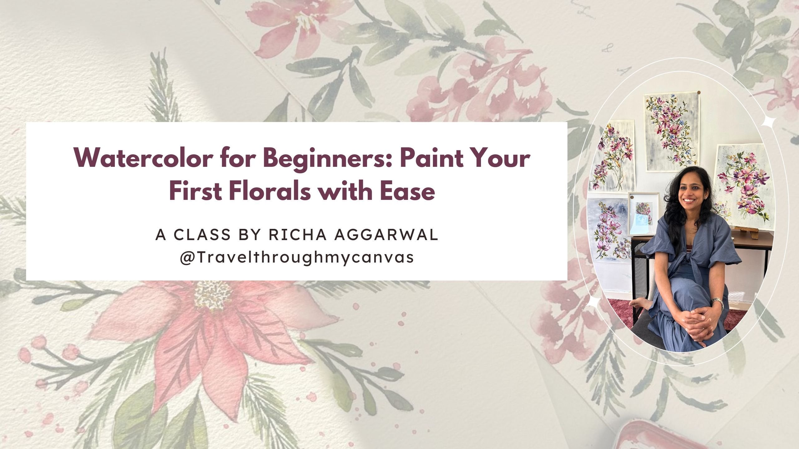
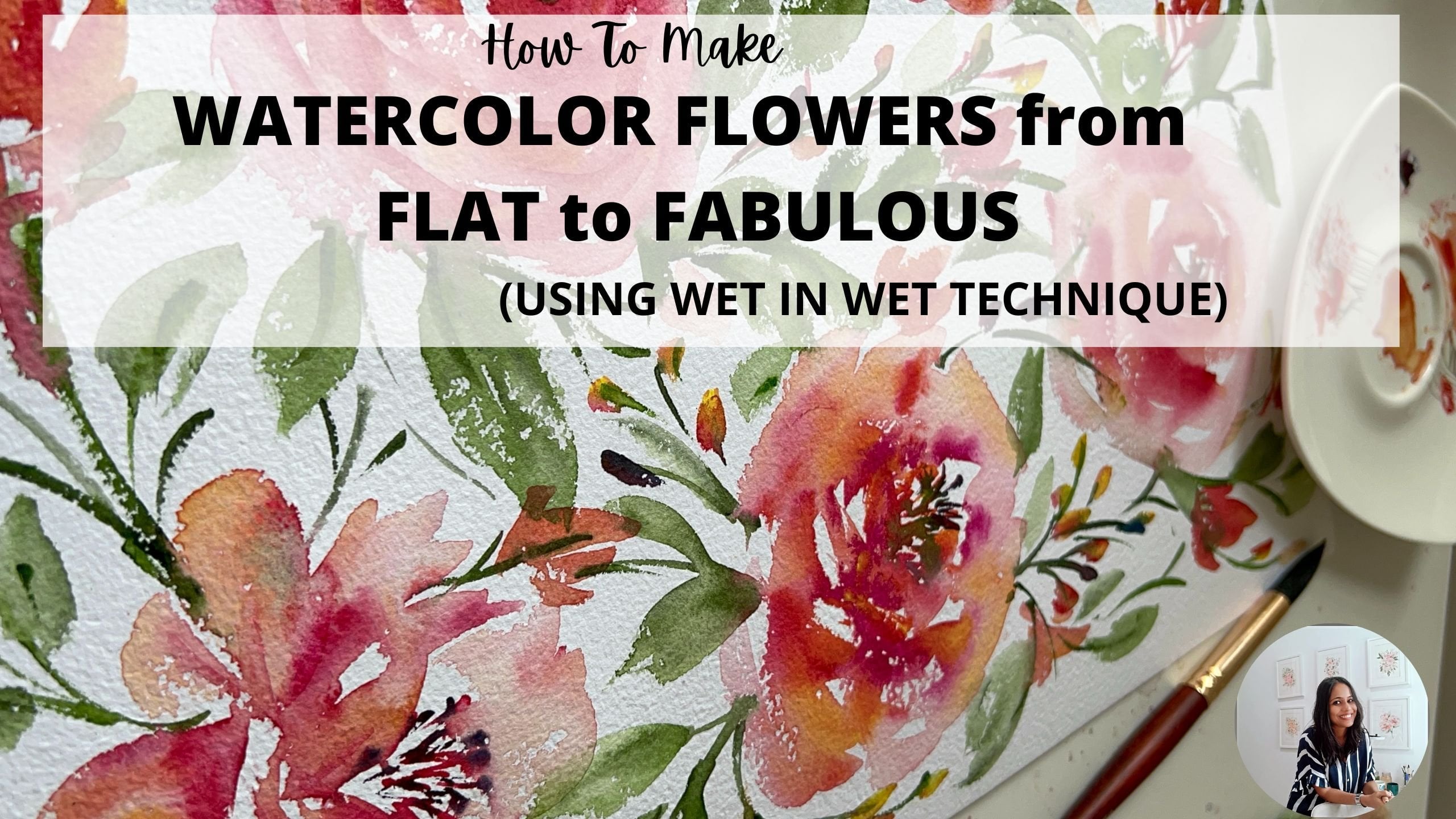
Transcripts
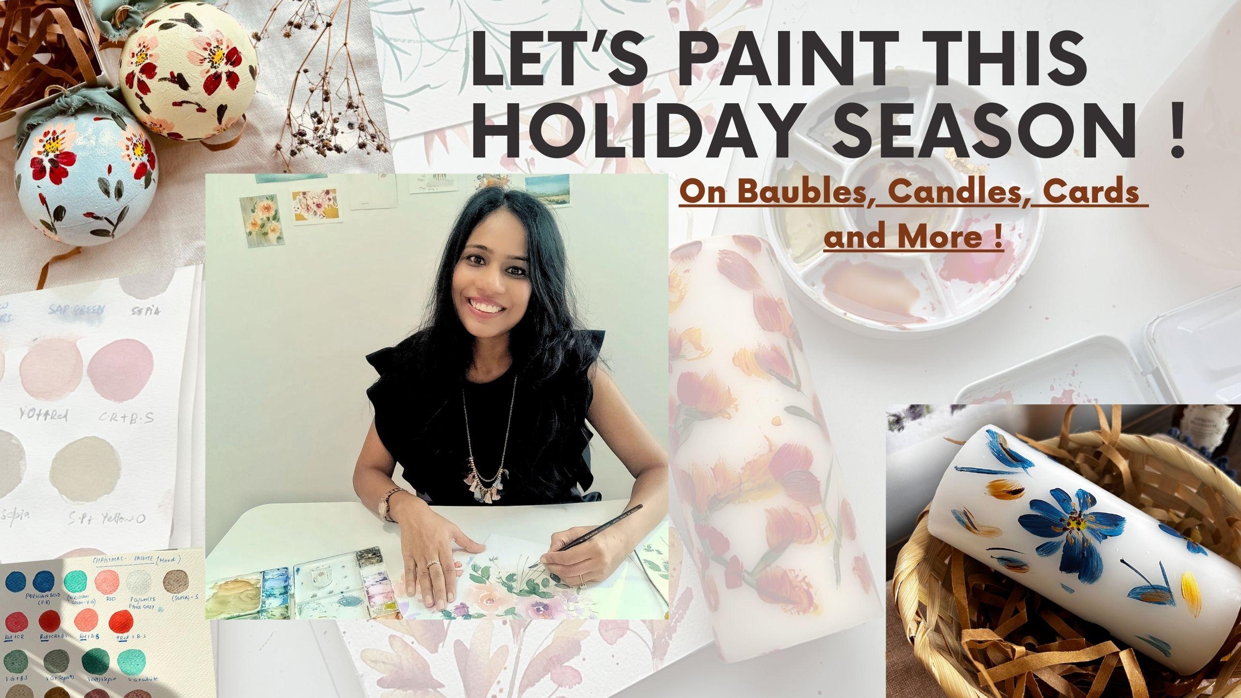
1. Introduction : Ah. Raise your hand
if you want to paint this holiday season and feel autumn Christmas
vale on your desk. Yes, Art has that power to let you feel the
autumn of Paris, the Christmas of Switzerland, sitting right at your desk. Hey, I'm Richard Agarwal. I'm a watercolor artist,
surface pattern designer, but I love to help artists to
paint more with watercolor, especially to paint
in their own style. Yes, I love when artists come forward and find their
style, evolve and thrive. But this holiday
event class is all about you feeling the vibes
of your favorite festival, be it the Vali, be it Christmas or be it
Halloween in autumn. So let me tell you how. In this class, we will
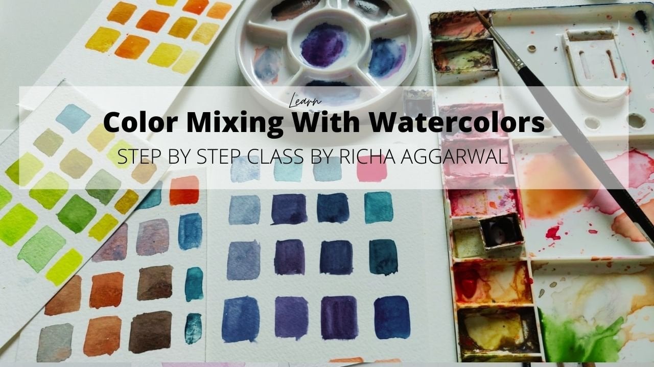
first learn to create color palettes of divale
autumn and Christmas, which set the mood. Colors are like everything
and you can use those color palette to paint any feas and paintings exciting. Because colors are
the main mode. Color is one of
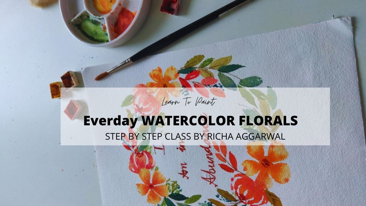
the main element. But that's not the end. After that, I will be teaching you to create two
floral pattern, one simple and one
a little advanced. With which you can paint anything like greeting
cards, candles, bobs or whatever
you think of reds, or you can make cute
paintings out of it. Let's dive in and there's a lot to learn and
explore in this class. This class is perfect for you, even if you are a beginner. Yes, all you need for
this class is the desire to paint this holiday season
and feel the joyful wife. Each and every lesson in this class will only
bring joy to you. If you're curious about
me and my classes more, say hi to me on Instagram at the rate
travels through my canvas. You find more of my
classes on skill share. Do follow me on
skill share as well. But I'm always there on
Instagram at the rate travel through my Canvas to chat with
you and to help you more. As of now, let's dive in into this holiday season class
and let's paint candles, baubles, greeting cards,
more and more and more. See you there in the class. Bye bye.
2. SUPPLIES YOU NEED : Let's have a quick
look at the supplies. For this class, you don't
need any fancy supplies. I'm just using a normal paper. It is cellulose paper. You can use any paper. It is 100% cotton
watercolor pad. You can use any paper. You can even use your
sketchbook for this class. Paper is not a very
important thing here. Other than that, you need any brush because they are
going to make color palette, so for in further classes also, you just need any round
brush, whichever you like. Here I'm using number six brush, which is silver
black velvet brand. You can use a brush
with a good tip. That is, must know things like a thing which I would highly
recommend if you can, then find a brush
with a good tip. Other than that, you can
always use this filbrit brush. This is also good for the class later on when
we'll be making patterns. This is Part number ten brush. Now the size of the paper
really doesn't matter. The bigger and so the
size of the brush. Bigger the paper is, the bigger should be the brush. Suppose if you're
using this size which is between A four, you can use number six
or number four brush. But if you want to
use a bigger paper, bigger than A four,
then use number ten or number 12 brush. You can also use
something like this. It doesn't have a
good tip, but yeah, this will also give you good
patterns for the palette, you can use even
the square brush. So here we go with the brushes. Next come your colors. I'll keep telling you the
colors which you'll be using for different palettes
like autumn palette, Christmas palette, and
the valley palette. I'll keep telling you
about the colors. Get your basic watercolors, whatever you have, and we will
be mixing a lot of colors. Make sure that you have
some shades of yellow, yellow ochre, burn
Siana, sap green, CPR and for the Christmas ones, we'll be doing red
and greens and browns and for divale again, red, green, blue and yellow. It is good to have
some shades of red, S shades of yellow, blue, green, and some
shades of brown, one or two, it will be good. Other than that, just
get whatever you have. I never limit my classes or
my students for the palette. And then definitely you
need a clean palette. That is a must to go and always
always clean your palette once you are done with one
thing, like one artwork. It gives a very fresh look. Other than that, you need two
water cans and any tissue, paper, or kitchen
towel or anything. I hope we are clear
and we're good to go. Let's die in into our classes.
3. LET'S MAKE AUTUMN COLOR PALETTE: So let's make an autumn
palette why I'm telling you, teaching you to make a palette because I love to
empower people. Once you know how to
make these palettes, you can transfer
them on anything. That's the aim of this class, you can transfer
them on candles, you can transfer
them on baubles, you can transfer these patterns on pumpkins, eggs, anywhere. Or on your greeting
cards, or whatever. But to give the
autumn feel like it's beautiful autumn here
and take that feel, it is important to know what are the colors we use in autumn. We see in autumn and
how to replicate. So let's start. The possibilities are
endless, but let's start. I'm first putting some water
in my loading my brush, just washing my brush and
taking some water in it. I'll be using four basic colors. The first basic color is born Siana Let's take
it. Let's mix them. Mix my bonsiana I'm taking a
little color and mixing it. Just take a little
color and mix it. This is my first color
that is burnt Siana. I'm taking it directly from
the tube, so no mixing. Then the second base color which I'm taking
is yellow ochre. This also I'm taking directly
from the tube, no mixing, but I would always
suggest you to mix your color in the palettes first and then put
them on the paper. This is a huge, huge mistake, the bigner artists
do. Even I did that. Always mix your colors in
the palette and then put it on the paper and
use your artwork. The third color is sam green. Okay. Here is a Sab green. This is a beautiful color
and you get it all the time every company make this. The last one which I'm
using is a darker brown. This is sepia. Okay. Here we go. These are four basic colors to make you remember,
I'm writing it here. This is my first
one is Bonsiana. Second one is yellow
ochre, then sav green. And CPM. Yes, it is good if you have these four basic
colors in your palette, then making this
palette will be easy. One more I would say, this
is not a color of autumn, but it is good to
have this red color. Let me show you how it is. Like the normal Indian
red or vermilion hue. This is good to have. But this is not an autumn color. Okay. Now, let's start
with our first mixing. In my first mixing, I will take my yellow red. I'll take red, and I'm taking a little
bit of yellow ochre. Okay. This is my first
mix of autumn colors. This is the orangish color. But I'll give it
yellow Ochre YO, Sab green is going to be SG. I hope that's clear
and CP going to be S. Let's name them and Boy
Can is going to be BS. I hope we are clear till here. This is a mix of
yellow ochre plus red. This is almost equal
equal if you see. If you ask that how much
color should I take? When you mix equal amount
of red and yellow occur, you will get this color. Now what I'm doing, I'm taking more of red. In the same mixture, I am taking more of red. Now this will give me
a darker orange color. This is also a
beautiful autumn color. This is just yellow occur
and red equal quantity. In this, I mix yellow occur plus I increase the quantity of red. Now, let's mix our
crimson red and Bnciana. This is the Bnciana. If you remember, I used it. I'm taking my crimson red here and I am mixing my burn Siana. I need to take a little more
burned Siana because that was not the way I wanted. Let's see. This is good. Let's see if I add a little
more burned Siana to it. What happens? It will give you a more automi This
is also lovely. You can choose any, mix and
see which one you like more. This is burn Siana
plus crimson red, burn Siana in more
quantity plus crimson red. We got 48 beautiful
autumn colors. This is going to be my shades of yellow or red, you can say. This is yellow ochre, you can add yellow ocher and all these
shades when you add leaf in greeting cards in
the shade of yellow and red. Now let's mix some shades
of yellow and green. Definitely sap green
as we had seen. Sap green is one of the shade. The autumn greens,
if I will say, I would love to mix
a little bit of burnt siana I think I'll
add more green to it. This one I like. This is another I'd say I would add
a little more green to it. I want to make it a greenish. A lot of green and
a little bit of burns Siana will
give me this color. A lot of green and a
little bit of burns Siana give you this color. Now I'm adding a lot
of green. To this. Wash your brush before you put
it into the another color. I am now adding Pipia. This is, again, one of my
favorite autumn greens. This will give you the green. Now let's mix green
and yellow occur. This will be a little
lighter version of green, but this is also my favorite, one of the favorite ones. I'm not telling you the
ratio here because I would like you to use your
creative freedom hair. Observe an autumn leaf or if you don't have
an autumn around you, just watch some pictures online and see what proportion
you are liking. I don't want you to be a
puppet of half of green, mix half of yellow, no, just watch and think
what you're liking. I'm really liking these green. If I like, Okay, I need to add
a little more green to it, feel free to add a
little more green to it. This using this base palette will give you only
the autumn colors. Don't worry, don't
fear, like, Oh, what will happen if I don't I this will not come
or anything like that? No. Just try using
the base colors, I will give you the
beautiful autumn palette. As you can see,
these are the greens and I'm just loving it. Now, let's make some browns. For the browns, definitely, Burnsiana are the
two base colors. But let's see what
happens when I mix Bnciana and Sepia together. I love this one as well. I'm mixing Burnsiana Now you have to use your own
judgment where to stop, but I usually mix them equally, give me a color in between of
the both Bnciana and sepia, a brown, which you can see. This is Sepia. This is Benciana. And this brown which we got
is in the middle of the both. I just love it. I just love it. One more experiment
we are going to do. We're going to make yellow
ocher in this color. I love this brown as well. I'm taking a lot of
yellow ocher and a little bit of boniana sepia. This is a darker yellow, which you get, so let me we
mix burn Siana and sepia. This is normal burnsiana
directly from the palate. This is sepia. This is
yellow ochre plus sepia. I'm just mixing these two
colors with the yellow ochre. Now let's take a yellow ochre. I'm going to mix a
little bit of sepia. No sepia. I'm sorry. I'm mixing burn siana
this yellow ochre and burn siana. Okay. This color is also a beautiful color and it will also go in your
reds if you want. This is yellow ochre
plus burn Sienna. Although this completes
the whole palette. But yeah, we can experiment
a little bit more if you are looking forward
for a darker shade of red. For that, I'll take crimson red. This is my crimson red. Always take a clean palette. This is a crimson red, that's
why I'm mixing it here. I'm going to mix a
little bit of CP in it. This is crimson red, plus sepia. I think I'll add a little
more crimson red to it. But this is a gorgeous color. I love this color for
my lipstick shades. This is crimson red, plus sepia. This is a lovely autumn color. Now, let's take crimson
red and yellow ochre. Here is my yellow ochre already. I'm taking my
crimson red and I'm mixing a little bit
of yellow ochre. Okay. Let's see. It's almost similar
to the orange, which we made, but
a little different. I would not say I use it
much in my color palette, but yeah, it is good. It is good. If you want, we can do one more, we can mix crimson red. Wash your color if you want
and I'm going to mix burnt Siana to it. Okay. We have already done it. Yes, crimson red, plus bunsiana
We haven't done burniana. We haven't done Sepia
Sepia crimson red, plus sepia and crimson
red, plus yellow. Occur. These two shades to
try them as well. I love this one, but
crimson red plus sepia. This is one of my favorite and this is
our whole autumn palette. It's coming out so beautiful
wherever you put it, in any pattern, it is going
to give you such a good feel. Do make it and let's move on to our next class
in which we will be making a Christmas
palette. See you there.
4. LET'S MAKE CHRISTMAS COLOR PALETTE: Okay, now let's jump to our next palette which
is Christmas palette, and you will see beautiful
beautiful colors like Christmas colors here. Again, we'll be
making a pattern, but first let's color palette. A few tips always
take a clean palette, take away wash your old palette or take on another palette, but use a clean palette whenever you are
making a new colors and also a clean water
jar and a clean brush. Clean water, clean palette. These are two basic
requirements of this class in this class, I'm using few shades of green, red, blue, and brown. I'm also using a new color. It's not a watercolor,
it's squash. Gouache is a color
which is in between of watercolor and acrylics. So if you thin it,
add more water, it behaves like watercolor
and if you think it, use it as it is, then it
behaves like acrylic. You can just order white
guash from any company. This is brusco from India. But yeah, if you don't
have it, that's okay. But if you can just get a white guash for Christmas
colors, that'll be good. Okay. I'm using the blue
which I'm using here is Persian blue and the green which I'm using is a different
green ardian hue. It's a rdiant hue of green, not the usual sap green. The red is same, the red, like the Indian
red or the Woman, orangish red, I would say. Always take your colors
in a clean palette. This is my green, this
is my blue and the reds. This is not my usual palette. I don't paint with
the Christmas colors, but my usual painting, But yeah, I love to create something in
the Christmas mood. I would say that Christmas, these colors are just the mood, they take you to anywhere
to the Christmasy land. I write sitting at your desk. The first color here
is Portianblue. I would say I'm using a
mid tone of Portianblue. This doesn't feel
like Portianblue so. Let me go back and check
my colours. And, um. I have ultramarine blue, I have cobalt blue, and it is my Persian blue, I hardly use it. That's why it's hiding hide. Now this is again a cobalt. Here we got it. This
is my Potian blue. Let me take it a little bit
here because I'm really not convinced with the shade
that this is a Potian blue. Yes, we are taking a portian blue color hair. Then we'll take a wooden green. I'll write the names
for you. Don't worry. This is very
Christmasy sweaters or Christmas tree kind of a color you see on
Christmas cards, of course, the red, that is the color of Christmas. All the reindeers and
everything flows to my mind, white, or if you
don't have white, just leave it and
or you can use also a very light shade
of pines gray. That will also serve as a white. If you don't have white,
don't stop yourself. Yeah, that's it.
More red and sepia. You're going to use these colors as our Christmas palettes. Let me name them for you. This is Portianblue. We'll call it PB. This is dan Am I spelling is a. Gan green. We'll be calling it V G.
This is our normal red. Indian red, this you can use
as a pines gray or white. Pines gray very
light shade of gray, and this is again Sepia. We'll be using S. All set. Now, let's create
some Shades of red. For the red, I
would like to take red and a little bit of
crimson red, I'll mix in it. I just love this one.
Red and crimson red, this will give you one red. In the same red, just
try and mix burn Siana. In the same mixture
and you'll get a lovely Christmas red. Now what I'm doing, I'm
taking my red and I'm mixing burned tumber burn
siana, whatever you call it. Red and burned Siana. This will give a
little brownish touch instead of just using red, you can mix crimson red
and burn Sianas to it. And let's try making a
little sepia as well. No, I don't like it that much, we'll keep it to red and burnt umber or bonsiana
whatever you call it. Let's try I'm using more
Bonsiana this time. Okay, let's increase a
little bit of red in it. Because Christmas
is all about red, so we'll be keeping more red. Then burns color
the brown shades. In Christmas, the red
and green will be more. While in autumn, the
earth colors are more, This is red plus crimson red, this is red, plus crimson
red, plus burn sienna. This was red. Plus burnt umber
and now we increase red plus burned Siana
burn Siana burnt umber. I'm using it interchangeably. As you can see,
there's more of red. Palette, it is more of red. While when you're making
the autumn palette, it will be more of early colors. Now let's go to our greens. For the green, I'll just take
this color virgin green. I'm going to put burnt
Siana again to it. Now see. This is actually
Christmas tree color which you get by mixing burnt umber burnt Siana same
color with the rdt green. Now what you do, you
add odian green. Instead of sag
green, we are using this dit green and
then I'll make my CPA. CPA is like a dark brown color. See. Now this is second
amazing Christmas color. I just love it. Now, let's add a little
more wooden green to it. Let's see. This was an amazing amazing amazing green for the Christmas. This is more towards
brown and this is more towards green
because it has more Pi and it has more green. Now one very simple, if you want to add it, but that is a personal choice. I'm taking white.
And wooden green. This is just white
and wooden green. If you want to add
it to your palette, it's okay and if you don't
have white, that's also okay. But we have Four very yummy colors. This is d in green,
plus B sienna. This is od in green, plus sepia. This is more of sepia and
this is more of od in green. Plus sepia and this is
d green plus white. We have our reds and
we have our greens. Now let's move to our brown. For the brown, I'm
taking my sepia. And I am adding my yellow ochre. Here I'm adding a little
bit of yellow ochre. Try this if you haven't
tried this color, a little bit of sepia
and yellow ochre. It's a very interesting color. See. This is the stems. I remember the days when I
used to paint landscape, I still paint but very less and for personal commission
work and all. But this color is a
very beautiful color of stems and all. Now, I'm going to mix all
the three shades the colors. I'm taking my sepia. I'm taking my wont umber and I'm taking my
yellow ochre, let's see. This color, you can vary the proportion of
all the three colors and you can make three
different colors in which one Sepia is more
or B Siana is more, but I like it a little
towards a brownish one, I'll keep Sepia the maximum. In this Sepia is maximum and a little bit yellow
ochre and burnt Siana. Okay. I hope you can see it. I'll write the palette for you. Don't worry the colors. In this now, I'm taking CPA. There you go. The CPA, a very interesting
color I'm adding in it. That is crimson red, okay? You'll feel but make
it more towards CiPi. Make it more towards
brown brown is more and crimson red is
less and then tried. It's a very very juicy
Christmas color. Whenever you want
to add the brown, believe me, you
will just love it. I'm writing it here,
Cp plus crimson red. You will just love it
more towards the sepia. This is Bonsiana plus
yellow ochre, plus sepia. More towards Sepia and this
is Sepia plus yellow ochre, simple, more towards CiPia. We are just making a different
different shades of brown because definitely the Christmas has a lot of brown
element in it, one more brown, which
is my favorite is mixing crimson red,
not crimson red. I would say is mixing my
red Okay. And my greens. This is definitely a dull color, but I love to add it somewhere
in my Christmas card. If you want to
learn dull colors, what are dull colors? What are fresh colors? I would like to invite
you to my other classes, or I'll try to make some class. But as of now,
just remember that mixing two complimentary colors will give you a dull color. We mixing red and green. I got this dull brown, but somehow I just love it. Red plus white and green.
These are the browns. Isn't they lovely? Yeah, they are. With my portion
blue, I would say, just add white to it or
you can just play with it. By adding water and
you will love it. This where you want
to add a snow, this is a very good snow color. And if you add more, this will become a different
different different tones. This is more white. This is more color, more
water or if you want, you can add a little pines gray with to your portion blue, add a little gray or
a little white quash. To the portion blue. This is to add those sparkly
stars or snowy colors. But they're very good. If you are making flower, you can make leave with it
or you can just sprinkle, you can make anything with this, but it's lovely or if
you want to add white, to the Persian blue, it will be lovely as well. These are just Persian blue, plus gray, plus white. This is Persian blue, plus more water, Persian blue, I would say mid tone. Okay. This is a Christmas palette. I used Persian blue
to just give you a revision Persian
blue, odian green, red, white or gray, and CPA as my base colors. These are all the reds
which you get in Christmas. This I have made by
mixing crimson red, Bsiana to different quantities, take it more, keep your reds more because Christmas
is all about red colors. When you're making greens, keep your green more and
just add a little bit of Bnciana CPA and white and make your different shades
of white for your greens, not greens, for your browns, CPA is your main color. You're adding yellow ocher. These two are really,
really good to try. Just try them and
you will love them. This one is my favorite
CPA plus crimson red. Let me know in the
comment section. Did you have ever tried this? This is Portianblue. It's amazing. It's amazing. S in the next class
and have fun. Do you do share your work
in the assignment section? I'm so eager to
see your palette.
5. LET'S MAKE DIWALI COLOR PALETTE: Let's create the vali
colors in this class. I'm an Indian, and we love celebrating Devali
is full of colors, festive, lights and everything. So how can I forget
my Indian friends and how I don't tell or create
the colors of D vali. So here I am. And in this, again, the two most important
things clean palette and clean water and a new paper. And let's get excited to
make the vali colors. So as I see this color palette, I would say so rich in
our culture, in our food. The colors are always taken from this yellow ocher is a food
of spice called Haldi. This is, again, a very
beautiful color of greens, which you see in all
our Indian arts. We will also learn the
color how we make our oli it's an auspicious Tilak. Which you put in all our
ceremonies and jamon color. The fruit in India, the blueberries are not the
heat ones, but the jamon, we'll be creating all the
colors and you can use it to make the valley cards
or paint your candles for the valley or you can make rangolis with it or
mandalas or anything. I am super excited. I hope this disk
is visible to you, let's get into the Wali mood. These are very good
colors if you want to create some Mud
las for yourself, even if you are not in Indian. The colors which I am the
base colors which I'm using here is definitely the
first one is Indian red. So very, very gorgeous
red. You love it. Then in yellow, we
are using two yellow. One is Indian yellow. This takes me back to the mango season the lovely
summer season of India, I miss this color. Again, the yellow ochre, and here I will be
using olive green. It is almost similar
to sap green, a little darker version. If you don't have olive green, you can even use the sap green and mix a little brown in that, that it is, nothing else. This is sap green. So Indian red, one more color, the same color which we used the Christmas palette,
the Persian blue. This is also
beautiful color which resembles the various shades of India. This is Indian red. This is Indian yellow, yellow ochre. This
is olive green. If you don't have olive green, mix your sub green
with a little bit of burnt umber or sepia, busianblue B, we'll
call it BB or G and IR. Indian yellow and yellow. Now let's start mixing red. For the red, this
is my favorite one. For the red, not
the crimson red. I'll be using the Indian red. And wash your brush before you put your
brush in the yellow, and I'll be using Indian yellow. This is beautiful,
beautiful and very bright. Orange you will get,
you'll love it. You will love it. Take my
words, you will love it. The second color, which I
will making is a roly color. That is Indian red, crimson red, and a little bit of burnt umber. A little bit. I think I need to a little
more crimson red. Red and a little bit of burn tumber a little bit more of burn tumber I will say. I have taken burnter
two times on the tip of my brush and then I got it
see how juicy and yummy. This is a color of our roll. Red, crimson red, and burn
tumer Burn tumber I will say a little more
than both the reds. Also, I would like to
add the same color which we have added
in many palettes, the crimson red
plus burnt umber. I would say burnt umber,
just go and buy it. But in this, it's a
great color to use. But in this crimson red
will be more, definitely. Now for the last color of red, we'll add Sepia in it. But you can also add
crimson red and sepia, just crimson red and sepia. This is a beautiful
Indian color. You will see these
colors a lot in our Langa during our weddings. Before I forgot crimson red, plus sepia, crimson
red, plus boned amber. This is a color of role. This is Indian red plus
crimson red, plus burnt umber. This is just red and yellow. Both the Indian versions. This is a red shade. Isn't it looking beautiful and yummy? Yeah, they are. They
are beautiful. T. Although my color palette don't include the
Indian palettes, but I just love them. This is portianblue. Now I'm making shades
of blue and green. I'll take Portianblue and
I'm adding CPA to it. Sepia is a darker
shade of brown. Yes, this is a little
indigo feel color. The ink color, you can say
Persian blue and sepia and one more color you will love
is Persian blue and gray. That is that we give you
real vibes of indigo color, Persian blue, and this is gray. Both of them mix, but
make sure when you're mixing that they don't mix. Persian blue plus gray, you can also lighten this one and use it for a lighter one, add more water to
Portian blue and the gray and the other one, which I would love to
tell you is olive green. In the olive green, I
would little bit add a pines gray this will
give a darker green, but it's so beautiful. In olive green, I'm
adding pines gray. I just love this color. You can add more gray if
you want a darker shade, that will also fall into
your Indian palette. These are some green and blue. You can definitely lighten
it and use this color. Also. This is Persian
blue, plus sepia. This is Persian blue, plus Persian blue
gray plus water. This is olive green. Plus gray, and this
is olive green, plus gray, plus what. What I will do, I'll just
take the screenshots of all these things and I'll put them in the assignment section
so you can refer them. This is a red. These
are our greens. Now you can just take a note of it while
you're watching the class. Now a little browns we
will be making Okay. For the browns, definitely, I'll take burnt umber and
sepia and yellow ocher. These are the shades by far, you must have realized that
we used to make browns. I'm taking mostly burned tumber in that I have
added a little red. Just look at this color. This is so yummy and it falls
under the Indian palette. Now in the same color
like Indian red, I'll add just a
little yellow ocher. I think I need to
add a little more. A little red to it. Red,
yellow ochre and bonsiana. This also falls a little
yellowish orange, but the oranges which
we get in India. As of this color, also, you can take the same color which we take in autumn palette, Bonsiana plus yellow ochre, almost in the equal quantity. This also falls in Indian palette. The
lighter tone of this. Indian colors are
really bright colors. If you want to add
more yellow ochre. All of the colors in India
are really, really bright. If you see our weddings
and our festival dresses, you will just see
the brightness. Just make your color bright. Even they are browns, but
they are very bright. Yellow ocher more
and Boniana more. I've taken Indian
red and I have mixed them with the yellows
and Bonsianas. Hand burnt umber. Now to my favorite color. The blue color. For that, I'm the jamon color. This is a bonus color,
I would say for you. For this, I'm taking
Portian blue and in that, I will just add crimson
red. We have not mostly. You can see this is
a beautiful color. But what I will do,
I'll add a little pines gray as well. In this. Already, I've got
a beautiful color. But if I add a
little pines gray, just a little to crimson
red and Persian blue, I caught this
amazing Jamin color. You can add more.
You can add more. You'll get a darker tone of it. We can even add white to it
or just add more water to it. That color also you will love or just try adding more
crimson red to this. You will also love that color. This is also an amazing color
to add to your palette. These three are the
surprise colors, the pop colors which will just alleviate your whole palette. This is more of crimson
red plus Persian blue. This is crimson red, plus portion, blue, you can use gray or
you can even use sepia. Any darker color. I just
add a little increase the gray and I'll
add more water, and this is crimson
red, Persian blue. You'll just love these colors, anything you create a card or a rngoli or candle with the patterns which
we are going to create, I'll definitely tell
you the patterns, but use these colors for whatever mood you
want Devali mood, use DevaliPaltte,
Christmas mood, use Christmas palette and Autumn mood, use autumn palette. I'm so excited. Let's create our artwork in the
upcoming classes.
6. WHERE YOU CAN PAINT THESE PATTERNS THIS HOLIDAY SEASON: Have created so far
these three palettes, autumn palette,
Christmas palette, and the valley palette. Let me tell you the
possibilities of these palette. You know, you can paint any pattern with these palettes and you will get into that mood. Like suppose it's
Halloween and it's autumn and you want
to paint a candle. So I'm going to tell
after this three palette, we're also going
to make a pattern. Okay? So this is a pattern
like easy pattern. You can make it dense, you can make it very, very dense or um you
can make it a lose one. This is one pattern.
First of all, you can make it in any
of the three palettes. If it is the vale which you want to celebrate and
get into the mood, pink paint this pattern
in the valley pattern. If you want to
make at Christmas, paint it in this
Christmas palette. If you want to celebrate
Halloween and autumn, then Thanksgiving, then
paint it in this palette. You've got your six
paintings with this palette. You can make it dense,
loose, change it. I'm going to explain
you further how to make this pattern in the
further classes and then from the paper, you can transfer palette, this pattern on
canvas like here. This is one of my students,
she's just 8-years-old. She transfer it on candle. You can also transfer
it on a bauble. You can also transfer
it on egg on a pumpkin. You can transfer this
pattern anywhere. Once you learn how to
make the palette and once you learn how to
a pattern on paper. Then you can transfer
this on any things. I'll show you a
few possibilities. Although you can think you can also paint it
on a greeting card, or you can paint it on a
Christmas wreath anywhere. But once you learn
the pattern and once you learn how to
make the palettes, you have, my God, the possibilities are endless. Let's dive into the
next classes and how to make this pattern and let me show you some possibilities. I
7. BASIC STROKES FOR MAKING STEMS: Before making these patterns, we will be learning and
practicing about brush strokes. You can use any two
brush you need. One, you need a thin
brush which is zero, one, which has basically
a thin, good tip. And are there any bigger
round brush like this is number four brush or a ten number brush to make
your the leaves and cherries. You'll making the stems with a thin brush and the leaves and the cherries with
a thicker brush. Or you can use any
medium as well. You can use watercolors. Uh one of my student who
is just 8-years-old, she painted this pattern on a candle and she used acrylic. You can use any brushes, any medium brushes
and any medium for this class and or
making the patterns. You can even use this
double zero brush for making the stems. We're just going to practice. Take any of your color. Practice. Mix your color nicely, as you can see, I am making
a very nice mix of my color. Then just take the color only
on the tip of your brush. The color is I've taken the
color only on the tip of my brush and now start
making some lines. I just give it a
free hand moment, I am not if you see I am
not twisting my wrist. The moment is coming
from the shoulder. The moment is this, first understand from where
the moment is coming. The first thing is that
your mix should be juicy. No mixing, not having a juicy mix will simply
not give you the results. If you want to learn the basics, I have basic skill share
classes in which I have teaching
mixing, everything. Go just watch that class. But we need a juicy juicy mix. Now the second thing is
after this juicy mix, can you see the consistency? It's very juicy. I'm
just dipping the tip of my brush and I'm holding it at approximately
90 degree angle. Then you make the stems. When you see this
dry line going on, then you can just
take more color. Since I have put this is
also not a watercolor brush. That's why this dry
line is coming. If I put my brush
full in the color, then these dry lines will these dry lines are also coming because my
paper has some texture. Just put your brush
on the tip and you start making
these lines and you will notice that if you put more pressure,
the line will be thick. Let me get closer
and what I'm doing, I'm putting more pressure, my whole body is on the paper. I'm getting thick line. If I just use the tip of
my brush, can you see? I'm not putting
any much pressure using my shoulder movement, then I'm getting
a very thin line. Just practice this. Take your hand in
different directions like this, make this. Once you have done, then you can practice
making this. Wherever I'm putting pressure,
I'll get a thick point. Practice, do a lot of
pages to pages till you is just plain practice
till you're able to make these stems. Yeah. Because this is the stems we will be using
in that pattern. You have to make your
stems like this. First, I practice this and
see how I'm holding my brush. I'm holding my brush
at a 90 degree angle, approximately 9010 degree
angle and then I am just not putting any pressure much and not moving my wrist. I'm using my shoulder
to hand move. These are just a few
things which you have to keep in mind while making these steps
if you use a zero number, or a one number rush, it will come. Just practice. If you are not
getting it in one go, just practice it again and
you will start getting it. I have been doing it since. So don't. You cannot compare
an apple with an orange. I'll take time. But yeah, whatever it is, just practice and
till you feel that, this is good enough, then wait. If you can see this student
like the eight year one, he stems are little
thick, but still okay. So but give your best. Whatever that's
what I expect from you is to not give
up and don't hurry. Practice at least two
to three pages and then you can move to the next
class in which I am naking, we'll be learning to make the strokes for these
leaves and cherries. This is a free hand,
creating pattern. I'm not sketching or drawing, so this is a little
different and that's how you paint on candles, baubles, and eggs.
You don't sketch. I don't sketch. That's my thing you can definitely
sketch if you want. But this is a los style. Okay. I hope I have explained everything and to
give you a revision, just mix your color, a good mix, put the color on your
brush on the tip, hold your brush at 90
degree angle and don't use this wrist movement. I have a very nice sketching
class also in which I am explaining how to make lines. That class will also help you in making this moment if you're
feeling it difficult. It's on skill share itself, so go check that class. That's it. Then you
have to just fun.
8. BASIC STROKES TO MAKE LEAVES : This class, you will be
practicing how to make the leaves and the
cherries in free hand way. For this, what is the most
important thing is your brush? Which brush you are
choosing According to that, you will get your leave. If you are choosing, I'll just first explain you the
different brushes which are different brushes and the different strokes
they will create. Again, I'm making a juicy mix, and this is a round brush, four number, and this is just
not a very, very good tip. I didn't get a very good tip, but a normal tip in this brush. The moment which I get
will be this, okay? I don't have a very good
tip at the end of my leaf. And if I use this brush, this is a very good tip. It is silver black velvet, 3,000 S series,
number six and C. Then I'll get out good tip. Good tip at my end and
here and there as well. If I use this, this
has no tip at all. This is number ten brush, and this doesn't make
a very good tip. You can see I'll
get this like this. If I use my fill brd brush,
this is quite a big one. But if you use a
smaller one as well, if I use it from the side, I'll get something like this and I get something like this, since it's a big brush. This leaf stroke will
largely depend on the brush. Choose your brush wisely
and be happy with that. Anything seriously looks
good, if you choose any. I don't want tips on
my leaves and I'm not going to use
that typical pushing and pulling movement
for this pattern. If you want to love and make your leaves in pushing
and pulling pattern, then I have a class on basic
floral patterns or strokes. I have explained everything. In that the classes of
Skals you can check the class basic floral shapes and how to make basic
push and pulleys. It's an amazing class
to learn the basics of flowers and we are making a flower bouquet, I
think in the end. It's an amazing class. Again, I'm making a juicy mix. You can choose and I'm choosing my phone number brush
and what you have to do. Just fill your brush full dip even if you're doing
with the acrylics. Then the main thing here
is to make a good mix. If you're doing with acrylics, you don't need much water, mix it and load your
brush fully like this. All the hair. Can you
see in the color? That is the most
important thing. You can sweep out
the extra color. If you're using watercolor, if you're not using
watercolor, just load that. Full stroking experiment
one time sweep, one time, don't take
out the extra water. Experiment. This time, I have just swept out all the water
and see how I'm getting. Now let me load it full. And this is a more watery thing. But this is also nice. What do you have to do take it and glide it on your paper. If you want you
can do like this, just take it and glide
it on your paper. Just take it and glide it. Again, Remember, this
thing is straight. I'm using my shoulder
hand movement. Just take it and glide
it on your paper. Take it and glide it on
your paper. That's it. This is a simple stroke which we are going to
use for the leaves. Just load my brush.
Two important things, load your brush fully, make a juicy mix, take it and glide it in
different directions. Suppose this is my stem so
here in different directions, try now my hand can you
see how my hand is? My brush is approximately
at 45 degree angles. My hand is twisted. Twist and turn your hand and
have fun and just relax. The more free you are, the better you will
get this stroke. Now for the cherries, again, load your brush. I'm using the same one. We're
not going to draw a circle. You're not going to draw
circle and paint color in it. No. What I'm going to tell
you are fun technique. We're just going to put
our brush on the paper. And rotate it and it
will give you a cherry. Just try it. This will
be a more natural one. Rather than this, you can definitely make a
circle and color it. You can also make a circle
for the leaves and color it. But I personally like to use
brush stroke techniques. In which you just
rotate your brush. Try it. If you cannot
do it, try it again. Ultimately, your backup is
always to make a circle. You have to or you can just
just put give a blotch. Try. Just have fun. So take it and it. Take it and just do it. Take it and just
do it like this. Just fill your whole paper, wet your brush, dip
your brush in water. It will lighten the toes. I have explained tonal
values and everything in the basics of watercolor
class. Don't miss out that. That will be an amazing
amazing addition if you have not done it yet. Even I have class on how to add the monochroms paint with monochroms and
how to give depth. That is again an amazing
glass. Try doing this. I'm all about teaching basics. I love to empower you guys so that you can paint
your own versions. But this is all
about having fun. If you want to make bigger, just try and rotate
it one more time. If you're really
painting on a big paper, This is quite a fun, try it. Okay. Then we may add a little, the darker tone,
the dark thick mix on one side of our cherries. The thick mix on one
side of a cherries. I hope I am clear. You have things to remember is make a juicy mix, take a brush, wildly because you
will get your product, you will get your leaves and your cherries as per your
brush and just be free. It's just a simple
hand movement. We are not giving this typical
pushing and pulling one. We're not making this leave, we're just making it
leaves in one stroke. For this pattern, if you want, you can make this as well. But if you want to paint
exactly how I have done this, then just be free and have fun. I'm going to tell you
how the colors colors make all the difference
in the patterns and make it beautiful even with a very free brush strokes. Practice the cherries
and leave fill pages and pages and pages and pages and post your work in the
assignment section. I'm looking forward to see it.
9. PREP FOR MAKING PATTERN-1: This class we'll be learning how to make this pattern finally. You can make your
pattern your own way. There is no good, no bad. You just I will be
teaching you how to make this one bunch and then you have to repeat
it the way you want. This is a little loose, I have given a lot
of space in between. This is a little
thicker, denser, I would say, and this is a lot
denser, big brush strokes. I'm so excited to
see your version. I really want you
to close your eyes and just do whatever way you want and adore it, accept it. You can make any. Let's
see first what we require. So we require two brushes, one thin brush, zero, one, and one thick brush, which we used to make the stems. Remember to practice Leaves. Use the same brushes and after the brushes
comes the colors. I would suggest first choose your palette which
palette you're going to choose? Are you going to choose
an autumn palette or you want to paint in the
vale or Christmas mood, first choose your palette, use one palette at a time. Okay. And you can
definitely paint these patterns in the same
way I'm painting it on paper. You can replicate it on candles, bobbles, pumpkins,
eggs, greeting cards. You can make wts, lots of
possibilities are there. I will be discussing
it in later classes. First for that first, we are
going to paint it on paper. What we are going to do, I am using the autumn
palette for this. First choose your stem color. I'm going to use CIPA
and just keep marking those colors that the CPA is going to be my
color for my stems, then choose one color, three colors from
this yellowish tones, one lightest, one
medium, and one darkest. I'll be using yellow
like I have used in this yellow, orange, and a darker one, I'll be using maybe crimson red and Bnciana I'll mix that. Choose any three colors from
your palette for the leaves, and one color from
your reddish tone, from your red tone
for the cherries. First decide your
colors, mix your colors. And then we're going
to start our pattern. My brushes are ready, and
let's mix our colors. This is always always, I would say that
premix your colors. This is my burnt
Siana for the stems. This is my burn Siana for
the stems for my leave, I'll be using yellow ochre, so that will go directly. But still, I'll mix and I'm going to make
a juicy mix of it. This is my second one. First one, I would say. The second one, let's
mix our second color. So, let's make a orange. I am going to use my red. And yellow ochre. This is my second color. You can choose any of
your three colors. I have told you how to make your whole palette and third
will be my darkest color. I want to use crimson red. I really wanted to darker one, so I'll be using crimson red and Bonsiana not Bonsiana sepia. These are my three colors. I just talked like my
daughter. The accent. And she did naughty things. These are my three colors. This will be for the stems. This is for the leaves one,
leaves two medium tone, and for the leaves, third, the darkest tone, and for the cherries, I'll just use red
or crimson red. I'll decide later on. That's the prep done
for our pattern.
10. LET'S MAKE PATTERN-1: Now let's dive in into
making the pattern. There is no right and wrong, but I still we can use this as a guideline
if you feel like that. First, we are making some stems. Make them short, make them
big or however you want. Just make them in criss cross. I like to make them in um a
very, very random fashion. If you are a very,
you love to make them in a more
organized way, do that. Just make them so that
leaves will come, leave some space for the leaves. That's the only thing.
I would say to you. I'm done with my stems. Now I'm taking my
yellow first color, which is yellow ochre, Now I will give it on my stems. Where is the end of the stem? There, I'll give my colors. Wherever I have made
the end of this stems. At the end of each stem, I'll make one leaf as using the same method,
the stroke method. As you can see. I'm just let it be free. You don't have to think,
how is it coming? Just enjoy the process. Just play for good music
and enjoy the process. Anything left? One stem here is left,
so I'll make here. If you want to make
here. This is done. Now, if you're painting for the candles or the
bobbles, just wait. Once one layer is done, just wait it to dry. Even in the watercolors,
I would say wait it to dry or otherwise, little bit colors bleed
and that's okay for me. Let's see how it comes. The second color, I'm
taking my second color. I would like to do
it a little darker. Thicker, I would say,
I'm making a more red and yellow. This is ready. Again, I'm using the same method of filling my brush full. Now what I will do, I'm giving my second pattern a little closer where I have
made my first leaf. As you can see. I'm not making it
an other branch, I'm just making it closer. Can you see? Yeah, it it is a little
overlapping as well. A little overlapping. See. You can wait to let it
dry completely or you can just do it instantly if you want those
bleeds in watercolor. These bleeds will come
only in the watercolor. I am making overlapping. 10% overlapping, I would
say, not very much. You can do as much
overlapping as you want, you can do it full like this, but leave some yellow
so that you can see it. Don't do it over the full. Otherwise, you
cannot see a yellow. Same brush. We're all done
with a second one. Now I'm taking my third color, which is this, I'm mixing it a little more because I think I will need a little more color. Once you're done with
this and it is dry, then you can just put it or third leaf, again, overlapping. O It is overlapping. You can just put
it here and there, but make sure that some part of yellow
and orange is visible. Can make it anywhere,
touching them. It's already looking so
beautiful, isn't it? Giving you the autumn
feel, I'm sure. It will take take you to Paris, sitting at your desk or anywhere you can imagine
and you want to be. That's the fun. Okay. Now
we're done with this. It will be quite fast process
once you learn the brasis. Now I'm taking again my thin brush and I'm making
my stems for the cherries. Wherever I see
these white spaces, I'm just making a few
stems for the cherries. This is completely optional. If you don't have much space
for cherries, leave them. Yeah, in this pattern, no, I did give in this. I did give in
everyone, but yeah, I think this my student doesn't
give it, so that's okay. Just make this simple
one and two stems, leave some space
to make cherries. Wherever you feel that
you want to fill it up, just make some stems. Now I am taking my round
brush and I want to give my cherries a nice crimson mix of crimson and red or
a more crimson red. Remember we did that. Same way. Okay. Just rounding my brush. Be free. I like my art to be very loose, especially when I'm
painting florals, that's my free space. My space brush is dancing and the things
are just flowing. If you want, you can change the tone by just dipping
the color in water. What I did, I just dip my
loaded brush in water, just the tip in water
and I changed the color. I have explained this very deeply in my monochrome
painting class, how to give depth, and
you can go and see that. But it's just a fun process
to change the tones. Okay, so we are good to
go with our pattern. It's looking beautiful. Now the final step is to what's
the final step is to make some dots and you can see that more by the
process called splattering. What I'm going to do
can take any color, not any color like orangish
among the autumn palette. You can take any color
among the autumn palette. I'm liking this orangish color. I'll mix a little
more yellow and red. I want it to be I'm mixing a
little Bnciana cpa as well. This color has to be liquid, a lot of water swipe out the extra water or
don't swipe out. That's also okay. Let me try. I'll give you an example. Then just What I'm doing, I'm using my thumb
and my second finger, I think it's called
whatever finger, the second finger, and I'm using my index finger to
tap on my brush. Just try this. It's a
very simple process. I have explained this process in detail as well in the
seven basic techniques, Waterglass Color class, so I'm just holding
my brush with my thumb and the second
finger and tapping it. The thing is that your color
should have a lot of water. Hold it from the top,
do it or not do it. It is your choice,
but I love it. Definitely, you cannot
do it on candles, you can just do it on paper. If you are making Christmas
wreath or greeting cards, or some holiday cards, this is just lovely. I hope you like this pattern
and I'm excited to see your pattern on paper and also on what product you are
going to make it on.
11. LET'S PREP FOR MAKING PATTERN-2 : We have made this beautiful
simple pattern in autumn. In this class, I'm going to challenge you more or those
who can make this easily. This is my request
or you can say, this is my gift to
you to challenge yourself and we'll be making one more
pattern in this class. That is this flower pattern. This one was a leaf
and a cherry pattern, and in this, we are going
to add just the flowers, these flowers as well, and then it will be a
little more complicated, I would say, a little
more intricate pattern. Let's dive in for that. I will be first telling you
how to make these flowers, and then you can easily, then I'll show you then how
to weave them in pattern. I have done this pattern on the bobbles and the candles
and they just look amazing. I will be teaching you how
to do it with watercolors, but you can do it in
acrylics as well. Okay. So this time, we will be
painting it in Christmas colors. But first, let me tell you
how to make these flowers. What are the strokes
for the flowers. For the flowers, I am taking you can choose
any two colors. I'm choosing this
yellow and red color because I want it to be
in the Christmas one. So you can choose golden. If you have, it looks amazing. To make golden in watercolors, I'm adding a little burnsiana in my yellow cha and it will
give you a feel of golden. For the flowers, I will tell you how to make it
with two brushes, one with your round
brush and one with this filbred brush. This is actually a cheat brush
for making these flowers. I will be using both the brushes to tell you the
strokes of the flower. Okay. So first, mix a lighter tone of color,
like a medium one. If you don't know what
are tones and everything, I have a whole class
on skill share in which I have explained in
details about the tonal values, the lighter, the darker tones. This is a medium tone like this. If you want, you can
make it darker as well. The more color you add, the darker color it will become. I'm loading my brush with
the color as you can see, I'm loading my brush
with the color. This is first I'm making
with a round brush. I fully loaded and this time I'm going to use the
side of my brush, as you can see how I
have placed my hand, how I'm holding my
brush and I'm going to use side of my brush, to make these flowers. Can you see this side
of my brush I'm using? I'm holding it like this and I'm using it like
this. One more time. This, if you want, you can
just round it with the tip, two round it with the tip, three, round it with a shrimp
or just leave it like this. I'm using the side of my
brush for the flowers. I also have a detailed
class on basic techniques. You can see over
there. If you're using this filbred brush, then it is very easy. You just have to use
one, two, three. You can also use like one, two, and it is done. One, two, and three. It is done if you want,
you can just 01 more time. With the filbrid brush, I think it is a cheat brush. So you can see, I'm loading my brush
fully with the color. Then I'm giving one
stroke and two stroke. I want a little tip, one
stroke, and two stroke. That's it. That's
all we have to do. Then I'm taking my round brush. And I will make it a
little darker tone. In the yellow ocher, this time, I'll add brown or sepia. This is a darker
one and with that, we'll just fill it. Like this, give some dots here. If you have a very good paper, then you can also do
it in wet and wet. If you're painting in
bobbles or candles, then use acrylics and just
make the strokes, the lines. Then take darker sepia, plain sepia and add
a few more dots. This just adds the tone to the flower. If you want, you can
just give few lines. Definitely this paper is
not behaving the best, otherwise it would
have spread fully. You can just 30 your Take a thirsty brush
and just spread. But it I've shown
you the technique. For this one, again, I'm going to take red and we
can mix a little CP in it. This you can see it is darker. I'll just add it into the lower. Similarly, we'll take brown. Put few dots here. Our flowers are ready. Now we'll just add
leaves here and there and we'll make
a pattern out of it. Okay. I hope these
flowers are clear. I've shown you how to make these flowers with
a filbrid brush as well as a round brush. Supplies is never a limit. But definitely if you're
using a filbrid brush, it will be a cheat. You have to just take your
brush to revise one more time, one, two, and three. You have done one flower. The more relax, two, three. The more relaxed you
will be better it will be with a round brush, you just have to do
it from the side like this and then round. Like this and then round like
this and I'm making three. You can even make it four. I can make it five. But in my pattern, I've made it half and half. As you can see, they
are overlapping. I'm just making a half the
three petals so that the other three comes a little over and it looks like both the
flowers are overlap. You can even make a
flower with five petals, a round brush or
the fibrid brush. All you have to do
is make a center. Then one, two, three,
four and five, like this five star thing and then make one
petal in each one, two, three, four, and five. Then just add a darker
shade to the bottom. This is a very,
very simple one and I'm telling you this so that you can also
do it with acrylics. Same technique which
I used with acrylics. Otherwise, there is a lot to
learn with the free stroke, flowers and techniques and all. I teach them everything in my 12 month course
making a line art. If you want to go
deeper into knowledge, and learn how to paint in
your style and everything, feel free to contact me
on Instagram or mail me. But yeah, for this, I think if you just want to
paint on bobbles and candles and make some Christmas greeting
cards, this is good enough. This is good enough.
I see you in the next class in which
I will be painting, making the whole
pattern for you.
12. LET'S MAKE PATTERN-2: Okay, so let's make a pattern. In this class, I have already
taught you how to make the flowers and all
the other strokes like leaves and cherries. We will be using
the same strokes which we made in this one. The only difference in this is that I'm painting it in autumn, not in autumn color, but
in Christmas colors. Feel free to use your
flowers as you want. You can even use golden. If you have, it looks amazing. For the Christmas, the
golden, red and green. That would be amazing, right? Or if we don't have golden, then you can use yellow
ochre like I am using. Let's get started.
Okay. To start, you definitely have to plan
how will your pattern go, where you want your leaves, where you want your flowers. Either you can plan it with
little circles or pencil. If you're painting on a surface like a
candle or something, then I would suggest that
plan one here, one up, one down, one up, one
down or just random, but leave some space in between. Similarly, I would say that
leave some space here on paper on greeting card
for your flowers, for some gap, you know. Maybe if I'm painting
one flower here, I'll be painting one hair, one hair, one hair, and one here and one
here. As you can see. The same pattern
I will be making. If you are painting it on
candle, then similarly, if it is big candle, then on one surface, maybe one, two, and
three can come. If it is a small candle, then only one flower will come and if it is a medium size, then one can come up,
one can come down. Then you know how I'm
alternating it one, one here, and then
in the middle, then one, one, and
then in the middle. Anything, but give some
space to the viewer's eye. Okay. I'll start with my
brown color CPR and I'll be making some stems and lines that we one
flower will come here, then I know one will come here. I'm just making some directions. One here, one here. One
bunch of flower here, one here, one here. This we'll see how it goes. So slit, paint some yellow one. I'm taking yellow ochre
and a little of Ponsiana. I will keep adding wet and wet is watercolor
for my second to. So this one, see how loose I am. I'm really painting
very loose and I have mixed my yellow
ochre and darkened, I would say hair only, which I can put because
I love wet and wet. If you don't love wet and
wet, you can just wait. If you're painting with
acrylics or something, then you definitely
have to wait. Till it dries, then only you
have to add one more layer. One, two, three, and here goes my wet in wet and
the second layer. Now again, one, this filrid brush is really
like a cheat one types. Here we go. I'm also putting
some in center, the toss. One more hair, one, two. You can make some
leaves smaller, some leaves shorter, just
to give some definition. The more loose you
will be you feed, the better loose style flowers you will get. Okay. Now let's take red. I'm washing my brush, as you can see, and I'm
taking my red color. If it is dried, then you can definitely overlap it as well. I would love to add
a little crimson in my red because I
love that color. I'm taking red and crimson. This is quite a darker
one. Yeah, I like it. Okay. That's one,
two, and three. He goes one, two, and three, and one, two, three. Maybe I can make four here. This made a little four hair. Definitely, I have to make a color which is
darker than this, so I'm adding my again, red this CiPia and I have made it quite
dark, but that's okay. Since my paper is good, that is the reason I am getting
so much of working time. If your paper is not very good, you will not get that much of working time to have this
wet and wet effects. Okay. It's all good. Just putting some dots
here. We are good to go. Now I want my greens. I will be using my greens
for the rest of the stems. I think a green
and a little brown because that's too
greeny for the stems. This is odian green. I think this will be fine. Yes, this is fine to me. To dry, add a little water. Not a worry, we can definitely
do a leaf over there. Are you having the
Christmas feel? This is just a similar
way which we have done. Now I'll take my brush
for the green ones. I would love to add a little Bonsiana in my
green. Let's do this. We will be doing it the
similar way a darker tone, lighter tone, overlapping one. If you feel that you
need some branches. Since we have done it, so I'm not explaining
each and every step of it because we have done
it using the same method. Now, if you want to you
can make it a little more dark by adding definitely
more burned siano this. Wherever you add burn Siana
Sepia, it becomes dark. I'm just some more. Yeah. Now it is good enough, the same overlapping thing. Now what I'm doing, I'm making a lighter version
of it by dipping my brush in water and just swiping it off the edges and I'll get
a very light thing. This is a lightest one. I'm giving a little
lighter tone. If you have golden, you can
add in the golden as well. I'm not adding in the golden, but I would love to
add Persian blue. I'm adding a little
portion blue. That will give a snowy effect. I'm adding a portion
blue for my cherries. This is just again a very
simple stroke, as you can see. These strokes are a
universal stroke. You can use it with watercolors, acrylics, any medium gauche. I'm just again, I've put water and if you
are using acrylic, then add white color. This is good enough.
Since I've not used red, I would love to add some red
cherries here and there. Because this red was mixed
with crimson red, remember? I'm just adding a few cherries. Here and there it is just looking so amazing
and so lovely. You can paint this
pattern on anything. Look lovely on the
cards as well. If you want to add
a little snow, what do you have to do all
stick this in your brush and just sprinkle a little
bit here and there. Okay. This will just give
you a snowy effect. One more thing. If you want
to darken your centers, you can directly take
your burn sepia and add a few dots in your flowers at
the center of your flowers. The darkest tone. I have a whole class. You can just go and check
it out on skill share, you'll love that if you're
confused about the tones. Yeah. See, it is
just just enhanced. It's just enhanced the flowers. And here, since I have
knowledge of colors, I want to take that liberty and add a little bright yellow hair. I think we are allowed. Yeah. That's it. If you would love to add golden, just go and add golden. But I'm loving this pattern. This is just giving me
so Christmasy feels. I'll look definitely
so beautiful if I painted them on
candles, bobbles, or cards, or on anything, or make a breath out of it. I'm so excited to see where
you take this pattern too and pour like where you
want to paint this pattern. I'm really excited to
look forward to it or are you just painting it on a greeting card or something? But yeah, do paint it,
have fun, be loose. I use brushstroke methods
if you want it loose. If you have any questions, you're free to ask me, and I'll see you again in
the next class. Have fun. Enjoy. Bye bye.
13. LOVE NOTE + INVITE FOR MORE !: Many, many congratulations
for finishing this class. Hey, amazing artist, I'm really proud of you
and it's a big deal. As I always say that success lies in doing, not
in achievement. Yes, you have done this class, you have reached till the end. It's a big achievement. Give a big pat on your back. And also how is your artwork? Take a headshot of it and share it in the
assignment section. I would love to say it. I appreciate you
for reaching till the end and I'm so proud of
you for taking out time. From your busy schedule, I know everyone has a
lot to do in a Toti list and it's a big deal that
you schedule time to paint. I know painting feeds your
soul, it recharges you. So it does for me. So here's an invite for you, a beautiful invite for you if you want to take it further, and I wish you should, as this might be your purpose
and this feeds your soul. If you wish to take it further
and paint in your style, if you want to paint
with watercolors, not only from tutorials, not only in my style or
some other artist style. But if you want to paint in
watercolors from references, your own unique style, make your own unique
compositions, make your own unique patterns, designs and spread
it in the word. Then I welcome you to join my three months
signature course making Aligned art where I
will guide you step by step from a
strong foundation, learn the basics, find
your style and thrive. That's a three month program in which I will be
guiding you step by step and it has amazing results. All the people are
doing over there, there is no doubt in that. So yeah, I welcome you to
join making a line art. DME, if you're ready
to take it further on Instagram at the travel through my Canvas
further details. Also also grab your free guide. The name of the
guide is paint in your style from
the link below in the project section
and start moving in the right direction
now from today. These tutorials will only help
you to paint in my style, but I have a
beautiful vision for you where I see you
painting in your style, making your own compositions, patterns, designs,
paintings, and putting them in the exhibition
spreading your art the word. That's my vision
and if it starts your vision elsewhere,
let's get ready. Let's get started for it. Download your free ride and if you are so eager to
know more details, DMU and Instagram, anda
travel through my canvas. Thank you so much for
taking this class. Please leave a genuine
review as it will definitely help me to create better classes and
serve you better. I wish to see you again in some other class
or on Instagram, say hi to me on travel
through my canvas or making aligned art community. All the best for
your journey ahead. Happy waiting, keep creating. Thank you. Bye bye.
See you again.
 Richa Aggarwal, Watercolor artist, educator and designer