Transcripts
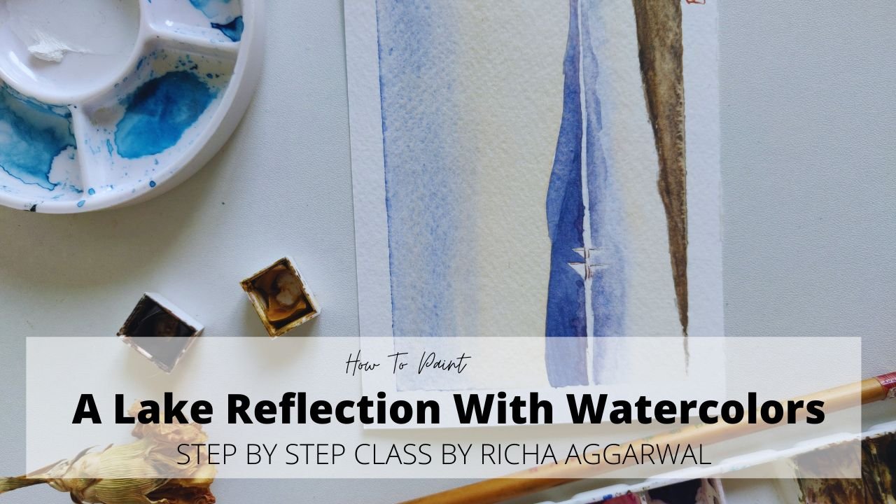
1. INTRODUCTION: if you love watercolors? and want to make one of those beautiful sunsets and hang it in your home? This class ! is perfect for you . hello, I am Richa ,founder of Travel through My Canvas, and a watercolor Artist rather, I'm a dreamer who dreams are making Art a part of everybody's life ! Not just a subject left at school. With some sweet memories. With that dream in mind, I have created this class , in which I will be guiding you step, by a step from studying your inspiration pic , to knowing your colors, and finally, painting a beautiful sunset scene. And this class, I've divided into bite size, , small, small lessons and each lesson is packed with. valuable tips and tricks. Those tips and tricks, you get not only apply for this painting , but many other paintings which you will be painting later, So let's pick up your brushes and start painting.
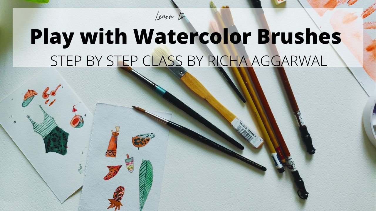
2. SUPPLIES YOU NEED: Hello everyone. Next day when into our class of building a beautiful sunset. And to start with, let's have a look at the materialist. Follow materials. You will need few sheets of watercolor paper. If you want to know which watercolor paper is the best watercolor paper, I have a full eBook you can download from the project section. And you will get all the details here. To start with. It's always good to have a 100 percent cotton people and at least 300 GSM. To start. I would suggest if you're a big now, Einstein with small phase of peoples and then slowly move to bigger sizes. After the paper, you need brushes. For watercolors, I always prefer quality or quantity. So even one good brush or a brush with nice hills and a pointed tip is enough. Rest is luxury. Obviously, if your water colors, so you can always use the primary water colors, yellow, blue, and green for the whole painting. But if you have more colors like Bhopal, crimson, red, they're always good to have. But if you adjust for the beginner, if you have these three colors there are enough. Obviously. Then next, whatever that tree, mixing tree, masking fluid, tissue papers, Java water, benches, and read over the sketching. And that's it. We are good to go for our painting. Let's stay with in the next class.
3. INSPIRATION PAINTING STUDY: Observation is the key for any painting. Before diving into any painting, I would suggest that it is a great way to absorb your inspiration picture. So let's start with observing our inspiration picture. Beautiful sunset theme. You can see. So let me divide it into three parts. The foreground, the middle ground, and the background. In the background against the sky with different colors. In the middle ground we have mountains, some faraway mounting. So this foundation is a faraway mountain. I'll tell you how to make among dean finally, and this mounting on the right side is a closer mountains. So we will learn how to make a mounting closer and farther. In this painting then. And the middle ground we have water reflection of sky. Some yellow will go here, some yellow will go here. And the top. And in the foreground we have a beautiful lavender fields, some stills and a bat. After studying all the three grounds, we have to choose to eliminate and to highlight which subjects. So in this painting, the hero of the painting is a sunset, is the water. And this area in the upper middle third area is the hero of this painting. So we will be working maximum on this area. And Redstone area will be the supporting characters of the paint. So this is lavender. Fees are the supporting character. I will not be making it a very detailed one. And I will focus mostly on the water and the gray sky and creating a beautiful center. So that's all for studying. Inspiration picture. And now let's see how to compose this picture on our people in a beautiful way. So in the next lab, we will be learning about the composition of this picture.
4. KNOW YOUR COLORS: Let us know our colors better before diving into coloring of the painting. So for this painting, this painting, I'll be going for the analog AS team. Let me tell you what is analog AS team, and let's see how it works. So let me introduce you to the color wheel. I'm just going to give a little bit introduction about it. We all know our primary colors, red, yellow, and blue. So these are the main colors which we'll be using in this painting. Don't worry if you don't have the secondary colors, orange, green, and purple. Although they will be used but began always made them from the primary colors. They are always good to have, but not necessary. Okay, now let's talk about the analog AS team. So what are analog of steam? And what are analogous colors? Analogous colors are, as the name suggests, which are closer to each atom. So yellow, yellow, orange, orange, red, orange, red, and violet. This colors then come together in a painting format and allow Augustine. As you can see in this beautiful Sal said, we are going to use these colors. So we will be going like this. Yellow then yellow, orange, orange, red, orange, and the book-building. When they come together, they form a beautiful, beautiful composition. So let me show you how we can make the beautiful colors that just these three colors, yellow, green, and blue. So to start with, for the sky, we'll use our beautiful yellow. I'll be using hair. Indian yellow. You can use any yellow which is closer to it. So we can go from darker to lighter. We can always make the color lighter by adding more water in it. To make the orange. And this yellow. I just have a yellow, more yellow and a tiny bit of red. If it was linear or orange will be more towards the red and less towards the yellow. So we want a yellowish orange. So keeping less red, if we want a darker tone of orange, we can make more mix more red. And here we get a beautiful orange which is Mordor. Sell it. Now let's see how to make a beautiful poeple. For the pauper. I'll be taking my blue, ultramarine blue. With remember that for the pulpal, the goal with ultramarine blue, not the cobalt blue. That's a great secret. And after that I'll digging a little red. And here I got my beautiful poeple, the blueberry one. If you will be adding more, they will go towards the darkish, brownish purple. And now let's see how to make our green. For the green, I'll be taking my yellow again. I'm mixing a little blue in it. I love this. Sam green, blue, yellow, green. So the key is that you have to take more of the yellow and less of the blue. If you take more blue, it will be more on the deeper side of the blue and the green. So we'll be using these colors for a landscape painting. If you don't have any of these colors, then it is highly recommended that you premix as color, keep them ready before diving into your paintings. I've watercolors are really fast and as a big now, it will be difficult for you to mix the colors again and again and go back to your beat. And if you have all these colors and that's a bonus, enjoy the beautiful sunset. Let's get ready for our next class.
5. COMPOSITION SKETCH: Okay, so let's start with the composition of this picture. To start with, I have taped my people from all the four sides so that the paper don't grumble. While doing the watercolor colors, we always use a very light pressure of a pencil. We don't meet very dark marks. First of all, the week, Mika Horizon, horizon, it is always meet either in the upper 1 third are in the lower one time. We never ever meet our horizon in the center of any painting. That's rule number 1, which is a very important rule. And it gives a great compositions to the painting. Let's draw a horizon NDA, upper 1 third, but I can divide my paper into three parts, 123 and this is upper one time, but I'm drawing my arrays. So on the horizon income, my one mounting and this demo, I'm just lightly sketching it. And this toward mounting ahead. And little below the holidays. After that, we will compose our foreground. For the foreground, we just have lavender fields in our Hoagland. For the foreground. I'm not going to give any details on the stairs and Apache, and I'll just focus at my lavender fields are in the lower 1 third part. So I will just lightly mark the division that we're my water is ending and where my lavender, starting in the lower 1 third bought. And keeping the perspective in mind and the rule of one toward this, in this 130 area, we are going to focus on a sunset on the yellow part 2 under reflection in water. And are but keeping perspective in mind, if I draw a line from here. Keeping perspective in mind, I'm going to make my day start from this point. And my party will go something like this. And that's it. You're not going to overdo on the battery or any other thing as just my likely the lower 1 third bond where my lavender, these are going to end the pathway. And I know that this is my one type bond where all the detailing and highlights the luca. So that's it. Me some stairs and you can do it also. So that's all we have to do the composition, we are done with our composition gradient, the horizon, the mountane, marking, the lavender field, keeping the perspective in mind and making these two lines which are going to be, I've stairs until you one more time how I have created this lines, I've kept my scale on this. And from there I have draw one line and then you just have to move it a little app and create the other line of them. Perspective is a very detailed study. I will be making some class and perspective someday. Maybe glad to teach you live in a zoo by these I, in my membership. But it is a very deep topic which I'll be covering later on. So as of now, we are done with sketching. And now let's dive in and do that next class.
6. PAINTING FIRST LAYER: Okay, so we had oil set to paint a beautiful sunset. This painting, I'm going to divide into three layers. The first layer, the second layer, and the third layer. Remember, as we go from one layer to the other layer, we increase the tonal values of the colors. That is a very, very important thing to keep in mind. So all the colors which I am going to put in the false layer, we'll have the lightest tone and value. That is, they will be done more diluted colors. I would highly recommend you to go back to the tonal value tutorial if you have any difficulty regarding don't undo it. So very important topic to master on before diving into watercolor speed. So let's start out for us. Lea. Let's take or less aplasia, ready? And I always prefer to have to cancel autobahn for clean water and one for dirty water. So far the first Leah, first I'm going to wet my paper and we doing it. And now three, firstly, I'll say be doing in three steps. First we'll be doing the sky. Then middle ground, that is Watteau. And then third, we'll be doing our foreground that the limit of a lithium member, that if you are putting water on your paper, then the colors will get lighter. Then what you will make stem that. Let's prepare our yellow color. So I'm taking water here. And now I went to add my yellow pigment into this quarter. File list, check on annual value, honest sash of people before putting it under bleeding. So I'm happy with this color tone. I'm going to tilt my board, don my bowl upside down on the sunsets. C, so that the colors flow nicely and is relaxed. You can deep breath. And B are going to use a variegated wash technique. I have a tutorial for that. You can watch if you any confusion. Now I'm mixing a little red in my yellow and putting it out with it. Not mixed any mortar for my second layer. You can see that after that I'm digging a little crimson and putting it on the top. And then I'll add blue to the mixture and be ready for all the surprises in the watercolor painting. And just so as we go from bottom to the dog, the sky always good to go. That's it. We're done with that. Sky. The first layer of the sky. Any retail, we feel any highlights you'll be getting into. Now the same way I'm going to do my water milligrams because water is just the reflection of the sky. So it is going to be the same way. Is to write your paper, lead the mountains, no need to do mountains. Then we'll be doing directly in the second year. History idea. People, again make a yellow color to it here. And data flow. Take your orange color, a little more red. Queensland. They already feel it is good to have a crimson color in your palate. Looks too dark. You can on this. And and little blue to the crimson. And as you can see here, the rod down here is not the darkest color. The color of it. Dilfer may give some ways space here. Sandwiches, you're really thirsty, brush to swipe all the winter term. But this is good to go for our reflection of sky in the water. Now let's be it for our board, the layers to dry completely and then we'll give a slight Bosch in our lab. One of these is a necessary to his dagger. Middle ground is fully dry before you do a wash for your third layer, the foreground. Otherwise, the colors from the middle ground will seep down to the third level. We don't want to get it as our foreground. We have to give a little leave a little white speeds. This is a darker. The lowest part is the darker and the middle part and the little light. So what we're going to do again, the way to delta board. And just make sure that the color that you have given in the sky, in their inflation, the same color you are you going to use for the wash? It is not necessary that you use the same poeple which is in the picture which I'm using. But make sure your colors as same. They're the same as your colors in your palette, so that they all look symmetrical. Okay, So this pope is the same. I'm happy with this purple. You invite your people. What the low ground as this the sheen of water down a glazing we are doing pooling up or making a point for water. And I'm just going to get it. And this time we'll use a gradient voyage. Did my color. Again, dipped my brush into water and just give it take it to the hair. If you if you are not clear how we make a gradient wash, you can always refer my previous glands in which I have told how to give this beautiful seamless gradient wash. What I have done, I have to put the first layer with full concentration of column. Then I dip my brush in water, remove some color, then again put it on the people. Then again dip my brush into water, and then again put it on the paper. And in this way, we get beautiful wash from darker to lighter dots. And this is what we are done with our first layer. Let it dry completely before diving India's second layer. That's a very, very important step. If you mess this, if you skip this, you are painting is going to have many surprises and happy accidents. So in the next class, anyway.
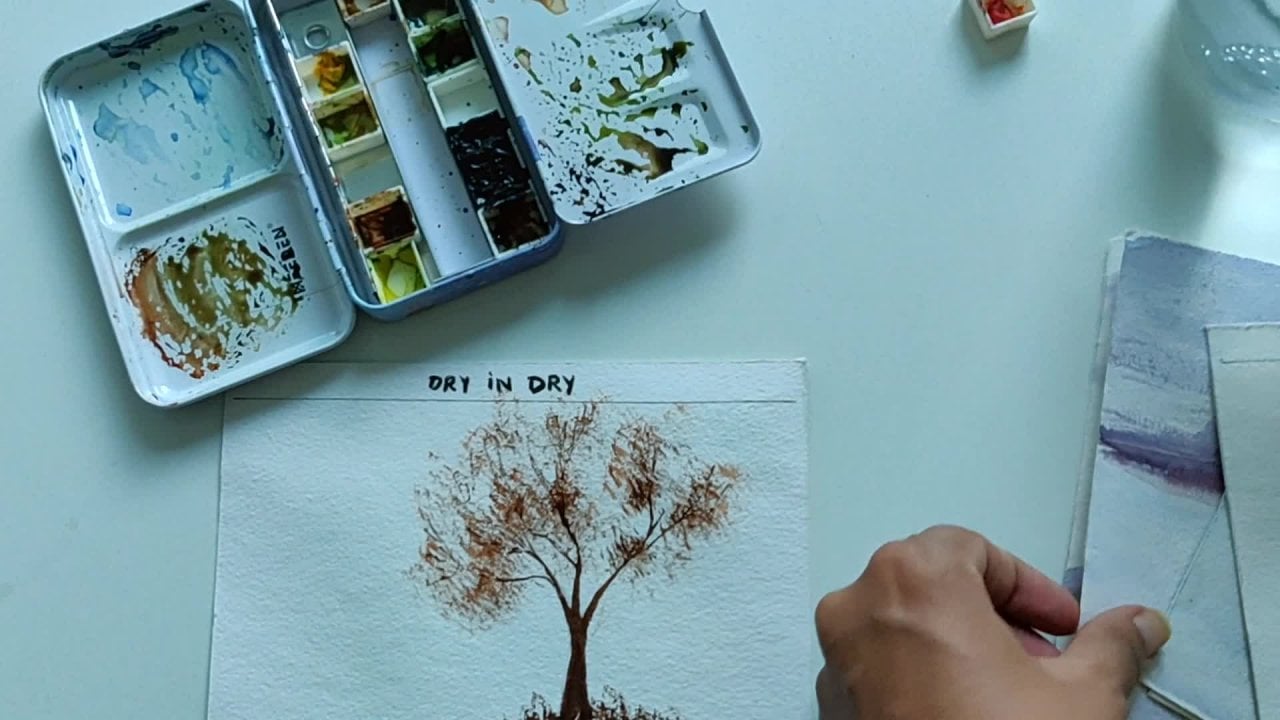
7. PAINTING MIDDLE LAYER: Alphas to completely dry. So now we will be painting the second layer and the thickened layer and building mountain and the foreground. Okay, So now let's start with the mountain. One among Danes, I'm taking my favorite fellow, ultramarine blue. Let's first mix the color and adding up danger of red in it. Just to bend, generate not much a little water. Okay, So what I want you to do this is my darker layer and this lighter layer of a mountain. I'm going to meet them mix a lighter layer. So how we show the mountain is fire and the London is bitch found in this file. And this model is Claude BLOSUM. It's just a simple thing. Now, which material mount is 50? We paint in a little later. Don't. The tonal value of that mountain is lighter. And whichever mountain is closer to the eyes, the tonal value of that mountain is greater. So that's easiest thing. Then mixing my purple color. And I'll just try that. The papal. If you feel you can change the dawns. That makes yarn both the colors pre handle, lighter shade and the darker shade. Okay, So they are ready with the shape population. Now let's dive in into the mountains. And among Danes or anything which has a triangle shape, rectangular shape, the solid, the shape without blemish. And try to use minimum brush strokes as possible. Leaves a bead of water in the downside, the image darker tone this morning. And also they didn't find a lot. That goes on here. And the lower band, we can add a few droplets of color to give it a sheet of duotones. Now I'm mixing a darker mix because this is a mountain which is the closest. So this AQIM a little darker. We'll be coming back to mount dead and adding them more details later. But as of now, this is good enough. Here also I am adding a little darker layer to show that this one, which will push this mound in a little behind. Whenever we add a darker layer in front of a lighter layer and push the thing behind this very easy symbol. And we are done. And if you want to give a little more extra thing, you can use to write your plush. Take the tiniest layer and make some impressions here. This is totally optional and not making much of a difference in your painting. Now let's come to our lavender field. I'm going to show you a very easy trick to paint these lambda Tree, which is Illi and makes it so beautiful. So let's see it. Funded feel. I'll be printing it directly into the dry brush technique. If you are, if you are not very much area, what is dry brush technique? You can see that tutorial of my previous class in which I have explained very nicely in detail, what is it? So we'll be using dry brush technique for the lavender fields. Let's practice that before diving it into the painting. So you're going to take these brushes, which are, whose bristles a little harder. One thing is that even in a graded brush, you can take with special bristles a little harder and flat. But the lavender field are what you can do. You can do your normal brush, but I'll take all bash and fan it and make the bristles flat. So that is a trait that we have to make the bristles flat. And I'm going to add too much water. And, and, and when they will be doing as we directly taking the color on the front part of the presence, you can see here. And the dad, before taking your color with the brush, this major color a little charged. The colored brushes dry, so the color has to be little charged. So I have done it. I have taken it on the business and the front band. And now I'm just doing it directly on the paper. If you don't have this color, you can just mix it. I'll take quantity and use it. So this is a trick which I'll be using and attachment green. So three colors I'll be using. And to go for me then, is that, that is what we have to do for our lavender fields. Again, always practice it. This dry brush technique before diving into the painting. And I'll let start and do live in their fields in our painting. I like to mix both the colors, purple and Clemson. It makes a little darker crimson. Check ticket. Yet the tuple, I have taken both the colors, purple and crimson. The top point, as can start will be more. Let's have a mix of dawns. There is no rules for this. Just a bottom but in little darker. And he said backlash towards the dark. It gets lighter. I just loved doing this. You're leaving some spaces for the greens. Now, come on green. You can always wash your brush. I can use it like me. I normally don't wash my brush. And they like to have that surprising color which I get. And not washing my brushes. You can see the environment wash my brush and getting them differentiator green here. Just going with my intuition. Green and purple in-between. More green at the end tried, as we can see, in relation, things don't overdo it does not stop. Wanting the cell. Borders are always higher. And as the law towards a million becomes later, it becomes shorter. Now that we're done with 11 the vth, they can see how beautifully the shine. So I'll just like to add some yellow here and there in our field. Just be careful. Just a glaze of yellow here and there. Dependent. This is called plainly. See, yes, we are good to go. And we're done. Our middle ground, the mountains. And yes, we are done with our middle layer in which we have done mounting and 11 defeats. Now we're going to put some highlights. The third layer, which will just give the ball to the opinion and not let get ready for getting untied layer. But before that, makes sure that your second year is completely tried. In watercolors. We don't walk in between the status either. We walk once the building is completely dry on, it is not dry still there. So that's a very important trick. Always keep in mind. Okay, see you. And let's get ready for our third layer.
8. PAINTING FINAL LAYER: Let's dive in into our third layer and the total area going to give some highlights, literally the darkest tone to debate. And this is a very important layer. But always keep in mind that this totally every only give 30 percent. Like the first layer is a 100 percent second Levy walk on the 70 percent in a painting. And the thirdly, a reward just under 30 percent. If we get too much highlight, there'll be no contrast in our painting. So to maintain the contrast in a painting, we really have to be careful. We are to give our total layer. And this is a very important step to learn to understand. So in this painting and just be giving some highlights in the sky, the mountain, the water. I mean apart during the part hair. And just making few tweaks here. So let's start with the sky first. Was that big clean water, clean brush. And we're going to revisit our sky. Then we're going to mix degrees. You're going to do daunt riveted too much. Otherwise the lower layer will come out. Just rewrite it a little bit, and mix the sheet which is little darker, and the top layer. I'm using ultramarine blue and a little bit of red to mix. It is tried in a splash of people. And we are good to go. And then just giving this week of colors here and there in the sky. That's it. Much of the pauper. Then wash your brush, make your orange by digging yellow and red. And just see, I'm going to give a few highlights, lighten my orange color, make sure that you are paid while. Is that that said, Don't overdo it and we're good to go. After that. We will be waiting water and giving the same highlights and the water is degraded 10 layer. Make sure it fits then do football or darken up volume is way it with your brush. Now using the same colors to give the highlights, to order. Same colors, the blue and the red. But just remember the reflections in water at a little darker than the sky. Seeing ultramarine blue and red portion, we decided to give the maximum height or length. It is a little darker than the rest of the painting. We're going to add a little audience then. And little yellow. We can add a little blue. On this side. Still wet system, very light dormi can give the eye, you can see that my water is still wet. That's my angle gain. Only if you are the variance, right? Just read reverted and then work. Okay. We're almost done with our water. Now let's lead wanted to dry the top layer and the water layer. And then we'll be adding a little highlight or lower painting.
9. GIVING HIGHLIGHTS: Okay, So we are done with that all the 3D layer, and we're just left with a few highlights which are going to make your painting more interesting. So in the highlights are we doing this spot, some lavender and this part, remember? So I'm going to darken this color. And they had dark darker shade of red and a uniquely a little brown in it. Just a brownish tone and be digging and I'm using my rigger brush are very thin brush and I will be giving me a headache. That radar. Just keep your hands three hands table and give it didn't meet deadlines and bind go. No need for any danger and how they are coming or they are not coming. Nine, nothing. Just meet them. They like free hand. Man. We can give it. If you want a going away, then you're a complete beginner. But I have just given the impression of the man, just the head and the smaller one. That's it. We are good to go with this. And I'm just making this times again. Okay, Now look here. I'm using my rigger brush really carefully. So I'm sweeping it from down to up and like this, down to up in one go like this. And just near the dolostone. And as angle 50, I'm going to make them lighter and smaller. And just using the tip of it and pressing it like random, don't meet them in a very much symmetrical manner. Give them random, called Nature is abstract and render. The more playful you are working with watercolors and your colors, the better it will come. Again. These are the only areas where we have worked. And then highlight. I'm not going to do it or do. And just be the beginning. One more mountain hare. Do meet the Mountain Standard. So I'm using the same colors. Ultra marine blue and red. This a darker tone of dad. And giving little highlighted dark bond in here, which you build a mountain which is closer to our eyes. And feel highlight. Just as you can see, I've given it 30% of highlights and nothing more than that. Just a few highlights here. You can give. Taking the theme regard trash. Or you can just to maintain the color harmony on both the sides and making few lines in this area as they're on the right side. But this is very less because I don't want this fast to data attention is to maintain the color harmony, be at doing this. So we're done, legally done with our beautiful sunsets. And now in the next class and tell you some tips for billing of masking tape and sign up eating and see how beautiful they are looking. For it to dry completely then will be peeling off. I might indeed have a great day.
10. TIPS FOR PEELING MASKING TAPE: Okay, So here I'll set to renew and peel off our masking tape and fan of our buildings. Few depths on building their masking tapes. You can always blow dryer, use a hair dryer to dry your tape and remove it on. Just keep in mind the study section. Whenever you are removing masking tape, just keep it at a 90 degree angle and meet keeping it away. If you remove it like this, it will definitely derivation of the both. You can always, always, always keeps of angles like this. And build off of the deep and get the script borders. Having a blow dryer is a great idea. If you feel that you are getting stuck anywhere. We have grass, beautiful borders and we're all set to go. Let's sign up painting. And we add who could decal
11. FINAL THOUGHTS: While living room was dark with tinnitus CFO and must elect this. But I can assure you it said 100 births into learnable skill. Not an easy gift. Even I pick up my brushes after 15 years of long gap at the age of 10 it so the more you practice, the better you will get. Never lose hope. Keep practicing is equal to e to be your until you master it and, and do them it. You are assignments in the project section so that I can do it. You can find me on Instagram at the rate of travel to McCandless. And don't forget to download the eBook from the resource section, that e-book that you got bleakly about all the supplies you need for watercolor paintings. I do follow me on Skillshare for regular updates about my classes. Keep practicing heavy bleeding seems good bye.
 Richa Aggarwal, Watercolor artist, educator and designer