Transcripts
1. Introduction : As Pablo Picasso said, learn the rules like a probe so that you can break
them like an artist. Welcome to this class. In this class, I'll
teach you how to paint neon letters
and illustration with go to bring out the vibrant colors
on the black paper. Neon colors or
fluorescent colors, are extremely bright version of primary and secondary colors, such as blue, green, red, yellow, and purple. These colors stand apart from the other types of
colors due to the hap, they emit light,
making them limits. We are going to use this
colors to make the painting. Hello artist. This is a Sultan, an art educator based in India. We will begin this
course by learning and understanding various
colors on black paper, and also the materials required. Then we'll dive into the
techniques of learning to blow up the neon like
effect onto the paper. In the class project, we will
learn how to paint a co, also there's a surprise
bonus class which you can see if you get
enrolled in this class. Are you excited to dive into the world of neon illustrations? All of the paintings
will be beginner friendly so that even
if you are a beginner, you can paint them effortlessly. If you don't have gosh, you can also go ahead with using acrylic
and poster colors. Are you ready to
immerse yourself in the world of neon letters
and illustrations? Grab your supplies and dive into the vibrant colors and
create art blues with bus. If you have any doubts
related to this course, you can come and down in
the discussion box so that I can reply to your
problems and solve them. And also share your
class projects. So others can get interested in this course and be a part of it. Also, if you like the
class and its structure, please leave a review so that the other students can find
this class and join with us. Let's begin with this
neon letters and illustration class without
any further delay. See you all in the next section.
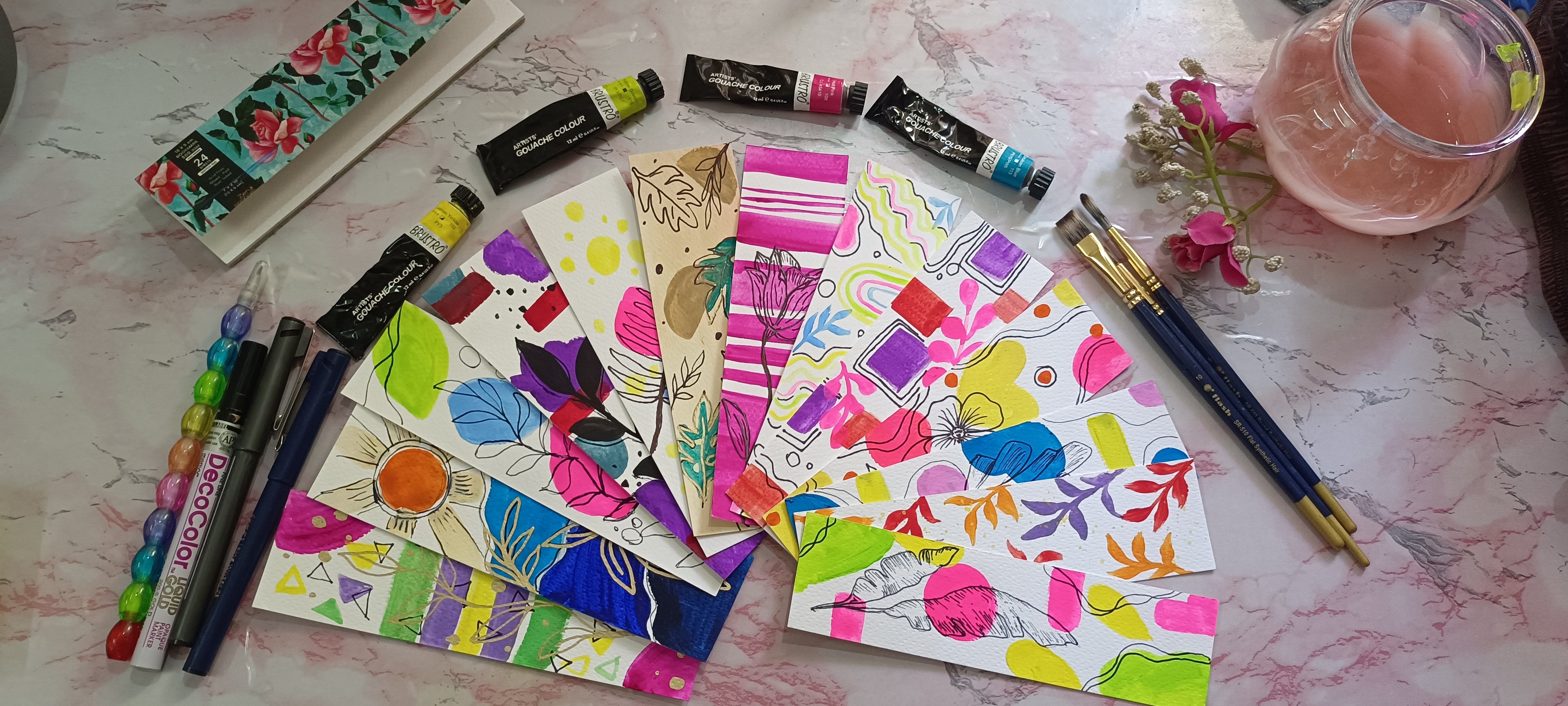
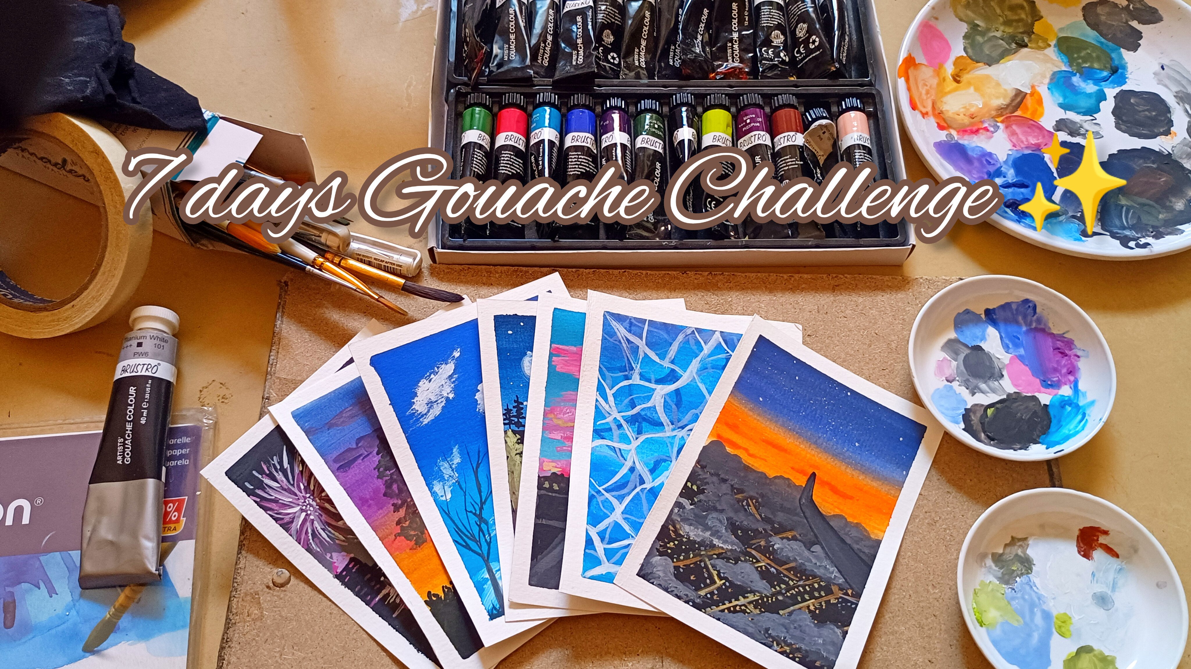
2. Materials Required : Firstly, let's begin by knowing the materials
required for this class. Here I'm using a black
paper sketch book. This is from Anupam
sketch pad of 180 GSM. You can use more than 160
GSM paper 180 is ideal, but if you have
more thick paper, you can go ahead and
use that as well. Then coming to the
artists grade colors, Use the artist grade one
because they give you a vibrant and a thick
consistency color. And then we'll move ahead
with the mixing palette. A cloth and also a jar of
water coming to the brushes. Here I'll be using
a flattened brush. A small size flattened brush, you can go ahead and use
water flattened brush, you have according to
the size of the paper. Then a round brush,
a line of brush, which is very essential if you don't have
a line of brush, you can go ahead and use a white gel pen along
with that, a pencil. Let's begin by swatching each
color onto the black paper. As we go through this step, we will be understanding
the consistency and also the colors which is best applied onto
the black paper. And also how to hold the
brush while painting. You understand so
much it's better to switch first and then move
ahead with the techniques. And then with the class project. I have structured this class
in such a way that you will have to knowledge
about the colors. You to go ahead and
practice this so that you will have an
understanding of how H works. Also you learn the consistency, the right consistency of Q to be used for the ones who
have no idea what gushes. Gas is an opaque
watercolor medium. It acts both like
watercolor and acrylics. If we thin down the pigment, it acts as a watercolor. If we add in a
thicker consistency, it acts as an acrylic. The only thing here to remember it is a water based medium. It depends on how much
water you add onto the pigment acts as an
acrylic or watercolor. Coming to the pros and
cons of the gauche colors. The pros are gash, is an opaque medium
and can be layered. The paint is very
easy to mix and use. It dries faster. But the disadvantage here is it is challenging to
work with for beginners. As you layer it, the
paint underneath it will be lifted up
and you have to be fast enough so that the paint underlying below
doesn't get dryer. The last one is it changes
its value from wet to dry. When the paint is wet, it gives a different color, and when it is dry, it
gives a different color. The darker colors dry, lighter, and lighter colors dry darker. That's what you have
to keep in mind and also look at the
vibrancy of the colors. It is very dark and vibrant. It's very good to use. If you're painting a
vibrant color painting while watching the colors, you can always experiment with
different brushes so that you can get to hold the
brush in a correct way, in a proper direction. And also you will
get to know how much of pressure
you need to apply. This watching method has
to be used in every paint set on white color and black color if you are using
it for the first time. So that you'll have an idea
of how the color will look in such and such paper and also in black or white background so that it'll be easy
for you to paint. While you're swatching, the
colors, have you noticed it? The lighter colors
are getting dry, darker, and the darker
colors are getting lighter. Now that we are at the end
of this watching table, we get to see what colors are highlighted and what
colors are vibrant. For example, mid yellow, rose, crimson, ultramarine blue.
These are the colors. Even Erlin, blue, violet, these are the colors
which are more vibrant. This, we can use
it for painting. Neon lights, also
white and green. Now that we know what
colors work best, we'll go ahead and use the colors for the techniques
and for the class projects. If you like any other colors, you can go ahead and
use that as well.
3. Technique Section : Let us begin with the
technique section. For this, I'll be
using a black paper, a flat brush, a round brush. You can go ahead
and use a line of brush instead of round brush, but here I'm using a small
brush and also a pencil. Firstly, we will begin by drawing whatever
illustration we are making. Here, I'm just going ahead and making a dripping
heart illustration. You can just go ahead
and make it white based on the
flattened brush size. I just like that. You can see later on
how jumbled it was, how clumsy it was. But anyhow, this is
only technique section. I'll show you how
it looks and how the effect looks like the
technique for painting. This is first we'll go ahead
with wet on dry technique. I have just taken a
crimson color and just going around the border
with a flattened brush, make sure you apply
even pressure. If you don't know how
to apply even pressure, just practice on some paper, a rough paper, and then
go ahead and do it. I'm just painting
randomly as you can see. A to a certain point, the color will be of value. And then slowly
it starts fading. Don't worry, go ahead and add additional color and then
go ahead and do it here. You can see how clumsy it has
become, the dripping part. Not to worry, we'll
cover up that later. Once the first layer is done, we'll go ahead and mix
some crimson with white. And go over the crimson hard dripping illustration here. You have to make sure that the underlying layer of
the color should be shown. Just don't mix it up. Once you're applying
the second layer, make sure you use a smaller size flattened brush of
the previous one. Or you can go ahead and use
a round tip brush as well. As you can see, I'm using
a round brush and moving ahead with the crimson
with white mixture. Here I'll also be showing the
underlying crimson color. If the crimson color gets
smushed up with the new layer, you can always go ahead
with the liner brush and add some more paint
around the borders. Take your time and paint it. Just make sure the pressure of the brush doesn't
change whenever you're about to take the next amount of
paint onto the brush, because the thickness
will be changed. Once we are done with the
second layer as well, we'll move ahead with adding the third layer which
will be of white. Before adding white,
just make sure that the underlying color is dried completely as gas dries faster. You don't have to worry, but just make sure
that it has dried. Because when you apply white
color onto the wet paint, it'll change its shade. Just make sure
that you check it. Also, you can go ahead
and use a marker or age helping for
the third layer here I'll be using
a round tip brush. You can go ahead and use
a liner brush as well. I'm just directly using it from the tube, the white color. Just like we painted. The second layer will go ahead and paint the third
layer as well. Just make sure the, the
crimson and white mixture is seen and then add white. If it is not seen, just make sure that you add a. And also the pressure should
be even as you can see, how much of unevenness
I have created, that is because of dry as well. Just practice before painting and then go ahead and do it. No matter how much you
practice at the end, some thing or the
other will happen, just try and make it as thin as possible and make sure
the pressure is even. This was the first technique of getting the neon glow
with three layers. Now we'll move ahead with the second technique,
as you can see. First I'll be using a pencil to draw and then go ahead
with the paint brush. Here, I'm just doing a
letter because first one we did an illustration
of a hard dripping. There's one more way of making
the neon lights more real. Is that while you're
drawing or painting. A letter or any type of shape. Just make sure the edge doesn't
meet the starting point. I mean to say a line
starts just like this. I'm just going with the left and not connecting
with the bottom line. I have left some
space and then move ahead with the remaining letter. Just don't connect lines with each other or
shapes with each other. I'll show you in the
later part as well. Just look at the way
how gas is drying. The darker color is drying lighter and the lighter
color is drying darker. If you might notice
this blue color, you can see how it changes its color when it's
getting dry here. For this technique, we'll
be using only two layers. The underlying blue color, on top of which, we'll
be painting white color. This is the way we'll
be painting it here. I'm using a round tip brush and directly applying
white from the tube. You can go ahead and use a
marker or a gel pen as well. Stay tuned for the section
for one more way and also for making it more depth
in the neon glow. You can see directly
applying white underneath the layer
is like super good. And here again, I'm not
connecting lines with each other. These are the two
techniques that we'll be using for
the class project. Always remember that the
technique here is wet on dry, so we'll be using this technique to paint
the class project as well.
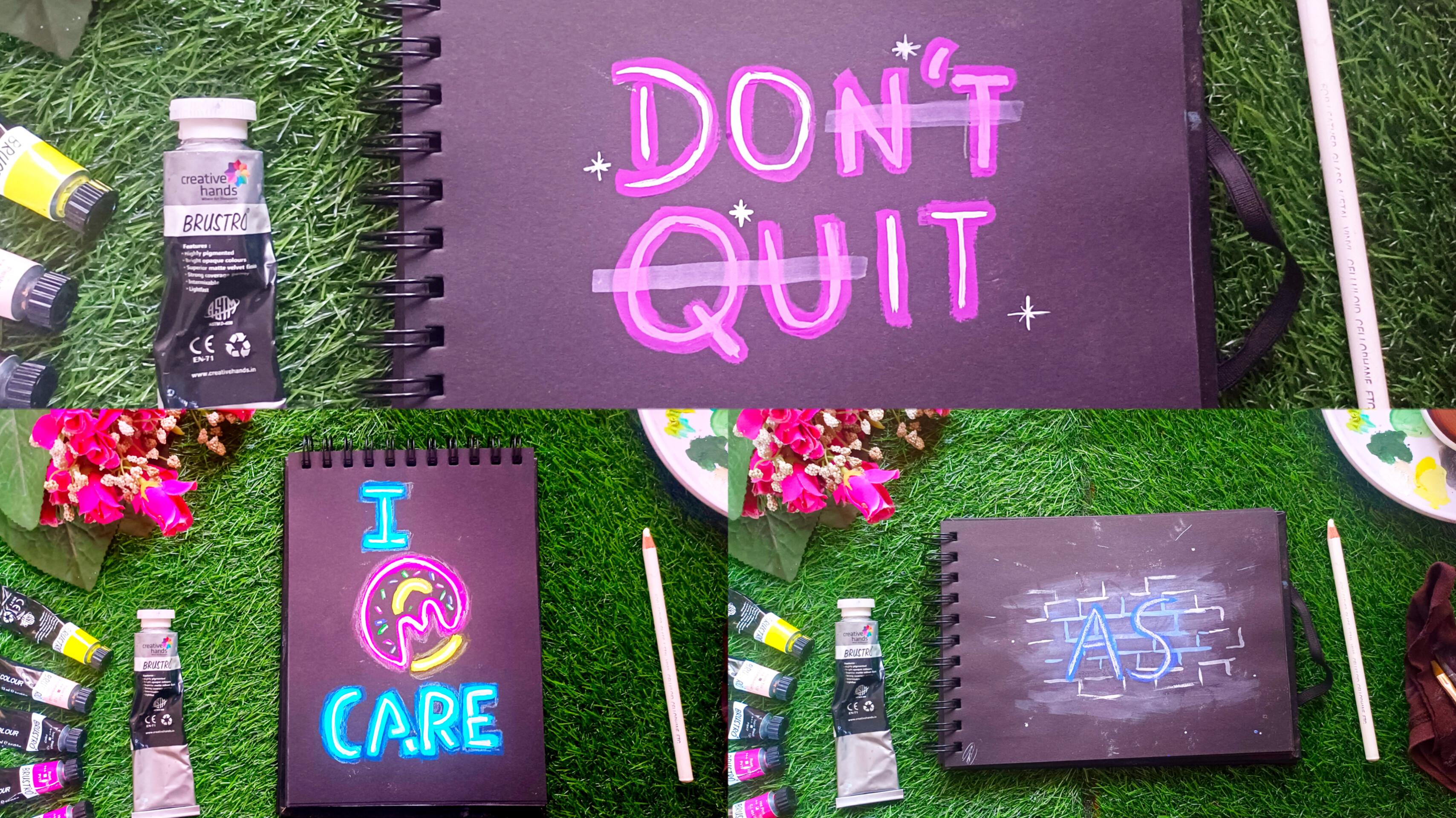
4. Class Project : Let's start off with
the class project. For this class project, I have selected a coat. You can go ahead and
select your own coat. Don't do it for this, I'll be using titanium
white and more color, just like how we did in
the technique section. I'll be painting like that here. I'll be using two layer method. I'll go ahead with more and then apply the base layer
just like that. Have some patience.
And go ahead and do it so that you don't smudge here. Since I'm using more color that was bright for me and vibrant. If you have any other
color in your mind, you can go ahead
and use that here. I'll be using flatten brush
first and then a liner brush. Make sure you use a
thick consistency of paint and not the
watery one because it will leave a layer of black color every time when you take a new set
of paint onto the brush, just be sure that it is almost the same consistency
as the previous one. Once I'm done with the
vibrant layer of this, I'll go ahead and mix some
white with more of color. I'll be applying this mixture
of mar and white to the Apostrophe and also go ahead and do the correction. Once we are done with the Now further do it, I'll go ahead and use a direct titanium
white from the tube. And applied onto the code. Now for the final touches, I'll go ahead with
the W consistency of titanium and apply it onto the apostrophe
with a flattened brush. You can see how I do it first and then you can
go ahead and follow. Now for the glow, I'll go ahead and add
some stars with titanium white around it with
a line of brush. So yeah, that's it
for this sting. We'll go ahead and see
the bonus section.
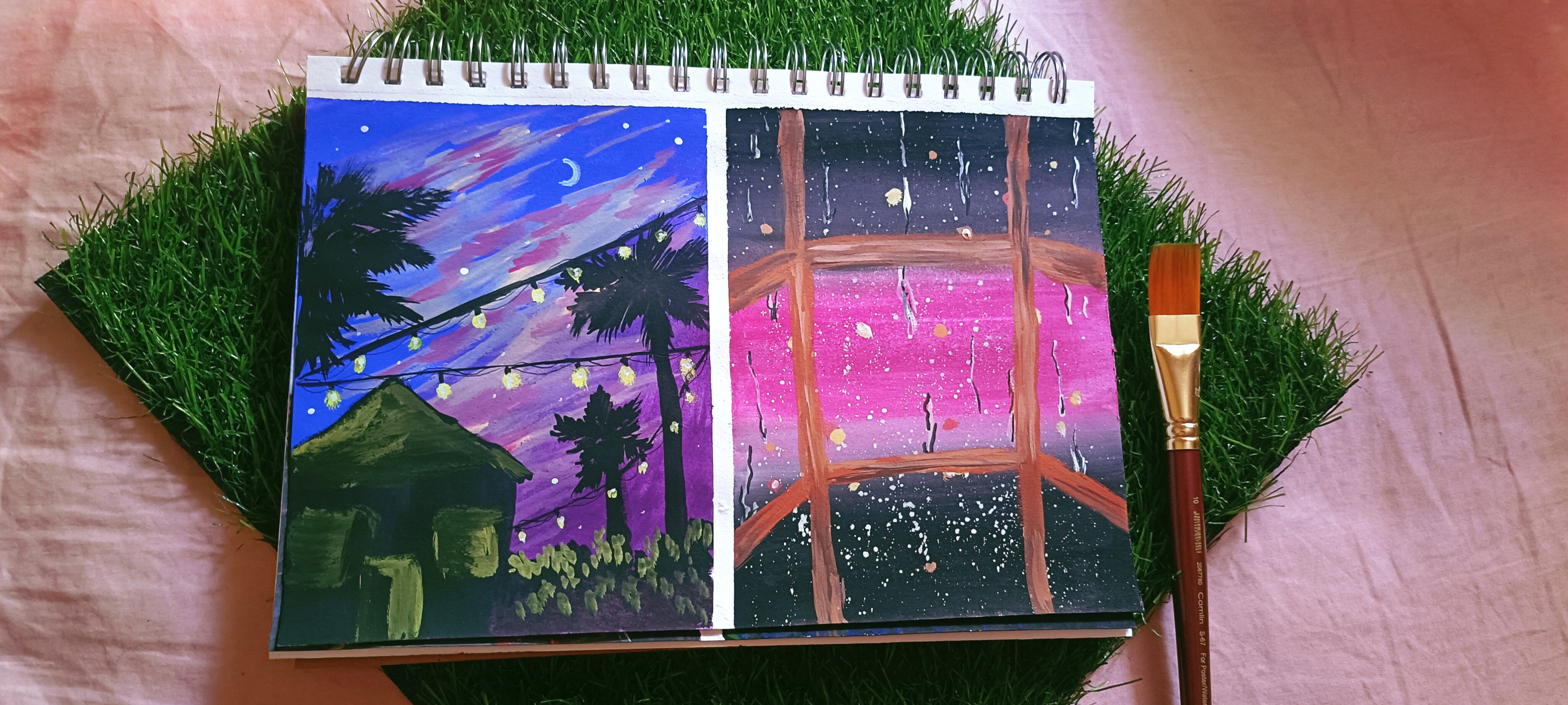
5. Bonus Class: Let's begin with
the bonus surprise. I'll be using the
same sketchbook and black paper for this. You can see how glowy it is, I'll tell you about it. I basically made the wary layer first as I showed
with titanium white, which we did on the coat. Then I added elements into it. It was just that much. Now, we'll go ahead with
the surprise stuff here. You'll learn how to
add depth in the glow. I'll be drawing a smiley and then painting it
with a lemon low. Yeah, I will be moving with lemonade low and
adding a layer of it onto the circle which is outside and titanium
white inside. I will be using the same flattened brush and the lining brush to
paint the smiley. The first layer will
be with lemon yellow and a little bit of white. And then we'll go ahead and add it onto the circle outside. Now moving to the eyes and
mouth will go ahead and painted with white using
the same flattened brush. Now I'll be taking
a white color in the liner brush and
going ahead and drawing the outline
onto the low. Here I'll be using some
thick and thin lines. Do the corrections as needed. Now comes the
important part here. I've taken a fiber calen, you can go ahead and use
whichever color pencil, you make sure that it is seen
on the black paper as well. Now I'll start shading
around the yellow color. As you can see, I'm doing it. Once we are done
with this layer, you'll see how glowy it looks. You can go ahead and color
it with orange as well. I'm using yellow color pencil. Can you see the difference? It'll makes a lot of difference. You can just pause the
video now and then go ahead and see the
first starting one. You can see a lot of difference, the glow, the death,
and the thing. Let me show you another
illustration with a letter. You can see here
I have painted an The base color is lemon yellow. Och will be painting it with
titanium white just a line. You can see somewhere
it is and it is light. Somewhere it is thick and
somewhere it is thin. But here I'm doing it evenly, it's just that it is not seen. Now, with the same
technique as we used above, we'll go ahead and color
it with lemon yellow. Once we are done with
shading of yellow, I'll go ahead and add
some white color as well, onto the yellow color
shade with white pencil. You can see how I'm doing it. It's just redefining the
edges and creating a sort of glow once you're done with learning the technique. Here I have a painting where
I have some illustration, some wordings as well. We'll go ahead and
add some depth into it using colored pencils. You can just follow me along. Or if you want to paint, you can go ahead and paint
and then follow this step. I've used a blue color. For the blue one, I'll be using a sky
blue colored pencil. For the pink, I'll go
ahead and use the pink. And for the yellow, yellow, you can go ahead and
use an orange color. And for the pink,
you can go ahead and use some other
shade as well. Just like how we added
the glow to the smiley. We'll go ahead and add the same shading onto
this coat as well. Look at that. Isn't it looking beautiful and so
much depth in it? That's it for this course.
Hope you enjoyed it.
6. Thankyou : The artists. As we wrap up our neon light
painting course, I want to take a
moment to celebrate the amazing journey
we have had together. It's been a world
wind of colors, creativity, and pure
artistic magic. Throughout this course,
we have explored the captivating world
of neon light painting. We have learned how
to use neon colors to create standing and vibrant
artworks that truly, from brushes to techniques. We have mastered
the art of bringing our painting to life
with radiant blue. I want to express my
gratitude for each one of you for joining me on this
journey of neon painting. Thank you once again for being a part of this
colorful journey. It's been an absolute
pleasure to be your guide in the world
of neon light painting. If you like the
structure of the scores, do share your review
and also the project. And if you have any doubts
related to this course, you can come in down in the
discussion blocks below. I would be happy
to help you out. Thank you for taking
part in this course. See you all in the next one. Until then, keep learning, Keep creating and keep painting.
 Arbia Sultana, Art Educator