Transcripts
1. Introduction: Are you feeling stuck
in an art block? Well, I have got an
exciting solution for you. Let's break free from
that art block by diving into the world of Boho
style painting using gosh. Boho style is all about
embracing free spiritedness, vibrant colors, and
unique patterns. It is the perfect way to let
your creativity flow and express yourself in a fun
and unconventional way. And what better
medium to use than quash paints with the intense pigmentation
and versatility. They will help bring your Boho
inspired artwork to life. Imagine creating
dreamy landscapes, intricate mandalas, or whimsical floral design
using bold and di colors. Gosh paints allow you
to play with opacity, layering and texture, giving your Boho paintings a rich and captivating
look. Hello, artist. This is Arba Sultana, an artist and in
dentist based in India. Today, I'm here to take you through a
beautiful journey of Boho artwork with
various intricacies and how to remove art block. So grab your brushes,
prepare your palette, and let's embark on this
artistic journey together. I'll guide you through
various techniques, share tips on color
combinations, and help you unleash
your inner Bohu artists. Let's banish that art block and create stunning Boho
masterpieces that reflect your unique style
and personality and let the Boho vibes
inspire your creativity.
2. What is an Art Block: What is an art block. Art block is like a painter's
version of writer's block. Dealing with the art block
can be quite frustrating. But I have got an
awesome idea for you. How about using Boho style art to overcome that creative block? Boho art is all about
freedom, expression, and embracing
individuality, which can be super helpful when
you're feeling stuck. In this introduction, I'll give you a quick rundown on how you can use Boho style art to overcome art block.
Let's dive in. First off, Boho art is known for its free spirited and
spontaneous nature instead of overthing or
planning every detail. You get to let your
creativity flow organically. It's all about
embracing that sense of freedom and going with
the artistic flow. Don't be afraid to experiment
with different colors, patterns, textures without
worrying about the perfection. Just let your art evolve naturally and see
where it takes you. Another great thing about Boho art is its
connection to nature. Spending time outdoors can do wonders for your
creative energy. Take a stroll in park, visit a garden, or
simply sit under a tree. Observe the colors, shapes
and patterns in nature, and let them inspire
your artwork. You can even incorporate
natural elements like flowers, leaves or animals into your Boho style art to
add a unique touch. Now, let's talk about
the vibrant colors and patterns that are a
hallmark of Boho art. When you're stuck, go for bold and lively colors that bring a sense
of joy and energy. Mix and match patterns, play with different
rust strokes, or try using
unconventional materials to add texture and
depth to your artwork. The key is to let
your imagination run wild and have fun with it. Oh, and don't forget to seek inspiration from
Boho culture itself. Explore Bohemian fashion,
interior design, and music. Look for Boho inspired artwork. You can incorporate elements like dream catchers, madilas, feathers, or geometric
patterns into your art to give
it that Boho vibe. So this was all
about an art block and how to overcome
an art block.
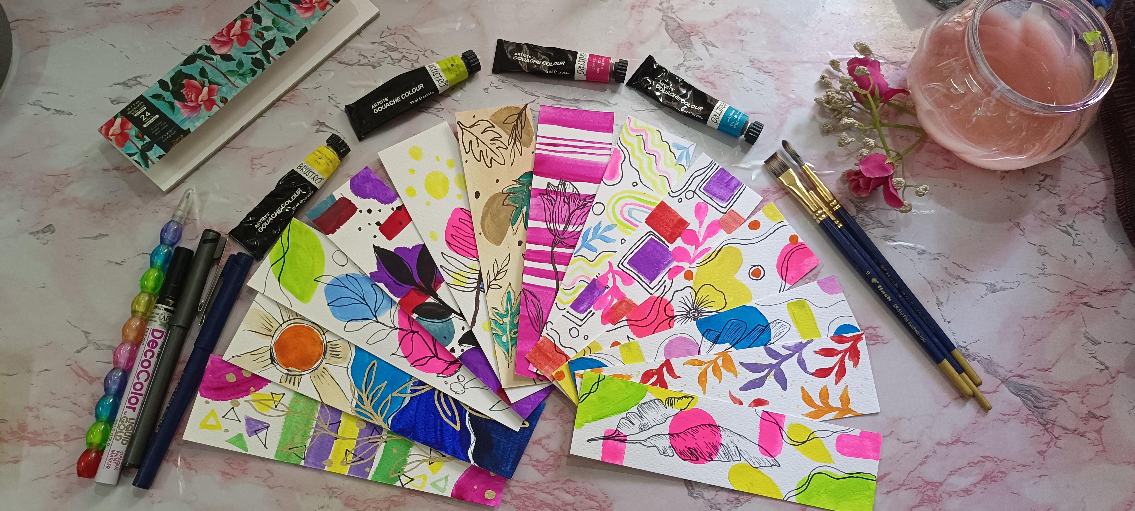
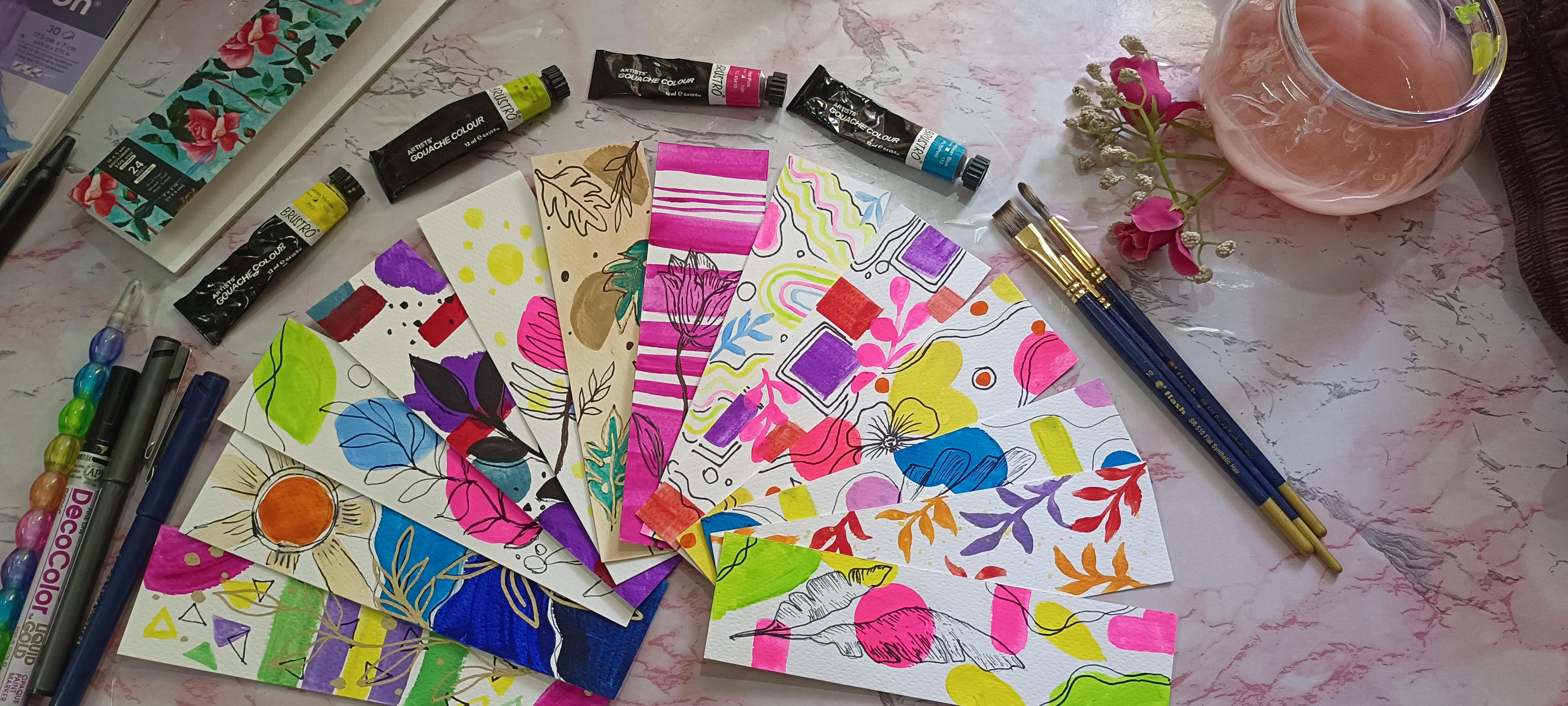
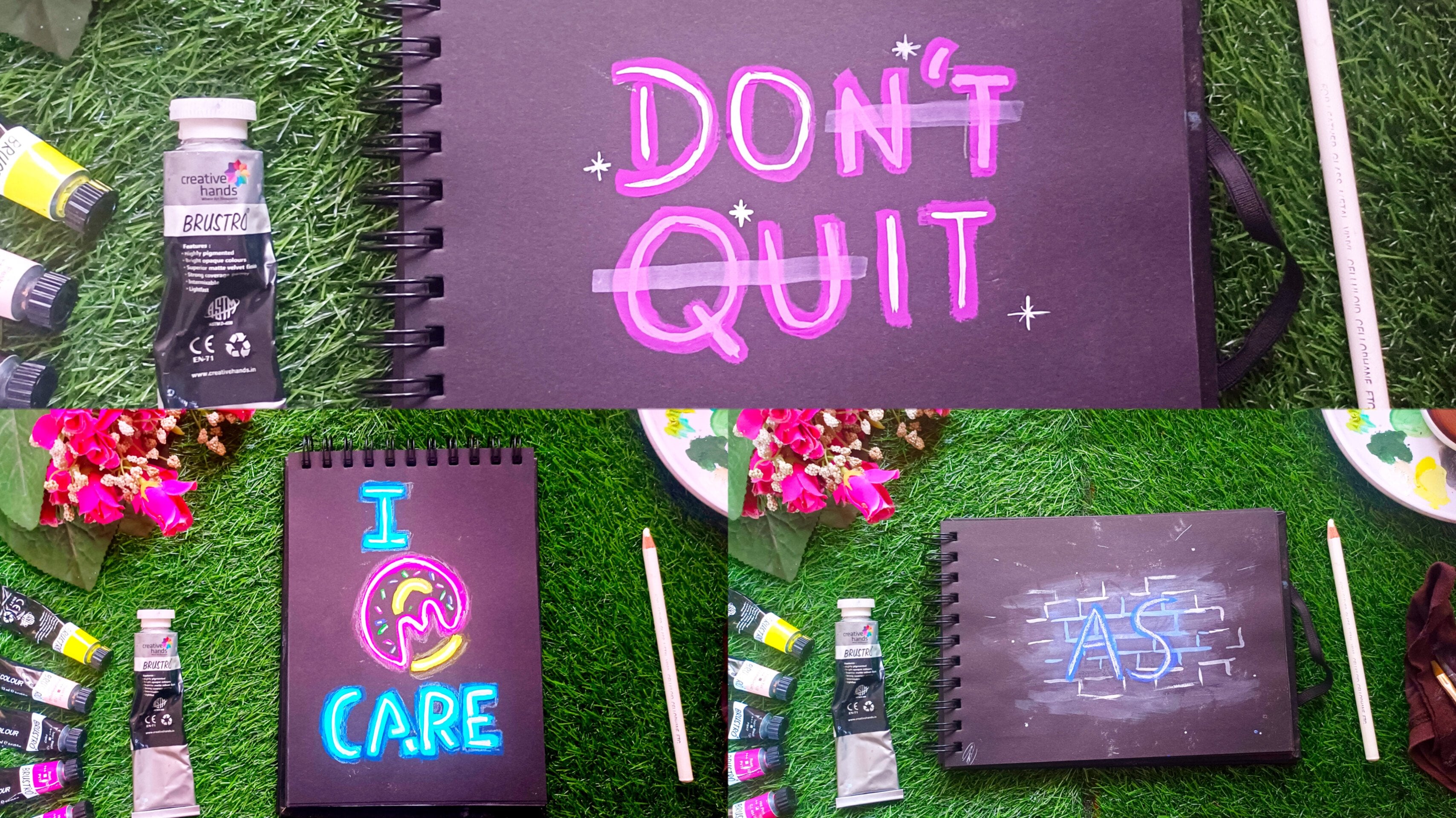
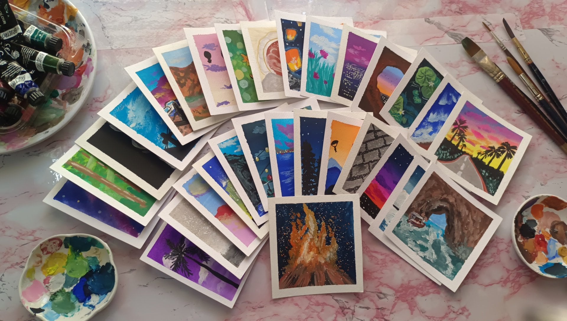
3. Essential Supplies : Let's explore the
essential materials. You'll need to bring your
artistic vision to life. First, let's talk
about the canvas. We'll be using Zen
Senngm bookmark paper, a sturdy surface with
a way of 300 GSM. It's texture adds character to your artwork perfect for
achieving that Boho vibe. Next, let's talk
about the paints. I have chosen the
Him Mia Gach paints. You can choose any
gauche paints. It's up to you. You
can also use acrylic or poster colors or
even watercolor paints. But the gauche paints give you a vibrant color and
smooth application. They are fantastic choice for capturing the rich tones
typical of Boho art. Now, onto the brushes
and the pens, we'll be using a
flattened brush for broad strokes and a route
brush for finer details. These brushes offer versatility allowing us to create intricate
patterns and textures. For adding those delicate
lines and accents, we'll use a liner brush. It's perfect for achieving
those intricate designs that are a characteristic
of boho style artwork. To really make our painting pop, we'll also use a
black fine liner pen and a golden marker for finer
details and embelshments. These tools will add depth
and dimension to our piece. Lastly, let's not
forget our accessories. We will be using a pencil for the details so that we don't mess up with the final
look of the painting. Also, we'll be using
tissue for blotting, that is blot dry and also
blending a jar of water for rinsing our brushes and mixing palette for creating a
custom color and gradient. And there you have it. All the materials
you'll need for our boho style wash
painting session. Now let's roll up our
sleeves and start painting. Okay. So before we
actually start, let me tell you that the color combination in the bookmark, you can use any colors, and you can also use the same
colors for every design. So it's up to you use your own creativity and
join into our session. I will see you in the class.
4. Banana leaf illustration : Hello and welcome to the first
session of the painting. We will explore
the vibrant world of Bohemian design
and learn how to create stunning
bookmarks bursting with color and personality. The color palette for today's
project includes hot pink, lemon yellow, and neon green. If you don't have these colors, you can go with pink color, yellow color, and green color. These bold hues will form the
foundation of our bookmark. Boho Masterpiece. So for applying, I'll be using a flattened brush, and with that, we'll
go from circle to rectangle with curves
to tear drop shapes. We'll experiment with
different and variety of shapes to create a dynamic
background for our bookmark, embracing the freedom
to play and explore different arrangements until you find a composition
that speaks to you. Here, I'm using the neon green at the corners, and in middle, I'll go with the pink
coal and at the corners, again, I'll go with
yellow colors. You don't have to
make it jam packed. You can always leave some space, but not too much of
space in between. I hope that you got my point. While using G paint, you can always experiment with the different consistencies
because we are not trying to attract that thick G. We are using the different
consistencies and adding texture. So it looks a bit different
but not too different, and that will actually
help you give more different look and that will also be a part
of your creativity. Once we are done
with the corner, Slets go ahead and add hot pink onto the paper in the middle. I'm just adding a circle. You can always press down the flattened
brush, not too much. Just a little bit and rotate
the paper or you can just rotate the brush just like
that and make a circle. See how easy it is to rotate
the brush and make a circle. You can go ahead and add those circles in
different places also. But here I'm just adding
at please for now. And I'll be adding some rectangular shapes
with a curved end, like a curvy end. If you think the
gauche consistency is too thick and it's
difficult to apply, you can always go onto the mixing palette at
some water and use it. See how I'm adding that
curve shape at the corner. That's only using
the flattened brush. I'm adding all the shapes. It's quite challenging, right? If you use simple basic brushes
to do different designs. So I'll add one more there, which is horizontal and
also vertical rectangle. Take your time and do it slowly. You can also experiment with different shapes
and composition. But this is what is
mine, which I like it. And you can see
how vibrant it is. Let's go with yellow color now. After thinking a lot, I have finally come
to a conclusion that we'll go with
a tear drop shape. What is a tear drop shape? It's like a water droplet shape. You see the bottom part
is heavy and curved, whereas the tip is
narrowing at one point. You can also add the different shapes
onto one on another. But be careful that you
don't ruin the composition, you don't jack all
the shapes together. So this was it for
the background part. I'll leave the empty
spaces just like that. Here I have copied
a banana leaf, which is from left
and right side. And using a fine liner, I'll be adding the tracing
out the banana leaf. We'll carefully sketch
out the leaves paying attention to the natural
curves and details. Along with that we'll be adding the texture onto the
leaf by shading it. Look how beautiful it's
looking once we are adding that bold black
line, which is very thin. Once we are done with
the banana leaf, we'll go the corners and
go with the curvy lines. You can also actually outline those shape and make
it look different. But I'm just overlapping and
drawing some curvy line. You can also leave some
space in between here, I'm using two lines. So you can also use one line or triple line or four
line. It's up to you. But here I'm only
going with 22 lines, and they're curved and some are overlapping and
some are cross crossed. Now, coming to the
shading part here, I'm using the same
fine liner pen and just going from the
corner part to the inside. And you can see how
lightly I'm holding the pen and just taking it away. And that's giving you
some rough texture, and it's not like a
complete bold line. It's having some spaces
in between the line. You can see the difference of the top lines and the
bottom lines right now. Look how beautifully
it's looking, isn't it? You don't have to add
lines everywhere. I'm just going from the
outlines in between, I'm just leaving it empty. So this was it for
today's painting. I hope you enjoyed it.
5. Silhouette leaf illustration : Hello, and welcome to
the second painting. Today, we are going
to experiment with the colors of purple
red and bluish gray. You can use any color
combination of your choice. But this time, I have chosen
a darker color palette. So if you don't have
bluish gray color, you can always mix match the colors and make
your own shade. Also the shapes which
we are using here is curved ones,
rectangle and circle. For the purple, I'll be using curve shape here with the flattened brush, as
you can already see. I'm just going in a zigzag
manner and adding the shape. You can always experiment
with a different brush. But here I've chosen
a flattened brush, and it's very
convenient, you see, and living between space, and I'm adding the purple color. M Using the same previous way that is which we painted
earlier in first painting. We will be adding circles in the same way with
blue gray color. Again, leave some
distance and add. Always experiment with
different consistency because I'll give you
really nice texture and also the overall look. No. Here I've added the
three semicircles. It's always necessary that
you wash your brushes thoroughly and clean the
brushes with the tissue. Once you are done with one particular color because I don't want you to
mix the colors. It's always good to mix, but then having the
bold vibrant color is a style of art isn't it. Let's add rectangles
and of red color. When I have given
you a color palette, you can always go and change
the combination, right? You can always experiment
with your own. Here I'm just adding red color, and here I'm not using
the glazing technique. I'm just adding the
opaque form of red color. Glazing technique is basically adding color on top of another, but the underneath
color is seen. Here, I'm just adding
it in an opaque form. Okay. I hope you're
getting my coin. So once we are done with
the background combination, we will be going ahead and adding a syllhab for
the illustration, for which I have I'll
outline the sketch of leaves and then we'll
add black color on it. We can use a rounded
brush or a line of brush, whichever is okay with you. If you're familiar with painting the leaf with
the flattened brush, you can go ahead
and use that also. Paint it slowly and go with
the natural curves of leaves. So once you're done with that, you can go ahead and add cluster
of black blows together. And for making it
even more beautiful, we'll be using a fine liner and adding circles which
are overlapping each other and also I'll
be going and adding the outline of the leaf
with the same fine liner. Okay. Also here and there, I
have added small dots. You can go ahead and
add lines as well. So this was the final of
the drawing and painting. So I hope you enjoyed it. I'll see you in the next class. M.
6. Random shapes with fan shape leaf illustration : Welcome to the third painting. So the color palette for today
is blue, pink, and yellow. And the shapes which we
are using is, again, similar to the previous one, that is curvy body
circle and rectangle. By now you know how to use flattened brush for making the curvy bodies and
also the circle. So we'll be using the same technique and
we'll be painting it. And for the illustration, I'll be using black
fine liner pen. And here, I'm just going to make a different kind of leaf. You can go ahead and experiment with whatever design you like. As of now, I like this, and yeah, we'll slowly
go ahead and paint it. Whenever you are adding
one particular shape, just make sure that you're not adding the same
shape next to it. Just try to give some space
and then go ahead and do it. So here we are playing
with the shapes and color. So give some space and do it
and make sure that it's not clumsy and cluster so that the composition looks
beautiful at the end. A Look, this is what the
background looks like. You can go ahead and make
a silhouette onto it or mandala or any animal figure
or human figure also. But here, I've chosen
to make a leaf, but it's a different kind
of leaf than a regular one. Shading the leaf
with the same pen. And also for the illustration
that is line work, I'll just go and follow the curvy shape of
the curvy bodies. And also, you can go ahead and add whatever shape
of line you want. This is my preference
of making the lines. This is the final
look of the painting. I hope you enjoyed it. I'll
see you in the next one.
7. Aesthetic leaf illustration : Welcome to the fourth painting. This one is obviously an
attention grabbing one because it has very
beautiful color combination. Pink. That is hot pink, lemon ello, neon green, blue, So with the
very simple steps, we are going to finish
off this painting. So we will use a curved
triangular shapes and also dots, cluster of dots, not
a single dot, okay? And as you can
see, I'll be using a flattened brush to apply the triangular body that is
curved triangular shape. You can go ahead and use
a rounded brush as well. That is more convenient
if you feel. Look how beautifully
it's looking. So I'll make the three triangles which are touching each other, but not like overlapping. And this is all going to be in a gauche consistency,
a thick layer. You can also make this two
shape together and then add one black color
oval shape that is long oval shape at one corner and give similar
shape to a butterfly, that will look even
more beautiful. So here I have
something else in mind. So we'll just go with the triangular shapes
and then on yellow dots. So the dots are going
to be somewhere small, somewhere big and everything
will be in clustered form. Okay. And look at
the vibrant color of this color combo,
isn't it beautiful? Using a liner brush, I'll go ahead and make the
circle and also the dots. You can use a rounded
brush for this. Oh. Now, coming to the
illustration part, I'll be using the same
black fine liner pen, but this is a CD or DVD
marker. That's the same thing. It's just that you
have to make sure the pen is a permanent one
and it does not smudge. So here, I'm just going to
make a palm tree leaf shape. As you can see how I'm
doing it without pencil. You can always go and sketch and then add the
liner on top of it. I am comfortable by
making it directly, so I'm just doing it
slowly and gently. You can go ahead and follow
me or you can just go ahead and draw it and pencil first and then go
ahead and draw. First, I have drawn
like a curved line, which is the main stem, and then I'm slowly
adding small small ovals, which is converging to the
tip of that line, main line. And as we go down,
the oval shape, the longitudinal oval shape is enlarging, bigger and bigger. I hope you're getting my point. Look at the shape first, and then go ahead and draw. So this is the final
look of this painting. I hope you enjoyed making it look how beautiful and
aesthetic it's looking. I hope to see your work soon. I'll see you in the next.
8. Monstera Leaf illustration : Welcome to the day five
of this painting session. So today, we are going to paint very different style
of Bobo art this time. So here, I'm just laying
down a flat layer of flesh tint color if you're using Brustra or you can also
use yellow teeth color, which is available
on imma palette. So the color combo here I'm
using is the yellow teeth and Burnsena Using the
flattened brush, I'm just laying down the color. Apart from that, we'll be
using semicircle shape and leaf shape and also
green color for the leaf. Emerald green I'll be
using and specific. Using the same flattened brush, I'm just adding a
semicircle here and there with Boncana you can
use any shade of brown. Now, shifting to
the emerald green, I'll be using a fine
liner or a line of brush. As you can see, I'm just using the emerald green and
making a leaf shape. If you don't know
how to do it take a reference and using pencil and then go ahead and
trace it out with the brush and then
fill it off inside. So I'm satisfied with the limited shapes
onto the bookmark. So I'll be using a fine line of brush
and a golden marker to go ahead and make
some more leaves and also outline the
emerald green leaf. Oh. To add some more elements, I'll be using the same pin in a brush and go ahead and a leaf. That is different
from this leaf. And also, I'll be adding
some dots here and there. So, this is the final look of our limited color palette
bookmark painting. So I hope you enjoyed it. I will see your artwork soon. Don't forget to post it. And yeah, we'll see
you in the next one.
9. Squares with leaves illustration : Welcome to the sixth
painting today. We are going to use the
color combo of orange, purple and hot pink. For the shapes will be using square rectangle and leaf shape. The leaf shape is going to be in the eucalyptus form
that is rounded form. It's one of the
variety of eucalyptus. We are going to do
that in background, and using a fine liner, we are going to
do some doodling. That is illustration work. We are going to
outline the squares and also add Covey
lines with bubbles. Using the same flattened ru, I'll be adding the
squares and rectangles. So be very gentle and careful. Just draw the outline and
fill it in. As you can see. Experiment the Gosh with different consistency up to you which consistency you'd like
to have on the background. Now, for the leaf, I'll be using a line of brush or even
you can use round brush. First carefully see how
I'm doing it and later, you can do it by your own. A I'm satisfied with the two leaves. So you can just go ahead and add more if
you would like to, but this is what the composition
is looking fine for me. So now I'll go for the
illustration work. So here I'm just outlining
the squares with double line. You can go with ly lines too. Again, a space and do it. Now, for adding
more wiggly lines, you can go ahead and
choose a corner. To make it more funky. I'm just going to add
some bubbles that is one big circle and one
small circle, as you can see. You can fill that
up here and there, but make sure the background has some white space to show up. So this was the final
look of this painting. I hope you enjoyed it. Thank you for joining in.
I'll see you in next.
10. Leafy background with splatters: Hello, and welcome
to seventh painting. So today, we are going to make this simple yet fabulous one. So here we are going to paint
leaves, and on top of it, we are going to add splatter
of paint with yellow color. So the color combo here
I'm using is purple, red, orange and yellow. For making this pattern, firstly, I have drawn a line, and then gently, I
have pressed down the brush and lifted it off. So this way I have
got the first leaf. And for the branches,
as you can see, I'm just going to press
down and lift it up. Again, I'm just going
to do this way. This is the second method. Like if you want a bent leaf, you can do it this way, or else you can just follow
me with the first method. So once I'm done
with the first leaf, I'll just rotate
the paper and go ahead and make one more
leaf with the same color. Keeping the composition
in mind and the spaces, you can go ahead and paint
as many as you want. So here I'm just
going to make two of such designs pattern with that same color and we'll shift on with the red and orange. The orange I'm here using is kind of yellowish
orange and you can always turn the paper
and go ahead and paint. It's not necessary that you have to paint it in one
direction itself. You can just rotate and
make your own design. And also keeping the
perspective in mind, you can go ahead and
paint or you can just randomly place
it here and there. But a bit of white space
is always necessary. A negative space enhances
the painting even more. As I have always told you, you can go ahead and experiment with different consistency. You can see this one is
like a bit transparent, but it's looking
beautiful, right? So this whole painting was
done with a round tip brush. Now, I'll shift to a lino brush and mix some watery
consistency of yellow and using the brush which I loaded with yellow
color and another brush. You can go ahead and
splatter it or you can use your fingertips
just like how I'm doing and you can
just splatter around. So this is the final
look of our painting. I am very much excited
to see your painting. Do share a review too, so I can make more such classes and more
interesting ones as well. And this was it for this class. I'll see you in the next one.
11. Long leaf illustration with doodling: Welcome to the eighth painting. Today, we are going to paint
this beautiful painting. It's similar to the first
and fourth painting. So here, I'm just going to
make the shape of a leaf. You can choose any shape
circle to rectangle or square. So the color combo here
I'm using is sky blue, lemon yellow, on green
and hot pink color. The illustration will
be different over here, and you can choose your own
illustration from any topic. And here, I'm just going to make one long leaf that is
running from top to bottom. Also for the doodling work, I'm just going to add some
bubbles and wiggly lines. So you can enjoy
the process now. Using a flattened bruh only, I have painted all the leaves. You can go ahead and paint it with a round
tip brush as well. Just going to make the curves by slanting the brush
and making it. The illustration here I'm
using is with the pen. You can go ahead and
use a paint brush also, and also you can make
slit on top of it. So this is the final
look of the painting. I hope you enjoyed it, and this was it
for today's class. I'll see you in the
next painting session. Don't forget to write a review and post your class project.
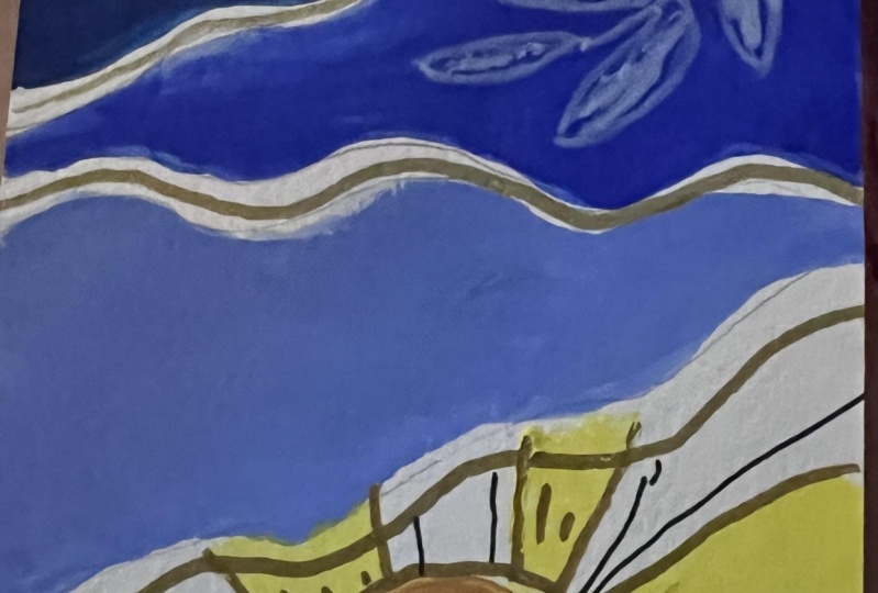
12. Mountains with sun illustration : Hello, and welcome to
the ninth painting. So today, we are going to
paint something different. That is, we are going to add some mountains and
also sunshine. For wards the colors I'll be using is the different
shades of blue, that is starting from
ultramarine blue, then cobol blue and Celine blue. And for the sun, I'll be using orange and
yellow te color. So firstly, I have drawn
a sketch with the pencil, and with the lowest
mountain part, I'm going to add the
darkest shade of blue. And as we go up, we are going to use the
lighter and lighter shades. For the yellow teeth
color, if you don't have, we can use the pastel
shade of yellow as well. Mix some lemon
yellow with white. I have never restricted
the color combo here. For this class, as you all know, so you can go ahead and choose
your own combo of colors. So as you can see, you can just draw it if you have
messed up with the line. And also, if you think that
the line is muched you can always go ahead and use white color white wash on top
of it to make that space. Slowly using flattened rush, I'll go ahead and fill
those mountain part. As you can see, I
have messed up with the spaces in between
the mountains, so I'll be using
White Gosh using a line of brush to
cover up that mess. Now, using the same
flattened brush, I'll go ahead and paint
the sun and its sunshine. Firstly, I'll add
orange color in that circle and then using
the flattened brush itself, I'll go ahead and
add the sunshine. Slowly leaving some equal space, I'll go ahead and add in
such a way the sunshine. The space should be equal. Now, coming to the
illustration part, if you draw it with
pencil, you can see, so I'm using a fine liner. So I'll go ahead and leaves. You can just trace it out with the golden
marker later on. Here, I'm just doing a sketch. Also, I'll be
doodling the sun and sunshine with the fine liner. So this is how it looks. Now coming to that black
color will just be tracing that black pen marker with
the golden shade of marker. Look how vibrant it's looking. This is a permanent marker and its consistency is
completely opaque. So it's very useful in painting the drawings when you have to finally give the
touch up or even the details. Look how beautiful it's looking. Okay So this is how you do it. And this was the final
look of the painting. I hope you enjoyed it. I'm looking forward for
your creativity and work. I'll see you in the next one.
13. Floral illustration : Welcome to the ten painting. Today, we are going to use
the combination of yellow, pink and orange color. The shapes are circles and
heart shape with yellow color. You can choose
whatever shape you want and the color
combo as well. So using a flattened brush
and round tip brush, I'm going to finish
off this painting. For the circle and heart shapes, I'm going to use
flattened brush, and you can see me how I do
and then go ahead and do it. For the illustration work, I'm choosing a very
simple drawing that is flower and also some wiggly
lines here and there. Keep some spaces
in between so it looks beautiful and have
that white background. For the illustration purpose, I'll be using the
fine line or pen. First at the corners, I'll be adding the curvy lines and then a very
simple drawing of. You can go ahead and
see first and then Do it slowly or you can just
go ahead and use a pencil drawing first and then trace it out with black fine liner then. So it's up to you
whatever you want to do, but have your own
creativity put into this. So it'll be more fun
and challenging. Oh. So after doodling a lot and making some circles here and there and adding those wiggly lines. This is the final look
of this painting. It's simple, but it's
yet beautiful one. As you can see. Now you have your own creativity
in your hand. Let me know how it looks. So, this is the final
of this painting, and that's it for this class. I'll see you in the next one.
14. Monochromatic background with floral illustration : Hello, and welcome
to the 11 painting. Seems difficult,
right? It's very easy. Trust me. The only color
we require is pink. You can choose your own color, and here I'm using
a flattened brush and going to make
stripe striped stripes that is running the
brush from left to right and making it
with various thickness. One with the broadest, one with the smallest and
one with the thin line. Like that, we are going to make many several lines with various. You can use a flattened
brush round a brush or even if you have any
smaller size brushes. Since this is a monochrome
type of painting, you can experiment this painting with many different
consistencies. Be careful with the edges
because that's what we want, like a sharp edge. So we are finally at the
corner of the bookmark, and this is how the
background looks. Now for the illustration work, you can go ahead and
draw any drawing. Here I have copied it from the Pinterest with the shading, so you can just go ahead and
try it out with yourself. You can have your own reference
image or just copy mine. I have one flower which
is almost blooming and the other with a
bud and some leaves. Here I'm using a fine
line of black pen for tracing out and
making the illustration. Once we are done with
the outline part of the illustration, let's do some shading. You can just have
some rough stroke and also keep the pen
in a very light motion, so you can do a breaking line. And you can see I'm not just
adding lines everywhere. I'm just leaving some
space in between. I'm adding some d kind of lines. You know what I mean by d
is very small, small lines. So here is breaking lines again. We'll just make the stem that is the main part of
the flower a bit. So this is the final
look of this painting. I hope you enjoyed it. It's very simple
and easy to paint. You can do it with any
other color as well. I am looking forward for your creativity
and class project. So make sure you post it, and I'll see you
in the next class.
15. Aesthetic Boho background with doodling: Hello, and welcome to
the 12th painting. This painting is going to be the last painting
of this course. The color combo here
I'm using is eminll, neon green, hot pink
and blue color. This combination of color is very common in this
course, isn't it? Whenever you type
Boho art on Google, you always find this art shape
paintings on Canvas board, on prints, and all. So taking that into
inspiration, here, I'm just going to add some
arches using a liner brush, as you can see, we are going to make each arch with
different color, and that is where I'm
placing the two arches. Inside of which we are going to make more arches with
different colors. And in between those two arches, we are going to make some
leaves and also some doodling with wiggly lines using the same
color combination. Firstly, the lemon
yellow, the arch, and then the next
color is on green and then hot pink
and the blue color. In between those two arches, I'm going to use the
same color combination, keeping the pink in between and adding the neon green and
lemon yellow around it. And with the blue color, I'm going to add the leaves. By now, you know how to
paint the leaves, right? Just drag and then push it down onto the paper
and then lift it. Adding some shapes to the hot
pin to cover up the space. Now, with the fine liner, I'm just going to outline the shape extra shape which we added and also
those wiggly line. Adding the wiggly line at
the corners and in between, I'm just going to break the
wiggly line and add it. By wiggly line, I
mean the curve lines. Okay. In between the white spaces, I'm going to add some circles. Even after putting
everything over here, you can still see some
white space, right? That's what makes the painting
even more look beautiful. I hope you enjoyed the series of this painting and
this one, especially. So I'm looking forward
for your creativity, and I'll see you in the thank you session. I hope
you enjoyed it.
16. Thankyou : We are finally at the
end of the course. We learned how to paint 12 different bookmark
using Boho style. Let's remind and see
what all we learned. First, we learned what
is Boho art and what is an art block and how to overcome art block
with Boho art. Boho art is all overtrending. That's because of its
freedomnes expression and embracing individuality
and its uniqueness also. With this idea and subject
of Boho art in mind, we learned 12 ways of painting different style of Boho
art on the bookmark paper. And also, we discussed about the essential supplies that
we require for this course. And we also learned how we
can use the two brushes, that is flatten
brush round brush and make so many paintings. You can also use any
other brush in specific and give yourself an art
challenge and complete it. With that said, I'll give you 13 ways to remove
block over here. We already spoke about it, but let me just remind and
let you know about it. Firstly, take a break and relax. Sometimes stepping away from your art can help
you clear your mind. Try your new medium
or technique. Exploring something different
can spark creativity. Look for inspiration in nature, books, movies, or even
other artist work. Fourth, set small goals and
focus on completing them. It can help you build momentum. Fourth, experiment with
different subjects or themes that you
haven't explored before. Sixth, join an art
community or take part in challenges to
connect with other artists. Seven, practice
regular sketching or doodling to keep your
creativity flowing. Eight, visit art galleries or museum to get inspired by different styles
and techniques. Nine, listen to music for podcast while you create the set a positive
and inspiring mood. Ten, take art classes
or workshops to learn new skills and techniques. Lemon, create a
dedicated art space that inspires you and makes
you feel comfortable 12, keep an art journal
to jot down ideas, sketches and thoughts
for future reference 13. Don't be too hard on yourself. Remember, that art is a
journey and it's okay to have ups and downs and
everyone makes a mistake. It's all right to be
uncomfortably comfortable. These are the 13 tips that might help you overcome your art
block or creative block. So we learned all
this with paintings. I hope you enjoyed the course. I'll see you in the
next course until then do post a review and also
your class projects. Each of them doesn't
take even 15 minutes. It's hardly like five
to 10 minutes long. It's easy and comfortable for you to overcome
an art block. Keeping that in mind,
I made the course. I hope you enjoyed it and
let me know about it. Until next time, keep creating, keep and thank you.
Have a good time.
 Arbia Sultana, Art Educator