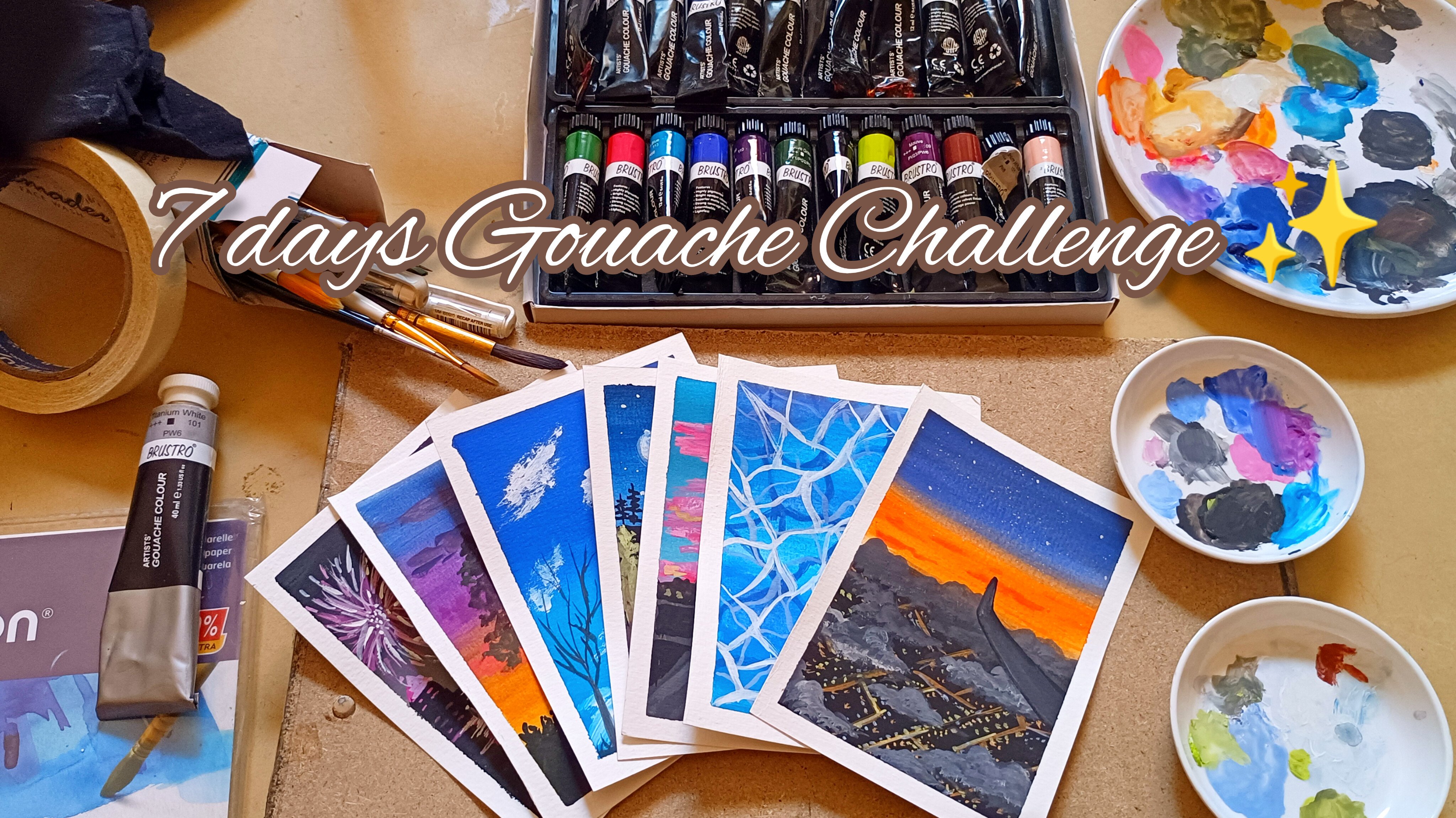
Transcripts
1. Introduction : Do you know some people
believe that you have to be born with an artistic
talent to be an artist? And there are some people who feel like there's
no point even in trying because they won't be satisfied with the
perfect result. In fact, anyone can paint art and I think
everyone should do art. Hello everyone.
This is a Sultana. I'm an artist, standard dentist. I'm based in Bangalore, India. Today, I'm here to take you all to a beautiful journey where we are all going to
experience like never before, very magical medium,
as many artists are familiar with it
as its trending. It is an opaque water
based medium which acts both like watercolor
as well as acrylic. Creating art is not just
about the end result. There are a lot more benefits. It is more like a meditation, that's where I started painting. It is more like a meditation. Creating art leads you to identify the details and pay more attention
to the environment. Creativity is just
more than art. Albert Einstein once defined
creativity as intelligence. Having fun, if it's been a long time expressing
yourself creatively. And if you don't know how to
begin, I'm here to help you. I'm super duper excited
to invite you all to a beautiful beginner
friendly gauche class where we get together
painting 13 minute paintings. And the best part is
that each of them can be painted in
ten, 20 minutes. This class is
specially designed for the beginners as well as
intermediate artists. Even if you're using Gauche for the first time,
you can join in. I'll be talking about each and every material
required in detail. This will help you
understand the medium and the material and get
comfortable with it. And also I'll be explaining
you about the techniques, how you can incorporate
that into the painting. You don't have to have any particular artistic skills
to get you started. You just need some
patience and of course, some passion to get started. All right, let's diamond
and get started.
2. About Gouache : Let's get to know about Gauche before we start
off with the scores. As a beginner, you might have so many questions related to it. Coming to what is gauche? Gauche is a type of paint that is similar to water colors, but it has a thicker consistency and a more opaque finish. It is often used in
illustration and design, coming to the pros
and cons of gauge. The pros are its
vibrant color that can really make your artwork
pop coming to the opacity. It has a more opaque finish
compared to water colors, and the mistakes
can be corrected. The third is versatility. Gach can be used on
various surfaces, including paper,
canvas, and even rod. It can be applied thickly
or thinned down for a more watercolor
effect blend ability. Gach paints can be easily
mixed and blended together, giving you the freedom to
create a wide range of hues and shades coming to
the drying time. It has a very quick drying time. Fragility can be more prone for smudging and damage
compared to other mediums. Limited transparency cost be more expensive compared
to other mediums. To the types of gas. There are two types of gosh, that is regular Gh
and acrylic gosh. Regular Gh or traditional
gach behaves like watercolor, whereas compared
to acrylic gosh, it gives thicker consistency. It is available in tubes, pants, or even cups, but I would recommend
you to go with tubes, although the tube starts to break out from the
edges and create a mess. But it's good in this cup form, you can see how
fast it dries and it creates a mess. Yeah. Whichever is okay with you, you can go ahead with it. But whatever you're using, make sure that you
rehydrate it very well and then bring it to its
consistency and then use it. Now coming to how to reactivate, gosh can be reactivated simply by adding water to the dried
paint on your palette. Gradually, add small amount
of water and mix it, the paint until it reaches
the desired consistency. What brushes suits
best for gosh? Any brush which works for
watercolor and achylic, I would recommend
synthetic brushes, brushes for general painting. Fat brushes for broad
and larger strokes, and detailing
brushes for details. Which paper is good for G? I would recommend more
than 160 GSM paper. You can check it out, whichever suits for you
can we use on canvas? Definitely, we can
use on canvas. And but before applying
it on the canvas, for we have to go
with a layer of gesso on it to make it waterproof and then
we have to use it. How do you see? Can be sealed using a varnish
or a wax medium. I would recommend you to start as a beginner
with because it is versatile and a
forgiving medium that allows you to experiment and learn different techniques. Plus it is easy to clean
up and have fun exploring. Yeah, these are some of the s, If you have any more questions you can go ahead and ask me. I would be happy to answer. This is how you
should mix the paint. Slowly, add some
amount of water, and just try to remove those chunks by adding
more water and mixing it. I hope this Epics help
you to know what is. Go, and let's move ahead and
get to know more about it.
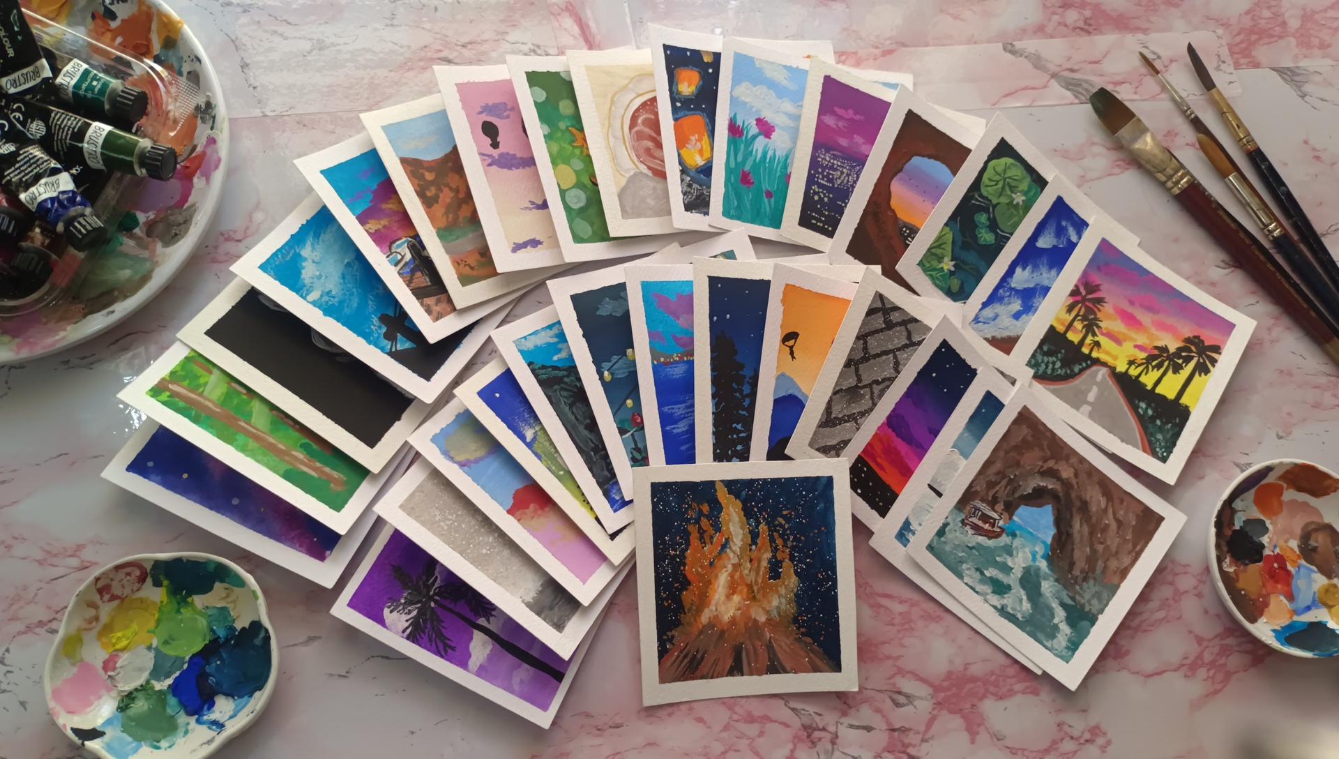
3. Materials Required : To create a work of art
is to create the world. With that said, let
me just quickly tell you about the materials
required for this class. I have considered a
beginner friendly products. You can always go ahead and use a better quality ones than this, or even the ones which
you already have. I would recommend to use the one you already have and
explore with them. Coming to the list
of requirements, here I'm using a square
sheet of gosh pad. You can use a paper which is
more than 160 GSM as well. This is Zen Square Pad, uh, and below which I'll
be sticking a board, a random board along with that, a masking tape, a cloth,
a mixing palette. And now coming to the jar
of water. Before that. Yeah. Now coming to the list
of brushes and stationery, I'll go with the
first line brush. As you can see, I have
taken a thin line U brush, this is from Merlin. Along with that, a fan
brush and flattened brush, which is of small size, I'm taking a palette knife. This is for the cup of, uh, to remove the paint. This is again,
flattened brushes, which you are very familiar
with if you have seen other videos of filberh
for making flosdrushs, small one and then
under brush which is like slantlyu I don't
remember that name but yeah, I have no clue be using that. But yeah, these are
all the supplies which I have as of now
which I'll be using them. Investing in detailing
brushes is very important. If you're into the
detailing part along with that basic stationary pencil erase a white gel,
black gel pin. I'll be also using a golden
marker and a white marker. Once you have grabbed
your supplies, let's move ahead with
the G paint here. I'll be using Mimi Gh paint
as well as Russto Gach paint. The tube and the
cup jelly carton. Whichever you have, you
can go ahead and use. It has its own advantage and disadvantages for the colors. I would also tell you
about the ones you can alternatively use if you don't have that
particular shade. Since Mima has so many colors, I have just forged it out
so that it is helpful for me to grab those particular
color and use it. If you're ready with the
list of supplies, grab them. Let's go ahead
with the painting.
4. Gouache Techniques: Hello artist. Let's learn about
the Gache first. Once you have got to know
what is Gh and what are the ices behind the Gh
and its consistency. Now we'll look into what is
the actual consistency of Gh. Along with that we'll go with
the techniques which we'll use very often with.
So we'll go with that. Yeah, Let's begin with this. As I've told already about the gas gauche comes in
various forms, tube and cups. Before we actually use them, it gets dried very fast. You have to hydrate
it and then use it. Gauche consistency is very
tricky be very thick. It should neither be very thin. If it is too thick, it'll give you a dark finish. And also it might cause the
brush to ruin very easily. If it is very thin, it'll look like a watercolor. The thick consistency you can use for dry brush technique, but the actual form of
Gh technique is fun. We'll see how it goes. Okay, this is directly
from the tube. I'm here washing my brush
thoroughly because it was dry. Then I'm just applying
the consistency of, gosh, look how thick it is. And it's giving you a
dry brush technique. You can see how much difficulty I'm getting while
getting that stroke. This is what the consistency of looks like as soon as you
take it out from the tube. Now we will be adding
two drops of water and making it into a
thinner consistency. As you can see, as soon as
I have added drop of water, two drops of water, I'm just going ahead
and mixing it properly. Along with that, I'm making sure that the crystal is taking up the right consistency
of paint into it. This is very essential
because it will lead you to have
somewhere thick, thin paint, while you're putting down
that Bristol onto the paper. This is the correct
consistency of ah, it is neither too thick
and neither too thin. Now I'll show you the
water color form. Again, I'm adding
two more drops. That is four drops completely. Then I'm mixing it thoroughly. As you can see, I'm just
like rotating the brush as well and then I'm
directly applying it. You can see how much thin it is, you can actually feel it. If you're practicing
this on the paper, just see how it looks like. Also to mention that there's so much difference in cotton
paper and silos paper. Made some notes after experimenting it with
the cotton paper. And sell los paper
the cold pressed one cotton paper in that the color sings properly and
creates a very good background. Whereas se lo paper, the paint moves but doesn't
sing completely like cotton. This is where you learn the right consistency by
practicing your hand, by adding or deleting dion
of water into the paint. It depends on where you
are and how much of water is required for
hydrating the paint. If you're using the cup form, it'll take more water. Now, coming to the basic
techniques used in gosh. Firstly, we'll go
with the wet on dry and then wet
on wet technique. In wet on dry technique, we'll wet, the brush, basically means the brush is
wet and the paper is dry. So we'll be taking the Um, paint and then directly go over the paper without
wetting the paper. This is how the brush is wet and paper is dry and Tony
effect is completed. You can go ahead and use
a consistency of gouge. I have thinned down the paint, you can go with the
thicker one also. The wet Rytt technique has its own pros and cons
coming to the wet. The pros, I'll tell
you, wet on dry has a good vibrant color after
completion of the painting. It gives you a sharper edge, whereas on wet will give you a nice blending, a softer edge. And it'll look more
like a galaxy painting, which I'll show you
in a few seconds. In wet, on dry, I'm just getting the right consistency
of gach first and then applying
it onto the paper. As you can see, it is
thick, yet creamy. Now I'm just taking
a flattened brush and then applying
water onto the paper. Here I have a
tingch of purple in it just to show
how I have wetted, Since it is a white
background and it won't be seen a tinge of purple. I had added, I hope you can
see that in wet on wet, I've used flattened brush and
layered it onto the paper. Now I'll do it
again because water absorbs really fast in cotton
paper than loose paper. Also, if you're doing the
galaxy painting in a, just make sure the water
consistency should be correct. If you haven't seen
my other course, I tut you about the correct consistency of water for painting galaxies
or any other stuff. As you can see, as soon
as I applied the color, it started to blend
and move around. And it's leaving a softer edge
rather than a rough edge. This will take time to dry. It depends on where you
are for paint to dry. Because sometimes it
dries in a matter of a few seconds and
sometimes it'll take time just because of
weather in Bangalore. It depends what time, what weather is
there, no one knows. Yeah, Whenever you're painting, just make sure it has completely tried and then move
on with the next one. Now let's move ahead with the
third and fourth technique, which is also commonly used as dry brush technique and
layering technique. Now, for the dry
brush technique, here I have thoroughly
washed the brush. As you can see, I don't
have a shiny surface when I run the brush onto
the behind of my hand, that means that the brush
is completely dried. I'll be just taking a few amount of pain while painting it. You can see the first
consistency that is first one. Before that we'll just remove some excess water from the
belly of the brush. Okay. The first layer
will always be wet, so it's always recommended that you try it onto the rough
sheet and then do it. So you can see I'm just
rotating the brush like this. And then you can see I'm
getting the dry brush effect. You can go from bottom
to top as well. From top to bottom,
you hardly get, but from bottom to top
you'll definitely get. But the first few strokes
will always be wet, but after that
it'll be like thin. You can see now the
wet consistency of the brush when I
run behind my hand. Now coming to the
layering technique here, I'll just draw one
flat wash of paint. I'll be using another color to demonstrate the
layering effect. Here I'll be using
a rose color from Rostro that is kind of
purple and pinkish mixture. Always three steps in layering, add color and then let it dry completely and then add the
next layer and blend it. Blending should be as
few strokes as possible, since I have just added the
color and did not let it dry. Here, I want to
show you that you can't really differentiate
the colors, two colors. Also, one more point to
remember is that celos paper, in that the
underneath color will react very quickly compared
to the quaton paper. Here are a few more strokes
where I'm demonstrating that you can't really add a color when it is
completely wet. Because it'll lead to blending of colors
instead of layering it so you can see it is not completely
dried, It's semi dried. The places where I'm
putting the strokes right now as the places where
it has dried completely. And you can see how bold it is when it is completely dried, it'll pop up really nicely. Now, coming to the
blending part. Blending can be done
in various techniques. It just depends on what
technique you like. Here are the four techniques
which I'll show you. One is with the brush itself, mixing the colors
using the same brush. Here, I have added a
layer of hot pink. And now from the bottom I'll
go with the rose color. And you can see I have
thoroughly washed my brush before going
with the rose color. And then I'll be applying
it from bottom to top, and then mixing it
with the same brush. I'll be adding both
the colors from hot pink and then
moving down to rows, and then adding rows, and then going on
to the hot pink. It just depends on what
dominant color you require. Moving on with the second
blending technique here, again, I'll add the hot pink and then a layer of
rose at the bottom. The blending of these
two will be by pre mixing the color in the color
palette and then adding it. You can carry a single or
double brush for painting it. Now coming with the
third technique here, I'll be using the same blocks, that is hot pink and rose. And then mixing will be done
with a flattened brush. And you can use
any brush as well, just that we'll be using plain layer of water to
mix those two colors. This technique is usually done for those colors where you get the muddy color mixture for those colors like yellow
and blue, which forms green. Especially when doing
the clouds muddy color in the sense that it
creates brown color, it looks very dirty. For those type of
paints you want to, if you want to mix, you
can use this technique. I have left the
third one just like that because I have added
extra layer of photos, so I wanted it to dry. Now you can see that I'm
just blending it out. And you can see the edges
aren't that smooth. It is sharp, but not
that sharp as well. If you want to leave a
wide space in between, you can go ahead and leave
while it with the clear water. If not, you can just do
the thing which I did now. Now, coming to the
fourth and final one, which is mostly
used in G paints, I've added two layers of paint. That is two blocks of paints. Now I'll be using titanium
white to mix those two colors. You can see how it
transforms its whole color, obesity thickness, and everything
into a C much smoother. And much vibrant and
better looking painting. You just keep seeing after running the
brush thoroughly from left to right
and right to left a few more times and you can
see how blended it looks and look at the consistency
of the painting. And also the two layers have
blended together properly, making it as a single color. You can do this with more
than two colors as well. All the techniques,
you can do it with more than two
colors as well. These are the few techniques
which we commonly use. And if you're looking
forward for more of water color consistency and
more watercolor colors, but you want it in
a vibrant manner, then you can go ahead and use whatever techniques you use. For watercolors, For example, the water, just experiment with the colors and then go ahead and use them. The few techniques which we see, which we commonly use, and if you're
looking forward for any other techniques
and wanted in detail, you can just come in down so that I can help you out with it. Now that you know all the
techniques used in, gosh, let's use this and paint
beautiful paintings with it.
5. Taping down the paper: Let's prepare the paper before
we start off painting it. For preparing the paper, we'll apply the tape that is masking tape onto the borders. Just look at those paintings. They have crisp
borders for that. You have to use masking
tape or painters tape, or even washy tape
For preparing this, you have to apply the
tape and you should run over the tape with
the fingers just so that if there is any
air tapped inside that can be released or else it might cause the
paint to leak out. There are I usually prefer
masking the tape onto the board has it
gives a clean border and it prevents
from buckling up. Buckling the paper will
raise just to prevent that, you can mask the tape around. Also, it is much more comfortable while
you are painting it. You can just turn
it around and lift. You can do all sorts
of stuff on the table. You can just rotate the board
and everywhere, 360 degree. You can paint also while
removing the tape. One thing to keep in
mind is paint has to be dried before removing
the masking tape, because it can rip off the
painting along with the tape. The second thing is
removed in a plant manner. If the tape is too sticky, use a header to melt the
glue and then remove it. I hope this is the thing
which you'll keep in mind. I won't be repeating
the same thing. This step has to be
followed in every painting. Quickly, fix your first piece of paper and join me
in the next section. We will start off with
our first painting.
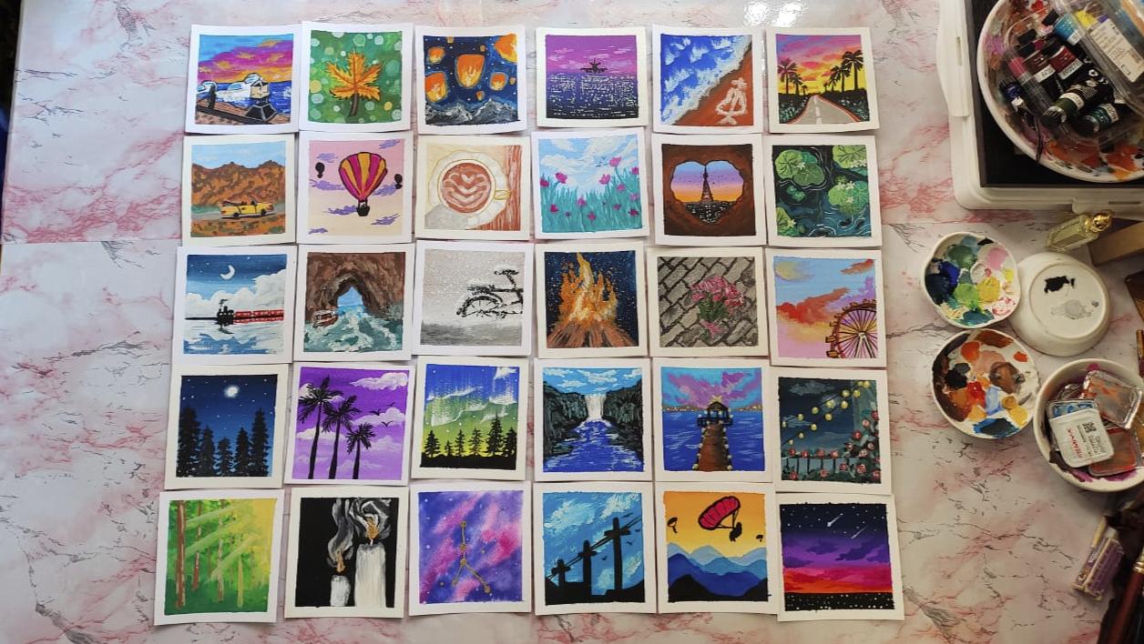
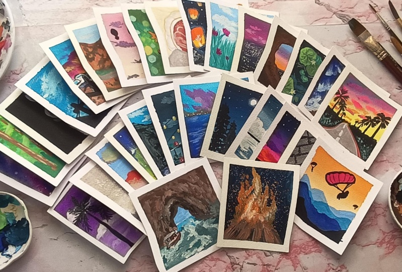
6. Day 1 - Palm Trees Painting : Hello and welcome to our
first painting class. For this class, the
colors require as violet, black, and titanium, white. As you know, this is a
very simple painting. If you're beginner, just follow the instructions and
you'll get the exact copy. If you have the right
materials with you for this. I'm using hemi gh paint. I'm just disposing
some colors onto the mixing palette
for the background. We'll be mixing violet and white and making a graded
wash for the background. Following which we'll be using Filbert brush
for the clouds, you can see how the C
shape may made the cloud. And the last step will
be the painting of silt. The silt is coconut
tree using black color. Once I have disposed the colors
into the mixing palette, I'll go ahead using flattened brush and
painting the background. Firstly, we'll start off
with the violet color, and as we proceed
towards the bottom, we'll mix white into the violet and create a
mixture and apply it. And that will give us a
pastel shade at the bottom. You can see and follow me along. I'm just taking the
paint onto the brush and completely dipping it and taking it in a
gauche consistency. And you can see I'm just running the brush
from left to right. Since I'm using a
flattened brush, it is covering up
a broader area. You can use a bigger
flattened brush that will be helpful to cover most of the area at a time and make sure you
cover the edges properly. If the paint is too thick, you can add some amount
of water into it. Then whenever you're taking up the paint or adding any
water or any other color, just make sure that you mix the paint thoroughly
so that there's no left out area on the Bristol which cause texture
into the paper. As you can see, I
have covered most of the paper with violet color. I'll be adding some
amount of violet and white into the paper here. You can see I have
just directly took up some white color. And then I'm just
gradually building up. That's because I
know that there is a violet color left left
inside the Bristol. That will help me
in giving shade. If you're wondering
what the Bristol is, it is basically the tip of
the brush carrying paint. See running the
brush from left to right and gradually
building it up, down with white color, How smooth blend it has given, and how much of
smoothness you can see. It doesn't have any sharp edge. Do you notice that there is complete fading of the
color from top to bottom? Now, using a fill bird brush, I'm just taking some
amount of white here. I have a thick form because I know the background
hasn't right, completely. I'm just taking it
in a thick form and just dabbing it over. Like lifting the brush and
putting down onto the paper. Just like that, I'm doing. You want to go with
a slow motion and follow me if you're
left over behind. Then just pause the video and
then you can just paint it. You can see here, I'm just
dabbing it and building it up. You can use the tip
of the brush or you can use the
side of the brush. You can see how much texture
it creates while having at the tip and at
the flattened type. Also, if the brush becomes dry, it'll give you more
look of the cloud. If there's too much of
violet onto the cloud, you can just build
it over with white. What to do if you don't
have a billboard brush? Yeah, I know. Because this is a special brush and you
find it at rare places. I feel because for me itself, it was very difficult
to find that brush. So basically if you
don't have that, you can use a round
round brush and just run the brush in a round motion for
making the clouds. I have further
classes coming up. I mean, in this course
itself where I'll show you how to make clouds
using round brush. We just follow me along
for this and then I'll show you in further
session how to use that. Now I'm taking a
small round brush, you can use a liner
brush as well. And filling the Bristol
with black color. Just make sure that
the consistency is of wash. And then I'll
just make a line. As you can see how I'm holding the brush very lightly
and not pressurizing the Bristolsjt broader area and thinner area.
Just light pressure. Firstly, I'm drawing the
irregular lines. But Wherever I want thick. I'm just doing it
where it is thin, there's thin a part, you can see the
bottom part a thick, whereas the upper part is thin. Once we are done with that, we'll just put the leaves just make sure the background
has dried first and then you can continue as
you know go dries faster for making the leaves
first you have to do the skeleton and then
go over with the lines. As you can see, if you're
confident with the shape, then you can just directly
start painting the leaves. There's no need of
doing the skeleton. The skeleton, I mean the five main lines
just like a star. Do it slowly and with the
help of the tip of the brush, you put there that much
fine line you get. If you put more pressure, the thicker line you get
just practice with that. I'm very sure that you'll
get hang on if you use that for painting
this structure. Once we are done with
the three coconut trees, let me add some birds here. Adding birds just that we are
doing it in a V shape where one line is thicker and one
line, if you might notice, everything is not in V
shape, some are broader, some are flat V.
Wherever you want to add some details such
as those trees were. I want the bottom part to be thick and top part to be thin. I want those mean structure
to be seen properly there. I'm adding color. Wherever
you want to add details, you can go ahead
and add details. Once we're done with that, we'll remove the masking
tape in a slant manner. If the tape is too sticky and it's just sticking
to the paper. Just make sure that you
run over the heating gun. Over it, heating gun. By which I mean the hair dryer, not too much of heat to be
applied onto the paper. You can always just do the detailing wherever
you require just that. You have to do the detailing
before you put the varnish, because once you
apply the varnish, you can't paint it again. This was a simple painting for the day and I hope
you all enjoyed it. And here's a close up look. I hope you have
replicated the same. I would love to see
it me on Instagram. Post it in Project section, and I'll see you in
the next painting.
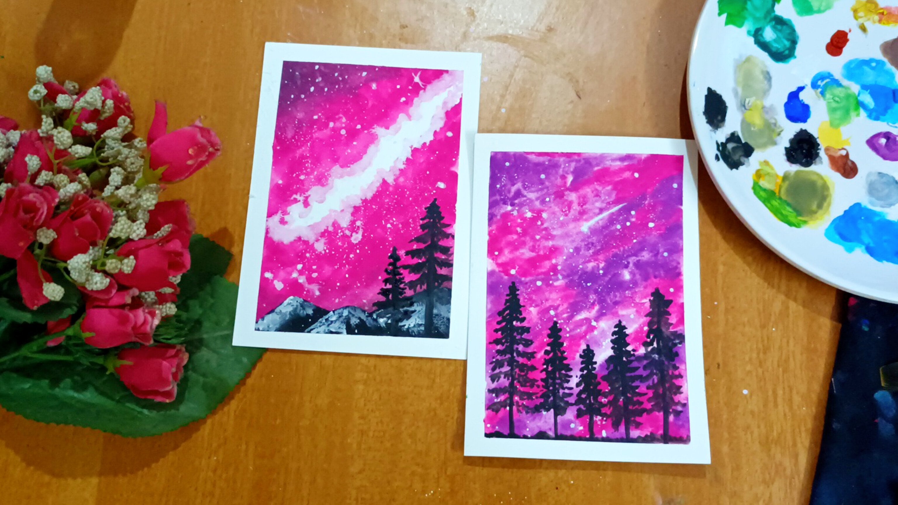
7. Day 2 - Galaxy Painting : Hello and welcome to
the D to painting. In today's painting,
we are going to paint this Galaxy painting here. I'll be using my zodiac
sign to paint the stars. And we'll start off this painting with
wet on wet technique. As you can see, I'm
just pumping out some water onto the
paper and either use a spray bottle or you
can just directly lift some water into the
brush and directly apply. Just as we did in the
technique section, we're just going to
wet the paper and then evenly distribute the water onto the paper with the brush. And then just wait for
a couple of seconds. You can notice how
I'm running my brush, that is top to bottom as
well as from left to right. Once we are ready
with the paper, we'll just take some
color that is here. I'm using bad blue and rose. That is pink color. You can
go ahead and use any color of your choice and just put
it on onto the paper. You can see I'm just randomly placing the paint with
the flattened brush. The color first I applied was a mixture of ball blue and pink. Now here I'm using pink. You can see I'm just
dabbing, dragging, and also giving a
round motion to the brush and then painting
it over onto the paper. Just make sure that
whatever you're doing the paint
should be in flight, watery consistency, but
not to water as well. Here we are, doing wet. You know how it works. Now, I have left some space over here and
there we'll fill that up. You, you can also mix some pink into that and
then just apply it, but more of blue
will look good with think you can see how the two colors are
blending with each other. Look at those edges. They aren't so sharp. They're smooth and
they're transparent. Once I fill up the
panes onto the paper, this will complete
our first step. You can go over it
with one more layer, but just make sure that wetting the paper again will
ruin the whole color. Yeah, be careful with that. Once you're done with the
background, let it dry. Now, let's take some white
color into the line of brush and make the consistency of white paint a bit watery,
but not too watery. Too watery will lead
to give bigger stars. More platters are one
concentrated area. Just make sure the
consistency of the star should also be in even manner. It should neither be too thin
or not too thick the paint, this is how you do the
plattering method. Just take brush and hit it over with your
finger with another brush. If the paint is not coming, just use the liner brush
step and then apply it. This completes the second
step of this painting. Now coming to a biggest star. You can choose whichever
silhouette or whichever you want to paint behind in
front of this background. You can go with a
couple silhouette, or you can go with any kind
of silhouette as well. But here I'm choosing
my zodiac sign. I'll be using black
paint initially to just sketch out how it looks. And then I'll be using
a golden marker to place the stars brightest stars. Just wait until that white color completely absorbs the paper. Absorbs into the paper. Once the paper is
dried completely, we'll move on with a third step that is painting the
brightest stars. Here, I'm using a line
of brush again and pointing out where to
put the biggest stars. As you can see how
I'm putting it, whatever syllable you're doing, just have a reference
image and then paint it. Draw with the pencil and
then paint it over if you're not confident enough or you can just directly
paint over it. Now here I'm using
a golden marker. This is acrylic golden marker. I'm just putting out onto the
black area, wherever it is. Yeah, that finishes
our painting. Be careful with the
markers because sometimes it will
leak out completely. Practice onto the
rough paper here. I have done it on the
masking tape side of the masking tape and then
I'm just painting over it. You can see there's some
black lines also being shown. You can just leave
it over or you can just cover it up just like that. If you don't have
a golden marker, you can go ahead and
use any color of the gauche paint
and then use it in a gauche consistency
and apply it onto the paper that will
look like more boulder. I'm using golden just because
that was easy for me. And here I'm adding
some more golden dots, but these are very tiny dots. This was the
painting of the day. That is day to painting. Let's remove the masking tape. You can see I'm removing it in a slant manner and
how easy it is. One more thing is
that you can lift off the painting from the table
with the help of this board. This board is very
essential if you want to lift it up or
rotate the painting, it's very easy if you don't have such a cardboard
You can also use the behind part of your
notebook or the exam pad. You can see you'll find the product anywhere
inside your home itself. There's no necessity to buy
a separate board for it. Here are some of the
paintings we'll be painting in the
upcoming classes. Stay tuned and show me all projects in
the project section. I would love to see them. If you have any queries, you can put out in
a discussion box so that I can help
you out with it. I'll see you in the
day three painting.
8. Day 3 - Floral Field Painting : Hello and welcome to
day three painting. Today we are going to paint
this beautiful flower field. For this, the colors
required is sky blue, emerald green, rose,
and titanium white. You can also use Erlin blue
instead of the sky blue and also pink or magenta
or even crimson pink, which you can use
for the flowers. And then emerald green. Instead of that, you can go with sap green or any
other shade of green, whichever you have along
with that white color, which is of course
needed for any gosken. Here I'm disposing
some of the paints. The first step for painting
this will be the background. First we'll paint the
blue and then the green. And then we'll add depth into the clouds by using the fill bird brush
or any other brush, whichever you have, then the flaw wheels will
define it more. This is the outline
of the painting. Once I dispose the color, I'll see you around
in the class. If you have tube format, then you can
directly dispose it. If you have such a cup form, you have to remote
with the knife, palette knife, brush, clean
brush and then use it. Or else molds will form which
will be very ritatinge. Every time you dispose a color, make sure that you wash it thoroughly and clean it and
then go for another color. Because if the paint
is left out and you go and remove from other paints, it'll lead to color mixture
and mold formation. Once we are done disposing the color here, flattened brush, and then directly going
ahead and using the sky blue and adding it
onto the paper. If you have seen blue, then go ahead and mix
some of it with white. And use that mixture. If you want to add white, you can go ahead and add
white. And then use it. Just make sure that you're
using it in a go consistency. Since the brush was also wet, it was in the go giving
us transparent look. Okay. Take a thicker form and then just add
it onto the paper. Once you wash the brush, try man onto the tissue
or a cloth just so that the excess water gets
removed for the background. You can go ahead and use
such a graded wash as well. I'm doing it because down
a part will be green, it'll be more of far. Look for that, I'm just adding a blue and then
white at the bottom. White and blue mixture
at the bottom. Here is also a graded. I hope you're following me
while painting and you can see I'm running my
brush from left to right and evenly
spreading out the paint. There's no transparent
or opaque look at any sort of place. I have shifted my brush
to a round brush. I'm using white color and then
some of the emerald green. You can go ahead
and Sen as well. I'll just go over the
background first in a U shaped manner and then I'll fill it up as told before, just mix the paint
properly so that every bristol of the
paint brush gets the paint and then use
it onto the paper. The corners of the
paper will have the highest amount of grain. At the bottom, it'll
be the lowest. It'll be just like U shape. You can see how I'm doing it. Once I'm done, I'm
adding more of a emerald green
into that mixture. And you can see how
I'm adding a stroke, just like from bottom to top
line and top to bottom line. I'm leaving space
also in between. And you can see it's giving
me some sharp hairy look. Or you can also do this by adding a black color
in the background. And then go ahead
and add a green. And then light green
and then light is green onto it and this
will build up the color. But here I'm just
using the green so that it is showing
a daylight color. And there won't be any darker
shade in this darker shade, by which I mean the
darkest is black. I don't want that
black interior. But you can also do that. I'm using the emerald green for the darker consistency
or darker look. Now, once I feel this
is enough as of now, I'll go ahead and
build up clouds. Before making clouds,
I'll be using a Pb brush. Can go ahead and use
round tip brush, but make sure that you run
it in a round shaped manner. But Filbert Brush has a shape, it's already giving
us the cloud shape. I'll just go ahead and dab
over some paint over it. And then if you want
a thinner clouds, just use the tip in a 90 degree motion and
then just drag it. And drag it, you can see
I'm just rotating and then getting it over
the clouds as well. It should be at the center of focus on the focus
point is at the center, all the cloud end points will be at the center.
As you can see, once I'm satisfied
with the clouds, I'll go ahead with
the pink color. You can use the pink and
white mixture and go ahead and add the flowers. For this, I'll be
using A as well. You can see I'm just drawing
the random shape here. You can see it's not
completely like a flower, it's just like some shapes onto which I'm adding
one more petal type, just like that bottom part. Also, I'll be adding
some of the flowers building depth into the flowers. I'll go ahead and use the pink and white
mixture and add it over it Here I'll be adding a
smaller shaped flower. Smaller flower than the original which we painted before or you can just add it at the
center, just like that. Few drops of shape, we can do it in between. That's more than enough. Just keep saying how I do it. You continuously watch
me and then paint it. One step also might
confuse you a bit. Yeah. Make sure that you
pause and then watch it and then do do it with me so that there's no confusion
and you're following me. Once we are done with
the floral part, let's move ahead with
the grass again. Here I'm adding a
white mixture with the emerald green and
making it to pastel color. You can see how much
pastel it has become. Now I'll be using
this mixture of paint for those strokes. Again, look how much of a difference they are making. And the behind painting is
giving us depth of its, building up the color as
we go lighter and lighter. Now with the final
line of brush, I'll go ahead and
add emerald green, which is touching the bottom
part of the flower and then carrying it to the bottom. You can see I'm drawing
just a single line, but here and there I'm giving it a shape of C shaped, U shape. It's not in a straight line, it's like bending
towards the center. You can see how I'm
doing it right. Bring more details
with the fine line of brush to the flower and
to the flower field. Now this was it for
the painting but just I felt the clouds are
empty without birds. I'll be using a black El pin
and then adding the birds. You can go ahead and use a black marker or
even black paint. You can see how I'm doing the R S. You can also do a V shape. You can bring the variations in those two alphabets
and the draw it over. This is why I don't want the
grass to be black because I want everything to be in a different color and
it'll look natural. Yeah, that's it
for this painting. Now, we'll remove
the masking tape. But before removing
the masking tape, ensure that the paint has covered evenly on
all four sides. If not, just cover
up at the side, especially at the bottom
or top or at the corners. This always happens, just
make sure before removing it. Also the detailing part. Whenever you feel there's
something which is not filled, you can go over and over it, but just make sure
that you don't smush the bottom
layer and ruin it. That's it for this painting. Let's remove the masking tape. Yeah. Again, removing
the masking tape in a slant manner
as you can see. Also, one more thing. Not all masking tape
suits the paper. You have to just keep trying to see which paper
works best for you, for that paper,
which masking tape will work best for you? You can also use tap, tap here by holding in
difficulty removing it. It's because two masking tapes have overlapped each other. Remove the masking tape
slowly and gently. And that's it for this painting. I'll see you in the next class. Make sure you share
your projects in the project section and
tag me on Instagram. I would love to see them.
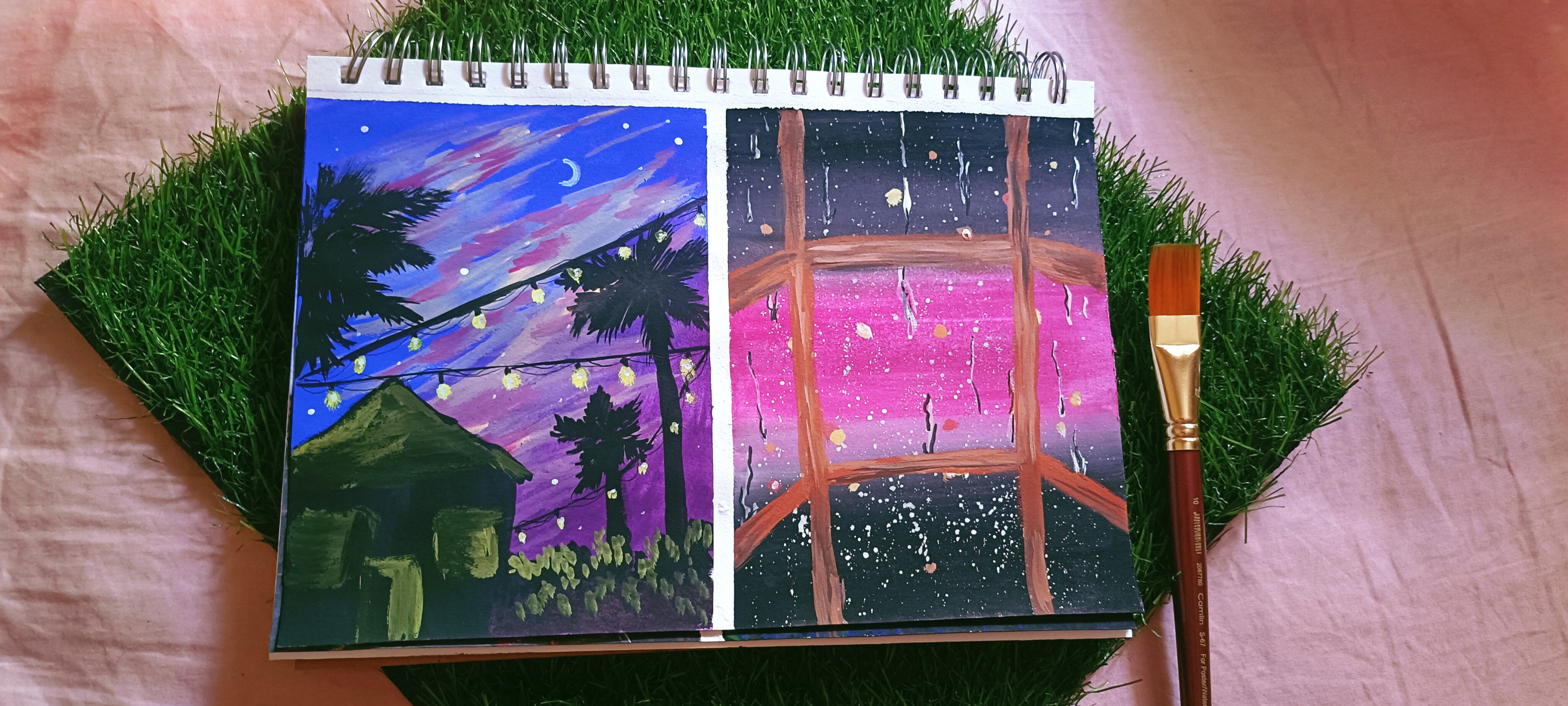
9. Day 4 - Ferris Wheel Painting : Hello and welcome today for
painting for this painting, colors required a sky blue, pink, salmon, pink, violet, white, black, and lu. By looking at this painting, you might think it's
very difficult to paint. But trust me, it's super easy. The first step to
this painting is painting the background
for which I'll be using the sky blue and
pink and making a wash of it. Blending is quite okay, but I'm not completely
blending it. I'll be adding clouds without
blending it properly. Then I will add the
Ferris for the wash. I'm just using the sky blue and coming from top to bottom. Whereas now I'm taking pink color Using the
flattened brush itself, because it covers up large area. As you can see, I
haven't wash my brush. You can go ahead and wash it
properly and then use it. Or you can just
like lift some pain from the cup and then just directly apply it on the paper. Or you can just
thin it down into gauche consistency in the
mixing palette and then use it. You can see some of the
purple color is also seen. But being a dominant color, most of it will be of
pink color itself. You can thin down so that
at it will blend easily. The excess paint,
as you can see, I'm just lifting
it over and then applying it at the corners. Make sure you apply it carefully and let it
cover all the edges. This pink and blue. As you can see, the pink has
a pinch of purplish shade, a very tiny tinge. You can completely
avoid that by directly adding the pink color in the mixing palette
and then using it. If you're using a tube format, then well in good wash the brush thoroughly
and then apply it. Now coming to the salmon pink, you can also use
the orange color. It resembles 90% orange
itself. You can use that. As I said in my first class, you can see how I'm making the clouds using a
round tip brush. This is how it makes
wherever the edge is there between the sky blue and pink
at that particular area. I'm doing this step,
adding clouds, you can just go in
a random shape, but just make sure that
the brush is rotating. It has a rounder
motion at the edges. It's going like a thin. At the center, it is thick. Now, using the violet color, you can go with
purple color as well. The mixture of orange and
purple is giving a muddy shade. So make sure you take the
fresh purple as you can see. If that muddy shades
on your background, it's looking pretty,
then you can go ahead and use no
problem in that. But if it is looking too muddy, then it's better that you
use a fresh purple color, wash the brush, and then use it. As you can see, the
borders which was there in the background between the blue and the pink has
slowly faded away. Now using the lemon yellow, I'll be adding more depth into the clouds and also
adding some more clouds. You can use the lemon
yellow directly or you can mix it
with white and then use it Orange and yellow will give like
super awesome combination on the senter. We'll go ahead and add some more
clouds at the cloud. You can use any other
color mixture as well, pink or orange or yellow. You have slidly faded away
With the brush itself, you can just fade the cloud. But we'll add some
more color onto it so that there's depth
in it later on. Now, we'll go ahead and
do the Ferris wheel once the background is
drying as you can see. I'm just drawing
shape two shapes. Do this step slowly and
have a reference image. There is one C which is
intercross in the other one. And then a stand at
the center of ulta V or you could say an E shape
at which the centers meet, a triangular shape at which the apex is the center
of the ferrous. Once we are done with that, we'll go ahead and add colors
onto the Ferris wheel. For this, I'll be using the
salmon, pink or orange. And then going ahead and adding the shapes with the paint. You can use a thin liner
brush for this step. Investing in line up
brushes is very essential. If you're up into
the detailed part, then definitely you
have to go with it. It is very helpful
as you can see. It's super easy
and it'll not give you a stroke that is too wide. Now using the black color, I'll go ahead and paint
that triangle shape, the center, and
then draw the line. Now using the orange
and black mixture, I'll go ahead and define the fells wheel and also the
inner part of fells wheel. As you can see, I'm just drawing the outline and then
I'm painting it. I'm painting the outline. And then also be adding
some more lines at the center just like
the wheel cycle. Now, for the cabins, you can go ahead and use
a brown color shade, this is completely optional. Or you can use the
orange, black shade, which will give you
the same color. You can use that or the color. And then go ahead
and add cabins. As you can see, I don't
know what it is called but I'll go ahead and
call cabin Okay. You can just add randomly
but make sure you add it in after leaving a few spaces and keeping
the perspective in mind and also the shape size has to be according to
the perspective. That is an will go ahead and define those with black color. You can use a marker for this. Or if you have a line
of brush and you have a hang on with that and
you're comfortable to use, you can go ahead and use that. You can use lemon
ello for the center or white color for the cabins. I'll mix some lemon
ello and orange and then go again add the you'll see the brown was of no use just for the background
purpose to highlight it now the cabins are
looking much more brighter. As I said before, you can
go ahead and use lemon lo with titanium white and this will give you
a brighter cloud. Or you can use it
at the starting, I mean at the center
of the cloud. Or you can use it for
highlighting purpose as well. Highlighting is better be, it'll give you much
brighter look. As you can see, it
makes a different shade and it defines like
super awesome clouds. You can add some more clouds. Obviously details are different, some of them are happy with it, and some of them
require more details. You can concentrate
on whatever you like and then go
ahead and paint. I think this is enough
for this painting in just that I want to add some
more white color highlights, which I'll add over
the cabin here. I'll be defining the
stand that is strangled. Just that I'm doing this
black color outline on the center part of far Sheel. Now using the Uniball
paint, white color, I'll go ahead and add some
highlight onto the center of the ferry wheel and also onto the cabins,
just few lights. If you want to avoid this step, you can completely avoid
instead of marker, you can also use the
paint, brush paint. Just remove the masking tape. I hope you have followed
me along with it. And when you're done
with the painting, if you are ready to show up, then go ahead and post your painting in the
project section. Even if it is in progress,
go ahead and post. I would love to see them. If you have any related doubts, go ahead and post it in the discussion box so
that I can help you out. You can tag me on Instagram
and post it on your stories. I'll see you in
the next painting.
10. Day 5 - Waterfall Painting : And welcome to Defy Painting. For this painting,
we are going to paint this amazing waterfalls, the colors required as acid, blue, black board blue, titanium white,
and emerald green. Firstly, we'll
fill up the spaces and then we'll go ahead and
in details for the sketch, you can pause the video
and go ahead and cop it. It's very simple. You in your sketch tab and also
your undisposing the colors. Once you have drawn
and ready to paint, we'll start off with the flattened brush and
you're disposing some white. White is very essential
color which is required every time
and everywhere, especially in painting
a flattened brush. And go ahead and fill
out those places. Firstly, I'll start off
with the acid glue. I'm mixing the paint
with some water, And here I'm filling every paint onto every Bristol
of the paint brush. See how much of
paint I have carried out and who of the
Bristols are carrying it. Now, I'll start off with
the top part of the paper. Flat brush helps a broader area. As you can see in
just two strokes, how much of the area is covered. And it's almost fill
up the sky by now. Just give it a very good stroke from left to right and right to left so that it is thick
enough and consistency. Now moving on with ball blue, the same thing I'll be
doing for the down part. I'll be filling out
those spaces as well. Those spaces by which
I mean extra tiny, little one area, you can see there's
some transparency which you can fill it out. Again, just gone with the first stroke where it's
in transparent consistency. Now you can go ahead and use the ph consistency
and fill it up. There's always a
color block method where you block all the colors, which color comes
and then go ahead and add details and
the second layer, third layer, and
finally the details. That will be like that
requires a lot of patients. Here, I have tried to depict stuff like that by
color blocking the Ana. Again, I have color
block the ana with this one black color here, leaving the middle space. I'll go ahead and cover up everything else
with black color. It's so easy with flattened
brush, as you can see, infraction of minutes,
it's covered up here. I have left white area, that's for the waterfalls. I'm adding shape
with the Bristol, if you might notice,
on the top apart. I'll add the stone area with the same paint which
we have drawn earlier. Look at that. I'm just
taking from left to right and just going in a
baby Maggie motion. But you're giving a shape. Just shaking my hand and
it's already giving a shape now using a round brush. I'll go ahead and take some
might for the clouds here. You can go ahead using
the dry brush stroke. Or as you can see, I'm
trying to make a dry brush stroke by dragging the brush where the brush is
completely dry. Paint is not that we now I'm adding a bit of water into that carrying the
dry brush effect. So once you're done with that, will go ahead and some white and had some
light onto the cloud. I'm removing the
excess water from the brush and then
just going from top to water so that I can drag on some of the glue from
the sky and come down. You can see at the top, I'm just trying to blend
it with black as well, but not too much. You should remember
that the brush is dry and the
paint is also dry. Then I'm going ahead
for the water. I started for a rough
motion from left to right. I'm not adding white
everywhere since it's dry. It's already giving me texture. And the paper is also cold pressed and it's giving texture, plus the dry brush effect
is giving texture. Once we're done with white, we'll go ahead and
paint the mantels with the emerald green
using the round brush. I'll go ahead and take
some emerald green. You can also take emerald
green and white mixture. I'll just be adding
random shapes just like dotted type where I'll be adding condensed one
at the top and towards the waterfall area as
we go far and below. I'm just leaving gap
between each tort. I'm just dabbing it, you can see how it is happening. It's giving life to the
painting some more. Emily Green onto the
stony part of the area, also emerald and white. It, using the dress stroke, we can just go from top to
bottom and bottom to top. If you don't know how to use, then just use dabbing motion. I would recommend that
you create texture, how much ever you
create texture, that will be so much good. And look at those area, it looks so much heavenly. Who? Painting is based on
the dry brush effect, if you might notice
everywhere it's used. Now, coming to the detail
using the line of brush, when below the stony area in the water and some in
the waterfall as well. Look how beautiful
it's turning up. When I'm dragging the
brush from left to right, it's giving so much
of a dry brush effect and it looks so real. The waves in the water. Yeah, that's it for
the sizing painting. I hope you all have
painted beautifully and I would love to see them just posted on
the project section. I'd be happy to see it. I want the masking carefully
and I'll see the gloves.
11. Day 6 - Boardwalk and Cabin Painting Near Beach: Hello and welcome
to D Six Painting. For this boardwalk painting, we are going to use acid
blue, cobol blue, burn, siena violet rose,
titanium white, black and lemon ello for
the alternative colors. You can see the
caption for this. We are just going to sketch out your stuff and then we'll
go ahead and paint. You can follow me up, you can just have a reference
image of your own or you can just directly paint and
then row and then go ahead. Detailing part, you can completely avoid sketching
if you're confident enough. Here I'm using two colors
for the background. One is acid blue and
other is cobald blue. You can use serulin blue
instead of acid blue. It looks similar using the flattened brush. As you can see, I'm using
the left to right stroke, right to left stroke, and covering up the edges, having smooth blend
with each layer. Once we are done with sky blue or acid blue or Erlin blue, we'll go ahead with
the cobalt blue. You can use ultramarine
blue as well for the water instead
of bald blue. So you can see I have
taken more than half of the page for bald blue
and a tiny bit of the acid blue is seen now for the boardwalk I'm
and brown mixture. First, let's go with brownish mixture using
the same flattened brush. I'll go ahead and do such a way the
background is still wet, that's why it's giving a mix
shade of blue and brown. Once it is dried, you can go ahead and
add brown color. Just like how I'm doing. I'm just letting that settle down and absorbed
into the paper. Now I'll add brown color, which is purely brown. Try to avoid as many
strokes as possible if you're doing layering
on top of one other color. Because it will tend to
blend the under layer and give you a mixture of
it even when it is dried. Just like how we did clouds
in the Ferris Wheel painting. We'll go ahead and add the clouds using a
small round brush. As you can see, I'm just going
in a random direction with a thick at the edges,
a thin stroke. And you can see it does
not like proper cloud. It has its own shape. You can see I'm just going
in a round shape manner, as well as dabbing it. This was a rost pink color. Now, I'll go ahead and use purple color and then add
shadows into the cloud. You can use the same
roasting color with a thick consistency and
add shadows as well. I'm adding the violet or purple
color at a certain area. I'm not going to cover up all the surface which is
covered with pink and there just that much and
adding extra clouds. As you can see, it's very
easy to paint clouds. It's just that you are passionate enough to
scribble on the paper. It's really that much easy. Now for the cabin, I'll go with black paint and using a
round tip brush here, I have a sharp tip on the round
brush, so I'm using that. You could go with a fine
liner brush as well or a marker and paint it
as seeing a cabin. I did not have a
reference image and I painted whatever
was in my mind. And you can see how it has come. It has come a bit cross, but definitely it
looks so lovely. You can go ahead and have a reference image
and paint the cabin. I have also added black
on the boardwalk. Now let's add depth into
the board work here. I'm using brown and
titanium white mixture. And to create this part will be lighter and the
card will be darker, or you can do vice versa. Does that make sure wherever
the light is there, it is light color? And wherever there is
duck, that is nighttime, which is D, there'll be
darker color shaped. I hope you're getting my point now. Using Lemonello
will go ahead and add lights over the cabin and on the boardwalk as well here. And then I'm just adding some. For lines. And then adding some lines onto the
boardwalk when it is at. Now, with titanium white, I'll highlight the lights, which is yellow color. Make it bolder and bright. Now using the same white color, I'll go ahead and add white onto the boardwalk only at
one single direction using the dry brush effect. We'll go ahead and add
waves just like that, with white color going left
to right hand within line. Let's define the
cabin and boardwalk. The mountains are
made with bosa and white mixture onto which
we'll add some light white. Making the light more bright can add red color as
well on those lights. It's an optional color
you don't have in just you can condense the light like or you can
just put it far away. Yeah, let's remove
the masking tape. That's it for this painting, I hope you all enjoy it. I would love to see your
creation of this painting and do posted here in
the project section. If there is any detail, go ahead and add them. As you can see, not every masking tape suits
the paper here. Got, just be careful you find the actual color
of board box brown. So you're amusing
bonsino to add it in. It's an optional step. You can go ahead and add or
just leave it like that. I hope you enjoyed
this painting. I'll see you in
the next painting. Until then, keep
painting, keep creating.
12. Day 7 - Moonlight Painting : Hello and welcome to day seven of this
moonlight painting. It's very simple and
elegant to paint. The colors required
is Persian blue, titanium, white, and black. It's very simple, just
that we'll go with graded wash of Persian
blue mixed with white. And then add some pine trees. And of course, at the
end, moon and stars, we'll start off with a flattened
brush and we'll go ahead and use some tiny bit of black if you require a
darker shade at the top. And then as you come down, you can by using Persian blue, then portion blue with
white and then white. I'm using Persian
blue, a bit of black. And then I'll go ahead and
add directly Persian blue. Then Persian blue mixed with a bit of white and
make a graded wash. As you can see, I'm
doing it slowly, gauche painting in a
gauche consistency. Running the brush from left to right and giving
it an even stroke. Every time I'm
taking a new paint, I'm just dipping it in water. Dipping the brush
into the water, that's because I
want the color to be fresh and let it be transparent. But then the second top layer should be a thicker
gah consistency. You can see how it's
blending smoothly and here you can see how
I'm making the graded wash. Sometimes the tube
form will be very dry. It's necessary that you use
water every now and then. Once I have added the
colors onto the paper, I'm just blending each stroke
running from left to right. And you can see I'm just
going in one unit direction. One direction. If it
is too transparent, then you can go ahead and
add one more layer on it. Look now how it's transforming the lines in between
have vanished away. Make sure that you
cover up the edges. That's very important. One more thing to notice is
that it has completely given a proper graded wash by running the brush
from one direction. Now, once we're done
with the background will move ahead and
paint pine trees. One thing to remember that pine trees are in
triangular shape, the apex being the
tip of the tree and the down part that's broader area will be
the bottom of the tree. I'm doing it in different sizes, Middle being the smallest and the corners being the longest. Now as I said, it's in triangular shape. The branches will also
spread out like that, The T being having
small branches, whereas while coming
down it becomes B. And B. You just have to
notice that first and then go ahead and pain,
sometimes it's confusing. I'm just dragging and giving an uneven edge at the corners. Look at those edges. They have some thin line and thick line and also there's
so much unevenness, You can notice this one as well. And then go ahead and
practice and then paint. You can just draw lines as well, but I would recommend
that you just press down the brush and drag it to the left
or right side, and then paint it. When you drag it to the corner, just lift it up so that
it has a beak like shape. For that, you have to
do it multiple times. Or you can use this
technique just doing the outer borders and then
filling it up with black. This is pretty much
easy, I believe. You can follow that
one leaving a bit of follow spaces in between, have patients and
paint it slowly. Here I'm using two
to three techniques. I'll zoom in so that you can see these are the few techniques
used to paint pine trees. If you have enrolled into
my Winter Elements class, then you would know how to
paint pine tree and there are so many other ways how
to paint a pine trees, which is clearly explained
in detail in that class. It's on Skillshare and dome. You can check it out. I was telling you about
the beak shape. You can see this is what
I was speaking about, drag on the brush, but as you appear to the corner,
just lift it off. Also there's unevenness created. Here, I have explained
three techniques. Basically, one is filling out in the center by creating
unevenness at the edges. The second one is creating
lines in the branches, as you can see that
center pine tree. And the third one is that
beak form of painting. Now let's add the moon. I'm adding white color, it's like directly
from the tube. You can go ahead and do this when the background
is completely dry. Here I'm using a Mob
brush, this is optional. You can just take
a tissue paper or even your finger and just
dab it on and spread it bicircular motion around that painted area so
that you get a blurred, blurred painting on top of it. You can add some more white
color so that it looks like the moon is glowing. This one will be smaller
than the background, one smaller circle than
the background one. Once we are done with that, let's add stars Here, I'm using the tip of the
brush for making the stars. You can go ahead
and use a marker. Also, you can paint
a shooting star. It's just that you
have to drag a line. It'll be a diagonal line. Yeah, that's it. Let's
remove the masking tape. Be gentle and make sure the paint has dried completely
before you remove it. As you can see in
all of my paintings, I'm just removing my masking
tape in a slanted manner. That's because I don't
want it to tear the paper. You to go ahead and do
this slowly and gently. I hope you enjoyed this
very simple class and I hope you had fun
by painting this. I would love to see
your paintings as well. Do share it in the
project section. I'd love to comment on it. Thank you for joining. I'll
see you in the next ing.
13. Day 8 - Hot Air Balloon Painting : Hello and welcome to our day
830 Days Painting Challenge. Today we are going to
paint this hate balloon. The colors required is
purple, rose, yellow, T, violet, rose, deep
yellow and black. If you don't have
so and so colors, then you can use the
alternative colors. You can go with pastel pink
or hot pink mixed with white, titanium white mixed with a tine of Flemonello
purple rose. Dello. For making this
beautiful aesthetic painting, all you have to do is make the background first
and then we'll go on adding the clouds and then we'll just draw of the
hot air balloon. And then that's it.
We'll paint that off. Let's move ahead
and do that here. I wasn't ready with
the paper tape down. You can see I'm doing it, you can follow me along. Or if you have already
taped it down, you can just skip this part. Always make sure that whenever we are putting the masking tape, it is parallel to each other. It does not cross because
it look ugly at the end. So it's better always that you look for parallelism
and then do it. Let's begin our painting
here I'll be using a flattened brush
and then I'll go ahead with the
purple rose color. Purple rose is basically
light pink pastel pink. You can go on by making
your own by mixing the hot pink with a tiny
bit of titanium white. Here I'm taking it from the
jelly cup from Hemimia, then adding it onto the paper. We can just mix it on the palette and then
get it onto the paper. Since the wash pants
are dry in the cup, it's always better to mix it in the mixing palette and then
add it onto the paper. Look how smoothly it's coming. Once we add water for
this yellow teeth color, it's very light sunny shade, so you can just use the
titanium white and very, very, very little bit of lemon
yellow you can add, and then you can use that if
you don't have that color. Once I've added both the colors, it's time to blend them. I'll be using the same color, that is yellow teeth color. And then blend those two colors by which the upper color
will change its shade. But it's all right because
it looks so beautiful. Both the colors
are in pastel form and it's looking super awesome. As we learned in the
blending technique that color to color
blending is also possible. We are trying to achieve that
kind of blending over here. Here for making the
pastel shade of purple. I'm using for ball
blue mixed with purple rose and a tench of rose color that is pink
color, which is bright. And then I'll be using the shade for making cloud here. I've made my own form
of purple shade. As you can see, how I
mix those two colors make the third color the
purple or violet color. It is pastel form. You can go ahead
and mix violet or purple color with titanium
white and then use it. You can see I'm just dabbing it. And then dragging the brush
towards the right side, giving the bulk at the center. And then as we come
to the edges is just living it off by thin line. This is how I'm making clouds. Using the smallest round brush, you can add as many
clouds as you want, or you can also use a dry
brush technique to paint this. I would recommend this
method because it'll give you a much defined cloud. The second step is also done
that is painting clouds. Now coming to the third step, that is drawing the
hot air balloon and then painting it here. I'm drawing a rough
shape and then I'll give the edges
in some definition. You can have your own
reference image or you can just see
mine and paint it. Before we actually paint, I'll just tell you about it. I have made some lines
in between the outline of the hot air balloon using the deep yellow
and rose color. That is bright pink color, I'll go ahead and alternatively
paint in a strip fashion. And then using the black color, I'll go ahead and define
those indentations. Also, I'll add some
hot air balloons behind having different sizes. You can skip those
behind hot air balloons. But I'll go ahead and paint. You can follow along. Now that you know how
I'm going to paint, you can just follow and
paint. Take your time. Be patient and use a
fine line up brush. I'm using liner brush for this step because I don't
want things to mix that up. On the first layer, you can see how much
transparent it's looking. It's okay, but when you
do the second layer, it'll look more
opaque in nature, so don't worry about
the first layer. And add too much of paint
at the starting itself. Let the first layer dry, and then you go ahead adding the second layer that
will define much more. This is how it looks right now. We'll go ahead and add the second layer,
the hot air balloon. And cover up those clouds
which is seen from behind. Do this slowly so that the colors don't smudge
and mix with each other. You can just blend
at the bottom part, but not at the top. Let it be defining at the top, but at the bottom, you can
just blend all the colors. Isn't it looking so gorgeous? That's it for this painting. I hope you enjoyed
this painting. If you have any queries, you can just put
your question in the discussion box so that I can get to know what is your problem
and help you solve it. I'll be very happy
to answer them. Just don't think that I'll them. I'll definitely answer
your questions. Let's remove them. Masking tape. Remove it in a slant manner and let the paint dry
completely and then do it. Sometimes the masking tape
will rip off the paper. Sometimes the masking tape
will tear just like this. It's because the paper
is not ready to leave the masking tape yet and
it's too sticky to do that. I'm just removing it carefully. You can do this this way, or you can use a
hair dryer and then melt the glue and
then remove it. Thank you for joining in. I'll see you in
the next painting.
14. Day 9 - Aerial View Of Beach Painting : Hello and welcome to day
nine of 30 Days Challenge. Hope you're enjoying
this painting. For this painting,
we are going to paint this beautiful scenery. For this, we'll be
using ball blue, titanium white,
burna, burnt umber. If you're looking for
alternative colors, you can go with lin blue, ultramarine blue, and a ball
blue is found everywhere. I just do not help to
alternative color. But if you feel you want some, then you can go ahead
with using that. I'm using the paint
brush and painting it in a plant plano by adding the cobol blue directly
onto the paper. Using flattened brush, you're
using some drops of water. I'm just blending all the
paint and making it in, in the paper itself. As I'm coming from
top to bottom, that is from left to right, the transparency
of color is fading away and it's
become transparent. The opacity to
transparent is forming. And you can see there are rough edges formed
with the brush. We'll just even it out. Once we have covered
half the page, we'll go ahead by
using some white. We can mix white
directly onto the paper, but I'm mixing it thoroughly in the bus and covering all
the bristols of the brush. And then just layering it down from right to the
top that is left. Add some more white and
try to make it like, as smooth blend as possible. Now thoroughly after
washing the brush, I'll go with burn sienna. Every time you're
using the next color, it's better to wash on properly removing the
paint from every Bristol. Then dabbing it out
onto the tissue or cotton cloth to
remove excess water. I'm taking the burn sienna. Since it and the paint is Dr, I'll go ahead and thin
it down on the palette. If you directly apply this, it'll require a lot of water
to thin down on paper. The paper will start
absorbing again and again. The texture of the paper
and the thickness will reduce the paper
quality will go bad. It's better that you do
it onto the palette. If there are types like too dry will cause such bad effect. If it is not too dry, then you can directly mix it onto the paper. It just depends. See, you can see the
blue and brown mixture is giving a different shade, but that shade is
also necessary. You can use white and
then just mix it up. But that shade is also
necessary for painting. Sometimes, especially
during the waves near the edge of the beach. Let me just cover
up the both Siena properly and as you can see
I'm just blending it over. First layer is transparent
so second layer is thick cover the edges. Now I'll be shifting my brush
to a round tip liner brush, which is thin brush and
it has a round Bristol. And I'll be using white color. And in between the
blue and brown, there's a line form which
I'll give a wavy shape. So I'll just lift some
color onto the Bristol. Here I'm rotating and lifting
out paint onto the brush. This is called
loading of the brush, and every Bristol has been
loaded with the paint fence and here and dabbing and I'm
not giving a straight line, I'm just going from up
and down and deep and somewhere high somewhere it is thick and
somewhere it is thin. It's just random, just stop to define that edge with waves. As we learn the dry brush
technique before in the technique section
we'll be using that method and
painting the waves. As you can see, I'm just
adding some white color. And then slowly I'll start lifting my brush
from bottom to top. That's giving me a
dragging motion. And also, once it's getting dry, it will start showing
the dry brush effect. Just keep doing The
initial first step after loading the brush is to
use a paper and do it. And then the dry brush
effect starts appearing, then you have to paint it. I'm just using
those initial steps onto painting that
line, particular line. Then I'm just starting off
with the dry brush method. As you can see, I'm doing waves. The blue is also blending, which is good somewhere. The blue also should be seen because after all it's water, you can add some more white
if it is too much of blue. And then do the
dry brush effect. You can go with any direction, but just make sure
that you're following one particular direction
for the waves and you can the brush and try
whichever method is suitable for
you from bottom to top or top to bottom or
from sides, anything. If you think there is too much
of blue and require white, you can go ahead and add some of white onto that particular area, but don't make it too wide. Now we'll cover up
the transparent area, which is seen on the
brown color part using one more layer
of burn sienna. It's always good to cover
that up if you want some texture then you have to add whole stuff onto the paper. Here. I'm using some white with, mixed with the burn sienna. And then adding it for
depth into the painting. Adding some more white onto the burn for painting
a hard shape. And you can see, firstly, I'm just painting
the arrow shape, heart shape, specially
with the lightest color. And then we'll add some depth
into this painting shape. You could say by making
it more lighter, and lighter, and lighter, I'm taking some more white. You can see the difference
between the left one and right one pastel compared
to the previous one. Then we'll be using the shade and we'll be
painting it over it. You can create depth
in this by making the background layer
that is hard shape, the first layer a bit thicker and then the
second layer thinner, and then the third layer
even more thinner. Since the shape is achieved, I'll go with dabbing motion, covering the whole painting of heart shape with such
a textured effect the painting is almost achieved. But it's time for
shadows in between the blue and brown that
is burnt sienna. We'll go ahead and
give a shadow. You can give that shadow to
the heart shape as well, but I would recommend the. Burn. I'm taking
burnt umber tiny bit, and then I'll just mix it up
and load it with the brush. Load it into the brush with
a little bit of water. I'll add some more burnt
umber because it's too thin. You can add some white
color to make it even heavier, part of pain. Have you ever noticed that
while thinning down the paint, the paint becomes too
light and transparent? But when you mix the same
paint with a white color, it makes it like heavy feeling. And the color will also be like super
awesome light shade, pastel shade without
transparency. Here I'm adding
bone tumber using the same round tip brush
under the white color. Once the shadow is done, we'll go and add some white
to the highlighting part. I use white for the waves. As you can see, the waves
have become lighter. We'll go ahead and use white. I'm using dabbing
motion the waves, especially at the edge
of blue and brown here, I'm giving it a shape as well. We are finally done
with our painting after highlighting the main
area of that is waves, heart shape, and everything. Just make sure that you check every corner and every side
that the paint has covered. And then we'll remove
the masking tape. So you can see I'm just lifting the cardboard and then
removing the masking tape. This is it's easy. It's easy basically just
because I'm doing in such a way because I
don't want the camera to shake and ruin the
whole footage. Once I have removed
the masking tape, I can see there is leakage
of paint into the area. White area which will cover up this white paint. White marker. Sometimes white marker
will be a failure because what type of a
marker is also important? Okay, here I tried
this white marker, but it almost ruined it. You can see we have to just press it down so that the
white thing comes out. And then I'll go ahead and
paint over the brown area. This is when the paint
has finally reached the tip and you can see it's spreading rather
than covering. I'll just go ahead with white paint using
a round tip brush. White acrylic also
works fabulous. But not white watercolor paint. It's better to use
Bosch or acrylics for this type of issue. This is it for this painting. I hope you all enjoyed it. Share your paintings in
the project section. If you have any queries, put your questions in the
description box below. I would be happy
to help you out. I'll see you in
the next painting.
15. Day 10 - Power line Painting : Hello and welcome to day ten
of 30 Days Squash Painting. Today we'll be painting
the par line painting. The colors require a elin blue, titanium, white, and black. There's no need for
alternative colors. If you all cannot find in blue, then you can go with
any sort of color. Let it be pink, let
it be orange color, but let it be in light colors. Not that brown or maroon.
That won't look good. I've taken lin blue, which was a bit chunky. I'm just making it into
a gauche consistency. And then we'll be
applying this onto the paper with flattened brush, upon which we'll make clouds. Then the power lines, you can go with the
salute which is here. I have drawn thicker
power lines. You can go with thinner
power lines as well, and small houses which
will give you far below. Sometimes you have
to paint it in perspective paintings
because that will give you more realistic
and more beautiful way of looking at the painting. As you can see, flattened brush helps us so much in
spreading the colors. Within seconds you can
see how far the paper has been covered will spread it evenly and cover up the edges and also the places
where it hasn't covered. The left to right stroke and then top to bottom stroke help a lot in spreading the
evenly onto the paper. I hope you're painting
along with me and let me know if you have anything to tell about this painting series, if you're liking it or not. Also, let me know any sort of questions if you have
related to this painting. Also share your project
in the project section, I'll be happy to help you out. I would be happy to
see your paintings after running the brush
from left to right, right to left, top to
bottom, bottom to top. Finally, I feel the
papers covered with blue. So let me just stop here
and then let it dry. Now, we'll go with clouds. Once we're done with this, I'm using a round brush and we'll be using titanium
white for painting cloud your I'll just then
down the paint and also load the paint into the brush With every Bristol
covered with white paint, we'll be making clouds when
the paint is half dried. Let's just wait for a
couple of minutes more. As gach dries faster, you never know when it
is completely dried. So you have to check
it. I'm checking it on the masking tape. Some part of clouds
require blue, so I'll just go ahead
when it is semi dry, you can do this step when
it's completely dry. I'm going from left to right
stroke with round motion, the cloud will be than broadest at the center and
as we go to the edges, it will be thinner and thinner. Do this step very slowly
so that you can enjoy. And simultaneously you can feel the paint running
onto the paper. And the rush, putting down the white color and dragging
some of the blue into it. Once we're done with the cloud, we'll move ahead with
the silhouette painting, that is pole painting it, upon which we'll add
one more layer of, but it has to be
dried completely. For that step here
I'm using black. With the same brush, I'll
just load the brush with black color in such a way that it's in G consistency
or in a thicker form. Because whenever you prove a silhouette or paint a silutte, you should never
use thinner paint. That is in Motclor consistency,
that's unevenness. And always remember
whichever consistency you're using for Silhouette, that has to be maintained
from the start to the end. I better recommend that you go for Pak form so that there's no transparency in the middle
of the painting and there's no patches form here. I'm taking it with the
knife palette and I'll be using water to thin down and then I'll
be using that paint, the one which I loaded before
I felt it's two or three, I will not use that. We'll be using this
particular thing and we'll go ahead and making the
power lines here. You can do a thinner power
line or a thicker one. It depends on you I
painter or thicker one because I felt that
the buildings are more closer to me
according to perspective. It has to be bigger and bigger. If it is far skyline
type of view, then you can go ahead
with the thinner one. You have to basically design your painting before you even start because at least you have to keep certain
things in mind. This thing will
come after this and this thing will come
after this so that you can put that into the
painting and look beautiful. Kain, always remember when whatever your painting have a reference image or at
least see the picture, how it looks so that you
know how it will come out. The outcome of it should
be similar to this. That will help you
out in achieving the painting which you're
looking forward here. I've just tilted the paper
and then applied it. This is the most helpful
stuff of the cardboard. You can use masking tape. And you can put the before side and the after
side of the paint. Like you see the center of the paint I'm just
putting right. You can put a masking tape on the left as well
as on the right. So that you can paint the it and then remove
the masking tape. That will be also helpful
in painting lines. But the only thing is, if the masking tape is not
adhered to the paper, proper leak out and the
background will be ruined, whichever is
comfortable for you, you can go ahead with that. Since we are using lining brush, it is most useful thing
for painting the lines, especially if you want to practice any particular
thing with the brush. How to hold all, you can just go ahead with
drawing or painting lines. I have actually practiced
this method and almost painting hundreds of lines and then I have got hang
on with this brush. You can try that if
you're not used to. If you're only markers, I forgot to tell you can use markers for this
particular step. You can use black color or red color or whichever
color you require. Just see to it that the
background and that matches. Also, sylhaettes are
usually in black color. It's not necessary that it
has to be in black color, but most of it is
in black color. We are done with the power line and the houses and buildings. Now we'll go on with the wires. And drawing thin line. As you can see, two
lines are enough. If you were looking for more, then you can go ahead and
paint or draw more than that. And along with this, I'll
be adding some, um, birds. Once we are done with
this, we'll go ahead and add the detailing to
the clouds as well. Just look ahead how I'm doing
it and then you can do it. You can first do the clouds completely and then come
to the step because I'm like too eager to paint
it and finish it off. I'll be, I have
done such a thing. You can just wait for a couple of more
minutes and then let the background dry and do the clouds and then
come to the step. Now I'm drawing the
birds as you can see, it's just a tiny ditch at the bottom and then
you're taking it away, like you're just pressing down the brush towards the bottom
and then lifting it off. It's very easy to paint the birds just like how we did
during our childhood time. We shape our shape such a stark. We'll be using a line up
brush again for the clouds. Here I've changed
the line up brush. You can use the
same brush as well, but wash it thoroughly
because it will give the black shade if there is any. As you can see, I'm
going from left to right with dry brush strokes, you can go dry brush strokes
or just like that as well. I'm adding textures cloud as well just to depict that
there's some part of cloud which is remaining
outside the cloud which we usually see in the normal clouds
as well sometimes. Let's finish off
the details before we remove the masking
tape wherever the white algol and use a blacker paint and covered up and
also the lines. If it is too white then you can go ahead and paint over it. Make sure that you have
painted the edges and corners properly before
removing the masking tape. And then mas okay, if there is any
detail, let do it. Cost. As I said before, it's all about
perspective paintings. If it is near, then you have to do it
as if it is bulkier. The buildings, the power
lines, and everything. If it is too far, then you have to do it in a thin manner. This was it. I'll see you
in the next painting.
16. Day 11 - Lantern Painting : Hello and welcome to Day 11
of 30 day course challenge. Today we'll be painting this
beautiful night scenery where lanterns are
lit up in the sky. For this, the colors
required by Persian blue, black, titanium, white,
orange, and medallion. I have here drawn
certain lanterns. You can just copy the same
or you can just go ahead and apply anywhere in the
paper and draw it. You can use any shape here
I use the rectangular one. Which common lantern? You can go ahead and use
the oval shape or shape. Also have done 123456 lanterns. You can do it as
many as you want, but just make sure
that they have tilted and some are small
and some are large. Such time we'll be painting, painting by negative painting, that we'll be leaving
the space for the lantern and then
we'll go and cover up the background and
then we'll add the mountain and then
we'll go detailing part. Okay, I hope you have
understood this much here. I've taken portion blue, which I'll add some
black into it. If you want to make any sort of night scenery or night painting, it's better that
you go with black, portion blue and
then portion blue. And if it is the light
area lit up area, then you can go ahead and use portion blue with white here. I've started off with
portion blue and black, but at the right corner part, I'll go ahead and use the
portion blue and white. It is much more lit up there
using the surrounded brush. I'll go ahead and do
the negative painting. You're learning so
many techniques. The techniques which I guess
you haven't known by now, you're learning so much. Let me know. How do you feel about this new new techniques. Also, let me know
how this session is going on and are you
painting along with me? Post the projects in the project section so that
I can see your paintings and will be proud and
motivated to create some more tutorials
for you guys. Once they have outlined
this using round brush, I'll go ahead and
mix the portion blue with black and cover up the remaining space with
the color, make sure. So as you can see, I'm using the same brush and limit
that particular white space. I'm going ahead and
covering it up. Do this slowly so that you
don't touch the painting. Also, go ahead and paint
the background completely. And then add orange and
yellow for the lantern. But somewhat under layer will get activated and
it will create a mess. This is the best method. If you can't do this, then you can go ahead
and use that way because acrylics work really
well in that method. This go, I recommend
this for you. This method, negative painting. As you can see, the
left one is darker, but the right one is lighter because more of
light is seen over there. I have done this now when we have almost
reached the bottom, as you can see there
it is transparent. Go ahead and cover that
up with the obesity, but then leaving
that will also be seen as light being reflected
in that particular area. Some white spaces is giving
a glue to the lantern. You'll not get to know now, but once the painting is done, you'll get to see
how it's looking. Now using a flattened brush, just going and covering it up
roughly with Persian blue. Then I'll add black onto that same area
for the mountains. First, let me cover up. Make sure that you're
covering the edges properly. Here you can see it's
thin paint in the bottom. This is because I want that
to be covered with mountain. Here, I'll be loading the brush in the Bristol
with the black paint. It's consistency for
painting the mountain. As you can see, I
have just planted the brush and then
I'm just painting it. And you can see how
much nice and how beautiful and easy it
is to paint mountain. You can also add shapes
to the mountain. You can see rough verbally
shape given on the right side. You can see in
curvy shape to it. Now we are done
with the mountain. Let that dry completely. You can go ahead and okay, let me just add white. Now I'm just lifting
some white color, loading it and then going in between the portion
blue and black. This want I'm doing
it when the paint is not dry completely. That's because I'm
adding a glue there. Whatever white is getting added to the black
and it's not merging. We'll do that later for
the detailing part. It will cover up This much
glue is enough over there. Yeah, using the same line of brush, I'll load the brush thoroughly
and use it for mid yellow. Here, I'm loading the
paint for mid yellow. See how I'm covering it up? By rolling the brush
and lifting it. I'll add the paint to the
bottom part of the lantern. I'll go completely and
you can see the border which is coming in between
the orange and yellow. It's straight, it has
lines, curvy lines. It has short lines,
some thick lines. It's not a straight line. So here I'm adding hello. Whether they can
go with yellow and white for the depth after this, do the step slowly
or you can also use a larger round brush and
go ahead and paint it. You can just do it in any way, but just be careful. And don't use flattened
brush for the step because the curviness won't come and it might
ruin the painting. Now we'll take
some orange color. Fan loading the
brush with orange. You can use direct orange or you can use orange and white. Most of the paint says
doesn't have orange. You can go ahead and
use the red color. You can just make it
red and yellow, mix it, and then you can use that
particular mixture carefully. I'm just applying orange, especially at the corner. I'm bringing some of the orange to the
bottom part as well. Whatever the space we left in, the yellow will cover
that up with orange. Yellow and orange are
not properly defined. They are mixed. As you can see, the tiny lantern has been
merged with portion blue. It's all right. Once it is dry, you can go over it with one more layer of painting
and you'll be fine. Or even you can use a
pastel shade for it. This is the lantern down
will add some Persian blue mixed with titanium white for
the glue and go around it. While you're adding portion
blue and white mixture, you can feel that
the brush has become dry and you get that
dry brush effect. That's even more good for
adding such texture and blue. Whatever the pastel
shade you have added, you can go ahead and add portion blue and white
mixture or even portion blue in between so that it looks more natural and not
everywhere the glue is. See how beautiful it's looking. Now let's jump back to the mountains. Here I've loaded my brush with the white color and using
the dry brush effect, I'll be adding some depth
into the mountains. I'm just running my brush how beautifully the
texture is created and it's looking superb
onto the mountain. Now, to define beautifully
the lanterns we require ring at the bottom for which I'll be
using the brown color. I am very sure that now you have some of the
brown or muddy color left in your palette. I tried making it with
orange, but nothing worked. Brown is always good. I'm using burnt umber tiny bit. I'll mix it along
with some orange. And then go ahead
and make the ring at the bottom of the lantern. You don't have to use black. Black will look more bright
and it won't look that good. Use this one or
yellowish orange. Extreme yellowish orange. It should be should the
one which is present in the lantern has to define
something should be different. I have had it almost everywhere. For that little tiny one. We'll go ahead and make some
pastel form and paint it. Now we are done with
the ring center part of it is still remaining. We'll paint that
with white color. I've loaded the brush with
white paint and then I in random motion and adding
white at the center, just taking it up
in a covey manner, also using the same
brush and same paint. I'll go ahead and add stars. You don't have to
use plating method because it will cover up the
lanterns and look a gleam. Now we'll add the highlights. I'll go ahead and add Summer
White into the mountain. Let's add some more
details and also we'll add some more lanterns
that look beautiful. And then a man in white into the lantern so that it
feels like it's really flying due to the
litter part Si, you can paint as many
lanterns as you want. It's just that whenever you're painting after the
background has dried, use the pastel form that
is mixed it with some white and then upright,
it'll start glowing. This is a Tegan. Let's remove the masking tape. As I said before,
I'm just lifting it up and removing
the masking tape. That's because I
don't know the shape. Although my hands are shaking, the footage shaking,
but not the camera. This is it for this painting. I hope you all
enjoyed and followed me along while painting it. I hope you are enjoying the tips and tricks
and new techniques. Whatever you're learning, let me know in the
discussion works, also share your painting or at least the progress
of the painting, so that I'll be motivated to create more
paintings for you all. Thank you. I'll see you
in the next painting. Do the detailing
before you end up, because detailing
is very essential.
17. Day 12 - Sunset In Paris Painting : Hello and welcome to day 12
of 30 Days Course Challenge. Today we are going to paint this beautiful sunset painting for which the colors is listed. You can choose the
colors which you have. If you don't have that
particular color, then you can go ahead and
use an alternative color. Instead of Sky blue, you can go with Erlin
blue instead of Organa. You can go with
pastel purple color. You can just use the purple with some titanium white
and then use it. And if you don't
have purple rose, you can go with pink
color with a little bit of purple in it and make
it into a pastel shade. And then use it for deep yellow. You can go with orange
and mid yellow mixture. Here I have taped down the
paper and drawn a heart. You can go ahead and
follow me along and hurry up because each
step is very essential. I'm using a flattened brush. You can go with a
round brush and just take some sky blue color and then go in a
horizontal manner, just a few width of sky blue because the
heart is very small. And after all, we are
using a small paper. If it is a big one,
you can go ahead with a broader flattened
brush and use it. After sky blue painting, we'll move on with
the purple color, Giana color, for which again, I'll be using a
flattened brush and applying it below
the sky blue color. Here, I'm painting only on the restricted heart
shape area because we want only the sunset
in that particular area. As you can see, I'm
just restricting my paint brush up to
that level itself. Once we are done with Giana, we'll move on with the next
color that is purple, rose. Here it is, color
which is past light. We'll be using a flattened
or even a round brush is helpful when the pain is rides better that you take in the mixing palette
and then mix it. And then it, if it is in
a gauche consistency, you can directly take it
from the tub and then it, once you apply the paint, you can just blend in along. If you don't want to blend, just apply the paints. And then finally, at the end, you can blend all
the colors together. Moving on with the next color. Here I'm using a deep yellow. You can go with mid low. Also, sometimes while blending one color dominates
the other one. So it's better that you apply all the colors
and keep blending. Here, I'm using a round brush
for the blending purpose. You just have to see
a few blending step and then get a hang on. We learned this technique in the gee technique
section as well. But if we apply more than
one color, it's difficult. It's better that you practice with time. You'll get perfect. We'll add on some
colors again and then we'll start blending here. You can see I have blended
the sky blue and oga color. The pink is blended with
the tello, deep low. We'll again apply some pink
color and then blend it. Have some patience
and do the step slowly because it might get
muddy color at some time. But it's better if you're using a darker shade to use
white and then blend it. Moving on to the
horizon line here, I'm using a bit of black
mixed with sky blue and then applying it on
to the horizon level. Then I'll be using gray color, that is black and
white mixture to cover up the bottom
part of the heart. Once the background
is completed, let's add the sun at the center
of the deep yellow color. Here I'm using a liner brush
to add a small, tiny circle. You can go ahead
and use a marker as well for that particular step. Now using the same
line of brush, I'll go ahead and add some
black color onto the gray. It's not going to
be an even layer, it's going to be somewhere
gray and somewhere. This is for creating
depth in the city. The background is completely
ready to make an Eifel tar. You can have your
own reference image or just type it in Google to get the easiest
drawing method and you can just copy that. I'm also taking a reference from the Google and
then painting it. You can use a marker or a pen, or even a paintbrush. If you're comfortable
with paint brush, then you can go ahead
and do that step and make sure it is very small. Eiffel Tower, like, the
details are not so much clear. Okay. The Eiffel Tower is almost ready and it's time for adding more depth
into the painting. I'll be adding some words around the Eiffel Tower and it's
going to be very simple dot, just like keeping a dot
and taking it away, like that kind of birds. So you can just do this with
the finest marker here. I'm using a ball
pin as you can see. And I'm just doing as
many birds as possible. Sky part is done. We'll move on with
the city here. I'm using a flattened
and using a pane. Then just dragging
the brush from top to bottom to
create some buildings. It's okay. If there is
unevenness, it's okay. You just have to just drag
on from top to bottom. And it has to be
rectangular in shape. Anywhere it's
possible in between. If there is any gray, that is also okay, let the buildings get dried. Here I'm using a broader
flattened brush and applying at the corners and
at the bottom as you can see, this is to get the darker part of the cave and bring
depth in the cave. If you don't have earth yellow, then you can definitely
go ahead and use burn sienna or a mixture of
burn sienna and burn umber. Here I'm loading the brush with burnt sienna or that is yellow. And then I'll be using this with black color and
then blending it. This is to get the depth, blend the brown and
black together nicely. And whenever you're drawing the edge that is the hard shape. Try adding some shape into that verbally shape as right side so that
it looks realistic. Don't do it. Very harsh lines, just a curve that you can see. It's real but not real. Because we have to add
depth into this to make it a realistic cave type for which you can use a rye brush technique or
different shades of brown to add depth in that
you can also use black color. I'm shifting my brush to
liner brush and using the black and brown mixture for adding the line at the corner. That is at the edge. It's not going to
be a straight line. I'll be adding some indentation that is depth and shape as well while adding the line at the
edge of the heart shape. I have also dragged some of
the paint inside the cave. And given a texture, you can give the
texture like that or use dry brush technique
and give your own effect. Also use different shades of browns to create depth in there. This looks so much better. You can still go ahead and add on the depth into the cave. But here I'll stop it off. I'll be shifting the paint to a white paint and create
some lights in the buildings here. I'll be adding some do some rectangular
shapes that is running from left to right and some rectangular shapes which is running from top to bottom. Some square shapes, it just depends on how you want
to add the lights. Just make sure that
every building has some or the other
difference in it. It's also near the Eiffel Tower, you can use a different
color of lights, such as red, yellow, white instead of white. You can use any other color
because we are already putting white into
the newer buildings. So you can go with
yellow or red, add on all the details and finish it off before you
remove the masking tape. And every time you
have to check that all the sides are covered with paint before you remove
the masking tape. This was it for this painting. I hope you all enjoyed and followed me along
with your paintings. Also, let me know
how this painting was and share your experience
and also the project. You can share it in
the project section. I'll see you in
the next painting.
18. Day 13 - Parachute Painting : Hello and welcome to Day 13. We are going to paint this
beautiful parachute painting, that is sky dining
painting for which the colors required
is deep yellow, the various shades of blue. It's not necessary
that you have to use this particular blue color. You can go ahead and use
your own blue shades, whatever you have
in your palette, like different
different blue shades. Also, at last, you
can go ahead and use red color for the parachute. If you don't have red color, you can go with any other
color of your choice. And black is important because
we are painting a silver. Firstly, we'll start
off by painting this background with deep yellow and then yellow white for blending it and
bringing a gradient effect. From the starting of the series, I've always told you to
use the dry paint onto the palette and mix it properly with water and get
into bosch consistency, And then use it on the paper. It has its own side effects, which I have also explained
before telling it again, whenever you use a dry, dry paint onto the paper and keep adding water
onto the paper, paper will start absorbing and
the thickness will reduce. The paper quality will go bad. It's always necessary that you put it on the mixing palette. And then thoroughly
mixing it with water and then getting it into
a gauche consistency, and then using it
onto the paper. If you don't have
yellow teeth color, you can go ahead and
use a bit of white, a bit of yellow, and use that, or else you can go
with flesh in color. If you have, it's up to you
whatever background you want. I'm creating a sunset,
sunrise background. Now coming to the
mountain part here, I'm using the lightest color
first, that is sky blue. You can go ahead and
use various colors, like if you're
choosing pink color, you can choose whatever shades you have of pink
color and use that. If you have purple color, then you can go ahead and use all the purplish
shades and painted. If you don't have
any such stuff, then you can always go with watercolor techniques
of applying the first lightest
shade and then darkest and darkest and darkest. That is monochrome painting. You can do that. I'm using a flattened brush
to paint the mountains. As you can see,
it's super easy to use a flattened brush
and paint the mountain. You can also give
an edge to edge design to the mountain
using the same brush. Moving on with the second color, here I'll be using
an acid blue color, which is a bit darker
than the sky blue color. You can go ahead
and use lin blue, the board blue, then ultramarine
blue, then Persian blue. And then this is
very common palette, which is found everywhere. If you don't have that
particular shades of blue, then you can go with
some other color. See how easy it was to fill the mountain with
the flattened brush. Next, we'll move on with the third color that
is co, bald blue. I'll be only using the three
blues. And then a black. We'll be painting each mountain a bit lower than
the previous one. You can see blue, I'm trying it and
giving a shape, a different shape compared
to the previous two colors. You can give your own shape
to each layer of mountain. Then finally, Black Mountain. The background is ready
for a parachute painting. I'll just go ahead and check for a reference image and
select one of it. And it you can have your own reference image or just copy whatever
I'm painting it. You can use various
different colors for the parachute and
also the designs. I'll be using red color for
the parachute and black color for the person and the strings
attached to the parachute. Using a round tip brush, you can go ahead and use
a lineup brush as well. Whatever is comfortable for you, you can go ahead and use that. I'll be adding some
more silhouettes of skydiving in the background
using black color. Now using a line, I'll go ahead and add the different
shapes in the mountain. And also adding,
using the same color. I'll be using a
line of brush and just applying the color
and then using water, I'll be dragging it below. You can use the dry
brush effect as well for dragging it below so that there's a depth in the mountain. See how beautiful it's
turning out to be. I hope you're following me
along and painting every step. Check out for details
and the corners. And let's remove
the masking tape. Remove the masking tape
slowly and gently in a slant manner so that the
paper doesn't tear off. Is the stickiness of in the tape for which it'll take a lot of efforts to
remove the masking tape. But be gentle and carefully removed so that the paint
doesn't get ruined. As you can see how I'm removing the small
piece which was stuck. This is it for this painting. I hope you enjoyed it
and followed me along. Chair your projects in
the project section. I'll be happy to see
it and appreciate it. Thank you for joining. I'll
see you in the next painting.
19. Day 14 - Citylights Painting : Hello and welcome to day 14, 30 days course challenge. Today we are going to paint
this beautiful nine scenery. The colors required as
Persian blue violet, peach blossom, pink, orange, black, and titanium white. You can use the alternative
colors as mentioned below. We'll start off with
the Persian Blue. You can go ahead and mix a
bit of black and Persian blue together and start off with
the initial few layers. As you go down, you
can use Persian blue. Along with that, we'll be using a few other colors to make the background apply the paint thoroughly from left to right. And cover the edges initially itself so that you don't
have to cover up again. I've added some black. And then I'll be merging
with the Persian blue below. Since the paint is still red, this will help in blending. It's very simple.
As you can see, I'm just running
my brush from left to right up by applying
the black color. And the down color is
reactivating and it's blending. Now let's move on with
the violet color. You can go ahead
and use purple two, I'll be applying
this purple color below the Persian blue. But just a little part of it, If the paint is too dry, you can go ahead and then
it down and then use it. If you have to form, you can disperse in the mixing
palette and then use it. As you can see, I have gone from bottom to top,
blending it carefully. If the colors
doesn't get blended, you can go ahead and white
and then go ahead and blend. But I feel this is okay because I want the definition
of the colors as well. I'll be using pink color. Which alternative color? You can go ahead
and use crimson. As you can see, I'm
just applying from the right side to the
center part using the rod. You can go ahead and use a
flattened brush as well. I'm using a light pink, which is a peach blossom color. I'll apply from
left to the center, just that much of it so
that cold colors fit in. Now blend both the colors that is light pink and dark pink, that is peach blossom
and pink color together. Also, try and blend
the violet color. I feel this is fine. Let's move ahead with another
color that is orange. If you don't have orange, you can go ahead and
use mid yellow color or just mix it by yourself
using red and yellow. As you can see, the width
of orange is different. This time the left side is, whereas the right
side is thinner. You can just alternate with
any other color as well. Now I'll go ahead and use
color and apply it down. But before that
let me just apply the violet color and
blend it properly. I'm using the flattened brush, which is easy for
blending purpose. As you can see, I'm just
running from left to right. And it's blending so much using the same flattening brush. I'm going ahead and
adding black color. And you can see it's
only little part, it's almost the width of the brush that I'm
painting, black color. And this much is fine. You can go ahead and
add silts onto this. It will look beautiful. After thoroughly making sure the edges are covered
properly with the paints, we'll go ahead
with another step. But before that, let's
wait so that it dries. Now we'll move ahead by adding
clouds to the background. Once the background is dry, here I'm loading my
round brush with cobalt blue and we'll be applying with this
to make the cloud. I guess I forgot
initially to tell you about the color,
particular color. You can go ahead and use any
darker form of this color, but not too darker than the portion blue or which
matches the portion blue. I'm just basically
lifting off the brush by applying onto the paper from bottom to top
as you can see, and in a round shaped motion. This way you'll
be adding clouds. You can go ahead and use
colors such as pink, orange for the
blue part as well. Basically, the clouds
are added onto the lighter area and not to the dark part that
is on top part. You can go ahead and add
stars on the top of part, but not too many
clouds at the top. I'm using the pink color for adding clouds at
the bottom part. You can go ahead and try
dry brush effect as well. I'm using the same technique
in motion to run the brush. For making the clouds. I'm making it on orange as well. You can't initially
see how it looks, but once the painting is dry, you'll start seeing the
colors and its texture. Now using a fine liner brush. I'll go ahead and load my brush with
titanium white color. Not into thick or not
into, at consistency, but an ideal consistency of H. And I'll be adding the stars and also the city lights as you're painting the
sunset white city. You can go ahead and add
variation in the stars, like some big stars and
some very tiny little stars for the city lights. You can go ahead and add tiny, tiny little dots of white not separated too far and
not too near as well. You can go ahead
and use lemonelloo mixed with white
also for the lights. This step is completely
an optional step. You can go ahead and use whatever the paint
has left over. In the mixing palette, I'm using the lemon
ello mixed with white and I'm using
it for the lights. Let's add some one or two
shooting star to make it make it look a
dramatic painting. Here, I'll be using the
same fine line of brush and I'm just putting across and then dragging one of
the line to the top. I'll show it one more time. I'll be adding some more clouds and complete of the
detaining before you finish off of the painting and remove the masking tape. I hope you followed the instructions and
painted along with me. This is it for this painting. I'll be removing
the masking tape. You can go ahead and
remove gently and slowly. If there is any detailing left, you can go ahead and add. You can also add a
wing of aeroplane to this painting which I
recently painted in my previous. You can check it out
on my Instagram, like how beautifully it turned out to be with this
particular background. But not the stars and all it has some
variation of course, but the background color
is almost similar. Yeah, I hope you
enjoyed this painting. Do share it in the project
section and let me know how you feel about the scores in
the discussion box below. And review the class
so that others can join in and they'll also
learn something really nice. I'll see you in the next class. Thank you for joining.
20. Day 15 - Flower Bouquet On Footpath Painting : Hello and welcome to day
15, 38 course challenge. I know this painting
is really nice and I hope you also enjoy
this painting with me. The colors require
a gray, white, black rose, and also green for the
leaves, them, et cetera. You can use an alternative
color for the flowers. I'm starting to apply gray
with flattened brush. As we go down, we'll add some black into it and
make it as a gradient for, you can recheck the colors again in the list
because I think I left few the types of green. Whichever you are looking for, you can go ahead and use a darker sheet and
a lighter shade. Basically, I'm going ahead
and applying the gray in a slant manner like
from right top to bottom left corner here I'm using the bush
directly from the tub. You can go ahead and
dispense it and then use it. It's in a thick form. I'm just directly applying it. You can run over the
brush and blend and cover up all the white spaces,
especially the edges. Be patient and enjoy the process and paint along
with me if you are doing it. So then you can just pause if you're left behind and
go ahead and paint, blending each stroke properly. Coming to the next step here, I'll spend some white
color onto the balette and I'll be mixing
a bit of black. And as you can shifted
my brush to a round one, it's not completely gray, but it is a lighter form of whatever we have painted
in the background. We'll be using a
dry brush technique and go ahead and
just do it with the, run the brush from
left to right so that we get some strokes
textured strokes. When we paint those cubes, like rectangular boxes of the
food part, it looks natural using the same round brush. I'll go ahead and take some
black color loaded into the brush and add some
outline of the rectangles. So when I'm painting rectangles, I'll go ahead with a line. It's not a straight line. It has some curves
here and there. It's not even as well as you can see from top left
corner to the bottom right. How the texture is
looking right now, as if the bricks are
arranged in a wall, such a type of scene, basically. Once we're done with this to
look like a bottom floor, we are just going to
add more texture into the rectangular boxes by adding some gray material into paint. You can go ahead and add
the corners at the center. You can use drys
technique as well. I'm making some boxes
really dark and some light. And also some part of the
boxes like super light here, I'm dabbing it so that the paint spreads to the other
part of the block. Here you can see
I'm just dragging it to make some texture as well. In such a manner you
can just fill it up. But don't fill it up
completely because we have given underlying
texture as well. Only the darker part of
the foot path is dark, Not everywhere, it is dark. Keeping the shadows
and highlights in mind will go ahead
and pain further. Once we're done with this step, we'll go ahead and we'll take some greens and add the stem
leaves and also the flowers. You can go with any
color for the flow. But here particularly,
I've chosen rose and crimson and also a mixture
of titanium white into it. The initial idea of me painting
Rose was a single one. But later on, I realized the bouquet would
look really pretty on it. As we go on, I'm just building
a tap into a bouquet form. As you can see, I've just painted a darker form
with a black color. And then I'll go
with olive green and then green if needed, I'll make some green, white and then
build in the stem. And as you can go
ahead and do it, or you can just directly in a bouquet form and draw as
many lines as possible, and then you can just
paint the bouquet into it. I struggle this particular step because whenever
the darker shape is there and on top of it, you want to add a lighter color, it won't easily adapt
with experience, I would say first
add white color and then go on top of it
with lighter color. Because whenever you go with a lighter color on top
of a darker color, the underneath layer will reactivate and it acts both
like acrylic and watercolors. It's always recommended
to go with white color for first step and then wait for it to completely
dry and then add on the depth on if you're
going from dark to light. It's not necessary like
how we do the stem part, but for that particular
rose on top, like I hope you're getting my point as I'm
building up the boque, you can go ahead
and paint along. When adding rose, it's not necessary that every
petal has to face you. Some can face top, some can face sidewise. Anywhere else as well. I'll just zoom in into this part so that
you can see clearly how I'm painting the bouquet and you can paint along with me. Look how pretty it's
turning out to be, somewhere red, somewhere
pink, somewhere green. For now, I'll just shift
into a line of brush and add some white with
some droplets of water. So that splattering
will be easy. Well, if you don't know
what splattering is, it's basically taking
some paint mixed with water and the
flattering onto the paint. Basically, I've taken
some white gash and added few drops of water. Then I have loaded the
brush with the mixture. And as you can see, the loaded brush is below. And I'm taking a normal brush
and hitting over the brush, over the loaded brush so
that the splatter occurs. Splattering of paint occurs. If you want a bigger
round of splatters, then you can add some
water droplet onto it, it forms a thick, thin, and the splatters are bigger. After this, I have added
some more splatters. You can see in the picture, this looks really pretty as if the snow is falling
or water is falling. This was it for this painting. I hope you all enjoyed it. Share me your progress
photo or the paintings. Also let me know how
are you progressing in this journey with
the reviews so that others can join in by
looking at the reviews. I will see you in
the next painting. Until then, keep learning
and keep creating.
21. Day 16 - Train Over The Ocean Painting : Oh and welcome to day 16, 30 days gauge challenge. Today we are going to
paint this movie scene, the colors required
as pert blue, titanium white, black,
red and yellow. Firstly, we'll go ahead
and draw a rough sketch. You can just avoid this, but make sure that you
follow rule of third and the line is at the
bottom third of the paper. You can just make a
rough sketch of clouds, where the clouds will come, but you can just avoid it if you're using a Filbert brush. Firstly, we'll go off with a graded wash that is Persian blue mixed
with a tinge of black. And then as we come down, it'll be portion
blue with white. We'll just reflect the same
thing onto the bottom part of the paper that is
below the line. We'll just make some white over it and blend it
thoroughly and make a graded wash. A bigger
size flattened brush helps to cover up a lot
of area in the paper. As you can see, it just
covers up so quickly. And it blends well
with the other color. And you don't have to run as many strokes as you
are using a smaller one. Once we are done with
this blending part, we'll shift our brush to a filtered brush for
which the clouds, as you can see,
whatever I had drawed, it is covered with
Persian blue and white. It is okay because whenever
we are adding clouds, there will be a shadow and
highlighted part of it. We'll basically add the clouds
with white color and then blend the underlying color for the shadow you keep
seeing and learning. I hope you have
followed till here. Here I've dispensed
a fresh white color since the Filbard brush has
its U shape at the top edge. Here I'm loading the brush
with the white color. As you can see, every Bristol is covering, especially the tip. And you can see the round shape
helps in the cloud shape. Bringing the cloud shape. Firstly, I'll just go ahead and make the shape outline
of the clouds. As you can see, I'm giving a round motion and
then just dragging around you can just
do the step or you can just like with
the dabbing motion, you can just put the
clouds everywhere. Here. I'm activating
the underlying color as well because I don't want it to have a rough edge basically
doing the same. Once we're done with this step, we'll go ahead and take
some white and go over it. As you can see, I'm just
lifting some white color onto the brush and then going around with round
motion and dragging motion. Whatever the shape of
cloud you're making, that has to be
reflected in water. You can just turn around the paper cardboard
and do the same shape. If you don't have a
fill board brush, you can go with a round
tip brush as well. And go ahead with a round motion to add the darker clouds
or shadow into the clouds. You can go ahead and
take some portion blue, a little bit of portion blue, and then just add it over onto
the paper just like that. And whatever the paint is there, you can just blend
it with white color, with the same brush. You can also use a
gray color as well, that is black and white mixture. I'm trying to cover up all the cloud area
till the bottom. You can just avoid, if you think the train, whichever is there, if
you're painting it bigger, then you can just
avoid that space. But here I'm just
covering it up. I know the bottom
part is very little, but you have to reflect whatever
you have painted above. And also you don't have to have the exact shape
because after all, we have to drag a little
bit left to right and make it as a
wave in the water. Once we are done with this step, I'll just show you how to drag on to make it look
like a reflection. Here I'm taking some
more white and going ahead and adding over
the painted clouds. The sky is done. The
clouds are done. Now it's time to
add star and moon. I'll be shifting my brush to
a round tip, small brush. You can use a fine
line of brush as well. And I'll go ahead and add
a crescent moon shape. Now for the train track. I'm going ahead and
using the same brush, you can go ahead and add a line, but black color or
brown color here, I'll be using black
color later on. As you can see now, it's the line has differentiated between the top and
the bottom part. We'll just start off by making
the train for which I'm using red color for the
boxes and for the engine. I'll be going ahead and
using a black color. As you can see, water
we have painted at the top that we
have painted below, but the bottom part is a bit thinner and you
can see the edges. I'm just giving you shape. Water is there and it has waves. Water has waves. Whenever the wave comes near that shape, that
particular shape, it will change its
complete orientation. I hope you're getting
what I'm telling. So I'm just painting some
random engine to the train. You can just have your own
reference image for this, or you can just go ahead and imagine the toy train
and paint over it for the smoke from the engine. Here I'm using black and
white together and giving it a random motion and you can see whatever the smoke is
coming out going backward. And the same way we are just
going to paint bottom part, but we are going to add a bit of lines here and there
just so that it follows the way was using yellow color. You can go ahead and
add the windows, but here I'm just adding
a line and then adding windows with the
titanium white color, just small squares. You can go ahead and
add small dots as well because it's too far and the reflection part
is not that seen. Once we're done with this, we'll go ahead and
add waves here. You can see using
dry brush effect, I'm going ahead and adding
lines from left to right here. I'm also mixing some
portion blue with white and going ahead over the
clouds and making those lines. It has reflection and wave. It doesn't matter much,
it'll look pretty. The dry brush effect is
also looking pretty. But sometimes you have to not give too much of texture because it'll
ruin the painting. This was it here. We'll add some stars
with a line of brush. I'll go ahead and add stars. Whatever we have painted above that has to
be reflected here. I'm adding the moon as well, but it's not in a proper shape. As you can see. You can
use a marker for the step. This is a movie scene where the train is running in
the middle of the ocean. I hope you all followed the instructions and
painted along with me. I would love to see
your paintings. Do share and tag
me on Instagram. Yeah, that's it for this
particular painting. Make sure you have painted
the edges again and again. Tell you that to paint at
the corner especially, it looks really ugly. If you don't paint at
one particular corner, yeah, remove the
masking tape carefully. If you have any
particular question related to this painting, you can go ahead and ask
in discussion box below. I would love to answer and a share your review so
that others can join in. And I'll see you in
the next painting.
22. Day 17 - Sunset With Yacht Painting : Hello and welcome today. 17. I hope you're
enjoying the series. Today we are going to
paint Sunset with yacht. You can call it as
Cruise as well. We are going to paint
this with various colors. You can take a note
of it and also pause the video and take
a screenshot and draw, because this painting is completely being
filled, That is, we are adding colors
into the drawing and we are going to give
depth into this painting. You can just take a note
on and follow me along. Firstly, I'll go with a round
brush using Edlin blue. I have loaded the brush with Erlin blue and going
from left to right. The reason why I'm using
a round brush instead of flattened brush is
because wherever you want, you can add colors. As you can see, I'm just halfway
through the cell in blue from left side and
I'm going with another color and
blending those two. And you can see the
blending is like purplish and not like pink
completely or blue completely. You can see I'm good
color consistency. If you use flattened brush, it's going to be from left to right a single stroke and you won't get such a drama
in the clouds here. That is why I'm using it. And you can see my strokes
are running from left to right and all the bristles are
lying down onto the paper. First, we painted it with
cell and blue, then pink. That is rose color, you can use rose color. And then we'll go with Medello. Whichever form of
yellow you have, you can even, you can
use orange color. You can see the blue and pink blending is
giving us purple. That is a good natural shade. Since the background is
looking so transparent, we'll go ahead and
add moles on top of it with the same colors and
blending together properly. By the time the sky is drying, we'll go ahead with
the water part here. I'm using ultramarine blue. You can go ahead and use
co bald blue or even portion blue since it
is like dark, watery. You can go ahead and use I'm trying to get that
bold, vibrant effect. I'm going with ultramarine blue. You can go with co,
bald blue as well. Here I'm filling the
water with the color. Later on, we'll be adding
the wave with white. Be careful and gently and
be patient and paint. Try to avoid painting
the yard with that color because Y is
completely different color. You just think this as a given an apple shape and you have to fill in
that color with that, in that particular boundary
itself in such a way, we are going to fill this and later on we'll add
depth into this, okay? Once we are done with
the sky and water, we'll go ahead and mix
some burn siena with white and go ahead and paint the
footpath and also the road. You can see how pastel
brown it has become to differentiate
between the browns. And to give a step
in the painting, I'll go ahead and mix burn
Siena with black and apply that dark brown in that
particular area for the pole. And that light, you can see it is like having a lamp and
then the bottom part of the lamp which is stuck to the foot part for
that will be using black gray and also yellow
pastel shade of fellow. You could say for the chain running from
lamp to the pole. You can add dots or
you can just make some oval round shapes leaving
a bit of space in between. You can use a line up brush for this step instead of
such a large round. If you don't know how
to use both of it, then you can go ahead
and use the marker. Pistol shade of the
low four light. Using the same cell
in blue will be adding the screen of
the yard with it. Since most of the
yards are white. For adding shadows and
depth into the yard, I'll be mixing some gray, lightish gray, and adding some touch ups here and there
using dry brush effect. And you can go ahead and use a small line of brush for this. Only add that color at
the corners completely. At the center. It little bit
at the center completely. Okay. Just go from left or side, or at the right side. Since we have filled
the colors everywhere, it's time to add
depth for the pole. I'll be using grey color
and also for the lamb. And to define the
edges as you can see, you can always alter
your colors according to your choice and according
to your satisfaction. But here I'm doing
a sunset wide, so I'm giving a look of sunset. Can always go ahead and change for the footpath and road. I'll be using a darker shade of brown and add textures here. You can see I'm adding as if some rocks are there
with a darker shade. We'll shift the
brush to a line of brush and add depth
in the clouds. Wherever yellow color is there, we'll be adding pink clouds. And for the pink we'll
be adding yellow. And for the blue we'll
be adding purple clouds. As you can see, I'm
just like dabbing and dragging the
brush before classes. Also, you have seen
how to paint clouds, so you can follow that. I would not recommend a Filbert brush here because we don't
need a fluffy cloud, we just need a far cloud. A line of it is also enough. Taking all the details
starting from the water to the yard and also to
the footpath road, and lamps for the water. Here I have used a
dry brush effect with the same line
of brush I'm just dragging from left to
right and also giving some fluffy texture
with the same brush, so that it has a bit of
white and also blue, and they are spreaded
equally for the light. You can see lamps. I have added a darker shade of orange
shade at the center. I'm just adding a little bit
of white for the footpath. I have added a dark brown lines. Complete the details
up to your desire. We are good to go with this. Details are essential. Make sure that you have
covered the edges. And also wherever you
want to add highlights, you can go ahead
and add highlights. And also if you want the
clouds to look bright, you can always make the
color pastel and use it. Remove the masking tapes
carefully and gently. Take your time and use
a blow dryer as well. If you would like to remove
a strong glued paper, complete the detailing
and check for the edges. And that's it for this painting. I hope you're
enjoying the process. Do share your paintings
in the project section, tag me on Instagram and also
thank you for taking part. Share a review so that
other people can join in. I'll see you in
the next painting.
23. Day 18 - Balcony With Fairy Light Painting : Hello and welcome to the
18 of 30 day challenge. Today we are going to paint
this balcony scenery further. The colors required as Persian blue, titanium
white, black, ging red green, olive green, okay, and even lemon yellow. You can go with any
sort of yellow and also the greens,
whichever you prefer. Firstly, for the background, I'll be using black
and persil sky. As we come down, I'll be
using white and making a greened wash. You can just
follow along and paint. I'm using a flattened brush. As you know by now, that flattened brush is
very easy and fast to cover all the edges
and the paper. It blends very smoothly. And also it quicks
up the procedure. Blend all the rough lines and smooth in the
background properly. The background is ready. I'll just take a round brush
and go ahead and add more, for which I'll be using a white quash paint
for the initial one. Once I add the paint, I'm just dabbing with my fingers
and spreading it across. And I'll go with two to
three more layers on it for getting that
highlighted look. And also as if it's
shining around, look how beautiful it's looking, as if it's a full moonlight. Now, with the same method, you can go ahead and
add clouds or you can just do the way I'm doing. And rag here, I've used the Persian
blue with white mixture. You can go ahead and
use pure white as well, but too much of white will create a brighter look,
which we don't want. You want subtle
and beautiful one? Yeah, if you like white, you can go ahead and use white color clouds after
all is meant to be, not to be judged by anyone. Whatever you feel like
you can go ahead and add. Now, coming to the wall, I'm using gene color, which is actually in
the hemimia palette. If you don't have
this, you can go ahead and use wall color. You can see right
now in front of you. And use that, just
make sure it is subtle grayish or bluish color, which is matching
the night sky over. Which will add dry brush strokes so that it looks like
curtains are present over it. Now, using a round brush, I'll go ahead and take some
black color and add the um, leafy area and also the balcony. You can see how pointed
the tip of the brush. If you don't have
such, it's okay. You can go ahead and still use a round for this
particular step here, I'm just dabbing around, you can just go in round motion. And if you don't know how to do this and
you want a quicker step, you can use fill bird brush
and go ahead and use it. Once we're done with
the black color, we'll go ahead and add
white layer over the moon. It looks even more brighter. And we'll add the dry effect over the wall so that it
looks like cotton falling. Yeah. Look how beautiful the
moon is looking right now. With the same brush
that is line of brush, I'm going ahead and
adding the strokes. White strokes. You
can go ahead and add black one as well
for the shadows. Blend them properly. Once we add the black color, you can go ahead and use
olive green on top of it. And then a lighter shade of that olive green and
it's still more lighter, so I'm using emerald green, over which I'll be
using the pastel shade of emerald green And go over it. As many leaves as posible, as many depth as posible can interchange
from olive green to emerald green and
then sap green and then to the green yellow color. Yeah, it creates a lot of depth and also it
looks very realistic. You can try that out whenever you're doing
the depth thing. Make sure that the previous
layer has completely dried. I have shifted to a round
tip, smaller brush. You see whenever I press down
the Bristol of the brush, you can see the leafy curvature and it has a almond
shape over it. It's a very satisfying step. So do it slowly and
enjoy the process. Now, coming to the
floral part here, I'm using art red. If you don't have red color, you can go with crimson
color or even pink color. And go ahead and put a round shape over which
you can put a sole off, a lighter shade of
that same color. Or you can go with different
colors of flowers. You can see, I'm
just putting out the basic structure first and then the sales
will be put in later. Wherever you want, you
can go ahead and add. Red color is really
bright and it looks like it's giving a glowing
look for the night sky. If you think the souls
are harder to put, you can see how I'm
adding the divisions and making it differentiate
into a floral petals Your own time and add the
details as many as you want. Cover up the edges especially, and make it look like
more aesthetic and glowy. Once we're done with the step, we'll move on with
the next step. I'm drawing two lines
with black paint. You can avoid the step or you can just put it
wherever you want. I'm going in a slant manner
and adding those two lines. Use a pen or a marker for
this particular step. Here we'll be adding
fairy lights, for which I'll be
using lemon elo. For the bulk, you can use lemon ello and white
mixture as well. Lemon Hello and white looks more bright. You can use that. You can wad the brush thoroughly first and
then go ahead and use, Since I was using a black color and it has
a pinch of black in it, you can completely avoid and use pure lemon lo,
and white color. And you can see here I'm
adding circles on the corner. One will be smaller as the line is growing
towards the top, it's getting bigger and
bigger and far as well. Inside that circle
will be adding the white color for
a brighter look. The corner one will be small
and together clustered, but as we come to the
top right corner, it will be far and also it will be bigger
in size, the bulbs. As we can see, we are almost
done with our painting. Just for some
highlighted parts here, I'm adding some pastry green shade around
the balcony grill. Whatever the details
you're looking for, you can go ahead and add. If something is missing,
you can add that. Or if you think it's
done, then, yeah, let's remove the masking tape and let's finish
off the painting. In such complicated paintings, you have to make sure that the
edges are covered properly and also the detailing has to be done like
super finished one. I know some part of it is
not completely finished, but the unfinished
one has its own look. Oh, no one can
judge your painting unless you feel yourself that
this is the perfect one. I would just say that don't
do the painting for others. Do the painting as
if it's emotionally connected to you and
it makes you happy. When I said that unfinished
one looks like a bit weird than the
finished finished one has its own glow,
that's why I said that. Yeah, keep painting and
keep and practicing so that you get that
idea of the finished. One will have a look unfinished, one will have its own look. Once you compare your older
paintings with the newer one, you'll know practice what was the missing content in that. I hope you're getting my point. If you feel annoyed with
this particular line, I'm sorry for that,
but that's the truth. I've removed the masking
tape and let me know if you're looking forward for
such aesthetic painting, so that I can make some new painting
challenges for you guys. Yeah, this isn't
for this painting. If you think there's
something left out, you can go ahead
and obviously add. I will see you in
the next painting. Make sure you share a review so that others can join
in the class and also share your paintings in the project section so that
I can appreciate your work. And that will motivate me
for making further videos.
24. Day 19 - Fall Leaf Painting : Hello and welcome to day 19
of 30 days course Challenge. Today we are going to paint this bouquet effect
with a fall leaf. As you know, autumn is
here and most of you are looking for autumn vibes
and painting with that. Here is one of the paintings, so you can try it out. I'm using three different
colors of green. That is three different
shades of green basically. A darkest green, a darker green, and a lighter green. You can go ahead and use
any other color of yellow, orange, red like that as well. Here I'm using the darkest form and carefully applying
around that leaf drawing, you can first go ahead
and draw the leaf and then go around it
with green colors. It's not necessary,
particularly that part has to be light green and that particular part
has to be dark green. You can go ahead and apply wherever you wish
for whatever color. As you can see, I'm using
a round tip brush here because the flattened brush will not get this
particular effect. Also, the blending is with
this particular brush itself. There's no other way of
blending it in water colors. If you might have seen
in the second day painting that we have just added water and then put down colors
and it blended equally. Here we are doing wet on
dry technique the same way, but wet on dry technique. Here we are not applying water first and then
applying the colors here. Just directly applying the
colors onto the paper. Here I have selected
olive green, dian, green, and yellow green color. You can see here how I'm
blending the two colors. Going like that. If you think it is going
like transparent, it's okay. Somewhere it has to be
transparent. Somewhere dark. If you think it is
too transparent, then you can go ahead and add
color. It's all in green. We are adding the background. You can try it out with pink, purple, or even red. Pat it peacefully. Slowly, enjoy the process and take your own time for this particular step of
adding the background. Once the background is ready, it's time to see the edges if they are covered equally
with the paint or not. Since we have used
a round tip brush, it's obvious that the color hasn't reached out
the edges properly. Check again, also for the leaf, as we can see here that I
have smudged it a little bit. I have come inside the Wh part. For that, we can
go ahead and add the white and make the outline. Yeah. Do the step, Once the
background is completely dry, blend with the previous color. If you think it's
blending, it's okay. We'll be using a
fresh color that is yellow and orange
color basically. It won't be having so
much difference later on, but try to avoid the pastel shade of green
as much as possible. That is, whenever
you add white color, it has to not blend with
the previous color. It has to be bold, white. Try and do that. Now it's time for
our second step that is padding colors
onto the leaves. Here I'm using mid
yellow and orange color to add color into the leaf. Here you can try
various directions. If you want to top half of the leaf with mid yellow
and half with orange, you can try that or
in a slant manner, or you can try any method, like it's not necessary
that you have to follow a particular way of painting or adding
colors into that leaf. You can add wherever you want, but make sure that you
blend those two colors properly and also the
edges should be sharp. Look how beautiful it
has turned out to be. And now it's time to add
the veins of the leaf. For that, I'll be
using the burn. We have various colors
in our palette leftover. You can use that as well, or you can go ahead and add
a fresh paint and use it. This particular step is
better that you shift to a liner brush and draw it. You can have your
own reference image. Or go in the middle of each
leaflet and draw a line. And various like, small
lines in a slant manner. And also for the bottom part, I'm going with
plain brown color. Now it's time for a third step that is adding bouquet effect. Here I'll be using
a liner brush. And washing the brush thoroughly
and lifting extra water. And using that same wet brush, I'm going in a round
shaped manner and making the rounds in such a manner. You can just do that and lift the exist water with
your hand or tissue. This is one way
and second way is adding white color and
blending with the previous one or wherever you have added the water and made a
circle on top of it, you can go and add
the white paint. And also the circles need not have to be in one
particular size. It can vary from
different sizes. Also, it's better that you
activate the underlying color. We have added various colors. When we activate it, it don't look like it is
having a particular one color. It'll have various
shades of its own color. Like if you mix the white
with a darker shade of green, it'll give you a pastel
shade of darker green. Just like that you can do. Okay, I hope you're
getting my point. Also, you can add
yellow color because yellow is prominent and
it'll look so good. I said the darker shade of bouquet color that
as you can see, the right side one do as
many circles as you want. And also it has to vary
from one size to another. Adding pastel shade of bouquet, pastel yellow shade in the circle manner
itself small, some big. And also activating
the underneath with pastel shade of yellow. Also, if you're trying
out the background with different color as
light pink or purples, or red, such a way
the bouquet has to be in whiter color or lighter
shade of the same color, or even yellow color. But don't use any
other color other than this three because it
looks really ugly. So yeah, follow this when you're trying it out
with a different color. Now coming to our final step, that is our last step of this
painting, adding shadows. Here, I'm using a black
color and going around the leaf that is like around
the edge of the leaf, and making sure that
I'm tracing out every edge of the leaf
with the same color here. I have started with
darker shade of black. As we go and come back to
that particular point, it is fading away. Wherever the shadow is, like wherever the
dark green is there, I'm adding the darker
shade of black. As you can see, you can see the left side top part
there it is, light green. So I'll try to avoid a black, as little black as possible. It shouldn't be too black. Okay. As I said before that I'll be starting
with the darkest shade of black and I'll be ending
with the lightest shade of black while coming back Marco. Or you can use a path that is line up and go ahead and
do this particular step. You can avoid the step as well, but here I wanted
that leaflet to be looking like the most prominent
part of the painting. I'm following the step. This is the end result of
our painting for the day. I hope you enjoyed the process and
followed along with me. Let's remove the masking
tape again and again. I'll tell you that make sure that you have
covered the edges. And also remove the masking tape gently and in a
slant manner so that the paint doesn't tear away or the masking tape
doesn't tear away the paint. Make sure to share
your paintings in the project section and also leave a review so
others can join in. I'll see you in
the next painting.
25. Day 20 - Sea Cave Painting : Hello and welcome today. 20 of 30 days course challenge. Today we are going to paint
this beautiful scenery. The colors required a
sky blue, acid blue, any two shades, different
shades of blues as required. You can go with Erlin blue
and Co Bald blue as well. And then you can
use any shade of brown using the basic
shape that is Siena, which is available in green
brand. Also the green. For the green, you
can directly go ahead and use dian green or olive green or any green which is almost similar to
bluish green kind. Yeah, we'll be using black color as well
as black and white. Here I'm drawing a basic sketch. You can pause the
video and copy it. It's just that you have to
make a cave and then a small, tiny boat. That's it. Once you're done with it, let's start off together painting this and applying
to this painting. Basically what we are going
to do here is we'll be painting in a part of the cave where we have a tiny
bit of sky scene. And we'll go ahead with
painting the boat and water with blue and green
and also for the boat brown. After which, we'll go ahead and add the colors
onto the mountain. For that mat is in the
darker shadow area. We'll apply darker color wherever the
highlights are there. We'll go with lighter shade of brown without wasting much time. Let's go ahead and
start painting. For this first step, I'm using a flattened brush. I'm using the sky blue color, which is almost similar to
Ellen Blue as you can see. I'm just using the tip of the brush and going
from left to right, you can go ahead
and apply directly the broader part and
cover up a large area, but just make sure that the boat is not covered with the color. Once we apply the
blue shade will go ahead and take a
darker shade of green. That is, by adding a black
into the mixture of green, a tiny little bit of white, you can directly go ahead and
use an olive green color, which is almost
like two dark color using the same flattened. I'll go ahead and add the color every here and there
around the blue, but not completely
mixing it up with blue. Here you can see I'm
just making it on a pastel form and then using it in between the darker
shades of green. I'll go ahead and add a
lighter form of green as well. If you are looking for
blending the blue, darker green and lighter
green, it's okay. You can just leave it like that because we'll go
ahead and add waves with white color so there's no need to blend them properly. Let's move ahead
with the sky part. For this, I'll be
switching the brush to a small round brush. You can go ahead and use
a bigger one as well, but just make sure that
the particular cave doesn't extend to the north. We have drawn, I'm
using a sky blue, which is really past blue. You can go ahead
and make yourself a pastel color and also use it, but here it has its
own past uniqueness. I'm going using this
particular color. After painting the
inner part of the sky, you can go ahead and
use a liner brush and add white clouds in it. It's an optional step though. If you like it, you can
go ahead and add it. I'm just laying it like that. Let's move ahead and
paint with brown here. Firstly, I'm using the burn. You can go ahead and use a pastel form or a darker
form of brown as well. I'm painting the bottom
part of the brown. You can go ahead and paint
with brown or gray as well, any color for the board. If you're not
comfortable with using a broader round brush, you can go ahead and
use a liner brush for this particular step. Let's move ahead
and paint the cave. In a part of the cave, I'll be using a darker form of brown, for which I'll be mixing
the Bon Siena with black. A tiny little bit of black
will make it like brown. So you can go ahead
and edert of the cave. You don't have to have like one particular color
running from left to right, from one end to another. You can go ahead
and add texture. Like you can see it has
rough edges as I'm doing it. It doesn't have a
particular shape, it doesn't have U
shape or anything. I have like rough edges as well. You can shift to a line
of brush or go ahead and use a round tip
brush as I'm using it. You can add that darker
form or brown or even to those lines where I have
marked right the dark shadow. Scalling even. You can use a dry
brush technique here, but I would recommend
that you add the darker form and
then the light form, and then go ahead with the
brush effect here and there. I have added the
darker shade of brown. Now I'm using the bona with
white and making it pistil. And then I'll be using that to cover up the rest of
the cave painting. So we are almost at
the end of the color filling part of the whole cave and water and also the boat. Now let's move ahead and use
some dry brush effects and the different shades of brown and make some depth in the cave. Do the step slowly and make
sure you enjoy the process. Also, don't forget to add
that brown inside the boat where a particular part of
the cave is seen from far. Now it's time for next
step of the painting. Here I'll be using a titanium white color
and a round tip brush. I will go ahead and
add the waves and also Rushing water around the
boat with white color. Here I have loaded the brush
with loads of white color. Here you can see with
that particular tip, at the end of the Bristol, I'm going ahead and adding white color in a zigzag motion, like having its own texture while running from
left to right. And also it's not even line, it has some thick
and some thin areas. You don't have to necessarily go ahead and fill
everything with white. You can lift some space
for greens and blues. Also, I would recommend you
to add some green color over the cave at the right
corner, bottom part. That's because as it is showing that the water is sitting on the cave and it's falling back. Yeah, if you like
that particular idea, you can go ahead and
use that for the cave. We can use the dry
brush effect with the same white color
or the pastel shade of brown and add that
thing onto the cave. If you have added too
much of white like me, then go ahead and add
the greens in between. And also try to blend
them as much as possible for the top of the boat
and also the handles. You can go ahead and use a silver color or
any other color. I'm using white color because
it's looking beautiful. And you can add the
details for the boats. Like lines on the
bottom part and also some tubes which is circlo. Hello, Calo. You can add as
many details as you want. This was it for this painting. You can go ahead and
remove the masking tape, but make sure that the edges
have covered properly. And also for the boat, you can go ahead and o
it, which I'll do later. First, let's remove the
masking tape and enjoy this process of removing the masking tape
slowly and gently. Tap is too sticky. Sure you go through the a dry or if you're
impatient like me, then give some time, take a deep breath and then
remove the masking tape. See how fast I'm removing. You don't have to remove
that fast as well. Just take some time
and then remove it, telling it again,
cover the edges. If you think you are left
with some uneven edges, you can go ahead and
cover that with it. Just like how I'm doing
with a line of brush. If the paint has come out
of the particular border, then you can go ahead
and paint it with white. As here I'm outlining the
board with black pen. You can use a marker for
this particular step. Yeah, this is it for this
particular painting. I hope you all enjoyed the process and
painted along with me. Share your paintings in
the project section, I would love to see it. And also a positive review
so that others can join in and be a part of
this art challenge. If you're not following me and you're stuck with
some particular step, you can go ahead and ask your doubts in
the discussion box. I'll be happy to help you out. Until next time, keep
painting and keep creating. I'll see you in
the next painting.
26. Day 21 - Sunshine In Forest Painting : Hello and welcome to day
21 of 30 days course. Challenge the colors
required as mid, yellow, yellow, green, and
various shades of greens. Here I'll be using
three different shades. You can go ahead and use one
particular green and go from lightest to darkest by creating its total value and using
it apart from the greens. I'll be here using
burn sienna and also titanium white
alternative colors. You can go ahead and
use lemon yellow. If you don't have yellow
green, readymine mixture, you can mix yellow and green
together and create one. And as I said before, you can take one
particular green and then create a tonal value by adding various whites on blacks and making
different shades. And using that here, I've used flattened brush, and first I have applied mid yellow and white mixture
and then yellow green. Here I'll be using
flattened brush for all the colors spreading. As you can see, I'm just
going in a sea shaped manner. That is from top or right corner to the bottom left corner. You can first apply all the shades and then
go ahead and blend it. While you are putting
the next color, you can blend then itself. As you can see, the yellow green and sap green has already
blended together. Now once we are done
with sap green, we'll move on with dian green. The next color we'll be
applying is olive green. If you don't have olive green, you can just add some black into the viridian green
and use it also the width of how
much paint should be there in each shade. It depends on you
completely how much you want and how much
you want to keep. Once we have added
all the colors, you can go ahead and run the
brush bottom left to top, or from top to bottom. It's better that you
go from top to bottom. That is top right
to bottom left, because the colors above are light and the
bottom are dark. Once we are done with this, we'll move on with
painting leaves. I'll be shifting my
brush to a round brush, wherever the
lightest area there. We'll go ahead and apply the lighter color
as we come to the next I mean to say if
there is mid yellow part, I'll be using yellow green and mid yellow mixture
for creating leaves. For sap green, I'll be using
the dian green for the leaf. It's like that one color ahead we'll be using
for creating leaves. You can see the yellow
and yellow green mixture, how beautiful it's looking here. I'm just going in a
rotation manner and I'm just applying color
and not dragging anywhere, it's giving me such a shade. Now coming to the
sap green here, I'm adding some of it
in a darker manner. You can see like that. We'll be adding the dian green
and olive green as well. We'll be adding some
bush at the bottom too. If you are not able
to make some leaves, you can just a and put
a dot here in there. If you're adding olive
green for the leaves, try to avoid as
much as possible. Just add few here and there. Not completely fill it
up with olive green. For the bushes, I'll be using the sap green also to
add the depth in that, I'll be using the lemon
yellow and green mixture, that is yellow green paint. Here you can see I have taken sap green and median green and creating that tiny
little b here. I'm going in a rotation
manner and just dragging the brush now, adding the depth
with yellow green, you can add the depth once the painting is dried
and wherever you want. But here I'm just
creating that effect. Now it's time for the sun rays. Here I'm using titanium white
and mid yellow mixture, more of titanium white and
less of yellow mixture. I'm dragging the brush
from top to bottom. You can make it a bit
wary, but not too watery. I've used bush consistency, but we blend this with water. The brush is dam,
but not too watery. Running the brush over
the painted area. I'm just cleaning the brush with the clot once I have
the paint excess paint. So you can make this transparent and also like
different green scene. Coming to the next step, we'll be adding the brown
for the trunk of the tree. Here I've taken like
lightest shade of burn Siena that is mixed burn sienna
with titanium white. Wherever the sun
rays I'm prominent, I have used the lightest shade. As we go towards the left side, it'll be the most darkest shade. I'm adding a bit of burn
Siena, but not too much. And adding that second line, third line will be even a
little bit of burn Sienna. And again, creating that line as you can see how
I'm making it. So we'll add depth
into it later on. So this was the darkest and the most prominent
trunk of the tree. The background has
dried completely. We'll add some more
leaves here and there, making sure that we don't
cover the sun rays completely. I'll be adding some
green to the bushes. You can go ahead and cover the
trunk of the tree as well, if you want to
leave it like that, you can go ahead and leave wherever the sun raise is
hitting at the bottom there. You can add the yellow
green mixture or mid yellow white mixture
just like that. The top. We are almost done
with the painting, but let's add some highlights onto the trunk of the tree here. I'm using the lightest shade
of burn mixed with titanium white and going ahead and adding here and there
are a few lines, you can go ahead and add
more than one line here. I'm just adding, um, in a particular line manner. It's not that I'm going
and adding side to side. You can go ahead and add
side to side and also make some U shaped
oval shape like that. But here I feel this
is much better. This is it. If you want
to create more depth, you can go ahead and create it. But I feel this is it for
this particular painting. It's looking good. If you want to add
more of the trunks, you can go ahead and add. You can also use the various greens and add
the trunk of the tree. It will be like it's
looking from far. Ain't all the necessary details before you remove
the masking tape. I feel this is it
for this painting. And we'll add some more if
there is anything here. I'm just adding the
bottom part of the trunk. So if you have anything, you can go ahead and add it and make sure that you
have covered the edges. This is the final painting. Look how beautiful it's looking. I would love to see your
creation of this painting. So let's remove
the masking tape. I hope you enjoyed
painting along with me. So this was it. I'll see you in
the next painting.
27. Day 22 - Aeroplane and Citylights Painting : Hello and welcome today. 22 of 30 days gas challenge. Today we are going to paint this beautiful airplane
city, light scenery. For this, I'll be
using rose color. More of color that is almost
like a violet or purplish. And rose is pink color. Along with that, I'll
be using Persian blue, black, white, and lemon yellow. Here, I've taken
a flattened brush and loaded the brush
with more color. As you can see, I just removed
the excess water here. I'm just going from left to right and applying
the first layer. And it's going to be like
few part with more color. And then we'll blend
that with rose color. As we go down, you can just go from left to
right or right to left. It's up to you once we are done with that
first particular layer, um, blending over
the rough lines will go with rose color. With the same flattened brush, I have loaded the brush with rose color and applied
onto the paper. Make sure you cover all
the edges simultaneously. If you remember
the rule of third, there are three boxes
and first part, I'll keep it for the sky
and the ground layer. You can do the alternative also like the first
two boxes for the sky and lower part of it for the bottom
of ground layer. Once we are done
with the spy part, I'll be adding a layer of color. And then Persian blue. A layer of color is okay. If you want, you can add oral. Once again, I tell you
first part is more color, that is purple, violet
and then pink color. Then again color Persian
blue and then black. This is the background
sequence of the colors. And you can see the bottom part and portion
blue has completely combined, but it has its own color. Okay? Keep adding the
colors and blend it. Eventually, you'll
get the color which you are looking for. Here. You can see I have got
its own unique color. And it's combined with
Persian blue move and black. Once we're done with this, we'll with painting lights here. Again, I'm just trying to
blend all the colors together. Here I'm using lemon yellow, with titanium white, and
using a round tip brush. You can use a line of brush. Also, I'm just applying small small dots and
making some road maps. You can follow the
road maps or you can just randomly paint the
dots here and there. But if you draw road maps, it will look beautiful. You can add as many
dots as you want and as much clothes as
you are looking for. Just make sure that
you're putting dots. Very tiny little dots, not like too thick
or to broader ones. Look in sequence. It's looking beautiful
here and there. It would cause a mess. Once we are done with this, I'll just go with titanium white and add some more
lights onto it. But before that, let's
paint the clouds. You can go with the
darker shade of clouds as well, the
violet mixture. Also, you can add, I'm using the pastel shade of rose
color for the clouds. I'm just doing the round motion and rambling for
making the clouds. Once you have added the
darker clouds that is potion, blue and black mixture, you can go ahead and add a pistol rose color on top of it but don't cover
the dark clouds completely. It has its own beauty. Yeah, do as many
clouds as you want. You can also try
dry brush effect, but do it in a
smaller brush so that the texture is spread it completely to the
whole of the sky part. Now it's time to go
for the next step. I'll be drawing a
silhouette of aeroplane. You can just have your
own reference image and go ahead and draw, or you can just copy mine by taking a screenshot
or posing a video. Yeah, I hope you are
following me with this painting and
enjoying the process. Do this step slowly
because silhouettes are like bold and they look beautiful if the
outcome is great. Here I'm using a line up
brush that a small round up brush and going ahead and
painting the silhouette. If you're not confident
with using the brush, you can go ahead and use a marker or a gel
pin, or a ball pin, but just make sure that
it doesn't smug later on I'm doing it very slowly
in gauche consistency. Whenever you use,
it's necessary that the silhouettes are
coming in opaque form. Also, if you're
using watercolors, it's again necessary
that it's thick form, not in transparent because every layer will have its own color and
it'll look daily back. So you can use marker. If you're not confident enough
in using any of the media. We'll add some lights over
the aeroplane as well. I'm just adding some tiny
little dots on the corners. As you can see. I'm just
standing here and there, but not in between
the silhouette. It's only at the border
and at the tips. Now using the same
titanium white color will add summer lights in the
bottom part of the painting. Look how beautiful it's looking. We'll add some more lights
at the horizontal level, but as if it's like converging, we'll go ahead and add it. You can use lemon yellow
and white mixture or just white mixture, but make sure the dots are
really tiny and it's in converging manner as you
can see how I'm doing it. If you're not confident, just use white Marco. If you have yellow color
Marco acrylic one, you can use that. I have smudged it a bit so you can use a tissue or a
cotton cloth to remove the excess paint and you
see it comes out very easily if it is at the starting
point and hasn't tried. Yeah. Be careful of
it and draw tiny, tiny little dots and it's
in a converging manner. I hope you're following the instructions and
painting along with me. Do share your
progress painting in the project section and
also the end painting. I would love to see it. And if you have any
questions you can ask in discussion box or
you can reach out to me on Instagram so
that I can help you out. If you recreate this
in your own version, do tag me on Instagram. So I would love to see
it and get inspired and also share the reviews if you like this
painting or the spot, so that others can join in by looking at this
beautiful paintings. A last check to
the details before removing the masking
tape and also the edges. Don't be in a hurry.
Just like me, let the pain dry completely. And go ahead and remove the masking tape
slowly and gently. Remove it in a slant manner. Sometimes masking tape doesn't get attached to the paper or A. That's because of
its g consistency. Make sure after painting it, it doesn't tear your painting look how beautiful it's looking. I hope you recreated
one of yours. And I'll see you in
the next painting.
28. Day 23 - Coffee Painting : Hello and welcome to day 23
of 30 Days Course Challenge. Today we are going to
paint this beautiful mug. So with a coffee
or tea painting, basically I've drawn round
shape to round shape. Then around it I have drawn floral design plate and
a handle for the mug. Here I'm using bien in the part also I'll be
using tightening it mixed burn sienna
in a part and for the side of the background I'll be using yellow teeth
color for the right side, same burn sienna for the saucer. I'll be using some
gray and white. As you can see,
I'm just painting the inner part of the
circle with burn sienna. Using a round brush to add some depth
inside the burn sienna. Here I mixed burn sienna with titanium white and
loaded the brush with, with the same brush, round
brush and painting a moment. I'm not going to
make it prominent, I just want to a bit
lighter in chain. Also, if you want
to avoid the step, you can completely avoid it. Also, if you have
any shape in mind like swan or your
name or anything which you can daily see in your cafeteria or
customized coffee shop, then you can go ahead and try. Those have just drawn
a sole and above it we'll be adding some hard shape design
using the same mixture, that is Gonza Y. No matter how much
white the paper is, I would like to go ahead and
paint it with white color. This will ensure that the
paper has absorbed the paint and whatever the porous area there is covered
with the paint, water or any other particle doesn't get absorbed
and create mess. Here I'm painting white
color on the plate area. That is florid
design we had made. It's not completely florid, it just has some curvy shape. So once we're done with that, we'll go ahead and
take some gray. And I'm just going
to make some shape, you could say everywhere shape. And then I'll be blending the white and the green
mixture together. The gray design, which I mean, I'll just make it flag blended
form, not too prominent. It'll look as if it has some
design and depth in it. Okay. See I'm just
making some new shapes. And also for the shadow, I'll be using the
gray color here. I've just copied the little part of the shadow with gray color. Whatever is seen As you can see, I'm just making a part of cup and also the handle
with the gray color. Gray colors are really
good copy for the shadows. So I'm just blending the gray with the white,
with the damp brush. I'm not using excessive
water or neither paint. I'm just running the brush
after removing the water with the cloth and the brushes dam. So you can see it's blending
perfectly as I wanted. I have left a space
for the handle, you can avoid that space
for coloring yellow ocher. As I said before that
I'll be painting a heart shape inside
the coffee mug. Here I'm using the
lightest shade of pastel color of
burn, siena and white. And going ahead and
adding those heart shape, I'll draw three heart shape and then the swirl surrounded. You can go ahead and
paint whatever you like if you have
something in your mind. Coming to the background here, I'll be painting a bit of burn Tiana that is shown
like a woody texture. And the rest, other part is like a cloth where I'll be painting the cloth
area with yellow, white and I will be adding
some texture into it. Not so prominent texture but a little bit
of texture here, I'm using the rounded
brush and carefully outlining and going
ahead and adding color. As you can notice, I have a little bit of white
loaded into the brush, but that isn't affecting because it's in the
belly of the brush. And at the tip here, I'm just using the tip and
painting it. Be careful of it. Now I'm shifting to
the yellow color. If you don't have this
particular color, then you can go ahead and choose any lighter shade of your
choice and go ahead and use it. Firstly, I'll be filling
out the space with yellow white color carefully
with the round brush blending the yellow,
white, and brown together. With the mixture of yellow, white, brown, and a bit of gray. I'm going ahead and
making texture, just random lines
here and there. You can go ahead and do that or completely avoid this step. I just want to texture
in the background. So I'm using this
particular method to make the texture you can
hardly see, I guess. So that is what is there. Now I have loaded the brush
with the bon sana and white mixture and
going ahead and making the lines onto the hoody
area of the background. You can make lines
or oval shape. I've drawn lines later, I'll be doing the
oval shape as needed. Coming to the next step, let's shift to a line of
brush and go ahead and add yellow ochre for making it more prominent
and look beautiful. I'll be painting
the yellow ochre, specially at the edges, as if it's like a T. Do
it slowly and gently. If you are not so confident, you can go ahead and use a golden marker for
this particular step. I'm just going out
with the outline. You can see there's
a handle which we have left space for that. I'll be using golden
color and we'll be painting with that
completely with yellow. White. Yellow represents
golden color. It's like luxury paint. Giving a luxury, right? Y we'll be painting time to see all the details
and correct the details. We are almost at the
end of the painting, like you can see the left side. I have some extra white near the yellow ocher and there's like white part in the
brown area as well. We'll correct all the mistakes
before we finish it off. Adding some more white
inside the mouth. You can say it as a
poppy T or cappuccino o. Here it is a beautiful
representation of the picture. The reason why I did not use golden marker is
because a large tip, when you try to remove the paint from the
tip to the paper, it'll smudge it
out and starting. So I did not want any
sort of stuff like that, so I just painted
with a line of brush. Here is a completed
painting of day 23. I hope you enjoyed the process
and followed along with me all the instructions
and painted with me. Let me know how you enjoyed this process and also share me your progress and also
the end of the painting. You can tag me on
Instagram as well. Let's remove the masking tape slowly and gently
in a slant manner. Yeah. I've taken the board in hand so that the
paper doesn't tear and I could easily
turn the painting here and there and then
remove it easily. Okay. This is it
for this painting, I hope you enjoyed it. I'll see you in the next one. Until then, keep creating
and keep learning.
29. Day 24 - Snow Painting : Hello and welcome to day 24, 30 days go challenge. Today we are going to paint this very simple snow painting. For this, the colors
required is titanium, white, gray, and black. You can do it with
water colors as well. So here I'm just drawing cycle, half of the cycle and
also the ground level. This is the first
painting, I guess, where I'm just drawing
with you guys. I hope you're following
me and doing it here. I've drawn semicircle
and then on top of it, and then I'm going
ahead and drawing one more semicircle which is half the size of
the previous one. Do it slowly and gently whenever
you want to use eraser, you can go ahead and use
eraser for making the circles. You can just put some
dots that is like half C shape and then
cover it all four points. Once I'm done with both the
circle semicircles here, I'm doing a small, tiny circle where I'm extending a line
towards right side. It's like a part of the
cycle which is like holding the other wheel of the cycle where the
pedal also comes here. One more line which
is going upward. Then I'll draw a slant
line which is like okay. Before that we'll make the
behind seat of the cycle. And also we'll put a rod
that is running straight. After which I'll
draw a slant line, which is like running from
bottom right to top left. And make a seat
over there as well. It'll take some time, gradually watch me and draw, or if you have any kind
of reference image, you can use that and draw. Finally, the final
drawing is here. So let's start with
coloring the background. For the background, I'll
be using gray color. In a way, consistency as
if it is a water color. I'll be using it,
it will not be like too transparent or too opaque. It'll be kind of like
a mixture of both. If you have watercolor, then you can go ahead and
try with that as well. I'm using a flattened brush
and going ahead and applying all of the gray water
tree consistency onto the background. Including on that cycle picture here, I'm using a liner brush filled
with water and I'm just dabbing around so that
it creates some blooms. You have to wait for a while to see complete effect
of that blooms. As you can see, it's
slowly spreading. I have used a tiny brush, that's because I don't want the blooms to form
like a huge one. You can try it out with a
bigger size brush as well, but too much blooms
will look really weird, as if it has like water
literally poured onto the. I'm just using a tiny
little dot of water or that particular step coming
to the foreground here, I'll be using the same
gray color but in a thick consistency
as you can see. Run the brush thoroughly from left to right
or right to left, and make all the edges smooth
and also the paint smooth. Now, it's time to let it
dry for a few minutes. Once the background has dried, go I am using a tap. You can go ahead and use a
liner brush or a marker, whichever is
comfortable for you. And go ahead and paint
everything in black. Whatever we have drawed, you can follow me
along or you can just see me and then paint it. It is completely all right. If you have smudged a
bit with black color, just like what I did on the
left side of the wheel area, it's okay because snow will
cover up for the snow. To bring the real vibes of snow, I'll be using a round brush in a bit watery consistency and add splatters before
painting the actual snow. I have taken a bit
way consistency of white Gh and loaded in the
Bristol off a small brush. And then using another brush, I'll be just tapping onto the brush which is
loaded with white gash. This will give splatters. It's really tiny because the water consistency
is not to try. Yeah, it's giving such
a splattering effect. If you add more water onto the
go, it will give you more, brighter and thicker
splatters for the snow. Here I'm using a round brush and going in a round
motion and adding over the seat and everywhere wherever the snow could
fall on the bicycle e It's time to add snow onto
the ground area as well. I'm just covering up the
bicycle with some snow. Using the dry brush effect, you can go ahead and cover the whole area of
the ground with it. Or you can just add like that. If it has too much of white, you can go ahead and
add some gray and black over the foreground
so that it looks real. It's time for next step
that is splattering here. I'm using the same line of
brush and making the brush a bit like water consistency and
loading it in the Bristol, I'll be using another
brush to tap over it. So in the platters are formed, I'll be shifting the
brush to a bigger one with bigger round brush
using the same technique. I'll go ahead and add the splatters to ensure
that I'm getting more broader and whiter snow
using two different brushes. One will give you
a thick splatters and one will give you a
small thin splatters. And once this is dry, you can go ahead and add
one more layer of splatters because that will become dry
and become kind of greyish. So adding one more layer
of white will ensure that it's literally
looking like a snoop. Okay, it's time to fill with black. Again, you require you can go ahead and add the B
also to the foreground. You can just cover
up with some gray and white or even black. As for what your choice is and what it looks like
in your imagination, I feel too much of
white as covering up. I'll just add and also a bit of black so that it
looks like a rough edge. After all the
detailings are ensured, and as for your desire, everything is looking perfect. It's time to remove
the masking tape. Remove it gently and slowly. I know there is a mess. Hell lot of mess
due to splattering. But it is one of the
favorite techniques, which I love personally
because it gives you a lot of texture and
beauty to the painting. So this is the final
look of this painting. I hope you enjoy it with me and do share your reviews and
project in the project section. I'll see you in the next class.
30. Day 25 - Candle Painting : Hello and welcome
to day 25. 30 days. Goss, challenge.
Congratulations, I've already finished 24 paintings. For this painting, we'll
be using black color. As you all know, it's a candle painting
before I apply black. I just want to tell you that. Just see for a while how
I'm painting it and then go ahead and paint because here I'm just leaving some
negative space. That is, I'm leaving
some space for the candles and then
going ahead and painting, you'll get to know
why I'm just leaving that particular space
only in a while. Yeah, the colors
required is black, titanium white, and deep yellow. You can also use
yellow teeth color, but it's an optional color. Basically, I've taken a
flattened brush and gone ahead and painted everything with black except for
that little space. I've chosen this
particular painting because we have already
painted so many paintings, and we are aware of
so many techniques. It's time to relax your mind and brain cells so that you
can enjoy the process literally by taking the brush and running from left to
right and right to left and creating the most
basic painting in a beautiful way round brush. I'm just applying
some white color. As you can see,
some grayish color is also appearing.
It's all right. I'm just trying to make
some rectangular part. It's okay if the
black color appears. It has to be appearing because we'll be
adding shadows later on to the candle not to
apply Too much of gray. A little bit is enough
if you don't want to use yellow teeth or if you don't have
yellow teeth color, it's okay you don't
have to use it. So I'm just using it for a
little bit of yellowish tint. But it socates an
optional color color and blend all those gray colors
which are appearing from the top to the bottom so that it looks like there's some
design in the candle. You can just run from straight
bottom or you can just add some wavy structure coming
to the flame smoke area. First, I'm just going
in an shaped manner. You can go ahead and use
as much as you want, but don't make
everything grayish or just have some wide
structure to present. I'm just going in shape manner. Everywhere you can see
there's some design happening right whenever you see a candle and it's almost
going to get off, you can see it has some shape which is running from
curvy, curvy pattern. If you have messed up with
that particular part, you can go ahead and
apply black paint again and cover up that
particular space. Or you can just redo it again. One candle is not enough. I'll be painting
one more candle. Now you can see why I literally avoided painting
everything in black. See, it's happening to be
like grayish. It's okay. First layer will be like
black because the paint underneath is getting blended with the white which
we are applying. You have to keep doing that and also do it when the
previous layer has dried. If you are doing it
again and again, when the painting is literally not dried, it'll keep happening. Let it rest for a while. I'll just do the
flame part here. I'm using deep yellow. It's like orange
and yellow mixture. Once I have added that, I'll just try to blend
them with the smoke. Also, I'll just make the
inner part a bit past making the smoke for the
little candle as well. You can see I'm just using a small round brush and running the brush in a pattern
manner and in S shape. If you think there's too much of a gray and white mixture, you can go ahead and use
black color in between and complete the design
as per your desire. If you think the smaller
candle has dried completely, you can go ahead and add
one more layer of white before removing off
the masking tape and also look for the details. So I have just painted the flame and not the smoke
blended together. So you can go ahead and blend the smoke together
with the flame carefully. Let's remove the masking tape
slowly and gently. Also, if you are
looking forward for more such paintings
or challenges, let me know in the review
so that I can make a class out of it and also
do share your projects. In the project section,
I'd love to see it. Here is the final output
of this painting. You are left out with
some detailing part. You can go ahead and do it if you think the yellow is
necessary in the candle. Then you can just
take some lemon, low and white mixture
and make it to the lightest pastel shade. And then go ahead and use it. So this was it for
today's painting. I hope you enjoyed it. Keep creating and keep learning. I'll see you in
the next painting.
31. Day 26 - Northern lights Painting : Hello and welcome
to day 26. 30 days. Gross challenge. Today we are going to paint
northern lights. We ever wondered how the dancing lights form in
the northern hemisphere? It looks so beautiful
and fascinating. We are going to paint one of it. Here, I have used Persian
blue and lemon Ello. We'll be mixing these two colors together on the paper
to make green color. The third color by
mixture of these two. Here I'm using a flattened brush and applying the Persian blue running from left to right and covering the paper
as much as possible. Half of the paper
with the Persian blue and rest lemon yellow, and the rest will be with black. I won't be painting
much of lemon ello. But a bit of it you can go ahead and try with
any of the other blues, which will give you a green
color when mixed with yellow. You can try with ultra
marine cobalt blue, any other color here. While using the
flattened brush itself, I got this crazy
little green color by the mixture you
can completely avoid. And just put the lemon ello
and shift to a fan brush. You can try that spikes with
a flattened brush as well, with a dry brush. Here I'm using a fan
brush because I'm on those spikes as
you can see here. I've taken a bit
of lemon yellow in the fan brush and
I'm just mixing it. Fan brush is basically, it has like fan shape. The bristles are like a apart. You can try it out with a dry, flattened rush as well. If you have seen my
older skillshare video, I have painted one
of it like this, but not completely like this. The background is the same, you can check that out as well. It has its own
beauty when painted. Once the background is ready, we'll go ahead and add
the silhouette and also the way dancing shapes
of the northern lights. Here I have disposed some type tanium white
onto the palette. Since it is a small area, I'm just using the round brush and covering up the
whole of it with black. Whatever part of
the background is left that I'm covering
it with black. And also I'll be
painting pine trees. You can go ahead and try some
cottage with other trees, but I'll just go
with pine trees. You can shift to
a liner brush or a small round brush and make the pine trees as I have
shown in the class seven, where we have painted the moon and pine trees the same way you can go ahead
and do the pine trees, it's just that make
a straight line. Top part will be the smallest. As you go down, it becomes
the broadest the line. Then we go from left to right in a zigzag manner by
some small rotations. As you can see this step
it goes Earlier explained, I'm just going ahead and
telling you to you again, there are various ways
to paint pine trees. Here are some of it. Draw a straight line from top to bottom and run the brush
from left to right. As a second way is after drawing from
top to bottom a line, you can just drag
your brush from left to right with
the rotation manner. Each line will be bigger than the previous
line that has to be started from the tip of
the top and coming down, it'll become broader
like a triangle. One more way is draw
a line from top to bottom and then make small
small lines left and right. In that each line, you can go ahead and
draw some small lines. Again, this is another way. Third way, which I had told you can just
continue and practice. Or you can just go with whatever method is familiar to you and go ahead
and paint it. Here. I'm drawing
various pine trees of various sizes
and various shades. If you want to do like
from various shades, you can just mix some
black with white. Or you can just make it into a transparent consistency and
use it not too transparent. I would recommend. Now coming to the dancing waves of the
northern lights here, I'm putting some
white as you can see. Wherever I want
that lines to be. Starting here, I'm just
adding some waves. To the sky with white color. Here, I'm using a dry, extremely dry, flattened brush. And running the
brush to the top, see how beautiful it's looking. It's giving a dry brush effect. And simultaneously,
it's as if it's showing that the Northern
lights are dancing. You can literally
add colors into this pink or even green. But I am okay with white color. I'm just using white. When you're pushing the
brush towards the top, just make sure that you're
gentle enough and not putting too much of
pressure onto the paper. Just put a bare
minimum pressure. It'll create its own effect. Yeah, as you can see, it's like not even
half of the brush is being pressurized
onto the paper. One more thing I
would like to say is, don't add too much of white. As you can see, top side, top right side, there's too much of white and there's
no dry brush effect. Sometimes you don't
have to overdo it. If you think that there's a bit of white scattered
on the wrong place, you can go ahead and correct
it with the same color, just like green or
blue or whatever. Or sometimes you can just
patch it up with white itself. You can go ahead and use
splattering method to add stars, but here I'm just adding the little bit of stars
to the tip of the brush. This is because I
don't want to spoil that amazing dry brush effect. One last check before you
remove the masking tape, whether the paint has covered
all the edges or not. If not, just cover it up and
also check for the details. If there is any detailing left, you can go ahead and add those. Also remove the masking tape
gently since the paper, the background is dry and
not the inside details. You can just remove it. Yeah. Do it in a slow manner, in a slant way. You can just remove
the masking tape. Since we are almost at
the end of the challenge, I would like you to review this class so that
others can join in and also post your projects
in the project section. I would be happy and inspired
to make more classes. You can try this background with a different color as well, because nothern lights are of various shades and various
colors also their amazing, fascinating dancing lights
with various shades. You can try it out
with different colors. And let me know which color are you going to try
it out next time. Thank you for joining in. I'll see you in the next class.
32. Day 27 - Hilly Area With Car Painting : Hello and welcome to day 27
of 30 days course challenge. Today we are going to paint a scenery which I
took on the vacation. So basically the colors
required here are sky blue, burnt sienna, a bit of black. Also deep yellow, mid yellow. And also gray color, black color, green
color, titanium white. I have told black twice, I guess, including million here. I'm using a simple drawing
and using a flattened brush. I'm going ahead and adding
the sky blue onto the sky. I'm just making as thick as possible in a
gauche consistency. I'm painting the sky part. I'll let that dry. Later on I'll add clouds using a round brush and white color. I've just added the sky. Now we'll move on and make some mountain for which
I'll be using burn siano. Using a round brush, I have loaded the
brush with burn siano. You can just thin down a
little bit but not too much. I just wanted to be in
a thick consistency, especially at the top. As you come down,
you can just thin it down as per your
requirements because we'll be adding loads of depth into it by using various shades of colors and also
different colors. So here I'm just painting
it with burn sienna, except that car part. Be careful while painting
that particular area. As you can see, there was
a little bit of white. So mixing the pistol color, it has changed its total color. So yeah, a little
bit of change in the color will give
you a lot of deference using the same color. I'll go ahead and paint the lower part of the
mountain as well. The middle part will be the road area and down part
and up part of the mountain. Okay. Using the
same round brush, I'm going ahead
and adding colors. Since it's not in the same
consistency everywhere, it's giving texture
as you can see. We'll add on the different
shades into this. I'll be using some yellow ochre mixed with Bon Siena and adding that onto the mountain and
also on the foreground area, just like that, I'm
colors and dragging it, I'm not covering it up, everything with that
particular shade. And also to the mountains. You can go like in a particular fashion and make some design
onto the mountain. But here I'm just
randomly adding as if some rocks are accumulated
onto the mountain. Next coming to the green, you can just take
any sort of green. I just using the Ldian green which was left over
onto my palette. And just randomly adding here and there using the
same round tip brush. This is wet on wet technique
because we are just adding colors when the
painting is already wet. Let's move on with
the next color. Here, I'm using
the gray color and adding near the road area. The next step is we'll just mix some burn Siena with black
color and add some more depth into the mountain as if there's multiple mountains and
rocks in the area. Whatever mountain
we are painting, it's not going to be very near
mountain, which we'll see. It'll be as somewhere far. The mountains are wet
on wet has that effect. It gives you a dull shape
and also smooth edges. It looks if you want to make
it like a prominent and val then you can go ahead and use on right
technique for that step. Here I have just randomly
added the burn sienna and mixed with black
mixture paint everywhere. So I'll be adding some of it
for the fue ground as well. Using a round brush, I'm adding white color clouds
onto the sky blue part. Coming to the final step
that is painting the car, I'm taking some black and
adding the shadow first. And then I'll be covering
all the tire area and then I will be painting the
car with yellow color. You can just go
with red color or any other color of your
choice car you want to have. For the back side of
the behind the seat, I'm just using the black
color and side part. I'll be painting
it with gray also. I'll be adding few lines
of black in between so that it looks like it
is a convertible car. Also for the front screen, I'll be painting it with
gray for the sides seat, also the wheel area. I'll just be painting it with a pure black color for the
head lights and light areas. I'll just go with
Vermilion color. You can just paint it
with yellow color. If the color of the car is different and for the door
and all with pure black. We'll just add some more
green color like near the area where the and
the mountain meet. And also look for some
other details for the car. I'll just go ahead
and outline it with the Mac pen to get
the feel of the car. I'm done with the painting, look for the details
before you're done. And also check for the corners. And then remove
the masking tape. This was it for
today's painting. I hope you all enjoyed it. If you're looking forward for
more depth in the mountain, let the painting and then go
ahead and add depth inside. You can use dry brush effect
also for the mountains. Since this was I did not do
much technique, the original. Do share your projects
in the project section. I would love to see it. I hope you all
followed along with me and followed all the tips
which I told you earlier. This was it. I'll see you
in the next painting.
33. Day 28 - Sunset Pathway Painting : Hello and welcome to day 28
of 30 Days. Go challenge. Today we are going to
paint sunset paintings. Who doesn't love sunsets? Sunsets are one of the
beautiful paintings where we can find it
in the vision board. In the beginner artistic levels,
everyone paints sunsets. Here I'll be painting
sunset scenery. The colors required
is Lemonello, rose, hot, ping, bald blue, burn Siena, deep yellow, and also black, titanium
white and green. You can use any green, whichever is left
out on your palette. Yeah, no issues with that. I've drawn a simple pathway painting where
I've drawn a line, some curved lines where
it's meeting the horizon. As you can see,
I'm just following the grid method where the bottom line where the
horizon is living, the two boxes up. Firstly, I have painted
lemon yellow left side, a bit smaller than
the right side. Next color will be
painting rose color. It's like color. You can just thin down the paint and make it into a pastel
shade and use that. This is the second color. I'm not blending it completely. The third color is cobald blue. I'm just readily
mixing the color in the palette and then going
ahead and blending it. You can see the cool
blue and rose color has blended together. Now it's time for
lemon, ello and pink. I'll just use white tum, white. And blend it together. All the three colors
are in blended form. Let's give you an
even look for which I'm starting from the bottom
and going ahead and mixing. And this is what the blended
painting looks like. Now it's time to add clouds here. I've shifted my brush to
a round brush and I'll be painting the clouds with deep yellow onto
the yellow part. Here, I'm using deep yellow, you can go ahead and use
orange color as well. I'm just going to make
tiny, tiny little clouds. As you can see, I'm
just putting some dots around one particular space
and just lifting it off. Lifting the brush off, and this is giving me
tiny, tiny clouds. As we go to the right side, I'll just be adding
more bigger clouds. And a bit far, far
from previous clouds. It's going in a slant manner, as if it's flying upwards. You can see how many clouds have done and everything
is in slant manner. You can add depth into
each cloud later on. Let's go ahead and make the rest of the clouds
that is using hot pink. You can mix hot pink and
white together and use that. I'm just blending it
with the previous clouds itself to give a nice look. This is what is looking. This was for the second
part of the cloud. Now it's time to
make a darker cloud. Here I have mixed
rose color and co, bald blue together to
get that purplish shade. But this is too much of purple. So I'll mix a bit of
pink together and make it a bit lighter. And it's darker
compared to hot pink, but that's really fine. This is what the
clouds look like. You can go ahead and
add depth into it with various colors or even
the pastel shades of that wound particular color. Let's move on with
the silhouettes. I'll be painting the pathway, the sides with black. And also the palm trees. Center part will be with
gray inside detailings. We'll do it further using the flatten brush and
we'll be painting of the pre color at the
center part of the parkway. Using the same brush, I'll go ahead and add paint
onto the side of the pathway. As you can see be
slower and gentle, especially if you're
using a broader brush. You can add textures
like a bit of round shapes at the
horizontal level. Now using a lineup brush, I'm going ahead and adding a brown color layer at the
corners of the pathway. You can go ahead and add black later on to cover up
that little area. You can just leave that
area as well as gray. Just define those
black edges properly. And leave that gray layer, let it be seen cool
for the center part of the pathway will add white
color for the trees here. I'm just drawing some
lines near the horizon. It'll be smallest tree, but as we come front, it'll become bigger and bigger. You have to imagine this
particular painting and then do it because this is all
based on perspective. I have drawn four trunk of
the trees for this one. Again, I'm just drawing the smallest tree
and the big, big. I'm just doing the three
trees for the leaf. You can go ahead and like a normal palm tree or whichever shape of palm
tree leaf you want to make, you can go ahead and make it. I'm just drawing a line and then adding multiple
lines at the tip. From the center. It's just like a line is coming
from the center. And at the tip, there are
two mini lines. Okay? This is making the leaf
denser at the tip. At the center, it looks
like a bit empty. Again, following
the perspective, we can go ahead and make the
center lines of the pathway. The nearest one will be bigger and the far one will be
thinner and smaller one also adding the white paint at the corners just like that. Once we have done with this, we'll go ahead and add some
greens in the black area. I'll be using two
shades, that is, one is proper green and
then space two shade of that green to
make it even bolder, I'll be adding green and
a denser form which is at the corners as the smaller lines are there of the pantries, I'll just put very far, far dots of green. You can see how I'm doing it. And then you can go
ahead and paint it. This is the outlook
of today's painting. I hope you enjoyed it. The cloud seems
like not so good. We can add a much fluffy cloud. We'll do it later. Let's
remove the masking tape first. I hope you have
replicated the same and followed the tips along
with me and painted. Thanks for watching. Let me know how your painting
session is going on. Also review this class
so that others can join in and post your projects
in the project section, complete the details and
give it a finished look. And that's it for
toy's painting. I hope you enjoyed it
as much as I did it. So see you all in the next painting, huh?
34. Day 29 - Bonfire Painting : Hello and welcome to D 29 of
30 Days Course Challenge. Today we are going to
paint a bonfire painting. This is one of the most commonly seen painting
during winter. Why not you paint it yourself
and feel amazing of it? The colors required
here is Persian blue, black burn, siena and orange. Also a deep yellow, lemon yellow, and
titanium white. Basically here I've drawn
a rough sketch of bonfire. You can just make two slant
lines and you can just go with random lines on top of it. Here, I'm just mixing some
black with Persian blue. Whatever the darkest
color is there, I'll just go around the foot area and the lightest
one will be on top of. I have mixed it thoroughly and loaded the brush with the paint. I'll just go ahead and
apply it onto the paper. Here I'm using a rounded brush
and not a flattened brush. That's because we want more depth and texture
in the background. Whatever the strokes
we are painting in, it will create its own texture. So I'm just using a round brush. Look at the background. The sides are darkest
and above and the top left and right
corners are lightest. Now it's time to fill
up the woody area. For this, I'll be using the
Bonciana black mixture. We'll slowly build on
layers on top of it, so don't worry, whatever
the shade you're applying, you can just go ahead
and apply it randomly. But follow the way
I am painting it. That's the way we'll
be adding woods. Also try to avoid blue but
blue mixing with burn Siena. But it's all right,
it has many layers. So eventually we'll cover up. Now we'll go ahead and
add some more black with the brown and make
it more darker. Now, I have just taken some orange color and
loaded onto the brush. If you don't have orange color, you can just mix yellow with vermilion or any of the red shades and
you'll get the color. If you don't have
that color also, then you can go ahead and use yellow or yellow ochre or
any of the yellows here. I'm just going in,
Wherever the borders are, I'm just adding orange. You can go ahead and add
beyond those borders as well, but let the blue settle
down whenever you mix. Whenever you put the
orange onto the blue, it'll start combining and
create a messy color. But eventually it'll
look beautiful. I've just outlined it with orange and added few
of it in the center. You can go ahead and do the
same also if you want to add. Beyond the borders,
then you can use the pastel form of
orange and add it. I'm to add the
second layer where I'm using the deep yellow color. Inside the orange color, I'll be leaving
some white space, but also covering the orange
color with yellow as well. And mixing it up here for the white color. I had some lemon ello
leftover in the palette. I've just mixed that with titanium white and
I have applied it, It's obviously a pistol shade and it looks very
beautiful when applied. So I just added that
around this flame, you can go ahead
and add some white and go over it
with orange color. And also eventually build
up with layers like orange, yellow, white like that, when the flame is
already getting dried. Let's go ahead and
build up layers for the wood area here. I'll be mixing some bona with
titanium white and we'll be using that particular
shade for the wood part. If you notice I have left some space in between
the previous color. I'll just leave that
for black color as if there's too much
of food inside it. I've taken a fresh shade
of the bone Siena, and I'm just applying over it. And you can just go
ahead and use the lines, small lines and do it. You can again build the
layers and layers and layers. That is what I'm doing it with, the pure form of burn Tiana. Then pistol shade
of burn Tiana with black mixture as I'm just dabbing the brown
color onto the flame area. That because it's as if like some ashes are coming out from that wooden area using
the same rounded brush. I'll go ahead and
build up layers with white, orange, yellow. Look how beautiful it's looking. To add more depth and more
drama into this painting, we'll go ahead and use
splattering technique and add some orange splatters
and white splatters. If you want, you
can go ahead and add the yellow
splatters as well. Basically, I'm loading the
brush with orange color, with a little bit
of consistency. And using another brush, I'll go over the loaded
brush by hitting it. As you can see, I'll
just start diving over the loaded brush
that's creating splatters. You can try with
different brushes, like one with a bigger brush and one with a smaller brush, but I like the small splatters. I'm okay with this. That was orange. You can try with deep yellow and also white. Eventually, it creates
a lot of drama as if the flame is like
literally burning around. You'll see the end product
is like super beautiful. This is where I'm testing it
before actually painting, putting it onto the paper. If you think the splatters
aren't coming properly, then you can just go ahead
and add one drop of, one drop of water onto the
paint and just mix it. And then go ahead and once you master the
art of splattering, I swear is the most beautiful technique
for every painting. It creates magic literally. And it transforms the boring art into an amazing,
interesting art piece. Just look at that, how
cool it's looking. Now it's time to add some
white over the flame. Inside the flame, which I mean, and slowly build up, don't disturb the
splatter as much. Okay. Wherever you want
the white color to be, just go ahead and add it. This was the painting
for the day. I hope you enjoyed it as much as I enjoyed it
while creating it. You followed my instructions
and painted along with me. Do share your reviews and
also projects in the project. If you have any queries, you can go ahead and ask. Also, let me know if you want to see me create more such
artworks and challenges. Yeah, let's remove
the masking tape gently and finish
off this painting. If you think there's
some detailing left and I need to be added, you can go ahead and add them. Yeah, I am done for it. I'll see you in
the next painting. Until then, keep learning
and keep creating.
35. Day 30 - Pond Painting : Hello and welcome to day 30
of 30 Days. Goss, challenge. I'm super happy that we are at this particular painting and we have completed
so many paintings. For this painting,
we will be painting a pond scenery where um, we'll be using some portion
blue and various shades of green and also cell in blue, black and titanium white. Before we start off with painting this
particular painting, I would like to say that
the lighter shades of darker and darker
shades of dry lighter. Here I'm using a flattened
brush and I'll be mixing black Persian
blue and dian green. The three combination colors and making it blackish green. And we'll be painting
the top part. As we come down, I'll
be mixing a lot of Persian blue with the same
mixture and apply it as we go. Eventually down, I'll
be adding more of the Persian blue or even cereblin blue and
make as light as possible. But since we are doing the darker color first
as we come down, that will also be
in darker form. Not to worry if you don't
see the colors initially. Whatever you have mixed, you'll eventually
say when it dries. Okay. So be confident
and start painting. Can you notice the
different shades of colors until the background rise here, I have taken dian green. I'll be mixing the dian
green with titanium white and make a pastel form of color for drawing the outlines. If you don't have dian green, you can go ahead and
emerald green or sap green also here I'm
just painting some leaf, whatever is found in the
pond, that kind of leaf. I'm just drawing it if you don't know how to do it and
if you're not confident, you can go ahead and
use white pencil and go ahead and draw it first. Then later you can just
add colors with the brush. Here I'll be drawing
multiple leaves, one which is stuck behind and one which is above
the previous one. Like that, and some
small and some big. In random shapes. It's time to fill in color here. One of the green is dian green, the other color is olive green. One more is the pastel
form of median green and also yellow green color the leaf which you think is
like deep inside the pond, that will be olive green, which is darkest of all greens. The leaf which is above, almost floating in the pond, that will be yellow green color. Just imagine and just
go ahead and apply it. You can also mix both
colors together. Such as yellow green and
Ldian green together. Dan green and olive green
together and do it, it's all about the
imagination and painting. If you're still stuck in not
knowing what to do wear, then you can just follow
my painting and just copy wherever I'm putting
that particular shed. You can go ahead and copy Copa the second shade as
in the green color. Look how bright and
beautiful it's looking. The third shade is
olive green color. Since we are done with all the basic painting of the leaves, it's time to paint the
wines of the leaves. You can go ahead and use the same color in
the lightest form, or you can just go ahead and
use a darker shade of color, which is like contrasting
the previous shade and use it for
painting the vines. You have to just
imagine a center of the leaf and then
draw many branches, just as if we are drawing lines to the outward
part of the circle. And then drawing even more
smaller lines like Y shape. You can see right like that. You can go ahead and paint it. You can use marker or even
color pencil for this. But I would recommend to use the paint itself
using the liner brush. You can go ahead and use it. Sometimes using its own
pastel shade doesn't work. It's better that you
use a darker color. For olive green
and red and green. Look how beautiful the yellow
green color is looking. Since I want to add a bit of lighter shade
at the bottom part, I'll be using blue mixed
with some blue and green. I'll just be applying. You can go ahead and
use direct blue also. As you know the lighter shapes, you can just go ahead and I'm not going to add complete cell and blue over wherever
we have painted. I'll just go randomly apply to a particular area engine
and then just leave it off. Blend a bit. Little bit
but not completely. Okay. Do it slowly, gently, and enjoy the process. I know it's a time taking
process, but yeah, it is the most
relaxing way to paint. Now, to add some twigs and part part of stuff
floating on the pond, I'm using the olive green and also some portion
blue mixture which was left over just
in white shapes. I'm adding here and there, Everywhere in
between the leaves. And also once we
had done with this, we'll go ahead and add
some flowers as well. On the lighter shade, we'll be adding some silhouettes of fishes as if there
are some fishes in the pond which are swimming around here I'll be adding
fishes in random motion. One that is rotating, one that is going straight, one that is going upward. You can do this with
markers as well, using the pastel shade of olive green and selled
in blue mixture. I'm just adding some white
shapes here and there, and there's some
green also left over, right under the brush. I'm just using the same mixture in a pastel form and using it as it's better that we add water waves which will
do it in white color. First, let us add some flowers. I can go ahead and
add as many flowers as you want once
we are done with this five petty flowers for the center or we'll go
ahead and use Lemon Local. Using the same round tip brush, I'll be adding some more lin
blue around in the leaves. You can see I'm just like
dabbing around and dragging it. Using a line up brush. I have gone ahead
and added lemon El. Sometimes it doesn't get added, so just wait for some time until the background has dried
completely and then go over it, which, uh, helps you to get
the brighter look also. And also wherever you want
that particular dot to be, it'll be there.
Okay. Be patient. Let us add some waves
around the fishes. I'm just using the curvy moment and going around the fish, around the leaves using some broken curved lines for this as the fish
moment is there. I'm going with the same moment
and painting the waves. This is the final look of
this particular painting. We are at the end
of this painting, I hope you enjoyed it. Also, let me know how it was and share your projects in the project section and
also give a review. Others can join in
and enjoy it as well. Remove the masking tape
slowly and gently. If you have any sort of queries, you can just go ahead and
drop your questions down. I would be happy
to help you out. I hope you enjoyed
all the 30 days. Paint 30 paintings with me and also learn so
many information. As you can see, while
removing the masking tape, there is some leakage of pain. You can just cover that up with a liner brush with the
help of white gauche. If you use Marco, then it might spread
a little bit. But using white
or white acrylic, it'll help to cover up. Thank you for being a great
student and learning with me. See you in the next class
where I'll be sharing you how to protect the Gah paints
and more information on it. Stay tuned and
follow me and keep creating and keep learning
until I pull the next class.
36. Congratulations : Congratulations, Finally we are at the end of this 30 days. Go challenge. Who knew at the starting that we
are so much talented? So yeah, kindly appreciate
yourself and tap your back. Thank you for joining in. And I hope you enjoyed every painting and
enjoyed all the tips. And you'll be using all the
tips which you learned in here to apply it on
paintings as well. These are the final 30
paintings which we painted. If you remember
that I had shared a introduction video
where I had showed a couple of extra paintings that are available on my
Youtube channel. You can go and check out there. Also, if you have any queries, you can go ahead and ask me. In the discussion box below, please do share a
review on this painting so that I can make further
painting classes for you guys. Interesting one obviously do share your projects so
that I can see them. Do connect me on all
other social platforms. The Instagram and
Youtube handle, I'll be just putting up here so that you can tag
me on Instagram. I would obviously share it on my page so others can
see your great work. One more thing is I have linked one more class
after this where I'll be speaking to you about varnish and
how to protect them, how to seal them, and how to store them. Okay? Painting is not only about painting it and
keeping it, okay. It's about storing as well and protecting from
the damage as well. I hope you all enjoyed my classes and whole of
this painting series. Thank you for being
a great student and enjoying all my
painting classes. I really appreciate
your painting works. I would love to see your work in the project gallery and I'll be waiting for
your reviews too. I'll be making up a class soon. Until then, keep
creating and keep learning and also
share your reviews with other friends so
that they can also join and appreciate my class
and learn something new. Okay. By take care.
37. How To Protect And Store The Paintings: Okay. So as I said before, I'll be telling you about how to varnish,
gouache painting. What is varnish before that? Aren't you curious to know? What if the gache
color reactivates by mistake after
such a hard work, by an accidental pour of
water or a coffee onto it? One more thing, what if the vibrant color
starts to fade away? Now you're getting
to know right, why varnish is very essential, but let us get to know
what actually varnishes. It is basically a
protective layer which is applied onto the
painting so that it stabilizes the painting and also prevents the damage of the
textures which we painted. One more thing is
it has its own. When there is there, obviously there's some, right? The disadvantage or cons of using varnish is that
once you apply it, you cannot reactivate it
by anyhow, one more thing. You cannot add extra paint over it and add some more
texture onto it. And third thing is if you want to add your signature also, you cannot do it. Okay? So you have to do it prior to applying the varnish
and coming to the varnish. There are two types
of varnish which is applied onto water
based mediums, that is x and
fixative spray wax. You can use door lance
wax medium for it. You can take a cloth or
tissue and take some wax in the finger like
in the tissue and rub it over the painting evenly, apply it and let that dry. And once it has dried, you can go ahead with one
more tissue and polish it. That's one way of sealing
wax onto the gage. There's one more way that
is fixative spray has its own disadvantage that you cannot use it
in a closed room. You have to take a ventilated, well ventilated because
it has a very bad odor, you have to do it outside The fixative sprays are easy to find and it's just
available everywhere. You have to just apply
it slowly in layers. Also, door land wax
medium is a bit difficult to find because I just tried it,
I couldn't find. Here I'm using the spray. The fixative spray
is also used for paperwork like the
charcoal work and all. Once you apply the varnish, you can see that
glossy finish, right? And you can do this for every
painting and keep it here. Just for the
demonstration purpose, I have shown like how to put the fixative spray varnish onto the painting.
It's not completed. One, it'll be even layer. Okay. Even layer
of gloss and all. Before putting varnish,
you have to ensure that the wash paint
has completely dried. Okay. Not a single
stuff has to be, it has to be reactivated. At least keep it for
two to ten days. And then after that you can
go ahead and use varnish. Applying varnish has to be done outside where there is full of air and do it slowly
before applying it. Just shake the bottle
a couple of times and then go from left to
right and right to left. And apply it like
keeping at least 20 to 25 centimeter apart and
putting the varnish. Each varnish or
fixative spray has its own precautionary measures. Make sure that you
read it before use and also read how to use it, because every varnish has
its own way to use it. One more thing is to prevent
buckling of the paper. What is buckling? You can
see those uneven edges, like sitting onto
the desk, right? They are some shadows
to make them straight. You can keep under some books, just make sure that there's
no dirt or any water surface. That would be the
paint storage thing. You can store it in
a transparent file so that you can see the paintings
and appreciate as well. This is all the information that I had to share
with you guys. I hope you enjoyed it. Make sure to share a review and your project in
the project section. If you still have any doubts, you can go and ask in the
discussion box below. Until next time, keep creating and keep
learning. Thank you.
 Arbia Sultana, Art Educator