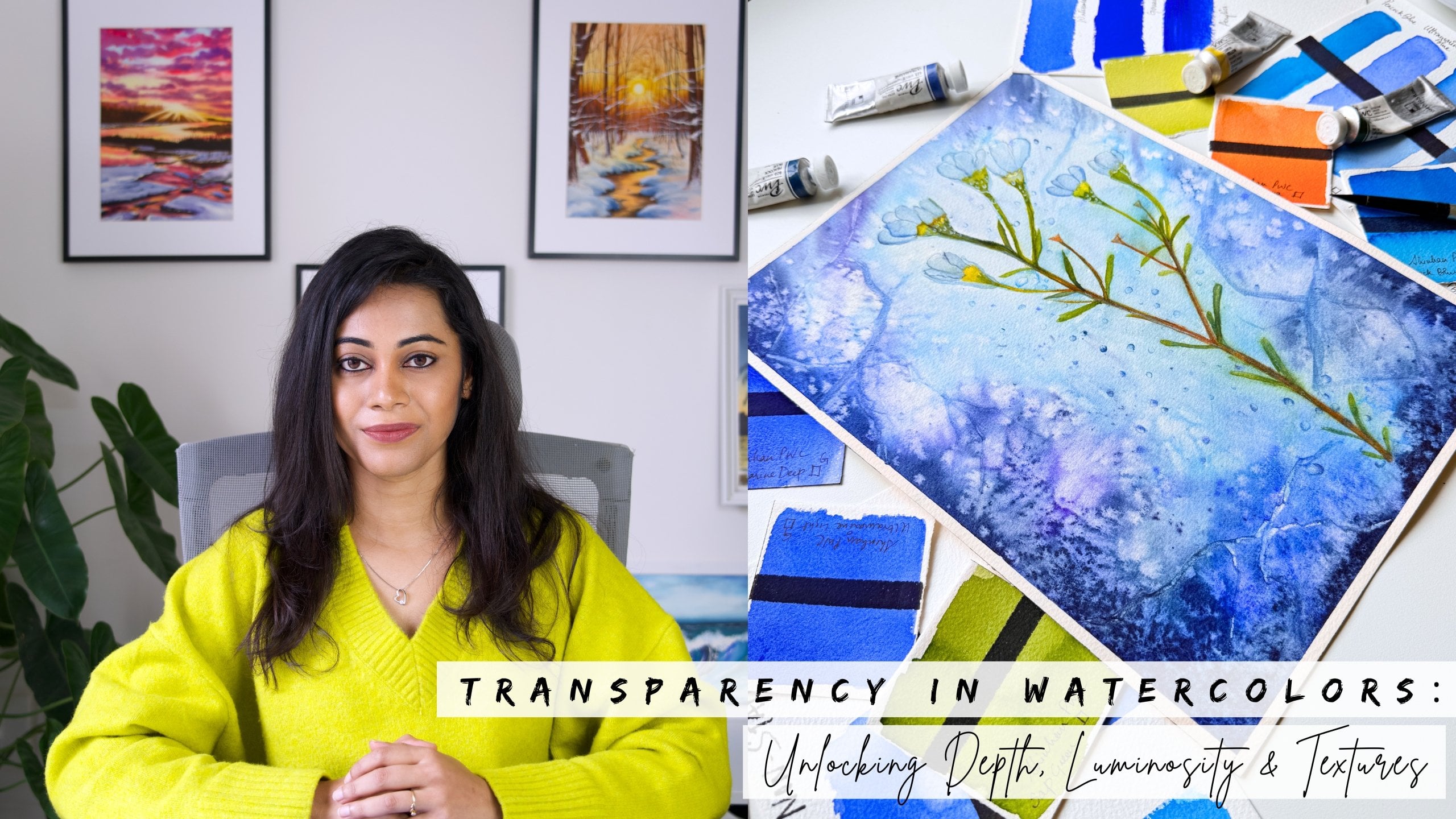
Transcripts
1. About the Class : There is something truly captivating about
the way water moves, ever changing, reflective,
and full of life. Painting water isn't
just about adding a few blue washes or
splashes on paper. It's about capturing its
soul, its transparency, its rhythm, its movement, and the way light
dances over it. But let's be honest,
painting water in watercolor is one of the
toughest challenges to crack, even for experienced artists. Translating that
elusive beauty of water onto paper is
indeed nerve racking. Trust me, I know that
feeling all too well. When I first started, painting water felt like
an impossible task. The colors got muddy,
some areas overworked, and somehow I lost the sense
of transparency, depth, and movement I
wanted to capture, resulting in the
outcome to look flat. And honestly, it
was so frustrating. But over time, after trying out different styles
and techniques, I discovered an approach
that made water feel less intimidating and much
more enjoyable to paint. Hey, guys. I'm Nelm Roy, a watercolor artist
and brand ambassador for Shinhan Art and
Silver Brush Limited. Through my in person
workshops and online classes, I have had the
privilege of helping thousands of students gain
confidence with watercolors, guiding them to better
understand their tools, techniques, and artistic voice. And one question that keeps coming back again and again is how to paint water without losing its luminous,
transparent quality. And that's exactly what
inspired this class. And in this class,
we are going to explore the many
moods of water from tranquil surfaces
and gentle ripples to dynamic movement and
glowing reflections. This class is designed
to help you paint water with clarity,
confidence, and intention. Here is what you will
learn in this class, how to analyze and simplify compositions for
effective waterscapes, understanding paper wetness
and perfecting your timing, using tonal values
to create dep, mixing water tones to achieve
natural looking water, application of fundamental
watercolor techniques to create light,
sparkle and textures. Learning the essential
skills will enable you to take on any water reference
and paint them with ease. We will reinforce these
learnings into action through seven unique
projects over seven days, each capturing the elusive
many moods of water. So whether you are a beginner or an intermediate artist looking to elevate your water scenes, this class is designed
just for you. And if you're brand
new to watercolors, I recommend checking out my earlier class
on transparency. That is a great
foundational course to pair with this class. So grab your supplies, and let's unravel
the mysteries of water one brush
stroke at a time.
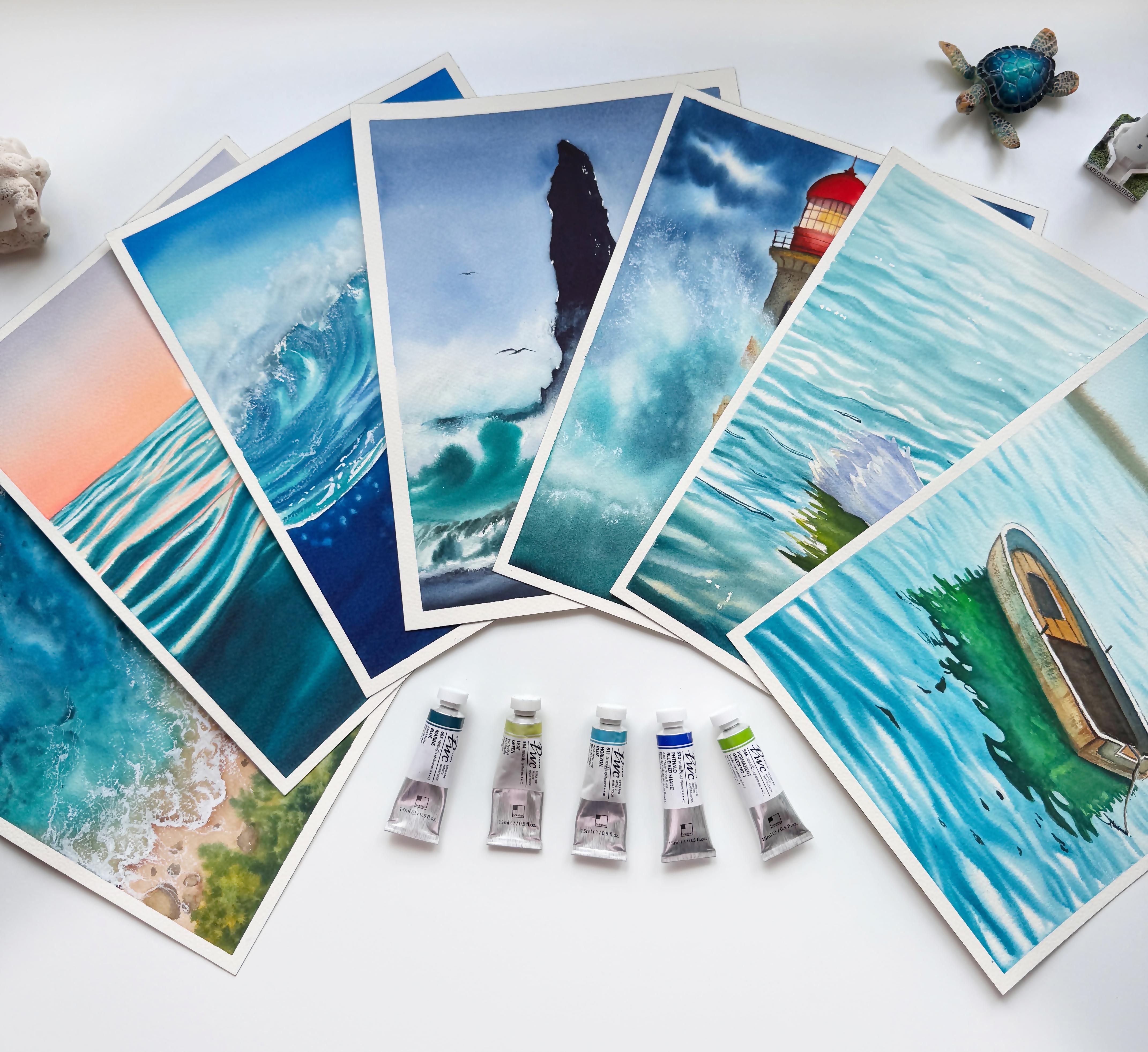
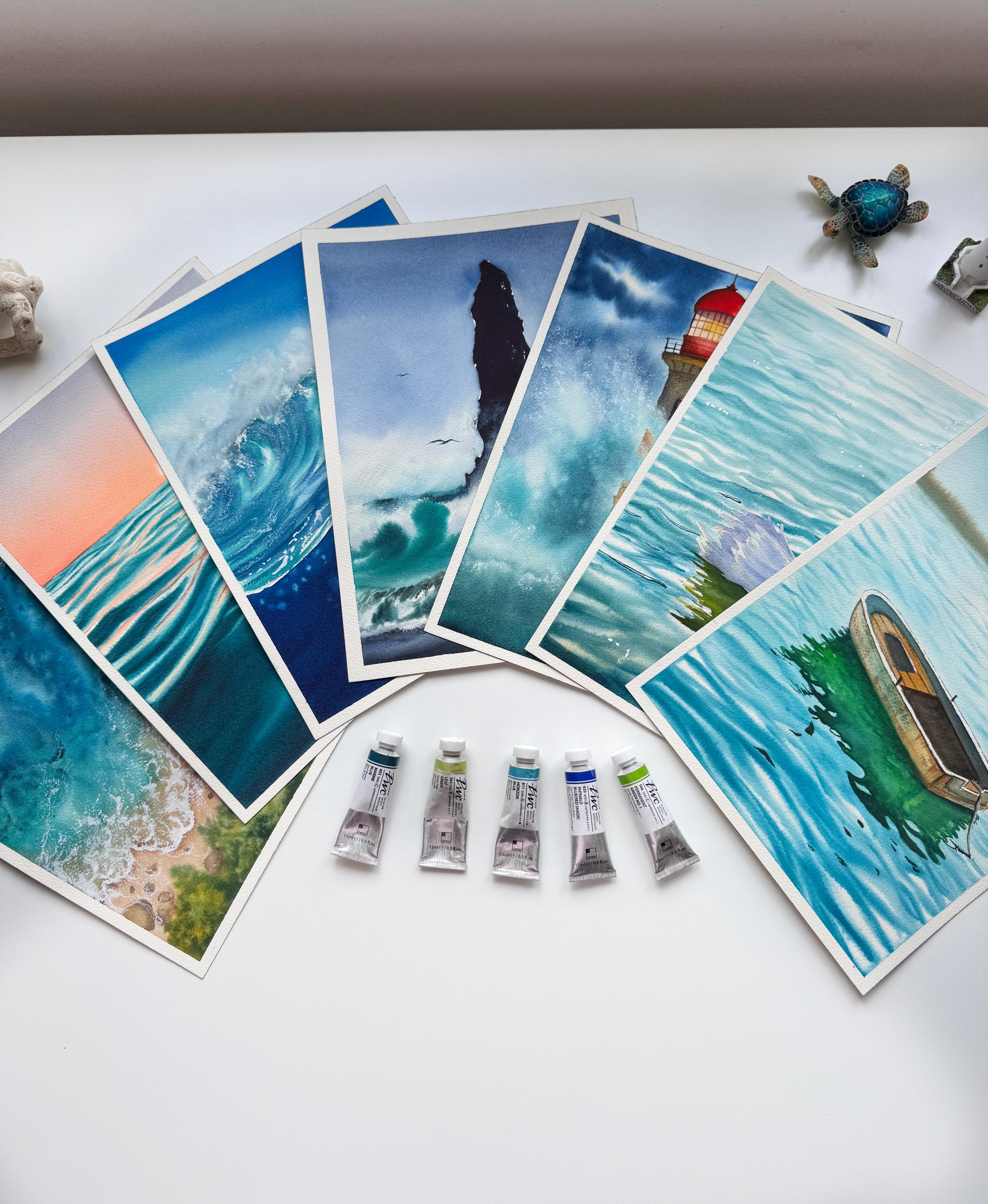
2. Supplies Needed : Welcome to this lesson. Here I'll walk you through all the essential supplies that you will need
for the class. Let's start with the
most important one our vertical paper. The paper that I'm
going to use here today is Saunders Waterford, a professional
quality 100% cotton, mold made acid free and
archival grade paper. It's a cold press, not grain fine paper. Now, if you look at the
texture of the paper, it is not too textured
like the rough ones. It has just the right
amount of tooth, not too grainy, not too smooth, which is ideal for the kind of soft blends and textures we will be exploring
in this class. It is truly one of my favorites. As for the size,
I'll be working with a 12 into nine inch
gummed paper block. If you are a beginner, I
highly recommend starting with a smaller sheet like
an A five sheet. Working on a large surface can feel a little
overwhelming at first. So it is best to get a grip on the techniques
on a smaller format and then gradually scale up to larger sizes like the
one I'm using here. For this class, I'm going to
go with full sized paper. Now, here I'm using a
gummed paper block, which is glued on
all four sides, and that is the
reason I wouldn't need any additional surface
to tape down my paper. But in case you are
using smaller sheets, then you would want a
non absorbent surface to tape down your paper
and start painting on it. Something like this, like an acrylic sheet
board. Here I'll show. Something like this, an
acrylic sheet board or even acrylic glass
writing boards. The advantage of this is you can use both the surfaces to
tape down your paper. It works beautifully,
keeps the paper flat, and helps in achieving
the even washes, and that's everything
about the paper. Let's move on to the
next essential tool that is watercolors. Okay, so moving
on to our colors, I'll be working
with Shinhan Arts PWC Extra Fine premium
watercolor range. Now, this is a professional
great artist quality line that offers vibrant colors
and beautiful transparency. Perfect for painting
our water scenes. Now, do not worry if you're
using a different brand. You can absolutely work
with what you have got. Just make sure to use
Artist Great paints. Also, no need to stress
about the pigment names. I have included a separate
lesson on pigment selection. Where I'll walk you
through the exact colors I use their pigment codes and
share easy alternatives. Plus, at the beginning
of each project, I'll watch out all the
colors we will be using so that you can
find similar shades from your own palette. I have got you covered, so do not worry at all. Now moving on to our next
supply, that is our brushes. Don't be overwhelming
so many brushes here. You definitely don't
need them all. I'll walk you through the ones I personally use and highlight
the brushes you'll see me. Use most frequently
throughout the class. First up is my hake brush. This one is from
silver Otilia series, size ten, met from goat hair. It is great for laying down large flat washes and covering bigger areas quickly
and smoothly. Now, if you don't have a
hag brush, no worries. You can easily
substitute it with a quill mop brush or any
broad bellied round brush. One, for example, is from
the same Ailia series, a quill mop brush that serves a similar purpose of laying
flat washes on larger areas, similar like hake brush, and you'll see me using this very frequently in my
upcoming projects. Next, the brushes you'll see me use the most are my quill mops. Both are from silver
Atia series. Once again. One is a size 20
go hair quill mop, incredibly soft and ideal
for fluid watercolor work. The other one is a
squirrel blend quill mop, size number 00, another
favorite of mine. I'll be alternating
between these two depending on the water
scenes that we are painting. Now, if you're not
comfortable using the quill mob brushes,
no problem at all, you can easily replace them with round brushes in sizes 12, ten, eight, and six. Now, let me show you here. These are from silver
black velvet series of fantastic and versatile set
for watercolor brushes. Sizes ten and 12 are
great for larger washes, which can easily help you
cover the large areas, and then size eight
is my favorite. It's one of my oldest brushes, and then size six is great for detailing and for smaller areas. So instead of the mob brushes, go ahead and use
your round brushes. Now let's take a look at few other brushes that
we will be needing. This is a synthetic
ultra round brush from silver Silk 88
Series, size number six. I love using this brush when I need more control
over the amount of water and pigment that's where synthetic
brushes really shine. They don't hold as much water as the natural hair brushes. Along with this,
I'll be also using the size two ultra round
brush from the same series. It has long bristles and
a beautiful pointed tip. Perfect for adding precise
details to our water scenes. Now, if you do not have these ultra round
brushes, don't worry. Even a regular round
brush will work just fine as long as it
has a sharp point tip. Now let's move on to two
other speciality brushes. I have been enjoying
a lot lately. These are from newly
launched bellet aqua series. They are smaller in size, making them perfect
for detailing smaller areas or even lifting
paint from the paper. This one here is size
eight cats tongue brush. It's incredibly
useful for painting distant wave patterns or
soft ripples in water. In the distance,
the unique shape really helps create
that organic. Next is the bright brush in size six and other
fantastic tools, especially for lifting pigments. If you don't have a
cat's tongue brush, you can also use an
angle chatter brush. It is just as effective as for lifting or creating
control ripple effects. And lastly, let's talk about
rigor or liner brushes. This one is size two
from an Indian brand called Bus also have
from Princeton, though the tip is a bit
free now from heavy use. Rigers are great for
drawing fine lines like water reflections
or subtle weve crest. Now, if you don't own a rigor or liner brush,
that's absolutely okay. Even a small size round or ultra on brush can
work as a substitute. Now coming to our
sketching supplies, I'll be using a
mechanical pencil, a ruler, and an eraser. You can also use a
kneading eraser. If you prefer, that's
totally optional. Next is my masking fluid. To preserve the
whites of the paper, I'm using the LeFrank
Burgoys masking fluid. I really love this masking
fluid unlike the others. It does not have
a strong stench. Now an important tip. Whenever you are
using masking fluid, always use an inexpensive synthetic brush
with a pointed tip. Do not use your good
brushes for this. Then I have this fluffy round
brush of size number six, which I use for the
dry brush technique, especially for creating
crashing wave splatters. This is optional, but if you have a similar
brush lying around, it can be quite useful. Now, don't forget
your tissue paper or your tissue towel
to dab your brushes. Then we would need two
jars of clean water. Lastly, you will also
need a mixing palette. I am here using a 35 well polycarbonate
palette from Shinhan art, but feel free to use
any ceramic plastic, or even regular kitchen plates. Anything that you
have handy will work just fine. And that's it. Those are the supplies that we will be using in this class. I'll see you in the next lesson.
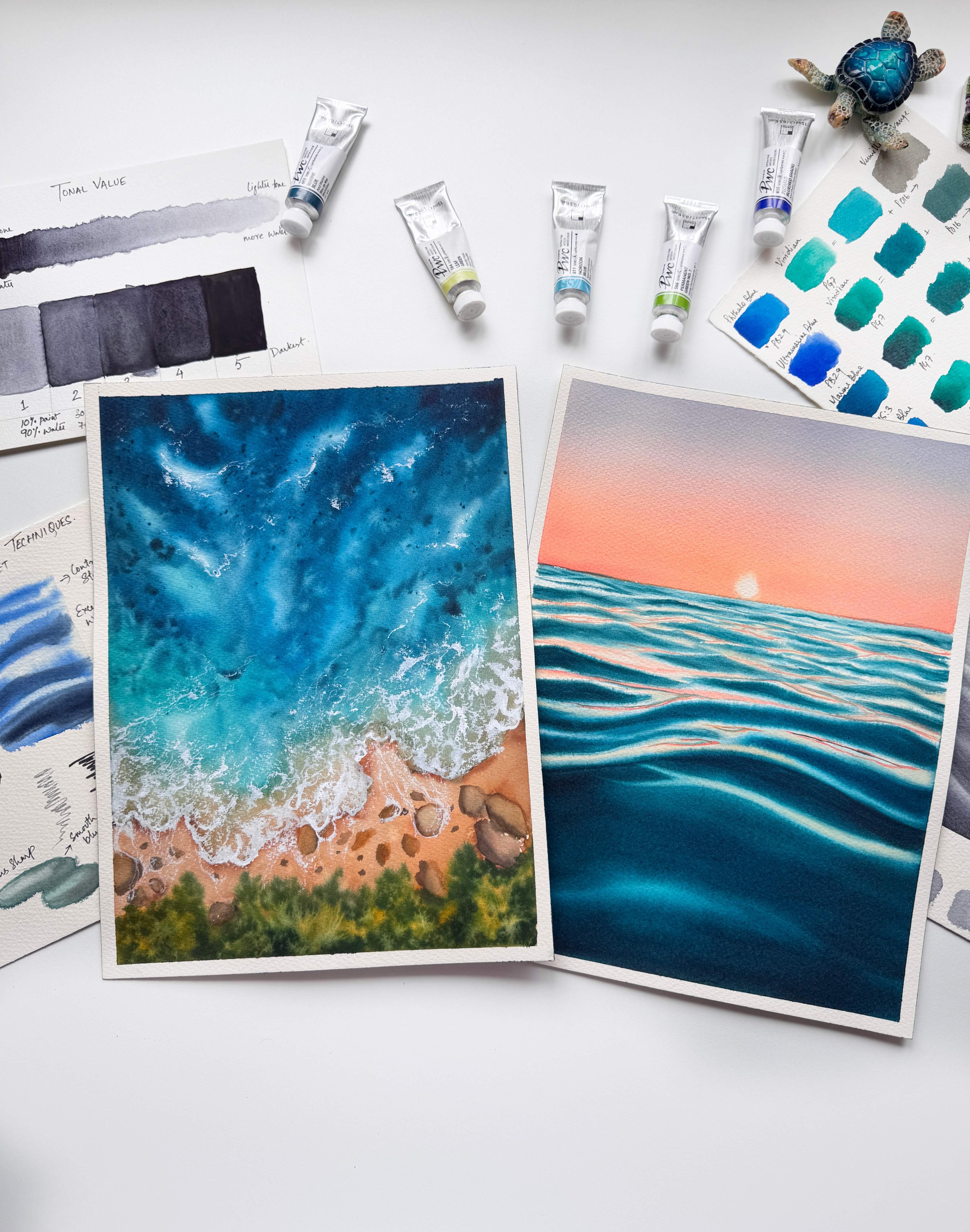
3. Selection of pigments-Transparency: Now let's talk about
why selection of pigments or colors especially
matter when painting water, whether it's a calm tropical
sea or deep ocean scenes. Now, here's my
biggest suggestion. Limit your palette to just a few single
pigment blues or greens. This will give you
far more control, create predictable mixes, and most importantly,
help you maintain that glowing transparency
that water demands. So the question arises, how do you choose
the right colors? Start by picking up your
watercolor tubes or pants and look for the
pigment information. Do not worry too much
about the name of the color or the number
printed beside it. Those vary from brand to brand. Instead, focus on
the pigment code that is labeled on your tubes. Now to give you an example, the tube that I have here has
the pigment PB 15 is three. Now, this is a very cool and
transparent staining blue. Now, if you take a
look at the swatch, you can see how beautifully
transparent it is. It is slightly staining, but because of the transparency, it creates a lovely
glowing effect when used in water scenes. Even if I lift the
color from it, it retains that light and
luminicity which is very much needed to create realistic
looking water scenes. Now, here is something
interesting. Let's say you have a thalo
blue from the brand rim brand, it might be made with
a pigment PB 15. Whereas, in my Shinhan PWC
extrafine watercolors, the Thalo blue red shade
is made from PV 29. Okay, so let me show you here the swatch of PV 29 Thalo Blue. Now, it's a very vibrant
and transparent blue, and I absolutely love it. But again, Thalo blues from
other brands could also use PB 15 or PB 1523 or even PB 35. So always check the pigment code and not just the brand name. So keeping this fact in mind, before starting any of
my water compositions, I like to lay out
all of my blues and greens and do a
quick swatch test, checking for their
staining and transparency. You can do it across brands
of colors that you own. This helps me choose the right
pigments that will enhance the natural feel of the painting and keep the colors
clean and glowing, making it look very realistic. Now, to help you with
your pigment selection, here on the screen, you will see some of my
recommended pigments, not specific colors,
but single pigments that I think will work
beautifully for any water, sea or ocean scene. Lastly, if your tubes or pans, do not mention
pigment information directly, do not worry. Just head over to the
brand's official website. Most of them provide a detailed pigment
chart that you can refer to before
making your choice. Okay, so now that we have got our pigment
selection sorted, let's move on to the
next exciting part that is creating our
own watery mixes. We will mix some
of these blues and greens together to
explore a range of transparent ocean
and still water hues from tropical turquoise
to stormy sea blues. So grab your palette
and let's dive in.
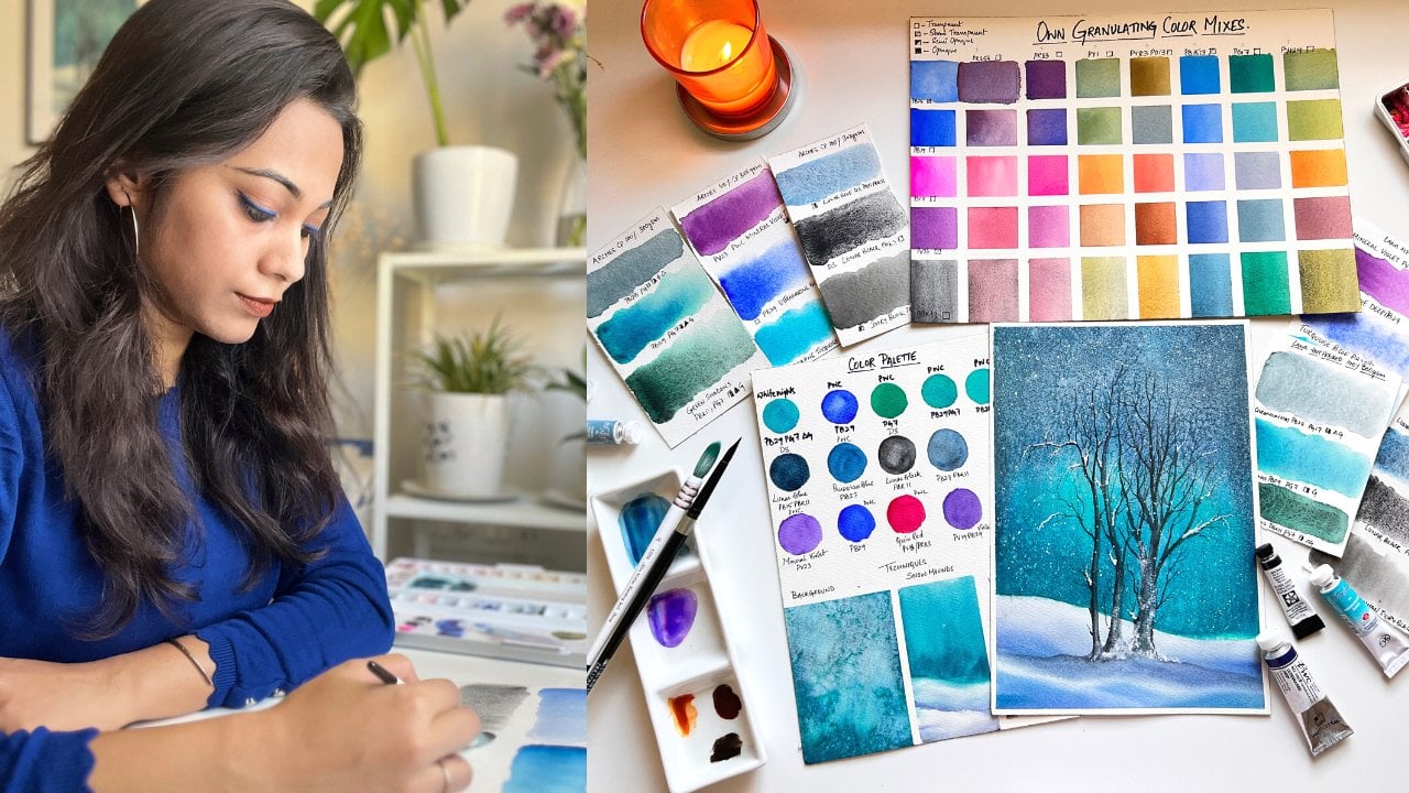
4. Mixing Water Tones: Hi there. Welcome
to this lesson. Today in this lesson, we are diving into how to mix realistic water tones for different water scenes
like the ocean, sea, lakes, waterfalls,
and still waters. To begin with, I'm using a curated palette of single
pigment watercolor tubes, primarily blues and greens from ShinhansPWC extra fine
watercolor range. That's it. Feel free to use whatever brand
you have on hand. As long as you can
identify the pigments, this exercise will
still be effective. And even if you don't have single pigment
paints, don't worry, just grab your available blues and greens and follow along. The first blue that
I'm swatching out is my Talublue red shade,
which in my case, is PB 29, but most
other brands may have Talublue red shade consisting
of pigment 15 east to one. Followed by, I have swatched
out my To green that is PG seven or also known
as viridian Shenanad. Now, when I mix both
of these colors, I form a very beautiful
turquoise blue colour. Now here it gets interesting. When I add a touch of vermilion
that is PO 16, a warm, single pigment orange
to that turquoise mix, it instantly
neutralizes the color, giving us a muted brownish tone. Can you see that? Now,
this color is useful for creating those murky,
shadowy watery areas. Now in the same pigment
of my turquoise blue, when I go with a mixed pigment of orange that is mixing
my red and yellow, I get a more warm
greenish brown tone, almost similar to that
of an olive green, which is a beautiful early color often seen in rivers
or lake reflections. Next, I will try mixing
my ultramarine blue with my green that is my viridiant
green of PG seven pigment. The resulting mix, which I get
is a turquoise green tone, but this time it is with a
slightly more granulating and a deeper tonal value thanks to the ultramarine blues
texture and the warm tones. Just like in the previous case, I will split this turquoise
green mix into two pools. In the first pool, I will add
my single pigmented orange, that is PO 16. Now, as soon as I mix it in, you will notice the
color instantly darkens and becomes
more neutralized. In the second pool, I'm
adding an orange mix that I previously created
using the combination of red and yellow pigments. This time, the resulting color leans towards a muted
brownish green. It's a very warm mixture
and will be perfect to create textures and reflections where the clarity
of water is low. Now I'm moving on
to my next color, which is my moraine blue
with pigment PB 15 is 23. Now instead of this, you can go ahead with cobalt blue as well. When you mix both of
this green and blue, you see the result is a
deep dark turquoise green. This happens because PV 153 is already a cooler blue with
a slight green undertone. So when mixed with PG seven,
the depth intensifies. I have created two separate
pools of my turquoise green. In the first one, I'm going
ahead and mixing my PO 16, which is a single
pigment orange, and you can see the
result is a desaturated, greenish neutral
the second pool, I add my pre mixed orange, but since there is more
green than orange, the mix stays vibrant and
isn't fully neutralized. It's a good reminder
that your final color always depends on the
pigment ratios that you use. I will now repeat this
same mixing exercise using few other blues
along with my PG seven. That is my peacock
blue and Horizon blue. This will help us explore the wide variety of water
tones we can create by simply shifting our base colors and observing how they interact
with green and orange. Now I'm moving on
to horizon blue, which is a tinted blue meat
with PV 154 and PW six. Instead of this, you can
also use cerulean blue as substitute with PB
35 as its pigment. Observe what happens when I mix my pastel turquoise with
this brilliant orange, the mixture turns into
a muted pastel brown, but it is opaque. But when I mix this
same turquoise blue into my premixed orange, it shifts into a
bright olive green. This is because unlike the
single pigment orange, which tends to neutralize
and dull the color, the premixed orange
contains yellow, which leans the mixture towards a warmer and more
vibrant olive green. For a change, I'm mixing my halo blue red shade with PB 29 with a bright
yellow green. The result is a brighter,
cooler turquoise, which is perfect for tropical
or shallow water scenes. Next, I add pure
orange into this mix, and you will see it turns into those murky greenish brown. And now I'll repeat
the same process with Prussian blue with PB 27 and
this bright yellow green. This will help us observe
the unique variations on how different blues and
greens shift the final tone. For the last mix, we will
directly desaturate our blue. In this case, we will add a little bit of paints gray or neutral tint to our halo blue. This immediately tones
down the vibrancy, giving us a muted
and moody blue, great for painting stormy
skies or deep waters. Now, if you take this
desaturated mix and add just a hint of
orange into it, it further mutes the tone, resulting in a deep,
dark bluish gray. Now, as a reference, you can also create a color
mixing chart by lining up all your blues against
a range of cool greens, warm greens, orange, reds, browns, and neutral tints. Here, I have done exactly that. This kind of chart is a powerful tool for
any watercolor artist. It not only helps you choose the right blues and greens
for painting water, but also deepens your
understanding of how to desaturate and control your
color palette with purpose. As you have seen
throughout this lesson, even small shifts in
pigment choices or mixing ratios can create an incredible
variety of water tones. From bright tropical
turquoise to deep, stormy seas or murky browns or greens, we have got it all. Whether you're painting oceans, waterfalls, tropical seas,
quiet, ponds or lakes, knowing how to control
saturation and temperature gives you the
power to evoke emotion, depth, and realism
in your landscapes. So take your time with this
mixing practice, observe, explore and most importantly, have fun discovering
the language of water through colors.
5. Simplifying what you see!: Before we begin painting
our water compositions, there is one very important
step that is observation. Whether you're a beginner
or an intermediate artist, I highly recommend you
to take some time to observe water in real
life whenever possible, be it waves, lakes or puddles. And if that's not accessible, collect as many reference
images as you can. But here is the key. Not every reference
is a good reference. The collection that
you have gathered, choose a reference that
feels visually balanced. Look for compositions
where you can easily apply the
rule of two thirds or the golden ratio or where the elements are arranged
in a pleasing way. This initial step of selecting the right reference makes
a world of difference. It sets the tone for the
entire painting process. Let me show you what I mean
with this first example. When you look at this reference, your eyes are
instantly drawn in. Why? Because of
the color contrast and how the light
reflects on the waves? The wave themselves have beautiful light
and shadow areas, adding character,
depth, and movement. It's dynamic and visually engaging, perfect
for a painting. Now let's take another example. Here we have a clear focal
subject, that is the dolphin. Notice how the light rays from the sky reflect
in the water, creating a silhouette of
the dolphin on the wave. There is a lot happening
in this scene, yet even if you simplify or omit some of the
background elements, the composition still works because of that
strong central focus. You can even play around
with just the dolphin as your main focal point and
build your own interpretation. The idea here is to train
your eye to indicate or notice what works in
a reference and now, there will be times
that the reference you choose might feel a little
bit too complicated. Let's take a look at this
reference as an example. At first glance, your eyes are naturally drawn to the
two boats in the scene. But as you keep looking, you will notice a variety
of background elements, maybe buildings, trees, or textures that add
to the complexity. Here is the important
thing to remember. Don't need to paint everything that you
see in the reference. The goal is to guide
the viewer's eye, so simplifying is
just often necessary. Here in this example, I'll go with the boat on
the left because we have a clear view of the entire boat and a beautiful
reflection in the water. I have decided to completely
omit that second boat, making the focal point stronger and the composition
more intentional, and the background can
be toned down and kept less detail to help draw more attention to the
boats in the foreground. This is how we can thoughtfully simplify your reference
by editing out distractions and
painting only what serves the story or
mood we want to convey. So I hope this makes it clear. You are not bound to copy every detail from your
reference. Use it as a guide.
6. Fundamental Techniques : Before we derive into
our main projects, let's take a moment to explore some essential
watercolor techniques that will form the
foundation of our class. The first is wet
on wet technique. Wet on wet is a watercolor
technique where we first wet the dry paposurface and then apply wet paint onto
the damp background. This method allows the pigment to spread and flow naturally, creating beautiful
organic textures. It's a highly versatile
technique that can be adjusted to suit the specific
needs of a painting. For example, in our case, this technique will serve as the base layer for the water. To add interesting patterns and textures to
this wet surface, we can then splatter either dark colored pigments
or some clean water to achieve those
soft blooms that mimic the textured look
of an aerial ocean. This is the very
first technique that we will be using in
our first project. Let's explore a variation
of this technique. For the background, I'll
start by wetting the paper using a mop brush to create
an even thin layer of water. Next, I'll then switch to a smaller round brush and try reactivating my paint
using my water. Here, notice how my brush
tip is loaded with water, and this is what is making
my paint mix too watery. As I try to paint waves
using this paint mix, the shapes become undefined as the paint spreads
too quickly. Now here is the trick.
When I blot my brush with a tissue or a towel to
remove that excess water, the brush becomes
more controlled, and as I paint the wave shapes again, notice the difference. The edges are still soft, but somehow the strokes
hold their form. This technique is known as controlled wet on wet technique. Now let's discuss another
important method, which is the lifting technique. This involves using the damp tip of your brush to gently lift off the excess paint from the
paper while it's still wet. It is perfect for correcting mistakes or creating highlights. Just remember always
rinse your brush in clean water or dab it dry on
your tissue towel or paper, and then lift the paint again. We will use this
technique very frequently in almost all our
upcoming projects. While the background
is still damp, I'll gently add darker
indigo values to the foreground using a
controlled paint to water ratio. This method of building tonal contrast is
called layering. Applying it on a wet surface
creates soft blended waves. This is one of my
favorite ways to add depth while maintaining a
gentle fluid look to the ocean. We will begin using this
technique in Project one itself, but it will become more prominent from
Project two onwards. Using this damp but dry brush, I'll load it with
dry paint and begin making vertical
strokes on dry paper. As you can see, this creates
textured broken marks, a technique known as dry on dry. Now, for comparison, if
your brush is too wet, when you load the paint, you won't achieve this effect. The excess water
softens the strokes, eliminating the dry texture. Now I'll attempt it one more
time. But still the same. On the third attempt, when the brush has
just enough moisture left after being used, you can see the ideal
dry brush marks textured and controlled. Now, when I dry out
the brush completely, you will barely notice any paint on the
paper. That's too dry. So the third stroke from the top demonstrates a perfect
balance for dry brushing. Now let's move on to
another key technique that is creating depth through
atmospheric perspective. For that, I'll first begin by
uniformly wetting my paper. And then load my brush with a dull green mix and start
adding some wave strokes. Notice how the values are
darker in the foreground, and this will become gradually lighter as they move
towards the horizon. This follows the
principle of perspective. That is, as the objects
recede into the distance, their tonal values become
lighter and less defined. If you would like to explore this concept in a
little bit more detail, check out my dedicated class on atmospheric perspective
on Skillshare. Okay. So to sum up
this technique, as we move further
from the foreground, tonal values gradually lighten and the shapes become
little less defined. Now the foreground will
always appear darker with larger and more detailed shapes because it is closest
to our eye level. This is linear
perspective at work, and it's simple yet powerful way to create depth in
your water paintings. Alright, let's move on to the next important technique that is wet on dry technique. This simply means applying wet paint onto dry
paper surface. It's one of the most
commonly used technique when we want sharp, defined shapes or clear
outlines in our painting. For example, here I'm painting
the shape of the stones, and now I'm going to fill it in using a flat wash of color. At this stage, the
result looks quite flat, but if I now drop in a slightly darker tone while
the paint is still wet, the stones begin to look
more three dimensional, giving us beautiful soft
laying with a defined shape. So it is really a matter of
controlling the moisture, either the paint or the
paper is wet, but not both. That's the secret of creating both form and clarity
with this technique. We are going to use
this technique for creating stones on the
beach in our first project, and this technique will also be used while painting the
reflections in water. Paint reflections on water, you will need a brush with a fine pointed tip that also holds a good
amount of water. I like to hear use my silver silk series ultra
round brush for this. For example, if you are painting a pole and
it's reflection, both elements should be painted using the wet
on dry technique. When painting the reflection, make sure your brush isn't
overloaded with water. Too much of water can
cause uncontrolled strokes while too little can result
in dry, scratchy marks. The key here is to
maintain the right pain to water ratio so your
brush glides smoothly, allowing you to create clean, sharp lines for the reflection. Now, just for demonstration, if your brush is too dry, you won't be able
to paint sharp, clean outlines for
the reflection. Instead of smooth
extended lines, you will end up with
scratchy broken marks that lack clarity. Alright, so here is
a quick summary of the broad fundamental techniques we covered in this lesson.
7. Tonal Value: Depth & Contrast: Now, if you're wondering what exactly is tonal
value, let me explain. Tonal value refers to the relative lightness
or darkness of a color. It describes how light or dark a color appears
regardless of its hue, hue being the actual color, like the red, blue, or yellow. Now in watercolors, tonal
value plays a crucial role. That's because watercolor
is a transparent medium. You can always add darker tones, but you can't easily make things lighter once
they are painted. So before you even
pick your brush, you need to evaluate the tonal values in
your composition. You have to plan ahead and
reserve the lightest areas, usually the paper white
right from the start. Once the tone is laid down, it is very hard to
lift it back to white. That's why understanding
tonal value is so essential in watercolors. So now the question arises. What exactly is
tonal value scale? Tonal value scale
is the range of values from light to
dark within a color. That is, it is the full
range a color can give you, and with this, we
can determine the lighter or the darker
areas in a composition. Now, this scale can come in
different forms most commonly as a five point scale or a more detailed
nine point scale. The nine point scale divides
the tonal values into nine distinct steps that is from pure white
to pure black. Let me show you this in the
nine point value scale. Let me now show you the nine point value scale for a color. You can see the
lightest color to the darkest range that
this color can produce. Here, nine represents
the darkest value, and one is the lightest, almost your paper white. Now, this scale offers a much
broader range of values, allowing for more
subtle gradations or nuances in shading
and highlighting. However, this can
get a little bit overwhelming for those who are just starting
out with watercolor. It is best recommended
for beginners to start out with a
five point value scale, which is easier to
grasp the concept of light and dark values
and apply them in practice. So let's get to creating
our five point value scale. Here I'm going ahead and
creating five columns, more or less making them
equal in dimension. For this value scale, you can start first with grading your darker
colors like pains, gray, neutral tint,
black, or blues. Here I'm going ahead
with blue because I felt the gradation of black was not properly visible
on the camera. So for your practice, start with your darker colors
and then lighter colors to understand the
difference between the tonal range in
each of its hues. Now let's get back to
marking the columns. I'll mark first my lightest
value, which is one, and then I'll go to
my darkest value, which will be my five. Now let's mix our values. We'll first begin with
our darkest value, which is our fifth value. Here, it will be 90% paint
and a little less water. I'm here approximately
considering at 10% water. The fourth will have
70% paint, 30% water. The third will so on will
have a balanced ratio of paint to water that
is 50% paint, 50% water. Now, this will be a uniform
paint to water ratio, your ideal consistent
mix of your mid value. Now for the second value, the paint will start to
get a little more diluted. We will use 30%
paint and 70% water, and one will be the reverse
of the fifth value. I scribbled earlier, 10% water, but it should be 10%
paint and 90% water. Now in 1-5 values,
values second, third and fourth will
present the light, mid and dark mid values. And as a rule, we know
that in watercolors, we always start from the
lightest and increase the tonal value to the darkest because once we go to
the darkest values, it's difficult to bring back that paper white finish
in your painting. So we always start with
the lightest value and then build the tonal values gradually towards the darkest. So similarly, I'll
do the same here. First, I'll fill the darkest and the lightest values
in the value scale, and then the mid and
darker value ranges. Now, starting with
my darkest value. This is my 90% paint
with 10% water. This is the darkest value
that my ultramarine can go. I'll give it a good mix
and then paint this box. You can go ahead with
more neutral blues and blacks or neutral tints
and compare the dark to light value range with
the lighter colors to get a better understanding
of the range of values in each
of the pigments. Okay, now let's go ahead and fill in the lightest
value of one. Here I'll be using 90% water and just a
tiny pinch of paint, which is 10% of a paint, and give it a good mix
to create a very light, watery ultramarine blue mix. Remember, the more
water you add, the more diluted your mix becomes and the lighter
the value will be. If you're unsure about
how light the value is, I recommend doing a
quick swatch test on a scrap piece of paper. Check if the mix is
light enough for the whites of the paper
to shine through. That's when you know it's
the true light value. Once you are happy with it, go ahead and fill it in the value box of
one on your scale. So once you have your lightest and darkest
values in place, you can now go ahead and
fill in between the ranges. This is much easier approach, and it helps you
understand better when you need to lighten or darken
your tones as you go. So now let's get to value two. For value two, I'm going to add a little bit more paint to my existing pool of
diluted color mix, and you will notice
that the value is now slightly darker as
compared to value one, just enough to show
on a clear shift. Now I'll rinse my brush and dab it lightly on
my tissue towel. I'll load now some fresh paint and gently mix it into
the existing pool. You will start to see the
value intensify just a bit. This is our value. You observe the consistency, you will notice the
mixture remains smooth, bright, and nicely pigmented. Perfect. For that, next
slide to mid drained tone. Now let's move on to value four. I'll repeat the same process, adding a bit more paint to the existing pool of paint mix. And here you will notice that
as compared to value three, there isn't a drastic
change in tone, which indicates that these
are your mid tonal values, the transitions become more
subtle in the mid range. So I hope now you are getting a clear idea of how tonal values shift and how you
can control them by simply adjusting your
paint to water ratio. Now that you have seen
how a single color can shift through different
values with just water, take a moment to observe how powerful this control
can be in watercolors. Let's now move on to
a simple exercise where we will put
this into practice.
8. Analysis & Value Study: Depth & Contrast: Before diving into a full
watercolor painting, one of the most
valuable things you can do is to take a step
back and create a tonal value study for the selected reference in the form of a small
thumbnail sketch. Now you might wonder why
this step is so important. In watercolor, you
don't have the luxury of working back and forth
like opaque mediums. Once you go dark, it's nearly impossible
to return to light. So having a clear map of light, mid and dark values
allows you to plan ahead, ensuring your final
piece has depth, balance, and visual clarity. Let's take this example, a sunset sky reflecting over a calm water body with some gentle ripples
on the surface. At first glance, it's easy to be swept away by the vibrant hues, the warm oranges,
soft pinks to corals, and then your faded out blues. But if you strip away the color and focus
only on the value, you begin to see the structure
beneath this beauty. Once you convert your reference
image to black and white, it becomes much easier to start analysing the composition
in terms of tonal values. You can now compare different
areas of the scene directly against your five
point value scale to identify what's light, mid or dark values. Here, in our reference, the sky at the top
edge of the paper is slightly deeper somewhere around the mid tone values
or value three, and the sky near the
horizon where the sun is setting is the lightest
area close to value one. When you analyze the foreground, the ripples and the large
wave shapes appear the darkest falling into the
value of four to five range. So once this basic
analysis is done, you are ready to
either sketch out the composition or simply block in the major shapes
using a single color, dividing them into light, mid and darker value zones. Now let's go ahead and create a quick tonal thumbnel sketch for this sunset
composition together. Let's begin our quick and
simple value study together. I have already created a small
frame using masking tape. Now I'm going to sketch out the horizon line to demarcate
the sky and the water. Next step is to wet my sky area. I'm going ahead with a
soft round brush just enough to give it a nice sheen without
creating any puddles. Now let's prepare a mid dark
value using neutral tint. You can use any dark shade of your choice for
this exercise, pains, gray, indigo, or even a dark blue
works really well. I'll begin by applying this mid dark value at the
top edge of the sky and gently transition it towards a lighter tone as we move
closer to the horizon. This smooth shift from dark to light is
called gradient wash, a fundamental
watercolor technique. This gradient wash technique is especially useful
when painting skies or calm water bodies where you want to show linear
perspective in action. It helps create depth
by transitioning from darker values in
the foreground to lighter values as you
move into the distance. If you would like to
explore this further, you can check out my class, the ultimate guide to
painting watercolor skies, a seven day challenge, where I break down
different types of washers and how to apply them
effectively in your landscapes. Now we will begin painting
the water, but in this step, we are going to focus purely on the light and shadow shapes of the waves and not
the finer details. Just like our thumbnail
sketch done in pencil, we will now start blocking in the major value shapes
using the paint. I'll now begin by placing the darkest values
first and then gradually adjust
the lighter tones as we move further
into the distance. Remember, this stage is
about simplification, capturing the large shapes
and their value relationship. It is important to
understand that you can always adjust darker
tones later if needed, but with lighter areas, you need to be more mindful
right at the start. Because in watercolors,
once you lose the light, it's hard to bring it back. So build your contrast
intentionally and keep an eye on the overall
balance of lights and shadows. To create the sense of light play on the
surface of the waves, I start by gently
lifting out any paint that's creeping
into the reserved white spaces or highlights. This helps preserve the
illusion of the reflected light and keeps the wave forms
more defined and dynamic. I will now add some
more darker tones to the bigger foreground waves to enhance the
depth and contrast. Now here, I'll
quickly spotch out the tonal values we
used in our painting. As you can see, we have
effectively used values from the five point value
scale that is from the lightest lights
in the sky to the darkest shadows in
the foreground ripples. Clearly shows how
practically useful the five point value
skill is when it comes to planning and
executing a painting. It helps you simplify complex scenes into
manageable value shapes and ensures your composition has a strong sense of
depth and contrast. So I hope you were able to follow along and understood
the importance of a value study in bringing out depth and contrast
in your paintings. This is a simple yet
powerful exercise. In our day two project, we will take this a step
further as we paint tranquil surface
waves focusing more closely on the interplay of
light and shadow on water.
9. Day 1: Composition Analysis: Let's take a moment to analyze a day one composition
before we begin. I like to start by converting my reference into
black and white so that I can focus purely on values without the
destruction of color. Then I carefully observe
and study the scene. The first thing that
catches my eye is the direction and movement of the water caused by the wind. If you look closely at
both the references, you will notice the water is flowing inwards
towards the shore. This creates a leading line that guides the viewer's eye
straight to our main subject, the sea foam, and the waves
crashing onto the shore. Next, I look at the light
shadows and contrast. The darker areas you see are actually patches of
algae growing or shadows cast by submerged
objects when viewed from above. I also roughly map out the tonal values
across the reference. This helps me understand where my darkest darks and
lightest lights will be. Finally, I take a note of the minute textures
in the water, which will bring extra realism and interest to the painting. So you see even a
seemingly simple reference can reveal so many interesting elements
when you analyze it. That's why I always recommend
doing this step first. I sets a strong foundation
for your painting.
10. Day 1: Color Palette: Let's take a look
at the colors we will be using for
our first project. I'm starting out with Marne blue with
pigment PB 15 is 23. Now it is a very cool blue, but you can use any
other blue that contains PB 27 or PV 15. This pigment is most commonly known as Thalo blue green shade, though the name may
vary across brands. Next, we have cobalt green. We have already
covered how to create this tone in our mixing
water tones lesson. Simply mix horizon blue with viridian and you would
get a similar shade. This is how you
obtain the shade. Now, if you do not have
this horizon blue, you could mix in a little
bit of your white pigment into your cerulean blue
and obtain this blue. Next help is
watching out indigo. Mix in a little red into your darker blues and you
would get this indigo readily. Another way to mix indigo is to mix in a little bit of paints gray adionutal tint into your blues and create a
similar looking indigo color. Next, we will be kneading in a little bit of burnt sienna. Now, this color is commonly present in all basic
watercolor sets, followed by shell pink. Now this is an optional color. You can substitute
this with white quash, but I personally love
combining shell pink with browns to get that beautiful
tinted sandy brown. Look at that beautiful pastel
brown that we have got. Next, lbs watching out a
very bright yellowish green. My yellowish green here is
a granulating yellow green. If you want to make your
yellow greens granulating, then I suggest you mix in a granulation medium into your color to make
it more granulating. We will also need sap green. I'll be mixing sap
green and indigo to create those dark
greens for our foliage. Also, when you mix
browns with indigo, it creates dark
brown tones perfect for adding depth to the
rocks along the shore.
11. Day 1: Wet on Wet Ocean : Alright, let's get started
with our day one project. I'm first going to secure my
paper using masking tape. Now I'm going to
sketch the outline of the shoreline and add
a few rocks along it. I'm not copying the
reference exactly. Instead, I'm capturing the
overall essence of the scene. Please excuse my slightly
rough voice today. I'm recovering from a bad flu. I'll quickly finish
the sketch so you can pause the screen
and outline yours. If you're working on a
smaller sheet of paper, keep in mind that the
shoreline should take up only about one
third of the space while the remaining two
thirds will be your ocean. Now, I'm going to start by
thoroughly wetting my paper. Since I'm working on a sheet
slightly larger than A four, I'm making sure it's evenly coated with a uniform
layer of clean water. This way, when I begin
applying my blues, the colors will blend and
bleed beautifully using the wet on wet technique we discussed earlier in
the technique section. The idea is to keep the
paper wet for a longer time, but also ensuring that there are no pools or puddles of water
stranded on the paper. For day one, the goal is simply to help you feel comfortable
with the process. We are keeping our strokes
fluid and free and letting the wet paper and paint do most of
the work for us. Now I'm switching to my
smaller sized mop brush. I'll dab it lightly
on tissue and then start preparing my
mix of marine blue. Notice how my paint
mixture looks. It's slightly dry yet still wet. That's because I'm aiming for the darkest value of
marine blue here. I'll begin at the edge
of the top of the paper, pulling my strokes inwards
towards the shore. Watch how I'm not covering
the entire area with blue. I'm intentionally leaving
some white spaces in between. These are important
as they will become our point of interest where
the light shines through. I am now dropping in a little more marine blue
over the base layer, working very lightly so I don't disturb the
paint underneath. Next, I'll mix a deeper blue by adding a touch
of cadmium orange. You can either use
this method or can use neutral tint or paints
gray for a similar effect. I will then use my spray bottle to lightly mist these areas. This helps the paint move more freely and keeps
the paper weight, which is especially important when working on a
larger surfaces, as they tend to dry out quickly. Just remember, spray gently
and from a bit of distance, too much of water too close can create unwanted
blooms or back runs, and we want to keep our
transition soft and controlled. Now, before I start
painting the shore area, I'm using a clean rinse
brush to gently re wet the parts of the shore
where the waves will touch. Next, I'm mixing in a medium
to light values of my cobalt green to fill in the left and right
sides near the shore. Now I'm splattering
some water droplets onto the painted area, especially over
the darker spots. You will soon see that this
creates a beautiful texture. Instead of water, you can
also sprinkle a little bit of table salt for even
more texture defect, but I'm skipping that here because I wanted
a smoother look. Next, using my Seisic
silver round brush, I'm gently moving the
paint towards the shore, following its natural direction. This only works if your
paper is sufficiently wet. If it's starting to
dry unevenly in spots, it's best to skip this step to avoid unwanted dry patches. Using my damp clean brush, I'm going to lift
some of the paint that's bleeding into
the white spaces. This will create the illusion of shimmering light dancing on the ocean waves as they
rush towards the shore. Once that's done, we will start painting near the shoreline
with burnt sienna, beginning with lighter values. We can always deep in these
values later if needed. To achieve a visually
realistic effect, I'm working in the direction
of the rushing ocean. Using horizontal
strokes here won't look natural since we are viewing
the scene from a top angle. So it's important to keep the
linear perspective in mind. Using the tip of a
slightly watery brush and tilting the paper, I'm allowing the browns to naturally met and
blend with the blues. As the paper starts to dry, I notice the lighter cobald
green areas begin to fade, so I will go back and lay in a light watery mix of cobalt green to
refresh those areas. I'm going to quickly splatter some water droplets onto the
semi dry areas of the ocean. This helps keep the surface
moist and will allow me to add darker pigment splatters
later to create the texture. Before the paper starts
drying in this area, I'll use the tip of my
size six brush to make patterns and marks here and there on the wet
surface of the ocean. Just remember this tip only works if the
paper is still wet. We will let this
part of the ocean start drying now and
in the next lesson, we will begin working
on the shoreline.
12. Day 1 : Wet on Dry Shore & Waves Details: Et's get started with
a shoe for that, I'm creating a mix of my
shell pink and burned sienna. Now, instead of shell pink, you can also go ahead and add in a little of your white quash into your burned
sienna or your burned tumber and create
this similar mix. I am going in and laying this color at the
center of the shore. Next, using a light watery
mix of yellow ochre, I'm going to gently fill the
bottom edge of the paper, blending it into the shell
pink and burn sienna mix. With a slightly damp
tip of my brush, I'm softening and fdding out that layer near the area
where the waves will crash. Then I'm going to go and
air in some darker browns right along the
shoreline outline and blending them into the sea. Here I'm using a careful
and controlled wet on wet approach so that
my layers look soft, yet I get the control over the wetness of my
paint and the paper. Using my Size six brush
and just the tip, I'm adding darker
tones of brown. And you can see the magic
of wet on wet happening. This is exactly the effect
I wanted for this area, building up layers while still keeping those
beautiful soft edges. We will let the shore near to the wave crashing area dry
for now and in the meantime, I will start working
on the bottom edge of the paper to create the foliage. I'm starting with greenish
yellow at the base. My greenish yellow is a
granulating beautiful color, which will add a beautiful
texture when we start layering mid values and darker
tones of greens to build that texture,
depth, and contrast. For the mid tonal
values of green, I'm going in and adding
in my sap green, making sure not too completely cover the base yellow green. I want it to shine
through in small pockets. This step needs to be done
when the area is still wet. If it dries out, simply
reapply a light, watery, yellow green base layer
and then go in with a flowy but not too watery
consistency of sap green. This ensures your layers stay
vibrant even after drying. For added texture, I'm using the water splattering
technique here. You could also go ahead and use a little of your table salt, just sprinkle over
the wet areas. But keep in mind
the salt technique doesn't always work well
on handmade papers. If you are working on
handmade Hadi paper, it's best to stick with a water splattering
technique which should be able to give
you a reliable effect. As you can already see, I have moved on to the rocks, beginning with lighter tones of my raw sienna and then
adding in darker tones. Well the first
layer is still wet. This helps create soft
rounded edges to the rocks. I recommend you watch this
whole process once before you start so you know what's coming next and
can work smoothly. Since I'm working on
a larger surface, detailing will take
a bit of time, but I'll keep the
pace quick here. With the damp tip of my brush, I'm going ahead and adding the smaller size rocks scattered throughout
the shoreline. Finally, it's time to work on our waves. I'm using a soft synthetic
liner brush of size two and applying a thick consistency of gouache using just
the tip of the brush. At this stage, it is
all about detailing. Notice how my brush
strokes are in straight. This is a common mistake
many beginners make. The key is to closely observe the movement of the waves
in your reference and mimic that flow when paint
this adds realism and follows a linear perspective of waves bending and twisting
along their path. I personally find this process very satisfying and theraptic. But if you're a beginner, I recommend taking a short
break and maybe grab a cup of hot chocolate or a cool drink to relax before diving
into the wave details. By now, our shore area
should be completely dry. Don't attempt this step
if it's still damp. Otherwise, you won't
achieve those crisp, dry brush marks
that are essential for giving their waves
their rough textured look. Another way to paint these
waves is by preserving the whites with masking fluid before you start
painting the ocean. Personally, I don't find this method very appealing
because creating thin curvy wave lines with the pointed brush and with masking fluid can be
very, very tricky. Even if you coat your brush
bristles first with soap, detailing so many smaller and curvier waves
becomes tedious, and the brush tip eventually gets clogged with masking fluid. That's why I preferred this
method we are using now. It might feel a bit
challenging at first, but once you get
into the rhythm, it becomes much easier and far more comfortable
to work with. This part of the process will
take a little bit longer, so I recommend watching
the entire lesson first. Be patient. I promise it
will be worth your time. I would also love
to see your work, so please share it in the
class project section. And if you have any
questions or doubts, don't hesitate to reach out
in the discussion thread. I'll be happy to
answer your queries. If you are working on a
smaller sheet of paper, you will naturally
cover the area faster and need less time
to complete this step. That's the key difference
between working on a smaller paper versus a large one where so much
details are involved. I wanted to show
you this process in real time on a larger
sheet so you can see how I manage to keep it
were working in different sections one at a time to prevent it
from drying too quickly. You can always
revisit this lesson when you are ready to
attempt larger paintings. Consider this as your
reference point. Observe how I'm using both
the tip and the toe of my liner brush to create a mix of thin and
thicker strokes. I already have a class on Skillshare on painting
oceans and seas, where I included a
dedicated lesson on brush strokes
and their practice. And sometimes practice is the real key to getting
your strokes right. I didn't want to repeat
that lesson in this class, so if you would
like to deep diaper and build confidence
in your strokes, you can watch that segment
from my earlier class. Now, for the final details, I'll add some dry
brush strokes around the bigger rocks to indicate
the waves retreating. This adds a nice visual
story to the scene. Okay, so with this final detail, we will be done with our waves. Once the painting
is completely dry, we will carefully peel
off the masking tape, and that pretty much wraps
up our day one project. I'm really loving
how it turned out, and I can't wait to
see your versions. I'll also be adding some extra practice references for you to keep honing
today's techniques. I hope you enjoyed the process and had fun painting along. I'll see you again tomorrow as we capture another
mood of water.
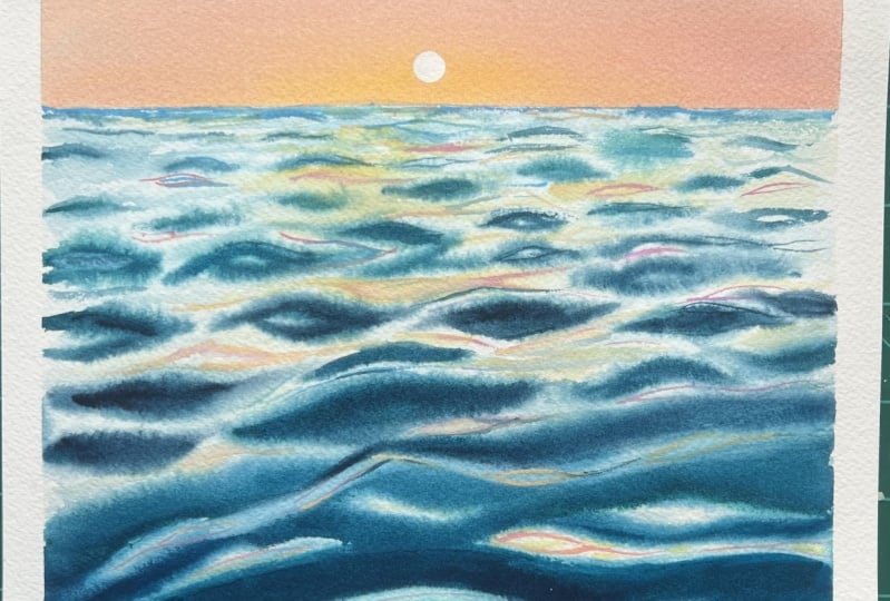
13. Day 2: Composition & Value Analysis: Welcome today too. Let's start by analyzing our composition. Here is our reference image. I'm first going to strip
away the colors and convert it into a monochrome or a black and white version. Now let's study
it in gray scale. Looking at the
overall arrangement, this composition also follows
the rule of two thirds. If we overlay our
two third grid, you will see the sky sits along the upper one third line and the remaining two thirds
are taken up by the water. Let's analyze the
reference even further, starting first with sky. We notice that the values
shift from slightly darker near the horizon to
lighter as we move upwards. Here, the usual rules of atmospheric perspective
change because the sun is sitting
right at the horizon. Now let's move to
the foreground. The first thing that grabs attention is a large
wave shape in front. It has a concave bulge with a bright highlight where
the light reflects off, making it the lightest
value in this area. Moving slightly away
from the foreground, we notice an interplay
of light and shadow. Here the tonal values
shift between four, three, two, and one on a
five scale tonal value. In the brightest parts, the light bounces off
the wave and casts shadows forming those
distinct horizontal lines. Now it's your turn to create a small thumbnail sketch before starting your
final painting. This will help you ease into the tonal values and make the transition to
color much smoother. For our day two final project, I have created a
sketch where I have outlined the major shapes
without filling them in, so I can adjust things
later if needed. The main goal here is to capture the essence of the scene
and not to copy it exactly. And that wraps up our composition
analysis for day two. Let's quickly take a
look at the colors that we are going to need
to complete this project.
14. Day 2: Color Palette: Welcome to Day two. Let's dive right in and start by
swatching our colors. First, I'm starting out with my marine blue with
pigment PB 15 is three. You can choose any
single pigmented blue, but try to pick the with
pigment PB 15 or 15 is three. Next, I'm going in with viridian or my halo green with
pigment PG seven. When you mix both
of these colors, you'll get a gorgeous
turquoise or sea green mix. This is the color that
we are going to use to paint our waves from the
foreground to the horizon. If you add a touch of
orange to that mix, it will create deeper, darker shades of sea green. We are going to use
these darker tones of our sea green to paint the
waves in our foreground. Now I'm going to quickly
swatch out my orange. I'm here using brilliant
orange with pigment Po 20, but you could also
use an orange with pigment Po 16 or simply mix your warm reds
with warm yellows. For our sky, I'm going to mix in my naples yellow
and opera to form this beautiful coral orange tone that we are going to paint
the sunset near the horizon. So for our sky, we will begin
first with naples yellow, then transition into opera pink, blend the two to create
that coral orange hue, and then softly fade it into the lighter values of
lavender at the top. So that's all for the
colors that we are going to need to complete
our Day two project. So go ahead, swatch
out your own colors and get ready to jump
into our day two project.
15. Day 2: Wet on Wet- Sky & Foreground Wave: Okay, let's begin
our day two project. First, we will tape down our
paper using masking tape. Then I'm going to sketch out
the horizon line just like we analyzed in our composition and mark the main wave shapes. I usually take this step of marking out the bigger
shapes when working on more complex scenes
where there is a lot of light and shadow from ripples
dancing on the waves. For simpler compositions
like this one, you can even go free hand. That confidence comes only with experience of painting
water and waves. I'm sketching out the big
wave shapes here just for you so you can see how to
approach and simplify them. This makes the painting
process not only more manageable and doable
but also more fun. Our sketch is now ready? You can pause the
screen here and outline yours before we move on. Our sketch is ready. Now we will move on to painting the sky using the wet
on wet technique. I'll start by laying
down an even flat wash of clean water over the
sky with my hake brush, being careful not to touch anything below the horizon line. I'll go over the sky area
two to three times to make sure it stays evenly wet
before we drop in the colors. Before dropping in the colors, I take a moment to wipe off any excess water pooling
on the masking tape. This helps prevent water from back flowing onto
the painted areas. Always make it a habit to
do this before laying down your paints because back flows can be pretty nasty. I
learned it the hard. I will now start
layering the paints. With a damp brush, I load
up some naples yellow, mixing it to a watery, but not overly
runny consistency. Next, I will add opera pink
to adjust the brightness, creating a soft coral orange. Before applying the color, I run my damp hake
brush over the sky idea once again to make sure the
paper is still evenly wet. Load my brush with a
yellow coral mix and dab off the extra water from
the belly of the brush. Then starting at
the horizon line, I lay the colors using
gentle horizontal strokes. I'm not covering the entire sky. I'm keeping the yellow hues limited to about the
mid section of the sky. For this sky, we are going
with a variegated wash, which is a gradient wash
of two or more colors. If you would like to learn
more about this technique, check out my lesson types
of washes from my class, the ultimate guide to painting watercolor skies a
seven day challenge. Now I'm going to mix lavender in mid to light tonal
values and blend it into the transitioning layers of caudal orange and pinks using
gentle horizontal strokes. While doing this, I hold the brush close to the
edge of the handle. This gives me more control, flexibility, and
softness in my strokes. If you observe, I'm
blending the layers with very light pressure using only the tip and
toe of my brush. I'm bringing the
light lavender layer only up to the mid
section of the sky. Next, I'll load my
brush again with that yellow opera mix and
start at the horizon line, blending it upwards towards the top without
lifting my brush. I repeat this process with light values of
lavender as well, continuing until I'm happy with the smooth even transition
between the lays. Now I'll grab my
Siixblack velvet brush, damp the tip, and gently dab it on the tissue to
remove excess water. Right here in the center, I lift the color using soft circular strokes to
create the setting sun. This isn't part of the
reference picture. It's something I'm adding
from my own imagination. You can choose to include
the sun or skip it entirely. If you do want to create a sun, another method is to cut your masking tape into
a circular shape and stick it on before painting or use masking fluid to preserve
the white of the paper. And with that, a
sky is complete, now we will let it dry. And then move on to
painting the water. For painting the water, I have a simple strategy to handle larger
surfaces like mine. I'll divide the water
into two halves. You will see what I
mean as we go along. I have started with a wet
on wet technique applying an even flat wash from the foreground up to about
halfway towards the horizon. But I avoid waiting right up to the horizon
line because that can cause unwanted blooms as the sky area still drying up. This is a super practical
tip to remember, and I notice many beginners
struggle with this part. Next, I'll be preparing a mix of my marine blue and halo green to create a rich,
buttery sea green. Make sure to make a good amount before you start
painting your water. This will be your
got Seagreen mix. The consistency should
be thick, not runny, so you can build dark values easily when layering
the foreground. Now I'll start to paint the water using my
size 00 mop brush, starting right at the
base of the paper. Pay close attention to my brush strokes and
the paint consistency. I'm carefully controlling
the paint to water ratio so that I can maintain
the distinct shape of the waves I'm creating. Notice how I'm holding my brush. This grip gives
me better control and allows for fluid
expressive strokes. I'm filling in the outline
shapes we sketched earlier while preserving the light highlights
between them. This is crucial
because thellow blue or marine blue with PB 15 or 1523 as a pigment is
a highly staining color, meaning lifting won't
recover those highlights. So it is important to
protect them from the start. Preserving the white of the
paper here as highlights. Now I'm adding some orange to my sea grin mix to create
some darker values, which I'll start to layer
at the base of the waves. Because the paper is still wet, these darker tones will blend smoothly with
the base layers. I need to work quickly to apply this layer before the
area begins to dry. Next, I'll switch to my size ford bright brush, dampen it, and use it to gently clean up any bleeding colours
that may have spread into the white
areas we want to preserve. I'll repeat the same process on the top spell of
the wave as well. Always make sure the tip of your brush is clean
when lifting color, especially if you're going
back into lift again. Now I'm adding some darker tones underneath the
swell of the wave. This represents the shadow
cast by the wave in itself. My paint consistency
is fairly dry, but my brush is damp and the
background is still wet. This allows me to add
the shadow smoothly without needing to reapply the darker tones
again and again. At the bottom of the paper, I'll add in some more
darker tones to make the lighter areas appear to
globe in between the layers. I'm reapplying the darker tones
with soft gentle pressure and smooth movements to avoid disturbing or lifting
the base layers. Always remember
with watercolors, colors dryer, shade lighter than they were
when they are wet. So it's important to be mindful of your tonal values
while painting. We started with
mid toonal values, but now we can
darken the areas as needed based on the effect
we want to achieve. With the help of my clean
tip of my bright brush, I'm lifting off any colors that have bled into
the white areas. And with that, the first
part of the water, especially the
foreground is done. We will let this
area dry completely.
16. Day 2: Creating Depth Through Atmospheric Prespective: Now it's time to move on to
the next part of the wave. Now using my damp hake brush, I'm going to lay a flat wash on the area just above
the wave we painted. If you observe, I started laying that flat wash from the center
and then I move downwards. Here, always recheck the
moisture levels in your brush. Too much of water can cause unnecessary blooms in
the drying painted area, especially the sky and
the foreground wave. Here is a helpful hack. If you're a beginner,
try painting your waves first and
save the sky for last. This way, you reduce the risk of accidentally ruining your
sky or foreground water, since controlling
wetness between both areas can be
a little tricky. I only realize this after
painting the sky first, it can be harder to manage the wetness when you start working
on the waves afterward. So it's often safer and easier
to start with the water, which is the main focal element of composition and
finish with the sky. Switching to my cat's tongue
brush and then lifting these areas where the colors are bleeding into the white
spaces we want to preserve. Now, using this smaller
cat's tongue brush, I use the tip and toe to
create thinner wave shapes. I start with the mid
tonal values and then add shadows when required
with darker tones. Here, notice my paint
makes it not watery, but rather it is
thick and creamy. More or less, you
can say it's dry. That's exactly what you need to create smaller waves
with good control. At this point, the process
is little repetitive. That is, we will be layering
mid to lighter values of sea green waves as we
approach the horizon. Observe how I alternate between shorter and longer
waves to suggest the natural movement of water as the waves recede
towards the horizon, they decrease in size, shape, and tonal value, following the principle of
atmospheric perspective. But using my small cats tongue brush, I'm now creating smaller waves as we move closer
to the horizon. Be mindful of your
tonal values and control the moisture on
your brush carefully. You will need to
work quickly here because once the
paper starts drying, it becomes difficult to achieve those soft smooth
edges on the waves. If needed, use a smaller mob flat or a round
brush to gently damp these areas before painting the smaller
waves. Be very cautious. Your brush should just
be damp, not too wet. Too much of water here can
easily ruin your painting, so please be mindful
and be cautious about the wetness or the
moisture levels in your paint brush,
and on your paper. Because I have divided
this painting into smaller segments and
wetted each area as I go, it's much easier to
control the moisture and keep the paper consistently
damp in manageable parts. If I had tried to wet the
entire surface at once, it would have been tough to
maintain that moisture and some areas of the waves might
have turned patchy or dry. This was a challenge I faced when I first started
to paint water. So controlling the
wetness of your paper is a skill that develops only
with practice and curiosity. Keep experimenting and
you'll improve over time. I'm finally happy with how the waves are
looking right now, so I'll leave them as they are. It's time to add the
sunlight triples over the lighter areas. Mm.
17. Day 2 : Wet on Dry- Final Details : We have reached the final
stage of a painting, adding those sunlit
highlights dancing across the waves to keep
them soft and smooth, I'll lightly run the damp tip of my mop brush of size 20 along the white
areas of the paper. Here, I'm being
extremely careful not to oversaturate the
surface with water. Remember, the brush should just be damp and not dripping wet. Next, I'll prepare a mix
of our sunset colors, that is naples yellow
and opera pink mixture, the same ones we
used for the sky. The consistency here should
be smooth and buttery. Please take a note of the
water control over here. Then I'll load the tip of my rigor brush with
this mixture and begin painting thin curved
lines to capture the delicate glow of light
dancing on the wave. Instead of a rigor
or liner brush, you can also opt for a small round brush with
a sharp pointy tip. For better grip and control
over your brush movements, I'm holding mine
close to the ferrule. This helps me create steadier,
more confident lines. Before you begin this
step on your painting, I highly recommend practicing the curve lines on a
scrap piece of paper. This way, you can ensure
your strokes are smooth and not wobbly when you
move to the final piece. Now I'm using my silver
belle aqua cat tongues brush of size eight and gently working with
the stip and toe to apply a very light wash
of yellow opera mix. I'll softly blend this into the white areas near
to the horizon, capturing the warm glow of the setting sun
reflected on the water. Switching to my liner
brush again and creating those thin lines here
at the reflection area. Some of these reflections are starting to appear a bit faded, so I'm going back in to
paint thin lines over them, keeping them soft, yet
ensuring that they remain vibrant and do
not lose their presence. Okay, so with this, I'll stop here and avoid
overworking the painting. I'm quite happy with
how it has turned out. Now we will wait for
the paper to dry completely before peeling
off the masking tape. Paper has dried completely. Now I'll carefully peel
off the masking tape at a 45 degree angle to prevent tearing or
damaging the edges. With this, we come to an
end of our day two project. I'll be uploading a few
additional references in the projects and resources
section for you to try out. I look forward to seeing
your interpretations. I'll see you again in Day three.
18. Day 3: Composition & Value Analysis: Welcome to Day three, and let's start by analyzing
our reference. This is a very beautiful image. It captures the dynamic
motion of the waves crashing along with a striking
half underwater view. Our eyes are first drawn
to the light on the left, hitting the waves and illuminating the surface
water on the right, which transitions into
lighter tones while the rest of the water moves
into deep blue hues. Now let's convert the
image into black and white to better study
its tonal values. In this composition, we can clearly see the full range from the lightest lights to the darkest darks on a
scale of one to five. The light from the sky striking the waves is captured in
the very lightest values, and the textures
of the bubbles are also highlighted
because the light penetrates only to
a certain depth before fading into the shadows. Okay, so now that we have
analyzed our composition, it's your turn to create a small thumbnail sketch before jumping straight
into the project. This quick step will help
you map out the major shape, values, and the
flow of the scene, making the painting
process much smoother.
19. Day 3: Color Palette: I'm so glad that you decided
to join me for day three. Now, let's quickly
take a look at the colors that we will
need for today's project. For this painting, we will be working with just a few colors, and they are all blues. The first color that I
am going to swatch out is my thalo blue
from Shinhan Art, which is a very warm blue and
contains the pigment PB 29. You can also use any
other similar bright blue from your own collection. The next color that I'm going to spotch out is my turquoise blue. You can easily mix
turquoise blue by combining a cool blue pigment that is PB 15 with your halo green
that is PG seven, a sea green pigment and add a touch of white
pigment to it. So you would get
this turquoise blue, which we have already
seen how to create this color in the mixing
water tones lesson. Now, by just adjusting the ratio of your green
and blue pigments, you can create a wide range
of sea green tonal hues, add more of blues to get a
turquoise blue or increase the green in the mix to achieve more of that
cobalt green hue. The next color that I'm going to swatch out is our indigo. The one that I'm using here is from Shinhan Art's PWC range, which contains both a
blue and a black pigment. You can also create a similar
dark blue by mixing pains, gray or neutral tint
into your blue, and last is a guash, which we are going to use to add fine details or the
dry brush patterns.
20. Day 3: Magical Blues- The Foreground: Hey, guys. Welcome
back to day three. Before we get started, a quick update on a supply you will need for this project, our versatile table salt. Keep it handy because
we are going to use it to create some beautiful
textures in today's painting. And as usual, I'm using my masking tape to
tape down my paper. Now it's time to get
started with a sketch. It's a very simple one, nothing much to draw
except the wave. I'm beginning with
a slanted H shape, adding another shape just above it to create
a double boundary, and then drawing the crest
of the wave at the top. This is a half underwater view, so part of the wave will
be beneath the waterline, and the other part
will be at the top. I'll quickly finish
up my sketch here. My suggestion would be to watch the entire sketching
process first and then walking out
on your own sketch. I'm done with my sketch, so let's jump right
into the painting. We will begin with a
half underwater view. Y two, we will be working with wet on wet
technique to achieve that beautiful
blend of colors and a smooth fluid transition
under the waterline. I'm making sure to keep my watery brushrokes confined within the underwater waterline. We will be approaching this
painting section by section. First, we will finish this
bottom half of the underwater, and then we will move
on to the water ad. And then finally the sky. This step by step approach
will help us paint the reference in a more
methodical and controlled way. I am now switching to my size 00 squirrel
blend mob brush, but you can also use a size ten or 12 round
brush for this step. I'm here mixing up a
cobalt green tone by combining my merine blue
with PB 15 as its pigment, along with yellow green
that is with PG seven as its pigment and
adding a touch of horizon blue that has
some white pigment in it. I'm aiming for a nice
creamy consistency in a mid tonal value. You can always watch this mix
on a scrap piece of paper first to check the value before applying it
in your wet layers. I am now starting at the top right corner of
our underwater view, applying the mix in a
deliberate patterned manner. This is important for
the final effect. Then with the watery
tip of my brush, I'll gently move and
fade the colors outward. Now, I'll be preparing
a mix of bright blue. The colour that
I'm using is from Shinhan Arts PWC range
halo blue, red shade. I'm making a creamy, dark valued mix and blending
it into our cobalt green. Because we are
working wet on wet, the colors will merge
beautifully together. Observe that I'm layering my
bright blue starting from the bottom of the
paper and letting them converge into
our cobalt green. To create a strong
sense of depth, we will continue working with
these converging strokes. They help guide the eye
upward and add dimension. Using horizontal strokes here would make the area appear flat. So maintaining this
directional flow is the key to the success
of this painting. Now I'm adding
darker tones of blue by mixing a touch of red
into my halo blue mix. I'm starting right at
the bottom of the paper, working in converging
strokes upwards. You can achieve this
darker shade either by mixing red or by
mixing pains gray, neutral tint, or even indigo into your blue to have
this darker shade. I'm making sure to keep the bottom corners darker than the mid section
and the top. This helps convey the effect of light filtering through
the ocean surface. The immediate surface
stays bright, but the light gradually
fades as it travels deeper, leaving the depths in shadow. So To balance out the values here, I'll mix some sea green with
that of a little bit of blue mix and very lightly try
blending at the top layer. Now I'm rinsing my brush
and loading lighter tones of cobalt green or sea
green to layer at the top. The background is still wet. These colors will naturally blend and create
smooth transitions. Next, I'm switching
to my rigor brush to splatter some water droplets
onto this wet area. Focus more splatters near
the top right corner using a mix of small and medium
sized droplets. Here is a tip. I like using a rigor brush for this because of its
elongated shape. It holds less water in the belly as compared
to the round brushes, which makes controlling the size and shape of the
splatters much easier. This technique works
for me every time. Now, I'm using my size number
two ultra round brush, which is just damp, and I'm trying to
lift out colors in small circular motions
to create tiny bubbles. It works best if you do this lifting technique when
your background is still wet. Next, it's time to sprinkle a magic ingredient that is our table salt. Here
is a quick tip. The texture defect from
the salt will only happen when the paper is damp
but not too overly wet. If there is too much of water, the salt will just
dissolve into the paint and you won't create
that beautiful texture. Also, I have noticed that this salt effect
doesn't really work on handmade 100% cotton papers or the 100% cotton adi papers. So if you're using that
type of paper and you're not achieving the desired
texture, don't be frustrated. It's not your technique. It's just how the paper reacts. Now we will let the
entire background get dried completely, but before it fully dries, I'm lifting out paint in those
small round spots because the wet background
allows the colors to gently bleed back into
those lifted areas. So this step helps me clean up and define the spots
a little bit more. If you prefer, instead
of this technique, you can also go ahead and use
your masking fluid or you can also create the small
spots using your white candle. This methods also
work pretty well.
21. Day 3: Crashing Wave & Sky -Part 2: Okay, so now let's move
on to a crashing wave. I'll start by carefully
wetting this area with my size 80 mob brush from
silver atelia series. I'll make sure that this area has a uniform flat
wash of water, no pools or puddles
forming on the paper, and I'm also being
very careful not to wet too close to the
underwater water line. Now I'm dabbing my
damp squirrel mob size 00 brush on a tissue and preparing a thick
creamy consistency of sea green or
cobalt green mixture. Using the flattened tip
and toe of my brush, I'll paint in inverted C shape, watch my brush
movement closely here. I'm working with both the tip
and the toe of the brush, varying the pressure
to create the sense of movement and direction
to the flow of water. Watch my brush movement and notice how I'm
holding the brush. This grip gives me more
flexibility to create expressive fluid strokes while wearing the pressure on the
tip and the toe of the brush. If you so observe, while creating the
inverted sea strokes, I have also left some white
spaces in between them. Now I'll move on to applying
some mid tonal values of my bright blue or thalo blue underneath the
curves of the wave. These are the areas where
the waves cast shadows, so they will be a bit darker than the rest
of the crashing wave. Now with the tip of my brush loaded with the mid
values of thalo blue, I'm adding more thinner lines, layering the darker tones
in between the lighter ones to showcase the play of light
and shadow in the wave. Observe my paint mixture here. It's not watery at all. I have kept tight control over both the wetness of my brush and the consistency
of the paint. With the same brush, but
using its freed dry tip, I'm dabbing to create subtle
textures in the wave. This dry tip dabbing helps give the surface a natural
foamy effect to the wave. Now, we will move
on to the sky area and wet it thoroughly with
a flat wash of water. Be careful not to wet the
areas you have just painted. Make sure you are
coating your paper with a thin uniform
layer of water. Repeat this two,
two, three times. This helps the paper
stay wet longer, giving you more time to work and blend your
colors smoothly. Using the damp frayed tip
of my size 00 mop brush, I'm going to add some
light tonal values of indigo and blues to create
subtle shadows on the aves. Take a closer look at my
brush movements here. It's soft and deliberate to blend the colors gently
into the wet paper. Creating some random brush
movements over here to depict the crashing waves and the flow of the water scattering
here and there. Now I'm mixing a light, watery turquoise blue mix. This will be our
base for painting the sky with a soft
light tonal value. Since I'm having trouble
blending the colors smoothly, I'll very soon switch to
my size 20 mop brush. I'm switching to my
size 20 mop brush. I'll wet it and load it
with turquoise mix and gently replant the sky area
to get that smooth gradient. Near the crashing wave, we will use very
light tonal value of this mix to keep
the transition sof. We need to work fairly
quick to finish the last steps before
the paper starts drying. While my paper is still wet, I'll use a tissue paper
and gently lift some of the light values we just laid to create that shape
of the wave and form. Then very soon,
I'll start mixing my thalo blue and begin layering the mid tonal
values horizontally, starting from the right
top corner of the sky. And as I approach the waves, I stop about halfway to maintain the balance
in the composition. Now, using the clean
damp tip of my brush, which is little watery, I'm blending the sky
from bottom to upwards, creating a smooth,
uniform gradient. Now I'm repeating the
lifting technique to create the foam of the waves using the clean
tip of my size 20 mop brush. One advantage of natural hair mop brushes is
their flexibility. They hold their
shape well letting you control your
strokes precisely. After lifting with the brush, I use tissue paper to gently dab and fully
lift the color, enhancing those bright
foamy highlights. I'm now preparing a mix of
blue and burnt sienna to create a muted dark tone for
layering the crashing waves. I noticed the tones
look a bit too bright, so I lighten them up using
my other wet mop brush. Then I lift some
of that color to soften the effect and
get the move just right. Using the flattened
tip of my damp brush loaded with light values
of indigo and blue mix, I start shaping the
crashing waves. Once that's done, I'll
switch to an old brush with a frayed dry tip and
loaded with dry gosh. I dab it vertically
along the white edges of the waves to create the
textured foamy spray effect. Sure. Then I'll grab my size two liner
rigger brush and add some dry brush marks near the wave curves to
mimic the foam spray, giving it all a natural
and realistic look. Now, it's all about adding
those last final touches. I'll keep on dry brushing some areas in order to
have that realistic, natural look of
the wave crashing. Now, again, with the damp dry
frayed tip of my mop brush, I'm adding a few more
textured patterns at the tip of the
crashing waves, but I'm careful
not to overdo it. I'm pretty happy with
how it's looking now. So we will stop here and let
the painting dry completely. My paper is fully dry, so I have rubbed off the salt. Now I'm peeling of
the masking tape. Make sure that you remove
the salt thoroughly. If you forget, it can damage
your painting later on. So I hope you enjoyed this journey with
the magical blues. I'm looking forward to seeing
your beautiful creations. That's all for today. I'll see you soon with Day four Project.
22. Your Turn to Practice - Break Day: Now it's your turn to
practice the techniques we have covered from day
one through day three. Today is a break day, a chance for you to revisit and reinforce all the techniques
we have learned so far. You can use the additional
references I have provided in the projects and
resources section or the ones you see
here on the screen. Just pause the screen, take a screenshot and
start your process. While working on the references, if you have any
doubts or feel stuck, you can always reach out to me in the discussion
section of the class. I'll do my best to help clarify your questions
and guide you through. From day four to day seven, we will be leveling
up step by step with each day building towards a
final project on day seven. So take your time
today, practice well, and I'll see you for
day four on Wednesday. No.
23. Day 4: Analysis of Composition : Okay, so let's get you started with analysing the
composition for day four. From today onwards,
the compositions will start to look a little more
complex, but don't worry. I'm here to break it
all down for you. First, we'll convert the
image to black and white, and this helps us focus on the structure without getting
distracted by colors. Now let's begin the basics. Using a two thirds grid, you'll notice that
the composition more or less follows
the rule of two thirds. The horizon line isn't placed
exactly in the center, but it sits slightly below it. Rolling waves
aligned beautifully with the two thirds
horizon line. The main rock formation occupies the intersecting grid
point on the right and sits across all
four quadrants, creating a strong focal anchor. Closer to the shore,
we have another set of waves that help guide the
viewer's eye into the scene. Once we break down the
composition like this, it becomes much easier
for us to decide how to place our own elements
on the picture plane. In our case, that is
our watercolor paper. Now let's analyze
the tonal values. I have broken them
down on the screen. Study this for a moment,
and when you are ready, we will sketch the
composition onto our paper.
24. Day 4: Color Palette: Alright, let's
dive straight into the colors we will
need for day four. Today is all about capturing the essence of moody Iceland, so let's get started. For the sky, I will be mixing ultramarine blue with just
a pinge of neutral tint. Both are beautifully
granulating colors, and I'll be working in medium to light tonal values
here for the sky. For the rock structure, we will stick with neutral tint. Now, in case you do
not have neutral tint, you can very well go with ivory black or your paints gray. For the waves near
to the horizon line, we will use thalo green
with pigment PG seven. The waves closer to the
shore will now have a darker and moodier
sea green tones, so we will mix orange with To green for that
rich dark tone. Now, to create the effect
of the waves receding back, we will be using
light tonal values of my ultramarine blue mixed with a little bit
of neutral tint. So I'm spatching here
my ultramarine blue. And lastly, we will also need a little bit
of white quash for those final highlights perfect for sea foam or sea splatters. Now, if you do not have quash, titanium white watercolor
works just as well. That's all for the colors. Now let's jump right
into the project. So
25. Day 4: Stormy Icelandic Sea: Part 1: Okay, so our sketch is ready, I hope yours is too. Let's begin our DFO
journey together. I'll start with
the roaring waves, the ocean section, which
will be our first to focus. I'm going ahead with the
wet and wet technique. First, I'll go around
the sketched waves just a little above the base
of that rock structure, wetting those areas evenly. Take your time here, make sure the paper stays moist for
a longer period of time. Now I'm switching to my
damp mob squirrel brush. I have squeezed out the
excess water from its belly, and I'll be reactivating
my halo green. But notice how my mixture is. It is buttery and thick. When you apply this consistency of paint onto a wet surface, you have better control over the shape and size
of your strokes. Watch how I'm using
the tip and toe of my brush to create
long slanting strokes, varying the pressure
of the brush and creating textures
that the waves have. For the shadow areas under
the swell of the waves, I'm going to use darker
tones of my tho green mix, which is simply mixing To
green with a touch of orange. Watch how I'm layering
these darker tones, I'm careful not to cover the mid values we
painted earlier. Instead, I'm leaving
small gaps so that the mid tonal greens
can still show through. This creates a beautiful
play of light and shadow. Also notice I have left a few thin white lines in
between. Those are intentional. The suggests the light catching on the
crest of the waves, adding that natural
sparkle to the ocean. Next, I'm switching to my silver belle aqua
cat's tongue brush to deepen the dark
tones under the swells. You can do this
step, either using a small sized bright brush or a flat brush or
preferably size number four or three or a round
brush of size eight, working with both the tip
and toe of your brush. After this section is done, I will move to my smaller
mob brush of size 20 to wet the areas of the waves closer
to the foreground. Using my same cats tongue brush, I'm now mixing a touch
of orange into my halo green for the
deeper, warmer tone. I'll load the tip of my
brush using this darker mix and start creating slanted
arcs of varying sizes. This get larger and
rounder towards the right corner following the
natural curve of the wave. Mixing your dark tones in
sufficient amounts right at the start will save you from having to recreate
the mix midway. This not only keeps
the workflow smooth, but also reduces the risk
of tonal variation where your values might shift slightly if you have to remix
them again and again. Consistency is key to keeping
your shadows unified. Here at the rightmost corner, I'm working with wet on
dry technique layering the dark paint using
inverted sea strokes. I'm making sure to retain some of that white gaps in between. This contrast helps suggest the bright sea foam
against that darker water. Once we finish that step, I switch to my damp, smaller sized mop
brush of size 20 and start wetting the areas
underneath the waves. This helps avoid
any harsh marks and ensures that the edges
appear soft and diffuse. Now take a look at this
scrap piece of paper. You can see how dry my
brush is at the moment. Using that same
damp flattened tip, I begin creating strokes because her background
is still wet, notice how beautifully
the paint blends in. Here, I'll quickly try
using darker tones to form up the shadowed
areas beneath the weaves. Now with a clean damp
tip of my mop brush, I start from the bottom
of the wave and gently pull the lighter value
upwards towards the top. This is how I create that foamy layer of water
just about to crash. Your brush here
should be damp, dry. If it is too watery, it can easily mess this up. So be a little careful. This technique not only help
build the foam texture, but also gives a more
realistic impression of waves, carrying the dirt and the sand, adding that extra layer
of realism to the scene. Now, with my larger size
80 M brush damp wet, I start to fan out the bristles. This helps create the
effect of sea spray. At this stage, the
top wave is semi wet, so I move quickly using
this fanning motion to lift out some paint and
suggest that fine mist. Since the paper here has
already started to dry, I grab a tissue and quickly
dab over the areas. I just lift it to
enhance that effect. Next, I load the tip of my size 00 mob brush with dark values of halo green and start
using the wet on dry technique to paint the
sea at the horizon line. I'm careful not to
cover the entire area, but instead leave
some white space in the shape of a rugged wave. Then with the damp tip
of my clean mop brush, I gently lift the colour very lightly to once again
suggest the sea spray. I'm happy with how
this has turned out, so it's time to move on
to the next part. But
26. Day 4: The Rock & the Sea - Wet on Dry: Okay, moving on to the next section that
is painting our rock. This part is pretty
straightforward. We will be using the
wet on dry technique with our neutral
tint in dark tones. Near the base, I'll be leaving some white areas for highlights. Notice how I'm leaving out certain white
patchy areas that's intentional to help depict
the texture of the rock. Okay. Now, with a wet, watery brush, I touch the
end of the last stroke. Watch how I lift the color. Every time I lift off the paint, I make sure to rub
off the brush on tissue paper to remove
any residual paint. This way, when I lift
again from the wet areas, I don't accidentally redeposit colour back onto the paper. I'll also use crushed tissue
to dab off and create a texture defect that suggests see spray
hitting the rock. This technique works best when your previous
layers is still wet. If your paint has already dried, use a misting spray
bottle to lightly mist only the rock
area you want to lift. Let it soak for
about 30 seconds, and then you can use your tissue to gently dab off the paint. Next, I load my size 00m brush and paint the
other side of the sea. Again, using wet on
dry technique because I want to have controlled
strokes over here, I'll be leaving
some white spaces underneath the wave
curls that I'm doing. To make the edges of
the waves look soft, I'll use a damp watery brush
to gently smoothen them out. Next, I'll be preparing a mix of my ultramarine and
neutral tint for our sky. You could also use indigo
directly if you prefer, but I have chosen ultramarine and neutral tint
for two reasons. Number one, they both
are granulating, and it gives a beautiful
textured look for my gloomy sky. And secondly, both the
colors are transparent, so the sky will look moody and gloomy without
becoming overly dark, allowing the contrast to stand. You notice, I'm
using your wet on dry technique for the sky
with a watery paint mix. I started first with the mid tonal values and gradually feeding
them to the lightest. The reason I chose
wet on dry here is because a rock is standing
tall at the center. If I had gone wet on wet, the rocks edges would have blurred and the shape would
have lost definition. Secondly, you could also paint the sky first and then the rock, and then it would
work perfectly fine. But in that case,
you wouldn't be able to create the
sea spray texture splashing at the
base of the rock as effectively as we
have created here. Now with a fanned
out tip of damp, slightly watery
brush, I'll create a smooth edge to blend
the sky and ocean. Using a very light tonal mix of neutral tint and ultramarine, I lay it at the bottom of the sky just above
the horizon line. This gives a voluminous look and suggests the
sea spray rising. Next, I'll complete the sky on the right side using the same watery mix
we prepared earlier. It's important to make enough of this mixture at the start so that you can start painting the entire sky in
one smooth layer, maintaining consistency
in tone and blending. To add some depth to
the sea waves and foam, I wet those white
areas and drop in very light watery values of neutral tint plus
ultramarine mix. This helps create the sense of depth in the crashing waves. I can find this effect to the bottom half of
the waves only and then fed it out towards the top using the
damp tip of my brush, keeping the transition
soft and natural.
27. Day 4: Shore Foam & Final Details: Okay, so let's move on to the final details
of the painting, the show lined with highlights. I start by layering
the darker tones of my neutral tint plus
ultramarine blue mix in slanted strokes
using the wet on dry technique just beneath
the layer of that sea foam, the area that I
have left as white. Next, I switch to my
smaller sized mob brush loaded with watery mix of ultramarine blue and go back in to create some
more slanted strokes, overlapping the previous ones. I layer from the bottom up with slanted strokes of neutral tint, and now we have that
light and dark contrast. Then with the damp
tip of my mop brush, I lift paint in the
same slanted motion, observe my brush strokes
here and the movement. And remember, every time I lift, I clean my brush on
tissue before going back. You soon start to see
the effect taking shape. I'm building the area where the sea waves have just receded. You can add much more
darker tones here beneath the sea foam to enhance the
three D effect of them. Using my cat's
tongue sized brush, I wet the area close
to the foam's edge. Then with just the
tip of my brush, I add tiny shapes and
pockets that look like bubbles frothing as the foam
washes up on the shore. Finally, I tidy
up the edges with the darker tones
using the tip of my brush for much more
highlights and definition. Now I cover my sky and rock, leaving exposed only
the foreground wave with some extra sheet of paper. Remember the one where we
created the sea spray? Here we will add
some white splatters using thin consistency
of gouache paint. Next, with my old
fluffy round brush that has dry and frayed tip, I load a little whiteqh and start dabbing
it over that area. I'm using whiteqh here because thalo green is a highly
staining sea green. Lifting it would have left residue on the paper,
as you can see. Adding some dry
brush textures in white helps the sea spray
look more realistic. You can also add
the dry textures to the edges of the
bigger foreground waves. I think I'm pretty happy with how this entire painting
has turned out, so I'll add few seagulls
heading towards the rock, giving a little background
story to the bees as if they're returning home
after their day's catch. Using neutral tint
and by liner brush, I paint the birds, making
sure the paint makes buttery, smooth and not too dry. I'll also add a couple of white curls for a
variety in the scene. Adding those white
seagulls heading home. And that's all for
this painting. I let the entire piece dry completely before
peeling off the tapes. Okay, so our paper has
dried up completely. Let's remove the tapes. I'm really loving how
this has turned out, and I'm feeling nostalgic about my time on the Black
Sand Beach in Iceland. Such a special place. I hope you enjoyed
today's process, and I can't wait to see yours. So I'll see you again in the next one until then
happy painting.
28. Day 5: Composition & Value Analysis: Let's begin day five
by first analyzing our composition and then
looking at the tonal values. I'll start by converting our reference image
to black and white. This helps me clearly assess
the rules of composition and decide if I want to make any adjustments before
I start sketching. According to the
rule of two thirds, our main focal subject
falls across the center and top quadrants of the grid with the subject placed
right at the center. The crashing waves are also
positioned centrally forming strong directional
leading lines that naturally guide the viewer's
eye towards the main focal. You observe the direction
of the swell of the waves, they all converge towards that central area making
this a balanced composition. Now let's assess
the tonal values. I first observe the overall
light and dark areas, then re examine each section to understand the subtle
tonal nuances. On the screen, you can see the
breakdown of these values. Now for the lighthouse, the center of the lantern
pane is the lightest area, and the left side of the
cupola appears slightly darker because the light is obstructed casting
shadows on this side. The right side, however, catches most light and
remains the brightest. With this analysis in place, we now have a clear
plan of how to approach our reference and move confidently into the
painting process.
29. Day 5: Color Palette: Okay, let's dive into
day five and check out the color palette that we are going to need for
creating the project. First, I'm starting with halo
blue with my pigment PB 29. Now, it's a very warm
and bright blue. So check out your colors
and pick any PB 29 pigment. Next, followed by indigo. Now, if you do not have indigo, you can simply mix
your neutral tint into your halo blue to get
a similar deep tone. Next, we have burnt sienna
with our pigment PR 101. It may also contain PBR
seven as your pigment, then followed by yellow ochre, a very dull and muted yellow. Next, I'll be
watching out my red. The red that I'm using here is a warm red and not a cool red. A cool red is a red, which has pinks in it. Now for the To green, which has PG seven
pigment in it, I will be using that for water, but I will also be
using a little bit of my marine blue that
is my thalo blue with the pigment PB 15 or 1523 with that green to achieve that
fresh vibrant water tone. So that's pretty much for the colors that we are going
to need for this project. Let's dive into the project now. I
30. Day 5: Sketch of the Light House : Okay, let's begin the sketching
process for day five. First, I'll start by taping down the paper with
my masking tape. Once done, then I look at the
central point of a paper. Now here, I'll start to place a write house right at the
center of the two thirds grid. Now, if you want, you can make an imaginary
two thirds grid with a very light pencil sketch
onto your paper and then erase it once you are
done placing the lighthouse. You can follow along as I work, and once I finish the sketch, feel free to pause the screen
and complete your own. Our sketch is now ready. Now let's move on to painting. First the Sky using
wet on wet technique. I'll see you in the next lesson.
31. Day 5: Sky & Water -Wet on Wet Part 1: Okay, let's start with the sky. As always, I'm using the
wet on wet technique. I'm making sure to wet
the paper thoroughly, but not to the point where it becomes oversaturated
and starts buckling up. One important thing to remember
is wet only the sky area. If you wet the sketched
parts of the lighthouse, the blues from the
sky will start bleeding into the areas
of the lighthouse, which could cause
problems later. Here, we will be using the
negative painting technique, painting the sky
while preserving the lighthouse in
also notice that I'm wetting the areas
near the base of the lighthouse where the
waves crash and meet the sea. This step is important because
we need those areas to stay wet so that the paints can flow and blend seamlessly. As you can see, I'm running a damp brush over these
areas multiple times so that the paper absorbs
the water while still retaining a slight
surface moisture. Here is the trick. After
your initial watery wash, the tip of your larger
brush should be just slightly damp,
not soaking wet. This gives you better control over the amount of
water on the paper. Switching to my smaller
squirrel mop brush size 00, notice how I control
its wetness. It's not overly watery
after rinsing I dab it on a tissue to remove
that excess water. Now I'll load it with
a warm bright blue. Here, in my case, it is thalo
blue with pigment PB 29. You can also use cobalt blue or cerulean
blue, if you prefer. As I paint the sky, observe how I leave some
white spaces untouched. This will serve as fluffy
clouds in between, helping create
contrast by balancing darker mid and lighter
tones in the sky. For the darker values, I'll use indigo
here I will need to work quickly so that the
paint bleeds while still wet, giving the sky a soft
yet dramatic effect. Now I start loading my brush
with mid values of indigo. I start layering over
the lighter blues, being careful not to
completely cover them. Then using the tip of my Size six silver black
velvet brush which is damp, I carefully lift and
smooth the edges near the corners of the sky and around the sketched lighthouse. Here at the bottom
half of the paper, I observe that my paper is
drying up very quickly, so I'm going to
lightly mist it at an angle to keep the overall moisture
of the paper intact. If you observe near
the bottom of the sky, I have laid some darker
tones of indigo, and here I am dropping
some water with the help of my
dropper was aiming for an effect that
I had previously achieved on Honeymole's
watercolor paper collection, where the paint naturally
disposed at the top, creating beautiful textures and shapes that mimic
wave splatters. Unfortunately, I'm not getting the same effect on this paper. So instead, I'll recreate it
manually using my mop brush, dispersing the paint and water while lifting the color
at the same time. Watch closely here and observe the direction
and movement of my brush strokes
as they're key to creating this textured
wave spray effect. Now, before I begin
painting the water, I lightly miss the bottom
half of the paper. Then using the dam tip of
my size 80 more brush, I'll spread the water evenly to ensure the
surface stays moist, giving me more working
time with the water. Now I'm using my size 00 atelier squirrel mop brush and I begin laying
in emerald green or halo green mixed with
a little bit of halo blue or moraine blue using inverted
sea strokes for the water. Notice that the paper
is very wet here, so it's important to control the water to paint
ratio on your brush. Use mid to dark tonal value so that even as the
paper begins to dry, your colors retain
their vibrancy. Remember, in watercolors,
the paint usually dries a shade lighter
than it appears when wet. Observe my brush strokes
here and how I'm building volume and depth in the waves as they crash and
interact with each other. It's all about the
layering, light, mid, and dark tonal values to achieve that sense of
depth and movement. To keep the bottom half
of the paper moist, I'll use the misting
technique again. Then with my larger mop brush, I'll spread the water
smoothly across this area, prepping it for the
next step that is layering the sea green
tones of the water. To accentuate the shapes
of the crashing waves, I'll lift some areas
with tissue paper at an angle and with
some dabbing strokes to create that sea
foam or sea spray and to make the waves
much more pronounced.
32. Day 5 : Water & Light house Body- Wet on Dry: Okay, let's quickly
mix our water tones. I'll combine my halo green with marine blue to create a
creamy, smooth paint mix. I'll begin layering these tones using inverted see strokes, leaving some white
gaps in between. The key here is to keep your paint at an
optimum consistency, not too runny, so the strokes hold onto
the wet background. This strokes are what gives your water its
sense of movement. In a way, you are practically painting the wind that
makes the water move. If you feel that your paper
is drying up too soon, then you could lightly miss it. This is a great way to keep the entire painting
soft and fluid, but also make sure that
once you missed it, you go over those areas and
apply a fresh coat of paint. Here I am applying some
bright yellow green tones and blending them with sea green to give that freshness
to the water. Now, I'll add some mid values of the sea green mix into the center of the white
foam that you see on right, aiming to replicate the
movement of splashing water, keeping the top white. I'll also smoothly blend the upper edges with a damp
brush or lift them gently. You can also lightly dab with tissue to
soften those areas. After smoothly blending out those edges of the
water splashes, the next step is to splatter some water droplets to create
some interesting textures. To achieve the beautiful
bloom textures, your background needs
to be still wet. If it has started to dry, lightly miss the area
from a distance and wait a few seconds before you begin splattering
the water droplets. Here, be mindful. If you missed your layers too many times during the steps, make sure to go over them
again with your paint mix. Otherwise, the colors may
fade out once they dry. So work quickly
here and complete the step before your paper
dries out completely. I am now splattering some white gouache as
the consistency of your gouache mix should
not be too runny or else it will again fade out
when the background is dry. It should be at a creamy
consistency yet not too watery so that the splatters
can appear on the paper. Next, I'll switch to my old round brush
with free tip damp, but dry enough to hold shape and loaded with freshly
squeezed wash paint. I'll begin dabbing the
brush very lightly along the white edges of
the wave splashes to create the dry
textured spray effect. Use gentle varied dabs, applying different
pressures to create a range of shapes and sizes for
a more natural look. Now, to add more volume to the white splashes of the waves, I'll drop a watery
mix of indigo with a touch of sea green near
the center and at the edge. Then using the tip of my
clean damp mow brush, I'll gently blend it out. This creates depth and makes the wave appear
more voluminous. With that, we have completed both the background
and the foreground. Now let's move on to
painting the lighthouse, the last and the final
element of this painting. And for this, we will be using both the wet on dry and
dry on dry techniques. Let's start painting the
body of the lighthouse. For this, I'm going
to create a mix of yellow ochre aiming
for mid tonal values. Since yellow ochre is
a semi opic pigment, in my case, I'll go for mid to lighter values
to keep it soft. I'm here using my silver black velvet size
number six brush to create controlled
soft strokes. However, you can use any other synthetic
soft brush with a pointed tip that can
give you similar results. At the base where
it meets a water, I'll fade the color out using
the damp tip of my brush. I'll follow the same
process to complete the rest of the lighthouse
body we sketched earlier. I will now slowly begin to paint the top part
of the lighthouse. I'll start with the
mid tonal values and then gradually fade them
into lighter tones. Now I'm preparing a
very light shadow for the lighthouse by diluting
my neutral tint mix. The mixture will be
a little watery, so make sure the body
of the lighthouse has dried completely before
applying the shadow. We will continue this
in the next lesson.
33. Day 5: Wet on Dry & Dry Brushing- Final Details: Okay, let's get started. But before that, I have
laid some tissue paper over the water areas because
I don't want to lift off the greens when the side of my palm rubs the area while
painting the lighthouse. Now I am working on the shadow
of the lighthouse body. I'll load the tip
of my brush with a slightly watery
neutral tint and gently blend it into
the shadowed areas. The shadow should remain
light, not too dark, start with a very light
tonal value, and if needed, add another light layer to gradually build
the shadow's depth. I'm here adding another layer of tonal value to increase
the depth of the shadow. Once the shadow is done, we will move on to painting the cupola and the base
of the lantern pole. I'm starting with the base
layer of cadmium orange, and then I will be
layering red on top. This way, when I lift the top layer later to
create the glow of light, it will have a very
nice warmth to it. To create shadows
on the left side, I mix a bit of neutral tint into the red and gently blend
it into the base layer. I will now start
painting the cupola. I'll use the same
technique that we have done for the base
of the lantern pole. First, I'll start with a base
layer of cadmium orange, and then I'll lay red on top. And this way, when I lift the top layer to create
the glow of light, it will have a nice warmth. So have you ever
wondered why most of the lighthouses
have their cupolas and the base of the lantern
pole always painted red? Well, I also, too wondered, and the reasons are because red stands out against natural
backdrops like the sea, sky, and the cliffs. It makes the lighthouse easily noticeable during the
day from a distance. And also mariners can quickly
identify lighthouses and differentiate them from other structures
along the coastline, especially when
multiple lighthouses are present in the same region. So it provides a contrast. Now moving ahead and painting the solar valve of
the lighthouse, which again, I'm painting
with the same red. Now I'll switch to my size
two ultra round brush from the silver silk series and start painting the
base of the cupola. I'll first create an outline
using darker red tones, then use the slightly watery tip of the brush to fade it in, creating highlights
on the top face. It is important to maintain control over the water
on your brush tip. Too much water can cause unwanted runs towards the
cupola or other areas. Now I have switched to
my size to liner or rigger brush and will start
painting this lantern paints. Now, here you could
also go ahead and use your sharp pointed
size number one or two round brush and
do the same step, but make sure that the
lines that you are painting are almost
vertically straight. Now, coming back to the
body of the lighthouse, I'll quickly go and use these dry brush strokes to create some textures
on the lighthouse, which will also make it look
very rustic and vintage. Before you apply these
dry brush strokes onto the body of the lighthouse, do test your dry
brush strokes on a crap piece of paper
before you begin painting. Now, if you so notice, the entire part of
lighthouse painting relies on wet and dry and
dry and dry techniques, building textures and
details one step at a time. While you're at it, don't forget to complete
the gallery poles. I had actually forgotten
to add them until the very last moment where after I peeled off
the masking tape, I recollected that I
hadn't painted them, and then I went back
in and painted them. To create a warm glowing light at the center of
the gallery paints, I should have painted
the yellow glow first and then added the paints. I went in reverse this time, so let's see how this
turns out to be. Now I'll start painting the
window of the lighthouse. I'll start by filling
it in yellow and then layer it with a neutral tint
to create that gray color. Now I'm adding some darker brown tones to frame the window. The entire lighthouse
is gradually coming together so beautifully with the right textures
and techniques. Because we have used
wet on dry methods, it's vibrant, precise,
and full of life. Now, since I have created that warm yellow light at the
center of the gallery pane, I'll add its glowing reflection just below the pane at the base. I'll use the lifting technique. I'll drop a bit of water, wait for a few seconds, and start lifting out gently
to create that soft glow. We are almost at the
end of a painting. I'll add some final
dry brush textures to the wave splashes using the fluffy frayed tip of my old brush loaded
with white quash. I'm applying these textures
along the outer edges of the white splashes to make the sea spray look
more realistic. He now we are done with the main painting and ready to peel off
the masking tapes. When I peeled mine, I realized I had forgotten to add the
fence for the gallery. So I'll go in and
add the poles using the pointed tip of my size two synthetic ultra round brush, mixing in a bit of neutral
tint with dark red. For the gallery poles, there is a bit of
perspective involved. The poles at the front
should appear larger while the ones behind
will slightly be smaller. When painting the poles, use steady straight strokes. Avoid wavey lines to keep
them crisp and realistic. I'm drawing out the tip
of my brush to create some dry brush textures on
the body of the lighthouse. Once I'm happy with these textures, we will be done with
today's painting. I hope you enjoyed the process, and I can't wait to
see your creations. Be sure to upload them under
the submit project section, and I'll see you
again in Project six.
34. Day 6: Composition & Value Analysis : Analyze our composition
for day six. First, we will convert our
reference into black and white to study the tonal
values more clearly. But first, let's look at the
rule of two thirds grid, and you will notice
that the horizon line aligns with the first horizontal
line of the two thirds. The main subject, the boat is placed diagonally
spanning from the left quadrant of the center to the last quadrants
of the grid. This diagonal placement,
along with the reflection and the ripples in the water help guide the viewer's eye
through the painting. It not only suggests
the movement, but also creates visual interest while drawing attention
to the focal point. Now if you observe the
reference closely, you will notice it clearly
follows the rule of atmospheric perspective
where the color values fade as we move further
into the distance with the horizon and the sky
showing the lightest values. Meanwhile, the
reflections of the boat display a full
range of tones from the deep dark shadows
right underneath the boat to mid and
lighter values. This contrast makes
a focal point stand out even more clearly. Now that we have finished
analyzing the composition, let's move on to the next lesson that is our color palette.
35. Day 6: Color Palette: Okay, let's get
started with day six. For the color of water, I'll be using turquoise blue. But do not worry if you
don't have this exact shade. Here I'll easily show you
how you can mix your own. Simply combine your blue pigment with PB 15 or 15 E three, which is a cool
blue with PG seven, which is, again, a cool
green tending towards your blue and add a touch of white to create that
fresh turquoise tone. Now, the next color that we will need is for
the reflections. Now I'll be swatching out a bright and transparent
yellow green. For this, I'm using my permanent green number
one from PWC's range, which is, again,
made from PG seven. It's a very beautiful
transparent color. If you do not have
this exact shade, you can easily
create it by mixing a transparent yellow
with your To green. Next, I have also swatched out my To green followed
by burn timber, and then I'll be swatching
out my raw sienna. So the colors like yellow
green, halo green, and burnt timber,
will be working together beautifully to
create our reflections. So that's all for
today's color study. I'll see you again
in the next lesson.
36. Day 6: Sketching The Boat: Welcome to Day six. Today
we will begin sketching, but before that, let me quickly update you
on the supplies. For this project, we will
be using our masking fluid, so make sure to keep it handy. We will also tape
down our paper with masking tape to keep
everything neat and secure. Now let's get to sketching. For our composition,
I decided to shift the boat slightly
upward so that it aligns with the second
horizontal line of the two thirds grid instead of placing it at the
lower quadrants. That's only the major change. Most of the other
elements remain the same, and we will simplify
those near the horizon. To start sketching the boat, I began with an infinity loop
to establish the direction Then connect the lines to form the gunwal the
sides of the boat. From there, I'll keep building the structure
step by step. I recommend watching
this entire process once first and then pausing the screen to sketch
your own outline. I have broken it down as simply as possible to make
your sketching easier. Now I'm working on the transom that is the back of the boat. This step often
involves a bit of back and forth with erasing
and refining the lines. So don't worry if it
takes a few tries. I recommend watching
the full process first to understand how I have broken the structure down and then try sketching
it yourself. Now that we have the basic
outline of the boat in place, let's refine the
sketch a bit more. At this stage, focus on
sharpening the edges, correcting any
proportions, and adjusting the curves of the boat so
it feels more balanced. You can also add
in subtle details, but keep it simple. We just want a clear, clean outline that will guide
us once we start painting. Now I'll create the
outline of the reflection. To do this, I'm using dotted straight lines to mark the boundary
beneath the boat. This helps me check the
proportions and make sure the reflection aligns correctly with the
boat's structure. Now I'll further refine
the insides of the boat. Spending a bit more time on your initial sketch here
will actually save you time later when you start
painting because all the parts are already
clearly outlined. For beginners, this
step is a must. As you practice sketching, you start developing
muscle memory which eventually allows you to paint directly without
needing detailed sketches. That's the level of skill you reach with consistent practice. This is the final
outline of our port. You can pause a screen here and start your
sketching process. I'll also include the
sketched outline in the projects and
resources section so that you can use
it as a reference. Next, I'll quickly
use a ruler to mark the horizon at one
third of the paper. And with that, our
sketch is now complete. Let's move on painting
the water. Mm hmm.
37. Day 6: Painting the Water- Part 1: Before we start
painting the water, I'll use my size two round
synthetic brush with a pointed tip to apply masking fluid along the
top outline of the boat. You can also mask the sides
of the boat if you prefer, but I'll be keeping it just to the top for this
demonstration. Once the step is done, we will wait for the masking
fluid to dry completely, and after that, we
will start painting the water using the
wet on wet technique. As always, the first step is to wet your brush and the paper. I'm here using a large
round goat hair mop brush, silver atelia series size 80. You can also use a
large round brush, a hag, or even a flat
brush for this step. I prefer the round mop
because its pointed tip makes it easier to reach
the curvy areas of the boat and the water. I'll carefully wet the paper
up to the horizon line working around the board so that the sketched outline stays dry. Make sure to repeat this
flat wash a couple of times. This will help keep the paper
moist for a little longer. Next, I switch to my size 00 atelier mob
squirrel blend brush, and now I'll lightly mist my paints with a
spray bottle and then prepare a buttery consistency of turquoise blue for a
first layer of water. To prepare my
turquoise blue mix, I'll combine marine blue with my halo green or viridian and add just a touch of horizon blue to achieve the right tone
of my turquoise blue. As you mix, be mindful
of your water control, both in the paint
and on your brush. Now, let's start
painting the water. I'm using both the tip and the toe of my brush to
create the ripples. In the foreground, we can go slightly with
thicker strokes, leaving some whites in
between for highlights. I'm beginning with mid
tonal values, but remember, we can always add darker tones later while the
background is still wet. Next, with a smaller bright
brush of size number six, I'll gently lift off any areas where the colors
have bled into the whites. I'm here using my silver
belle aqua bright side six I'll continue painting the water using the same
Crisscross network of strokes. For softening and fading, especially near the reflections, I'm switching to my size six silver black velvet round brush. Since the boat and reflection
are the main focus of this composition will keep
the water more minimal. Before our foreground dries, I'll go in with a slightly
darker value to paint over the ripples using very
light and gentle strokes. Notice the values
in the foreground. They stay a bit darker, and as we move upwards, they gradually lighten out. This is the rule of
atmospheric perspective. Before adding this layer, I'll run a damp brush over the empty areas once more just
to keep the surface moist. This ensures that the
paint flows smoothly and helps us achieve that soft
natural effect in the water. Now, I'll switch to
a size 20 more brush and load it with a watery
mix of turquoise blue. Using this, I'll lay
down a flat wash while leaving a few white gaps
in between for highlights. Next, I'll quickly lift off any blue stains from the boat with the damp tip
of my mop brush. Then I'll quickly switch to my cisic silver black
velvet round brush to paint small ripples and waves with lighter value of turquoise blue. Notice, as we move
closer to the horizon, the ripples become smaller, thinner, and more delicate. At this stage, I'll
work fairly quick so that the background stays wet
and allows smooth blending. Here I'll work quickly
using both the tip and the belly of my brush to create natural looking ripples. Apply very light pressure when using just
the tip for fine, delicate lines and
slightly more pressure with the belly to
form broader strokes. This variation gives your water a more realistic movement. I will continue with the
same repetitive step until the water feels complete, wearing the tones where
needed to create depth. Once the water is ready, we will then move on to
painting the boat. B.
38. Day 6: Painting the Boat Wet on Dry: Okay, so now let's begin
painting our boat. For the front side,
I'll start with a very light tonal
value of my raw sienna, and using a damp brush, I'll just start laying the color onto the
side of the boat. Observe how light my value
of raw sienna is here. Now using a damp brush, I'll gently lift some of that
color to lighten the front. This is a lifting technique, and I'll repeat the
same light wash at the back of the boat too. Here, water control
is very crucial. If your paint mix is too watery, it can bleed into the water area and create unwanted patches
in the reflections. This can disturb the tonal
balance of the painting, so always check the consistency of your paint
before applying it. Next, alert values at the corners of the
boat using a damp, almost dry brush to
create subtle textures. Watch my brush movements
here carefully. Now, I'll dry the brush fully and load it
with burnt tumber. The more darker your tones are, the better and create dry brush strokes along the
lower side of the boat. This gives the illusion of an older and weathered
surface of the boat. I'll now add even
a few dry strokes with a hint of blue
for extra character. Once that's done, I'll
switch to a liner brush to apply darker values
and sharp outlines. With the help of my liner brush, here I am trying to create
the back of the boat. I'll go with first
darker tones and then lighten it with little
watery tip of my brush. Gradually, I'll keep
layering my browns and blues step by step until we achieve
our realistic looking boat. So keep observing closely
as the details build up. Now I'll begin building layers for the inner
side of the boat. I have prepared a
muted dark blue mix by combining my turquoise blue
with a little bit of brown, but you can also go ahead
and add a little bit of neutral tint into
your turquoise blue to obtain this color. Using my size six
round damp brush, I'll start painting the
inner walls of the boat. This step requires precision
and control strokes to maintain proper
proportions and uniformity. Throughout the process,
I'll be working with wet on dry and dry brush
techniques to build both the structure and
the textures on the boat. Isn't much I need to describe
in details over here. You can simply observe how I
gradually build up the form, switching between tonal values and colors to create
depth and shadows. Now I'll be using
mid light tones of raw sienna to paint the
fore deck of the boat. I'll keep the right corner
slightly darker and follow the curve of the deck with my strokes to give
it form and depth. Now, using my bright brush loaded with darker
tones of blue, I'll layer over the
inner walls once again to build more
depth and dimension. Next, I'll move on to
painting the inner walls of the front deck using
the same mix of my neutral tint blue
and a touch of umber. For this, I'm switching to again my size eight bright brush, and I'll always confine the darker tones
towards my right. With the damp tip
of a clean brush, we will then gently smooth
out the dark tones to soften the transition between the light and the shadow as. With the same brush
now loaded with mid to dark values
of the burnt tumber, I'll begin painting the thwart or the cross seat of the boat. Notice how I create
the holo form here. Instead of using flat
horizontal strokes, I work with curved sea strokes. The flat head of the brush really helps achieve that shape. On the right inner
wall of the thwart, I'll use slightly darker
tones to create shadow, just as we did earlier
for the front today. I have layered some
mid tonal values of burnt timber
at the opening of the front deck too to maintain that uniformity with the bottom
inner layers of the boat. Now I'm switching to size two synthetic rigor brush to add some half dry lines
along the thwart of the boat and a few textured
strokes on the front deck. This subtle details can help create much more realistic
texture to the boat. With that, we have completed
the basic form of the boat. Now we will move on to painting the reflections in
the next lesson.
39. Day 6 Painting the Reflection & Final Details: Okay, let's get started
with the reflections. I'm switching to
a soft synthetic size six ultra round brush from silver silt series
and loaded it with a transparent mid value
mix of yellow green. Add a little extra water
to your mix so that the reflection layer smoothly
onto this dry surface. While this layer is still wet, we will quickly
go ahead and load my brush with a
slightly darker green created by mixing blue and brown and paint the shadow
right beneath the board. Working wet on wet here helps the transition stay
soft and natural. Observe how I keep
blending the darks and light so that the reflection
looks fluid and seamless. Using the pointed
tip of my brush, I'm outlining the curves of the reflections and blending them into the
transparent layers. Here we are working with
control wet on wet technique, and then we will be
going ahead with layering darker values along the edges of the reflections
to bring them to life. Now I'll begin
layering darker values of green by mixing browns, blues and greens together. I'll start applying the stones along the corner edges
of the reflections, then blend them smoothly
into the lighter greens, working while the
background is still wet. This is very important. Observe my brush
strokes and movements carefully as I build up the layers to bring this
reflection to life. Now at this point,
if your background has dried, don't worry, use a damp brush to re
wet the area before blending so that the transition
stay soft and seamless. Now, I'll start adding darker
tones to our reflections, creating sharper edges
and more contrast. At the same time, I'll make sure not to cover the lighter
areas completely. Leaving some of the lighter
tones visible helps capture the reflected light
from the boat in the water. Now, I'll add some more
reflections on the water, which will be
scattered and broken. For this, you will need a
slightly creamy paint mix, not too watery and
not too thick. Both extremes can cause
unwanted blotches, so make sure your paint
consistency is just right. Your brush should be able
to glide smoothly across the paper with minimal friction to create soft and
natural reflections. I'm pretty happy with how the reflections are turning out. I'll add a few more smaller
reflections on the waves, and then we will be done
with the water reflections. After that, we can
move on to painting the sky and the background
elements along the horizon. For the sky, I'm starting
with wet on wet technique. Here we will go ahead with a gradient wash for the sky using our seam
turquoise blue mix. I will start by mixing a slightly watery mid value of the same turquoise blue
which we used for the water. Using swift back and
forth brush movements, I'll create a gradient
wash darker at the top and gradually lighter
towards the horizon. This is how we are
going to paint our sky. For the midground along
the horizon line, I'll add some hills with
mid tonal values of burnt timber mixed with a
little bit of turquoise blue. I'm switching to my
size 00 atelier quill mop to sketch the outline
of the background hill. The paper is only lightly damp, not soaking wet, so we get a soft blurred effect
that suggests distance. This helps us follow the rule
of atmospheric perspective, creating depth in the painting. Now, I'll peel off the masking fluid from
the top outer edges of the boat and sharpen
the borders using a synthetic liner brush
loaded with burnt umber. Next, I'll add in
a few small poles. This is optional, so you
can skip it if you prefer. Here, I'll be using
darker burned temper tones to paint the reflections in the
water of the rope, leaving tiny whites at the
top to show highlights. Alternatively, you can
also use white gouache to add the highlights after painting the rope with
your burnt tumber. This small details bring the
entire painting to life. Once finished, you let
the paper dry completely, and then we will be carefully peeling off the masking
tapes at an angle. Our paper has dried completely, so let's peel off our tapes. And with that, we have
completed our Day six project. I hope you enjoyed the process
and painted along with me. I'm really looking forward
to seeing your versions.
40. Day 7: Composition & Value Analysis: So let's quickly study our
reference and break it down. At first glance,
our attention is immediately drawn to the swan and a shimmering reflection, making the swan our
main focal point. Now let's convert our
reference into black and white to assist the
overall composition. Now we will place the rule of two thirds grid and analyze how the elements
are positioned. You will notice
that the swan sits right around the center
of the grid quadrant, and we will use the
second horizontal line of the grid as a reference line to sketch the base of the swan. And Now, if you wish to tweak the
composition a little, you can experiment with changing the direction
of the swan, placing it at a slide diagonal
along the grid lines so it feels more dynamic or simply adjust the way
the swan is facing. There are endless possibilities depending on how you choose
to interpret the reference. Another interesting detail to observe in this reference is the underwater rock visible near the foreground
of the water, and that's exactly what sets this project apart
from Project six. Now on your screen, you will find the tonal value
analysis for the reference. Follow the guiding arrows
and take a moment to observe the subtle variations in tonal values
throughout the scene. You will notice
that this reference beautifully follows the principle of
atmospheric perspective, where the colors and
the tones become lighter and softer as they
recede into the distance. Before we wrap up, don't
forget to download all the other references included in the projects
and resources section. Take some time to study how
the composition varies in each and try interpreting
them in your own unique way. Now let's move on
to our next lesson and continue the
painting process.
41. Day 7: Color Palette: Let's begin by taking
a quick look at the colors we will be
using for this project. Our primary cool blue
will be our marine blue, which I'm going to
swatch out first. Now, instead of marine blue, you can use any other
blue that leans slightly towards green
and has a single pigment. Generally PB 15 is that blue. Now I'll be mixing
my marine blue with my viridian or Telo green consisting of
the pigment PG seven. Now, when you mix
both of these colors, you will create a very
beautiful sea green or a turquoise green mix, which is perfect for creating
those water reflections. Next, the color
that I'm going to swatch out is a
bright yellow green, which is called leaf green from the branch in an arts
PWC watercolor range, and we are going to
use this color to create the reflection
of the swan in water, which is going to be the base
color for the reflection. Now this is followed by permanent green number one
from the same branch inan art. Now, when you mix permanent
green with marine blue or your ultramarine blue
or any other darker blues, you would get a
deep and rich color that works wonderfully for the shadowed areas
in the reflection. Now for the swans in itself, we will need a few
additional colors to capture the highlights
and subtle shadows. And for that,
first, I'm going to swatch out my naples yellow for the bright highlights
and followed by ultramarine blue
to create those soft, cool tones of shadows. The next color that
we would be needing is our black or neutral tint. Here, I'm using my neutral tint, but you could also opt for your ivory black or your paints gray, the choice is up to you. So I hope you have got all
your colors ready now. So let's jump into
our next lesson.
42. Day 7: Sketching Process: So Hello, and welcome
to Day seven. First, we will tape down a paper on all four sides
with masking tape. Now using the pencil and
the reference image, I'll lightly measure and block in the placement
of the swan. Notice that although the swan appears near the center
of the reference, it sits slightly below the true midpoint
of the reference, around the second
horizontal line of the two thirds grid that we covered in the
previous lesson. I have marked the
base of the swan on that second horizontal and indicated the top
edge of the body, which can be simplified
into an oval. You may prefer to draw the oval first and then refine it
into the swans contour. Either approach works from here. I'll break the form
down step by step, drawing each structural element lightly and adjusting
proportions as needed. As with my previous
other projects, watch the full demonstration and the process of
sketching first. I will make small
corrections along the way to ensure that the swan
looks really like a swan. I will now move on to
sketching the head, beak, and the neck of the swan. At this stage, I notice that the neck doesn't
quite look right. It feels a bit off as
compared to the reference. So I'll resketch
the neck this time, emphasizing in that
elegant S shaped curve you can notice in
the reference image. The neck curve really defines the swan's graceful
posture and character. So you must do it right. In the additional
references that I have uploaded for the day seven in the Projects and
Resources section, you will find swans in
various poses and angles. Take some time to study and
practice those as well. It's a great exercise to build your confidence
and improve your understanding of structure and the movement of the animals. Now I'll refine the
feathered back of the swan. Begin by sketching
a light outline to capture the general
contours of the wings. We are not aiming for
intricate detailing here. The goal is to suggest the form rather than
render every feather. Keep your lines
minimal and fluid, focusing on defining
the overall structure. Remember, our main
emphasis in this painting will be on the swans reflection
shimmering in the water, so keeping the swan itself simplified helps direct the
viewers attention there. Now that the swan is gracefully
placed on the paper, it's time to sketch
its reflection. To maintain Kadc proportions, here is a simple
method or a tip that I would like to show you
the dotted line technique. Lightly draw dotted
guiding lines to mirror the main
dimensions of the swan, then use them as a reference to build
the reflection beneath. This approach helps you
accurately capture the shape and flow of the reflection without it appearing
distorted or uneven. Because the water has
ripples and is moving, the reflection will read as
wavy and slightly distorted. However, the overall proportions and the structure of the
swan remains the same. Watch as I build the
reflection step by step, I follow the dotted
guiding lines and shapes established earlier, then translate those shapes into broken horizontal strokes that mimic the water's movement. Keep your marks loose and
flowy so that the reflection feels natural while still matching the swan's
underlying form. Here, if you may notice
that my reflection appears a little longer than it should as compared
to the reference. To correct this, I roughly
measured the width of the swan's body and adjust
the reflection accordingly, ensuring it stays
proportional and believable. This step helps
maintain accuracy while keeping the reflection
harmonious with the main figure. Finally, I'll sketch the subtle depression in
the water on the right, showing the gentle movement
caused by this one. With this last detail, our sketch is now complete, you can now pause the video here after watching the full
demonstration or simply download the reference
image in the projects and resources section and begin your outline at your own pace.
43. Day 7: Part 1 The Foreground Water: Okay. Now that our
sketch is complete, our next step is to mask out the swan using the
masking fluid. This makes our
painting process much easier later on when we start with the
wet on wet process, I'll focus on carefully masking the outer
edges of the swan, and then I'll add
a few touches to mask the glints on the
surface of the water. Once the masking is done, we will start by
wetting our paper, beginning from the
bottom and moving up to about halfway
through the sheet. While doing this,
make sure to go over the surface a couple of
times with a damp brush. This helps to
maintain the moisture on the paper for
a little longer, giving us enough time to work smoothly with our
wet on wet washes. You notice, I haven't weighted the areas where we have
outlined the reflections. This will really help us later when we start building
those reflections, keeping them crisp and clear instead of
letting those colors blend too much into each other and turning
muddy in the process. Now I'll quickly create a mix of my turquoise green mixture by combining my merin
blue with viridian. I'm preparing this mixture in
a generous amount so that I can easily adjust
the tonal values as and when required
in the painting. Now I'll prepare another
mixture using my yellow green, combined with a touch of burnt sienna to create
the underwater rocks. For this, I'll be using my cat's tongue Belle
Aqua silver brush, but you could also
go ahead and use your round brush or a flat
head or a bright brush. With this, I'll create a
few uneven slanted strokes. Notice how I layer the yellow greens and
the browns together. My mixture here isn't
too watery, but instead, it is creamy and with tonal variations ranging
from medium to light. My paper is still wet, so I'll just quickly
go ahead and create a very light tonal value of my moraine blue and
start layering it off. Now, before you move
on to your blues, make sure your paper
is still damp. If it has started to dry, gently re wet the blank areas, using a damp brush, not a soaking wet one. Now start layering the blues. Make sure not to
completely cover the underlying greens and the browns that we just layered. Let them peek through subtly. Also be careful around the sketched outlines
of the reflections. This is where the
transparency of your blue pigment
will truly shine. Here, at this point,
if you feel that you have gone a bit overboard
with the layering, simply lift off some
paint pigment to balance it out when the
paper is still wet. Once the paper starts drying, it will be difficult to
lift off the paints. So Now, before the bottom part of
the paper starts drying, I'll quickly create
the larger glint at the bottom right corner. For this, I'm switching to my silver brush
round size number two and gently lifting the color in a round
circular motion. Each time that I lift the paint, I rinse my brush in clean water, dab it on a tissue, and lift the paint again until I get a nice bright,
shiny glint. Now, here is a tip. You
can also try adding a tiny drop of clean water
on that spot before lifting. This helps to expose the white
of the paper beautifully. Now to enhance the sparkle, I'll finish by lifting
shorter soft rays around the glint to create
that sparkling sunlit effect. Here, the sparkle
looks a bit dull, so I'll add in a touch of
white quash to brighten it up. Once that's done, I notice that the bottom area has
already started to dry, so I'll quickly take my
broader mob brush and gently re wet the white areas
about halfway up the paper. Now, I'll begin
layering my blues, but, oh my goodness, the bottom
area has dried out already. So what should we
do? Okay, here is a solution to reactivate
those layers, I'm going to use my
spray bottle and lightly miss those
sections only. Then I'll quickly get back in with my brush
and blue paints and start with creating
the ripples so that it's all blended
out seamlessly. Here at this stage, we need to work fast so
that we can cover the areas we have just re wetted before they start
drying out again. It's the same process as before, adjusting the tonal
values to create the illusion of ripples
in the water as you keep Now at the left
corner of the paper, I'll start adding the ripples. My paper here is still wet, so I can do mine peacefully. But if you find that
yours has dried out, quickly re wet the areas
either with a mop brush or by lightly misting it with your spray bottle and then spreading the moisture
evenly with your brush. You will also notice that
I'm using a lighter value of blue this time rather than the sea green mix we
used at the bottom. This helps capture the
sense of light and the subtle presence of underwater rocks
near the foreground. As we move upwards, the water will appear
to be more transparent, so I'll be using
medium tonal values in the center of the paper, gradually shifting to even
lighter tones towards the top. This gradual transition helps us follow the rule of
atmospheric perspective, giving our painting
a beautiful sense of depth and distance. Observe the water content
in my brush here. I'm working with a
medium tonal value using less water and
more of pigment. With a light hand, I am gently creating that rippling
movement of the water. Notice how the soft
control strokes help in building that natural flow and rhythm on the
surface of the water. Okay. Next, I'll move on to wet a small section
here so that we can continue working wet on
wet in the smaller areas. A tip here is to keep your paper slightly inclined
so that the water doesn't flow down and cause unwanted bleeds in
the bottom section, which is still drying. Now, here another tip is to control the amount of water in your broader mop brush or any broad shape brush that you are using to coat the
surface with water. Now it's just a
matter of repeating the same process and creating
those gentle ripples, maintaining that
smooth flow of water. Since I'm working on
a bigger sized paper, so it's taking a bit longer. No matter what size of paper you have chosen
for this project, I recommend watching
the entire process and the flow of the painting first
before starting your own. This will help you
understand the sequence and how each layer
builds up upon the next. And remember, if you
feel stuck at any point, you can always come
back to this lesson, rewatch the section, and
paint along at your own pace. I will now work a little quickly so that my
paper doesn't dry out. Using a mix of longer and
shorter brushstrokes, I will continue to create
ripples in the water. As we move upwards, notice how the size
of the ripples gradually becomes
smaller and smaller. This helps to create a natural sense of
distance and perspective. Now, once we will be
done with this section, we will then move on to painting the remaining
part of the water, that is the top
section of the water, which we will see it
in the next lesson.
44. Day 7 : Part 2 : Okay, we will now
repeat the same step, slightly tilting the
paper and running a damp mop brush over the
remaining blank areas. Here, my brush is
not too running wet. It is absolutely damp so that it can cover the area smoothly. But here, too, we will work in smaller portions so that the paper doesn't
dry out too quickly. Go over each section
a couple of times to ensure it stays evenly
moist for longer. Once the surface is nicely wet, we will move on to creating
the ripple like patterns, just like we did before. Now take a look at the reference and observe how the
light hits the water, the direction, movement, and
the rhythm of those ripples. Try to capture that
essence on your paper, but don't worry about
coping it exactly. The goal is to interpret it in your own way and make
it feel natural. Now, this wet on
wet technique and prolonging the wetness
of paper will work only best when you are using
100% cotton, 300 USM paper. If you're using cellulose paper, it may dry out much faster, so be mindful of that when
creating your project. Observe here how I'm controlling the water on both my
brush and my paints, you will notice that
the paint isn't bleeding excessively on
the wet paper surface. Instead, it's retaining the
shape of each stroke I apply. This is one of the
main key aspects of mastering how to paint water. Once you learn to
control and balance the amount of water on your
paper, brush and paint, everything starts to
feel much easier, not just for water, but for any subject you
paint with watercolors. And after that, it's all about understanding
the fundamentals of perspective and how tonal value shift across the painting. After vetting this
topmost part of the paper with my
broader mob brush, I will pick up my
size 00 mob brush from Silver ateliers
squirrel Series and begin to create
broad strokes using a light tonal value
of my sea blue mix, leaving some whites in between to let the paper
whites show through. Observe the bent spread
out tip of my brush. It helps me smoothen out any areas where the
color has bled. This is the beauty of a
natural hair mob brush. It not only holds good
amount of water and paint, but also retains the shape
of your previous strokes, allowing you to refine
and blend seamlessly. Now I have switched back
to my cat's tongue brush. But instead of this brush, you could also use a bright
brush of number six or eight and create the ripples of smaller and thinner sizes. Using just the tip, create very thin and short ripples as we are approaching
the horizon. This is the lightest
part of a painting, so we will fill this section with the same ripple pattern, keeping the strokes
gentle and subtle. Before you know it,
your entire paper will be filled with
this delicate ripples, creating a beautiful
sense of movement. Once we are done
with the water part, we will now quickly move to the bottom half of the
foreground and add some bright sparkling
glints using the sharp pointed tip of a brush with white
watercolor or guash. I'll add a few of them
here in varying shapes and sizes to give a more
natural shimmering effect. We will come back to
the shimmering glints later on in the project, but now let's allow
the paper to dry completely before peeling
of the masking fluid. Okay, as I begin
peeling the fluid, I notice that a small
portion of paper near the swan's neck has
come off along with it. That probably happened because
I was a little bit too impatient and tried to remove it before the
surface was fully dry. So take your time and make
sure your paper is completely dry before removing
the masking fluid to avoid tearing off the paper. Since I used an eraser to
remove the masking fluid, some of the pencil markings for the swans feathers
also got lifted, so I'll quickly
sketch the feather outlines again to bring
back those details. In the next lesson,
we will move on to painting the swan
and it's reflection.
45. Day 7 : The Final Details: Okay. Now let's move on
to painting this one. I'm starting with
the neck area using my size six silver silk
ultra round brush. First, I'm wetting the
neck with a clean water. This will make it much easier to control and blend the lights
and shadows smoothly. I'll begin by laying down a light wash of naples
yellow along the neck, but be mindful of the
amount of water that you have on the tip of
your brush and your paint. Along the neck and the base, I'll start to blend it equally. Since the paper near the neck
had peeled a bit earlier, it's behaving
slightly differently. The yellow paint
is spreading into the paper fibers more
quickly than I thought. That's completely fine. I'll try working this
part and adjust. Next to create the shadows, I'm mixing a light
tonal value of ultramarine blue with a
touch of neutral tint. Both are transparent colors, they will layer
beautifully over the yellow but not give
you a mix of green. I'm applying this mix from the outer edges and softly blending it
into the yellow tones. Keep observing how I'm gradually building the values,
and when needed, I use a combination of
techniques like lifting and layering to bring out the
light and shadows naturally. Now, with the tip of my damp silver silk ultra round brush, I'm gently lifting
the grays around the neck to lighten and
refine the tonal transitions. Take your time as you
pull the color back, rinse and blot your
brush as frequent as required to keep the tip of your brush clean
and controlled. Next, I'll paint the swan's head and then move on to the beak, working step by step. Use a small precise brush
for the beak and build the form slowly from light
to slightly darker values. It's preferable that you go for a synthetic round brush to give you better control on
the amount of water. It's essential to have
a tight control over the water on your brush and the consistency of your paints. Too much fluid and
the color will run off the outer edges
of your outlines. So keep your brush tip damp rather than soaking
wet Always test the balance of water to
pigment on a scrap piece of paper before you work
on the delicate areas. I'll let the beak dry completely
before coming back to add slightly darker tones along
the edges for definition. In the meantime, I'll move on to the feathered
back of the swan. And for this, I'm using a light tonal value of
my ultramarine blue. If your brush feels too wet, simply dab it on a tissue to
soak up the excess water. This will help you maintain better control
over your strokes. Now using the tip of your brush, create sharp curved strokes along the outlines of the back. Observe how I'm doing it here. To create the second
set of inner feathers, I'll be using the wet on wet technique with the
same synthetic brush. I'll start by lightly damping this area with clean water
before laying in the blues. Keep observing how
I build the layers, beginning with light tonal
washes of ultramarine, and then gradually adding
slightly darker tones to contour and define the
form of the feathers, giving them depth and
softness at the same time. Oh. Now, let's come
back to the beak. Here I have switched to my size two silver silk ultraund brush, perfect for creating
sharp thin lines and precise strokes to add
the final details. Now, using just the
tip of the brush, I'll carefully run it along
the outer edges of the beak. This subtle touch
defines the shape and gives the beak a beautiful
three dimensional effect. And if you have so noticed, we have done the beak with
wet on dry technique. Now it's time to move on to
the reflection in the water. I'll begin by laying down a semi watery medium tonal value of my base layer using my Sisi
silver ultra round brush. So Next, I'll prepare a darker green mix by combining marine blue with a touch of burnt sienna to create a rich,
murky shadow green. I will now apply this
darker green mix along the base of the swan. I'm not really happy
with the green. So on a scrap piece of paper, I'll quickly spotch this
green mix to test the tone. I feel it needs to
be a little cooler, so I'll add a touch more
of sap green into it. Now I'm happy with the color, and I'm going to use
this mix to paint the shadows along
the right edges of the outlined reflection. I will now use neutral tint
directly on the right corner. Since the layer is still wet, it will blend in smoothly. Here I'm adding depth
and dimension to the shadows by creating three or more subtle
variations of green. This layering of
tonal values helps the reflection look more
natural and dynamic. I will continue to build
on this reflection, so keep observing my brush
strokes and my hand movements. Now, once I finish this
part of reflection, I'll next move on to creating the reflection of the neck
of the swan in the water. Here in some areas
from left to right, I'll just go ahead with a damp
tip of the brush and lift some areas out to create that illusion of light shimmering in this
reflection as well. Now let's move on to painting
the neck reflection. I'll begin with the same
yellow green mixture, applying it lightly
to the base stone. Keep your brush movements gentle and follow
the natural curve of the Swan's neck to maintain that graceful
reflection in the water. Now I will start adding in the darker tones of my
green at the right corners, just like how we did in
the previous reflection. We will now move on to create the reflection here at the
foreground of the water. It is the same drill. First, I outlined
with a darker tone of my green and then filled it
in with a lighter value. Now along the sides, I'm just going to
blend in darker tones, keeping the center bright. This reflection part is
actually quite simple, not the hardest at all. You just need a
sharp pointed tip on your brush to
achieve those crisp, slightly distorted edges
of the reflection. Focus on wearing your
tonal values from light to dark to keep the
reflection looking realistic. I'm using your wet on dry method as it helps
me maintain those clean, defined outlines in the water. Okay, now we are done with
the major reflections. It's time to add the smaller
reflections on the ripples. Use a sharp pointed tip on your brush to create those
delicate thin lines. There is not much
to explain here. We will continue using the
same wet on dry technique, so just keep
observing how I work. Once we have finished
this section, we will let the
painting dry completely and then carefully peel
off the masking tapes. We have finally completed
our day seven project, and with this, we wrap up our journey exploring
the many modes of water. I hope you enjoyed
painting along with me. I truly can't wait to see
your beautiful creations. And I have a little
surprise for you. A bonus lesson is waiting just around the corner,
so stay tuned.
46. Bonus Project: Color Palette: Before we begin,
let's take a look at the colors we will need
for this bonus lesson. The first color
that I'm going to swatch out is my leaf green, a warm yellow green, and here is how you can mix it. To create your own leaf green, take your thalo green, which consists of the
pigment PG seven. Now, this may also be named as viridian in
different brands. So check accordingly and add in a little bit
of lemon yellow. My lemon yellow consists
of the pigment PY 81, but the brand that you are using may have a different
yellow pigment in it. So check on that,
and you will get a bright fluorescent green when you mix both of these
colours together. Look how beautiful
this color is. I call it the grass green color. Now, when you add into this color your
warm yellow orange, you will achieve a similar
looking leaf green. Hope this helps you mixing and creating your own
leaf green color. The next color which
I'll be swatching out is my halo green consisting
of the pigment PG seven. Now, this is the
green which we have already used in the
previous projects, followed by marine
blue, which is, again, a cool blue consisting
of pigment PB 15. Then we have our burnt umber. Now, when you mix your burnt
umber along with your blues, you get a muted brown tones, which is perfect for
creating the depth we want for the
underwater stones. Lastly, we will also need
some white watercolor or white quash to create the sparkling glints
in the water.
47. Bonus Lesson: Part 1: Three Hey, guys. Welcome to this
special bonus lesson. I'll begin by quickly sketching out the
view of the platform. Please ignore the faint outline of a bird that still
shows through. I erased it, but some
impressions still remain. We are going free
hand for this one. This lesson is all about
trusting the process and applying everything that we have learned from day
one to day seven. I have already laid down
an even coat of water, starting from bottom of the paper about
halfway up to the top. We are going here first
with wet on wet technique. Now I begin to add my bright yellow green pigments in loose and circular shapes, leaving small gaps
in between them. Next, I lay my burnt sienna
at the base of the greens. Now here, my burned
Siena is toned down with the help of little pastel
shell pink, which I used, but you could totally
ignore this step and use your medium tonal
value of burnt sienna, or instead of burn sienna, you could also go
for burnt umber. If you observe in this painting, I'm starting to build layers. First, I started with
very light tonal values, and then I am increasing
the level of tonal values. Here I'm using medium tonal
value of my marine blue. For the success
of this painting, our paper should be
moist at all times, so I'm using my spray bottle to lightly miss the surface
whenever needed. Now keep watching
my brush movements and color choices and try to connect them with
the techniques that we have practiced in
the Elan lessons. I recommend watching
the full process once before you start
painting along. This will help you
understand the flow and prepare yourself mentally
for what's coming next. Using just the tip
of my mob brush, I'll start layering my greens in short and long
ripple like strokes. Make sure that your
paint mix isn't too watery because you want to
have a creamy consistency. And also, if you feel that
your brush is too wet, simply dab off the
excess water from the belly of your brush
for better water control. Now I'll prepare a dark mix by combining a little of
indigo with burnt sienna. I actually added a bit too much indigo here,
so don't do that. Keep your mix closer to a deep, dark, muted brown instead. Using the same mix, I'll start layering those
darker tones to build depth and suggest the presence
of underwater stones. But here, if you notice the
colors are not blending into the base layers as much as it showed
on wet background. The paper is still
quite enough wet, so I think the sizing
of the paper is lost. Here, I'm trying to
blend those patches, especially on the left side, but the brown
pigment seem to have been absorbed too
quickly into the paper. They are not really
moving even when I'm trying blending with a
moist tip of my brush. I'm starting to get a little frustrated here,
but that's okay. Let's stay calm and avoid
overworking this area. Instead, let's move on to the other sections and
come back later if needed. We need to work quickly
here and proceed with the lifting technique to create those ripple reflections
on the stones. Now here I'll be using my damp bright size number
six belle aqua brush to lift the reflections and suggest ripples over the
underwater stones. Move quickly here because
the paper is still wet for you to create
these lifting techniques. Look for the brightest layer
of colors you laid earlier and lift from those areas to depict where the light
is catching the stones. Keep watching my brush work
and the timing of each lift. This small quick moves what makes the reflections
read as believable. I continue this step until the reflections appear
on most of the stones. Once that's done, we will wet the top portion of the paper and continue
building the water. We will now wet
the top portion of the paper and continue
building the water. Once you layer the top
portion uniformly with a damp mop brush or a flat
brush of your choice, the next step is to repeat the ripple technique we practiced in projects
six and seven. Watch carefully how I'm leaving small white
spaces in between the layerings and
how I lay the greens and blues to create the
depth and movement of water. Now, using my marine glue with medium tonal values
and broad strokes, I'll paint the top
part of the water. Remember to maintain the
atmospheric perspective by keeping the depth in mind. The base layer at the
top is now ready. We now will add
darker values where needed to enhance the
dimension of the water. Once this layer is done, the next step is to
preserve the whites of the paper peeking
through the blues. I'm using my bright brush
to carefully refine the areas where the colors have started to bleed
into the whites. Gradually, you will start to see the painting
come to life. I have to admit I'm a
little concerned that my colors are looking a bit dull as compared to the usual, but we will see how it all comes together once the
painting is finished. Let's not give up yet. My paper is still wet here, so I'm going in and adding few strokes of my blues in here. But if your paper has dried, you can skip this step. Now we will move on to painting the dog in the next lesson.
48. Bonus Lesson: Part 2: Okay, now let's move on to painting the raised
viewing platform. For this, I'll be using
the wet on rye technique. I am first preparing a slightly watery
mix of burnt sienna, and to that, I have added a little touch of
pastel shell pink. But you can completely skip this pastel
hue, if you prefer. Just mix a little bit of
whitequah to lighten the color. When applying the colour, layer it in such a
way that you get a tonal variation from medium to light while leaving
a thin white line between each plank to
suggest the separation. To build texture and
depth to this plank, I'll next add a dark brown
line along the edges, followed by a medium
brown stroke beside it. Then using the tip of
my cat's tongue brush, which is slightly
loaded with water, I'll softly blend and fade those dark lines to create
a natural wooden look. Now, using a sharp pointed round brush
of size number two, here I'm using the
ultra round brush from silver silt series. I'm going to add some fine
textures to the wooden planks. Here is a quick tip. Make
sure your previous layers are completely dry before
you move on to this step. If the base layer is still damp, the new strokes might
bleed or appear too thick, and you will lose that crisp
texture we are aiming for. Once that's done, it's
time for the final step. That is to create those beautiful sparkling
glints on the water. Our water area has
completely dried now, so let's remove
the masking fluid. I like to use my fingertip
to peel it carefully. My paper has been
acting really weird. I didn't expect the
sparkles to look this dull. So I'm going to switch to a
mini line of brush and add some thick whiteqh to bring in those sparkles and highlights
on the surface of water. Sometimes even when your
techniques are spot on, the results might not
turn out as expected, and often the reason lies in
the materials you are using. Yes, this is very true. In my case, it's
the paper that's giving me trouble today
in creating this project. It seems to have lost its sizing because
there were instances where the paints
were not spreading as it should on this
beautiful paper, and also colors are appearing a bit dull than it usually is. So these all little
little changes that you notice when
you are used to painting on the same
particular brand of paper suggests that something
is wrong with the paper, the sizing is lost. It's a small reminder
that sometimes our little careless
habits can end up costing us our
expensive art supplies, and ouch, that pinches
a lot, isn't it? Has this ever happened to you? So let me be honest with you. The results didn't quite turn
out as I expected it to be, but that's totally fine. Every painting, whether it
feels like a success or not, teaches us something new. For this bonus lesson, I wanted to keep
things simple and stress free so that you
don't get overwhelmed. I actually plan to
recreate this project, but honestly, life has been a little crazy and I
didn't get the chance. I think I kind of like it now, but if you do so, then
please do give it a try and share your version in the Create Project section.
 Nilam Roy, Art Instructor