Transcripts
1. Introduction: Hello, my creatives. As we step into a
brand new year, I want to wish each and
every one of you a happy, creative, and a
fulfilling start to 2025. This time of the year is perfect
for refreshing our minds and embracing new
creative habits that bring us joy and growth. And what better way
to do so than diving into the versatile
world of watercolors? If you are new here and
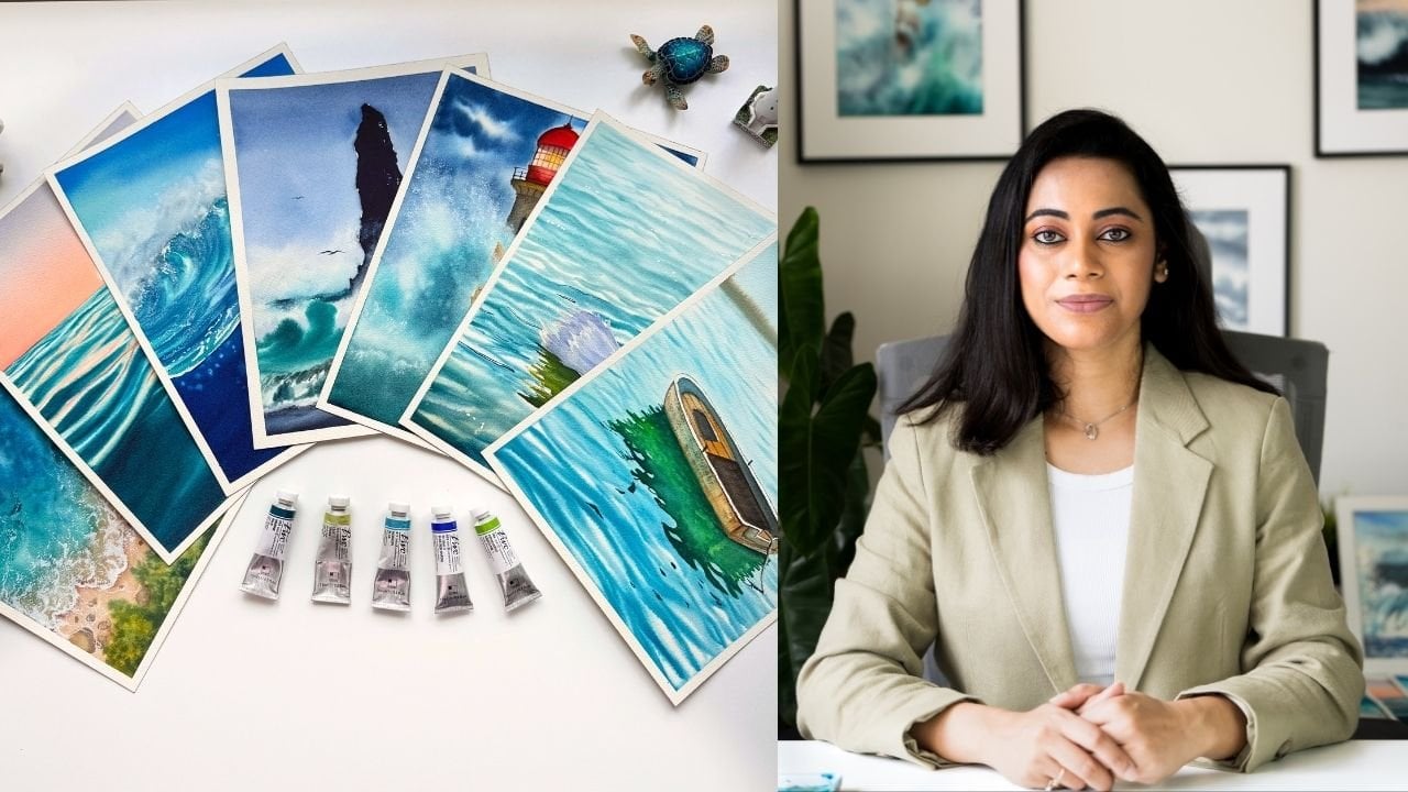
don't know much about me, I am Nilim Roy an
art educator and a watercolor artist
with four years of experience exploring
this magical medium. Currently, I am the
brand ambassador to a South Korean paint brand named Shinhanat and Sitar am
Stationers in India. My journey with watercolors has been one of a
constant exploration. Every stroke reveals
something new, and it is this very
unpredictability that makes watercolor
so fascinating. Today, in this class, we will focus on
mastering one of the most magical qualities of watercolors that
is transparency. Transparency is what gives watercolor paintings its luminous glow and
incredible depth. In this class, we
will systematically explore what is transparency
and why it is important, how to identify transparent, semi transparent
and opaque pigms, correlation of staining and non staining pigments
to transparency and techniques to create transparent mixes
from opaque colors. Our class project
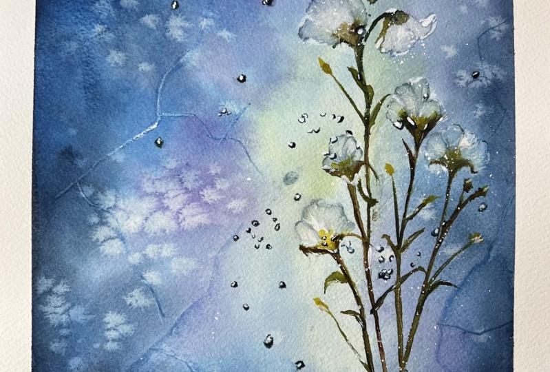
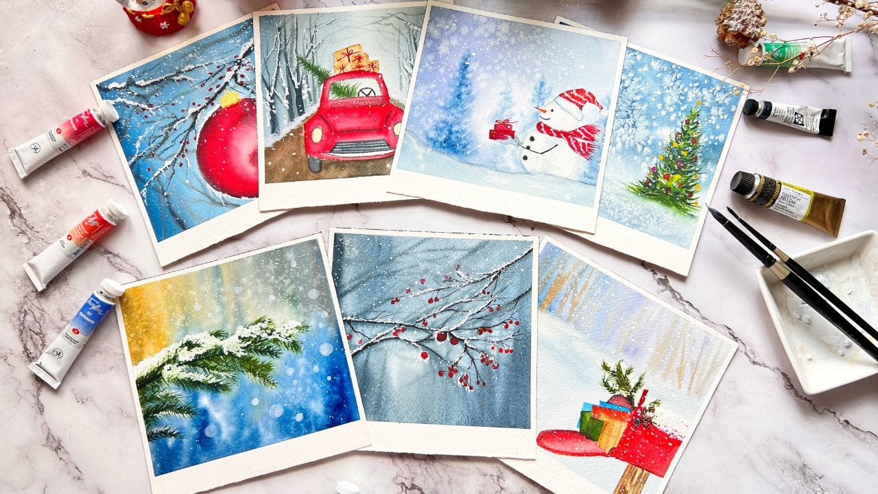
will reinforce all of these learnings in creating this beautiful winter
themed painting. We will begin our
class project by selecting the color
palette for our class, focusing on the properties
of transparency and the stining behavior of
the watercolor pigments. Then we will simplify
the reference and create a sketch to
establish our composition. Next, we will dive into
loose expressive wet on wet strokes to form organic
patterns and shapes, mimicking the natural cracks and textures found in the eyes. The class is designed with easy to follow manageable
steps removing the stress of
recreating the painting and encouraging you
to enjoy the process. As we progress, we
will use laying techniques to create
the illusion of depth, making the flower stem appear as though it
is encased in ice. This is the magic of watercolor
transparency in action. By the end of this class, you will have a solid grasp
of watercolor transparency, empowering you to elevate
your work by making intentional color choices which you could use for
your future projects. Whether you are a
watercolor enthusiast or someone looking to refresh
your creative skills, this class offers you a comprehensive exploration
of the subject. So grab your brushes and
paints and let's get started. In the next section,
I will take you through about how the
class is organized. So meet me at the next lesson.
2. Class Overview: Thank you for
joining this class. I'm thrilled to have you here. Let me quickly take you through how the
class is organized. To begin with the class, we will explore how transparency in watercolors creates depth, luminosity, and glowing effects that make your
paintings captivating. Next, we will learn to
identify transparent, semi transparent and
opaque colors using simple techniques
like the grid test and understand their
impact on your work. The next lesson is all about creating transparent
color mixes, where I will show you to create temporary transparent mixes by blending colors and
adjusting water levels. We will then understand how transparency
influences layer, glazing, and the overall mood of
your painting through the help of our layering
or glazing charts. Combining all of these learnings from the previous lessons, we will put into
practice by carefully selecting a palette
of transparent colors using techniques like
layering and wet on wet to replicate the ici texture and depth for our class project. I would also highly recommend
watching the entire class first so you can mentally
prepare for what's coming next. This will give you a
clearer understanding of the process and flow, making it easier to follow along and fully enjoy the
creative journey ahead. In the projects and
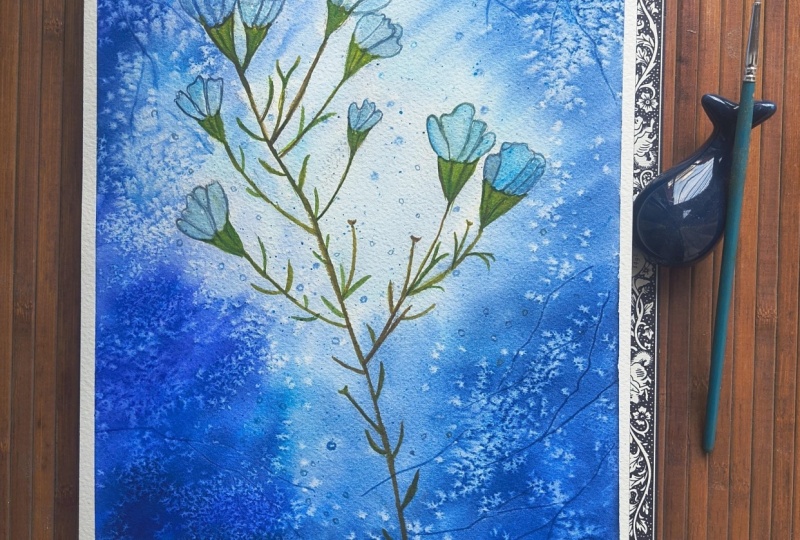
resources section, I have added the original
reference image, my final artwork, and a sketch you can trace
or print for guidance. Feel free to
experiment and upload your finished painting
under submit project. I would love to
see your work and provide feedback
to help you grow. If you are on social media, tag me at the rate Neil's
arts Underscore Cove. I would be thrilled to
share your creations. And last but not the least, don't forget to
follow me here on Skill Share for updates on
new classes and giveaways.
3. About Supplies: Welcome to the supply section. Let's quickly take a look
at all the materials or the supplies that we are going to need to
create a project. The first and the most
important supply we will need for this class
is watercolor paper. I'm using here Saunders
waterfot paper, a premium quality watercolor
or aquaril paper. It is made from 100% cotton
acid free archival grade and is perfect for
professional results. The paper I'm using
is coal pressed, also known as grain fine, denoted by the
letter CiPi naught. Here is a close look
at its texture. It's not overly grainy, nor it is as smooth
as hot press paper. It strikes a perfect balance, offering just the right
amount of texture to deliver stunning results for
any watercolor painting. Now it's absolutely
okay if you do not have the same exact brand of
paper that I'm using. Feel free to use
any brand that you are comfortable with
or you have on hand. As long as it is 100%
cotton, coal pressed, and at least 300 GSM in
thickness, it should be fine. If 300 GSM isn't available, a minimum of 250 GSM
would also work. The paper that I'm using here is a size in between A three
and an A four size, but you are welcome to choose any size you feel
comfortable painting on. The key is to work with
what suits you the best. Next, let's talk
about our colors. For this class, I'm using
professional grade paints from Shannan Arts extrafine
watercolors from their PWC range. I have been using this brand for several years and
absolutely love the colors. Being artist grade and
made with single pigments, they offer excellent clarity and transparency just as
watercolors should. Specific colors selected for the class project will be
discussed in detail in the selection of the color
palette lesson where I'll share the pigment names and
explain why they were chosen. As mentioned earlier, it's
perfectly fine if you do not have the same exact brand
or colors that I'm using. Feel free to work with whatever supplies
you have in hand. You can always
learn and invest in higher quality materials
as you progress. Let's talk about our brushes. For the classes, I'll be using a few key favorite
brushes of mine. First one is this hake brush. This one is from
silver Atia series and with bristles which
are made from goat hair. It's incredibly soft and has
excellent water to paint holding capsity making it perfect for watercolors
and laying flat washes. Nextus round brushes. I'll be using a
size 12 round brush from silver black velvet series, which is ideal for
versatile strokes. Alongside that, I
will be using size six round brush or an
ultra round brush. My ultra round brush is from
the silver silt series. The next brush is
this detailing brush. I'll be using size two synthetic round brush from the same
silver silt series. Now, apart from them, I'll be also using
these blend brushes. The purpose of the
blending mops is to blend the colors very softly on
wet and wet background. So either you can go for the silver reteliaGtir
mob brush or a synthetic blend
squirrel blend mop brush or a natural squirrel mop brush, anything that you have got. It's absolutely fine if you
do not have mop brushes, as long as you
have round brushes in sizes 12, six, and two, or even a mini liner or a detailing brush in size
one or two, you are all set. That's pretty much
everything about brushes. Next, we will need
a palette knife, which we will use
to create textures. If you do not have
a palette knife, you can also use expired or discarded
cards as a substitute. We will also need salt for
additional texture effects. Regular table salt
works perfectly fine, but you can also experiment with chunkier options like
rock salt or kosher salt. Just use whatever you
have in your kitchen. Finally, we'll need some
basic sketching supplies, a mechanical pencil
with HB lead, preferably 0.3 MMM
thickness and an eraser. Now you can use any
pencil that you have got. The next supply that you would
need is your masking tape. This will be used to tape
down your paper on fo sites. Next is palette. I'll be using a ceramic palette along with a mixing tray to
create color pools. Next will be tissue
paper or towels. These are essential for lifting. We will also need two
jars of clean water, one for rinsing your brushes, and another one is
as a fresh source of water for laying flat
washes on the paper. Another essential supply
that you would need is a spray bottle to miss the paper lightly and
keep it moist as needed. And that's all the
materials that you will need to get
started with the class. So gather your supplies, and let's begin this
creative journey together. See you in the first lesson.
4. What is Transparency ?: If you are wondering what is transparency, let me explain. Transparency refers to the
ability of watercolor paint to allow light to pass through it and reflect off
the paper beneath. This property is what
makes watercolor unique compared to opaque mediums
such as acrylics or guash. Let me demonstrate this
concept using simple swatches. I'm starting with my
ultramarine blue, a transparent watercolor. First, I create a watery pool of the color by diluting it
with plenty of water. Then I apply it in
a thin layer over this black grid which I have prepared using a
black permanent ink. As you can see, the black grid
remains visible throughout the transparent layer and the whites of the
paper shines through. This effect will be more pronounced when it
dries completely. Next, I'm repeating the
same using gouache, which is an opaque medium. I use the same ultramarine shade but apply it over
the black grid. Notice how the paint
sits on top of the grid, partially covering
the black lines and giving a more
solid appearance. Finally, I do the
same with acrylics. With this opaque medium, the effect is even
more pronounced. The paint completely covers the black grid sitting
prominently on the surface, creating a vibrant bold layer. When comparing the three, the
difference becomes clear. The transparent
watercolor appears to sit behind the black grid, allowing the texture and details
beneath to show through. In contrast, both gauche and
acrylic sit above the grid, masking it and making
their opacity evident. Let's take a quick look at some of my watercolor paintings. In this, I have combined transparent and
semi opic pigments to create striking contrast. In my seascapes, I use viridian, a transparent pigment for the water in varying
tonal values. For the skies, I use semi
transparent to opaque pigments, giving them a velvety softness, perfect for creating
the dramatic feel. The colors of the sky
reflect on the sea while the luminous transparency of the viridian makes
the waves glowing. This shows that opaque pigments are not to be avoided
in watercolor. They are essential when paired thoughtfully with
transparent colors. Understanding pigment
properties allows you to make informed choices
for your palette unlocking endless
creative possibilities. In the next lesson, we'll
explore this further.
5. Determining Transparency: The transparency of
a watercolor paint can be determined by the
following three methods. Now let's take a look in detail about each
of these methods. Let's take a look at
the first method. Most professional
watercolor brands provide pigment details on their product catalog broochurs or their tube packaging
and websites. Thise properties
include transparency, staining and granulation. Look for symbols
such as open square, open square with a diagonal, half filled square,
and a fill square. If your tube lacks
the information, check the manufacturer's
website for a comprehensive breakdown
of the pigment properties. This is especially
useful for verifying details when certain
properties aren't specified. Here is an example of how Daniel Smith's website provides detailed information
about their watercolors. The list all the essential
properties of each pigment, including their
transparency, staining, granulation, light fastness,
and pigment composition. You can find all the
pigment properties right on your paint tubes. Look for symbols
commonly used by watercolor manufacturers such as filled square for an opaq, open square for transparent, half filled square
for semi opaq and open square with a diagonal
is for semi transparent. Now let's take a look
at the second method. That is a grid test. Draw a black grid on watercolor paper and apply
a wash of color over it. Observe the result
once it dries. If the paint is transparent, black lines are clearly visible. If the black lines are
partially obscured, it is semi opaque and
if the black lines are completely covered by the
paint layer, it is opaque. Now, if some color appears, but the black line
remains visible, it is semi transparent. It's an excellent way to test your colors and
verify transparency. If the label information
seems inconsistent, this can be the best method that you can test your paints
for transparency. The next method is
to experiment with a flat wash to further
confirm transparency, create a flat wash. Now,
what is a flat wash? A flat wash is a consistent
even layer of paint applied across the paper at one go without lifting the brush. By observing how the color
interacts with the paper, you can determine transparency. Transparent pigments will allow the paper's texture and
whiteness to shine through it, whereas the opaque
pigments will create a more solid flat layer
masking the paper beneath. Testing your colors
through this methods ensures you fully understand
their properties, allowing you to make
informed choices for your future artwork.
6. Correlation of Staining & Non-Staining Pigments to Transparency: In this lesson, let's
understand how staining versus non staining pigments affect the transparency
of a color. Now, water staining pigments. Staining pigments are those that soak into the paper fibers, making them harder to lift. Now, how do we
know if a color or a pigment is a staining
or a non staining one? We can determine so by
doing this simple test. On a black grid, lay a flat wash across and
let it dry completely. I'm mixing my peacock blue
into a thin, watery mix. After I lay a flat wash of my peacock blue
over the black grid, I let it dry completely. I will repeat the same process
using another pigment, which is my
ultramarine light and repeat the entire
process all over again. After layering a flat wash of my ultramarine blue
over this black grid, I will wait for it
to dry completely. Now, the best method
is to let the colours dry 24 hours before you go
ahead and perform this test. Once both the layers have dried, I use little water and damp a portion of my
peacock blue layer and try to lift the paint off we notice that it's difficult to remove
the paint completely. A bluish tinge remains
on the lifted areas showing that this pigment has been absorbed into
the paper fibers. Staining pigments like this, such as PB 153, such as Taloblue or
peacock blue are known for their intense vibrancy
and subtle transparency, contributing to a luminous
glowing effect when lead. I repeat the same process
with the ultramarine, and I notice that the
paint easily reactivates and lifts off revealing the
underneath of the paper. This indicates that it is
a non staining pigment which does not fully absorb
into the paper fiber. Once the paper dries, we can understand the difference between both the
colors distinctly. The white of the paper is distinctly visible under
the ultramarine blue, whereas we see a
bluish tinge appearing on the lifted areas
for the peacock blue. This test clearly
determines which is a staining and a
non staining pigment. For this reason, non
staining pigments are easier to manipulate, making them ideal for corrections and
adjustments in your work. Since they get readily
reactivated with water, you can effortlessly rework the underlying areas if needed, providing greater
flexibility and control during the
painting process. If you would have
noticed, both of my colors are made
from single pigments, single pigments tend to have more consistent transparency
because of the pigments, natural characteristics
are not altered by the blending of
different pigments which have different properties. On the other hand, mixed
pigments which are made up of more than one
pigments might result in less transparency as some pigments used
in the blends could be more opaque affecting the overall transparency
of the paint. Let's explore how
the transparency of staining pigment affects
watercolor painting. In this painting,
I use halo blue or warm staining blue to paint a bright blue sky
with fluffy clouds. When I tried lifting paint from the areas which are meant
to represent the clouds, it was difficult to
completely remove the blue, leaving a faint bluish
tinge on the paper. To effectively depict the
glowing white clouds, I used the negative
painting technique. Instead of relying on lifting
to create the cloud shapes, I outlined the shape of
the clouds with my blue and intentionally left paper
unpainted in those areas. This approach allowed me to
capture the luminosity of the clouds while avoiding the limitations of lifting
a staining pigment. Thus, by understanding the
behavior of staining pigments, you can make informed
decisions about how to work with them to
achieve the desired effects.
7. Creating Transparent Mixes: In this video, we will
learn how to prepare a transparent color mix
using an opaque color. To demonstrate the
dilution method, I have prepared a
black grid using a permanent ink marker and
allowed it to dry completely. Once dry, I remove
the masking tape, leaving our grid
ready for testing. Our grid is now all
ready. Let's begin. For this test, I'm using my neutral tint and
opaque mixed color made from two pigments, PB 66 and PBK 11. Now you can go for any
opaque color of your choice, but here I have used
neutral tint because it did not have any white
pigment mixed in it. I squeeze some paint
onto my palette and prepare a uniform paint pool
using a watery flat brush. Then I apply a single stroke
of the paint over the grid. You will notice that
the paint covers the black grid, darkening
it significantly. This shows its opaque nature. Next, I use a dropper to
add water to the paint, diluting it to create
a lighter tonal value. I mix it well and apply
it over the grid. You can see the tone lightening, but the paint still
remains some opaque. I add even more water
further thin the paint. At this stage, the layer
turns semi opaque, allowing hints of the black
grid to show through. By continuing to
dilute the paint, the intensity decreases and the mixture transitions from semi transparent to
fully transparent. This process is
similar to creating a tonal value chart
for watercolors. These lighter values of opaq colors are ideal
for layering techniques. However, since opic colors, especially those made
from mixed pigments, tend to dominate
the layers beneath, using them as an underlayer
can sometimes cause subsequent transparent or semi opic layers to appear muddy. By understanding how dilution affects opacity
and transparency, you can make more
informed choices when building layers in your
watercolor compositions. The next method is to
mix and layer colors by understanding how the
colors interact when layered, including changes in hue,
saturation, and transparency. To do this, we will go ahead and create a glazing or a
layering color chart. Now, what is a glazing
or layering chart? It is a tool that
helps you to evaluate the transparency of
watercolor paints and how they
interact when layer. It is particularly useful for understanding how pigments
behave when overlapped, revealing their potential
for creating depth, luminosity, and complex color
effects in your paintings. To create this glazing chart, I have used all my primary
warm and cool colors. You will notice that most of my primaries fall into the
categories of transparent, semi transparent and
semi opaque colors. This chart helps me
to understand how each of these colors
interacts when layered, providing valuable insights
for future projects. To start, I painted a
horizontal one stroke layer of each color across the grid and allowed it to
dry completely. Once dry, I labeled all my primaries along
the X axis of the grid. Then I repeated the process for the Y axis following
the same color order. Using a single stroke
for each color, I carefully painted vertical down the grid without
lifting my brush, ensuring smooth
and even overlaps. I observed that the
granulation effect of the ultramarine blue was prominently visible
when paired with both transparent and
semi transparent colors. When mixed with warm yellow, it created an early warm, slightly muddy tones of green. On the other hand, when paired with cooler reds and yellows, it resulted in smoother, brighter greens and purples with a clean,
vibrant appearance. Notice how smooth and vibrant
color mixes are formed when peacock blue is paired with semi opaque lemon yellow. This interactions
highlight how the nature of each pigment can
influence the final result. Depending on your needs, you can then use these
observations to select the right colors for
the specific techniques in your future projects. The possibilities are endless. Create as many glazing charts
as you like to explore the interactions between
different colors and unlock their potential. Now it's your turn to create your own glazing chart and
be amazed by the results. I will upload this
glazing chart of mine under the projects
and resources section so you can find it there.
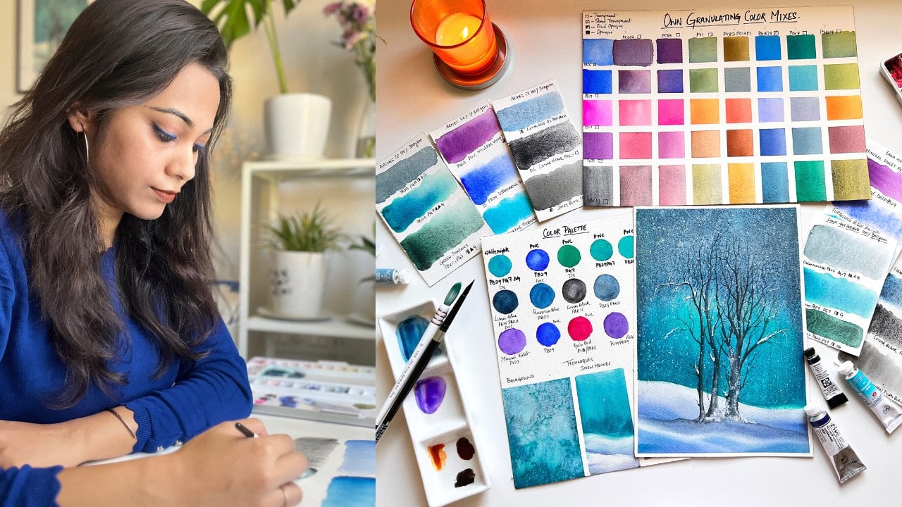
8. Selection of Color Palette: Now that we have explored the
transparency of the colors, let me share how I thoughtfully chose the color palette for
our class project. Looking at the
reference, I know I will need to work with different
tonal values or blues. My first step is to swatch
out my blues and perform the grid test to identify their transparency and
staining properties. I then narrow down the most suitable single pigment transparent and staining
blues in my collection. Here's my color selection
process for the project. For the base color, I will go ahead and choose
peacock blue, which is semi transparent and staining to lay down
the lighter bases. And now to add textures, I will use ultramarine deep and ultramarine light for their granulating
properties. You can see here how beautiful the granulating effect
of this blue pigment is. For the flower stem,
I'll use burnt sienna, which is a transparent pigment and sabgreen which is, again, a transparent pigment,
followed by a custom mix of a cool yellow with sav green to create lighter tonal variation. The stock of the flour. Now, the sap grin that I'm
using here is transparent, making it idle for creating custom lighter
yellowish green tones. To achieve this,
you can either mix your sap grin with a
transparent yellow, such as permanent yellow deep or a transparent lemon yellow. Now, the lemon yellow that I have from Shinhan
is semi opaque, but I'll show you how to make the resulting mix appear
semi transparent by adjusting the water to paint ratio using opaque to
a semi opaque paint. For this, I will
use two parts of transparent sap green and
one part of lemon yellow. Now you can see the
lemon yellow is semi opaq whereas sap
green is transparent. Here are some key points when mixing these colors that
you must keep in mind. The resulting mix
that will be produced from mixing lemon yellow and
sap green will be a smooth, yellowish green, but with
semi transparent properties. Now, how we can achieve the
semi transparent property by adjusting the proportion of lemon yellow or
the water content, you can control
the transparency. When you add more lemon yellow, it makes the mix lean towards semi transparent or
semi opaque properties. And when you add more water, it increases the transparency
and lightens the mix, requiring multiple
layers to build depth. Notice how the paint
starts to turn translucent as I keep
adding more lemon yellow. However, when I increase
the amount of sap green, it then suddenly neutralizes
the translucency, resulting into a semi
transparent mix. When the mix is wet, it may appear
slightly semi opaque, but the true nature of the transparency becomes
evident once it dries. We will wait for it
to dry completely. As it dries, you will observe
that the color appears semi transparent with the
black grid line still partially visible beneath
that layer of paint. This demonstrates how the
proportions or pigments and the drying process
significantly influence the final transparency of
your watercolor mixes. To enhance depth along the edges of the paper,
I select indigo. While enhance indigo doesn't meet my preference
for this project, I opt for indigo
from art philosophy, which delivers the
desired effect, it being a semi transparent and a highly
staining pigment. Let's recap the color choices. For the texture defects, I use my granulating
ultramarine blue, and to add contrast at
the bottom and the sides, I use indigo, along with little traces of transparent
permanent violet. Now the glow around
the stem will come from a highly
transparent cool blue. In my case, it's peacock blue. And for the flower stem, I use a combination of
browns and greens. By selecting pigments based
on their transparency, staining properties,
and their behavior, we can create a balanced and
visually engaging painting with glowing layers
and rich textures. Let's dive in and see
these choices in action.
9. Class Project- Sketching: This is the reference
that I have chosen, while it may look delicate, but it may seem
complex at first. So we will simplify it to create similar
textures and effects. Instead of replicating
it exactly, we will try to give it a
unique artistic touch. I would recommend watching the entire sketching process first before attempting
it yourself. I have printed the reference
on an A four sheet as I am painting on watercolor paper that's slightly
larger than A four, but smaller than A three. If you are working
on a smaller canvas, observe the reference
closely and note the flower stems position. It is not centrally aligned, but slightly shifted towards the right near the two
thirds intersection. I am positioning the
printed reference on my watercolor
paper and roughly marking the flower stems placement along the edge and
the bottom of the sheet. Next, I begin the
sketching process by marking the flour stalk and extending it down to form the entire stem running to
the bottom of the paper. It's a simple sketch, so I recommend watching the entire process first
before starting on your own. I begin by marking down
the flower stalk and extending it to form the entire stem running to
the bottom of the paper. But first, while forming
the flower stem, I create this V shape. As you can see, the
first two flowers in the reference are positioned
exactly in the same way, and then I join it
to form the stem. As I reach the lower
half of the flower stem, I draw another line
extending to the right, forming a V shape to create the internode of another stem. The basic outline of the
stem is now complete. We now add the flower stalks and leaves to completely
finish of the sketch. A Now slowly, we will start to create the flower and start
forming its petals. So these are very easy. It's more like a kind of tulip, but not exactly a tip. So it has almost three or
four petals per flower. We will now extend the
lower half of the stem, leaving a 1 centimeter gap from the bottom
edge of the paper, just like how you see
it on the reference. Next, we will add the stems, leaves and complete
the sketch by drawing the flower petals
on the internodal stem. Here I'm replicating
the flower stem as seen in the reference, since I'm working on a
larger sheet of paper. However, feel free to adjust
your composition by adding more or omitting some flowers and stems to suit the
size of your paper. If you are working on
a smaller sized paper, I would recommend to omit
some of the flowers so that your sketch looks neat
and not very overcrowded. Making some final
corrections to the stem, and once you are finished, our sketch will be
ready for painting. I'll include the
sketched outline, along with the reference image in the class resources section. Feel free to download and use it for your own sketching needs. Oh
10. Class Project - Background I: Our sketch is ready, and we will begin with
the background shortly. Before that, I'm squeezing out
the paints from the tubes. You can see the colors I'll be using in the left
corner of the screen. If you don't have tube paints,
that's perfectly fine. You can use pan paints instead. Just make sure to have cool and warm blues
in your palette. With that, our freshly
squeezed paints are now ready to use. A quick sprits of water
will activate them. Before we start painting, we will thoroughly
weight our paper, and I will be doing so by using my soft hack brush from silver black velvet
of size number ten. But you can use any broad
flat brush that you have got. Ideally, a soft goat
hair flat hag brush will provide you better
blending results, which you will notice as we
progress into the painting. I'm currently applying
an even layer of water across
the paper surface. Make sure to spread
the water uniformly, avoiding any puddles
or uneven spots. Using a back and forth
motion with my hack brush, I'm ensuring that the paper is evenly coated with a
flat wash of water. You can do this step
multiple times, ensuring that the paper is
uniformly coated with water. Once the paper has an
even shine and you are satisfied with the
uniform water application, we will move on to the next step that is paint application. For this, I will be switching to my size number 12 round brush
from silver black velvet. I chose this brush for a sharp pointed tip and rounded belly which
holds water effectively. Using the tip and
toe of my wet brush, I will be picking up
some of my peacock blue. The peacock blue
that I'm using here is from Shannan
arts peacock blue. Using the pigment PB 15 is 23. It is a cool, semi
transparent pigment, but it also has a semi
staining property. So I'm creating a watery
pool of a light tonal value. This diluted mix will ensure the transparent appearance
as the paint starts drying, maintaining the delicate
effect we are aiming for. I'm starting with a very light
tonal wash of cool blue, randomly covering areas
on the left side of the paper while leaving some white spaces
to show through. Notice that I have avoided painting close to
the flower stem, leaving those areas
white for now. As we progress, we can
then decide whether to fill some of those gaps
based on our preference. Next, using a watery brush, I'll mix ultramarine blue
deep to a medium tonal value. This is a beautiful granulating and transparent warm blue. I'll use it to layer
the leftmost corners, enhancing depth without fully covering the light wash
of cool blue underneath. Let's begin adding
mid tonal values of ultramarine blue to the lower
right corner of the paper, keeping the mix watery to
ensure it stays wet longer. This allows the darker and
the lighter tones to blend seamlessly achieving the soft blended appearance
we are aiming for. Now closer to the flower stem, I'll carefully apply a very light tonal
wash of cooler blue. That is my peacock blue to
preserve its luminous quality. Next, switching to a size number six pointed damp round brush. I will fill the smaller
details around a stem with delicate light wash.
Once this layer dries, you will notice the dreamy luminous effect we are creating. Here in the upper right corner, you can see that the previous
layer has dried already. So in order to create
a smooth blend, I will be using my
size number 12 brush loaded with a watery mix of my peacock blue and begin to fill the area while blending
the colors seamlessly. This technique is known as layering with transparent
tonal washes, which helps build the depth and dimension we
are looking for. But With the same size number six brush, I'm going to load a little
medium tonal value of my peacock blue and blend it into the lighter tones
that we layered earlier, blending it seamlessly
because now we will start layering our darker tones towards the corner edges
of left and right. Before we start adding
darker tones of blue, to enhance the texture, I'll add water splatters, which will help
disperse the paint and produce beautiful
organic patterns. I am absolutely loving
how the ultramarine blue has granulated and blended so beautifully with
the peacock blue, creating a moody
spontaneous effect that enhances the texture. To intensify the depth, I will now add darker tones
of ultramarine blue with a hint of permanent violet to the left corners
of the paper. Mixing little amount of my ultramarine violet
with this watery mix of ultramarine blue and
dropping it randomly into certain spots
at the left corner. Here, the strokes
are totally random. Since the paper is wet, the colors will disperse beautifully into
the wet background. With my damp watery brush, I'm pushing out the
cooler tones of blue towards the darker
tones of my ultramarine, which I just lay to
facilitate that blending. To lay the groundwork for the appearance of
the frozen leg, I use the tip of my brush to create subtle
slanted strokes. These strokes will play
a key role later in the process as they help
build the illusion of cracks, adding a sense of realism and
texture to the icy surface. Using my damp tri
coat hair hag brush, I softly blend the colors, starting from the
light peacock blue and moving outward
towards the darker tones. Observe the gentle control
brush movements here. Applying too much
pressure can lift off the layer since our
background is still wet. I repeat this process
for the bottom and the side darker tones of
ultramarine, but this time, I reverse the strokes, converging them inward to create a cohesive
seamless blend. Switching to my blended
squirrel mob brush, I create a puddle
of darker values by mixing indigo with ultramarine
blue to build depth. Insured the consistency
of this mix is balanced. It should be fluid enough
to layer on wet paper, but not overly watery, as it can make controlling
the flow of colors difficult. At this stage, if you
notice the colors aren't dispersing or moving properly on the wet paper as it should, it's a sign that the
surface has started to dry to avoid disturbing
the underlying layers, Lightly miss the paper with a spray bottle to rehydrate it, allowing for smooth blending. Once you do this step, you will notice the
stark difference. Now the colors will be easily
moving and flowing across the paper and your brush will be gliding very smoothly
onto your paper. This is the magic of wet on wet. Using the same mob brush, I start layering the
darker values to the outer top edges and
bottom of the paper, leaving the center
areas lighter to create contrast and
enhance the composition, repeating the same process to the right side of
the paper as well, adding in the darker values to the cornermost
areas while leaving the areas closer to
the stem lighter. Now to create the illusion
of cracks in the eyes, I will add some sharp lines using the pointed
tip of my brush. However, it seems
better to switch to my size number six synthetic round brush
for more precision. Since the paper is wet, these lines will blend softly, creating a smooth,
natural effect rather than appearing
very hard and rigid. These lines will serve as guides for adding more
textures later on. Adding in the lines
to my left as well, here I'm using the mix of my ultramarine blue and
my permanent violet, using a very light gentle stroke with just the tip of my brush, I'm creating the strokes, now adding in some darker tones of my indigo mixed
with ultramarine. I feel we can go ahead
and add in some more of the darker tones of indigo
towards this left corner. Once you are happy and satisfied with the
lines and values, and before the paper
begins to dry completely, quickly use a
fluffy dry brush to softly blend the layers again
as we have done earlier. Here, I'm using my
smaller mob brush to blend the darker
value seamlessly, achieving the same soft
cohesive effect as before. Here at the left
bottom, if you observe, our ultramarines are completely covered with the indigo mix, so I'm just going and quickly layering a wet mix
of ultramarine, blending it all into
the wet background. Now it's time to add very light tonal wash of our
ultramarine blue mixed with our peacock blue and create this very light soft blend near to the stem of the flower, ensuring that the white
spaces are still retained. Now time to create some magic. I'm here using table
salt and sprinkling it onto this wet background
all over the area, especially the darker areas. This will give a very
beautiful outcome. Also, if you want to experiment
and enhance the textures, you could go ahead and add in some other bigger chunks
of salt particles like kosher salt or rock salt to it to have more
pronounced effect. A pro tip for you. Add salt for
additional textures, only when you feel the paper has reached a semi wet state. If you add salt well the
paper is too wet or soggy, the salt will begin to dissolve, which will then
prevent it to create the desired texture
you are looking for. Timing is the key
for this technique. Looking at my paper, I can gauge that certain areas
have started drying, which means the salt might not create the desired textures. So to help the process along, I decided to add few water splatters to allow
the salt to work its magic. At this point, I feel that some darker splatters near
the corners and sparingly around the lighter
areas will also set the tone beautifully
for our next step. So go ahead and have
some fun with it. Let the spontaneity of the splatters enhance
the overall effect. Continuing with the splatters, but being mindful not to
go overboard with it. I think with that,
I'll stop adding the splatters and prepare for the next step with
my palette knife.
11. Background II- Textures: At this stage, our
paper is semi wet, so it's a perfect time to
start with our textures. Time to have some fun
with a palette knife, to create the texture
of the cracks, use the side of the knife and gently drag it across the paper. In the direction you want
the cracks to appear. The key here is to do this when the paper is
still semi wet, wet enough to allow
movement of the paint, but not so wet that it
all blends together. Now you must be wondering how to identify the semi
wet stage of the paper. We have no idea. Here are two of my pro tips. One is visual clue. The paper will start
losing its shine but will still appear
slightly damp. You can also identify the
stage by the touch test. That is, lightly touch the
paper with your finger. If the color displaces
immediately, it is still too wet. If you feel the dampness, but the color stays in place, it's a perfect time to start creating textures. But be wary. You should not apply too much of pressure while
touching the paper, then you might just lift up
the paint because after all, the paper is still wet. Once you have found
the right stage, lightly press and drag
the palette knife. You can also use alternative
tools like old credit cards, hard plastic cards, or any other similar object to
achieve similar effects. Here are some pro tips
for you. Light pressure. Avoid applying too much of pressure as it may
tear the paper, practice few strokes on scrap paper to get
the hang of it. And then second point is
reactivating dry areas. If you notice parts of a paper have dried out and you
can't create the texture, miss the paper lightly
with one sprits of water and wait for a few seconds for the
layers to reactivate. Be careful not to
oversprit or you may need to wait longer for the paper to return to
the semi wet stage. I hope you find
these tips helpful if you find any
hiccups along the way, and this will make the process much more smoother
and enjoyable for you. I will continue creating
the cracks until I'm satisfied and they resemble
the texture in our reference. Once I feel they are just right, I'll stop and avoid
overworking them. At this point, the paper at the top has started to dry out. Well, the bottom
part is still wet. So I'm going with the
next step of using a crushed tissue paper to create some additional textures. But this is totally an
optional step for you. If you feel that your
paper has started to dry, please skip this step. It's pointless to go on with this dry tissue paper over a dry paper because you will not be able to get
the desired result. If you are not aware of which
technique I'm using here, so this dabbing technique is also known as the
lifting technique, which involves lifting of wet paint from the paper
to create textures. Here I'm using a crushed
tissue rolled into a ball to generate the subtle
textures of a frozen lake. Notice how gently and
randomly I'm dabbing the tissue ball across the wet areas to
achieve this effect. We will now move on to
our next step that is creating the trapped
bubbles in the icy waters. If you are feeling a bit
overwhelmed at this point, take a break and come back
when you feel refreshed. There is no rush at all. This step uses the
wet on dry technique, so you can resume exactly where you left off
whenever you are ready. I begin by reactivating my cool blue on the
mixing palette. For this step, we will use a light tonal value to mark
the shape of each bubble. Notice that I focus
on the lighter areas where we had earlier
splattered our darker color. I carefully go around
those tiny plattered dots, shaping them into bubbles. Then I fill the bubbles
with darker values, blending them softly with the dam brush in
the lighter areas. This blending creates
a natural transition, giving the bubbles a realistic and three
dimensional appearance. For this step, I
recommend using a thin, pointy round brush, preferably size one or two or
even size zero. Choose the brush
size you are most comfortable with to create
the delicate bubbles. The finer the brush, the more precision you will have for shaping and
detailing the bubbles, making them look
realistic and refined. I will continue creating
these bubbles in varying sizes to achieve a
look similar to our reference. But I'll be careful
not to go overboard. Always remember, there is
no end to adding details, so it's essential to
know when to stop. One effective way
to decide is to pause and view your
painting from a distance. If you feel happy and
satisfied with how it looks, that's your cue to stop. Trust your instincts,
and enjoy the process. The next few minutes will be dedicated to adding and
shaping these bubbles, bringing them to life on paper. While it is an easy step, it can be a bit time
consuming since we are creating multiple bubbles
of varying sizes at once. Because it is a
repetitive process, I have sped the process up. I suggest you watch the entire video first
before painting along. This way, you will be
fully prepared for the next step and can
follow along more smoothly. With this final bubble, I'll stop here and prepare for the next step that is painting the mean flower stem
and the petals.
12. Flower Stem - Wet On Dry: All right. Let's begin with
the flower stem and petals. I'll start by
painting the flower petal using the
layering technique. First, I'll apply
a light tonal wash with my indigo and peacock blue. I will use indigo to outline
the shape of the petal, and then with a
slightly damp brush, I'll fade in the peacock blue. This creates the illusion of a white petal trapped in the eyes, adding depth and the required
texture to the design. As you can see, once I have finished outlining
the first petal, I load the tip of my brush with a very light tonal
value of peacock blue. I start filling in the petal, beginning from the edges and gradually working my
way towards the center. This ensures that there are no harsh lines between the outline and the
body of the petal, even while using the
wet on dry technique. Now, if you are wondering
what is wet on dry technique, it is a technique which involves applying wet paint
onto dry paper, allowing for controlled layers
and smooth transitions. Will continue painting the
other petals in the same way. Since the petals are small, it's important to maintain control over your brush strokes. That is why I would
recommend using a size number two
round brush with a pointed tip like the one
I'm using in this video. This will help you
achieve precision and control while painting the delicate details
of the petals. I'll continue using
the same technique to complete the other petals
and allow them to dry. Once dry, I'll reassess and see if any additional layers are needed to enhance the depth. Y with this last petal, I'm done with
painting the flour. Now I will move on to painting the flour stock connecting
it to the stem. For the stalk, I'll be using a beautiful yellowish
green color. You can mix lemon yellow with sap green to create
a similar shade. Here I have added a tinge
of my burnt sienna into this greenish yellow
mix to turn it into a similar color as that
you see in the reference. Towards the bottom of the stalk, I'll add darker tones of green. To achieve this, you
can either go ahead and mix your ultramarin blue with
the yellow green mixture. Or use the sa green with
medium tonal value directly. I recommend mixing the
colors and testing them on a scrap piece of paper first to ensure they match the
tone you are aiming for. I am painting directly
on the paper here due to years of experience with tonal values and color mixing. But for beginners, it is always best to test your color mixes on a scrap piece of paper before painting the stalk and
the stem of the flour. This entire process of
painting the stock and the stem will be done using
the wet on dry technique. It can feel a little
monotonous at times as we will be switching between browns and greens to finish
painting the stem. To make this process
more efficient, I'll speed it up here. I recommend watching
the entire video first so you can see where
the color switches happen. This will help you stay prepared and organized when
you paint along with me. If you so observe closely, I will first complete the flower stalks before
moving on to the main stem. There is nothing new
to explain here. I'm simply repeating
the same steps that we used to paint
the stalks earlier. So just relax and
enjoy the process with a warm drink and
maybe some good music. And You can now slowly see how our painting is coming to life as we
complete the flower stalks. Now it's time to move
on to the main stem. To begin, I will first layer a light tonal value of yellow green on almost
half of the stem, connecting it to the
stalks at the top. Then I will use the
mid tunnel value of burnt sienna to
finish the stem. I'm making sure to stick to
the outline of the stem we created as I don't want it to look too thick or
out of proportion. And to achieve this, I'm using a small pointed brush
of size number two. Take your time and be
patient with your strokes. Here is a quick tip. You will get smooth, clean
strokes from the tip of your brush only if
your paint mixture has a creamy consistency. If your paint is too dry, it will result in dry and
patchy strokes on your paper, so make sure you adjust the consistency of
paint accordingly. Now towards the
bottom of the stem, I will start adding darker tones of brown
by mixing ultramarine. When you mix ultramarine
with burnt sienna, you achieve a darker hue because these colors are complimentary
on the color wheel. Complimentary colors when mixed, neutralize each other, creating
a richer and deeper tone. Our stem is slowly
coming to life. I am now refining any wobbly lines to make it
appear clean and realistic. Next, I'll start working on the internodal stem connecting the flower stalks to the right. As you proceed, be
mindful of the amount of water you add while preparing your paint
mix for the stem. The right consistency
of paint is the key to achieve smooth
and precise strokes. I will now start adding the dried empty flower stalks using my same burnt sienna mix. Once these are complete, we will then move on to
painting the leaves. Just here at this part, I'll add a little
yellow green mix and blend it directly
on the paper. This adjustment is only
for this specific area, as you can observe the same effect is there
in the reference to. Oh, I just noticed that I missed painting the stalk of
the flower on the left. So I'll just quickly go
and complete that now, and I also see
that the bottom of few stalks on the top of
those flowers have faded out. So we will go back in and
add mid toonal values of sap green to bring in more
depth to those areas. Aside from the ulivations, I think there is nothing much to explain about
painting this stem. It is quite self explanatory if you follow along
on the screen. Now it's time to add the leaves. I'll begin at the
top by painting the first two small leaves using mid tonal
values of sap green. To bring variation and make the leaves look
little more dynamic, I will occasionally add
darker and lighter tones of green as we keep
painting the other leaves. The variation will help the stem pop and
appear more realistic. For the leaves, I am
continuing to use the same technique that is our wet on dry
technique as before. For painting the leaves, I have switched to my size
six ultra round brush. Its beautifully
pointed tip allows me to create those
sharp strokes while its decent belly holds
enough paint and water to paint these leaves
in one smooth stroke. If you use a smaller brush, the process might
just become more time consuming as you would need to reload your brush frequently, and this could also lead to inconsistencies in the
tonal value of the paint. That is why I recommend using a brush with
a sharp tip for precision and a good
belly to achieve those broad, consistent
strokes effortlessly. So for my recommendation,
sizes four, five or six of round brush with a pointed tip is a good choice
for painting the sleeves. Recently, I added this ultra round brush
to my collection, and I couldn't be happier
with my decision. Now, you must be wondering, what's the difference between an ultra round brush and
a standard round brush. So here are the difference. Ultra round brushes feature this exceptionally fine and
sharp pointed tip, which allows you to create fine lines details or
any intricate work. Well, standard round brushes have a moderately pointed tip, which may be versatile
for general use, but you cannot use for very
precise detailed work. And also the stroke control. Ultra round brushes
tapered design provides excellent control for both delicate and bold strokes, making it versatile for
one stroke technique. And hence, my
recommendation to at least have one ultraound brush
in your brush collection. I will complete the
remaining leaves using the same techniques, starting with a light
wash of sap green and then adding depth to the
sides using darker tones. After that, I'll finish of the stalk behind the
first flower we painted. Once done, we will
then move on to the next segment that is
painting the flower petals.
13. Flower Petals-Layering : Okay, let's proceed to paint the remaining flowers just as
we did with the first one. I will begin by applying a mid tonal value of indigo to outline the
edges of the petals. Using my Sisix
ultra round brush, I will then paint the insides with a light tonal
value of indigo, lifting off pigment as needed to expose the
underpainted paper blue. This same approach will be
used for all the flowers. Take a note of the light source. For flowers in the
lighter areas, keep the tonal value
soft and delicate. For flowers in the darker areas, you can add more layers to
create a stronger contrast, giving the illusion
of light and shadow. Here, I slightly used a watery dark value of indigo to outline the
edges of the petals, but it was too much watery. So to rectify it, I'm using a damp brush. I gently blend the areas
to soften the edges. With the same damp brush, I attempted to lift
off some excess paint. However, I noticed that
there is too much of water, so I dab the area lightly with the tissue paper to absorb
the extra watery paint. This is an example of
the lifting technique. You can see here how we turned a potential mistake
into an opportunity. This is one of the greatest joys of working with watercolors. Mastering the right
techniques allows you to fix errors without having
to rework the entire piece. That said, your ability
to correct depends on the subject you are painting and the color palette
you have chosen. The properties of
the colors such as whether or not they are
staining or non staining, play a significant role in how easily you can
make adjustments, and I hope you are able to clearly notice
the difference here. Another practical tip
that I would like to share while working
is whenever you feel your brush has too
much of water paint or a darker tonal
value than intended. Always keep a tissue
paper or a towel handy, rub off the tip of your brush to remove the excess
water or paint. This small step
allows you to adjust the paint's value and work in a more controlled
and precise manner. Following the same process, I'm going to
complete the rest of the flowers and let
them dry completely. Once you have completed
all the flowers, observe the painting and
match it with the reference, and then decide if additional layers are
required for the flowers. If you are satisfied
with the result, move on to the next step. If not, carefully add another layer to deepen the tones and bring
out more depth. But here is one
cautionary advice. Avoid overworking this area as it can compromise the
freshness of the painting. When the painting has
completely dried, remove any dried salt
from the paper using a soft fluffy brush or by gently rubbing a tissue
paper over the salt. Be cautious not to
press too hard, especially if your darker colors are near to the
base of the paper, as you may lift off darker
tones unintentionally. Once your paper is
completely dry, we will move on
to the next step. That is to make the flour stem appear realistically
embedded in ice. To do so, we are going to go ahead with a
layering technique with a very diluted mixture of
staining cool blue pigment. In our case, I'm using
here peacock blue. Ensure the mixture is highly diluted to maintain
transparency, especially if your cool blue
isn't naturally transparent. As you can observe
in the reference, the air pockets around
the flower enhance the effect of it being
embedded in ice. To achieve this
encassing effect, we will outline around the
flower with a light mix of peacock blue mixed with
a little bit of indigo. This combination creates
a subtle realistic effect of the flower being
encased in ice. For this step, I'm using the long pointed tip of my size number six
ultra round brush. However, you can
choose any brush with a fine pointed tip to apply this detailing
with precision. Using just a damp brush, I will softly fill the
areas around the encasing. Observe how the paint
mix is kept very light and blends seamlessly with a controlled wet
on wet technique. Here I'm just going over the area with just the
damp tip of my brush. I start by preparing a pool of very diluted peacock blue mix using my size number
12 black velvet brush. This brush with a rounded belly holds an excellent
paint to water ratio, allowing me to smoothly
apply the watery mix over the flower stem and
into those wide spaces. The large belly ensures a
consistent flow of paint, making the layering
process seamless while the tip can reach out for all
those nooks and crevices. While applying, ensure you don't go over and over the
same area repeatedly, as this may reactivate the underlying layers and
disturb the transparency. Use very light handed, smooth strokes in
one single motion. Remember, the larger the brush, the larger area you
can cover in one go, making this step more efficient. This step is very
crucial as using a highly transparent pigment is essential to achieve
the desired results. Start by applying a very light
tonal wash of cool blue to leave a faint tinge of blue
on the paper once it dries. If your paint isn't
transparent in nature, dilute it until it
reaches a tonal value similar to mine and
always test the mix on a scrap piece of paper
before applying it to your painting to ensure the desired transparency
and the tone. I will not overwork
with this area. I will stop here and
let it dry completely.
14. Tapped Ice bubbles & Final Layering: Using this watery mix of my peacock blue and adding
a little bit of indigo, I first identify the shapes within the texture
to form the bubbles, outlining the bubble shape, and then I add the
darker tones of indigo towards the bottom of the
bubble, creating the depth. Now using a clean damp brush, I gently feed the darker tone upwards to maintain a
lighter area at the top, giving the illusion of
light hitting the bubble. I will repeat this technique to create bubbles of varying
shapes and sizes, ensuring that each one has its
unique character and glow. Now you do not need to fill the entire area along the
textures with bubbles. Just a few will
effectively portray the scene of trapped
bubbles within the eyes. Here I'm using my
mini liner brush to create bubbles of varying
small and medium sizes. A fine pointed brush works well, so I would recommend
you using a brush, which has a very
fine pointed tip allowing you to paint the
tiny bubbles with ease. The key is to vary the
size and placement to keep the effect
natural and realistic. I can identify a bigger bubble within the texture
in this darker area, so I just go ahead and outline it with a
medium tonal value of indigo as it sits within the darker
area of the painting. Next, I feel the bottom
of the bubble with a slightly darker
tone to create depth. Now using a clean dam brush, I softly fade the
darker tones upwards, leaving the top lighter to
capture the effect of light. It's the same
technique as before, apply to a larger bubble. Now it's time to switch to white watercolor paint or
whiteqh and use a thin, pointy brush, preferably
a detailing liner brush to create the bubbles
on the flour stalks. We will create bubbles around
the stalk of the flour to replicate the effect
of the trapped bubbles. The technique remains the same. That is outlined
the bubble shape first using white paint, focusing on the darker
green areas of the stalk. As you can see in the reference, this helps enhance
the realism and makes the bubble stand out beautifully against the darker background. Make sure to prepare a
creamy consistency of white paint that is neither
too thick nor too watery. Achieving the perfect
consistency allows your brush to glide smoothly
while outlining the bubbles. As you can see here, I struggled a bit with that consistency
of white paint. So prepare your mix accordingly. Focus on creating bubbles that are medium
to small in size, as you can observe it in the reference rather than
going for larger ones. This balance will help maintain the realism of the
trap bubbles effect. Here is a closer Zoomed
in look at the process. I will continue creating
these bubbles until the result closely resembles
to that of the reference. While I'm not aiming to
replicate the reference exactly, my goal is to create somewhat similar effect that conveys the same
idea effectively. Using the pointed
tip of the brush, I create sharp thin lines to indicate the freezing
effect on the stem. Thise delicate lines
will add texture and enhance the realistic
appearance of the frozen stem. Here, I switched to my size
six ultra round brush, loaded it with a light
watery tonal value of peacock blue to fill in
the whiter areas of the stem. If you remember correctly, we initially applied a
very light tonal wash or peacock blue in this area, but it has now faded. Now I'll go over it with
another delicate wash or blue to bring back
the subtle tones and enhance the overall effect. For the next few minutes, I will continue painting
these tiny water droplets on the flower stalks and
adding textures to the stem to depict
this encassing effect. I hope you are not
feeling bored. Sometimes patience
with the process rewards us handsomely
at the end. So let's stay focused
and enjoy this process. If you're feeling overwhelmed or tired from painting
continuously, take a moment to stretch, go for a short little break, stroll around or sip
on a refreshing drink. Taking little breaks
during the process can help you regain focus and
come back with fresh energy. Give it a try and let
me know how it affected your mood and perspective when you resumed back your painting. Oh. Continuing with some thin, delicate lines along the stem by mixing my white along with that very light tonal value of peacock blue to keep things
interesting and minimal. And here I have sped up
this process because it's the same repetition of
steps that I'm doing here. So feel free to watch
the entire process, and then you can paint along. Once you have completed the frozen textures on
the flowers and stems, we will move on to
our final step, that is the layering process. For the next step, ensure your paper is completely
dry and laying flat. To make sure the flower stem
appears encased in ice, we will apply a thin wash of light peacock
blue over the stem, focusing on the
lighter areas only. Be careful not to touch the darker areas as preserving
their contrast is the key. The layering process will
enhance the depth and giving the encastefect
that we are aiming for. For this step, prepare a very light tonal pool
of your cool blue and load it onto your flat
head broad hake brush. Softer brush is recommended for this step because you
need to go very lightly and gently over these
areas and spread it out outwards into the darker areas like the way I am
doing out here. Sure not to exerting
too much of pressure as you may lift the
colors from the stem. Because those colors
are not staining, so you need to be
very careful and go on layering this
color onto the areas. Do not go touch
the darker areas. You just need to confine your strokes within the
lighter areas of the paper. Next step is to let your
paper dry completely so that it lays flat once it is flat
and it has dried completely, peel off the tapes by
pressing the paper softly, but ensuring that you're
not ripping off the paper. And with that, our beautiful, frozen winter lake is complete. Take a moment to step
back, admire your work, and give yourself a
well deserved pat on the back for
making it to the end. I'll see you in the next
lesson where we will wrap up the class with a recap of everything we
have learned so far. Great job, and thank you
for painting along with me.
15. Final Thoughts: Congratulations on
completing the class. Let's take a moment to quickly recap about the
learnings of this class. Transparency is the heart and soul of watercolor painting, allowing light to
pass through and create those beautiful
luminous effects we love. We then learned how to
identify transparent, semi transparent and
opaque colors and how these properties
influence layering and depth in your artwork. Together, we explore techniques
like lacing, dilution, and creating transparent mixes, which are powerful tools to elevate your watercolor skills. Here are some bonus tips
for selecting pigments. Choose transparent colors
when layering is the key because they help build depth
without causing muddiness. Use staining pigments
for vibrant glazes and non staining pigments to
achieve soft texture defects. Always test your
pigments beforehand to understand how they
interact with light and paper. I can't wait to see
the magic you create. Don't hesitate to
upload your work in the submit project
section of the class. While you are there,
take a moment to browse through your
fellow artists projects. L and comment to cheer them on. Let's celebrate each
other's creativity. If you have special
recommendations or suggestions for
future classes, please feel free to share them under the discussion
section of the class. You can also ask any questions about watercolors or this class, and I will do my best to
answer them promptly. I hope you have
enjoyed this class. If you found this
class valuable, then please feel free
to leave a review. It not only helps the class
reach a wider audience, but it also supports my
journey as an instructor. Thank you once
again for joining. I'll see you in my next class.
16. Bonus Lesson: Color Palette: Hello, my creatives. I'm back with a bonus
lesson for this class. And for this entire painting, we will be just using
the five basic colors. Let me quickly swatch them and walk you
through the palette. One important thing
to keep in mind, just as we discussed in the previous lessons
is to always check the transparency
or the properties of your watercolors
before you begin. Now I have already sketched out the horizon line and the
mountains in the distant. Here, we will introduce warm sunset colors for the
sky and for the frozen lake, we will stick to cooler
blues in the foreground and subtly mimic the sunset hues as reflections on
the icy surface. So now let's get started
with spatching our yellows. The first color is
my naples yellow, the only opaque color in
our selected palette. Now, when you observe this
yellow is very opaque, but when you tone
it down with water, you obtain the
light tonal values which are pretty
much transparent. Next yellow that
I'm going to swatch out is my permanent
yellow orange. This is a very beautiful, warm and very transparent
yellow orange from Shinhan. Both of these colors are from Shinhanart PWC extrafin
watercolor range. Now coming to the
blues, for a change, I'll be using blues
from Izaro watercolors, Belgian brand known for their beautiful handmade
paints, and I'm loving it. And you can see just how
richly pigmented they are. The blue that I'm spatching
here is my halo blue, and it is very transparent. You can see here clearly, right? Thalo blue that I
have swatched here is a cool blue consisting
of pigment PB 15 is 23. Now the next blue that
I'm going to swatch out here is an Idanthn blue, which is a very warm and
highly pigmented color and also very transparent. Now, this consists of
the pigment PB 60. Now, when you mix
your danthn blue with your burnt timber or any
other darker shade of brown, it creates a very deep and
darker values of blue. If you use both these colors
as transparent colors, then the darker mix will
also be transparent. But if any of these
mixing colors are semi-transparent
or semi opaque, then the result will
also depend accordingly. Now instead of this donthnblue, you could also use
your Indigo or mix a little bit of neutral
tint into your thalo blue. Here is a recap of the colors
that we have swatched out.
17. Bonus Lesson: The Sky Part 1: Okay, now let's get
started with our sketch. The sketch is very simple. We are just outlining the horizon line at one
third of the paper, and then we will sketch
the distant mountains, keeping it very
simple and basic. There is no details
involved in here. Once our sketch is ready, we will then move on to the sky where we are going to use
the wet-on-wet technique. We are painting a sunset sky, so we would require some warm
yellow tones for our sky. So let's get started. For the sky, I'm going
to go ahead with a wet-on-wet technique that is wet paints on
wet paper surface. So as a first step, I will generously wet the sky area with my Hake
brush from silver Limited. Now, making sure there are
no pools or puddles of water and carefully avoiding
the outlined mountains, I'll spread the water
uniformly across the paper. With the damp tip
of my mop brush, I'm going to prepare a
mix of my naples yellow, keeping it medium tonal value. I do not need it very watery because the
background is already wet, so I'm going to prepare a
nice buttery consistency of my naples yellow and start layering it at the
base of the horizon, moving upwards and leaving
a gap in the center. One reason I always prefer
an opaque base layer for lightwh in the sky is
what? Can you guess why? If you have taken my previous
lessons in this class of transparency or my
ultimate guide to painting watercolor skies,
you will know the answer. Curious to know why, here it is. Transparent watercolors
let the paper show through, which
is beautiful, but often it can make it tricky to achieve strong
and vibrant layers, especially when you are using the lifting technique or the layering technique
to paint your clouds. An opaque base covers
the paper more fully, so subsequent layers don't get diluted by the
whites of the paper. And hence, it is easier to control light to
dark transitions, especially when you are
painting gradient skies. So this is why it is essential to know the
properties of your colors, whether they are opaque,
transparent, or staining. Understanding how your
pigment behave allows you to make the right decisions
and picking up your colors, whether it's building
vibrant skies, creating depth in layers or controlling your light
and dark values. When you know your colors well, every brushstroke
becomes intentional and your painting comes alive
exactly the way you want it to. Here I wanted my sky to
have warmer orange tones, so I mixed in a
little bit of opera. I love how this looks. Now, if you don't
have opera with you, you can achieve a similar
effect by mixing warmer reds of vermilion into your base yellow to create a
brilliant orange, then you can layer it
gradually over the sky. One important tip is
to make sure that the colors that you are
mixing are transparent. Using opaque colors here
to mix in and layer over the opaque base layer can make the sky look heavy
and unrealistic. Transparent layers,
keep it light and airy, which makes the sky look
luminous and natural. And that's all for our sky. While we let it dry, we will move on to
painting the frozen lake. So let's get started with
our lake in the next lesson.
18. Bonus Lesson: The Lake -Part 2 : Okay, now let's begin
with the frozen lake. We are going to
mirror the sky by replicating the same
sunset colors in the lake. I'll first start with
the very light washes of my naples yellow
and then mix in a little bit of
warm yellow orange to create our sunset hues
in the lake as well. Now, for this frozen lake, we will work in single
wet-on-wet layer. This means the entire lake
will be completed in one go. While the paper is still wet, we will build depth and
contrast by layering different tonal values from
light to slightly dark, allowing the colours
to naturally blend and create that
icy reflective feel. Okay, so now let's
get on with it. I'll begin near the base
of the horizon using Naples yellow in a medium to
light watery tonal value, and we will apply this on
our dry paper surface. So here we are working
on wet on dry technique. At this stage, I'm still deciding whether I want
to paint sparkling sun ripples on the
frozen lake or simply reflect the soft light halo
that we created in the sky. I think I let that decision unfold as we progress
into the painting. Since we are working wet
on dry with a watery mix, we will have the flexibility to rethink and adjust the
sun's reflection as we go. We will continue building
the lake in layers, keeping the washers
light and fluid. This approach will give
us better control over both the intensity of the colors and the level of wetness, allowing us to work
efficiently while still maintaining softness and clarity in the reflections. Now I'm going in with my permanent yellow orange
in a medium watery mix. Here, my yellow orange
is highly transparent, and this is very
important here because if your colors are quite
opaque or semi opaque, the layer itself will
start feeling very heavy. It is very important that you choose your pigments wisely, especially if you choose
transparent pigments, it will allow the layers
underneath to glow through, keeping the lake
luminous and light. If you use opaque or
semi opaque colors, they tend to sit
heavy on the surface which can make the
frozen lake look flat or chalky and you may lose
the sense of that light and glowing reflection that
you want in your frozen here, I have added a
touch of opera pink into my yellow, orange
and naples yellow. If you do not have opera pink, a tiny amount of warm vermilion or any other warm pink
works just as well. As I blend this warm
mix into the yellows, I have decided to completely
layer this first and then use the lifting technique to create the sun's reflection. Now here I start lifting a few areas to suggest
cracks in the frozen lake. Now, you can choose to do this lifting technique
later as well, especially if you're comfortable working quickly and can maintain a smooth gradient between blues and yellows before moving
on to the lifting. This approach tends
to be much easier for intermediate artists as it requires good
control over timing, paper wetness, and
pressure when lifting. Bgness may find it challenging
to keep the paper at the right moisture level without accidentally
lifting too much color. That's why I'm demonstrating the lifting process early here. Now I have switched to a flat brush to create
that crack marks using the lifting technique and use a soft flat brush and
apply very soft pressure. We do not want hard
or sharp lines here. The goal is to keep
the crack marks very soft and subtle
at this stage. Now we will move
into the foreground. I'm preparing a
generous watery mix of my transparent,
cool halo blue. Even though we are technically
working wet on dry, the high water content
and continuous layering will prevent the
underlying washes from drying completely. This approach is one of my
favorite and is often used by most other
watercolrist who enjoy the look and feel of wet-on-wet but with
much more control. The advantage of this
technique is it allows us to build layers while still managing the
wetness of the paper. The key here is to
constantly observe your paper and adjust your water to paint
ratio accordingly. This is a very timed and
intentional approach. Once you understand it, it works completely
in your favor. My paper is still moist, which is why the blues are beautifully blending into
the yellow orange mixes. Occasionally, I might have
to switch to a flat brush and lift colour to make sure the cracks are more prominent. We need to work quickly here and coat the bottom
half of the lake with another light watery wash of yellow blue to ensure the
wetness of the paper. To work on the bottom half, I'll slightly moist the paper at an angle so that
the warm yellow, orange layers at the
top remain undisturbed. Now I'm going to layer
the bottom half with a light watery tonal value of my transparent
thalo blue mix. I'll then mix a medium to
dark value of Idothron blue, along with a touch of
my ndiki brown audio burn tumber to
create a deep blue. Make sure that the mix
is a transparent mix. I'll use this to build contrast
at the base of the lake. At this stage, we need to work quickly to create a
smooth transition from light to dark while still allowing the halo blue
underneath to show through. As I move close to
the horizon line, I'll load just the
tip of my brush with a light value of my yellow opera mix and
gently layer written. This keeps the surface active and reweights
the bottom layer, which then allows me
to lift the color easily and create the sun's
reflection in the lake. The bottom half of my
paper is still wet, so I'll quickly go and add a few tiny water splatters
and let it rest for a moment. Once the surface is just right, I'll use my palette knife. Instead of palette knife, you could also go ahead and
use your credit cards or any other plastic cards to work with the side edges and
create the crack textures. Another alternative is
to use your Kling wrap. I have already a class on creating this frozen
lake using Kling wrap. You could check that out. At this point, an
important tip is, if the paper is completely
dry at this stage, the paint won't disperse and
you won't be able to get the natural textures that you are creating with
your palette knife. So always feel your paper. Notice whether it's still moist. If there is that sheen on
your paper, it's still moist. And if it is beginning to dry, you will notice the dry patches. W Here I have gone a little overboard
with the number of cracks. If you're happy with
just a few lines that reveal that beautiful white and light yellow blue textured paper,
stop right there. You can always
enhance the effect by later splattering some
tiny water droplets. It gives a nice
beautiful effect of tiny water purple strapped
underneath the ice. To enhance the dark contrast at the bottom of the lake using my very dry brush and my
very dry dark blue mix, I'm just going to brush
it along the edges. This dry brushing adds a beautiful textured feel
along the bottom edges, so I'll stop right here. I do not want to
overwork this area. Now it's time to complete the painting by dry
brushing the mountains.
19. Bonus: The Final Details: Using my damp dry ultra
round synthetic brush, I'll prepare a dark dry mix to create dry brush
textures on the mountain, and before painting, I'll test it on a scrap piece of paper. This helps me check if the
paint consistency is right. Now, if you feel that
your brush is too damp, dab it on a tissue and
scrub it lightly on rough paper again until you start seeing those
dry, scratchy marks. Now, I'll start creating
dry brush marks directly on the mountain using just the tip and toe of my synthetic brush. As I build these textures, I'm making sure to keep my
brush strokes unidirectional, following the natural curve and flow of the mountain form. You can refer back to
the reference here. This helps the textures
feel more organic and enhances the sense of the structure and depth
in the mountains. With this, we are done
with the mountains. The next step is to add a few dry brush highlights using thick whiteqh because
as the paper dried, the white cracks
that we created on the bottom half of the paper
has almost disappeared. So I'm switching to a
synthetic liner brush to carefully create these
dry brush patterns. Earlier, I scratched the paper when the surface was too wet, and as it dried, the colors moved and
settled back into the white of the paper,
softening those cracks. This is exactly why timing is so very crucial
in watercolors. Knowing when to add texture can make or break the effect
you are trying to achieve. Our painting is completed. We will now let the
paper to dry completely, and then we will peel our
tapes from all the four sides. Before we peel off the tapes, I wanted to show you
the difference that transparent colors make,
especially in the sky. I think you can
clearly see it now. Although I love the frozen lake effect in the
left painting, the result came down
to better timing. I started scratching
and dispersing the paint just as the surface
was beginning to dry, which helped retain
those des beautifully. This really highlights
the importance of transparency and
timing in watercolors, and I hope you
enjoyed this lesson. I'll see you again in my
next class Happy painting.
 Nilam Roy, Art Instructor