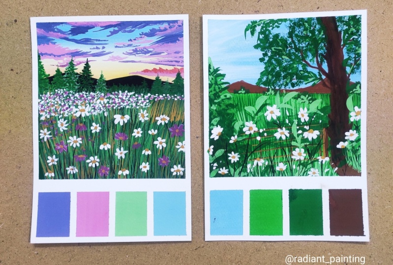
Transcripts
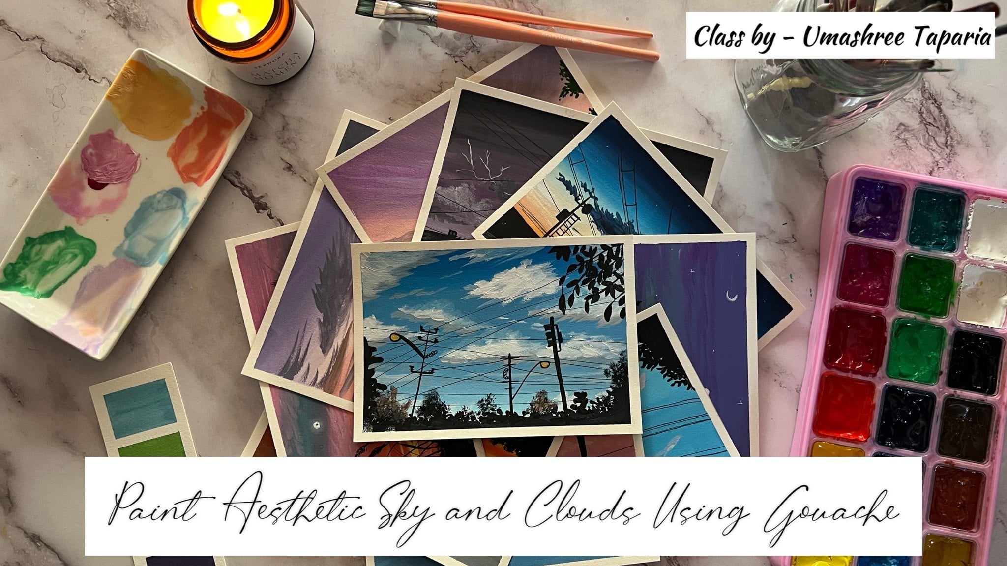
1. Welcome to the New Class: It is something about disease that the attract me the most. Recently on my trip, I just happened to witness these beautiful disease and couldn't stop staring at them. It's something about them that always wants me to
keep painting them. Hello everyone. My
sheet the patio. A chartered accountant and
an artist based in India. I won't majorly with
gouache and water follows, with watercolors being
my most favorite medium. And occasionally exploring
acrylics as well as gouache. You can find instagram
under the handle, creating from the
heart where I share all of my other works
and my creative journey. In this finance short class, we are going to be painting in this beautiful sunset
view DC field. I will be guiding
you through each of the steps for
painting in the sky, the clouds, the grass, and then the disease. Before beginning, I will be guiding you through all
the materials that we will be using for
this class projects so that you can grab them
and keep them ready. I will also be guiding
you through the taping down off the
class project paper. How we are going to
begin in taping down. We will even be discussing in the different angles of
the disease in this class, how you can add them in
different views into your field. In fact, you can follow this for any other floral field
that you wish to paint. I'm sure by the end of
this class you would get a little more clear perspective about adding in the florals
with different angles. So come join me into
this fun class and let's paint this beautiful
daisy field together. See you guys into the next
lesson of this class.
2. Materials Required: Let me quickly walk you
through the materials I'm going to be using in
this book on paper, which is approximately five
inch by eight inch in size, I'm going to be using in
this hot press paper. This has a smooth surface and it's perfect for gouache and acrylic gouache colors sliding smoothly on such hot
press top surface paper. Next you would be needing
in gouache paints. You can go ahead with any
set that is availability or n you would be needing in
a mixing palette as well. I will be guiding you through the colors that we
will be using it and mixing in the colors
if you do not have the exact same shapes. Next, or I will be mixing
the colors onto the palette, and I will be using
it a ceramic palette. And you need some dark tissues and new jars of clean water. For the white gouache. I'm going to be using in a separate palette because we will be needing a lot of it. I would be using the
masking tape to tape down my paper for
the class project. Apart from this, you will be
needing in a few brushes and going to be using in these synthetic flat and
round brushes. I will be guiding
you through each of the brush that I
will be using in. These are all the
materials that you would be needing for this class. Go grab them and I
will see you guys into the next lesson where we begin painting in her class
project for this class.
3. Taping the Paper: Let's begin with the taping
down off the paper first. I'm first going to be using in and taping down
all the foresight. And then at the
bottom of the paper, I'm going to be using
in a smallest size masking tape and taping
down four blocks. Make sure you tape
down the masking tape well on the edges and
leaving equals pieces. So first you will see
that I'm taping down the bottom edge has been we will be creating in the
bottom blocks later on after taping down
all the four edges, you can go ahead
with NSAIDs after masking tape that is
available with you. I'm Dan taping down
all the four edges and now I'm going to be creating in these four blocks at the bottom space out here. For that first-time, going to be taking down the
same masking tape and tape it down from a little
below of the center space. So approximately or whatever
space you are looking for, for creating in
those bottom blocks, you can add in, in
that much space. Now next, using in this
smallest size masking, if I'm going to be creating in the smaller blocks
out your first, I'm taping it down in
the center, more space. And then on both the sides I will be creating into blocks. Each you can go
ahead and create for the smallest size boxes or
you can even skip this, But, but just to make
it a little different, I'm going to head with
this blocking method. That does it. We are ready
with the taping down.
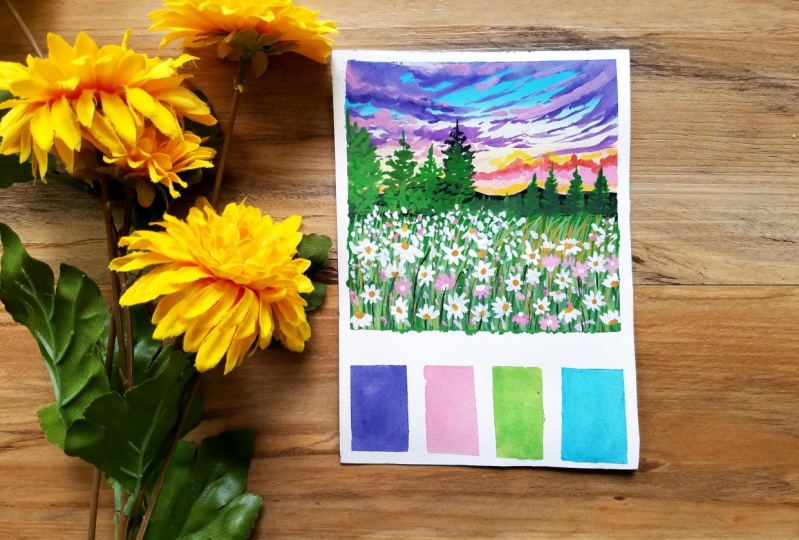
4. Daisy Field - Part 1 - Painting the Sky: Let's begin with
the class project. Now. I'm going to first show you the colors that
I'm going to be using. So for this guy, I will be using in the city in blue color. Then I will be using in
the rose madder lake, the violet color, and
the yellow color. These are the colors that I
will be using in for the sky. And I will be
guiding you through one-by-one each of the colors
that we will be using in. I'm going to first quickly
removing a little of four of these colors onto my
palette and keep them ready. You need very little of the basic colors as
we are going to be adding in white
gouache to these and creating in photo pastel colors. You can see I'm removing
in very little of the fallow for us to
settle in blue color. Next was the rows modality. Now I have removed in
the yellow light color. And lastly, I'm going to remove a little of the
red violet color. It's removing a little of the violet color and
getting it ready on my palette because
I will be adding in little highlights with
the violet color as well. So these are the five
basic colors that I'm going to be using
in for the sky. Also, I would be using in a
little of the orange color. So you can go ahead
and use a yellow, orange color, scarlet
color, home million colors. Or you can even mix in a little off the red
and the yellow to get an orange color who did not have the direct orange color. And next you would be needing
in the white gouache. So I have the colors ready. Now let's begin in with the pencil sketch for
the class project. I'm going to begin by marking
out the horizon line. This is going to be
my mountain range and below that I'm adding
in the horizon line. So I'll just define
the mountain range a little now because
I'm going to try and leave these
pieces blank while adding in the colors
as much as possible. So we have two horizon line
and almost the center of the paper and a small
mountain range on top of it. We are going to begin
in painting in the sky. First, I'm going to begin preparing the colors one-by-one. I'm using a size
eat blender brush. You can go ahead and use in any flat brush that
is available with you and post mixing in a lot of white to the
civilian blue color. Now using the space to do color, I'm going to begin in
from the top species, adding two to three stools. Then I'm going to use invite gouache and
for the lighting up this color directly on the paper without mixing it on the ballot. And then closer to
the mountain range, I'm going to be adding in the yellow color to
given the highlight of the sunset view just from
behind the mountain range. Adding in the white, you can see I am trying to blend in both of the colors and I've gotten a little lighter blue
color out there. Now I'm going to be shifting
into the yellow color. I'm going to begin adding
this onto my horizon line. But before that I'm mixing
in a little bit of white as well to the yellow
color your as well. Now you can see I've
tried to define the mountain range well and
try to maintain the edge of the mountain area so that
I can add it the colors they're easily now just blending it well with
the white color. This is just a BCR of the sky. And onto this we are going to be adding in the Cloud details. Now I'm going to
add a little paint highlights into the sky. So I've mixed in the rows meter color with a little bit of white to get into the
color pink tone your, and I'm going to begin
adding in very light strokes over to the yellow color
using in the same flat brush. You can see I've just need
literate off the color closer to the mountain
range and just adding in little strokes from
the edges and blending it away till the top blue color so as to get in
the perfect storm. If you do not have the
rows middle color, you can go ahead and use
the crimson color or any other pink tone adding in little white to create
the pace to look. Now we need to wait for a
little of the sky to set an in. Till then, I'm just going to begin preparing in the colors. So the first color
that I'm going to be picking up is this
red violet color. And then it'll tint
of the violet color. If you do not have
the red violet color, you can simply directly using the violet color and
adding a little of the crimson or any
or pink color tone that is available
in your palette. To this, I've added in a
little bit of the white color. Next I'm going to be
adding in a little bit off the black color as well for
creating in the cloud color. So basically my cloud
of the layer that I'm going to be adding in is
going to be full color mix. First, the red violet color, the violet fellow black
and the white color. I'm just going to pick up
little of these colors out. You're onto a separate space. I'm going to mix them again. I picked just a
red violet color. Now to this I'm going
to add in little of the whitewash and then a little of the violet and the black
color from the palette. The violet and the black are
going to be very minimum, so make sure you do
not add a lot of them. I'm going to swatch
this color in the bottom false blocks
that we have created in. I'll quickly mix
in this color and then swatch and
show you, though, you don't muted kind of a
violet color tone that we have achieved in by mixing
in these four colors. You're in this swatch, you can see the new deadline
of the tone that we have achieved in by
mixing in this formula, we are going to create a
lighter tone of this as well for adding in the
highlights in the Cloud. So first I have
added in the tube of the white gouache to
this again so as to get the lighter tone
first for adding in those highlights
to the Cloud. So I'm just mixing a little of the colors again to get
in the lighter tone. Now using in the smallest
size flat brush, I'm just going to
begin adding in the clouds from the
top space suggests basically I'm going
to be adding in very simple cloud ships
coming in from the edges, creating in very draft
Edge Cloud details. You can see how slowly just
using the tip of my brush, I'm pulling out these
clouds strokes from the edges and giving
him the Cloud detail in-between you can see
I'm making sure that the blue color is still
visible in the center space. So it's very important that
you maintain the center look colors or the peace Leo
colors that we have added in. Now in-between, you will
notice I'm just using in very fine lines using
the tip of the brush, creating in smaller
plots as I'm moving towards the bottom
of the sky area. That is because as I'm
reaching in the yellow color, I'm going to be adding in the clouds using in
the other colors. Hence just giving it
a little detail with the violet color clouds
that we have created in. Now picking up the
white gouache, I'm again mixing it with a
little bit of the rules, muddled colors, getting
enough pink color again. And using this pastel
pinkish red tone, I'm going to follow the
begin adding clouds at the bottom of this
guys is majorly closer towards the mountain
range and onto the yellow sky part we are going to be adding
in these clouds. Now you're, I'm
using a round brush and just creating a
random Crowd shapes, moving my brush in
circular motions. You can add the same using an a flat brush just as we
were adding at the top area. So again, I just wanted
to show you the two ways, how you can add the clouds
are step-by-step together. Now using in this color, I'm going to add in little
lighter highlight cloud onto the violet color clouds that we have already added in. Now to some of the blending I'm just going to use
in a damp brush and quickly blend both of the colors beliefs that they have the perfect
blending effect. You can see how I'm
adding in the pink color now and add pleases just
using the damp brush, I'm blending both of them
together so as to get into soft edge in-between the colors and two that you do
not have or you know, the sharp edges of the
clouds everywhere. So this is how
using a damp brush, you can simply blend in the
colors of the Cloud as well. Adding them, Leo, Leo. Now next I'm adding in the orange color to the
red color onto my palette. I'm going to add in
little orange color Cloud highlights at the bottom space. Now again, is going to
be in such a way that the pink color clouds are still visible at the bottom
layer relative. Now next I'm just going
to be adding in little of the yellow cloud highlight mixed in gouache and
the yellow color. And I've added more of the
white gouache then I added for the base layer and just adding in little
bright yellow cloud, just about the orange
clouds. And I'm going to In both of these, well as bell. So basically these clouds will
act as the glowing clouds in-between these guys piece
in this class project, the sky as well as a
very detailed part. Hence, it's going to
take in a little time, but the end result is going
to be quite beautiful. And that is the reason I've kept this class short and sweet with just one project so as to give
you bought it in learning, of course, walking
layers on layers. Now I've just picked up a
more posts based on color of the orange color and
added in little highlights. Now I'm just kidding in the darker color
of the popular and the red violet mix that I have shown you at
the bottom space. And using in this darker color, I'm just going to
begin adding in little highlights onto
these violet Cloud SAP. I've added it onto the
false beard of the clouds, just going to add in the
darker highlights using in the darker version of the
color that we have created it. Now, these darker clouds will be covering the little of
the pink clouds again, as we have added them
over to the pink clouds. So do not worry about that. This will make
your painting look more natural when Leo's on, Leos are built using in the
different palette tools. Using in this darker color
at the bottom space, I've just added Nitin
highlights and those will be majorly covered up with the Ganges that we will
be adding in there. So I'm just going to
blend the space quickly using in a ****
brush now that I do not have any sharp edges
in between the sky and the clouds space at
the bottom area here. Again, it's onto you if
you want to leave some of your Cloud shop and prominent and standing
or differently, you can do that or if you want to create in perfect blend, you can simply
using a damp brush. And as I'm trying to blend in and create soft edge everywhere, you can also create
in the soft edge. So it depends onto your
life and your creativity, how you wish to go
ahead with this. I have shown you
both the methods keeping it without
those soft edge. And then now I'm using the
damp brush creating in the soft edge and blending in the fellows into each other. Now before letting
the sky will dry, I'm just going to add
in further strokes with the different tones
of the violet color. So I'm using the same mix
of the red, violet, violet, white and less indifferent colour can't sustain
sees that's adjusting in the white color component
in it and creating in different tonal values and using them to adding
in highlights. Now you can see
on my palette I'm adding in more off
the whitewash, creating in a very light
pastel color and just going to add in some highlights using in this lighter
tone as well. So just by altering in the white color consistency
in your color weeks, you can create in different
tonal values and keep adding in little highlights
into your sky space. That is it for the sky. Now I'm going to paint
in the mountain range as well because since we are
working with gouache, meaning not wait for
one space to dry completely until unless you have to add a layer over it after it has
dried completely. Using it, the black
color I'm going to be painting in the
mountain range first, suggest going to go
ahead and define the top edge of the
mountain range and give it a very perfect shape
so that you have that uneven edge making
it look more natural. Now make sure you define
the horizon line bailout. You're not run out
of space because the bottom space is going
to be the field area. And with gouache, it's quite, it easy to correct any mistake, but still going very
carefully and slowly and cover up this entire
mountain range with the black color forest. After this, in the next section, we are going to begin painting in the base year for the film. And then move ahead and begin adding in the
further details. Let's move into the
next section and see how we are going to
paint in the field area. I'm done adding in the first
year for the mountain range and now I will see you guys
into the next section.
5. Daisy Field - Part 2 - Base Layer for the Field: Now let us begin painting
in the field space. So I'm going to go in with the color blocking method
first for the field area. So I'm going to be
using in the duct sap green color along with a
little bit of the black color. I'm going to quickly remove in this tax or pink color
out on my palette knife, you do not have the
dark sap green color. You can go ahead with any medium tone of
the green color or a dark green color
which is available in our palette and use this color, you can do the same when it comes to really
propose to colors as well and using whichever color is
available in your palette. Now using in the
sap green color, I'm going to begin closer
to the horizon line. And in-between I'm going
to follow the doctrine of discovery using the black color. This is just the base
Neo for the field area. Onto this we are going
to be adding in a lot of the brass DTL and
then the DCD days. And then we are going
to be adding in little pine cheese or crossing the mountain
range as well. Hence, I'm not wedded
much about how the colonial we'll be
looping right now. It just the color
blocking enough, picked up the yellow color
that was on my palette to make it a little lighter
green incentives piece. And at the bottom
I'm going to be mixing in black as
well. Later on. You will notice
that these lines, I'm not worried about
how street or clean. Dr. again, I'm repeating this is just the color
blocking that we're doing. That on top of this when
we add the glass tubes, the bottom area is
completely clean covered. And in-between the
grass strokes, again, you will just be able to see
in the green field area. Now till the first
MMWR sentences, I'm just going to paint
the second lockout. You're at the bottom space in that I'm just going
to mix in the white. And this rule has been done color space that pink color that we have
used in the clouds. I'm going to add it in
the second block out. You're now again in the blocks, whichever color you have used
in your entire painting, you can go ahead and add in any of those colors
of your choice. They need not be the
exact same as mine are the exact same of
placement as mine. You can again, go ahead with
your own creativity and add these blocks and colors
according to your choice. Now next, till the time
the field area dries in, I'm going to add a little of the pine trees on top
of the mountain date. So I'm mixing a little of the dark SAP BW with the
yellow on my palette. You can go ahead and use a
lighter skin tone directly. And I'm going to be adding in little fine teeth on
the horizon line, crossing a little bit
of the mountain veins and running into the
sky spaces in between. I'm going to read
you the heights of these buttons as well. Study the TAs as well. And I'm going to be adding in these teeth vary
randomly and roughly. I'm not going to go
ahead with a lot detail. Bandura suggests very
simple pine trees. If you want, you
can go ahead with any other TAs welding not be the pine trees are the
exact same teasers. Might I just want to
add in little foil it, adding in unmoving to
this Christ peace. Giving him more detail look to the field area that we
are going to paint it. You can see how I have VD, the heights of the pine trees that I've added on
the right side. Now in the center space, I'm just going to add
in very simple or just some foliage details
or some, you know, far looking DDD to just adding in simple lines closer
to each other to depict as a little lock the foliage in this Alternate going to read in-between, that is in-between. I'm going to give him
some smaller heights and Sandiego height. And then on the left
side of the painting, we are going to be adding
in a few more pine trees, larger ones as compared to the ones that we added
on the right side. You can see I'm adding in the pine trees which
are much bigger than in height as
compared to the ones on the right side
that we had added in. But when it comes to
the file HD them, you can see I'm just simply moving in my brush
on left-to-right, adding the foliage detail. I'm not adding in much of
the detail look because the main focus of my painting is this guy and the DCP and area. This is just a little bit
of the detail looked at. I'm trying to add in
giving in more detail out. Now on the left
side, as I told you, the pine trees are going to be bigger and bigger and height. You can see the pine tree next I'm adding on the left side is bigger than the first one that we added on the left side. And they are reaching a
little of the Cloud spaces. But in between the pine trees, I'm still making sure that the yellow color
cloud lines are still visible or the
yellow palace tripod is still visible at places. So now from the edge LTR, I'm adding in one pine tree which is half
visible to our site. So for this, I mixed in white gouache and I'm using
in the lighter tone first, and then I will add in
little darker highlights. Once this Jason,
I'll settles in. This is how you
can even create in further details by adding
into different tones of the same fellow to
give in more detail to this area or the foil
each detail as well. Now again, using in
the darker pink color, I'm just going to add in
little foil it onto this light impinging that we have added
on the left-hand side. Now using in the
lighter green color, I'm going to be adding in
little highlights onto rest of the pine trees
that we have added in, that we have in little
more detail look to these, the pine trees or the bean field areas that
we have added in. Now next, using the black color, I'm going to add
in one pine TL TR, almost in the center speed from behind these green details. So again, you will see
that these g's are reaching a lot of the sky area, almost the center of this pie. On the left side, as I told you, we're having more often long Gs as compared to the ones
on the right side. Now my field is also completely dried and I'm
going to begin in with the photosphere
of the grasses to my darker pink color
as just 16 whitewash. And I'm just going
to begin adding in simple glass tubes moving
towards the right side. So I'll let him towards tilted
towards the right side, as you can see in-between, I'm going to add enough
new tilted towards the left side as well to ask
to give it the perfect loop. Now again, remember this
is just a falsely obvious, still going to add in much
more layer of the buses, giving in much more detail and depth loop to this
class field area. Now also, if you notice
these grasses are crossing the mountain and on the binaries that we have added on
the mountains int. And that's exactly
how we want it to be asked to show that our
main focus is the field. And then that is the reason
behind the field area. A little of the mountain and
the pine trees are hidden. And then at the top
cities we have this guy. This is the third line of
glasses that I'm adding it. So I began from the top line and then moved
on to the second one. The second one was overlapping
the first one at places, and now the third one is
overlapping the second one at places so as to give them the faucet depth to the grasses. And I'm going to be
adding in one more line at the bottom space yet
with the same color. Now the bottom-most plus
area is going to be the tallest one has that
discloses to our view. So you can see these
drugs blocks are much because compared to
the first three lines. And they are more
prominent and more tilted and more
closer to each other, giving it the more
closer view effect to these glass torques. Now just filling in
the process out, you are at the bottom most line. Then this will be
done for the false. Then we will read for
the first layer to dry completely and then begin
adding in the second layer of gases and then
the third layer and then move on to
adding in the disease. So make sure you add
these grasses enough. Now you can see in
between the classes, the bottom when
palate is acting as the climate piece
for these grasses because of the color blocking
that we have given in. If you would have
directly gone in with just adding in the
past as it would be very difficult to cover the entire space and
yet get the class. So it's very important
to give them the color blocking in the
bottom with the darker tone of the team tones that you
are going to be using in for adding in the detail.
6. Daisy Field - Part 3 - Adding the Grasses: Now let's begin in with
the next layer of process. My first layer of
classes is completely dry to the green color that's
already on my palette. I'm just adding in
a little bit of the yellow color to get
a yellowish green color. Now I directly have a yellow
green color in my palette, but I'm mixing in the colors
so that the green color on my palette can be
used and it does not go wasted. To this. I've added in a
little bit of the white quash as well to get in a little of the yellow green
tone in the pastel color. So again, if you
have the yellow, green, or light green
color directly, you can directly use
in this color and you do not have to mix
in both of the colors. Your I'm swatching out
this color in the code. Block out your. If
I didn't give up, you do not have this color. You can mix in SAP clean, yellow and white to get
this yellow green color. Now using in the point
at the brush again, I'm beginning to add
in the second layer of the classes using in this
yellowish green color. Now if you see this secondary of classes is going to
be very randomly and it's going to be less as compared to the false near
of the process that we have added in so that
we have two layers of the glasses visibility with
two different tonal values. So it's very important that you make sure that you
add the classes in such a way that the false Neapolitan of the process is also
still visible. Now again, you will see
that these grasses are majorly tilted towards the
right side that I'm adding in, unless towards the left side, but still a little of them
are crisscross to each other. And again, I'm going on in the line method to add it
first in the first line, then moving on to the second
line which are overlapping, the false flying and so forth, I will move ahead towards
the bottom space. I have almost reached
the bottom line and you can see we are almost done with the second layer of the grasses. And now with the second layer, the grass field area looks in so much more detail
and filled up. But still you're left to add in much more detail
into the grass area. With the grass is
itself another layer and some detail with the
yellow ocher color as Belle. First, I'm going to pick up a little of the dark sap
green color again. I'm going to begin
adding in more detail. So now with the dark
sap green color, I'm just going to
define a little of these pine trees
that have added it. Because I feel a little
of the detail out here is ruined because of some
bigger foliage detail. I'm just connecting in
by adding in little most mollify leash
detail out your and giving some highlights to these
pine trees because if you see the forest looks a little
dull on the black color. So this is how we'd quash. You can just correct any detail anytime adding in
another layer if you feel that the
layer is in perfect enough or isn't given in
the perfect highlight. That's the best
thing about gouache. You can redo or revisit
any of the space we correct or add-in for the details as per
your convenience. Now next, I'm going to pick up a little of the
yellow ocher color. And using in this
yellow ocher color, I'm going to add in little
highlights onto the grasses. I'm using in my
mini liner brush, which has a pointed tip. So it's the long
mini liner brush. Now using this
yellow ocher color, I'm going to add in little
of the grasses out here on the top right side with
this yellow ocher colors. Who asked to give a
little detail look to this field area in this piece where I'm adding in more
of the yellow ocher color. I'm going to add in very little daisies out
you're trying to show in that the grasses out your have dried and completely
because of fish, there are less disease
in this piece, and hence the grass is of this
yellow ocher color almost, you know, the grass in a
dying stage for detail. So this is how you can
further keep adding in little detail in
between to give it the natural loop, very randomly, I'm going to add in a few more of the yellow ocher
grasses so as to show some dead grasses in
between or the dried grass detail in-between
this greenfield space? That is it for the grass
detail of the field area. Now I'm going to begin adding in the bases in the next section. Let's begin adding in the
daisies into this space, and let's move on to the next section of
this class project.
7. Daisy Field - Part 4 - Understanding Daisies: Before moving ahead,
I'm just going to show you the different types
angle of the disease that we are going to be
using in this first and the simplest one is
the front angle view, suggest very simple floral
from the front view. After that, the second one is going to be from a
little different angle. So in this angle, you will notice that the bud is little on the top side and you have the bigger leaves
at the bottom side, and you have the smaller
leaves at the top side. So this is kind of the horizontal view for
the floral that we want. And add the top you
have two smaller petals and at the bottom you have
the bigger petals out your, this is the second angle that we are going
to be adding in. The third and the
fourth angle are going to be the left and
the right angle. In the third one, again, the Daisy is going
to be the side view, but this is going to be
from the left side view. So the bud is going to be on the right side and we are going to have in very smaller petals on the right side and
on the left side we are going to have in the bigger
petals to this fluorine. Now just to reverse replica of the third style that
we are going to be using in is going to be this
quote style where the bud is going to be on the
left side and we are going to have in the smaller
petals on the left side and towards the right side we are going to have in
the bigger petals. This is when you view the Florida from a
side view wedding, the bigger petals are
much closer to your view. Now the fifth triangle is
going to be where you can see half of the DZ that
is bloomed right now. So the body is going to be
at the top and you're just going to have in simple
petals at the bottom side. Now in the same way you can even have the sixth one
that is wherein the petals are just towards the top side and the bird
is at the bottom side. So that's going to be a
replica of the fifth one. Now in the next lesson, let's begin painting
the daisies.
8. Daisy Field - Part 5 - Adding the Daisies: Now let's begin
adding in the Daisy. So we've seen all the five
to six different angle of the disease that we are
going to be using in your, so I'm going to add in
the disease using in the whitewash to directly make sure you use
the white version, a thick consistency so that
you have an opaque look. Also, while adding
in the daisies, make sure you do not add in a lot of pressure on your brush. Otherwise, the basically your
color will get activated. Hence, because this is water based gouache
that we are using it. So first I'm going to be using in the smallest size down brush, and I'm just going
to begin adding in some simple daisy
starts the first style, the front view daisies. I'm going to add a lot
of these scattered. Make sure you add in the
disease far from each other at this point because we are going to add
in different angles, daisies in-between
these, you have to try to strike a balance between the different kinds of daisies. Do not add one kind
of the daisies just closer to each other and the other one closer to each other. That will not make your
field look natural. So it's very important to
keep them scattered and have all the styles closer to each other and mixed into each other. Well, beginning in with the four simple style which I'm going to be adding
in the most of them. You can notice I'm
not adding in much of these daisies closer to the
horizon line at the moment, because closer to the horizon
line I'm just going to be dabbing in a lot of
simple white petals using the tip of my round brush so as to give them the
foliage detail which is far away from our view and
fill in that space quickly. Now, I'm going to
begin adding in the DVs in the second
angle and the third, fourth the angle as well. Now I'm going to add in a mix
of the next three styles. That's the side view, the left side view, and
the right side view. Alright, so first adding
in the second style. So at the bottom you can see
the bigger petals that I've added and add the top side I've added in the
smaller petals. Now next I'm going to add in the DZ from the left side view. So on the right side I've
added in very small patches. On the left side, I added
in the bigger petals in the same way I'm going to add in the fourth style as well. This is how you're
going to strike a balance between the
different style of daisies I'm going to use in the fifth and the sixth
style as well. Now make sure you
add these daisies scatter and fill in
the gaps in-between. We are going to add in a
lot of disease outcome. While adding in these daisies, make sure you go in very slowly. Keep filling in the gaps
and little by little, do not overdo any one style or one angle of the disease
all closer to each other. Now at the top speeds,
as I told you, I'm just going to be dabbing in some white patches
close to each other. So this basically depicts as these daisies are a
little far from our view, hence not visible in March of the detail angle in-between, I'm just going to be
adding in one or two of the detailed floral does Bell and some mini flowers as well. And our few of the daisies you can see I'm trying to show them overlapping onto
the mountain range and those little pine trees. Because if you notice, we have added in the glasses crossing in those
mountain range and the buying cheese to give him the perfect view that the fields are the
most closest to us. Now remember across the
yellow ocher grasses do not add much of these daisies because we
are trying to show that these classes are
already dried in. Hence we have in very
less disease out there. You will notice that across the yellow space I'm
adding in or leaving in the space much blank so as to depict in that dryness of
the grasses out there. Now at the bottom space, wherever I feel the need, I'm just going to be
adding in little of the foliage that
is just adding in some dabbing
technique to fill in the space in-between these
bigger flowers as well. And at some places I'm going
to add in the further detail Flora Lucas better
wherever I feel that I need to add in
some more flowers. Now next I'm just going to create a very
peaceful pink color. I'm adding in a lot
of white gouache to the rose madder color that's
already on my palette. And using in this
baby pink color, I'm going to add in
a few of the daisies in-between using
in this pink color to give it a little color. Dazhao. If you want, you can directly add in
all of the disease with the white color and skip adding
them with the pink color. But I just wanted to
give him little of the sky color effect
into the field areas where hence I'm adding in these ping daisies in-between the spaces that I've lived in. I'm even going to be adding in the middle of
the foliage detail, add the top area near to the horizon line with
the pain pallor. Now with the pink color as well, you can see I'm adding
in the disease in different angles out your so as to give it the
perfect you under natural view to this field area. Now just using the
combination of the pink and the white
colors I filled in little gap at the bottom
space of the field as Ben giving in the detailed
view to the field area. Now let's begin adding
in the further details. I'm shifting it into
a size two round brush and using the
yellow ocher color, I'm going to add in the bots to the white colored flowers, to the pink colored
flowers I will be adding in bed with the
white color for now. Just depending on the angle of the duties that
you have kept in, you have to keep
adding in the buds, basically to the front view
flowers you will be adding in the bud in the center space
to the side view flowers, depending on the right side, you will be adding
in the bud closer to the smaller petals of the
flower as you can see your, alright, so you can also create this rough
diagram with the pencil out your and understand the placement of the
buds that you have to. I'm done adding in the
buds to the white flowers. Now I'm going to add in the buds to the pink color flowers to do the things colored
flowers I'm going to add in the Bible
with the white color. So I'm going to simply
using the white gouache. The reason of using
white gouache for the pink flowers is
because the yellow color, yellow ocher color would
not stand out, right? So I just added a
little tinge of the yellow ocher as
well as you can see, a very peaceful yellowish
color that is false. Now just going to quickly add in the buds to all of the
pink flowers as well. Now next, using the black color, I'm just going to begin
adding in a few of the stem to the bigger flowers
that we have added in. Very simple, just black gas lines to depict as this
tempt to these flowers, not going to add to
each of the flowers. I believe some of them. You can see I'm just
adding in these terms vary randomly moving across
at different angles. You can simply add is
very little urine there. Now to give him
the last touches, wherever I feel that there is a little more requirement of
the flowers to be added in. I'm just using the
white color and adding in a few more
of these flowers. And do these, I will be
adding in the budget as bell. So depending on the color that you wish to use,
either the pink, other white, or any other color combination that you
have gone ahead with. You can add the flowers
if needed or if you feel that your field area
has enough of the flavus, you need not add this step out. You're now then adding in the flowers, just adding in the stems
to them as very, very bad. I feel the need to, you can see the stems are
connected to each other, off the top flowers connected to the bottom flowers
and then reaching the bottom most based off the
field area, very randomly. I'm just adding in
a few of the stem at the top or area as bad where we added in both mini flowers from
the distant view. Now this last box I'm going
to fill it with In lieu, follow up quickly and
then we are ready with this class project has been
your is our final painting. Now let's remove the
masking p, one by one. You have to remove
the masking tape which you added in last. First removing the
masking tape out. You are at the
bottom boxes and now I'm beginning in to
remove the masking tape, which I've laid down
last into this sheet out to be very careful while you're moving
in the masking tape. Remove it against the paper
so that you do not turn off the edges and you do not lift up the colors from
the paper as well. So very carefully, I'm almost under moving
in the masking. Just three more slides left in is our final painting. You can have a closer view. You can see how pretty
the sky is looking with those lovely different
colored clouds and the perfect fields pace. I hope you enjoyed painting this beautiful daisy
field with me today. I will see you guys soon
into my next class. Thank you so much
for joining me.
9. End of class Project 1: Thank you so much to
each one of you for joining me into this
short and sweet glass. If you liked this class, makes sure to drop a review
into the review section. And if you have
painted along with us, make sure to upload your class project into
the project section. I would love to see your
class project out there. Thank you so much once again for joining me into this class.
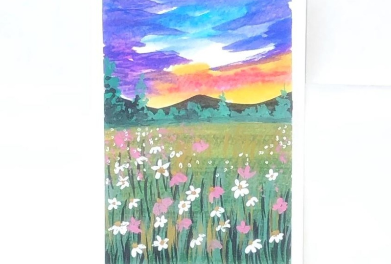
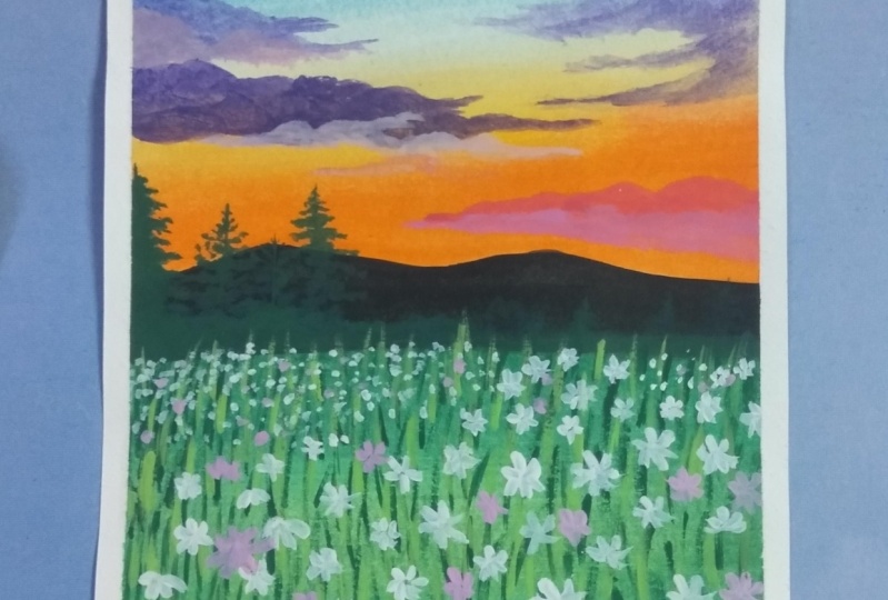
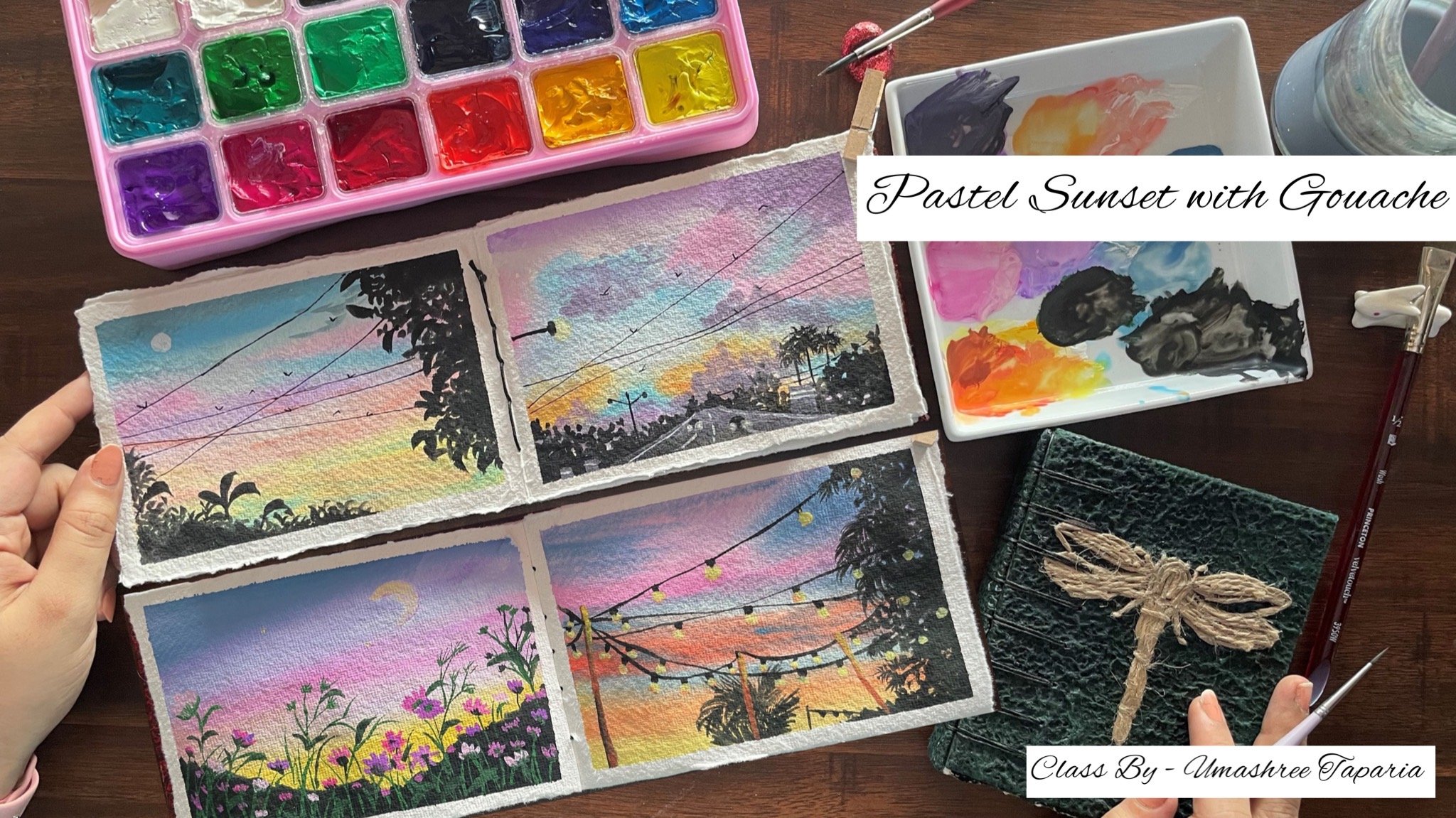
10. Bonus Lesson - Country Side Field - Part 1 - Painting the Sky: Let's begin with the
bonus class project for this DZ field class, we are going to begin in with
the pencil sketch first. So today we are going
to be painting in a DC field by the countryside. So first I'm marking
out the horizon line almost in the center
of the top space. And on top of that, I'm just starting in a
small mountain range. We are going to be
having an a simple, pretty blue sky and a Greenfield area at
the bottom space. And then we are going
to be adding in alert the pine tree details or some greenery details on the left side that
we've marked in. And on the right side we
are going to be adding in a huge G with a lot of PMDD
is moving into this guy, this now into the
countryside area out you're at the
bottom and feeding of any small pathway just
around which the G is moving in and you're
at the bottom space, we are going to have in
a smaller fence detail moving into this garden area. So basically all of these pencil sketch
will not actually be visible once we
begin to paint in the base neighbors budget. So as to give you
a rough idea of what we will be adding
at what pleases. I'm giving in this pencil
sketch detail that you have a little view in your mind as to what we will be
adding at the places. Everywhere else you are, it's all going to be grass and the disease areas are not
adding in much detail. Just enough pencil
sketch for you to understand the layout
now from this tree as where we are going to be
having a lot of branches and simple greenery moving
into the sky space. So that is about the
basic pencil sketch. Now let's begin picking
up the colors one by one. The first method I'm
picking up is the sitting in new philosophy
painting in the sky. I'm going to be adding in
a lot of white wash hands. I'm just removing in very
little of the color. Make sure even you do not remove much of the base colors
because it's divided course that we will be
using it a lot for creating it or the piston and the
perfect tones for the sky. You can see I'm adding
in a lot of white. I'm still going to be adding in little more white
because the color seems still a little more dark as what I need for the sky space. Make sure you use in
a sky blue color. So it either if you have
a piece of blue color or a sky blue color
already in your palette. You can even directly use that
or simply you can mix in, in blue with white. Make sure you do not
add lots of water because we do not want to lose the consistency of
the forces and get an opaque look for
the gouache colors that we're using in. Now. I have added in
little of the blue fallow. Now I'm going to shift into the white color more
and just going to add in very new to touch of the Bloom's even less than
the previous one. Now, you can see how
I have created in different tonal variations
of the blue in the sky. This is the base layer. Now using in much more different tonal variations,
the blue color, I'm just going to be adding in little cloud effect
into the sky as well. We're not going to be adding in much detail in this guy this time because of we will be adding in March of
the other details. That is the fence
detail, the 3D days. Hence, I kept the sky
for this class project, very simple and uneasy one. Now I'm just going to lift up little white color and this
going to keep adding in little strokes randomly and
in-between randomly going to pick up little darker
tonal variation of the blue column
mixed in with white. Just going to pull out little cloud strokes that I
had literally from the edges. You can see on the
right side I've added in the darker
stroke with a blue color. Now I'm shifting into a smaller size
blender brush you can use in a smallest
size flat brush. And using whitewash, I'm
this window full-out little cloud strokes from the left side moving
until the center, blending it with the
darker blue tones. Now on the right side, I know that medial part is
going to get covered up with the greenery space
of the three that we will be adding in pens, I'm creating in the cloud effect majorly in the center
and on the left side, that these still be visible. Hence, on the right side
you will notice I'm not giving him much of the
details for the sky area. Now just using a
little darker tint, I'm going to add in
little darker highlight through these ice clouds
that we've painted. And I'm going to
blend it quickly using in this flat
blender brush itself. So I just apply the color
and just drag my brush very gently so as to make it blended and look saddled with
the background colors. Now, this I did a
little wet on wet, hence the colors
have blended and have a soft edge to all of it. Now just going to pick up little more of the
white gouache and I'm going to add in little
more white cloud detail on the left side. Again, you will see I'm creating more of the cloudy effect on the left side and
just add in lifting from the top right
corner because there, there will be little less of the grass details or the
bush detail of the G. Hence, you want little sky as
well to be visible. You will notice
this time there is no specific pattern
for painting. Just a mix of the blue and the white color in
different tones, creating in the
different cloud effect into the sky space and pleading in that abstract kind of
a cloudy sky this time, you can simply just blending the colors as well
randomly and just add defense strokes of
different blue color and cleared this abstract
looking cloudy sky. So now in the next
lesson we will begin painting further
into this painting.
11. Country Side Field - Part 2 - Base Layer of Field: Now moving further, I'm going to add in this
mountain range out here for that I'm using in
the shade of burnt sienna. You can go ahead and use any brown shade that is
available in your palate. It need not be the exact
same shade as mine. You can also alter the color
of the sky if you wish to. You can go ahead with a mixed of the yellow and
the blue color, creating analytics and the sky, or adding in little pink
strokes into the sky as well. Now using a smaller size
flat brush or a round brush, you can simply just add in the base layer for the
mountain range out here. So under this layer, I'm still going to be adding in little more detail with
the darker tones pens. I'm going ahead in the
mid-range tone off the ground, color out your father basically. Now you will notice even
on the mountain range, I'm not giving a perfect
blended look because I wanted to give it
that natural look to the mountains as well. Hence, let me give
you a closer view and show you how my
mountain ranges, looking at how roughly I have added in the
color of giving in the rough strokes make it look more natural and giving
it the nutshell look. Now next I am just
going to mark out a few lines into the
field area so as to let you know the darker and
the lighter sheets that we will be used him to distinguish
these feelings spaces. So we are going to
be having in like three to four shades of
green that we will be using to fill in
these spaces to give him the differentiation
in the field space. The set that I'm using in has almost seven to eight
shades of green color, but I'm just going to be using in three sheets of
the green color. That's a light pink color
or medium green color and a little darker skin tone. Now if you do not have
the exact same sheet, you need not worry. You can simply using one sap green color and
create the different tones. So say if you have a medium
tone of the green color, you can make it the one
shade lighter and clear the yellowish-green
color by adding in a little tent off the yellow
color to your green color. And to create one darker tone, you can simply add in a
little tent of round to your green or a little dent of
black to create a darker tone. You're amusing in the
yellow green color, the sap green color, and the bamboo green
color mixing in all these three randomly creating
in three different tones. So again, as I told you, you can simply create the tones depending on the
fellows that are available in your palette. In beginning in with this
light yellow, green color. Now I'm filling in
the spaces that we have marked in for
the bushy area on the left side as well. Because I'm that we are
going to be adding in the leaf effect with
the darker color. Hence, in the base layer, we're going to
fill all of these. On the left side, just added one block with the
lighter green door. Now on the right side, I'm using the same color, that's the yellow green color. But to this I'm just going to add in little darker tint by using in the bamboo vin
color just on the edges. I'm going to blend in this
bamboo green color with the light pink color
and show it a little different from the left
patch that we added in. Now the bigger field space at the bottom media
I just make stint a little bit of
the sap green with the yellow Bian color to
get a medium green tone. Because my sap green color is a very dark tone and I do not want to use such
a dark tone now. I'm just going to
mix them both the sap green and the yellow
green color create a medium green tone and fill
the entire bottom space out here with this
medium green tone. Now, as I told you, when I begin adding in the
colors in the base layer, the pencil sketch of all
of these fans and the tree will begin to get a hit because of the opacity of
these gouache paints. Hence now we will have to add in those details after
these colors dry in. Also, you will
notice I'm leaving the tree bark empty and not adding in the
green color there. So as much as possible, avoid adding in the color
out there because there we can directly add in
the brown color later on. Now even in the rightmost side, I'm going to fill it with this medium tone of green color. At the bottom you will see a small factory space that
I've left by because I will be painting it with a
muddy color tone out there using in the
shades of brown. Now the brown color that I
already have on my palette, I'm just going to
lift up this color. I'm going to add it and
do that part we adapt. We have left at the
bottom right corner. Now next I'm going to paint
the tree bark out there. So I'm going to be using in
this dark shade of brown, It's the Van ****
brown from this set. Now do not worry
if you do not have the Venn diagram follow
if you have a CPFR or you can just mix in a little bit of a
light brown colors to get a little darker tint and
not equal to a black pen. Make sure you do not add a completely or
blackish brown color our tour because on
the tree bark as well, we're going to add in details with the black color later on. Now you can see when I'm
painting the tree bark also, I'm not taking in the
perfect blended school, just going ahead and adding in very random strokes so as to
give it the nacelle look of that rough textures
on the tree bark and also on the edges
you will see I'm simply pulling out
little of those bugs, very smaller box out from the bigger box so as to
give it all a natural look. Now at the top space you are, I'm going to pull
up the branches out from this box piece. So I'm taking the buck, a little toddler and from this now using the same brown color, I'm just going to
add in a few of the branches for
this G. Now again, you will notice this
entire painting is quite different from
the first painting that we have done in. In the first painting, we've gone in far more
realistic kind of a view. Whereas for this one we
are going in for more of the nostril and rough view of without giving it
the perfect blend. I'm giving it a
very dark picture while painting itself and adding in very rough
stroke beginning from the sky to the tree as Ben, even for the grass
EDI in this painting, we are going to go ahead with very rough strokes
in the next lesson. Let's quickly just add in a
few of the branches out your. And then we will move on to
the next lesson and begin adding in furthermore details
into this painting. Now.
12. Country Side Field - Part 3 - Adding Grass Details: Now onto the green space
I'm going to be adding in very simple brass didn't quick one I'm going to be using
in this hake brush, you can use a fan
brush, hake brush, comb brush, or you can simply
use in your round brush. This hake brush. You can
see when they didn't water, the bristles flipped and create those comb like effect
tends using this brush, it's quite easier to add in the grass details
quickly when you do not want the grass details
to be much detailed one. Now I've picked up
on the pin color, which is one layer dark, 12b1 darker than the base layer. And I'm just adding in very simple
brushstrokes out there. And I'm going to
make sure to keep the partitions between
the classes as well. And hence, I will leave that very little line
at the bottom space. Now using inlet of
the brown color, I'm just going to add in little brown effect as well
onto the grass pieces. Make sure when you
use a Hake brush, you do not have excess water
on your brush who otherwise, it will be very
difficult to achieve these grass strokes
easily. You ready? I didn't patches of the
color and bigger strokes. You can see on the right
side I added in the grass TO using analytical darker
green tint than the VCF. Now lastly, at the bottom
space I'm going to mix in again the yellow-green
and the sap green color, but one tone darker
than the base. Theo, I'm just going to begin adding in very
simple, just truth. Rather I'm just adding post a few grass groups with
the lighter tone as well. Then I will add little with
the darker tone as well. Since the basically of grass
is a little darker tone, I'm adding in little
lighter grass effect by mixing in white
with the green color, giving in some lighter
details as well. Now you can see as I'm moved
towards the bottom space, I've increased the
tonal value of the color and taken
up a darker tone, adding in some darker
glass tint out. Now you will notice
that I've added in very rough and not much detailed
look to the grass piece. If you want to add in much of the detail,
look through the grass. You can keep adding
in one stroke at a time using in our
detailer brush. But my main focus is going to be the fence area and the disease that we will be
adding at the bottom space. Hence, I'm not wedded much about these background
grasses and adding them quickly in a
less detailed view. Now next let's add
the foliage to the tree using in this
coiled round brush, I'm just going to pick up
the dark sap green color. The doubt adding in much of the water and just holding
my brush perpendicular, I'm going to be adding in
very simple pilot detail, which will make them look
as a cluster of leaves out together onto
this cheese paste. You can see using in
his quiet round brush how quickly you can add
in this foliage detail, just holding the
brush perpendicular. The PR is again that your
brush should not have excess of water and the
paint also shouldn't be bit. It's kind of a dry brush kind of a technique that we use in your PR adding in this detail using this
quite round brush, the presenters quiet
and they do not come together tens
because of this, you can simply use them and add the greenery details quite
quickly into your paintings. You can see how
quickly I've added in the green detail onto
these branches and how beautiful it is looking
and it makes it look more natural rather than
adding in one leaf at a time, we're still going to
be adding in a few of the prominent
leaf shapes as well. Now, I'm just going
to pick up a little of the black color
and I'm going to add in the darker details onto the teabag as I told
you in the beginning. Now all of these I'm
doing wet on dry, so my t back is
completely dried. And onto that I'm adding in
these dashboards basically just very random strokes on the feedback you've given,
the darker details. I'm making sure the base
Theo Van **** brown color is also visible in-between and
not pop it up completely. Using the Van **** brown color. I'm just adding little
dry brush detail onto the mountain range as well to
give it little more depth, the very little
detail, Not much, just very simple dry brush technique that I'm adding
on the mountain range. Again, this is also
a veteran dry. You're also you have to
make sure that you do not have excess water or
an excessive wet paint. Otherwise you will not get these dry brush effect
is rather you would just get in patches off the darker color that you
are trying to add in. Now last week, just at
the bottom field space, I'm going to add
a little more of the grass effect and then onto the next lesson we
will begin adding in the folder details
into this painting. We will keep building
this painting step-by-step and the
bottom four blocks, I will fill them completely
at the end of the painting that we do not have to body of the sheets that we
are adding in this. Let's move to the
next lesson now.
13. Country Side Field - Part 4 - Adding the Daisies: Now if my painting is
completely dried and we're going to begin adding
in the further details. The details that
were left to add in is the bush
details on the left, the disease and the fence TDL and little more
foliage details. So first we are going to begin adding in the fence detail. So far the fence I'm just
mixing in a little bit off the ground with the lighter
tone on my palette. In a medium tone of brown, I'm going to begin
adding in the fence out. You're closer to the
t on the left side. Now on the left side it's
going to be the poll. Sorry, on the right side, you're going to be the
pole of the fence. Now as I move towards the
left side for the fence area, I'm just going to
add in the details, but on the left side, I will keep it a little hidden
because in front of it, I'm going to show
in the bush detail. So I know it may be a little
confusing for you right now, but as we move ahead and you
see me adding the details, you will get a clear picture of what I'm trying to tell you. So on the left side, do not add any pole or closing to this
fence area for now, let's just begin adding
in the grid details in the center of this fence
that we're adding in. I just added it to
vertical lines, divided it into three
equal parts and adding in Porto five of the
horizontal lines. Now according to your size
of paper, size of fence, this will 3D and you
can adjust accordingly. Now using in the
dark sap green color that's already on my palette and mixing in the little
lighter green tone into it and using
the round brush, I'm just going to begin adding
in simple leaf detail at the bottom of the T out your and on the right
side of the gene. In the same way I'm going
to add in little of the detail leap on
the left side as Ben. You can see how
simply you can add in simple leaves using
the round brush. So just press the
belly of the brush and once you're satisfied
with the size of the list, you can just lift it up
now into this pathway, this piece just adding in little brown detail from
grass detail as bell. At the bottom, we're going to add in little
detailed glass snoop also plated on before
painting the disease. Now I've mixed in
a little bit of the yellow green color
with a lot of white, wash out your and using a
smallest size detailer brush, I'm going to add in some detail grass top
from the bottom space. Now, make sure that you add the fence post and then begin adding in
these grass tedious because we want
these glass to be overlapping the fence
because we want to sue the fence is behind
this glass piece basically. Hence, we want this overlapping
onto the fence area. Simply just using in
the detailer brush. You can see I've
just added in fine, just using in the lighter tone. Now on top of this, I'm just going to add a little detail just with
some darker tone and spell. But it's going to be a
little less as compared to the lighter tone gases
that we have added it. But these also will
be overlapping the fence atria out
at the top space. Now for adding in the
leaves on the left side, I'm just going to pick
up a little more of the sap green color and mix it with the remaining
greens on my palette. Again, I will repeat, you can go ahead with any different shades of
green that is available in your palette or create your own sheets of theme
by mixing it with yellow, brown, or black color depending on the shape that you
have in your palate. Plus on the left side
moving from a little of this thigh space just
about the mountain lead. I'm going to begin adding in
the deep end of grass loop. You remember that triangle that we had marked
with the pencils get Sanborn to be following
that of the pencil sketches, no longer visible,
but we already know it in mind how we did that. So again, you're also just
using the smallest size down. You will notice I'm adding
in very simple leaf detail, just dabbing my brush at places and leaving some
pilot instead by just filling in and on the edges I'm giving in the detailed
leaf look effect. Now as I move
towards the bottom, these needs are going
to be overlapping the fence space as
well on the left edge. That is the reason
why I did not add in the left side ending
of the fence area because it's going to
be a completely hidden one with these leaves that
we are adding in now. I'm going to take these
leaves completely till the bottom space out. Now on the edge of this bush
area that we have added in, I'm just going to
add a little of the detailed leaf effect
popping out from these spaces. The anything in
listen more detail, look just on the edges. So on the left side your, you will see that I've filled
it completely very quickly. But now on the right
side of this book, just giving in the
detail look towards the edge site using again
different tones of greens. Now next knee just
going to add in little detail leaf
effect to this G out your short little of the branches swapping out
from the top sky as well. And just going to add in little detail to this
gene vary randomly. So far I think in the
nice detail you're also, you can see I'm very simply
just pressing the belly of my brush and lifting up once I'm satisfied with
the size of the leaf. Now again, you are also, you will notice I'm using
indifferent owner variations of the green color so as to
make it look more natural. In the base layer, we use the very defiled mean for adding in the bush on the free space. And now I'm adding in
these detailed leaf I'm just using in one
liter so as to give it a little more detail view with different tonal
variations of the green using in the
darker green color. I'm just going to add a little of the detailed
brush stroke out. You are at the bottom spill. I was waiting for the
lighter vein to the dry completely and then add in little of these
darker Beanstalk. But little on the
right side you can see I'm just leaving those
light of installs. Fevers will now saying there I'm going to pick up the
lighter green color. I'm going to add in little brass didn't just at the
end of the feedback at the bottom space
out your to give it a little more detail
and distinctive view. Now mixing in the
dark sap green color with the white color, I'm going to create our
very best to kind of be in color or dark green color. And using this color for
adding in the second layer of leaves details onto the
bushes on the left side. So again, you know, it is a tedious task building in the ozone layers
with gouache. But at the end of the painting looks much more
natural and beautiful when you keep adding in videos are step-by-step layer on layer. Now next, in the center
of the fields, please, I want to a little
of the shadow of the bush deep into
the field space. So the bushes out to her and I wanted to show
the deflection out. You're just cruising
through this fence space. I'm going to use in a little darker tint of the
Sapien colors, not much dark, just one your darker
than the BCL green of the field space and going to be adding in little detail A2A. Now this is just again, the first Leo for the shadow. I'm going to blend
it later on using in a lighter tone with
the edges because I don't want much prominent shadow visible in-between the
fence blocks also, I'm just going to add
a lifted off this darker green to
act as the shadow. Do not worry, the fence
is not yet complete. We are still left to add in much more details to
the fence as well. This is all just the base
knows that we are building in for adding in the final
details into this painting. Now I'm going to mix
in a little bit of the white to the burnt
sienna palette out. And I'm just going to
add in this nighters, troops onto the fence detail giving him those liabilities. I'm going to add in this
lighter brown stroke in such a way that add the
morpheme of the stroke, you still have little of the dark brown stuff that we
added previously visible. In the same way, I'm just
going to add this thin line on top of all of the
darker brown lines that we have added in. You can see how
carefully you have added in the lighter
brown stroke onto these darker brown
stroke is giving it that light effect onto
this fence area as well. Now next I'm just
going to add in very small trees and Bush
detail on the mountain. I'm going to pick up a mix
of the dot sap green color with a little tinge of the lighter tones
outward on my palette, I'm going to add in little bush details onto the mountain. You can see I'm using the darker green color
for the base year, and then using the
lighter green color, I'm adding the highlight
onto these bushes. Now disputing little bushes
back on the horizon line, but smaller than the
mountain range ADR. Now using the smallest
sized round brush and using the whitewash in
a thick consistency, I'm going to begin adding in the disease into the field area. We are going to be having in the DVs misogyny at the
bottom side of this painting. Now, I had already
discussed with you all the dependent angles of the disease that you
can use an added. So I'm going to quickly be
adding in the disease in all of those angles
and different format. So I'm going to use
in a mix of all of them and keep
adding them quickly. On the right side
you will notice that I've added in Betty's
smaller disease, make sure you do not add
much bigger ones of them. Now on the bottom
left side as bad, I'm going to begin
adding the disease. Now these daisies at places
are going to be overlapping the fence area again and overlapping the grass details
that we have added in. Make sure to use a blend of all of the different kinds
of disease that we have launched in
indifferent angle and perspective view that will add to the natural beauty of your painting and make
it look more natural. Now even at the bottom
left side, your, I'm going to add in a few of the DDS overlapping
bushy area as well. Again, you can notice
I have been using in a blend of all the
different kind of disease. Now in-between, I'm just
going to dab the tip of my brush and adding very
simple foliage details. Filling up the steps in
between to soar Some of the minute or smaller disease which are not much
closer who have Woo. Now I'm just a little
bit unsatisfied with the shadow that we
added for the bushy area, I'm going to quickly be
connecting that using in the lighter green tone of
the BCR that we had used in. I'm using in the same yellow, green color mixed in with a little tint of the sap
green on my palette. I'm going to fill
this space with these colors. With gouache. You can see how simply you can connect anything if
you are not satisfied. And we do again without
worrying about the, uh, you know, having in the
wrong medians or anything. And it's quite easier with wash to connect in your details. And you will overdo the Leo's with a darker or lighter tone. Again, that this deal
was a darker tone. And now you can see
I'm predicting it with a lighter tone
of the green color, mixing it with a little
bit of the white. Just be very careful near to the fence area because we do not want to lose
the fence detail. It may be a little tricky to fill in this color
in-between the fence. But if you are satisfied with the shadow
that you have added in, you need not follow this
step and leave it as it is because I was a
little unsatisfied. I'm doing the head and
going on with the CEO. Now very carefully, I'm going
to fill these boxes as well in-between the
fence with a little lighter in tone and
blend them quickly. Now you can see the fence
is looking a little covered and hidden because of the green layer that I added. Now, I'm going to quickly using the same brown color that
I used for the base layer. And again, we're going to
add an offense diesel. I know my walks
increased a little bit because it's adding
in that one layer, but it's better to add and
rather than, you know, be unsatisfied with the
painting at the end. It's just in two minutes tasks more for adding
the details again, allele or over it, very wide fields hidden. Now I didn't see you
into the next lesson, adding in the final details.
14. Country Side Field - Part 5 - Final Details and Thank You: Now let's begin adding in the final Lee builds
into this DZ field since we added in the darker brown tone
again in the last lesson, I'm going to add and lived in light white stroke
again onto this, giving him that detail
onto the fence piece. Again, when I add
in the white color, I will add it in such a way that the modern new bound Balance
tool is still visible. So I'm just going to add
either on the neck order ID, just giving in highlights with the white color and not poverty in the friends completely. You can see I'm just
using the PIP and adding in very fine white lines. Now we're going to
add in a few of the disease or
LinkedIn highlighted out your uncovering and beating little off
the top peel space. So very little, not much. The major disease
are going to be at the bottom that
we've already added. A few of the disease. We are going to add them
in a way as if they are entangled into the fence and moving out from the
fence eight yarn and a few of them from
behind the fence space. So those are the ones
that we are going to be showing in from behind
the fence space. We're not going to be adding
in much detail look to them. So it's just going
to be very simple, dabbing off them as well. I added in a few
of the D1 disease. Now, just using the
dabbing technique, I'm going to show some Philips pieces
filling up the gaps in between time he saw some
disease farther away from a view to just using
the tip of the brush, dabbing in the white paint. Nietzsche, you already
changed on your hands. Do not add in a lot of pressure, otherwise, the base
green color Leo, will be activated again since we are using in
water-based squash. And then your white will
turn into a light pink tone. Instead of standing out, opaque white daisies out, you're now on the fence piece. You can see I've just
started very few disease, major disease are behind the fence peas and in
front of the pens piece. Now wherever I am
feeling the neat to just adding a few more of these daisies before we move on to the next step
of this building, I'm adding in the disease. Now I'm going to
pick up a little of the yellow ocher color for adding in the buds
to these daisies. It, very little of it suggest
to move a very small thing that you do not
miss the colors and they do not dry out
onto your palate. It says using in this
yellow ocher color and using a smaller size down virus which
has a pointed tip. And this one to begin adding
in the center but spaces to all of the daisies
that we have added in. Now, depending on the
angle perspective of the disease is rare to add in these yellow bars to sort of profit angle
of the disease as Ben, I'm almost done adding in the or bots to all
of the daisies, just a few of them I left. You can see I have made sure
that I add the yellow bar, or depending on the angle of
the daisies that I've added an apartment giving them
much more of a natural view. Now next to a few of the disease I'm going to
be adding in the stem, the denoising in
the black color. So after we are done adding in these buds with the
yellow ocher color, just using it, a
pointed tip brush. We're going to begin adding in the stem of you offer daisies, trying to show them connected
to the bottom space, time shifting to a pointed
tip detailer brush, which is a size 0 brush so that I get those
very thin strokes. You can add these drugs
using in all fine liner pen if you do not want to add it using it as well as ice brush. You can see how simply I'm
adding in these towards making each of the DZs mousse
build the bottom space. Now off of this talk
you will see I'm just adding in empty
strokes as well. So as to show that the flowers I get to bloom onto
these branches. Although you will
notice that the disease that are at the top
space of the friends, I'm making those branches or those stems meet the
bottom ones out, you're unsure them
crisscross to each other, giving it more of the natural
and then tangled view. I'm adding in this temple, each of these daisies. Now next I'm going to shift into my smallest sized
round brush again and using indifferent
tones of greens, I'm just going to add
a little leaf effect. I'm going to be in
the green colors in such a way that they are visible on the basis
of bean colors. So accordingly, depending on
the type of green colors, all the sheets of film fellows that you have been using so far, you can adjust the bean tool so that these needs
are visible to just going to add in a few
more often deep effect popping God from the bushy area, Asbell And middle of the
leaf effect popping out from these disease or understanding
of the babies as FIN. Now adding in a few often
leave it that using in a very lighter
green tone as Ben, We are almost done
with this painting. We just have to fill in the
bottom four blocks Asbell of this painting using in the different tones that
we used in art painting. And then removal of the
masking tape has been to just adding in the last needs before seeing if we are
ready with tapping. I just wanted to add in little more of the light of
the NDP thoughts. You're at the top as well. Or babies appeal the
toughening of looking, lifting dollars compared
to the bright Skype, suggest adding little light
green leafy things out. So you can see the daphne
neared is also still visible. I have made sure that both
of others be visible. Now just adding
little dark cookie in effect on this slide z so as to sort of perfect
blended view out here. That is it. Now let's begin
painting in these blocks. So the first color that I'm
going to add to the block is going to be the sky blue color that we used in for the sky. Just going to quickly
fill in the false block. For the second block, I'm using Indian yellow, green color today without
adding in any other Carlo. For the third block out your I'm using in the dark green color, you can see how dark
my sap green color is, and I did not use
much of the tasks have been colored detective without adding in other fellows, I only use the dark sap
green color for adding in little darker details of the
VNET into this painting. In the last book, I'm
just going to add in our mix up the brown
colors that we have used in just a little darker in the almost off the mountain range
color that I have added in your daddy and done with our bonus
class project for this daisy field painting. Let's begin removing the
masking tape one by one. Make sure to remove the
masking tape that you added last post is locked at the end. I'm going to begin
removing them one by one, and then move on to the masking tape onto
the edges as well. Make sure to remove the
masking tape against your paper so that you do
not tear off the edges. Also makes sure
that your edges are completely died so
that the colors from the edges do not fall onto the white edges that you
have it or added in. Your final painting for the boom is clef
reject for this class, I hope you guys enjoyed painting this different kind of
a daisy pill with much more abstract and
roughly deal instead of the perfect blending that
we use for the first one, I just added a little more
detail to the t out here. You can see I added listen lighter color green leaves as you can also
add them as well. Thank you so much for joining
me into this bonus lesson. I hope you enjoyed it.
 Umashree Taparia, Artist, Art Instructor, Entrepreneur