Transcripts
1. Introduction: Hello. My name is China, and I'm going to show
you how to paint a daffodil using watercolor. I've been an artist
for over 20 years, so in portrait, it's worldwide. And now I am a teacher. I love teaching beginners
how to paint and how to draw because I believe
everyone can do it. I teach mostly beginners who
think that they can't paint, and if you're one
of them, you're definitely in the right place. If you've ever looked at
watercolors before and thought, it's a bit unpredictable,
you're not wrong. But that also is what
makes it so much fun. I'll break everything
down step by step, so it feels more
simple and manageable. We'll start with a really basic
sketch and then move into light washes and slowly build up the layers to create
depth and colour. Detail will go on
right at the end, so don't panic and just
take it nice and slow. I'll also talk you through
how much water to use, how to avoid muddy colors, and how to fix things if
they don't quite go to plan. This class is designed
to be a relaxed, beginner friendly
approach to watercolor. So there's no pressure
to get it perfect. The goal is to enjoy the process and come away with something that
you're proud of. By the end of this
class, you'll have your own daffodil painting and a much better understanding
of how watercolors work. Which hopefully you can use
for future paintings, too. All you'll need are some
basic watercolor materials, a simple pan set, a nice brush, which isn't too big, and it
has a round head, some watercolor paper
so that the paper doesn't get warped
by the watercolors, a jar of water, an old rag or some kitchen
towels and a pencil. So whenever you're ready, grab your materials, and
let's get started.
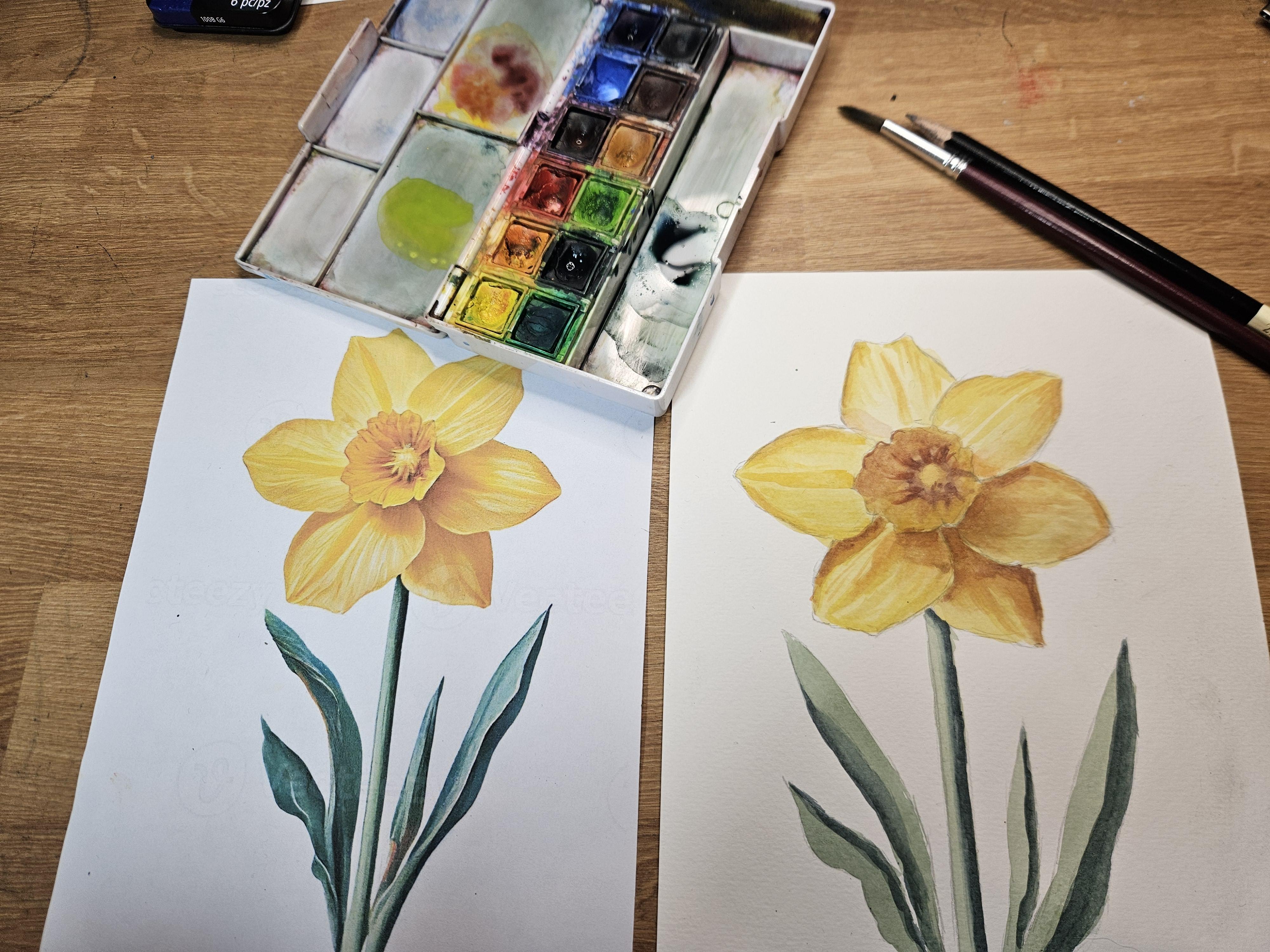
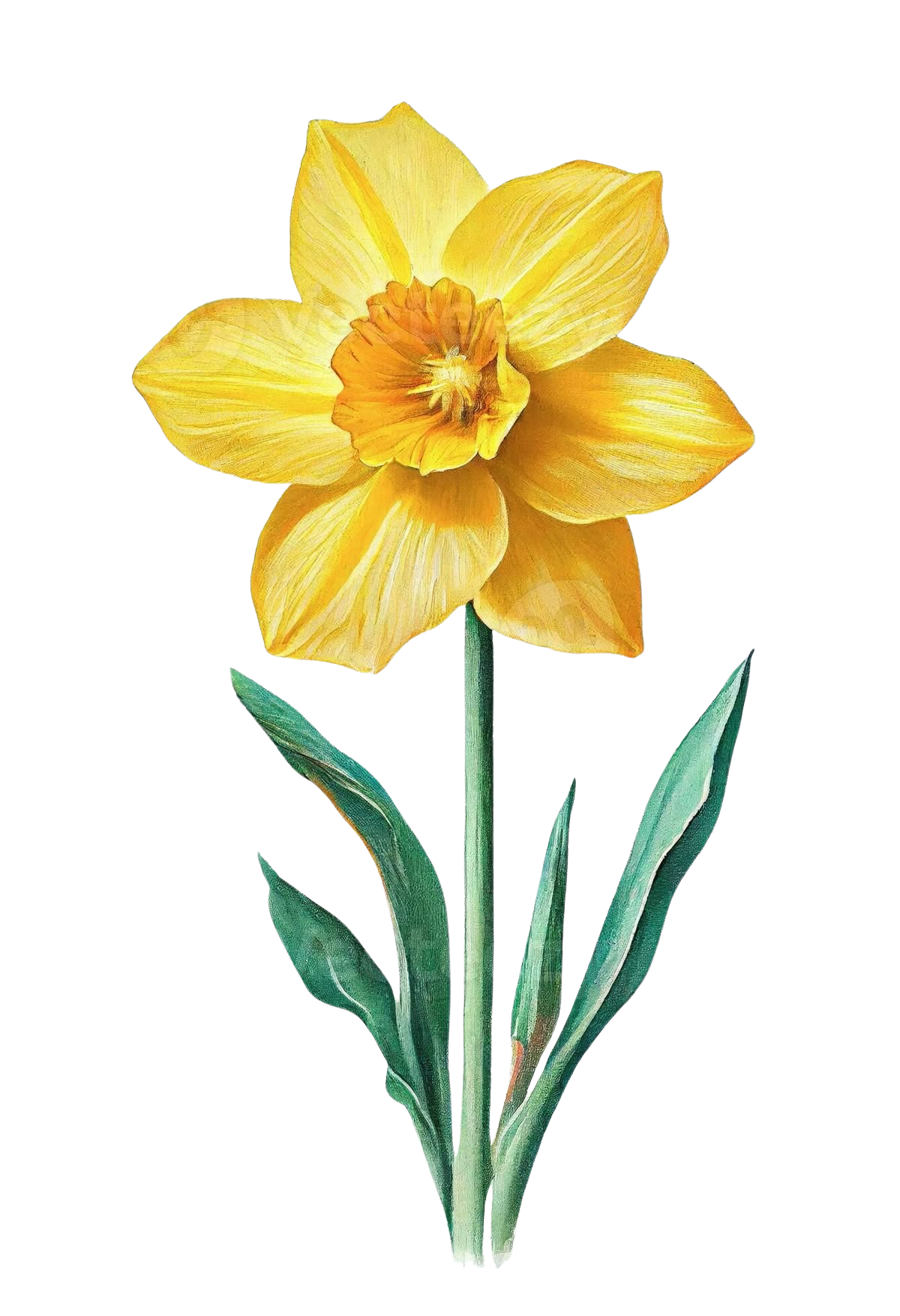
2. Step 1 - The Outline: Okay, team. So we're going
to start the drawing stage, and I want you to grab your
watercolor paper a pencil, and we're going to start with
the center of the daffodil. So this wants to be
in the right place. This is basically going to set the position of your daffodil. And you want to draw
a vague circle. It doesn't have to be
perfect because it is a flower and it has
some losa bands in it. From there, we're going to
try and draw the petals. So I'm going for this lovely
shape on the back there. But then I want to make sure my petal is in the foreground. So you see how we have the lines coming from the oval for the right petal
that I'm drawing now. And then that helps you to frame the petals that
are setting backwards. So you're looking at
where the petals start. Where the lines curve
and where they end. So are the lines round? Do they have a slight dip in it? Do you have a slightly weirder
petal than the other one? So make sure as
you're going round, you're not just guessing
and adding them on, you are trying to really look at the direction
of the petal, the direction of lines, and
the uniqueness of each one. And just make sure you have
ones going in the background, which means that their lines aren't connected to
that central oval. From here, I'm just going to refine the
lines a little bit more. So the first stage
is essentially, it's a bit like a rehearsal. And then when you
go over the lines, I'm being a bit
more confident and a bit more decisive about it. And I'm looking for
those minor changes. So yes, we have the
line direction, but then there might be
a very subtle little dip or a subtle little
change of direction. Well, you might just notice
that you were just a little bit more incorrect
in the first round. So go over this again
with your pencil and really look for
those unique details and directions of the lines. Next stage is just to tidy
up your lines because you've probably got a few outlines
are a little bit thick. So I use this amazing
pencil rubber. It's really nice and thin,
and it can just get into the nitty gritty tiny bits without having to
rub out too much. So tidy up your edges, and then we're just going to add a little bit more detail in this central oval or central circle because there's a lot of tiny little
folds in here, and it doesn't have to be exact, but you do want to
get the essence of the daffodil just
slightly turning. So you'll see that we
have some tight curves on the left and some less
tight ones on the now, you can use the center of
your petals to try and figure out where your curve start and stop because it
does feel a bit ambiguous. So using the points of
reference from the petal lines, where they touch the circle and then using the center
of the petals, as well, and that should just
help guide you to your curvy central parts
in the right places. And that will just
help to show that it's curving slightly twisted and facing over your left shoulder. So have a go at this bit, and again, tidy up
when you're done, get rid of any lines
that don't serve you and make sure your lines aren't
too thick or too dark, either because we
don't want it to show hugely through
the water colors. Okay. And then we
have the middle. So in the middle,
you just want to add this vague shape.
It's a bit ambiguous. I'm actually just going
to do a little circle, and then we're going to
head down to the stem. So the stem is
slightly off center. It's on the background leaf,
just to the right there. Then we're just going
to go straight down, and from here, it's going to
help us to do our leaves. So I'm going to start
with a leaf that is closest to the
petal on the left, and I can see the distance from the tip of the
leaf to the petal, and I'm just going
to draw that in. Again, this doesn't
have to be perfect. Nature is all kinds of
weird and wonderful shapes, but just try and get the essence of it and the proportions. Don't try and make them
too big or too fat. Just make them thin and tall and long and make sure they're going in roughly the right direction. Once you've done this,
your drawing is complete, and we get to do the fun bit, which is the watercolor. But it is important to spend as much time as you can on the drawing and make sure you're happy with it
because it does make your whole life a lot
easier in the next stage. So hopefully you're
happy with that, and I will see you in the
next lesson, ready to paint.
3. Step 2 - Light Washes: Okay, team. So our main point that we're going to
start with today is just the block coloring. So I'm going to
start with yellow. I'm not going to worry
too much about detail because I'm just wanting to
mark where the colors are, and then we're going to go
into detail after that. I'm going to choose, well, my yellow has a little
bit of green in it, so I'm just going to
clean that first, and then let's just pop that. Yeah, there's a huge
difference there. So, yellow is a little
bit too bright. I'm actually going
to add a tiny bit of orange just to dull the
brightness down a little bit, but it still will
be very bright. Now, we don't want
it to be too thick, because then it's just going to be a thick,
blobby yellow. So we're going to add a
little bit more water in the lid than you
probably feel is natural. It might feel like
it's too little, but I'd rather it be too
thin than too thick. And all we're going to do
is paint that straight on. Spread it about as
much as possible. And I always like to
finish the petal before I move on if I need to pick up more paint because
if it does dry, at least it's drying on the
end of something, okay? So we don't want to stop halfway and then there'll be a harsh line down the middle. So let's pop that on there. Let me go and then I'll just
pop that in the middle. So when it dries, it is
going to dry lighter, which can be sometimes
quite annoying, but also it could
be a saving grace for somebody if they have
gone a bit too dark, know it should dry
lighter in a second. Now what we're gonna
do is mix a green. So this has a
slightly bluey tinge. I'm going to pick
up my dark green. Pick up a little bit of this navy blue and also a bit of the bright green because I don't
have a natural green. And if you do just add
a tiny bit of the blue, and that should give it
this lovely aqua effect. And then again, I'm just going to color it in. There's
no white, really. There is a lighter
bit on the stem, but when we get to that, I'm just going to add
a bit more water. So keep the same base color. It does make sure everything's nice and consistent,
which is good. And then that's going to give us a very nice simple
flower painting already. So let's go into this one. Again, don't worry
about the detail. That's not something we're
looking for right now. And hopefully, by the time
I've painted the leaves, I should be able to paint against another layer on the petal because
it's nice and thin. And as I said, add a bit
more water to the stem. And that should just
be a little bit lighter for us. Okay.
4. Step 3 - Building Up Tone: So now for the petals, my yellow slash, a little bit of orange is also going to
have a bit of yellow ochre. Then I just want to
look at the color, and I'm going to
ask myself, is it dark enough? It's not really. It could be a little bit darker, so I'm just going to add
a tiny bit of purple, which keeps the color
nice and vibrant without losing too much
of the brightness, but also keeps it dark. So I'm going to start with
this under petal first, and then I'm going
along the edge like this and then I'm just going
to quickly clean my brush, dry off the excess, and I'm going to
pull that upwards. So this time, pulling
it upwards gives me a few more natural streaks rather than going along the
edge, which I usually do. Pulling it upwards just helps it to wiggle around
and goes with the natural streakiness
nature of the petals. So I'm looking for pockets now, pockets of shade because it's
not going to be consistent. You have to really
look and identify it. And some of the edges might be nice and crisp like this one, but some of them might
be softer as well. So if I pop this one here, I've got a little
shadow down the middle. And then I just want
to soften that edge. Now my colour has become a
little bit more diluted, so I'm just going to have
to make a little bit more. There we go. Pop
that back in there. It's really nice once you
start seeing shadows on the artwork because that's
when it really comes to life. So let's look at this one. And here, all of
these at the bottom are going to have the
greatest shadows. This leaf is going to need clean dry brush
to be pulled up, but you do have to work really really quick and I've pulled it all
the way to the top, so that is slightly
damp for me to go from the top
and then go down. There we go. Okay. Where
else do we have one? We have a little bit.
Here, this one's a softer one. So clean and dry. This time, I'll go
in the direction. We do have a little bit
of a shadow up here. Pull that one down. And
then just in general, in the middle,
it's a bit darker. It's a little bit warmer. So I'm going to just color that one and it's probably gone a
little heavy handed, but the brightness is there, and it is actually
the right color. So I'm not unhappy with it, but probably wouldn't
encourage you guys to fully throw
that on there. It's quite timiding.
Whilst it's there, I'm going to go for a little bit of a darker tone
because it's wet. And then I'm just gonna dot
that around the middle. My brush, dry it. And then just pull
that out. Okay. Nice. Gonna let
that dry slightly. And I'm going to move
down to the leaves. So I'm going to pick this
dark green, dark blue. And then I'm going to decide which sides need a
little bit of shade. The easiest one is actually going to be
this side on the right. So if I plop that on. And then we're basically showing that this leaf is folded over. That looks really nice.
Same with this one. Okay. And then on the left side, it's a little bit
more confusing. So I'm just going to make a
decision and do one half, dark, pick up some more paint. And on this side, I'm actually gonna flip that Trough the back. Why? Maybe it's a bad idea,
but I've committed that. And then let's refresh This, and we're going to
go down the middle. So only on one side. Clean the brush, dry it. And then just with a
slightly damp brush and just go along the edge, and that just softens the blend.
5. Step 4 - Adding Detail: Okay. So let's go back
to the flower now. Again, now I'm looking at it
and we've added more colors. The initial base
looked way too bright. So I'm picking up a yellow
and then a little bit of the orange just to make
it a bit more vibrant. And then I'm going to start
going around the edges. So trying to look to see which
colors we need to pick up. And we can leave some
little streaks of the light underneath. That
could look quite good. And we just at a few
streaks over here. But I don't want it
to be too harsh. So it's slightly damp brush. Keep rinsing off the excess or just squeezing off the excess and just go along the edge
is really, really nice. So let's do that again
on another leaf. This one we could maybe
pull that one down. And then already, I
need to make a bit more pain Yeah, nice. Okay. Now, let's
add some of this. Basically in all of the leaves. So just make sure you keep
looking at each leaf and just seeing where the
vibrancy can be pulled. So where can we add
a brighter yellow? Where does it need to
be a little bit darker? And just remember, don't
use black if you go in darker because that
really kills the color. So I'm just going to clean that. Pull some of those streaks
down. That looks good. This one definitely needs. I hope you guys
can hear the pug. It sounds like uh,
Lake you a little big. I was looking lovely. Okay, beautiful. So let that dry for
a couple of minutes. And then let's come back and
see what else we can push.
6. Step 5 - Pushing The Darker Tones: Okay, so I'm looking at it. I still looks a little bit flat, and that's mostly
because of the middle. So what I'm going to do
is mix myself a color. So nice and dark, but again, keeping
that vibrancy. So this time, I'm
adding a bit more red. And then let's see what that
looks like on top of this. Now, already, I'm feeling that that is quite a good pairing, actually, using a red on top of the purply mix underneath. And I basically just
want to try and do the same thing as before. So, adding the colour, just cleaning and then
just stroking that up. Pick up some more colour, especially in contrast to
here. Let's do that again. Just make it a little
bit more paint. Good. Then one little bit here. I don't know if
we see the edges. They do have a little
bit of color changes, so make sure we add those in on the outer edges where they're needed to
definitely keep looking. It's too easy to
get in the flow, and then you look and
you're like, Oh, no. That actually doesn't
have that there. Okay, good. And then I'm going to go
in with a purply red, but a bit of orange still. That's really dull.
That's great. And then I'm just going to add a few shapes in the middle. Clean the brush, and then
basically just smudge it. So you kind of smudge
from top to bottom. Maybe a couple of streaks. Yeah, just be a little
bit careful there. It gives it something, but
it's not quite enough, so let's just scumble that in. Oh, that's way better. And then it's slightly redder,
one for the edge. So it's almost like an
outline, but not quite. I'm just going to soften the paint a little
bit more water. And then you'll see that the top half
actually is a little bit darker than the bottom half. The bottom half is more yellow. So in that case,
you're just gonna pick up some more yellow. Okay. Good. We could go a
tiny bit darker on here. But that's gonna depend
on your painting. So you're going to be
the one to decide, Okay, does it need to go
darker or am I okay with it? And I love pushing contrast. So making sure we're seeing
that there is a shadow cast from the top to the bottom is super,
super important. And already, just by
making these little marks, I think it looks ten times better just adding that
dark contrast on there. So make sure when
you're doing yours, you're looking at it objectively, rather
than emotionally, and I say that because
it is really emotional to push something darker when it doesn't feel
appropriate to do that, so just be brave. So there we have the daffodil. I hope you enjoyed that class. For me, it was really,
really fun to paint. And I can't wait to
see what you've done so make sure you share
your images in the chat, and I'll see you
in the next video.
 China Jordan, Art Teacher