Transcripts
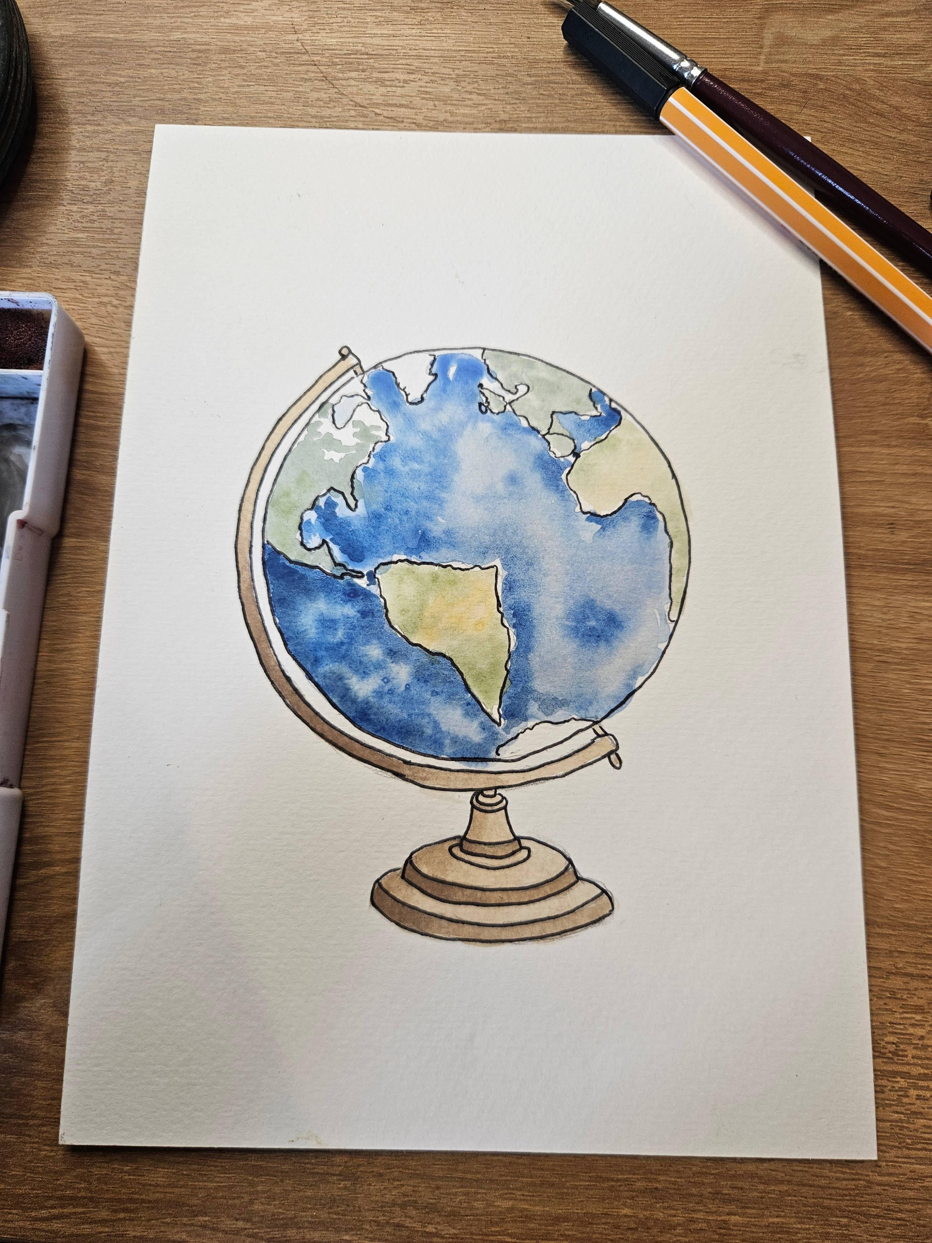
1. Introduction: Hello. My name is
China and welcome to my beginner friendly
watercolor painting class. Today, I'm going to show
you how to paint the globe. This is a really fun and
relatively simple exercise for beginners. Don't worry. I'm not going to make you paint
or draw a circle by hand. I'm going to show you
how to use something really easy to get
that nice and round. You're going to need
your paint palette. Watercolor paper. It's
really important. It's not normal paper. You'll need a brush, so a nice fine brush
with a rounded end, a pencil and an eraser. A fine liner pen.
This one is a 0.4, so nice and thin, not too heavy. Then you'll need an old
rag just to make sure you can dry your
brushes on there, your water jar, and maybe
a cup of tea on the side. So, grab your materials when you're ready.
Let's get started.
2. Stage 1 - The Outline: I'm a huge believer in
working smart, not hard. So I want you to grab
a circular object. I'm using this tape here, which is nice and
round and will give me a perfect start to our atlas. Now, you want to make sure you position it in the right place. So we don't want to
be too high because then we're going to have a
huge space down at the bottom, and we don't want to
be too low because then it won't really
have anything to sit on. So let's try and
put it somewhere a little bit more central, maybe slightly higher than central just to give
enough space for the base. You're going to use a pencil and draw it nice and
lightly around it. You don't want to push too hard, and that should just give
you the shape of the globe. Now, what we want to
do is find the axis. So the Earth is tilted,
as we all know, hopefully, and I'm just going to do a little
line over here. Trace an angle down here. It might not be the right axis, but hopefully you kind
of get the drift. And then all we're going
to do is a parallel line. So just notice how I
am sketching this. So I'm not doing it in
one continuous line, just really lightly
sketching around it. Feel free to rotate your
paper if it's easier, and that's going to end here. So roughly that
edge is going to be the same distance from
here to here to here. Then what I want to
do is a second line. So we're going to go around here and do exactly the
same thing again. So this will just show the
thickness of the stand, and then we're going to
have a gap in between. So obviously, this needs
to attach to the globe, so I'm just going to close off the edge and then draw a
little nub in on the top, followed by an
attachment on the base. So I'm just using that dash we did making that as a stick. And then I want to
find the middle. So I'm basically tracing
that line down the bottom. I'm skipping there. And then I'm just going
to do a little axis here. So from there, it's
all about ovals, so nice and gently around. And we're going to
build it up in layers. So we've got one ring going
around the initial oval. Then we're going to
go in at the waist. Another dip, so this is a
parallel curve to this. We're going to go out again. You can have as many of these
weird shapes as you want. I'm not quite sure
how to describe them. But I'm just going to
add a couple more, make sure it's
realistic and kind of hold the way to the world. Obviously, it doesn't
have to be true grandeur. And then let's do
let's do another one. This time, it's going
to be a bit bigger. So I'm going to start behind that there and
then curve around. As your ovals get bigger, it does become more challenging. So the trick with ovals is number one, don't
draw a sausage. Number two, don't draw a lemon. So a sausage means that you have done a straight
line on the top, straight line at the bottom. And then a lemon means that you are curving on the
top and bottom, but you've just
pinched it around here, and we don't want that. So just spend a bit of
time on your ovals. It will be worth it. Let's just do a couple more. Again, do as many as you want. Then I'm gonna end
mine by going down and my final arch here. Okay. So that should be
enough for the outline. So once you've done your base, we're going to add
some of the countries. So you can orientate the
globe wherever you want. Perhaps, you want to
spin it around slightly, but I'm just going to go from a generic reference
picture of the globe. It's not going to be perfect. So please don't
slate my accuracy, but it's going to look earthy, so I'm just going to
get a few squiggles and gibbles around here. Uh, and a few islands maybe UK. You've not been
great at the minute, so I'm not gonna
put you onstage. There you are. You
got to live there. Bit of Spain. Okay, then Africa. And then, of course,
the South Pole. Can you see the
South pole? I don't know if you can see
the South Pole here. Anyway, let's make this a tiny bit smaller and add
some of the South Pole. But my question is,
is the South Pole south or is it on the
axis? I don't know. You can decide in
yours. Okay, so that's everything I think
we need for the outline. So grab your paints, and
let's start on the fun
3. Stage 2 - Wet-On-Wet: Okay, so the earth
is going to be a really playful dash of colors. So we don't want to be
too boring on this. And I want to start with
a wet on wet technique. So that means that I'm
adding clean water. And I'm just making
it nice and damp. Now I'm going to use the land as a sort of barrier so I can start painting and then
move along as I travel. Then what I'm going to do is use a couple of different blues, maybe add a bit of
green occasionally. So you see how it moves quite freely, and I
really like that. And then I can add
another type of blue. So it's nice and juicy. I'm just dabbing it in. And
then I'm going to leave it. Let it do its thing. So once I've done that, I'm going to start moving on, so dragging and adding lots
of fresh water around here. And let's do the same
with the blues again. I'm not going to add
any greens just yet, just in case I don't like it. But I will carry
them with the blues, and then I might experiment with some greens on
the second layer. And that's the nice thing
about this technique is you can just add some on top if you're not
happy with the base. Um, but obviously, you can't do that with every painting
or every technique. So continue with this. Try and be careful not to cover any land mass and keep adding the water in smaller
chunks just so you have time to kind of get
your paint in order. Now, I'm a bit of
a quicker painter, so I might be doing it slightly bigger in chunks of
wet water than you would. You might be like, Oh, how
can I not do this as quick? Why is it drying? It's because I've been
doing this for years. So do it in chunks. Do it nice and
slow, but make sure it's really wet just to give it plenty of time and plenty
of movement on the water. Already, I quite like
this, so fab. Okay. I'm going to let let dry because I want to see how it dries. I will look a bit different
from when I applied it. And in the meantime, I can start to add some colour to the stand. Now I want to go for
quite a opulent stand, so I'm going to go for
as brass sort of color. And all I want to do for this
is pick up my yellow ochre. And we're wet on dry this time, so I don't need to
damping it before, and I'm just painting
it as a block color. I'm not worried
about any detail. I don't know whether
I'm going to add detail just yet, but for now, I just want to get that on there whilst my background dries. And I'll start to feel a bit more like it's
coming together. That's the worst thing
about painting is it will look pretty naff
for a long time. So just be patient
with yourself. We are building it up in layers and adding detail
and just taking it nice and slow. Okay, fabulous. Um, I could add a
shadow on the ground, but I just want to let that dry. I'm gonna add the
shadow afterwards. Once I'm happy and I decide if my light directions
coming from here or here, I feel like possibly it's gonna
come from this direction. So grab a cup of tea
or a biscuit or five, and we'll come back
once this has dried.
4. Stage 3 - Shading The Landscape: Okay. Now that this
has mostly dried, there's just a little
bit left up there. I'm going to work on the
land. So it's a small area. I'm not going to
use as much paint, but I still want to make it wet. Sorry, I'm not going
to use as much water. So I'm just spreading this
dip of water out there, and I'm going to use well, let's use this golden colour for a slightly hotter
country on the equator. Maybe a tiny bit of yellow just to spruce up the
color a little bit. And then I'm going to
transition into greens. So if you want to you can
prepare your colors before. I usually have a
palette which has a mixture of colors
always ready for me. I'm just going to try and dot that around there because there's a lovely jungle
somewhere in here. So I'm going to do
the same for Africa. So I'm saying that
this is my equator. So I'm just going to
make that slightly sandier but also we do
want some green as well. Now, everything does
dry a bit lighter, so I will look at
this again when it's dry just like it
will with the ocean. And then I will assess whether
it needs more color or, you know, a bit more darkness. As I'm going into Europe, I'm just going to go
for more of a darker green slightly different
green, as well. And again, it just makes the
painting more interesting. Now, have to be conscious,
this is Greenland. I say that with hesitation, and also it depends
what time of year it is whether
things are going to look, greener or whiter. You know, this is
Canada and Alaska that might not look so
green all the time. So I will just leave that a little bit.
A little bit vague. Okay, so because I
used less water there, it should dry much quicker, and that's going to give
me time to look at this. So I want to add a few shadows. So let's get this in here, and I'm going to
focus on the folds. Is that right? Where it layers. The edge of the
layer. There we go. That's usually
English better china. So I just want to say that. Okay, this is darker down here. It's probably going to
be darker down there. And already, that looks way more interesting just by adding
a slightly darker tone. Is there anything
else possibly this? Oh don't forget the nub ins. I did leave them blank Whoopses. Okay. And that was wet on dry. So now let's just add a bit
more of a light source. So my light source is gonna
come from this direction. So that means on
the left hand side, I'm just going to
do a darker edge. I'm gonna clean and dry
that brush slightly. If it's a harsh edge, I actually think it
will look quite cool. But that just helps me to show there's a bit
of a light sauce. Now, on the stand, we can add a suggestion of
a light sauce, as well. And I'm mixing the gold
and the brown together. So if my light's
coming from here, these two parts will
be pretty light, but then right at the back,
that's going to be darker. So you see how dark
that paint has got. And then I'm just trying to paint up and down
at the same time, so I don't get any
super harsh edges. And then I'm going to blend
that in a little bit, feel free to take up a
little bit more paint to soften it whilst it's damp. And again, it just makes
it a bit more interesting. So now that this is dried, I can see that we
can go darker here. Darker there, darker there. So just on the left
side, clean that brush. Let's just blend that in. Okay, that's looking
pretty good.
5. Step 4 - Adding Tone: Whilst this area is drying, I'm just going to look
at the water again. I quite like it to be
honest, it's pretty nice, but I do want to just increase that blueness
a little bit more. And all I'm going to do
is a slightly damp layer, so it's not as wet as before. And I do want to spread
it around evenly. And then I'm just going
to get some thicker blue. And again, just pop
it wherever you want. You can have some
right in the middle, right next to the landmass. And again, because we have
the light coming from here, I'm actually going to not
touch the top as much. But instead, I'm going to focus on making this
left side darker. And to be honest, now that I've seen it with a green land, I'm not too interested in
adding green to the water. It could look nice, maybe
more of a neon green, but I'm quite happy
with how it looks. So, you know, looking at yours, you might make a slightly
different decision. But for now, I'm just focusing
on getting the tones, getting it to feel a
little bit more round and making it darker by
doing a thicker blue. Leaving that much brighter. So actually, let's just try
and smother this a bit more. Even around here. So half of it is
going to be darker. That side is going to be whiter. And if you want
to, you could try a tiny bit of black
with the blue. Yeah, that looks good. Okay, fabulous. Again,
leave it to dry, and I think the final part to do is using a Bro as our outline.
6. Step 5 - Fine Liner: Okay, so grab your fine liner. I just have this fine 0.4,
and it's pretty good. So I would say a thinner line
rather than a thick line. And I want you to take
it nice and slow. Don't ruin it at this point. So deep breath, and I'm going
to start with the outside. So I'm not rushing it. And this time I am doing a continuous line just to try and make it
look less sketchy. More like a conscious decision, and I just want to go around it. And you can, if you want
to add any other detail. For example, if you want
to add some sort of element in this holder, maybe there's some
sort of embossing or script or any words that
you want to add in there, you can totally do
it with your biro, and it's going to
look really good. So we're going to spend the next few
minutes going around it. Oh, that's the most nerve
racking bit. The circle. So inside the land, that's gonna be a lot easier just to kind of
squiggle around here. And, you know, if you have
any sort of hand tremor or, um, nervous disposition, this is a perfect sort of painting
to lay it out on. Because you can add
it as your style. Well, I think I've
messed up Spain and France there, but oh, well. And with the the countries, you don't have to do green and, you know, classic
as the Earth is. You could, you could
do the countries, if you want to put that much
effort and energy into it, or, you know, you could
make it a bit creative. You can make up
your own world, and that's a really cool
thing about this. So let's get on to the ovals. This is where we mess
up all that hard work. I'm just going to tilt
it so it's easier for my hand because
I'm right handed, so it's easier to do the
curves away from my hand. There we go up on the edges. And on the back. There we go. There we have it. So, hopefully you enjoy that. It's really fun and
relatively quite simple, and anyone can do it. So really embrace how
you paint your oceans, have lots of color in there. And yeah, feel free to design your land
as you would like. Thank you for watching, guys, and I'll see you
in the next video.
 China Jordan, Art Teacher