Transcripts
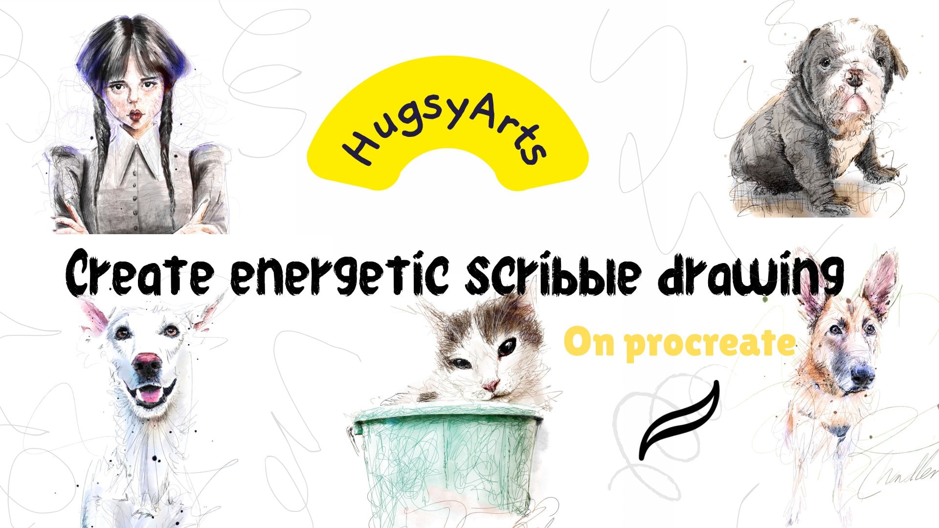
1. INTRODUCTION TO FUNKY DOODLES: Hello everyone and welcome
to my new tutorial. I've decided to call this new, this new method or
style, funky doodling. Because that's
exactly what it is. We're sort of not getting
too serious with details. We're letting our
expressions free. We are creating some fun and exciting pieces
using this style. So here's one I did just
previous to making this video. And you can see
it's kind of loose, but it's vibrant and bright. And it's still looks good
even though it's loose. So I'm gonna be taking you through a few methods
because we're not just limited to buildings
and landscapes. We can use this
method for anything. You could draw literally
anything in this style. That's why I was so
excited to get it shared and share
it with you lot. I provided some brushes
which are going to help us through this sort of carefully crafted for this specific style. Yeah, So I hope
you guys enjoy it. We're going to start
off the class. First off, we're going to learn the actions and the functions of the brushes I've created. So knowing when to use
them and et cetera, et cetera, how to use them. Then we're going to get
straight into the line art, which is that part. And then we're going to learn
how to best do the color. It's really simple. It's not like other videos I've done which are
quite technical. It's a fun style suitable for, for everyone who is suitable for the experienced artists want
to just try something new, right down to people who have
literally just purchased their first iPad or
digital art application. And they can pick up their pedestal and
get straight into this. So yep, so join me in part one, guys and we'll get stuck in.
2. HOW TO USE BRUSHES: Okay guys, Welcome back
to part one of funky, funky doodles or funky doodling, whichever I decided to
call it in the end. So the first thing we
need to do is I've provided you with some
brushes for this class. I'm just going to quickly go through some of them brushes. There's nothing
special, nothing fancy. Maybe one or two. You may need to be taught on. But most of them are just
generic brushes, quite wet. And I'm quite size variable, so we'll have a look at them. So the first brush I want to show you is the lineup brush, which is what we're
gonna be using. First off, I've created this one which is hugs
the ultimate lines, ignore the 112 is just because I've got it in other categories. That's all. So this is
the first line art brush, and it's just a generic
pressure weighted brush, which so of gets thicker. The harder you press. It's got a nice bleed to it. We go for that real
genuine inky look. I mean, you could even put it on a paper effect Canvas
if you wanted to. I'm gonna be working straight on the actual procreate
canvas for this one, it's very, you can get
some really thin strokes. Some really thick strokes using exactly the
same brush size. So perfect for what we
want. Really lively. Sketching brush offers a slightly different
finished look. It's more similar,
but it's more, if anything, is a bit neater. It offers that sketchy
pensively sort of effect that the finish
is just an alternative. It works along exactly the
same lines as the other one. Only it's got a
bit of flow on it. So the lighter you press, the lighter, the
brush strokes or B, whereas the other
one is more inky. So it's got a bit of a
tilt to it. Tilt it. You'll get a bit of
a bit like a pencil. I mean, it's my
sketching pencil, which I've just included into this nosy blood. If
you could do that. Right. The meanwhile, I think
we need to learn these two, which are the two colors. To color brush. We're gonna be working
with both colors up here. And I'll show you how it works rather than
try to explain. So let's say we wanted
pink, sunset or sky. The color will be
a more orangey, say, lighter color like this. So we've got two
colors up there. These are the two colors that our brush is going to be using. The harder you press, the more you're going to go
into the other color. The color you've got selected up here is the color you're
going to start with. The lighter pressure. The lighter pressure
would be that color. The harder you press. You're going to start going
into the other color. So you can start with whatever
you feel comfortable. You can start with the
darker one if you want it. In which case, the lighter, you press harder for
the other color. It's just personal preference. You will probably find that you will stick to one
method that suits you. I would like to personally
start with the lighter, press harder for the darker. It's kinda what I stick to. So that's how that works. It works best if you're
doing C or sky and you want to just put subtle changes and
it adds instant variation. So you can add lots of lots
of variation to your colors. Without picking and choosing new colors and blah,
blah, blah, blah, which is super bowl you want
because we just want quick, quick fire funky doodles. So that's that
one. The other one is exactly the same lines. That's the softy. In fact, I'm just going to
rename this now right here. So to color. Otherwise, how will you know? There you go. It's exactly the same as the
last one. Works on pressure. Like so. Okay. And that's how they work. I've added one of my
favorite all-time brushes, my soaking. We soak in water colors, which is from my water pink SAT. So I've added that
in for a bit of a static and a bit of
background noise, you do some good blockchains and it's just there
if we need it, don't always need to use it. Provided some brush flux, we want to add a bit of a static inky paint splatters, whatever. Good old fashioned round brush, which is my round brush. And I've added that in as
well, just for the **** of it. So there you go. That's our brushes.
So join me in part two where I'm gonna be showing
you exactly how I start. These are really quick. They're not long,
tedious processes, like with the portraits
where you need to take a bit of time
on certain things. Super quick and fun. You let yourself go. You
haven't got to be neat. So grab yourself a coffee. Join me in part two,
and that's what we're gonna be starting the process. All right, Cheers.
3. HOW TO DOODLE A STREET: Okay guys, Welcome to part two, which is technically part one. We're gonna be starting the
process and I'm going to show you step-by-step
how I do this. So like I said, this process works for anything, not just landscapes, houses and scenery
and things like that. You can literally draw
anything in this style. Which is why I've
added a couple of miscellaneous random things
just to quickly show you. Now, let's start with, let's start with this one,
which I've just done, because a good one to
show to start things off. The photograph where you
want it into the middle. Like so. Lower the opacity. And we're good to
go, go up a layer. Select your line art color. If you notice where
I'm just deep blue, they're quite unsaturated. I want that authentic
inky color. That's why I'm down there. And let's get going. So I'm going to
show you two ways. Sketching first, going
to find more, right? So what I like to
do is start thick. As we can see you
as we taper off, I'm not gonna be good
doing the whole picture because that took me
30 minutes just now. So I will take up
most of our video. I'm just going to quickly start so you can see my strokes
and how I'm doing it. So let's start off. Less. Pop in and literally
just go with the flow. Draw quick. Easy strokes. Neatness absolutely is not
wanted for this method. Not at all. We're just enjoying ourselves creating some
good old-fashioned. Yeah. That's what we like. And
always be all deadly accurate. Too stressful,
anything like that. I don't own extent mistakes. I mean, I live there. It's up to you at
all. It's kinda fits in with this method to be fair. They mix it up a
bit more authentic. Try and be pretty
with the strokes. It's a difference with
doing this loose style. But don't be all very
much the same, same, same holding the same pressure and taken off or
lines like that? I mean, I wouldn't look
pretty tried to stick to clean curves and lines. And it'll give you a nice
finish, a really nice finish. Just gonna do a
bit of this house and I got a bit of income. We'll move on to the next one. We're not going to be doing
a full masterpiece here, just to teach you guys
the method dream pipes. So I'll tell you now that
when I usually do it, I usually use my inky brush, which is the ultimate
lines one over this one. But I wanted to give you a
quick look at this 1 first. Then I'm gonna do it in the inky lines so you can
see the different facts you get canvas around so that you're always comfortable, never go into
uncomfortable positions. Were super sort of keep
the same repetition going. Again, young gonna be perfect, but just to get
those nice strokes. Not really too fast on the
details. To be honest. I mean, if you wanted to, you could go nuts and
really go for it with this. And you could keep
it will get it right and get it right
if you wanted to. But that's sort
of start drifting off into a different
kind of style. If you go to meet, you start drifting off into the it's got to all
be perfect scenario. You can glean about
a bit of it perfect. So that's why this
style is better. It's all messy and
it's all loose. So fun. Messy is the
wrong word, isn't it? Fun is the word, start to drift day and I'm
probably going to lower the pen size just to give it a bit of variability as I go further
back into the picture. Okay. Just get a little
bit of this side. Now, I'm not going to be lying in the sea or
anything like that. That's going to another
paints do that. I'm just getting the sort of building structures in place. As you see it goes
fast as you want. It all looks good. Pushes down there another night because we're getting
a bit nearer now. I think just gonna do
this a little bit and I'll finish off for that part. Please. As Louis slew slope fun thing about these sort of things is boost to character. It brings character to
a piece, reads those. So you've seen, I've done
there as long as that taken. Besides showing you
the brushes and stuff with 30 minutes in, I probably spent eight minutes without explaining the brushes. So we've got a lovely, lovely base doodle
to start painting. Start painting. We call the layer below. And this is where the
world's your lobster. You would just have some fun. If we just quickly grab our reference photo
and bring it to a reference just so we can
color, pick and stuff. Okay? And if we grab a brush, I say are two colors softly. Let's grab a local color of
our photograph, like so. So that's one color. Next color, we want something similar.
I don't believe so. Kinda go a little bit lighter. So I'm just variant and C. And I will go even
lighter on that one, even darker on that one, starting on the
darker this time. Because I want to get
some of that in harder. I press it to the theory. Okay. They probably think that looks
all for what she could do it grab your smudge or I'll
add it to smudge it out. I haven't added it yet. Okay. No drama. Biggie. Gone. Okay. I'll be adding
this, smudging. You pick softly blends so
that'll be included anyway. Let's just give it a little. Nothing much, only the
old phone strokes. Now want to take it
all away from it. Just like that. I'll do sky, a scrubber, local color. Let's grab a lighter color to that so we can see
where we are on the hue. You want to go near there. Maybe go to gray to white. And let's go a layer
above that line, sort of starts the case and they wouldn't be
working in that box. Let's just begin. Let's get lots of variation. Maybe a bit more gray,
a bit more blue. Just really not
care in the world. More blue, less gray. Mixing it up. Give me a good smudge. Like that. Looks like a
nice whites will get added. Some nice white
breaks in the clothes there were just try and
get a bit alarming. Okay. We'll do that. We'll do our background
is in place. Now we just want to
do the buildings. So we're going to do the
same process layer above. And you can color
them you haven't got so you could just delete and
I'll show you what I mean. Gabby, as tool. I'm going to show
you, first of all, I'm going to just merge
these two together. I like to keep it clean. In fact, I'm going to call
an end to part one there. I call them apart one there. I don't want to bog you
down with big long paths. So join me in part two. We'll, I'll show you how we
approached the buildings. The background was the easy bit. Okay, Cheers.
4. HOW TO DOODLE EVERYDAY THINGS: Welcome back guys. So if you remember in
the previous part, we started our
process of a picture. We managed to get all
the line work and I will call background
in as well. Just while we're on the
subject of background, I want to show you
one little trick. I do use some times just to
add a bit of cloud break, Sunlight, breakthrough,
things like that. So go on a layer above
and just just pop in some white some white
cloud breaks like so. I just want to show
you how we use this. So give it a little
smudgy smudge. We do. What we can
do is go to bloom. And we could just bring it out. If you want. The
drum got to go nuts. You could just blew me out a bit and give it a Gaussian blur. Just to get some, some clay bricks and lights
that you can use that in any scenario just wanted
to show you that's all. Buildings. Go layer above. And whatever color your
buildings are going to be. Select the local color. Going creamy. Color there. Get your S Pen, has shaped tool,
and I'm not unfree. Go to free hand and
have some fun again. To worry about being too neat. Same principle as our ally. Not just loosen free, loose and free like so. Not really. I mean, I didn't really finish
that part down there, so I'm just not even going
to let it entertain me. Yeah. This is how I approach that. That's just get rid of
background and felt. So we got that sort
of thing going on. See where we're sort
of working now, let's highlight everything
a minute and I just want to shimmy it down a touch, move it down a touch. Like so. And I want to blend in some of that background to
be so dramatic. I mean, you could got this
now we can alpha lock it and we can only work
within buildings. So you could keep it. You could make it
white and not even color it in if you
want it like this. There are a lot that adds
quite a nice effect to be fair as a really quick,
quick RT doodle. If you want to do that,
what I would suggest is to just blend out some of your edges which you want to, want to be on alpha lock for. And just, just soften some of them just
to give it a bit of a genuine genuine
luxuries, not too sharp. So now you can leave them, stick their stay at
that if you want it to. Just add a little bit of color, which is what I did
on my last one. I just grabbed some green. Grab some more green. Grab a two color brush. Just dab, let's go a bit deeper. So starting on the darker color, the lighter I press, the darker, the harder I press. We're gonna be going up
to my lighter green. Just adds, it's
just a speedier way of just adding variation
to your colors. It's nothing more, nothing less. I know there's
some yellow is on. Hello play with maybe
some orange flavor. Okay, So that's kind
of the process. Once I've got a bit of
debate of painting, I usually give it a bit of a
smudge over just like this. For static, you could
throw some brush, brush straight back,
flexing if you wanted to. Okay, so that's one
method of our do it. And that's how that method looks compared to the
inky brush lines, which is more
dramatic and thicker. And thinner because
of the shape of it. I did actually complete
this one though. So it's a slight variation
in the style of loans, whatever you're going for. But as you can see, we've
spent minimal time on this and we create something
quite, quite attractive. 20 minutes, probably
about 15 minutes max. It took us to do and
it's great fun for cards and just letting go sometimes when you just want to draw and release your brain. I do it most mornings. Okay. Let's move on and quickly
do something else. Let's add another picture in. Um, we got this, We got my daughter's prom. Random miscellaneous. Funny shape actually, isn't it? So drag that up a bit. Make it a bit more to normal. Looks funny. Okay, kids prompt. Lower the opacity. Upper level. Grab a pen, whichever one you're
going to use. I'll use the inky one this time. Such as thick as a bit heavy. The middle. And off you go. Yourself. Enjoy yourself
nothing, nothing too heavy. Keep your strokes attractive. Don't have no sharps, stops. Let it flow. Which is easier to say than do, but you will get there. This looks fun. Curves like that
can be a challenge. They're actually easier
with the sketchy pen to do curves and things. If you do struggle
with this one, just skip the sheep, the basic shape of that clip. So the base bit
of a funny angle, this photograph
dominant wrote to me now my circles and
then you could see, look, this is how we want it. We don't want perfect
circles. That's boring. It's not interesting
to look at is boring. So there are some spokes to get in. Spokes. I had some really fine lines now just put a bit of interest. This is just trying
to accentuate the flow of the picture
rather than anything else. Just randomly adding items. Just adds a bit of a bit as
something should we say. We've sketched out there now, you're probably thinking, wow, that's a pretty bad drawing, but I'm sure you're not. You can see that
it's fun slightly. It's just looks like
a cool sketch to me. Let's get some
color straight in. Grab the reference. They were funny shaped. Prime minister took it on
widescreen or something. I don't, I don't know.
Grab the local pink, which is the baby pink. And a secondary
color is going to be just a bit deeper there. And let's use the two
color Sharp Brushes time. Why not? I'm starting on the darker of the two pinks are the harder
I press lighter it will get. So you know, that, that's how I like to do it. You might prefer the other way. Start with the light
and press for the dark. I mean, to be honest, I don't really think
about it that much. Which is sort of
whatever when I'm last on is kinda
what I would do. Let's go a bit darker. A bit like that. Now I'm on the light.
You see whatever is up there is light light
pressure. Yeah. Some light likeness and then that's a different
pink altogether as and as more and more electric
is more electric. So we will, we will
go more electric too. But let's just give it all a
big smudge, smudge your G. So let's remove that
because I wasn't intended. Okay, we got some
whites and grays now. Been white. Bit of a darker white. Let's just let's just put the spokesman. I wanted to do this one
because I just wanted to show that you can actually draw
anything with this. With this style is
really, really versatile. It's a sort of graphic
designers have been still, they still use this style to this day to design
their cars and stuff. It's obviously got
something in it. It just creates life. Let's go a bit whiter because wheels are actually
waiter spoke. Okay, we got a bit
of a pink going on. Pink clip there. Right side, a bit of depth and shall we the dark gray. Some areas just to get
some variation going. This other bit of
lightness to the matter. You could use whatever you
want to add the lightness. I would use the software. We're just going to
add some highlights. Certain areas. White. Give it all smudgy, smudge. Background noise if you wanted, or you could just
add some static pink splashes wherever you want. Obviously, it does look like
a funny shape prime because the photograph was
quite, quite distorted. So it's not great.
It's not great. But it is what it is. And that's how you do that. Join me in the next part. What everyone did
that too. I just didn't take long at all, did it? Let's have a quick gander. Luck. Eight minutes. Eight minutes to create that
little fun piece there. I know it's not the best, but just getting you used to what the process is rather than how it's up to you then to put the time
in whatever you wish. The next part we'll
draw a, another scene.
5. HOW TO DOODLE OLDER BUILDINGS: Guys, welcome back. I actually had
another little goal, spent another ten minutes
on another parameter. We also took a little break and I think it's just an
oddly shaped photographs. So it wasn't really
given us the real vibes. So let's go straight in
and do a, another scene. In fact, it's doing a landscape. Landscape berm see. Well that looks
pretty, pretty cool. Lower the opacity. Get your ink color. Ink, pen, whichever you're
going to go with this one. I go in. All guns blazing. All guns blazing. Not care in the world
at this moment in time. Really good for the
field of mental health. This process. Mrs. actually
loves doing this as well because she's did you still enjoy coloring which
candidate and stuff? But this is sort of a similar along the
same lines, isn't it? You work in the
same brain parts. You just mindlessly that can stressed going with the flow. And that's the key to this
whole process is flow. The word twins foliage can be a bit of a
challenge to be fair. Kind of works its way out. In the end. Just kinda
bubble and double around. The outlines is how I do it. Windows. Be careful if
you do at some point, we're going to take a bit more
time on this part or that part risk than losing the style. I've mentioned before,
you start to go down into a more serious
architectural type of style which has
to be all that way, then doesn't really work. It can work. If you if you work out, it can be cared for. So I'm saying rough road in drifts off it back
around foliage, grass. And we just got pure scope down. You just got roles and roles
of trees in the background. Let's just add some, some fun, some fun lines to the thing. So long is that going to sketch that out? You've seen the
effort that went in. It was minimal. Three minutes. Three minutes. And that's with waffling. And we've got a fun
little doodle to color. And it's going to look
fun. Guarantee it. Let's get our reference. So I must reiterate
that when I say, be careful if you're going
to start going neat, you can take longer
than what I'm doing. Two, this is more
for video purposes. You can put a bit more effort in to your strokes than I am. You haven't got
to go this loose. You can go to your preference. You can lower the brush
size down and stuff, but you do risk. Again, falling into the category which I've already spoke about. Just go easy, breezy, go with basically doing
what you enjoy, right? Let's get all that greenery
and in the background. So we got some crazy
colors going on. We've got dark brown, and then we're going to go dark. Dark green to start with, shoes I were to color. Unless it just comes
straight over the top. That silly. Let's just get our base
dark colors in place. Like so. And then I scale a
bit more of a dark color. Let's give it a
little blender blend. And let's bring some
of that brighter colors in their case. So we go that yellowy color. I think it's gonna be
very similar color for the next one. Yeah. Let's go again. Bring
some of that lighting. Just be careful
with over blended, which I just did. You can sort of get a muddy volume which
don't really want it. It's a bit of orange
oil coming through. A bit of orange down. I think what I'm
gonna do is I've gone a bit too a wire
on the dark green. Bring it up a bit. Bring it up a little bit. Maybe even switch
the hue just to add more green color, right? So that'll do with
my background to be fair layer above S2. And let's start cutting
out our focus point. The building behind. Follow down that
path back around. When building D will get foliage going on there. Just so keep that as it is. And we'll go with
that color, is it? It's like a brown
and gray, isn't it? So we'll go with that
and then we will have very similar color. I'll go in with a
two tone again. I will just vary it up
and see how it looks. And then we'll
just go a bit more extreme with the colors. Just for pure variation. So it looks like we put
loved the best fitting. We haven't. It's also good for
bricks and stuff because bricks are obviously
carry different views. You can just dab on variation, get some good effects. Darker there, isn't it? Darker than the roof
looks a bit of a color. A different color. Gray road. Blue is a cool green room. You become greenery, but over a bit, that way we still got a cut
in a bit of this building. We don't want, quite best. Guess my greenery back as well. Losing our frame, if
you know what I mean. Kind of sticking into
this little frame. What I said earlier, we could do we could bring in
some of that orange, really bright orange color. Um, we can we can
work with it using our Blum, Blum that up. Now, you can get some
sort of light going on. I can zoom blur effect. Maybe went too far on the
bloom there to be fair, I'm going to bring back a touch. It looks really
cool, looks good. Through some aesthetics
down if you want to think about some more lines,
if you wanted to. This is just like I
say, just the process. I'm not really
going mad with it. But they've seen it took us 12 minutes to do
the whole thing. And I mean, minimal
efforts gone in. It's just fun to do. I could go back in on
that and add a bit of texture to those
trees and stuff. But I'm only showing
you the basics. So join me in the next part. We'll do another one.
6. HOW TO DOODLE MORE ADVANCED SCENES Part 1: Hi guys. Welcome back. I just had a thought. So I thought I'd go back
and show you some of my older versions of
this that I've done. And this was one that I did at my local city and kinda
picked off the best. There's not many the best
landmarks that we got to offer. And kind of exactly the same
style I've been showing. You. Just come up with this.
I've actually got this on my wall and it looks awesome. On the wall. It looks modern, funky, fresh. So it's the same sort of
thing that I'm showing you. I've just added a bit
of an overlay layer over the top just to bring some of the light soap
on this one in particular, which you can do that
as another one of the Church that we go to. It's an old church. Took a bit more time on
the liner on this one. Where is the line emerged? Yeah, it's gonna be more total
that line out on that one, um, as you can see, but was worth it, got slightly different
effect in the end. Using the same brushes. Same thing, spend a bit
more time on the line art. It's not a solution free. But same process. Just used my wet paint
brush to fill it in. These are actually the same. No, that's not that
is not another one. Yeah, super loose. I mean, it's quite
a nice reaction. And Facebook groups, which
if you haven't, by the way, join my Facebook
group, Procreate, learn and share with
all learn together. This is exactly
the same principle of what I've been showing you. We've got our loose line art. Then we slept in some base
colors using a two tone. We put a bit of an overlay
on to get some shadow. And then we added some light. Simple. So let's do one more. Let's do one more. Let's
do one more picture. Let's do two. Let's do this. One. Looks super daunting
when you look at it, but you've seen a quick
we've got these done. I like to have a
bit of backgrounds. Don't like to fill the whole
page because I want to keep that rough edge
around the colors. So I'm actually not going to be drawing a
lot of this picture, so I'm going to cut it off. I'm going to just
draw that part. Yeah. That's what I'm
going to be doing. Let's get rid of that.
Lower the opacity, go up a layer, pick your
ink, color and brush. Gets stuck in booked. Going to say I got all
experienced drawing boats. Go. Absolutely no muscle memory to go on here whatsoever. Theory and stroke. Sensitivities. Things hanging down. Does say much, I know great
books because some things hanging down. That's about it. The only way I could scrape
them really small and just get some let's just
get some wiggles on. Over there. You get the shape of
the actual island. Like so. Get this bolt in. I'll do we'll do some ink on it. Reference book. Oops. Let's get this base color, crazy sky, dark color,
the white there. Let's have some fun with that. So with DAC for the
lights are so we're just gonna we'd all like
to over this side. In fact, we read in some parts, shrink it a bit of that
pink, going running through a lot or a little once. I'm bringing it back in a bit
because they're not going to be one high or far over. We got some very dark
colors over there. I mean, it's just going to
go down and that's that. So maybe a sharp, sharp brush, soup better. Rough. Maintaining atmosphere. Still gonna give it a
little smudge though. Water. Next, we've got a
blue and I'm going to just stick to very
similar and go darker. Start on the lighter. You can see the variations. You can just pick up
just effortlessly. This is why it was making
the pictures interesting, is the color using light
colors coming through there. Then the bottom, lighter because of the sky is pink. So when I just want to add some some slightly
darker sketchy lines just really through running
through that water. And some light switch will
add now on a new layer. Some orange lights. Very, very ready. Already shown the one. Very light orange on the other. We'll just throw them in there. Just give it a little bit
all little DOB and adapt. So it's not so hard. Could even give it a little wiggle if
you wanted to because it's in the water. Like so. Should we give it a bloom? I suppose it wouldn't. There's no harm in C and I, what Bloom would look, is there. Just get some white and
yellow bloom would look. Yeah, it looks pretty cool. Like get your Bloom, Right. So I mean, to be honest, this is how I do this one. I come in here, I cut
out our foreground, which is the rectangle, the back cover, and just cutting in line with something
very loosely draw. Okay, so that's
that voltage alone. Okay? Never mind. Let's just fill out
in white for now. I'm seeing layer. That's got boats. Boy and his little friend
boat with their background, a little something over there. Just fill that in. Let's grab the local
color, blue color. And then let's go a little
bit darker or lighter, sorry. And let's just give
it a little okay. Yeah, I still got to select it. So just only the boats alpha
lock step to that media. We go we go just collecting just going
to leave that there. So guys on the parts to
go onto long as you know. So join me in the next part. Well, a complete this and we'll just go over a few,
a few things, okay? And a few little
tricks and things like an overlay layer and the bloom to make sure
you understand that. And then we'll call it a day. See you in the next part.
7. MORE ADVANCED SCENES Part 2: Welcome back to the next part. So no break them
straight back into it. It's fun to do as
enjoyable to do. It sounded better liked
variation into my work. They were sure. Give
it all a little. Blend. The Blend. Blend, blend like so. When we pet hates is
actually messy canvases. Just blend a bit of that
bucket and like that, okay, little bit of
depth here and there. This is the beauty of
working like this. You can see little simple
things that might help. Or we can see we got to shut the window boat so
we'll go darker. We'll give it a little
little weird stuff. Like So. I quite like it actually
quite like, Oh, this one's going to
turn out quite nice. We may as well go the whole
hog key out of me and I'm some greenery going. You can see we got a bit of
greenery here and there. Most, most here, they're just take the Nationalists off. Like so. Okay. Boats. It's kind of
like a white color. So I'm just going to
use my round brush for these boats here. I'm going to grab
the blue back in. It's very dark at the bottom. I'm not being too pedantic
with things like this. Windows. Give it
all a little thing, little smudge, some
bright orange. We call them. So far away. There's pretty much dark. It's pretty much dark
because it's so far away, further away in the distance
you go, you lose saturation. So bear that in mind. I'm just looking at
that blue now and thinking it's way too blue. We're going to bring
it back in a bit. We're going to bring
it back in a bit. We're going to read boy,
which is very, very dark red. See, an older boy
is the last stupid. And we have a final
piece of the jigsaw, which we are unfortunately
going to have to cut again. So we're going to cut
our new bolts for forefront of the piece back. So we can work neatly
into it. Say neatly. Take a look. This is a bluey color because
of the shadows casting. So that's exactly what
we're going to do. Whatever to Tom
brush I'm gonna go. Thing is that saturated
trick somewhere? We're going to try
that for status. I'm going to try
that for starters. Maybe we'll go right
to it in some. You can see we're going very dark at the bottom and in fact, it's just a different color. The masts extremely dark. Like so. We've got some little
dark tremoring the edge. We'll go for it. Why not? We'll go for it will soften it. Go some blue sheet and going on. So it's a blue sheet and the next color is
going to bleed. A very muted blue, that sort of thing going on. But I just want to
go much darker areas into like that. Okay, so we've got a nice
little painting going on there. We can just reposition
a few things. We can bring it still selected. We can bring it into a better
position on the canvas. Painting going on. We just need to know, maybe bring some parts of life, which we can do with
an overlay layer. If you open up a new layer
above, go to overlay. Now, this will take your darks darker and the lights lighter. So you just would end up black. I'm softly. Softly and just see. You can just go like that
and it will bring that instantly to shadow areas using dark if you want to
bring lightness, we go up. We can bring light. Let's come to their
normal software. You're going to
enlighten us to areas. So it's a very cool
layer, powerful to use. So let's do that. We'll
bring some darkness in. It's not going to
hold full whack. Darkness in under their seats. Greetings and shadow
all across this. But I'm going to just blend some parts into the ripples. We could just squiggling a few, few of them like so. And for the light, we could just squiggling
a few of them like so. See what I'm saying. We
could bring some lights, bring some more pink
this if we wanted to. I were pink sky yellowing. If we wanted to. But yeah guys,
this is my methods on creating funky doodles. You can use it for anything. And it's super fun to do. I guess more fun the
more you do it and the more experience you get
out it doesn't lose its firm. We've created quite
a fun little piece. They're just overlay
and some of those. And, um, yeah, I
hope you enjoy it. I hope you'll go on and
enjoy it as well as I did. Put your own spin on things. Draw whatever you want,
practice and yeah, Please do please
do share with me. I love to see really
do some things there. Some duties. Maybe
a little clouds gathering their bloom. Just draw on that layer. I did I didn't mean to, You
didn't mean to do that? I meant to do it above. I have a play around, guys. This is your Canvas. You can do some magical things
on this list application. You can even pop out things
if you want it as well. You can. I mean, we could take this whole piece and change the whole
dynamic of it. By just, we just merge
all that down together. We could sort of, you could play around and create some popularity styles
if you want it to. Most important thing
is that you have fun and that you are happy with what you're doing
and that you're enjoying it. That's the main
biggie, isn't it? You're enjoying it. I'm just going to erase
some parts back because I don't want to mess. It looks cool. I quite like that might be
going on my wall actually. I'm just going to
smudgy smudge a bit more about that folks. So yeah, if you're
interested in creating these fun super easy doodles, we created a bit of
a nice one there, which I am actually going
to be putting on my wall. It's taken us 23 minutes and
I'm more than happy with it. Well, I'm happy with
how it turned out. So I hope you liked
the video guys. Please comment and include your attempts and efforts
on the Resources section. Any problems? Message me. We can find me on Instagram
at hugs the arts, or you can purchase my stuff on GMB rolled
again, hugs yachts. Do feel free to join my Facebook
group, Procreate, learn, and share where I'm always
on personal hands to offer advice and stuff
and help you out. On a personal level. It's quite difficult to do
that like this on Skillshare, but on a personal level, I mean, the Facebook
group willing to help. Thanks for watching,
thanks for taking part guys. See you
in the next one.
 HugsyArts, Aspire to inspire