Transcripts
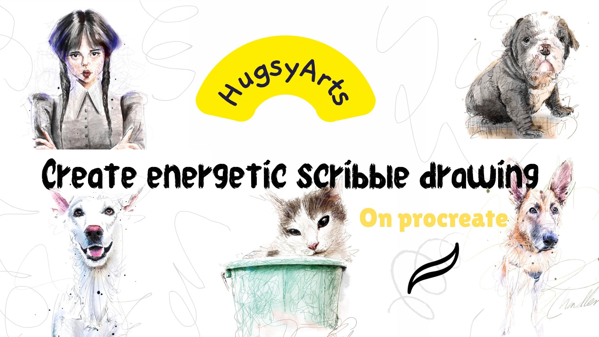
1. Introduction : Hello everyone. My name is hugs the
arts and I'm back with another tutorial
is being too long. And so many people have
been asking me about my new minimal, funky
inky portraits. And they want to
know how it's done. So that's why this
tutorial is all about. So if you want to learn
how to create fun modern, Inky style portraits, which
takes no time at all. I can get a portrait done
in 5 min if I wanted to. I could do 20 a
day. If needs be. It's fun to do. It's not tedious, is
just about learning the tricks in the method. And I'm gonna be sharing
my brush pack with you, which I use to get an
authentic inky look. And I'm also going to share
the tricks and the little treats secrets if it were
to help you on your way. I've also thrown
in a little bonus, bonus tutorial right
at the end too, which is going to
show you something unusual and also equally fun. So, yeah, I hope you
enjoyed the tutorial. I'll see you in class.
2. Briefing on the brush pack: Hello, every body oxyacids here. And finally got a new
class to give you. For this tutorial, I'm gonna be teaching you how I
do my Inky style. Minimal portraits
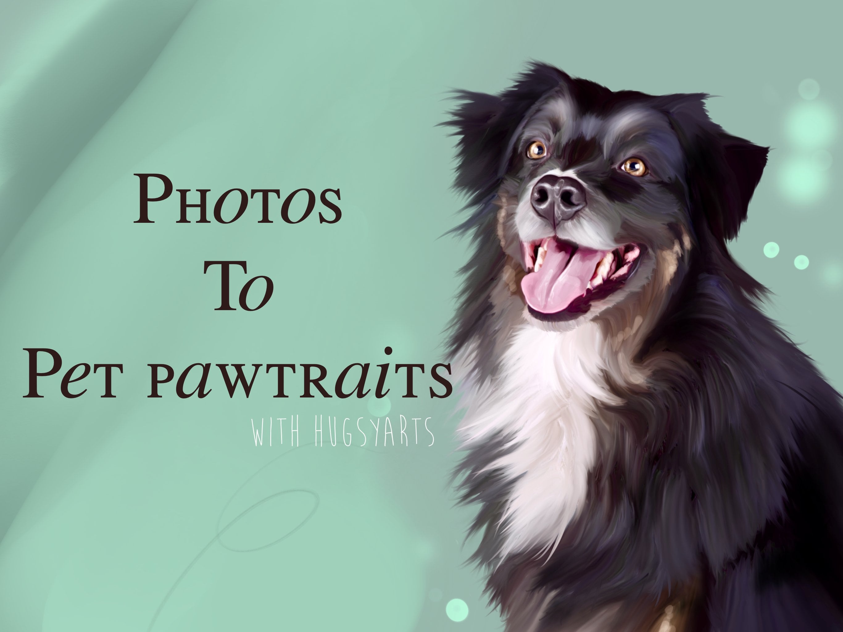
or illustrations, like you see here. So if you fancy
learning this method, then let's get stuck in. This is what I did the
other day of Gary Linux. This is what I did at this lady. Just to show you the style. One of this little girl. Have we got any more
pet one's going on. I did this. This is the style. I'm gonna be showing
you how it's done and all the
secrets involved. So for part one, we're gonna learn the tricks. So the tricks or
tips that we need to trace something to
get it really good. We're not gonna get
the same effect, tracing straight
over a photograph. We need to edit this photograph. So what we're gonna do is I'm gonna be
teaching you how I edit this photograph and get it where we want it to
get stuck straight in. So first things first, let me just show
you a little bit about the brushes
that I've given you, which is inky, minimal, clumpy for you all
know what that is, is it's a smudge. Although you can draw with it, but it's a smudging tool, which is going to
give us a nice wet, soft look for certain
parts if needed. Same for the harder when we
got the background splat, which is just going
to add a bit of effect for us at some point. Again, if needed. We've got hugs the
pencil, which is more, I like to use this to glaze
in at the backgrounds. I'll show you as we go. It's more just a Gliese,
nice textured brush. The same with this, my Mr. Soft, which is again, it's more of just a textured
fill in brush which we're only going to be using to certainly fill in at
the ends and times. We got our ink brushes
at the bottom, which are all fairly similar, but very inky and very messy. And they give a nice
authentic inky look. So that's exactly what we're
going for in this style. I'll be going and doing
a few of these because they're really quick and
they're super fun to do. So I'm going to do a few
of them in this lesson. I'm going to show you step-by-step what
I'm doing and why. So join me in part one, because the first part is
possibly the most important. That's where we edit
the photograph using a few tricks of the trade and a few techniques to
get it how we like it. It's actually from
the tattoo trade. Ms. Hotel twists. So prepare their
stencils, many of them. So I'm going to show you how
that's done in part one. See you in a bit.
3. How to prepare our reference photo: Hello guys, welcome to Part one. So part one, we need to edit a photograph and get it perfect so we can draw
straight over the top. Lucky enough, I've got to
photograph right here. We can draw anything
in this style scenes, pets, inanimate objects, humans, anything is completely, is completely free with
this style and super-quick. A really good, I wasn't
even sure if I was going to share it because I might get telling off
from those that no, don't really want this
published worldwide. But anyway, here's
what we're gonna do. We're going to duplicate
our photo layer. Okay, so we're on
the photo layer. The one above, we're going to
turn off our original one. That's just going to
stay there for now. Just forgot about this,
pretend it's not there. So we've duplicated
and we've now got two. We want to turn this
to black and white. So go to hue, saturation and
brightness less knock the saturation all
the way down to zero. Now we just got a gray
scale of our photograph. It already looks a bit
clearer to trace over with, but there's more will
duplicate this again. And we'll set this layer
by tapping on the n, will set this to color dodge. And it's popping the
lights and really exposing the darks now. Like so. But there's more. We're going to tap it again. And we're going to hit invert, which is going to make our
image completely disappear. So we need to bring it back and we'll do this in this way. Select the Magic Wand. We're going to use
the Gaussian blur. And the more we slide more of the photo
that we bring back. So we could have just the outlines or we could bring back the shadows,
or we could do both. So I'm going to do both now and I'm going
to show you how. So I'm just going to bring
in just 278 per cent, 1110 per cent there. I'm happy with the outlines. And you can imagine it now as
a tattoo artists stencils. It's easy for us to
trace over this. So do that. Now what we're gonna
do is we're going to duplicate that layer. And we're going to knock off our original back
to Gaussian Blur. And this time we're just
going to take it up further so we can really
see where the shade in the shadows or ticket to wherever is comfortable
every photograph, it will be slightly different. So I like to sometimes just
take it all the way up. And on this one, I'm on 92% there. On this one we can really see where the shadows
are on our picture. So it's really easy
to trace over. So we've got that one
and we go outlines. There's another little trick. Let's just turn off
that one a minute. So what we wanna do is duplicate our original black
and white one. Just lift it up above our
outline to Gaussian Blur. I know this is confusing. It will become second
nature to you, I promise. Knock that off. So this is the original
that we had here. These two, remember we just
put a color dodge Over. We hit Invert and we just slightly Gaussian blurred it just to bring out the outlines. Now what we're gonna
do is snap them together and go to Curves. And I just want to
make it a bit darker. So I'm just dragging from
the center donors touch. And then I go back into curves. And I'm dragging from the bottom just across a touch
from the top, just left to touch, just to give it more. There's more to see. It just defines your lines a
bit better. So that's that. Now we want to do the same
for the more shaded areas. So we're going to
snap them together. We're going to go to curves. We're just going to give
that more pop as well. A curves from the bottom
left we're going to go across and we're going
to bring a bit of this in. And you can see, now it starts
to take a bit of shape. We have options. We have options to
create a portrait, and we have options
to create one of our minimal Inky
style portraits. Okay, So that's the secret.
The secret right there. It works on any photograph. It makes it easy to see
the shading and the light. Easy to see the outlines. Perfect for tracing, perfect for creating these
minimal in key portraits. I mean, these things you
haven't gotten no way to draw. The, anyone can do this is
just knowing how to do it. You can sell these
as commissions whilst you continue on your art journey
and learn to draw. So it'd be a nice
little, earn a few. So join me in the next part where I'm gonna be
showing you the next step where we're gonna be going
straight in with our ink.
4. How to ink our artwork: Welcome back. Welcome back. So as you know in part one, I just sort of exposed the
industry to twist secrets. And I've exposed
it with you all. Why not? It should be shared. Knowledge should be shared, not kept to the grave. So now you can see that was our original photograph
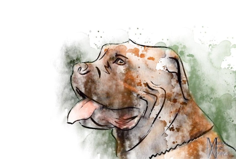
of Mr. Gary Linux, and this is our outlines of him. And here we got the
definition parts, the shading and the light. So let's open the layer above. Let's grab an inky pen, whichever one you want to use. I switched it up. I'm
not going to lie. I switch it up and I use a different one nearly
every single time. This one is probably
one of my favorites. This is a new one,
which I've done and they're very similar. So there's not a lot of
difference between them. They're just very
bold, very inky. Okay? So use whichever one you suit. Also with this method, there is no particular style. Now you know the secret. You can play with it and
do what works with you. So I've just lowered
the opacity of our drawing outline, sketch. And I'm gonna get stuck straight
in with my inker brush. Okay. That's a bit high. There is one more thing I'm
going to show you in fact, scrub up because
I'm going to add a whole section on whole part. I'm going to show
you my settings for my streamline and also my settings for my
preferences toolbar. I'm going to dedicate a whole parts where
ignore that for now. So let's get stuck in,
let's draw what we see. Draw what we see leaving
the white parts. And you'd be surprised at
what comes out at the end. Just scribbling and draw in, leaving the white parts. You may do more,
you may do less. This is going to come down
to your personal taste too. Whatever you decide in their color this bit in here, I'm going to get it
better that make this one a little more detail than
I probably normally would. Just to get the chief
jaggedy chief bits in there. Be at lower this down a
touch. Just get a bit. Yeah. Bits. Just to signify
that got a bit of facial hair going
on with his hair. But I'm not going to leave
that for a sec because you'll find that it's easier to
use this one for here. It gives you more because
you more options. So let's get stuck
in with the hair. And just sort of inking in really loose because if
he was doing it on paper, it would be really
loose if he was doing a minimal ink
portrait of someone. So I'm just doing it like that. We've got this dark shadow here. I'm going to have a
dark shadow there. Let's go back to our outline. You can mix and match
to what you wish. Be careful to follow
the, this one, the outline one to accurately, we don't want it
to become boring. We want to maintain life. So be free with your strokes. And you can see I've loosened. It's more about
knowing the secrets to this one rather than the rest will come at your own. Well, you know what you, what you like and
what you want to do. Really great earner and they look Brill and
they're fun to do. So I'm just going
to do a little bit more now on the shadows. I'm going to bring a
bit of shadow in there. I haven't lowered the
opacity on that one. Yeah. Okay. Jordan on the shadow. The shadow, There's a
bit of shadow in there, so I'm going to get okay, we've done, we've
made a few pen marks. Let's see where it looks. Now you go. There you go. It's as simple as that. Okay, So that is how you
knock up one of these. Now underneath our ink layer, I'm going to create a new one. And we're going to just
sort of add some shade. So I'm going to use
either this or my, I mean, any of these
three are great. Just going to use
this one for now. We're going to use this
layer for our shading. I'm going to grab
a lighter color. And I'm just going to
glaze in some parts. Like so. Just glazed, messy and glazed just like so. You want to adjust
the brightness of it. We know that that's
really simple. I'm going to make a new layer. And I'm going to
do the same again. Might even use the same brush. I'm gonna go lighter
this time. This backup. And let's just let's just
throw a bit of this on. Throwing paint on
as if you would on a canvas than it
looks free and loose. And I just gonna go
around and get some of these more refined details. The beauty of this is, is you
will never do to the same. You'll never do to the same. That is unique. People's portraits will
feel unique to them. And it just looks cool to that. Now above all that,
I wanted to just add some inky splatters. I've added juice or
what color drop. Brush. Let's just throw
in a few splatters. Not too much, don't overdo it. That's enough. Maybe add
some background splash. Let's see how it looks. Get a nice light gray and pop in on wash on its own layer. Like. So. Move that down
to the bottom. We can re-size that. We can also play with the
saturation as needed. It's just a bit of texture. So a long did that
take Let's have a quick look on Canvas
information, statistics. It took us 19 min to
create something new, could potentially handover
the people there happily. They print awesome
because it's super thick, super thick crisp lines. They print awesome.
They look amazing on the wall in black and white. You could add color
if you wanted to. This is where it all
becomes up to you. Right? Let's leave
that up there. That's the end of this part.
5. How to set your stabilisation and streamline settings for natural art: Hi guys, Welcome back. So for this part, I
want to talk about my pressure stability settings, which may be maybe
more personal to you. I'm going to tell you
what mine are anyway, because many people
have asked me. And I said, Now obviously the
brushes are all set anyway. So you don't even
need the touchdown this set how I like them. Okay, they set how I like them. And if you notice there's
some differences here. If you go to Preferences
and then you hit pressure and smooth and you got, I got my stabilization on three. And I got motion filtering
expression on zero. And nothing on my pressure
sensitivity is as it was. I have been known to turn
this up to like 0.5. This all the way up. What this is gonna do is gonna give you, gonna give you some
expressive lines, is going to be nice. Not quite as free as I
would like to be fair. But it's going to help you. If you've got shaky
hands or something, it's going to help
you get nice aligns with whilst keeping
the expression. So it's quite important. Let me just not that backoff. Keep it how I had it. Okay, So if you are struggling to use these,
you can see this one. I've got the motion
filter and wrote up. So it's going to be more stable
to use than the Inca one. It's just not going to look
quite as authentic. To use. This one is really unforgiving. So maybe start
with the scramble. Okay, So what we got, we got, we got, we
got phone lines. Again, this one is going to be streamlined because it's just literally just to add in some bits at the end
if you want it to. I really do. Okay. It's just there
if you want it. Okay. So I just
wanted to quickly clear that up and show
everybody my settings. There's nothing fancy going on with my streamline settings. Pretty bog standard. I've just got my
stability on three in my pressure and smooth
and that's it. Guys.
6. How to ink a pet in full : Okay guys, so the ones that get the most attention are of
course, the pet portraits. So I've got one here. As a rule of thumb, if you're doing
these to print off for people on pictures. Imagine your canvas
is in thirds. Imagine this in thirds. And you want the eyes. If you want to capture
most attention, you want the eyes to
be sat on this line and fairly central, if possible. That's where you're
going to ask the viewer, is going to look first. So try and keep your lines in that area and you know, you're
in a good place. Just thought I'd get
out quickly out there. Remove that. So
here we are again, we've got a photograph
and we need to make this a bit easier to read. So let's duplicate it. Let's knock down the saturation. Like so. Duplicate it again. I mean, you could actually just duplicate for
straight off the bat. If it's easier to
turn them off a sec. This one goes to Color
Dodge, remember? And then we hit Invert. And we Gaussian
blur to our liking. So that's nine, that'll
do for my outlines. That'll do for my outlines. Let's pop them together. Unless show off and go to
this one. Color Dodge. Invert. Gaussian blur. To get the shading
wherever you want it. I like to go quite high and
less snap them together. And now if we want to weaken
curve to bring in some, some extra depth, that's fine, that's fine as that is. And on this one, we can curve to get some extra darkness
so we can see a bit more clear. Like so. And we literally get stuck in, on a new layer above. We get stuck straight in. Grab a brush. That's way too big. And just have fun. Ink. Ink where you see, don't, don't second
guess yourself. Just kind of trust. Trust what, what the
template is left. You can be as loose, as free as you like. This bit of that. Loose as you like. I mean, you could take a bit
more time if you want it. And this is why I'm saying you can put your own spin on these. This is not the only
way you can do these. I'm just showing
you how I do them. Loose and free. Gesture strokes, which on their own,
just create energy, create life. Stops there. Now let's go back in. On a layer above, unless we're shading parts. If is there anything
that really needed shaded logo right there? The eye is, maybe think
we've pretty much covered all that. Let's just do that. Okay, now underneath, we're
gonna be going a bit lighter. And we're gonna be
doing our shading. So let's knock the
opacity down on that. Let's just, let's just
go ahead and have fun on the bits which
are darkest to us. So again, like so with pets is good
idea to just sort of Let's put in some
strokes which sort of guide the viewer
to the way that hair is moving like that. And then underneath, of course, we can just put a quick glaze of a lighter color in
just to simulate. Maybe get different tones
and colors on the dog. Bit darker for his
thing and his nose, maybe one then if that Let's
put in some splatters, ****** do, just to make
it look a bit funky. Maybe a drip. And see what we just did. Before we have a
look, Let's have a look how long that took us. 9 min. And that was a lot
of bumps that I explained other stuff to knock it all off. And there you have it. We have created a little
doggy doodle in minimal time, which looks really cool. And y is the splatters, not theirs because I
haven't got them on. There we go. So that's it, guys. That's the be-all and
end-all of this method. The most important thing with this method is the
trick of getting phone calls to appear in
a very stencil like form. Then we just have fun. Now you can use whatever
brushes you want. You can do whatever you want. It's also a handy
way to just create portraits and it makes
tracing a lot easier as well. You can add color to this. If you're, let's say we
just merge these together. You could use gradient maps to just pop in a bit of color. The opportunities are endless. You could get 25 of these done
in a day and make fortune. It's really great.
You've got the curves. See the red. There. We got we got that going on. I mean, we could You can
have fun and new can really, really do as you please. All right guys. That concludes my
little mini tutorial on inky, minimalistic portraits. I'm just going to quickly go
through some that I've done. Obviously showing you them ones. This this was a
similar sort of thing. Actually. That was a
similar sort of thing. I think I'm going
to show you that too, because that's
another trick. That is another trick
goes minimal ink. Again, it's exactly
as we just did. You see? It's exactly
as we just did. Denzel? Exactly as we did see. This one. Exactly as we did look see
we've got our stencil of our photograph which I
brought into stencil. And then I started with the lines through in
a bit of another color. I cited a bit, a
little bit of warmth, which is a personal thing. To create the finished product. Another pet portraits,
actually the dog we just did. Just a different, different one. You will never get
to the look the same. If you see this one. That's the one I did. And this is the one we just did, which is a lot quicker, looser. But it's the same principle. I mean, I even did
this just using the gradient maps to
pop in some color. But yeah, give it a go. Super, super fun. Join me in the next
part where I'm going to show you another trick.
7. Bonus, technique to paint with a photo!: Guys, so this is a bonus part. I wanted to show
you another trick. Too generous. So
this is pretty cool. Actually. I'm going to go straight
in and show you. So I've got a photo of a dog here and put your dog
wherever you want, like so. Now you're going over
follow what we just did in the inky tutorial, the minimal inky tutorials. So we duplicate were
not the saturation off. Duplicate again. Okay, we hit that as a color
dodge and we hit as Invert, Gaussian blur it wherever you
want and put them together. And this is just quick. This is a quick bonus tutorial. Let's grab a brush. Okay, let's grab this
one for a change. Now. Let's just quickly draw our
outlines of what we see. Really super loose. This is again more about
showing you the trick rather than producing an
artwork myself. So we've done that. We've linked our outline
of our little doggy, which looks awesome, I
think in my opinion. And now this is where we're going to use a bit of
trickery, a bit of wizardry. Let's bring our
original photograph, the color one, right to the top. And let's put it on open
a layer underneath. Set that photograph as
clipping mask. And it's gone. Click back on the
layer below it. Now, this is where
the fun starts. Pick any of my hat. She brushes which I've
just included into the park and watch this call is that it's actually bringing out just those parts of the
photograph you see. So let's just remove that and show you with the other brush. See, super cool. It's only bring him that
from the photograph forward. Look, it looks, it looks
great and it's fun. Just to show you
with another brush. Let's see, we use this
background splash. What we're gonna do is we're going to bring more
of this pattern Lok Si, si, super cool, super fun. This is just the photograph
that's underneath. We can tinker with
this photograph. We can change the colors in. I'm not sorry, not Gaussian
blurred gradient maps. We can, we can play with it. So we can have fun. We can play with it with
the saturation. We can have fun that way. Either way, whichever
you decide. As long as you're drawing on this layer directly below your clipping mask,
which is the photograph. We can bring back. Parts, see even just dabbing in extra dodges and splotches. We could even include
now the hatching. Some parts too. I wanted to just
quickly show you that. That little cool trick guys. I hope you enjoy that as well. So thanks for joining me
with my tutorial today and remember to join my Facebook group which
is called Procreate, learn and share, and share all your amazing artworks with other keen artistic enthusiasts. Unless all grow and
have fun together. See you next time guys.
 HugsyArts, Aspire to inspire