Learn Sky Gradient Techniques | Oil Pastel Easy Landscape for Beginners
 Michelle Gooi, Traditional Artist
Watch this class and thousands more
Watch this class and thousands more
Lessons in This Class
-
-
1.
Intro
1:35
-
2.
Material
2:03
-
3.
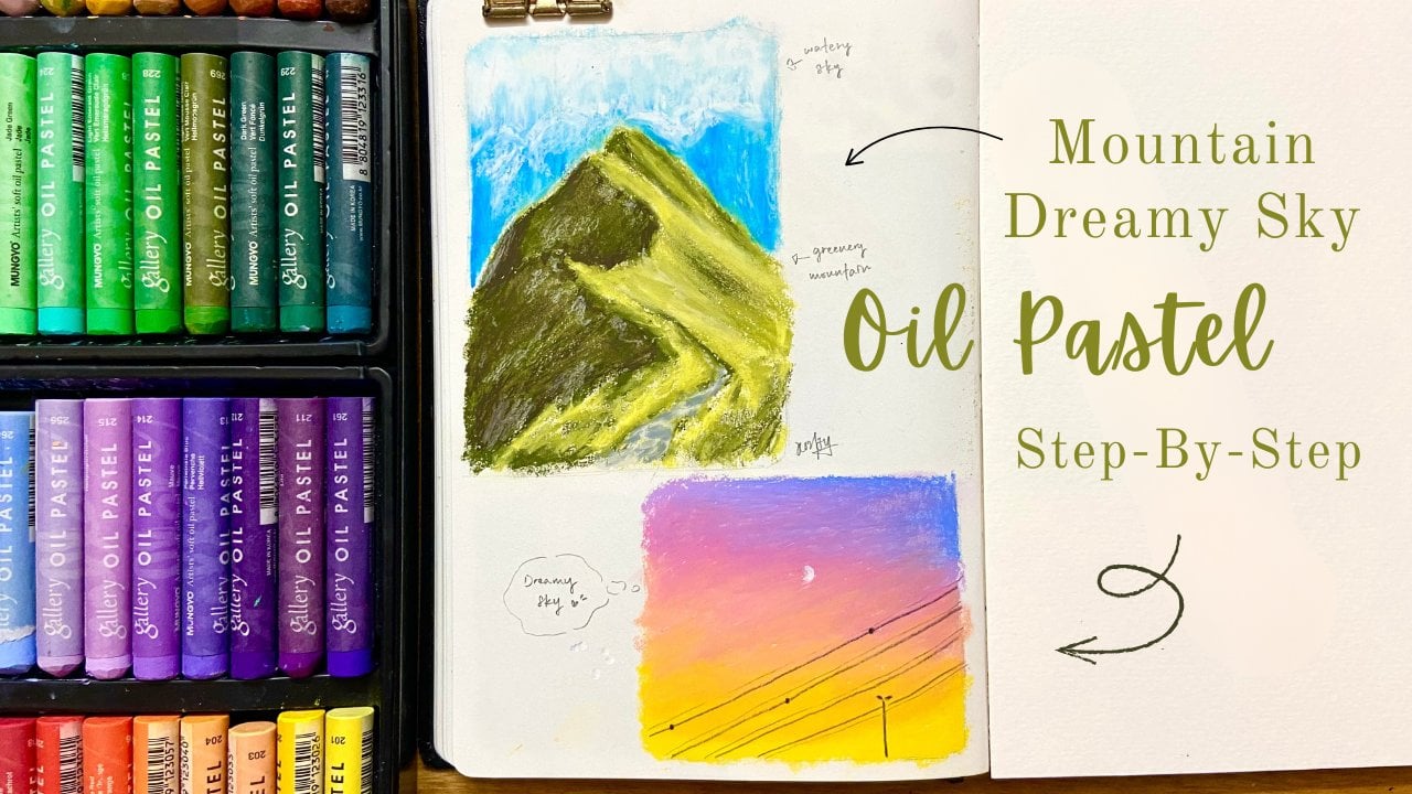
How to make sky gradient
7:16
-
4.
How to blending sky gradient without any tools
4:18
-
5.
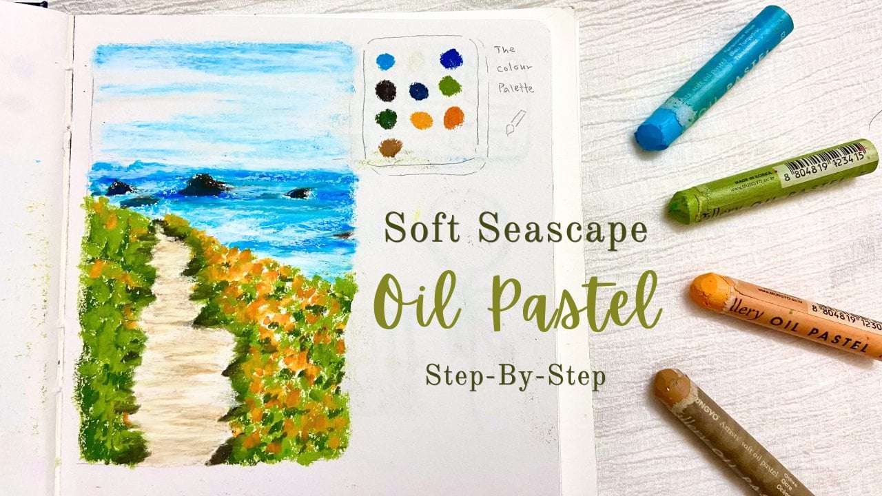
Simple ocean painting
3:43
-
6.
How to draw trees in thin lines
4:13
-
7.
Layering Grass
4:15
-
-
- --
- Beginner level
- Intermediate level
- Advanced level
- All levels
Community Generated
The level is determined by a majority opinion of students who have reviewed this class. The teacher's recommendation is shown until at least 5 student responses are collected.
3
Students
1
Project
About This Class
About This Class
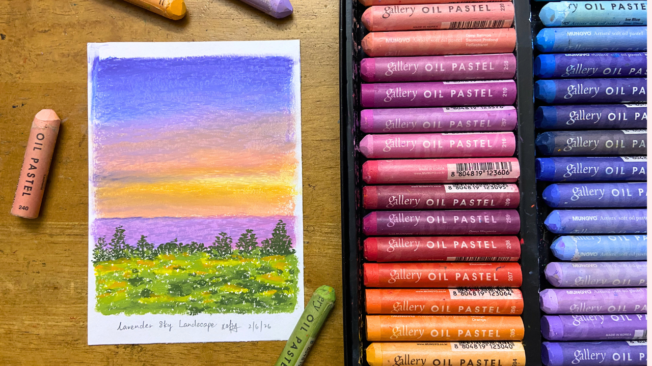
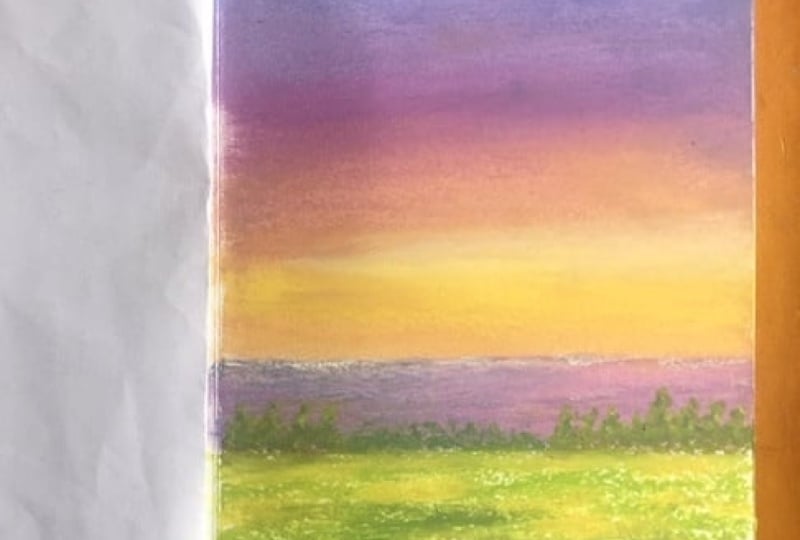
In this class, you’ll learn how to create dreamy landscape drawings with oil pastels, focusing on soft sky gradients and simple tree drawing and cozy grass field.
Whether you’re new to oil pastels or looking to improve your skills, this class will help you create smooth color transitions and bring depth to your landscapes.
In this class you will learn:
-
Create smooth gradients in the sky using multiple colors
-
Blend oil pastels using just your fingers
-
Build depth through layering techniques
-
How to use thin lines to draw trees
-
How to draw grass and flowers using simple shapes and layering
-
Develop confidence to yourself draw with oil pastel without sketching with pencils first
Landscapes are a great way to improve your understanding of color, lighting, and composition, and oil pastels are perfect for creating soft, expressive effects.
This class is designed to be simple, relaxing, and beginner-friendly, while still teaching important foundational skills.
If you enjoy calm, aesthetic art and want to create artwork that feels soft, dreamy, and expressive, this class is perfect for you.
Thank you so much for your interest in this class!
Hi, I’m an oil pastel & also pencil art artist, a self-taught creative who learned through online courses and lots of practice—no art school required. I believe anyone can learn to draw and paint with the right guidance, and I’m here to show you that oil pastels can be fun, relaxing, and beginner-friendly. I teach food drawing with oil pastels and am working on more classes featuring landscapes, pets, animals, and human portrait. Follow my Skillshare profile to stay updated on new classes and creative lessons.
Meet Your Teacher

Hi, I'm an oil pastel & also pencil art artist, a self-taught creative who learned through online courses and lots of practice--no art school required. I believe anyone can learn to draw and paint with the right guidance, and I'm here to show you that oil pastels can be fun, relaxing, and beginner-friendly. I teach food drawing with oil pastels and am working on more classes featuring landscapes, pets, animals, and human portrait. Follow my Skillshare profile to stay updated on new classes and creative lessons.
See full profileHands-on Class Project
For this class project, you will create your own cozy whimsical landscape using oil pastels by following the techniques taught in the lessons.
Your project should include:
- A soft gradient sky using the blending method demonstrated in class
- Trees created with thin line techniques
- A textured grassy field using the layering techniques from the lesson
Gather Your Materials
You’ll need:
-
Colors used in class: (Oil Pastel I used is Mungyo Gallery 72 Colours)
217 sky blue, 213 periwinkle blue, 215 light purple violet, 240 Salmon, 216 Pink, 243 Pale Yellow, 204 Golden Yellow, 232 Moss Green, 241 Light Olive, 202 Yellow. -
Oil pastels (any brand is fine — as long as your colors are similar) Mine is from Mungyo Gallery
-
Sketchbook or drawing paper (110–200gsm recommended)
-
Eraser
-
Fingers (optional for blending)
Steps
- Sketch the basic landscape.
- Create a smooth gradient sky with oil pastels.
- Add trees using thin and delicate lines.
- Build up layers of grass to create a cozy and whimsical atmosphere.
- Add any personal touches or color variations to make the artwork your own.
Upload Your Project
Please upload the following to the Project Gallery:
- A photo of your finished artwork.
- Optional: 1–3 progress photos showing your drawing process.
- A short description sharing your experience creating the piece.
Share and Get Feedback
After uploading your project, take a moment to browse other students' projects. Leave encouraging feedback and share what you enjoyed about their artwork. Feel free to ask questions or request feedback on your own project as well.
I can't wait to see your beautiful oil pastel landscapes!
Class Ratings
Why Join Skillshare?
Take award-winning Skillshare Original Classes
Each class has short lessons, hands-on projects
Your membership supports Skillshare teachers
Learn From Anywhere
Take classes on the go with the Skillshare app. Stream or download to watch on the plane, the subway, or wherever you learn best.