Transcripts
1. Intro: Welcome to my class. If you ever wanted to create something beautiful but feel overwhelmed or didn't know where to start, this class is for you. In this class, we're
going to create a fun and relaxing four in one
illustration project. On just one page,
we'll divide it into four section and draw four
different themes together. A cherry, a moon in a dark sky, a vase with flowers, and a dreamy flower
viewed landscape. Hi, I'm Michel Gui, an artist and content creator. I love creating soft
dreamy illustration that feel comforting
and calming. I have been sharing my art
journey online and helping others explore creativity in
a simple and enjoyable way. In this class, I'll get
you step by step using oil pastel and focus on helping you feel more confident and free when creating art. By the end of this class, you'll be able to create your own aesthetic
four panel artwork, understand basic oil
pastel techniques like layering and learning, and explore different themes
in one cohesive piece. Class is perfect for
beginners, hobby artists, or anyone who just want to relax and enjoy a
creative moment. You don't need any p experience. Just come with an open
mind and have fun. We'll start by
preparing our page and sketching the layout. Then we'll move through
each section step by step, from simple objects
like cherries to a soft glowing moon to
flowers and landscapes, learning different
techniques along the way. Your class project
will be to create your own four partner
illustration on a single page. You can follow along
with me or add your own personal touch and
make it uniquely yours. I'm really excited to
create this with you. Let's get started, and I'll
see you in the first lesson.
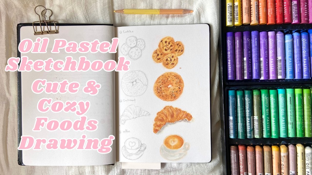
2. Material: Now we are going to go over all the tools and supplies you
need to use in this class. We only need three things
which are a set of oil pastel. I'll be using Muno soft
oil pastel 72 colors. It's a brand from Korea, but you can use any
brand you like. When I'm referring the oil
pastel number in the class, the number I refer
is from uno brand. But you can just find
any similar color with the oil pastel
I use in the class. Second, a pencil for sketching. Or if you prefer to use light colored pencil to
sketch, it's fine, too. And lastly, an eraser to erase
the sketch, and that's it. No need any fancy supplies. Let's just start
the class and play.
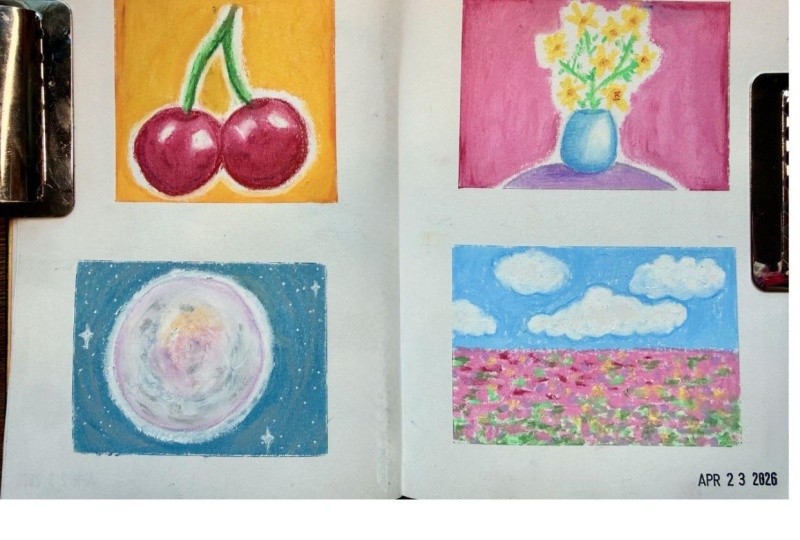
3. Cherry: Hello, my friends. So we are going to draw
on our sketchbook. So this is my sketchbook, and these are some doodling
I drew. Please don't mind. I'm going to draw on
the right empty page. So the first drawing we're
going to draw is a fruit, which is a cherry. The color we will use
to draw the cherry are carmine, scarlet and white. And for the steam, we
will use emerald green, light, olive, yellow
green, and ochre. Now before we start drawing, we draw the frame first. Use salmon color to separate into far
right tangle or grids. Then we start, draw the cherry. First, we draw a
simple sketch first, pencil to sketch,
draw two circles, but not totally round. Cherry usually have a
little heart shaped look and have a distinct,
slightly pointed end. Then draw curve line at
the top that sunk in, then draw the stem
of the cherry. After that, use eraser to
lightly erase the sketch. Later on when we use
oil pastel drawing, it will not much our painting. Now we start using colour. Use colour to paint
as the base color. It's more easier to draw the outline first the
feel the color in. Remember to leave
white space for the highlight area that you
can see from the reference. Don't need overthinking
too much to shape. We can adjust it later. Now let's move on
to the other one. Also remember to last
space for the highlight. Now, we finish the base layer. We built out the second layer, but it starts adding more
darker red, which is camine. I added the carmine
in the shadow areas, which is the bottom and
a little bit at the top. Then we use white. Remember to clean your white
oil pastel before using. Use white oil pastel to
paint the highlight, but don't fill up the
entire highlight area. Just around the red. Try your best to not touch the center highlight because we want to keep a little bit of the original white blank
space as the most bright white highlight look and also on the other
side of cherry. Then use decorate, which is camine to add
the shadow again. You can see there's
a little bit of reflect light at the right
side of each cherry. So we use white colour
to emphasize that. Add a few strokes at here, then just use your
finger to blend it. Then also blend lightly the highlight above to
make it look more natural. Keep adding the highlight
and the reflection and blend it with your finger until you're satisfied with the looks. Then we move on
to add the steam. Use yellow green to
draw the curve line, but how do we draw
a line without looking so you can break
this at the side first. Try not to put full pressure and try to find the pointed area or the edge of your oil pastel and
start to draw the steam. I will teach you how to
draw in line later when we draw the blant with a
bus in next few chapter. Then use light olive color. Remember to clean
your oil pastel. And you also can practice
and find the edge or pointed area of your oil
pastel at the side first. And then draw the state. It's okay if you draw
out of the line. Don't be hard on yourself. Think it as experience
and a fun drawing. Let go of the pfessionism. Then use emerald green to add as the darker
color of the steam. Then use light live again to
add on top as another layer. This time, remember to connect
the steam to the cherry. It's okay. The red goes out
a little bit on the steam. Then use Occur to add on
the top of the steam. Next, use olive green to add
on top of the ochre colour. The upper areas of the steam
seem a little bit too thin. I make it look more thick
like the reference. Then I add a little
bit of yellow green again on the steam to make
the colour look more pop. Lastly, I use carmine
and white to create the sunken in area at
the top of the cherry. And use finger to blend it and ta da, your cherry is done. Lastly, you can use any color you like to
colour the background. I just use golden yellow to paint as the
background because I think this colour will make the cherry look more
pop and stand up. If you like, you can add more decoration like draw
a few star around it. I just use camion red
to draw the star. So your terry drawing is done. You have done a great job. Let's move on to the next one. We're going to draw Amon
4. Moon 1: In this chapter, we are
going to draw a moon. The colors we are going
to use are white, gray, and Prussian blue. First, let's draw
circles with pencil, roughly draw it, then use eraser to lightly
erase the sketch. Then we start adding
colors with oil pastel. Use gray to draw
the circle outline. Then start filling inside
with a circular motion. Don't fill up the full moon, just some areas that
have darker gray as in the reference.
Vary your pressure. Don't apply full pressure, just lightly draw it. You can apply more gray
color at the bottom. Then use white colour to
blend the gray color. Start from the edge
of the circle, then start to blend from the left side and go
with a round direction. Lift it the bottom gray area. Add more white colour
at the right side. Then use your
fingers and start to blend also in a round
circle direction. It's okay if it goes
out from the outline. We will add the dark background later on, so don't
worry about that. Now, we want to add more depth
by building more layers. Use white with full pressure
around the circles. And some at the center. And around the outline, too. Then we use finger
to blend the white. If it's hard to blend, you can add more white colour. I add more white
around the outline to make it look more
soft and smooth. Now, I want to add the
texture of the moon. Use back the gray colour
we use at the beginning. When you apply the
gray oil pastel, only put very light
pressure when you draw, so it will turn out
the texture like this. If you put full pressure, it means you paint
with full coverage, and it will not appear
to look like this. Slowly adding the texture
little by little, be patient. We are only adding in the areas that we see have those
blocks in the reference. Or if you want to be a little
bit creative and different, you no need to follow
the reference. You can be creative
with the mode. The reference is
just a reference. Next, we blend it with finger. Don't fully blend it away. We are not going to
make the textures away, we just make it
look more natural, especially around the outline. Then we continue adding the
texture little by little, and blend it at the same time. Also, we slowly create the circle's outline
shape around it. You can see there's more white at the bottom
and the right side. So we are adding more
white oil pastel to it. And also some parts that I
think need less gray colour.
5. Moon 2: Next, we're going to
paint the background. The sky is not
totally black colour. It's a very dark blue, so I use plasian blue
for the background. Start with around the moon, but leave some space between
the moon because we want to create the smooth transition later around the moonlight. Once you finish, draw the
rough circles around the moon, paint the rest of the
background with the same color. Next, we start to use white colour around the
moon with light pressure, slowly adding more nearer
and nearer to the moon. Then this is the key moment. We use white colour
to draw around the moon and on top of
the dark blue layer. Then start to add
more white with gently light pressure
around the moon background. And this is where
the magic happen. We use finger to blend it, try to create the round shape intentionally when
you do the blending. If you accidentally
change the shape like me, just use white oil pastel
back and paint it, then blend it again. Now we are just trying to
make the moon shake look round by using white colour
to draw a bow white circle. Then when you use
finger to blend, don't use the same finger we
did the blending just now. Use another clean
finger to blend. Because we don't want
to smudge the painting, then we start blending from
the inner circle of the moon. We can add a few strokes with gray oil pastel to create
more clear round shape. Now we're done with
the inner circle. Let's start blend the
outer circle of the moon. You can add more white
to adjust the shape if you think your moon
don't look round enough. I think the texture on the
moon look quite bolery now, so I'm using gray color to draw the texture again to
make it look more clear. Next, I use the dark blue colour to draw around shape around the moon to create the circle moon shape and try to make the moon
look more stand up. Then use finger to
blend carefully. Try to blend the
outer circle first, then slowly plan
the inner circle. It's okay if your moon
don't look very round, you can use white colour to
adjust the shape anytime. You can see there's a white glow around the moon
in the reference. So we just use white colour to draw the
round circle of the moon. And at this point, your moon is actually done. But if you want to keep
rendering and adjusting, it's up to you as long as you satisfied
with your painting. I just put another
dark blue layer again and blend it to make the
moon look more set up. So your painting is done. You have done a great job
if you make it till here. In next chapter, we will
draw a flower vase. See you in next chapter.
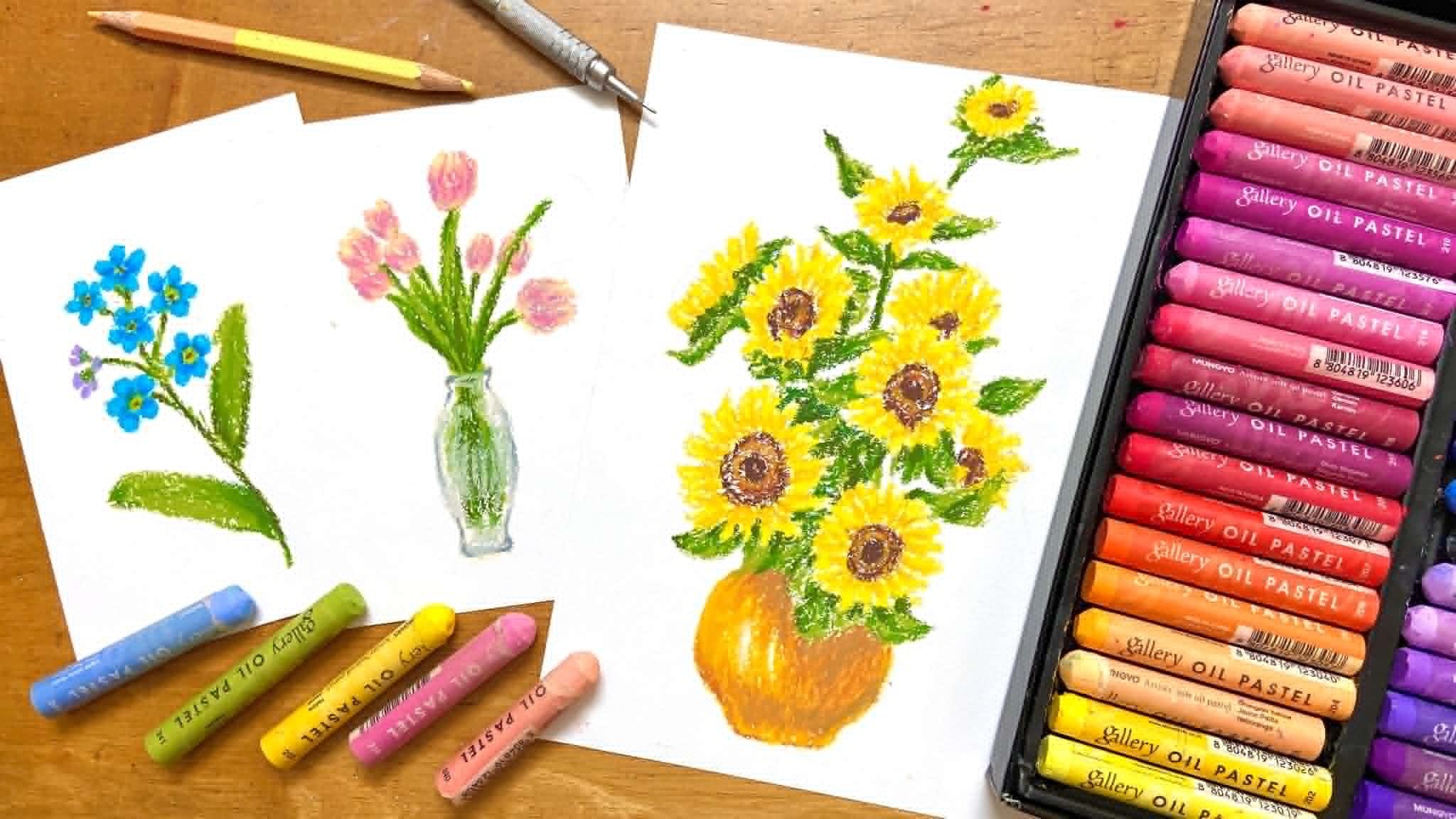
6. Flower vase: So in this chapter, we will
draw a vast with flowers. The colors we will use are
yellow, golden yellow, white, yellow
green, grass green, ice blue, and light blue. First, we use Spencer to sketch. We'll start by drawing the vast, lightly estimate the overall
shape and size of the vast. Draw two horizontal lines, one at the top for
the opening of the vast and one at the
bottom for the base. Then draw two vertical lines
on the left and right side. Connect all the lines to
form the body of the bass. And at the bottom to
complete the base. Now, the vast shape is finished. Next, we'll mark the
positions of the flowers. There's no need to draw the detailed shapes of
the flower at this stage. Just draw simple circles to indicated where each
flower will be. And that's complete
our simple sketch. Now that we've
finished the sketch, gently erase it using an eraser, leaving only faint
visible outline lines. Et's start coloring
the vast first. We'll begin with ice glue as the base color,
just like before, start by drawing two lines, the top opening of the
vast and the bottom. Then outline the full shape of the vast following
your sketch. After that, fill in the colour. Make sure to leave
some blank space on the upper right and
right side of the vast. This will represent where
the light is hitting. Next, take white and apply it to the highlighted area
on the right side. Then, use your finger to
gently blend the colors. If any areas become too bright, you can go back in with a bit more ice blue to balance it out. Now, we'll add another
layers to create shadows. Take light blue and draw a
soft line along the left side, slightly towards the bottom, following the edge of the vast. Then apply ice grew above it and gly blend
it with your finger. For the base of the
vast, sin is white. Use light blue to lightly draw a thin separating
line above the base. Then fill the bottom
part with white. You can also use white
along the edges of the vast to refine and
clean up its shape. If you want to enhance
the lighting effect, add a bit more white on the right side and
softly blend it again. And that completes the bus. Now, let's start
drawing the flowers. We'll use yellow for the petals. Don't overthink the shape. Just imagine a simple
asterisk or starlight form. It doesn't need to be
perfect or complicated. Before drawing on
your final piece, you can practice on the side. Try to keep your strokes thin. If your strokes feel too thick, adjust the angle of
your oil pastel, use the edge or hold it at
about a 45 degree angle. This will help you
create final lines, practice until you
feel comfortable, then move on to your outward. Start drawing the
flowers from the bottom, following the circles
we sketched earlier. Slowly walk your way upward, placing each flower
where you mark them. Once you're done, take golden yellow to add
the flower centers. You can practice this on
your test flower first. Simply press a small.in
the middle of each flower. When you're ready, add them
to your final drawing. H. Next, we'll draw the steam
and leave using yellow green. Again, practice some thin lines and shrugs on the side first. Try to keep your lines
delicate by using the edge of your pastel or
adjusting how you hold it. Looking at the reference, the lines might seem
messy or overwhelming, but we can simplify them. Just focus on connecting
each flower back to the s. Raw the steam one by
one slowly and gently. Hey. At this stage, it might look a bit too simple, so let's add more
strokes to create leaf. Along each steam, add a few
extra stroke on both sides. This part is actually
very relaxing. Just pw it up gradually
from the bottom to the top. If you see empty spaces, you can fill them in. But remember to step back and
check the overall balance. Try to avoid making
some areas too tense while others
look too empty. Not every space
needs to be filled. Leaving some breathing
room will make you upward, feel more natural and balanced. Now, let's add more
depth using grass green. Go over some parts of the
leaf we just drew and lightly layer this color on
top using the same strokes. This will help your
drawing look less flat and more dimensional. And now your vase with
flowers is complete. If you like, you can decorate the background
however you want. For example, you can
add small star or little decorative elements
using your favorite colors. Just has fun and be creative. For mine, I added
some yellow star, then fill the
background with pink. After that, I added a layer of white and blended it slightly. Then I went back in
with some yellow in certain areas
and blended again. And that's it. A simple
and soft background. How did your piece turn up? I would love to
see it. Feel free to upload your artwork
in the project session. In the next chapter,
we'll be drawing a simple but beautiful flower
fields with a blue sky.
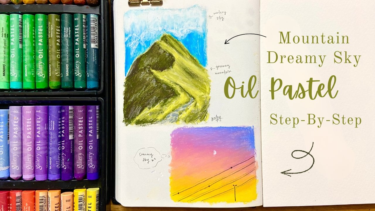
7. Landscape and Outro: Now we're going to draw a
simple flower view landscape. The colors we'll be
using are ice blue, white, pink, cold pink, grass green and yellow green. First, letly draw
a horizontal line across the middle of your
paper using a pencil. This will separate the
sky and the flower view. Once you're happy
with the placement, you can go over this
line using pink. Let's start with the sky. Take ice blue and begin sketching out the
shape of the clouds. Draw one on the left,
one on the right. And one large cloud that stretches across the
lower part of the sky. For now, just
outline the shapes. Don't feel them in yet. Next, lightly add some shading underneath each cloud
using ice tube. Keep your touch very soft, as we'll blend this
later with white. After that, use the same ice boo to fill in the rest of the sky. Now before we move on, make sure your white oil pastel is clean so you don't accidtly mix other color into
your sky. A quick tip. If your oil pastel gets shorter, try pulling the wrapper from the top instead of the bottom. The color number is usually
printed at the bottom, so this help you keep track
of your colors more easily. Now take white and begin blending the shaded
areas of the clouds. Try bending in a slightly
diagonal direction. You can also experience
with circular motions. The effect will be
slightly different. So choose what you prefer. Next, use white to softly go around the
edges of each cloud. This help blend the clouds into the sky and create us a
softer, more natural look. If the shadow look too light, you can go back in with
a bit more ice bog, then gently blend it
again with your finger. You can also use white to refine the shape of your clouds, making them stand
out more clearly. And that's it. The
sky is complete. When you pin to draw the
flowers from the reference, you can see it's a large area
filled with pink flowers. So we'll apply the colour
in a horizontal direction. Remember to leave some small gap in between for the grass. Try not to color in
large solid areas. Instead, work in smaller
section and vary your pressure. Sometimes lighter,
sometimes slightly heavier. As you move towards the bottom, use smaller strokes, you can start using a
dotting techniques. Just tapping the pastel to
create more flower shape. The flowers should become more scaded and less dens
as you go down. So avoid making
them too crowded. If you notice some areas
at the top feel too empty, you can likely add a few more
flour to balance it out. Next, take glass screen
to draw the glass. Use the gap we left earlier and observe the
reference to guide you. Start from the top and
apply the color lightly. Think of this as layering, build it up gradually
with soft strokes. In the upper area, you can use more
line light strokes, and as you move downward, slowly fill in more
of the empty spaces. H. The lower you go, the denser
the glass can become. Then lightly add a
few small green dots within the flower area above. This helps the flower
and grass blend together more naturally instead of
looking too separated. Now, we'll use yellow
green to add more depth. This colour is lighter, so it helps create reaction. You can layer it on top of the green areas or feel
it in any remaining gaps. Build it up slowly from the
bottom towards the top. If some areas feels like they
don't have enough flowers, especially near the bottom, you can go back in with
pink and add more. It's totally fine to layer
it on top of the green. You can also add a
bit more grasping within the flowers to
enrich the texture. Next, we'll use pink for
some of the flowers. In the reference, some flowers
appear more saturated, so we'll use this color
to represent those. You don't need too many, add them mostly in the lower area. Oh If you still see a lot of white gaps, you can choose to
leave them for lighter airy look or continue
filling them in. I'll add a bit more pink, and since it's overlap
with the green, I will enforce it with cold pink so the
colours end up more. Looking back at the sky, if the cloud feels too white, you can likely add a
touch of ice blue. Then bend it again with white. As an optional step, you can gently add a bit
of pink onto the clouds. Then blend it softly with
white in a diagonal motion. This helps the sky and flower feel more connected
and harmonious. And with that, your
landscape is complete. Thank you so much for
joining me in this class. I hope you enjoy this
relaxing process and feel inspired to create something
beautiful in your own style. Don't forget to upload your artwork in the project section. I willtu love to see
what you created. If you enjoy this class, feel free to follow me here for more art
classes like this, and I'll see you
in the next one.
 Michelle Gooi, Traditional Artist