Transcripts
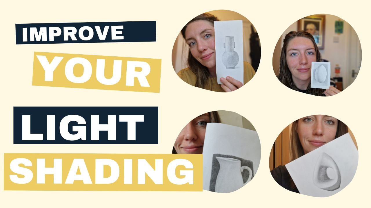
1. Introduction: Hey team, My name is China and welcome to this
special drawing class. In this workshop,
I'm gonna be showing you how to shade lightly. This is one of the
most difficult things to do as an artist. Tried to show
different textures, different shades, all
with one or two pencils. Now, as an artist, I understand all the
challenges that you face. Sometimes we draw too hard, sometimes we draw to light, and sometimes we just don't really know where to go with it. So these workshops are
really helpful to improve your skills and really refine any techniques that
you want to learn. In this class, I'm
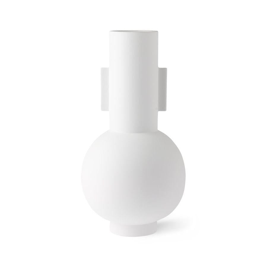
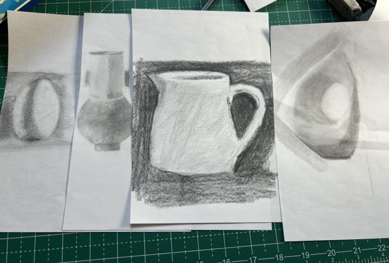
going to show you four different drawings for you to practice your technique. We're going to look
at a white egg, a very classical thing to draw. Then we'll be looking at a vase, a jug, and an ornament. Now, shading likely might seem
like quite a boring topic. But it's not. It's something that
challenges you and pushes you to become
an even better artist. As an artist myself, I often struggle with
the light shading. I can be a little
bit heavy handed, so I've tried to
teach myself how to become a little
bit more delicate. The more shades we draw, the better our drawings become. So grab your to-be, you're to hate and you're 8 ft. And let's begin our
light shading course.
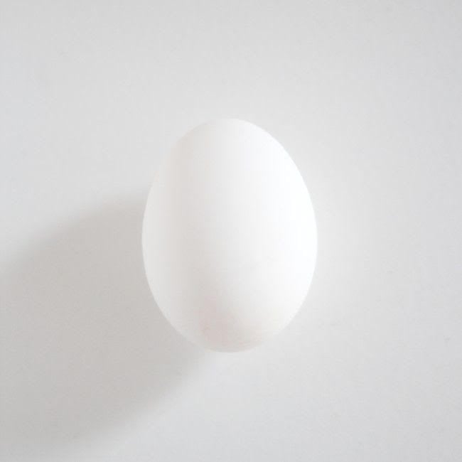
2. Lesson 1 - White Egg: Hey folks, So to kick off
our light shading workshop, we're going to start
with a classical thing to draw a white egg. Now this egg is laid
on white paper. So are there any shadows that
it is a real discovery on how delicate you can be without actually
having any outlines, depending on the shade
next to another, where it goes 1-2 and try to see that subtle difference without
pushing the pencil to hub. So grab a to-be Annual to age and let's get
started on our egg. We're going to start
with the outline. So grab your TB pencil and
try to create an egg shape. Now, if you think
about it, Exit do have a little bit of
a point on the top. It's not huge and the
base is much rounder, so definitely try and get
that shape if you can. Drawing the outline
can be frustrating. So be patient with yourself. Try and give it a go, and if it doesn't quite
work, start again. There's no harm in
repeating yourself and try and get that
symmetry if you can. Now I'm going to start
my shading and I'm just going in the direction
that my hand usually sits. You'll notice if I
pause for a second, how far away from the
end of the pencil I am. You can even do this if
you have a short pencil, but I want it to be as light as possible and as
soft as possible. So in basically
sabotaging myself so I can't press too hard
and that's what we want. Some of you might find as soon as you put the pencil down, a big line has been created and that's
not what we want today. We want to be really
soft and delicate to try and just change the
position of your hand. It might feel a
little bit weird to hold your pencil so far away. It is self-sabotage. It's a bit like
brushing your teeth with your non-dominant hand. Won't feel super
smooth this out with, but the more you practice it, the more you give
yourself a little wobble, the easier it is going to be. Keep going with it. Now, next, we're
going to start to push the very faint shadow
that's on the egg itself. So let me just draw
around the shape so you can see what it looks like. Basically saying to myself, inside this shape is pretty much one shade on the left side of it as another and the right side is another. And you can just see by these quick color
samples there as well. The difference is very subtle, but it's definitely there. So we want to make sure we're getting are dark is
value on the egg, which is that weird shape. And we're getting the medium gray on the left and a really, really light on the right
this whole time as well. My pencil is stay
and sharp and I'm trying to make it as
smooth as possible. I'm trying not to
get it to grainy, so I'm using the tip, but also the edge of
the pencil as well. Now, once you've placed some of your shadow
on there and you've, you've pushed a little
bit of the edges darker. You see the top
and the bottom is, we're going to just shade
on the outside of the egg. So what I'm looking
at this video, I'm like, oh my goodness, that is way too dark, but you've got to
trust the process. It's basically because I've put a darker gray next to white on the edge that
it feels much darker, but really it's not
as dark as it seems. So once everything's on, it's going to settle
down a lot more and hopefully you feel
less aggressive. I guess if you can even
say an egg is aggressive, I don't know. I don't
think I've ever said that. One's been for anatomy. So you can see very sharp
pencil, very important. Now, what you can
do at this stage, when you're happy with the
placement of all your shadows, use a to H pencil just to really refine all
of that shading. This goes inside all
the nooks and crannies. It gets rid of all of the
texture of the paper. And you'll really
slowly work your way around trying to
even out the tone. And this would help with
leveling any shading, pushing anything that
tiniest bit darker, rather than going for super dark with an AB which we've
classically been doing this yet. But a to H can just bring
those subtleties together. Just remember, if you're drawing on top of pencil
that already exists, you're adding
another layer to it. So if you want to
even something out, maybe there's a
splurge of dark gray instead of shading on top
of that and around it, you just want to
shade around it, obviously in a very,
very small scale. And of course, the key to this drawing is
trying to make sure your edge of shading really disappears into
the white of the egg. So we don't really
want to see it at all. We want the outline to
disappear and blend in. So I hope you enjoyed
this first challenge. It does take some time, so be kind to yourself, be patient, and just keep going. Okay, folks, well done. And I'll see you in
the next video for another light shading challenge.
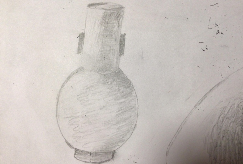
3. Lesson 2 - White Vase: Okay team, we are going to
wrap things up a little bit now because we're shading something a little
bit more complicated. It's a nice white vase. Now, we've learned
a lot in the egg, specifically how we can make sure we can't
see an outline. We've practiced some
really light shading to show the idea of curvature. Now, in this session, we are going to be
looking at something that has a bit more symmetry in it. So I'm going to show you some different ways that you can make sure this is
perfect for you. Grab your Tooby and you do H. And let's get started. As usual. Let's start with the
outline, your to-be pencil. And the main thing about
this part is the symmetry. So symmetry is very, I
find it quite difficult. Actually, some people
might find it easy, but trying to get the left
side look like the right is not a simple task. So you can either do what I did wear
dress cylinder first and then a circle underneath, or you can draw the left side
followed by the right side. So completely up to you
how you approach this. Try both CF1 works
if one doesn't see if you could definitely
get that symmetrical image, because it's really going
to help with this drawing. Now, some of you might be
getting really frustrated in this early stage and it's
completely natural and normal. I've seen it so
many times before, but as I always say, be patient with
yourself and just keep going until
you're happy with it. Once you're happy with that, we're going to start
with the shading. Now, stick to your Tooby
and all you're gonna do are these gradual little
gradients that go from the right-hand side
to the left-hand side. So I'm keeping it very, very light, very soft, and seeing if I can just soften the edge when I get to the left. And you can use a couple of
different directions here. But the trouble is if you
do go left and right, like this stroke, you might end up having some harsh edges. So just be very
light on pressure if you end up doing two
different directions as well. But it's good practice, and it's actually
good practice to do this underneath the cylinder. So in the circle because
the cylinder has more light in it and the circle doesn't have any
white bits, that's false. So when you're ready, you're just going
to fill this in, in a very light layer of pencil. Just get a little bit darker
on the right-hand side. Just thought to show that
you're seeing shadows. Remember from our
previous lesson, if you hold your pencil
really far away from the tip, is going to make it much lighter than if you hold
it really close. What we're essentially doing at this stage is a bit
of a rehearsal. So we are just
telling ourselves, or I can see a shadow here, just gonna go a
little bit darker. And that's what we, I
think we naturally do this with my drawing because
we're quite scared of dog. So we show a little bit of the shadow and then we
start to put it in. So yeah, this is what I want you to kind of go
with your instinct, I guess, which most of you probably will have
a lighter instinct, but some of you will
have a darker instincts. So it's finding that
balance between the two. Once you're a little bit more comfortable and confident with where your shadows are. I want to start to push
things a little bit darker, so we're just edging there. We're not going to go wild. And we're trying to keep
all pencil very sharp. So you'll notice my
hand keeps moving away from the artwork it is because
I'm sharpening my pencil. All that. It just means for a final point, and it means you can get in
all the nitty gritty bits. I sounded real common
than nitty-gritty. So that's one thing
I would say with any light drawing is make sure your pencil is incredibly sharp. Once you've done the main
chunk of your shading, then you can start to push the dark of it's a
little bit darker. So obviously you've
got the top part of the vase, the entrance bit. And then you do have this slightly darker part where the light stops
hitting the cylinder. So some people call
it bed bug line, but this is a quite a chunky
bed Bud Light Actually. It just shows that
there's a glow next to the handle on the right. And as I'll show
you in the arrows, so you've got a darker
a bit for the handle, a little bit of a glow next
to that and then a dark bit. And then you've
got the gradient. So it's just recognizing all these little things that
that light kinda gives us. It shows us on shapes. Yeah, try and get these on, but try not to leave
a highlight as white. This is one of the most
common mistakes we make. Our guess is leaving
highlights. Why? When actually they're
still in shadow, there should still be
a little bit darker. So it still looks a
little bit messy. I think it looks quite streaky. So once you've placed your shadows and your gradients
are looking pretty sick, you want to grab
your two H pencil. So hopefully we're
getting fairly familiar now with what the two H can do. And you can see instantly when I start
to use it on the vars, things get a lot softer. Now, it's starting
to look darker, but there's only because I'm essentially
filling in the gaps at the two H pencil can
get to in the paper. So if I go over this bed bug line or this
slightly darker bit, then that gets darker to add, the glow comes back. It's like magic. We love magic enduring. I suppose drawing is like magic. And then what I could
do is just soften the edge as well where I
get the gradient because I want it to look like
you can't see where one line stops at one disappears and the
two H is so light, it can do that, but the trouble is, it is
quite hard, so do be careful, try not to make it too
aggressive on the paper. It can really like
cut it up. So sad. I don't know if
you've had it before where you've drawn a line, you've tried to rub it out
and you shade on top of it, but you can just
see a white line of where your pencil was
in the first instance. So that's what a to H does. It scars your paper, so be careful with it. This is why we don't
do outlines into h. Anyway. You want to go around your
whole drawing out with a to H pencil and don't just rush it. I would say look for the discrepancies and wiggle
your pencil in there. So really look for the gaps. Don't just throw pencil in
there for the sake of it. Wiggle your pencil around, and then it's just going
to fill those gaps and much more nicely
doesn't feel right. Much more nicely,
nicely, much more. Anyway, you might just want
to watch this for a second and watching it disappear is
actually quite satisfying. Not disappear. It
doesn't go anywhere. Sorry, watching this evened
out and smoothing out. I don't know if that's
where your word anyway is so satisfying and you can push it a little bit
darker if you think, oh, actually, I have
been a bit shy on this, I could go a little bit darker. So use this as your final layer just to push everything in the place that you
really want it to go. And you can get it so smooth. And you can just
see where you need to make things more even or make them a
little bit different. Because as I'm pushing
the cylinder on the top and the
cylinder on the bottom. I can see that my ball
isn't looking very fruity, actually, has become quite flat. So I just need to push that pencil in a
little bit harder, build back that shade. So I'm not going for that dark shade that often
I do ask people to do. I'm building it up as you my
way forward and then just slowly seeing the
curvature come together. And I think you do need
that in this approach, especially with
drawing white things and trying to draw a
really, really light. So that concludes our
light shading today. Alright folks, well done and keep watching
for more videos.
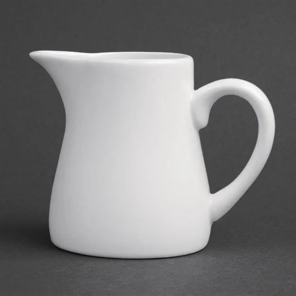
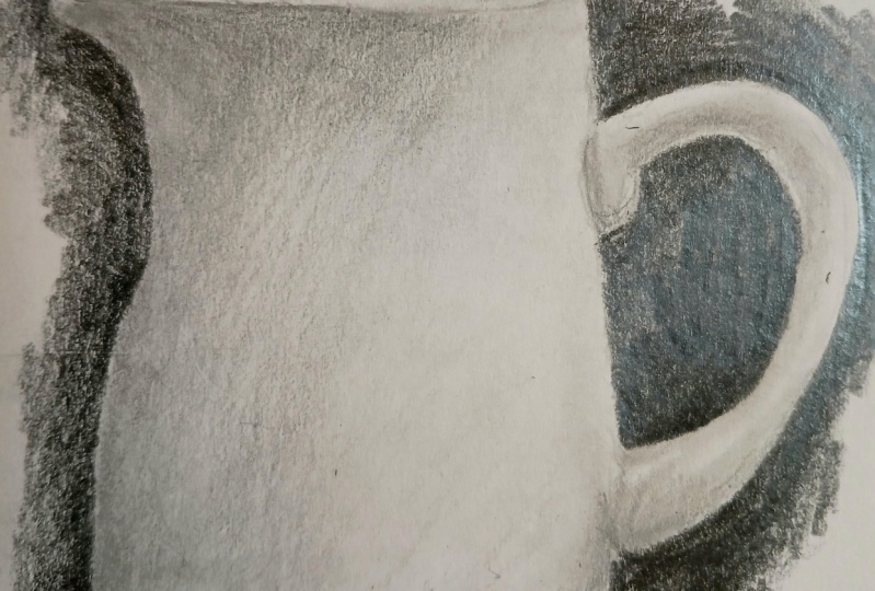
4. Lesson 3 - White Jug: Hey team, this is a really
lovely thing to draw today. We're gonna be doing a white jug with a darker background. The reason why this is more interesting is because
you're going to see what happens when you
surround something light by something dark. So will it make your
shading look lighter? Will it make it look darker? Because there's
always a relationship between light and dark. So grab your Tooby and into
H and let's get started. Okay, folks, so grab
your usual to be pencil. This is going to start
off our outline. Now, the jug isn't symmetrical, so this is our first
challenge trying to get it to sit
in the right way. Now, I would maybe draw
a rectangle around this, or I would just try and
look at negative spaces, are looking at the spaces around the jug and just see if
that's going to help you with your outline of the shape you might
have realized by now. But spending a little
bit of extra time on your outline is really crucial. We don't want to rush
into the good stuff and be frustrated because I'll
outline wasn't very good. So as always, just spend a little bit more
time on your drawing. The shading will be so
much easier, I promise. Now, once you've done that, we're going to head
straight into the shading. So it's always best to start with the darkest
part that you can see and something
with a bigger space. So I'm just starting in
the left corner with a spouse is I want to go into
a few different directions. So this is going to help to
make the shading smooth. And I'm almost starting to add a bit of a gradient
on here as well. You can see it gets lighter as it moves around to the right. This is a key element
in any 3D curved edges. So we're going to look at
to the handle as well. And you'll see that there's
maybe a sharper curve is not as round as the actual area. And there's a little bit
darker in some spaces. So try and push that a little
bit darker if you can do, don't just try and treat
that as a blockchain. You'll see that the shadow
is underneath the pot. The handle with your
finger probably sits on an underneath
the bottom as well. So the light is being
cast from the top. Once you've got that in place, just add that little
entrance hole where the milk goes in. And you want to be looking for the light part that just shows
where the difference is. Now it's so light that there's not really an outline at all. So don't push too hard. But I know the
temptation is to go full work and shovel
out of darkness in the, so we've got some of the
shading on and it looks okay. But what happens when we
add a dark background? The dark background is going to change how our shading looks, especially when I'm drawing
is surrounded by white. What does it do when it's
surrounded by black instead? So grab your HB pencil and push this in around
the, the jug. Now the background is so boring. I can do it is I do
tend to rush it. But then I'm left with
this super grainy texture and it does ruin the picture. So I'd recommend to get a layer down and just want to get
a bit bored, do a corner, do a little section
of it, go back to it, but it is worth just trying to make it look
better than it is. Or think about it another way. If you're having a **** day and don't want to think
about anything. You don't want to have the
stress of doing a drawing. Just do the background
because it's kind of mind knowing and you don't have to think
about anything else. So it could be a good
stress reliever, or in my case, it could be quite stressful. My friends now is a good time
to check in on your jug. Now, you've added
a dark background. Has it changed the
way your jug lux is, your jug to light? Is it too dark? You can only really
tell once you've set that background and balanced
the shades together. Spend a little bit
of time just saying whether the tones of
your jug correct. Or whether they need to be
tweaked ever-so-slightly. As always in these drawings. We then go over them
in a to H pencil. Now, the thing with
the background, especially a dark one, it makes the work we've
done look a lot lighter. So I want to find that balance
and be quite careful on how much darker I push
my white shading. So the two H pencil can help to bridge
that gap a little bit. It's not pushing things too hot. And you just want to build it up and just slowly
add another layer. Keep looking at the
reference picture, asking yourself,
is it dark enough? Is it light enough? Have I gone soft enough? And hopefully, you can also see the soft little
changes in, in edges. So is it a hard edge? Is it a soft edge? And these are other
questions I'm constantly asking myself when I'm
drawing something like this. So trying to find that balance, go over your drawing
NO2 H pencil, and really spend the time
just to refine everything. And most likely you'll need to push your light
shading a little bit darker because the surrounding area has shown us how
long we've gone. Why is such an illusion? So I'm hoping you
experienced that anyway. Otherwise, this means
absolutely nothing to you. The last thing to make this look realistic is to add
a bit of a shadow. So it makes sure your
HB pencil is sharp. Go very, very thinly
along the bottom and add a little glow that
comes over to the left. And voila, there is a gorgeous light shaded jug that were really ******* proud
of well done folks. And I'll see you next
time for another session.
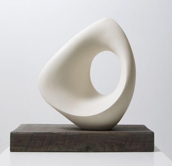
5. Lesson 4 - White Ornament: Hey team, this is our final
session on light shading. So hopefully you're
excited about it. Hopefully you're like,
Yeah, there's can't way. Give me another word. But today we're gonna be
looking at a white ornaments. I don't think it's very useful. I don't think you can
put anything in it, but it's still really
good to do because it's abstract and it's curved, and it also has a
hard edge as well. So really challenging. Now, grab your Tooby
and your two H, and let's do a final drawing and something you'll be
very, very proud of. As always folks, we want
to start with our outline. So take a few minutes
on this and try and check curvature of the lines. So what I tend to
do is I have a, a pencil or a straight line, and I try and compare
it with the image to see whether my curve is
in the right direction, whether it peaks at
the right point. So probably your pencil
vertically and horizontally does help to make sure your shape
is in the right place. Once you've done that,
you can just add that little edge where
there's a sharp corner. Then we can start shading. Now I've done a lot of videos on shading and
how to improve that. And if you're looking
for more tips on how to improve your drawing, do follow this on YouTube or you can check out one of the
other videos on Skillshare. What we're aiming for is just a rehearsal of where
our darkest part is. But remember, because
it's a light drawing, I don't want to push too hard, so I'm only limited myself
to my Tooby at this stage. And I'm starting to see
where the shadows are, especially on the
picture because we have some edges that are
crisp, like underneath. We have some edges
are really soft and go into a curve or folds. Just want to make sure that I'm happy with my placement before I do any sort of fine detail
or anything that says Yet. Now, let's go dark and then
I might regret it later. So you want to be a
little bit more careful. Don't forget as well
whilst you're drawing, you might see
something a little bit better because you're spending a bit more time staring at it. So I just extended the bottom of my drawing and it actually fits with the
proportion is much better. To finish this stage,
just try and get it as, even as you can and make
it nice and smooth. Now, it's time for the
magical bit the two hate. This time we're going
to try and shade on the white bit of the
paper with the two H, rather than just
using the two H to go over the shading
we already have. So make sure it's super
sharp and let's try and gently push that shading it a little bit
darker than white. This is going to be a real test. Not only do you have to go over the party shaded
with your to-be. But I want you to make the
blend with your two age. So the texture is
going to be different. The lightness is going
to be different. And you want to make
sure that pretty much all of your piece, your ornament, your vars, whatever the focuses, is, nice and shaded and blended. So you're constantly
looking about the subtle differences
between value one, value two, value 2.5. And if you don't know
what I'm talking about with these numbers
and the values. Go back to one of the
first lessons and you'll be able to see
exactly what I mean. So make sure
everything is nice and even this is a perfect
pencil for doing that. And if you can try to enjoy it, I love this stage. I think it's so who
would you call it? I don't know. Thoughtless. You don't have to
stress so much. You've done the outline. That part is usually
the hardest. The shading is where the real mindfulness kicks into place and trying to tackle something like the lightness in this and trying to
get your shading soup. It even is, it is a challenge, but it's something that you
can absolutely achieve. And you'll see on mine
as the time goes on it, it just looks a little bit more realistic with each
passing minute. And that's because I'm not
leaving anything as one shade. I'm not leaving anything flat. And I'm doing that by
constantly making gradients, pushing something a
little bit darker, but I'm not going full guns
blazing on the darkness. That's what we're gonna
be doing next month. So be prepared to be
excited for this. We're just easing into, I want you to build
your confidence with your light shading, trying to get as many
different shades as possible. So at the end, you can just add any details that you
think you've missed. A little shadow on the bottom. If you want an extra
brownie points when you try and
add a background. And a bit more challenging, but I believe you can do it. Folks, that concludes
our light shading. I hope you enjoyed that one. I hope you enjoyed this
month because it's really beneficial and it's something that you'll
learn a lot from, especially when it comes
to finer drawings. So I'll see you next week, folks, for another drawing. Maybe we will go dark.
 China Jordan, Art Teacher