Transcripts
1. Introduction To Realistic Drawing: Hello, my name is
China and welcome to my drawing class where I teach
you how to draw a trill. Be now I'm a realistic artist and I specialize in portraits. But before I could
get to portraits, I really had to hone in my
skills and learn how to draw. It's my mission to help you become the artist
you've always wanted to be. In this class, I'm
going to show you how to draw a hat, not just any hat. A hat that has tons of gradients and a big,
audacious shape. That's quite difficult to draw without knowing
how to break it down. So I'm going to show you from the beginning how to
break the image down, how to build up the shading, and how to apply those
lovely gradients to make it look realistic. And three D, you're going
to need your two H, your two B, and
your eight pencil. Not forget your
paper and erazor and something with a straight edge so that you can draw
the box at the start. Take your time in this class. Feel free to pause at any
point and don't forget to share your artwork at the end so I can see what you've done. So grab your pencils
and let's get started.
2. Stage 1 - Drawing The Outline: Okay team. Grab a ruler or
something straight and we are going to draw a well rectangle. We don't need to be
too little either, but all I'm going
to do is a length that's Mr. Biter
longer on the width. And then we want the
edge to be roughly 34. If that's a that's a half, maybe that's one half,
that's a quarter. There's the other edge. Let's see, I should
have done this. There's a quarter here. Okay. That might
have felt rushed. So let me just draw it first
and then I shall explain it. We wanted the rectangle to
be wider rather than taller. I want the horizontal line to be a little bit longer
than the vertical line. If my vertical line was to fit
inside my horizontal line, it would be a full length
and then an extra quarter. Okay, something
terrible happened. I was recording, but my
camera was facing up. I haven't actually
recorded any of this and I've done the work. I'm actually just going to
explain to you how to do this. First of all, once you've got your grid or your
square or rectangle, you're going to use that as ways to figure out where to start. First of all, look at the outside of the hats
or just the outside. And I'll pop this on
the screen as well, and you're going to be looking
for the negative space. You see this corner here
where my pencil is tracing? That is a negative
space around the shape. Use your box to think right, where is my junction
for the hat? Where does it cut into
my line? Is it halfway? Is it further? Is it
three quarters? Is it 23? And that way it will help you
to pinpoint where this is. Do the same for
the next junction. So wherever it
interacts with the box, and then if that
travels up the box, that's fine, that
counts as well. And then look at
this negative space, use your box as a guide to
create this space in between. And as you work your way around, you'll end up with something
that looks like this. Once you've done that team, this will help you
to draw the inside. You can continue these
lines that go down here and just notice
that they are an angle. They're not straight like this. This one points to
the right and this one points slightly to the left. From there, you need to
figure out where they end. This is not too far
away from the bottom. As we travel around, these
two lines are fairly parallel until we move upwards. That will help you
to get the curve, Thinking about where the
bottom of the curve is here. Once you've got your band, then you can add your shadows. So you've got a nice shadow
coming out from under here. Then you've got this
cross that goes across the brim and then up and creeps into the
top of the hat. Followed by the tree be where people can grab it and then
there we have our outline. Apologies for not being able
to draw it live with you, but hopefully I'll be able to fix it now and move
forward with the shading.
3. Stage 2 - Applying The Base Shades: Okay, so we've got the outline, you've done yours,
you're happy with it. And now we're going
to start the shading. I'm just going to start
with my two B pencil. All I want to do is start
with my light shading. You see I'm using the
edge of my pencil. I'm using this flat
bit rather than tilting it up and I've got the pencil just relaxing in
the corner of my hand there, All I want to do is
add some block shades. I'm not being a
perfectionist about this, I'm just trying to
get it on the paper. I'm trying to get rid of as much white and do it really smoothly. Remember, you can
go in a couple of different directions
if your texture is a little bit streaky. Once we've done
our block shades, we can then add some details. Try and get your light
shades the same shade, you'll see that's
what I'm doing now. Then once we've done this,
we can add the medium shade, then we can add
the darker shade. And we might probably
use our B for that one. Just go around now
trying to get that consistent is light shade. Then we will do
the medium shade. Okay, So we've just got a fairly even light
light tone around there. And all we want to do now
is go for the medium tone. I'm still using my two B. I'm just trying to
push a little bit harder in the shadows, not the band, just the shadows. Again, try and keep it, get the tone the same. And use the side of your pencil. Just make sure that texture
is nice and smooth. You should see a difference
between the two shades. Naturally, you're going
to feel like this is weird and wrong
and it's too dark. But trust me, it is
not too dark at all. Go ahead and do your medium
tones and then we'll finalize the drawing
with our darker tones. Can see two different
shades so far. Now we just want to get that final darkness
along at the hat. I'm not pushing
the pencil in too hard because I don't want
this whole thing to be black. But I am just wanting
to push that a little bit darker so that it stands out against
all the other shades. Naturally, your
eight B pencil will do that because it
is a darker pencil. It's a softer pencil without
having to push too hard, it will look darker
than your two B. To be honest, it's probably
the same amount of pressure that you put
for your medium shades, For your two B pencil, it should be nice
and easy to get this looking slightly
darker than the rest of it. Okay, now we've got
all three shades. We've got light,
medium, and dark. So we've plucked it all out. We know where the
shadow should be, We know where the
highlight should be. And now we need to
make it look real. We're going to take it step
by step, section by section. And I'll show you how to
turn something from a flat, weird surface that looks
like, I don't know, pattern on fabric and make
it look like a curved, realistic hat. Let's crack on. Okay, team, grab a ruler or
something straight and we are going to draw a little,
well rectangle. We don't need to be
too little either, but all I'm going to
do is a length that's longer, longer on the width. And then we want the edge to
be roughly three quarters. If that's a, a half, maybe that's one half,
that's a quarter. There's the other edge. Let's see, I should have
done this a bit higher. There's a quarter here. Okay. That might have felt very rush. So let me just draw it first
and then I shall explain it. We wanted the rectangle to
be wider rather than taller. I want the horizontal line to be a little bit longer
than the vertical line. If my vertical line was to fit
inside my horizontal line, it would be a full length
and then an extra quarter. Okay, something
terrible happened. I was recording what my
camera was facing up. I haven't actually
recorded any of this and I've done the work. I'm actually just going to
explain to you how to do this. First of all, once you've got your grid or your
square or rectangle, you're going to use that as ways to figure out where to start. First of all, look at
the outside of the hats. Just the outside. And I'll pop this on the screen as well. And you're going to be looking
for the negative space. You see this corner here
where my pencil is tracing. That is a negative
space around the shape. Use your box to think right. Where is my junction
for the hat? Where does it cut into
my line? Is it halfway? Is it further? Is
it three quarters? Is it 23? That way it will help you to
pinpoint where this is. Do the same for the next junction where it
interacts with the box. And then if that
travels up the box, that's fine, that
counts as well. Then look at this
negative space, use your box as a guide. Create this space in between. As you work your way around, you'll end up with something
that looks like this. Once you've done that team, this will help you
to draw the inside. You can continue these
lines that go down here and just notice
that they are an angle. They're not straight like this. This one points to
the right and this one points slightly to the left. From there, you need to
figure out where they end. This is not too far
away from the bottom. As we travel around, these
two lines are fairly parallel until we move upwards. That will help you
to get the curve. Thinking about where the
bottom of the curve is here. Once you've got your band, then you can add your shadows. You've got a nice shadow
coming out from under here. And then you've got
this cross that goes across the brim and then up and creeps into the
top of the hat. Followed by the tree be where people can grab it and then
there we have our outline. Apologies for not being able
to draw it live with you, but hopefully I'll be able to fix it now and move
forward with the shading.
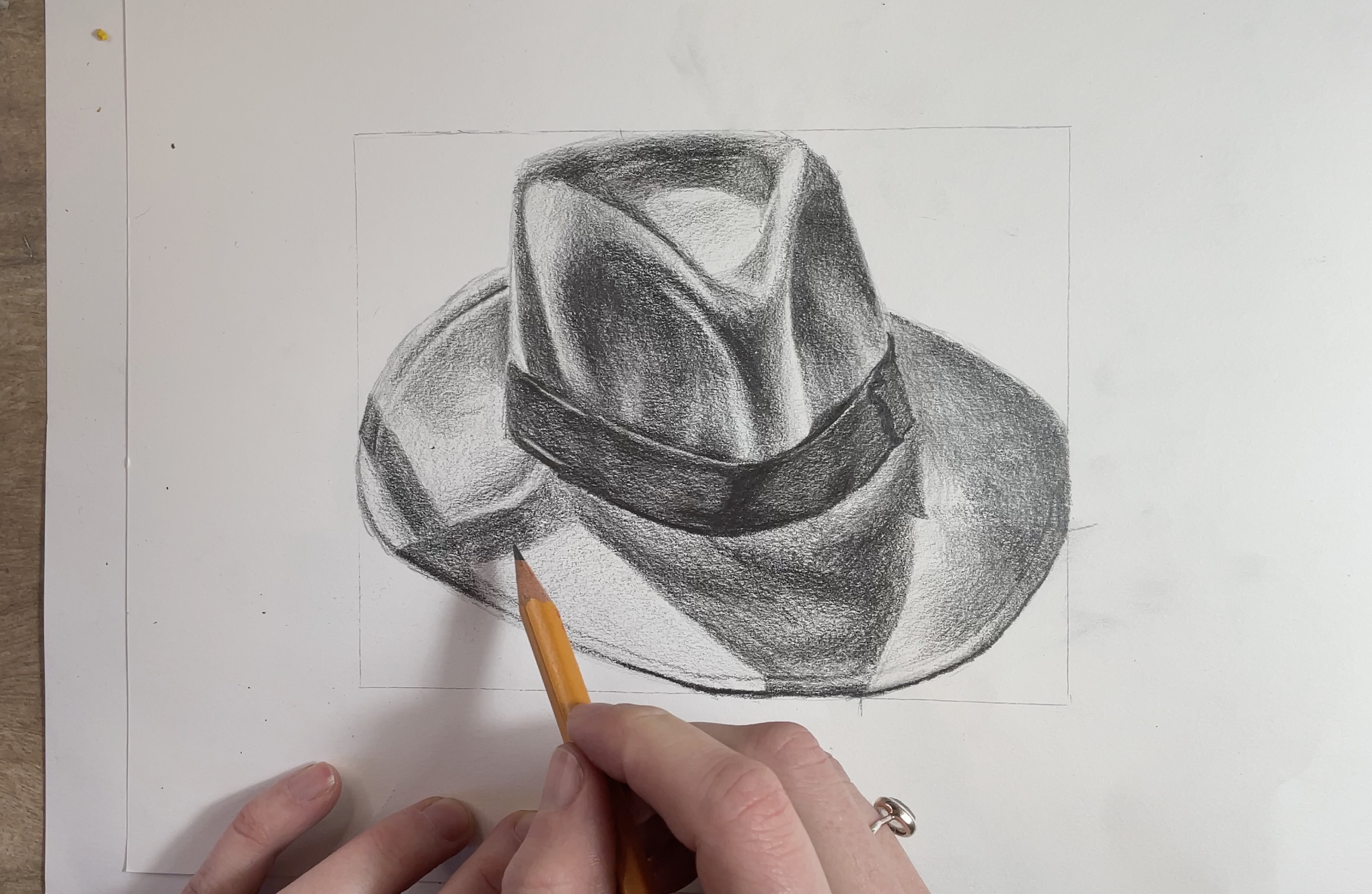
4. Stage 3 - Shading The Brim: Okay, I want to start
in the back corner. Don't ask me why I go by got feeling for some of
this whenever I'm drawing. First of all, let's get that little edge of sewing
that goes along there. That's a nice little
bit of detail. Even though it's a line, it still needs to have
variations of shade. Where it's further
around the back, it needs to be a bit darker
as it comes around the front. It needs to be a
little bit lighter. Then I can see that
there is a bit of a gradient coming from that
edge where drew the line. I'm just shading
upwards a little bit, but not all the way to the top because I want that
to look lighter and it gives the impression that this sewing is pushing down. Then if I go just underneath it and again leave a
little lighter gap, then it will just look as if that fabric is
rolling into the thread. It makes it way more
interesting already. The section I'm doing has to be darker than the
highlight next to that. I know that all this section
is going to be pushed bit darker then I want to see where it stops
roughly around here. Then this has like a
weird little triangle that comes down. There we go. All my shading has
to be really soft. Whenever it ends somewhere, it has to end in a
nice, delicate fashion. Every shadow has a shape. Always look at the
shadow and see what shape that is.
That will do for now. Let's move down to this section because that's fairly light. Then it's a bit of a gradient
that comes down here. Push, push, push, push,
Slight highlight there. There we go, I'm just leaving
that little gap. Nice. Always compliment
yourself, team. All right, and then let's
work into the shadow. Might need to bring my B, let's go from the top
down a little threads. Very dark and it's a little bit darker on the
top of that section. Then I'm just going to
blend to the middle. The middle section
will be the lightest. I say lightest, it's like
half a shade lighter. There we go. Let's just
re check the edge of this small curve then. That has a very small curve as well because there's
a bit of a bump here. Then I just push
that a bit darker and again it has a little bit of the underneath shade
just poking through. It gives that little glow that runs consistently
down there. Cool. Then let's go left. All right, so it's darker
where my pencil is now, then it blends in and it's
a little bit lighter and that should touch
the fabric cool. Then we have a very
dark edge here, and then I can just blend that. All right. Actually,
I'm just going to bring that over into there. And then just add a little bit of blend You Wendy, there too. Okay, cool, Nice already. This is way more interesting
than everything here, so work your way around the
rim now doing the shading, and then we'll talk about the ribbon and the
top of the hat next.
5. Stage 4 - Shading The Ribbon: The base not finished. The shadow starts
blending with the brim. What we want to do is
help this to stand out. What I'm looking for
is the dark tone, which is right in
the center here. I just basically
want to draw out the shape that is black. We have a bit of an
angle on this line. It creeps. Keep saying creep. It scoops up to left this, that goes around there. Okay. All right, go. I'm happy with that
shape and I just want to add wherever the fabric
folds over here. And then that goes in there, some wiggly bits down and
round to make sure this is in a small space because it is right on the edge over there. And then just trying to
find dark bits and shade, there's like a angular
line down here. Let's move cross,
Keep it interesting. If you get bored in a section, always move away from it
and do something else. It just keeps your
brain entertained, especially when
there's a little bit. You're like, oh, it's
just so annoying. It's ADHD, it could be both. But let's add some
shading over here. A lump there, and then, okay, what actually I'm going to do might
feel controversial, but I'm going to get two H. I just want to even out
the shading because I really feel like
if I use my two H, it's going to make
the shading look darker just because it's
filling in those wide gaps. I'm just going to take
it little by little. I'm not doing any massive
gestures, any huge lines, because I want to control my shading and just try
and even out the tone. And I can really see
already just from here, that I don't need to push
hard on my soft pencil. The soft pencil sometimes sabotages because it just
shows so much white. Your two H will
just help to get in those white pockets that
your AB couldn't quite get. You can actually see the value
of the shade you've done. It's looking nice. I made this decision, you might not need to. But I have a feeling it might help for your
drawing as well. It also just helps to sharpen any edges there we go to make
some crisp lines as well. Good. Actually, I just need to use my razor
and get some of the highlights back in there. Just draw very thin, dark line on top, trim that
a bit with my shading. Okay. So just take a few
minutes to look over your drawing and see
if you need to add more subtle shades to show that it's folding and
twisting a little bit. And then make sure that your
dark bit in the center has some small gradients just on the edge so it doesn't
look so weird. And it blends in
nice and easily. Nice, naturally. Should
I say nice naturally.
6. Stage 5 - Shading The Top Of The Hat: All right, so what
I want to do now is try and get the shadows that
are being cast from the hat. I need to make sure my line
is super, super crisp. You see the precision there? My pencil feels like
it wants to break. Please don't do that. Keep
sharpening it so much. Let's just see where the shadow goes around
here. That's all the dark. Maybe that can blend in the
and just attached to them. Okay. It's super, super
dark, really black. Until the section then
that's a little bit lighter. Okay, that adds quite a
dynamic element to the piece. Just work your way
around the top and the bottom if it needs
any crisp edges. And then see if
there's anything you need to push in or tidy up. Want to happy with that? Let's now work into the top. It's all about gradients, right? It's all about soft, soft edges. There's not really
any harsh edges at all in this top section. We want to make sure we're not too hard when it comes
to changing shade, and we're trying to
control that pressure. We can push hard, but then we can push
light and blend that in, work into each section. Feel free to jump around, but always ask yourself, how wide is my gradient? Is it a short one? Is
it a really wide one? That's going to be really love. I'm going to fast
forward this now. I want you to enjoy it.
Feel free to watch it. If this is speeded up, it's probably going to be less than 30 seconds
for you to watch. I learn a lot by watching. Anyway, if you learn like me, then that's going to
help you as well. Just how I apply it,
Even though it's quick, you can still get a good gist of what to look out for
and then try your own. If you're really struggling, feel free to e mail
me, obviously. I'll give you some
pointers but just very quickly top is a good example of a shot gradient and
they're everywhere in this. So have fun with this section and
I'll just talk to you at the end about how
to improve it even more. It's looking pretty good because each section has had
a bit of a working. It's had the dark and the light bits have
always been there. But we could push this even
further, it's two h time. And those of you that have
drawn to me before know that I love a two H to
refine my edges. And we've done it
on the dark band, so it's going to look really, really good on the
rest of the paper. Let me show you the difference
of how it will look.
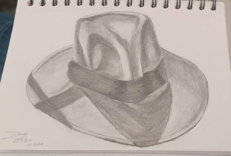
7. Stage 6 - Final Refinements: Look at that when you take
a minute and just step away and then you come back
to and you're like beautiful. Yes. Even on your own work. I'm just going to do
this little section, I'm going to show you
the before and after. I'm looking to
even out the tone, just like we did in the band. If you don't have a
two, I should say, you can just use a sharp H B, which is a standard
pencil or a sharp two. You're just trying to get
rid of that graininess. I'm paying attention and
I'm still looking at the picture to make sure I
haven't missed anything. Maybe I've seen
the gradient shape a little bit more accurately. Because the more you
look, the more you see, the more you can add. Rather than working
from one big shape, you start to work and
refine the smaller shapes. Spend this time. Now, this should be the really fun part
because you've done all the hard work and really
look at your shadowing, your gradients and
look for any glows. I can see there's a
bit of a glow there that's a tiny bit too dark. I can use your razor as
well to put things back in, but always try and
shade on top of it just to bring back the texture and make it a bit more believable that it's a
part of that section. Because often when you rub out, it really changes the
whole texture of it. Enough chit chat from me, I'm going to speed
this up again. Feel free to watch it first
and then do your own. Just go for it and do
whatever you want. Well, I say whatever
you want with the guidance because that's why you're here. I
don't want to help you. I do hope you enjoy that. So let me speed this
up and have fun team. Congratulations, this is a
quite challenging drawing, but I think it's
one of those ones where you don't realize that you're doing
a really good job. So make sure you spend
time away from it before you decide to rip it up
and throw it in the bin. And I will see you in a couple of weeks for
another drawing session. Have fun team. See you later.
 China Jordan, Art Teacher