Transcripts
1. Introduction: Hello, welcome to autism. My name is China and
I'm here to show you some fun exercises
to help you become a better artist without
even realizing it. This course is designed to take the stress and frustrations
away from drawing. Especially if you're a beginner. Each class will have its own download and
you can complete these exercises at your own
leisure and in your own time. You might want to pause
the video at points, or you might want to
watch it all the way through before you go off
and do your own thing. Now, I've been an
artist for many years, and drawing has always helped me to get through
difficult times. It gives me a sense
of achievement, a sense of pride. And it makes me want
to do something with my hands and get
away from the computer. I really want these exercises
to help you in your day to day to these exercises
look almost too simple, but trust me, they are more
challenging than they look. We have five exercises
in this workshop. Let me list them for you. Number one, my favorite, fill in the gaps. See if you can match
the shade to make the whitespace is
completely disappear. If you're drawing to blend
with the print seamlessly to symmetry using a building
method of geometric shapes. Can you complete
the missing left side of the nose by
following the steps, you want to make it as
symmetrical as possible. Number three, value scales. Practice your
different shading and see if you can get ten
different types of shade with just one pencil
number for the grid method, can you complete the
artwork in the grid, getting the proportions
as perfect as possible. Finally, number five, metal. Can you get this surface
looking reflective and shiny using
simple, easy methods. Each class is designed
to help you think differently and to
see differently too. You'll need a few
things before we start. You'll need a to be an
HB and a to H pencil. You'll need a ruler, something you can print the exercises off, and maybe even a rubber.
That one's up to you. Good luck. I can't wait to see
what you achieve.
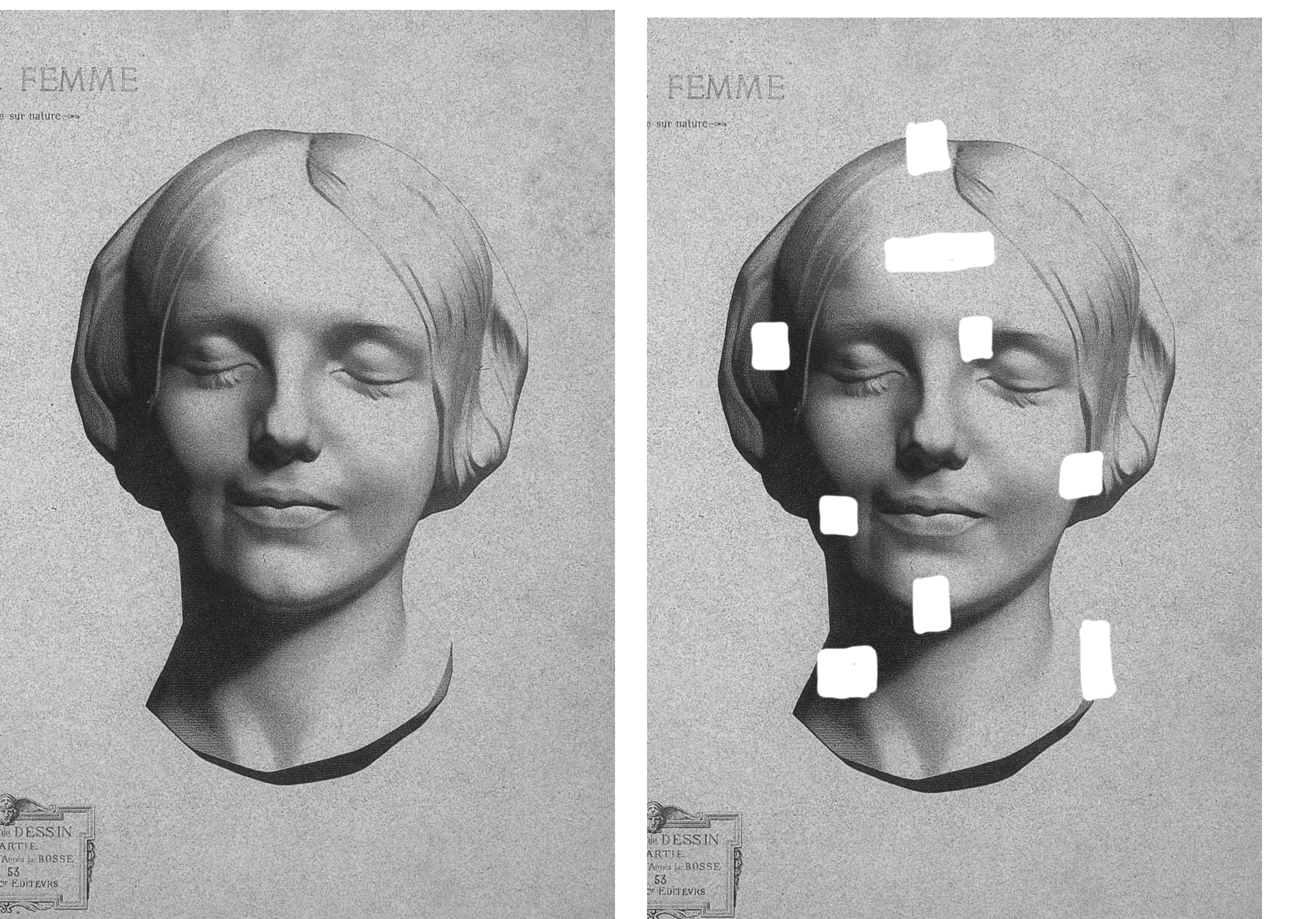
2. 1. Fill In The Gaps: This exercise is called
fill in the gap. On the image to the right of me, There are several gaps that we've been printed
with the picture. What I've done is
I've shaded them in so that the room was camouflage and they disappear
into the artwork itself. Before we begin, I
want you to take a good look at this picture and see if you can count how many squares
have been shaded in. So take a second, pause the video and
see if he could find all the squares I've been
shaded in with a pencil. The answer is nine. I hope you counted that. And I'm just bringing the
paper in so you can see exactly where they are because the pencil has some
reflections in it. It's quite a shiny material and compared to a
normal print out, you can really see it when I angled a paper
in different ways. This is what it looked
like to start with. And you can see the
different shapes of squares that
I've got in there. Now the pencils we're
going to use to beat. This is good for light shades on a good texture and
our HB pencil, so this is good for dark shades
and a much softer pencil. The brand I use
is Faber Castile. And they are really
good for any sort of any shading really
is a really good brand. Let's start on the forehead. We want to try and go
in circular motions, will give it a go in this square with just some circular motions. Because I want to get the
textures smooth as possible. I don't want to see
any straight lines going up and down or at an
angle of left and right. So if we go in a
circular motion, then it should be a bit more
smoother on the texture. You can see I'm just
working my way across, wiggling it a little
bit and trying really hard not to go on
top of the printout. Once it got a layer down there, I want to try vertical lines. Now, these should
be less easy to see knowing that we've
got a base underneath it. I'm just going to go from
left to right because I am right-handed and just add
some vertical lines in there. That's going to
add another layer. And just give me a
chance to build up the layers until I really
start to see it disappear. The next layer is trying
a horizontal lines. So that means I'm going from left to right in a flat line. Again, trying really hard not to shade on top
of the printout. I don't want to make the
print any darker than it is a just want the shade to
match the shade of the paper. I'm building it up in layers because I don't want to
go too dark too early, that could be a disaster. There's a point when you keep
shading and eventually it just disappears
and we're about to reach that point in a second. On the left-hand side, it
pretty much has disappeared. But I'm just going
to work on this a little bit more because I
can still see the edges. I'm sticking with my tube pencil because it's quite
a light shade. And you can see I'm just
changing the direction again, going up and down just to see if there's anything
that I've missed, any gaps that I can't quite get nearly at the point now
where it's disappearing. If you just take a
second step away, you can see that
it's disappearing, but there's just a tiny bit
of light in the corners. So there we go. That's, has pretty
much disappeared. Now, let's move on to
the corner of the eye. Now this one again, I'm starting with my pencil. I just want to get a
base coverage on this. I'm not doing the circular
motions in this one. And that's because I want you to just try different
things because this is a really fun exercise. So I'm sticking
with angular lines, vertical lines and
horizontal lines, all those things we just
practiced in the one before. You can see that the shade on the printout as much darker
on the right-hand side. But the shade in the forehead that I'm trying
to meet is much lighter, so I'm just playing it safe. I'm just trying to match
the lightest value. And then I'm also using
the reference picture on the left-hand side to see where I have to draw
my dark shades. So now I've matched the shade
just above the eyebrow. And I'm starting to
think about where I can improve the ice hockey or where
is the eye socket ending? And I'm just penciling
in, excuse the pen. Just trying to think, okay, well, if I put a
little mark here. Is that where the eye
where the eye sits? Is that gonna be okay? Again, starting to push those darker shades now a
little bit darker in that. And I'm just going to build up the confidence and
keep working on this. I'm just going to
fast-forward this attached, which you can barely tell because it's such
a tiny movements. Now I'm going to
introduce my HB pencil. So this is a darker pencil. It's a little bit softer,
a little bit grainy. So this is gonna be much
better for darker shadows. You probably can do
a similar thing. We've just a tube. But I would really
encourage you to get an HB pencil because it's much easier, much more efficient. And you're just wasting less time trying to build
up layers that might not even get to his
dark as you want it to be an HB pencil. It can really get some
dark shades super quickly. Now, you can see that
I've just matched the shade where it's
in the mono brown. I'm not quite sure
what that's called. So I'm happy with the top edge, the left edge, and now I'm
working in that socket. So I do want to be mindful of the shape of the
shadow in that socket. I'm just easing my
way from the edge and trying to work on
what shape that might be. So it's a little bit of
a sharp bend and I'm hoping past China did
manage to reach that. I think I did. But again, I want to
make sure I'm reaching that shade so I'm pushing
it a little bit darker, a little bit darker. And the thing is
with this dark area is the printout is
super dark anyway. So the chances are I can't go to dog unless I'm gonna be very
aggressive on the pencil, but that will not be
the case on this one. Just take your time
on this one to try to wiggle in those shadows, trying to get that
texture nice and soft. And you can see already it's
starting to really blend in. So it's a little bit
more complicated than the forehead because
obviously we do have a bit more
shading going on. But that's good. It's great because
it prepares us for the squares that are
to come ahead of us. Nearly there. You can see that I'm just
using the tip of my pencil to get in those little
pockets of light areas. But that just helps
to smooth it out. But getting into those pockets of light with a sharp pencil. Now that's done. Let's move on over to
the left-hand side. So I've got my two
beat pencil here, which you can see
very, very blood. I'm just going to
pop a layer of to be down because this
again is going to start our texture really
nice and soft and hopefully get rid of any fine lines
that are pencil could leave. At doing a bit of
crosshatched motion. We're doing those
vertical lines, the horizontal lines and
the angular lines, as well. As I've said a couple of
times before, excuse the fly. That's fairly
annoying, isn't it? This is just making very, very good base for us. So switch to your HB pencil
when you're ready with that and start outlining and
joining up the hair. So again, you've got your reference picture on
the left-hand side. You don't have to
totally guess this and start to build up
that dark layer. Once again, I'm just
using the tip of that HB and my pencil
is nice and sharp, so it's just helping to get
that texture nice and smooth. So you can see there's
a little bit of hesitation that I'm putting forward here because really I should be able to go
a little bit darker, but I've decided to go onto the left-hand side just
to build that value up, build that shade up a little
bit darker because at the minute is quite
garish lights. If you look really closely
at the original picture, you can see if you
find strands of hair. So this is what I've
put in there as well. They're really, really delicate so you can just about see them. So don't over push them
and do try and make sure that they're really
thin at the end as well. You can see that it still
needs to be dark at birth, the left-hand side and
the right-hand side. So hopefully with my HB, I'm just going to stop
pushing that dark now and you should start
to see it disappear. Knowingly. The pencil is so Shawnee, it is quite difficult for you to see how much it does
actually disappear. But hopefully at the
beginning you did see some different angles,
whereas less shiny. You'll just have to
trust me on this one, I promise you it does disappear. So Faber Castile that the brand guys that have brand though help you
reach those values. I know he slipped up
there and now they started with my HB on the cheek. But again, I want to start with that Tooby and just start
with that base layer, getting my crosshatching going. And then I want to
go in with my HB. So look how confident
I'm being now. God, he could tell it's been a couple of weeks since I've made this video because I'm looking
at it like, Wow, Go China. Eight kb is starting
to press on. Now, again, I'm just
identifying that cheek, the shape of the
shadow on the cheek. And I'm really going for it. Can you see how quickly the value is matching the
shade of the printout? And yes, I have
fast-forward a little bit. Nothing wrong with a hyperlink. I perhaps the right-hand side of that shadow does need
to be dark as well. So just make sure
that you're shading that in so it matches
the shade too, is quite easy to keep
that nice and light, but it does need to have
some darkness to it. It will disappear and there'll be a point
when you're like, wow, this is exactly
the same shade. You can see, just
tidying up the corners. They're just making
sure I've not left any light bits right
now at the edges and make sure that my shadow joins from the top of the
square to the bottom. So that means it's finished in French
all that, That's it. Anyway. We should keep doing
my French lessons. Sorry, moving on
to the neck now, it can be quite tempting just to shade that whole left corner, top left corner of
the square in black, but actually the neck
line is at an angle. So you do want to make
sure you're chopping off that shadow and angle? I did do the tube based, but I have basically gone
in quite quickly with the dark 8-bit and you can just see how it's building
up and building up. And I just want to make
sure that I'm not shading the whole square in pure
darkness because there's a tiny, tiny gradient just
near the bottom there. So do make sure that
you're checking the reference picture rather
than just assuming that, oh, this must be solid black. Now onto the chin, this is
possibly my favorite books purely because it has a tiny highlight
just under the chin. So it's a really delicate but lovely
part of the portrait. Same process. So you're still creating
that base layer with a to B pencil and then you are going in dark with your HB. Now. You want to be able to join the shadow
from left to right. And you want to get that
nice tiny gradient where it goes from the foreground
chin to the next. So we have a little
bit of depth there. And you want to be
careful that your lines aren't too harsh because it
is a really soft drawing. And you also want
to make sure that your highlight under the
chin is not too light. You really need to trust
yourself that by going darker, it will blend in. Just because it's
slightly lighter, it doesn't mean it
should be left white. So just pay attention to that and make sure
that you're making that highlight darker
because it's still a shadow technically is not
really a highlight at all, but we just notice that
there's a difference in shade. The phone a bit you might
have seen was just two. Gets a little bump chin on that. She's got a little bump chin. Now let's move on as move
on to the top of the head. This one's a little bit more challenging because you've got some angular lines and some shadows that
an irregular shape. So the first thing to do is to just join the crown of the
head from left to right. So once I've done that, I can then start to use the edges of the books as
a bit of a grid method. Just thinking about
where the hair goes into the hairline and then I'm trying to meet the
values after that. So it's not as difficult
once you get started, so long as you have a little
process too, attack it. Again. Once you meet that value, it will blend in. So that's happened
quite quickly for me. I think. Hopefully by going in his weird and wonderful
way is kind of built up to one of the more
difficult sort of areas. Only two more to go. Let's move on to the cheek. And again, this one
gets a little bit more technical because not only
do you have the cheek, but you've got the hair, the dark shadow of the hair, and you've also got some
light of the hair as well. So in this one I'm
trying to actually meet the value before
putting the base layer down. So this is if you want to
push it a little bit harder, maybe don't want to put a
base lay down each time. Maybe just want to go for
it and see if you can meet the value in the
shade at each point. So you can always try that. It's a bit like yogurt. The teacher tells you
to stretch deeper. This is one of those
deep stretches. This one, I'm
definitely just going for it and it's working out. Okay. Obviously, I've been drawing
for a very long time, but this isn't a masterpiece. This is an exercise. I really want you to
play around with it. And you could print out a couple of sheets and
try different methods. You could try going straight for the value or you can try
with a base layer as well. So it really does
give you a lot of opportunities to practice
different methods. So you can see
online quite quickly that one disappears and I think I'm actually quite
proud of that one. Finally, we have
got the showed us. This one is a really
delicate square. I did decide to go back
to having a base layer because I wanted to figure
out the drawing aspect of it. So where does the
neckline come down? Where does the I don't
know what you call it, the crack of the model. Where does that come up to? This one took me a
little bit more time because I really
wanted it to be right. But it can be a
forgiving square as well if you get it
slightly wrong because it's not often we
see a head that is seven from his body as a mobile. Brains don't know
what to expect, which means it will
probably just accept that this is the shape
that the area has. And that's okay. I'm just taking my time a
little bit in this one, but as soon as I get that
dark shadow underneath and start to compare
it to my left image, then it really comes together. As I look back on
the other squares and I'm just finishing
this one here, but I can only really
see a couple of them. And when the reflection
is disappeared, so does the squares and
you can't really see any. So I hope that was a really fun and useful
exercise to practice your shading and
to see if you can meet all of those different
shades within those squares. So feel free to print
this off again, try different things
and even make your own. You could always just
find a picture online, add some white squares on it and paint or whatever
people use nowadays I use Procreate and then you can make your own and just keep doing this exercise
because it's really fun and it's really invaluable. I hope you enjoyed
that class and we'll see you on the next one.
3. 2. Symmetry: In this part of the class, we are looking at symmetry. This is a really fun exercise to see whether you can copy
the right-hand side, which is the image, and do the same on the left-hand side. Now this is a nose, so it's a little
bit challenging, but also quite fun
because breaking and nose down into two halves makes
things a lot easier. Now, bearing in mind noses
aren't typically symmetrical, but for the sake
of this exercise, we're gonna make it so it is. Now we've not left you to it completely because
we have offered some little stages
to help you build the nose and constructed
in a slightly easier way. So make sure you
download those and make sure you print this page too. Let us begin with a jury. So first of all, I'm gonna
grab my Tooby pencil and I'm working from
the first sheet, so that's gonna be Sheet one. This is the geometric form of the nose and we call
this using planes. The planes of basically if
you imagine that someone has sliced through
a curved object, or maybe a better way
to imagine it is, is if you're a sculptor and you've been given
a block of granite, and you first start
off by slicing, slicing away into
the model before you start to cough it out and
make it nice and smooth. So is imagining the form
and a geometric way. And it just helps us to get our proportions and get
everything in place. Another way to think about it is whenever there is a
change of direction. So if we're looking at
what I've done so far, you're going from the
bridge of the nose, so that's the top
of the nose week and run your fingers through it. And then it goes down
the side of the nose, the wing of the nose. There's a change in direction. There is like a little
mountain, a little hill. And that means it
can basically be a different plane because it's
a big change in direction. And at this stage we
want to keep things fairly simple, fairly basic, because it just makes it a lot
easier for us to, to draw. Essentially, if we work
from simple forms, we can then work into slightly
more challenging films. In the next stage,
just finish off your, your planes here and we'll
move on to the next pump. Now the next part is
just about starting to create some idea
of shading and 3D. We're going to shade
in the blocks. And again, this is
in the handout, so this will be in sheet too, so you know exactly
what you should be shading and it just starts to help the nose look like it's protruding forward
without any shading, then I'll nose is
going to look flat and it won't look as
effective as it can be. So we need to make sure
that we're mapping out where there's a
change in direction, where the planes are different. Because whenever there's
a different movement or direction on an object, usually the shadow
will follow that. So you can already see online that the note is
signed to push forward because we've got the
shadow under the tip of the nose and on that side
wing that I'm just doing now, you'll always find that whenever there's a different plane
as a different shade. So just try and bear that in mind when you're
shading your own. Just in general for noses, a normal light or outside or were in the house and you've got your light source
coming from the top. The area that I'm shading now is actually a little bit darker
than the bridge of the nose. So people often forget
this in drawing. Actually, if you'd like, drawing faces is something good to remember because
there's a change in direction and you can just
trace your finger from your forehead down to the
tip of your nose and you can feel that change
in direction too. Now in some of the edges, you might notice that
they are a little bit softer than say, underneath the
nose, for example. So just bear in mind what sort of edge
you're finishing on. Now, the next part of this is we're going
to start to work in some of the detail
and we're just going to use a dark pencil. So I just picked up
my seven B here. What I'm going to start
with is the nostrils are some people absolutely
hate the nostrils, but I loved them. I just love the shape that
they create. Little bit weird. But I do love drawing a nose mainly because
of the nostril and the shading that
happens when it comes out of the nostril hole. First of all, you want
to outline that nostril. And then you want to start
to make slightly darker, stronger marks where we're
seeing shadows change. So I keep flicking back from the image on the right-hand side to
the image on the left. And it is challenging because you do really
have to imagine that there's a mirror down the center of that
knows and you have to flip the angles
in a vertical way. So if you've had any experience during the
annual phone with an image, then it's a good
way to practice. As I'm working up the nose, you'll notice that there is a little bit darker right now, the ridge and then that
shade just kind of Blends outwards so there's
no real definite edge. So just watch out
for your shading and just look where
the soft edges are. Now we do have a little bit of a shadow just underneath
the tip there. So that's what we
call a cast shadow. All of these terms, by the way, you can find in our
ultimate shading course. But for this, I'm not gonna go into a huge amount
of detail because they that's why that needs to have longer lessons on that. But I just wanted to give you a brief description
of what is going on. So as you can see, when we add that cast
shadow underneath, it really again pushes it
knows even more forward and it helps us to see how much darker underneath
on no should be. Now, the eyebrow definitely
needs a little bit of love because usually
darker than US skin. Now the tip of the nose just
be a little bit gentle. And this one, because we want
to get that soft idea that there's a spherical
shape right on the tip of our nose
just coming forward. So try not to make
this too hard an edge. It wants to be a nice soft
edge and a very small space. And you can see that
I'm just kind of edging towards the
absolute center there, just to try and get it
as smooth as possible. Now, I keep going back to those wings because
I really want to show that the bridge of the nose is the most forefront
area of the face. Now, a really important
part of the nose is having a bit of shading just on
the side of the nostril. So at the wing of the nostril, because instead
angles it looks like the nostril has a bit of
overlap and it's just because it actually
comes away from the face quite a bit and can create quite
strong cast shadow. Whilst we're that we're
just going to darken up that cast shadow
underneath as well. And you can start
to see it really coming together and
really coming to life. Now, I'm not too sure if mine is perfectly symmetrical,
but it's getting there. I'm going to keep working
on it because you have to trust that you can fix these
things if there are issues. So if you find that you're in a very
similar situation to me, Don't go with the urge of
rubbing it all out and then start and again to see
whether you can fix it. Because I do think we learn
the best from mistakes. And I definitely, along
my own creative journey, have learned so much
just by making mistakes. So just be patient on yourself
and give yourself a break. Allow yourself to learn and allow yourself
to have fun with it. I'm not sure now this is a
favorite pauses the best part. You're just seeing
the different shading that's going on in the dark is bit you can see a
very short gradient and that's a really soft edge. And then just, just above the nostril you can see
a little bit of a glow. That glow is very common in noses because we have
refract light there. Hopefully you found the
nostril as exciting as if not. I didn't know who does that
say more about merely. Anyway, we are getting to
the end of the drawing now. Feel free, by the way, at any point to slow this down, I have sped it up
ever so slightly because you don't really
want to listen to me, keep talking and talking
about the same thing. So do feel free to pause
this at any point. And I definitely should have
said this at the beginning. But we're at the stage
now where we are really refining the
shapes and the shadows. And you can see I'm actually
taking a bit more of a second to look at things and really compare left and right, really compare the
shading and just seeing where I need to push
it a little bit darker, make it a little bit sharper. Maybe just change the edge of an outline a little bit more. And you'll notice that
you're watching this tiny, tiny change can make
such a big difference. When you get to this stage, do take your time on it. Because this is where you really start to hit
the nail on the head. This is where everything
comes together and it is worth just spending those
extra seconds to look at it. Now, we should be
very, very close. I think I need to
go a little bit darker at the top
and other brow, so hopefully my pen. So there we go.
It's getting there. The eye socket definitely out a little bit of
shading in there. It just softens the
eyebrow attach at it. It just makes the nose
feel like it's actually on a face rather than just
in a very random place. Now, obviously there's
loads of different ways to drill noses and faces. If you sat there thinking, Well, this isn't the
way that I draw a nose. That's fine because the way of drawing this was really
to help with symmetry. And just to have fun and give yourself a
chance to draw a really cool knows because it's so satisfying when we draw something that we're
really proud of. So I really hope
this structure we gave was it was helpful. Now you can see when I change
the angle of my camera is less shiny and a
lot more contrasty. That's not a word. There's
a lot more contrasted it, this is what you've
really aiming for, that strong contrast
between light and dark. The garden really dark and
the eyebrows under the nose. Anywhere where there's a shadow. Make sure that
your final stages, you really are pushing
the contrasts and I'll pop a little picture in
the downloads as well, just so you can, you can see exactly
how dark it should go and make sure you do
download all the handouts. So there's several
sheets on here for you to see the different stages. I really hope that
that helps you so well done on getting to
the end of the class. I really hope that symmetrical
drawing worked for you. And I really hope you learned
something from it too, because it should be fun, but you should also always
be learning when you're drawing and if you keep
drawing, you will be learning. Now, don't forget, you can draw your own
symmetrical drawing. Just take a picture
of something shopping in half and draw the
other half of it. Don't forget to share your
drawing with the class and I really can't wait
to see what you've done.
4. 3. Value Scale: In this shading exercise is all about increments of shading. So can you get from the dock his adult with a pencil all the way to the
lightest of light. And this is really
fun because we're not only testing how
much you can shade, but can you shade
it really smoothly. It was looking for texture and we're looking for value change. So let's see what
we're about to do. This might look like
really easy exercise, but it's definitely a lot
more harder than it looks. Shading should be a
lot of fun and this is a great way to
practice what we do. We're looking for
those smooth textures that he spoke about and
you can see it in that, in that middle books. And we're looking to
make sure that each box has a different shade,
a different value. Now you can look
at a value lesson in one of our other videos. But for now if are fed
to the temp value, I actually mean shade. Now just watch what
happens when I change the background color from
white to gray to black. It's pretty cool because
you can see that each square will disappear
at some point in time. And that's because it matches the value of the background. So it has more of a
cool little trick. But now let's start
the drawings. If you want to grab a
ruler and you're gonna do ten squares now at recommend
not to make them too big. So I'm going for 1.5
centimeters each, but you can just go for one centimeter in each square
for that makes it easier. Now you can drill
this without a ruler. There's nothing saying
you have to use one. It just looks a
little bit nicer, a little bit tidier. But by all means you can just make sure that your
squares are touching each other and don't press
too heavy with a pencil because you don't want
a thick black line in-between each value. Just press quite lightly. Now we're going to start
off with our HB pencil. The reason for this is
because it is really, really, really dark, so it makes things a lot easier for us. So start in square ten and you want to press
quite hard with the pencil. So just notice the
grip that I've got. It's really close to
the end of the LED and I'm really filling
in every tiny area. We want to make sure
it's nice and even, and this is the darkest
that this pencil can go. So don't be afraid to
push dark with it. The LED is nice and soft, so the chances are you won't break through the
paper if you do, it will be very impressed. You can see how
dark that books is. Once we've done this one
and you're happy with it, you can then move on
to box number nine. So that's just to the left
of the one that we've done. Remember, we're aiming
to make the next book's a little bit
lighter than the first. And we've already felt how
much pressure we have to put on to make the 10th books
as dark as it can be. So we know that we need to
make it a little bit lighter, which means we're not
pressing as hard. And you can see, I got
that quite quickly. This is sped up a
little bit just so you don't have to painfully watch. So do feel free to pause
the video at any point. Now, we're moving down
again to box number eight. And again we're going
a little bit lighter. You might have noticed that
as we move down the books is my grip changes each time I get a little bit further
away from the lead. I'm not holding it as
if I'm writing my name, I start to distance myself
from the tip of the pencil. You can see here that there is definitely a
bit more distance from my finger and my
thumb to the lead there. It just means it's
a lot softer for me to shade and I have less
control over the pencil, which might sound
counter-intuitive, but actually it's really helpful when it comes to
shading lighter. I will show you the difference in how I hold my
pencil is per squares. In a couple of squares time. Don't feel afraid to go
back up to the scale. If you think somebody needs
to hear a little bit darker, you might find that a few of your values are looking
fairly similar, and that is not what we want. So you are able to
go back and forth, pushing one darker, pushing
one light at each time. Now we're in the middle
of the value scale now. So this is probably where you're going to find
your values are looking very similar because mid gray is a bit boring, Let's face it. But we still have to try and
make them look different. For me, it gets a little
bit more difficult as we start moving into
the lighter areas, especially with my HB. And technically I
wouldn't often shade and light areas with my HB because
it is such a dark pencil, but there's nothing wrong in his becoming masters of our craft. Now, let me show
you the difference in the distance from my
fingers to the lead. And now that we're
a few squares in, you can see how I start
to push that pen the way, especially with the
one that we're on now, you can see I'm right at
the end of my pencil. I'm barely touching it. That just helps me to loosen my grip and to let
gravity do the work. Basically, gravity is causing the friction between
the lead and the paper and it's not
allowing me to push really hard with my hand. Here, I'm gonna go a bit slow. And now because it's
the lightest of light, I want to try to
avoid layering it. I just want to do
one layer if I can, and leave that as
light as it conveyed. So it might be worth
just giving it a second, having a look at your
value scale and seeing if anything needs to go darker and anything needs
to go lighter. In a second, we're going to use a2b0 and do exactly
the same thing again, I would recommend doing your next value scale
just underneath, mainly so you can physically
see the difference. And it's really
important because this will help us get more
familiar with our pencils, especially if we are wanting
to improve ourselves. We're just going to start
at number ten again now, if you wanted to push yourself a little bit further and just like any sort of activity like yoga where they tell you, do you want
a deeper stretch? We have the same
option in drawing. So instead of starting
at the dark is the end where it's easier to see and to know how
dark that pencil can go. You could actually start
with the lightest ends. You could still at
box number two, shade really lightly and work
your way up to number ten. Now it's much, much harder because you don't have the
darkest value as a reference, you only have the lightest
value and you could have started way to dog when
you begin at the light end. But it just pushes you a
little bit more and makes you think a little bit
more about those steps. So you'll going in,
the two beat will naturally start at
a lighter value. So the tube will never get
his dark in number ten, is it willing number eight? So it's really important
that we know that and we know that when we're
shading in a value scale. So work your way down again, work from the dark
and the light end, but get to the other end of the scale and see if
we can get those sets. So tiny differences. Now you might have noticed
as well that this pencil has a different feel to it
when you touch the paper, the grip that it
has on the paper, the lead is a little bit harder, so that means our lines
look a little bit smoother because it can get in all the knocks and crannies
that the paper texture has. Which is great. It's great that our pencil can
offer a different texture, but that comes with
the sacrifice of losing some darkness
in the shading. Our eyes really, really
loved high-contrast. They loved light and dark. So this is why we need to introduce a dark pencil,
which is our API. And we also need to
offer different texture, which is about to
be this one is a little bit easier in the lighter shades because
it is a lighter pencil. So that's one benefit
of using a to B. And hopefully you'll
find that as you move further down into
the light is much easier to get the
lightest values because it starts
off a lighter point, then it's much easier for us to just get the light shading done. A bit more tricky to
get the dark shadows, the dark bits in our drawing. This is really good lesson to
learn from a value scales. Hopefully you're
finding that too and you're feeling it
and you're seeing it because this drawing is all about touch and it's
all about site. We feel it through the pressure
that we apply and we feel it through the grip that
lead has on the paper. Now, getting into the
lighter bits now, and technically it should still be lighter
than the row above. So using the row above is a really good guide to see whether you're
being light enough. Because if eight
beacon get really light than a to B
should be even lighter, you might even want
to go back into your value scale an HB and
do some tweaking there. Now the square two should be the lightest, lightest value. And you can see I'm just gently, gently touching it, hardly
gripping the pencil. That's all. And it's just
about lighter than the one above and just about darker
than that first box there. You might want to label
above your box is ten, all the way down to one, because our next task will
involve some numbering. Now we're going to
draw ourselves a cube. And if you find cubes difficult, just try to follow my method. So we'll start with
three vertical lines. Two of them are on
the same level, one of them is slightly lower, then we will close them off. So a bottom line is going at that angle and the
next one is parallel. On the other side, you'll do the same thing
to close it off. So we've got one
line at the bottom and then a parallel
line above that. And then finally the
lines on the top of parallel as well too, that says stirring edge. So hopefully that makes a nice box for you and if
it's not perfect that way. Now what I want you to do
is put three numbers down, which you are going to shade. While value eight
on the right face, that means I want to shade
that face value eight. I'm going to pick
up my HB pencil. And if I have a duckface, I'll use my dark pencil. If I have a light face, I'll use my light pencil. If there's a shade
in the middle, you can use either pencil. So if it's maybe shade full
all the way to shade seven, you can use either
your HB or YouTube. This is a test to see
whether you can visually and physically match the shades that you've done on
your value scale. And this is just by looking and then obviously
trying to match it by feelings you might want to build up in a little
bit of a layer just to give yourself a
chance to reach there. Once you've done one of your
faces, try another one. So we've got three phases to do. And you might
notice when you add your second face that you'll first one might not
have been dark enough, or maybe it is too dark. Shades often interact
with each other, especially when they're on
a white background because white backgrounds can
be really deceiving. Finish all of your faces and don't be afraid to go
back to them if you need. Now there's a way to
test our value scale, and that's with viewfinders. You'll find these in your
downloads and you can just print them off
and cut them out. It's basically a white frame with a small square
hole in the middle. Now, do be careful if you are
using a knife or scissors, because it can be a little bit tricky and obviously I do not
want you to hurt yourself. So take it slow when
you're doing this. This helps us to see the
two values because we have a thick white frame
which isolates that shade. You put one of your
viewfinders on your value and then pop
it on your value scale. You can see whether they are dark enough or whether
they are too light, or if they're just right. I noticed that mine was
a little bit too light, so I've just gone and touch that up and made
it a little bit darker. So let's look at number eight. I think we're pretty
good at number eight. Then look at number
two and I use my tube. So I checked with that and
that's pretty good as well. This is something
you can try again and again and again and
never get bored of it. I do them all the
time and I still generally really loved
the challenge of it. Remember, you can change it up, you can try different pencils. You can go from right to left, you can go from left to right. So hopefully that's
really fun and good exercise for you
to practice at home.
5. 4. Grid Method: When it comes to
enjoying drawing, one of the best
methods out there is this one, the grid method. You might seen this on TV, you might have seen
this in pictures, but it's very common
for artists to use it. It helps us to figure out upper portions and
figure out how scales. So that when we come to
shading the drawing, all the hard work
is done for us. Hopefully is a bit of an easier method than ones
we might already use. You'll notice that the
video is speeded up, so please pause it at any point just so that you don't feel like it's
going too quick. It could feel like
quite a long video. Otherwise, if I
had a normal time, it took me about an hour
to draw this picture, set yourself a good amount of time and maybe you
can work on it and little stages and
make sure you've got your rule that you'll pencils
and have fun with it. This is going to be a really, really great drawing fee. So let's start by
drawing a grid. We're gonna go
with three squares across and full squares down. Now it's really important
that you draw this grid as squares and not accidentally
drawing rectangles. Because if you do
draw rectangles, then you might find the drawing
looks a little bit odd. I'd recommend for you
to do your squares between four or five centimeters to make sure it's a good size. I'm going for four centimeters. It's up to you which
one you want to go for. Now, we're going to start
with the top-left square. We're going to
think about each of these sections as junctions. Wherever a part of the
image cuts into the grid. We think about that as a
junction and we can make a little mark just to help
us put it in its place. Once you've got those
two little junctions, you can then draw the line
together to draw your image. Now if we go to the
middle section, I want to think about
how high my peak is. Is it going to touch the top
of that grid and it doesn't. So I think about is
in the center of that grid and it's not
the peak of that line, it just slightly to the right. That will help me to get the
curvature of that square. Finally, don't forget that little statement
in the middle there. Now on the right-hand side, we want to make a junctions
again and just watch out for this curve because it's a little bit more bent
than what we think. I often see students making
this really flat line. So do try and make it nice and curved and don't be
afraid to adjust it. And then don't forget
that statement again. Now let's follow the
grid so we'll go down one and we will
continue this line and start off with the outside of the petal first because that will just help us to figure out how much space is
needed in the middle. Now this is a much more
complicated square because we do have
shadows going on. We've got folds. So I'd recommend for you
to take your time on this. With each line that you drill, you can think about where
the next line is coming off, that is it coming off
halfway down the line, a quarter of the
way down the line. And keep comparing your
lines to each other. Now if we move one down again, there's a lot less going on, but there's still a few
folds that we need to draw. You want to make
sure that your lines are coming from
the right places, from the square above. And make sure these
lines don't come too far down the page because they
will affect the next square. Moving left, we have another
quite complicated squared. So again, think about
your junctions. Think about where
there's an interception from the object
onto your square. Is this crossing happening halfway along that
vertical line? Is it happening a quarter of the way along the
horizontal line? And you're using this
reference point consistently through the drawing to figure
out where you aligns go. After you've done that,
this central one, you're gonna move down. I want you to think
about that general angle of this outside line. Now it is pointing towards
the bottom left rather than a straight line which a lot of people
who attempt to do. And then once you've got that, you can add the
little curves and the shadows inside the area. Now when we continue in
the bottom left square, don't over-exaggerate
your curves on this one because it
will look a bit weird. But what do you move up? This is a little bit more curvy, so I want you to
recognize the size of the whitespace compared
to the shadow and just think about where it's thicker and where it's thinner. A new notice that the
curve that just a little bit different on each line. Now we're nearly there. We just have to mow
squares to go on. This won't just above, we have what I call a
witches finger because it looks which is finger at the
tip of that pencil there. So do spend a bit of
time on the end there. Now, finally, we've made
it to the last square, and that means that all
of your junction should already be made because
you've done the work before. It was just the case
of joining them together and getting
the right curves. Now once the outline is done, you'll start doing the shading. But it might be worth
saying that maybe you spend an extra minute or
so just to refine any of the lines that you
think might need a tweak. Because once we go
into the shading part, we want everything to be good
and ready for us to get. We want to start with
a dark his part first because our eyes love
seeing high contrast. That means that they love
seeing light next to dark. The more dynamic we
can make a drawing, then the more interesting
is gonna be to us, we're gonna start
without dark pencil, and this is gonna
be our eight KB. This is the one that gives
us a lovely dark tones. And I want you to go a little bit darker
than you feel comfortable. Because I found that a lot of
my students have this fear of going dark and really we shouldn't
be feeling like that. I understand where it comes from because when I first
started drawing, I was also terrified of making a mistake and not
being able to fix it. But the chances
are that if you're shading in a dark area already, then if you need to rub it out, you'll never need to leave
that paper white again, so you'll probably
only shade over it. So I want you to not feel
nervous about shading to dog. If it is a little bit too dark, just use your rubber,
lighten it up a little bit. Now, I am going quite
fast in the drawing just because otherwise I'll be here for a very long
time talking about you. So do feel free to
pause the drawing, watch it and then do it. It's completely up to you. But hopefully you can
see quite quickly that just by adding
the adult bits, it's starting to become 3D. Once this is done, we will introduce a2b0 pencil, and this is when we start to
work in the lighter bits. This is when we
start to refine it, the soft details,
the lighter details. It really makes a drawing
come to life even more because there's not much
white left on the paper. I just want you to watch
how I'm holding my pencil, so it's quite a loose grip and the pencil is quite far
away from my fingers. I'm trying to get that
flat edge of the lead. I'm not holding it as if I'm
writing my name at the tip. I'm using the widest part of
the lead and that means it's really soft and
it's not too harsh. So see if you can just
adjust the way that you hold your pencil to make
it nice and light, especially in these
lighter areas. Now there are other
videos that you can see in my profile and hopefully that will help
you with how to hold your pencil that will be
in the shading lessons. And you'll just find these little tricks to hold your pencil will hopefully
really help you. So just keep working your
way around this drawing, getting these lovely soft edges, these hard edges which
we've looked at before. And your drawing should
really start to come to life because you're
not leaving any areas. One shade, nothing is left flat. You're making it
nice and dynamic. And you're really starting
to add the curvature and the organic shapes
of this artwork. Once you're happy with
what you've done, it's time to shade
in the background. Now, this, In all honesty, is not the most entertaining
part of the drawing, but it will have a significant effect on
how you're drawing looks. Huge, dark pencil. And we are going
to ignore all of the blurry detail because
that will be very difficult. Thing to do is not impossible. We can definitely do it. But for me, the drawing
isn't about the background, is about what we
can see and what we can make look really nice. So you want to get a
nice dark background, make sure your edges are nice and crisp because that'll just help your image to come
forward even more. If you have blurry edges, then it won't let your
picture the realistic. Now once you've got this kind of messy background going on, I wanted to switch to
your two H pencil. This is a really hard pencil. Is quite light, so
it's not going to make your drawing look too dark. This stage is all about refinement and
defilement, defining it. But this is basically going to smooth out lots of your textures and is gonna make your flower
look even more realistic. Now, pencil can be quite grainy. It can have quite a texture. And the aim of an artist, or especially a
realistic artist, is to get rid of
as much texture as possible and to make the drawing look super, super smooth. Now, you might want to mix between your pencils because
the more that you look, the more that you see. So I will be dipping
between all three pencils, my to my HB and my tube. Just to try to
refine it even more, I'm going to ask
myself questions. Is this bit darker than
I've originally drawn? It? Is it lighter than
the area next to it? Can I make it even smoother? And your two mainly is going to get inside those nooks and crannies to even out the shade. And hopefully it
will help to remove any scratchy lines that
your pencil might create. Now that will take a bit of control and it will
take a bit of time. So I wanted to really work your way through this
part of the drawing. For me, this is probably the most special
part because you're really start to see
everything come together. It's a lovely,
lovely moment with a drawing to define the edges, make them super crisp. Push your dog beds
per show shadows and you'll just see it step-by-step come more
and more to life. You can see already
a mine that is much better than it was
a couple of minutes ago. As I said, this is
speeded up just so you don't have to
painstakingly watch it, but do feel free to
slow it down or you can pause it and you can just
take your time on this. This probably took me
about an hour to create. And I have speeded up
to about 12 minutes. So you can really see the
time difference there. This style of drawing is so, so good for anyone who is starting to drill
or wants to improve their skills because it
just breaks everything down into a much
more manageable, bite-sized way of drawings. I really do hope that
you have enjoyed this. I hope that you've learned
from this and I would love, love, love to see
what you have done. You can try it the grid
method on anything. You can either print out the grid on some see-through
type of paper like acetate or maybe you can produce it on the
computer, just like I did. I did mine on Procreate, so it's nice and easy, but you can also use PowerPoint
if that works for you, draw something that
you really love. And I hope you enjoyed
this exercise and I really hope that we can
see what you've done.
6. 5. Metal Surface: Hello. In this lesson we occur into look at shading
metallic surfaces. Now we're using this
as a fun methods. So we have provided the grid method to help
you draw your outline. You can either
print the grid off beforehand with
the attachment in the class or you can
draw your own so that you can rub out the
lines narrow the end. Now, metallic surfaces
can look quite difficult, but when we get to is actually
not as hard as it looks. Because all we want to
do is really simplify that shape and use what we
can see in front of us. So enjoy this class, see what you can do and I think you'll be
pleasantly surprised. Grab your pencils annual
paper and let's get started. So the pencils, we're going
to use Tooby and our API. This is going to be used for
our outline and our shading. I'd like to start with
your tube pencil. This is if we make any mistakes, It's really easy to rub out. Now try not to press
too hard just in case you do need to erase
any of the monks. Now, we're going to use the same method as
the grid methods. However, this time
you are going to draw your box is
in a random order. You're not going to follow
it around one-by-one. Instead, you're going to jump around to different squares. You might want to choose
the squares that feel a bit easier or you can go
to the hot stuff fest. But this just means
that we prevent ourselves from guessing
what the image is doing. And if we follow a pattern, sometimes we can just jump
the gun a little bit. By jumping around to
different squares. It really helps us to focus
on that square in hand. And we're not relying
on what we did previously with attacking
each box as it comes. For this first part
of the drawing, I just want you to focus
on getting the outline. And that's by using
this junction methods. So trying to find out where you think the
lines are situated, where they cross
the box and putting those little junctions into hope you join everything together. You may actually want to make sure you
watch the grid video, which is in this course just
to give you more pointers. Or if you've done that already, then great, you should
be off to a good start. And we do have the
grid method in a longer version if you're
interested in that too. Now, the thing with reflective surfaces and
anything that's met. So we do need our lines
to be nice and clean. So it is worth just
spending a bit more time on the outline to get it
where you're happy with. And we've tried to be
helpful in this one, we have a grid printed out. What we need to do is
download the grid and you can have that ready for you. However, if you want to remove the grid after
your drawings done, you won't be able to do
that obviously because it's printed out so you
can draw it by hand. But if you just want to use this exercise for practice
or you can download it. Now once the general
outline is done, your next task is to
block out the shadows. What I mean by shadow, just so we're all
clear, is those really, really dark patches is really
difficult to actually see a shadow on reflective
surface because it's always catching light
and bouncing it back. In this situation, I want you to draw around every
area that it's black. That's a nice, easy way to know exactly what
you're defining. And I know there's the
mid grades in there. There's quite a few mid grades. But for the purpose
of our shading, this will make life a
lot easier once you've isolated those darkest bits
and put them on the paper. Because this is what's really going to
define your drawing as a 3D metallic
object is this clean, crisp lines that are soup, soup dark next to extreme white. So do make sure that
you're looking at every single dog
section in the piece. Do pay attention to the curvature of these dopants
and also to the thickness. Don't treat them all as the same thickness because
each section is different. It's a little bit skinny in some places and a little
bit thick and others. So you do want to be watching
and getting that balance of propulsion throughout
the shadow phase. Remember, you can pause this video at any point if you
just want to double-check, you're drawing against
the demonstration because sometimes you might find that
you've missed something. That's the outline done. Now it's time for the fun bit. This is where we get to
shade the darkest pause. I want you to grab
your HB pencil. You're going to shade in those sections as
dark as possible. A common mistake that I see
people make all the time is that they are too scared to go to doc unless
they make a mistake. I completely understand
that because it's a big commitment going dog is quiet, big commitments. I want you to trust
your drawing stage. And if you spend a good amount of time when you're
drawing stage, then there should be no reason
why you doubt yourself. And from that then, you know that the
hard work is done. You can just shade
in this section is a bit like coloring within
the lines with this point. Hopefully you can see by
mind that quite quickly you're starting to
already envisage. I don't know if that's
the right word. Envision. You know what I mean? You starting to see that the object is coming
forward a little bit more, it is starting to
have some texture. A brains already
recognize that it has some shiny surface because
we have this high contrast. We've got really dark
next to a really light. And this is something
that I jabber on about all the time
is high-contrast. Getting your light's,
getting your darks, and making sure you're
not afraid to go to dogs. So really push in
with that pencil. You can see how
closely I'm holding that pencil to the tip as
if I'm writing my name. I've got a really strong
grip on it and it's making sure that my lines
are as dark as possible. I also want to ensure
that my lines are crisp. I mentioned earlier that metal
and reflective surfaces, they will have these crisp
lines because light will just follow the
direction of the shape. So if you imagine like
the middle section of this drawing is
just a cylinder, well, those light sources, that dark strip, for example, it's just traveling up
in a straight line. So if you want to use a
ruler for this, Paul, by all means you should
because that will get you even sharp edges. But if you want to push
yourself and do it by hand, then you should do that too. Now, once you've
done the dark bits, you're gonna get your
tube and you're going to shade in those mid tones. So here we're looking
for that medium gray. Sometimes it's a light gray, sometimes it's a medium gray, which means it's
in-between light and dark. But this is again going to push your drawing
to another level. So to start, I just want you
to get a base color in or base value so that we're knocking off the white
where it's not white. And we're still going
to really feel that the item has curvature,
it has depth. And it's more than
just black and white. Adding low the different shades really makes a drawing
look realistic. So work your way around and see where you can
add these mid tones. And luckily, it's quite easy to figure out
where they start and stop because reflective
surfaces of very clean, they already did dictate
where value starts and stops. And there will be some
gradients in there. And we'll get to
that in a moment. But now it's more important
just to knock off the white ware
areas aren't white. Then once you've done that, you'll start to look at
the detail. At the top. There is a bit of a gradient. There's also some
really thin lines and really intricate details
that we want to pop in. After you've got
your base layer, this is where you start
to pick it up a notch. You want to start asking
yourself questions, Okay. Is there anything darker in this little patch that
I need to put in? Can I get my shading
super, super smooth? It can I make sure my
edges are really crisp? It is worth spending a bit
more time on this as well. I find that this is the fun bit. I absolutely love shading. The outline is the
graft and this is the reward at the
end is really making it come to life in a way that
you probably didn't think that you could. But
you definitely can. Everybody is super
capable of doing that. So as we start to
wrap up this lesson, hopefully you happy with it. And hopefully you can see that this is a
reflective surface, is a really satisfying
drawing to do. And I think actually
metal can be quite terrifying because we already have expectations of it. But so long as you
follow the process, so long as you've got this
high contrast of light and dark and you've
added a bit of detail, then you'll tap will
absolutely come to life. So definitely spend
a bit of time on it and look at the fun details. And I'd love, love, love to see your work
after this is finished. So do share what you've
done with the classes. I'm sure everybody is desperate
to see what you've done. Now. Do you remember we have plenty
more courses to look at, so hopefully you can
find them really helpful for your own
drawing practice. I hope you enjoyed that
class and I really hope to see you soon. Find out.
 China Jordan, Art Teacher