Transcripts
1. Introduction: Hello everyone. My name is Jessica. Hi, I'm an artist and
illustrator and I've also been a graphic designer
for a long time. So page layout has always
been important in my life. Let's start this discussion with a simple question and answer. What is Page Layout? Is the question the
answer simply put, is the arrangement of stuff on a page so the page
can be printed. Usually the stuff is pictures and blocks of
type and different sizes. Body copy, headlines,
subheads, logos, etc. This stuff has to be
arranged so that it will fit on the page and
look good together. Page layout is the same thing as composition in a painting. It makes the difference whether the page communicates
or doesn't. Pretty much anything that
goes through a printer, whether it's your own
printer at home or one at a print shop or publisher
has to be laid out first. It's easier to do
this layout thing on a desktop computer with
apps like InDesign, Affinity, Publisher pages,
or even Microsoft Word. This is a page from pages. All of those programs have the essential tools
you need for layout, rulers and movable guidelines. But jump over to the iPad and rulers with guidelines
cannot be found. Even the newly released
Affinity Publisher to for iPad does not have the rulers that are in
its desktop version. Some apps like Procreate have grids and you can size them in a very clunky way and then count squares to figure
out measurements. But that really gets awkward
and interrupts flow. Flow is important
for good design. And there are still no
movable guidelines. In this class. I'm going to provide
you with rulers and movable guidelines
for Procreate and show you how to
use them to place pictures and type on a page precisely where you want them and just the size
that you want them. You will be able to print your page straight
from Procreate to your printer or export the page to send to a
commercial printer. Our class project
will be to lay out a page for printing
greeting cards because it makes a great example
of why things on a page needs to be put
in certain places.
2. Supplies: The supply list for this
class is very, very short. Obviously, you need an iPad
and you need Procreate. If you have an Apple pencil, That's nice because they're
great to work with, but you actually don't
need it for this class. So the iPad and procreate, and then a special Procreate document that I have
created for you, which will allow us to have rulers and guidelines
to work with. You have to get this
download through a browser. If you're in the Skillshare app, you're not going to
be able to find this. So you can go through
Safari on your iPad or you can go on the
desktop and go to skill share and
go to this class. And under the class
which would be up here, projects and resources. And over here you
would find resources. This Resources page
layout, guide letter tall. You want to hit that
to download it. And then if you're
downloading to your computer, you're going to AirDrop
that over to your iPad. A little window is going to open up and ask you where
you want to put this. The smart place to put this as a resource is in your
files on your iPad. We can go from procreate
and we can get it into Procreate from there. But if we go directly
into procreate from here, we're not going to
have that backup file sitting out there in case we mess up and ruin the one
we have in Procreate. So if you go through Safari to the Skillshare website on your iPad and you
hit this download, then you're going to write away, have that window about
where to put it. So save this into files and we will go and
get it to work with it. In my file's app on my iPad, I happened to have a
folder named procreate, and I keep a lot of
different things in there. So here is my copy of the
guide and my file's app. And by just tapping that, it will just open
it in Procreate. And we can move to our
next lesson from here, because now we have our working file with
guidelines and rulers. You can't really see
all the rulers there, but if you do that, you can. That's it for supplies.
3. Using Vertical and Horizontal Guidelines: We're going to start with the
design guide letter tall. And when you open it, you're going to have something
that looks like this. At the top is a ruler
that measures 8.5 ". At the left is a ruler
that measures 11 " going down and they meet
up here in the corner. These are guidelines
that are just arbitrarily placed
at the moment. We're gonna be able
to move those and set this up however we
want to set it up. And I'm going to show you
how to do that right now. You have to have a little
bit of knowledge of Procreate layers in order
to use these guides. And that can come from any number of beginning
Procreate classes. I have one called Procreate
kindergarten on Skillshare, that many other
teachers also have really good beginner classes
and you can learn about layers in the most basic terms. Layers are like a stack
of clear transparencies, I guess as a
real-world equivalent. With them, you can put
different pieces of your art on different transparencies and you can see the whole thing
because you can see through. But in Procreate, there are
many things that you can do to each layer without
affecting the other layer. And I know that's making no sense unless
you're looking at it. But in the Layers menu here, we have a working layer
and that's the top. So picture that as where you're going to
do your layout work. Then what we have here
is a layer group. And then a layer group are the
parts of our design guide. So let's take a look at that by hitting that little
arrow right there. And you'll see that this
group has four parts in it. This background down here, this is background color. And it has really nothing to do with what we're
doing except it has, it puts white behind
everything which helps us to picture a white page. So what we have in
this list of four is we have two layers that
have the rulers on them, and two layers that
have the moving guide. And so what we're gonna do for our own convenience
is we're going to lock the ruler
layers for now, okay, So they're not going
to move around by accident. And to lock a layer, you swipe to the left and you get a little option
here to lock, then it's got a
little padlock on it. What that means is that's
our horizontal ruler, that's this guy up here. It means we can't
move it by accident. And that is just a good
thing because we don't really want to move it for
our project right now anyway. Okay, and the vertical
ruler is this one and we're going to lock
that into place as well. Okay? So that is done. Now, the layer is
where we do want to move something are
going to be our guide. Layers, horizontal
guide, this one. Vertical guide, this one. As we add and use more guides, we're going to keep them on different layers and you'll
see why in a little while, basically so that we can easily
move them if we want to. So let's start out with our vertical guideline was activate that layer
by tapping on it. And now with this layer active, we can move our vertical guide to wherever we want to put it. In order to move it,
we have to select it. And this is the
selection tool here, but to draw around it every
time would be quite tedious. This is one of the
reasons we keep each one on its own layer. Because just by
hitting this arrow, we can select our guideline. Dark. Try to move
your guideline by putting your Apple pencil on it. It's a lot more
accurate to have it outside of it and then be able to move in and
see where it's landing. See it overlaps the ruler. So you can put it
anywhere you want. Now that's 1 " into the paper. So if you are creating
something where you want it to maintain an inch
margin on each side. That would be the first
thing that you would do. You can move this to the
exact center of the page, which is what we'll be doing
for our greeting card guide. You can move it anywhere
over here. Okay. So you got the picture I had. This guy will go anyplace you want and you can move it up and down,
but you don't want you, when you finally placed it, you want it to just be
overlapping the rulers so you can easily see
what measurement that is. When you have the guideline
where you want it. You just hit this arrow
again and there it is, it's de-selected and it's going to stay there
until you move it again. What if you want another
guideline which you usually do when you're setting
up some kind of a layout. Well, you go to the layer for the vertical guideline
and you swipe left again because one of those other choices after
Locke is duplicated. So now you have another layer that has
another guideline on it. So working on that
layer and hitting your arrow means that you have another
guy to move around. See how easy, right? It's the arrow again to
de-select that guide. You can make as many layers as you need vertical guidelines. You can make as many layers as you need horizontal guidelines. For our first exercise. Using these, we're
going to set up a page that you could use to make your own business cards. And a uniform size. Business cards are almost always 2 " tall and
three-and-a-half inches wide. So we're going to take this letter size page and you're going to find out
that you can get ten business cards on a
letter size page that you can then print and trim
on a paper tremor. We already have as many
vertical guidelines as we need for this. And we're going to just move them to where
they need to be. My two vertical guideline
layers are right here. I'm on the top one
which was this. And I'm going to go to the
other one just for the sake of making this not
too confusing. I'm going to hit the
Arrow to select it. And I'm going to bring
this one over to 3.5 " because that is the
width of a business card. Okay. Hit the arrow, so
it's de-selected, go to the other
vertical guideline. And we're going to move that to 7 " to business cards crossed. Okay. Just place it as
accurately as possible. It's hard when you're
filming this to be able to see at the
distance you have to be in order to have the cameron
between you and the iPad. Anyway, we're going to hit that. And now we have the
way that this came, just happened to be at 2 ". And so now we have basically a space for
two business cards. Then we want to go and get
horizontal guidelines so that we can figure out where to
put the other business cards. I'm this shape. So we're going back here
and this time we're going to the
horizontal guideline. We already have the
first one in place just because that's the way that
the canvas came to you. And so the first thing we
have to do is duplicate that and then hit the arrow. And we're going to have
a second one here. That one is going to come down
to four and hit the arrow, and that's in place. Go back here. Rinse and repeat. Duplicate. And move this to six. And move this to six. Again, go back to layers, duplicate again, select,
move it to eight. And we're just gonna
do this one more time. De-select, go here,
duplicate again, select again, and move to 10 " and de-select. So what we have here
is the basis to set up ten copies of
our business card. We're not going to make our
business card right now. We're going to start
actual designing with a letter size sheet that will be the basis for
printing to greeting card. But before we leave this page, we want to do a couple
of things and one of them is to go in here and to reduce the confusion of all of these
guidelines that we have, we're going to close
that group again. Now all of our layers
that make this up or actually in design
guides right here. Now we can protect that
even further if we want to, because we can lock that. So it doesn't accidentally
come on down. If you wanted to use them
snore and move them smaller, you would unlock and go back to where you
wanted to change it. Sharing. This is a really good
idea because you will have a business card layout blank
that you can use again. And so that is what
we're gonna do with this particular page
that we created. To do this, we're going to go to Share under the wrench icon, and we're going to
choose to share this as a Procreate file. Now what to do with it? The best thing to do with it, It's just send it to
your files on your iPad. Now, we already
have this or I do anyway in my files and I don't
want another copy of this. I want to save it as what it is. And so if you tap that, you get a chance to wipe out the name and call it
something else entirely. So I'm going to call this business card layout that is now going to be saved in your files where you can
go and get it anytime, open it up and procreate and
make more business cards. So why don't we
just do that, okay. And we'll close this one by
going back to the gallery. And then we'll go
to my files. Okay. And in my files I have recents. And in the recent here is
the business card layout. And we're going to tap that. And it will import
it into Procreate already to make a
new business card.
4. Resizing Photographs: We said that layout
was usually on the arrangement of photos
and type on the page. And one of the great
things about being able to do a layout
and procreate is being able to take photos that you have on
your iPad and size them so that they
can be put into a sketchbook or into anything that you
want to put them in, even if they're not part of a layout that you're
designing for print. Photo resizing is pretty
tough on the iPad. I don't know how much you
fooled around with it. Obviously, you can pinch in and pinch out and do screenshots and there's
lots of things you can do. But I do a lot of sketch
booking and so I will have a photo and it needs to fit in a certain place on my page. I need to size it accurately. And with no rulers on iPads,
that's almost impossible. So we're going to look
at resizing photos right now because it's
such a helpful thing. I went back to my files
and I got another guide, a blank guide, starting guide. And the way to do this, that is really a
smart way to do this, is every time rather than
go back to files and get another copy of your guide, the best thing to do, and that's true of any
Canvas or Procreate file that is useful for you. Again, it's a good thing to
go to the gallery and swipe left on the template that you're going to use the
guide in this case for us, there again is that
little duplicate guy. So you always can have a fresh one to
start with that way. And when we start
our rulers don't I show because of this
stuff at the side, we're going to pull that
in so that it does show. Let's start on our
working layer, which is the top one right here. And what we want to do is bring a photograph and to re-size it. Now you want to have in mind what your final size
for the photograph is. Go to your sketchbook, your page or scrapbook you wherever you are going
to print this photo and put it and get a measurement
that you're looking for. And sometimes you don't
need both if you're not going to crop that photo
any further than it is, you really only need
one measurement and the other one's going to adjust because we're going
to do it in a uniform way. Let me show you how this works. So we're going to go to
the wrench and we're going to go to Insert
a Photo under Add. And we're going
to get something, we're gonna get
something square. Let's see here. I think I'll use this
photograph of some markers. When you bring in a photograph, it's already selected and it has handles on all the edges. And you want to look down at the bottom and makes sure that uniform is selected
at the bottom. And that means that
when you resize this photo by pulling a corner, you're doing both
dimensions at once. Okay? This is giving
us pixels over here. But that's just not as
accurate as we want it to be. So this photo, I'm not
sure what it is right now. Move it by outside of its
edges. And let me see. This photo is about
a four inch photos. I'm going to say I need
it to be 3 " instead. So temporarily, I'm gonna
move this out of my way. And I'm going to go
ahead and deselect it. We can re-select it easily because it's the only
thing on this layer. That's what's so nice about having different things
on different layers, is that you can just do that
and you're ready to go. Alright, so I'm going to
go to my guidelines now. And I know that I want
this to be three-by-three. Now here's an interesting
thing to point out, and that is that
this entire document is eight-and-a-half by 11, and that is when it
prints to your printer, it prints out a letter sheet, just like you're
thinking it's going to. But these rulers overlap by about three eighths of an inch
mirror, three-sixteenths. I don't know what it is exactly. But for that reason, we can't just take
this photo up here, corner it, and then pull it in. We have to take it up there. And then when we pull it in, We can't see what we're doing. So therefore, we're
using our guidelines to tell us how to size this. I'm going to go to
my guideline layers. I'm going to
de-select the photo, go to the guideline layers, and take my vertical guideline and select it so I can move it. I'm going to bring
that out to 3 " Now you really only need
one guideline to do this because the other dimension is going to go the same way. So I'm going to de-select
that it's at 3 ". And I don't really need
my horizontal one. I could just I could turn the visibility off on
my horizontal guide. But I can also just
use it for the sake of another little practice
in using our guidelines. So let's go to the horizontal guideline
and let's select it, and let's bring it
to 3 " as well. Okay, and de-select. Now go back to your working
layer and select your photo. One tap, Select there, drag the photo all the way to
the corner of the document. Does that's where our
true zero point is. And then get a hold of a corner here and bring it
within your guidelines. And now you have a photo
that you know is 3 " by 3 ". Now you can keep doing
this on the same page. So let's just look at that. So you end up being able to print a whole lot of
photos on one page, but it doesn't waste paper. That is a really good
thing because most, most times you tried to go
out to the iPad to print is going to just limit your
sizing a whole lot. So let's go, Let's de-select
this and let's bring in another photo right here
on the same working layer. Right? So we go, here, we go, and we go
to Insert a photo. And this time let me get a something that's not
square. Let's see. I'm okay, I don't
think this is square. Okay. This is a rectangle now. And this is a sketch of
a gate near Santa Fe. And I, let's say I
want to put it into another sketchbook
or I want to put it onto a card or
something like that. So I decided that it should be three-and-a-half
inches wide. And since I don't want to
crop in a further, this is, this height is going to be
determined by the width. Okay? So in this case
I am going to turn off the visibility of my
horizontal guideline because I don't need it. And I'm going to go to my
vertical guideline layer and select Move this guideline
to three-and-a-half. Alright? And do you select, go back to the working layer. And actually we are because this photo
has been brought in, we are actually now on a layer
above our working layer. It's okay because in the
end we're going to get it all together on one page
just by merging down. But for right now
you'll see here's working layer
inherit is the layer that was created automatically
when the photo came in. So that's where we want to be because we're sizing that photo. We want to hit our
arrow to select drag all the way
into the corner. And we're going to pull in until or what is
three-and-a-half? So that means that our
height is now 4 ". But we didn't have to
put a guideline for that because the uniform
sizing is going to make sure that the photo remains in
the same aspect ratio. So if it's gonna get thinner, narrow, or it's also
going to get shorter. Alright, so I'm not going
to continue with photos, but you could until your page
is full and ready to print. I'm going to move
this over here. Because if I was
going to continue, I would keep moving my photos
to maximize page space. And also I like to I'll show you this what I like to do when I'm doing a lot of
photos on one page. I'm going to go to the other
food thing here and get it. Are we keeping these separate the whole time or
work and because we don't want to have
to go and select them. But what I'll do is
something like that. In my arrangement tried
to align cut lines. You know, when you
print this page out, you're then going to
use a paper trimmer or hopefully not a scissors, but Paper trimmer exact
dough to trim out these photos to put in
your destination place. And this is going to really save you to make one cut
across at the same place. And so what I can do it, I tried to arrange them
on my page this way so that their tops are
in the same place. And if you want to get
really accurate about that, you could go back to your invisible turned off
horizontal guide. And you could go to that layer. Select your guide. We went up to be a guideline. No notifications drive me
crazy but, you know, whatever. I guess it's people liking you, so it's a good thing. Alright, and so now I have an actual guideline
for their top, so I'm going to de-select that. And then I am going to go to the layer where this photo is. And I'm going to
select it and I'm going to move it up to
match the same guideline. I know that when
I print this out, I can take one cut
across there and I'll be cutting right at the top
of both of those photos. Okay, one more thing. I am going to go back here, the term both of the
guides off visibility. And so we're just going to look at how did we get
these all on one page, and here's how we get
these all on one page. We hit the layer and
out here we have a choice to merge down. You can pinch them
together and stuff. I find that awkward. I think my thumb is not a
happy picture or something, but when I tried to
pinch layers together, it's just, this is
much more accurate. So I'm going to select this layer and I'm going
to say Merge Down. You see that now both of our photos are on
the same layer. If we're on the same layer, that our arrow select is going to select
everything on that layer. And now there's more than
one thing on the layer. So these can be moved together. Or if you need to move with just one of them,
you'll de-select there. You'll get the selection tool
there and you will draw. It can be as wonky as you want, line around one of them. Then you hit the arrow, then only one is selected. So that like if you decided, oh, I wanna do this
instead or, you know, whatever you wanted to do, all you have to do is draw
one around the one you want and hit Select. So what we have now is we have
a page that we can print. And you want to
make sure when you print your page
that you turn off the visibility of
your whole group of guidelines that
are deselect there. So I'll show you that. We would just go here. We were close up our list of guides and we would make it all invisible
at the same time. So there goes the rulers to the rulers would print if
they show they old friend. You don't want that necessarily. Sometimes you might,
I don't know. But they're also the rulers
are in the way margin, edge merge and probably won't
print and most printers, but anyway, they don't show now. So at this point, we can
go out to a printer and print this page with all
our photos on one page. And it'll be beautiful.
5. Using Type in Procreate: Now we just talked about how to size the picture
and bring it in. Now we're going to talk
about text in Procreate, which is not intuitive. That's best thing I'm
going to say about it. It isn't. You don't want to be doing a large blocks of
text in Procreate, you'd want to do them over
and notes or somewhere in, bring it in and then change
the style and the size. However, we're
going to talk about how we create
something right here. So under I have I just opened a new document
as a plane letter page. All we have is layer one
and a background color. In order to add texts, we go over to the wrench
again, to the Add. To add text. It's going to come up in
this funky looking way here, in whatever font was
chosen the last time. And so to get rid of this
funky looking thing, you can hit Delete. And now you can type
something else. So I'm going to type, does something
lame, like my name. Then I am going to go to this little double a here by the
keyboard that had popped up. Now this textblock, the
way it is right now, is not in condition for us
making changes down here. If we do things, nothing
is going to happen to it. So what we have to
do is touch outside the box and then
into the box again. And now we have it
selected with no cursor. And this is the format in
which we can make changes. So let's look down here under our AAA and see what
changes we can make. The first one is fonts. I have this set, a note worthy, I'm going to use noteworthy because you have
it on your iPad. Part of the system fonts. There are a lot of other
fonts that you can bring in and we will
talk about that later. Basically, any OTF
font or a TTL font, you can bring it in and open it into Procreate and it
will be available to you. I can show you an example. Here's one called
The Great Escape. And I brought that is
not a system file, so I brought that in from outside and that's something
that you can do too. But for now, we're going to work with noteworthy because it is a nice casual font and
it's there for everybody. So what changes can we make? Well, noteworthy has
two styles available. The light, which is what
we're looking at right here, and a bold style. So when this text box is selected and not
having a cursor in it, It's when you can do all of
these different changes. So we just went to
bold from light. I'm going to go up to
color hair and show you that I can change
the color just by tapping anything,
any other color. Okay. So that's a really
good change to, I'm gonna go back to black
for visibility sake. And I'm going to tap this
again to bring back my AAA. If you accidentally lose it, you need to just tap on there. Your keyboard will come up. The AAA will be up the
upper right-hand corner. Okay? Size can be done like this when you want to go for
a particular point size, this is being
measured in points. So there we go down
to like 24 point. Here we go up to 70, whatever, whatever and it will it
will reform within the box. I'm not sure what the
rhyme or reason is there, but that is what it does. Okay, back to a, again, this is a good example of something else that
we can do because we can come down to
the, the letting. And letting is space between lines of type
and that's right here. So if we do this, we can adjust. And that's really good
because many design e-Types, they're letting it as it
comes set is pretty bad. I mean, it might be really, really too wide and it's rough to change in some
apps, but not this one. This is a good thing to do here. Okay? And tracking is like
spreading the letters spaced out at somebody
you don't want to play with too much kerning, you would put a cursor
back in and then spread just the space between
a particular two letters. That's not something
that people ordinary dude, ordinarily do, either. And baseline just moves the
entire thing up and down. Your entire block. I'm going to take that
size back down as some, a little bit more normal
over here is pretty obvious. This is a left, a flush left, and this is centered, and this is flush, right? And this one is
called justified. And if you had several
lines of type, it's not a good thing to use, but if you had several
lines of type, it would stretch the
spacing out so that both edges of the type box
but of the type block, or even it's very rarely useful. Okay, I'm underlining. Don't ever do that. Outlining. If you only do an open face
type like that, that off. I don't really know what the and I don't think I want to because that
did not do anything for me. This down here is nice
and convenient though, because if you wanted
your type to be all caps, instead of having to go back and retype it with the Shift key, you can just put this button on and it turns it into all caps. It's kind of a cool thing. Now that we know how to
use type in Procreate, I'm going to show you
how you can bring in a font that you like
from somewhere else. My favorite font sources are my fonts.com and
Design cuts.com. And you can form very
reasonable price. You can purchase fonts that express any mood
that you happen to be in. I want to tell you how you can then get
them into procreate. So the first thing that
you're going to do is you purchase them and then you transfer I
purchase on a computer. So I'm going to say
I airdrop to my iPad and I put the font into files when it asks me
where it should go. I think that when you go on safari on the iPad and you
order a fun and downloaded, the same question occurs. I just haven't done it that way. But the point being that
it ends up in files, now I have a procreate folder in my files where I keep things
that are headed there. This right up here is a block letter
font that I wanted to use to develop some
procreate stamps. This is a gtf font. Otf fonts work very well also. So here it is. It's in files. And if I tap it, it goes right into
Procreate just like that. And then if we go and add text, get rid of that. And look for our font
that we just brought in. There it is, it doesn't
show very well. Move up here so that you
can see it's outlined. So it doesn't show very
well, but there it is. When I am ready to type, I just do it. And there's my brand new font that came in from elsewhere. So you can do that with
any font that you buy. And it's really, really
helpful both for doing artwork and on for doing layout of
things like greeting cards.
6. Adding Photos to the Layout: So now it's time for
our class project. The first thing
that we're going to do is we're going to go back and get another copy
of our guide file, our page layout,
vertical letter file. And I am in my gallery
and there it is. And I don't want to use that
one because I'll have to go get another one next time. So I'm going to swipe
left and duplicate this. And I'm going to open
the duplicated copy. And here we are, and we can't see our
rulers very well. So we're gonna do this again
so that we can see them. And we are going to create
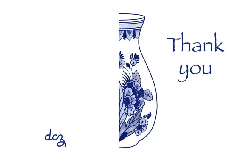
a page that will print two A2 size greeting
cards on one page. So this is like one of the
most popular cards sizes now, especially online
card companies. And it's because of
the economics of being of easy layout and because, um, you cannot waste paper and some other card size
is it does waste paper because we usually printing on home printers were printing
letter size paper. So the best use for cards of letter size paper is this
layout that we're going to do. So we go in here. I'm going to unlock
here to open my guides. Now that it's open and I can hit this little arrow and
they're going to show. And again, we're not
going to really move our, our actual rulers around. Sounds that you hear
in the background that sound like someone's
stomach growling there. My has skis and they
they it's not a snore. It's a little noise they
make when they're sleeping, but it's going to show up in my soundtracks here and there. And I tried to get a
fine to get it out, but it doesn't always work. Okay? So we're going to start with our vertical guideline layer. And we're going to select
that vertical guideline. And we're going to take
it to dead center on a letter sheet of paper
which is four and a quarter. Alright, there. If I'm a little off again, it's because I can't see
from this distance here. Okay, and then we
like that there. So we're going to
de-select there. And then we're going to move to our horizontal guide layer. My pencil isn't
happy this around. I don't know what's going on. And we're going to select it. And we're going to divide the paper in half
and vertical way. So we're going to move this, this is 11 ", right? So halfway here would
be at five-and-a-half. Okay. This is 8.5, so therefore
a foreigner quarter. So I better move it
over a little bit, so it goes all the
way across, okay? And do select. Alright, so this is our whole grid for what
we're going to do. We're not going to work on
these layers obviously. So let's go back and let's go, we'll just close them and
get them out of the way and go to our working layer. Okay? Now, this line in the middle is going to be a fold line
and not a cut line. And this line is a cut line. So when you make a two
up for A2 size card, you are intending
to cut the page in half right here
on paper trimmer. After you have scored a
fold line down the middle, or you can cut first
and then you're going to score your fold
line two times. I have a class on greeting
cards, on Skillshare. And we have all about scoring
and cutting and so on. So if you're interested
in that part of things, then you can move on to the greeting card
class from here. This is going to be the
front of each card. Okay, because we've
cut it in half and we've folded along this. And so this would be
the open side and this is the front
of the card and this is the back of the card. Let's work first with
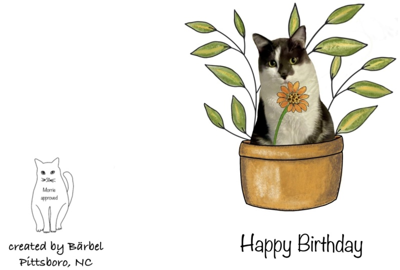
the front of the card. And I have pre-chosen a couple of my images from my cards
that I'm going to use. You. Can go along right now if you haven't already
thought it through and pick out two of your own photos
that are going to be just right for the front
of your cards. Okay. If you needed to stop the
video and go do that, that is just fine. But here we are, We're
back and I put my photos. I'll show you in a folder that I made in the photos app
labeled greeting card art, that makes it
easier to find them without scrolling
through everywhere. And so I'm gonna go
back to Procreate. And I'm going to go over
here to insert a photo. And I'm going to
go to my albums. And I'm going to go into
my greeting card or elbow. And there they are. And I'm going to
start with this one. Here it is. And it comes in
like we saw the other day at actual size and
actual size is gonna be just way too big for
this greeting card. I'm going first thing
I'm going to do, and I'm not going to
have to use my rulers to do it because I
can eyeball this, because I can see where
the front of the card is. So I'm going to make it smaller
until I think it's about, you know, it's at least
going to fit in there. And I think that's
a little small. So I'm going to make it a little larger within that
frame so that it takes up a nice part
of the card front end. I am going to center
it by looking up at my rulers and making sure that the space here is about the
same as this space here. And we have basically
three-eighths. So I know that I have
it pretty centered. And pretty centered is good enough for an
image like this. It's not as if this frame
is going to be showing. And the viewer can see in a tiny difference
between the two sides. Because you've got leaves over here and you got a flower
sticking over here. So visually, that's
gonna be just fine. And so when I think
it's just fine, I hit my arrow. That's the front of
my card in this case. Now this card, you could also
duplicate the same card. But I'm not going to, because I want to show
you how you might put an image and then
add some type to it. So I'm going to return
to the wrench and insert a photo and go to my albums
and go to the card art. Now I'm going to
bring in this image. We're seeing it
right over the top of that image, but that's okay. Because I'm gonna do
the same thing that I did a few minutes ago. I'm noticing that I actually
grabbed the wrong image because it's showing its
watercolor paper background. I have a second one that
doesn't have a background. But I don't care right
now because it's more important to show you what's happening then to
get my card perfect. So I am not centering
it this direction. And the reason is
because I want to put the answer to this question
down here by using some type. So I am going, I like it sideways
orientation in, so I'm going to
say fine, alright.
7. A2 2 Up Card Layout: Now I'm going to add type down here and I want to check
something here first. Yeah, the second photo did land on its own layer
above our working layer. So this is what we
have so far because our type is going to
create yet another layer. I have my color black, which is what I
want my type to be. And I'm going to go over to
the wrench and say add text. I'm going to get rid of the little crazy looking tax and I have a cursor in here now, so I can type in
whatever font I choose. So I am going to choose noteworthy because it's
casual and you have it. There it is. I'm going to choose a size that probably is going to
fit across there. So I'm going to take
the size down to about 20 points and
we'll see what happens. Now I say done. And oops, light text
box disappeared. I'm going, It's
on its own layer, as you can see here. And so what I'm gonna
do to get it back, It's just tap that layer. Alright, we could do that too, but I want the one
with the cursor in it. So that's why I tap the layer rather than go
after the selection arrow. So I want to say because you can. That's why. Okay. And I'll put a period. There are some times in
greeting cards, don't do that, but I'm going to move
this type now down, get rid of my keyboard. And move this type right down here underneath my illustration. And I'm going to
re-size this because it's centered in that textblock. So I'm re-sizing it so that
it's centered on the card. And it play around with
where you like it to be. Don't want it too close to
the bottom edge because some printers don't print the
last half inch on the page. And I'm now looking at my picture and wishing it
was a little bit bigger. So I am going to say, Okay, on this type and go
up here to my layers. I'm going to leave the
type layer and go to the picture layer
and select it again. And let's pretend I don't
have this background, so I am not caring
about the visibility. That background. I would probably bring my
image up to about that size. Doesn't matter about the
guidelines because we are not looking at the guidelines. Okay. That looks good. Hit the arrow to deselect. Now, if we didn't have this watercolor paper
texture showing, we'd have a pretty good
looking couple of cards here. I might want to move
my text up though. This is space seems a
little bit big to me. See, this is torqued
yourself layout time, and this is what you do. You judge, and you read, judge, what the wonderful thing
is about being in a place where you can change
what you're doing. I don't know how we did that, but anyway, being in a place, you can change your
mind about what you're doing is just kind of cool. So I am going to move that
up to just about there. Alright. Now what do we put on
the back of our card? That is really up to you. Do you have a logo? Do you want to put art by you? Do you want I would
not advise it, but if you're selling your cars, do you want to print a price? I never print the price
on the cards because sometimes I change the price
for this reason or that. And you don't want a
bunch of cards that you printed to have the
wrong price on them. The beauty though, of doing this in Procreate is that you're only going
to print the cards. That you need at a time. So, alright, now, let's make, I'm trying to think
how I want to, what I wanted to
put on the back. And I think, alright, I am going to put the name of my online card shop
is sky dog and Chevy. And so I am going to add text. Delete that weird looking text, and I'm going to type sky dog and chevy.com. Now. That is too big and I am
going to move it over where it's going to be so that I
can tell how to size it. And I'm going to go to the a's here and go to the size slider. And you see it did not hold the point size from the last textblock we made.
I wish it would have. But that's just one
of the weird things about texts and procreate. But if we reduce, got to have it selected a
different way, no cursor. Alright. If we reduce the size until it kind of
looks like it should, then we can move that down here. Okay. And I'm going to bring the text and text and
again to add my name. And this time I'm going to say illustrated by return. Jessica was for work. And go to our size slider
and bring it down. Like maybe about so. No, I don't really like how much spacing is
between those two lines. So I'm going to select that
box again and go down to my go-to my letting slider, which is right down here, and reduce that line sizing. Okay? Then I usually put it
about this kinda thing about a third of the way down. Good. Now, I would like to put the same thing on the
back of the card. So what is the easiest
way to do that? Well, I'm going to
look over here. I'm going to see that each of my pieces of type is
on a different level. This different layer, this one is here and it
tells you which is lovely. It tells you which one is which. So this one and this one, or this one and this one, I'm going to merge
these two together. Merge down. And now both of these, both of these are on one layer. Alright? And so I can
duplicate that layer. And now I have another layer
with the same thing on it. And even though it
doesn't look that way, because they're sitting
over each other. When we do our selection arrow, we have them both selected. And what's selected is really a copy of
what's underneath. So all we have to
do is move this down to this card and
space at about the same. And then we can de-select. Now, we actually have everything that we
need for our print. You can leave these layers separate because you might want to use this entire
thing as a template. In other words, we would save this document just the
way it is right now. With these on separate layers, this on a separate layer. These on their own layer. Because we can take
this whole document in again and make a layout
for two more cards. Alright? And so before going to the
where the print stage is, I am going to save this
as its own self here. So I'm going to share it, and we're going to share
it as Procreate document. And where are we
going to put it? Like we said, good place
to put it is in files. Okay, so this is going to save it to there and I am
going to name it. I'm going to X out that and
I'm going to name it a two. Another two here too. Up Card layout. Done. So how could
you use this again? Well, I'll show you.
8. Two More Cards from Our Template: So now that we have
saved our card template, we're going to close this by
returning to the gallery. I'm going to show you
how to go and get that to use again. And you have to leave Procreate, go to your files. And this is my procreate folder. Here is our A22 up card layout. And we can hit it there. And it's going to open right
up for us in Procreate. So here we are. And it should retain all of its layers that it
has, and it does. And that's great. So we're probably just going to keep the left side the same, but we can replace
what is on this side. So where is our signed
from the universe tree? So let's take a look in our
layers and there it is. And what was the working layer? So the easiest way to
clear that is gonna be to tap that and to hit clear. So now there we are. In here is my one that
should be replaced. Anyway. Let's go to that layer. And I'm going to go back into my template and
get rid of that. Actually. It's this
layer right here. So we do the same thing. We tap on the image of the
layer and we clear it, and there we are. Okay? And our type layer in case we wanted to add any
type, is still here. And it's live. The keyboard pops
up, the page, moves. I know, weird. But you again can have your cursor back and you can backup input different
words in the same style, in the same size. And when you're doing
cards in a set of cards, that's a good idea
that it kinda looks, has a uniformity to it. So I don't know what
pictures I'm putting in yet. But I'm not going to change
that type right now. But I think I want to go and add a photo that's a little crooked so I can show you
how to straighten it to. So we're going to
add, insert a photo. Go to my albums, go to my cards. And I think this one is
a little bit crooked. I really liked this one. And here it is. And obviously it's too big. And so we're going to size it so that it's probably
going to fit. We're going to move
it into place here. That's about right. Then this little guy
right at the top, this green dot is going to allow me to straighten this because this bothers me, see how its tip this
way a little bit. And so I'm going to
touch the green dot. I hope there if you touched
it twice or you held it, you get to do it by degrees.
I don't wanna do that. I want to do that by eyeballs. And so I'm just gonna do that
until it looks right to me, alright, and de-select.
And there we go. Now we have our third card made. And I'm wondering if I have any others to add type two because that would be
a good little demo. And add and insert a photo
and go to the album. And anything else that I forget because I did
these long time ago. This one this one might have
a caption in here it is. And it's too big and
we're going to make, it is not crooked though,
which is really nice. Now we're going to pull it
down here, make it larger. And I'm going to change my copy. Alright, good, on the photo. And then I'm gonna go here
and go to the layer where my copy is, which is here. And I'm going to
select my coffee, which is going to
pop it up there. And select it again and
get my cursor back up. And going to put my
new coffee here. Says one way going up. I'm going to say it's the only way to go from here. All right, Now, get
rid of the cursor. Select again so
that I can move it. If you had to change
the size because or make two lines of
it change the letting. Any of that. You could do that too by going to the a here and
doing whatever to it. But I think this works for me. And so I'm going to leave it
the way it is and say done. So let's bring our cards
template back down here. Okay? And we are ready to print. Except for one thing. If we were to print
directly out of here, the rulers and the guides
would be a part of what we've printed and that is
not what we want. So obviously what we're gonna do is we're going
to go back here. And we're gonna go to
our design guides, which is right down here. And we're gonna make
our design guides. Invisible. Keyboard thing
is going to drive me nuts. I tell you, okay,
get rid of this. And so we are ready to print.
9. Printing Your Project and Final Thoughts: So now all that's left to
do is to print our card. And to do that,
we're going to go to the wrench and we're
going to go to Share. And we're going to choose
what format to print from. This is a 300 dpi
document already comes in your guide because that is the resolution that you
would like to print out. So that's best supported
by a ping or tiff or a PDF or JPEG sometimes saves an
image in a reduced format. And I don't know whether that happens in procreate or not, but I don't want to
take a chance on it. And so I'm going to choose Ping. Now, we are in our share box
that we're used to being in. And we're going to hit print. That's going to bring up a
window that's going to let you choose whatever printer you
might have on your network. You might have one on your
general Wi-Fi network in your studio or a
couple of my printers, they have a direct signal and
this Cannon is one of them. So my Wi-Fi on my iPad is set to the signal coming
from this Canon printer. And so that's why the Canon printer is
also selected here. But if your printer isn't here, you would do this and there
would be a list of choices. And you would choose
in each printer is going to give you
its own thing here. Okay? And so I have presets. I want one copy and I don't
want black and white. And my papers size that I
want is letter already. There are with some printers,
some other choices, but this one is letter. So all I would do at this
point is I would hit the print button and things over there would were and bop. And we would have a printout
letter size of our template. Here we have the
fruit of our labor. This is a printout of the
two cards that we set up. Our next moves
would be physical, and that would be to cut this paper in half
this direction. Score along this
middle line here, and fold them into cards and
give them to your friends or sell them or
whatever you're going to do with your card layout. Just a couple of more
things I would like to add. Trouble you may run into that. I always like to
tell my students what trouble you might
run into because I run into it and then you won't think you're
all by yourself. You see the difference
in these two prints. Now I don't know what
printer you have and whether it's going to be
like this for you or not. This is a pretty good little
cannon portable picks up on the iPad printing direct. I don't have any. It doesn't offer
inequality controls or any controls for change for
choosing the correct paper, like a photo paper as
opposed to just copy paper. And so this is a very washed out print
when I printed direct. Okay, this one. I didn't print direct. So I saved this as a
tiff into my photos app and I airdrop it to my laptop so that I could
print from a laptop. Then from the laptop, the printer has a
whole other interface. That law allows
me to choose the, the print best and the choice of a photo paper instead
of copy paper and so on. So if someone asked me my opinion from what my
experience has been, I would say, don't print straight
out of Procreate, Share a tiff or a ping
out of Procreate, send it to your computer
and print it from there. Now the other thing I
wanted to show you was my result from making
our business cards. This is a logo of mine and I
don't really put too much. I just put my business phone
number and website on there. But if you recall, I just wanted to
tell you how this can be cut up and dealt with. And you can go back to the
template we made now that you know how to do type and
how to size photos, you can go back and make
your own business cards on the template that we created
and saved in your files. This procedure would be the same thing as what we did
with the back of the card. So you would set up your business card in
one of these squares. And then you would
duplicate your layers and move the business cards
into all their spots. In the end, you could just merge down all those layers and they wouldn't all
be sitting there, but that's the
easiest way to do it. Duplicate the layer,
hit the arrow to select everything on that layer, and then move it down just like we did on the
back of the greeting card. And your trim for this
on a paper trimmer. Remember that a business card is three-and-a-half
wide by 2 " high. And so this is an
eight-and-a-half by 11. And so you would be
cutting this too. Two times
three-and-a-half, seven, you'd cut an inch
and a half off of this wave first. That's
the way I do it. I do that breath first. And then this five
business cards times 2 ", that's 10 " off of an
11 inch piece of paper. So you'd be cutting
1 " off here. Then what I have that
sheet I couldn't have at three-and-a-half there. Then you have two strips
and you can just put it through your paper trimmer
and cut every 2 ". And then you'll have a
pile of business cards piling up right there
next to your paper term. Or I would love to see what you do with your project
for this class. And I hope you will upload
it into the project section. And we've made this class around just a single guides file. And that is a portrait and up and down vertical
letter size sheet, because that is the
one that will be used most often for these
kinds of projects. I am going to create one, a letter sideways for
people who might want to, to do brochures or something. And then I'm going to
research whether there are other common sizes that people might be wanting
to use out of Procreate. And when I do those guide files, I will upload them to the
resources for this class, and I will let you know that by email that
they are there. But for now, I didn't
want to confuse things. And so we have R1 gives us this orientation
that we can use. In many ways. I hope you enjoyed the class. I hope you have fun
creating greeting cards and creating business
cards and creating everything that comes
to mind for you. If you would like
to see any more of the greeting
cards that I make, you can find them and you
can find all kinds of things of mine at Santa
Fe Art cafe.com, and you can find that link
in my profile as well. I have freebies there, I have newsletter there. I have a community that's free to hang out
and talk about art. So if you're interested, you can check there for
other goodies you might be able to add to your projects.
 Jessica Wesolek, Artist/Teacher