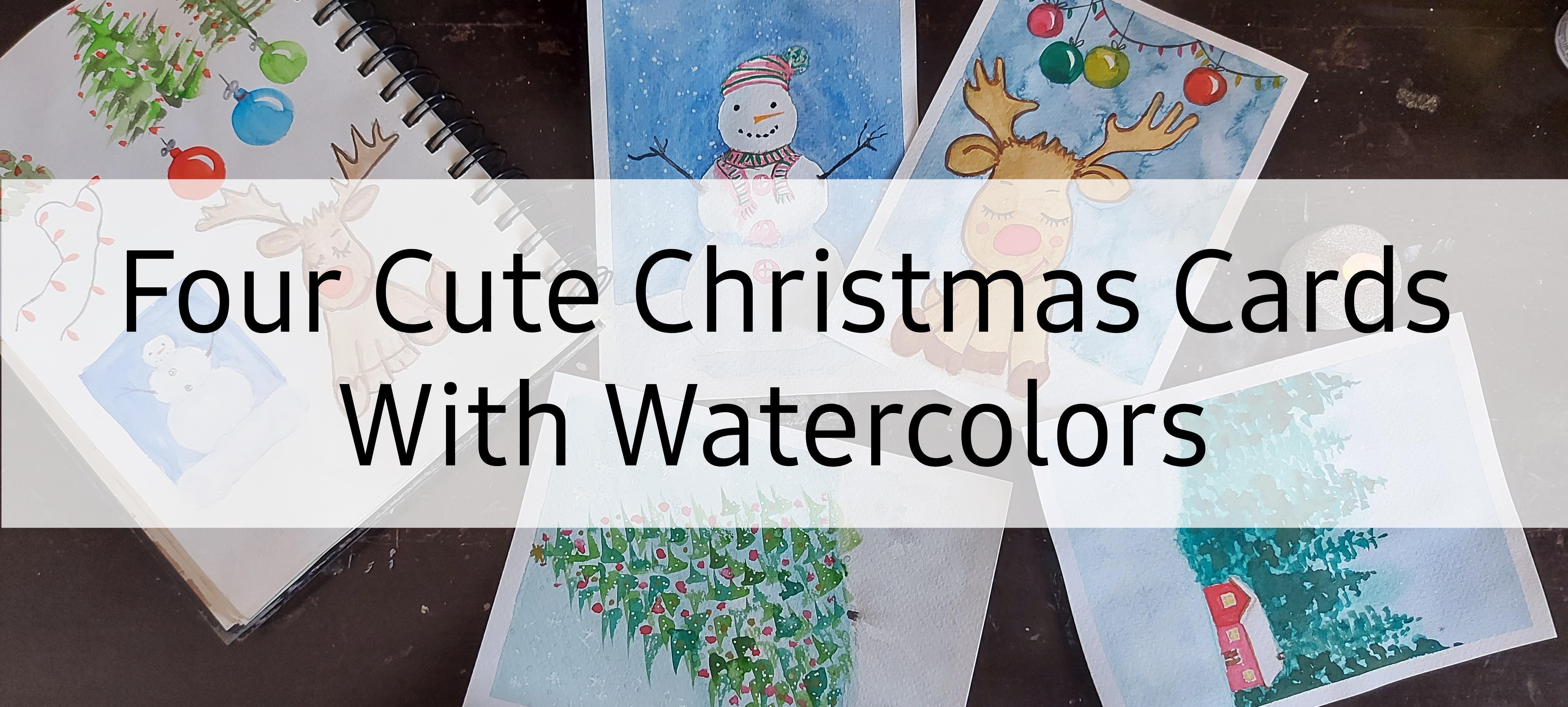
Transcripts
1. Last Minute Welcome: Last minute holiday gods for those who've
got to buy them, or those who just
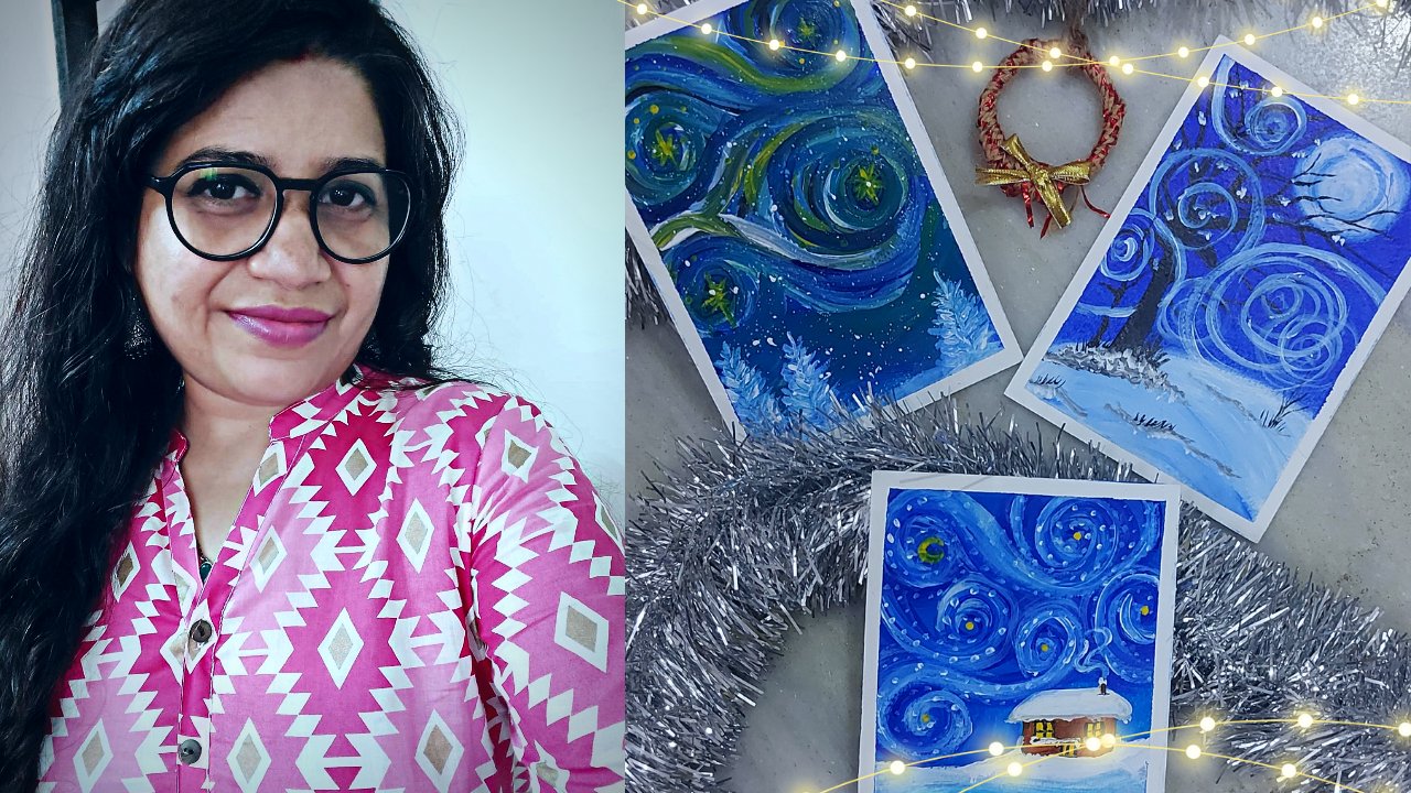
ran out of stock. Hi, this is M, a right to a model and an
artist B's out of India. I love to be in different
mediums like watercolor, acrylic wash, and even
booster colors and markers. I'm a self-taught artist and
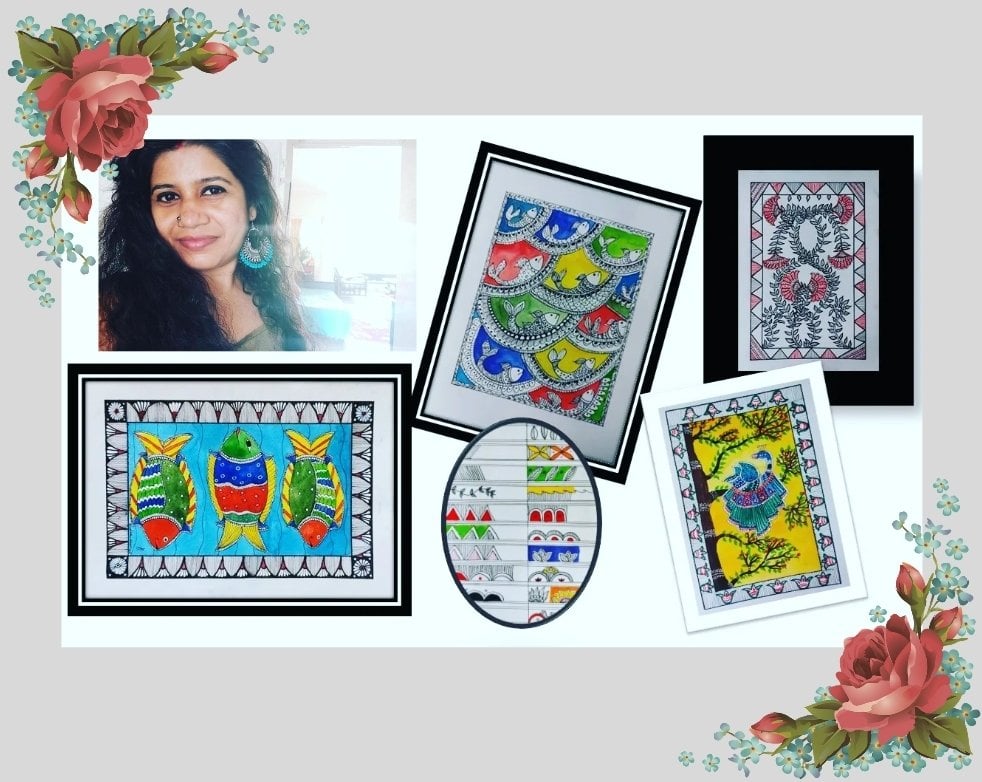
art is not just my hobby, but it's all part of my life. Indian folk art forms like Madu, Bonnie and go and are very close to my heart and I
love to use them in creating unique characters and illustrations in
my very own style. Ever since I have started, I love to paint small paintings, be it a quick urban sketch
or a realistic landscape, but I like to keep it small and simple and that we are
made sure to paint every single day
because practice is all that it takes
to be perfect. In my previous Skillshare class, we painted these beautiful
Venter landscapes with watercolor. And in this one here, or we will be painting cute Vento animal
characters with gosh. It's a beginner friendly class where we will be painting for QED postcards using the
basic techniques of gosh. And you can use these artworks
not just as postcards, but also as Christmas
decorations. So if you are convinced
about joining the class, meet me in the next lesson
where we will be talking about all the supplies that
you need for this class.
2. Last Minute Supplies: So let's see what all
we need for this class. First of all, the people, I will be using 300 GSM, 100 percent cotton paper. And I suggest using a 100 percent cotton
paper with higher GSM. I'm using this texture people, but you do need to
have a textured paper. You can use smooth finish. I British sheets also can do for this class because
we'll be using gosh, these people was already
in the size of a postcard, but you can use a bigger sheet and cut it in your desired size. So that's about the repo. Let's see the colors. So we will be using gosh colors, but you can use anything
that's a big and can be led. So poster Carlo, acrylic, acrylic paint markers, anything that's opaque,
you can use it. I will be using this
basic set of gosh, nothing fancy at all. And I will also
use an extra tube of white gouache because we need a lot of
white for mixing. Also, keep white
jelly roll handy. And we will be needing
a jar of water. I roughed lot for
cleaning your brushes. And for the brushes, we will be using small brushes. So number three, flat brush, number 3, round brush, and a very fine
detailing brush will do because these are
very tiny projects, so all swan rushes. And then finally for practice, we will need notebook or a sketchbook and
some basic stationary. So these are all the supplies
we need for this class. Grab them all, and meet
me in the next lesson.
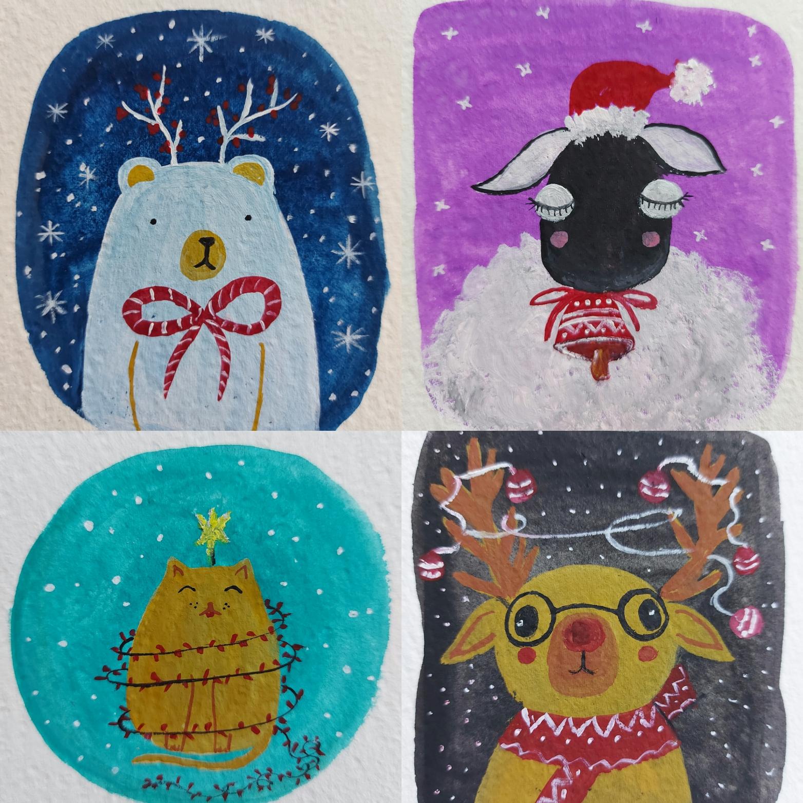
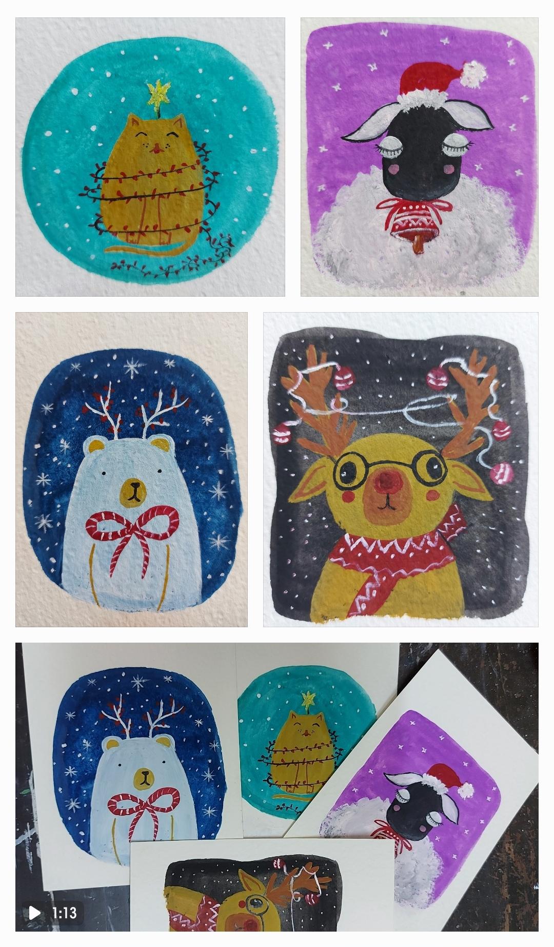
3. Last Minute Class Project: For the class project, we will be painting
these Fool postcards for cute window animals. Either be being done
them as both guards, but you can also use
them as gift tags or, or you can cut the artwork. You can keep the
background rounded and got it and punch a hole in the center on top
and use them as Christmas decorations or the ornaments on
a Christmas tree. So you can use them
whichever you like. If you paint them, please don't forget to share the pictures of your artwork. In whatever form they are. Gift wrap, sorry, give DAG or Christmas ornament
or a postcard. Just share the pictures
of your artwork in the project gallery for
me and others to see. I'll be super happy to see them. And I'll be super
happy to know that I helped you create
something beautiful. So I'm so excited
for this class. I hope you are excited as well. So meet me in the next lesson.
4. Last Minute Drawing Practice: Drawing cute animals. So first of all,
let's see what are the aspects that make
anything look cute. So as a general rule of thumb, whenever movie draw
something sharp or point D, It does not look cute. For something to look cute, we have to draw things
rounded and curvy and fluffy. And they automatically
start looking cuter. And right. And when it comes to drawing any character like a human
figure or an animal, we keep in mind that we make the head bigger than their body. And this concept
comes from babies. A few observe the BBs carefully. You'll see that their heads are always bigger than the body, and that makes any figure
or character look cute. Then there are several
things like lower eyes. Eyes fire from each other. They make things look cute. Oh, oh, I can't draw here. There's something wrong with this part of the
people. Be changed. The pencil, okay, no, we can't draw like there's something
seriously wrong with this part of the paper. I just can't right here
no matter what I use. Okay. Let me use a pen. Maybe that will work. Let's see. Yes, it's working. So here, as you see, I'm drawing small ears for considerably larger
fees. I'm drawing a sheep. So here's the tuft
of hair on its head. And I'm drawing eyes which
are lower in the face. And they are far apart. And then there are
other elements like blushes, cute little mouth. You can add nose
also if you want to. I'm not using the laws here. Now. I can be drawn in several ways. They can be just
the dots or they can be really big
into drooling types. Then they can be small eyes, big eyes, closed eyes. And then you can add lashes
to the close eyes like that. Then there are happy
eyes, these ones here. And you can also
have big eyes that small dots for the
iris like that. Or you can even make
big rounded eyes with closed eyelashes like this. Big line dividing the socle into halves and
small, small lens. To depict the lashes. I am going to use these
eyes in my final postcard. And here I'm showing
it to you again because might have not seen it properly due
to the camera angle. And there goes the
body of the sheep. And here's a cute little sheep. Avoid this, and then it skewed. Now, if we have to draw
a cat for the cat, we will have to use pointy ears, but we can make the
points little rounded. And then we draw this
teardrop shaped body. So it's a teardrop but
two ears like that. And I'm keeping the drawing really simple as you've
seen in the sheep also. I'm keeping the drawing
very simple because simple makes it more cute. Little bit wonky makes it more cued to perfect and do complex. Doesn't look cute. I mean, they can look amazing, but it won't look cute. All right, and then that's the amount and the
viscous of the cat. And do parallel lines with some goes at the bottom
will depict the legs. I'm not worried about the
hands and not big enough. I will directly made
the deal like so. And there, That's
my cute little cat. Right? Now let's see how we will
draw the next animal. And that's a bear. So for that, I'm drawing
an upside down U. Thank. So do parallel goes for the hands and
overview for the mouth. Another oval inside
it for the nose. And that's the
opening of the mouth. And again, I'm drawing release, more eyes, flight
away from each other. And that's though. And that's another year, and that's our base. Now let's draw the video. And for that, in the same way, I'm going to draw this big head, almost roundish and the
slender body like that. Another boo-boo for
the mouth and nose. And that's the loans, uh, bake Rudolph nose in now. Mouth. And I'm going to make bake
eyes far away from each other, but big and small and blushes. Now let's draw a small hears
on both sides, like so. And for the ACLU, I'm not following any
particular pattern and I'm not even worried better route of them
are seeing or not. Just making random sheets
to suggest that I'm close. And this is the, I, I know it looks a little
wonky or surprised, but that's fine.
That is what it is. We're going to look cute. If you want. You can also give it
attains like glasses. So let's give him
glasses like so. And then they will be decorating all these antibodies in
response or window view. But for now, this
is how we draw Q, the animals practice them. And when you're confident, meet in the next lesson where
we start painting them. All right, so I'll see
you in the next lesson.
5. Understanding Gouache: Okay, so before we start
working with the Bush, the mixing palette is
something that I forgot to mention in the materials lesson. So that's one
supply you'll need. Now let's start with
the garage practicing. Here, as you saw in my palette, there was so much dried color. And since gosh is reactivated
by the use of water, I reactivated one of the colors. And I'm using that to pinned
solid layer of this color. Here. As you see, this color on my palette already
had vite in it. And that's why you
can see the layer I have painted is
nice and opaque. And as you can see, there are streaks of color. You can see the brush stroke. So that means the color I'm
having in my brush is not nice and it doesn't have the accurate amount of
water that should be there. The brush is a little dry and that's why we can
see the brush strokes. Here. I'm blending and
mixing the layer, trying to get rid of the brush strokes and
make it solid and opaque. But this is the best I can do. So I'm here adding another
layer of the same color. I've added a little bit
of water in this one. And with that, I'm
giving it another good. And now, as you see, it's pretty much
solid annual peak. Now let's take another color which was already
there on my palette. I'm reactivating it with Porto. And this time I've
taken my round brush, as you can see here. I've added a lot of water in color and it's spreading
nicely on paper. But as you see, it become a little
bit transparent. It's not as opaque
as it should be. Here. It's transparent. And also because the
color was dried on the palette and I'm using it by reactivating
it with photo. The spread is also
not very nice. We can see the brush marks and streaks of colors
here and there. It's not very, even, it's not very uniform. Alright, but yeah, we can use
this way of coloring if we, if this is the effect
we are aiming for. Alright, so this is one layer. Now let's see if this is right. No, we can still see those chin. We can still see the sheen. So we'll have to wait
until that layer dries. And then we can
layer on top of it. And learning is the only
technique that we're going to use in making all the booths
cards here in this class. Now here I've deactivated
another color that's Bhopal. It was already on the
palette and it falls dried. I have reactivated
it and I am being degraded with the same
round brush of mine. Again, you can see that texture. So the brush is not very wet. It's almost dry
brush, dry brush. And here again, the streets and the brushstrokes
are very much visible. We can blend it after
going back and forth, back and forth with
the brush like this. But then it's too time taking and we're not getting
the same result, the same color that
we want that we can get if we use the fresh color
straight out of the tube. And I'll demonstrate the
same to you in a while. Here. As you see, I'm adding more water and I'm
adding more color. Like not adding more color, I'm loading my brush
with more color, but the effect is not very good. Now here I'm taking fresh
color directly from the tube and you'll see
the results in a vial. But this color also I
cannot use directly. I have to dig a wet brush, not soaking wet by the damp brush to mix it
to make it more fluid. And then I can go on
painting the people. And now you see the creaminess, the fluidity, and the
opaqueness of the color. It's pretty much
fluid and creamy. It's gliding on the
people very easily. I don't have to make
that much effort that I was taking when I was using the color that was dried
on my palette already. So it has become a lot
more easy and effortless. Alright, and it's
spreading very nicely. And now you see the effect, you see the result. It's very different from all the other batches
I have painted before. Now, this was the pure
color out of the tube. Now, if we add a little bit of white in this color,
then what happens? So let me take some white
and mix in this green only. Here. I have taken
White and I am taking a very little amount of this fight and mixing
it with this green. Of course, the color
becomes a more, a lot lighter. It becomes PESTEL. But we can achieve the value of the color by adding
some more pigment, some more pigment to it. So value is not a problem, but you see the creaminess
now and see it on people. It's already so opaque. Like see the difference. When I paint the
patches side-by-side. One is the color
straight out of you and the other one is when
I have mixed white in it, you see I have to add
some border because it's becoming very
dry and hard to beat. So why it makes it
a lot more dry. All right, so now
you see the color, the way it's spreading
on the people and the way it's obesity is that's the effect we want when we use
squash. See that? I'll show one more time. See that. That's the
color, that's the obesity, That's the effect very easily
where evil to be int batch, which is opaque and
uniform and even on right? So this is the only and
these are the white. So let's write it here. Color plus white. And we know that
effect, the difference. Right? Now. This is the dried color
which I had reactivated. This is also the
right dried color, but this already had vitamin and this one
is the fresh color. So let me write that down also. Yes. Dried color, dried
Kano and dried color. So now you know how
important it is to use fresh color
out of the tube. So tick the amount you need and don't reach the
color on your palette. And if you've taken
extra amount, you've got to get rid of it. I don't think you
should use that. After reactivating. Yes, if you're doing
an under painting, you can still use it,
but not for the droplet. All right, so now let's
move on to the technique we're going to use for
making all the gods. That technique is
called layering, where we will layer
another color on top of the previous color, right? And since gouache
is very opaque, we can use lighter colors
on top of the darker color. But the only thing to
keep in mind is that the previous layer has
to be absolutely dried. So is this one. And here we go with the
same green and white, makes sure you can, as you see, we can let it very easily and nicely like that. Now let's go on this one. Now, this layer has
not completely dried. They're still a little
bit of moisture left. So you can see that it is
mixing up with the green. Blue is mixing up at the green a little bit in the center.
And we don't want it. So whenever we're letting
1 to keep in mind is that the previous layer
has to be very, very dry. And the other point
we have to keep in mind is that we don't have to scrub a lot because
the previous layer, no matter how much right. It is, it can be deactivated. If we scrub it a lot with water or watery pinned on right. Now. Here I'm taking another color. Again this time, I'm not, I have not mixed
white in this blue. It's only blue and
I'm laying it on top of the green there. But now I will add
some white in it. And then you'll see the
difference in a while. There. Now you see it, it is lighter. I agree. But see the effect. That's the effect reborn. We don't want that effect
where I have used only color. All right, so this is
how we layer in garage and this is the
technique we're going to use in every postcard. It's very simple and very easy. So let's move on to
the next lesson and start painting the postcards. Let's start with
the first layer, because we are going
to go layer by layer. And that's how we
pinned in Gosh, you always go layer by layer. Alright, so see you
in the next lesson.
6. The First Layer: So we are going to paint the first layer on
all four postcards. And for that, I have
taken these colors. I have taken the gouache
colors directly from the tube, and now I'm taking some
white next to each color. You can choose the colors
of your own choice, or you can go with those same
colors I am taking here. Alright? So let's choose false color. Let's say green. So here I'm mixing some green
with some white. But my flat brush. I will also make sense
some amount of water. And before starting to mix, my brush was already read. It was long, soaking wet but
it was a little bit down. So with that, I'm
going to be solid. So now here I see my
brush is too dry. So I dipped it in some water, not making it too watery so that the gorge
becomes transparent. But I'm just taking hello and mixing it with
water a little bit. Also my people is the extrude. That is another reason
that I am getting a lot of texture and I'm getting
a lot of dry brush effect. So if your people is smooth, you might find it
easy. Randomly. I'm not too worried about
flatness of this layer. Just randomly, I'm going to make some good right in the
center of the postcard. Like that. In order to make it
perfectly rounded, I'm making it bigger as
you see, but that's okay. We can afford to make it a little bit more rigor
as it was too small, even for a smaller people. And there, this one is ready. Let's move on to the other one. Let's choose another color. So let's say it's purple. So it's going to be the
very same techniques. So I will just stop talking and take a time-lapse so that
you don't get booed. We have to just randomly
picking some sheeps, differentiates on each postcard with different,
different colors. As you see me doing. Here. As you see, I had voiced my brush and that's why
it's a little too red. And I have changed the blush. It's the round Rationale. And with that, I'm
taking a lot of cosh, and here I am
making a box sheep. I won't say whether
it's a square or rectangle because it's
not it's none of them. Actually because I'm
not measured it. It's just a box, sheep with poor corners. And as you see here,
even the corners, I am making them rounded and not making sharp corners
of this box. And this, I will fill in the
empty within the boundaries. And like that only
I will complete the first layer
of each postcard. Or deep watching as I
paint all four postcards, the first layers of all
football scarves on right. We're done with this one. Now let's move on to the other one and that
one is going to be. So I've been mixing
black and white. For that. Following the same courses, I will again beamed another sheep and adipose
Skype. So here we go. As you can see here, I have kept the bush little
bit more transparent, but the color is OK, so it's okay to keep the
voyage little bit transparent. And nine that I have, again, another
sheep, solid sheep. Get the color. That since it looks a
little too perfect, I'm going to make it a
little in both it by making the sides of this shape a little 3D and go like that so that they look more organic
and more natural like so. Now that we're done
with this one also, now let's move on
to the last one, which is going to be dark blue. So for that, I have taken
indigo and of course, I will mix in a little
bit of weight with that. As a rule, we always makes fight with the colors
and we are using wash because that makes the
color more opaque and flat, and that's all we
want with quash. So here again, I'm using the round brush
only and the dad, I'm making this a perfect door. So that's the
outline and now I to quickly fill in the blank space. Again, I'm not worried
about the flatness of this layer because any
reasons layer is going to be covered underneath the character and other
elements of the postcard. So I'm not too worried about this layer being too
perfect or flat, right? So it's okay, if it's
patchy, it's just okay. So here are the four postcards
with the first layer done. Now we will leave them for drying and I'll see you
in the next lesson.
7. The Second Layer: So I let the first
layer dry completely, and now we're moving
on to the next layer. And here I'm taking
yellow ocher. I have chosen this first
postcard that we painted, and here I am drawing
this over for the cat. And since gouache is
an opaque medium, we don't have to draw
the entire figure and diode character just
in the first goal, we can just concentrate on the bigger shapes
and the painting. So here I drew this
oval and then I will add the other
body parts like that. That's the deal. Now you
know what I'm drawing two until that's a cute cat. And here's the first year. And second year, I blended the edges or
they don't look jointed, they look not sure like that. So that's the
silhouette of the cat and I'm leaving it for drying. Now I'm taking the purple one. And on that I'm going
to draw the sheep. So she is going to be white, but the face is
going to be blank. So a big fees with the help of my round brush for
the fees like so. And do small. You will see whether we want
to color it white or black. And here, after washing
my brush totally IFFT can write goes directly from
the tube and I have not made a tiny bit
of water in it. And with that, I am just
dipping the brush on the surface like that in dabbing
movement, dab, dab, dab. And as you can see, it's almost dry brush
because I want this texture, this texture of fluffy
rule on, right? And that's what I'm doing. Stippling to get
the proper texture of volley body. Like so. And to add some dimension, I'm using a little bit of black, which touching the white
automatically is becoming gray. And I'm adding some more white. So I will keep repeating this process of adding
white and black, ready tiny bit of
black until unless I'm happy with the color and the texture of the
body of the sheep. Now here as you see, the face has becomes more low and the body
has become bigger. So even that works for me, though the full
proportion is not right. The basic idea is that it's
not the correct proportion. Either the head is too big or the head is too
small for the body. So that will make
the sheep look cute. And here I am again
trying to blend the color for the
body of the sheep. As you can see, I'm adding little bit of
black and lots of white. And now I'm happy with the
Cloud like body of the sheep. And I decided to
paint the ears white. So here I'm just
filling in the color as you can see, like so. So don't worry, logos
on the outline. That outline was just
the placeholder. I will outline the ears and
other things as required. Again. So don't worry. And again, using the
stippling technique, I am painting the tuft
of hair on top of the sheep's head and
now do big eyes. But what I noticed
is that the fees, the black color on the
fees has to land, right. And that's why it's
blending with the eyes, white eyes that I'm making. I don't buddy, even if we get a gray eye or or lighter eyes, we can always go back to it Once the colors
have dried and we can correct it because
gouache is an opaque medium. I think we can leave
this for drain. All we can add some character by making the
blushing or a small mouth. And that. And now I'm taking the
detailing brush to outline the ER visit black, like so. And the eyes. Outlining the eyes. Maybe it's not a very good idea. And maybe I will work
on it later when it's completely dry it and I'll
make it completely right. So now I have taken no
blue God and on that with titanium white
straight out of the tube. I'm drawing this upside down, U shape like that. Or you can say half
oval shape, Semi. Hope. I write like that. That's the body of the bed, the cute baby agreeing to
draw for the class project. Any survey, first layer, very first layer of the
full class projects. That's our bear. Let's give him some features. Body features. Let's add the ears. Just the first layer. I want this layer to dry completely before I
add the features. The features which are
going to go on top of this. Now let's move on to
our last blue sky, which is the black one. And on that, I'm
willing to draw. So first we will paint the
silhouette of the reindeer. And for that, I have
mixed some yellow ocher. And the dad and whip
my trusty round brush. I'm making this oval
head of the reindeer. And then I will meet
the slender body. Like so. Peninsula nobody. And fill color. And again, we'll have
to let this dry. Meanwhile, let's
draw some and close. That's also the
first layer only. And the Atlas don't
have to be alike. They can be completely
different from each other. That's okay because we're not drawing a realistic,
hyper-realistic Grindr. We're just drawing
fun and cute radio. What it would be going to. And here, I'm almost
done with an NGO. And once it's done, we'll leave this for
drying with rest, guts. And once they are
completely dried, we will move on to
the next lesson. And here, as you see, I can see this looks a little
too dull after drying. That's another quality of that. It changes the value
when it dries. So it can either
look very dark on light as compared
to when it was wet. So you have to be
careful about it. So here I am getting the CAD, another coat of yellow cup. And let these postcards dry and meet me in
the next lesson.
8. The Third Layer: So let's begin with the bear. And this is our code lives. So here I'm making two tiny they are far apart and
bear lower in the fees. And some yellow ocher
for the mouth area. Once this dries, then I
will add the nose and the mouth on top of that
and hear the years. You can also use dark
brown or you can use green for these peaches. But I just like it, it golden. So I used yellow ocher. Now this one is going to
bear this red bowtie, really huge and Teddy bearish. And also Christmas Eve. I know Christmas is over. And these are likely literally
last minute holiday gods, but still we can still make allostatic those dresses
in Christmas diet. And here is some made
out of the drinks. And I'm also willing to make some berries to make it look more like. So since the blue tie
has tried to solve it, my detailing brush and the white gouache
straight out of the deal. I mean, these lines on top of it, it's completely optional. You can just leave it
like that if you want, or you can make polka dots on it so
it's completely on you. Like so. And don't worry about it to be perfect because
perfect is gorgeous, wonky is beautiful, and that's
what we are aiming for. And now with the same brush, I'm drawing some
snowflakes here a bit. Or you can call them stars, whatever you like it, or some decorations for
the background. Like so. And now I'm adding some dots with the help
of the blush only. You can also use white
jelly roll. If you have it. I might be using
that in the next. And here, as you see the gods, solute is dry it and
here I have taken dark brown or adding the
features like so. That's the amount of the cat. I'll have to add. Oops. So that's a spot and
an unwanted spot. We'll fix it later. Right now, just forget about it and concentrate on the painting. I hope that did not
happen with you. So here are some happy
eyes and viscous. And these are the series light
or fairly light on, right? So I am adding these
lights on the god because it's pretending to be
the Christmas tree himself. Yes. It's a him in my
head. It's a name. You can call it a higher also, because we are the
masters of our painting and we can imagine them forever, really want, isn't it? So here I'm making some
fairy lights in red. Again, you can choose the color. You can use one galore like me, or different, different
colors, totally up to you. Let's make The Star
White. And data. Maybe I'll color it. Because before this
it was almost Doty black because the
colors did not drive. And here, I am adding dark
brown to my reindeer. Right? So CBS adding the next layer only when the first layer is, previous layer is dried. That's a deep red
nose of the Rudolph. Make so we have to always keep in mind that
the base layer has dried. If it's still wet, we can do in the painting. So the range is
going to be varying. The buffalo or scarf, red one for the Christmas, for the new year,
for the holidays. Let's add other features. I am not liking the way the eyes I enlight
seen stem later. But first let's meet the
decorations on the Anglo. They simply and easily, I mean, these decorations. You can choose to make other
decorations or you can choose to keep the
UNCLOS free only. Without any decoration. It's totally up to you. Now. You know, when the scarf is dry and it's time to
add some details, some designs on it, like so. And you can choose the color of this curve and the design. As per your choice, you don't have to stick to this red and white team at all. Now let's look at the sheep. As you notice, I have made
the eyes, which lashes. I have my mouth. I did not need it. And now it's time to dress up red Santa hat and a
red belt around her neck. Little bit of blending
and shading like so. Now with the use of the
same stippling technique, I am making the palm, palm on the Christmas hat. Like so. And now let's detail though, red bell, because
the red has dried. That's the final element. In this postcard. That's the bowl which is tying
the belt around her neck. Her now, yeah, this
cheap for me as a whole. Here I'm adding some details to the bell using some
brown and yellow ocher. And I band here, I'm using my white jelly roll to debate some snow or status. You can do that very easily. Now, let's add some
stars on this one also. So on the decorations
are still wet. I can't use a jelly
roll on top of them, so I will wait for them
to dry completely. Meanwhile, I am adding those features on the
face of this range. And I have filled the
sky that starts there. And now I had to also fix
the star on top of the gut. Now it's yellow again. Went off. And did this via done
bit also postcards. Meet me in the next lesson
for the final watts.
9. Happy Holidays!: Yay, we made it to the end. We've painted all
four postcards. And I am so happy
with the results. I hope you enjoy the
process as much as I did. Please don't forget to share
the pictures of your artwork in the project gallery
for me and others to see. And until my next class. Stay happy, stay blessed,
and keep painting. And if you like the
classes I share, you can follow me here on
Skillshare so that you get notified whenever I am
sharing another glass. So see you in my next class. I wish you all happy holidays.
 Manishaa Shriivastava, Artist, Art Educator, Author