Transcripts
1. Intro: Jewel toned botanicals: Hello and welcome
to my home studio. I'm Emily, and in today's
Skillshare class, our goal is to relax and have fun while painting
with watercolors. This skill shirt
tutorial is designed for beginners and comes with
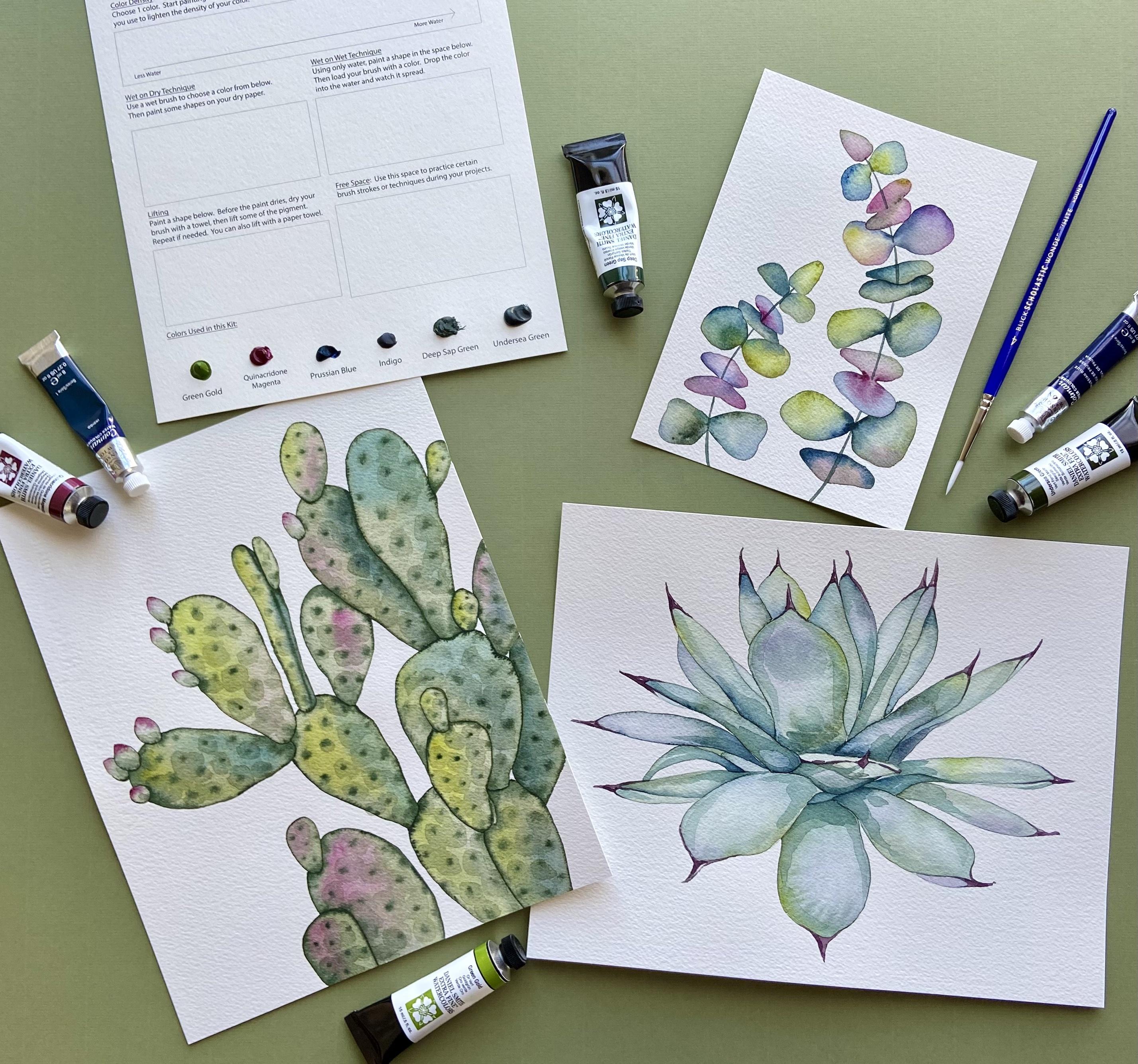
three different projects, a colorful eucalyptus spray, prickly par cactus
and an agave plant. We'll add some
jewel toned accents to brighten up our botanicals and leave them
beautiful enough to hang in any room of your house. The class includes
printable templates for printing the
outlines directly onto your watercolor paper using your home printer and
traceable templates, if you'd rather trace the
outline onto your paper. It also includes a
video tutorial to teach you how to print on
your watercolor paper. In the step by step
video tutorials, you'll learn how to create
these paintings using basic watercolor techniques
like wet wet and wet dry. We'll also take a
look at layering and using blooms
to your advantage. So get your paper,
brushes, and paints, and let's get ready to paint
some jewel toned botanicals.
2. Supplies Needed: All right. We'll start
off this tutorial by talking quickly about the
supplies that you'll need. First off, you'll notice that
in all the tutorial videos, I will be using a practice sheet like this with all of my
colors along the bottom. That's because I actually
sell these as kits, where the paints come included, your design is printed on your paper and it
comes with a brush. And so to translate
them into skill share, I'm still using the paper
here and all my paint spots. But when I'm painting at home, of course, I will use
a traditional palette. So the colors that you
will need for this project or colors that are similar
that you might have at home, I am using a combination
of Daniel Smith watercolors along with
Windsor Newton Cotman. With Daniel Smith, I
am using Green Gold. Quinacridone magenta, Undersea
green and deep sap green. If you don't have these
exact same colors, particularly with
undersea green, you can mix your own
undersea green at home by mixing a French ultramarine
and a quinacridone gold. Those are actually
the two pigments that make up undersea green. Undersea green is a
granulating color. Meaning that its pigment is going to granulate
as it's drying, you'll see a
speckled look to it. If you don't have French
French ultramarine or quinacridone gold at home, I would suggest that you
can use a sap green, maybe add a little bit more of a gold or a brown tone because this undersea green
is a little bit more earthy and brown than your
traditional sap green. Your deep sap green, of course, is just a darker color. And then with our
Cotman water colors, we have Indigo and
Prussian blue. You can use different
brands, if you'd like. Of course, Windsor
and Newton Cotman is the student grade brand
of Windsor and Newton. The difference between
student grade watercolors and professional grade
watercolors is the amount of
fillers that it has. So you'll often notice that your professional
watercolors, like Daniel Smith,
have a much richer, more vibrant color than
your student grade. All right, Let's move
on to your palette. In this tutorial, I will be using a plastic
yogurt container tap. At home, if you have your
own porcelain palette, Porcelain palettes are great. It allows you to mix your colors and to see them really well. You can also use a plastic
palette that you might have at home or even a glass
plate also works. You'll want at least
one cup of water. I usually like to paint
with two glasses of water. This just helps to have one on hand in case one gets
really dirtied up. For the brushes that you'll use, you'll see me using a
round size four brush in the entirety of all three tutorials in
this Skillshare video. However, you can choose any
other size of round brush. I would stick around four, five, six, those numbers, maybe a size three or two for
some of the finer details, but I don't really
think you'll need a brush much larger
than a six or an eight. The brushes that
you see here are silver limited black
velvet brushes. These are brushes that I
use professionally at home. If you're looking to purchase
any brushes at home, these are a great way to start with your
watercolor collection, and a size four and a size
six for the work that I do tends to be the most
versatile size brushes. You'll also want a
paper towel or a cloth. In the tutorials,
the projects are printed onto arches
cold pressed paper. Your arches paper is
going to look like this. It might come in a pad of paper. I like to buy in pads
of papers instead of the very large pieces of paper because I like
to work smaller. I tend to buy arches this size, the A three size, which is just under 12
" by just under 17 ". And then I like to cut
these pages down to size, so I can actually fit 28
by tens in each page. So this pad of arches,
cold pressed paper, even though it has 12 sheets, I can I can get 248 by ten
out of this pad of paper. If you are painting, for example, the
cacti or the Agave, something where you're painting a larger section of paper, you can always tape your
paper down onto the desk that you're working or onto some other waterproof surface. All that's going to do
is it's going to keep your paper from buckling
while you're painting. You will see in my tutorials that I will not tape them down. Another option if you
don't want to tape your paintings down is to purchase blocks of
watercolor paper. So a block of watercolor
paper is glued at the edge, and so when you paint, your paper cannot buckle. And then when you're
done painting, you can use a palette knife or another sharp knife
to let's see where the opening is to cut your
your paper off of the block. My suggestion would be to spend the most amount
of money on your paper, because in my opinion, a high quality paper
that's 100% cotton, such as arches is
going to give you a much better product
than a low grade paper. You can always save some money by purchasing student
grade paints. And then if you continue
liking water colors, you can purchase
professional paints to get a little bit
higher pigment. More than welcome to use
whatever paper you have at home. Just make sure that it
is a thicker paper, so I wouldn't suggest using
anything under 140 pounds, which is 300 grams. And if you are purchasing
a brand other than arches, I do highly suggest
that you try to have it be 100% cotton.
3. How to Print Your Watercolor Templates: In this video, we'll look
at how to print templates, Trace using those templates
and Trace using your phone. I'm going to talk
quickly about printers. Not all printers are
designed equally when it comes to printing on
your watercolor paper. The first printer I
want to talk about is the Epson workforce W F 78 40. I just purchased this printer, and I am in love with it. It's an ink jet printer. It uses pigment ink, which is known to be waterproof. So when you're looking
at your printer, pigment ink is
better than die ink. The ink that this
printer uses is called Durabrt ultra Ink. That means that when
it's printed and you use your watercolors
on top of it, those that ink will not bleed. It does have a rear feed, which is definitely useful. You will need to
use rear feed when you are printing on
watercolor paper. However, you do need
to load it one by one, which can be tedious, and it is a very large machine. Next, we're going
to compare that with a brother laser printer. With laser printers,
a lot of people will tend to use a
laser printer instead of an ink jet for
printing templates on watercolor paper because
the ink used is a toner. Toner is waterproof, whereas pigment and dyes can
be not so waterproof. You do have a rear feed option, which you will need for
cardstock watercolor paper. However, some laser printers
don't print color very well, so you have to be careful when choosing your
laser printer. There's also some concern
that the heat used to print using lasers will ruin the sizing of your
watercolor paper. Others have used them and
think that they're wonderful. I personally don't have any experience with laser printers, but this is just what I've been reading as I've done research. Lastly, we'll talk
about the Con TS 95 21 C. This is the printer that I'm using
in this video tutorial. It's the first printer that
I started printing on. I have been printing
both prints, cards, merchandise, as
well as some templates. This is also an ink jet printer, which can cause some
concern because the die used in this
printer is a die ink. Dye inks tend to be not
waterproof and will bleed slightly versus the pigment
ink used in my Epsin printer. After I noticed how
much bleeding of ink, this was causing on
my watercolor paper, that's when I decided to
purchase the Epsin workforce. The cannon printer does
have a rear feet option, which is necessary when printing on cardstock or
watercolor paper. However, you do still need
to load it one by one, or otherwise, it will jam
and cause a complete mess. As you get ready to print on your watercolor paper
using your home printer. Just be aware of these
differences knowing that the template that you
print might be waterproof, or it might not be waterproof. It might bleed slightly. If this is a concern for you and it ends up
being troublesome, remember that there
are templates for tracing in this
tutorial as well, and it might benefit
you to trace the template instead of print it directly on your
watercolor paper. Let's take a look at how to
print using my canon TS 95 21 C. If your project is meant to be printed on an
eight by ten inch of paper, you will need to cut it first. I do recommend using a cold press paper w of
at least 140 pounds. Once your paper is cut, you'll once again scroll down to the printable template
section of your PDF. Continue scrolling
until you find the eight by ten inch design
that you'd like to print. For example, this Pony, go find the printer icon
and click Once again, you'll want to
check to make sure that you have your
printer selected. We do not want to
print all of the PDF. We just want the current paper. Make sure that the current view is the design you want to print. Right now, we need to
choose a different size. Currently, it's on a seven
by ten inch size of paper. We're going to click
on page setup. Then paper size. And you'll notice that there
is no eight by ten option, so we are going to have
to manage custom sizes. Once again, we need to
create our own custom size, clicking plus bot button, and we'll rename
it eight by 10 ". Change the width to eight The height to ten. Once again, we don't
want any margins. We're going to change
every margin to zero. Then click k. Check
the paper size once again to make sure it's the correct size eight
by ten, then click. Now, it might be
the setting fit. We do not want it to be fit. Remember, we want
it to be printed on the button to the right
that says actual size. So I'm going to click
on actual size. You should see, once again, the red box around the
area that will be printed. C heck again that you have an eight by ten inch
piece of paper. Make sure that it's on the correct portrait
versus landscape. If it's landscape, it will
not fit within the red box. And then click print. Once again, you'll load your pre cut paper in the
rear tray of your printer. Make sure that the rough
side is facing up. These designs are meant
to be printed on, so you'll notice the lines
are a little bit lighter. You're all set to paint. If you don't feel
comfortable printing out the template directly
on your watercolor paper, there are also darker templates
that you can download to use to trace the template
onto your watercolor paper. As soon as you open up the PDF, you'll need to scroll down past the printable templates to the traceable template section. You can use the
following templates to print each
design onto regular 8.5 by 11 inch paper and then trace it onto
your watercolor paper. You'll note that these
traceable templates have darker outlines. Scroll down to the template
that you'd like to print. If you're printing
a watercolor card, you'll notice that it
has a box around it. Click on the Print icon. We will not print all. We'll click on the
current selection only. You'll check the paper size. Right now, it's
on eight by 10 ", so I need to go down
to my page setup. Find paper size, and click
on US Letter. Click Okay. Now, it doesn't matter if
we have fit or actual size. Either one will not change
the size of your printout. It will be the same size. Once again, make sure that
you're printing to an 8.5 by 11 inch piece of paper
and then click print. Another option for your
traceable templates is to trace an eight by
ten inch template. Once again, you'll scroll past your greeting card template or your five by seven template, and then find your
larger eight by ten. Click on the printer icon. Once again, we are not
going to print all, we're going to print the
current selection only. Check the paper size
that it's 8.5 by 11 ", which is a normal letter size. If it is not on that
normal letter size, you'll need to change it
using the page setup. Find paper size and
find US letter. Click Okay. Make
sure once again, it's the correct size for
a normal sheet of paper, and then click print. Since you're using
regular plain paper. You can either load it in the rear tray or you can
load it in the lower tray. You'll notice that your template
comes out nice and dark. To use your tracing
template, first, place your watercolor paper
on top of your dark template. You'll need to line
it up correctly. Then use some masking
tape or painters tape to secure your
watercolor paper on top of your template. Use either a light box or a bright window to trace the template onto
your watercolor paper. Last option is to use your phone to trace the templates onto
your watercolor paper. I like to use an app on my
phone called Da vinci I, where you can upload any picture or image that
you'd like to trace. Using the classic mode, you can move and resize your image to help you draw it onto your
watercolor paper. To use this technique, you will need a
phone holder so you can look through your phone as you're tracing your outline. Please do remember that these templates are
for personal use only. It is illegal to paint them
and then sell them for money. Enjoy painting them for
yourselves or to give them as a gift. Thank you. If you are interested in these designs printed on
your watercolor paper, but don't have a
printer at home, you can always purchase one of my watercolor kits
on my website. Paper, paints, and a brush are included in
the purchase of your kit.
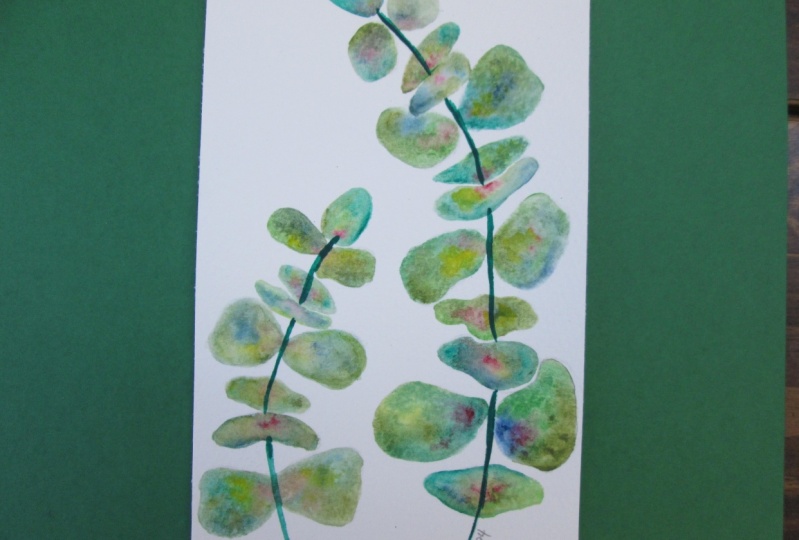
4. Eucalyptus, Part 1: For this eucalyptus painting, we'll be using mostly a wet on wet technique to drop in colors into each
individual petal. Now, the colors that
you'll use are green gold, acido magenta, Prussian blue, indigo, and undersea green. The only color on your
practice sheet we won't be using for this project
is deep sap green. So I'll start by simply adding a few drops of water
to each color. This is just going to
activate the colors so that they will be ready for
me when I want to use them. Like I said, we won't
use deep sap green. I'm going to show you what it'll look like using undersea green. I can wet my color. And using this color, I will paint wet on dry
to the very top leaf. Now you notice that my color
is not extremely dark. I am using quite a
bit of water and I'm not pulling directly
from the paint. I'm taking some paint off to the edge and then pulling
it onto my paper. If you're finding that
your color is too dark, you can simply add
some water to a plate. And then add some of your
undersea green to that water. That way you'll get a tone that isn't too dark for
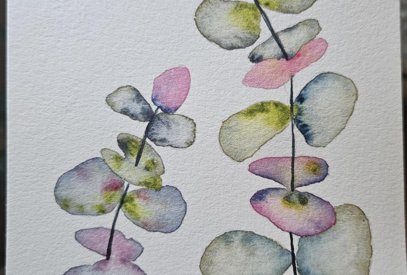
your first layer. While our leaf is still wet, I'm going to drop
in another color. I might choose, for example,
quinacridone magenta. As I drop it in, I'm going
to stay closest to the stem, and I'll let this water carry the pigment wherever
it would like to go. I'm going to do
something in addition to help this pigment mix
itself on the paper, and that is to add
water to my painting. I'll clean my brush and using the water
that's on my brush, I'm going to tap and drop
some water directly in the center of this leaf. I'll do it a few times. What you'll notice is that the pigment is going to be
pushed to the outer edge. I'm going to then dry my brush. And lift some of that
liquid that I just dropped from the
center of that leaf. I'm just going to lift a
little bit of that liquid, so it's not a complete pool. What we're left with
is a ring around the outside that is much more
dense and dark than inside. That's kind of the look
that we're wanting. Now we can continue
with the rest of the leaves of our
eucalyptus spray. We do want to be careful
to do these two at a time and making sure that we're
not touching extra leaves. So I'm able to do these next two because they're not
touching the first. However, once I
move on to these, I will not be able to do these two eucalyptus leaves until these first two are dry. So once again, our first
layer is wet on dry. So because I want my first
layer to be a little lighter, I'm going to put some
water on my plate. I might choose a different color such as indigo to start with. I'll grab a little bit of
indigo. Put it on my plate. And now I'll use that
indigo to paint wet on dry, meaning I have a wet brush and
I'm painting on dry paper. I'm going to paint both of these leaves at
once and then drop in some brighter colors
while they're still wet. All right, now that I
have that first layer, I can wash my brush off and choose any of the additional
colors to drop in. Let's see what happens if
I drop in this green gold. Once again, I'm going to drop in some of that color
closest towards the stem. If you notice, I'm just
dotting the color. And as I do, that color
is spreading even more. Now, when you're
painting double leaves, you can choose to either add one additional color or
two additional colors. So I think I'll take a little
bit of this Prussian blue. And maybe I'll add
a little bit of this Prussian blue just
to this upper side. Once again, I'll clean my brush. Now it's time for our next step, which is dropping in water
to force these blooms. Wash your brush,
grab some water, and drop it towards the
center of each leaf. Then immediately dry your brush. And now you can start
to lift and move that color wherever you
feel you need it moved. Re wetting the area is basically just another way to help move
the color around the paper. Now we can continue. I have these next two here. I have two base colors. Perhaps I want a
third base color. Remember our base colors are going to be our
lightest colors. I'll add some more water here, and perhaps I want some quinacridone magenta
as a base color. I'll add some
quinacridone magenta. And now I can paint wet on dry. So you have a little drop here. I'll suck that up
with my paper towel. Yeah. Now, like I said, I'm going to skip these
two because as you notice, the bottom bun of this hamburger is touching
the next bow tie. If I were to paint
this next one here, the colors are going to
bleed into this set. I'm going to ski
it and come back. There apicoec I end of the
5. Eucalyptus, Part 2: All right. Now that we are done painting all of our leaves. We do need to let it dry thoroughly before
we paint the stems. You can tell that my painting
is still wet because you can see the light shining
off of the wet areas. So typically, it'll
take anywhere 10-20 minutes for your leaves to dry completely where
they have a mat finish. And then we'll come back
and finish the stems. Now that we've given our
leaves some time to dry, we're ready to paint the stem. First step, you'll need to clean the plate
you're working on. We need to mix the
color for this stem. Next, grab some water
onto your plate. We'll be using two
colors to mix. First our undersea green. Maybe two or three brushflls
of undersea green, and the second color is indigo. Same thing about two or
three brushflls of indigo. You should have a
nice deep color for the stem. Now we're ready. I'm going to tap my brush
a few times onto my plate just to release some of that
liquid that's on my brush, so I can have a really
nice fine point. I'm wanting to tilt my brush in the most vertical position
that I can have it. I do not want it
to be parallel to my paper because I want
the tip of my brush here. I will start at the very top with a very
light brush stroke. If this is something that
you'd like to practice first on your practice sheet, I highly suggest taking
some time to practice and see if you can paint some very thin strokes
on your free space. I like to keep my
wrist on my desk, and I'm only moving my fingers. I'm doing small sections at a time to make sure that I don't have to do one single
long stroke for my stem. Coming back to my final piece. You'll notice that I'm going to skip some of the
eucalyptus leaves. The reason being is
the ones that are like a hamburger shape, one
on top of the other. The leaf on top is actually the leaf that's the
most in the background. The one in the front is actually protruding
out towards you. The stem theoretically
goes in between those two. I will leave that open. I'm not going to paint my stem on top of the
bottom most leaf, and I'll continue on. It'll go once again
through the top leaf of that hamburger bunch and
not through the bottom. You will go through
the bow ties. And all the way to the base. If the line that you
made is looking a little bit to
translucent, transparent, you can always go ahead and do another line with
your paint brush. I'll move on to the
second eucalyptus branch. Remember that you
can turn your paper so that it is the most
comfortable for you to paint. Once again, I'll paint a stem
the top of the hamburger, leaving the bottom bun open. I can always stop
mid bow tie as well. It's just your personal
preference there. Through the top of the bun, leaving the lower
bun without a stem. As I continue down. Once again, through the
top of the hamburger bun, stopping in the center,
skipping the bottom. And since this is only one of the hamburger buns,
I can go through. Or if you're at home and you
don't like how that looks, you can keep your stem
behind that single leaf. Once again, you can go back
and check out your stem, see if there are any
places that you need just a bit darkness added. The very last thing
that I want to show you is what it would
look like if I were to add a second layer of color
onto some of these leaves. While you're painting at home, you'll obviously notice that your colors are going to
be different than mine, be it that you're using
different colors or you're using opacities of colors? You might notice that
your colors are slightly lighter and less
vibrant than mine. You may notice that your
leaves are looking to purple or too red and you'd like them to be a little bit
more green or teal. So perhaps I'm looking at
these two leaves here, and I'm wanting one leaf to be a little bit
darker than the other. So I can make a second layer
on one of those leaves. I'll add water to my plate. And now I need to choose a
color for that second layer. So perhaps I want it to have a little bit more of
a pink tinge to it. Maybe I'll add a little bit of quinacrodon magenta
to that water. I do need to have
this second layer, like I said, be a little
bit more transparent. And if you get any
accidental slaters, right away before they dry, lift them up with
your paper towel. All right. Now that I
have a water down color, I can work on painting
the second layer. I need to fill in the entire leaf using
that second layer color. Now, because you're using high quality paints and
high quality paper, you will not have any of that
previous layer lifted up. If you were to use lower quality paper or
lower quality paints, you might notice that instead of adding a layer
sitting on top, you might be lifting
some of your paint up. I can add a second layer to
any of them that I'd like. It's really up to you at
this point and your judgment based on what you see and
what kind of colors you want. So perhaps I want a of this
magenta at the base here. I can add a second layer on top. And you notice how it
completely changes that color. Instead of it being
more of a green tone, it has a little bit of
this pink tone to it. Oh.
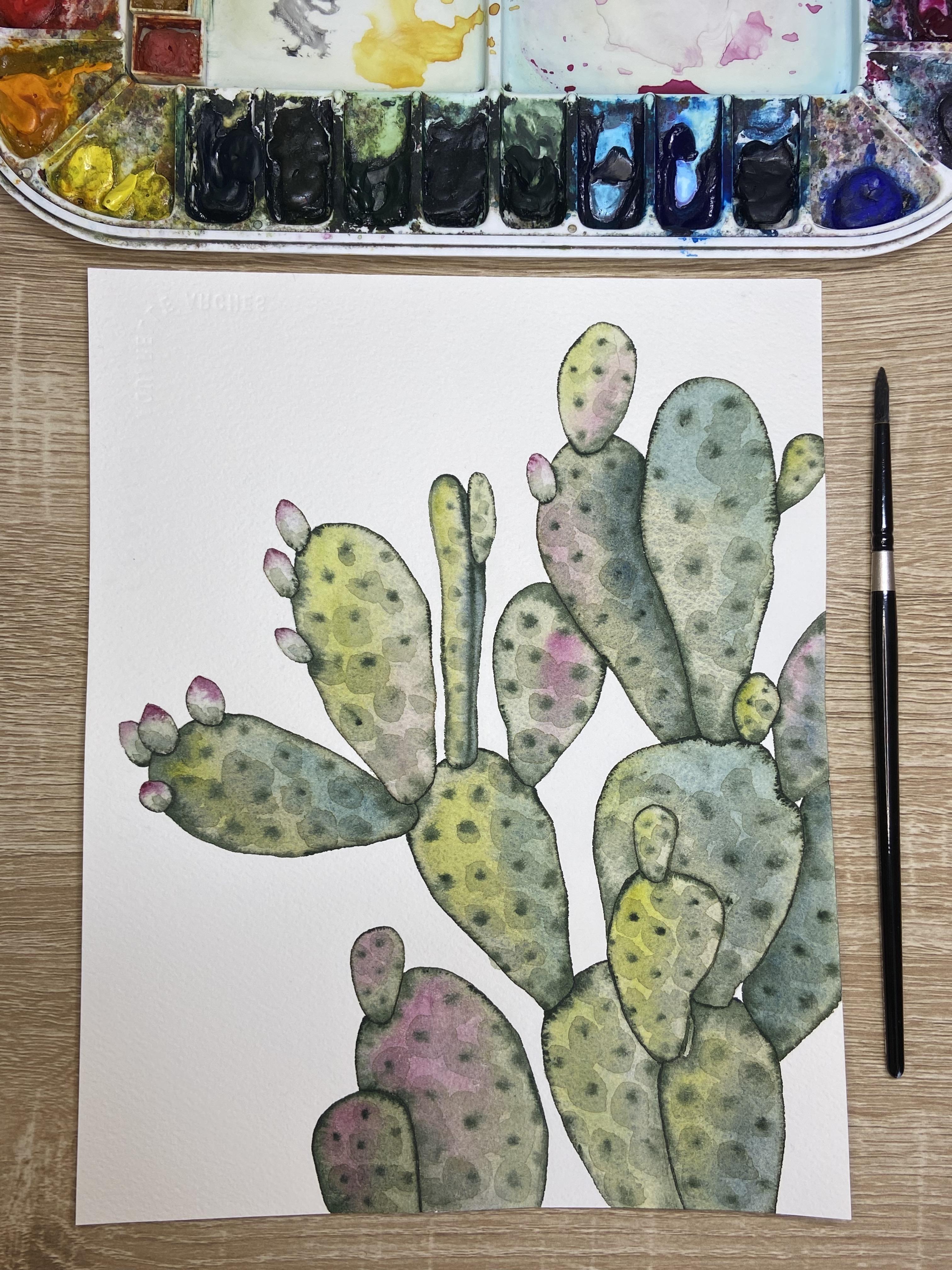
6. Prickly Pear Cacti, Part 1: Just like with our
eucalyptus spray, we will need to mix a
base color to paint each of the paddles of
our prickly par cactus. The base color is
going to be more transparent than any of the
other colors that we drop in. So we need to have
quite a bit of water to mix our base color. Add quite a bit of
water to your plate. Throughout this painting,
you might need to mix more base color as there are quite a few paddles
that you'll need to paint. The base color that
we'll use for all of the paddles is going to
be this undersea green. So wet the color, add some of that
color to your water. Now, we can check this color by painting it first
on our practice sheet. It's a little light for me, so I'm going to add just
a little bit more color, a little bit more pigment. Okay, that's better. Now that we have our base color, now we can talk
about the process. I will be first painting
my base color wet on dry. Meaning I have a wet brush, and I'll paint on dry paper. Then, while it's still wet, I'm going to drop in an
accent color on each paddle, just like you did for
your Eucalyptus spray. The accent colors that I
would suggest for you are the first four colors
on your practice sheet. Green gold, quinacrido magenta, Prussian blue, and Indigo. Our deep sap green we use
around the edges of the paddle, as well as dotting
in the center to create some thorn looking spots. Let me show you what
this looks like. Step one, paint wet
on dry for one pedal. I might start
towards the bottom, just because if I
make a mistake, it'll stay towards the bottom of my sheet instead of one of
the more prominent paddles. It's always a good idea to start your painting
towards the bottom. Perhaps I'll start
with this guy here. As I'm painting, I'll come
all the way to the edge. I'm constantly grabbing
more liquid from my plate because I need to make sure
that this paddle stays wet. I might go back to the
area that I just painted, go over it one more time
just to make sure that it stays wet for the second step. Now, the second step is to clean your brush and choose
an accent color. Perhaps for this accent
color for this small one, maybe I'll choose a little
quinacridone magenta. I'll grab a little on my brush, and I'm going to add that color to one section of the paddle. Be careful here
about over mixing. If you start to mix too, you're going to overly
blend your colors. So if you noticed, I added that
quinacrodona magenta, and then I stopped. If I were to keep moving
my brush back and forth, I'm going to muddy the color and turn it into a nasty brown. Now, I'll wet my
brush and I'm ready for painting the
edge of my cactus. With a wet brush, I'm going
to activate deep sap green. I have deep sap green
on the tip of my brush, and now I will paint all around the outside
edge of the cacti. You, you should notice
that your color is starting to slowly sep inside. If it's seeping too and
it's overtaking the paddle, that means you have too
much liquid on your brush. With too much liquid
on your brush, it's going to take over
everything on the inside. To fix the problem,
Make sure that you tap your brush on your paper towel before you
grab some of the paint. You want mostly paint and not so much water for this step. Now I can paint a few dots in the center to mimic the thorns. My dots, I am painting
in a horizontal fashion. I'm painting both
the dots and all around the edge while
the color is still wet. This is known as wet on wet. If you wait too long for the first layer and
your first layer dries, this will not work. Make sure that you are
fairly quick after you paint your first layer to then grab your accent color and the
dark edge around your paddle. Let me show you what
that looks like again, what those three
steps look like. Now, I'm not going
to be able to paint this paddle here until
this first one dries. So perhaps I'll paint this
little tiny guy first. Remember, step one is to
paint inside the paddle. This is wet on dry, a wet brush, on dry paper. I'll go back to the
area I painted. Make sure that the
whole area is wet before I clean my brush
and grab an accent color. Perhaps I want this whole group down here to have the
same accent color. Maybe I'll choose
Quinacrodone magenta again for this accent color. I'm going to choose
about the same location for this accent color. Remember, I'll drop in some of that color and then
I'll leave it. I want it to naturally expand. If I use too many strokes, it'll mix the color
and it'll turn muddy. Now I need to paint
around the edge. I'll take some deep sap green. Directly from my paper. I'm just having enough so that it's on the
point of my brush. I don't need to roll the
whole brush in the paint. Now I can paint around
the edge of my paddle. I'm going to start
at the top and paint around the edge lifting
as I come to the base. Wherever you lift your
brush off of the paper, that's where the majority of the pigment is going
to stay on your paper. If I were to start at the
base and pull upwards, I'll have a dark spot of
deep sap green at the top. Now I'm ready for the
dots of the thorns. Same thing. I will
dot a few thorns. And now I'm going to
wait to let that dry. Let's move on to a
bigger cacti paddle. Now, this is completely up to you if you would like to lighten that first layer of your
cacti for the paddle. You can always add more water here to
your undersea green. I'm noticing that
these two paddles are pretty dark colored.
7. Prickly Pear Cacti, Part 2: You can notice that I have quite a lot of
liquid on my paper. With watercolors, you shouldn't see your brush strokes
on your paper. If you see your brush strokes, it means that you're not
using enough liquid. I'll go back to that same area that I just painted to make sure
that it's nice and wet. You can tell that my
paper is nice and wet because I can even
move around that liquid. You see there's
more liquid here. I could move it down further, can move that liquid all around. That's how wet this
section of my paper is. And I'll paint around
the edge here. I am going to leave
a little bit more of that pigment on this underside where the next
paddle is attaching. More water you have
on this paddle, the more that it's going to
seep into your first layer. If you're not noticing
any of that green color seeping into
that first layer, it means that your first
layer is not wet enough. Now we're ready for our
dots of our thorns. I'm dotting in a
diagonal fashion. I am keeping them
somewhat spaced out. I don't want to
overcrowd my dots. Let's keep painting
a few paddles using the same technique. The base layer first
and accent color. Then at the very end, deep sap green all
around the edge, as well as some
dots in the center. I'll speed up this video. You are more than welcome
to go back to the beginning and introduce yourself
to these concepts. H. Cacao act H Now, this paddle in the
center here is going to be slightly
different than the other paddles
that I've painted so far because instead of
forward facing you, this paddle is actually tilted. You're seeing the skinny
edge of this paddle. There is a little line printed here that's to show you
that it's at the side. I am going to continue with
the same steps I've done. Except for, I'm going to create a shadow along
this back edge. And I'll use this green gold
to highlight the front edge. So I'll talk you through it. First, just like before, we'll wet our area and paint it using that first
layer of undersea green. Once again, I'll go back to the very tip top and make sure that it's nice and wet so
that it won't dry on me. Now I'm ready to
drop in the colors. I'll start with the
highlight, this green gold. Now, I'm almost pretending that the sun is coming
from this left side, which is why I'm
highlighting using green gold on the side
of these paddles. I'm going to do the
same for this paddle. I'll highlight this edge. And then I'll clean my brush, and I'll use a
little bit of indigo to add a little shadow on this left hand or on
the right hand side. I need a little bit
more than that. All right. Now I'll continue with
the same step as before, adding that deep sap green
all around the outside edge. I do want to try to keep a skinnier line on this left hand side,
where the highlight is. I'll start on the
right hand side because then I can use some of that deeper color
that's already in my brush and use it up before I get to that left hand side. Now that I've used up
some of that paint, now I can continue on
to this left hand side. Looks like I'm running out. I'll grab a little bit more. I'm grabbing little bits
of paint at a time, just to make sure that I don't
have too much on my brush. Now, I am going to add
one extra step here, and that is to add this
little center line with this deep sap green
where it was printed. All right. And the very
last step before it dries, is to add a few of those thorns. As you can see, just that
little bit of shading has helped to kind of out that. We'll continue on with
the rest of the m. A.
8. Prickly Pear Cacti, Part 3: Oh Now, for these ti paddle that
are ahead of the rest. They're in front of the
other paddles behind them. I do want to keep the
accent color quite light. If you notice the
accent color that I added for this
paddle behind here, I use some of those blues and indigos to make it slightly der. I am going to try
my best to keep this paddle and the one above it slightly lighter
than the rest. So I can always lift
some of this color up. And the accent color that I'm going to
choose is going to be this green gold
so that it's nice and bright in the foreground. Now, remember, the same holds true for the paddles that
are in the background. So for these paddles that
are more in the background, I am going to use a
darker accent color, particularly close
to the areas where it is behind the other paddles. So I'm using an indigo in this area to help give
this sense of dimension. Isn't. Cc O. A. Octo
9. Prickly Pear Cacti, Part 4: Now that we've
finished painting, the majority of our paddles, the only ones left are
these little tiny, they're actually flowers
that will eventually blue. So there's four
at the base here, three on this paddle,
and one over here. I will use still some undersea
green as the base here. So I'll need to mix some
of that at my base. The only difference
that I'm going to paint for each of
these individual ones, is that I'm going to add a dot of quinacrido magenta
at the tip of each. That way, it'll just act and mimic one of the
flowers about to bloom. I'm going to tilt
my paper so that I don't rest it on the
area that's already wet, and I'll start by
showing you one of them. Same thing. I'll
start by painting wet on dry. Wash your brush. Grab some of that
quinacridone magenta. And then I'm going
to add some of that quinacridone
magenta just to the tip. Now, it is quite watery. It will start to set down.
That's actually what I want. If you'd like, you can always
add just a little bit of that deep sap green
around the lower edges. Just make sure that you're
not bringing any of that deep sap green
up to the tip top. Now, if you notice that your magenta is
coming down too far, you can dry off your brush. Make sure it's clean from
that deep sap green. Dry it off, make sure
you've got a nice point, and then you can lift in that middle area so that it does not sat
down quite too far. Now, here my colors
are starting to dry, but they're starting to
look a little too uniform. I am going to drop on
purpose a droplet of water to push these a.
The same thing here. I'm going to push that pink, and I'm going to push
that dark green down. With just one drop of
water in the center, it'll push both of those
in opposite directions. Now, I can also speed
up this process by doing more than
one at a time, except for this one that's
hiding in the back. I can't do that one yet. I need to wait for
the others to dry. But I can do all three of
these at once or two at once, depending on how fast I work. Remember that you can turn your paper so that your hand is not resting on the area
that is still wet. First step is to
paint wet on dry. I I'm going to do
all three of them at once since they're fairly small. You at home get to decide if you'd like to do
more than one at once. All right. Lastly, we can add a little bit of details
to each of the paddles. To do that, we need a light
layer of undersea green. We'll be adding a second
layer on top of the paddles, but we will be making sure that this
layer is nice and light. So we do want to add
quite a bit of water. Member. I'll start once
again at the paddles towards the bottom just
in case I make a mistake, then at least it won't be
some of those center paddles. I'm going to take quite a bit of liquid on my brush,
roll it all around. I want my brush
completely loaded, and I'm going to paint on top of the dots that I made
for the thorns. I'm just painting circles
on top of these dots, and I'm connecting some of
these circles together. Now, to do this, I'm using the edge of my brush. I'm not using the
point of my brush. It's going to make it a
lot quicker if you can use the edge instead
of the point. So when I make these big
circles on top of the paddle, what you'll notice is that it gives it just a
little bit more te. It's more similar to the texture
of these types of cacti. We'll do the same thing so
that you can see a little bit more how this texture
starts to look. Remember that we're
making large dots on top of the thorns. I'll show you what
it looks like on one of these that's
slightly lighter. Now these dots, like I
said, they can connect. Some of them will connect, and not all of them
need to connect. Just like in nature, we have we don't want
it to be too uniform. You notice here, some of these circle dots that I'm painting on top are
connecting, others are not. This will only work if your
layer is nice and light. If you have too much pigment, it might end up looking
a little distracting. So make sure to test
this out on some of these paddles that are
lower in your painting. Just in case if it's too dark, pat it off right away
with your paper towel and then add some
water to that mixture, so it's nice and light. Now, I don't have to
add this texture to every single th I might choose in some of the areas that are
more highlighted. For example, here,
I might choose to not add that texture.
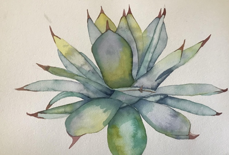
10. Agave, Part 1: The first thing that
we need to do for this painting is to
mix our base color. We're going to be using
a lighter base color to paint every single paddle
on this agave plant. Grab your water, add quite a
bit of water to your plate. We'll need actually quite
a lot of this base color. If you do run out, remember
that you can always mi. Once I have quite a bit
of water on my plate, I'm going to start
with undersea green. So once I have a little
bit of undersea green, I'll wet my prussian blue, roll my brush around
a few times and add that to the undersea green. I'm wanting a teal color. I do want this color to be more of a more of a blue
teal than a green teal. So I'm looking to add, maybe just slightly
more blue than green. Remember that I do have
a little section here on my practice paper that I
can use to check my color. Add a little bit more water. It seems like the color
is getting a little dark. And now I'll check it on
a free space on my paper. So this is about the color
that I'm looking for. Our first step is to
paint wet on dry, meaning I have a wet brush, and I'm painting on dry paper. I'll start by working
on just one of these paddles. Wet on dry. I'll continue to make
sure to bring quite a bit of liquid to my paper. If your color is too dark, you can grab some water
directly from your cup and add it to that mixture just to lighten up your
color a little bit. Now, as we're painting
these paddles, I should note that the little
thorns at the very tips, we will not paint. Those are going to
be a magenta color. So we're only painting
the paddle part. We do want to paint this. Slowly making sure that we have our color all
the way up to the edge. And once I finish
filling in the paddle, I'm going to go back to the very start and
rewet the area, making sure that it
stays nice and wet. Remember that we need
the area to be nice and wet to drop in our
accent colors. Now that I have it nice and wet, now I can choose an
accent color to drop in. I'm going to start
with this green gold. I'll grab some on my brush, and I'll maybe to add some
green gold just along the edge here. Clean my brush. Now, I also might
want to drop in some darker tones where the
paddle connects to the plant. The darker tones are
going to be indigo. I'll grab some indigo
from my paper, and I'll drop in some indigo where this paddle
meets the plant. When I say drop in, I'm actually dotting
the liquid because I have enough liquid on my paper. As I dot dot dot, the pigment is going to be
pulled into that liquid. All right. Now, I can always add in a little bit more of
this undersea green. If I'm feeling like it needs to be a little
bit more green, you can kind of play around
with your colors here. Now, I will be adding some water here to
purposefully create a bloom. A bloom is made when you
have add water to color. Now, this area that I just
painted is still a little bit too wet to add the bloom because I do want to be able to see the
edges of the bloom. I do need to let
it dry slightly. While I'm letting that dry, I'm going to actually mix some purple color
for an accent color. To mix that purple accent color, you'll need a little
bit more water on your plate in a
different section. Once again, this accent
color is going to be nice and transparent. We don't want
anything that's too bold for our accent colors. So quinacridone magenta. I'll mix it with some
Prussian blue and that will give me a
nice purple tone. Now, I want to make
sure that this mentioned this
purple, excuse me, is nice and light and isn't
too dark for my agave plant. If it's too dark, it's going to kind of take over those greens. All right. Now that I've mixed it, I'm
going to take another peek at this first paddle, and it's looking like
it's starting to dry, but it's still a little
too wet to add this bloom. So I can tell that
it's still a little too wet because as
I move my sheet, I can see a really nice shiny
sheen on that reflection, meaning that it's
completely wet. In the meantime, I might paint a smaller section of the paddle, perhaps this little
section here. The little tiny sections here, I do want to keep
nice and light. I might lift some of that
color up by drying my brush and just lifting some
of that color so that that section
is nice and light. Perhaps I'll do some of these other little tiny
baby sections here. Now I can show you
that the shine on this paddle is
significantly less, especially considering the shine of the little sections
I just painted. But I can tell it still wet. This is the stage that we want
for a very defined bloom. To create this defined
bloom, I take my water, and I'm going to drop
water into the center or a certain space in my paddle. Maybe I would drop it there and a little bit further down. As I drop the water, I'm just tapping my brush to get some of that extra
water off of my brush. What you'll notice is
the water is going to push the pigment
to the edges. It's going to give this
almost stained glass look where the edges are
darker than the inside. I'll show you what that looks like with some other
sections of my paddle. Now, remember that each paddle, I need to let dry completely before I paint the paddle
immediately next to it. If I started to paint
this paddle here, my colors will start to
bleed into each other, and I won't get this
nice line and nice edge. So I'm going to have to work
on a completely new section, so perhaps I'll work on
this section right here.
11. Agave, Part 2: Now for some of these paddles, I will want to add water
immediately for my bloom. Some of them, I want to
create a more distinct bloom. Others, I just want to
add some water right away just to push that
pigment to the edges. This is what happens when I
add the water immediately. You'll notice that it pushes
the pigment to the edges. I can then lift whatever
pigment I want from the center, say it's too dark, or
say I wanted to add a little bit more purple in a
section that got diluted. O. O As we move on to some of the larger
paddles of our painting, remember that you need
to constantly go back to that first area that you painted to make sure
that it stays wet. I will sometimes rotate
my paper so that I don't accidentally
it with my hand. It also allows me to get
nice and close to the edges. If when you're adding your, if your color mixes too much
with your base color, you can simply lift
some of that color up, some of that base color and then drop some of
your purple on top. With this purple color, we want to avoid
mixing it too much. Or otherwise, you're
going to create more of a blue purple color. You can notice that I did have some color leaking
into this panel next door that simply tells me that this panel
wasn't dry enough. If that starts to happen to you. My advice is to let it dry completely first before
you try to fix that spot. If we were to try to
go in right now with our brush and fix that
with a damp brush, all we're going to do is
end up ruining that paddle. We're going to it dry
completely and then we'll go back and see if we want
to fix it when it's dry. If you notice a stain or
a spot on your paper, the best thing is
to the stain right away using clean water and then use your paper
towel to lift it up. So I can tell that
this larger paddle is ready to add the water
because once again, I noticed the shine
on the paper isn't as shiny as the more
recently painted. I'll grab some water and drop it into the center
of the paddle. You'll notice already that the pigment is starting
to be pushed to the edge, and it's creating
a harder edge that looks a little bit like a
stars or a firework pattern. Remember that we had a
little bit of a problem with our color interacting with this paddle
that wasn't dry. We have the same here. Now, this section isn't dry yet, so I can't work on this to soften those edges
until it dries. This section, though,
I can tell is dry because it doesn't
have that same shine. So I'm going to show you
how to clean that edge. You'll need to wet your brush. And then you'll
tap your brush on your paper towel because
we want it damp, but we do not want
it soaking wet. And then we'll come back with a damp brush and just kind
of rub the edges out. Remember that whenever we
fix sections like this, that first layer has
to be completely dry. There. This area, I cannot fix yet
because it's still wet, so I'm going to let
this section dry before I clean up this paddle. Now that this section
is completely dry, I can fix the seeping color, so I need to wet my
brush and dab it onto a paper towel before I start
to blend these edges here. I might need to rewet the entire section of the
paddle in order to do this. But since it's already wet, if I notice that the
stain isn't going away, I can add a little
bit more color to the whole paddle to
kind of cover that up. Once again, I can only do this when both the paddles
are completely dry. A Oh.
12. Agave, Part 3: Okay. Now that I'm done painting every single section
of my Agave plant. I need to let every
single section dry before I can put
on the second layer. In order to let it
dry completely, I'm going to take around
ten to 20 minutes to let each section dry. I will continue to
check in light by moving my paper under a light to see if I notice
any glossy sections. If there's any gloss at all, it means that it is still too wet to add the second layer. Now that we've let our
sections dry enough, we'll go back and add a
second layer wet on dry. So I'm not going to
wet each section. I'm going to paint just
some shadows on each of these sections to give it a
little bit more dimension. First, you'll need to clean your plate if you
haven't already. Then add some water
to your plate. We'll mix a slightly
darker teal color than what we use for our base
color as this second layer. Instead of using undersea
green for the second layer, I'm going to use
this deep sap green. So roll around your brush
and add it to your water. You'll probably need to do that two times to get enough pigment. Then this is a little too
green for my agave plant. A gave plants tend
to be, like I said, a little bit more teal
or blue in color. I'm going to add
some Prussian blue. Trow my brush, add
it to my color. Now using the practice section of my paper or any free
section of my paper, I'm going to test my color. That's looking pretty good. This second layer,
even though we do want it to be slightly darker
than our transparent layer. We do not want it to be opaque. Since we're adding
a second layer on top of color that's
already on the paper. We do still need to have that
watery translucent quality. If it's too dark, say we use color directly from the plate
or from our paper, and it gets to be too dark, for example, this darkness, and we won't be letting any of the colors underneath that we already painted
shine through. So we do need to make sure that that layer is still
quite watered down. Now that my paint
is ready to go. Now I'm going to look
at where exactly am I going to paint
this second layer. I do want to add some details along both the edges
of these sections, as well as closest to where these segments are connecting
to the base of the plant. I'll start with this
largest section here. You'll grab some paint, and I'm going to
start with making a few strokes horizontally
along the base here. I know it's going to look
like it's quite dark, but it will dry a
little bit lighter, so I don't have to
worry about that. I'm also going to make
some vertical strokes along the edges. I'll start at the top. I'll push slightly harder in the middle and then
I'll lift my brush up. That's going to create this
nice edge of the section. I'm going to do that same
thing on the right hand side. Little pressure at first, press down harder as
we get to the center, and then lift lighter
as we come down. Now, the only reason why
I'm not too concerned about these hard lines is because I'm using quite a
transparent layer. I want you to notice
your own color at home to see if
it's light enough. Are you still seeing
the color underneath? If you're no longer seeing
the color that's underneath, you are going to need to add more water to your
second layer color. Then I might add just a blob of color to this
section here up top. Once I have this
circle of color, I'm going to blend
out the edges. I'll clean my brush, tap
it on my paper towel. And then I'll just go
around these edges with that wet brush just to
soften those edges up. This is the only one that I'm
going to soften the edges. I can also make it
a little bit darker by adding a little bit of
that pigment already in. All right. Now I'm going
to look at some of the other branches to see
if the other branches, the other sections to see if
they need any darker hues. I know that this section that seems like it's
protruding towards you, is going to need a
little bit of work. I'm going to add a little bit of a darker layer here at the
edge of this corner here. But I'm also going to add a little bit darker
towards this bottom. Then I'll look at this section, this triangular
section underneath. I'm going to add a few
strokes coming up to this thorn that's coming out. Once again, I can soften any of these edges by
cleaning my brush, tapping it on my paper towel, and then softening that edge up. Oh coverage coverage. Oh All right, once again, I'm going to look in the center here
because that's where I want my darkest colors. So I'm looking to see if I need to add a third layer anywhere. And it's looking like
maybe I'll add a little bit here at the base. With water colors,
we can add anywhere from one to about five layers. You do want to start to
limit yourself after about five layers
only because it tends to my up the colors
that you painted. All right. Sometimes
the hardest part with water colors is
knowing when to stop. And so I'm going to
stop there, let it dry. And then the last
details that I'm going to add is painting
the little ths.
13. Agave, Part 4: All right, the thorns
on my gave plant actually are slightly
a reddish hue. So I can mix a new color here. I can clean a section
of my plate as long as I'm done with those
that second layer of color. Add a little bit more water. And this time I'm going to add a little bit of this
quinacridone magenta. I want to start to turn this quinacridone
magenta slightly brown. In order to do that, I
can add a bit of green. I'll add some of that
deep sap green to start to turn this slightly
brownish hue. To me, this is looking
a little brown. I'm going to add a bit more
of this quinacridone magenta, just to brighten
it up a bit more. I think I added a
little too much green. Let's check and see now. It's a little bit brighter
than the other color. So we're wanting something
around this color. So we still have that brightness
of the quinac magenta, but it's just muted slightly
by the deep sap green. Now, to do these thorns, you are going to need
quite a fine tip. So being that this brush
is a size four brush, one thing that we can do to make sure that we don't have
too much liquid on our brush is to tap it on our paper towel before
we start to paint. Now, as I paint each of these thorn sections,
I'm going to take that, that color, and I'm going
to pull it slightly around each section as
much as you can pull it. If you're finding
that this brush is a little bit
too large for you, you don't need to
worry about having it come the edge all too. One tip for you is to
fill in the thorn. And then using the liquid
that's already on the paper. I'm going to just
slightly continue to touch my paper here
as I pull it inwards. I'm going to do the same
thing on this edge here. I'll use whatever pigments
here. Pull it in. It's a very light touch. As I'm coming around
the edge here, I'm lifting my brush up until it no longer touches the edge. Oh And you're all done. You might notice as you
finish your painting that your paper has warped
slightly after painting. If that's happened to you, you'll need to wait for all
of the paint to dry first. It has to be dry to the touch. Then you can either lay it flat in between
two heavy books to flatten or you can
flip it over and use a hot iron to iron the backside of your paper
to flatten it slightly.
14. Follow me on Social Media and say Hi!: For watching. If you
enjoy this tutorial, please follow me
on social media. Check out my website, and make sure to subscribe
to my YouTube channel.
 Emily Marie Watercolors, Watercolor Artist and Dog Lover