Transcripts
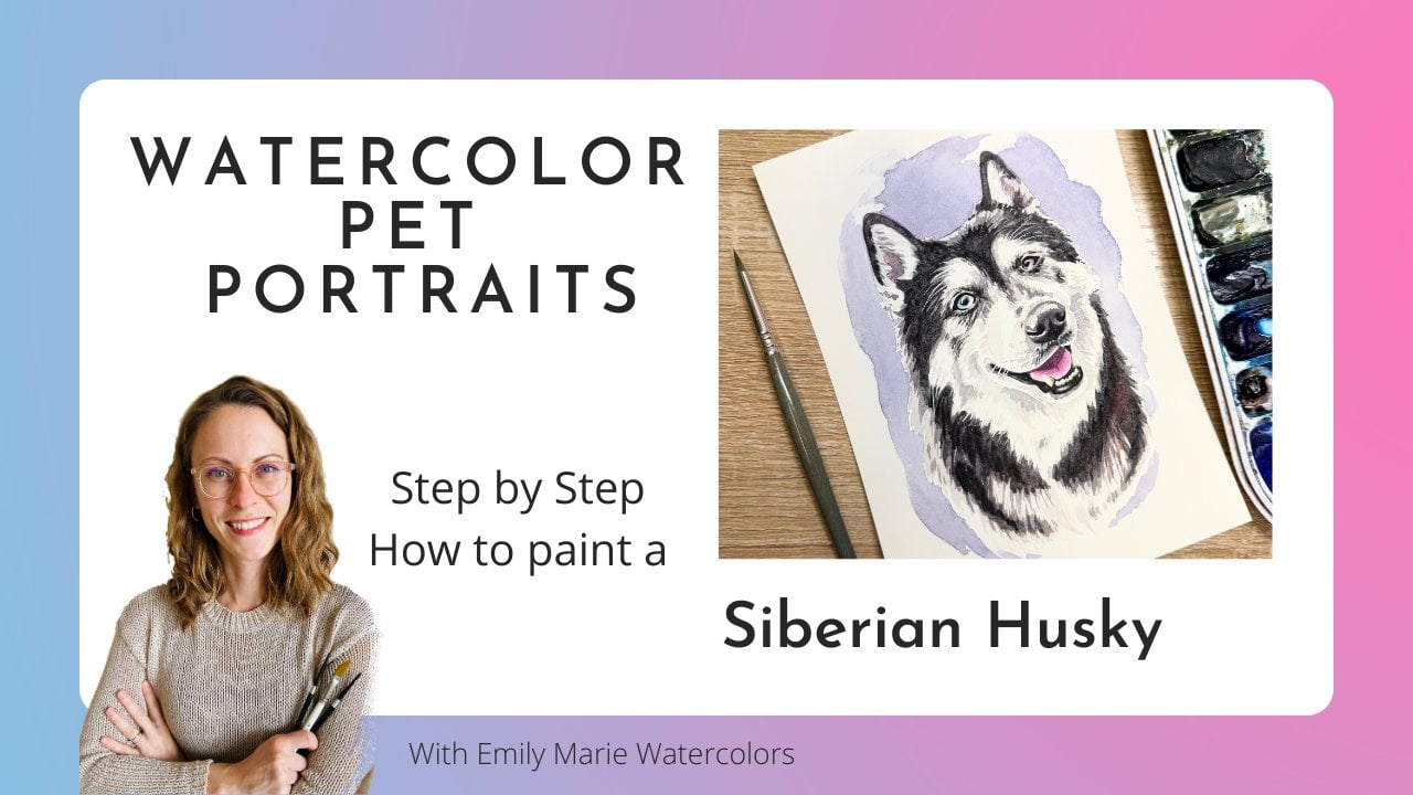
1. Intro Pet Portrait Tutorials: Hello, and welcome.
My name is Emily, and I am the artist behind
Emily Marie Watercolors. Welcome to my home studio
here in Madison, Wisconsin. In this tutorial, you'll
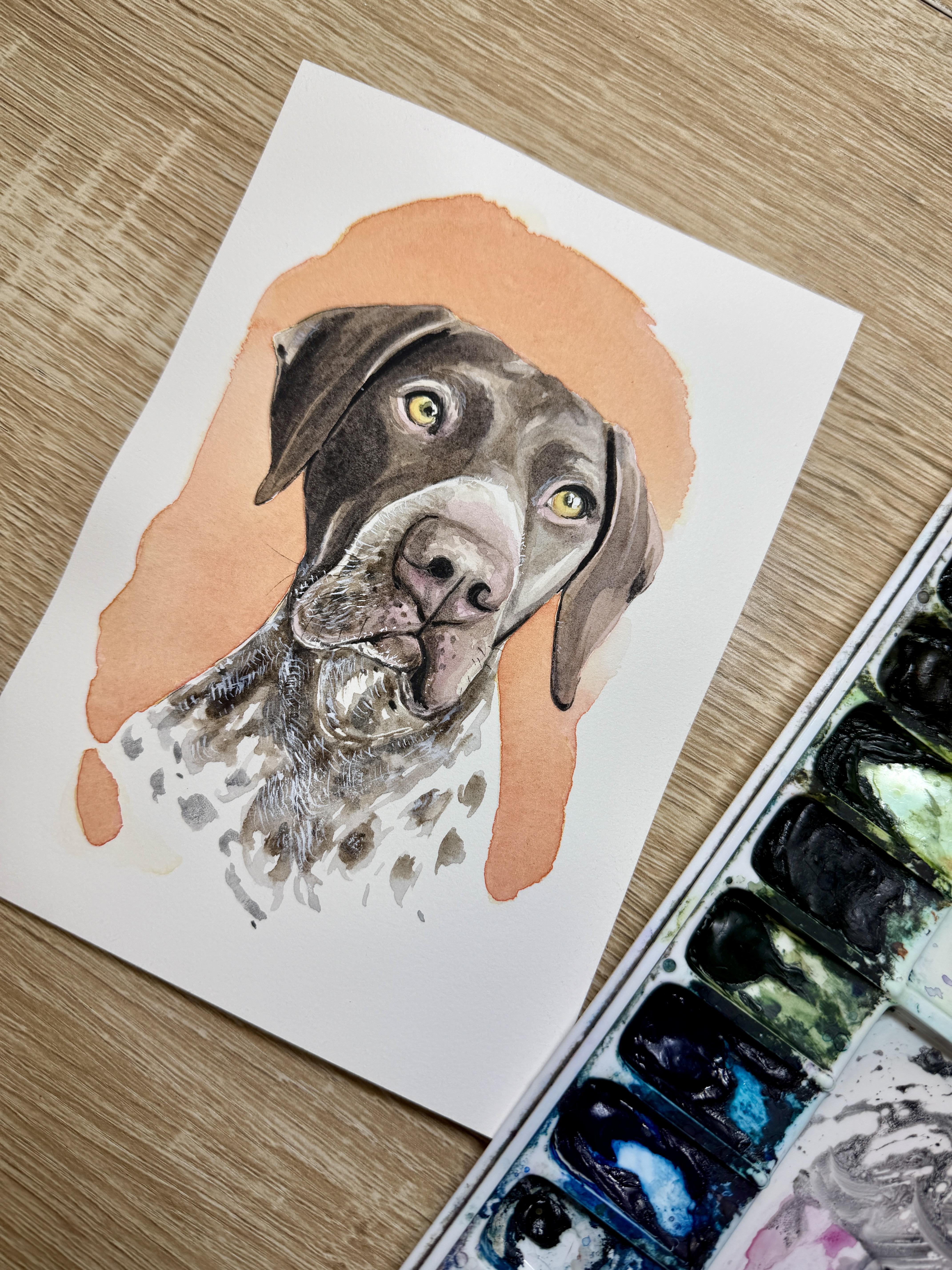
learn how to paint Tilly, a German short haired
pointer, using watercolors. As a watercolor artist, I have found a passion for
painting pet portraits. If you already know the
basics of watercolor, painting pet portraits can
be a great way to turn your hobby into a part time
or even full time career. My style is characterized by adding details to
the mouth, nose, and eyes, but not
getting caught up in painting every
single hair or curl. Use the tracing template
of Tilly included in this tutorial or choose your own reference
photo to paint. You'll also have access to a color reference
photo of Tilly, as well as all of the supplies and colors that I
use in the tutorial. I'll break it down
for you step by step. We'll look at painting our
first few layers of brown fur, how to paint a modeled,
speckled neckline. We'll also add black
details, and at the end, we'll look into using white gouache to add
some fine white details. As an added bonus, I've even included a quick
guide with step by step pictures so that
you have an easy way to see how all these
layers come together. So grab your supplies, and let's get ready to paint. Don't forget to upload any
questions that you have, and I'll try my best to answer them along the way.
Let's get started.
2. Supplies and first layer of irises and nose: Alright, so I have
my sketch all on my five by seven inch hot
pressed watercolor paper, and I did tape it onto a
plastic corrugated board. I used some Kiwi hub tape, and I also added some masking
fluid using an old brush. Um, I use the same brush
for masking fluid, so I don't have to really
clean it off too well. And I added just a little bit of masking fluid in the
highlights of both eyes. So this left eye here
has just one highlight. It's the one
rectangular highlight. And this right eye has two
small rectangular highlights. I decided to add two
small highlights, and then after I
finish painting, I'm going to decide if I really want to keep
both highlights. But when in doubt, always mask out more than
what you need, you can always
adjust it later on. Alright, so I have my reference
photo on my computer, and I have the brightness
of it completely up on my computer so that I can see all
the nice highlights. And I'm ready to
start painting Tilly, our German short haired pointer. So whenever I start
pet portraits, I do like to start by
painting the colored iris and then also any of the pinks
that I notice in the face. And so I'm going to
start with the irises. I'm starting off with my
round size four brush. To be honest, I probably won't change and use a different size brush
the entire tutorial. However, if you have a slightly
smaller round size brush that you would like to use
for details such as the eyes, nose and mouth,
you are more than welcome to use a slightly
smaller detail brush. Alright, so Tilly's eyes, um, are more yellowish in color. It has just a little
bit of brown, like a maple brown
around the edge. But I do want to start
with that yellow color as my first layer, and then I'll try to drop in
a little bit of extra color. I'm noticing just a
hint of green and then a hint of kind of this
maple color around the edge. This color that I'm using for the base color is an
art philosophy color. This color is called sassafras, but it's very close
to a gamboge, which is slightly
more brown tones. So I will paint the entire iris. Using this yellow color. I'm going to do both at once. Now, from here, I want to
drop in a little bit of color while this is still wet. So using whatever water
is left on my brush, I'm going to grab first a
little bit of this maple color. This maple is very similar to a quinacradon burnt orange if you don't have that at home, if you don't have maple at home. I'm gonna drop it into the edge, and I'm noticing that maple is really flying all
over the place. So I'll tap my paper towel, get a little bit of that
liquid off of my brush. If you're noticing that your
color is going everywhere, it means you have too much
liquid on your brush. You're reintroducing
too much liquid. So I'm going to just lift. I'm going to use a dry
brush to lift a little. And then I will use that yellow drop in that yellow again to push that
maple to the edge. I'm also noticing just
a little hint of green. So I'm using a little
bit of sap green. I'm noticing that sap green
closest to the pupil, though, so I'll just get ever
so slight amount of this green and tap it
near where the pupil is. And I'm going to let that dry. Now, remember that you can
always dry your brush off and lift color if it
got all over the place. If you're not happy with
the color before it dries, press down, lift it up, and try over again. Now, the pinks here, we do have some pinks
in the nose area. But because it's blended in
so nicely with the brown, I think I actually want to add that pink when I'm
adding my brown layer. So we're not going to do
that pinks at this stage, but we will when we do the
first layer of our nose. Alright, so while
I give the eyes a little bit of time to dry, I'm going to jump on to the
first layer of the nose. Now, normally, if
there's a black nose, pup that you're working
with, I would choose a gray. But any of our brown nosed pups, um, you actually are going
to want to choose a brown. The brown that I am
going to use for the majority of this painting
is pyominiteGenuine. Um, this brown has
more red tones to it, and it is a granulating color. So when you lay the color down or when you let it
settle on your palette, you will notice those
multiple colors separating, and so you will have
to continue to mix it. But I do think that whatever sort of brown color that you have in your palette, if it's not warm
enough of a brown, you can always add
a little bit of red to your brown or a
little bit of magenta, like a quinacrito
magenta to your brown. So I do want a really light, transparent brown because I do want that lightest
highlight of the nose, that center of the nose to be represented with this color. So I think that's a great
color to start with. And I am keeping my
magenta kind of in line in my mind because I do want to add that magenta towards
the bottom V just below the nostrils. I'm going to drop it
in while it's wet. Before I drop it in, though, I'm going to cover this whole
nose with this first layer. I go back to where I started to make sure
it's really nice and wet. And then without drying
my brush or cleaning it, I'll grab a little
bit of that magenta, and I am noticing there's more
pinks under the nostrils. Now, obviously,
that's a lot of pink. So I'm going to blend
using a damp brush. Now, damp, not wet.
That's important. If you use reintroduce
more water at this point, all you're gonna do is you're gonna push the pigment away. So you want to be extra careful now that
the pink is there, I'm working really
fast to dry my brush. And then to lift a little bit, I'm using the edge
of my brush and a dry a dry edge of my brush
to lift from the end here, as much pigment as I can. And then I'm also gonna lift
a little under the nostrils. I might lift in any other
little areas where I see that there's a little
bit of highlight. Now, I don't have to worry about getting every single
highlight represented here. I just kind of want to
get the lightest shades.
3. First Layer of Brown Fur: So we are now going to start on the first layer of
brown for the face, particularly around
the eyes and ears. Now, you might need a slightly different
shade of brown than what I have for Tilly here. And we have two options
here for our first layer. So we have kind of
our warmer color that leans more red brown. That's our pyominite genuine. And then we have a cooler brown that leans kind of more yellow, and this is a sepia. So sepia is still going
to be a light shade, so it's not going to be very, very dark in color, but we are wanting to
just get color down. The only area that I'm going
to avoid at this point is the muzzle area where
it kind of turns to white. At this stage, we don't
need to worry about leaving any sort of painting
any sort of fur strokes. Because we're gonna leave those individual fur strokes for our second layer of color. Right now, we just want to get that first layer of
color down and kind of get our bearings down
for this portrait. Now you'll notice I'm
going to do the ear first. And then I'm going
to take a peek, if I notice any kind of red areas that are
leaning more towards red. So maybe closer into
the face is leaning a little bit more
red. I'll go back. And now I'm gonna look around
this left part of the face. Now, you do need to
leave that paper color, that white of the paper for
any place that is white. Um if there are little tiny
hairs around the eyes, these little tiny white
hairs around the eyes, I'm not going to keep that open. Those little tiny hairs I will not be representing
in this painting. It's just too hard,
too small of details. However, when I get up
to the muzzle here, I do want to make sure that
I'm keeping that clean. Now here around the eye, particularly, I do
want to be careful. I'm going to switch
to that more red. I might actually even drop
in some pinks here as well. So here I've got too much color. I'm going to lift some of
that around the eye area, and then I'm going to
just grab a little bit of that quinacdomgenta, that pink. See if I can add a
little bit of pink here. And I'm going to move
on to this next side. So I'm trying to do this as quick as I can
because, of course, this hot press paper
dries quickly. It's one of the challenges
of working with hot press. Now, on these seams where
it already started to dry, you can kind of try to rework
that seam, if you will. God. My biggest tip, though, is to try to plan out your painting so that you are stopping where you
have a natural border. So I've got this natural
border by the ears. I don't want to add too much space for
me to paint at once. This is also why I'm
working on five by seven. I might have to
adjust it slightly if I were working a
little bit larger, so I might have to paint in smaller sections if it
was a larger piece. All right, so I'm going
to try to do the same, drop in a little bit of
pink around the eyes, trying to keep my
brush, somewhat dry. I don't want to reintroduce
too much water, or otherwise, it's going
to push the pigment away. So I'm keeping my
brush as dry as I can while still adding
in that pigment. And then now, when I
move on to this ear, I'm gonna be using
more of that piaintte genuine because I
am noticing more of those red undertones
in that ear. If you are starting to paint this at home
and you don't have time to drop in the pinks
around the eyes, do not worry. That step you can always add
after the browns are dry. I would though suggest
drying your brush and lifting a highlight
around the eye so that you have less brown pigment in that spot so you can
drop in the pinks later on. Alright, so now from here, I'm going to take a
peek at the nose area, and I do want to use
the same browns that I have mixed on my
plate on my palette, simply because I want to make sure that I'm
connecting the two. Obviously, I'm going to be
adding a lot more layers onto around the eyes and ears. I'm going to start, though, with using this
piamintite genuine and coming around the bottom of the nose because
that is where, of course, it is the
darkest in color. And it's the most uniform. So I don't have any of this little texture around the edge. So all I'm doing right now
is I'm taking a peek at where that kind of blob shape is around
the base of the mouth, and it kind of extends a little bit along
the base of the lip. I'm going to do it
on the other side because I am working quite wet. If yours is drying
too quickly here, you can stop and drop in your magenta before
you do the other side. So this side, we've
got a little bit of the bob coming down this way. Now this blob that I'm referring to is kind
of where you see more of the pink
in the mouth area. So I'm dropping in a little bit of that quinacridone magenta. Of course, it's looking pretty intense with quinacridone
magenta right now. It will dry a
little bit lighter. However, I can
also wash my brush off and use it like a
sponge to kind of soak up where maybe it got a
little bit too intense in color or where it maybe
got a little bit too dark. I know that this is gonna
dry a little bit lighter, so I'm happy leaving
it like that. And now I am going to use this
sepia that's watered down, and I'm going to try to extend it to this upper
section of the nose. So the above the nose here, we also have a little
bit of a blob shape. It's kind of more rectangular. And then after this blob shape, it just kind of
seeps into white. So while this is still wet, I'm gonna dry my brush, dab it so it's not soaking wet. And then using the tip
of that wet brush, I'm going to come to
that line, that edge. I think I got too much water off and just kind of extend
that edge there. If needed, you can always drop in more pigment
now that you've got that that edge of wetness. Now, I'm taking a peek at
kind of the left hand side here where that sepia is a
little bit darker in color.
4. Painting the cheeks and mouth: It is extending here. And then what I'm
noticing then is that it's just a lot of
little tiny lines. So here is where I kind of do want to add a few
little hair details. This is where I'm kind
of starting with some of these little hair details
coming out from the nose. I'm using trying to use what pigment is
already on my brush from this one line
that I created here. And I'm making I'm barely
touching the paper here. Kind of making these
little almost like hash mark lines coming
out of the edge here. It's gonna be thicker
closest to the nose. These little blobs. And then once you come
outside of the nose, I'm trying my best to make
kind of random lines, but also checking out
my reference photo and seeing where these are
connected a little bit more. So it looks like there's some
blobs here along the edge. I'm leaving some of that
paper to shine through. That was a mistake. I'm understanding that I can always come back with water
and blend some of these out. Once I come towards the
center of the nose, now this areas already
starting to dry. And so I can use
this brown to add some of these little dots where the hair follicles
are coming out. Oh, well, it's wet. I'm gonna grab a
little bit more of that sepia directly from my pan, add it to where
it's the darkest. Noticing it's dark out here. It's dark in here. And then, of course, it's the darkest around the
edge of the nose. Then we do have a little bit more on this left
hand side, as well. A this area of your painting is
probably going to be the most challenging
around the nose here. The rest of the painting
has different texture. When you're done with
those little lines, wash your brush and use
a somewhat damp brush, tap it on your
paper towel first. And then using that
somewhat damp brush, you're going to go over
that area that you just did all the little
scuff up marks. I like to go over it with a little bit of water
afterwards because I do feel like it then helps to blend it into
the painting itself. Especially because, you know, we've got so much texture
going on here that, yes, we want those individual hairs, but we don't want them
to look too perfect. So when they look too perfect, they end up looking
awkward in our painting. So sometimes adding a
little bit of water and making it a little bit more fuzzy of a look
sometimes helps overall. I still, though, want to leave some of that
white shining through. So I'm trying my best to leave a little ring
of white around the edge and to leave some
white shining through here. Now, on this right hand side, it's definitely
not as prominent, but we still want to add some of that texture because
we don't want it to just fall flat
then on this side. So where I'm noticing the
darkest pigment is going to be now under this right hand side of the nose. So I'm
starting there. I'm also coming down into this little line that
goes towards the mouth. And now I'm noticing more shadow instead because of how the light is under this right lip. Gonna grab a little bit of water to lighten down that color. And then I'll come in on
this side with that sepia. It's looking a little too dark. So I'll grab a little
bit more water and add it directly to my brush. And now I'm going to try my best to kind of erase that little edge that I had made
with the colorful blob here. Alright, now, the
last thing that I'm going to do at this stage, I'm gonna grab a little
bit more of that CBA. It's hard to tell, but I do know that this lip underneath is the same coloring as around
the outside of this muzzle. And so I do want to add a
little bit of color here. It could be that kind
of medium sepia tone. There's a little bit of
texture on the left hand side. It gets really nice
and dark on the right. Now, because I'm using this hot press paper,
it's already dry. So I don't have to worry about these two blending together. I am leaving a little bit of white along the bottom
rim of the lip here because my German
Shorthaired Pointer has so many little white
hairs popping out. Then the lip that's connecting to the body there
is going to be much lighter, much more of a rosy color. So I'm using that piainte
genuine on that lip part. And it's actually
going to be a little bit lighter than the rest
of the brown around it. So after dropping in a little
bit of that pink color, now I'm gonna dry my brush, and I'm gonna lift a
little bit of a highlight just right there under
where that lip should be. Now, if your colors still
haven't dried in time, dried yet, you can always add a little bit more darker
shadow here to the right. However, if it's already
if it's already dry, you can wait for it to dry completely and add
that at a next step. Okay. So I'm just
adding a little bit of that more concentrated sepia along the outside edges there.
5. Second layer of Brown Fur: Alright, so before we
start working on the body, it seems like the area above around the eyes
and the ears are dry. And so I do want to add
a second layer there. So I am going to use kind of
where my palette is here, that a little bit of that sepia. I might have a little bit of that peaminite genuine kind of mixed in there as
well, and that's okay. Um, so my second layer is going to need to be
a little bit darker, more opaque and transparency
than my first layer, but still not as dark as these darkest shadows here
on the left hand side. I'm going to be doing
at least three layers. A lot of times when painters
are painting portraits, pet portraits,
their second layer that they paint
might be too dark. And when it's too dark, the contrast is too intense
and your portraits tend to look a little bit more
illustrative versus fine art. And so as you start painting
your second layer here, if you are noticing that it is very much a stark contrast
between the first layer, think about maybe adding a little bit more water to
your second layer there. Alright, so with
this second layer, most of the section
of the ear here is actually going
to be covered in this second layer because this left ear is
so dark in color. The only section
that I might keep out from that color is there's a little bit of
highlight here in the ear. And so just at the
little tip here, I might leave a little bit of that original color
to shine through. But really this section of the ear is gonna
be the darkest. And so I pretty much the entire ear is going to be covered with
the second layer. I just lifted a little bit
of highlight from there. Now, when we start painting
the section of the head here, so there's a little almost, like, flap of the ear. So I'm gonna try
my best to leave a little tiny bit of that
first layer to shine through and just add a little sliver almost
there to the ear. Now when I take a peek at painting the rest
of the head here, I'm going to try my best
to kind of keep some of these lighter areas
shining through. Now this is where it
can get a little bit challenging simply
because you're needing to paint reverse style. Where am I seeing
the lightest lights? I'm seeing them around the eyes, and I'm also noticing there's a lighter
here in the middle. So I'm going to work a
little bit on blending. Now, when I'm blending, I'm going to just
grab a little bit of water, dab my brush. And now I can use a very, very light hand to come
on into the center here, and that's how I kind of blend out the color into the center. Now here around the eye, I do have this
darker kind of chunk around the eye here and it's
coming all the way around. So from that dark chunk, I'm going to add a little bit of some little hairs coming
out from that chunk here. Then on the inside, I'm going to try to do the same. I'm going to pull a
few hair strokes. I think I can get this
a little bit closer. The same with the bottom here is that you do
have a little bit of this highlight under the eye. And then the rest of the
area we're just gonna fill in with the sepia until we get to this kind
of jawbone area where we can just try
our best to leave a little sliver of that first layer. Try my brush, come along
that edge and just lift up a little bit of that pigment along that hard inner edge. This darker sepia is
coming in a little bit. And now I'm noticing some shadows here in
the center of the face. So it's kind of a triangular shadow that kind of comes up. Now in the center of the face here of the forehead,
it gets darker. This is where it
can be a little bit challenging to paint all of
the shadows that you see. So I'm gonna try my best to paint some of the
larger shadows. I wet my brush, dab it on my paper towel, and now I'm using
this damp brush to just kind of blend
some of those edges. A grabbing a little bit more, mixing a little bit
more of this sepia. Now, on this right hand side, we do have our main highlight. And so the area that we want shadow is you're noticing this line here on the
inside of the eye. That's kind of where shadow is, and it's reaching from the
bottom here of the nose, and it comes up along the eye, and then we've got this
little darker eyebrow almost on top of the eye. And then we're also reminding
ourselves that we've got that same light
area around the eye. So I want to extend that
highlight and blend the edges we've got a little bit
of this kind of triangle underneath and a little line running down the
edge of the face, blending those edges
with a damp brush. Now, on this right ear,
I'm mixing in the rest of that pyomintype genuine to kind of give it a little bit, a little bit more
reddish of a hue.
6. Adding details in the eyes, nose and mouth: Alright, so we are now in the
stage of a painting that I like to call and that a lot of other artists
call the ugly Face. It's where your painting doesn't
have enough details yet. It's looking off. It's got some interesting
choice of hard edges, but we don't have
enough detail yet. And so this is kind
of the stage where a lot of artists tend to want to give up on
their paintings. And so I like to tell people
to just push through, see through it and
see if you can, um add if by adding
a few more details, if you can then start to see your final product
kind of emerge. So what I would like
to start on now at this stage is adding some
details to the eyes, nose and mouth, just so
that we can start to see our pet come alive instead of seeing
all these blobs of color. So I'm using shadow violet. This is the gray that I like to use for all my pet portraits. I'm mixing it with some water, but I am doing a fairly opaque tone because I'm going to be
going around the eyes here. And so I want to make
sure, of course, that it's dry at first, but I'm going to start by
outlining around my eye. Now, this is the part that
if you wanted to switch just slightly smaller
round size brush, you can do this round size zero. I'm going to start with this
four and see what happens. I might switch part way. So with our German point
short haired pointer, we're going to have this
line around the iris. And it's going we're gonna have quite a thick shadow
here on above the eye. And that thick shadow kind of runs into this kind
of droopy center. So it kind of comes down
and it wraps around. Now, the one thing with pointers
is that there's a very, very thin line around
the bottom of the eye. It's really a lot
thicker around the top, and it kind of comes to a
point here in the edge. The pupil in the center of the eye is going to be
a little bit smaller because we do have our
pointer facing the sun. And so the center of these
eyes I did water down. I just grabbed a
little drop of water. Just to make the center here a little bit lighter in color. I'm going to add a little
darker of black in the very, very center, but this outer edge I do want to keep a little
bit lighter in color. I'll do the same
on this right eye. It also looks like I got this
gray a little bit too flat. This gray needs to kind of
get pushed up a little bit. So I'm gonna re wet the area, reactivate that gray because
I don't want that gray. There anymore. I want that
gray to be slightly raised up. So this is another good excuse for really adding
quite a lot of water to your mixture because then
if you do make mistakes, it's much more it's much easier to then lift
those mistakes. So I think I'm just gonna kind of redo this whole section. So I lifted the
area, dabbed it off. Now I'm gonna kind of
let it dry a little bit. But I'm going to add the
little highlight in the eye. Alright, and then I will go on. I'm gonna move on to the nose, then while I let this
eye dry a little bit. I'm gonna start with that. Shadow violet and the nostrils. I'm gonna run the shadow
violet down the center of the nose and also around
the edge of the nose. So right now, basically, what you're noticing or maybe you're not
noticing this at home. But when I take a peek now
of this shadow violet, now I'm noticing
just how different the shadow violet is from
the rest of my painting, so from these browns here. And so I do want
to bring some of that shadow violet
into the rest of my painting so that it doesn't just kind of exist
only in the eyes here. So I'm going to
bring a little of this shadow violet into where those darkest areas
of the face is here. I'm gonna really water it down. So I've got this sepia mixed
with the shadow violet, and then I'm going
to come in and add some shadows on
this left side of the nose around the nostril here around the lower edge. And then I'm going
to add a little bit of texture to the nose, so I'm gonna dab my
brush to release some of that liquid and then add a little bit of
texture by just dotting. I just want to keep kind
of the center area open. And I'll also add some of that shadow violet
to the mouth area. So here with the shadow violet, I do want to outline kind of on the under part of
the upper lips. So instead of outlining
the lips themselves, I'm going slightly underneath. I'm going to add
a little hint of a line here to kind of
outline that lower lip. And then I'll outline
under this right cheek. And around under the chin here. Remembering that I'm
kind of trying to keep that little edge of white here. All right. And
before we continue on with more of
the shadow violet, I do want to take a
peek back at that eye and try to correct
that eye a little bit. This is a really hard angle. I'm going to start
with the inside, so around that iris on
the inside of the eye.
7. Fixing the shape of the left eye: Right, so I want to take
a break from the eyes, nose and mouth,
especially from this eye. I'm getting slightly frustrated with that eye, which is fine. I think I'm going to
correct the shape later on. Well, actually, you
know what I'm going to correct it right now now
that I'm noticing it. So I think the reason
why it's looking off to me is because I think I cut the bottom of this round circle a
little bit too much. I think I need to round
it out a little bit. So I'm gonna clean my brush
and then use a wet brush. I'm going to reactivate the edge at the
bottom of this iris. And what I'm trying
to do is I'm trying to extend that iris, make it a little bit more
circular at the bottom there, see if that helps
with the shape. The shape of yours at home, maybe, maybe you got
on the first round, and that's awesome if you did. If you did not rewetting the area and just kind of
scrubbing it out a little bit, letting it dry and
then going back is a great way of
kind of adjusting.
8. Painting the Speckled Neck: Alright, so we'll let that dry. We'll kind of leave it for a little bit while we calm down. A lot of times I'll have
to do that as an artist. If there's a section
that's bothering me, it's best to leave
it and come back. And so we're going to work
on the texture of the body. So this texture is going to
be a similar texture as to what I use for kind of
my curly hair dogs, and that's going
to be more blobs. And we're going to do
the blobs in two layers. So the first layer is
going to be wet on dry. And I'm going to be
using my shadow violet. I do want this shadow violet
to be really liquidy. I want it to be about
a medium opacity, so it's going to be
around that opacity. And then I'm going to
take a peek at where my sepia is and
keep that in mind. So my sepia is right here. So our goal is to
do our first layer. Um, I want to make
these little blobs, but I do not want to use
the tip of my brush, so I'm not having a
perpendicular brush to my paper, or my blobs are going to look
too tiny and too circular. I want to instead use
the edge of my brush, and I'm going to be
kind of dragging the edge of my brush. I'm making a little bit of
a dotting motion while I pick up and kind of move my brush almost in
circular shapes. And I want to keep quite a
lot of pigment on my brush. I want it very loaded. And I'm going to
kind of just almost brush along using this edge. It's almost completely
parallel with my paper. That's how much of
the edge I'm using. I'm not pressing down too hard, and I'm leaving
some of the white of the paper to shine through. And kind of making
these shapes that are very unique and that have
white paper behind it. Now, before it dries, this is where I want to take
my brush without washing it, take some of that sepia
directly from my paper, and then I want to drop in that sepia in certain spots where I know it's going
to be the darkest. So this section is
already starting to dry. So I want to keep
in mind that when I'm doing my final painting, I do want to do
this a little bit quicker than what I'm doing or I want to actually do
smaller sections on my actual painting. So this is kind of the
texture that I'm looking for. Um, this is going
to do two things. One, it's going to kind of help combine the two colors that we're using in
the top of our pet. But it's also going to give us that really bright
contrast between the white of the paper
and then the splotches. Without having to paint
the individual splotches. Now, as I paint my splotches
on my final paper, I'm going to be aware of kind of where my natural
divisions are going to be and then try my best to help show those
natural divisions. So whenever I'm painting the chest here and
blending it into paper, I am thinking about
wanting it to be more triangular in nature. So I do want the
chest here to be the lowest point and the edges of the
shoulders to be higher. And I'm noticing some of
these curves of the neck. So I'm going to
start off here on this left hand side because that's going to be the darkest, and I'll start off
with my splotches. I've got my fully loaded brush. I know that here it's
going to be quite dark because that's kind of where it's coming
into the neck. And now, as I come down, now I can kind of start
to splotch it out. I'm taking a peek at my
reference photo to see if I can kind of somewhat
mimic these splotches. I'm going to kind of pause
once I get to this fold. But I also know that I want to I kind of help
with the shape here. So I'm going to start to make my little shape coming
down to the center, and then this is where
I'm going to stop it. And now I'm gonna go back and grab my sepia before it dries. And in those spots where it's the darkest drop in that sepia. Drying my brush and
using a dry brush, just kind of lift up if anything got a little
bit too intense. I'm going back to
that shadow violet. And now I'm going to work
on this little section here leaving some of the
paper to shine through. And then, of course, I'm
noticing that there's kind of this arch of the
kind of shape the fur. Then you've got some of
your splotches here. No, I don't want to
do too much before I drop in the color, so
I'm going to stop there. And then drop in where it's the darkest, which is kind of in
the center here. It's going to be the darkest. Grab a little bit
more shadow violet. Now, I'm noticing that it's getting a little bit dark here, so I want to make sure that I'm not that I am leaving some of this
paper to shine through. So over on this right hand side, I am going to keep
these dots separate. So I do want some of
that white in between. The reason being is
that I want to make sure that it's very apparent that there's white underneath. And so if I don't add, if I try to overdo the spots
and have them to connected, it's gonna read that there's no white paper underneath or
that there's no white fur, I should say, not
no white paper. The same here in the neck, I'm going to leave a little bit more of this white paper open.
9. Adding Shadows with Gray: Alright, so now I'm going to use a shadow violet for adding some shadows around
the eyes and ears. This is going to act as
instead of my black. So I'll add some black details, but I do want more of the darker details to be the shadow violet
than the black. So I am mixing up kind of a slightly darker
opacity shadow violet, but still mixed with
quite a bit of water. I'm gonna start in the ears here where it's going
to be the darkest. If I'm noticing that there are some very dark
sections anywhere, I can go back and
drop in some of that shadow violet
directly from my pan. It can be pretty challenging when you're looking
at your reference photo, especially one that has
so many details in it to kind of pick out which of the details are the most
important to paint. Sometimes it's easy to get
lost in those details. Now, for the main face, we are going to look at
where is the darkest. So, of course, it's
around the eyes here. Kind of bringing into this
cheek bone at the bottom, and then it'll come around here. And, of course, these
little eyebrows is where it's going
to be the darkest. Still following the
curve of the eye. We've got a little darker
of a section here. Makes up a little bit more
of that shadow violet. Of course, it's the darkest
here above the eyes. I'm gonna do another
layer there. Okay. There is a little bit of that brown coming into
the center of the eye. Let's see if that helps
a Dar eye placement. All right. Let's try this once again. O. And we'll add some of our darkest shadow here to
that crease in the ear. I'm going to bring that
dark actually it's kind of like a line
around the edge here.
10. Color Corrections: Alright, so we are going to do a few color corrections
here before we add our black layer. And so whenever I do
color corrections, I want to take a peek at where do I need to kind
of amp up my colors? And so when I first
take a peek at mine, I am looking at the eyes, so I do want to add a
little bit more color into the eye area as a second
layer of wet on dry. So I'm going to add just
a little bit more of that kind of honey color. And then I also want to add a little bit
more of this yellow. It's not looking kind of it's not looking
bright enough to me, especially in this right
eye where I kind of had lifted a bunch of color
and reworked it a bunch. Alright, and then I'm
going to take a peek at some of these pinks
in the nose area, in the nose and the mouth. So this is kind of a
good time to do glazing. So I've got a very,
very water down pink. And I'm going over some
of these areas where I'm noticing that it just needs a little bit
more pop of color, particularly in the nose and
then in this mouth area. Now, glazing happens
when we go over sections that we've
already painted with this really watered
down mixture. And so it just
really helps it pop. I can also glaze
around the eyes if I need a little bit of extra
pink around the eyes, especially in the centers here. I can blend out any
of those edges. Now, the nice thing
about glazing on top of these browns is that it also helps to kind of bring the browns
to life a little bit, adding a little
layer of that pink. And so I might end up going into a few more sections
with this pink, particularly in this
ear that's kind of highlighted by the sun. This section of the mouth. All right. And then I do want to adjust the darkness
on this left hand side, so I noticed that I need this section to
be a little bit darker. I'm going to do that before
I add my layer of black because I want this kind of left hand side to be
a little bit darker. So I'm going to do all
around that outer edge. And then also this
little triangle that you see on the inside here. You're around the
eye a little bit. I'm really wanting to make sure that's
really nice and dark. This is also the
stage that I can glaze over anything
that needs to be um, blend it a little bit better. So if these highlights around
the eyes are too much, I can also glaze over those. If I need a little bit more
gray around the nose here, I can glaze over this, just kind of make it
a little bit darker. I can also use a
wet brush and blend some of these edges if these
edges have gotten too hard.
11. Last layer using Black: Alright, so when I
start with my black, I do want to start with
the darkest areas first. So here I'm using lunar black. So it is a granulating
color by Daniel Smith. If you do not like
granulating colors, you can use a regular color. And I want to start
in the eyes here where I'm seeing the
blackest of the blacks. I want to use it
kind of sparingly. So I'm adding along the top
eyelid here of the eye. Outlining that little kind
of divot in the middle here. And then I'm going to extend that black a little
bit along the base. This is where I might
come back and use a little micron pen to
really get it nice and fine. And then I'm going to add a
little bit of that black in the center of the pupil to really help that
pop a little bit. Move on to the next I. I'm going to do a little bit of a ring around the
top of the iris. And then with this
eye, particularly, I do want to also do
a dark black along the top of that eye. But I'm trying to keep a little sliver of
that color underneath. I think I went a little too far. So I'm trying to keep
a little sliver of that paper or that brown
that's underneath in between. Once again, if you want to do this step with your
smallest brush, it's obviously an option. A little.in the very center. And now I do want to
use this darkest black to I want to make sure that I'm using the darkest black to frame
the face with the ears. So in this line here where the ears are
meeting up with the face, it's where it is the darkest. I do want to add a
really nice clean line. I can extend it. To the bottom of the ear. I can also extend it slightly along this
left side of the face, which is going to help kind
of highlight that section. I'm going to do the same
on this right side, adding that line of black in between where the ear
is attaching to the eye. And then a very fine line. I'm going to leave that
section open, but a very, very fine black along
the bottom of this ear, I kind of left a little bit of the brown to shine through, so I didn't fully outline it. And now this black
I also want to use in the darkest
spots of the nose. So that's going to be obviously the nostrils here of the nose. And then I also want a
little bit of the outer edge of this nose to be
outlined just lightly. I think that this black in the center got a
little bit too dark, so I'm gonna lift
that up a little bit. This is the other
nice thing about using this lunar black as a granulating color for your pet portraits is that it
does lift up really nicely. So if you do make mistake,
when you're painting, you can usually rewet it with water and then lift
it pretty easily. We've got this little
kind of V at the base here of the nose. And now, this black
here I can use on this right side of the face
of the lower lip here. Kind of in this space
running under that big lip. I might also use a little
bit under this other side. I do want to use this
black sparingly, though, so I do really want to use it where it
is the darkest. I'm gonna start adding a little bit of
water to that black, and then I'm going to come and
use it in a broader sense, so water down a little bit in where the darkest
spots should be. And I'm using the edge of my brush with this
watered down black. And now I am finding
that I'm kind of losing the mouth here into the neck. And so I am going to
use this black to kind of help create a little bit of a
division between the two. I'm not fully outlining it. However, I am kind of
using a dotted line almost to just emphasize the
top part of the face here. And then I might also do that along this just this
edge of the face here. I don't think I need to
do it on this right side. I'm worried about
having that kind of come get a little bit
too intense in color. Can I add a little
bit of darker spots. You don't want them to
get too dark, though. And now I do want to add a little bit of
this watered down black to the body here. So I'm using very watered
down kind of keeping it in these areas where it's the
darkest adding a second layer. You can always add
a few individual oh which actually that helps a lot because I
think this left hand side, when I did the body here, I kind of joined these globs together a
little bit too much. And so to get that
nice brindle effect, adding and extending it
a little bit on hand, this side is going to
actually help with the whole kind of illusion
of the brindle there. Alright. And then at some point, we have to kind of stop
and say, Enough is enough. We're gonna do the
background splash, and then we can
always come back and add more details if we need to. But sometimes
continuing to work on these areas sometimes helps
it, sometimes hurts it. It can hurt it by muddying up the layers that
are underneath. And so, instead of having those
really nice clean layers, you end up muddying up
your layers a little bit. So I am going to stop there. Like I said, I can
always come back with some fresh eyes once I do this
background layer and see, are there any areas that need a little bit
more definition, a little bit darker of shadow, or is it looking decent
the way that it is? So, before I keep moving, we're going to do our
background color.
12. Optional: Colorful Splash in the Background: Alright, so I'm cleaning
off a section of my palette because
I'm going to mix my colorful splash color that I want to use
in the background. Now, I do ask all my clients if there's a specific color
that they would like, and the client Tilly's owners would like an orange
Sherbet color. And so I'm switching
out my water. I'm gonna add some
water to my palette. Let me give it a slightly
larger brush to speed this up. Orange sherbet. I am going to use cadmium orange hue for
this orange sherbet. Then I'm going to
take a peek and see what it might
look like adding some Chinese white to
see if that kind of creates this kind of orange set look that we're looking for. Here I've got this little
orange sherbet color that is obviously going
to be mixed with water in the background. I do think that going
more transparent with this orange sherbet
is going to look better than going too dark. So obviously, if I have
too opaque of a color, it's gonna kind of drown out
all the details on our dog. So I'll wash off my brush, and then I'm going to actually do a slightly
different technique, which is a wet-on-wet
in the background. I'm going to start in the neck area because
I want to make sure that I've got these
whites really nicely framed. However, I don't want to go down too far here with my water because I do want these nice details to
kind of stick out. And so if I bring that
orange down too far, I think it's gonna
just get too busy. So I'm gonna wet the area that
I want to add the orange, and then I'll come and I'll
grab some of my orange, keeping my paper towel close. If I want to blend it
into the edges at all, I can dry my brush and use a dry brush to kind
of blend those edges. Then I'm going to rotate and add my colorful splash
around the top of the head. Now, this is definitely
just a suggestion. You do not need to do
these colorful splashes. You can choose your own colorful splash if you would like, or if you want to paint
a whole background, you are also more than
welcome to do that, too. So I'm going to just kind of amplify the shape of the head. So I'm going to kind
of amplify this tilt. So instead of adding I
got a hair in there. So instead of adding more of a color splash coming on
this way to even it out, I want to amplify
that head tilt. The owners did mention
that that head tilt was something that is
very unique to Tilly, that whenever she is trying
to listen to her owners, she always tilts her head. And so I don't want to even out that tilt by adding more
pigment up on this side. I want to accentuate it by adding more pigment
over in this direction. So you see how that tilt
just kind of became accentuated based on where
I added that color splash. I do always like to add a little bit more opaque of color
closest towards the head. I did try on purpose to
leave a little bit of white along this left edge of the body just so that it reads that there's definitely
white in the body. Adding a color splash like
this behind your pets also helps to emphasize features
like that where, you know, part of the body is white because you're adding some
color right next door. Now, I could leave it like this. However, I'm feeling
like I wanted to add just a little bit of an extra blob of this
sherbet color here, just kind of balance things out. Sometimes I end up hating
it. Sometimes I like it. Yeah, I think that probably
wasn't the best option, but since it doesn't
really lift very well. I'm gonna just try to make the shape a little
bit smaller there. Alright now, I'm gonna
need to let this dry for at least a few
hours before I take the masking fluid
off and then go in and add any sort
of extra details.
13. Final Details: Removing Masking Fluid, adding black pen, adding white Gouache: Alright, so I've let my
painting dry for a few hours. I'm coming back to now look at the last few details
and to make any sort of corrections or
adjustments before I send off a picture
of it to my client. The first thing I'm
going to do is take off the masking fluid from the eyes, and then I'm going to adjust and see if I like the
placement of where it is, if I need to add anything
or take anything away. And so I am going to use my smallest round
size zero for this. I am going to use it to
add just a little hint of blue to one of the highlights
in this right eye. I just want to break apart
that rectangular shape. And so doing that with
just a little hint of blue sometimes can bring the kind of sky color into your painting. Then I can use a damp
brush and just kind of adjust the shape of
the other highlight. And I will do the same
thing with this highlight, so I'm noticing that
this edge needs to be a little bit more curved for
the curve of the eye there. And then, same thing. I want to break up
this left side. Just a little bit. I don't
want that edge of that left highlight there to be
so straight and linear. So just by breaking up that
edge of the highlight, it actually helps quite a bit. Now, a few little
extra things that you can do here if you are finding that your
eyes are looking off or you need to just kind of highlight
them a little bit. Sometimes I come in and use a
micron pen around the eyes, particularly if you
have around the edge, such as this left hand eye where you need a
really fine line. Sometimes I will also
use this if I have to outline around the
highlights of the eyes, if I need to kind of extend anything in the center
of that eye, Yep. Same here if I need to make
that just a little bit more. You'll obviously just want
to be cautious with this because it is permanent. And so you will not be able
to lift it up once you add any sort of detail
lines with this micron pen. The same here. You
can always add some extra fine detail
lines to the nose. If it's something that
you're needing to add a little extra to the nose, sometimes I take a peek at
the whiskers here and see, do I need to add any sort
of little black whiskers. So I'm noticing just a
few here that I can add. Now I'm using the lightest
touch, obviously. Um, I don't really notice
many on this side, although there's a few kind
of smaller flecks of one. So just adding a
little extra detail here is going to actually
really make a big difference. The other point that you
can also use a micron pen is on adding a little
bit of a hard edge, particularly on certain
edges where you need just a little extra
um, to define it. So on this left ER I added just a little hint
along the base there. In my reference photo, you can see that it is there's there's definitely
a hard edge there. And so by adding that
with my micron pen, it just kind of helps to
give it a little bit more of a clean edge. All right. Then next
we'll move on to adding some sort of
white details here. So there's a few
areas that if you had wanted to add white details, now that the watercolor
portion is done, you can definitely always use some PH Martin glee proof white with a small detail brush. Add a little water
on your brush, and then you can use it to kind of adjust the
highlights in the eyes here. If you need the highlights
to be bigger, to be smaller, if you need them
a different size, just be careful with
this because, of course, you can water it down to make it a little
bit more transparent, but it is really hard to
take it away and take it off your paper completely once
you have it on your paper. The other area that we can
use this bleedproof white to add some texture is to the chest and then
to the mouth here. And so there are a few options. You can either use bleedproof
white to add some texture, or you can also use a charcoal pencil to
add some texture. If you choose to use
bleedproof white, it could be helpful
to use a comb brush. So a comb brush has two different lengths of
bristles at the end of it. One set that's cut slightly shorter and
one that's cut longer. And so when we dip our brush in water and add some of
our bleedproof white. And then if we take a section, I'm going to practice
on this section here, we can add little
tiny white hairs and add some texture on top of that section without having to do little
tiny individual hairs. Now, obviously, the
harder you press down, the more pigment you get out. So you do want to practice this a little
bit ahead of time, just so that you understand
kind of how it works. If I were to use
it on my painting, I think I would come in
on the nose here and just add a little extra on
this area here because, of course, those little
white hairs were really challenging to keep white. So we tried our best. But here, just by adding a little bit more texture with this bleed proof
white afterwards, you notice that we are able to definitely add those a little bit of
those white hairs. Now, if you do not
have this at home, this tool, you can always
use an individual, a small detail brush for this. This is just kind
of a fun option. If you're looking for
something to play around with. And also, I mean, if you're looking to do these
pet portraits more often, it could be kind of
a nice tool for you. So another option
if you don't have bleed proof white or
if you think it's a little bit too intense
of a white is to use a charcoal white pencil for some of the white shading
in the chest here. So I'm using my test strip
to kind of see how it looks. Now, you have two options. You can either use it
without dipping it in water. Sometimes, though it especially if you don't have that
rough of a paper, you might not be able to
see it all that well. So sometimes I'll
just dip it in water. And then I'll go over that same area after
I dip it in water. So dipping it in
water just kind of activates that
charcoal a little bit. It softens it up a
little bit so that you can see it a little bit better. Now, of course, it's going to look different than these
little tiny white lines. And so if I were to dip and say, add some white
here on the chest, so this is kind of what
it would look like with some little extra white
details on the chest. And obviously, I'd want
to kind of bring it the same direction as the hairs. I do think, though, that
I'm liking how it's looking with the bleed proof
white and this comb pen. So I'm going to do that instead. So I did want to mention that I ended up changing
the background color. It dried way too yellow for me. And so I mixed up a little
bit of red and orange. So I made a really
deep orange and glazed it on top of my yellow. And I was able to then
change that background color from this really dry yellow to that slightly more orangy color. And there we have it our
German short haired pointer.
 Emily Marie Watercolors, Watercolor Artist and Dog Lover