Transcripts
1. Introduction: I've heard before that talented artists are like children that love drawing and never stopped. For people like us that stopped, how can we get started again? If you love the idea of sketching the world around us, watercolor is a wonderful medium to try out. Hi, I'm Elisabetta, an Italian artist. I started painting later in life. It was two years ago when my son left for college that he thought to buy me as a present a wonderful watercolor set, this one. I was sad and proud at the same time, and he thought I could find joy in this passion, and this is what happened. I bought a sketchbook like this, and I picked up the brush and I started painting and I never stopped. I sketch every day. It's a kind of self-care routine for me. I find it healing, comforting. It's really a joy. In this class, you will see that sketching with watercolor is much more about capturing the idea of what you see around us than perfectly copying it, because you just sketch what you see not just with your eyes but with your heart as well. That comes with practice, so it's very important to sketch as often as possible, and you will improve dramatically. Today, I would like to share this process with you and tell you things that I wish I knew when I started painting. I was a bit lost. We will touch many steps together from sketching with some tips about composition, inking with a method called lost edges, how to mix organic colors, how to mute them and desaturate to make them more organic, how to add different layers of watercolor, and add final touches to make it more realistic. I'm so excited to be here, and without further ado, we'll let's start sketching together.
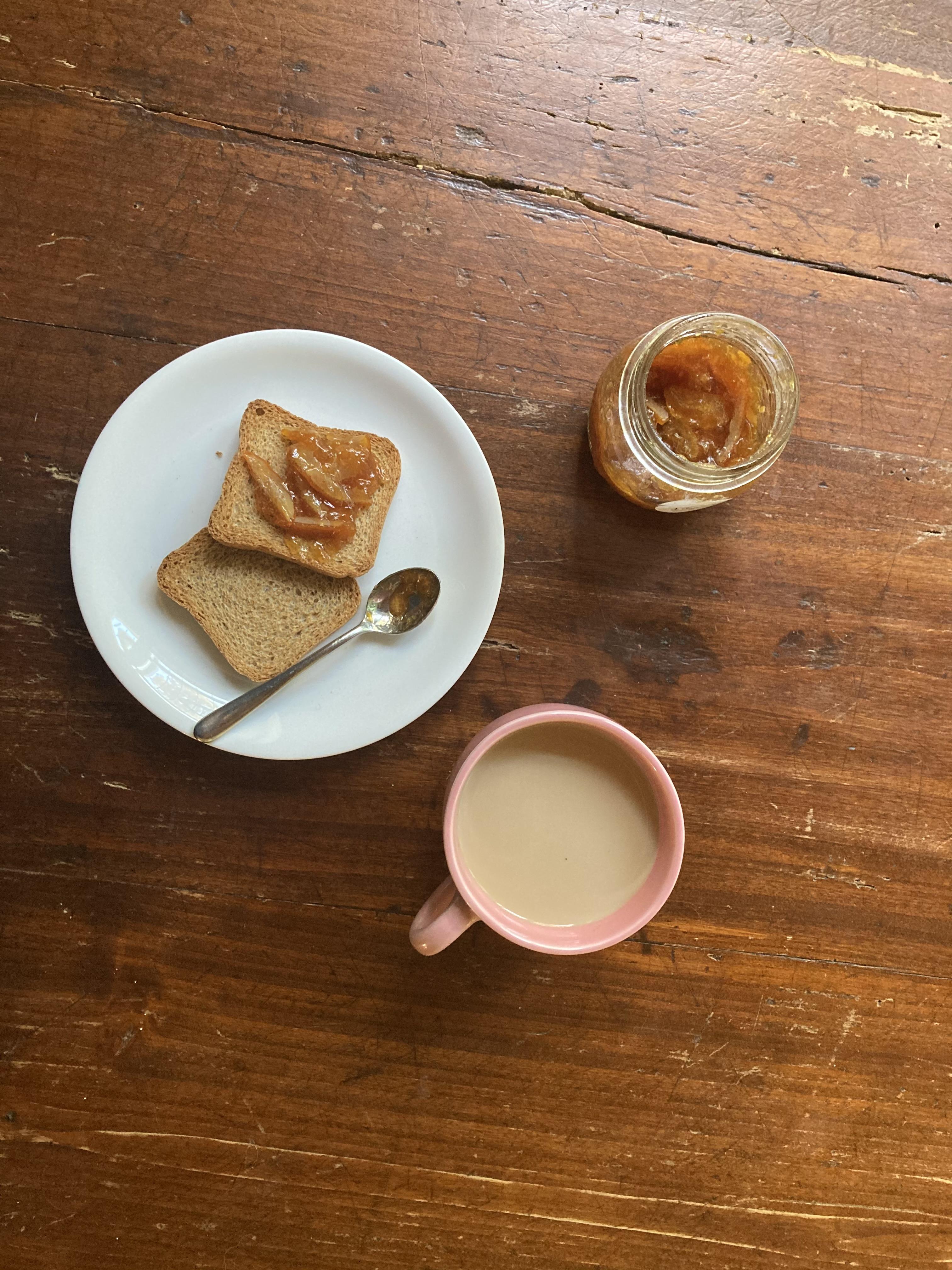
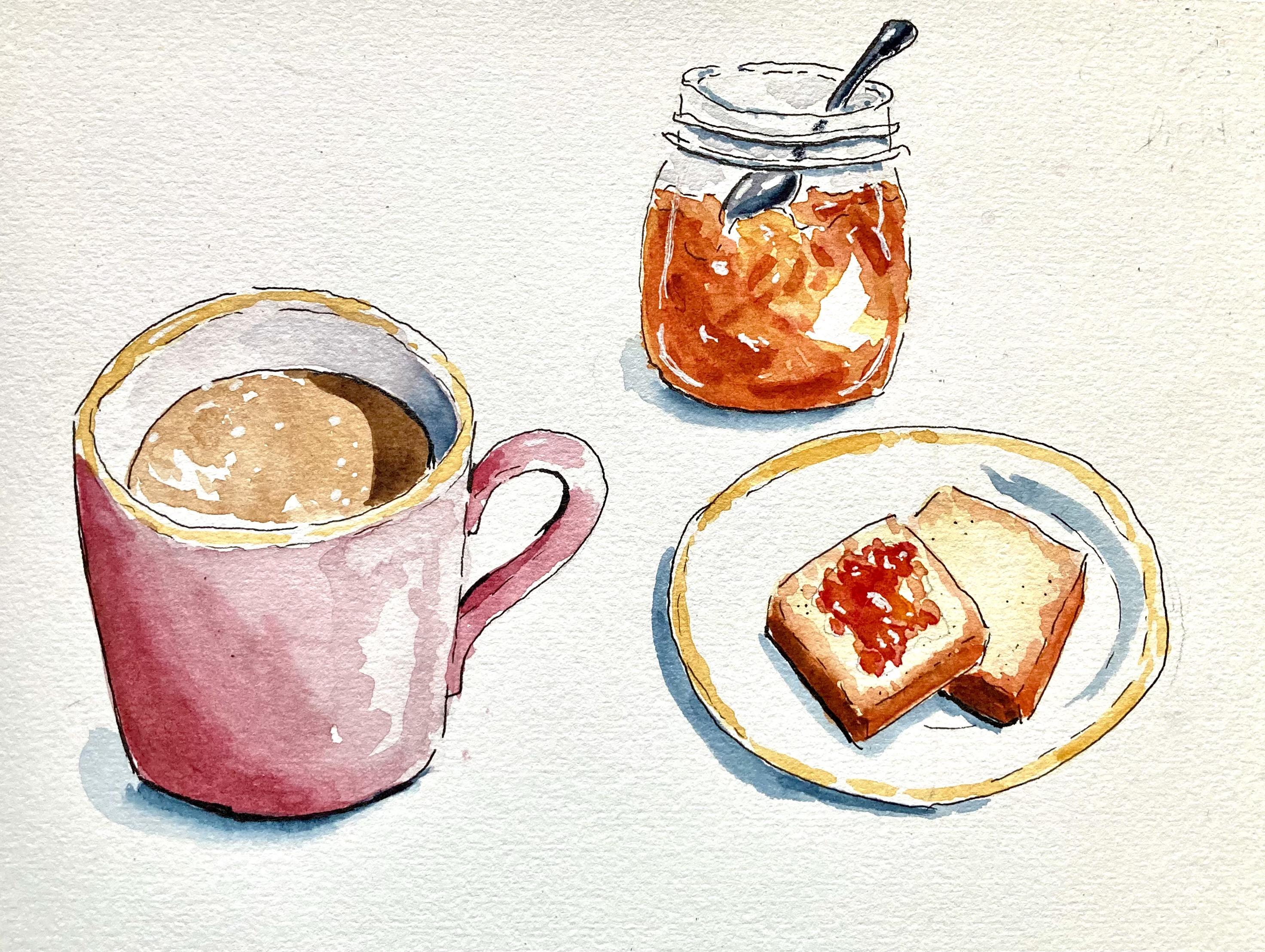
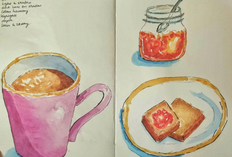
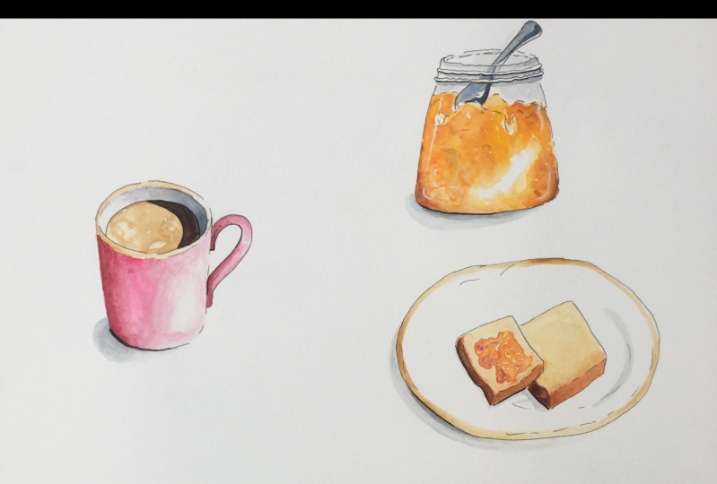
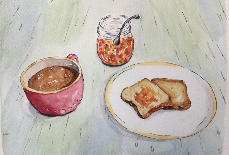
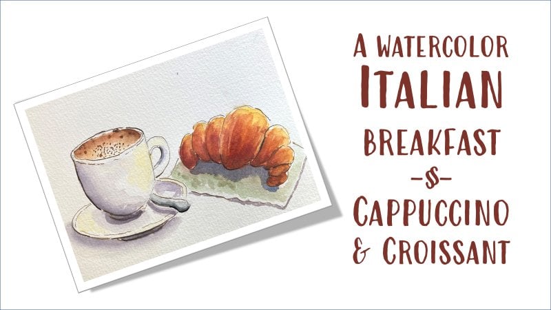
2. Project: Hello, welcome back. Here is the project that we will paint together today. As I told you, it's my breakfast, and it consists of three elements. Cafe latte, which is what I think you call latte in English, a big bowl of milk with some coffee in it, then homemade orange marmalade but you can make any taste that you prefer, strawberry or raspberries, whatever you like, and then rusks. Rusks are typical Italian, everyone eats rusks for breakfast. They are not just for children here but also for adults. I use the reference image, you see I have it on my iPad and I will provide it to you. But I am not copying from this image. It is just an inspiration of my own breakfast. Of course, I use it for lightened shadow to see colors, but it's more than inspiration because in watercolor and in sketches, I like to simplify and also draw from my imagination and adjust what I see according to what I like better. We will be doing this in five easy steps. We will draw with a pencil, then we will add an ink outline with a pen, then we add the first layer of watercolor here. We add the first layer, we let it dry. We add a second layer of watercolor to give a three-dimensional look and to add more depth. Then we just add some final touches with a white gel pen or maybe with some more watercolor if we need or some extra ink. It is very important that I can give you my feedback on your works, so do not forget to upload your projects on the gallery. I will be very happy to share my feedback with you, and I'm excited to see your work in the project gallery. Do not hesitate to get in touch with me and ask me any help or advice you might need, can't wait to see your projects in the galley.
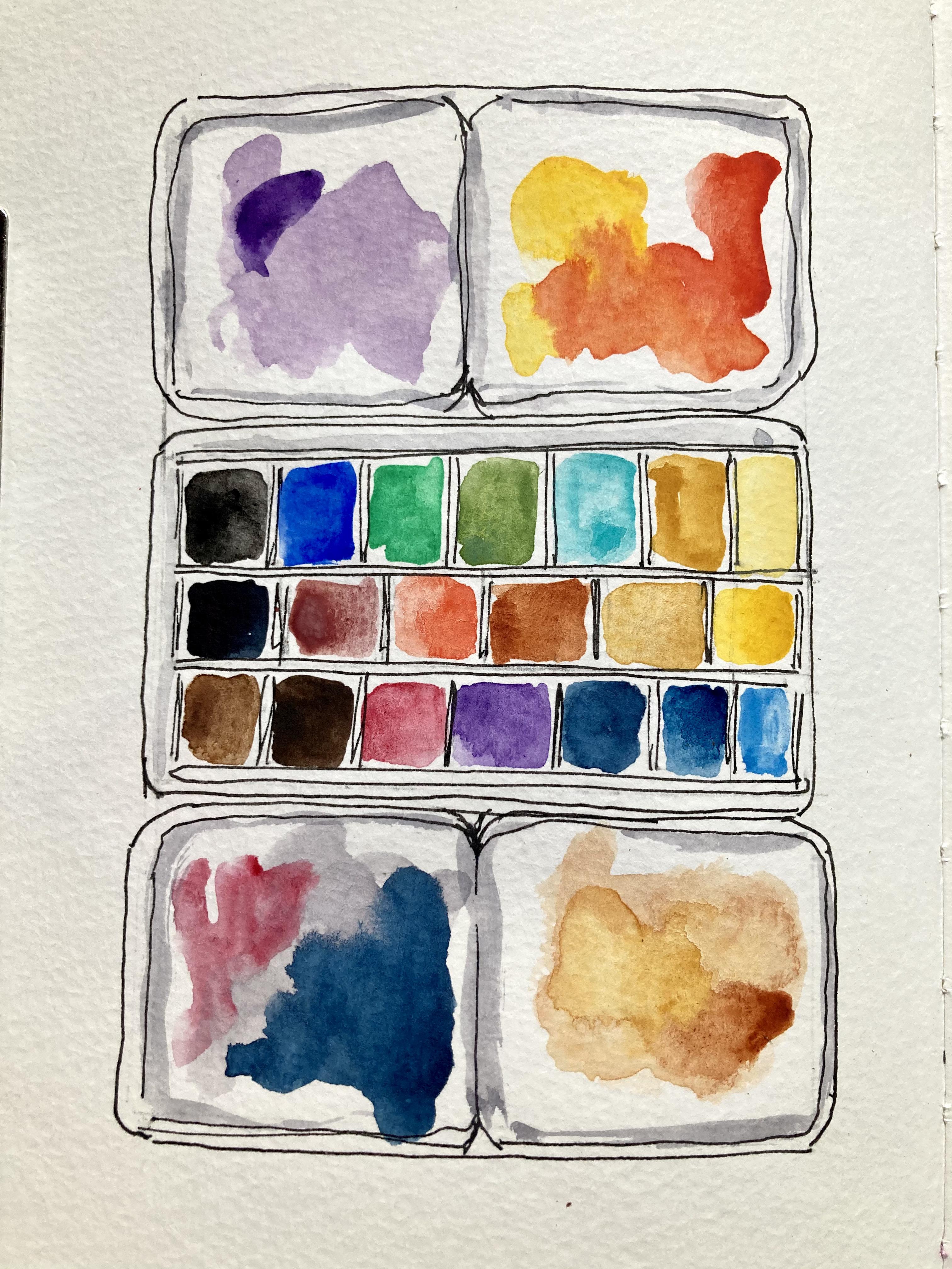
3. Materials: Let's talk supplies. The first most important supply is good watercolor paper. I use this Clairefontaine paper, but there are other very good brands like Fabriano or Arches. I like Clairefontaine which is a very good quality for the price. This a hundred percent cotton, but you don't have to use a hundred percent cotton. You can also use cellulose paper like, for instance, Canson XL, which is also very good paper. But cotton paper makes your task much, much easier. You would not believe the difference once you try cotton paper. This is the first thing. I use this format which is 18 by 24 centimeters or 7 by 9.5 inches, which is a convenient size, not too small, not too big. You see, I have already painted here our sketch. Then I will talk about paint itself. For this sketch, I'm using a palette that I have built through times. I have selected the colors that I use. But if you are a beginner, this is not easy. So I suggest that maybe you start with Winsor and Newton Cotman set which is a very good quality student-grade. If you have to sell, maybe student-grade is a bit fugitive, but for a sketch on your sketchbook or for yourself, this is perfect. Brushes. I use two brushes; one bigger, one smaller. This one, it is important that they have a good point. I use synthetic brushes. I don't use natural brushes. For this sketch, a medium-size brush would be more than enough. You can paint everything with one brush. This is, for instance, is da Vinci or Tintoretto. This is Tintoretto number 5, or you can have a da Vinci number 5. But you can buy a good-quality synthetic brush, and with number 5 or 6, it will be perfect. Then you need some paper towel to dab your brushes to absorb the excess water, or a rag. I like to use a small cloth like this. I throw it in the washing machine once in a while. For the sketch itself, you need a pencil, an eraser, and a kneaded eraser. Once you have done your pencil sketch, you can erase with a kneaded eraser because it's somehow gentler with your paper. But I use a regular, normal eraser. You will be needing a pencil. It is very important that it is a waterproof pencil. There are many types. I like to use this one, the Uni-ball Eye Micro. It's very soft. It gives a very sketchy, easy line. I also use a fountain pen, but you need to make sure that the ink is waterproof, so this is a bit more advanced way to sketch. You can just use Uni-ball Eye Micro or you can use also this type, which is also very good. I like it very much which is Micron PN Sakura. This is 05, so a good size. You can use 08 for a thicker sign in the end of the sketch as we will see. Then, we need some water. I use two jugs for water. One for clean water, and the bigger one, this is an old yogurt pot for dirty water. It is important that you have two different pots; one for clean water and one for dirty water, so you never pollute your paints, and for supplies. That's all.
4. Sketching and Composition: Ciao. Welcome back. We start sketching our rusks. To do so, we take a pencil, HB pencil or a mechanical pencil, whichever you prefer. Just I suggest that to use an HB or a mechanical pencil because it's very easy to erase, and once we add ink and we erase with an eraser, we won't see the lines anymore. So you can sketch without fear because, in any case, the pencil lines will be erased. Let's get started sketching. Let's start sketching. Let's say that we want to indicate roughly where we put the three elements, I think we will put the cup here, the jam here, and the little plate with the rusks here. This is ideal because we don't have a completely symmetrical composition. Symmetrical is not natural. We want to have an organic, natural sketch, and to do so, we have to introduce some lack of symmetry exactly as in real life. Let's start with the cup. The cup we said we will put it here. We start by drawing an ellipses, and then the body of the mug. For the ellipses, we don't want to make a perfect sketch, but we want to make a sketch that is pleasant to see. For an ellipses, we will make a cross and then we will unify and touch, you see all the four points, the four arms of this cross. You can find the perfect ellipses drawing more circles here. Then we go down. Of course, we have a cup that we see from top. This is the view that we have when you go down a little, and then you have the bottom of the mug, which is following, more or less, the same shape of our rim here, so like this. Then we need to put a handle. For the handle, you can choose the shape, but typical, it's like an ear or half. Think about a heart that is half. So half a heart would be exactly the handle of your mug. Remember, you can be sketching in this phase because after this we will outline everything with a fine liner. Here we have our mug, the handle, and inside we need to put some coffee like this. Here is our milk with coffee. Then we will think about fine liner later. The other thing that we see is that we have a rim here and then here, here. Same here. Remember that here you will have some dotted line. Now we go to the small jar of homemade marmalade. Here also, we will have a rounded jar with a rounded bottom and a little bit of symmetry on the left-hand side. Then we don't need to be perfect. Remember, we need to sketch exactly what we see. There is no need to trace. We're going to sketch everything freehand because we just sketch what we see. This is the secret. Now we put some lines here and then the rim. If you want to put the cross, it's going to be okay. Use the same method. We're going to erase all these unnecessary lines after we have outlined everything with our fine liners. Then we have an irregular for the jam, and we will be brave and put a spoon in it. Let's put a spoon. The spoon is going to be here. I just catch what I see. This is our jam. We come to the small plate with the rusks on here. Again, our system of the four arms. Then we just draw it. We draw it like this. It's not important if it is not perfect, it's a sketch, it's not a picture. If you want a perfect image, you take a picture with your iPhone. Imperfection is the beauty of sketching freehand. Here we will put more or less a rusk here. The shape is that of a toast. Then one overlapping here. Let's take out some unnecessary lines. The pencil sketch is here. You see, it's not perfect, but we don't need these to be perfect. We can also put a sign here for shadow because the important thing now is to understand where light is coming from. We can decide, for instance, that light is coming from here, and we put an arrow. Remember, this arrow for light is very important. We will erase it afterwards. But now you know that for all your objects, light is from here, and you have a cast shadow here. Here you will have darks. Here you will have darks. You will have some darks here, cast a shadow here. This is good. We remember to be consistent with our lights. So we're finished. It was not difficult. You can make all the mistakes that you want in this phase because you will be erasing all the pencil. We will see you in the next class where we will put some ink over these lines and erase to make it definitive. But I think it's already very pretty like this. What do you think? We have put our three elements, we have paid attention to be not exactly symmetrical. Never put an object exactly in the middle. That's not pleasant to see. Try and be somewhat asymmetrical. This brings an organic feeling to your sketch. I'll see you in the next lesson. Bye.
5. Inking and Definition: Ciao, welcome back. Now that we have drawn with our pencil, we can outline with our ink pen. I like to use this uni-ball pen, but you can use whatever you like, just make sure that it's waterproof because otherwise it will smudge once we add watercolor. You can also use a fountain pen. I have many fountain pens like this one for instance, but it's not necessary. This is maybe a bit more advanced, so just use a waterproof ordinary pen. It will be perfect. Why do we outline with the pen? Because outlining with the pen makes it much easier to add color. It's like, do you remember when you were a child and you were coloring in borders? It's exactly the same feeling. It's fun, so once you add ink, you can just color inside the border as you did when you were little. Let's start inking. Let's start as usual from the top left to the right bottom. I do so because I'm right-handed. If you're left-handed, you should do the other way round so you will not touch what you have just drawn. You won't smudge it. Let's start with the mug. For the mug it's important to remember that we have light coming from here, so these lines will be more dark, and these line will be lighter. You can leave some angles that are not finished. It makes it more interesting, and also you can make some dotted lines here where you have your light because this is what you see in reality. It's called the lost and found lines. Your eye will fill that gap here, but it's very nice to see. It's very artistic to see some lines that are not continuous but dotted. Here you have the back rim, and here you have the internal rim. You see? Here you have the second rim towards you that will be just very light and dotted. Same here, the continuation would be very dotted. You have these outer edges that are stronger, and the inner edges that are lighter. Then you have your coffee, a nice round line. If you make a mistake like here, no problem. You will just leave it like this. Mistakes make sketches more interesting. Now your rim. I can just change something while I put some ink. You see? I make it just more interesting. Here, now we go to our jam. The spoon, remember that you don't see the rim behind the spoon, so here and here we have some lines for the screw cap here. You see? It's not perfect. That's the interesting thing. Also it's a bit thick the rim, that's why we put something here. Here also we have some lost and found lines. Then we have here really with the marmalade you just scribble something like this. Now we come to the crusts. This is the crusts on top, the side, the side here also it's lost and found because it's not a real edge, it's a curve. You see I'm changing something. You see? Now our plate. You just follow the outer edge. Here also we have an inner. I can put something like this to indicate that there is a rim. See? Here because the light from here, we will have some shadow also so we can do so. Also here we can do so. Now we must make sure that our ink is dry. We must let it dry for some time. I can start from the cup that I have inked as a first element. I think it has dried in the meantime, but make sure it is. Start erasing all the unnecessary pencil line. Erase everything with a light hand so you don't damage the paper. Be careful not to smudge the think. You can just be very careful when you touch it with your hand. Maybe you can just wait some minutes, you go and have a cup of coffee. Then we go to the marmalade. We could do the marmalade, the spoon. Let me see. You can also use a brush if you prefer to take away all the eraser, but I use my hand. You see I'm a bit messy, but it's okay. When you sketch you're allowed to be a bit messy. Now we have, you see? It's much nicer now, and it will be even more nicer with the marmalade on. We can still use some pencil to indicate maybe we have some marmalade on one of the crusts, the top crust. I use the pencil for these very light. We have inked with our fine liner. We have made sure it's waterproof. We have used these lost and found lines method to make our sketch breath, and we have also used the method of putting things in an asymmetrical way to make it more organic. Now, in the next class we will add some color. I hope you had fun in this class. I'll see you in my next lesson.
6. Mixing Organic Colors: Let's start painting. Now, the fun part. Here, I have two palettes of watercolor: a student grade Winsor & Newton Cotman, which is very good student grade, you can paint really lovely sketches with it, and then a palette that I have made myself in time. I have paints, professional-grade from different brands. I have White Nights, Sennelier. I have Winsor & Newton Professional. I have Daniel Smith. I have Shmincke. I buy it in tubes and I pour it in my half pans so that I have a palette that is tailor-made to many then test this. We can go through that in another class. I can clean up my palette. We will clean up and we start painting. Done cleaning. I usually leave my mixing space dirty because that helps me to reach more color variation and more natural colors. I don't like my mixing space all clean, but for you, I will clean it today. I'm starting with my brushes. I have my go-to brushes. I have a number 8 from da Vinci. Then I have for the moment being a smaller one, pointy like this. Then I might use later even a smaller one for details. Let's start with the cup. My cup will be pink. For pink, I mix some Alizarin crimson. I will start spraying my palette to reactivate. I will try not to use colors straight from the pan because that brings natural colors. But I will desaturate them, tone them down with a touch of black or with a touch of complimentary color. I will show it to you right now. Let's start painting. I take some Alizarin crimson. I really water it down. Remember that in watercolor you always start light and you build values layer over layer. It's better to start light because you cannot go lighter, but you can always go darker. You see, I use some of the dirt that I have in the corners to desaturate it. If you don't have it from previous sketching, you can always add a touch of black. I really water it down. I have a very natural color this way. You can always test it on a corner or on a piece of scrap of paper, or you can do like me, you just start sketching and you can adjust it once on the paper. Remember that we have our light source here. There is the arrow. I start from the left-hand corner, which is darker, and the I dilute the color towards the right-hand side, which will be lighter. Maybe you can hear my cat in the background.
7. First Layer: The Mug: Welcome back. Now that we have sketched and inked our breakfast, we can add the first layer of watercolor. This is the most exciting moment for me. We are going to add a very light layer. We can always increase darkness with extra layers. But in watercolor, you can only go from light to dark, you can never go from dark to light. It's better safe than sorry. We start with a very light wash and then we add intensity with extra layers. This is the very most important moment in this class. Let's start using our watercolor. Let's start painting the mug with my bigger brush. I have this muted pink, which I like very much. You see the color is muted pink. I can add some more pink if I want it brighter. This is 100 percent cotton paper, so it reacts very well to the paint and holds moisture for a long time. We go towards the right-hand side adding just water. Remember to always add some white space, because in watercolor you don't use white paint, you use the white of the paper to indicate the highlights. This is it. We will let it dry and then we use some second layer to add shadows. As long as it is wet, we can add some depth here. We can have some color, especially here to give some roundness, but only when it is wet. When it starts drying, just don't touch it anymore. You see that we leave some white here and there. I've done a mistake here, I'm out of the border. But it's easy with watercolor. If the color is still fresh, you just deep your brush in clean water and then you take the mistake, you dry it with some paper towel, and you fix your mistake. You see. Clean water and your mistake is gone. Clean water, and you just dry it with some paper towel and your mistake is gone. This is our mug's first layer, easy, right? Now to the handle. Here, see, I make mistakes and fix them all the time. Now, for the handle, I would put somber. Remember always that the light is from here, so we will leave some white space here. We start from where we think is dark. Here, we will have some dark, here we will have some dark, and here we will have some dark. I will then dilute it and leave some white here. You'll see that. Now, let's go to the inside of the cup. Because the light is from here, we will have some dark here. We imagine that it is white, the inside of the cup, right? But we will have some shadow here. Let's put some shadow. To make it gray, you can either take some Payne's gray or you can mix with some gray. You have your Alizarin crimson or any red that you like, and you just add some blue to it, such as marine blue I have some purple. Then I can add some brown, and you will have a gray. Now, this looks gray with a little warm. Add again some blue, or you can take some burnt umber mix some blue, and you have your gray. You can add more blue if you wanted a colder gray. I will put it here in this angle, and then with clean water, I will dilute it towards the other corner. Clean the brush, you just wipe the brush on your paper towel. You have it. Now, there is too much paint here, so we'll use what I call a thirsty brush. I clean the brush, dry it, and then pick up some paint here. You don't have to be perfect. Just a quick sketch to give you an idea. You see how round it is. We'll wait to put coffee until the other paint is dry. The other thing that you can do, you have hard edges here, you can soften these hard edges. You take some clear water and you soften the edges, so you don't have these hard lines called hard edges. Here you are.
8. First Layer: Marmalade & Rusks: Now, let's go to the jam. For the jam, you can start with a deep yellow. I don't have a deep yellow in my palette, I don't have an orange, so we'll make some. I take some cadmium yellow and I add some of my alizarin crimson. It is always better to mix your own colors if you can and you can use what I call a limited palette. Don't use too many colors. Just try to mix the different colors using maybe five or six colors at maximum. There would be a connection between all the different colors that you have on your sketch and it will be much more pleasant to see. There would be a unique sense of color. You see here, I have mixed some cadmium yellow with a touch of alizarin crimson. I water it down. I put plenty of water because marmalade, it is transparent. Leave some white for highlights. Remember, leave some white space because this is the way jam is. What you do then, you have this wet dark cadmium yellow and you put some alizarin crimson. You darken your orange. You see, I put more alizarin crimson in my dark yellow so I have a more intense orange. I darken it, just touches here and there and even some pure alizarin crimson. As long as it is wet, it will disperse in a very natural way. You can help it with some more water. You see, that just touch it. You see, it's very natural. Remember to leave some whites. Now, we can have some burnt umber. You see my burnt umber is here. I take some burnt umber and I have an even more intense orange here in the corners, on the bottom, even some pure burnt umber in the corners. Now, this is all very natural. It is your orange marmalade. Here. Let's go now to the rusks. Rusks needs several layers. I make plenty of mistakes. Let's see if this is dry. To check if it is dry, touch it with the back of your fingers. Now, first layer of the rusks. For the first layer over the rusks, I'll take some yellow ocher. Yellow ocher, if I have here. Yellow ocher and I dilute it. The yellow ocher is a very opaque color usually, so to have it transparent, just water it down a lot. You see how I water it down? Now, I put it on my rusks all over. All over the rusks. I just add water and put it all over. Leave some white space if you remember, it will help you. I have taken a smaller brush. I do it very, very quickly. This first layer is done. Enter where it's supposed to be jam. Leave some white towards the corner, makes it more interesting. Now, while it is wet, the same moment, take some burnt umber. Sorry, take some burnt sienna here and just touch the crust, small touches of the crust here and there. Then, with some clean water, you wipe your brush and you just put some nice warm color on the crust like this. You can slightly blend it here towards the center. It's more natural, you see. You just blend it towards the center with your brush and then we will have some darks in the second layer when it is dry. What can we do now? It's time to add the milk with coffee. In Italy, we have a large bowl of milk and we put an espresso. The color is a warm toffee. To do so, I will take some of my yellow ocher that I have used for rusks and I mix it with some burnt sienna and a touch of burnt umber. I have another brown, I have Van Dyke brown. Any brown will do. I take it and I put it all over, leaving some white space. You see that I leave some white space here and there for highlights. On this corner, towards the light, there will be a cast shadow from the cup. So here, it will be darker. Don't leave any dark space here. Don't leave any white. But here, we can leave some white, see? Also, we can soften the edges with a clean brush, wipe it, and touch the edges. This is coffee for the moment being. Now, we will add a first layer of the spoon. For the spoon, we will take our gray. You remember, you take some blue. We can take same ultramarine blue. Any blue will do. I will take some ultramarine and mix it with some brown, so I have this dark gray. I will add more blue. Here, also, leave some white space for where you think you will have highlights. Leave it. It's done. I'll see you in the next class where we put the dark shadows and the highlights. Thank you very much. This is the first layer. We need to let it dry. I'll see you in my next class.
9. Second Layer: Marmalade & Rusks: We are adding the second layer now. We start from the rusks, the joint here because we will add some more white once it's dry. We start from the orange color of the orange marmalade. We must go back and mix some more of this color. We start with the yellow. Oops, look, paper towel. We start with some yellow and we just put some yellow here and there and then we add some Alizarin crimson to this yellow. Remember to leave some white space, but we can add later with the white gel pen. The first layer is done. We can just drop some pure Alizarin crimson here and there to add some color variation and interest. Shadow is on the left-hand side, so we add more red on the left-hand side, and we leave lighter colors on the right-hand side. Now, we let this dry. We add more depth to the mark. To add depth to the mark, we need to add shadow here, cast a shadow here, cast a shadow here, and on coffee as well. We start from coffee and then we'll let it dry. We need to mix some burnt umber, some brown that you have. Actually, this is not burnt amber. I mix it here. This is Vandyke brown and I can add some blue to make it even darker. We make a round shape like this, a half-moon. This would be the shadow coming from light from here, so it's going to bounce here and there is a cast shadow from the ring here. That's it and we let this dry. You see? It's immediately nicer. Then we add some darker values on the handle and on this side of the mug. We rinse our brush and we take some Alizarin crimson. It's enough just to add another layer of Alizarin crimson, this is just enough. If you want to add even more depth, you can add a complementary color like a touch of green, and it will give a darker shade and a more organic feel. Where do I see shadow? Light is from here, so here we are going to have some shadow, some darks here. This is very intense, not diluted at all. Here is going to be very dark, here we are going to have some dark, this is enough. Here we can reinforce, especially to give some roundness here just a bit like this. You see immediately, it's more realistic in three-dimensional. Let's add some more because always remember that dries lighter watercolor. I take some pure Alizarin crimson and then I add a touch of green. I will give some color variation interest and the roundness. We can blend a little. We could also leave like this because shadows are not always blended. They can have rough edges, but we are going to give a soft edge like this. That's enough. Once the coffee is dry, we can add some shade here. Let's go to the jar. We need to add some highlights of glass. For this, we take some Payne's gray that I have here. Remember that you can always mix your gray with blue and burnt amber. Blue and brown always give gray if you want a cooler gray, just add more blue. But I have Payne gray and will use that one and I will add just touches like this here and there and that's it. Just a hint of glass. You know, there is glass here, so just some gray, very, very light. Then we have to add a cast shadow here, but also we could add some orange zest. How do we do so? We take some red like this, and we add some burnt sienna, so it's dark, not too diluted. Maybe I take a smaller brush for this, so maybe I can take this brush which is smaller, you see? I take the smaller brush, not too wet and I can just like this. More color, more burnt sienna, color variation is key. Just some zest, you know that zests are so good in all directions. Let's not overdo it but the temptation is very strong to overdo it. Now we have our zest. You can even add some burnt sienna directly in some corners. Remember, towards our shadow, we can add some pure burnt sienna just to give some depths here. Now we let it dry, it's done. Same here, maybe? No, it's still wet, let's leave it like this. Now, we need to give some more depth to the crust. You see the crust of the rusk is dark and so we take some of the brown that we have used for coffee, we mix some burnt sienna. The more you mix, the more natural it be be. You just touch it with a very intense color, don't put much water in it. We need to add some red. We can mix it directly on the palette you see on the paper. You don't need to mix it. We need to put some red. I can mix it directly on paper. Same here. Maybe it's darker here, a little precision. Now take some diluted of this color and just blend some clear water. Here you have some lovely crust, all around the rusks, you have it baked to look like this. Now, we let this dry.
10. Second Layer: Mug & Coffee: To verify if our coffee is dry or wet, we can tilt the paper and see if it shines. If it shines, it's still wet, it doesn't shine, so it should be dry. What I can do, I can touch it with the back of my finger. If it feels cold, it's still wet, no it doesn't feel cold, it's perfect. We can add some dark here. Let's go. We take our green, we make it a bit darker. I mix some blue, some Payne's gray. I dab my, I take some and start it. Now, the beauty of working with a sketch book is that you can turn it. I suggest you to turn it. I do it all the time. It's like cheating. The way it's more comfortable for you, I tilt it. I put some here, then I rinse my brush, dab it and then just with clear water, I blend it and I soften this edge. Now, I put it back in its position, you see? It's very nice like this. It's very realistic. Here we are. Same with the glass here, we can add some darks in the spoon, here, it's too wet, let me dry this. If you put too much water on your paper, you pat your brush dry and you just absorb the excess of water with your brush. It's called a Thirsty Brush. You take some pure Payne gray basically and you add some darks here, some contrast here. You see? Along this side. It's a see through glass so we see through the little spoon. Now I can blend this. Not too much. Dark edges are also correct with when you have a shadow. Now, you take a slightly more diluted Payne's gray and you add here, under these lines, you add some gray like this. Now it's even more three-dimensional. Now we can add some cast shadow. For cast shadow, which I find always very difficult, I start light and then I will add, so if I do something that I don't like, I can correct it. Let's forget one moment about the rusks that are still drying. I can put some cast shadow here, very small, you see? Just to indicate that it's not flying, like this, then we can add something darker with our ink. Same with the mug. Here we are. We can add it also under the dish, like this. Also, because light is coming from here, we will have some cast shadow on this side as well. Also the rusks will have some cast shadow. Let's try to put it, I hope it's not. Let's verify if it is dry, I tilt it. Oh, yes, looks like it's dry. It's a warm day today. I put some little line here and here and also on this side. This is so realistic, don't you find? What we can do now is, add some brown on the side of the rusk because it will be in shadow. Same here for the jam. We look at our reference photo. We also use our own imagination and we'll see what it's like when we add final touches and we correct to give an even more roundness. We will put some more orange here, darker orange. To make it darker orange, I take some red, some touch of a little crimson to make it even darker and a dab of yellow here. It's partially covering our zests but it's okay. We will add some more later. I can take some straight burnt sienna and put a zest here back. I restate my zest, you see? It's important to give some color variation. Now, this is going to be in shade also the bottom. This is so nice. Now, we said that we want to add some dark brown, some pure brown here. Because this is a shape, it's going to be darker compared to the other side. Here we are. Now, it's always more realistic. Here we are. Now we let to dry this then we come back, no, maybe I'd like to add more color to the jam on my rusk. What can I do? I can add more of this dark orange like this, pure Alizarin crimson and some pure yellow for color variation. Let them mix on the paper, you see? It's a good idea. Don't be too precise, don't be afraid to make mistakes. This is the beauty of sketching. What I can do now, now that I see, I can put an even darker line around the objects where you see shade. Let me see. What can we do? We take our pointy brush, we dip it in Payne's gray, I tilt my paper and I just go very near to the border here and I have the darker shade here. Here, you don't have it because you don't see it, but here you see it, like this. Dab your brush and just like this, you soften the edge, you pull it down. Now, more contrast is always nice. Some dark here, that's perfect. I like it. If you want to do something really nice, you can also add a golden ring to this cup, you want to do it? Let's do it. You take some yellow ocher, you reactivate it with a drop of water, you put it here where you find space. I hope but not to ruin this. Now, here is wet, so I will dry it with a paper towel and I will put, not everywhere, because remember that you have highlights. This adds a lot of life, don't you find? Leave some white space for highlights. Here you are. What do you think of adding the same gold around your dish? I think it's a good idea on its body. Don't be afraid to sketch it. Not everywhere. This is not from a reference photo, something that I'm adding from imagination. But it's really nice. It adds interest and color. Just some yellow ocher, like this. I love it. Now, when you use a color, you should try to have it in other mixes as well. I'll take a dab of this yellow ocher and add it in my marmalade, like this. You will have some more color and harmony. Restate your zest here. It's gone. I would restate it once again. Now, I know that if I keep on, I'm going to overdo this, so I leave it like this. I will see you in the next lesson for our final touches. It's been easy so far. Bye, I'll see you in the next lesson.
11. Final Touches: Welcome back. We are almost finished. It seems that we're almost there, but we can still add some final touches, very important. We must check if we need some extra shade, and we can use some more paint, or we can use our pen, or even take a thicker pen if you have it, or some white gel pen. In any case, also use your fantasy. You can also add colored pencil if you prefer. Just use your fantasy and add those little details that make the difference. Let's start adding the final touches. Now that everything is dry, I see that here, I would like to soften these edges, so I just take some clean water and try to soften this edge. I just add some very diluted color, like this. I don't like this. I will add some more yellow ocher to accentuate the gold around the plate. It's never finished, this process. Like this, like this. Just in some spots. Now, we take one of our pens. We can take the pen that we have used for sketches, or if you have a thicker pen, you can use a thicker pen. These are all my pens. I have a thicker fountain pens, or you can have Sakura number 8. I will use this fountain pen with a large nipple. I think it is ideal to do so. With this pen, I will make thicker lines where I see darks, like here, and on this side maybe here, here where we have some shadow. I will add also on this side of the spoon. Here we have the darks, so I will add it. Under the mug. You see, I'm not very good at drawing straight lines. But as it is a sketch, it is not important. Just do your best. Also here, and here. We will have some here, some shadow and also on this point just below here. I think it is enough. Then we can take a white gel pen. I have a number 8 Gelly Roll or number 5, but I will use the number 10 today. You see, this is the number 10 of this Gelly Roll Sakura. Uni-ball also makes a very nice white gel pen. We will use it just to add some highlights on our spoon or on jam here and there, just touch it. It would be very nice to see this highlight. I think a highlight could be added here and there. Also, a thicker line that will cross the corners of our jar, like this. It's not very visible. You maybe should do it twice. Second layer. You can put some rounds on your coffee, around the edges. Some little rounds like this and some dots here and there. Second layer. Now, the last thing to do, you take your black ink pen, and you put some dots here and there on the rest because it gives some nice texture to it, just not all of them, just the idea. Just give the idea, and your brain will fill the gaps. Some curvy highlights. Now it's finished. What do you think? You like it? It's never finished actually. You can always find some interesting place for a highlight, but I think it's finished. Thank you very much for having painted along with me. I can't wait to see your project. See you in my next.
12. Congratulations & Conclusion: Ciao. You have painted along with me, congratulations. I think that painting together is a very exciting journey. It is for me at least. I hope that you can grow your passion for sketching as I did. You have learned how to sketch with a pencil, to outline with ink, to add color, different layers, and then to add the final touches. Now, it's your turn to sketch. Please upload your project on your gallery so that I can see them and give you feedback. Also, I would be very happy if you could upload your own breakfast that you have at home. It would be very exciting to see breakfast from all over the world. Follow me. You can also follow me on social media. If you post your projects on social media, please do tag me. I can't wait to see your project. I'm really happy to share this with you. I'll see you soon. A big Ciao from Italy.
 Elisabetta Furcht, Anyone can paint!