Transcripts
1. Intro: Hello, I'm Elizabetha
Italian watercolor artist. I'm a self taught artist, and I believe very
much that art is for anyone that
anyone can paint. Watercolor this style that I teach with ink and watercolor is an easy way to
approach art and it gives immediate
very quick results. In today's class,
we will be painting a very suitable project
for the season. We will be painting
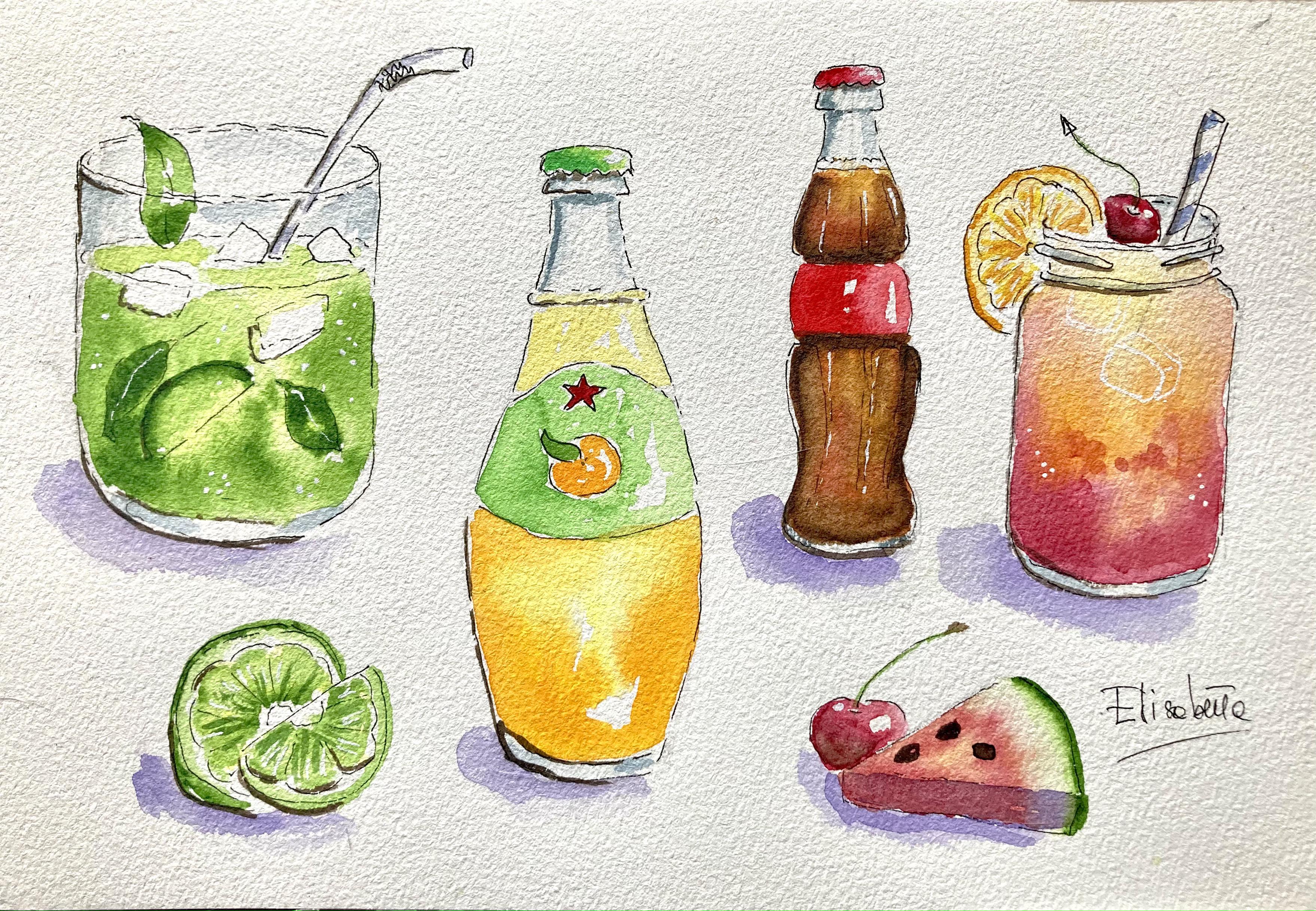
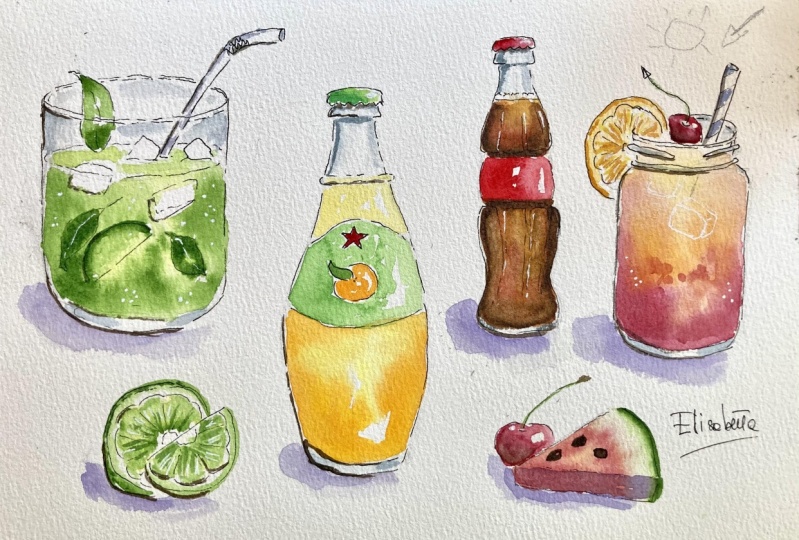
these watercolor drinks. We will have Moo, we will have an orange juice. We will have a coca cola bottle. We will have a fruit cocktail with some fillers fruit leaves. Why have I chosen to paint
watercolor drinks with you? Be they are beautiful to see. They are suitable
for the season, and they have incredibly
beautiful colors. In this class, you
will learn plenty of wet and color tricks and tips because we will be
learning to paint glass. We will be learning
to paint both wet and wet and wet and dry. We will be learning how to outline in with
the broken lines. This is what I call
lost and found edges. We will be learning how
to paint a drink liquid. We will be learning how to simplify objects that
you want to sketch. We will be learning how to paint light and shadow in
a consistent way. We will learn how to mix organic colors either on our palette or
directly on paper. It's not only very educational because you
learn plenty of tricks, but it's also going to
be a very fun class. The project is very easy and it is suitable
for beginners, but I think it's a
nice project for intimidate artists as well because it's a beautiful project to see and to paint
without further ado, let's start sketching. Okay.
2. Supplies: Let's talk about our
supplies Bega supplies, the most important supply is not water color but is paper. Paper needs to hold a
lot of water and must be absolutely specific
for water color. We using paper that has a larger format
because we will be painting a composition that
requires a lot of space, and that is very thick at
least 300 GSM or 140 pounds. I must say for watercolor, if it has a cotton content, 100% of 50% is even better
or you can use a sketchbook. Moleskin sketchbook,
for instance, have 25% cotton
and they are very good We need some
watercolor paint. For this project, I'm using my white knights palette that I like very much because
it's very pigmented. We're using different colors. But you can use
whatever you have at home and have similar colors. We're going to need some greens. I'm using green but You can
use the green that you have. Then we will use some yellows. We will be using some reds, some blues and paints
gray for the glass. But if you don't
have paints gray, you can just mix brown and blue and you will have a
beautiful gray. Don't worry. Take whatever water
color you have at home and you will have
a very nice result. Then the third piece very important is
watercolor brushes. As you see, I have a whole collection of
watercolor brushes, but you really need just three watercolor
brushes for this project. I use bigger one, even bigger. Like this to add water because we are going to do a lot of wetting
wet techniques. We have a larger
brush to add water. Then we need a medium
brush to add paint, and then we need a smaller
detail brush like this. Then we're going to
need something to draw. For drawing, we will be needing
first of all, a pencil, suggest HP pencil
because lines must be very light and you can
erase them very easily. You can also use, of course,
a mechanical pencil. Mechanical pencils are also very easy and practical,
convenient to use. An eraser soft eraser. I use a regular eraser. You can use a needed
eraser if you prefer, but a regular eraser
erases the lines. I also use a small eraser
to erase the details. You can use this one or
there is another very good from Tombo
which is this one, and you can erase
the little details in pencil with this eraser. Then we will be needing a pen. I also have a collection of pen. You can use a fountain
pen if you like, but be very careful, it's tricky because you
need to use waterproof ink. I suggest that you
use a regular pen, but it must be
absolutely waterproof. I use this fantastic for a
sketching for urban sketching, this Nibal micron and I like it very much because
it dries very fast. It's very smooth and your paper once you
apply water color. This is a very good choice. Or you can also use this
fantastic micron Sakura micron, which is very popular
among urban sketches, which I also like very much. And last but not least, we need a white gel pen. White gel pens like this
one from Sakura is called jelly roll are necessary to add the final touches
and final highlights. This is a very nice
convenient pen to have. If you don't have
a white gel pen, maybe you can
consider buying it, or you can use the white quash with a very fine detail brush. It's good alternative. But I like to use gel pens. A quant this is P number ten because it gives very nice
results on water color. Just wait for the paint
to be completely dry. That's important. Then we
would need some water. I always use two jags, one for clean water and
one for dirty water. Rinse your dirty brushes here and you pick some
clean water here, so you do not
pollute your paint. Then you need some kitchen
paper or piece of cloth, which is more sustainable to dry your brushes and
absorb excess water. Of course, you need a
pallette like this. These plastic pallette If
you don't have a palette, you can use maybe the one
that comes with your a set. Or you can use just a
regular white dish. The important thing is
that the background is white so that you can exactly see the
colors that you are mixing for supplies, that's all. I also strongly suggest
to get reflash drink with you so that you can
drink while you paint. It's always nice. To see you in the next left. Okay.
3. Pencil sketch: We start by sketching
our composition. I first do that with a pencil so I can make all
the mistakes that I want, and then I will outline
it with an ink pen. This allows us to make mistakes, raise and make mistakes again. But mistakes are not important
because sketching in this class is very spontaneous
and mistakes are allowed. I will use some reference
images that I found on the Internet that I keep
on an iPad next to me. So I will start with
I put the Mito here. Occupy the place. I will put an orange
juice bottle here, a small coca bottle here and another cocktail
here more or less, here and here, I will put some fillers like
fruit and so on. I will start with a
glass of moto here, not to make mistakes
in proportions and not to draw an image
that is too large. I will put a very light
square a free hand square, so that I exactly know how much space my class
of Mo will take up. I will put it here. I will start by
making a cross here. I make a v for the glass. Then we can make a
very easy glass. We can go straight down around
here around bottom here, and then some perspectives
around bottom rip. Then we put the moto here another oval that
emulate the upper one. Just a sketch, then
we can be more precise when we
outline with ink. Here, we have our second ova. Then we can put for instance, a straw here. A straw. We can put some yes like this slice of lime, some leaves and the
floating leaves like this. Another then more ice here maybe This is all for the Mo. Then here, we make a
bottle of orange juice. I will use an orange juice
that we drink in Italy. It's called the Spigro chatarra. I will put a line to
facilitate symmetry. I know that I want the bottle to start here and finish here. I take the image of the bottle. I have it in front of me
on the iPad, you see. And I start sketching the so we have the lead here to make sure that the
symmetry is expected, put two points at
the same distance. So here you have a
small shape like this. Then you go down, then you go down up to
here, same distance. You can eyeball it, and then you go s here. And then you go down. Then you have some maybe can
be a little larger here. So when I told you that using a pencil is
always a good idea. Here, the bottom must
be slightly rounder, like this. Then we have Label, the label will be here, an arch and another
larger arch here. Then we have a star here. We can do it very rough way and we will
refine it with our pen. Then we have an orange here. Of course, it will be simplified a leaf and an orange like this. This is that's all for take it, it's not very symmetrical. So I will I can correct it if I don't
find it very symmetrical. Okay. It doesn't matter if it is not too symmetrical because
that's really a sketch. You can do many light lines
with your pencil until you don't find the perfect shape. I think that you shouldn't just trace ready
made drawing because for the coordination
between on hand, free hand drawing
is very important. Then we can put a small
bottle of coca cola here. I take my reference picture, and I will upload it in the project section
so I have here. I will put a small
bottle of coke here. Here again, I can use a
little vertical line for symmetric Here we have a
cap Just occupy the space, then you can do all the
little dance with your pen. The classic shape
of this potter. Then you have four equal areas, so one, two, three, four. The first one, like here, then it goes in then you have two arches then it goes out, and then you have like this, the classical iconic shape
and the round bottom. Now, because it's
maybe too thin, I can enlarge it to to. Okay. My here a little shorter here. This is more tic. Just try until you find a
shape that satisfies you. It doesn't matter if it isn't identical to the real
pot, gives the idea. Once you put color, you will see it will be similar. Make a bigger Mason
jar, always our oval. If you're not sure
how to make an oval, you make a cross and then
you touch the four points. Don't put a sharp
corn angle here. Just go very round in
the corners you see. Then you go down. Here also to make sure
that you are symmetrical, can draw a box. And then you can use
the box as a guideline here rounded bottom
and then with the pen, we will add here the lines
that are typical Here, we will put some
water melon, maybe. And the cherry. We will also
put here a slice of lemon. Just occupy the space, a cherry here also. And a straw. This one. Put straight. Start inking.
4. Ink outline: We can refine our sketch, add something and we will
erase all the pencil lines. We start I always start from top left to bottom right
because I'm right handed, so I don't smudge my drawings. The same applies to water color. When I apply color,
I always start from top left and I go
down to bottom right. We start with the glass. Remember, when you add ink, don't make continuous lines. It's much nicer if
you use broken lines, especially If it is
glass because glass, we have a lot of highlights. Just do some broken lines. Here, be careful because here you have the leave behind
the glass and the straw. What you can do here, you can take a smaller eraser and erase the unnecessary
pencil lines, you will not make mistakes. Like this one, you
don't see you will see. We can start by drawing maybe
the leaf And the straw. Okay. Perfect. Here, same. Don't put
a continuous line, but use some broken
lines to indicate the glass so here you have a thickness
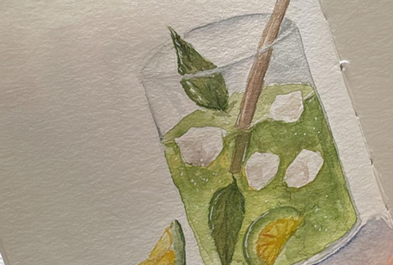
of the glass. You put light line here
and here, like this. Okay. Then you have. Here you have same broken lines, you have the drink itself. Here you have some ice. You can vary the shape of ice. You can see below.
Here you have slice. Here you have a floating
leave, summer ice. Okay. Suggestion of another
leaf, and that's it. Now, we let this try and
then we erase the pencil. Here we have the orange potter remember like this,
then goes outwards. Same thing here, don't think you have to do
a continuous line. Here you have a ring, which also marks the liquid. Now, I go very likely. But, and hear same. Break the line because
this is called lost edges and your brain will know exactly that
the line is continuous, and then you will help
it with your brain. But it's nicer to see and it's more inspiring a suggestion. For a sketch is
really nicer to see. Then we have to
outline the star just outside and we will erase
those ugly pencil marks. Here the orange Okay. Okay. Here is the
small bottle of coke. Don't break them in the same exactly in the same
point on both sides. Just chose different moment
to break the lines here. Here we have a label label we have some like this. Just a hint of what we see. And now we are at the Mason. So we start maybe
with the lemon. The outside. So here we have
the with its thickness. Here we have a straw straight. Here we have the typical pattern of a Mason jar here. Again. Okay. Here we have small round
corners and then it goes it goes down. Okay. And we have some
thickness here in the bottom. Then we can add maybe
our water melon. Here, just a suggestion
of the corner, a cherry. Here, I want it to
put a cherry as well. Must also make some arches, the center and a hint of the, this is the inside of a lemon. Maybe we can add align here because we have
space we need a filler. We'll put a slice here. Direct pen if you think
you can, otherwise, you can start with a
pencil And maybe behind, we can put a whole half line. Okay. And that's it for
sketching in the pen. You see it's not perfect, but that's the objective sketch, not a picture that you can
take with your iPhone. You can also refine if
something you don't like, although in in, you
can always refine it. Here we have some bubbles here. That's it for I'm
part water color.
5. First wash: Okay. The first thing
to do is erasing all the ugly pencil
lines, erase everything. We start with moo
for the Mito we take a bigger brush and
where we know is then. Remember to leave white space. Here the top you don't you You randomly leave
some also the bottom. We need to add I forgot
to add in for the bottom, so I will add it in pencil here, and I will add in
after water color. Don't put water here, here, maybe around the ice cubes, around the ice cubes. Okay. And above this
thickness of the bottom. So now we take now
that it is wet. We start from yellow,
a diluted yellow. Can you see it in camera? Yes, a diluted yellow. And you Just add it randomly. Stay away from glass tubes. Now we need to decide I'm keep painting what direction
is our light. Maybe we can decide that light is from this
side, I put an arrow. Side light is here. We know that the darker part
the darkest will be here, and the light will be here. That's why I put
some yellow here. I will put more green
and darkest values on this side and lighter
values on this side. Then I need some sub green. We'll be using a
lot of sub green. I diluted and I applied
randomly always staying away from the rim and ice
cubes, just randomly. Okay. Then I take some diluted green and I
apply here and there on top. Stay away from the center here. Just always leave some
white space because it's nicer around so I
add some green here. Now, I take some
more intense green and I put it in the corner. Always wet. That's why
I can keep painting. Once it starts drying, I cannot touch it anymore. I help it. Help it with brush and water. Now I might with some different
green paint the leaves. So I can take you see this very light green that I will also be using for or you can mix your yellow
and your sub green, and I will paint the
leaves like this. And add some concentrated
sub green on the leaves on top and
bottom on the corner. Also outline my line slice
and put some yellow inside. You can also put some yellow. Here. Okay. You can add if you would like some
darker green in the corner. Okay. I will let this dry
for the moment being. Maybe we can paint this leaf. We take some sub
green and we paint leaving some yellow space, some white space like this. Then we can find it. Maybe in the middle of
you see leave some white. Then I can add some more
concentrated color. Okay. Is cotton paper, so it reacts very very
well to wet in wet. Last thing to do now, we can maybe paint the straw. The straw, we have we can
add with in pattern here. We let the ink dry and
then we come back. We can always refine
in a second wash. Then we go to our orange. There is some pencil left, so I make sure that
there is no pencil because graphite will
make our water color. I take my bigger brush water. Okay. And I will
just like before, a water, leaving
some white space, maybe add some water, stay away from the label and
from the bottom thickness. Add a lot of water, but stay away maybe from a highlight here
and from the label. Now, I will add the same light yellow in
the middle, like this. Then I will take some
darker yellow for bottom. Some light orange
like Indian yellow, is light orange for sides
and bottom like this. As usual, you can help
it with a clean brush. I take a small brush for this. I can go next to the label
and next to the rim. It's very nice if you
leave some whites and with the same smaller brash, you put a mixture of
these two yellows. On this upper part, leaving some white spots
like this. That is perfect. We let it dry but we
can paint the orange with this light orange, the orange inside here also, you can leave some white
highlights like this. Okay. And you can also
paint the red I take some red that I have on my
palette, some permanent red. It is a bit. This
is a little cool, so I will sorry. So I will just warm it
up with some yellow. And I I will change brush. I'll take a smaller brush. There is too much
water on your brush. Just try tap it away because you need to
have a lot of control, not much water while
you paint the star. So it's perfect. We can also paint. The lead the pa. We take I have this green that is
slightly more artificial. It's not like fruit,
it's more like a label, but it's a cool green. You can just add a touch of blue to your sub
green or you can take some viridian green and
water it down and I will apply starting
from the dark part. Then I will add some
yellow, lemon yellow. And now we continue
and mix this on paper. So I have color variation. Color variation is
the nicest thing that you can get in water color. Always try to vary
your color and by mixing your colors directly
on paper or on your palette. Now, we go to this bottle. We start from a light shade of we can directly take
this light orange. And we put some of the watery mixture
must give it watery on the top and here also
on the bottom part. I take some of this
just not concentrated. It must be ware down. You clean water,
otherwise with green, you will pollute it. I have polluted it a little, but it's not important. Now, you take some burnta Okay. And you start from
the sides and bottom. You see? And you darken it. So it
plans directly here below. Its directly on paper. Okay. Here also start from
sides and here at the bottom. Go randomly leave some yellow
spots, some white spots. Now you take an
even darker brown like burber or van **** brown. I have a van **** brown. I hope you can see in camera. Yes, you can you
added two sides. Then we will see
in a second wash we more contrast or
maybe this is enough. Here also at the bottom. Here, just below and above
the label because it goes inward and these lines. We know that light
comes from the right, so we will have
some here and here. Um You can also lift some color where you think it's necessary
here, I can lift it. Maybe I need some more
red here, you see, so I need to warm it up
so I will put some more orange or even directly and let it mix. Directly on paper. We need to darken sides
on the bottom part. So I think somewhere
and brown here. Okay. And it's done. Okay. Maybe darker on this side because this
is where it is in shade. Now we can paint the red
cpper I take some red, put it here, a smaller brush. I don't have a precise red, so I mix some different
reds that I have, and I start from here. Rings brush and they pull
the color towards the light. An almost clean rush. This is done. Now, let's
go here to this cocktail. This cocktail is going
to be cherry and orange. We will once again take some
clean water and wet the jar. This time, we're going to do something different
for ice cubes. Maybe we can we can lift
paint in some points. So we'll wet it. Then I will start from
the upper part with some yellow, a warm yellow. Okay. I leave some white
part for ice cubes, you see, then I start
mixing some red. I take this pink
here at the bottom. I let the two mix together. I will help them with
some clean water. Well let this dry. I help russia I will add some yellow here
to have a transition. I will also add some red. You see some dark red like
this here right at the bottom. Everything lands
directly on paper. Now, we take a very
dry rush clean water, very dry, and we just lift here. Here we can come up. Also here we will lift some
pain for e. Must be very dry. We put some clear water. We dry the rush and then here
we're going to have ice. Can make this. What
can we do here? Maybe we can slightly mix
it and I can add some here. We can also add some orange
for color variation. Now we can let this try and
then we will paint the, the on, and the
cherry or the orange. In the meantime,
we can paint this. This will have some curt here. Perfect. So we're going to paint the line here and we
wait the other drinks to dry. So we put some water down yellow as a base. Okay. Water down. This
yellow is bit opaque. You can choose maybe this is the lemon yellow that I have. It's a bit opaque. But if you have a more
transparent one, it's better. I always prefer transparent
transparent yellow colors. I always prefer colors
that are transparent, but this green is
very beautiful, from the center I's
and then we Okay. Okay. Go towards
the end like this. You have some nice color
variation. Blend it. Now, with the same sub green, you go around and you
soften this edge. Same here. You go around. Okay. And then you soft in the edge. If you don't have
the exact green, you can just add some yellow
to the green that you have. Okay. Can also left
some paint here. So you will have
highlight. Okay. I realized the watermelon
was out of screen, so I will do it again on a
small sketch book for you. So what I do, I will
put a triangle here. But the sketch done
together an arch. Now, I let this dry and
I will prepare some Clean water. Can you see now and I
will wet the water melon. But on the on the
on the left side, don't touch this arch. Just arrive here. Stay
away because this is the white and then the green
peel. So we wet it. And then we take some
of our that we have used and we touch
it here and there. Now, because we like
color variation, we take some different red, a lighter red, for instance, and we touch other points. Then with the clean brush, we help spread in every corner
but stay away from here. Now, because water color
dries much lighter, we need to add some dark red
so it takes some darker red. Also this red that we
have used for cherries, especially here where
we will have shadow, we can add it and
we can just touch some random points
with this darker red. Now, let's spread
to make an arch. Now we will throw the peel. We take our beautiful sub green, this white knight, it's
a wonderful paint, and we make a line like this
here can be sick because it's a side and you just
soften the edges like this. Okay. And you also
soften the edges here. And they almost touch. Okay. Now with the dry brush, you lift the paint so that
you find your white again. Okay. Now, with a darker greener, you take a much darker greener, you touch the outside
like this. Okay. Let's done. Now, we'll let this try and then
we add the seats. For Mo we can paint the straw. For the straw, we can
leave a white straw. Just some shadows. I take some purple that I had on my palette,
some light purple. It's very watered down. And I just touch towards the side that is away
from lights on the left. Okay. Like this and inside. We can strengthen the
leaves and the line. So I will take some
more sub green and I will refine the line. I leave here. I can leave the yellow patch. And I will soften.
6. Second wash: We can paint the label
of our orange juice. We can take the same sub green, maybe add a touch of blue
to make it slightly cooler. I will take maybe my fake
green and I will paint it. Always remember to leave maybe some white
space here and there, be precise around the star, keep the leave for the
moment being paint round. Leave some small white
unpainted spaces. It's very nice. We can have it here and pull it here towards the light with
lighter values like this. Then we need to add more
contrast to our coke bottle. On sides, we need to be darker. I take some sepia or you add some black
to your van **** brown. I take some sepia. But really, you can
add some black to your Vandy brown and I will paint this side below
the label here, bottom, and then blend
it and soften the edges. Also bring some of the
darker paint on the side, bring it up on this side, maybe soften the edges here and some of the dark
inside here from below. Then we can always add some highlights
with the white pen. Okay. Important thing is to have some color variations
so that you have a more yellowish We can
lift some paint. You can have more
yellowish paint inside. We lift some color here, and we add maybe of
our light orange here. Okay. You don't always touch
it until it's wet. Otherwise, you ruin it
if you start drying. This heavy caramel, which
is typical of this drink. Okay, so you drop maybe
some red to add some warm. Then you have big blending. Okay. I like it better with some red in it. Now, I like it. Here,
we need to paint this could be an
orange or a lemon. We can make a lemon maybe we take a yellow yellow
here, we paint it here. We soften. And then with very
light just dirty water with some lemon yellow, we go inside, and that's it. Now we touch it with some
darker yellow like this. Random places. Also, you put some dark yellow
here around the p. Here, for this straw, we can
put some lines like this. We can make it. I don't know. Different color, maybe some blue that we
don't have anywhere. So I can take some cobalt blue. Okay. Or any blue ultramarine blue. I have I take some cobalt. I'll take a smaller brush. You can leave some white towards
the light. Here, we are. Now, we go back to our Mo and we add some paints
gray for the glass. Pain gray is a very useful
color to have for glass. If you don't have it, just mix some brown with some ultramarine
blue or cobalt blue, and you get some gray
but it's a cold gray, it's more blue than brown. I take some pain gray
that I have here. I dilute. And I will add it here on
the corner of the glass in the bottom also on these
corners along the rim. Then with clean water, I will just dt also
behind just like this. Same for this
bottle the corners. Below and here in the corners. And then with clean water, I will just soften the edges. Here. Same thing. Here we have the red
labels, so don't touch it. Soften the edges here. Then for here the
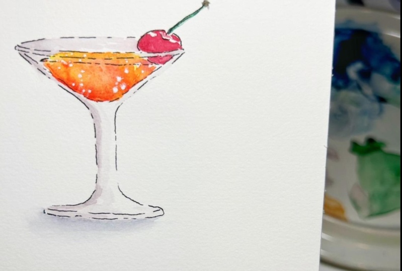
This one cocktail. This cocktail, I would like
some more color variation. Here, we put the cherries,
so don't touch it. What I will do here is
I will wet it again. And on corners, I will put some. Okay. Here and there. I like it better this way. Then we need to put
some shadow here, but before we can
paint for the cherry. To paint the cherry,
we take our red, we water it down. Remember that light
is on this side, we put a little window
and light here, and we paint our cherry. Then we need to go
with the shade value on this side Okay. And then we just
blend the edges. Just leave this highlight. Then here we will come
with a very dark red. So we have greater contrast with the watermelon and also it
gives roundness and Now, I think we can paint
this red label. We take our red which
is a mixture of two, one called one warmer. We have this red of
this brand of soda. I always start from the darkest side away
from light and with the Clean water, I will push
it towards the light, leaving some
highlights like this. My be here again
darken it. Okay. Okay. Perfect. I also need to take my smaller
brush to put this leaf. I have to differentiate it
from the rest of the label. So we'll take some sub green
and I will paint it with care in a very dark
green like this. Okay. Now, we can take now our ink
and add the final touches. But before, now we can add
shadow below our drinks. For this, we take some
purple because we can't take paints gray because
paints gray would be the color of our glass. We need to differentiate, we take some purple,
very water down. I just wet this area
that is away from light, and I will add
some light purple. This is we need shadow
to ground our objects and not to make them fly
around the paper. Same here. Is very water down, so it's a little circle on
this side. Here, we need to. We can take the purple and darken the whole
side because this is in shadow or water melon. We will need to darken also this side of the cherry
before we apply shadow. I take some black you see the red that
we have used and I will darken this side. Okay. I also need
to paint, my cart. I also need to paint
our char here. So I take some just a. We leave night light here also. We don't really need to
give roundness to this, but maybe we can
now that is wet. We can add some
darker on this side. So dart we can plan. Here we have our shadow, I take the shadow
purple water down. And I water down and I apply
some water around my ****. I have my cat visiting me. Okay. Let's blend these shadows. Must be very loose. Now, I think we can put it here doesn't really
matter if it please. It's going to be
preaching in any case. We need to add the green I
have my cat visiting me. So if you see a shadow
or sub green here, and we take some
of our brown and we just some of our brown. You try to use always the
same color. It's nicer. I can always add some
of my soda brown here. Just blend it. Same
here. Take my sepia. So we don't change
color too much, and I give some roundness
of this cherry blended. Okay. Okay. Okay. Now, we can let it dry and
then we add our final touches. We need to add some paints gray here with a
very small brush. Here. Maybe we can
add some shadow here. Same here. Here under the lead. Here we'll be slightly darker because it's
away from light. Okay. Here we can add some gray. Okay. First of all, we need to add seeds
to our water melon. We take a smaller brusher. We take our sepia or we mix
some burn amber with black. I have sepia so I can use this beautiful sepia
and we add seeds. Okay. They have the same
size of a drop, and they have a shape of a drop, and they're always
nicer when they are in odd number like
three or five. We can put maybe
three, like this. Then what we can do, we can take this and we can some lines that
are away from light, for instance, we can underline this broken lines with a very small here. You can do that
with p if you like, but we can do with random
random lines here or there, especially if they're away from light like this the bottom. Here, the glass. I think snuff. Same here. The bottom. Same here. Maybe we can put some kind
of shadow here, here, here. And can add some of this below Cp can do this
in black if you prefer. I can add some black. Maybe this yes here. So yes. Some lines here and
there. Not everything. Just to put some differences, some variation in our drawing. Just not continuous line. Broken. Everything that is away from light can be
underlined this way. Now, we forgot to put
some here. Also, the
7. Final touches: Okay. Now I take
my white gel pen and I add some final touches. I will add some highlight here. And here also broken
lines, they're important. Maybe here as well. On the cup. Maybe on the cherry here. You can we need to
paint this in green. We could leave it black
as it is a sketch, but I think that we can complete it in
green. Just to make it. Also, let's see what's. I think there is some
variation here missing so I can take some of my orange. And here and there, I will add broken because that's the way citrus
fruits are. Same here. I will take some darker green and somehow broken. I will add it. Also some lines here. Now that is dry, you can
add some lines like this. Same with the orange here. We can take our orange, mix it a bit with red so
that we have some variation. Maybe we can add some lines. We can also take some
yellow and do the same. Okay. Okay. Then we can put a highlight
here the cherry. Put highlight whenever you
think it is necessary here. Here we have put a
little highlight. Maybe we can put one here. Here, bubbles. I can put little
bubbles on this side. Here in groups. Okay. That is very pretty Adapos maybe we can add
some white lines here. Should be drier,
maybe. Same here. We can add some white lines. We can add some small
white dots here too. That would be nice.
We can also highlight some ice cubes in white like
this, very visible. Okay. It's a hint. But
it's nice once try. Someone should stop me. I can put a line in
here to in the leaf. If you want to just do something nicer you can further blend here the shadow because
it's even if it is slightly more
I had some color. So I add some darker
color next to the object, so it's more realistic. You see, and then you blend it. Same here. Add some darker color
and then you blend it. It's done. Just you can
put your name on it. I will put my name, and you will put yours. So I will sign Eliza. F. You're done.
8. Wrap up: Very well done. You have sketched your watercolor
drinks with me. I hope you had fun, and I encourage you to upload your
projects in the gallery. This helps a lot of
the other students to see what kind of
results you can achieve. Don't forget to follow
me on skill share. Don't forget to
follow me as well on Instagram where I have art page. If you post your projects
on social media, don't forget to tag me, and I hope you had fun and I'll see you in my
next class. Keep painting.
 Elisabetta Furcht, Anyone can paint!