Transcripts
1. Introduction: [MUSIC] Hello. Welcome back to my
Skillshare channel. I'm Elisabetta, an Italian
watercolor artist. I like to sketch my word
and sketch the food I eat, the books I read and
the objects around the house or
restaurants that I go. One year ago, I published
my first class, which is the typical
Italian breakfast. It is the breakfast that
I had every day at home. Today, I'm celebrating
one year on Skillshare with a new
edition of the same class. It's an Italian
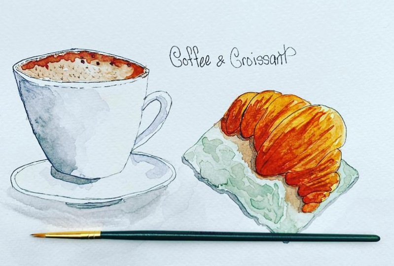
breakfast in a bar. This is an illustrated
sketch of these breakfast that every day is
served in thousands of Italian bars throughout
the peninsula. It's the cappuccino, the famous coffee
with the latte with milk and a croissant
that in Italy, just the curiosity, in Northern Italy where
I live we call it [inaudible] and in Central
and Southern Italy, they call it a cornetti. Even in Italy, we don't
understand each other. It's a typical Italian breakfast
that you have on the go before you go to work
and it's delicious. That's why I would like to
sketch it with you today. It's not only delicious,
it's an easy, fun class that is suitable for beginners but you will
learn plenty of tricks. You will learn how to simplify a complex
reference [inaudible] You will learn how to
[inaudible] into it and give life with the Latin shadow. You will learn how to
add color variety. You will learn how
to mix your grays. You will learn how to
use a limited palette. You don't use too many colors, and you just mix a
limited number of colors to achieve
harmony in your sketch. For this sketch, you need
some basic supplies. I'm sure you're going to have
fun and I can't wait to see you in this class with me. Ciao from Italy. [MUSIC]
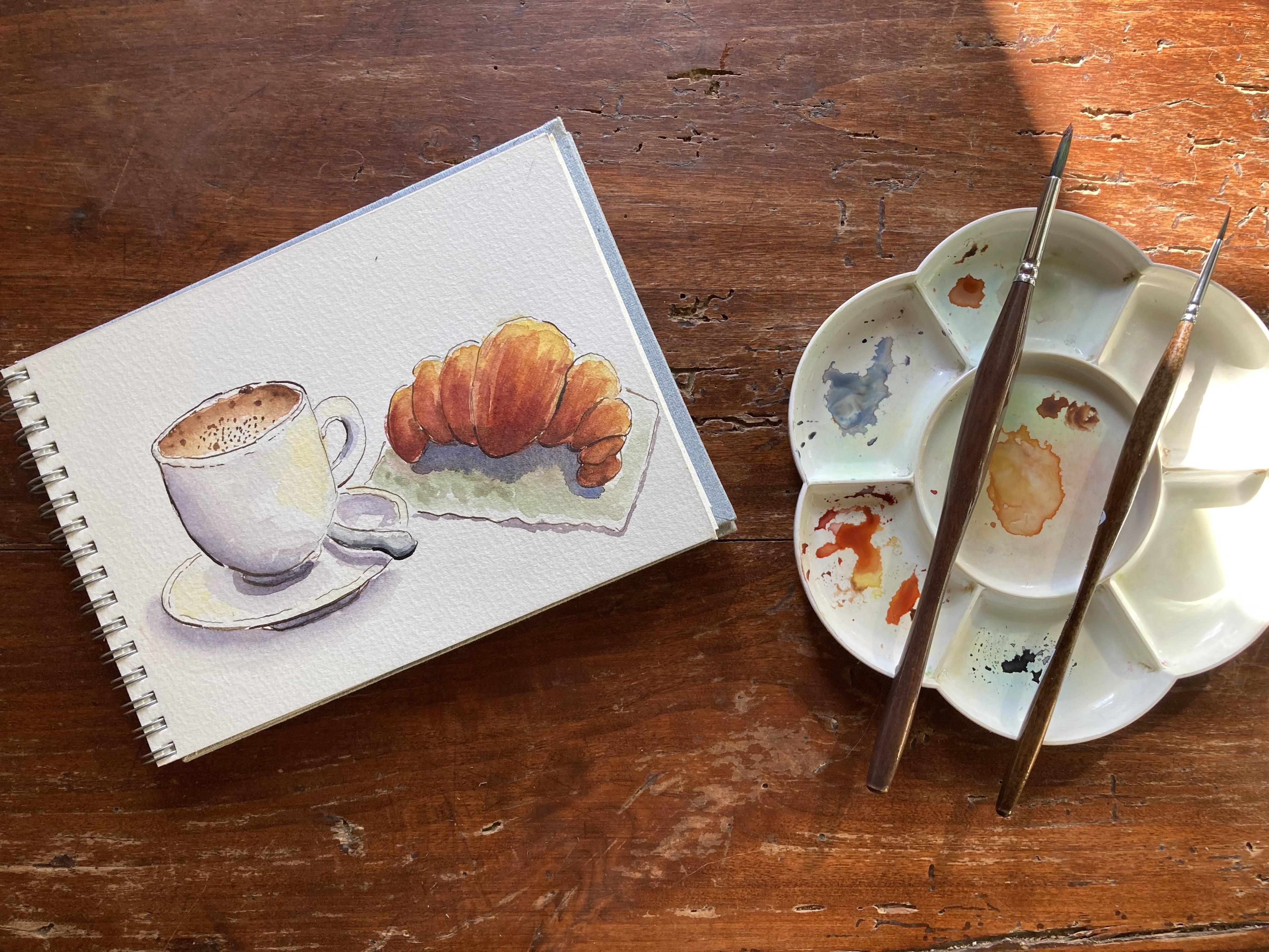
2. Supplies: [MUSIC] Let's talk about
the basic supplies that you will need
for this class. The most important
piece of supply, I think is have some
watercolor paper, not any paper, but some paper
that says for watercolor. This is a sketchbook that I like very
much because it is made with the cotton paper. This is [inaudible], 300 GSM, 100 percent
cotton paper. If you don't have cotton paper, you can still follow my class. I also use a Strathmore
sketchbook like this. It is cellulose and
it's a very good paper. The important thing is
that it is thick paper for watercolor and the weight
should be at least 200 GSM, better if it is 300 GSM. This sketchbook, because
this is a class for sketches in a sketchbook but if you don't
have a sketchbook, to say, it's nicer
in a sketchbook, then you will need some paint. I will use some paint from
my watercolor collection. I have a palette where I put colors from different brands of the colors that
I like very much. I move them around, I sometimes change them. But for this class, you will use some basic
color sets that I will list in the resources section. But basically, you will need some earth tones
like burnt sienna, some raw sienna or yellow ocher, some yellow like cadmium yellow or Naples yellow,
some basic yellow. Also for background, you can
choose whatever you like. I will use some earth green, but you can use any green or pink really, you can decide. But the earth tones will be, the most important colors. It will be in the
spectrum of browns, burnt sienna, raw sienna, yellow ocher, and some gray. But for gray, don't worry. If you don't have a gray, you can either use
Payne gray or make your own gray with for instance, purple and orange or blue and orange or
blue and burnt sienna. There are many
ways to mix grays. To like to mix my gray, we will see how. Then we will need some brushes. I will use some round
brushes of different sizes. Let us say that if you
have a round brush with a very thin point, it's enough. But if you're scared
about thin lines, you can also use a very
small detail brush for finer lines and a larger brush for larger areas like this one. It's round, synthetic
watercolor brushes. They must be watercolor
because they hold more water. Choose a brush, which
says watercolor brush. Synthetic is better like
this one from Jackson's. It says studio synthetic
and it's very good one. They're not very price usually. Then you will need for the
sketch a pencil and an eraser. Then we will need
some pen, some ink. I will use probably nib holder, a dip pen like this with
some ink, waterproof ink. But you can also use a
normal waterproof pen. The important thing is that you use a waterproof pen
or waterproof ink. Then you will need some water. Take two cups of water, one for clean water
and the other one for rinsing your brush and
some kitchen paper, paper towels to dry your brush to blot it dry and to
correct some mistakes, it's a very useful
tool to have around. You will then need
a mixing palette. I'm using these
cheap plastic one. It's perfectly fine. It's important that the
background is white, so you see the colors
you're mixing. You can also use a dish separated from eating dishes
because colors can be toxic or maybe you have a mixing palette that comes along with your watercolor set. This plastic one
is perfectly fine. That's all for supplies
and let's start with the sketch. [MUSIC]
3. Pencil Sketch: [MUSIC] Let's start on the left
of the paper because I'm right-handed so I don't
want to smudge my drawing. I always prefer to start from top left and draw
towards right bottom. I go this way. If you're left-handed,
you will go this way. I start from the cup for my
cappuccino and I will draw more or less box of the size of the desired cup. Then I will put a
cross in-between and I will draw some
horizontal lines where the oval curves into
a horizontal lines here. Don't put an angle here. That would be very wrong. It's not realistic. You touch the four
little lines like this. Here it goes inwards
so you always find the center like this, and it goes inwards towards the base
because you know that this is the back
of the oval inside. You know that these type of
cups have a smaller base. Try to be a little symmetric. This is the pencil face like this and then we will
put a little dish. Always we put some
dots at a distance. This will not be seen, but we still draw it and
we put some dots here. This is the center, so here, here. Once again, we will drop an ellipse which
is our little dish. This is the base of our cup. We can also put even
a little spoon here. Spoons have this shape. We'll put a little spoon
hidden beside the cup. I will now erase the
unnecessary lines. This is hidden. But then we will trace
everything with ink. Here also we will
have the liquid, the cappuccino itself
inside the cup, very light. Now the handle. We put it on the side
because it's easier. We put a semi heart in
here and we follow. You can make it different sizes. You can make it
rounder like this. This is our handle. Let's now sketch the croissant. The croissant has
a half-moon shape. Remember perspective,
so would be not perfect because
it's not from top. Here we will have the center
of our croissant, which is oval with an angle here. Then on this side , on this side. I will not overlap it with the cup as it is in the picture because
it's easier this way. Like this. Here would be more leaning on the
right-hand side same. I'm just looking my
reference picture. Here, I will have one last. Maybe it should be
more on this side. [MUSIC] It's more
symmetrical here and here. I can't really fix my mistakes as much as I like on
the pencil stage. Here, like this and
here like this. Now I like it. Also, now that I think about it, I'd like it to be little fatter. This is the handle and
I will erase here. I'm also canceling this line because cappuccino will
come up to the rim, up to the border. Now that I have played with my pencil we can apply our ink. [MUSIC]
4. Ink Outline: [MUSIC] Let's start
applying our ink. As I said, I will use a nib pen and some water proof drawing
ink from my Pelican. But you can use the just standard
waterproof pen like this one or the Micron,
they're all very good. Just keep in mind that
it must be waterproof. If you use a deep
pen, like I do, be sure to have some
water and some paper next to you to fix some
accidental mistakes. I start with this. [MUSIC] Your line doesn't have to be perfect. It can be also dotted. This side, you just don't
draw it, just some dots. Same with the inner line. The inner line should
be closer because of perspective to the top. Here you will have a closer. [MUSIC] You can also draw some bumbles here
and there for cappuccino. Here it's slightly
more far way from. This side, we must decide
the light direction. I always put it coming
from top right. From this side, I'm
very consistent, so I never make mistakes. That's my way. But
you can choose it. If you do like me,
just put an arrow here with a little sunshine, meaning that here this
is our light source. This line, because
it's in the darker can be slightly thicker. If you have a deep pen you can, and this also because it's
in the bottom and you can be lighter on this side
towards the light. Same here, thicker. This is a CPI ink,
it's very light. I like it a lot. You can vary the
width of your lines. Here we can have rim. Here also would be
thinner towards the upper rim and thicker here. We can also put little bottom here. Now the croissant.
The croissant, we can always fix
lines in this stage. You start from always
the left-hand side because I'm right-handed, I don't want to smudge my ink. [MUSIC] I will put more pressure towards the bottom and lighter towards
the light, thinner. This ink is very
transparent so will be not very visible once we
apply our water colors. You see I just vary the width. This is our croissant. Now I will also direct in ink, put a little napkin and a little towel
under our croissant. I will put a line here. Not too straight because
it's cloth. Like this. Just a little towel. We'll also put some
little circle here. Let's wait until it dries and we can start applying
color after it dries. I'll be back in a few minutes. [MUSIC]
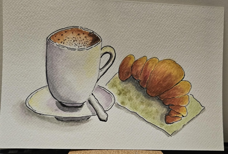
5. Watercolor First Wash: Now 10 minutes have gone by. I think it's dry so I
can erase everything. Now it's crisp and clean. I just don't erase my source of light because
this is important to remember. You see, the sketch is
not perfect at all, but that's the beauty of these quick sketches for a
daily illustrated journal. Let's start from our cappuccino. I have prepared some
burnt sienna here, with some yellow ocher. Always prepare some in advance. Then with a clean brush,
I pre-wet my cappuccino. These area where I will
have my cappuccino. Then I will touch very lightly the outer part like this. Alternatively with also touch of maybe yellow ocher to give
some color variation. I will not draw the
fancy feather because usually you don't
get it in Italy. It's more for pictures, the real cappuccino that
you get in a barra. It's more simple one. I will also add
some darker values. We'll take some burnt umber. Here it is my burnt umber and touch maybe on the side
where I have shadow. Touch just the outer rim. Then we let it rest
and do its own work. This is the cappuccino
for the moment being. Then I see I have some
graphite left here. Let's imagine that this
is porcelain white cup, we will have some shadow here. I will mix my own gray as I said and I will take
some ultramarine blue, ultramarine and I will take
the same burnt sienna. I use what I call
a limited palette, not too many colors, more blue. You see you immediately
have a lovely gray. If you wish you can
add a little touch of purple because it's a lovely
addition to shadows purple. Like these. What I will do
is I draw a shadow here. I will have some shadow also on. Remember that light
source is here. The shadow will be where the sun or the
light doesn't hit. Prepare more of these. It's too red, so more blue
and a touch of purple. I like this touch of purple. It's a personal touch. Then I have this for
sure here, some shadow. Here I will have
a little shadow, then on here below the spoon, I just pull these, I don't
want a hard edge here, so I will put more paint and immediately water
it towards light like this. Here I don't want to, so I put some clean water. Then I go with my napkin
to absorb the mistake. More really here, you've
really outer edge. This is just a first layer. Then we can put some light that hitting here to counterpart. Where we see light,
although it's white, we can put some yellow
because yellow stands for light in the language
of light and shadow. We take some cadmium yellow, pure warm yellow, and
put some here and here. It stands for light. Also here. Here also we have some light. This is not what
we see in reality, but it's a language of light. Yellow stands for light. Let's go to the croissants. For the croissants, we make an under painting
using the same warm yellow, so we don't use too many colors. I could use quinacridone
gold or other yellows, but I will use a very
simple basic palette that everyone has. I would put some where I see
some patches of yellows. I will put some yellow
here and there. It's an under
painting that we give an overall light impression
towards the light. Then we absorb
these excess here. Then I will add
some burnt sienna. I don't wait until it's dry. I will put some wet here at
the corners that are dry. Starting from
corners and center, I will add some burnt sienna especially in the center
and in the bottom you see. Touch it with not real
brush strokes but patches of burnt
sienna. More here. I insist on bottom
because I have shadow. I put some more
here in the center. We slightly blend it here. I would also take some red. I will take some Indian red, which is a nursery red,
but you can take any red and mix it with your
burnt sienna and I will just touch the very end here to add some warmth and
accentuate shadow. Here and there. Blends this, starting to
dry so I should leave it. We will come back
when it's drier. What I would like to do now is to add more yellow
while it is wet. We'll take my cadmium
yellow, again, slightly more concentrated
so it doesn't disperse too match and I will add some touches of yellow
towards the light. Along the lines and
towards the end. Important is to give
some colored variety. Now we go back to
our little spoon. If you have payne's gray,
you can use payne's gray. Or you can even use some
diluted black [inaudible]. I see that there's a
little mistake here, so I go with clean water. It's not important. Just to help you in and just in case you don't
have Payne's gray, you can take some black. I have some neutral
black, which is perfect. I dilute it a lot because it must be completely
different from the one, the gray that's
used for shadows. You just apply some black towards the
opposite end of the light and then you just
dilute it, and don't touch. Leave some white on the paper. Don't touch this
line. leave some. That's it. This is our spoon. Then we will insist with
shadows and we do it right now. For shadows, I go back to the gray I have mixed with
the burnt sienna and blue. It's called Jane's Grey. I mix some more. It's too brown, so
we'll add some blue. Especially if it's
on the bluish side, I'll add a touch of purple, and I insist on shadows
where I see more like here. And also maybe on
this side of the cup, and then I blend this. Don't overwork it. Just leave it as it is. I take other brush
and I blend this. Now maybe we can
still work a little our cappuccino I like
it the way it is. But there should be
more white inside. So the first thing that I do is, I will lift up some color
here in the middle. I take some clean water. I applied here. Then with a dry brush, I will try and lift
some of this color. Like this. It's lighter now and we can accentuate the reddish
around the rim. For these, I take some burnt umber with
some burnt sienna, and I take a touch
of the Indian red. Any red. Just mix your colors until you
find reddish brown. I would just accentuate here in a very messy
manner. It's not. Then I blend it not
towards the center, but outwards so that I
just push away this. I don't pull it
towards the center, but I push it towards the rim. I will take some darker value. Put it here in the purple. I can also touch here
and there for bubbles. The two like that. Don't be this symmetric, just more of scattered in this. I wouldn't touch this anymore. Now, we can paint
the little tower. For the little tower as I said, I will take a very light
green, which is earth green. You can take any
color that you like. This earth green is a
very nice delicate one. It's not very easy to re-wet,
but we will just apply with lovely strokes,
larger strokes. Leave some white towards the black line because it
makes it more interesting. It's a very delicate,
transparent weak green. Very close to here where
we have shadow and almost white towards the edge. While it is wet, we can take some
complimentary color of green. The complimentary
color of green is red. So we take some of
these Indian red for instance and we draw a shadow. Here, it's too reddish, so I will mix some of these red with my green to get
more natural green. Because here we
will have shadow. Here, we have our shadow. Just blend it slightly. We can also add some
dots of green here and there for a more textured
look of the cloth. Now, we go back. We let these stay as it is, and we go back to our
croissant for some texture.
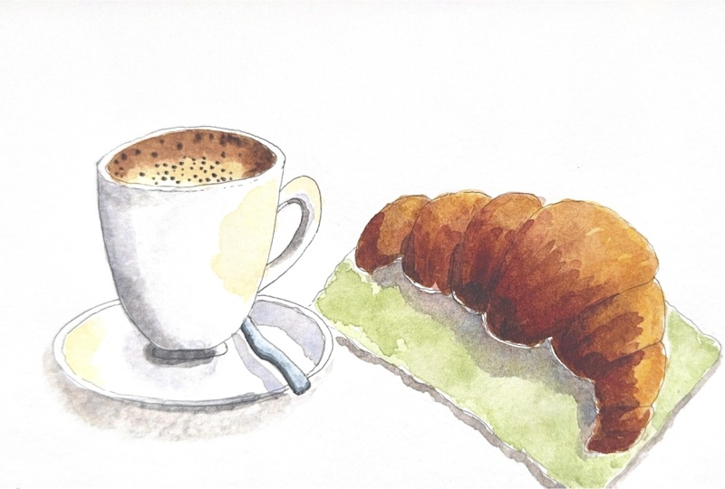
6. Watercolor Second Wash: [MUSIC] I will take now a thinner brusher. I will go back to my Indian red, mix it maybe with a
touch of burnt umber, and some burnt sienna. We have some very
warm reddish-brown. Just mix it until you
find the right color. There is no one right color. Whatever color, the
important is value, it's not the correct color. It's to vary color. We watch our reference image, and we apply more color
where we think it's needed. [MUSIC] Either because
there is more shadow or because it's more baked here. Along this line in
the middle like this. [MUSIC] Our burnt sienna, we'll concentrate here. More here in the the bottom, and then some stripes
in the middle. I have some red here
and there for variety. Back to my burnt sienna. [MUSIC] Here at the bottom. [MUSIC] Be careful, see there are drops of water. Clean them before they
fall on your drawings. [MUSIC] Now you can take your cadmium yellow, and add some more yellow
where they're needed. [MUSIC] You can just blend
some lines here, the yellow. [MUSIC] Let this stay. Maybe we add a little brown towards the
shadow, the ring here. [MUSIC] Because here it's darker. [MUSIC] If you think that
you have shadow, you can add some burnt umber. [MUSIC] I add some yellow ocher to mute a bit this yellow. This is our croissant. Now let's add some shadow
below the little cloth. We go back to our shadow color. We add a touch of purple. Here we have some cast shadow. Be careful to fill the
holes here so it makes more obvious the movement of
the cloth of the fabric. Very little here also
because sun is from here. Also, we will have some cast shadow here around it. [MUSIC] Add some
more bluish here. [MUSIC] Must have the same direction of this cast shadow here. You will have this
cast shadow here. Then you can blend it with
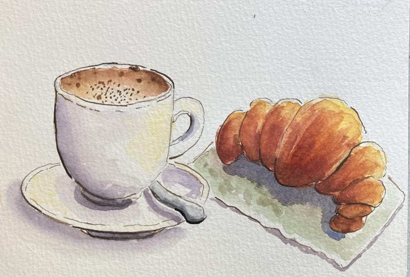
some bigger brush here and oaf so cleaner [MUSIC] like this. Now we need some more cast
shadow around the croissant. I think that I will put
my cast shadow gray here. [MUSIC] Follow just the
shape of the croissant. I think that some blue note
might be perfect here. [MUSIC] Then just blend it a
little because it's close. You can add some more gray. Some darker here. Here I see some white, you shouldn't see white here. Just touch it here
so you will get the darker value,
no whites here. Also, you can take
some burnt sienna, and just add some central
lines here for added texture. You're going to have
a clear separation between the burnt
sienna and the yellow. Last, but not least, in Italy, we put cocoa powder
on the cappuccino. I will take some burnt umber, [MUSIC] and with a very
thin touch here and there. [MUSIC] This is exactly what
I wanted to achieve. Now we can accentuate those shadows of the
spoon and of the handle. I take my gray, and I draw a very thin
line here and here. Also, I can put my burnt umber, and I can draw some
shadow here on this side. [MUSIC] Because on this side, there would be some
cast shadow from the [MUSIC] rim of the cup. [MUSIC] I will stop now. I let it dry, and then we'll come back for final
consideration. [MUSIC]
7. Final Thoughts: [MUSIC] We have finished
together our sketch. I hope it was a fun class. I hope you learned something. You have also learned something
about the Italian food. I see you in my next class. Don't forget to post
your projects in the project gallery so that
I can give you my feedback. Also if you post your
project on social media, you can tag me on Instagram. You can find me under my name, Elizabeth [inaudible]
Thanks a lot for having joined the class
and having sketch with me. It was a great experience for me and hopefully you too. Ciao.
 Elisabetta Furcht, Anyone can paint!